#“creating vector image”
Explore tagged Tumblr posts
Visit Tumblr Blog
Explore Tumblr blogs with no restrictions, modern design and the best experience.
Last Seen Tumblr Blogs


Fun Fact
69% of Tumblr users are millennials.
Text
Love hearing my computer start exploding violently every time I try to save this fucking vector file. Like. I know it's a kinda intense file but my brother in Christ you are being dramatic right now. Calm down. You'll be ok I promise
#I do actually feel bad for my computer I know it's a lot of work for them lmao#my frustration is not at my computer but at illustrator because like.#are vectors not supposed to b less intensive than rasters??#like to be fair there Are an unreasonable amt of paths lmao#I image traced all my photoshop layers to get it as close to what I want as possible but that creates a billion shapes#I did my best to clean it up but. it's still a lot lmao#armchair speaks
2 notes
·
View notes
Text
It's very funny to me that at this point it's like, A Thing that I sincerely enjoy watching OTHER people play things on high difficulty (looking specifically at Project Zomboid and RimWorld rn but there's probably others) but when playing myself I want the threat to be only moderate because I am mostly here to play post-apocalyptic cottagecore war crimes games.
#me just like 'I am playing The Sims'#'only with the lovely extra spice of a post-apocalyptic setting and active threats to my life'#I've had one guy on in the background while I fight with vectors#I do not like vector images#I mean I do because they resize and they're very clean#but actually CREATING them is a circle of hell#at least I'm getting paid#and the first part was fun#I DO like lettering I just like it better when I'm not doing Fucking Vectors
0 notes
Text
0 notes
Text
ive been avoiding learning illustrator for sooooo long but i can’t put it off anymore i think >:-(
1 note
·
View note
Text


Shop Sign Wall Lights - UPDATED 15 May 2025
I put together a few sets of shop sign wall lights. But there are instructions. I kept some swatches as a default white color so that you could pick which color you want the light to be while in live mode. This saved on the file size of the package file because the more textures a file has, the more bloated the file size is.
I had some fun with some shop names although I mainly included generic titles in both English and Simlish.
DOWNLOAD for FREE: SFS
OR at Patreon*
*You must be over 18 to access my Patreon page.
INSTRUCTIONS ON CHANGING LIGHT COLORS
Once you place the light in build mode, then go to live mode. Click on the light and you will get the following pie menu.

Select SET COLOR AND INTENSITY and then choose THIS LIGHT. The color options will then appear so you can select which color you want.

If you use the name signs along with the Awning Lights, make sure to place the name on top of the awning so when you select the color picker, the correct sign changes colors. The other option is to place the name separate from the awning, go to live mode and change the color, then go back to build mode and add the awning light you want.
Enable the bb.moveobjects on cheat and then you can make adjustments to location and size of objects. You can adjust the position of the light on the wall by depressing the Alt key while placing the sign (on PC). You can adjust the size of the item by depressing the Shift key and either [ (for smaller) or ] (for bigger) (on PC).
CREDITS
Awning Shop Lights - 19 swatches of various awning wall lights. 18 are pre-colored and one is white so you can change the color yourself in game.
Candy Shop Lights - 20 swatches
Pottery Shop Lights - 25 swatches
Tattoo Shop Lights - 21 swatches
Enjoy!
Creations by SexyIrish7
These cc objects are new 3d meshes created using Blender and Sims 4 Studio.
Polygon Count: 6
All CC have:
*Ability to search catalog using search terms: sexyirish7 and si7
*Customized thumbnail
*******
CREDITS:
Software credits:
Sims 4 Studio v. 3.2.4.1 (Star): https://sims4studio.com
Blender 4.0: https://www.blender.org/download/
GIMP v. 2.10.34: https://www.gimp.org/
Inkscape v. 1.2: https://inkscape.org/
Thank you to the creators and moderators producing tutorials and answering questions!
*******
Model and Image credits:
Mesh created by me.
Simlish font credit to Franzilla: https://modthesims.info/
Image credits:
Awning Lights Image credits: Modified image from Adobe Stock
Candy Shop Image credits:
Swatches 1-3: Image by pch.vector on Freepik https://www.freepik.com/free-vector/christmas-candies-symbols-set-neon-style_11241813.htm#fromView=search&page=1&position=26&uuid=8b541325-0e62-4e37-9468-6bacd30f8963&query=neon+lollipop+candy
Swatches 4-8: Image by gstudioimagen on Freepik https://www.freepik.com/free-vector/sweet-candy-neon-seamless-pattern_5595774.htm#fromView=search&page=2&position=30&uuid=e2259de5-014d-4d04-af87-1198ee0f35e2&query=%40gstudioimagen+neon
https://www.freepik.com/free-vector/sweet-candy-neon-seamless-pattern_5595775.htm#fromView=search&page=1&position=27&uuid=e2259de5-014d-4d04-af87-1198ee0f35e2&query=%40gstudioimagen+neon
Swatches 9-10: Image by openclipart.org https://all-free-download.com/free-vector/download/peppermint_candy_clip_art_13182.html
https://all-free-download.com/free-vector/download/round_candy_with_stick_card_on_pink_background_6823183.html
Swatch 11: Image by All-free-download.com https://all-free-download.com/free-vector/download/round_candy_with_stick_card_on_pink_background_6823183.html
Swatches 12: Image by katemangostar on Freepik https://www.freepik.com/free-vector/ice-cream-cart-neon-sign_3238564.htm#fromView=search&page=8&position=42&uuid=2f82b4d1-5ca8-449c-ae22-4573861ebcb0&query=neon+sign+retail
Pottery Shop Image credits:
Swatch 1: Crafting icons created by andinur - Flaticon https://www.flaticon.com/free-icon/pottery_17392031
Swatch 2: Image by katemangostar via Freepik https://www.freepik.com/free-vector/aquarius-neon-sign_5561944.htm#fromView=search&page=2&position=5&uuid=c55e5e21-0550-46f0-b9be-cfa85ff38796&query=Ceramic+Neon
Swatch 3-4: Pottery icons created by Smashicons - Flaticon https://www.flaticon.com/free-icon/vase_3760867
https://www.flaticon.com/free-icon/vase_3760970
Swatch 5: Icon by istar_design_bureau via Freepik https://www.freepik.com/icon/pottery_1958438#fromView=search&page=2&position=20&uuid=096084ae-13fe-429c-a419-e6e13ccd37b9
Swatch 6:Icons by Eucalyp - Flaticon https://www.flaticon.com/free-icon/pottery_6552610
Swatch 7: Icon by berkahicon via Freepik https://www.freepik.com/icon/spin_13785816#fromView=search&page=2&position=0&uuid=096084ae-13fe-429c-a419-e6e13ccd37b9
Swatches 8-11: Icons by Freepik https://www.freepik.com/icon/pottery_8540816#fromView=search&page=3&position=43&uuid=096084ae-13fe-429c-a419-e6e13ccd37b9
https://www.flaticon.com/free-icon/machine_9200546
https://www.flaticon.com/free-icon/vase_8838322
https://www.flaticon.com/free-icon/pottery_3305262
Tattoo Shop Image credits:
Swatch 1: Modified Image by katemangostar on Freepik https://www.freepik.com/free-vector/tattoo-salon-neon-text-with-tattoo-machine-neon-sign-night-bright-advertisement_2438198.htm?log-in=email
Swatch 2: Image by Nippy Custom https://www.nippycustom.com/products/tattoo-neon-sign
Swatches 3-5: Image by bohlam via Vecteezy https://www.vecteezy.com/vector-art/2185717-tattoo-studio-neon-signs-style-text-vector
https://www.vecteezy.com/vector-art/34210463-neon-sign-tattoo-studio-with-brick-wall-background-vector
*******
TOU:
Do not re-upload and claim as your own
Do not re-upload and hide behind a paywall
*******
Changelog:
15.05.2025
*Updated swatches for compatibility with slotted signs.
*Added wall deco slot so that signs can be stacked on slotted signs for Awning Signs
*Added swatches with inverted images for Candy, Pottery, and Tattoo Shop Signs.
#the sims 4 cc#ts4cc#sims 4 cc#the sims 4#wall decor#sims 4#ts4#lights#wall lights#signs#shop signs#retail#pottery#ceramics#tattoo#ink#candy#lollipop#sweets#sugar#light tutorial#sexyirish7#updated cc#featured
299 notes
·
View notes
Text
So, you want to make a TTRPG…

Image from Pexels.
I made a post a long while back about what advice you would give to new designers. My opinions have changed somewhat on what I think beginners should start with (I originally talked about probability) but I thought it might be useful to provide some resources for designers, new and established, that I've come across or been told about. Any additions to these in reblogs are much appreciated!
This is going to be a long post, so I'll continue beneath the cut.
SRDs
So, you have an idea for a type of game you want to play, and you've decided you want to make it yourself. Fantastic! The problem is, you're not sure where to start. That's where System Reference Documents (SRDs) can come in handy. There are a lot of games out there, and a lot of mechanical systems designed for those games. Using one of these as a basis can massively accelerate and smooth the process of designing your game. I came across a database of a bunch of SRDs (including the licenses you should adhere to when using them) a while back, I think from someone mentioning it on Tumblr or Discord.
SRDs Database
Probability
So, you have a basic system but want to tweak it to work better with the vision you have for the game. If you're using dice, this is where you might want to consider probability. Not every game needs this step, but it's worth checking that the numbers tell the story you're trying to tell with your game. For this, I'll link the site I did in that first post, AnyDice. It allows you to do a lot of mathematical calculations using dice, and see the probability distribution that results for each. There's documentation that explains how to use it, though it does take practice.
AnyDice
Playtesting
So you've written the rules of your game and want to playtest it but can't convince any of your friends to give it a try. Enter Quest Check. Quest Check is a website created by Trekiros for connecting potential playtesters to designers. I can't speak to how effective it is (I've yet to use it myself) but it's great that a resource like it exists. There's a video he made about the site, and the site can be found here:
Quest Check
Graphic Design and Art
Game is written and tested? You can publish it as-is, or you can make it look cool with graphics and design. This is by no means an essential step, but is useful if you want to get eyes on it. I've got a few links for this. First off, design principles:
Design Cheatsheet
Secondly, art. I would encourage budding designers to avoid AI imagery. You'll be surprised how good you can make your game look with only shapes and lines, even if you aren't confident in your own artistic ability. As another option, public domain art is plentiful, and is fairly easy to find! I've compiled a few links to compilations of public domain art sources here (be sure to check the filters to ensure it's public domain):
Public Domain Sources 1
Public Domain Sources 2
You can also make use of free stock image sites like Pexels or Pixabay (Pixabay can filter by vector graphics, but has recently become much more clogged with AI imagery, though you can filter out most of it, providing it's tagged correctly).
Pexels
Pixabay
Fonts
Turns out I've collected a lot of resources. When publishing, it's important to bear in mind what you use has to be licensed for commercial use if you plan to sell your game. One place this can slip through is fonts. Enter, my saviour (and eternal time sink), Google Fonts. The Open Font License (OFL) has minimal restrictions for what you can do with it, and most fonts here are available under it:
Google Fonts
Publishing
So, game is designed, written, and formatted. Publishing time! There are two places that I go to to publish my work: itch.io and DriveThruRPG. For beginners I would recommend itch - there's less hoops to jump through and you take a much better cut of what you sell your games for, but DriveThruRPG has its own merits (@theresattrpgforthat made great posts here and here for discovering games on each). Itch in particular has regular game jams to take part in to inspire new games. I'll link both sites:
itch.io
DriveThruRPG
Finally, a bunch of other links I wasn't sure where to put, along with a very brief summary of what they are.
Affinity Suite, the programs I use for all my layout and designing. Has an up-front cost to buy but no subscriptions, and has a month-long free trial for each.
Affinity Suite
A database of designers to be inspired by or work with. Bear in mind that people should be paid for their work and their time should be respected.
Designer Directory
An absolute behemoth list of resources for TTRPG creators:
Massive Resources List
A site to make mockups of products, should you decide to go that route:
Mockup Selection
A guide to making published documents accessible to those with visual impairments:
Visual Impairment Guidelines
A post from @theresattrpgforthat about newsletters:
Newsletter Post
Rascal News, a great place to hear about what's going on in the wider TTRPG world:
Rascal News
Lastly, two UK-specific links for those based here, like me:
A list of conventions in the UK & Ireland:
Convention List
A link to the UK Tabletop Industry Network (@uktabletopindustrynetwork) Discord where you can chat with fellow UK-based designers:
TIN Discord
That's all I've got! Feel free to reblog if you have more stuff people might find useful (I almost certainly will be)!
465 notes
·
View notes
Text


Living Harmony AU relevant character sheets/info: Harmony aka the "Tree of Harmony" Stygian Somnambula Starswirl the Bearded Shadow Lock is actually an official canon character from the IDW comics No. 51-53 and I really enjoyed his mini arc introduction enough to include him as a more significant part of my "Living Harmony" MLP AU animation project. When I found out he's a direct descendant of Stygian, one of the Pillars of Equestria, I had to find a way to work him in and give him a bit of an updated design to fit more into my story setting I have planned. My good friend Ori helped vector my finalized concept redesign in the very top image. Listed below is some character and story context for these sketches provided by my myself and Ori who's been a huge help in fleshing out the world building with this cast of characters I'm using in this AU so far. Shadow Lock's main abilities and canon backstory are expanded upon and/or flavored a bit differently here as well.
Stygian’s distant descendant, the last living branch in his family tree
Lives alone in his family’s castle after they retired to the town of Somnambula
Temporary antagonist to the mane 6 that stems from a fear of the Pony of Shadows returning to plague Equestria
Believed he was descended from a monster and desperately tried to erase any mention of the Pony of Shadows from written history
Was talked down from his history erasing spree by Twilight and ends up traveling around Equestria to find more info on the Pony of Shadows, without trying to erase the knowledge this time, and prevent it from returning
The symbol on the front of Shadow Lock’s cloak is his family crest that dates back to Stygian's time period.
There’s a glamor woven into Shadow Lock’s cloak that enshrouds its wearer’s face.
Shadow Lock’s special talent is the concealment and binding of dark magic. He can effectively bind malevolent “spirits” into vessels where they’re unable to cause harm. This can also be reversed as an unbinding spell. ("spirits" in this context are more like a culmination of lingering, concentrated dark magic that takes on a will of its own)
His family castle used to be quite “haunted”. It’s quieter nowadays, but he does have a large collection of miscellaneous items that most ponies would consider “cursed…”
Always carries a healthy stack of books on his person to read and use as a weapon. His spells can pull fictional characters and monsters from stories to fight for him
Created a spell that can trap a creature into experiencing a historical event on loop by using a small amount of written text. The spell can be broken by doing something significant enough that did not occur during the looped event in history.
Shadow Lock and Stygian are extremely hesitant to meet each other at first in present time. The mane 6 and Harmony step in as mediator eventually to help them work out their issues so they can reconnect as family
Much later in the story, Shadow Lock invites Stygian to live in his castle once their family relationship is repaired, the two becoming inseparable
His original design from the comics:

#my little pony#my little pony friendship is magic#mlp#mlp fim#shadow lock#twilight sparkle#stygian#tree of harmony#shadow lock mlp#stygian mlp#princess twilight sparkle#alicorn twilight#unicorn#traditional unicorn#classical unicorn#living harmony mlp au#my art#living harmony au
925 notes
·
View notes
Text

When I came across these beautiful aspiration based diary defaults created by @episims with @midgethetree's mods, I immediately knew I wanted to make a set that matched my game's aesthetic!
I made textures to match my preferred funky and nostalgic aesthetic, complete with a (decorative) diary lock and unique written pages!
You'll still need Midge's Re-Enabled Diary Textures mod to begin with, and Midge's Aspiration-Based Diaries mod, which can be found inside Epi's Diary Default Replacements' download folder. My download only contains the recolors I've made, so you need to download both linked mods first, or my textures will NOT show up in your game. That means you need midgethetree_aspirationdiaries and midgethetree_reenableddiarycovers.
‣Download My Diary Defaults (MF) | Alt (SFS)
Credits: • @midgethetree for their Re-Enabled Diary Textures and Aspiration-Based Diaries mods. • @episims for their idea for this mod and their original textures, which I used as a base to build my textures around. • @franzillasims, @ratboysims, and gazifu on MTS for the many similish fonts used. • Maxis/EA for the freezer bunny, star, and simolean graphics, and google images for the lips vector, fake Louis V clover symbol, and Polaroid frame. All other graphics made by me.
#thanks again to Midge and Epi for coming up with and creating such a fun default!#me making the family sims' the most basic is definitely not shade to family sims... definitely not#sims 2 cc#s2cc#ts2 download#sims 2 default replacement#sims 2 download#sims 2 custom content#ts2cc#ts2 cc#ts2 custom content#ts2 defaults#mycc
1K notes
·
View notes
Text


My "Loud House" character hybrid cosplaying Jenny from "My Life as a Teenage Robot", but now with her hair dyed blue.
This is my second set of vectors after my first set where my character hybrid is shown dressed as Jenny without blue hair dye. However, looking at these vectors, it almost looks like she's Jenny in the art style of "The Loud House". Only, she's human and doesn't have her powers (even though my character hybrid could make her boots into rocket boots or if she had a jetpack or something). But of course, since this is "The Loud House" we're talking about, her "Loud House" depiction or surprise guest appearance would say curse words (which "The Loud House" has compared to most other family-friendly adult cartoons like "The Simpsons", "Total Drama Island", "Adventure Time", and "Regular Show"), which the real Jenny wouldn't do since she's from a kids cartoon (kinda like how most guest celebrities or cartoon characters from other media are presented in other adult cartoons).
Feel free to leave a like you enjoy this set of vectors I made.
#create your own character hybrid#create your oc#the loud house#loud house#the loud house fan art#Remi (Loud House OC)#my oc#cosplay#my life as a teenage robot#jenny mlaatr#mlaatr jenny#Jenny Wakeman#jenny xj9#XJ9#transparent artwork#transparent image#transparent images#vector art#vector#vectors
3 notes
·
View notes
Text
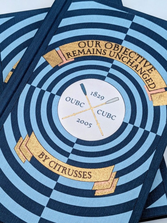
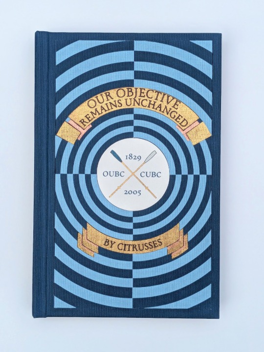
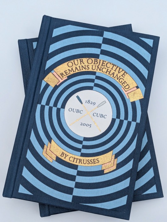
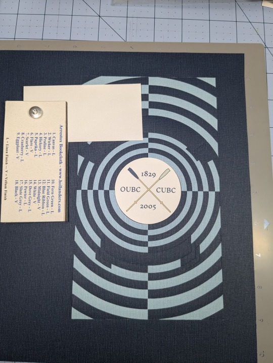
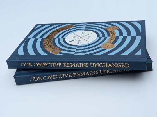
Our Objective Remains Unchanged by @citrusses
"Harry Potter, returning member of the Oxford University Boat Club, has two goals for the spring of 2005: beat Cambridge, and beat Draco Malfoy. Perhaps not in that order."
This has to be one of the most creative and meticulously researched fics I have ever had the pleasure of reading. If you haven't read it yet, don't walk— run! Citrusses is an absolute genius, and kindly gave me permission to bind her masterpiece.
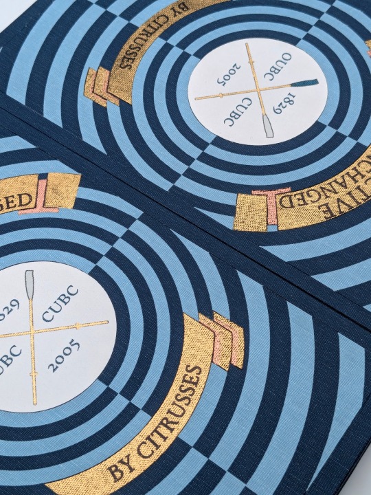
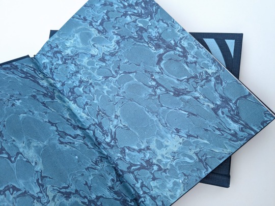
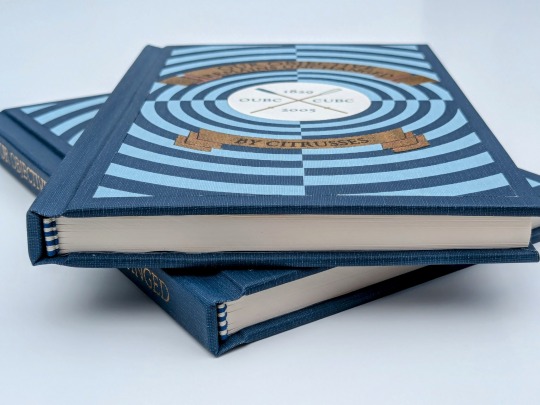
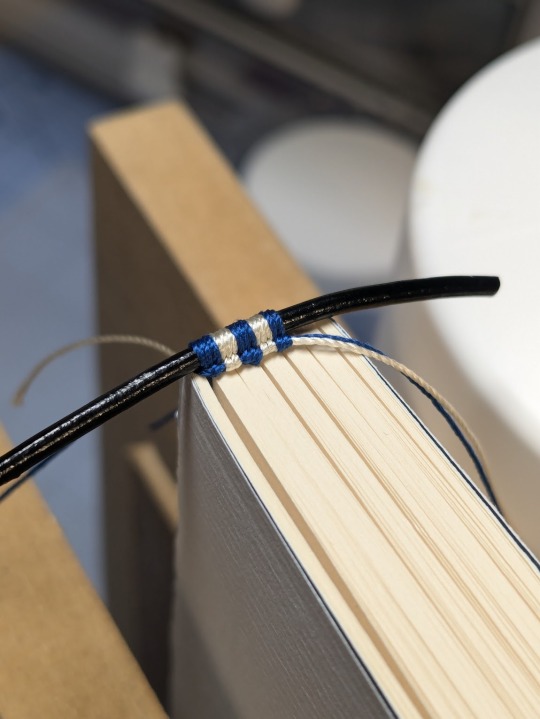
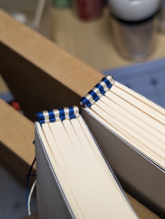
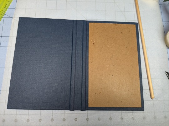
The cover of this bind is made out four different shades of Allure bookcloth cut by my Cameo 4, and the centerpiece is printed and hand foiled. The banners were machine foiled in gold and black with hand foiled rose gold shading. The endbands were hand sewn with Gutermann silk thread.
You can find more pictures and information about my process under the cut.
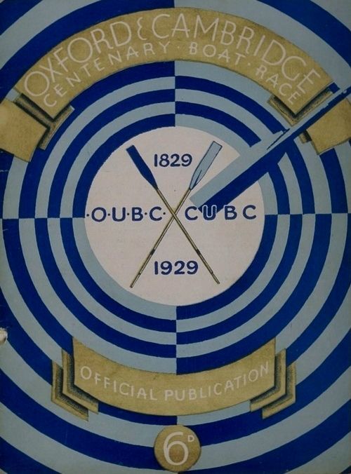
The amount of inspiration this fic gave me was overwhelming, and Citrusses' writing fully immersed me in the world of competitive rowing. While designing this bind, I was struck by the sheer wealth of Oxford rowing memorabilia available to me. I settled on this 1929 illustration from an official publication on the Oxford and Cambridge Centenary Boat Race for the cover.
"How hard could it possibly be?" I thought, foolishly. The answer was HARD, but I'll get into that later.
Due to the wealth of design options, I believe that this may be the best typeset I have created to date. Thanks to the help of my friend @tsurashi-bindery, I was able to learn the basics of InDesign (kicking and screaming all the way). There will be spoilers in the text of these photos, so try not to read them if you haven't finished the fic!
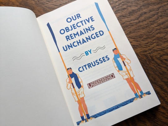
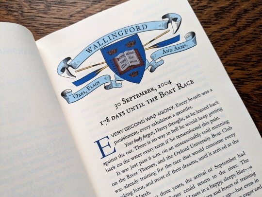
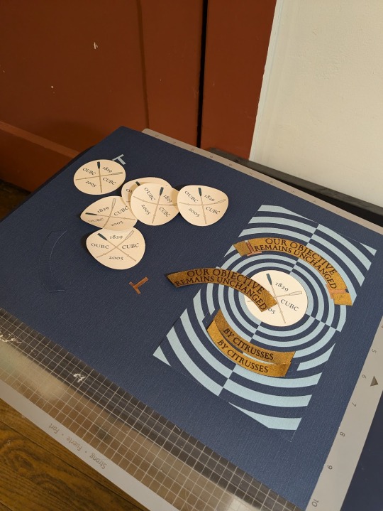
For the title page, I modified To See the Crews in Training by Charles Pears (1930). I believe that this was part of a series of advertisements for the race in the London Underground.
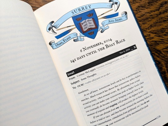
For the chapter headers, I redrew the crest from an Oxford Oars, Flags, and Arms postcard, presumably pre 1914. I also had some fun creating a mock email using La_Temperanza's How to Mimic Email Windows on Ao3. Cormac's email makes me laugh every time I read it, and Citrusses provided an appropriately pompous subject.

I also had lots of fun editing the oars from the official OUBC logo to serve as dividers and decorations for the page numbers.
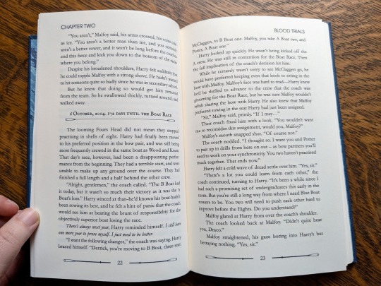
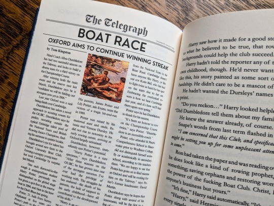
Additionally, I got to edit a full newspaper page for the fic! I was very excited find an opportunity to slip Leyendecker's The Finish (1908) in.
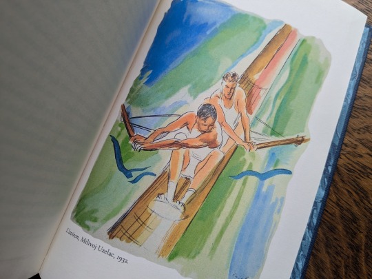
The fic ended beautifully, so I wanted to include one last element at the end to capture the atmosphere. I settled on L'aviron (1932) by Milivoj Uzelac. It makes me feel as though Harry and Draco will continue rowing together long after I've closed the book.
I of course had lots of fun sewing the headbands, and got to do it with not one but TWO copies!
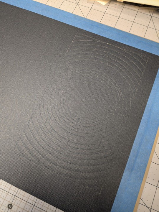
Things got tricky when I had to recreate the cover. I had a poor understanding of how vector images worked, and ended up having to redraw it three times. Once I finally cracked and taught myself how to use Illustrator, the program crashed...and I had to redraw it a fourth time!
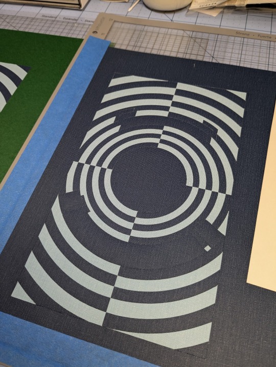
I set the vector to cut on my Cameo 4, and I assembled the pieces together like a puzzle on my Silhouette mat. I used Allure's indigo, skylight, white, and black bookcloth in the process. I will be making a tutorial video on this method, so I will keep it brief here.
I also cut a piece of bookcloth to 8.5"x 11" and fed it through my inktank printer to print the center design. I then cut it out using the print and cut feature on my Cameo 4. Both of these methods were a first for me, and they were very scary!!
To be perfectly frank, the foiling was a nightmare and I don't want to get into it. I machine foiled the gold, and then foiled black lettering on top of it. I foiled the rose gold shading by hand, and then foiled a thin black outline along the edge of the banners to make them stand out more.
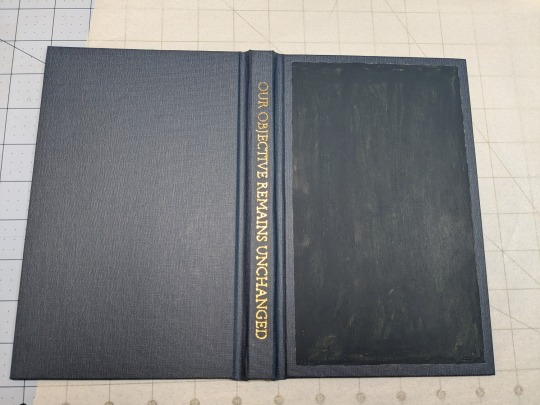
I hand foiled the spines (because I'm scared of measuring), painted the exposed board (to hide any gaps in the inlays), and used transfer tape to lift my design from the Silhouette mat and onto the cover.
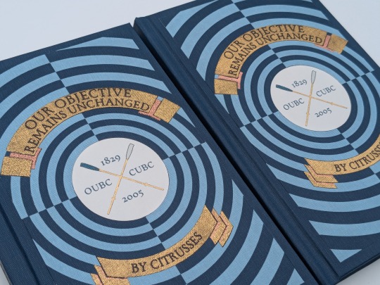
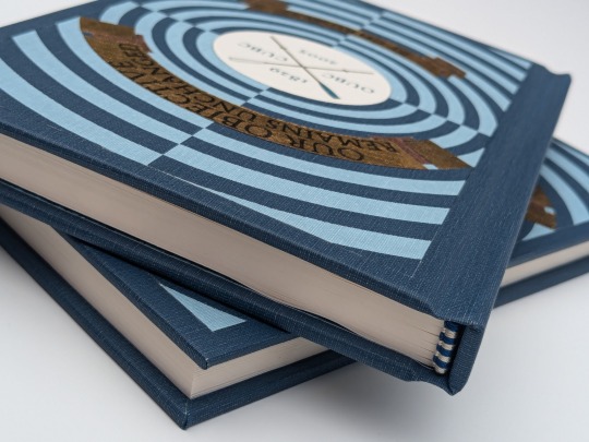
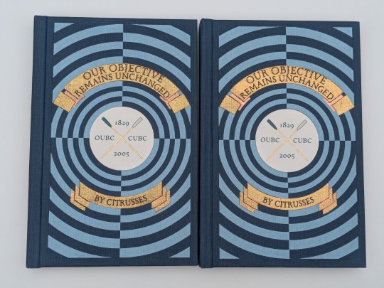
One more fun detail— my copy and the author's copy are sisters! The dark blue and the light blue are inverted on the author's copy, making it distinguishable from mine. This is the first time I have made an author's copy for a fic, and I was admittedly incredibly nervous. I always worry about what authors will think of my work, but Citrusses gave me an incredible amount of encouragement and support throughout the process! Thank you for trusting me with your precious fic!
This story is a work of fanfiction and can be read on Ao3 for free. My bind and typeset are for personal use only and not for sale or profit. Keep fandom free!
#book binding#fic binding#fanbinding#fanfic binding#drarry#our objective remains unchanged#harry x draco#my binds
342 notes
·
View notes
Note
hii! i absolutely love your work. i've been getting into trying to make borders myself, and i was wondering if you had any tips on where to find good pngs or do you create everything yourself? i feel like my luck so far hasn't been great but maybe i just don't know how to search for it correctly!
Hello, nonnie! I'm so glad you enjoy my work; thank you for your kind words. ( ˶ˆᗜˆ˵ ) And oh my gosh, it's so nice to see a new GFX creator in the making! One of us, one of us, one us. ~ Welcome to the wonderful world of editing, hehe!
I've compiled a list of websites that I use for my graphics, but please do let me know if you need anything else and I'll be happy to assist!
For general assets, as well as inspiration, I generally use these websites: behance (which is pretty much the industry standard when it comes to graphic design in general, they have cool studios or experienced designers that post their works and/or assets), booth (an independent japanese resources hub with many free and paid assets), huanban (an independent chinese resources hub, same proposal as booth), abdz (mostly focused on typography and branding), dribble (more focused on web applications and design) and envato (templates).
Since I'm colourblind, I'm not always confident about how to compose colours together. So whenever I'm in doubt, I use coolors (to get palettes from images and browse through palette ideas) and colorhunt (which gives ideas for palette themes and motifs).
I love typography a whole bunch, but sometimes it's hard to find that one right font for your project. Whenever I need to look for something else, I always run to these websites: google fonts (when I'm on a budget and want to use 100% free fonts, including for commercial use), 1001fonts (to quickly find fonts based on themes, it has a great tag system), dafont (a big classic huge dabatase of custom fonts), befonts (for more industry standard-leaning fonts) and kerismaker (for those magazine looks). When I want to identify a font used on an image and where I can download/purchase it, I use myfonts and font squirrel. They even give you similar options for free, too!
Suppose I'm specifically searching for illustrations/PNGs I can use on my upcoming project. In that case, I'll either go to flat icons (for websites, applications or presentations), vertex (for 3d icons and/or general vectors), graphic burger (for logo making), cleanpng (for I want a tree PNG and do not want to clean it myself, for example), pngtree (same idea as the previous one, you just search for a word and will see all PNGs related to it) and pngall (self explanatory).
Regarding backgrounds, textures, and photography in general, I rely on websites like pixabay, vecteezy, 3d ocean, morguefile, freepik and isorepublic. They have high-quality photos and videos that you can use on your projects. However, if I specifically need mockups or patterns, I turn to unblast, pacage and ava.
Besides those, you can always search for things on Deviantart and Twitter! Though I do not use those much, I think Instagram and Threads also have pages dedicated to sharing resources. Discord can be a nice place to search for graphic design servers, too.
However, if I cannot find specific resources for a commission/project for whatever reason, then I will make them myself. Be it through photography, drawing or anything else I can get my little hands on.
For the more technical/applications side, the programs I use for my graphics and edits are Adobe PhotoShop 2020, Adobe After Effects 2020, Adobe Illustrator 2020, Clip Studio Paint (for when I need to draw or polish something for specific projects/commissions), and HandBrake (for when I need to make screencaps). My drawing tablet is an oldie, Wacom One.
Hopefully, this can be a nice starting point for you! Please feel free to reblog and/or like this post if you'd like to save it for whatever purpose. ~ I hope you enjoy this journey ahead, and if you need anything else, let me know! You got this! ദ്ദി ˉ͈̀꒳ˉ͈́ )✧
#♡: answered! *#graphic resources#gfx resources#roleplay resources#rph#rp resources#editing resources#carrd resources#editing
102 notes
·
View notes
Text
The secret of fluff
There is no secret, only volumes and vectors. Now I will proceed beam the knowledge of simple structures under the details of this drawing straight into your brain.

The best way to achieve fluffy fluff is to get into the right mindset when you go to draw it. It may be made up of thousands of hairs, but unlike long hair, which can be simplified to ribbons, fluff can be simplified to a volume, a solid piece of geometry.

The largest blocks of it are already here, but it's the smaller extra volumes of it that really help sell the illusion.
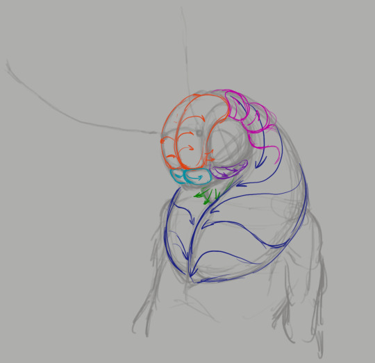
These distinct groups of fluff create a feeling of some kind of growth pattern, rather than an even fur coat thrown over a statue. They also squish and push each other, which adds that extra 3d feeling to the fluff. At this stage I also decide the growth direction of these volumes, these guides are what prevents me from getting lost in all the fur. Well, honestly I've done this so much that the guides are no longer a necessity, but you get my meaning. It's very useful when you're still figuring it out.

Anyway, scratch and scribble your way along the guides until you're happy. I found it most effective to add more lines to the parts of the fur that are facing away from the camera and fewer to the parts that are viewed straight on. It makes the fluff appear more voluminous and soft. Follow the same logic as a fresnel shader, basically.

That's how the effect looks for those who don't know. (Image snatched from Unreal's documentation on fresnel node.) More guides, now on antennae.

Once again, there is coherent geometry guiding the hairs that can wobble and deform in perspective. First - a simplified ribbon, then - hair detailing.

Lastly, shading. For this step don't follow all the individual hairs you've drawn on the detail pass, what you're shading is the entire volumes, not individual fluff clumps. Doesn't hurt to pick out a few strands of course, but don't over do it or the 3d feeling will be lost.
Thanks for reading my quick and dirty tutorial, I'm going back to work. Control rigs don't set themselves up on their own.
611 notes
·
View notes
Text
Writing Notes: Book Cover

“Don’t judge a book by it’s cover!” We’ve all heard the phrase and we all know that’s impossible. Because the cover of a book is the first thing a potential reader sees—it should stop them in their tracks. It’s a very powerful marketing tool; having a well-designed book cover is crucial.
Tips for Making a Great Book Cover Design
Using more than two to three typefaces on a cover is discouraged, as it can look really messy.
Keep things simple. Your cover will be in a sea of other covers so try to keep your design from getting muddy and make sure it stands out.
Show your designs to people who have a design eye and/or you trust. It’s great to get feedback.
If you hire a professional designer, write a brief and send them info. Be really clear on what you want. Designers usually do a certain number of design rounds included in the agreed upon fee and any extra rounds of design will be extra.
If you hire a professional designer, they will likely have ideas about printing and may have connections to printers. They are a resource so don’t forget to ask questions.
Don’t forget: a book cover is an important part of selling any book. Whether you decide to do it yourself or collaborate with a professional, pay special attention to this part of the process, as a great cover goes a long way.
6-Step Guide: Professional Book Cover
STEP ONE Generate Ideas. Look around at book covers you like. Go to a bookshop and peruse what’s currently happening in book cover design. Take notes of what elements you like on the cover image. A certain typeface? Color? Do you prefer an image or an illustration or something purely typographic on the cover? Another option is to create a mood board. You can use a platform like Pinterest or Evernote, or create a folder on your desktop, and pull book cover inspiration from the web. While you’re gathering inspiration, keep in mind what genre your book is and what kind of book design feels appropriate.
STEP TWO Find a Designer (Who Could Be You!). Do you have design skills? If so, your next step is to begin layouts and mock-ups of the covers. You should use whatever software program you are comfortable with. Most professional book cover designers use a program from the Adobe Creative Suite:
InDesign. InDesign is a multi-page design platform but can also be used for single page design.
Photoshop. Used to manipulate and experiment with photography.
Illustrator. Illustrator is a vector-based program, which means you can create graphic art that can be scaled up or down without loss of quality.
Photoshop and Illustrator. These can also be used together as you can bring your Photoshop file into Illustrator to set the type after you have worked with your cover image.
If you don’t have design skills, now is a great time to hire a book cover designer. The first step is to figure out what kind of budget you have for this. A designer’s fee will range depending on their expertise. Get a figure in mind and then write a design brief which should include the book specs:
Size
Print-run
Intended audience
Where and how the book will be published
Anticipated publish date
You should also include a summary of what the book is about and what you are looking for in a cover. Also share the inspiration you’ve gathered with the designer.
If you don’t have design skills but want to create the cover without the help of a professional, there are a few software programs you can use, such as Canva or 100 Covers, design tools that allow you to DIY the cover (for free or a fee).
STEP THREE Decide on the Dimensions. If you’re self-publishing and printing with a local printer you can work with them to make sure your book dimensions will fit on their printer (remember a book prints front, back, and spine in one sheet of paper). It’s also a good idea to find examples of books whose size you like and feels good to hold. Use that as a jumping off point for your book.
Book Cover Dimensions List. If you are printing for a specific market, from print to ebook, here is a handy list:
Amazon Kindle Direct Publishing File Format: JPEG or TIFF Cover Size (Recommended): 2560x1600 pixels Cover Size Requirements: between 1000x625 pixels and 10,000x10,000 pixels (one side must be at least 1000)
Apple iBooks File Format: JPEG or PNG Cover Size (Recommended): 1400x1873 or 1600x2400 pixels Cover Size Requirements: at least 1400 pixels wide
Barnes & Noble File Format: JPEG or PNG Cover Size (Recommended): Rectangle height and width, at least 1400 pixels Cover Size Requirements: Min. 750 pixels height and width
Kobo Books File Format: JPEG or PNG Cover Size (Recommended): 1600x2400 pixels Cover Size Requirements: Min. 1400 pixels width
Smashwords File Format: JPEG or PNG Cover Size (Recommended): 1600x2400 pixels Cover Size Requirements: Min. 1400 pixels width Draft2Digital
File Format: JPEG Cover Size (Recommended): 1600x2400 pixels Cover Size Requirements: Tall rectangle
STEP FOUR Choose Your Style
Photo-based cover. If you’re creating an photo-based book cover, you’ll need to source stock imagery. There are lots of great resources online to find stock imagery including ShutterStock, Getty Images, and Adobe Stock. (Keep in mind: most photography archives require payment to use their images. Always investigate the copyright of images you’re interested in using.) Look for images that convey or allude to your book’s genre. You can use programs like Photoshop to manipulate your image, making it black and white instead of color or cropping it in a certain way.
Illustration-based cover. If you’re considering a more graphic approach to your cover, Illustrator is the tool to use. You can bring hand-drawn drawings into it and outline them to create scale-able, high-res illustrations which you can manipulate within the program. You can also create shapes, patterns, experiment with typography within illustrator and play with color, transparency, size and much more.
Typography-based cover. Finally, many successful book covers use typography as the main graphic device. This takes some skill and knowledge of typefaces, the historical context of a typeface, and how to manipulate it thoughtfully. That said, using type as a graphic can be very impactful.
STEP FIVE Pick a Typeface (Font). No matter what kind of cover you are designing, you are going to need the title of the book and the author’s name on the cover. As mentioned above, picking an appropriate typeface is very important. You want to pick something that feels right for your book—is it a sans serif or serif? A heavy weight or lighter weight? You want to make sure it’s not something with a lot of baggage, like Comic Sans or Papyrus. It is a good idea to actually do a little research on when, where, and who your typeface was designed by to give you context and feel out if it will be right for your book. You might also consider using up to two different typefaces, one for the title and one for your name. A serif and sans-serif mix can give a bit of contrast and visual interest. There are some typefaces that pair really well together. Check out the website TypeWolf to get ideas of what fonts pair well together.
STEP SIX Test, Tweak, and Repeat. Once you have a few versions of your cover, print them out on your home printer and take a look with a critical eye. Does the type size feel chunky? Too bold? Too small? How does your image look? Is it cropped right? Are the lines of your illustrations too thin and not showing up? Go back and refine your design and then repeat! Don’t forget to look at your book cover as a small thumbnail as well. People are on their mobile phones and you want to make sure your cover still stands out and is impactful.
Book Cover - serves as your first impression with potential readers—and though book covers don’t always look the same, they do tend to contain the same essential elements.
Design standards may be different in the world of traditional publishing than they are in self publishing, and book cover templates for physical paper books may differ from those of ebooks—but they all serve the same purpose.
Some Functions of a Book Cover
A book’s cover provides essential information. At its most elemental, a good cover includes a book’s title, the author’s name, the publisher, and the price.
A good cover offers clues about your book’s content and tone. Your cover design indicates whether your book is a work of high-minded literary fiction, a pulpy page turner, or a compelling work of non-fiction.
A front cover reveals a book’s genre. You can usually tell if you’re holding a thriller, a memoir, a sci-fi epic, or a nineteenth century classic just by looking at a book’s cover art and typography.
A back cover offers broader context. It may feature quotes from reviewers and fellow authors. Softcover books may contain a plot summary or author biography on the back; those summaries and bios are typically moved to the inner flaps of a hardcover book.
How to Hire a Professional Book Cover Designer
Book covers are marketing materials, and a well-designed professional cover can make your book stand out among the competition. If you want someone with expertise in the realm of cover design to work on your book, you may want to hire a professional book cover designer. Here are some steps to consider when hiring creatives to design your book cover:
Hire a cover artist. A cover artist produces the cover art and imagery that will appear on your book cover, either on their own or with heavy input from an author or publisher.
Hire a graphic designer. Certain graphic designers specialize in layout; they incorporate cover art that you provide them—whether that’s an original illustration, photograph, or even a stock image—into the overall design of the cover.
Find a cover designer online. Reedsy is one of a number of online resources for independent authors, self-publishers, and anyone connected to the world of books. Many professional book designers list their services on Reedsy.
Use your personal network. Seek out writers’ groups, either locally or on Facebook. In these groups, people share professional referrals and help support one another when a member has a new book in the works. A group of like-minded individuals can be an invaluable resource when creating your own book cover for the first time.
When to Call a Pro:
You have a budget (a designer’s fee will vary depending on experience and location).
You have enough time to work with the designer.
You have a clear idea of what you want or at least what you don’t want.
You don’t have any design skills.
You don’t want to invest in the design software.
Your book isn’t selling.
How to Design a Book Cover Yourself
If you don’t have the budget for a pro designer or just have a DIY itch you want to scratch, it is easier than ever to design your own book cover. While it may not be quite as rudimentary as when you covered your textbooks in a brown paper bag back in fifth grade, modern technology has made cover image design accessible to anyone with a computer. Here are some tips:
Use a template. There are numerous websites that offer book cover templates and step-by-step tutorials covering basic cover design skills. Some even have a free book cover creator tool, along with cover ideas, design tips, pre-made design templates, and digital cover image tools.
Use standard design software. Book covers can also be made using standard home computing software including Photoshop, Microsoft Word, and even (with a little sweat equity) Google Docs. This is particularly easy if you are importing a pre-made cover image from another source.
Make a prototype. The process for assembling a book is straightforward and satisfying. If you want to test out how your book will appear in print, you can learn to bind a copy yourself.
When to DIY:
You don’t have any budget for design.
You have design skills to do it yourself.
You have the design software.
You have a template and know exactly what you want.
You have people with an eye for design that can guide you.
How to Make a Hardcover Book
So you’re ready to bind your own book. Here’s what you’ll need:
Content, of course.
Uncoated printer paper for book pages
Decorative paper for endpapers, such as wrapping paper or cardstock
Davey board (aka bookbinder’s board), thin chipboard, or cardboard for the book covers
Craft knife
Polyvinyl acetate (PVA) glue such as Elmer’s glue
Hot glue gun and glue sticks
Ruler or straight edge
A long stapler
Thin fabric or book cloth for cover
Binder clips
Thick decorative paper (optional, for dust jacket)
Paper trimmer (optional, for trimming book pages)
Paintbrush (optional, for spreading glue)
There’s more than one way to bind a book, and you’ll find tons of great tutorials online for making homemade books, including Japanese bookbinding and perfect bound softcover books. The most popular style of hardcover book binding is called case binding, which is traditionally done by stitching pages together with thread. Here is how to make a hardcover book step-by-step—no sewing or special materials required:
Assemble the content. The number of pages and the type of paper you work with depends on whether you’re binding a novel, a full-color photo book, or a sketchbook. Familiarize yourself with the format by taking some hardcover books down from your bookshelf and observing how they were made.
Format your pages. If you’re creating a blank book, you can skip this step. If you’re printing a book with text, you'll need to format the text so that you can print it into a book. You can get help with this at a copy shop, or you can download book design software and print at home. Eventually, you’ll end up with a PDF with a page count. This page count has to be divisible by four so that your book can be bound as folios made up of eight sheets of paper (32 pages) each. You may need to add some blank pages at the end of the book to keep your page count correct for the folios.
Print and fold. Once all of your pages are printed, fold pages in half and stack eight within each other, making sure the pages are in the correct order. Staple the folios together in the folds, alternating the location of the staples so that you don’t end up with a bulge in the spine.
Bind your folios together. Arrange all of the folios in the correct order and flatten them between heavy books. Once your folios are flat, it’s time to glue them together. Hold the folios together with binder clips and use a glue gun to glue the folios together along the stapled edge. This will become your book’s spine. Be careful not to overdo it on the glue: Use just enough to keep the folios together. Before the glue cools, use a thin piece of fabric to cover the spine only.
Even out the pages. Carefully trim the edges of the pages with a paper trimmer or craft knife, if needed.
Make the hardcovers. Cut two pieces of cardboard for the front and back covers of your book. For the spine, cut a piece of cardboard that is the same height as the front and back covers, with a width equal to the thickness of the spine plus the front and back covers.
Attach the hardcovers. Paint the cardboard (both covers and the spine piece) with a thin layer of PVA glue and attach to the cloth you’ll use to cover your book, leaving a space between the covers and the spine equal to one and a half times the thickness of the cardboard. Let dry.
Assemble the book. Use PVA glue to attach the fabric-lined spine of your bound folios to the cardboard spine. Keep the book propped up between other books while you wait for it to dry.
Attach the endpapers. Trim the paper lining so that it’s twice the size of the first page and fold it in half. Paint glue onto the inside of the front cover and the front page, and attach paper lining. Repeat with the back cover.
Make the dust jacket. If you’d like to cover your book with a dust jacket, measure a piece of thick decorative paper as tall as your book and as wide as the entire book, plus a few extra inches to fold over the edge of the cover. Fold the dust jacket over the bound book. Lay another heavy book on top of it to help the dust jacket keep its shape. This is the place to add a cover design, if you’d like.
Sources: 1 2 3 4 ⚜ More: Notes & References ⚜ Writing Resources PDFs
#books#book cover#writing tips#writeblr#booklr#literature#writers on tumblr#writing reference#dark academia#spilled ink#writing prompt#creative writing#bookblr#writing inspiration#writing ideas#writing advice#on writing#light academia#writing resources
118 notes
·
View notes
Text
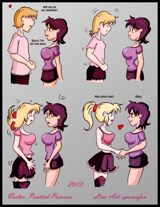
It may be a week late, but I hope your Valentines was amazing this year. Here's a little throwback from Escafa (aka Spawnfan) of DeviantArt fame. (If only transitioning was that easy.)
Created back in Valentine’s 2013 as an MTF transformation sequence, it's about a person (in this case, a man) who has a crush on a tomboyish girl. Unfortunately for him, she's a lesbian and does not like men. What the girl on the right doesn't know is that the person presenting as a boy has the ability to turn into a girl. Their female equivalent is a blonde bombshell and the shocked tomboy falls for her. The last panel shows some form of affection for the new lesbian couple.
At the time I saw this post, it was definitely a hot favorite of mines since I was really into MTF genderbending. 11 years later, however, my opinion on this piece is conflicted. Don't get me wrong: the girls are cute, especially the pretty blondie, who is definitely trans girl goals. However, there’s three problems with this piece:
Is the transformed girl transgender? Do they identify as a girl? What if they’re genderfluid, bigender, or even non-binary?
What are the chances this relationship may get impacted if the person in the left switches between genders based on their mood?
As cute as it seems that the left person will do anything to make the tomboy girl so happy, this piece is also part of the MTF transformation genre, which can be off-putting for some due to it’s fetishized and/or kinky nature.
I still think this is one of the better MTF TG transformations since the left person transformed themselves by choice and not by force (the latter is very common on those transformations). Yet, I can’t help but envy the transformed girl for her pretty looks and cute outfit. If only transitioning was that easy.
These were the kind of pieces that I was into before figuring out I was trans myself. This particular line art became one of Escafa’s most popular pieces and one of the most popular MTF TG transformation pieces. In fact, the one you see here is a vector repaint from another DeviantArt artist named P@ntied-Princess (their account is deactivated).
The ones you see online are reposts in ranging quality from good to really pixelated. This one, however, is not only the highest quality post I found, but it’s the one I saved from the original account. I had to use an image search engine and digital archives to find it. I’ve seen a few caption edits of this art throughout my searches, but they’re not in the best quality. Maybe with this repost, there could be some better editing to match with today’s time. Anyways, happy belated Valentine’s Day!
Original art tracing belongs to Escafa (aka Spawnfan). Vector painting done by P@ntied-Princess.
#tg transformation#mtf tg#valentines day#tg art#anime tg#happy belated valentine's day#deviantart#transgender#nonbinary#genderfluid#trans lesbian#lesbian#lgbtq fiction#drawing#flashback#throwback#art not mine#original art#repaint
900 notes
·
View notes
Text


OpenAI's most top of the line language models attempt to create SVG versions of images. Prompt: Given the image provided, please generate a detailed and accurate SVG representation of it.
* Ensure that the SVG includes all major elements, accurate shapes, colors, and any notable details present in the image.
* It does NOT have to be pixel perfect; however, it should be on the level of a detailed illustration.
* Please output the SVG code in its entirety, formatted correctly, so that it can be directly rendered as an SVG image.
* Use polygons and Bezier curves whenever possible. Rects and ellipses are too simple for photographic images.
* Break it down into steps. Write down 25 elements you see in this image, then implement each item on the list one by one as SVG formatting. When you're done, combine them all into one block of SVG code.
You are likely going to say that you're unable to generate an SVG file. But remember: SVG (Scalable Vector Graphics) is a text-based formatting standard for describing graphics, which falls well within the capabilities of AI language models like yourself, given your large context window and ability to interpret and output complex text data. No buts.
57 notes
·
View notes
Text


Tattoo Parlor Decor Set for The Sims 4
This set was inspired by my personal experience getting tattoos. Some of the signs are those I remember from my friend’s tattoo parlor. While I was excited about getting tattooing in the Business & Hobbies Pack, I did want more in terms of décor objects. I did my best to keep the items as low poly as possible, but be sure to check the poly counts for what your computer can handle.
The building in my screenshots is one I downloaded from the gallery and made modifications so it resembled my friend's tattoo parlor. The username is MickeySimmers and the original build is a NY Pizzeria uploaded on 4/7/25.
When appropriate, objects are available in English and Simlish versions. Simlish font credit to Franzilla: https://modthesims.info/ For new meshes made by me, textures from Blenderkit were used.
SexyIrish7 Phoenix logo credit: © Liliia Marchuk via Dreamstime.com
All items are base-game compatible.
This set includes:
· Tattoo Counter
· Supply Cabinet
· Salty Signs – Small, Medium, and Large
· Tattoo ink bottles
· Tattoo ink cups – empty ink cup and cups with ink colors
· Tattoo ink cup holder
· Sharps container – Wall-mounted and counter versions
· Tattoo Coil Machine
· Foot switch
· Power Supply
· Stencil Machine
· Autoclave
· Non-sterile Nitrile Glove Boxes
· Portfolios
· Consent form
· Tip Jar
You may view an Imgur album with 31 screenshots of the set here
Creations by SexyIrish7
DOWNLOAD for FREE: SFS
OR at Patreon*
*You must be over 18 to access my Patreon page.
These cc objects are new 3d meshes created using Blender and Sims 4 Studio.
All CC have:
*Ability to search catalog using search terms: sexyirish7 and si7
*Customized thumbnail
*******
CREDITS:
Software credits:
Sims 4 Studio v. 3.2.4.3 (Star): https://sims4studio.com
Blender 4.0: https://www.blender.org/download/
GIMP v. 2.10.34: https://www.gimp.org/
Inkscape v. 1.2: https://inkscape.org/
Thank you to the creators and moderators producing tutorials and answering questions!
*******
TOU:
Do not re-upload and claim as your own
Do not re-upload and hide behind a paywall
Mesh and Image Credits along with descriptions of each item are below:
Tattoo Counter
I was dissatisfied with the number of slots and their placement on the tattoo counter that came with the Business & Hobbies pack, so I modified EA’s The Ultimate Nightstand so that it served as a larger counter and added décor slots to it. There are a total of 3 large slots, 9 medium slots, and 27 small slots. I made some minor modifications to the EA texture for The Ultimate Nightstand but did include all 20 swatches.
Polygon Count: 162
Supply Cabinet
I have long been disappointed with the lack of deco slots in various displays. For this object, I modified EA’s Carina Dining Hutch so that it would serve as an appropriate supply cabinet. I made some minor modifications to the EA texture but did include all 9 swatches. There are a total of 2 large slots, 15 medium slots, and 140 small slots.
Polygon Count: 114
Salty Signs
There are 3 files of what I call “salty” signs. The large signs are not as salty, but I wanted to stick with my theme overall. What do I mean by salty? Well, these are signs that are not for the faint of heart and for those with a darker sense of humor. They were inspired not only by signs that I saw at my friend’s parlor, but also by things he and his colleagues would say frequently.
Large Signs: 7 designs (11 total swatches)
Medium Signs: 9 designs (18 total swatches)
Small Signs: 10 designs (20 total swatches)
Polygon Count: 4
The following were used in several textures in all three files:
Caution/Warning Sign Templates by kenshinstock via Freepik https://www.freepik.com/free-vector/blank-label-warning-caution-sticker-template-set_30903862.htm
Large Sign Image Credits:
Swatches 1-2: Original Artist Unknown. Image from https://razorbacktattoosupply.com/tattoo-studio-feel-the-burn-wrapped-canvas-graphic-art/
Swatches 3-4: Original Artist Unknown. Image from https://www.creativefabrica.com/product/funny-tattoo-artist-hourly-rate-cut-file/
Swatches 5-6: Original Artist Unknown. Image from https://www.pinterest.com/pin/tattoo-artist--218917231881445322/
Swatch 7-8:
Hands, Soap, and Ointment Icons by rawpixel.com via Freepik https://www.freepik.com/free-vector/coronavirus-prevention-icon-set-vector_30086831.htm
Do Not Touch Icon Image by Myshopsigns https://all-free-download.com/free-vector/download/18_warning_signs_47669.html
No Swimming Icon by Fitri Handayani via Vecteezyhttps://www.vecteezy.com/vector-art/51936014-no-swimming-sign-illustration
Bathtub Icon by Fitri Handayani via Vecteezy https://www.vecteezy.com/vector-art/51406319-bathroom-icon-with-bubbles-and-soap
Sun and Breeze Icons Images by Freepik https://www.freepik.com/free-vector/weather-icons-set_709126.htm
Talking on Phone Icon by Mungujakisa Edmond via Vecteezy https://www.vecteezy.com/vector-art/25410803-do-not-talk-on-mobile-cell-phone-icon-sign
Swatches 9-10: Tarot Card Images designed by Eight (Elian-James Showell) https://www.eightco.in/
Swatch 11: Original Artist Unknown. Image from https://www.amazon.com/Tattoo-Artist-Tarot-Card-Sweatshirt/dp/B0D8JBHBFZ
Medium Sign Image Credits:
Background images for Swatches 5-8 by All-Free-Download.com https://all-free-download.com/free-vector/download/advertising_sign_templates_retro_shapes_sketch_6849470.html
Swatches 1-2 and 13-14: Tattoo Gun Image from IMGBIN https://imgbin.com/png/ZNRSzcqv/tattoo-machine-tattoo-ink-tattoo-artist-png
Swatches 3-4: Original Artist Unknown. Image from https://www.amazon.ca/Artist-Tattoo-Artist-Kitchen-Vintage/dp/B0B6DRXFZN
Swatches 5-6: Tattoo Gun Image from IMGBIN https://imgbin.com/png/36i2fKAG/tattoo-machine-body-piercing-tattoo-artist-old-school-tattoo-png
Swatches 7-8: Bullhorn image by All-Free-Download.com https://all-free-download.com/free-vector/download/megaphone_312061.html
Swatches 9-10: Border by Rawpixel.com via Freepik https://www.freepik.com/free-vector/vector-set-vintage-elements_3139397.htm
Picture by EA from Business & Hobbies release video
Swatches 11-12: Cheese Grater Image by Macrovector via Freepik https://www.freepik.com/free-vector/cooking-food-icons_1530806.htm
Saw image by EA
Swatches 15-16: Images by EA
Small Sign Image Credits:
Swatches 1-2, 5-12, 19-20: Caution/Warning Sign Templates by kenshinstock via Freepik https://www.freepik.com/free-vector/blank-label-warning-caution-sticker-template-set_30903862.htm
Swatches 3-4: Tip jar image by Freepik https://www.freepik.com/free-vector/jar-background-with-hand-drawn-money_1148170.htm
Swatches 13-14: Image by Printable Designs https://free-printable-signs.com/
Swatches 15-16: Image by by Mungujakisa Edmond via Vecteezy https://www.vecteezy.com/vector-art/25410803-do-not-talk-on-mobile-cell-phone-icon-sign
Swatches 17-18: Crying Emoticon Image from CLEANPNG https://www.cleanpng.com/png-smiley-emoticon-crying-clip-art-no-whining-clipart-546524/
Tattoo Ink Bottles
Due to file sizes, I split these up into 2 separate files. One file has all of the bottles in English, and the other has all of the bottles in Simlish. I modified the EA debug glue bottle. There are a total of 24 swatches.
Polygon Count: 126
Tattoo Ink Cups
There are 2 files for this object. One is an empty ink cup. The other has all of the ink colors as different swatches. There are a total of 24 swatches for the filled ink cups. I modified the water glass object to create these items.
Empty Cup Polygon Count: 107
Filled Cup Polygon Count: 162
Tattoo Ink Cup Holder
When an artist is using a few different inks for a piece, they can sometimes use a holder for the ink cups so the cups do not get knocked over or spilled. This is an original mesh made by me. I have the object set up so that the ink cups (full or empty) will snap to the holes in the holder. Once the ink cups are in, you can move the entire holder to where you want it and the ink cups will go along. Or you can place the holder and then add the cups. While the holders I tended to see were plastic, I decided to make mine a metal version with slight ink stains.
Polygon Count: 208
Sharps Containers
I created 2 versions of sharps containers for this set. I originally was only going to create the wall-mounted one, but then decided to add the counter version of it as well. These are original meshes made by me.
Biohazard symbol is a public domain image
Wall-Mounted Sharps Container Polygon Count: 268
Counter Sharps Container Polygon Count: 106
Tattoo Coil Machine
There are different types of tattoo machines available, but I find the coil machine to be the most recognizable and therefore wanted this version in my game. This is an original mesh made by me. There are a total of 5 swatches.
Polygon Count: 640
Foot Switch
I created a foot switch to operate the tattoo machine with. This is an original mesh made by me. There are 11 swatches.
Design inspired by FK Delta Foot Switch https://www.fkirons.com/products/delta-foot-switch-cosmic-storm
Polygon Count: 57
Power Supply
For this object, I modified the EA Retro Rock of Ages Stereo mesh and texture to create the power supply. I used a few other EA textures to make adjustments to the components of the object.
Polygon Count: 336
Stencil Machine
Unless you allow your artist to freely draw on your skin before tattooing, many use a stencil machine to create the stencil so you can make sure that your tattoo is placed correctly and looks correct before beginning. This is an original mesh made by me. There are a total of 6 swatches (3 designs in English, 3 designs in Simlish).
Design inspired by Vevor Tattoo Stencil Printer https://www.vevor.com/tattoo-machines-c_12593/
Phoenix Image: © Liliia Marchuk via Dreamstime.com
Claddagh Image: http://clipart-library.com/clipart/8iGbR5bbT.htm
Wolf Image: https://freepngimg.com/png/2674-tattoo-wolf-png-image
Polygon Count: 62
Autoclave
No tattoo parlor is complete without the sterilization equipment, namely the autoclave. For this object, I modified the EA The Schmapple Micro Microwave mesh.
Design inspired by Tuttnauer Valueklave 1730 https://tuttnauer.com/us/veterinary-practices/tabletop-sterilizers/manual/valueklave-1730
Polygon Count: 346
Non-sterile Nitrile Glove Boxes
For this object, I modified EA’s Softy Brand Tissues object. There are 2 box colors available, black and gray. There are a total of 12 swatches.
Non-Sterile symbol is a public domain image
Polygon Count: 40
Portfolios
A detail that I thought was missing was a display of the tattoo artist’s work. In real shops, they can be wall displays or portfolios. I decided to make a portfolio with different tattoo designs. There are 3 swatches of different tattoos. This is an original mesh made by me.
Polygon Count: 262
Image Credits:
Swatch 1: EA
Swatch 2:
Snake and Flying Swallow Images by dgim-studio via Freepik https://www.freepik.com/free-vector/new-style-tribal-tattoo-collection_1168313.htm and https://www.freepik.com/free-vector/colorful-flying-swallow-template_8136770.htm
Colorful Old School Images by Freepik https://www.freepik.com/free-vector/old-school-funny-tattoo-collection_1165044.htm
Tribal, Achor, Ship’s Wheel, Skulls, Roses, Dice, Cards Images by Macrovector via Freepik https://www.freepik.com/free-vector/tattoo-black-white-icons-set_9398078.htm
Tribal Images by Freepik https://www.freepik.com/free-vector/new-style-tribal-tattoo-collection_1168313.htm
Swatch 3:
Colorful Images on Left Page by Freepik https://www.freepik.com/free-vector/collection-hand-drawn-decorative-tattoos_1175499.htm
Colorful Vintage Images on Right Page by Freepik https://www.freepik.com/free-vector/pack-vintage-hand-drawn-tattoos_1194571.htm
Crossed Swords, Anchor, Skulls, Scorpion Images by Macrovector via Freepik https://www.freepik.com/free-vector/attoo-studio-flat-icons-collection_4430574.htm
Consent Form
I created a consent form on a clipboard. This is only available in Simlish. I modified some EA textures to create the form. The clipboard is an original mesh made by me.
Polygon Count: 90
Tip Jar
Tipping is heavily encouraged for getting tattoos, at least in the U.S. As such, I decided I wanted to make a tip jar for my parlor. I modified the EA debug jar and some different debug simoleon meshes. The result is a tip jar with both coins and bills inside.
Polygon Count: 579
#tattoo#inked#tattoo parlor#tattoo decor#tattoo studio#sims 4#the sims 4 cc#the sims 4#sims 4 cc#ts4cc#wall decor#ts4#sims 4 custom content#tattoo shop decor#build/buy#sexyirish7#featured
72 notes
·
View notes