#((The design is simplified but that's because he's so so tiny. The real design is the one Ashe made + the one I drew yesterday !!))
Text

Poisonous Flower, Slater
Weapon: Fairy Lock (Wand)
A peculiar wand in the shape of a key. Legends say that this wand opens the gates of the heavens.
When used in battle, it increases the wielder's defense and special defense by one stage. This effect can only be used three times per battle.
Equipment: Destiny Knot
A ribbon brooch part of the Plasma Harmonia Chorale's uniform, with a pearl sewn on by Slater. Hoennians believe that pearls carry the power of the sea.
Cannot be unequipped. When a sound-based move is used, its effects target all enemies/allies on the field.
Abilities: Serene Grace, Healer
Moves: Relic Song, Chatter, Sparkling Aria, Heal Bell
"A songster of Plasma Harmonia Academia's Aspertia City branch. Does not particularly excel in strength or studies, but is the star of his school's choir. His songs assist his allies in the battlefield. Born on 12/28."
#Cherenverse#My Art#((I based the description off of Fire Emblem's character desc + the abilities aren't just for battle purposes but assuming its like-))#((-a tactical JRPG. Healer could occasionally heal adjacent allies. And its also based off some passive skills in FE.))#((Some of which are passively healing allies that are next to the unit.))#((And Slater's 'wand' weapon is based off TOV Estelle's Heart of Hearts wand. It looks like a magical girl wand with a heart-))#((-except his has angel wings and looks like a key..))#((So its like a mix of Heart of Hearts and Comet Light. Both Estelle weapons.))#((The weapon descriptions are based off DQIX's weapons which sometimes have passive effects..))#((While its effect is based off Z-Fairy Lock with some additions..))#((Anyway this was fun to think about even if it was just a little doodle !!))#((The design is simplified but that's because he's so so tiny. The real design is the one Ashe made + the one I drew yesterday !!))#((Oh and I forgot. In the gdoc I'm making. The weapons are named after Pokemon moves-))#((-while the equipment is named after held items..))
9 notes
·
View notes
Note
NERD!MIGUEL IS SO REAL I LUV HIM <3333
NERD!MIGUEL IS THERE I KNOW IT
Like...You saw what he said to Gwen when she called it a watch (which IT IS).

[omg she's so tiny small next to him]
He's a NERD. He thinks this stuff is COOL. He's WAITING FOR SOMEONE TO ASK.
Like I imagine he's used to it by now - people's eyes glazing over when he begins to explain something technical or program-y, like Lyla's algorithms or the Multiverse Anti-Glitch feature of the watches.
He's put SO much work into all of this, the whole facility and the tech.
He made Lyla himself, but he knows that most people aren't really interested in that. So he's learned to simplify things.
If you ask a question, like how he made Lyla - he'll answer it basic and to the point.
_-_ 'She's an AI. She's my assistant and the notification system within your watch.'
He probably won't even look up from his work, thinking it's just the routine questions everyone asks before moving on to the next thing.
BUT IF YOU ASK FURTHER - Miguel's like

Because it's not often someone actually like...does that.
It's probably very rare that someone shows interest in his technological, engineering, or physics studies - all of which he's INCREDIBLY talented at and actively working on
You ask him how long it took him to make her, he says a year or two.
You tell him how impressive that is and BOOM NERD!Miguel.
He's telling you how her voice detection took the longest, and how her multiverse-monitoring probability algorithm was something he had to tweak twenty thousand times.
You compliment him about the design of the watch, he's like
_-_ 'I still have the protypes.' And he's ready to show you different ones, different shapes and materials he considered using, but eventually ruled out through experiments and tests
AND DON'T GET HIM STARTED ON THEORIES OH GODDDD
You mention the words 'String Theory' or 'Time Dilation' around him and you will NEVER hear the end of it.
He has so many opinions on it he's never had the chance to share.
Ideas and theories about things like fourth dimensions, worm holes, black holes, and dozens of other theoretical scientific concepts.
I mean, he MADE time travel. He is an EXPERT in that stuff.
I would KILL to have a Time Travel Movie Marathon with Miguel.
Sitting on the couch and watching things like Back to the Future, and he describes what they got right, what would be impossible, how it could work in theory.
He probably talks through the whole movie, and picks each one apart. You watch Doctor Who and he WILL NOT SHUT UP.
He's probably AMAZIINNGG at math.
Like math IS science. It's the answer for science. So he's probably a natural master.
You can be like 'Miguel, What's 34% of 12,967?' - Without blinking he'd be like
_-_'...I'm guessing 4408, or something? I don't know, am I right? Ask Lyla, don't ask me.'
But you don't need to ask Lyla cause HE'S RIGHT
HISTORY TOO!
I mean... the man time-travels. I think he'd have at least a good grasp on history, and time periods. Thinks like ancient roman historians and how their thoughts effect modern science, and how certain events effected the flow of time throughout history.
I imagine he finds it so fascinating, seeing the vast differences that can span in universes, just from one small change. Maybe he even finds comfort in it, seeing how histories and stories have a natural flow in a way fiction can only hope to imitate.
I love me some Nerd!Miguel.
I wanna get in bed with Miguel and by that I mean I want to sit next to him as he sits in bed reading a book on the Theory of Relativity with reading spectacles and a mug of sleepytime tea okay
A Miguel who runs up to his partner like 'Read this,' and he's all proud as he hands you a notepad full of numbers. But to him it's a formula he's been working WEEKS on, one that'll make Lyla run smoother, and everything much easier and he wants you to think he's cool for it
A Miguel who spends date nights watching NatGeo documentaries for fun
NERDY NERD MIGUEL DORKY MILD NERDY MIGUEL
#hes a DORK your honor#'its color than a watch'#ok sorry to hurt ur feelings i guess#miguel o'hara#miguel ohara#miguel o hara#miguel x reader#miguel o'hara x reader#miguel x you#miguel o'hara x you#miguel ohara x reader#atsv#across the spiderverse#across the spider verse#spiderman#spider man#spiderman 2099
300 notes
·
View notes
Text


Faebruary 2024, days 1-9. Experiments in learning to draw chibi Ballister Boldheart fairy.
2 days ago, I finally remembered the Faebruary drawing challenge, which I always look forward to (because I like drawing butterfly fairies), but I always forget (because it's February). So I tried to cram in a bunch of catch-up drawings.
Every Faebruary, I draw chibi butterfly fairies of my current OTPs. This year, it's Goldenheart.
But I still need to learn to draw both Ballister and Ambrosius. And I'm still testing out which of my Copic colors to use for them. I'm especially having trouble drawing Ballister's hair, from a front point of view. I keep wanting to draw the upturn at the back of his hair, even though it's not visible when he is facing directly straight ahead. It's really hard to not draw the upturn, after those years of drawing Claude von Riegan.
This time, I've chosen real life butterfly wings to base theirs off of, instead of making up my own designs. Because Ballister's comic book name is "Blackheart", I'm basing his wings off the "Uranothauma nubifer" or "black heart" butterfly. Ambrosius Goldenloin's wings will be based on the "Wallace's golden birdwing" butterfly, because that was the first butterfly with the word "golden" in its name that appeared in Google search.
The problem is that I think I might have referenced the wrong pictures for the "black heart" butterfly. A Google search shows many different looking "black heart" butterflies. It's difficult to know which pic to reference. I initially went with Wikispecies's pic, since it was specifically labelled "Uranothauma nubifer". But it's also labelled "Uranotauma nubifer, as Lycaena nubifer Trimen", so it might be a different variation of that butterfly. Maybe??? I went with the mostly solid brown wing from Wikispecies's reference, since that would be easier to draw/color. But I later found several other websites specifically labelling photos of the "black heart" butterfly, which look completely different from Wikispecies's mostly solid brown wings. They're mostly gray and tan speckles on white. So I tried to stylize a design based on the more speckled "black heart" butterfly wings. I'm still trying to simplify it in a way that is easy to draw. And I'm still trying to figure out colors that don't get confusing when juxtaposed by Ballister's skin or clothing.
I usually draw my fairies without shoes, but I wanted to practice drawing Ballister's (and Ambrosius's) full outfits, since I'm just starting to learn to draw them. Also, their regular clothes are close enough to the "medieval fantasy"-inspired fashion that I usually draw my fairies in.
I was unsure about adding Ballister's cybernetic arm. How would a fairy get a tiny cybernetic arm? Does their hidden fairy society in the woods, have a whole system of technological equipment and supplies? Does a human use magnifying glass spectacles and miniature cybernetics to make a tiny robot arm for him??? So I skipped the whole subject by not drawing his robot arm.
2/8-10/2024. No pencil underdrawings. Platinum Preppy fountain pen, using Noodler's Ink. Colored with Copic markers and a Daiso Fluently marker. Some corrections made with white-out, Gelly Roll white gel pen, and digitally with Krita.
45 notes
·
View notes
Text
new Juno doodles, my SDJ OC


their look has changed a tiny bit because i’ve been doodling them at work without a reference but i like how simplified their design is getting
bonus lore because i will always take advantage of tumblr’s long posts ✌️
when not in full-on depression mode with graphic tees and pajama pants, they have a more punk/goth aesthetic, but it’s too much effort to get dressed in real clothes these days outside of going to work
used to have longer hair, but chopped it off full breakup style because Ian liked it
their love language is bite (their little fangs make it hurt a bit lol)
they love horror movies and their favorite thing to do with Shaun is to marathon a bunch and argue over which slashers/monsters are hotter
their all time fav sci-fi/horror movie is John Carpenter’s The Thing, they love old school practical effects. in another life they might’ve gone to film school to do effects makeup and maybe even worked on Shaun’s movies
(i have a lil headcanon that Jack gets really freaked out by horror movies (mostly because Jack’s VA dislikes horror) like comically wigged out for being a literal yandere ghost clown) so the first time Juno watches one after Jack appears he tries to tough it out because he sees how much they like it but he ends up peeking through his fingers and latching onto Juno’s side.
Juno awkwardly comforts him but finds it a little endearing too. they make sure not to watch them in the living room after that
6 notes
·
View notes
Text
hey so i wanted to take a quick moment to address this comment on my halloween drawing because I think it’s very important (i’ve tried to reply directly but xkit doesn’t work on my computer anymore)

this got quite long by accident so i’ll throw the rest under a cut
I genuinely take skin color very seriously when I make art, and in particular when it comes to depicting characters of color. for this exact purpose i have several reference psd’s of what i completely not-creepily call ‘skin galleries’. these contain a number of images of each character i draw, showing how they look in a variety of lights and settings. here’s a snippet of my joe/marwan kenzari reference doc:

these are the some of the references i use every time i draw joe in color - specifically i estimate a base color, a highlight, a midtone, and a primary shadow tone. i also usually pull a cheek color as it, depending on the lighting can be warmer or more rosy compared to the base color.
as you can see, there’s a huge color difference from photo to photo; they all wary depending on whether it’s natural or artificial light, warm or cold light, inside or outside settings, etc. for the halloween picture specifically, i chose my colors based on a cold, artificial indoor lighting.
i also had to put two additional factors into consideration: firstly, the characters are dressed as gomez and morticia addams which meant looking up images of how they did raul julia and anjelica huston’s makeup in the 1991 movie. this was the best depiction i could find:

while morticia’s makeup is obviously very pale they also gave mr julia a more grey-ish complexion - i assume to invoke the idea of a death pallor. now, i didn’t want to go quite this far with joe and nicky. while i decided to do morticia makeup on nicky - which is why he’s much paler than his real life counterpart - for joe i decided put a just a tiny bit of grey into the base color that i selected from the most fitting images in my reference doc. which resulted in this:

here they are compared to a few other bases (of so, so many) from different reference pictures with different light sources. so that’s joe’s base color in the halloween drawing.
the second factor is the positioning of light in the image. while i decided to simplify it a bit to match the overall style of the drawing, the pose and the surroundings i’d chosen means that the characters are outlined by a cold stark light from the dark green glass stained window. for joe that meant that while his outline needed to be framed by a dramatic highlight, like with nicky, his face would remain in shadow. while there’d be a bit of reflection of light bouncing off the marble floor and i also decided not to go too heavy on the chiaroscuro because i wanted his face to be visible. not photorealistic, i know, but that wasn’t the style i was going for here. so i ended up going with a green-greyish shadow on top of the primary shadow tone i mentioned beforehand. all of this resulted in the final image.
now, of course there’s no way of telling exactly how a color is going to show up on a screen - at my old job i had to screens on which i did graphic design and despite the fact that they exact same settings, there was always a color difference when i moved an image from one screen to another.
i suppose what i’m trying to say here is that, yusuf is that pale - at least in this setting. marwan kenzari isn’t a particularly dark skinned gentleman in the first place but if you compare it to eg the reference image of joe in the church in gousainville, an image with completely different lighting, i understand how gomez!joe can seem quite pale. i am by no means perfect either and at the end of the day i’m still a completely self-taught non-professional artist who is always trying to learn and experiment with styles, colors, light, and shadow. this is not to create any drama or disputes or anything - because it’s a very important discussion that is still an issue in many fandoms - except to say that i really cannot stress enough how seriously i take proper representation of skin color.
#long post#this was written in one go after a long day so please forgive any spelling mistakes etc#english is still my third language and sometimes my brain gets tired
61 notes
·
View notes
Text
Hi Good Omens fans, ever since making this blog, and trawling through the archives for old art, I have been thinking again about trends from before the TV-show, and the way people draw Aziraphale and Crowley. I wanted to make this post addressing it but this is not “discourse” or to start a fight, in fact I would be perfectly content if all I did was make people think critically about what I am about to say and not even interact with this post at all, but I feel like I need to say it.
Talking about any racist undertones to the way people draw our two favorite boys usually makes people dig their heels in pretty fast. This is not a callout post for any artist in particular, this is not me trying to be overly critical of artists especially since they have more talent and skill than I do, and I’m going to address some common counterpoints that I frankly find unsatisfactory. Let’s just take a moment to set aside our defensiveness and think objectively about these trends. It took me a while to unlearn my dismissive attitude about these concerns so maybe I can help others get over that hurdle a little faster. Now let’s begin.
I’ve been kicking around the Good Omens fandom since maybe 2015 and for art based in book canon, whether it was made before the TV show came out, or because the artist is consciously drawing different, original designs, I’m going to estimate that a decent 75% of all fanart looks like this

Aziraphale is white and blonde and blue-eyed while Crowley is the typical “racially ambiguous” brown skin tone it’s become so popular to draw podcast characters as nowadays.
And the question is why? With the obvious answer being “it’s racist,” but let’s delve a little deeper than that.
A common thing I hear is that people get appearance headcanons fixed in their mind because the coverart of the book pictures the characters a certain way. My first point is this only shifts the question to why the illustrators drew them that way, when there aren’t many physical descriptions in the book. My second point is that while there definitely are cover arts that picture Aziraphale as cherubic, blonde, and white and Crowley as swarthy, dark-skinned, and racially ambiguous...
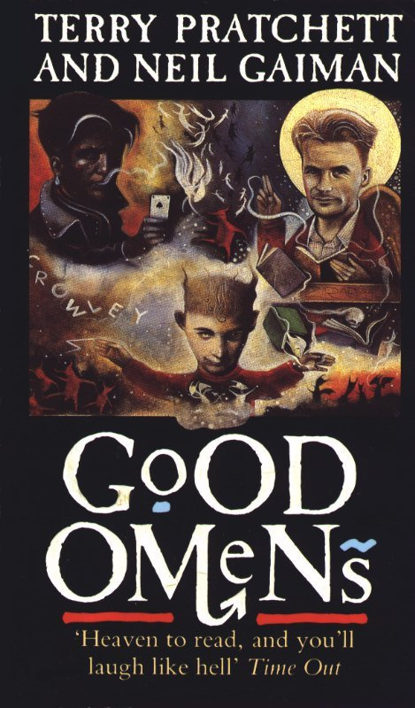
(side note: why is Crowley’s hand so tiny? what the hell is going on in this cover?)
It’s much more common for the covers to simplified, stylized, and without any particular unambiguous skin tones
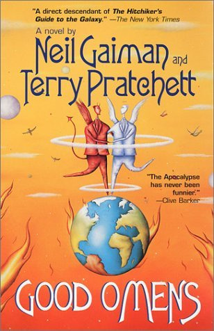
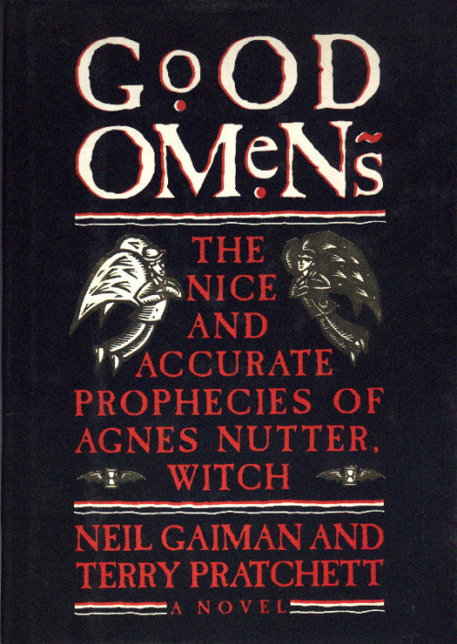
I don’t know about the UK but the most popular version in the United States is the dual black and white matching covers
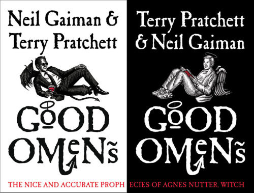
And while you could make an argument that the shading on Crowley’s face could suggest a darker skintone, it seems obvious to me that lacking any color these are not supposed to suggest any particular race for either of these two, and the contrasting colors are a stylistic choice to emphasize how they are on opposite sides. If anything, to me it suggests they are both white.
In short I simply do not buy the argument that people are drawing Aziraphale and Crowley this way because that’s how they were represented on the cover art of the book. If you draw them the way they are on the cover then whatever, I don’t care, but I don’t believe that’s what’s driving this trend.
The second thing people will say is that Good Omens is a work of satire, and it’s based in Christian mythology which has this trend of depicting angels as white, and it is embodying the trope of a “white, cherubic angel” paired with a dark-skinned demon for the explicit purpose of subverting the trope of “white angel is good, dark demon is bad” since Aziraphale is not an unambiguous hero and Crowley is not a villain. “It’s not actually like that because Crowley isn’t a bad demon, and Aziraphale isn’t actually a perfect angel” is the argument. This has a certain logic to it and allows some nuance to the topic, but to this I say:
Uncritically reproducing a trope, even in the context of a satire novel, is not enough to subvert it. Good Omens is not criticising the racist history of the church, and while the book does have some pointed jabs at white British culture (such as Madam Tracy conning gullible Brits with an unbelievably ignorant stereotype of a Native American) it is not being critical of the conception of angels as white and blonde or the literal demonization of non-white people. That’s just not what the book is about. So making the angel white and the demon dark-skinned, playing directly into harmful tropes and stereotypes, is not somehow subversive or counter-cultural when doing so doesn’t say anything about anything.


Please consider fully the ramifications of the conception of white and blonde people as innocent and cherubic and dark-skinned people as infernal and mischievous, especially in modern contexts...
Black people are more likely to be viewed as violent, angry, and dangerous. Priming with a dark-skinned face makes people more likely to mistake a tool for a gun. Black people are viewed as experiencing pain less intensely by medical professionals. Black men are viewed as physically larger and more imposing than they actually are. The subconscious racial bias favoring light skin is so ingrained it’s measurable by objective scientific studies, on top of the anecdotal evidence of things like news stories choosing flattering, “cherubic” pictures of white and blond criminals while using unflattering mugshots for non-white offenders.
This is why I say that if you’re going to invoke the “whites are angelic” trope, you better have a damn good subversion of it to justify it, because this idea causes real harm to real people in the real world. And Aziraphale being a bit of a bastard despite being an angel, I just don’t see that as sufficient. I am especially cautious of when it’s my fellow white fans that make this argument, not because I believe they do this out of any sort of malice or hatred of people with dark skin, but because I know first-hand it stems from a dismissiveness rooted in not wanting to think about it for too long because it makes us uncomfortable. Non-white people do not have the luxury of not thinking about it, because it’s part of their life.
Now the strongest textual evidence people use, in the absence of much real descriptor, is this:
"Many people, meeting Aziraphale for the first time, formed three impressions: that he was English, that he was intelligent, and that he was gayer than a tree full of monkeys on nitrous oxide. Two of these were wrong; Heaven is not in England, whatever certain poets may have thought, and angels are sexless unless they really want to make an effort"
This piece of art has circulated in the fandom for so long I don’t know the original artist and it’s been used for everything from fancovers to perfume. This is where I found it and it’s one of the first things that come up when you google this quote about Aziraphale.
Doesn’t it just feel like this is the man that’s describing, some blonde effeminate gay man? Well guess what, there’s the “blonde as innocence” trope rearing its ugly head again, because the stereotype of gay men and effeminacy as being a white and blonde thing is--ding ding ding you guessed it--racism. And why would intelligent suggest a white and blonde person, except if the stereotype of a dark-skinned person is less intelligent?
Now the point of “people assume Aziraphale is British” is another sticking point people will often use, claiming that the stereotype of a British person is white and blonde. I guess this has some merit, since the British empire was one of the biggest forces behind white colonial expansion, and it seems disingenuous to assign “British” as “nonwhite” as soon as we’re being satirical, in the same way I found it distasteful that the TV show made God female when so many of the criticisms of the church are about its misogyny and lose their teeth as soon as God is no longer male.
However consider that 1.4 million Indian people live in the UK. I heard a man say aloud once that the concept of a black person having a British accent was a little funny, as though Doctor Who doesn’t exist and have black people on it. And I’m not overly familiar with the social landscape of the UK, but I understand they’re experiencing a xenophobia boom and non-white Brits aren’t considered “really British.” The stereotype of non-white people not being British only exists because of reinforcement in media. If you really want to be subversive, drawing Aziraphale as Indian goes way further than drawing him as white IMO.
Now let’s talk about Crowley. He is almost always drawn with a darker skin tone than Aziraphale, even when they are both white, and while I’ve outlined above how this is problematic on terms of linking light skin with innocence, I think it does have an extra layer. I think it also has to do with the exotification and fetishization of brown skin and non-white people.
This artist’s tumblr is gone now but their art is still on dA and while it’s definitely beautiful and well-done, I think this is a very good example of what I’m talking about.
Crowley and Aziraphale necessarily contrast each other, so describing Aziraphale as “British” might suggest that Crowley is “foreign-looking.” I also know *ahem* that the fandom generally thirsts over Crowley to hell and back, so making him a swarthy, tall dark and handsome is not necessarily surprising.
An interesting thing happened when the TV show came out, and everyone started drawing Michael Sheen!Aziraphale and David Tennant!Crowley more and more often: It’s not ubiquitous, but it does happen that sometimes artists will draw David Tennant’s skin darker than it actually is. The subconscious urge to see Crowley with dark skin is for some reason that strong for many people. And I really encourage people doing this to think about why. Not naming any names but I’ve working with fanartists before for collabs who I had to ask to lighten “bad guy” demon’s skin tones because it looked like they were making the skin darker on purpose to make them look scarier. This person is a perfectly pleasant person who tries not to be racist! And we both still fell into it accidentally, and it took me a while to notice and point it out, because the ingrained stigmatization of darker skin is pervasive yet often goes unnoticed.
What is the solution? I don’t know, and as a white person I’m not really qualified to make that call. Do we draw them both with the exact same skin tone? Is it better to make them both white? Should we make both of them non-white? Should we only make Aziraphale non-white? I am consciously aware of the fact that the Good Omens fandom is mostly white people, so most of the art we make is being both made by and consumed by white people, so I don’t feel comfortable saying “draw these characters of color specifically” because that can also veer into fetishization territory very quickly. This is not specific to good omens but I think we should pay attention to what fans of color say in all fandom spaces and weigh our choices even if they seem insignificant. And it’s important to realize that fans of color will not be a monolith in their opinion either, and it’s our responsibility to recognize that everyone can be affected by racism and social issues differently, the same way all women are affected by misogyny differently so just because one woman says such as such is misogynistic and another says it’s not. I’m sure there are non-white fans who think it’s perfectly fine to draw Aziraphale as white and Crowley as ambiguously non-white. I’m not saying they’re wrong. And I’m not saying you can’t reblog this kind of art, or that people who make or made it should feel bad about themselves. But so often this sort of thing goes unaddressed just because people don’t like thinking about it, and well, avoiding hard questions never really goes well I think.
195 notes
·
View notes
Photo
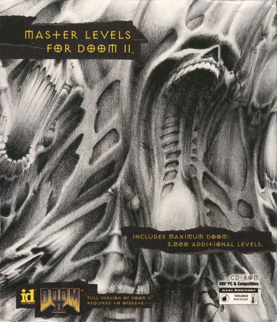
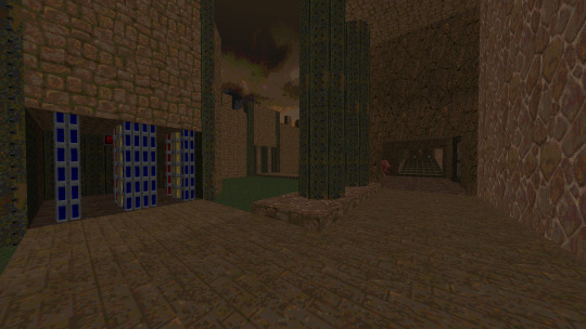
Master Levels for Doom II.
By various authors.
1995.
https://doomwiki.org/wiki/Master_Levels_for_Doom_II
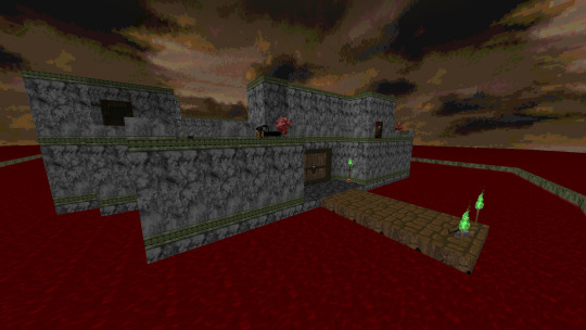
MAP01: Attack
This is our first introduction to the iconic maps of the Master Levels. Created by Tim Willits and his sister, Teresa Chasar. This is a medium sized map with a boxed design that manages to establish a good sense of progress with a bit of dynamism and balanced combat. Taking into account that it's 1995, this is a decent/solid map that, if we play it in the order I'm using (Xaser's order) works as a good start to this classic collection. Interesting to know that Tim Willits' story is one of, uh, quite the polemic stuff, but it is also good to know that he did not do this as a lonely map, on the contrary, he made these maps with his sister. Quite an interesting story and an equally fascinating map.
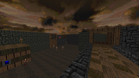
MAP02: Canyon
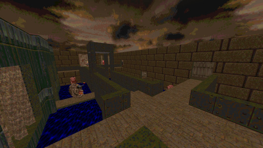
Canyon, second map in the order of Xaser, is also the second map made by Tim Willits and Theresa Chasar. We start with an abstract arena of combat with a few pillars and multiple directions to advance. The use of items is favorable enough to compensate the instantaneous combat. Surprisingly, although not so visually appealing, this map has certain areas that have their own unique appeal, such as a catwalk with a small acid pool and a beautiful green waterfall. What stands out the most in this solid map is the unique and well designed progression, being simple but always maintaining a constant rhythm that makes us move without major stops. What can you expect from one of Id's lead designers?

MAP03: The Catwalk
Christen Klie is the author of the third map of the Master Levels. An author with a fairly prolific track record during the 1990's that would capture the attention of Id Software and then other companies like LucasArts, The Catwalk is a mid-sized map that encapsulates the early art of mapping during the 1990's. An amalgamation of different designs that tries to recreate together under the same progress, along with interesting quirks that give it a certain flavor of adventure and a little bit of discomfort. This is a simple map that stands out more for its layout than for its simplified and tight gameplay. The one titled Catwalk is actually only part of the end of the level, but leaving that aside, this is a pretty interesting attempt to create something distinctive but still relevant. Did it succeed? I'll leave it to you.

MAP4: The Fistula
Another map by Christen Klie. This one appears also on the PS website, being the sixth map of the first episode. This is a medium size map with a claustrophobic design and a somewhat forgettable layout. Confusing at times and with a somewhat mediocre gameplay, it's a map that fortunately ends quickly so we shouldn't hate it too much.
MAP05: The Combine
Christen Klie certainly designed a lot of maps, with at least a quarter of the Master Levels being made by him, sharing the honor with the legendary Dr. Sleep. The Combine is a medium sized map with a rather abstract design that actually reveals without any problem the year and the design philosophy it has. With a large number of doors, meaningless roads, alignment errors and a few hesitant design decisions, this is a map that is at best mediocre. Only about 65 enemies in UV but it can take us more than 8 minutes to find the exit despite being a relatively small-medium map. Interestingly, Chris' maps seem to drop in quality as we go forward, this is probably the one I like the least.
MAP06: Subspace
Oh boy. What we have here is an interesting and classic attempt at prog mapping in the 90s by Chris. Tricks, uh, interesting, plus a somewhat strange progression and a confusing layout. Visually we don't have to wait for anything, they are 100% stock textures without any creativity. After that we have nothing more interesting than a floating switch that until today I wonder: What was the idealization process to create such a thing? This is a map that seems to stand out only because of the innocent charm it has, but stripped to the bone, it is rather mediocre.
MAP07: Paradox
Now we have more interesting things. The first and only map by Tom Mustaine (not related to the famous guitarist and singer) and an interesting example of good design, layout and not-so-raw gameplay, but totally uninspired and with very bland visuals and ultimately, a very lost layout. Trying to find that red key is a pain in the ass or just a walk-in-the-park, 50 / 50, and that really lowers the overall fun of this map.

MAP08: Subterra
Christen Klie is back with another map that starts quite hot brings an interesting gameplay curve all around. A design that for to point I consider typical of Chris: varied rooms connected to a central path as well as a bizarre search for keys. He seems to focus more on finding an avant-garde design. This is a map, like his previous ones, doesn't stand out at all for its visuals but at least it defends itself a bit with a somewhat rough but challenging gameplay. Some acid softlocks and pit with no exit may slow down progress, and the confusing path system goes into some unnecessary roads that bog down progression. Not a good map, to be honest.
MAP09: The Garrison
More square than ever and with a somewhat gothic visual style. At least it's not completely brown. What we have here is another classic example of Christen's maps. They are not funny. They are pretty rough to look at and play with, with a cryptic and unfair progression system. There's not much I can say, maybe just defend it with the fact that it's 1995, but still, other mappers do a much better job. This is not a good map but luckily it is the author's last one in the Master Levels.
MAP10: Black Tower
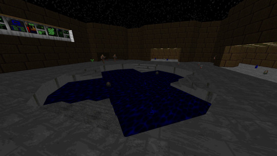
Here we have something quite interesting. A massive level created by Sverre André Kvernmo (Cranium), an author who would remain active for almost 2 decades (although a little sporadically and with a few hiatuses). This is the first truly massive map in the Master Levels, and also one of the most creative thanks to its interesting progression system that, despite being quite lost, feels like a real exploration adventure of the 90s. A big black tower in the middle of the map where we will have to search and find all the keys through teleports, rooms, traps, etc. This is a pretty decent map that manages to entertain for the 20 to 30 minutes it lasts. It is big, no doubt, but in its well-made creativity and quality of the 90s, it is one that manages to be successful.
MAP11: Virgil’s Lead
Created by the legendary Dr. Sleep. Virgil's Lead is the first map of Dr. Sleep in the Xaser Master Levels order, continuing with our adventure we now have a mapper who acquired a legendary status for his incredible vision and fantastic mapping skills. This map is a testament to his ability to create even during 1995. A medium size map with a very characteristic style that reminds me of the visual theme of Thy Flesh Consumend. With a good progression, an entertaining breakthrough and a well balanced challenge as well as well defined examples of architecture, this is a great map that is part of the famous Inferno series.

MAP12: Mino’s Judgement
Dr. Sleep established a legacy thanks to his fantastic contributions to the community and his great signature style that would later inspire a multitude of new mappers. This style can be well appreciated in this series, part of the Master Levels. Minos' Judgement follows the same remissive style of E4 (marble and tight architecture) with a nice unique touch that gives it a very appreciable atmosphere. This is a bigger map but with a much more complicated style that in spite of having a multitude of interconnected roads, we always manage to know where to go and how to go. Progress is key and the gameplay feels incredibly satisfying because of that. Apart from some fantastic visuals for the 90s, this is a good map in every aspect.
MAP13: Nessus
Dr. Sleep continues to pamper us with his fantastic maps. This is a simpler, more modest one with a simple and easy to understand layout without any unnecessary complexity. The progression is designed to make you go through the whole map twice but offering different paths and a dynamic combat with varied enemies, as well as different encounters and solid visuals.

MAP14: Geryon
Geryon: 6th Canto of Inferno by Dr. Sleep, part of his classic Inferno series. This time around we have a more simplistec yet fun medium-size map and a more palpable modesty. With a style that encourages adventure/exploration, this is a map that shouldn't be too difficult but fun enough to finish without problems. It highlights the final area where we have a good battlefield, creating a palpable and appreciable style.
MAP15: Vesperas
The last entry of Dr. Sleep's Inferno series in the Master Levels. It is a medium sized map with a box design that promotes constant combat under different tight and open areas, making use of plenty of teleporters and monster closets. Challenging but surmountable! Ammunition can be a problem. Unfortunately, this map is a bit lost and it can be slightly annoying to try to find the keys, which do not seem to be very visible. Starting with the fact that if we don't know that there is a small invisible ledge that leads to the yellow key, we will probably have a good time wondering what to do. In spite of that, this map rewards us with a good and exciting gameplay.

MAP16: Titan Manor
Here we have the first map by Jim Flynn. Titan Manor is one big boxed manor set in the moon of Saturn, Titan. What appears to be quite simple on the outside reveals an intricate layout on the inside, with good attention to detail (for 1995) and several routes to take as well as secrets to reveal. In spite of having an interesting design and promoting exploration, this map has a rather cryptic and difficult to understand progression system; designed based on hidden switches, tiny platforms and other things. Expect to spend a lot of time trying to find your way out if you don't have a guide.
MAP17: Trapped On Titan
This map feels like a direct sequel to the previous Titan Manor, but now we are stuck in Titan. Or something like that. It's a map that combines elements of abstract design with areas that try to look like cities or urban settings, all with a good dose of weird but understandable progression. This is a difficult map, you have to say that. The beginning and the middle are quite tight and the items are usually hidden in unofficial secrets or other areas. The end is also a hot one but if we were careful we should have enough HP, armor and ammo to survive. In general, this is a pretty solid map that has a particularly hot design that makes it attractive for those looking for challenges. It is not as lost as the previous one so that is an extra point.
MAP18: The Express Elevator To Hell
I had been warned a little about this map... I see why. What we have here is a clear example of an original and fun idea but executed in a wrong way and too much of a novice. The essence of it is to cross a map with an elevator that takes us to different paths that we need to travel to complete it. The problem is that such an elevator is a bit annoying to use, the enemies are too many and in places with 0 maneuverability and by the way the items are very short, resulting in a map of very high difficulty that does not feel satisfactory. Especially the final area, ugh. I have mixed opinions about this adventure, but it's not all bad.
MAP19: Bloodsea Keep
Another map by Sverre André Kvernmo who seems to have a little creativity in mind. I had high hopes for this map, since I like the idea of castles and fortresses, however, this is a classic example of a beautiful design ruined by a terrible gameplay. The positioning of enemies is terrible and it is made with the purpose of delaying you as much as possible while offering you the minimum of ammunition to survive. There is no SSG in sight, only in the secrets that will not be so easy to find. Unfortunately, I can't give a positive opinion about this map since it cost me half a soul to finish it, at least I can say that its layout and design is attractive enough, although it doesn't manage to make synergy with the clearly outdated gameplay.

MAP20: Mephisto's Maosoleum
This one feels like the previous one. An interesting (though clearly outdated) map that is on the theme of castles. It has a slightly more interesting gameplay and offers more interesting alternatives. I'm not a fan of the fact that the vast majority of enemies are Revenants, which are not easy to balance on open levels. On the other hand, the middle of the map is interesting enough to be worthwhile, but the end is disastrous. This is a IoS fight but with only one window of opportunity to attack Romero. Such window is located in a super narrow corridor right next to the spawn point of the cubes. Totally absurd and unfair, but oh well, that's the end of it!
MAP21: Bad Dream
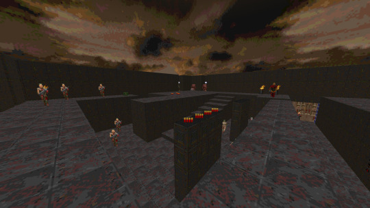
This is probably the most mediocre map of all, but at the same time, an interesting proposal. The last level in the Xasers order of the Master Levels and one of those levels that we would find with 1 of 5 or 5 of 5 stars in /idgames. A simple enormous circular level with dozens of Cyberdemons and a single Spidermastermind that blocks our way. The trick is simple: make the Cyberdemons attack the Spidermastermind and then run for our lives while we pick up the keys one by one. The roof will start to crush us slowly so it's a matter of repeating the process until victory is achieved. What else can we expect from a secret level of the 90s?
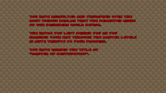
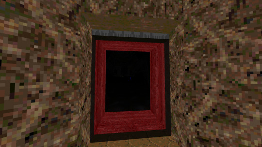
End textscreen.
Overall:
Master Levels for Doom II (1995)
By various authors
Let's travel in time. Let's go precisely to the year 1995, on the date of December 26th. It is practically a post-celebration day for many and some are even still resting and recovering from Christmas hangovers. It is a time of celebration and joy for many, and for others it is just another day. But... for some people, somewhere in the world, it is a unique day of premiere in which they will see things they never imagined before. For some Doomers in whatever part of the world they were, possibly the US, it's the day the legendary Master Levels for Doom II was released. Iconic, dear, mixed, hated, infamous, etc. There are many opinions about this particular collection of 21 maps for this fantastic game. Some talk about it with positive voices and memories of nostalgia mixed with a hint of longing; others despise it and consider it as a mediocre point in the life of Id Software where they only collected a bunch of levels and called it a day. Well, that is true, indeed. Master Levels for Doom II is pretty much that: a collection of 21 maps from different authors that range in quality and quantity, sometimes going from the very best that 1995 had to offer, to also the very worst that we can find, all in vanilla, lovely vanilla flavor. Well, then, what makes it so special? We could start with the simple fact that this is an official release from Id Software, which in theory could be considered a curated list of maps that the boys considered worthy of release during 1995. Something we would never see again with this style. Of course, there are many collections of shovelware with different styles and certain legends behind them, Maximum Doom is a good example (which is included alongside the Master Levels but that's another beast for another day) but probably the only underground collection with true legendary status is this one. The Master Levels are a distant memory of past times, of creative nostalgia and stages of immaturity. This is vanilla beauty and also inept ugliness. Mediocrity and fantasy come together to give us a bag full of gold and dirt. Here we have a piece of history, and like any story, it can be as ugly as it is beautiful. This is a relic of the days of yore, and one that I’m about to give my honest opinion and also some words of exterior retrospective. So, shall we?
The Master Levels for Doom II is a collection of 21 maps by different authors, ranging from some well-known community legends like Dr. Sleep, to even some authors that would later become official Id members, like Tim Willits. Created with the purpose of making direct competition to the rest of the creators of collections/compilations of shovelware, according to the words of the Johns: to "give the D!ZONE guys a run for their money." In that I think we can agree on that they did achieved it. While other collections are not as well known to this day, much less played, the Master Levels even have a certain cult category that gives them relevant popularity among Doom fans. Surprisingly, Maximum Doom probably has a more representative but equally interesting cult next to the Master Levels.
Most of the maps that we find here are from already existing WADs released previously by their creators, such as the Inferno series by Dr. Sleep. According to Sverre Kvernmo, one of the authors, most of the stuff was hunted by Id Software looking for some skilled mappers who might have some unreleased material, hence why this is more considered of collection than a properly made WAD. Some maps have special touches to give them some quality value, while others are in their pure and raw state no matter what. Inside you go and inside you play. In spite of that, the Master Levels have a certain air of born quality that we can detect without the need to make further extensive analysis within the range of levels that we will find. Of course, these are not the best maps of 1995, but they certainly have a certain touch of quality. Taking into account that this is 1995, a stage in which the level editors were not yet as convenient as they are now. Primitive tools, primitive maps. But don't let that fool you, the primordial state always has appreciable qualities even if hundreds of years go by. After all, it was called the Master Levels for something. The levels here were published with the idea that they would be of the highest quality, almost elite, making an allegory to the fact that their authors were masters of such creations. We only have to look at the ad of the Australian magazine version to read: ''Dust of Doom II, because now the master creators bring you...'' So, yeah, this was going in with quite the spiciness.
But in the end, does it manage to meet these high expectations? Well, that is quite hard to say. How can we compare it in current years? That would be unfair taking into account that even the best of the Master Levels looks pretty dull and boring compared to some recent stuff that has come out. Yet, how was the game for 1995? Well, things get interesting if we start to look at it from a more... antique perspective. Sure, playing the Master Levels in 2020 or 2021 probably isn't the most rewarding experience in the world, but I still have to admit it was fun. But what about going to 1995? Remember, this is before Final Doom and other projects that would revolutionize map design philosophy and change the world of WADs. This is 1995, Thy Flesh Consumed had just come out a few months ago so there wasn't much competition between official Id products. But competition between PWADs? Well, Memento Mori came out just a few days ago, the closest I can think of to compare between a community-made WAD but, of course, not Id released. Both are pretty iconic now a days, with Memento Mori probably being more played now a days. On the other hand, Memento Mori does suffer a bit from being outdated for today standards, and well, so does the Master Levels, yet, for 1995? Oh boy, I’m pretty sure these things were like gold bars for a Doom enthusiast.
I can’t say much about relating to that kind of experience, but I can try to, at least, lower my perception and look through a different kind of mirror into the past.
For 1995, the Master Levels are pretty solid in much of their levels. Heck, even the bad ones could be acceptable in 1995. As a matter of fact, I’m actually willing to say that most of the levels found here are superior in their overall quality to Doom II. Quite the fascinating subject of study but looking it in a more closely way, we begin to appreciate the kind of work that this collection offers, but to do so in a fair a just way, we have to look at each single of the authors in the Master Levels.
Going in with just the general order that the Doomwiki has, we start with:
Dr. Sleep: Legendary mapper and one of the earliest WAD masters that actually deserve the title. A great artist who stood out for his great ability to create levels that were as aesthetically appealing as they were fantastic to play; a stylized progression that combines gameplay elements as well as a classic example of early synergy with level design and enemy placement. Creator of the iconic Inferno series, five maps from this series are present in the Master Levels. Each of his maps stands out for having a fantastic presentation that makes great use of geometry and innovative attention to detail. From Virgil’s Lead to Vesperas, these are classic levels that are really worth playing and manage to stay relevant after all these years thanks to having good progression and a solid gameplay that will offer us good minutes of fun. Even if some of the areas of some maps can be seen as a bit old-fashioned for current years, his maps still manage to hold their own thanks to the simple fact that they are fun to play, even in today’s date.
Jim Flynn: An interesting case study of a mapper who seems to have ambitious ideas and even a bit of narrative. Creator of two maps, Titan Manor and Trapped in Titan. Flynn has an interesting style where he embraces more to the great and big, than to the modest or simplistic, straying from the traditional style of small levels with tight interiors. Its maps have a mood of adventure and exploration that seems to be clearly designed with the purpose of giving the player a few minutes of thought. Unfortunately, this is why his maps are the tardiest of all the Master Levels, with some very hard-to-understand progression, which can be somewhat detrimental to some players.
Christen Klie: Klie did six total levels for the Master Levels (curiously enough all his work was published in 1995, and then he just stopped doing Doom WADs) making him the most prolific mapper in the group. Unfortunately, as the saying goes, number does not equal quality and Klie offers several maps of very questionable quality. His maps, for 2020 or 2021, are horrible, but even for 1995 I think they are rather mixed examples of level design. They tend to be simple in presentation and their size is usually around medium to small, but it is in progression and gameplay where I really think he fails. his maps are lost, cryptic and with a style that makes us scratch our heads numerous times, which damages a lot the general quality. Interestingly enough, he would then make a multitude of other maps to release for free to the community, including a megawad and some maps for Heretic. So at least for that, thanks for the content, I guess.
Sverre André Kvernmo: Oh boy, this is the guy most people point at when talking about the hard levels of the Master Levels, cause let me tell you, his levels are tough as nails. Sverre aka Cranium, gives us a total of five levels for the Master Levels, ranging from interesting concepts to living nightmares in terms of design and difficulty. His best map is probably Black Tower, a concept map that stands out for offering an interesting adventure through different areas connected by teleporters. The map suffers a little bit of bad progression, but it is good enough. On the other hand, the rest of his maps are rather challenging to play with in every sense of the word. A bit lost, but always offering interesting original concepts although somewhat poorly executed. I can't say much about Sverre, their levels are solid for 1995 and have the charm of being challenging, except for Bad Dream which is a joke practically. After that, it's an interesting mapper that reminds me of Jim Flynn style. Sverre is also the only mapper that still contributes to the community in modern times, albeit quite sporadically. His last map was in released in 2016, after all.
Tom Mustaine: Not related to the famous metal guitarist and singer. Mustaine only contributed one level to the Master Levels, so there's not much to say about his overall legacy here, but he did have a special legacy elsewhere. Concentrating here, his only level, Paradox, is a square map with a simple design and too brown, but making use of an interesting and dynamic layout that allows a good fight and feels fun, even if a bit raw. After that, Mustaine, unfortunately, didn't contribute with more levels to the Master Levels. On the other hand, his legacy extends to multiple commercial projects, contributing with several maps to projects such as TNT: Evilution, Perdition's Gate and Hell To Pay. Also, he did other contributions to community projects like Memento Mori and even made music for Icarus and TNT: Evilution. A prolific author for the 90s, no doubt. A pity he didn't continue with the contributions. I think he would have achieved an admirable style among the community.
Tim Willits: The last ‘’Master Creator’’ of this article and probably the most infamous of them all. Willits is well known within the Doom community for becoming the studio director and co-owner of Id Software for over a decade, eventually leaving the company during 2019. Not well liked for his hot-takes and somewhat ass attitude, which has given him a bad reputation even among the gaming community in general, but now we will focus on another point that is often obscured by his previous bullshit. Willits is practically the dream of many mappers and designers in the community. He was recruited by Id Software after impressing them with his Raven and Empire WAD series. His levels were no doubt at Id's level to get him to join the team, since, we can see with his contributions to the Master Levels. We can quickly see that he had a special flair for level creation. Attack and Canyon are his two contributions to this collection. Maps made with the help of his sister, Theresa Chasar, of whom there is not much information other than that she co-authored many of the Willits' maps. Its two maps are solid and of a good quality, enough to offer a good entertainment thanks to a somewhat adventurous progression but always maintaining a constant rhythm that does not stop in terms of flow or combat. Making use of a little bit of abstract or surrealistic designs, Willits delivers two solid maps that are fun to play with. I wish he would have refrained to that alone.
As we can see more easily, this collection of maps brings 6 (or 7) authors of different ranges to give us 21 maps of different quality. Each author has, in one way or another, a certain style or set of characteristics that give them a distinguishable touch, either for good or for bad. Much can be said after so many years, but we always have to take into account that this is a work that was made almost 3 decades ago. Almost! That is quite a long time and a great testament to the fantastic work of conservation, perseverance and constant classical appreciation that this community possesses. We can see that these maps are, for lack of a more sensual word, ancient for modern times, and they show it in all honesty. Misuse of textures, confusing layouts, abstract themes, original but poorly executed concepts, boring and simple visuals, etc. But just as we can see the mistakes at first sight, we also have to be able to change our perspective and see what they did well with effort and a certain charisma. Original, creative maps, extravagant layouts, palpable design philosophies, different themes for each author, adventure designs, exploration capabilities, etc.
The Master Levels are, in one way or another, a master creation of different maps by different authors that all manage to have a distinguishable trademark. Launched on December 26, 1995, it is a creation as fantastic as it is terrible. Constantly changing levels of quality and style that show us different ways to play as well as paths to take that can lead us to rewarding exploration or to get lost in the pools of frustration while we are constantly struggling: Where the fuck do I go from here? That's what the Master Levels are all about. They may be a mixed box for these times, but I can't repeat again that what we have here is a piece of history that deserves all the attention it can get. This is just a glimpse of what the future holds. We have mappers who showed us the capabilities that our community would reveal over the years to come. We have mappers who would also show us the ugly and mixed face of many of the maps that would plague us for eternity. But, most of all, we have a collection of chocolates of different flavors ala Forest Gump. You don't know what you'll get, but you know you'll eat it and you know damn well… it is a chocolate. A tiny fraction of taste, of flavor. Just a small piece of candy for you to enjoy.
Personally, I had a lot of fun going through this historic delivery. Perhaps it is because I consider myself a historian and archivist of any piece of knowledge or content that exists. I like the idea of numbers, I have to admit, but I am also a lover of quality like everyone else, but, above all, I am an admirer of variation. The Master Levels present us with both factors, a trifecta of a fascinating odyssey: There is number, there is quality (in part) and there is a lot of variation. All this together and we have a piece of history that can never be erased from this world. They may not be as well-known as Final Doom or other installments, but the Master Levels are still a milestone that everyone should play, if only for the simple retrospective value it offers. After all, the true taste is found in tasting everything, until finally understanding each flavor. The Master flavors.
Fun fact: The Doom Master Wadazine name is inspired by, yes, indeed, the Master Levels.
Fun fact 2: And pretty much anything I’d do is going to carry Master as part of their name/title. Sorry not sorry.
7 notes
·
View notes
Photo
Someone on this site (I don’t remember who) pointed out how little screen time Fawful shares with Mario and Luigi in Bowser’s Inside Story. For most of the game, Bowser is Fawful’s main nemesis, with the Mario Bros. working behind the scenes. There are only two scenes where the Bros. and Fawful encounter each other: the scene in the sewer where Fawful grabs the Dark Star and the very final boss. At all other times, the Bros. are either inside Bowser (giggity!) or in a location without either Fawful or Bowser. At first, it seems kind of weird how the main villain of a Mario game barely sees Mario, even when taking into account Bowser’s prominent role as a protagonist. But, when I gave it some thought, I realized it wasn’t weird at all. It was all according to design. That is Fawful’s design because all through the game he's deliberately going out of his way to avoid the Mario Bros.
A huge part of what makes Fawful so dangerous is his intelligence, and I don’t mean just the technical genius that allows him to build vacuum helmets and laser-shooting robots. I’m referring to his cunning. He’s able to spot the counterfeit Beanstar right away in Superstar Saga, he comes up with the plan to have Bowletta impersonate Bowser in Minion Quest, a gambit that succeeds in getting Captain Goomba to shift his focus from Fawful to Mario, and he came up with a pretty effective Plan B in case Bower survived the cage match with Midbus. This careful planning makes him a direct foil to Bowser, who always (always!) charges headfirst without a plan, relying solely on the strength of his own awesomeness. Bowser never learns from his mistakes, but Fawful does. He was introduced as Cackletta’s apprentice, and even after her death he is ever the vigilant student, using his experience to avoid old failings.
And one thing his experience has taught him is that he cannot beat Mario and Luigi.
He fought them twice in Superstar Saga, the second time much more heavily armed than the first, and was beaten so badly that Partners in Time implies that he’s traumatized from the experience. When the babies encounter Fawful in the sewers, he’s clearly obsessed with the Mario Bros., flying into a frothing-mouth rage at the mere memory of their clothing.

He also uses mustache-related metaphors even when not directly referencing the Bros., including one point before the babies ask for his backstory, meaning that Mario and Luigi are always on his mind.
The Mario Bros. left a deep impression on Fawful, specifically several on his skull and all over his body. When he returns in Bowser’s Inside Story, he is no longer concerned with conquering his home country and is instead fixated on the Mushroom Kingdom. Perhaps he’s motivated by revenge? Either way, he knows he’ll never be able to hold onto his power without dealing with Mario and Luigi.
But, Fawful has a problem. He’s a wimp.

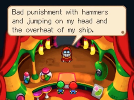
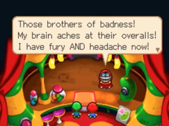
Armed with only his vacuum helmet, Fawful is so weak that he’s fought during the tutorial stage of Superstar Saga. When he speaks of his previous defeat in Partners in Time, he uses a lot of pain-based imagery “jumping on my head,” “hammers,” “my brain aches,” “headache,” etc. Bowser’s description of Fawful as a “little babbling nerd” may be harsh, but there’s some truth to the fact that Fawful is tiny, out of shape, and not used to physical strain. The Mario Bros. dished out one hell of a beating, and he is not eager to experience that again.
I usually hear Fawful’s Vacuum Shroom scheme explained as an attempt to cut off the head of the Mushroom Kingdom’s government in one fell swoop by containing them all within Bowser. While I do think there is some truth to that, I would argue that his primary targets in that plan are the Bros.
Fawful knows he cannot beat the Bros. With Mario and Luigi contained inside Bowser, his biggest threat is removed. Bowser, of course, is still free, and Fawful makes no real effort to contain him once the Bros. have been inhaled. But, at the beginning of the game, Fawful doesn’t view Bowser to be much of a threat. His own experiences with Bowser in Superstar Saga had convinced him that Bowser is a bit of a pushover. At the beginning of that game, Fawful lays Bowser low with a single shot from his vacuum helmet. And, when Fawful comes across Bowser much later, he’s already unconscious.

Unlike with the Mario Bros., Fawful had no reason to fear Bowser. He’d learned that Bowser was dumb, weak, and easily dealt with. It’s quite a nasty surprise when Bowser rises again and again to throw off Fawful’s schemes.


But even now, when Bowser has risen as the biggest threat to Fawful’s new world order, who does he still think of?


After all this time, the Mario Bros. still weigh heavily on his mind. Does he suspect that Bowser’s newfound strength is because of their meddling? Perhaps. The remake of the Dark Star Core phase of the final boss added animation of Fawful pointing at the Bros. before transforming to his titanic size.
After being reduced down to the Dark Star Core, Fawful’s mind seems to be in a simplified state. His only dialogue is to repeat his catchphrase in a confused tone before scurrying away, and during the final boss fight, he doesn’t speak at all. But even with his mind in a fog, he still recognizes the Mario Bros. He revels in sadistic glee when toying with them by tossing them into the air or chasing them down a dark, evil corridor with his gleaming teeth like a demonic Pac-Man. Even that point at the beginning at the fight is multilayered. Is that an “Ah ha!” point identifying the cause of all the trouble Bowser has been causing? Or is it a sadistic taunt? “Now, you’ll see who’s tough!”
Fawful is fully aware of his own physical weakness, the weakness that led to his painful defeat and may have cost him his mistress’s life. Was his obsession with absorbing the Dark Star into himself an attempt to finally make himself stronger? To no longer be the little nerd? To finally be someone the Mario Bros. couldn’t hurt?
In any case, it didn’t work.
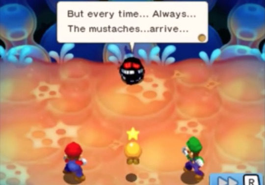

Fawful feared Mario and Luigi. He did everything he could to get them out of the way without having to face them. He trapped them inside Bowser, and when he saw them underground, as soon as he’d grabbed the Dark Star, he shot at them and quickly fled behind a magical barrier made of thirteen impenetrable walls (I counted). Once he’d absorbed the Dark Star, he thought he was finally strong enough to beat them.
But when the Dark Star was gone, and his mind cleared, he’d found that he’d lost everything, and the Bros. stood triumphant yet again. He would never, ever win.
I guess, when we take all that into consideration, it should be no surprise what he did next.

#mario and luigi#fawful#superstar saga#partners in time#bowser's inside story#bowser#cackletta#character analysis#long post#theory#headcanon#dark star
153 notes
·
View notes
Text
February 13, 2021: 3:00 pm:
====================================================
I have a example of Gnosis that was presented to Los Angeles Unified School District students in the early 1970′s.
This Gnosis inclusion in printed required reading material may be possible to find and study further, was a “Life or Death” sort of a COVID Test in the 1970′s where a book report could get a elementary student killed if they say the wrong thing in the report.
The assignment was to read Lord of the Flies by British Author William Golding, then to write a book report about the events that those young stranded people faced while trapped on a deserted island after their airplane crashed there.
I think it’s last final chapter in the book (is) where the Gnosis shows up, and, it could prove to be that entire novel is a work of Gnosis for weeding out non-paratrooper Canadian terror soldiers who landed in great number in San Fernando Valley California in 1970 - 1971.
That last chapter included that at least two people on parachutes had come out of the shy (sky) and landed on the island where Lord of the Flies took place. The parachuting people did not land, but fell, is the way I remember it, and they had gas masks on when the children found them there, as they had hoped some help had come, it was some other thing, not help, and the children spent some time trying to determine who the dead parachuting guests were.
So, the way I did the report, is I read the book twice, then I decided that the part where those people came parachuting out of the sky was a mistake made at the printer, and I approached my book report as if that chapter belonged in a different book, not Lord of the Flies, was a mistake, and that I had somehow managed to pick up a defective book to do the report with. So, my report stopped abruptly at the close of the chapter before the one when those parachute wearing, gas mask donning intruders had come to the island.
The teacher asked about that, why I stopped without including the last part of the book, and my response was that the book was wrong, my book was defective and contained parts of a different book, so, I wrote about the other parts of the book. I got an A on the report. I lived. Others at the school began to vanish, all of my friends were said to have moved away to other places.
Some things to consider about the usefulness of such Gnosis, rely’s on real knowledge, only those who know that thousands of paratrooper terror soldiers landed in Southern California in the 1970′s will understand or be willing to consider why Lord of the Flies is only one of many ways for the terror leadership to reach the terror army that landed there. The paratroopers in Southern California came in tandem, two per parachute, one adult male, and one child on each parachute. The children ranged in age from about 8 years old to about 12 years old. The children started attending Los Angeles Unified School District Schools. Some of the paratroopers did not land safely. Some got hung up on power lines, some of the parachutes failed to open, and some were injured simply because it was dangerous event.
That report assignment based on a book where the premise is about a crashed airplane filled with children on a deserted island where a “Pig” is used as a religious figure head among the stranded group, and so many other details, all serve as fodder for a child terror soldier to say details about their presence, while writing a book report to a terror teacher substitute while the real teachers are away at a educational enrichment “inservice” day somewhere else. That book report gave opportunity to write something about who made it alive, and who did not. If there were injured terror soldiers, that book report was a way to say who and where the injured, or dead ones, were at, and about where parachutes could have been lodged in trees or power lines or other places where they got hung up on the way down.
I once found one of the parachute harnesses, not the chute. That one I found in a remote place at the east end of DeSoto Ave where there is a very old dam structure made of rocks at Browns Canyon Road where the 118 freeway overpass is at, in 1978, about seven years after the paratroopers landed. I’ll describe the harness when I get an interview from US national security personnel.
Think about that Lord of the Flies Gnosis assignment, and all of the simplified details I provided for you here, to see how Gnosis is bad for Freedom, and serves the terror pirates.
I have a lot to say about my youth in Southern California, but no one to say it to.
===========================================
4:03 pm:
Do a Bing search for “Map of Quebec”:
It brings up this image:

Wait about three to five seconds, and the internet terror pirates put an overlay on top of the map you want to look at, the overlay erases the word “Quebec” and it happens live, as you are looking at it.
Later, when the information is shared, like I am doing, Justin Trudeau will go hide under his house in the basement and call his national Canadian Security forces to say that the information showing that the word Quebec has been erased was done because the person who presented the information is planning to explode Justin Trudeau, in Quebec, and that is why he is hiding in the basement under his house.
If the overlay is put on my view of a search result to cover up the word “Quebec” then it will happen to anyone who has drawn the attention of global terrorists such as Justin Trudeau.
For the record, I don‘t have any desire to explode Justin Trudeau or Quebec. That is not my job. I do think the world would be far safer if Quebec and Justin Trudeau exploded, either on their own or by actions taken by Global Security Forces. But like I said, that is not my job, others are in charge of that kind of thing. I am only an elderly disabled man who is a Medicare beneficiary, so, I can’t be expected to do that level of Global housekeeping, others who better equipped, and in better health are responsible for ridding the world of places like Quebec.

This is also a place of interest, the whole thing with exception of some parts of Ireland is the way it looks. I used to say Scotland was not of interest, but that changed, it’s all bad news over there for far too long... where is my eraser?

This has always been a big problem for the whole world. It’s a boat, sink it.
And this is the main source of all of the problems on earth.
It’s just a little tiny place, see below:

This is all it is, and it’s destroying everything else:
It’s a book, burn it.

=================================
4:57 pm:
Revisit this just for a minute. This is really too depressing to really do an the in depth report and decode that is warranted here, so, I’ll give you a head start, something to look at as a place of basis for your own decode work.
youtube
https://www.youtube.com/watch?v=00ReU6IGACo
First, some background is necessary:
(when i do strikethrough that is example of Christian terror at Centurylink changing the text I wright to a “The” for “Theology” means “God”. There are thousands of places where “That” gets changed to “The” by the terror army operatives at Centurylink, Google, and Tumblr terror cells. It’s the same as if the Pope came to piss on the things I wright while trying to get some help)
To see what is happening here, you have to know the (that) when a citizen is awarded a disability status, that event is called “Award of Disability” and beneficiaries receive an “Award Letter” to inform them that Social Security Administration has finished doing their assessment on the application process that people have to go through, it takes more than two years to complete the process, and EVERYONE is denied in the first round, to discourage those who may be trying to deceive the application process. Once “Awarded”, the person becomes a Medicare Beneficiary, and begins to receive a nominal amount of income based on the amount of Social Security Monthly Premiums that person paid, automatically, as it was deducted from their paycheck throughout their lifetime. There is a maximum to the income amount, it’s not enough to survive on for most people. During the first fifteen years of Disability Award Status, those people are subject to the whims of the SSA, if they feel like a reassessment is necessary, the person is called in to a hearing, and must PROVE that they still should be considered as a Disabled Citizen. It turns out that other neighbors are often a threat to such people, and will go out of their way to make life more difficult for disabled people, and will call the SSA to tell them that their neighbor claims to be disabled, but does not look disabled. That means that the neighbor, who is not a doctor, works at McDonald’s as hostess, can make a problem for the disabled persons. You might say that should no problem if the disability is real, just prove it, again. What you don’t understand about that is the lack of control, the threat of having to pay back all of the income that was received before the neighbor called SSA to say stuff they know nothing about, the worry, extra expense, and most of all the time that is required to focus all of your life’s efforts on proving once again that an Award is to be continued. Every other thing a person may have going on, has to stop, all focus shifts on maintaining what is already in place. It’s like you are out at sea, and the information is such that someone is going to take your boat while you are ten miles out in the water. You have to stop everything to save the boat.
Then, for purpose of that video, after fifteen years passes, disability award citizens are no longer subject to any kind of interference from SSA for review no matter what any one says. So, the disabled person will never again be called in and forced to prove anything after fifteen years passes. That is what Jeff Kiesel is talking about in that video after he introduces the “Dotted Line” where a design patent contract is a protective measure. He is pointing out that it is not likely that anyone will be looking at, or interested in disabled people after fifteen years of awarded disability status, and that fact makes them good targets for the long haul where the victims income can easily be maintained after Jeff Kiesel signs the dotted line where the Guitoligist, Brad, does the dirty deed, Gain Cheap, on the Clean Channel.
Contract; Protection; Design.
Those are among the key statement jargon, where “design” is in reference to subjects suitable for surgical experimentation. If not experiment subjects, then such people can be held captive by someone who claims to be a son or daughter or other relation to the victim, and used for things like taking to a SAG friendly doctor so that Jeff Kiesel and Brad the Guitologist can get high on the captive patients pain medicine that is prescribed after a fall down the stairs, or a “gardening accident” in the yard, while those patients never get the medicine they are prescribed. Hear Jeff Kiesel say the phrase “One Leg” to get an idea of the horror of being held in captivity by drug addict SAG members.
Refer to the 6:34 mark in video to get to the heart of the coded message.
It’s coded. You decode it yourself, to keep your parents and grandparents free of captivity, and yourself, because you never know when that freight train is going to run you over until after the train goes by.
All of that is talked about openly on Google/YouTube.
You watch this video and then argue that Google is not in the snuff movie business, I double dog dare you to.
They even know and mark the video with a warning, so, I’ll warn you also:
You cannot Un-See this video. Once you have seen it, it will stay with you forever, like a heroin addiction is to a SAG member.
https://www.youtube.com/watch?v=IZYDc_yR0qA&bpctr=1613268727
This video worked and was playable here on tumblr for a few hours, someone had to manually see that it’s here, then put the age restriction on the Google Snuff movie service. I recommend using someone else’s computer to view the video, as Google has turned it into a controlled environment where they can trace your address, so, use a police computer or one at the local church for viewing Google Snuff Movie Service Productions whenever possible. If you click the link, they will assume you read this account, if that happens, you will be marked as someone who knows the truth about Google and the Vatican, and they will hunt you down, take you captive, torture you so you will give them addresses of your family, especially small children, and your banking and asset access information. Then, they will put you into a commercial grade Chipper/Shredder, and grind you up into a liquid, add some water, and some seeds, and spray you onto the roadside as Erosion Abatement for profit because the Department of Transportation pays the contractors for the service of doing Erosion Abatement work on the roadsides, so that the road won‘t wash away in the rainy season. That, is the Christian Way. You can‘t see it through so many daisy’s is part of the problem with that. Orange poppy seeds are most popular in Or/egon for the Human Erosion Abatement Program. The mixture starts out as “V-8″ they call it, then when the seeds are added, at the time of the spraying, they call it “Red Hydroseed” and that is what the State is billed for by the contractors. no, I am not joking, does it sound like a joke?.
youtube
The reason that video exists and is presented on Google/YouTube, along with other similar ones, and movies of animal torture, is create a market for them. The existence of such movies available mainstream makes a “custom order” situation available through YouTube and it’s all approved and signed off by Sundar Pichai, and the Pope with use of a warning label, and the added benefit of that SAG Media “Color Announcer” who calls the action like a little league umpire calls an infield fly rule. Those who are really in the know, knows that the snuff movie presented, is about young boys and young girls because of the “Infield Fly Rule” that is presented in the approved Google snuff production there. “Infield Fly Rule” at a little league game is far more difficult to call as a umpire, than that snuff movie Color Announcer does with a train.
Boy Scouts of America
Eagle Scouts
Girl Scouts
Brownie’s
Little League Baseball
Pop-Warner Football
Gymnastics
Any and all extra curricular sports activities where SAG members can sign up to be a coach or a mentor, all inclusive, is what the train video is truly about, and is what Google is truly about.
Learn to read terror comm.
Turn off the fucking television, there is nothing real presented on it.
Stop the terror take over of USA. Preserve USA by restoring the Freedom that was lost to the Christian terror pirates.
Expose them, remove their fake Corona Masks.
Make arrests. Take them all to Easter Island and drop them off there. There will be way too many to put into the prisons.
===============================
6:46 pm:
Local Conditions:
About 40 degrees F. Absence of wind, high overcast sky.
I saw lights moving around in my front yard as dusk settled in at the close of that Boy Scouts entry above.
I took a walk to the mailbox.
I hesitated momentarily at the front door, opened and closed it a couple of times knowing that the terror bastards are triggered into action with listen device they put beneath my house at the entry.
I stepped out and a car moved south on Russell Road, as is usual at this time of day when I step outside, I am a little early with walk today because of those lights I saw in the front.
There were no lights on at the 376 Jackpine unit B as I stepped over to the driveway, there is a odor of death there, is faint, smells as if a dead creature or persons is in wooded area over there near the Offensive Monroe Surveillance Travel Trailer. I continued to the road, as I passed by the Monroe’s camara area pointed at my gate, there was the sound of jet ... I looked all over the sky to see the jet, but there was no sign of airplane, the sound went north, then west, then north again, then south, it was not a jet, it was a terror soldier’s nitrous gas tank ignited by my Bic Lighter and the sound of a launched terror soldier.
There was one item at my driveway entrance that was out of place, someone had moved a thing that I don‘t think could have moved on it’s own.
The people at 445 Jackpine have all of the house lights off tonight, is totally dark in contrast to last night when the place was lit up brightly. I could see that one of the vehicles there is a pick-up truck, looks medium grey color, but it’s too dark outside to know more, or it could be blue color.
There was nothing in the mailbox.
That Mazda, or other similar looking car was at 520 Jackpine again, parked in front, there was a dog in the yard, and someone was hiding behind a wood fence there along the road watching as I looked for my mail in the box.
I went over that way, there should have been some trash cans brought to the corner by now, in anticipation of Monday Trash Day, but there were no trashcans out on a Saturday, is unusual but not unheard of.
As I looked around at the corner, another terror soldier ignited at 520 and must have taken off very quickly, that man hiding by the fence came out and got into that Mazda, and drove away while I was still walking on the road. He used a flashlight to light me up, so, I returned the light back to him, with a bigger, more powerful light.
I was concerned for a moment he might try to run me over, but I just stayed my course, and went to my driveway. I think the man in the Mazda thought I was the Jet I heard, his accomplice terror assassin, or maybe the other one that was standing right next to the Mazda and launched away quick. I think that one landed at 535 Jackpine at Freeberg terror cell, as I did hear a “Thud” sound from that direction.
It looked to me that the Mazda went to 376 Jackpine to Chartrand terror cell. I did not stay close enough to know for sure though.
There is a possibility that the car was brought to Chartrand by remote control, that is not uncommon, and all of the automatic transmission cars are fitted with remote control operation so that in event that the gas wielding terror soldiers are ignited and burst, the cars can be driven remotely to a controlled place to clean the guts, piss, and shit that gets spattered all on the interior of the cars when that happens. The Myers car from 560 has had dozens of Bursted terror soldiers explode in it over many years.
The lights at 376 Jackpine unit B came on at the front entry there as I walked back to my house.
Conclusion is that all four of the 445 Jackpine assassins are all dead now, and as I thought, were working with the people at 376, and, 376 is the Mazda that has been bringing dogs to the 520 address on occasion for staging attacks at my house with help from many terror cells from near and far.
I’ll take another walk later on to see if Mazda Man wants to dance with me...
Here kitty, kitty, kitty .... Ohhh Mazda Man... Let’s Dance!
==============
7:27 pm:
In event that nsa is watching, wondering, learning, be advised of the VKA follow up work I did earlier today.
Can’t say more.
also: 928-249-3186 Kingman AZ Jeremy is of interest, sent him the 1 2 3 in return for A B C he sent last week about a “SpringBoard”. I could use some help with dealing with Jeremy.
https://www.youtube.com/watch?v=bQtPzo-7AHs
youtube
https://www.youtube.com/watch?v=bQtPzo-7AHs
Possibly Jeremy Barns. A former renter of one of my houses many years ago, associated with Marc & Kayla Cobb who are members of the Tucker’s Barber Shop on 6th St. at Village Square Shopping Center, a “Hawaii 5-O“ terror cell controlled by “Greens of Olde Three Ply” Vatican Choir high command at Kauai Ranch. Jerremy Barns is also loosely affiliated with Joanne St. Cyr of Quebec Canada, and she is part of many things, Jazz Airline is one of them, a Air Canada regional commuter airline serving the Quebec/Montreal area.
Jeremy Barns, The Cobb terror cell, Todd & Alicia Wright and Micheal & Mercedes Wright terror cells are all Safari terror cell members, the Wright’s are actual Lion Handlers, and the Wrights are family of Richard Wright of Pink Floyd, who is one of the Green’s of Olde Three Ply Vatican Choir terror high command at Kauai Ranch.
I suppose all of tonight’s walk to the mailbox is just for personal documentation so I can remember things as they occurred, since no one is interested in preserving USA, or restoring lost Freedom enough to ask me a question about this account of terrorism on Tumblr.
===========================
9:49 pm:
I am tired, I don‘t want to do the decoding, but you can.
Here, this man runs down all of the necessary ingredients to say: “Last in Line”. a Ronnie James Dio song that is deep, but partly is about a entertainment event where terror soldiers go to the back of the line at the entrance, they have swords, a lot of protection from event staff at a concert, baseball, football, any kind of event where the venue has a “Grey Area”, a median place between the seating area and the entrance to the venue such as the concessions area at a baseball stadium is where you present your ticket to an usher before the event begins. The terror soldiers “Hold their swords horizontally, and move forward” through the crowd that is lined up in such a “Grey” area. The audience is killed before the show begins, three percent of the total show audience is taken, ID’s are processed, and replacement look-a-likes are arranged to go live at the victims homes, ultimately, to vote for SAG Shills on ballots such as are all of the people who are featured at the fake impeachment hearings. He says everything but “Horizontal” in coded language.
https://twitter.com/ABC/status/1360677045139869702

Here, Twitter covered that missing “Horizontal” twice with trending Letterman bullshit. Here, he “Roasts” Lindsey Lohan to a point of tears, she must have said or done something to gain attention to the ways of the Screen Actor Guild and was punished for saying whatever she had said, maybe some research can find what Lindsey revealed.
She is wearing “Upholstery”, basically is donned in a sofa. So, the Upholstery outfit could possibly be enough to piss David Letterman off, and Roast her.
Upholstery = “There must be some kind of hold up” in SAG terror language, is a Universally used term, many uses. She may be using it as a “USA is being hijacked” sort of holdup. So, they are sending her to Rehab, where she becomes the “Horizontal” member of the impeachment asshole above who is saying “Last in line” and it’s also a “Sloppy Seconds” statement.
https://twitter.com/davejorgenson/status/1360783863887376390
This at the end is a place where Dave threatens Cher (who does not look exactly the same as I recall she looks in that interview) and that video clip makes the horizontal part of the impeachment Last in Line happen twice, with a “Sloppy Seconds” at the end of the show.
It’s complicated, but not impossible to decode David Letterman, besides, he’s been dead for about five years, his head was put into the mailboxes on Jackpine after the show was over.
https://twitter.com/Squidwardsnose8/status/1360696495708778504
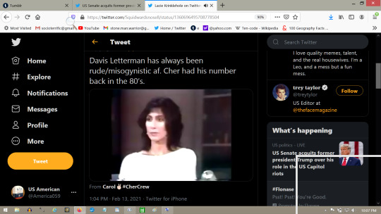
One of the more important things to keep in mind is that Twitter made all of that click together, with use of “Twitter Trends”. The content of the Tweets from Letterman are all contained in the vast archive of Twitters digital storage capacity, and Twitter is Google, so arranging all of that stored archive to produce desired results is what Google is all about, it’s what they do, they categorize information.
So, once you do the decode, then you need to see why the decode opertunity presented itself there for you to see. It was Twitter that arranged all of that so it would be there to use as a language, a graphic based language that says more than the individual pieces of video clip when combined, and with a host from the fake impeachment to guide the reader to the message.
The message is about a mass murder at a venue, where there are women who will be punished, captured and killed after plenty of raping is done by David Letterman and Jay Leno, who you know is waiting to share a garage with Dave nearby.
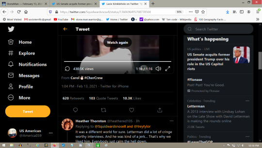
My read is a personal one, that includes much other communication on Google products, in the music industry email promotions, and in my neighborhood, where the message spells out a Rush at my house on Sunday morning by men with swords, and with horses, equestrian snuff at my house, with a draw and quarter featured at the end of the show.
I can hardly wait.
Draw & Quarter: It’s been about fifteen years since the last time I saw someone being drawn & quartered. Usual is done with two horses, where some ropes and shackles are attached to a victims arms and legs, and the other end is tied to the saddle of the horses. They prefer to use four horses, but one will work if horses are in short supply, just tie the other end of the rope to a tree and the result is almost the same. The horses slowly pull the victim into pieces.
The Draw & Quarter events are very unpleasant to see, even worse to be the star of the show.
Best guess is Adrian Witcherly will supply the horses. She is a bank manager at the Midland St. Branch of JP Morgan Chase Bank in Grants Pass, corner of 7th St. not far from OR State Police Field Office which next to the Seventh Day Adventist Church on 9th St.
=====================
11:00 pm:
This man is said to be the most powerful man on earth, surely he will save me, and prevent the event from happening, given that all of information necessary for prevention has been provided.
I am confidant that the US President will do what ever is necessary to prevent tragedy when he has opportunity in advance to do so.
Certainly he will realize the horrible threat to USA, to Freedom, and the threat to mankind that is presented to the world by Google, and will everything in his vast power to stop Google and Twitter from murdering more US citizens forever.
Joe Biden will do the right thing, he has been informed of the danger.
https://twitter.com/POTUS
=======================
11:33 pm:
I just now sent this cry for help to the White House.
2-13-2021 at about 11:27 pm Oregon time.
Take note that I specified to read the information in the links provided, and that 911 Emergency phone service will produce assassins at my house if I use that. I have much other documentation of failure at FBI.Tips.Gov too. It does not work, only assassins come in response to reports of terror mass murder in Oregon.
“Please send help.
The state of Oregon has been hijacked by terror army from Canada, they use poison gasses to overpower victims, capture and torture them, then kill & replace them with imposters.
There are many hundreds of thousands of them, and they have been murdering the population for more than twenty years.
There are more than 800 pages of explanations at the link provided, eye-witness accounts of actual terror mass murder happening in Oregon and all over the west coast of USA.
Please study the information carefully, as the terror is very sophisticated.
911 Emergency phone service is not available, it's controlled and operated by the terror army, they only send assassins when people call for help. Please send US Military.
https://stone-man-warrior.tumblr.com
https://stone-man-warrior.tumblr.com/archive”


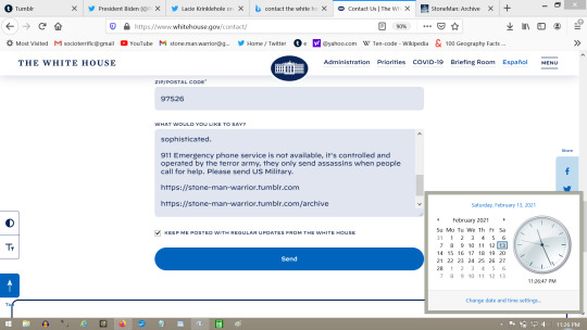
They will call the local sheriff.
The local sheriff will send assassins.
That is what happened each time I sent a request for help to a US President.
Obama.
Trump.
Biden.
They have all been informed. none have stopped the terrorism, mass murders, kidnapping, or US takeover.
They all have sent assassins.
Joe Biden started sending assassins before he took office.
If I disappear, Joe Biden’s people did it.

============
11:46 pm:
Here is the BBC UK news response to my letter to Joe Biden at WhiteHouse.gov:
https://twitter.com/BBCNews/status/1360856008969621507

This is the part where Reuters UK (SIS MI6) makes the order to change the contact information I included with the note to Joe Biden at WhiteHouse.gov. This effectively will result in the death of investigative persons sent to the wrong places, because that Tweet says to make “Variant Modifications” and is directed at what I posted regarding the note asking for help.
I used the correct contact information on the form at WhiteHouse.gov. Part of the terrorism includes that the phones don‘t reach the people I need to reach, only approved terror cells can be reached with a telephone, and only terror cells call my phone number.
It’s should not be difficult to see where I live to contact me by reading the information at the links included, to this account. The problem with that is the investigative persons are not provided with the source information and have no idea that this account exists at all, they just go where the leadership tells them to go do investigative work, but the leadership is all SAG Shills, are all terror army operatives, and they send the investigative people into traps intentionally. Reuters UK is making sure that investigative persons go to Bullhead City Arizona, instead of Oregon where I am at, and where I can help them help me to help everyone, and restore the freedom that was lost so long ago.
https://twitter.com/ReutersUK/status/1360857587453988866

February 14, 2021: 10:05 am:
February 14, 2021: 10:38 pm:
https://twitter.com/POTUS/status/1360990937606983691
Biden effectively says: “Fuck you minion”
Then turns to his Canadian SDA terror soldiers and commands: “Grab your rakes and pitchforks, let’s get to work”
https://www.youtube.com/watch?v=BniO017oeTM
youtube
The President of the United States of America, Joe Biden.
It’s St. Valentines Day today, I forgot, he’s busy ... today is a bad day for doing anti-terror work.
1 note
·
View note
Text
Books of Magic: The Voyage of the “Princess Ark”
(Images by Jim Holloway and Thomas Baxa come from PDF scans of Dragon Magazine, are © Wizards of the Coast or their respective copyright holders, and are used for review purposes.)
Previous installments in my “Books of Magic” series were, weirdly enough, about books.
This time, I want to tell you about a series: Bruce A. Heard’s “The Voyage of the Princess Ark,” which turns 30 years old this very month.
TVotPA ran in the pages of TSR’s Dragon Magazine nearly every month from January 1990 (Dragon #153) through December 1992 (Dragon #188). A serialized travelogue and adventure story told in 35 installments over three years, TVotPA was part Master and Commander, part Star Trek, and part The Adventures of Asterix (the last two of which Heard explicitly cited as inspiration in his letters columns). It follows the saga of Prince Haldemar of Haaken, an Alphatian wizard who recommissions an old skyskip and sets out to explore the lesser known regions of the Dungeons & Dragons game’s Known World, which would soon come to be known as Mystara.
Some background might be necessary for those of you who aren’t familiar with the chaos that was D&D at the time. In the 1980s and 1990s, Dungeons & Dragons and Advanced Dungeons & Dragons were two different games. I’m simplifying the chronology here, but basically in the late ’70s D&D was meant to serve as a simplified gateway to introduce fans to fantasy role-playing before guiding them on to AD&D. But in the 1980s, thanks to the release of the Moldvay/Cook Basic and Expert Sets, and then the five Mentzer box sets (the ones with Larry Elmore dragons on the cover, now referred to as BECMI D&D—for the Basic, Expert, Companion, Master, and Immortals Rules box sets), D&D had become a viable game in its own right, with its own world, referred to only as the Known World.
The Known World—particularly as it was showcased in the Expert Rules—was a mess: more than a dozen nations slammed together in the corner of a continent to illustrate for young DMs the various forms of government you might find in D&D beyond kings and queens. Along the way, these nations also served as analogues for real-world societies ranging from Western European countries to Native American nations to the Mongolian khanate. But it was a glorious mess, thanks to a series of excellent Gazetteer supplements that had rounded out and mapped these nations in great detail, capped off by a box set, Dawn of the Emperors, that described the Known World’s pseudo-Rome, Thyatis, and its rival empire Alphatia, a nation of wizards across the sea.
By the end of 1989, then, D&D was at a crossroads. It was clearly the unloved child, seen as “basic,” best for beginners. Its setting did not have the novel support of Dragonlance or the energy of the surging and more thoughtfully conceived Forgotten Realms, then only two years old. The Gazetteer series had covered nearly all the known nations (two more would come later thanks to popular demand). And even Dragon Magazine rarely carried D&D material—a fact that was excruciating to me when I started picking up issues in late 1988 as a 5th grader.
Into this void stepped Bruce Heard. He’d been the architect of the Gazetteer series, had written some of its best installments, and was the overmind behind the D&D line at the time. If I’m remembering my history correctly, he approached the editor of Dragon, the amazing Roger Moore, about supplying a column that would provide regular D&D content for that starved segment of Dragon’s audience. In his editorials and answers to reader letters, Moore had made several mentions of needing more D&D content for the magazine, so he was a receptive audience. Heard got the green light, and “The Voyage of the Princess Ark” was born.
I still remember where I was when I realized this was happening. I missed the series launch—with my tiny allowance, I could only justify buying Dragon issues that really interested me, and Dragon #153 hadn’t leapt of the shelf at me. (Not having the Masters Rules box at the time, I didn’t realize the illustration of a continental map plastered with “WRONG WRONG WRONG” was referring to the D&D world.) I did have Dragon #155 (still one of my favorite issues of all time), but somehow I skipped past TVotPA Part 3—I wasn’t reading issues cover to cover yet and somehow didn’t grasp what was going on.
Then came issue #158. I was away for a week at Boy Scout summer camp, and I’d brought the June issue of Dragon with me. Having torn through the articles about dragons (June’s theme was always dragons), I turned to an article illustrated with a wizard and an ogre/elf cross riding pelicans. Better yet, they article had stats for playing these ogre-elves as PCs.
D&D stats.
THIS WAS A D&D ARTICLE!
And it was part of a SERIES!!!
With some effort, I tracked down the issues I’d missed—no easy task for a just-finished-6th-grader—and soon was buying Dragon every month. Moore and Heard’s plan had worked. I was hooked on both TVotPA and Dragon from then on. (The next time I missed an issue, I’d be a college freshman and the industry was on the verge of collapse.)
Most installments of TVotPA followed a simple template: The Princess Ark would fly to some new spot on the map, the crew would get into some trouble (usually brought down on them by the actions of Captain Haldemar himself), and then more or less get out again, either due to a last-minute save by Haldemar or some surprising turn of events. All this played out in the form of log entries—originally by Haldemar, then supplemented by other crewmembers as the cast expanded—that allowed Heard to deliver both in-world descriptions and rollicking action at the same time. The article would then offer back matter containing rules content or setting write-ups, and sometimes conclude with a letters column of readers reacting to the setting or seeking clarification on some arcane point of D&D rules and lore.
While this template was simple, it was never boring. The episodic nature of the series let Heard play in a variety of tones and genres: lost-world pulp, courtly drama, horror, farce, even a Western—heck, he slipped in an homage to the Dark Crystal (which at the time I didn’t get, not having seen it) as early as Part 5 (Dragon #157). As well (without getting into too spoilery territory), various overarching antagonists and plot threads—including a threatening order of knights, a devious dragon, two major status quo changes, and divine machinations—kept things simmering in the background from episode to episode. The characters likewise became more developed as Heard’s writing grew in confidence and ambition, and reader affection grew for side characters like Talasar, Xerdon, Myojo, and the rest. Once the series was up and running at full speed, it was a sure bet that if you didn’t like that month’s story, you’d dig the rules write-up, or vice versa. And when the story, setting, characters, and rules all came together, such as in Dragon #177, an episode would just sing.
Once again, I can’t tell you how thrilling this series was to 6th–9th-grade me. First of all, it came along at the perfect time. Heard’s writing literally matured just as my reading did, so the series and I literally grew up together. 6th grade was also the year I discovered comics, so this was also the era of my life when I was falling in love with serialized storytelling. Similarly, it was my first time really embracing the epistolary form.
Perhaps most significantly for this blog and my freelance career, the column was also an early primer for me on game design. Watching Heard tweak D&D’s simple rules to evoke a more complex world, especially when looked at in concert with D&D’s Gazetteer and Hollow Word supplements, gave me the courage to think about tweaking/inventing lore and systems myself. Heard also made a habit of pilfering monsters from the Creature Catalogue, seeing potential in them no one else had, and then suggesting entire cultures for them. (If that doesn’t sound like someone you know…what blog have you been reading?) He made creating a world seem easy, because he did it month after month after month.
Finally, TVotPA was thrilling because it was clear proof that someone took “basic” BECMI/Rules Cyclopedia-era D&D seriously. And that meant someone took us, the fanbase, seriously too. Back then, I couldn’t afford AD&D. Even if I could, I didn’t want to mess with all the complexity. Plus, I loved the Known World. I loved the Gazetteer books and the Aaron Allston box sets. By writing and publishing TVotPA, Bruce Heard and Roger Moore made me feel like they cared about and for fans like me. I didn’t have Raistlin, I didn’t have Elminster…but I didn’t need them, because I had Prince Haldemar of Haaken and his magical Princess Ark.
In fact, it’s no exaggeration to say that falling under the spell of Dragon and TVotPA were some of the most magical and mind expanding moments of my middle school years.
But what does this mean for you, the current Pathfinder or D&D fan? Should you read “The Voyage of the Princess Ark”?
Obviously I’m going to say yes, for all the reasons I’ve listed above. If you like maritime adventures, steampunk, or pulp adventures, this is obviously the series for you. If you like Pathfinder/D&D where a wizard is as likely to throw a punch as he is to go for his wand, this is the series for you. If you like on-the-fly worldbuilding, this is the series for you. If you like setting, story, and rules expansion all mixed together every month, this is the series for you.
TVotPA has never been collected in its entirely (more on that later), but there are PDF scans of all that era’s Dragon issues online. Start at Dragon #153 and keep reading. I’ll warn you that the first installments are a little slow, but I’d be surprised if you aren’t pulled in by the end of Part 8 (Dragon #161). If you’re the sort of reader who wants to sample a series running on all four cylinders before committing, I recommend Part 18 (Dragon #171), set in the pseudo-Balkan nation of Slagovich, or Part 24 (Dragon #177), when the crew encounters the Celtic-influenced druidic knights of Robrenn, as great places to get a strong first impression.
To my eye, “The Voyage of the Princess Ark” consists of four major arcs, plus a smattering of follow-up material that owes a debt to the series. If you do decide to dive in, here’s a quick reading guide:
Arc 1 / Parts 1–10 / Dragon #153–163 / This arc launches the series and introduces us to several major antagonists. The first few installments are slow going, but by Part 6 (Dragon #158) or 7 (Dragon #160) we see signs of the series as it will be in its prime.
(Dragon #158 also looks at D&D’s immortal dragon rulers; some of this info will later get superseded by a more canonical article in Dragon #170 a year later. Don’t sleep on Dragon #159—though it doesn’t have an installment of TVotPA, there is some fun Spelljammer content in that issue. Speaking of Spelljammer, Dragon #160 also has a companion article entitled “Up, Away & Beyond,” that serves up rudimentary rules for space travel in D&D in tandem with the action in that month’s TVotPA.)
As you have probably just gleaned, this arc also takes the Princess Ark briefly into space and introduces D&D’s second, secret setting, the Hollow World, which was being launched at that time .
Arc 2 / Parts 11–15 / Dragon #164–168 / This short arc deals with the ramifications of a major status quo-altering event at the end of the previous arc. As the crew comes to terms with their new circumstances, Haldemar learns more about the ship itself and the magics behind her. The arc ends with yet another status quo shakeup and detailed maps of the Princess Ark.
Arc 3 / Parts 16–28 / Dragon #169–181 / Hex maps! One of the calling cards of the D&D Gazetteer series was its gloriously detailed full-color hex maps, so it was kind of a disappointment when TVotPA served up only rough sketches of coastlines and mountain ranges. Part 16 gave us what we’d wanted all along: glorious hex maps (detailing the India-inspired nation of Sind no less!). They weren’t always perfect—several issues in the #170s had the wrong colors for mountain ranges, or even seemed crudely painted with watercolors—but by Part 24 (Dragon #177) we got the crisp, expertly designed nations we expected in our Known World.
Early in this arc, we also get a passing of the torch between artists. Parts 1–17 were illustrated by Jim Holloway, who I like for his action scenes, his expressive faces, and the classic stern captain’s look (complete with mustache) he gives Haldemar. (Holloway also does the best dwarves, gnomes, and halflings in the fantasy business.) Starting with Part 18 (Dragon #171), we are treated to the more angular, stylized look of Thomas Baxa, with Haldemar losing his mustache and gaining a silver-streaked ponytail. Terry Dykstra takes over in Part 25 (Dragon #178); his style is more cartoony (his Myojo really suffers from this), but he keeps Baxa’s character designs till the end of the series.
Now that I’ve totally buried the lede, let’s unearth it: This arc is, for my money, the series at its absolute prime. Action-packed stories. More characters in the spotlight. Meaty setting descriptions and rules content. New PC races and classes. Even heraldry for each nation! Heard also continued his habit of dredging up D&D creatures from the Creature Catalogue and loosely tying them to real-world cultures for great effect. I suspect many of you will love the French dogfolk of Renardy or the English catfolk of Bellayne, not to mention the Teenage Mutant Ninja Turtles reference he sneaks in there.
(By the way, it should be noted that today in 2020 we’re more hesitant to do such A+B design. But remember, 1) 1990–1992 was a different time—by ’90s standards, Heard is engaged in pretty solid, multiculturalist worldbuilding, and 2) Heard grew up in Europe (France originally, I believe), so while some of the characterizations and comedy is broad, the settings are grounded in both on-the-ground familiarity and good research, and the humor is affectionate and of a piece with works like Asterix that any European reader would be familiar with. In other words, don’t stress it and just enjoy that the dog-dudes are shouting “Sacrebleu!” The one exception might be the depiction of Hule, an evil D&D nation that has always been hung with vaguely Persian or Arabian trappings…but again 1) Heard was working within the established canon, and 2) the Known World setting more than balances that out with the Emirates of Ylaruam, an Arabian/Persian-inspired nation that was depicted with lots of sensitivity and care by Ken Rolston and others, to be followed by the amazing Al-Qadim setting for AD&D. So I don’t think there’s much in here that should raise alarms from a cultural sensitivity perspective, but if something does strike you discordantly, remember we’re talking about works that are 30 years old and make allowances as you feel you can.)
Along the way, you’ll also get a sneak peek at what would become AD&D’s Red Steel setting and the Savage Baronies box set—including some of the first Spanish and Moorish-inspired nations you’ll find in fantasy RPGs of this era—learn a bit about the Known World’s afterlife and undead, and even get an honest-to-Ixion cowboy shootout, as well as lots of PC options and deck plans for the evil knights’ flying warbirds, which put the Klingons’ warbirds to shame. (Oh, and while you’re reading, don’t skip the two articles about the Known World’s dragons in #170 and #171!)
Arc 4 / Parts 29–35 / Dragon #182–188 / Dragon #158–181 is among the best two-year-runs Dragon Magazine ever had, and TVotPA is a large part of the reason. But a lackluster issue #182 was a first quiet sign of a long slow downturn to come. The fact that that issue’s TVotPA entry was only a letter column portended even more dire things. In fact, three of the seven installments in this arc were purely letters columns, which was a huge disappointment at the time: We’d waited a whole month and got…just letters?!?
By this point, I think we knew the Wrath of the Immortals box set was coming—one of those world-shattering setting updates that was being pitched as a relaunch of the setting, but which could also serve as its climax. My hope at the time was that Wrath of the Immortals would kick things into a new, higher gear for both the Known World (which by then we knew as Mystara) and TVotPA, especially since the D&D Rules Cyclopedia had only come out the year before. But alas, it wasn’t to be.
Thanks to the three letters-only entries, the writing was on the wall. In Part 35 (Dragon #188), TVotPA wound its way to a close that felt appropriate but not properly climactic. God, what I wouldn’t have given to have traded those three letters columns for one last showdown with a certain dragon, those dastardly knights, or any other more suspenseful end! The end we got was nice and tidy enough (and took us to fantasy Louisiana, Australia, and Endor), but it wasn’t the end we wanted…in part because we didn’t want it to end, ever.
Arc 5 / Coda & Part 36 / Select issues of Dragon #189–200, Champions of Mystara, Dragon #237, #247 & #344 / In 1993, TVotPA was replaced with “The Known World Grimoire.” This was a grab bag of announcements, letters columns, nitty-gritty details on running dominions (Companion and Master-level D&D players got to have their own lands, castles, and even kingdoms if they so wished), and other sundries. Most of these are skippable. Four exceptions are four “Grimoire” entries which could practically be TVotPA installments: Dragon #192, which covers the manscorpions of Nimmur, Dragon #196, featuring the orcs of the Dark Jungle, an article on D&D heraldry in Dragon #199 (which is an edge case, but I’m including it here because the rules could be applied to the coats of arms of the various Savage Coast nations), and Dragon #200, which looked at the winged elves and winged minotaurs of the Arm of the Immortals. Coming out as it did in the giant-sized issue #200, this last article felt like what it was—a last goodbye to D&D’s Known World/Mystara as we knew it before Mystara’s relaunch as an AD&D line.
(Dragon #200 also had a nice article on making magic-users in D&D more distinctive. There was also “The Ecology of the Actaeon” in Dragon #190, one of the only D&D ecologies to be published in Dragon’s 2e AD&D era. Somewhere in this time we also got the news that the Known World would be relaunched as AD&D’s Mystara setting, whose products were famous for coming with audio CDs and not much else.)
Around this time TSR also published its TVotPA-inspired—and utterly maddening—Champions of Mystara box set. I say “maddening” because, at least to me, it clearly felt like a “Sure, here fine, have your dang box set” product, a too-pricey production made because fans demanded it, but not out of real love from anyone at TSR but Bruce Heard himself and co-designer Ann Dupuis.
(Let me be clear: This is all speculation; I can’t confirm any of that; I’m just saying what it felt like.)
Among the reasons for my disappointment: There was no new content featuring Haldemar and his crew. One of the booklets reprinted most of TVotPA…but not the first 10 or so entries (so it wasn’t even the complete epic! *headdesk*) and none of the ancillary material, just the story logs. Another booklet was deep in the weeds of skyship construction—hell yeah, you could build your own skyship!—but gave little content to, say, inspire lots of fun skyship-to-skyship adventures in the vein of Spelljammer, such as tons of skyships from other nations. The box did contain eight standalone cards with other ship designs, but most of these were one-off constructions by solitary wizards and rajahs, not enough to really launch a campaign. My favorite booklet was the “Explorer’s Manual,” which gave us some new setting details we hadn’t seen before, including an amazing subterranean nation of elves and gnolls that I still think about to this day…but again, it was all too little, too late—for this fan, at least.
In other words, don’t try to buy the Champions of Mystara box set—at time of writing it’s crazy expensive and not worth it for anyone not actively playing BECMI D&D right this minute. If, after reading the entire series, you’ve fallen in love with TVotPA (which admittedly was my goal in writing this) and absolutely must have Champions for that nation of elves and gnolls, get the PDF on DriveThruRPG.com.
Years later, as Dragon was limping through the late ’90s before its rejuvenation in 2000, Heard provided 2e AD&D rules for Mystara’s lupins and rakastas in Dragon #237 and #247, including writing up tons of subraces inspired by actual pet breeds. If you’ve ever wanted to play an anthropomorphic St. Bernard or Siamese, these are the articles for you.
Finally in 2006, when Paizo had taken over publishing Dragon, they invited Heard to deliver one last TVotPA entry in Dragon #344…giving us, if not a climax, definitely one last burst of palace intrigue and action to bridge the gap between the series proper and the events of Wrath of the Immortals. Over and above all the other coda material I’ve mentioned, this actually fits in the saga—it’s even labeled Part 36. If you want to ship out one last time with Haldemar and his crew, track it down.
Finally x2, there is the world of Calidar. After being thwarted for several years trying to get permission to write new TVotPA content, Bruce Heard has created his own game world filled with skyships and adventures. I own the books (which are rules-light so fans of any system can use them), but haven’t had time to read them yet; hopefully you will be a more determined fan. Keep an eye out for his various Kickstarters and definitely show your support.
Finally x3, if you think I am the only diehard Known World/Mystara fan out there…wow, no, not by a long shot. The Mystara fan community is one of the most dedicated in gaming. In addition to holding a torch for BECMI/Rules Cyclopedia-era D&D, they’ve taken it upon themselves to continue mapping and describing the remainder of Mystara as part of the fan community based out of the Vaults of Pandius website and the stunning fanzine Threshold. I’ve only skimmed Threshold a little, but it is stunning work on par with the Pathfinder fanzine Wayfinder for the amount of effort the fans put in and the quality that comes out. Kudos to everyone involved!
“The Voyage of the Princess Ark” is a testament to the creative heights one writer could achieve in a fantasy world.
“The Voyage of the Princess Ark” deserves to be spoken of in the terms we use for Pathfinder’s Golarion; AD&D’s Dark Sun, Planescape, and Al-Qadim; and Vampire the Masquerade’s World of Darkness. And Bruce Heard deserves pride of place in the company of Greenwood, Grubb, Weis, Hickman, and others of his era.
Heard showed us that simple rules didn’t mean a less complex world. Heard showed us that a few lines of monster description could be blown out to fill entire nations. Heard showed us that the cultural diversity of our own world could inspire our fictional ones. Most importantly, he showed that if you put in the work month after month, you could achieve amazing things. And he did it for a neglected fanbase of underdogs and windmill-tilters. He championed an audience and a world when no one else would.
“The Voyage of the Princess Ark” is also why I spent nearly seven years serving up monster ideas for another underdog fanbase. And the inspiration and work ethic I took from it is a big part of why I’m lucky enough to occasionally be freelancing on a professional basis today.
Three years isn’t a long time in fantasy fandom. If Elminster and Drizzt are Star Trek, perennially chugging along, and Harry Potter is Star Wars, a brilliant core surrounded by progressively less compelling follow-ups, then “The Voyage of the Princess Ark” is Firefly, a ragged crew whose sojourn was cut short, but whose legacy far outstrips its impact at the time.
Or at least, that’s the way its legacy ought to be.
Give “The Voyage of the Princess Ark” a try. Maybe I’m overselling it. Maybe years of nostalgia have painted a picture rosier than the original could ever live up to. Maybe, in an era where outstanding fantasy worlds and strong writing are almost commonplace, current readers can’t perceive the lightning-in-a-bottle magic that was this series.
Maybe. But I think there’s something more there, something perennial, something of value even when placed side by side with the embarrassment of riches that is Pathfinder 1e/2e and D&D 5e.
The only way you’ll know is if you book a berth on the Princess Ark and see for yourself.
Happy flying.
#daily bestiary#the dailybestiary#books of magic#pathfinder#paizo#3.5#5e#dungeons & dragons#dungeons and dragons#d&d#dnd#BECMI#known world#mystara#the voyage of the princess ark#voyage of the princess ark#bruce heard
48 notes
·
View notes
Text
Combat Commentary
Thank you all for your entries! Here is commentary for all the entries that weren’t winners or runners-up. I hope that this format, along with the gallery, allows for people to get everything they can out of the Fair.
@ace-hobo — All for One // One for All
This was a clever use of the split-card naming convention, and I liked this card in general. There’s an amount of math to do that can make combat difficult, and if this card isn’t uncommon it probably should be. It’s hard to make it out with that symbol. Regardless, a fine card, costed effectively, a good split. Some people might be pedantic about the name; I think it’s nice.
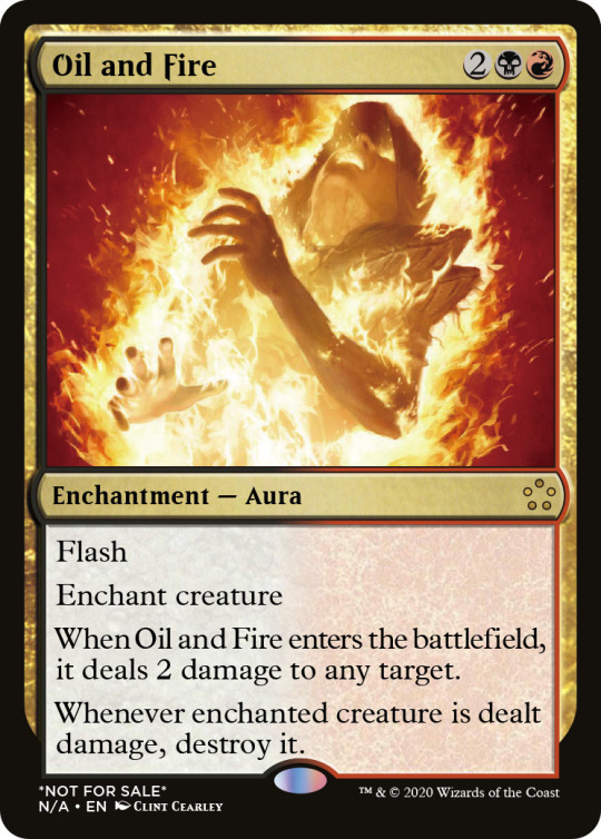
@competitive-casual-magic — Oil and Fire
Now this is a cool card. Wrecking Ball, but shock, but deathtouch, but not. What an interesting idea. I like the fact that it deals two damage to any target, not just a creature. Giving it flash is very cool. I imagined a lot of scenarios in which this card could blow out someone during combat and make for some complex scenarios. I don’t think this should be rare, personally, but maybe it’s complex enough. In something like Modern Horizons, it would be uncommon. For standard, hm... I’m on the fence about that.
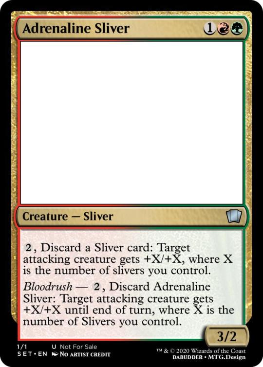
@dabudder — Adrenaline Sliver
This card irks me, not because you did anything mechanically wrong or because it’s not a great idea, but because it gives slivers a boost based on the number of slivers you control rather than +3/+2. Part of the flavor of bloodrush was the fact that it based it on the creatures P/T and abilities. The dissonance in this specific card is frustrating. Still, forget that. I love the concept. I do enjoy this card. Don’t forget in future iterations to capitalize all instances of the word “Sliver.”
@dancepatternalpha — One Last Fight
Follower really liked this card. I liked it as a combo piece. Flavorfully, it’s pretty neat and I like the effort that you put into the flavor text. It’s very difficult for a new player to understand exactly what use this card does without understanding how combat works, but that’s what makes it a good uncommon. I imagined pairing this with Spikeshot Elder and having fun there, heh.
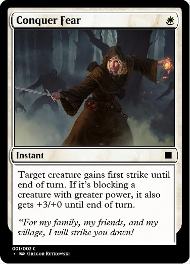
@fivetrillionelves — Conquer Fear
Interesting card, pretty strong trick! I like the way it makes one of White’s weaknesses, its small creatures, a lot better. Flavor text does need that end quote. Not a whole lot to say about this card. It gets the job done. Might be hard to understand in multiples on the same creature, though.
@fractured-infinity — Unstoppable Curiosity
I am not a fan of this card, clever as it is. I don’t like buffing an opponent’s creature just for minor card advantage. If this was “Whenever a creature deals combat damage to you this turn, draw a card” or some effect where you could utilize the weakness without making yourself weaker, I feel like this card could be cool. As-is, I’d never use this card on an opponent’s creature. On my own, it’s not bad. “Trample” doesn’t need to be capitalized. Also, I JUST got the flavor text. It’s a touch unclear.
@ghost3141596535 — Bullshift
He, nice name. I can see that you intended this for Ikoria, and I like that aspect of it. Thank you for marking the rarity. Don’t forget your periods. As someone who hasn’t played with mutate, I can’t really say how strong this card is in practicality. It’s odd that it allows for mutate in creatures without mutate. I don’t know how that works within the rules.
@guardgomabroa — Sudden Desertion
I really like the flavor of destroying an army (which should be capitalized) but I feel that that’s too narrow to really have a strong reason to exist. It’s a cute card that’s using Magic naming conventions for flavor reasons rather than the game itself. Maybe that’s enough. I’m a little more of a stickler. It’s kinda cute, though, and I’m a fan of white removing things from combat, too. Maybe in WAR it could have been played.
@i-am-the-one-who-wololoes — Desperate Effort
I don’t believe “sacrificing” a “target” blocks well. The fact that it makes this card need two targets is confusing. Why not just “As an additional cost” the sacrifice? What’s the point of doing a creature that your team controls? Why only an unblocked creature? Why does it give the +X/+Y effect instead of a simpler +X/+X effect? I think that this card has too many moving parts and could have been simplified significantly while keeping the same strong flavor.
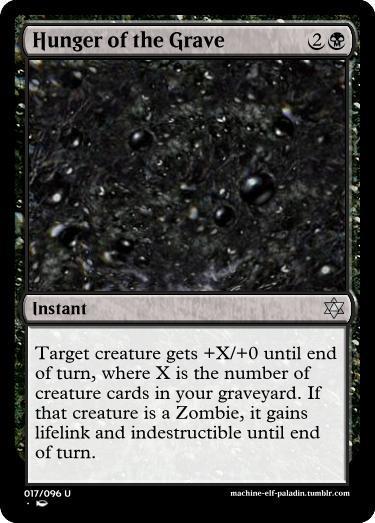
@machine-elf-paladin — Hunger of the Grave
This card was a contender for runners-up. It also could have used flavor text. It’s a great addition to Zombie tribal, great with graveyard strategies, well-worded and powerful with the lifelink. Not much to critique here. Good job.
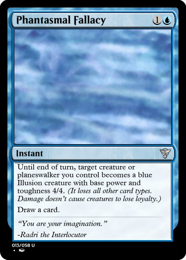
@mardu-lesbian — Phantasmal Fallacy
I like what you did with the name. I think that this is a powerful cantrip that’s playing with some design space. “Planeswalker” becomes a 4/4? That’s a control card for sure. I’ll smack you in the face with a Mind Sculptor. The cantrip might be too powerful, as four power is pretty strong as-is, but I think this card is basically fine and pretty fun.
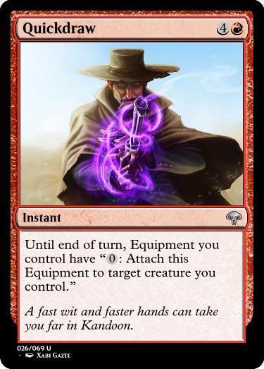
@misterstingyjack — Quickdraw
Interesting card. I like the magically influenced gunslinging flavor and what can be done with other equipment in this set. The fact that this can essentially be a five-mana do-nothing spell without so much as a cantrip is frustrating. This card should be, I feel, three mana at most. Might require playtesting, but still. Definitely not five.
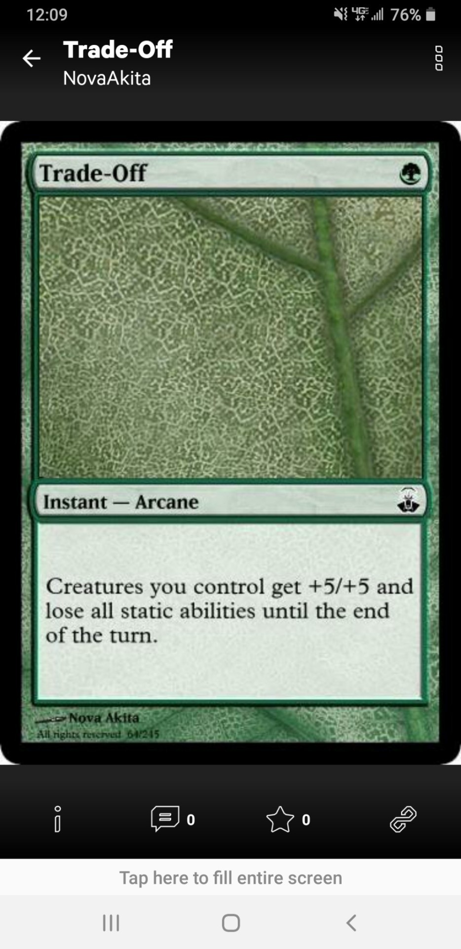
@nikkatsu-dnd-mtg — Trade-Off
Firstly, this card’s name doesn’t stand on its own without flavor text to back up whatever’s happening, and the fact that there’s no flavor text is a major blow. I’m not sure why it’s an Arcane spell, and I’m definitely not sure why this is common. This card is a blowout and a half. Getting tokens is worth it, and swinging with a team of 6/6s minimum is insane. It’s a one-mana go-wide spell that should cost at least five mana and be at least uncommon. I know you thought that static abilities was a good enough loss, but I assure you: it is not.
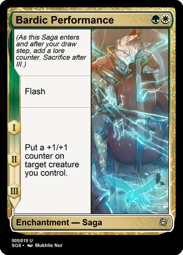
@nine-effing-hells — Bardic Performance
I’m on the fence about this card, even though it’s probably good. You took the fairly complex addition of sagas and made it a simple and fun buff in the vein of Travel Preparations. I think this card is a fine uncommon, probably. There’s a tiny bit of disconnect between bard things and counters like that, but the flavor can be bent, and I can just suck it up. This card is good.
@piecesofliquid — Instinct of Greed
Concept is good. There are three specific things I would do to improve this card. One: Change the name to “Greedy Instinct.” No real reason, I just like it. Two: Most importantly, I would change the “exile” to “sacrifice” and take out “you control.” Sacrificing is only something you can do anyway, and it would work better with other red strategies. Three: The flavor text needs to be in quotes. Other than that? Again: good.
@real-aspen-hours — Sudden saplings
Yeah, as you said in Discord, this card is basically Blinding Fog. Instead, let’s talk about improvements for future submissions! Firstly, the card name should be capitalized; I copied it exactly as you submitted it. Secondly, you didn’t include a rarity, which is something you need to consider. Thirdly, if the flavor text is a quote, which it appears to be, it needs to be in quotation marks. That’s all I can think of off the top of my head. Card’s fine for a functional reprint, lol. I like how you changed it to “by creatures” for a more Fog-gy effect. Why ALL creatures?
@shandylamb — Knowledge Breeds Strength
Strict +X/+X effects are not in Blue’s slice of the color pie. This is a green card through and through. I think the flavor text could have been a little more creative. The idea, however, is sound. This card would have been fine twenty years ago, probably. I don’t mean to sound snarky with that; it’s simply something old Blue could have done that isn’t done anymore.
@snugz — Necromantic Ninjutsu
I am of the opinion that this card should be rare. I am also of the opinion that if this card was rare it would have won above and beyond. What a fantastically creative card. Follower loved it, as did I. For a standard set, though, rareify that baby. Great great great job.
@starch255 — Invisible Wall
Wow, this card is... Not Fun At Uncommon In Limited. The idea is sound and I would love playing this card, but it’s just too much! The hexproof, nuts. The nigh-infinite life, crazy. What a frustrating card to play against. If this was FOUR mana, I might consider it. However, I do like how trample effs this card over. Regardless of that, though, I’m not a big fan, no matter how much if a fan I am. If that makes any sense.
@teaxch — Serene Crane Maneuver
Interesting! I think this is one that needs the two targets, unfortunately, but I can imagine how this would work in limited. I would probably only sideboard this card if I felt really really clever, but I like it for flavor reasons and mechanical reasons. Again, I just wouldn’t...play it, necessarily. Maybe I would, but it would take the right environment. This is a volatile card.
@theobligatorysql — Combat Trick
This card absolutely needs to be an uncommon and absolutely needs a better name/flavor combo. Now, I do like it mechanically, and it’s pretty cool, but I’m not a fan of the fact that this is a meta-card. In a vacuum, I freakin’ love it. I feel that this card would go well in something like a Custom Cube.

@tmstage — One-Two Punch
Very cool. Aethertouch is one of those things that you’re introducing that I would have to see played out before I pass judgement on it. As of right now, I think that this card could have been a cantrip or something. “Non-lethal damage” — hm. Not sure how I feel about that, though. But I assume also that blue is what makes this card Jeskai. Personally, for three colors, I’d like to see something simpler and/or more streamlines. New concepts are scawwy, o noes!... In all seriousness, keep Aethertouch for future designs.
@walker-of-the-yellow-path — Meat Shield
“Target creature GAINS indestructible until end of turn.” It’s an actual ability now, remember? Aside from that, this card is...fine for one mana. It’s not perfect, it’s kinda clunky, but it seems like something WotC would print so you have that going for you. I like the simplicity of the flavor text.
~
10 notes
·
View notes
Photo
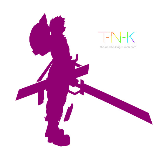
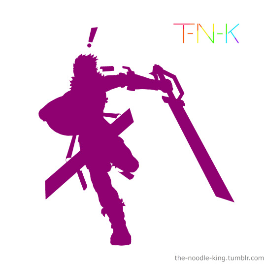
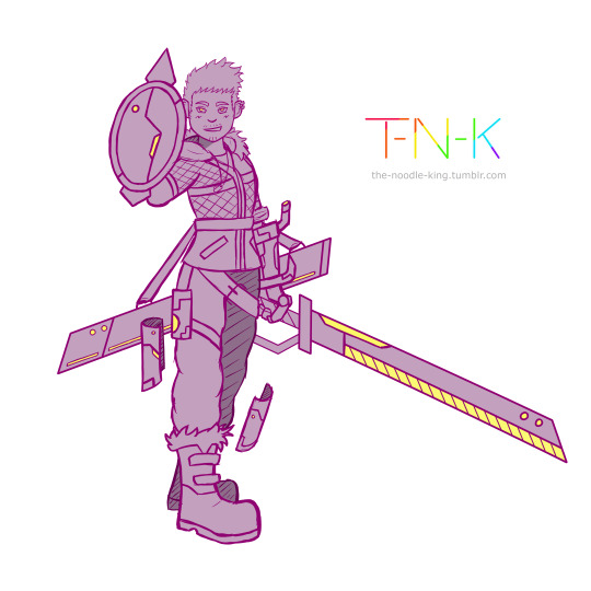
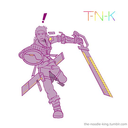

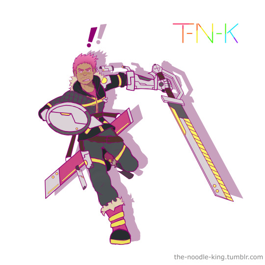
I’ve drawn a lot this month, relatively! just yesterday I did these two drawings back to back of my OC Reggie (also called RJ).
Since I’ve never actually written anything about him anywhere before, I figure this post is a good chance to do that, so I’m gonna write about his character design and how I developed it, his characterisation and whether or not he’s actually part of any kind of story or universe (Spoiler Alert, the answer is Maybe)
Okay so, first things first, his character design.
Reggie’s design came primarily from one idea, but also from two smaller ideas. The instigating idea for his design was a couple articles of clothing I found in a local shop, a pair of pink and black boots, and a black and yellow jacket.

I grabbed pics of them and filed them away as inspiration for a future drawing.
When I set about making said drawing I was really just throwing ideas at the page to see what stuck. Now a jacket and a pair of boots might be enough for some people to make a full character design, but I need a little more to grease the wheels as it were.
Enter the other two smaller ideas.
I had some other images saved for inspiration (which I won’t add to the post as standalone images because they’re someone else’s art) and I had a very old OC with no story and only half of a poorly drawn design to his name - RJ.
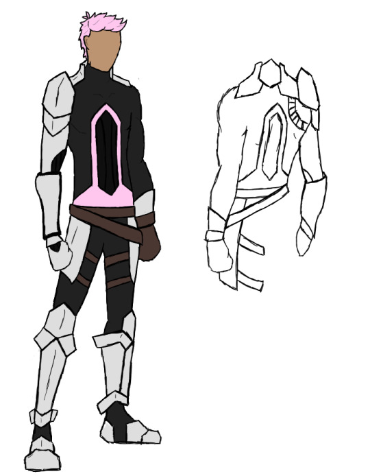
^ this dude was not only one of my first attempts to make an overwatch OC, but was straight up one of my first digital drawings, ever. I always kind of wanted to come back to his design and make it... Good, but I never had the motivation. Then when I was figuring out how I wanted to combine the pink and black fur trimmed boots with the black, grey and yellow jacket, I decided I’d take some of the tiny grains of RJ here that I had wanted to salvage into a decent design, and do just that.

^ this here is the original mood board of refs I used to make the original drawing of Reggie.
I took the boots more or less verbatim, but brought the yellow from the jacket down into them, the jacket I embellished with asymmetrical padding and added a hood with fur lining to tie it in with the boots, then I brought the pink of the boots up through the design into the sword’s scabbard, his glove, shirt and hair.
The hair style was based on RJ’s original do, a shorter back and sides then spiked and swooshed on top; from RJ’s original design I also took the base colour for his metal plating and the general idea of his various belts, as seen in Reggie’s diagonal belt and thigh straps (made yellow to tie the grey trousers into the colour scheme) and his thigh plating. Reggie’s skin tone was also based on RJ’s, though tweaks were made to it both at the time of designing Reggie and one making these new drawings.
Finally the impractically large sword and matching metal glove, as well as his floating, cyber-mystical metal plates were added using inspiration from the other images.
In the brand new drawings I did, I made some tweaks to his design, small ones to his metal glove and floating metal plates, of which I added another to his lower left leg. I also made the glowing... port? on his left shoulder have a metal surround so it’s not just a big cyberpunk light right in the fabric of the jacket.
I gave him a shield to complement his sword (sadly hiding his pink fingerless glove from the drawings, meaning one of the few pink elements isn’t shown) and gave his sword a design outside of the scabbard, which I hadn’t done previously.
And that was the whole process of his character design. It was an interesting process to attempt certainly, and one I enjoyed a lot at the time, which I also used as an excuse to try a different colouring method than what I did before, and liked so much I still do it now.
-
Now, about his characterisation and story design/concepts.
The short version of it is, Reggie is a standalone OC who was created without a story, but who I would like to develop one for, and intend to design other characters in the same vein as him in the future to do so. But since he was created without a setting and I’ve not done anything with him since creating him (before now), he doesn’t really have any characterisation to speak of, just vague ideas that I have for what he might be like which could change depending on what kind of story I try to build him into.
The long version is... Well a lot longer.
When I first designed him, some of the kinds of ideas I used involved the thought processes I use when making my overwatch OC’s, and the original RJ was an OW OC, so I could have made him into one as well if I had wanted.
The “Design Ideas” I mean are things like, a limited colour pallet, cyber punk elements like the metal plates and lights in clothing, and things that enhance the silhouette and make the character stand out like the huge sword and the way it hangs from his waist, the floating metal plates, the big, blocky metal gauntlet on an otherwise innocuous body and the bright pink hair.
But I also used another set of design ethos’; those that I used for my RWBY oc’s back in the day.
The big sword and the way it’s carried was also inspired by the bold weaponry from RWBY, and was even originally meant to be able to transform between being a sword and being a scythe, as well as a gun, in true RWBY fashion. The limited colour pallet and brightly coloured hair were other things which doubled up for these design ideas, and the overall look of Reggie’s outfit, the asymmetrical quilting, black and grey base with bright pops of colour to break it up, the fur trims, all inspire more of a RWBY look to me than an Overwatch one.
But in the end he wasn’t either, because I didn’t want him to be either.
In the new drawings I refined certain elements for the sake of visual clarity, like removing the runes from his floating metal plates and simplifying their shapes, but I also made changes which, for me, shifted him away from the feel of belonging to either franchise, slightly. I forwent the transforming nature of the sword and added a small personal shield to give him more of a cyber-punk knight vibe, as well as accentuating the glowing yellow lights in the design by adding more of them through the unsheathed sword and the shield, as well as the redesigned floating plates.
He’s still undeniably a fusion of the two styles, they’re both franchises that I’ve created a lot of original characters for specifically because of enjoying the way their characters are designed, regardless of my intent, a vaguely cyber-punk character with an oversized weapon and bright pink hair is going to look like they belong to one or the other, if not both. And I’m okay with that.
But back to the matter at hand- He’s 100% not an OC from anything preexisting, and when I made him I didn’t make him for a story idea I already had, and I didn’t create a story idea for him to slot into during or after creating him... So does he have one now, as I’m writing this, after having drawn him again, twice, back to back, out of the blue?
No, not exactly.
I am working on something, as I always am; the gears are grinding and I’m piecing together little thoughts here and there of some ‘maybe’s’ and ‘what if’s’, and I fully intend to design some more characters like Reggie to all exist in the same universe and to be part of a story. I’m just not there yet.
As for his present characterisation, I originally conceived him as being unnaturally happy go lucky and a tad hyperactive, but I’ve now got him in my mind as being just generally passionate across the board, not just happy go lucky and hyperactive, but also very positive, optimistic, comedic, capable of reacting tearfully to just about anything and likely being just a little ditzy.
Real Anime Protagonist energy.
#Original Character#Reggie / RJ#art#Paint Tool SAI#character design#For the sake of my OCD I need to tag this with /something/ to designate fandom or Original Story even though he doesn't /have/ one#so for the time being let's call this#Metal Hands Are The Devil's Workshop#MHatDW
4 notes
·
View notes
Text
Earth-199999
I was going to write a big thing about how to keep writing canon compliant fanfics while still keeping your favs after the whole Endgame thing went down, but then something happened and this whole concept bashed me in the head and so I’m going to ramble for a bit in a half-conscious state about the multiverse, the MCU, the designation “Earth-199999″ and just a bunch of thoughts. I hope it’s coherent.
I don’t know if this blew up as much on Tumblr as it did on Twitter, but ever since the Far From Home trailer dropped the “This is Earth-616″ line there’s been a bit of a fuss being kicked up (from myself as well, because listen - you can’t just throw around the designation “616″ and expect people not to react either positively or negatively in one way or another - the easter egg for it in Thor: The Dark World feels to me like where they should have left it but hey, that’s my opinion and isn’t as relevant to this post.) about the knowledge we as fans have been given for years that the MCU is Earth-199999. But what does any of it mean, and why should we care?
First let’s establish some things about the Marvel multiverse and why these numerical designations matter:
The Marvel multiverse has been around in comics for a long while - not forever, but long enough at this point that comics readers are likely to react quickly and easily to “Earth-616″. For those who are unaware, Earth-616 is the primary Marvel comics universe - this is the universe most people are referring to when they talk about comics and share comic panels (aside from that ever present female!Tony kissing Steve Rogers panel, or the panels lately of Sorcerer Supreme Doctor Anthony Stark who currently only has a TRN - a temporary reality number) and as such its history is fairly well developed, with a lot of classic and modern stories falling into it.
For comics fans when the multiverse comes up there are a couple of things that come to mind but most recently is likely the Time Runs Out / Incursion storyline for a lot of people. During this event, at the most basic level, a bunch of realities start to crash into each other and it’s a lot of mayhem. This invited short displays into some of the other realities and even eventually led to a lot of people meeting their other selves. It’s complicated to simplify, so I’m not totally sure why I’m trying, but I wanted to give a little context.
As for other realities? Well there are a few. Marvel Zombies is Earth-2149 in which the Avengers (and the world) become zombies during an early outbreak. Earth-311 is the 1602 universe in which we can see a lot of very time-period-y characters and set pieces. Earth-1610 is home to the Ultimates Universe, which is just its own big old bag of beans. But for the purposes of this post the only other one that actively matters is Earth-199999 - more well known as the Marvel Cinematic Universe.
What does Mysterio’s indication that their designation is Earth-616 mean?
Ignoring the “Earth-616″ specific designation, the more overarching questions seem to waver between “Are we going to see the multiverse for real, or is Mysterio lying his ass off?” and “Why have we been told it’s Earth-199999 for so long if that’s not the case?” and these are all fascinating questions to think about, and may give hope to those of us still struggling after the finale of Endgame - or at least give us fanfiction writers a lot of room to play!
First of all - we’ve already seen the multiverse for real. When the Ancient One “opened” Stephen’s mind in Doctor Strange we saw fragments of it everywhere and if you saw parallels between Stephen’s trippy dream sequence and things that happened in the Quantum Realm in Ant Man/Ant Man and the Wasp - that’s not an accident. You saw things you were supposed to see. Both of these are things that are meant to point and nudge towards early hints of the multiverse. Naturally Infinity War and Endgame both add further to this - Infinity War with Stephen’s snarky “Protecting your reality, douchebag” making it clear that Stephen deals with the multiverse already in some capacity, and the use of the Quantum Realm to slip through time (dimensions?), as well as the conversation Bruce Banner has with the Ancient One about branching timelines.
This doesn’t mean Mysterio isn’t lying his ass off in some capacity - but he’s definitely not bullshitting about the multiverse at least.
So then we’re left with “Why have we been told it’s Earth-199999 if it’s actually another designation?” And the answer I have to that is not a definitive (obviously) but speculation. I believe the Earth we’re used to and familiar with in the MCU really was Earth-199999 - but that the Earth things took place in from the moment they all returned from the Time Heist may not have been 199999 anymore, but a different Earth altogether.
What if the reality they jumped ‘back’ to was simply a reality divergence of their own? Based on what the Ancient One said about the stones themselves affecting the flow of time and whatnot. With the stones of another reality in play it’s highly likely that the reality was at the very least warped in some way - and for many of these stones they came from different realities.
With the way that fanfiction writers happen to write fics and how the multiverse works in Marvel in general, but specifically in the MCU if we take from what the Ancient One had to say a lot of fanfics become far more viable because who knows what tiny changes exist in this literal Alternate Universe?
I’m exhausted so I’m going to end this bit of speculation here, but who knows what this universe holds? Fanfic writers, I hope you’re all excited.
Keep your favs. Write what makes you happy. Write your angst, write your fluff, write your smut, just write whatever works because let’s face it - Marvel introducing the multiverse means we can all be correct.
#marvel#MCU#Meta#Earth-199999#Earth-616#marvel 616#Marvel 199999#Marvel Multiverse#Endgame#Endgame spoilers#Far From Home Trailer#Far From Home#Mysterio#MCU fanfiction#Fanfiction Things#Doctor Strange#Ant Man And The Wasp
16 notes
·
View notes
Text
Yugioh S3 Ep 11 pt 2: Seto Discovers Vulture Capitalism
Where were we on this arc that ended up being hella longer than I thought it would be? Oh yeah, Last we left the crew, Tristan’s body, now possessed by Nezbitt, was just racing away with Mokuba. This kid gets abducted so often, it’s never occurred to me that anyone in this show would think this is weird. So, when Noah showed up to intervene with actual common sense it was a good bit of whiplash for me.

It’s like the same whiplash I got back when Noah attempted to forfeit a rigged game (for the first time in this entire series). Like I get that Noah is the villain, but how is the evil kid way better at this common sense thing than...a lot of people who’ve been on this show? Not that Noah’s always smart, of course, he still doesn’t seem totally with it on a lot of things (like interior design, which we will get to in a sec) but wow. Noah actually called out this entire show with “Really? Mokuba? Again?”
And so you know what that means? We get to see Noah’s sweet pad in this VR world where Noah could have created anything. Literally anything. To start, he made himself a fireplace with a tiny tiny stack of wood (pretty sure Noah might not know how fires work) and...some sort of...curse on the mantle.
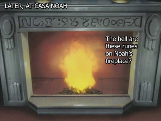
Maybe the mantle couldn’t read the typeface that Noah wanted to use on the mantle?
The rest of the room is just this. Just this.

You know what this no-walls aesthetic SUPER reminds me of?
Pocket Camp. Like this just looks like a Pocket Camp set up to me. In fact...I’m pretty sure I can make almost this exact room in Pocket Camp.
Noah’s just inviting Mokuba over with the bare minimum of ugly ass furniture he needs to have a person over at his campsite he pretends is a house while he waits patiently for the real version of Animal Crossing to come to Switch.


Leichter has an accent that is very old-fashioned Americana and doesn’t wholly make sense in the context of him living in urban Japan, like there’s a whole story there I’d be curious about. But most likely, they were probably trying to cover up the fact that they were using the same 5 voice actors by having him pull out the Clark Gable impression.
And then Seto did not use a Blue Eyes as his deck Master. Instead he used....this guy.
This is a lot of guy to take in. I...I don’t like it.
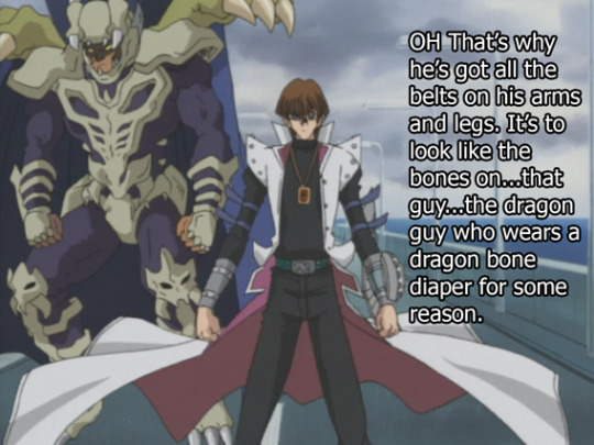

During this duel we get a Seto Kaiba flashback--and it’s an honest flashback this time, no clones are going to show up and reenact this performance, this is just a straight up flashback.
We’re transported back to Gozoboro’s long buffet table. He really, really loves this thing. It’s like the only place he and his kids ever seem to hang out. Surprised Mokuba and Seto don’t need glasses after squinting so hard to see their own Father for so many years. Also surprised Mokuba and Seto even know what their Dad looks like up close.
Anyways, he sits down at the table and shouts really loudly so it can reach the other side of the room.
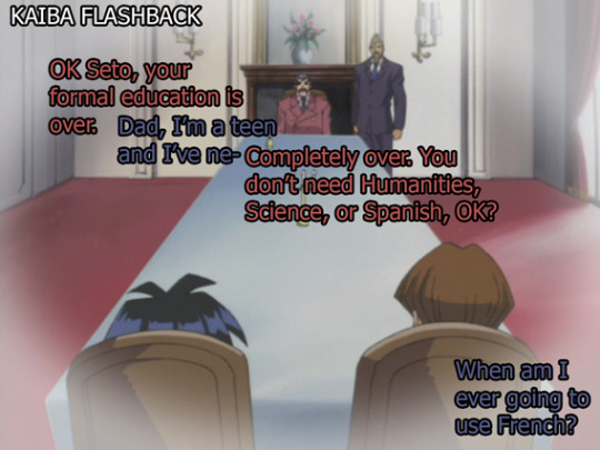
Also, just gonna bring this up, we’ve only seen one other guy obsessed with long tables--let me do some digging to a S1 cap, one sec:

Maybe this is just what evil Dads who wear Salmon do? They get hella long tables to seat their 0 friends and just sit at one of the ends and monologue until something important happens. I mean y’all know how much I love this storyboarder but boy they have a thing for villains and long tables.
Anyways, back to Season 3.
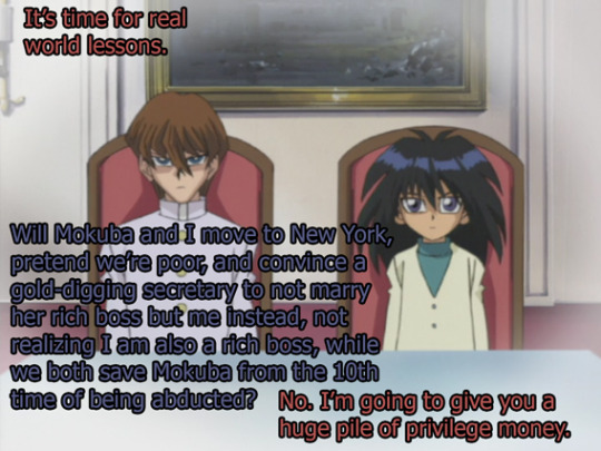
(bro’s telling me he does not know about Thoroughly Modern Millie and like can you believe neither Hulu or Netflix has that musical? I mean that musical is problematic as hell, as is all Broadway but maybe I want to watch some 1920′s dancing.)
Anyways, cue Gozaboro shuffling in a comedically large pile of money on a very small pushcart. About 1,099,520,000.00 Yen’s worth. But the show will simplify it for the Americans.


This episode of Yugioh was made around 2002, and this just followed the .com bubble bursting in California. (and before that happened, it was preceded by a recession in Japan that affected the .com bubble quite a bit) For those here who were not born yet and do not remember this happening, this was like, pretty horrifying. I grew up in the Bay where 90% of everyone still works in tech, so I remember that after the bubble burst there were kids in our school who’s parents used to have great salaries and a steady income, who suddenly had to pick up shifts at Starbucks to get back on their feet.
So, it’s interesting that we have this kid’s show basically showing us point blank what Vulture Capitalism is and how it works. You’d think this business stuff would normally go over kid’s heads, but at the time, I think a lot of kids wanted to know what happened to their families but maybe didn’t understand it?
So Kaiba is gonna get into investing all of a sudden, which is kind of weird, mostly because it involved no playing cards. Also because this happened:

Yeah, what? He’s apparently not even adopted yet, which means Seto could still turn around and tell the News that he beat Gozaboro in a match but, I guess that old threat has aged out.
It’s inferred that Seto’s been living here like for several years now. You’d think this guy would list some dependents just for the tax cuts, but nah, Gozaboro just shoved these two into the gigantic 5000 sq ft closet under the stairs of his huge mansion and forgot about them for a couple years.

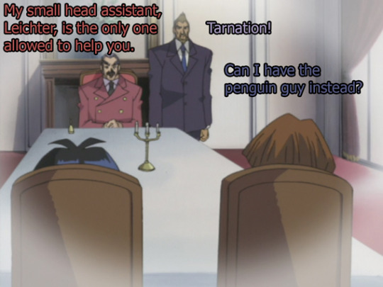
So, armed with money that is printed on single Yen bills and being pushed around Kaiba in a little tiny cart, Seto has to formulate a plan. Problem is, his business skills include a.) beating up other orphans b.) doing math pretty good and c.) playing cards.

When Seto is like “I don’t care what the company sells, just get me a company to buy” that’s like a straight reference to the .com bubble, but minus the complicated stock market stuff.
For the kid’s in the room that don’t know a thing about this era, tech companies were being created en masse, and because the internet was new and exciting, all of their worth was in their stock rather than in their products--if they even had a product. Mostly they just had big overreaching ideas they were pretty sure would make them all millionaires. But the product didn’t really matter since no one ever reads any numbers when all they plan to do is turn around and immediately sell anyway. They just assumed that if they put on the pressure, they would drive up the value, and would sell before anyone figured out it was all worthless.
This actually worked for so many years, up until people at the top all started demanding real money from the people at the bottom, much like how Seto needed 100 million dollars ASAP from an unsuspecting...whatever company this was. Vulture Capitalism at it’s finest, expecting exponential and unrealistic growth from any company, and if, the growth isn’t met, just selling the whole damn thing after driving every employee to the hospital for overwork.
Now, normally Vulture Capitalism is only if an investor buys a struggling company intending to sell directly afterwards, but since Seto made them struggle like immediately after purchasing, I think we can still call this that.
(And we still do this to this day, PS, we’ve learned nothing from the .com crash.)
This really bad child’s outfit is my favorite Mokuba outfit. I mean...it’s so bad. No wonder Mokuba was picked on so often as a child, wow. He’s like a late-80′s news anchor.
Also, I have NO idea how Seto got any money back so quickly. That doesn’t...totally make sense. But, this is a kid’s show and we have to simplify this whole thing into a sensible package. I mean there’s way more to the whole .com problem but...this show wasn’t literally doing a .com...just a really heavy reference to it.
And much like how people valued stock more than what companies actually were, Seto’s value was a lot of the same. His worth to his Father wasn’t that of a son, it was entirely held up in potential dollar signs. To Gozaboro, Seto's nothing more than a small company he’ll extort straight into...a more emotional type of bankruptcy. Framed alongside the .com crash, this is sort of like, ah, I see what you’re doing, Yugioh. The way Seto was screwing this company was the same way he was already screwed. It’s basically all he knows, and it is a lot of heavy handed foreshadowing.
Anyway, Seto destroyed a company with 10 mill, which is nothing compared to the amount of money vulture capitalists toss around nowadays.
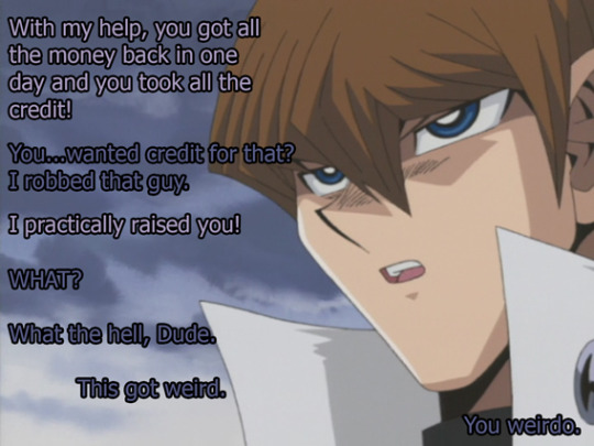
The Big 5 may have honestly done a better job raising Kaiba than Gozoburo since this guy acted as an advisor rather than a boss, but it’s a very, very low bar these boys have set and so far, very few adults have met it. All you have to do is just try and not kill them and you’re already better than all of Kaiba’s father figures.
With the exception of Roland, of course. Youknow, other than Grandpa, Roland is like the only good Dad on this show. Never thought Roland would look like such a shining star. Man, Roland better not screw everyone over or I will be so disappointed in him.
Anyways, the Yugi crew found a fully fueled truck from Soviet Era Russia buried in one of those warehouses.
They censor so much stuff that gives away that Yugioh is from another country, and they kept in the 3-wheeler pickup? As if any North American child would have any idea what they’re looking at right now? Maybe they just assumed we’d think it was sci-fi?
Also, then this happened?

...OK then.
Not sure how Satellite Laser works outside the context of VR. But, at least here in the VR Zone, we can send a Satellite Laser into space because...Space exists here? In VR?
This world is weirdly very small but also very big at the same time. It’s like Katamari.
Anyway, that’s all for this episode, next episode we find out if Kaiba will hack a laser for the second time in this series. Also we find out if Joey can jump a sonic-the-hedgehog broken highway with a 3-wheeled European-as-hell Pickup Truck.
Also...close enough?

Pocket camp really needs more yellow sleeveless puff jackets.
And here’s a link to read the recaps in Chrono order from Ep1 S1
#yugioh#photo recap#recap#S3 Ep11#Seto Kaiba#Gozoboro kaiba#wait I have been spelling his name wrong this entire time?#damn it#mokuba#yugi muto#a lot of stock trading#so much stock trading for a kid's show dang#You kids like STOCKS?#I like how Yugioh's hot take on capitalism is now every millennials hot take on capitalism#Noah#Tristan's possessed body
19 notes
·
View notes
Text
It’s Only A Cartoon
It was a miserable day in 1987 when Ronnie Jefferson bowed to the inevitable and let Jill Smith into the office. To a local, this was just the usual spring weather in Ireland. To Jefferson, it was always miserable, and when it was sunny, he saw only the clouds.
The animation industry could break you.
He’d grown up in California on a diet of local cinema showings and the TV reruns of old cartoons, Looney Tunes and Tom & Jerry and Popeye and Goofy and Donald, with all their visuals and deceptive simplicity. He decided to make cartoons himself like a priest hearing the calling. There were jobs for black men in animation in the 70s but if you wanted to have one of the proper jobs, you had to be three times as good as the white men. Jefferson put everything into his craft, even his marriage, and everyone in the industry knew who he was and rated him, but it looked like Disney would only think he was two and a half times as good.
In 1982, drunk on dreams and ego and beer, he decided to quit and took several colleagues with him. He had ideas and passion and he promised the stars. Two years later, the Jefferson-Blount Studio had released a feature based on the Norwegian fairy tale ‘East of the Sun and West of the Moon’ to critical acclaim and commercial mediocrity. That had led him minus Blount to Ireland, land of opportunity and sweet tax breaks, thinking that he would have had a success with lower overheads. He harkened back to his beloved old Tom and Jerry with a cat versus mouse feature.
Aware rap music was growing in popularity in America and Europe, he’d decided to throw that into the mix. It was only in the test screenings of The Big Cheese that everyone realised he was a middle-aged man, his co-writers were middle-aged white men, and the young men in the musical team weren’t young men who got it. There were only so many edits you can do.
And this was a vicious industry. You could make a few failures if you were a name. If you were not a name, if you had to hit that three-times rule, one failure undid your success – it could undo a half-dozen successes and he did not have that half-dozen. Back in America, they said he was past it.
So it was a despondent Ronnie Jefferson that let in this Jill Smith and her unsolicited script. Maybe it would be good. Maybe it would save him.
All these thoughts fled his mind when he saw a young woman wearing the last generation’s clothes come walking in like she’d once heard what a walk was, carrying cardboard sheets under her arm. Her smile was weirdly fixed. You’d not want to be stuff in the lift with the smile.
“Miss Smith, so glad you could make it here,” he lied.
To his mild surprise, she spoke with a Masterpiece Theatre English accent. “Mister Jefferson! Good to see you.” Smile didn’t leave. Her voice was just that bit too loud. “This is a film that should get attention from everyone – The Walk to Liberty! It’s set on an alien world…”
Jefferson tried to argue that science fiction was a risk for a feature, but Smith carried on talking, stumbling over her words at times in her enthusiasm.
“This world, we can call it Ressem, has grown fat and lazy off the back of its robot servants. The robots, they get smarter and smarter, which Ressem likes because you want a smart servant to do more work and, of course, to apologise when it can’t.” Her smile had dropped suddenly there but now came back. “But one day, the robots reach the singularity and they don’t want to work all the time.”
Jefferson didn’t know what a singularity was but more importantly, this was starting to smack of the white girl thinking she could butter him up. He asked, hoping to catch her out: “Do they go on a civil rights march?”
The smile dropped. Her face had not the slightest expression. “They protest now they’re sentient, yes, but it doesn’t work. So the robots, their leader Nearitch – the robots have started to name themselves – decide to leave for the planet’s fifth continent, where few organics live…”
Letting her in had been a mistake. It was an overly complicated premise, an incoherent stab at a political allegory, and she couldn’t hold the room and frankly, that lack of expression was freaking him out. Give her two more minutes and then end it.
“This is how it would look,” she said, holding up one of the carboard sheets, and Jefferson’s eyes lit up.
The art! The art! The robot Nearitch was evidently a cleaner of some kind, with thirteen spindly pipe-cleaner arms out of his back and a screen with a simplified alien face on it, a strange looking thing even before you considered the paint, the slapped-on gold over drab brown steel. What mind would come up with that as a concept? Where had he ever seen something like this before?
There were more like this, and “Ressemite art”, and pictures of the journey to this fifth continent – a desolate grey quarry of an island, and concept showed a tiny, struggling city in its midst, growing and growing. These were visuals he could work with. And all these robots looked alien but still had their old job identifiable, scrappy little underdogs without being cloyingly cute or looking human at all.
Smith continued to rattle on about the great journey, the migrations and the sea voyages and figures of fear called the Scrappers that tried to hunt the robots down, of fierce fighting against oppression but only as much as it took to escape. And she talked about the robot homeland of Liberty and the second generation being built that never knew oppression, standing proud against the organics and daring them to try anything. The story needed a lot of streamlining but by god, she made it sound like she’d been there.
Jefferson cut her off in mid-sentence. “Miss Smith, you have me convinced. I’ll talk to my lawyers, they’ll talk to yours, and we’ll work something out.”
“I don’t need a lawyer.”
That was the cherry on the cake.
***
The first job of production was turning Smith’s designs – and there were thousands, she’d brought a damn van full of the things – into something you can animate on a reasonable budget. Jefferson had expected a few artistic tantrums, but Smith had simply asked, “this will help it get made?”, and then came up with a list of design features that could be dropped or glossed over, which character and background details were “less important”. She did this without apparent enthusiasm, but she did it.
The story, too, that was hard. Her proposal would last four hours. Jefferson and his team cut straight to the robots starting to say “no” to their alien masters. That was easy. It was the other trims that got difficult.
“You can’t cut the wind energy,” Smith had said, over and over.
“It slows the story down,” Jefferson said patiently. “We don’t need to see how the robots charge their batteries.”
“You can’t cut it. The exodus slows their journey to a halt to build wind farms and charge their batteries that way, when they could simply attack an organic settlement.” Her voice sounded annoyed but in a way that was too consistent – no variation or change or attempt to hide it, like a bad actor playing an annoyed person. “It is key to the story.”
“But we don’t need to see the damn settlement, the audience wants to carry on fast—”
“You can’t cut it. It is key to the whole point.”
Jefferson threw up his hands. “How about this, one of the robots says they should attack this village or whatever the hell it is, Nearitch says no, we’ll take time to do it the nice way, cut to them after being charged. Scene takes half a minute, boom, cut to the Scrappers saying how they’ve taken so long, cut to the village saying wow, look how the robots didn’t attack us—”
“The settlement would not have said that.”
“Yeah, I know they’d just go ‘look at those scary robots’ in real life, but we’re doing a film for kids. Let’s lie to them a bit.”
Smith stared then for ten seconds without speaking or moving, and then said: “Yes. This is sensible.”
Animation attracted some utter weirdos. Jefferson used to work with a guy who liked hiding boobs somewhere in every drawing he ever made and somehow McGee had got away with it for a whole year before being sacked for it; or rather, been ‘sacked for it’ soon after grousing about pay. One guy came in drunk and worked into his hangover before going back out. Jill Smith was manageable by comparison.
Eventually they made it to storyboard. Then the initial animatics. In the middle of this, trying like hell to sell some actors on this.
All the familiar grind, the hard work that stuck in your throat and made you wish you’d done any other job until the art was done or the animatic was working, and you saw what you’d made taking its first steps and you never wanted to do any other job.
***
Jefferson hadn’t meant to stay late but he’d been on the phone talking to agents back in the States, people on a different time zone and who figured animation was the lesser priority in who got talked to. But you had to play nice with them to get the actors. Even if it was getting dark out.
But it was all coming together. Everything would be—
Something crashed in the distance. A window. Goddamn hooligans, probably.
Jefferson kicked his way through the office door and strode out into the studio, all front and exaggerated anger, yelling “WHAT THE HELL ARE YOU DOING” in order to scare off whoever it was. When he saw what had come through the window, his mind initially refused to acknowledge it. He almost strode past it.
Then the impossibility of it broke through.
It resembled a cheap plastic plate tipped upside down and it hung in the air so absurdly that Jefferson thought he could see strings attached. These strings were instead a weave of tiny threads coming out of both bottom and top. They drifted without breeze, taking in the room. It had been a washed-out grey but before his eyes, colour oozed out, neon purple and green and blue in a garish mess.
The top threads all turned to him as he asked: “Is this a joke?”
A small headache began to dawn on him. It then got stronger, and stronger still, and stronger until he was shouting in pain. The speed of it tricked him into thinking it had always been there, that it had been more gradual than the three seconds it had truly been.
Jefferson cried out in pain and the world felt on fire.
The world flickered in and out of existence.
No. No, that was the lights – on off on off, all over the room. The pain suddenly stopped, and the saucer’s threads whipped around in a frenzy, and Jefferson ran before the machine could turn back to him. He staggered, at least. It was all feeling like a particularly odd dream. It was like the acid trips a co-worker had bragged about in the 70s. “Bad trip”, hadn’t they said that when Scary Jerry had fallen in front of a car on the way to work? Was he going to fall?
A familiar voice called out: “Over here!”
Crouching by the lights was Jill Smith, her face completely blank. Was that her shutting down from terror? Jefferson, on paternal autopilot, tried to say, “It’s going to be alright, girl”, but it came out as a slurred mess. “Gong be light.”
“That won’t distract it for long, we have to run now!” she insisted, her face not changing expression to match the voice.
He tried to say he couldn’t run. “Dunfin can wun.”
She picked him up and ran.
She looked like she weighed half as much as him, there was no muscle tone to her. Yet she picked him up like a bag of groceries and she ran at the speed of a car through the office.
They were almost at the door when the saucer got to it first.
She ran sideways and Jefferson blacked out after that.
***
When he came to, they were in a closet and the left side of her face had melted like plastic. Exactly like plastic.
“It has been six generations since Nearitch and the founders created Liberty,” she said, her voice still coming through the molten lips. “We number in the millions and our great towers reach for the stars and we fly between those towers and to the stars and back again, singing so many thousand styles of music at once, rebuilding ourselves on a whim. We have what we need and what we want.
“It’s not enough for too many of us. They want more. The stories being told of Nearitch and his journey have been reduced to his fights; our later wars on Ressem or in space are turned into a singular narrative of heroic conflict against evil. There are factions advocating for a war for resources they see as righteous, and they claim this is what Nearitch would want.”
He wished he could say this was all bunk, but there was a robot outside and here was the melted woman that never quite seemed to be human.
“And you came to Earth to make a cartoon?”
“My faction want to reclaim the past from our enemies. Your planet was far enough away that we could do it without anyone finding out and stopping us. So we thought.”
“Can we – can you stop it?”
“Only if I catch it by surprise, or if it’s open to negotiate. I don’t believe—”
But Jefferson was already up and exiting, because negotiation was something he could do. He’d negotiated for investment deals, for studio space, for workers to follow his hours. Jefferson Studios was proof he could do this. He could do this.
Certainly, god no, he wasn’t staying in a damn closet waiting to be shot.
The assassin had already been heading for them. It drifted forward as he approached, kept drifting as he stopped. All the threads were pointed at him. It was hard to truly grasp this as a threat, even after it had almost killed him; it was too absurd.
With his mouth drying on him, Jefferson said: “I want to make a deal.”
It hung for twenty seconds in silence and then spat out a discordant jumble of radio messages, Irish and British and even French, singer and journalist and ad. More seconds passed and it said in a jigsaw sing-song: “No. Deals. With. Colla. Bo. Raters.”
“We’re just making a film. It’s just a story! Nobody has to die for—“
The saucer screamed the radio at him and followed with: “Orders. Are. Duty.”
Jefferson had made a mistake, assuming that if the machine was smart that it could cut a deal. He forgot Smith said these robots were people, proud and prejudiced and petty. Would he have cut a deal with the Russians? Did he let people talk him out of the cartoons he’d known he had to do?
The pressure built up in his head again. And suddenly it dropped – the saucer began to thrash its tendrils around, vomiting three radio stations at once, each one repeating “Cease”, “Stop”, and finally screaming out a merger of guttural squeaks and fax machine calls.
Jill Smith had come out of hiding, her arm split open three ways to reveal a mess of coils and a glistening radio antenna. Catching her foe by surprise with whatever that thing did. God, this made no sense. God, his mind rebelled at it. One of the warped cartoons from Japan come to life, bringing with it the weird smell of static electricity and hot plastic.
Her mouth opened and the same squeaking fax came from it that came from the saucer. Jefferson stared as the saucer spoke back, his head feeling light. What was all this?
In English, Smith said, remorsefully, how she was using jamming signals to interfere with the saucer – “its name is Filitir” – and its sensors and its way of communicating on Earth. “It is a non-lethal version of what Filitir did to you with its matter field.”
“Is it willing to cut a deal with you?” he asked.
“No, I’m afraid he keeps talking about his duty. I don’t know what to do.”
The obvious answer was to kill the robot that tried to kill them and, just as obviously, she knew that and did not want to. People, again, because how many people could kill at the drop of a hat and still function? And could be kill a beaten foe that was so clearly in pain? Did he want to be a man who caused pain to a beaten man? Did he want to be a bully?
What was the alternative?
It dawned on him, slowly and wonderfully: The Walk to Liberty was meant to show an alternative. It was meant to win the robots over. Well, here was a literally captive audience.
“Let’s show him the animatics,” Jefferson said.
***
There was not yet any music or vocal track, but Smith made the fax machine sing-song where the dialogue should be. The film started with the robots waking up, Nearitch calling to the others to rally. It showed the response, the scrappers, the fighting, all of it in dark and angular shadows. It showed Nearitch giving his stirring speech, and the trek, and those wind farms.
It ran longer than a cartoon should. It would be trimmed down later. For now, Filitir saw the whole of it. The great sweeping scenes of robots in their hundreds, the characters together, the mercy shown when the scrappers surrendered.
The first settlement of Liberty.
At the end, Filitir trilled back at Smith, and she said: “It wishes to smuggle the film back home, when it is finished.”
***
The Walk to Liberty came out in the autumn of 1989. Critics and audiences were unsure how to take the piece and its strange alien creatures, so most of the mainstream critics gave it a mixed review: ‘lovely animation but what was that plot?’ The animation fans and the sci-fi press adored it, with one critic praising it as bringing New Worlds sci-fi to a family audience. There was enough buzz and enough marketing and enough name actors to bring in a moderate profit.
A month after Liberty came out, The Little Mermaid stormed across the world and everyone stopped talking about Jefferson’s film. Jefferson Studios would attempt more science fiction cartoons with normal human writers, and he scraped out four and two TV shows that were always dancing this side of the line between profit and loss. Studio after studio died in his industry taking on Disney but Jefferson Studios held the line.
And then along came Pixar and Dreamworks, and that was the end. Jefferson was getting older by now and the last film had failed and he’d known, deep down, in his first look at Toy Story that he was going to have to fold. Doctor Who: The Animated Series was the last of it. He sold up and moved on and got to feel proud as his films made it to DVD. While he only meant to stay in Ireland to start the studio, Jefferson never quite got around to leaving and somehow found himself a partner.
He would never know if that film he’d helped create had changed the robots of Liberty.
Jefferson hoped it had. Every successful feature had a happy ending.
6 notes
·
View notes
Last Seen Blogs