#Advertising Rectangle
Explore tagged Tumblr posts
Text
doodle spam
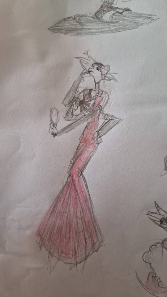
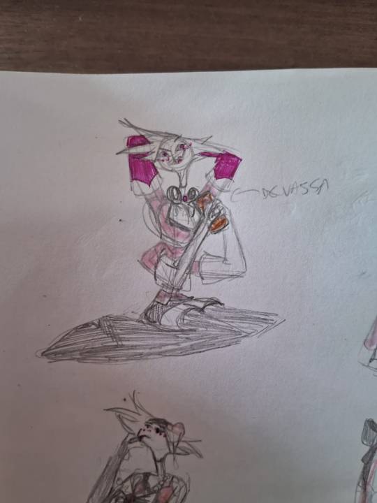

[IDs: A few doodles of Angel Dust. In the first one, he puts on lipstick and wears a fancy pink dress, while looking a bit tired. In the second one, he is on his knees holding a beer can and smilling, and in the last one, he poses near a large circle that reads "Trust US with your entertainment" -VoxTek", and wears a simpy black outfit made of leather straps. /end ID.]
#hazbin hotel#my doodles#i like to think that he advertises for voxtek sometimes#fun fact: the second doodle's pose is literally in the devassa's logo#(it's a popular deer brand if you don't know--well. at least it is popular in my country)#that's also the deer he's holding#the third drawing's pose is ALSO took from a devassa advertisement#also the “entertainment” on the “trust us with your entertainment” is on a different color and also framed by this lil blue rectangle#to sign that it was a blank slot but then they wrote “entertainment” on it#but this ad is supposed to work for the voxtek angel security; voxtek products in general and all the stuff vox sells :)#this was fun to do#hazbin angel#hazbin angel dust#my art#angel dust#hazbin hotel angel dust#fanart#the last two are my favorites#the hair acessory did NOT go that well on angel's head as it would on actual hair. me thinks#but it's still cool af#i like to think that in the first drawing hes tired and wants to go home but he still got some event to go#described
15 notes
·
View notes
Text
2235.
in the midst of all these summer homes in winter crowded together kissing close one empty lot and then another like missing stairs like this should feel like some kind of a relief and it just doesn't and I can't tell you why
#365#poetry#also i didn't take a picture because it felt weird#but there's a house that's presumably being redone#got the sign up advertising who's doing it#and the trim of the porch has these hand-painted flowers#and this is original right this is chipped and faded and it's the old house#that's about to go away forever#and it's so fucking depressing#it's the mcminimalism thing that gets me#not quite mcmansions because those aren't as trendy now so it's these clean white and gray rectangles#still oversized crowding the lot super close to one another but 'minimalist' in that trendy way#and that's what's going to happen that's what we get we lose that painted trim#and we'll lose those vacant lots#and it'll all be mcminimalist#that's my tag rant enjoy your evening
2 notes
·
View notes
Text
to this day i can't get over how stupid it was to remove the headphone jack from phones. now if you want to use wired headphones you have to use the charging port. and then they made a stupid little external adapter you have to plug in that sticks out of your phone and advertise it as Hey now you can listen to music AND charge your phone at the same time! what an innovation! if only we could have done that before! the thing i want most from these increasingly sleek and efficient shapes and designs is to have a bunch of external bullshit sticking out of it to make it as clunky as possible! next they will remove the call function from your phone entirely and in order to make phone calls you will need to attach it by a twirly cable to an external keypad that plugs into the wall, and to enhance the speaker/microphone you'll be able to set your nice neat rectangle into a banana shaped device that sits nicely against your ear and mouth. and that's what we call innovation
#tbis is not an elegantly worded post im sorry i am too grumpy to make this like a well formed joke#it's just stupid. it's just so fucking stupid#removed from what i personally want as an individual consumer it is just bonkers bananas to be like#oh we're trying to streamline our design and make it simpler and cleaner#so we've removed essential pieces and now you need external add-ons#isnt literally the entire point of creating a multifunction device that i need to carry less shit around to make it work#no. of course not. im stupid. the point is to sell as much shit as possible#you know new phones dont even come with a fucking wall adapter anymore#rookposting#old man yells at reasonable grievance
450 notes
·
View notes
Text
Making Mychael's Horns
My mom likes to celebrate Halloween with a family dinner in costumes. This year I decided to have a Mushroom Oasis inspired outfit. I found a peach mushroom sweater very similar to Mychael's in day three, and his gloves, but I knew what I really wanted to try was to wear his horns! I haven't done a craft project in a while, and I haven't done any cosplay before. This is documenting the process and has some accompanying pictures.
Before the essay starts, (I wrote a lot!) here's the finished product! It was lightweight and fun to make!
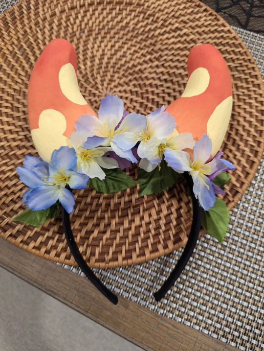
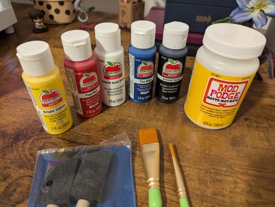
Here are the materials I used. Since I made this across multiple days I took some pictures for fun. I didn't expect to make this into a blog post but here we are! Sharing this out in case you want to try and make this. The products I noted here are not to advertise anything, I just tried to find the cheapest materials I could use. I also noted the prices.
Total Cost was ~$22 USD but that includes extra material for other projects. I bought all this at Walmart. I noted all the materials and detailed instructions below!
Materials
Acrylic Red Paint (Apple Barrel Matte Flag Red) $0.58
Acrylic Yellow Paint (Apple Barrel Matte Bright Yellow) $0.58
Acrylic White Paint (Apple Barrel Matte Snow White) $0.58
Acrylic Blue Paint (Apple Barrel Matte Too Blue) $0.58
Mod Podge Matte-Mat-Mate $4.94 for 8 fl oz
Foam Brush (optional for blending) ($1.48 for 4)
Some paint brushes (a few sizes for basecoating and details - $2.98 for 3 brushes)
Pencil
Thin wood dowel $0.42 around 1/8 diameter maybe?
1 Foam Block (Medium/Small - Used as a base to hold the horns upright while working/drying) - $1.97 for 2
Blue artificial flower pick $0.50 (I got one on sale at Walmart that had some purple, white and blue flowers with green leaves. Feel welcome to grab a couple picks just in case)
2 Craft Foam Rectangular Blocks (FloraCraft Foam - I used DryFM green blocks that aren’t as porous. They’re usually used for keeping water for flowers. I got rectangles that were a bit larger than 5 in H x 3 in L x 2 in W. $1.07 for each block.)
Soft Fabric Headband (I used Goody Fabric Covered Headbands in neutral colors. You can get one similar to your haircolor $4.48 for 3)
Hot Glue Gun (I owned one already)
Dinner Knife
Gloves and Face Mask
Scissors
Here are the steps. I added in a lot of notes for gotchas/oopsies that I ran into.
Instructions
Carving the horns
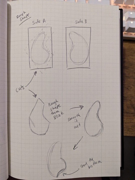
With the large foam rectangular blocks, draw out the shape of the horns on the two widest sides gently with a pencil. This will help guide carving.
With the serrated knife cut gently along the areas around the lines to form the rough shape of the horns.
Don’t cut directly along the line. Cut out from the rectangle a rough polygon shape to start that is a bit bigger then the drawn lines. Then slowly start carving closer like carving a fruit and curving the knife. You can cut larger shavings for the rough shape, but try to cut smaller shavings as you get closer to your drawn lines so that you can get more detailed easily. The less you cut, the easier it is to fix. If you cut more, then you aren’t able to add foam back. Take your time cutting. See drawing on process.
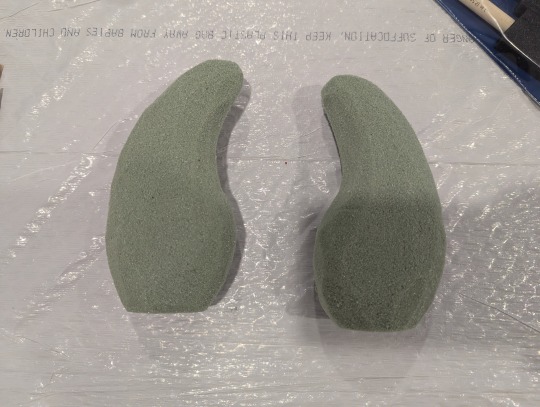
Since the foam is soft, you can optionally cut the rough shape and use your fingers to smooth the edges and curves of the horns
Once you’ve completed one horn, you can work on the other. As you carve, compare the two horns and try to make them similar in width, height and length.
Recommendations/Notes
Line your work area with a bag for easier cleanup.
I recommend wearing a face mask and gloves so you don’t breath in the fine dry foam as you’re working with it. It’ll get messy if you cut fast. It’ll cling to your hands and maybe clothes.
Be careful with the knife, I ended up using a small serrated dinner carving knife
Treat the foam gently, it can be easily squished if you grip it too strongly
If you want to buy an extra block to practice carving a 3d shape, it might be helpful
No worries if the two horns aren’t exactly the same. Imagine that a horn is like a thumbprint, no two are alike :)
After all the carving, the horns were roughly 5 in H x 3 in L x 2 in D. Feel welcome to make them smaller or larger.
Strengthening the horns
Gently clean away with your gloved hands as much of the foam dust as you can from the exterior of the horns.
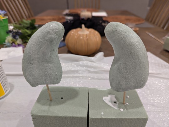
Cut up the wood dowel into a couple of small pieces. This will be used to prop up the horns so they’re upright and allow them to dry. Gently poke through the bottom of the horns with the dowel, and poke the dowel through the base foam block.
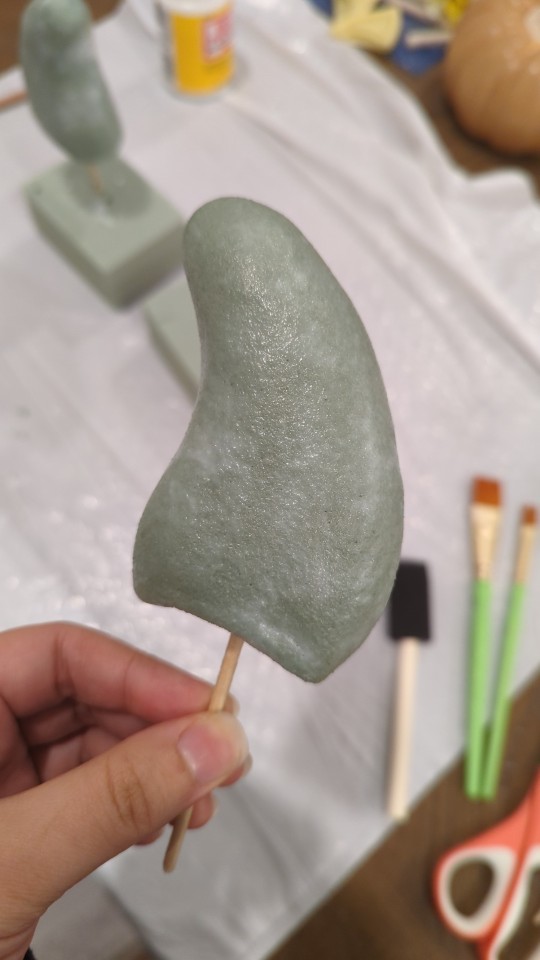
Pour some mod podge into a reusable cup and with a medium/large brush coat the first layer on both horns. Paint all over the horns including the bottom.
Wait for it to dry and continue to coat the horns with additional layers until it isn’t porous anymore
Recommendations/Notes
Since the foam is porous and soft, some mod podge or similar material will help fill in the holes and strengthen it
Even though the exterior is strengthened and prepped for painting, the foam can still be squished if too much pressure is on it (squeezing it strongly, hitting it with something, etc). I chose this foam since it was lightweight and would be easier to wear, but that is the main downside.
You can use a blow dryer on low heat to help speed up drying. I think I waited at least 15-20+ minutes in between layers. I would go about and do some other stuff around the house and come back to it.
I coated the horns with about 2-3 layers of mod podge.
Painting the horns
To cover up the green foam, paint a base coat with the darkest red of the horns. You’ll need about 2-3 layers of base coat to cover all the horns in red. Let the horns dry a bit in between coats.
After the base coats are fully dry, prepare the three horn colors to make the gradient. Paint the darker red at the top, the orange around the middle, and the soft yellow near the base and bottom. Feel welcome to blend with a brush or even some gloved fingers! Let the horns dry a bit and apply additional coats as need until you get the desired result.
Once the gradient on the horns is fully dry, make the spots color and plan out where your spots will be before painting them on. Have fun with it! You can try to match the spot positions in the character reference sheet or make your own. You’ll probably need to let it dry a bit and paint a few coats until they are a nice solid color.
For steps 1-2, you can use the blow dryer until fully dry or let this dry overnight. I waited overnight until the next day in between each step.
If you have a spray on mod podge or other sealer, feel free to spray the horns to lock in and protect the paint colors! I didn’t get a chance to do this. This would be the last step.
Recommendations/Notes
Refer to Mychael’s character reference sheet as a color guide. His horns are a gradient of three colors with a fourth lighter color for spots.
You may want to practice mixing colors a bit to get the hang of it before creating larger quantities. For the quantities I made about 1/4 cup or so? I don’t know the exact proportions I used since I eyeballed it to the best of my ability. Here is a rough approximation:
The darker red at the top is like a vermillion. I used mostly red, with a few touches of blue (no more then 10%), a few touches of yellow (no more then 10%).
The orange was a mix of maybe 60% red and 40% yellow.
The softer yellow for the base was yellow with some white and a bit of peach (no more then 15/20% for the white/peach colors).
The spots were made with some of the soft yellow and extra white
The red paint I purchased was the strongest color, so keep that in mind when creating the oranges and yellows. The paint I used is a bit thin so I had to paint multiple coats.
I ended up painting a base coat with the darkest red color a few times to cover up all the green foam.
I mixed each of these in different reusable cups.
You’ll want to paint the gradient all at once to blend it.
You can use a blow dryer on low heat to help speed up drying. I think I waiting at least 15-20+ minutes in between layers when applying multiple coats. Then I waited overnight to let it fully dry.
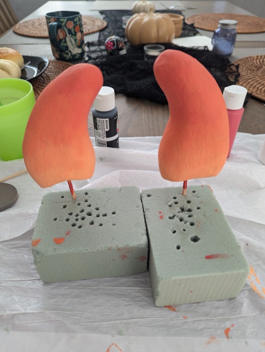
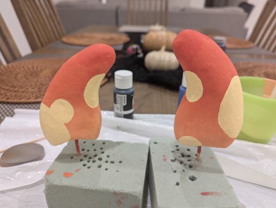
Creating the headband
Choose a fabric headband that’s closest to your haircolor (or Mychael’s if you’re wearing a wig!)
Mark faintly with a pencil where the horns will be on the headband. I placed the horns a little less then 2 inches apart from the center of the headband. Feel free to adjust to your liking.
With the glue gun, add some glue to the base of the horn and hold down firmly. Be careful for any excess glue that may spill. I added in extra glue and made sure it was pressed firmly on the hairband to secure it.
Repeat with the second horn a few inches away from the other one. Dry it with a blow dryer on the low cool setting if needed
Optional for the flowers
Carefully remove all the fabric flowers from their stems on the flower pick. Remove the plastic base and leave the stamens. Use the scissors to cut some of the back stem if needed.
Apply some glue to the back of the flowers and carefully attach them to the headband around the base of the horns. Feel free to mix around the colors and leaves as you’d like.
Recommendations/Notes
Be careful with the glue gun. If you add too much glue onto the horn, you may burn your fingers when pressing it down onto the headband.
The flowers hide the base of the horns where it’s glued. This is optional if you prefer the horns as they are. I did this since my glue gun work was a bit messy and I thought it would dress up the headband and help blend the horns to my hair. I didn’t wear a wig.
I used 5 blue flower, 3 white flowers, 3 purple flowers, 6 leaves and 5 little fuzzy blue and yellow stems I used some leaves on the sides of the horns and the back. I glued the leaves first, and then some additional flowers on them. I tried to position the flowers at slight angles around the base of the horns in the back and front of the headband.
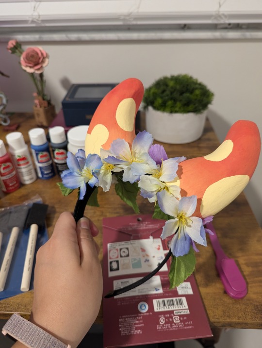
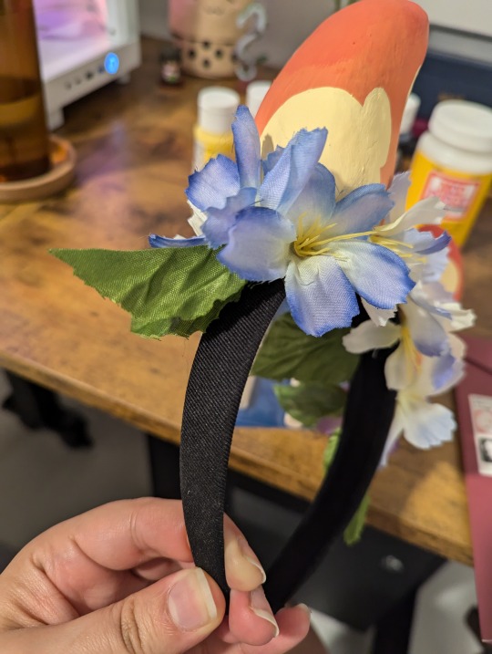
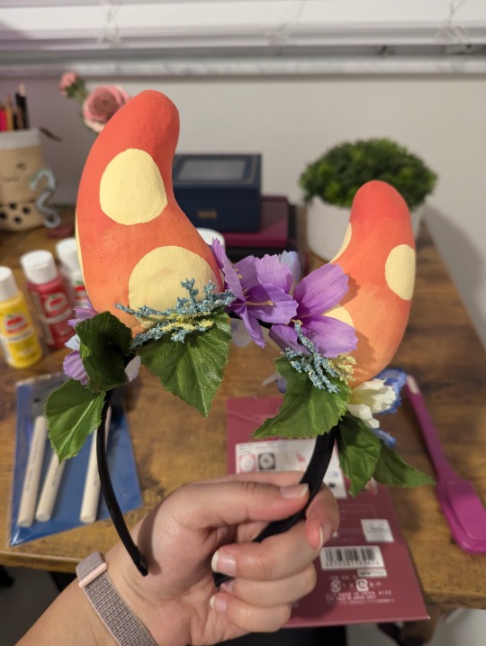
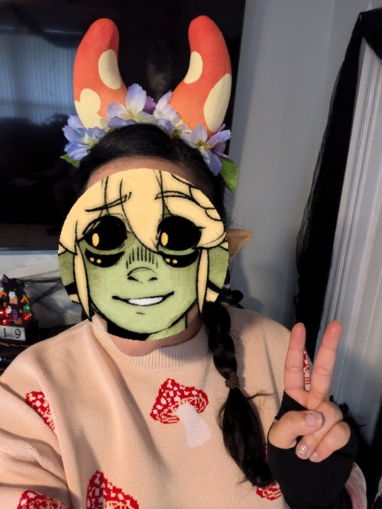
Here's how they look once they're ready! If you do end up making these, please share! It was so much fun dressing up, maybe next time I can try to go green and make a tail.
123 notes
·
View notes
Text
So I was thinking about creating a loose list of recs for ORV fans or, in other words, "If you liked ORV, you also may like this." I decided to add things less obvious because I think people already read works like Trash of Count's Family, etc.
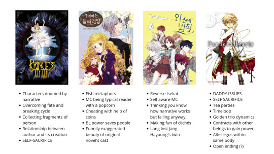
Princess Tutu
“The beginning of a story is a sudden event; the start, a happy accident, the end, the fate for which it's meant. A story that never ends is a sad fate.”
Let's start with Princess Tutu (PT), anime, not manga because they're different. I watched it about a week before ORV and after finishing both, I can't help but notice their similarities. However, meanwhile, ORV is about the relationship between the reader, the author, and the protagonist, and PT is more about the relationship between the author and their creation: the story and its characters. Don't let the name fool you, don't be like me. It's much darker than I expected from this style and genre. Be ready for angst.
Plot: Ahiru is a small duck in a pond. One day she notices a dancing boy with a very sad gaze. Boy every day goes to dance near the pond and the little duck is completely mesmerized by him. She can't help but notice sadness and loneliness in his dance. She wants to make this boy smile and at that moment a writer Droselmeir appears. He tells her that she could do this by collecting shards of his broken heart but under some conditions. He gives her a magic pendant that can transform her, first into an ordinary human girl, then into the graceful ballerina Princess Tutu, a fictional character from the tale that was doomed for tragedy in the original story.
Later we find out that this city is kinda enchanted by Droselmeir's tale (reverse isekai before it became mainstream) and some characters broke out of the tale like the boy by the lake - Mytho or Raven - the villain of this tale. Tale elements blend interestingly in the city and its residents.
Also, I have no idea wtf is happening with the main characters' dynamic in this complicated rectangle, but there is no straight explanation for this.
I can't help but see some parallels between Mytho - KDJ, Fakir - both YJH & HSY, Ru - HSY, and Droselmeir - Dokkaebi. I love how the story describes characters doomed by narrative and the struggles of being a writer. Also, all of these subtle references to fairytales at the beginning of the episode? Love it. I bet there are more references for the ballet part, but I probably didn't get it. I gently encourage you to check it out. (Definitely not gently, I'm as desperate as Kim Dokja trying to advertise TWSA to other people)
“May those who accept their fate be granted Happiness, may those who defy their fate be granted Glory.”
Miss not Sidekick
It's a much simpler read, just to chill and have fun while laughing at Mc shenanigans. Plot: Typical isekai story, where Mc is a fan of the internet novel of the reverse harem genre. When isekaied decided to invent popcorn and enjoy full time 4d immersion in the story.
There are not so many similarities in themes like with Princess Tutu, but more the role of MC – Latte as reader. I liked how she continued to behave like a spectator of a story inside Isekai world, treating it like she's inside a special 4D theater, not existing in this world as a part of it, until she couldn't.
Until her 4th wall is shattered (*badabums* it's a bad pun, she doesn't have it like kdj) and she realizes she could actually die, (quite shocking I know). Also, MC invents BL for this world and converts other people into it. Overall, the art style is different from other isekai romfant and it's something you need time to get used to, but after a while, you understand it suits perfectly for the narrative and silly tone of the comic.
Inso's Law or My Life as an Internet Novel
I feel like it's more reverse isekai similar to orv, where the story becomes part of your life. But if in KDJ's case, this transition is obvious and life-crashing, then in MC's situation is really creepy. It blends seamlessly into her regular life making her feel insane because everything remains the same except having a whole new friend who behaves like your bestie and a different school, where everything starts to feel like a romantic novel full of clichés. MC like KDJ is also unreliable in her perception of others here and thinks her knowledge of clichés like a reader-outsider makes her more omnipotent than she really is. Too bad they used 3 person POV, so it's really obvious, but funny nevertheless. (One of the cases where she thinks one of her classmates is a girl pretending to be a boy cause of some kind of cliché family drama, when in fact it's just a boy and I find it funny how this classmate looks like Jang Hayoung twin and have similar fate, poor souls) guess she also has similarities in her character to pre-scenario or regular life KDJ. They both seem to have this introverted avoidance type of personality. I'm curious about supernatural events happening in manhwa and I hope we'll get some explanation for it.
Pandora Hearts
Nice little thing with funny and cute tea parties that everyone would enjoy. 😍
SHHH, nothing about the plot. Let it be a small surprise for you.
It's all vibes and similar tropes now, folks.
Like dynamic between the main trio: Gilbert - Oz - Alice YJH - KDJ - HSY. Also this time loop thing? Daddy issues? Self-sacrifice as a form of love? Ugh. (Also, I need this scene with Oz and Brake "Where in the world are you?" But with KDJ. Maybe I even draw it).
It's all for now, maybe I'll write more. Please share the recs if you have them!
#whoever readed till the end#thank you#omniscient reader's viewpoint#orv#omniscient reader webtoon#kim dokja#miss not so sidekick#princess tutu#orv spoilers#inso's law#my life as an internet novel#pandora hearts#it was in my drafts since October
175 notes
·
View notes
Text
the bbger cast has been advertising their final tour by posting pictures of themselves contorted into the shapes of every prefecture which is very funny and also makes me realize I dont usually see people in other countries who are so obsessed with the shapes of their prefectures provinces and states. in the US everyone is crazy about the shape of their state even when it’s just a big rectangle. it’s on the state highway signs and the license plates and every other souvenir. is it like that in other countries and I just never paid attention? can I go to stuttgart and buy a sticker shaped like baden-württemberg? can I go to toronto and pick up a novelty wine glass with ontario printed on the side?
11 notes
·
View notes
Text
Matchbook Cover Collection
Patented in 1892 by lawyer Joshua Pusey, the matchbook, a seemingly insignificant piece of cardboard enclosing a handful of disposable paper matches, quickly became the staple advertising space at the dawn of the 20th century. Beginning with beer company Pabst and tobacco company Bull Durham, businesses big and small started to purchase printings of books from match companies such as Diamond and Ohio which found their way into millions of coat pockets, hotel rooms, and restaurant ashtrays.
As the butane lighter usurped the match as the portable cigarette light of choice and radio and television became the new frontier of advertising (not to mention the decline in the ubiquity of smoking), matchbooks fell out of favor, now only commercially used as a boutique novelty advertisements for high-end or niche establishments hoping to invoke a sense of the past.
Collectors known as phillumenists (“lovers of light”) still seek out the cardboard rectangles, however, for reasons as diverse as the pictures on their covers. For some, the images on the matchbooks are art in and of themselves; for others, the specific company advertised is of interest, or the category of good and services. Still others attempt to complete sets of novelty books, with the matches themselves printed with or in the shape of such images as bowling pins or ladies’ stockings, or commemorative books, featuring images of historical figures or celebrating such events as a World’s Fair. Whatever the reason, people have come to adore the matchbook in the same way as the baseball card, as a snapshot in history.
The Browne Popular Culture Library (BPCL), founded in 1969, is the most comprehensive archive of its kind in the United States. Our focus and mission is to acquire and preserve research materials on American Popular Culture (post 1876) for curricular and research use. Visit our website at https://www.bgsu.edu/library/pcl.html.
65 notes
·
View notes
Note
Can you write a mermaid au where the reader attends a circus with poorly dressed employees who are supposed to look like fairy tale characters but the main event of the circus is a merman ( kyojuro) and he does this amazing performance and the reader goes and talks to him to ask how he does those stunts in the water without breathing (because she don't think their a real mermaid) until she see the gills actually moving?
Please and thank you I just think Kyojuro would be so pretty as a merman
Ooohh! Cute, a Merman Kyojuro~! Let’s go, I can’t wait to finish this up! Thanks again, loves!
Rengoku Kyojuro- Fantasy is True

You could tell why this cheap half-assed circus managed to attract the attention of a number of families. It spilled out so many promises on online advertisements and it rolled around your little homely village regularly, it was clearly a quick cash-grab type of business
On a meaningless but yet only relax day of Sunday, you truly had nothing else to do once you finished your power nap and your curiosity got the better of you, ended up with a single ticket to this circus that proudly proclaimed to have had a real fairytale creature performing for them
You want to see if they really do have a real life fantasy creature at their disposal, willy-nilly or if they are just bullshitting to further get money off circus-addicted children or bored adults like you
Taking a lazy seat at the first empty bench row you spot when you enter through the curtains, you slid the paper ticket into the case of your phone and pocketed it. As a extra measure incase you need that ticket, you propped your hands on your cheeks over your knees and stared at the empty stage, already bored out of your mind with loudly speaking children and occasionally scolding parents filling up the seats all around you
You hoped this circus would make your day even the slightest bit better
Boy… it for sure did
The employees’ last-minute baked uniforms were clearly modelled after fairytale characters; Riding Hood, Fairies, Elves, all kinds of would-have-been pretty looking displays if they gave a shit to actually look good. You could tell how badly careless the outfits were thrown together, stitching all over the fabric and even a zipper busting out from the back on the Riding Hood actor as many came out of the darkness circling the stage
You truly had no right to complain as the children in the stalls were cooing and cheering at the performances. Clearly, they had some reputation of being incompetent and children aren’t that brainless, even some lonely middle-aged adults or bored teenagers were remarking openly that the performances were decent
The juggling, the fire ring jumping, the clown scene, all do the stereotypical and common circus parts came in so quickly, filling the lousy stage with people doing their best to entertain. Crossing your arms and hoping something else would come, your request suddenly came to reality as the much more fancy and lavish-appearing Ringmaster appeared in the centre of the stage
The non-dressed employees that clearly hid in the back, possibly operating the music and lights, wheeled in a huge mysteries rectangle covered by a pale yellow sheet and held off the ground by a massive dark blue metallic mini-trailer without the walls. Was this the fascinating real fairytale being this circus proclaimed to have?
“For the grand finalee~! Ladies and gentleman, I present to you! A real lifeeee—” The Ringmaster dramatically called out into the microphone clutched tightly in his hands as his makeshift clown tore the sheet off the rectangle and revealed the content underneath. A gigantic glass container without the lid and filled to the tippy top with clear yet noticeable light blue water
What was inside was actually more believable and realistic as compared to all the other circus performers here
A human being, a fully grown man was swimming around the thick, you assumed, seawater with a bright smile on his attractive fan. His skin was a healthy tan, his visible torso and arms were built to the brim with muscles and athleticism and the most interesting part. A merman tail that directly mirrored the long-finned tail of a Firefish Goby. From what you saw of his fingers, they were webbed and his ears looked more like fins then ears
White at the hips and fade to dark red at the ends with light orange to dark orange completing the beautiful fade. This most-certainly fake merman tail prop looked very convincing and very professional! This is beyond amazing as compared to every other actor, they must have poured all their love into a merman actor
“Welcome! Our lovely merman, Kyojuro!” The Ringleader cheered pridefully, quickly rushing into the black shadows as the many high-beam lights illuminating the wide stage shut off mysteriously and all the ones remaining tilted over to the supposed merman’s container as to place the centre of attention onto him. Like it was nature, Kyojuro flung himself out of the water beautifully and begun to harmonise, seemingly as ready as he would ever be
His singing voice is incredible, so angelic and majestic as he hung over the thin glass wall before he flopped back into the water without stopping his singing, your eyes widened in shock. How was a human singing underwater? No, it must have been a technological trick of the radio playing a convincing audio of a man singing as the actor pretended to sing, he probably isn’t singing at all!
You carefully followed every movement and stunt the supposedly Merman, Kyojuro performed as he leapt out of the water, flinging thin strings of water around, in which glittered with the artificial light by a flip of the tail’s small round fins. Even the adults were gawking in wonder at Kyojuro’s fascinating show and by the end, the Ringmaster excitedly thanked every paying customer for taking time to come to their circus but you ignored his little speech
Your eyes followed watching the employees wheel away Kyojuro from the centre of the wooden-pane stage in a extreme sense of wonder and want of discover. How he could stay underwater for so long and even keep his mouth open underwater so effectively, wouldn’t it cause water to enter his lungs? Thankfully, the Ringleader was too ego-driven to not let the children approach the employees and praise his work
You manoeuvred through the wave of parents with their young children once you stepped down from your seat. Most other patrons had left with only a handful exploring the stage and speaking with the actors. You were the only solo adult doing so but you didn’t want to pretend you were believing that you were talking to Snow White, no.
You just wanted to meet and greet the amazing “Merman”
Pure amazement overflowed your eyes as your pace grew slower, you pressed palms on the thin but tall glass pane wall facing you once you reached it, flinching when Kyojuro does the same from the inside. Your palms looked as if they touched his on a angle. You couldn’t believe this human was doing all these stunts for almsot three hours non-stop without needing air as he was singing and speaking everytime he went up, was he using a invisible oxygen task or something?
The floating locks of firey yellow and red crossed his neck and face slowly by the water pulling it around, highlighting his gorgeous flame-coloured eyes, in which calmly bored through you with enlightenment for finally having company again, especially company from a pretty woman. Your world begin spinning in amazement and disbelief at what you noticed after examining him up close
Three thin lines on both sides of his neck, almost like strange lacerations, slowly flaring in and out like how a chest would rise and fall. Exactly as how fish filter water for their own breathing needs, he did the same
Kyojuro was worried for you by the way you reacted as he pressed his brick-like muscular chest against the glass like he was trying to break out, his expression dissolving into concern as you stumbled back, clutching your head with one hand. You almost didn’t want to believe it but all the evidence, you couldn’t ignore all the evidence
…He wasn’t a normal human nor a very trained human actor. The oddly-marketed main attraction of this dilapidated wannabe circus is no joke nor a fake, he is a…
A merman! A real merman!
#kimetsu no yaiba#demon slayer#anime and manga#kny imagines#short story#kny short story#kny hashira#rengoku kyojuro#kyojuro rengoku#kyojuro x reader#kyojuro my beloved#kyojuro rengoku x reader#demon slayer kyojuro#kimetsu kyojuro#kny kyojuro#demon slayer rengoku#rengoku kyōjurō#kimetsu rengoku#kimetsu no yaiba rengoku#kny rengoku#rengoku x reader#merfolk au#merman Kyojuro#mermaid au#flame hashira
67 notes
·
View notes
Text
No. 15 - PSA (Pacific Southwest Airlines)

Thank you to @lobstersinmyhouse for requesting PSA! And, in all honesty, this is exactly my feelings too. Pack it up, post over.
...okay, no. I am going to write a post, but I make no secret of loving PSA's airplanes. After all, one is even my icon.

image: Piergiuliano Chesi
There was never an airline like it before PSA sprang up in 1949, and there has never been an airline like it since. Decades after its demise I still feel a real sense of grief about the fact that it's gone. Pacific Southwest Airlines hasn't existed for longer than its entire time in operation and it mostly only operated in a single state, but it remains one of the most beloved airlines ever to exist. I'm certainly far from immune to catching their smile. So I'm very, very excited to cover the iconic grinningbirds, one of the best-known airline liveries of all time even 40 years after the regional carrier which wore it ceased existing.
youtube
PSA officially stands for Pacific Southwest Airlines. Unofficially, it was the Poor Sailor's Airline. According to a button they put out, it was this.

image: psa-history.org
But really, it can stand for anything you want. I think it stands for Pretty Smiling Airplanes.
You see, PSA's marketing leaned into the fun and casual as much as it was possible for an airline to do. They called themselves "The World's Friendliest Airline". Their branding was all bright, colorful, delightful. One aspect of it is particularly well known.

image: Piergiuliano Chesi
The name "grinningbird" is literal. PSA's fleet was lovingly painted with massive smiles directly under their noses. Their advertisements encouraged people to "catch our smile" across the state of California.

A preserved DC-3 in original Pacific Southwest livery
PSA was started as a single leased DC-3 hopping from San Diego to Oakland. Apparently their ticket office was literally a refitted military surplus latrine where they weighed passenger baggage on a bathroom scale. When they expanded with DC-4s they painted rectangles around the windows to make them look more like DC-6s. This was in 1955. And then, by the early 60s, they were taking off.
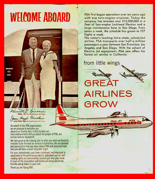

A pre-smile PSA Electra. The L-188 Electra is, of course, my favorite jet plane. image: Jon Proctor
It was in the 60s that their planes stopped saying 'Pacific Southwest Airlines' and started just being PSA, and it was in the 60s when they caught their smiles. This was the point when PSA became PSA, transforming from just another intrastate airline in the pre-deregulation era to a turning point in aviation history.
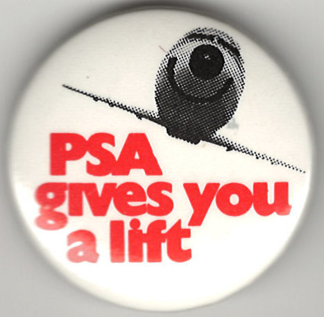
a 1972 promotional button image: psa-history.org
While the smiley faces are the most significant historical fact about PSA, also notable is the fact that they were the first low-cost carrier in history. Although PSA's routes were limited to Southern California, they charged $9.99 for a ticket other airlines would charge $13.50 or $22.05 for - and keep in mind that in today's money that's a difference of hundreds of dollars. Free of federal fare taxes and operating frequently, PSA grew at an intense pace with its new fleet of Lockheed L-188 Electras.

I love the L-188 Electra (not to be confused with the earlier L-10 Electra best known for Amelia Earhart reasons). Although Lockheed has long since moved over to exclusively making weapons for killing people, back when they were in the civil airliner market they made the most incredible planes which somehow ended up commercially flopping time after time. The Electra, for instance, was all but killed immediately by two early crashes caused by a sneaky design flaw. These were fixed, but the type's reputation had already been sullied. (Interestingly, similar early design flaws with far less prompt responses failed to kill either the DC-6 or the DC-10, despite the latter causing the deadliest crash in history at the time and the former having had the serious potential to give us a timeline where the President of the United States was killed because his presidential transport had a design flaw which encouraged going up in flames midair.) Ironically, the Electra is actually an insanely reliable and sturdy plane, and the example pictured is still in service as an air tanker under the registration C-GZCF, still doing her thing at just 63 years young. (Another Electra in Air Spray's fleet is a similar age but also survived being bisected across the belly by her own detached propeller, and she literally flew two days ago. These planes are on a level only shared with Nokia cell phones, especially for their size.)
That paragraph became about the Lockheed L-188 Electra. I did not mean for it to be, but I am leaving it in, because I love this plane. Looks great with the smile, too. The roundness of the nose gives the distinct appearance of something like a teddy bear snout.
From this point things only grew quicker. PSA continued to be PSA, acquiring more aircraft to fly more passengers. They did expand routes eventually, and once the 1978 Deregulation Act allowed they flew to some other states and even Mexico. Despite this, they remained an icon in their home state, and are often called "the unofficial flag carrier of California".
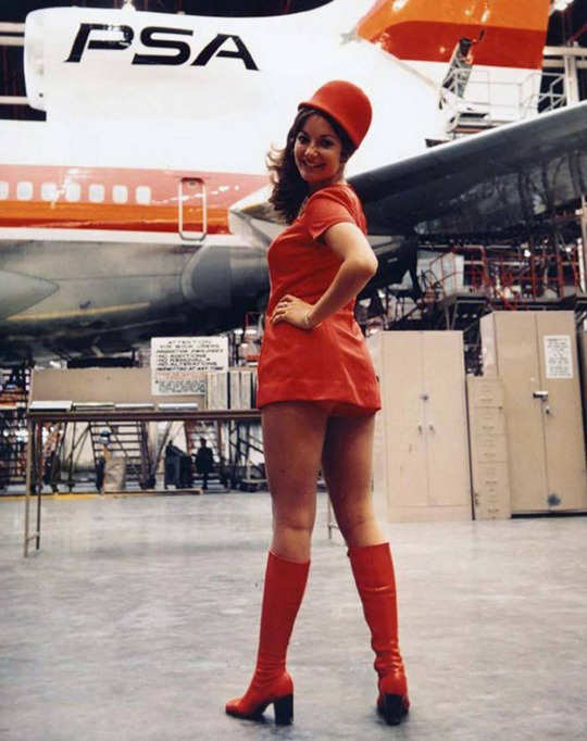
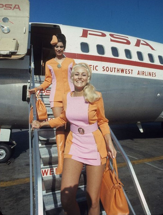
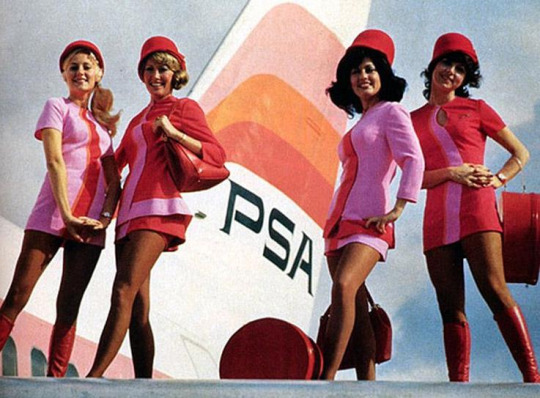
PSA stewardesses. I can't find an original source for either of these pictures, which have been widely spread without context or credit - although significant effort has been made to archive PSA's promotional content, a lot of it is, sadly, free-floating orphaned bits.
PSA's stewardesses wore bright pink and orange uniforms of miniskirts, hot pants, and go-go boots. They were encouraged to joke around with passengers, and so were the pilots. Other airlines at the time were still only slowly losing the unapproachable aura they had cultivated of stiff, sterile luxury and gravitas. PSA would get you where you needed to go without any fuss and they'd charge you half as much for it. And they weren't sloppy, either. Despite their low fares, PSA was incredibly safe, having one fatal accident in a span of time where American Airlines had 16, and even though nostalgia is obviously a factor I've only ever heard glowingly positive accounts of PSA, its service, and its staff.

image: Bill Larkins
PSA's fleet was...eclectic. Though they operated a few very popular models, like the Boeing 727 and McDonnell Douglas MD-80 series, a lot of their offerings were somewhat uncommon. The plane in my profile picture is one of their two L-1011 TriStars, another of Lockheed's underappreciated airliners and by far the most advanced wide-body aircraft of its time. PSA was unique in that it operated a jumbo jet, their "Mother Grinningbird", on a route that was not just domestic, but intrastate. They also apparently operated a single Bell 206 helicopter, which I can find no additional clarification on. Lastly, they flew one of the oddest airliners ever built in both function and appearance, the British Aerospace 146.

Just your regular high-wing jet. No thrust reversers necessary. Western-made but rocking the Il-76 wing anhedral. Super quiet because the powerplants are based off what you'd put on a helicopter. Seats less people than a 737-200 - six-across layout for maximum discomfort - and flies exclusively puddle jumps...yeah, I think four sounds like the right number of engines. image: Ted Quackenbush
Across all these planes, they found a livery that worked and they kept going with it. The reason this post is so long is to give context to just how important this livery is. The grinningbirds were what started low-cost carriers, paving the way for the silly names of jetBlue airplanes in a future its founders couldn't even have imagined. The shift to approachability over prestige in airline marketing was PSA's lasting gift to aviation, as were the low fares and the knowledge that a 'budget' airline didn't have to be dodgy or unpleasant - they just had to charge less than TWA and Western.

image: Piergiuliano Chesi
PSA's colorscheme was incredibly vibrant. The red and orange colors feel warm and tropical, complementing the California sunshine in which these planes spent their time. Earlier liveries also had a shocking hot pink shade above both, though it was eventually painted over due to issues with paint fading - I think the livery is vastly improved with its presence, but I suppose needs must. Despite the airline serving commuters more than vacationers it puts one in mind of things like beaches and ice cream stands - warm, high-energy things. The sorts of things one might smile about, if they like those things. I hate those things, but these planes make me like the idea of them, because they're just so darn happy to take me there!
The design of the fuselage is incredibly bold despite not using much more paint than any other airline of the day. While the striking colors definitely contribute to the overall look being more than the sum of its parts, I think there's also a few bits of clever design that really elevate the design of the plane.

The tail has a design almost like an inverse hockey-stick. Instead of following the cheatlines for maximum sleekness it chooses to diverge from it, creating a sharp angle that keeps the aerodynamic feeling while feeling fresh from similar designs of the time. By having the thin line from the tail trailing down towards the fuselage it prevents the block of empty space on a regular hockey-stick livery, where the forward portion of the empennage is fully unpainted, and creates a feeling of continuous color and excitement while keeping some staccato punch.
Similarly subtle yet effective are the stripes themselves. They aren't of an equal width - rather, the red stripe is thinner than the orange one, and in planes with the additional pink stripe this one is even wider. It feels a lot more dynamic than simple even-width stripes, feeling almost as if you can see the colors start to mix into each other. The 'mixing' feeling is helped by the fact that the cheatlines wrap under the nose instead of simply ending where they meet. The small painted white line under the main colored ones, above the unpainted metal of the underbelly, creates basically an extra two stripes for the price of one despite being so subtle many people probably didn't notice it.
On its own, the design of the bodies of PSA planes is already good, but it practically ceases to matter when you get to the face.

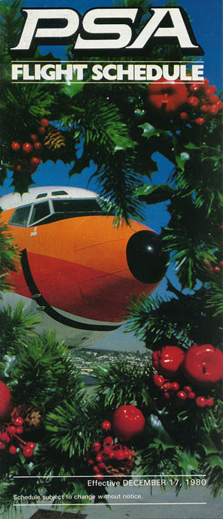
The way the top line of color wraps around the back of the cockpit windows makes it look almost like the plane is wearing sunglasses. And then there's the little painted black nose and, of course, the huge ear-to-ear grin. I don't really know what else to say about this because it's all been said time and time again.
I genuinely don't know how else to express it. PSA's livery was gorgeous and it was perfect for PSA. In all honesty, I don't think it's possible to improve it at all. My one slight criticism is that the actual PSA wordmark, though designed well, is a bit small and out of the way, but to be totally honest it's barely necessary. You see the smile and you know exactly who that plane is flying for.
PSA gets a PSA+.
So what happened to PSA, if they were so successful? Did an economic shift catch them off-guard? Did some demographic evolution rob them of their old customer-base? Did a change of management result in a new owner running the airline into the ground? Did it have anything to do with the fact that the one time they were involved in an accident it spent eight months as the deadliest crash in US history?
Nope. They got bought out by USAir because they wanted more routes on the West Coast.
Yeah. That's the story. Neither a bang nor a whimper. They left one morning and didn't come back. That was the end of PSA, the first-ever low-cost carrier, California's most beloved airline, and one of the best-designed liveries in airline history if not the very best.
There is, however, one final twist. USAir eventually was sucked into the gaping maw of American Airlines. With this merger American Airlines also inherited the rights to PSA's IP. In classic fashion, they created a wholly-owned subsidiary by the name of PSA Airlines, just to make sure nobody else could get the trademark.


Under the iron fist of first US Airways (USAir's eventual rebrand) and later American Airlines, we were allowed one last grinningbird - an Airbus A319-100 registered N742PS. It's strange, seeing the PSA livery on a model of airplane they never operated. It's a rare example of the design on airframes that have that rather distinct 'default' modern empennage, all sharp and tall with no t-tail or third engine. The implementation could take some notes and the colors look bizarrely plastic, but I will never stop loving her no matter how much they take from her. How could I not, with that smile?
Unfortunately, in April of this year she was re-painted to a standard American Airlines livery. Although the Allegheny and Piedmont heritage liveries were removed at the same time, I almost don't even notice their absence because of the loss of our very last holdout from a much more colorful time and place. Part of me feels a sort of ripping-the-bandaid-off relief at it. American Airlines shouldn't get to parade around the skin of a much better livery worn by a much better airline. That isn't theirs; they didn't earn it. And there's no way to rebuild PSA now that times have changed and the industry is unrecognizable from the days when a ticket from San Diego to Burbank cost $9.99. All the same, the loss of yet another smile hurts. There's no way it wouldn't. And at the end of the day it makes me feel a little dead inside just imagining the mindset of the American Airlines executive who walked by her in the hangar and instead of smiling back gave the order to paint her white. And that day, the sky got a little less colorful and a lot sadder.
Maybe, in a strange sense, the way it happened is better. Nobody ran PSA into the ground. They did not cause some sort of reputation-ruining accident through willful negligence. Their customer service did not decline until they were widely grumbled about. They didn't die infamous for poor safety and loose morals like Pan Am, or splitting at the seams and betraying their reputation like Chalk's Ocean Airways. No, I don't think an organic shriveled going-under would have held any more dignity than this. I think the ending PSA got is as graceful as the ending to something like PSA could be. There is no end to the glory days which forces itself into our memories. There is no decline. No sunset to fly off into. There is a loss to mourn, but no accompanying moment to curse. Lost at sea, ship never found, nothing to imply a terrible fate; all we know is the poor sailors aren't here anymore.
Maybe it's not universally known to people who aren't interested in subjects that bring them close to it, but to those of us who love planes PSA is truly special. Its quiet apotheosis has made it synonymous with the very best an airline could be. The joy of a time where a regular person could finally afford their first plane ticket and be greeted by colorful people who talk to them like friends, where even the planes are smiling, is encoded into the DNA of PSA's remnants, into every anecdote told by an aging former stewardess and into every Polaroid taken of one of those smiling planes parked on a sunny California tarmac. It was there, and then it was a distant echo of warm breezes and idle chatter that feels almost close enough to reach out and touch. PSA never died. One day it was flying passengers to their destinations, planes smiling their same smiles. The next day it was fond memory, already graduated to the distant sunny shores of nostalgia.
youtube

#tarmac fashion week#grade: a+#region: north america#region: united states#era: 1960s#era: 1970s#era: 1980s#pacific southwest airlines#requests#defunct airlines#regional airlines#double sunrise#long haul#galley gala
109 notes
·
View notes
Text
FRUTIGER AERO(WEB 2.0)
For the first style that I'm gonna talk about is Frutiger Aero! So jumping right into it, Frutiger Aero as explained is a style and design that was first used for advertising in 2004 to 2013 and it overlapped with other styles during it's time like McBling and Electropop 08, there are also many sub cultures to this like Frutiger Metro, Frotiger Eco, Dark Aero, Technozen and many more(that I'll do a deep dive into some other day). Though I didn't do much research on music but from just veiwing some videos and websites, it seems most of it is old nostalgic music, mainly from games from the wii and ds along with other techno music. Now in present time, Frutiger Aero has made a come back on becoming popluar once again back in late 2022 on tiktok and I would say is pretty relevant now.
A lot of themes used in the Frutiger Aero style are glossy textures like fishes, bubble, water, glass, and even fruits. One of the common themes you may also see are big grassland scenerys. Frutiger Aero is also a very nostalgic style as a lot of features are from old internet like from many games, some of the games I would take inspiration from are Space Channel 5 and Mario Galaxy 2. Frutiger Aero also has a futuristic, y2k style.
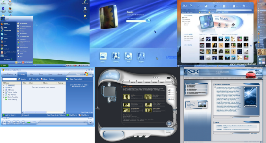


Now onto the actual fashion and clothes, It was kind of hard to fins any actual words from people and not just images but from what I gathered a lot of it is still just Y2K fashion from the year it was made, most of the clothing items for frutiger aero that people have wore were sportswear items like tracksuits, tennis skirts, and tank tops(perferably with a grapic design) all with bright colors like green, blue, orange, and white(those being the main colors I saw with most outfits) for shoes are white sneakers with maybe some accent colors along with platform or heeled sandals and latex boots. All of these are still with the Y2K, futuristic, yet nostalgic style. Another style I see that kinda popluar within the Frutiger Aero community is a colorful office style, usually with a grey, blue, or white suit with a colorful undershirt and accessories, other times it can just be an oversized office button-up with any bottoms. Other clothes used are oversized shirts with a flowy or swirly design, or juet a graphic t-shirt and oversized or cropped zip-ups. BUT if you are going to a special event and want a dress then ones that go up to your mid-thigh with a flowy sleeve or no sleeves at all with be perfect!
Now... ACCESSORIES! For jewlary, I don't see much people go to the max but they do wear bangles and maybe charm bracelets along with thin necklaces that cometimes have a charm on them. Belts are also commonly used, mostly colorful ones wether they're big or small. Headphones are probably a must have to these outfits and just the aesthetic. A pair of shades are also pretty popular, they can be rectangle frames or oval frames but most of the time they're either a bright color or white(this may be my personal opinion but I suggest no dark colored glasses unless it's the lenses). As for a bag, they seem to have a lot of uniqueness whrther it's their shape, their color, or design. Most bags you may see are small shoulder bags with a bright color or they may be in the shape of a computer, the size og your bag doesn't really matter in this fashion so feel free to use any size!
Lastly, hair..... I'm not too sure what I can say about this but I think any 2000s style will be perfect. Some hair styles I've seen that I think would go great is straight hair, spiky buns, pig-tails, any half up-half down style would be great. Also dying your hair a cool and bright color would help the look! As for hair accessories, try to keep it minimal but still colorful. Wear a few hairclips, maybe a colorful headband with your fav video game character on it and headphones if you have!


Anyway, that it to the rant! Thxxx 4 reading!!! You can now sign off or stay for some after notes. I really loved talking about Frutiger Aero and I'm glad it was the first fashion/style/aesthetic I talked about here! Obviously I will talk more about it in the future as this is not even everything about Frutiger Aero, though most likely I'll just talk about the sub-cultures to give it it's own post! Again, thx 4 reading and goodnight!
#fashion#clothes#style#aesthetic#music#wii#nintendo#nintendo wii#video games#space channel 5#nintendo ds#sega#frutiger aero#frutiger aesthetic#frutiger metro#frutiger aero aesthetic#frutiger aqua#frutiger eco#2000s#2000s nostalgia#00s#super mario galaxy#2000s hair#hair#hair styles
16 notes
·
View notes
Text
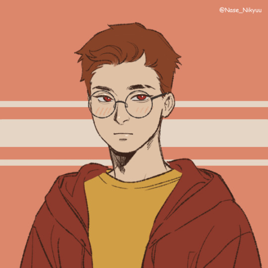
that time of my life again where I try making human designs for quix and still dont like them. they're nice. but just. not me. I can only be human for a short period of time before I need to return to doggy and rectangle

4 notes
·
View notes
Text
For the past 2 months or so every day on my way to worm, I pass a billboard for a recently opened tattoo shop in my city that has a giant ai generated image of a girl in a bikini covered in what I have to assume are tattoos based on the context and holding a white rectangle that they have gone over and put their logo on and every day I get more pissed off ass I pass it twice
You are literally a tattoo shop you literally employ artists why are you unwilling to show their work in your advertising???? I do not trust them to give me a tattoo
5 notes
·
View notes
Text
Fits & Spells
A creel of musings fished bare handed from the stream of consciousness.

A few of the poems in this collection might not be appropriate for the tender or those faint of heart. However, when compared with some of the posts observed on Tumblr, they're mild. Although not intended to be songs, save one, several of the poems have optional AI generated musical accompaniment, i.e the purple rectangles have deltas that when clicked launch audio.
Curious readers and listeners are invited to keep scrolling down. Comments, whether encouraging or scathing, are sincerely appreciated.
When you have the inclination, an additional collection of noodle doodles can be found at https://www.tumblr.com/blog/gaeilmeta
NOTES:
If an image doesn't populate immediately, it will appear eventually. Sometimes a scroll up or down will help. As a last resort, click on the blur. The image will then be revealed separately.
Should clicking on the red delta button fail to launch a YouTube video, click the "Watch on > YouTube" button instead. Clicking on a YouTube music video may also sometimes produce a "sign-in" request, which is YouTube's way of telling you that your VPN is making you look like a bot. Turning off your VPN should stop YouTube from making sign-in requests.
Finally, you are likely to run into some insinuated advertisements since this is not a Premium blog.
#poetry#music#original poem#poetry collection#writing#writerscommunity#writers on tumblr#writers and poets
4 notes
·
View notes
Text
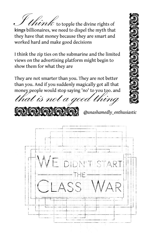
Divine Right of Billionaires is a work from Holy Nonsense, a Creative Commons project. View Holy Nonsense 2020 here. Thank you to first time contributor @unashamedly-enthusiastic for agreeing to participate in the project! You can see the OP here: https://www.tumblr.com/unashamedly-enthusiastic/721958091109842944
Each entry (single page or multiple pages of the same work) is released under an individual CC: Attribution, Non Commercial, No Derivatives license. That means you can repost this work as-is anywhere for any non-commercial purposes.
Image descriptions, including transcriptions of text, are expressly allowed, but just make sure you include the credits that are baked into the image when you do them. Image Description after the cut.
Image Description: Two sections of text on a white half-sheet vertical page. The top section is bordered with repeating floral tiles that look a little like a skunk or badger. The bottom text is centered in sketchy overlapping rectangles
Top:
I think to topple the divine rights of kings billionaires, we need to dispel the myth that they have that money because they are smart and worked hard and make good decisions
I think the zip ties on the submarine and the limited views on the advertising platform might begin to show them for what they are
They are not smarter than you. They are not better than you. And if you suddenly magically got all that money people would stop saying 'no' to you too. and that is not a good thing
@unashamedly-enthusiastic
Bottom:
We didn't start the Class War
72 notes
·
View notes
Text
Chapter 24 of The Life of a Star Has Been Published
Chapter 24 of my FNAF fanfic starring Sun, The Life of a Star, is here, in which takes place the great plushie heist…and a short-lived showdown between Becky and Miss Sullivan! Who will win in the clash of the century!?
Chapter 24: B Stands for…
Preview:
“Dad and I were shopping for something for Becky’s birthday, and…” She paused, her smile continuing to grow.
“Yes, and…and what?” He leaned even closer.
“...aaaaand…I bought you something!”
“Oh, Cassie, you shouldn’t have,” came the automatic response. Seriously, he wasn’t allowed to accept gifts from the kids. Ones that cost money, anyway. Drawings were fine because they were free.
Money was…when you exchanged something to get something else. Like that game where you traded paper rectangles for little plastic houses. Or the time he had tried to buy compressed air from the janitors with graham crackers.
Nevertheless, Cassie threw out her arms which had previously been hidden, revealing a very special plush that Sun had had his eyes on for some time now.
Forget what he had been saying two seconds ago. Yes, she should have. She really should have.
The toy had puffy pants striped yellow and red just like his own and a smiling face, alongside his pretty blue eyes. He hadn’t ever gotten a good look at his own face, so the toys and the candy advertisements were all he really had to go on. But he didn’t exactly have any reason to doubt them.
Sun placed both hands over his mouth. He meant to gush over how wonderful and precious it was, but instead, what came out was a refrain of before. “I-I’m actually not sure I can keep this. You see, I…” Sometimes, he’d really like it if his system wouldn’t try to talk over him.
He took the plush before his programming could interfere any further and pet its head with one hand. The triangular felt rays surrounding its cute little face drooped from his caress.
“It’s okay. My dad let me use his employee discount. Plus, you’ve always been so nice to me, so I wanted to return the favor.”
Sun pulled his attention away from his new toy when something clicked into realization. “Wait, you were in the Pizzaplex, and you didn’t visit me!”
“Sorry, we didn’t come into Kid’s Cove! Otherwise, I would have said hi! Promise!”
Sun hugged the plush toy closer. Looking after Cassie was reward enough. But who was he to turn down a present? That’s right, he silently reprimanded his programming, refusing her gift would be outright rude! And Sun was extremely well-mannered! “Thank you, Cassie! It’s absolutely perfect and wonderful, and I’ll treasure it forever!” He really would. No…
He would love it like his own child.
Please read the full chapter for more!
#five nights at freddy's#fnaf#fnaf security breach#fnaf sun#fnaf moon#fnaf sundrop#fnaf moondrop#fnaf daycare attendant#fnaf cassie#fanfiction
5 notes
·
View notes
