#COVERS
Text

Rabbit pattern. John Martin's Book: The Child's Magazine. March 1920. Cover detail.
Internet Archive
#covers#pattern#patterns#rabbits#bunnies#animals#black backgroun#nemfrog#1920#1920s#children's illustration
479 notes
·
View notes
Text

2-0 (Cover)
FIRST | PREVIOUS | NEXT
64 notes
·
View notes
Text

Superman #19 Cover Art (Simone Di Meo Variant)
20 notes
·
View notes
Text


Howdy, pardner~
My 1:25 variant cover for Action Comics #1076 -- out 11/20 (FOC 9/23)! It was very fun to try my hand at a big bold shot of the big guy himself. Hope y'all dig!
2K notes
·
View notes
Text


Thank you Dazzler for all that you do for us 🩵
2K notes
·
View notes
Note
I just received a copy of a book I've been very much looking forward to by a favorite author, but the quality of the book itself is... not great. Cheap paper, weak binding, even a weird illustration of the main character on the cover that I'm having trouble believing the author approved.
Obviously, I don't want to leave a bad review on Amazon or GoodReads or anywhere, as I'm 100% certain the content is as excellent as her other work. But how can I best let the publisher (Baen) know I'm disappointed without threatening to never buy her books again? Because, well, if this is the only option, I'm gonna keep buying them even in my disappointment.
Well, the first thing I thought when I read this was "Wow, I'm really glad I don't have anything in print from Baen at the moment except a couple of anthologized short stories." :)
As for the rest of it, let's take it point by point.
Adding a cut here, because this will run a bit long. Caution: contains auctorial bitching and moaning, painful illustrations of cases in point, and brief advice on how to complain most effectively. (Also links to paintings of cats.)
Cheap paper: This has been an accurate complaint since well before COVID—and it's often been worse since, with supply chain issues also being involved. That said: one way publishers routinely save money on printing books, especially the bigger ones, is by going for thinner/cheaper paper. I remember one of our UK editors going on at great length and with huge annoyance—during one of those late-night convention-bar bitch sessions—over how the only way they could get some really good books published (because Upstairs insisted on reducing the per-copy production costs) was by reducing the paper quality to the point where you could nearly read through it. Sacrificing decent text size(s) also became part of this. Nobody in editorial was happy about the result: but there wasn't much they could do.
Bad bindings: Similar problem. Sewn bindings used to be a thing in paperbacks... but not any more: not for a good while, now. These days, it's all glue. Even hardcovers are showing up glued rather than sewn. Don't get me started. :/ (This is why I so treasure some of the oldest paperbacks I've acquired, which are actually sewn.)
Crap covers: I've had my share of these—though my share of some really good ones, too. And one of the endless frustrations of traditional publishing is that the writer routinely has little or even no influence over what the cover will look like... let alone how much will be spent on it, or (an often-related issue) how good the execution will be.
There are of course exceptions. If you're working at the, well, @neil-gaiman -esque level or similar in publishing, a lot more attention is going to be paid to your thoughts. You may even be able to get "cover veto" written into your contracts, so that if you disapprove, changes will get made. But without actual contractual stipulations, the writer has zero legal recourse or way to withhold approval. (And I bet even Neil has some horror stories.)
The normal workflow looks like this. After a book's purchased, its editor and the art director discuss what it's about and what the cover should look like. The art director then hires an artist and tells them what to do. After that, the artist executes their vision and gets paid. It is incredibly rare for a writer to have any significant input into this process. And as to whether or not they approve of the final result, well... the publisher mostly just shrugs and goes back to eyeing the bottom line, muttering "Who told them they get a vote?"
Now, I've been seriously lucky to occasionally be an exception in this regard. In particular, my editors at Harcourt (when Jane Yolen and Michael Stearns were editing Harcourt's Magic Carpet YA imprint) would ask me what I thought would be a good idea for the next Young Wizards cover, and I'd think about it a bit and send them back a paragraph or so about some core scene. They'd then talk to their art director, and after that send their notes and mine to Cliff Nielsen (who started doing the covers for the hardcover and mass-market paperback editions of the series in the mid-90s) or to Greg Swearingen (who was the artist on the digest-format editions). And the results, by and large, were pretty good. ...I also think affectionately of the UK artist Mick Posen, who insisted on seeing pictures of our cats before painting the covers for the Hodder editions of The Book of Night with Moon and On Her Majesty's Wizardly Service (the UK title for To Visit The Queen).
But this kind of treatment is a courtesy—not even vaguely suggested in the books' contracts, and very much the exception to the rule. And for every writer who's midlist, there are times when the luck runs out. For example: one time I wrote a book that was an AU-Earth-near-future fantasy police procedural, thematically pretty dark—dealing with issues of abuse of megacorporate power, institutionalized bigotry, and (explicitly) attempted genocide. And the cover, done by an artist who's a good friend and some of whose fabulous art hangs in our house, came out looking like this. It was... let's just say "not ideally representative."
So I was glad, when my local workflow allowed it, to recover the current, revised version of the book with something at least a little more apropos. But the original cover's not the artist's fault. He did what the art director told him... as a cover artist must do to get paid, and (ideally) to get hired again. At present, that's how the system works.
...So. You've got a badly-built and -presented book on your hands. How best to make your feelings known in some way that might make a difference down the line? (As you make it plain that you'll keep buying this author's books this way if you must.)
First of all: when (as part of my psych nursing training) we were taught how to complain most effectively, we were told that the first and most basic rule of the art is this:
Only Complain To Someone Who Can Actually Do Something About Your Problem
So I salute your desire not to waste your time taking the issue to the reviews on Amazon, or the pages of Goodreads... because they can't do anything. The odds that anyone from production at Baen is reading the comments there strike me as... well, not infinitesimally small, not being hit-by-a-meteorite-while-in-the-shopping-center-parking-lot small... but really low.
So: write to corporate.
In your place I would go online and rummage around a bit to find out who's on record as the publisher at Baen. I would then write them a letter on paper. And I would lay out the problem pretty much as you laid it out up at the top.
The tone I think I'd choose would be the more-in-sorrow-than-in-anger approach. I'd say, "I write to comment about your recently published book by [X Writer], whose work I love. I have to say, though, that I don't think the cover on [X Book] is terribly representative of the quality of the prose inside. And also, the construction and production quality of the book itself was a disappointment to me because [here spell out why].
"I'd really like to see [X. Writer's] books succeed with you, and I'd like to buy more of them without wondering whether I was going to be disappointed again. But if this is typical of how they're being produced, I'd also be concerned that the state of these books is setting up a situation in which the author's sales will be damaged, and you would stop publishing them... which would really be a shame. Whereas on the other hand, better production quality could keep previous purchasers coming back and buying, not only more books by this author, but books by others whom you publish."
This phrasing, as you'll have seen, walks a bit wide around the issue of your further purchases, while directing attention toward the bottom line... which will routinely be what the publisher's looking at from day to day. And—being, one has to hope, in possession of the wider picture as regards what's going on with their production costs—maybe they can actually do something about it.
Anyway, nothing ventured, nothing gained, yeah? It's worth a try. All you can do is hope for the best.
And finally: please know that I admire your commitment to the author: whoever she is, she's lucky to have you. It's a terrific thing to have readers who'll willing to spend the time to hunt you down, and who're willing not to judge a book by its cover. :)
2K notes
·
View notes
Text


joni mitchell's 'hejira' album cover and the layers used to construct it, 1976.
552 notes
·
View notes
Text

New cover for Batman #151 like wtff
#batjokes#batman#batman and joker#batman x joker#comics#comic books#dc comics#the joker#batmm#dcedit#covers
548 notes
·
View notes
Text

Star Trek Logs 4-6 Cover Art by David Mattingly
#Star Trek#Star Trek Logs#Covers#Cover Art#Federation#Starfleet#Constitution Class#USS Enterprise#Sci-Fi#Mecha#Spaceship#David Mattingly
877 notes
·
View notes
Text

#hatake kakashi#kakashi hatake#manga screencap#ch.016#guys guys guys ugys guys guys guys guys guys Guys look. its obito :)#& minato#& obito#& rin#& sasuke#& sakura#& naruto#also he looks particularly whoreish in this i know hes just sleeping but .#& mr. ukki#<- im doing that as a joke and as a test to see if ill remember to tag mr ukki later.#covers#chapter covers
988 notes
·
View notes
Text

Poisonous, noxious and suspected plants of our fields and woods. 1866. Book cover.
Internet Archive
171 notes
·
View notes
Text
Buying bread at the grocery store this afternoon and they're blasting "Blue (Da Ba Dee)" over the PA, and I'm thinking oh, okay, we're doing 1990s nostalgia today – which is why it takes me a solid minute before it occurs to me: is that fucking T-Pain?
It was, in fact, fucking T-Pain.
I didn't even know he'd covered "Blue (Da Ba Dee)".
You learn something every day.
1K notes
·
View notes
Text

X-Men: X of Swords - Stasis #1 Cover Art (Michael Del Mundo Variant)
#Marvel#Comic#Comics#X-Men#X-Men: X of Swords - Stasis#Covers#Cover Art#Variant Covers#Michael Del Mundo
18 notes
·
View notes
Text
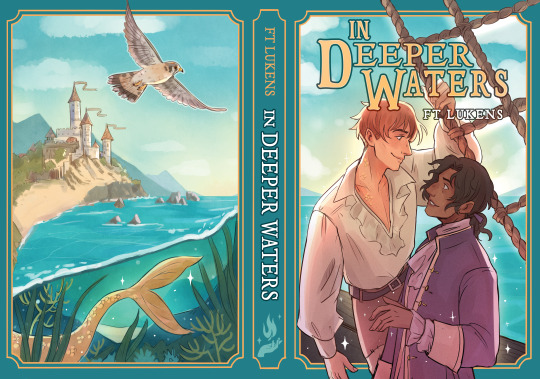


I'm very excited to finally share the alternative dust jacket designs I did for dazzlingbookishshop's FT Lukens set! I absolutely adore these books and they were such a pleasure to illustrate covers for. Check out their site for details if you're interested in grabbing the set!
https://dazzlingbookishshop.com
#FT lukens#so this is ever after#In deeper waters#Spellbound#books#book cover art#book illustration#f.t. lukens#lgbt books#I worked really hard on these I'm really proud of them aaaaaaaa#My dream is to draw book covers so this was such a joy to draw#my art#pigeon princess#covers#book#book art#The original covers for these books are also phenomenal so I really just had to hype myself up that I could make my own lovely versions#Helps that the original artist is a mutual ahahaha
824 notes
·
View notes
Text

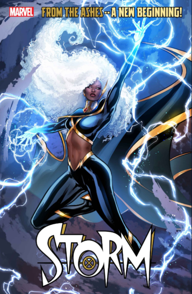


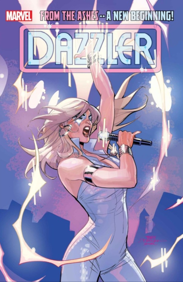


A round of applause for the most female centric comic book relaunch of all times! Safe to say, I will own every single issue of these so here are my favorite covers for the moment!
Support women!🎉
#magik#illyana rasputin#covers#mystique#xmen#marvel#x-men#raven darkholme#comics#x men comics#X-Men#ororo munroe#storm#jean grey#phoenix#dazzler#alison blaire#laura kinney#wolverine#psylocke#kwannon#rogue#anna marie darkholme#anna marie lebeau
253 notes
·
View notes
Text


Fiona Apple magazine covers 1996-2005
385 notes
·
View notes
Last Seen Blogs

fandom-yaoi-at-your-service
Yaoi Fanservice

pakachate
PAKACHATE

hakkobenkyou
hakko benkyou

hakkamania
題名未設定

siddiquebappee-blog
Siddique Bappee