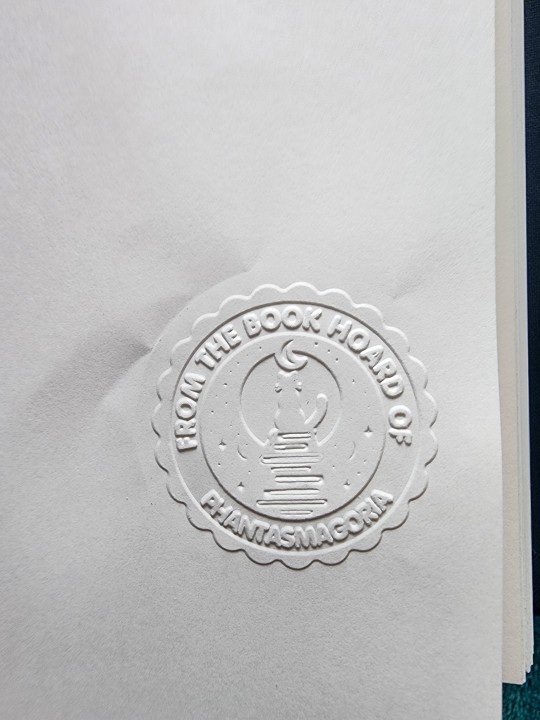
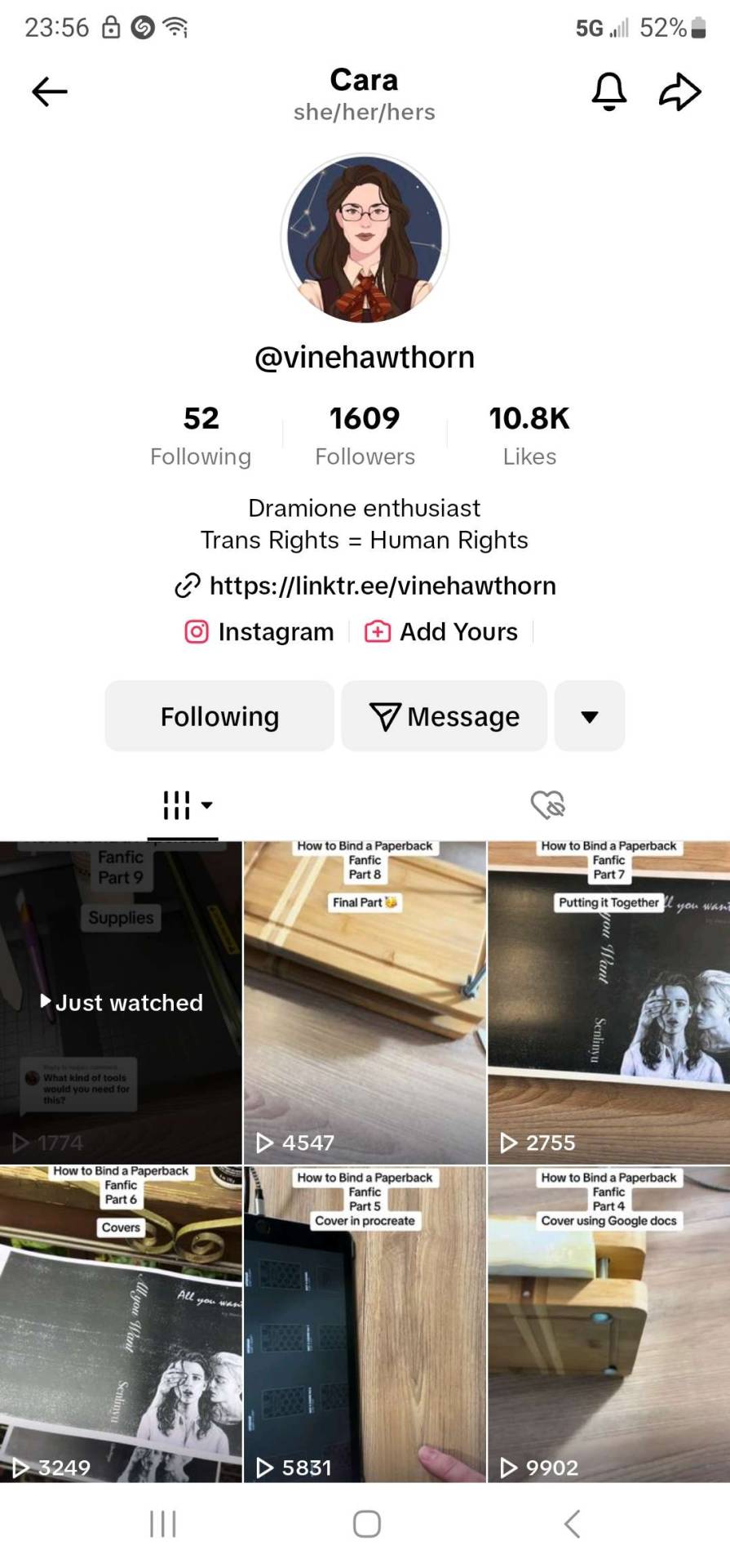
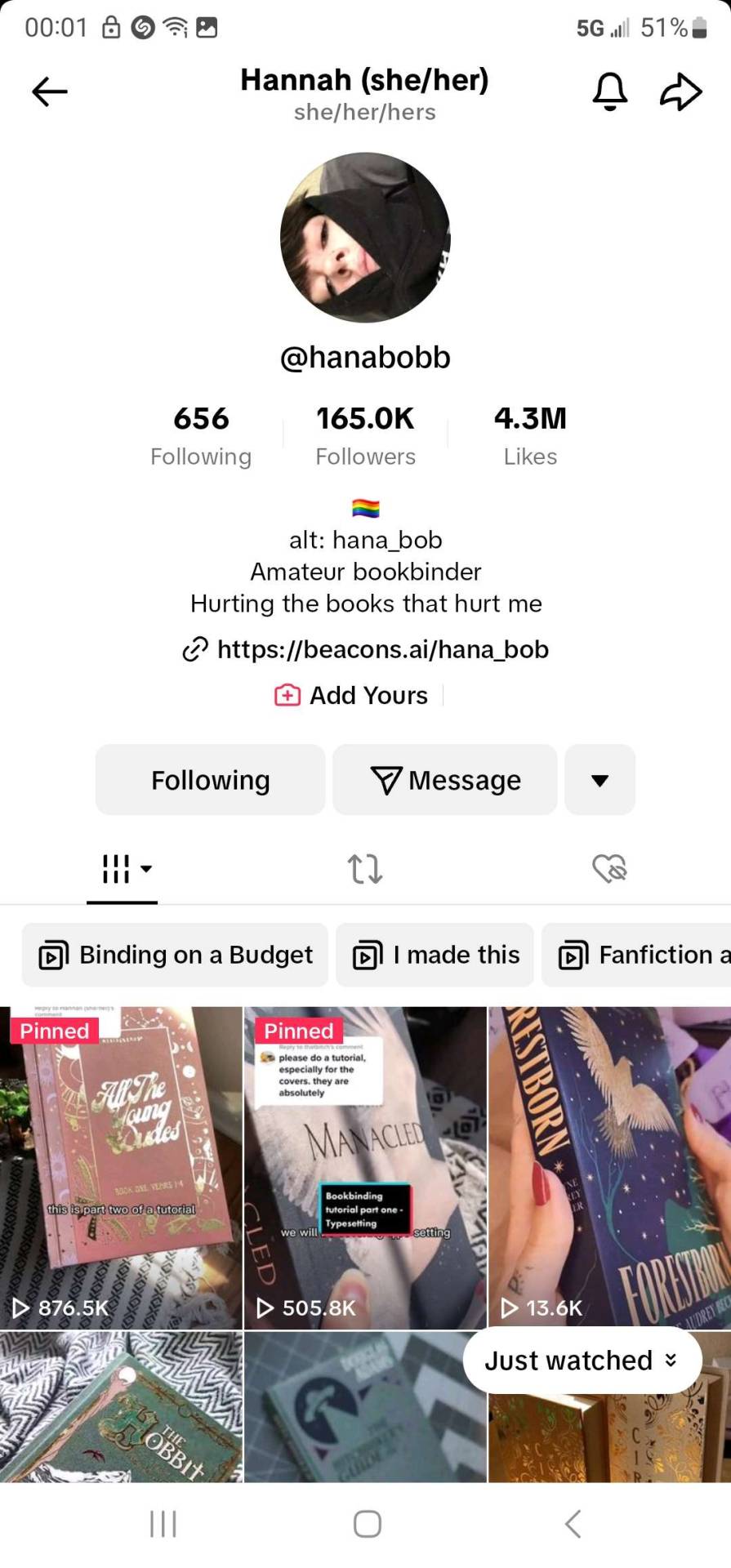
#HTV cards
Explore tagged Tumblr posts
Visit Tumblr Blog
Explore Tumblr blogs with no restrictions, modern design and the best experience.
Last Seen Tumblr Blogs


Fun Fact
Tumblr was created by web developers David Karp and Marco Arment.
Note
Hi there! I figure that you might be the best person to ask - in the past I've used Clueyvoter to plan out my Senate vote. It was a fairly good site - if you never used it, you'd rate the parties on a 1-5 scale, and it would then let you adjust candidate positions if desired, then generate a printable sheet in ballot order to take with you to copy onto your ballot. But, it looks like it's not updated for this year - any suggestions for any similar sites\services for this year's election?
First, my apologies for not answering this sooner—I meant to check, then got caught up on completing the reviews and had not looked up options until yesterday afternoon when completing my index of reviews.
I am happy to say that Cluey Voter now includes the 2025 federal election and it is the only ballot creator that I have found for this election that enables you to create a personal how-to-vote card for a below-the-line vote.
Even if you are voting above the line, though, there are a lot of parties and planning your vote ahead of time will save you hassle at the polling place. Sure, you could just make a list from most to least preferred in your word processor or notes app of choice, but having the candidates numbered in ballot order makes voting a lot quicker when you get to the booth and are trying to wrangle the big Senate ballot. You can copy column by column, left to right, rather than searching back and forth for each party or person.
So, here is a quick overview of options for anyone voting tomorrow who wants something in ballot order that they can have on their phone or print and take with them into the booth to transcribe onto the ballot. You must transcribe it onto the official ballot—you can't just stick the printout in the ballot box!
Personal how-to-vote card creators if you are voting above the line in the Senate
Donkey Votie and Build a Ballot both enable you to create a personal how-to-vote card if you are voting above the line. Donkey Votie is simpler, so it is the one I recommend; plus you can enjoy their humorous brief summaries of each party. Build a Ballot also enables you to make a personal how-to-vote card for your lower house electorate—but you have to go through a somewhat tedious quiz first (which to me seems to have been designed to suggest to soft Labor voters that the Greens align more with their views).
Personal how-to-vote card creator if you are voting below the line in the Senate
As noted above, Cluey Voter is the only one I've found. Us BTL voters are more poorly served this election than any I've voted in before when it comes to custom vote creators. I honestly find Cluey Voter a bit cumbersome: you rank parties by 5 general levels of support, then it generates a card and you can manually edit the numbers. This is fiddly, especially if you change your mind on even one candidate's position mid-ranking, but there is at least a feature to check if you have made any mistakes in the count.
If you have a complex vote like I do (reordering candidates within and across numerous tickets), here's my strategy to save time with Cluey Voter. First, list the parties/candidates from most to least preferred in your word processor or notes app of choice. Then go to Cluey Voter, select your state, ignore step 1 entirely, and click "go to step 2: rank candidates". Now, click "minimise preferences", which reduces what's there to just 12 digits. Delete all those. Now, use your ranked list to find each party/candidate, start numbering from 1, and get them into ballot order. Make sure you click "check" to see if there are any errors in your numbering. This is basically what you'd be doing if you took your notes app list into the ballot booth, but you can do it in the privacy of your own home before you go, with the added assurance that you haven't made any mistakes that would invalidate your vote.
(Be confident in your ranking from most to least preferred before you begin, because if you make an adjustment that throws off a large chunk of the ranking, even by one, you'll have to edit the lot manually.)
Once you're done, if you want a paper copy click "printer friendly" and then "print". I found, though, that even when I selected the options in the printer dialog box to try to force it to one page, this worked poorly. I had to shrink it to 70% size to fit on one side of A4 paper, which for me was too small to read comfortably. But then I blew it up to 135%, and for WA that put groups A-J on one side and K-UG on the other of a single sheet of A4. Perfect!
PS if you are wondering who I am putting 49th and last on the Western Australian Senate ballot, it is the one and only "senator in exile", Rodney Cullerton of the Great Australian Party. I thought of leaving the square blank as a wry joke about the fact he is ineligible for election and the AEC has referred him to the Federal Police for a false declaration on his nomination form, but putting the last preference against his name will be even more satisfying.
#auspol#ausvotes#ausvotes25#ausvotes2025#Australian election#Australia#Australian politics#Australia decides#how-to-vote cards#personal how-to-vote card#Senate ballot creator#Senate#below the line#BTL#vote below the line#voting below the line#Australian Senate#ballot creator#HTV cards#HTVs#personal HTV#Cluey Voter#clueyvoter#yes I am a completist political nerd
16 notes
·
View notes
Text
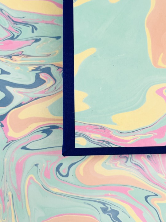
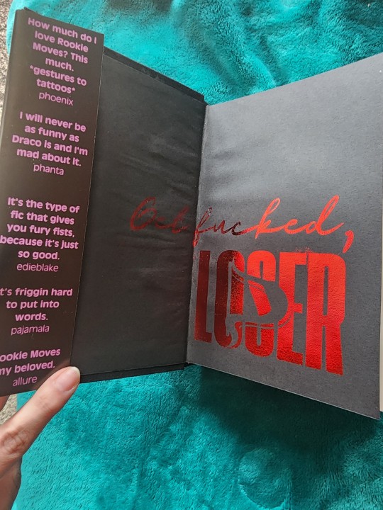
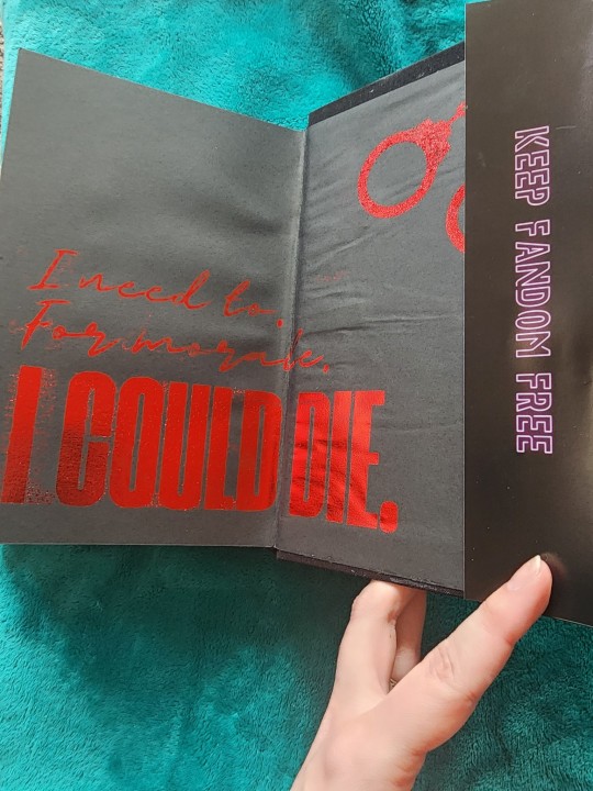
Bound: Fucking Feelings — an anthology of works by @its-the-allure
Typeset by: @sits-bound (stay tuned for typeset details from sits)
Bound by: me, @phoenixortheflame
What can I say about this bind except it was made for a beautiful human for whom I owe a lot to.
I met @its-the-allure on Reddit of all places. One post led to another and she ended up beta-reading my WIP. This is notable not only because I was new to Drarry and didn't have any fandom friends, but also because I'd never written fiction before in my life. Like truly, not a word of it.
If you've had the pleasure of Allure reading your work, you know she is a generous and delightful beta, and her enthusiasm gave me the confidence to start posting my work.

Not long after I started writing, Allure did too, and I had the immense privilege of beta-reading for her, too. In less than a year she published tens of thousands of words, including the 90s chatroom epistolary Come As You Are, which I see rec'd literally ALL THE TIME (seriously, it's amazing and if you haven't already read it, you definitely should).
A few months into binding I told Allure I'd bind her an anthology of her works for her birthday. Well, that day came and went a couple months ago, but — in my defense! — I was making four copies of 22 Cards, OUR FAVOURITE FUCKING SERIES, so I know she forgives me.
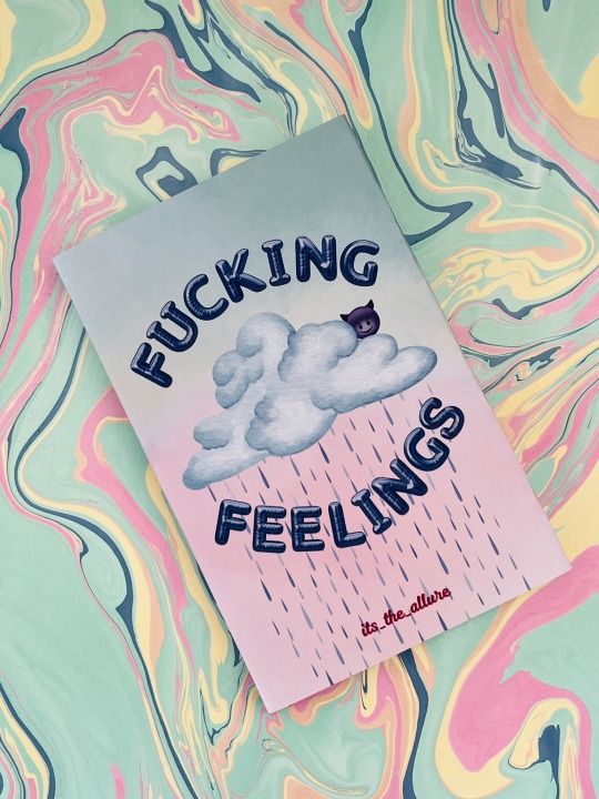
The anthology is called Fucking Feelings because this is the tagline we came up for Allure's work. There are feelings — and there's fucking.
The dust jacket is inspired by Melanie Martinez's album cover for Cry Baby. And the back table of contents is supposed to imitate a chatroom, with each work represented by a DM from the person whose POV the story is from. (If you look closely you'll even see a forwarded message, because that one is actually a Pansmione fic).
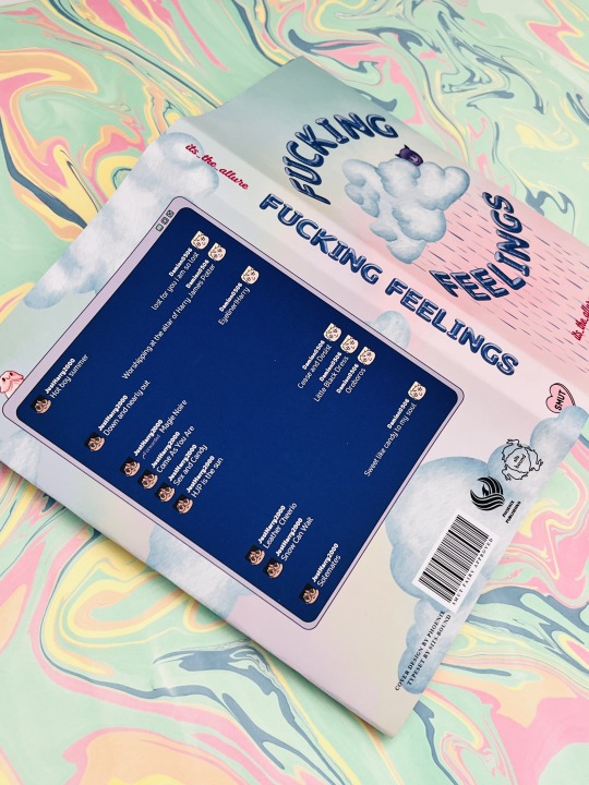
Throughout the cover design and also the typeset (all credit to @sits-bound for that part of it) are fun little nods to everyone's favourite messaging app, Discord.
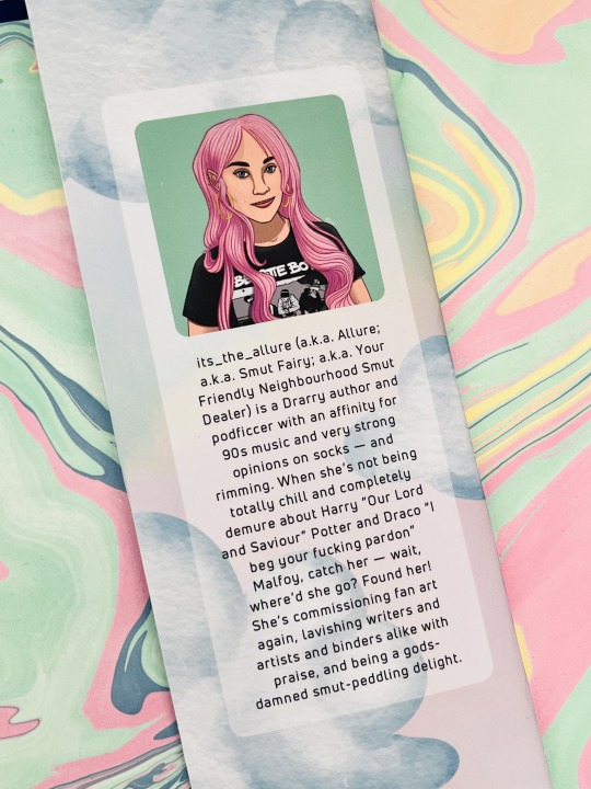
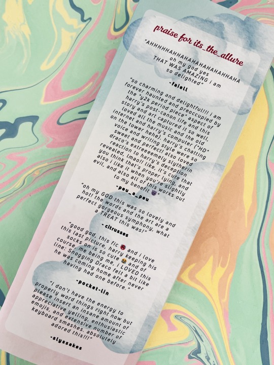
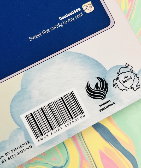
As always, Allure gets her own bio and a Praise For section with comments from some of her favourite people (shout out @faiell, @citrusses, @pocket-lin, @slyssnakes, and of course peu).
Happy birthday, Allure — I hope you love it, babe!
Materials and bind details
Book cloth is Verona in Amped Indigo
HTV is Cricut brand Everyday Iron-On in Blush
Endbands are Trebizond is a 3-ply silk filament thread using DAS's Two Colour Front Bead Headband tutorial here
Marbled paper from The Paper Place
Dust jacket is printed on 48-lb glossy photo paper (13" x 19") and covered with soft-touch laminate
HTV and dust jacket designs all done in Canva
215 notes
·
View notes
Text
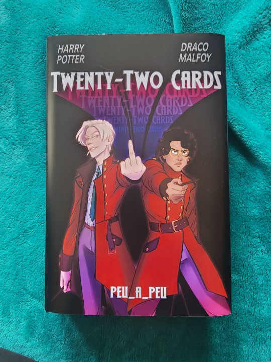
My bind of Twenty-Two Cards has reached @sits-bound so now I can post this! The cover art, typeset, and bind is by me. It also features art by others (@appleslightning, @creeeee, and @littlewinnow) in the typeset.
This was so fun to make and now I just have to finish the author copy (and a special lil gift for @arminaa8 💜)
More pics!
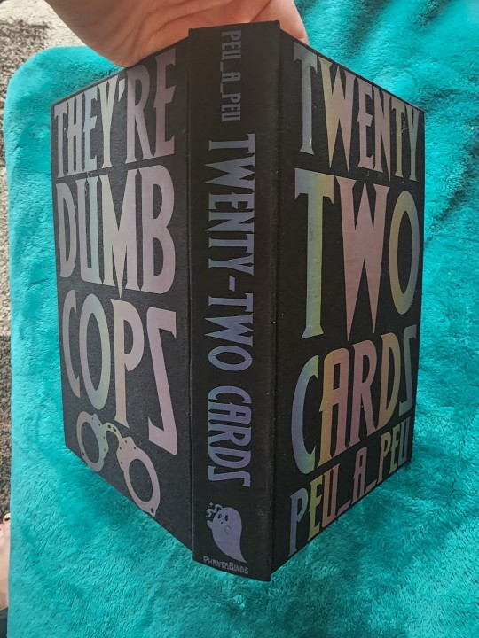
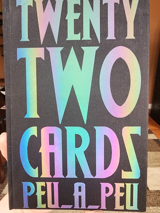
The htv was this neat black-to-rainbow light shifting thing, and the cover art was inspired by the movie poster for the 80s cop movie 48 Hours.
312 notes
·
View notes
Text
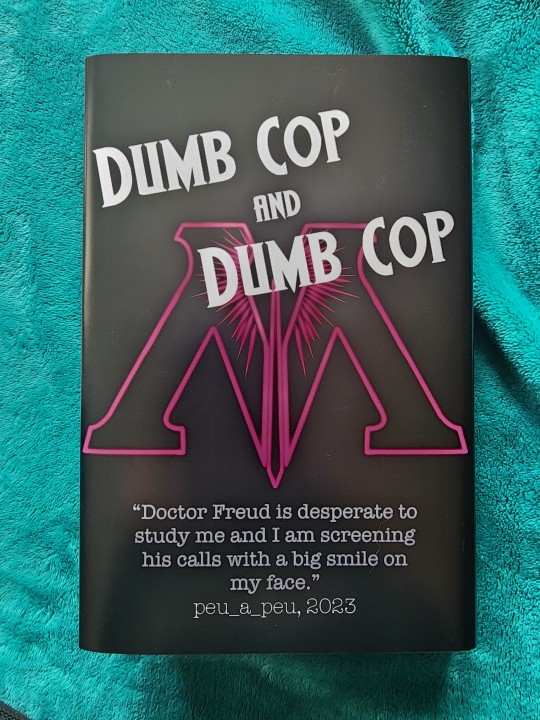
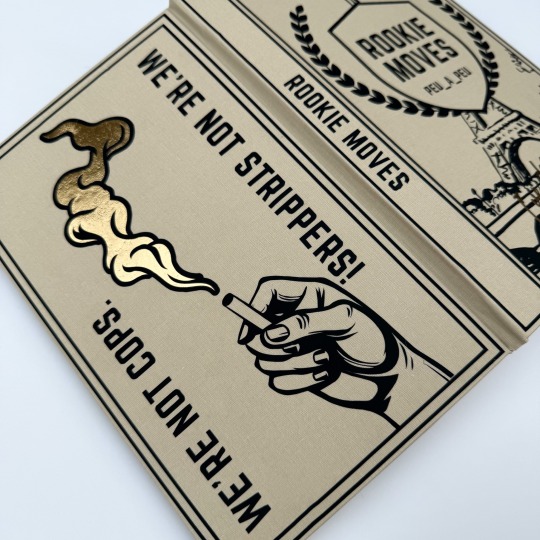
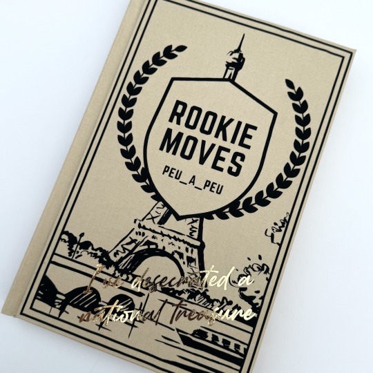
Rookie Moves by peu_a_peu for @sits-bound .
She posted the original bind I sent her, which was still cute, but I was worried wasn’t going to hold up over time because of some of the materials I was experimenting with. So this is a remake with the same typeset.
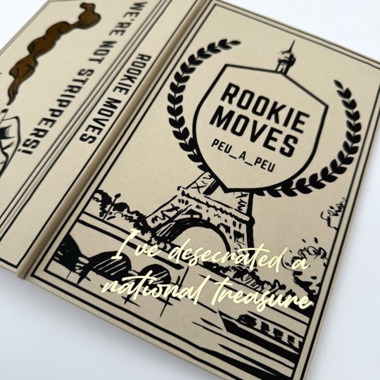
I made this version with Hollanders allure bookcloth in the color “canvas”. I made most of the htv design in canva, imported it into cricut, and then decided it was missing something so obviously I needed to add the cigarette.
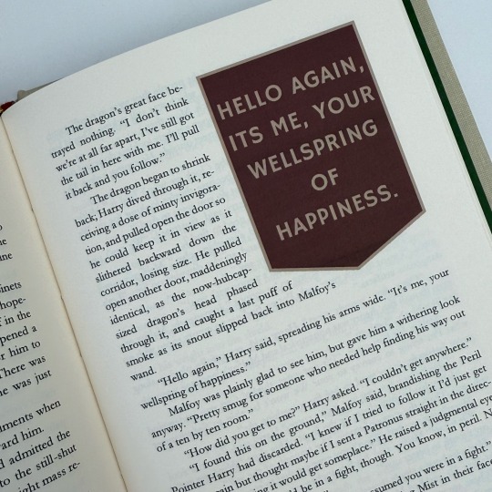
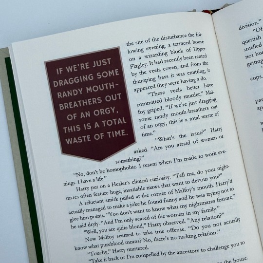
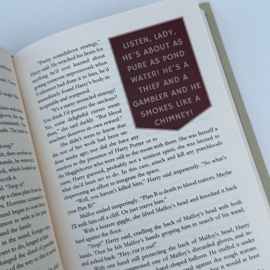
“Of course Malfoy was the type to work out on holiday. Body fascist.
He set down a baguette he’d got on the way home. “How do you think I maintain my figure, magic?”
Cigarettes and mental illness, Harry almost said, but thought better of it. “Can’t say I’ve noticed your figure.”

The dust jacket and typeset art is all by @ectoheart
This fic is hilarious. I tried to cram as many quote highlights into this bind as I possibly could because there are just. so. many. good ones. I’ll edit the typeset eventually to add the other fics in Twenty Two Cards but for now it’s just Rookie Moves.
“What have you done,” Harry breathed.
Malfoy grinned, passing a hand over it from back to front. “I’m in a confusing new relationship, I acted out.”
“It’s so,” Harry said helplessly. “Short.”
“Yeah, that’s the point. I’m thinking of getting my ear pierced too so I really look gay.”
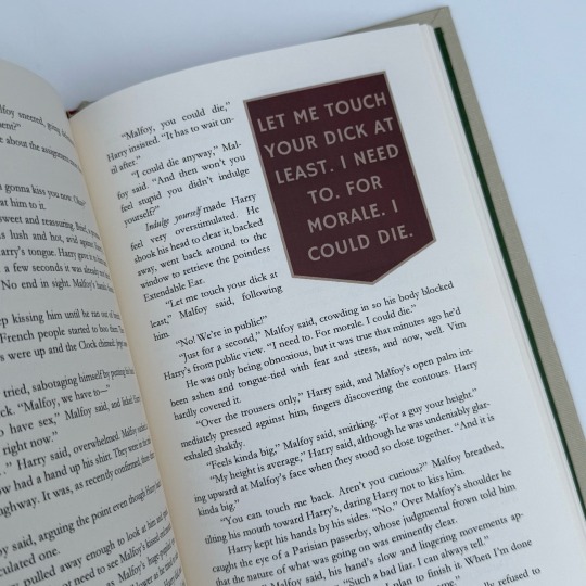
I would read this authors grocery lists if they let me.
And really wet, Harry discovered as, following an absurd little urge, he pulled Malfoy in and hugged him.
“Stop acting like you like me, it’s very manipulative,” Malfoy said.
“I could never hope to manipulate you,” Harry said against his skin.
“That’s just what you would say. To manipulate me.”
161 notes
·
View notes
Text
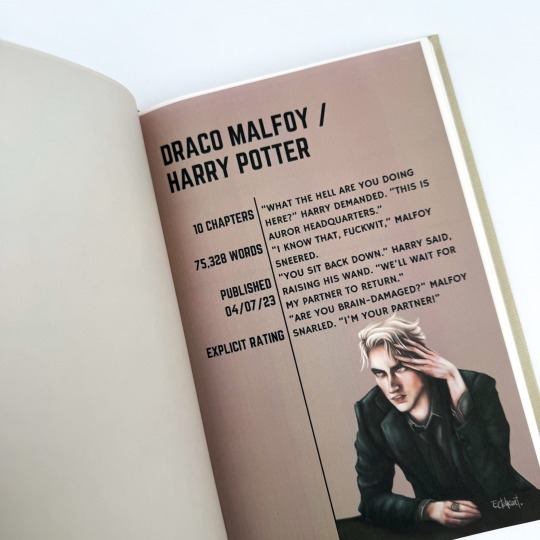
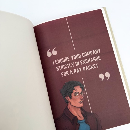
Bound: The Twenty-Two Cards Series (Rookie Moves + 6 more) by peu_a_peu

I am pretty insane about this fic right now. Between this bind and the podfic I'm making of it, I am happily living in the world of these two dumb cops.
I made this for the @renegadeguild's Renegade Loves Fic(writers) event for Fanfiction Writer's Appreciation Day (which is today!), and sent it to the author earlier this month.
This bind has a couple of firsts:
First hand-sewn endbands


I am very very proud of the endbands - it has taken me many, many, many attempts to get them right. Huge props to maleeka_mols for this fantastic tutorial!
First dust jacket


I made a dust jacket because I felt like the design of the case didn't do this series justice. It just needed MORE.
Making it was fun but also very stressful. I had one chance to get the printing right (since I don't have a large format printer and so I had to get it printed as a poster, which is pricey) and thank god it all worked out perfectly.
So let's talk about the details…(other than the end bands and dust jacket.)
The 22 cards of the title reference the 22 cards of the major arcana. I am not familiar with the tarot, so I hope I didn't do anything "wrong" by choosing cards to use based on aesthetics. But it is such a fun aesthetic to use!

Weeding the HTV on the front was a lot. And then the gold of the title got a little wonky (another reason for the dust jacket, if I'm being honest) but I love the way it looks.


There's a lot of gold foiling on the inside. Each story has its own tarot card (again, chosen based on looks because I am shallow). I also made a table of contents! Just a lot of stuff. The typeset itself is fairly simple. (Would I love to have made a maximalist version like the one @slbindery made for me? Yes, but I have to accept that that is not the style I excel at.)


HAPPY (FAN) FIC WRITERS APPRECIATION DAY!
240 notes
·
View notes
Text


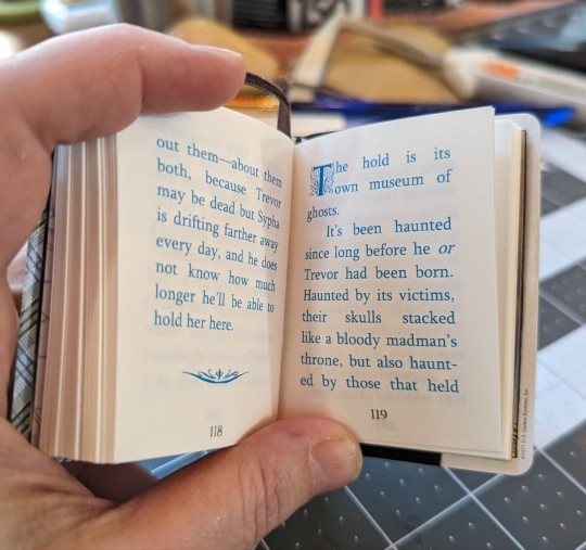
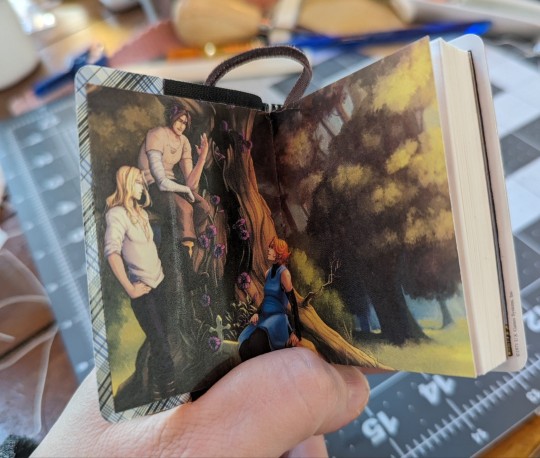

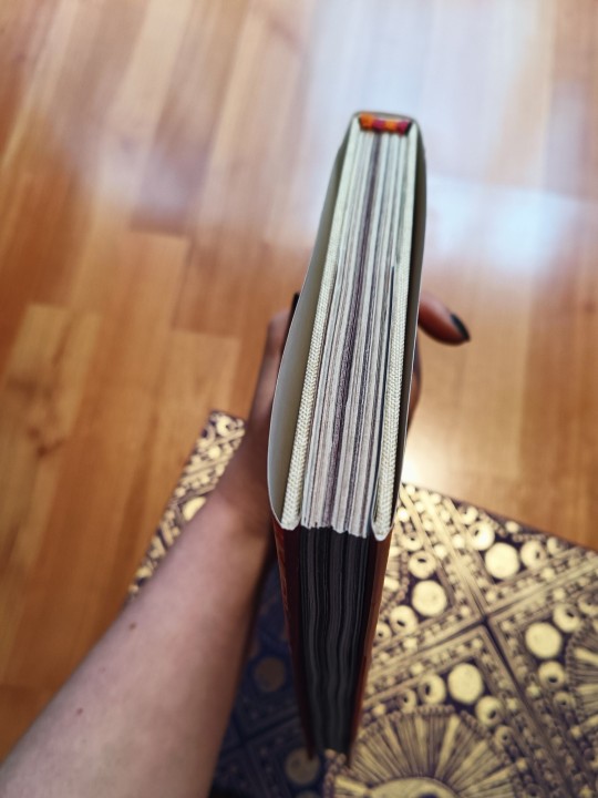
My first REALLY tiny book, a bind of Four of Swords. A sextodecimo! This lil guy is about 3" x 2 1/4" and is bound with actual cards from the miniature edition RWS deck. Because of the fun tarot imagery I'd been wanting to bind this one, but it's so short, just about 5000 words, so it had to go really little :3
Printed on pop-tone white from French, spine and sword detail done with HTV. I printed the main narrative in black and the flashbacks in blue, for visual separation, and the endpapers are of artwork done for this fic by the incredible @sandwichartistdatzu !!
#book binding#bookbinding#ficbinding#fic binding#fanbinding#fan binding#handbinding#hand binding#tarot#tiny book
169 notes
·
View notes
Text
2024 in Binding
I started bookbinding back in April, so it's been about nine months of learning. Here are the stats:
Fanbinds: 29 30 complete binds of 18 19 different typesets. (Mostly one typeset = one fic but I have a couple of compilations of shorter fics in there.) I might actually eke out one more before January 1, which would make the total a pleasingly round 30. Done!
Blank book binds: 21 blank books of various sizes, mostly gifted to friends.
Rebinds: Only 2! This is a great way to practice making cases, though. I will do more in the year to come.
Public Domain/Non-Fannish Binds: 8 books -- two public domain binds, two copies of a book of plays written by a friend's parent, and four copies of a book of stuff from a parent of mine.
Total binds: 60! 61! Whoa.
Some photos!
First book, feat. very ugly cover paper, scorch marks, and terrible hinges.

Fave book (that can currently be shared publicly):

Latest (fannish) book:

More rambling under the cut.
With my typical ADHD-style approach, I definitely didn't hone one style/technique at a time. Things I've learned/tried in binding include:
case binding (with and without bradel-style construction)
three-piece bradel binding
coptic binding (a journal, I didn't share it)
sewn-board binding
criss-cross binding (haven't shared yet!)
sewn pamphlet binding
stab binding
double fan/Lumbeck binding for paperbacks
many quirky small binding styles in my weekend course (matchbook, accordion, dos-a-dos, origami, and more)
In terms of finishing techniques, I've tried:
Endbands from bookcloth
Sewn endbands (French faux double-core) with cotton and silk
French link
Sewn on tapes
Made endpapers
Tete-beche binding (haven't shown y'all that one yet...)
Paper-covered boards
Homemade bookcloth
Hot foiling onto cloth (yet to be featured on a fanbind)
HTV on cloth (of course)
Toner-activated foiling
Wrap covers
Dust jackets
Box-making (for spouse - a card game needed a box)
I have acquired/made lots of equipment but my faves currently are:
Cricut Maker 3
HFS guillotine (love/hate relationship)
homemade book press out of cutting boards
Wrapped bricks for weights
Bone folders - real bone and teflon
Epson ET-15000 colour printer (still getting used to it but it's nice)
And of course I've honed and improved on typesetting and design skills using InDesign, Illustrator, Bookbinder.js, and (recently) Canva.
What do I want to do in 2025?
more gift binds!
thermal-bound paperbacks (binder acquired via Xmas!)
slipcases
a fanbind with foil-quilled covers
inlaid bookcloth covers
embroidered decoration
rounded spines
backed spines??? Maybe?
edge gilding/painting
bookmark charms
laser-cut insets on covers
a magnetic closure on a bind
get better at coptic binding
learn how to make straighter cuts with the stupid guillotine
learn how to marble papers (paper-marbling starter kit acquired via Xmas gifts!)
End of ramble.
#fanbinding#bookbinding#this is a niche bookbinding post#case binding#sewn endbands#handmade journal#drarry fanbinding#hp fanbinding
23 notes
·
View notes
Text
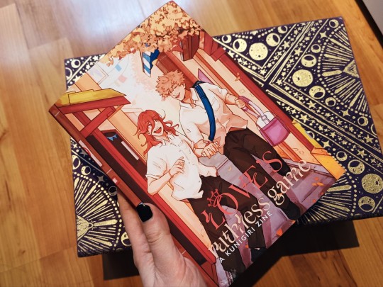

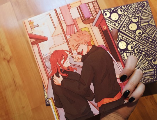
Love's Ruthless Game: A Kunigiri Zine
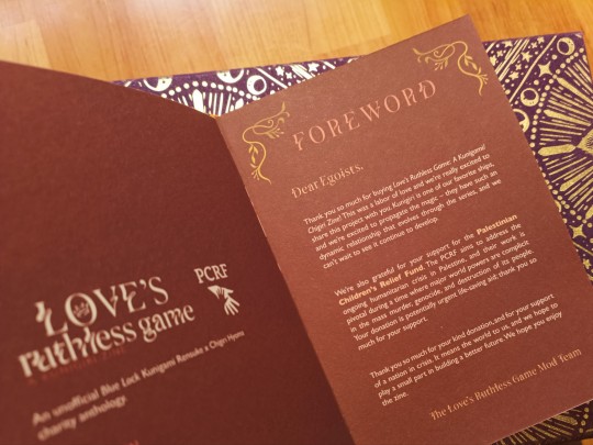
This zine was compiled by the wonderful mods over at @kunigirizine and distributed to fans with proof of donation to the PCRF. It raised $502, a figure our small fandom can be proud of 🧡❤️ Ón abhainn go dtí an fharraige, saoirse don Phalaistín 🇵🇸
The zine focuses on the Blue Lock ship Kunigiri (Chigiri Hyouma x Kunigami Rensuke). It features stories and art from 22 contributors, including myself. The amount of love that went into this sings from its pages—it's a beautiful-looking publication and I'm so grateful I got to contribute.
Naturally, I made a physical copy to gnaw on admire ✨ Technical specs below:
A5 casebinding with linen bookcloth
Handmade dust jacket, featuring art by the inimitable bell (@\forb1ddenrain on twitter)
128 pages (8 signatures) printed on A4 recycled cartridge card (140gsm), thick enough to prevent bleedthrough. Signatures were guillotined before sewing.
Endpapers were marbled by me and sewn on. The colours contrast but I think it works in person 🌈
French link binding with alternating thread. The idea here was to avoid having white thread visible in the darker coloured signatures. 'Twas a pain swapping thread every 1-2 signatures, but look how pretty the sewn textblock was! ...only to get glued over and hidden. I'm happy with the in-bind result though:
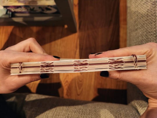

Handsewn double core headbands in Kunigiri's signature colours.
Metallic rose/blush coloured HTV for the bookcloth cover.
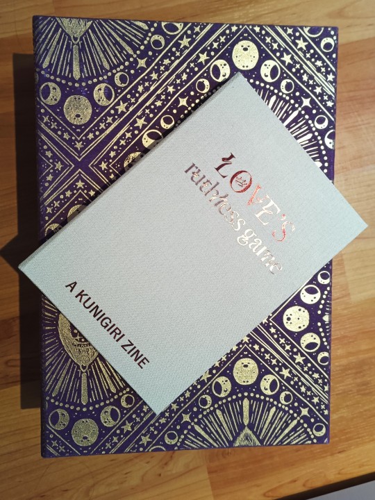
My printer is basically out of magenta now, but I'm so happy with this bind 💕
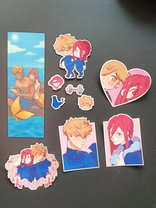
The zine artists also provided a haul of printable and digital merch! 🥺 these bookmarks and stickers are both by Froggi (@froggirum on twitter). Best believe I stuck them EVERYWHERE.
#bookbinding#fanbinding#love's ruthless game#kunigiri#chigiri hyoma#kunigami rensuke#blue lock#bllk#kunigiri zine#fandom zine#boin de bindery#renegade bindery
51 notes
·
View notes
Text
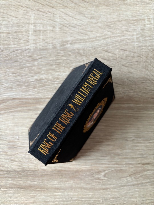
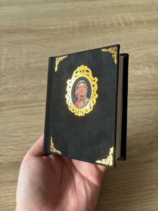
──────── · · ─ ·𖥸· ─ · · ────────
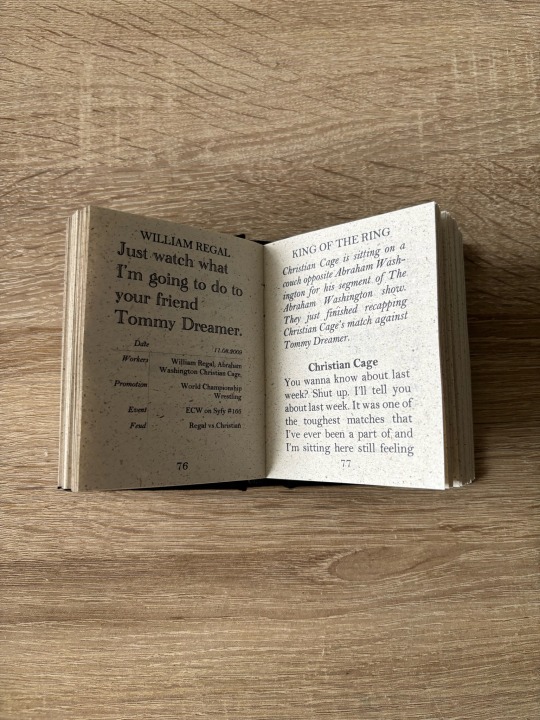
I bound William Regal’s promos.
──────── · · ─ ·𖥸· ─ · · ────────

──────── · · ─ ·𖥸· ─ · · ────────
I���ve been watching a lot of his old matches and promos and what can I say? I love the guy. And he’s a great talker, which is crazy considering there aren’t a lot of promos of his transcribed on cagematch.net. So I had to do some of the work myself. But I really had a grand old time watching through old episodes of Raw and WWE’s version of ECW. Regal is such a perfect, almost Shakespearean, villain. And I really wanted to do him justice with this bind.
──────── · · ─ ·𖥸· ─ · · ────────
──────── · · ─ ·𖥸· ─ · · ────────
I also got to use some of this Carta Varese paper I got. It’s a little darker than I expected but it worked out so well for me, I’m not even mad. I also got to reuse my edit of Regal for my fanfic bind "The God of Spiders and Flies". This time, as a playing card. King of the Ring. King of Hearts. You get it.
──────── · · ─ ·𖥸· ─ · · ────────


──────── · · ─ ·𖥸· ─ · · ────────
I also love this pic and I thought it would be perfect for the cover. I formatted everything in my cricut design app and then chose the print and cut option. I printed this image several times on my printable iron on paper, because sometimes my printer hates me and sometimes even my cricut fucks up the cutting process. Now here’s the thing: After weeding the htv vinyl pieces, I also cut a hole into the medallion piece on the front because the layer that’s supposed to go between the vinyl and the iron is sticky. And it’s gonna damage the image on the iron on paper if I’m not careful. I had some issues with it on my Dead City script bind and let’s just say I’m trying to avoid that headache. It turned out great. Thank god. And there ya have it.
──────── · · ─ ·𖥸· ─ · · ────────
#william regal#pocket book#bookbinding#miniature books#book#diy#aew wrestling#wrestling#pro wrestling#professional wrestling#blackpool combat club#WWE#wwe raw#ecw#wwe ecw#all elite wrestling#crafts#craftblr
18 notes
·
View notes
Text
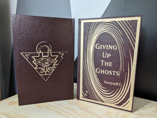
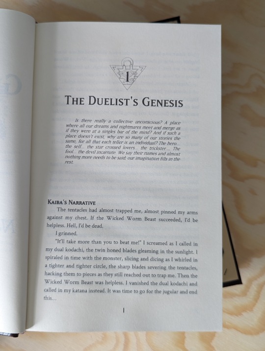
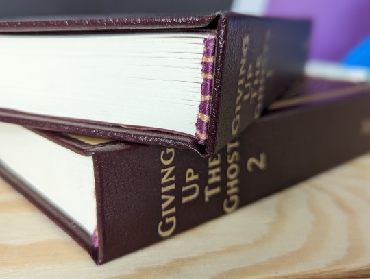
Giving Up The Ghosts By Nenya85
Fandom: Yu-Gi-Oh! Word Count: 266,598
The front cover of both of these is inspired by the swirling gold pattern on the back of the Yu-Gi-Oh! cards. And we have the Millennium Puzzle on the back of the cover as well as holding the chapter numbers for each chapter.
I found fonts inspired by the cards to use for titling and the block quotes at the start of each chapter.
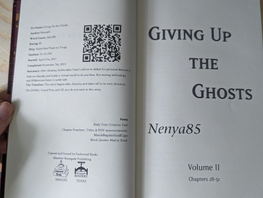
These books were my first time working with HTV and I ended up having to make a new case for the first attempt as I proved a bit overzealous in my application of heat.
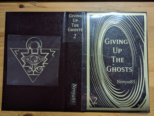
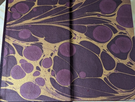
I loved the marbled mauve paper that I found for the end pages of these it fit perfectly with the color scheme I had come up with for the books and it gave me something to color match with when picking my thread for the headbands.
288 notes
·
View notes
Text
Bookbinding for Beginners by a Beginner Part 2
Am back there were some things that I missed stating in my last post. And starting up where I mean to continue. I may add things as I go, fair warning, but there is a lot to cover and sometimes I walk away and go "Welp.... forgot that thing". But for the sake of things not being overwhelming I tried to get the most "Up front" stuff done and out of the way in part one.
And I would like to take this time to say: Take it slow, pace yourself. There is no race. And the learning curve is steep in areas. You have to be ok with making mistakes because it WILL happen. Accept that you've made a mistake but don't get upset with lost time or materials. Make a note of what happened and have a journal on hand if you'd like to see how far you've come and the "OK so.... that didn't work. Don't do that again." At the end of the day we're here to line our shelves with lovely wonderful stories and have the pride of "I did this ain't that cool?"
There are a few optional things you might want to consider.
A paper guillotine this is to make the pages of your bind more tidy, but there is nothing wrong with a deckled edge.
example of deckled edges. It's just a fancy way of saying 'uneven'. There are ways to trim your project with a crafting knife / box cutter and a ruler but my experiments have yielded not so great results. Likely, it's due to several factors: One I don't know my own strength half the time, Two "light but firm pressure" means exactly "Well which is it cause for me those are two different things". Three See one. So deckled edges it is. But if you splurge on a paper guillotine, I salute you. You can also take it slower with a more traditional paper cutter but I recommend measuring twice before committing to a tape marker of where to line your pages up. It is up to you.
Optional but fun: Scrap book paper for decorative end pages. It's fun hunting around a craft store and finding what suits the vibe of the fic you're binding. My only note is aim for something that's not too stiff aim for something fairly easily folded and thin. Card stock like paper won't lay nicely in your book.
End bands these will go on the edge of the spine of your fic but over top of the mull (What is mull? That's coming up)
Mull which is essentially stiff cheese cloth this will add extra structure to your bind
Another option is a Subscription to Canva I only say this because you can sign up for free, but some of the options are locked behind a pay wall. It's fun to play with but the Pro version of Canva also lets you resize your canvas and do custom sizes. I have also done my binders logo in Canva (I actually have two as variants). I also use it to make decorative cover pages.
For your viewing pleasure this is what I came up with. Fun fact about me, I'm a thalassophile (I love the sea and everything about it) since I was consciously aware of the sea. The primary reason WHY I got into book binding is because I am going to be eventually moving onto and living and working off of a boat.

Lucky Seas Bookbinding one and two. Depending on what I feel like using.
Cricut all cricut accessories- there is a mini cricut if you want to dip your toe in. IF you go this route you'll need "HTV" or "Heat Transfer Vinyl"
You can also build your covers in canva and get as cost saving options
Printable sticker paper. OR Heat transfer paper
But this is stuff for covers. I'll get into what you need for covering the chipboard in a minute and give you a "Recipe" for book cloth (Cause I ain't got time nor the funds for some of the book cloth that is out there) but if you want to splurge for your project by all means look and see what is out there. But make note of this- you can just cover your book case in paper and just use sticker paper. I will recommend getting some sort of transparent contact paper to protect your cover (I will go through all of this in future just make a mental note of this)
Now for I promised:
I will be using Celestial Navigation as my example fic of how to down load a fic.

You're going to go to AO3 and go alllll the way over to "Download" and hit "HTML" you can either have it pop open right away or you can go to your downloads and open it up along with your word processor of choice.
You're going to hit Control A (PC) or Command A (Mac), Control/Command C, and then go to your word processor and hit Control/Command V. And listen to the take off noise your computer brand of choice inevitably wants to do while the fic makes it's way from the HTML over to the word processor.
What this all did was copy EVERYTHING and plop EVERYTHING (Save for comments) onto your document. Feel free to save what you have this far and pat yourself on the back you're about to start type facing.
I'm a minimalist in my designs but I have expanded a touch in terms of what I'm doing just to know and experiment for what works for me and what doesn't.
I will reiterate that I will be using Microsoft Word but I'm sure there's away to do this on other processors I just don't know how to do the other one's. I know Mac has something called "Pages". I never worked with it. I will try to add as many visuals as possible but some of my instructions will be "Go to this tab, click X Y and Z to make a thing happen".
Just know that this is what works for me and this is how I've managed to bumble through thus far. This is hardly perfect and I'm still very much experimenting with EVERYTHING. IF you find a better simpler way of doing things- by all means do so.
There's even a way to set up a template when you fire up Word but I've yet to figure it out.
But for now the fun begins- there is some tedium with this but it's best done with music or something on in the background that you can easily listen too but not watch.
First and foremost what you need to do is make the formatting into "Booklet" How to get there is:
Next up hit command A again. Yes... trust me. There might be a lot of this going on for a little bit while you fiddle and fart your way into a typeset you like.
Indent first line and line spacing is found here: Home Tab, Paragraph section hit the arrow pointing down towards the document- next to that is Line and Breaks- hit that if widow and orphan control is clicked unclick it what that does is allows paragraphs to be broken up and will flow into the next page.

Widow/Orphan control example:
Font: For me personally I do Garamond at 11 or 12 depending on my mood. I just like how it looks but find a font type that pleases your eye.
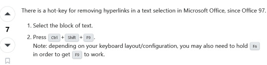
To get rid of hyperlinks:
Line spacing I set mine to 1.5 lines for easier reading. You can keep it to 1 or bump it up to two but the more space between lines means the larger the text block (AKA the book itself) will be.
Now I go back and highlight all of the fic information, and go to the popup menu after highlighting and take the line spacing down to 1 and remove the indents.
I also like to go to the headings section and get rid of the indents one by one on the chapter headings and then center them in the page. Go in front of the Chapter title EX "Chapter 1" and hit backspace until the indent is gone Highlight, there should be a pop up that allows you to change formatting, font and where the indent is.
This is all in the Layout Tab of Word:
Margins- I keep my margins at 1" all directions just because of how it looks on the page but you can have that as narrow as you please.
Next Page- separating the document to make type facing easier. What this does is make the document have "Chapters" within the document. Do this between Chapter one and the first few pages- the opening blank pages, title page ECT.
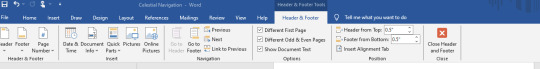
Double click on the header and footer on the document itself and click "link to previous"
What this does is make sure headers and footers (page numbers and the like) do NOT go up to the "Section" above the area you're working.
Word of note- I like having Chapters start at the beginning of a fresh page so I will go to the beginning of the Chapter Title "Chapter One" and hit "Next Section" and it will jump automatically to a new page.
You might also want to open up the navigation panel so you can hit the headings tab (I have mine set with Navigation Panel already open I don't recall how to get there, play around BUT the Navigation Panel will look akin to this on the Left Hand side of the document:
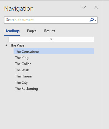
I downloaded "The Prize" to continue the examples as best I can sometimes it's hard to screen grab what I need on an already done document.
You can also add section breaks but leave it linked to previous to continue page number flow.
So you know selecting "Different odd and even pages" means that if you set a fun or different font for the page numbers you will have to go to ex page 2 and unlink the section from the previous.
Do this for headers as well. But that this does is give you the option to put the author's name and fic title alternating on odd and even pages:
Headers and footers:
With headers and footers section still highlighted hit "Page Number" "Format Page Numbers" Hit "Start at" and hit "One" for the section with the main text body.
This... I will admit took some fiddling for me to figure out. There were some frustrated noises and some choice words at times. But if you hit Layout, Next Page it should prevent you some heart ache instead of just constantly hitting the Enter Key and hoping for the best.
Different Odd and Even Pages what this means and how it works:
In my experience you will have to go to the first 1-3 pages to unlink everything from the Previous Section so it doesn't show up on the beginning pages of the document- but if you like the look of it, more power too you. It's your fic. It's going to be on your shelf at the end of the day. Follow your joy. I'm just letting you know what I do.
You will also have to unlink to previous section with the footers as well, and if you choose a different font and you want the numbers to match through the whole text you will have to input that. Hit the "Pages" Navigation and use that to scroll through things quickly so you can check your work and see if you're happy.
I'm kinda a fan of leaving the headers with the author's name and fic title alternating on pages OFF but I have experimented with it a little bit just to know what it looks like and what it does.
But here is an example of alternating Headers for Sabrecmc's "The Prize" (It was on my To Bind List and since Sabrecmc has given their blessing I'm hoping they don't mind me going "Alright people need visuals.... and this is what I'm working on."
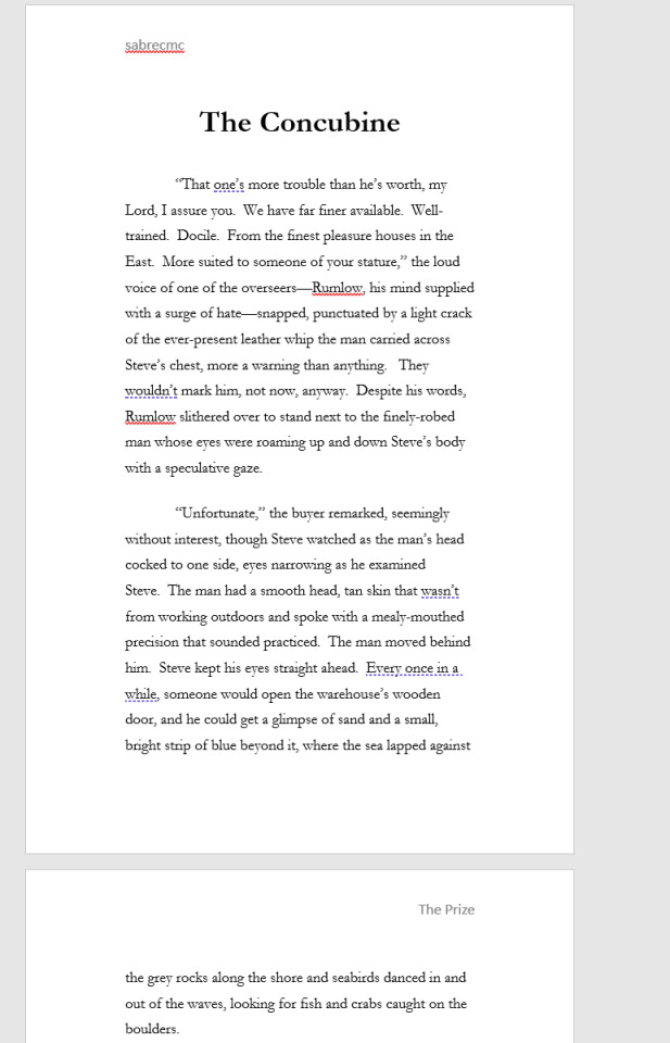
To get the header from the left to the right side- hit tab and type what you please you can also highlight and set colour and font type. This is just Garamond for now for ease of example and reading for now.
Choices choices choices.
Some fic binders like to keep everything including author's comments at the beginning and ends of fics. Personally, I remove them just to keep the flow of everything. You can have a section at the back of the fic if you'd like with all of the comments but that is entirely up to your own personal preference. This is the fic for your shelf make it in a way that makes you happy.
Now all the way at the top of the fic I want you to insert 6 blank pages. But keep in mind this is front and back of pages in a book. Two blank pages on the document equals one page. Some binders go more than that depending on what all they like to do. You'll figure out what you like and what works for your project. Think Bob Ross- Happy little trees and do what you want.
But for me in the document: Pages 1 and 2 are blank as a sort of buffer page, 3 is the title page with the fic name and author and likely some simple design, 4 is all of the fic information- I keep the pairing, chapters, any additional or important tags or warnings, rating and a QR code to link back to the original fic. Page 5 is either left blank but I have added images as something fun for the hell of it that fits the fic, page 6 is my logo. In earlier experiments I played with where my logo goes this works for me I think but it may change in the future. IF you want to have a table of contents by all means add some pages to do so. I don't find it necessary so I don't do it.
To insert an image- for QR codes or title pages:
QR codes can also be just dragged and dropped I've been lazy and dragged and dropped and resized them from there.
I also put a disclaimer in red font: "This is for personal use only and is not intended to be sold! Retail value is estimated 25$" That is to cover the cost of the materials you have used or made in the process of your book that way if your fic somehow ends up in a donation bin it can't be sold for very much.
This is what the info section of a completed fic looks like for me:

To insert an image:
Insert Tab (Next to Home Tab) , Picture- next to the "Table" section, hit the drop down menu and hit "Upload from this device" and select where you have saved the QR Code to, desktop downloads what have you.
It should appear on your document and you can resize it as you please, if you click on the image there should be a pop up with a grey looking rainbow with lines- that's important for QR codes I have it "in line with text"
for fun headers "Have image behind text"
This is.... getting LONG as hell... so I'm going to stop here. But this should give you a jumping off point to start with your fan binding. Play around! Have fun.
Last few Tips:
Home Tab- in the paragraph section- if you need to know what the nitty gritty of what's going on in the document is- hit the backwards looking "P" with the line that's the sign for "Enter" on your keyboard. So you can see what that looks like I don't use it cause it clutters everything for my eyes, but it won't show on the final product. You can turn that on and off at your leisure
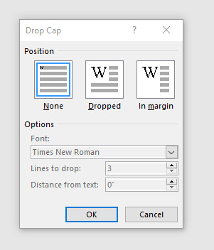
Insert Section: Scroll along the top until you see "Word art" one more over "Drop Cap", That's how you can get fancy letters at the beginning of the chapter. Sometimes you DO need to add some spaces between the Letter you're Drop capping and the rest BUT what that window looks like is this When you hit "Drop Cap Options" you can set whatever font you please for however many lines I typically do 3 but the more lines you drop the larger the letter. Tinker with it have fun.
There will likely be more type facing goodies next post... but after I get done type facing I'll get into getting the document ready for printing, how to print and what to do with that shopping list I gave you in that previous post.
REFERENCES, LINKS AND HELPFUL PEOPLE!
Some links for your consideration you will need this for future reference so book mark these:
French Link Stitch
Perfect bound books (AKA Paper backs)
Fun Fonts to spice up the document body itself, you can also import them into Canva.
Da font
1001 Free Fonts
Another resource to keep in mind for ink is this site here if you have cartridge printers see if you can't get a refillable set for your printer so you don't have to sell your arms, your legs, your first born and your house to keep printing your fic projects.
These two tiktokers right here explained everything the best, they are worth checking out even if you don't have Tik Tok. They've been going at this longer than me and don't go "OH SHIT I FORGOT A THING" constantly.
EDIT ONE! This is the punch cradle I have it makes it easy for french links for me
HoneyMinCo Sea Lemon
16 notes
·
View notes
Text
Fusion delusion and HTV confusion
This week, the Fusion Party—whom I reviewed at considerable length and not because I think they are a good option—posted how-to-vote cards (HTVs). Today, they retracted some of them and deleted posts from social media platforms. So, it's going well!
It seems there was very little vetting, with candidates not just free to allocate their own preferences but also with no review or questions asked before the HTVs were posted publicly. It speaks poorly of party processes that evidently nobody said "uhh hey what's going on here?"
Luckily, I saved a couple of the worst HTVs for individual seats, and the Victorian Senate HTV is still up. Shall we have a look? Let's begin with that Senate HTV:

I will get the obvious dunk out of the way: this is an atrocious design, busy and unpleasant on the eye. The emojis are completely unserious. But, look, HTVs are rarely artistic masterpieces. They should communicate a party's agenda concisely—which this one does not do, there's way too much text—and set out some preference recommendations to aid their supporters.
And hoo boy look at those Fusion preferences: Libertarians in 5th above Labor in 9th and the Greens in 10th. The Libertarians are one of Australia's most loathsome minor parties and they stand against what Fusion claims to be their core values, such as a denial of the reality of climate change that is at odds with the "Planet Rescue" part of Fusion's current registered name. How would you feel if you were a member of Fusion constituent party Vote Planet? I'd assume not great, although I also understand Kammy Cordner Hunt, the Victorian lead Senate candidate above, is from that wing. A penny for her thoughts!
Fusion have been taking some serious flak for this on social media. If you have a Facebook account, here is the announcement of the Senate HTV, with reactions and defensive replies by the official Fusion account and some candidates. People are not happy about that Libertarian preference, and the second candidate on the Vic ticket, Simon Gnieslaw, has been responding at length (hi Simon, I'm sure you're reading; yes I remember you getting upset in my DMs in 2022 because I called your centrism "waffle" and your website "amateurish"). I've screenshotted three choice replies below.
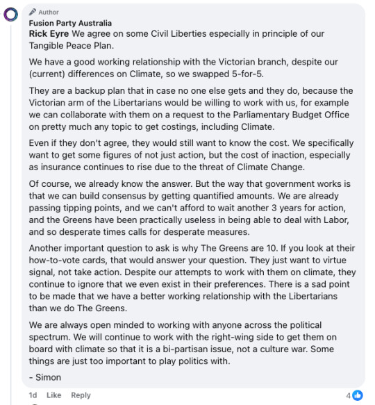


This is quite silly rhetoric and it seems that some Fusion organisers have been taken in by smooth talk from one of Australia's most distasteful parties. The Libertarians' lead candidate in Victoria is a literal con artist and the party are bad-faith actors. It is little wonder that in private they can make soothing noises of "good will" and massage the ego of Fusion delegates in preference discussions. Gnieslaw's comments (particularly that third screenshot) also evince a naive belief in "compromise" above everything else. Forever seeking compromise rather than sticking to principles is just a way to allow bad-faith actors to drag the Overton window towards themselves. This is delusional stuff.
As for the Greens, they have little incentive to deal with electoral lightweights such as Fusion. The Greens' preferences are certain to be distributed after Fusion is already out of the count, if distributed at all. Unlike the Libertarians, who as a fellow micro-party need all the favourable HTV treatment they can get and will say whatever it takes to get a good placement in the hope it pays off in the contest for the last Senate quota, Fusion are the ones who need to get the Greens to want to work with them, not the other way around. It seems Fusion can't play with the big kids who have built a seat-winning constituency in every state—possibly because Gnieslaw has a personal grievance against them over the Israel–Palestine conflict, as articulated on his candidate page. The HTV above claims Fusion is "the only party with a Tangible Peace Plan for the war in Israel and Palestine" (oh yeah sure you've solved a century-long conflict) and even more ridiculously suggests that Fusion is "already working in the background to deliver this plan" (solving the problems of the world over beers at the pub is not "working in the background"). You can read this Tangible Peace Plan for yourself; perhaps you'll agree with me that would be better summarised as intangible principles.
One more comment on the Senate HTV before I move on to some of the House HTVs: if you looked closely, you would have noticed that among the unnecessary emojis are three other symbols. One, a circle with 3 Rs, indicates support for the Climate Rescue Accord, which Fusion developed through negotiations with the Animal Justice Party, Australian Progressives (contesting this election as part of Fusion), and Reason (now de-registered, with Fiona Patten standing for Legalise Cannabis). It has reasonable enough objectives mixed with the sort of futurism about R&D into technologies that some would dub optimistic and others fanciful. The second is a Khamsa symbol, which indicates parties who have given in-principle support for Fusion's "Tangible Peace Plan". And the third is a symbol indicating support for a Universal Basic Income.
The thing about these symbols is that they mean nothing to the average voter, and although they are explained on the Senate HTV, Fusion has used them on HTVs for seats in the House of Representatives with no explanation. They're simply mysterious icons beside their name and that of some other parties. If you are even mildly inclined to conspiratorial thinking, you might wonder what they are meant to communicate and to whom.
So, let's turn to HTVs for specific seats. Remember, Fusion has recently incorporated the Australian Progressives (who, despite their name, now claim to be in the "sensible centre") and Democracy First (a fringe right-wing org of serial candidate Vern Hughes). It seems candidates had freedom to distribute their preferences however they wanted, and some went... off message.
First, the Fusion candidate in Melbourne, Helen Huang:

Yes, she is sending her second preference to independent Tim Smith and her third to the Liberals. Smith is not the disgraced ex-Victorian Liberal politician of that name, but a contestant from Married at First Sight who says that "I don’t like politicians" and promotes the "strategic" use of social media outlets like Instagram and Tik Tok to gauge public opinion instead of holding referendums (wait until this guy finds out about constitutional law!). As for why on earth the Liberals are third, above Labor or the Greens, the HTV itself says this is because of Steph Hunt's "credentials in peacebuilding to end wars and bring people together". Yes, Liberal credentials in peacebuilding. Ponder that one!
But the real humdinger is the HTV for McEwen candidate Erin McGrath. See if you can spot the issue among the preferences:

That's right: Family First is preferenced fourth, above any of the major parties. Yes, the Family First, the party of vile anti-LGBTIQ campaigner and professional eater-of-shit Lyle Shelton. They could scarcely be more at odds with core Fusion values.
But it gets better because people pressed Fusion about this on Twitter and they simply couldn't pick a lane. The original post has now been deleted—it just had some HTVs including McGrath's for McEwen—but if you have a log-in you can view a surviving comment chain here. One reply flagged some of the bizarre decisions, and the official account began by saying that they were made based on personal interactions:
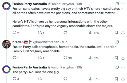
So, at first, Fusion are fine with preferencing "one guy" from Family First for being "vaguely reasonable". Then, as the negative response grew, they deleted and offered this explanation:

Yup, apparently this was simply a production mistake. If that is true, it speaks very poorly for the party's internal oversight, because multiple people clearly did not think to say anything when making, approving, or posting the HTV. And when pressed on this, Fusion replied with an absolute gem:
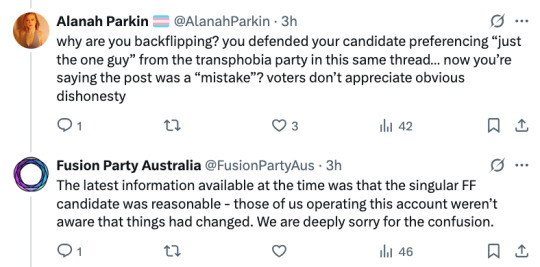
Things had changed?? It's Family First. WHAT CHANGED.
The party says it is a mistake, but these contortions are worthy of professional gymnasts. It seems the reality is more straightforward. The party's own list of candidates includes a small logo showing which constituent of Fusion the candidate is aligned with. Some, such as Huang in Melbourne, appear to be unaligned, but Erin McGrath in McEwen is aligned with—you guessed it!—Democracy First. She's part of Vern's right-wing rabble. I am far more prepared to believe she genuinely sympathises with the Family First candidate than that "things had changed". The only thing that changed is people noticed this laughable preference at odds with Fusion's own stated values.
We will see what an updated McEwen HTV looks like and if any others are amended. In any case, this further affirms for me that Fusion is not—or at least is no longer—a decent choice, least of all for left-wing voters who might have positive memories of some parties that are now part of Fusion.
#auspol#ausvotes#ausvotes25#Australian election#Australia#Fusion#Fusion Party#how-to-vote cards#HTVs#Democracy First#preferences
28 notes
·
View notes
Note
Hi! As a fellow fanbinder I am absolutely enamored with your beautiful books, and I wanted to ask about your binding of "Factory Settings" (/post/728205256440283136). How did you do that beautiful inset oval of marbled paper on the cover? And what is a "foil quill" and how do I get my hands on one, cause your gold detailing looks amazing!!
oh thank you so much for the lovely compliments <3 so for the cover inset, i basically had a piece of 300 gsm card that i cut the same size as the cover board, and then using my silhouette cameo 4 i centred the oval on that piece in the software that comes with it, and cut it out! then i glued that card to the board and covered the whole case with cloth, making sure to use my bone folder to work the cloth into the creases. i then also had my machine cut an oval in the marbled paper that was 1 mm smaller than the oval it cut into the card, to accommodate for how paper stretches when moisture is applied to it, and then i just glued the paper down straight onto the cloth! Sorry, i dont have any photos of this process! D:
The foil quill i was talking about was the We R Memory Keepers foil quills. sadly it did not go well at all, and i instead just cut out HTV copper foil for the spine and cover for the design. you can get lovely results, as seen on basically any of des' books. her work is wonderful, i just don't think i am patient enough tbh. the process for that is using washi tape to put down your foil, then over the top of that you print the design that you want. that's what i struggled with the most, i think. i didnt go slow enough and take enough time to do all the details, and it looked patchy. its why i decided to cover it with htv instead.
8 notes
·
View notes
Text
I was in a relationship with one of the state candidates for 8 years, and handed out HTV cards for Fiona Patten at one point.
Good times.
In the 2010 Australian election, candidates running under the banner of the "Australian Sex Party" won 250,000 first preference senate votes, making it briefly the fourth largest party in the country

2K notes
·
View notes
Text
Unleashing Creative Potential: VEVOR 53 Inch Vinyl Cutter Plotter Machine for DIY Advertising and Label Making

VEVOR Inch Vinyl Cutter Plotter Machine mm Vinyl Cutting Plotter Signmaster LCD Screen for DIY Advertising Label Making
👉👉Buy now: https://youtu.be/azBfOtThKwA
🔥🔥 DISCOUNT: 68% 🔥🔥
In today’s fast-paced advertising and design industry, precision, speed, and versatility are paramount. Whether you're an independent creative, a small business owner, or an established signage professional, having the right equipment can be a game changer. Enter the VEVOR 53 Inch Vinyl Cutter Plotter Machine (1350mm)—a robust, feature-rich tool built for efficiency and creative flexibility. With its compatibility with Signmaster software, integrated LCD screen, and wide cutting range, this machine is ideal for producing professional-quality decals, signage, labels, and more.
A Beast in Size, A Precision Tool in Action The first thing you’ll notice about the VEVOR 53 Inch Vinyl Cutter is its impressive cutting width. With a maximum paper feed of 1350mm (approximately 53 inches) and a maximum cutting width of around 49.6 inches, this machine offers enough real estate for large-scale projects. From full-size banners to vehicle wraps and window displays, the VEVOR vinyl cutter allows creators to take on more ambitious and profitable projects.
Despite its size, it doesn’t compromise on detail. The cutter offers a cutting precision of ±0.01mm, allowing for clean, accurate cuts—whether you're working on intricate logos or large-format designs. Its adjustable cutting pressure (10-500g) and cutting speed (10-800mm/s) enable users to tailor performance depending on the material used.
User-Friendly Interface with LCD Display One of the standout features of the VEVOR 1350mm Vinyl Cuatting Plotter is its intuitive LCD screen. Designed for both beginners and pros, the screen simplifies navigation, allowing users to adjust settings on-the-fly without fumbling through menus. With real-time data feedback and simple button controls, it enhances productivity and reduces errors, especially during high-volume production.
This plug-and-play machine also comes equipped with USB and serial ports, ensuring easy connection with PCs and laptops. The plotter is compatible with Windows operating systems and comes bundled with Signmaster software, one of the most popular tools in the signage industry.
Compatible with a Wide Range of Materials Versatility is key in any design tool, and the VEVOR vinyl cutter doesn’t disappoint. It can handle a range of materials including adhesive vinyl, heat transfer vinyl (HTV), reflective films, card stock, and more. Whether you're designing vinyl decals for car windows, heat transfer graphics for t-shirts, or reflective safety signs, this cutter is ready to deliver.
Additionally, the pinch roller mechanism ensures accurate material feeding and alignment, helping reduce waste and improving overall efficiency. This feature is particularly useful for extended runs where precision is paramount.
Signmaster Software: Your Creative Co-Pilot Bundled with Signmaster software, the VEVOR vinyl cutter provides an all-in-one design and output solution. This user-friendly software supports vector editing, text design, contour cutting, and even custom job queueing for efficient task management. It also offers direct cutting features, so you can send designs straight to the machine from the software interface.
For those transitioning from manual cutting methods or less capable software, Signmaster’s intuitive platform is a significant upgrade. It supports file formats like SVG, PDF, EPS, and AI, providing seamless integration with Adobe Illustrator and CorelDRAW workflows.
Ideal for Entrepreneurs and DIY Enthusiasts Whether you run a home-based custom t-shirt business, a print shop, or are a DIY enthusiast, the VEVOR 53 Inch Vinyl Cutter offers the scalability you need. Here are a few potential uses:
Signage for businesses: Create storefront signs, directional signage, and promotional banners.
Custom apparel: Use heat transfer vinyl to make custom t-shirts, hoodies, and caps.
Car decals and wraps: Personalize vehicles with logos, stripes, or full branding.
Wall decals and home decor: Produce custom stickers and art for homes or offices.
Event branding: Design signage for weddings, parties, trade shows, and more.
This versatility not only expands your creative possibilities but also opens new revenue streams.
Durability and Build Quality VEVOR machines are known for their solid construction, and this model is no exception. Built with a high-quality aluminum alloy body, it resists vibration and provides long-lasting durability—even in demanding work environments. Its steel axis and roller system ensure smooth operation with minimal maintenance.
The machine also features an emergency stop/start button, giving users greater control and safety during operation. Combined with the anti-static system, this machine is as secure as it is functional.
Why Choose the VEVOR 53 Inch Vinyl Cutter? Here’s a quick breakdown of what sets this machine apart from competitors:
Extra-wide 53-inch cutting width for large projects
High cutting precision and customizable speed/pressure settings
LCD screen for easy control and real-time monitoring
Compatibility with Signmaster software for professional design capabilities
Supports multiple materials from vinyl to cardstock
Durable metal frame and professional-grade components
Beginner-friendly with advanced features for pros
Tips for Getting the Most from Your Cutter To maximize the lifespan and performance of your VEVOR vinyl cutter, consider the following tips:
Keep the blade sharp: Replace cutting blades regularly for clean, accurate cuts.
Clean the rollers and feed system: Dust and debris can affect material feeding.
Use quality vinyl: Low-grade materials can cause jagged cuts or clog blades.
Test cut settings before large jobs: Avoid material waste by dialing in pressure and speed for new media types.
Regular software updates: Keep Signmaster updated for optimal performance and new features.
Final Thoughts The VEVOR 53 Inch Vinyl Cutter Plotter Machine (1350mm) is a powerhouse of precision, size, and user-friendliness. Whether you're just starting out or upgrading your equipment for a growing business, this cutter is an investment that pays for itself in both capability and reliability. With intuitive controls, powerful software, and a robust build, it stands out as a top choice in the world of vinyl cutting.
If you're looking to take your creative or commercial vinyl work to the next level, the VEVOR vinyl cutter is an outstanding solution that offers premium performance without the premium price.
#vinyl_cutter_plotter_machine#heat_press_machine#printer#iron#diy#htv#vinyl#tshirt#bag#fabric#cricut#mug#cap#pen#bottle#shoes#football#youtube#video#home
0 notes
Photo

FREE Leather Earring file, Printable vector clip art download. Free printable clip art. Compatible with Cameo Silhouette, Cricut explore and other major cutting machines. 100% for personal use, only $3 for commercial use. Perfect for DIY craft project with Cricut & Cameo Silhouette, card making, scrapbooking, making planner stickers, making vinyl decals, t-shirts making , fashion, apparel, HTV, and more! Earring SVG, DIY Jewelry making, handmaid Jewelry, leather earrings
0 notes