#I designed an ENTIRE FONT for Override.
Text

Winx Club functional books
It's me again ! I know, weird that I'm more active in a week than I was in the last years, but hey I'm feeling productive so why not make some stuff out of it.
I feel like there's not enough activities for your kids in the Sims 4, like we don't really build their personnalities while they're children before turning them into teens and it bothered me. In my mind, it's at that stage that we truly discover how life works, what we like and what we would like to discover and learn throughout the years. It's at that stage that I discovered how much I loved books, and now it's my studying field !
So, in a nostalgic way because this series is one of the firsts I read as a child, and because my child sims need some love too, I made those 6 books for them to read (is there even any books for kids in this game ?)
They work as volume 1 of the logic skills so your sims will also gain some skills while reading (but as they level up, they might get bored)
This set is entirely base game compatible, they don't override any book and you can have as many book as you want in your game !
They can be read by children up to elders
I only did the first season because it took a long time to just make those six (even if the longest was to create the model I used throughout the whole collection) but I plan to make other seasons later (Aisha doesn't appear until the first book of the second season, I might at least make her book and release it before the entire second season is created as they are like 20+ books in that season)
The entire set is written is simlish BUT the books I referenced are written in french, so that's on french that I based the simlish textes + the title and the summary of the set in game are written in french (I'm sorry, I couldn't find the english version, but if you know of any, I will try to add them in the future)
I wanted to make pages for the interior, but the game works in a way that the two that are shown when your sims are reading books are the same, so it would be a bit weird to have two identical detailed pages next to the other. Thus, I took the lyrics from the opening credits in the TV shows (in french again) and copied/pasted them on those pages. Now you have a semi themed read, but not that substantial
TOU :
You can recolor, edit and use my custom content as you like, but please don't steal my content, don't reupload and claim as your own or tag me if you made any slight change. I would love to see how you use it in your own game, don't hesitate to share some screenshots with me and I hope you like what I create as much as I love creating it <3
Download
You can find the whole design for the first book here :

Simlish font by @franzillasims once again, thank you so much for those resources <3
#TS4#TheSims4#TS4CC#TheSims4CC#Build&Buy#Activities#Books#the sims 4#the sims community#sims4#sims 4 cc#simblr#sims community#sims 4 custom content
71 notes
·
View notes
Text
Ao3 Coding References
I recently made a code-heavy choose your own adventure fic, and I wanted to compile all of the really helpful resources I've found along the way. I know little to nothing about HTML but having all of these resources were amazingly helpful.
Basics:
This Ao3 Posting Doc converts Google doc into HTML, adding bold, underline, italics, strikethrough, paragraph breaks, and centered text. Major game changer for heavy HTML works
The Fic Writer's Guide to Formatting by AnisaAnisa: This is a masterpost in itself, covering links, images, boxes, borders, fonts etc. So I'm putting it here since it's amazingly helpful
HTML References by W3 schools- I've linked the HTML colors here, but this is a platform designed to help people learn/reference HTML
This got long: Text resources, fancy formatting & other website formats below the cut
Text resources:
Font's chapter: The Fic Writer's Guide to Formatting: okay I know I already linked it above, but listen it's very good so I'm linking again
Fonts colors and work skins oh my by Charles_Rockafeller takes fonts to a different level.
Multicolored text skin by ElectricAlice GRADIENT TEXT
All the Emoji by CodenameCarrot while Ao3 has signifigantly improved on hosting emojis, this code helps with using some more unconventional emojis. Amazing resource.
Upsidedown text and Zalgo text generators - these specific text generators allow for you to see their direct HTML codes
Workskin for showing and hiding spoilers by ElectricAlice makes text appear when hovered/clicked. Amazing for Trigger Warnings
Make text appear when you click [Work skin] by Khashana clickable end notes buttons for your work, similar to the spoiler button text
Desktop/mobile friendly short tooltips workskin by Simbaline
How to make Linked Footnotes on Ao3 by La_Temperanza
User-selectable Names in a Fanfic work by fiend Ever want people to select between different names in a fanfic? I could also see this used as ability to switch gender in a fanfic.
AO3 Comic Text Effects using CSS by DemigodofAgni Ever want a giant comicbook POW in your fic?
How to override the Archive's Chapter Headers by C Ryan Smith
Fancy Formatting:
Embedding youtube videos on ao3 to scale with the screen by pigalle add youtube videos mid fic
Conlangs and Accessibility by Addleton this fic instructs how to have accessible translations in fic
How to mimic letters, fliers and stationary without using images by La_Temperanza Really helped with box formatting
Decorations for Fic (HTML/CSS): Fanart, Dividers, Embedded Songs and More by Jnsn this has SO MANY cool coding features, including a chessboard that moves when you hover over it
How to make a News Website Article Skin on Ao3 by ElectricAlice
Screenplay skin by astronought
How to make custom Page Dividers by La_Temperanza
How to make Images Fit on Mobile Browsers by La_Temperanza great image adding code
How to Wrap text around images by La_Temperanza image text wrapping
How to insert Gmail emails in your fic by DemigodofAgni
How to mimic Email Windows by La_Temperanza
How to make a Choose Your Own Adventure Fic by La_Temperanza allows for clickable links and hidden text.
Personal Experiment with HTML and CSS by MohnblumenKind This has a variety of help, Chapter 6 & 7 were great for choose your own adventure, Chapter 4 talks about columns and skins, and Chapter 10 even has a newspaper made entirely from site code.
Learn to Microsoft Excel by ssc_lmth insert a spreadsheet in your fic
Ao3 Work skin: a simple scoreboard by revanchist shows how to code a scoreboard
Colossal Cave Adventure by gifbot Working Keyboard anyone?
How to make a rounded playlist by La_Temperanza Ever want to show a character's music playlist within your fic
Tabbing experiment by gifbot (clickable tabs)
Repository by gaudersan google searches, ao3 stats, instagram and text messages galore
Workskin for in Universe Investigative/Mission Report with Redaction by wafflelate case files/CSI reports
CSS in Testing/Bleed Gold by InfinitysWraith Masterclass in cool formatting, including overidding default headers, Doors opening animation, Grid interactive photos, Hovering to change a photo, Retroactive text etc.
CSS in Testing:Second in Series by InfinitysWraith: Interactive keypads, Mock news site and interactive locking mechanism.
Other Websites:
Texting
--How to make iOS Text Messages on Ao3 by CodenameCarrot, La_Temperanza
--A Quick Generator for Embeddable iOS Text Messages by 221b_ee
--imessage Skin by Adzaema
--Retro imessage by Adzaema
--Basic Text Message Work Skin by ProfessorMotz
-- Bubble platform [workskin] by Khashana
Tumblr
--Tumblr style CSS Tweaks by Aposiopesis
--Ao3 Workskin Testing and Tutorials by junietuesday25 tumblr DM
--How to make Tumblr Posts on Ao3 by phyyripo
Twitter
--Repository - Twitter by gadaursan
-- How to mimic Social Media in an Ao3 work by aerynevenstar
--Twitter Work Skin Template by etc e tal
--Twitter Workskin: Tweets and Profile by starskin
--Twitter Mock-Up by TheBrookesNook
Ao3
--How to mimic Authors notes and Kudos/Comment Buttons by La_Temperanza
--How to mimic AO3 Comments by bittermoons
--How to add mobile Ao3 in your fic by DemigodofAgni
--How to make a fanfic style header Ao3 style by ElectricAlice
Facebook/Instagram/Whatsapp
--Whatsapp Group Chat builder by FestiveFerret
--How to make Facebook Messenger Chat on Ao3 by ran_a_dom
--Whatsapp Work Skin Template Revamped by etc e tal
--Whatsapp group chat skin by ovely
--Instagram DMs for Ao3 by monarch_rhapsodies
--How to make Instagram DM mockup by xslytherclawx
Snapchat
--Snapchat skin by Azdaema
--Snapchat Template for Ao3 by starskin
Reddit/Forum
--UPDATED Reddit Skin by diamine
--2020 Reddit Work Skin by timstokerlovebot
--Reddit Work Skin CSS & HTML by knave_of_swords
--How to mimic Social Media in an Ao3 work by aerynevenstar
--template Reddit Skin by spookedcroon
--Ao3 workskin for Forum Thread by fencesit
--How to mimic 4chan posts without just taking screenshots of 4chan
Twitch/Youtube
--Mimicking Twitch Chat for fics by Ultraviollett
--Workskin testing by tohmas [Youtube comments]
Discord/Slack/Zoom
--2023 Discord Theme Workskin by TrojanTeapot
--Discord Work Skin by unpredictableArtist
--Discord (Dark Theme) Workskin by Heterochromia_Mars
--Ao3 Workskin Testing and Tutorials by junietuesday25
--Slack Workskin by Khashana
--Zoom inspired Ao3 skin by mystyrust
Video Game Dialog Mimics
--Dialog [workskin] by Clover_Zero
--Dialogue Workskin (with parallax BG effect) by mystyrust
--My S Ranks--System Windows by unpredictableArtist [computer dialog workskin]
--Tutorial: Ace Attorney Work Skin by QuailFence
--Among Us Ao3 skin by mystyrust
--How to Mimic Undertale Fonts on Ao3 by La_Temperanza
--Tutorial:Rain Code Work Skin by faish
Misc. Sites
--How to mimic Deadpool Thinking boxes by La_Temperanza
--FetLife Skin [Work Skin] by Khashana
--Replika workskin by FaeriMagic
--Disco Elysium workskin by SarunoHadaki
--StarTrek PADD workskin by duskyspirit
--Wikipedia article work skin by styletests
--Yelp Reviews by kiwiana
--Amazon Reviews by kiwiana
--MDZS-themed letters by allollipoppins
--A Newbie's Guide to Podficcing by Adzaema [skin for podfics]
Bonus: Ever wanted to see how crazy HTML can be on AO3? Try playing But can it run Doom? or Tropémon by gifbot
Happy Creating!
Last updated: Aug 19 2024
#archive of our own#html coding#fanfic#Hopefully I'll update this list as I find more resources#ao3#ao3 writer#ao3 fanfic#fanfiction#ao3fic
12 notes
·
View notes
Note
well now i wanna know what ur first tattoo is
When I was 18, summer after graduating high school, I was dating a 21-year-old who took me to a tattoo parlor and we both got walk-in tattoos for $80 each. Already not good XD But I got song lyrics from my favorite song from middle school, Override [A] by Area 11, specifically the lyrics “Trigger the Override” (meant to symbolize my life changing now that I had left high school and was going to college)
The tattoo artist let me get the lyrics, but I wanted it on one line down my forearm in like, a mock computer sci-fi font, very pixelated, and he went “Nooo I don’t think so” and we ended up with a plain sans serif font, box-sized on two lines, facing so other people can read it but not me… XD
My entire family says it’s ugly which I don’t agree with, I think it’s fine, it’s just not what I wanted to get and it put me off of word tattoos because it’s like. I designed a simple tattoo that I loved, brought in that design, and just got told “no” and talked down to something that people find ugly LMAO it did not go well. I’m glad I got the tattoo though it means a lot to me
2 notes
·
View notes
Text
CHAPTER I: Before & After
The broadcast came to life on the holo-viewer, flashing the Charys 6 News Report logo with flamboyant graphics and an assortment of mismatching fonts. The channel’s premier anchorman was as starchy and stiff as ever when his weathered face and silvered hair graced the screen. He performed the pick-up-and-straighten-the-stack-of-papers table tap and set them back down with practiced fluidity, prepared to give the report.
“Hello and thank you for tuning in to the Charys 6 News Report. I’m Ray Lundgren with tonight’s top stories,” he initiated in a booming, informative tone. The screen switched to a closer side shot of Ray as he swiveled in his chair to face the new camera. An info graphic displayed in the top corner of the screen showing an image of a planet-like structure with “ERESHKIGAL” in bold letters below it.
“This week Hydrangea Technologies plans to complete their newest project, the Ereshkigal Interplanetary Detention Facility in the orbit of the planet Gaia after five years of testing and construction. Company spokesman Siebold Luz is scheduled to host a ribbon cutting ceremony at the facility this weekend at an unspecified time, citing that Hydrangea Technologies wants to be certain that the facility is functioning perfectly before it is deemed complete. The CCCP plans to implement the facility in a new incarceration and internment program, which went largely unopposed when it was proposed by Hydrangea officials at last month’s Consortium meeting here on Charys. Charys 6 News attempted to get an interview with Mr. Luz but-“
Max shut off his viewer, officially sickened by the barrage of news reports on the corporate space station that had been looming in the atmosphere of Gaia for the last five years. He kicked back in his chair, feet up on the array of flashing and unnecessarily complex control panels that lined the cockpit of his own ship, which he called “the Heimdall.” It was bad enough that he flew a ship that was designed by Hydrangea, he felt he didn’t need to be thinking about what prison life would be like on their new pseudo-moon. Hydrangea Technologies had effectively seized political control of the entire Cosmos since their inception Before, which to Max was not unlike the days of Disney and Comcast, although he did realize how contrarian it was to continue flying the Heimdall. He even refused to purchase one of Hydrangea’s (almost) universally beloved and accessible “ENKIDU” mobile devices.
The holo-viewer had dissolved from the ship’s center console, and Max was now looking out at the landscape before his ship. Colossal tree roots sprawled across the land, forming hills of wood and dense canopies filled with nothing but branches, leaves, and the occasional family of tree-dwellers. Max liked to park the Heimdall here in the Grove, which was what remained of a country that had sort of self-destructed some time Before, leaving nothing but toxic spills and Mother Nature in its wake. Thankfully, much of the Grove had covered up the ruins and wreckage. The ship was nested in a small clearing on a cliff, providing a perfect view of the land’s natural beauty. It was one of Max’s favorite places in the Cosmos.
Max’s tranquility was interrupted when the overhead light began flashing red and an monotonous alarm sounded. The holo-viewer came back over the console and displayed a message: “IDENTIFICATION ERROR – EMERGENCY OPERATIONS INITIATING.” Max spun his chair around and rushed out of the cockpit. Ducking under pipes and hopping over technological fixings, Max attempted to reach the engine bay before it was too late. He felt the ship reverberate as it prepared to take off toward the nearest Hydrangea orbital station. Finally, he arrived at the engine bay door and threw it open. The engine bay was a closet-sized room, the engine filling it almost entirely from floor to ceiling, wall to wall. A computer console was nestled into the center of the engine, displaying the same warning message. Max slid the keyboard out and began typing frantically:
>EMERGENCY OVERRIDE
>IDENTIFICATION NO. 68106-402
>CUT ENGINE POWER
Having done this before, Max was able to work quickly and succinctly, and successfully shut off the engine before the take-off could proceed. This was a process that Max had to repeat about every other week, though what caused the error was a mystery to him. All he knew was that he’d rather deal with the temporary scare than try to take it to a Hydrangea orbital station and solve the issue. Though Max was unsure of how and why such a thing would happen to his own ship, he resolved the issue of his own accord and considered that to be good enough. The first time it had happened, Max sprang into action the same exact way, although figuring out the engine console took a little bit more time. How long ago was that, exactly? A dozen instances? Two dozen? Max couldn’t recall clearly. As the engine quieted down and the Heimdall returned to its resting state, Max heaved a sigh and strolled back into the cockpit, returning to his reclined position in the captain’s chair. All in a day’s work, he thought.
The holo-viewer reappeared a bit less urgently with a new message: Incoming Call from LETUS. Max leaned over the console and pressed a few buttons and switches, effectively accepting the transmission. His friend’s beaming face came over the holo-viewer, and he excitedly began speaking at breakneck pace as he usually did.
“Hey, man! Good to see you enjoying the views as per usual,” he started, “Did you see the Charys newscast about that Hydrangea shit?”
“Yeah, man,” Max said in a relaxed tone, “the usual corporate takeover bullshit. I’m real over it.”
“Me too, me too. Anyways, the boys and I are goin’ up to Lunar-12 tonight, you in?”
“Yeah, alright. What time?”
“Oh, probably roundabout six,” Letus tousled his own hair and fidgeted with his beard stubble as he paused, then continued, “Y’know, that girl Machiko will probably be there.”
Max rolled his eyes. “So?”
“You know why ‘so!’” Letus laughed. “Don’t pretend that doesn’t entice you, dude, I know you.”
“Yeah, yeah. I’ll see you then, man.” Max reached up and cut the call so Letus wouldn’t see his smug grin at the idea of seeing that girl again. Machiko was a girl that Max, Letus, and their friends had met at that very moon base, Lunar-12, about a month prior, and they’d seen her there every time they went since then. All Max knew about her, thanks to a brief and awkward conversation the first night they’d met, was that she was a mechanic that worked for Hydrangea. Though this generally would be much to Max’s chagrin, he couldn’t help but fall into the gravitational pull of a pretty girl who wanted to talk to him at a bar.
It then occurred to Max that he had a perfect chance at another conversation with her, A, and B, a chance to get her aboard his ship. If she was a Hydrangea mechanic, he could invite her to take a look at the recurring errors he’d been experiencing. Two birds, one stone. This newfound motivation shot Max out of his chair as he raced out of the cockpit toward the back of the ship where the captain’s quarters could be found. It was time to make use of the only button-up shirt he owned.
══╬══
Max arrived with the utmost punctuality at six o’clock on the dot, pulling his ship into the docking area of the Lunar-12 moon base, located on the grey, craterous surface of Gaia’s one and only moon. The entire base was located within one of the moon’s largest craters, and the docking area was positioned just outside of it, with a tunnel for patrons to pass through to and from the parking lot that drove through the crater wall. Lunar-12 was not only a collective of individual bars, but also hotel accommodations, a small water park, a few restaurants, and even a strip club. Its name was merely a shortening of its full designation: Gaia Lunar Operations Base No. 12. All of the other bases were out of commission, and even Lunar-12 had been fully renovated from its previous state as a military base before becoming a tourist attraction for denizens across the Cosmos.
The parking lot was rife with spaceships of all shapes and sizes, most of them parked dreadfully. Max parked as far away from the crater tunnel as he could, hoping it would prevent the Heimdall from being the victim of a hit-and-run. Though the parking spaces did indeed have designating lines, most of them went ignored by some of the massive ships that had obviously carried crowds of people, whether they were corporation flagships taking employees on a company retreat or just an exceptionally large family of some alien race famous for its hardy broods. Some still lingered in the docking area, eyeing Max as he made his way across the expansive lot.
Letus had messaged Max via his ship console again and the two agreed to meet at the southernmost bar in the base, the same place where they’d seen Machiko on every visit. Max couldn’t help but daydream about the conversation he’d have with her, imagining himself suavely inviting her aboard the Heimdall, desperately in need of a Hydrangea mechanic to check out his engine console. He thoughtlessly mouthed some of the words as he walked, earning even more confused glances from some of the passerby. He finally arrived at the gate to the tunnel, where two guards awaited him, having been watching him approach with his head so obviously in the clouds.
“Identification, please,” one of them said in an uninterested voice. Both guards were dressed in an over-the-top silver garb that shone in the light of the stars. A patch was featured on the chest, ‘LUNAR-12’ emblazoned across it in bold, yellow lettering. Max whipped out his wallet and produced his ID. The guard studied it briefly before handing it back to him and turning to open the gate. The massive panels of the gate slid open with a low roar, and the guards stepped aside as Max passed through. The tunnel was dimly lit with low-hanging light fixtures, and posters featuring some of Lunar-12’s “coming attractions” that never quite came were plastered on the walls. One teased a state-of-the-art movie theater, another showed off one of the highbrow bars that had already completed construction some years back. They were all very much in the same vein. It took Max a full ten minutes to cross to the other side of the tunnel, where yet another pair of guards stood before an identical gate. They needn’t ask for further identification, so as Max approached, they simply opened the way inside. Max nodded at them and passed through, his heart now beating out of his chest at the thought of his potential upcoming conversation with Machiko, who happened to be a female that also happened to have a pretty face, which was all very taxing on Max’s psyche.
Max followed the elaborate halls that interconnected the many facets of Lunar-12, every single one of them packed to the brim with both tourists and regulars. If not for the many directories and labelled arrow signs, one was sure to get lost in the sea of unbridled, drunken chaos. It was another twenty minutes of pushing past guests and wading through crowds before Max finally arrived at the south bar, where he immediately eyed a table filled with his friends. He waved to them, and they yelped out back to him, waving him over. Max could feel a few beads of sweat form on his forehead as the potential of spotting and/or being spotted by Machiko was now at maximum capacity. He took his seat as the already drunken Letus patted him on the back and welcomed him to the circle.
“Hey, dude, sorry we came a lil’ early,” Letus paused to burp, “We jus’ couldn’t wait to get th’ party started!” The whole table guffawed.
“No worries, man,” Max reassured him and the others. He could feel his eyes wandering around the bar. Every table and booth was filled with equally chaotic groups of friends. Every single bar stool was filled, with waiters and waitresses dashing between tables, bartenders running up and down the main bar. The funny part to Max was that it was a Thursday night. This kind of night was nothing to a business like this. It was then that it finally happened; Max spotted her.
One Machiko the Female was seated at the bar between two obvious Hydrangea employees, the company’s flowery logo printed on the back of their jackets. She wore one as well, but Max was liable to credit it to her potentially feminine personality had he not recognized the emblems. Letus caught Max looking off in her direction. “Go over there, man!” he encouraged, “We all see the way you look at her.” The other men at the table nodded and agreed with gleeful cheers. Max sighed, knowing that this sort of teasing would persist if he didn’t just rip the bandage off and go over there. And so, he did.
Max pushed once again through the crowd of patrons and reached the bar. The blinding overhead lights made him a little dizzy, or was it the nerves? Perhaps both. He reached the end of the bar where the three Hydrangea-ites were seated, and he reached to tap on Machiko’s shoulder. As he did, a massive, manly hand reached out and grabbed his wrist faster than he could react. One of Machiko’s coworkers had noticed his approach.
“Hey there, little man,” he said in a deep and smooth voice that seemed to cause Max’s entire body to vibrate, “got somethin’ to say to my girl?”
Fuck, Max thought. She’s taken. He urgently began stuttering out a response. “N-Not at all, I just have talked to her before is all, just wanted to say hi.”
At this point Machiko had turned around and was scolding her boyfriend. “Knock it off, Dirk, he’s a pal. We know each other.” She turned to face Max. “Hey, Max! How ya’ been?”
The beads of sweat were probably visible to anyone in Max’s immediate vicinity at this point. “Oh, ah, y’know, not too bad. Just getting by.”
“Oh yeah, I know how that is. Don’t I, Dirk?” she passed a jeer over to her man.
“Yeah, if anyone’s getting by, it’s you, babe,” he laughed and finally let go of Max’s arm, turning to finish the rest of his drink that was resting on the bar. The couple’s third coworker had yet to join the conversation beyond flashing a few glances at Max.
“Anyway,” Machiko seemed to be wrapping up already, “It’s good to see you, Max.”
“Y-Yeah, you too,” but just as Max began to turn away, his brain cells seemed to reform a fully functional brain and he spun back around. “Actually, ah, Machiko-“
She interrupted him, “Oh, call me Mai.”
By some supernatural occurrence, this token of seeming familiarity made Max blush. “Oh okay, uh Mai. I’ve got somethin’ I wanted to ask you.”
She sipped on her drink without saying another word, awaiting his question.
“See I actually fly a Hydrangea built spaceship, and, well, it’s got this error message that keeps coming up, something about identification, and I was wondering if-“
She interrupted again, “Oh, for sure! Yeah, Dirk and I can go look at it.”
This was about fifty percent of the response that Max was hoping for, but to him it at least beat a blank. He nodded, “Cool, yeah, if you just want to, uh, finish your drinks, I’ll rejoin my friends and we can all go look at it together.” Max considered briefly that Letus and Co. might make for some decent back up, and then recalled how absolutely trashed they were. As Machiko turned back around, Max sheepishly hurried back to his table where Letus awaited his report.
“So, how the hell did it go?” Letus asked earnestly.
“She’s in a relationship, man.”
The table got quiet. “Oh, bummer.”
“She’s gonna check out my ship, though. Y’know, that error message I was telling you about?”
“Oh yeah, that’s perfect! Get ‘er alone on your ship, dude! Pretty freakin’ sly.”
“She’s bringing her boyfriend.”
If it were fundamentally possible for the table to get quieter, it would have.
“Oh,” Letus finally said under his breath. After a few extremely awkward moments, the table went back to their raucous drinking and let Max bathe in his embarrassment before having to board his ship once again, hand-in-hand with girl who was hand-in-hand with boyfriend.
══╬══
“So what’s this guy’s name, anyway?” Letus asked in a hushed tone. He and Max walked together, just ahead of the happy couple, leading them across the Lunar-12 parking lot to Max’s ship. Max was relieved that Letus was able to find it in his heart to chaperone him, turning their awkward threesome into an awkward foursome. Their other friends were still at the bar, pounding away at an appropriately intergalactic rate.
“Dirk,” Max answered after a grimace.
“Dirk!? Jesus Christ,” Letus looked back at the couple briefly and gave an underperformed wave to cover his glance before turning back to Max and whispering, “Yeah he looks like a Dirk.”
They arrived at Max’s precocious parking space, boarding ramp lowering. Max ushered his old friend and one new friend too many onto the ship, crowding them into the the ship’s main corridor. Dirk and Max ducked under the piping and tubing that lined the ceiling as the happy group strolled on over to the engine room. He threw open the door, as he had many times, and introduced Mai to the console, pulling out the keyboard for her.
“Now,” he began to explain, “everything probably looks in order at the moment, but every couple of weeks my entire ship will go on the fritz and start heading off to the nearest Hydrangea station claiming that there’s an ‘identification error’ despite the fact that my ship doesn’t even record my identification, or at least, not as far as I know. It’ll just start taking off if I don’t come back here and override it.”
“That is strange,” Mai agreed, already tapping away on the keyboard and accessing the ship’s internal systems. Dirk and Letus were looking around in the main corridor, poking and prodding at random terminals and fixtures to appear occupied. Mai looked up from the console at Max, who realized in that moment that he was hovering directly over her as she worked. “Do you have your identification on you?”
“Yeah, duh. You have to have one to get into Lunar-12.” He fished his wallet out of his pocket once again and presented his ID to her.
Mai brushed her stark black bangs aside as she studied the ID. “Maximus Cellulie, huh? Well, there’s your problem.”
“That’s a problem?” Max asked.
“Yeah,” she returned her attention to the console, “Your ship is registered under an Auber Thomas.”
“Auber Thomas? I recognize the name, but, ah, I can’t put my finger on it. But what does that have to do with the error message? Like I said, it’s not like I have to present my ID to fly the ship.”
“That’s true, but remember, you’re talking to a Hydrangea technician here, buster brown,” she giggled and looked back up at Max. “These ships are high tech as shit. They know who’s aboard them and who’s not. Auber Thomas sure as hell isn’t aboard it. That’s why your ship is freaking out.”
“Wouldn’t it be doing it constantly, then?”
“Well, yes, ideally. I’m not sure why it isn’t. Old model, I suppose?”
“Old? It ain’t much older than me, though.”
This comment struck Mai as more confusing than anything else that had been said so far. She furrowed her brows and began working away at the console again. “Um, think again.”
“What?”
After a few more moments of surfing the systems, Mai pulled up a window and pointed to it. “See?” she said, urging Max to look. Max followed where her finger was now pointed and read the text: HYDRANGEA STARSHIP MODEL 6767 “TREKMASTER” OPERATIONAL SINCE 2158. “This ship is old as shit, my guy. It’s from Before.”
“What the actual fuck,” was the only thing Max could utter as he stared blankly at the screen, grasping what was being said to him.
“I’m thinking we need to take this bad boy to an orbital station after all if you want to fix this, don’t you think?” she asked.
“Yeah,” Max said, “yeah I do think.”
1 note
·
View note
Text
Deep Conversations

by QuackGames
Deep Conversations
for The Sims 3 gives you some insight on what your Sims are talking about and often lets you choose what your Sim will say, which may affect their relationship positively or negatively. There are also some surprising things that may happen! Start talking to your neighbors right now and get to know them on a deeper level!
Features
Improved Get to Know -
The Get to Know interaction now has a completely new functionality! Your neighbors will let you know of everything that's going on with their lives. They will recite their entire biography in first-person so that it realistically looks like they're talking about themselves.
Choose what to say -
Interactive dialogs will often pop-up where you can choose what your Sim will say given the circumstances. These will give different and surprising results depending on your choice.
Meaningful conversations -
Conversations will last and be remembered of as your Sims will get different moodlets depending on what you said or on the general topic of the conversation.
Adaptive conversations -
The current conversation topic, dialogs and results will change depending on the tone of your interactions. Friendly, funny, mean, and romantic interactions all have different, unique, and procedually generated dialogs.
Localization
The mod is currently localized for the following languages:
English
Brazilian Portuguese
German
French
Italian
Spanish
If you would like to help me localize this mod, download
VictorAndrade_DeepConversations_Strings_EN_US.xml
, translate the strings to your language, and post your translation
here
. If your translation is good enough, I'll definitely add it to the mod.
Compatibility
Deep Conversations
for The Sims 3 is built on the patch
v1.69 (latest)
and might not work on previous versions of the game. It simply adds a new behaviour to the game and doesn't override any game tunings, so there shouldn't be any conflicts with other mods or CC.
Built w/ patch 1.69
Download at ModTheSims
Credits
Made by Victor Andrade
The Sims Sans Font Family designed by Jason Williford
This mod was made with the help of these tools:
S3PE by SimLogical
And with the support of our patrons:
Victor Kovacs
Thank you
I just wanted to thank you all so much for all your love and support. When it comes down to it, that's all that truly matters. Your support is what fuels me to keep going. And I'm not planning on stopping anytime soon. So thank you!
32 notes
·
View notes
Text
BMW Motorrad Vision AMBY

As a completely new concept between bicycle and motorbike, the BMW Motorrad Vision AMBY taps into fresh possibilities for the innovative, urban mobility of the future. It is one of five different concept vehicles that the BMW Group will use at the IAA Mobility 2021 in Munich to showcase its vision of individual mobility in and around the urban setting.
Under the common umbrella of electric mobility, digitalisation and sustainability, these five pioneering concepts form a versatile and sustainably conceived mobility mix on two and four wheels that comprehensively addresses a highly diverse range of mobility needs.

BMW Motorrad Vision AMBY and BMW i Vision AMBY.
AMBY stands for “Adaptive Mobility”. The BMW Motorrad Vision AMBY and the BMW i Vision AMBY (see BMW i Vision AMBY press release) interpret the fundamental idea of adaptive urban mobility on two wheels based on differing facets. Both vehicles are electrically powered with three speed levels for different types of road. The drive allows up to 25 km/h on cycle paths, up to 45 km/h on inner-city roads and up to a top speed of 60 km/h on multi-lane roads and out of town. A helmet, insurance licence plates and the relevant driving licence are required to be able to travel at higher speeds, however. While the BMW i Vision AMBY as a high-speed pedelec requires constant pedalling in order to gain assistance from the electric drive, the BMW Motorrad Vision AMBY is accelerated using the throttle grip and has footrests instead of pedals, as is typical of a motorcycle.
The modes available to the rider are stored in the app on the smartphone that connects to the respective AMBY vision vehicle.
Manual selection of the speed level is conceivable, as is detection of the road by means of geofencing technology, thereby allowing automatic adjustment of the top speed. As there is currently no legal basis for such a vehicle with a modular speed concept, the idea behind the AMBY vision vehicles is to prompt legislation that will enable this kind of set-up. In this way, the BMW Group is demonstrating that it will continue to be involved in providing mobility options in big cities in the future and offers innovative solutions.

New stimuli for emotional mobility on two wheels.
“The BMW Motorrad Vision AMBY takes us into new territory. For us, the focus is on user behaviour – the question is: how will customers want to get around in the future? What will they expect their vehicle to be capable of? This was precisely the starting point of our deliberations. Our aim was to develop an extremely emotional vehicle for smart mobility in and around the city that offered maximum freedom. The BMW Motorrad Vision AMBY really does enable our customers to experience urban life in a whole new way, cover distances more flexibly and “break free” of the city from time to time, too. At the same time, BMW Motorrad is consistently pursuing its electromobility strategy for urban conurbations. It’s a fascinating introduction to the world of BMW Motorrad that also promises maximum riding pleasure,” explains Edgar Heinrich, Head of Design BMW Motorrad.

The design – the DNA of BMW Motorrad.
The BMW Motorrad Vision AMBY defies all existing categories: visually akin to the world of bicycles, it is a motorbike at heart. Its slender proportions promise ruggedness and adventure, while its design suggests clear echoes of the expressive style and layout of an BMW Enduro motorbike. With chunky treads on both the 26-inch front wheel, which has a thinner tyre, and the 24-inch rear wheel with its more rounded tyre, the BMW Motorrad Vision AMBY clearly shows that it is both willing and able to go anywhere. The firmly integrated seat with a height of 830 mm is just as typical a motorbike feature as the fixed footrests.
The seat also acts as a design element over the flat, rising upper frame section, creating a striking flyline. This produces a completely new, fresh look for BMW Motorrad – a link between the e-bike and motorbike world.
The large energy storage unit and drive unit form a dark graphic block at the centre of the frame.

The large-dimensioned bicycle fork on the front wheel features protectors and gives the entire front section a more massive, powerful look. A small headlight with the U-shaped BMW Motorrad light signature is a clear reference to the roots of the concept, as is the double LED element as a tail light. Another BMW Motorrad feature is that the BMW Motorrad Vision AMBY is accelerated from the handlebars, as is customary on a motorbike.
With a total weight of just 65 kg, the BMW Motorrad Vision AMBY is significantly lighter than other motorbikes, ensuring it offers excellent manoeuvrability and agility.

Colour and material concept featuring depth and unexpected details.
As compared to a conventional combustion engine, the concept of the electric drive in the BMW Motorrad Vision AMBY means there is little in the way of visible mechanics.
For this reason, its technical heart is deliberately disguised and showcased in a striking machine-like style. This accentuates the highly elaborated colour and material concept, which goes well beyond the traditional dark underlying colour scheme and use of white highlights.
In its use of materials, the BMW Motorrad Vision AMBY cross-references two other concept vehicles that will also see their world premiere at the IAA Mobility 2021: The BMW i Vision Circular and the BMW i Vision AMBY. The trim material used on the energy storage unit – known as “floating grey polymers” – is also used in the bumper of the BMW i Vision Circular. It consists of recycled plastic and can itself be fed back into the material cycle at the end of the product lifecycle. Meanwhile the material used for the seat is also to be found in the saddle of the BMW i Vision AMBY and in the tyres of the BMW i Vision Circular. Based on recycled plastic granulate and sporting a fascinating terrazzo look, it demonstrates how several materials can be given a second life with a new form and function.

Asymmetrical design of the sides of the vehicle.
In keeping with the unexpected, self-assured character of the BMW Motorrad Vision AMBY, its two sides have deliberately been designed distinctively. On both sides, the white “AMBY” lettering catches the eye above the light-coloured drive unit, making a striking statement as a stylised graphic on the trim of the energy storage unit. While the lettering on the left gains additional visual depth from a colourfully shimmering, iridescent drop shadow, the inscription on the right appears deliberately without a drop shadow. Below the energy storage unit there are two iridescent elements that add a further accentuation.
On the right-hand side of the vehicle, three small turquoise blue tubes visibly emerge from the silhouette, clearly alluding to the electric heart of the BMW Motorrad Vision AMBY. Next to this is a quote by Markus Schramm, Head of BMW Motorrad: „Electro-mobility will be very significant for the future of motorcycling. We foresee a slew of upcoming products with a focus on electric propulsion, particularly in the field of urban mobility. And I’m not only thinking of classic scooters here, but also of alternative modern, emotional products. Electro-mobility on two wheels needs to be really fun and adventurous and BMW is committed to developing corresponding products.”
On closer inspection, the interplay between the technoid pixel font with the classic serif font reflects a great attention to detail at several points: together these bridge the gap between the past and the future – just like the vision vehicle itself. The coordinates on the right are a reference to the BMW Motorrad Design Studio in Munich, where the BMW Motorrad Vision AMBY came into being. On the opposite side, the letters “AMBY” also appear in Morse code, but with dashes visualising the dots. In their perfect interplay, all these carefully conceived details create a unique graphic and a highly contemporary sense of style.
The smartphone as the key.
The specially developed app enables the user to activate the BMW Motorrad Vision AMBY for riding, read in their stored driving licence classes and make use of the appropriate insurance cover on an on-demand basis as required. In this way, the app performs the classic key function while also making use of the customary identification options provided by the smartphone such as Face ID. Basic functions and status queries (e.g. current charge status) are available as in the BMW App. Further developments and adjustments to the software can be provided to customers at any time via over-the-air updates.
The smartphone shown in the vision vehicle charges inductively on the magnetic holder in the rider’s lower field of vision. These connectivity options would also allow anti-theft protection and the freely programmable immobiliser to be offered as basic functions.
And the answer to the question “Where is my BMW Motorrad Vision AMBY?” would be just a click away on the smartphone, too.

Geofencing as a key technology.
Instead of choosing the riding mode yourself, geofencing technology combined with the detailed HERE map service could provide the required parameters for automatically adjusting speed levels (25/45/60 km/h) and the matching insurance cover. This technology enables the vehicle to detect the type of road, cycle path or slow-traffic area currently being used so that the maximum permitted speed can be automatically adjusted. In this way, the BMW Motorrad Vision AMBY would transform from a vehicle similar to an S-pedelec to something that is more motorcycle-inspired. The user cannot override the mode. The required licence plate takes the form of an innovative display surface, so the mode selected at any given time can be easily recognised and read by other road users.
Additional technological innovations are conceivable for the BMW Motorrad Vision AMBY, too: an optimised ABS system could further increase safety, as could an automatic high beam or brake light assistant, as well as daytime running lights. A tyre pressure monitoring system such as the one already available as an optional extra in BMW Group motorcycles is also conceivable. Finally, potential safety features could also include a distance radar with a range of up to 140 m to provide a visual and acoustic warning in the app when there is a vehicle approaching from behind.
The BMW Motorrad Vision AMBY shows one possible manifestation of what the modern, urban mobility of tomorrow might look like. It is intended as a blueprint to drive forward conversations about future-oriented travel in cities.
Figures of the BMW Motorrad Vision AMBY.
Battery: not specified
Output: not specified
Vmod1: up to 25 km/h
Vmod2: up to 45 km/h
Vmodmax: up to 60 km/h
Range: approx. 110 km (combined according to WMTC)
Wheels: Studded spoke wheels with 26-inch front and 24-inch rear
Seat height: 830 mm
Unladen weight: approx. 65 kg
For more BMW Motorrad UK news check out our dedicated page BMW Motorrad UK News
or head to the official BMW Motorrad UK website bmw-motorrad.co.uk
Follow us on social media:
Instagram: @superbikenews
Twitter: @sbknews
Facebook: @superbikenews

SBN Directory - add your motorcycle related business here

Click here for more info on Arai Helmets

Click here for more info on Xena Security

Click here for more info and to buy Biker T-Shirts

Grid Girls UK
If you would like to receive our headlines daily to your email inbox then sign up to our newsletter: Here
Subscribe to our news channels: Here

Read the full article
0 notes
Text
Download Adobe Indesign Mac Crack

App Info NameAdobe InDesignVersionCC 2019 14.0.1ActivationPatchSize871 MBPlatformMac OS XLanguageMultilingual
Free Adobe Download For Mac
Download Indesign Crack
Download Adobe Indesign Mac Crack Cs6
Download Adobe Indesign Mac Crack Torrent
Download Adobe Indesign Mac Crack Download
Download Adobe Indesign Mac Crack Adobe
Adobe Indesign Crack Mac free. download full Version (Tutorial) Adobe InDesign Crack is a very lightweight program but very attractive and amazing. Additionally, It is a tool that solves all types. No, InDesign is our most up-to-date version and the only version of InDesign you can download for a free trial. Do students get a discount if they decide to purchase after the free trial? Yes, students and teachers are eligible for a big discount on the entire collection of Creative Cloud apps — 60% off.
Download adobe indesign cc 2020 setup (911mb - 812mb) Enjoy: Adobe Indesign CC 2020 Crack Torrent Compressed Pre-Activated Full Version for 32/64bit Free Download 1 comment.
Adobe InDesign CC2019 MAC free download is Adobe’s professional products company to design any type of photo and layout. The 2019 version of its recently listed by the company for the operating system for Macintosh has been published. This software has all the innovative features, designs and innovative tools, with which you can quickly and effectively develop the design of the pages far from any complexity. This software supports designs and texts from various formats, including PDF and XML files that it offers, a set of tools for editing, working with layers, tables and templates. Adobe InDesign Mac Full is a complete solution for publishing content that provides accurate control over typography and design at pixel level. Its features include easy compatibility with different formats, layouts, page orientation and device while maintaining high-quality images.
The following are the summary of Adobe InDesign CC 14.0.1 Macintosh (Latest) :
Adobe Photoshop Mac - The Adobe Photoshop for Mac family of products is the ultimate playground for bringing out the best in your digi. Adobe Photoshop CS6 Full version can be purchased from Adobe’s Site. But it is expensive if you have a home user to purchase a licensed version of Adobe Photoshop CS6. So here is a simple way to Convert the One month trial into the Full version of Photoshop cs6 by only changing a single.dll file. Download Photoshop Cs6 Free full version of File Softwares with no cost. It is an offline setup installer with having compatibility of 32 bit and 64-bit OS (Operating system). You can not only use this software for window 7, you can run this program on window XP, window vista (any version) and window 8, 8.1 pro, 10 and all version of Macintosh. Adobe photoshop cs6 mac full version free download.
Free Adobe Download For Mac
Release Date – 16 October 2018
Current Market Price – $9.99(monthly subscription)
Content-Aware fit
Layout adjustment
Import PDF comments
Properties panel
Visual font browsing
OpenType SVG fonts support
Space between paragraph styles
More Info – https://helpx.adobe.com/indesign/using/whats-new.html
System Requirements
Minimum requirements for Adobe InDesign CC 2019 MAC 14.0.1 Download
https://furrycatcollection.tumblr.com/post/642352475046821888/what-do-i-need-to-download-in-order-for-adobe-to-work-on. For optimal performance with Creative Cloud apps, we recommend you keep the operating system of your computer or mobile device up to date. For desktop apps, use no earlier than two versions back of Windows or macOS. For mobile apps, use no earlier than the previous version of iOS or two versions. As the inventor of the PDF file format, Adobe makes sure our Acrobat PDF to Word conversion tool preserves your document formatting. When you use our online PDF converter, your fonts, images, and alignments will look as expected on Mac and Windows. The converted file is an editable Word document that you can start using right away in Microsoft. For step-by-step instructions, see Install Adobe Acrobat Reader DC on Mac OS. Select your operating system, a language, and the version of Reader that you want to install. Then click Download now. When asked whether to open or save the.dmg file, select Save File, and then click OK. Installing Adobe Acrobat Reader DC is a two-step process. First you download the installation package, and then you install Acrobat Reader DC from that package file. Click Download Adobe Connect below to download the various clients and applications. Follow the onscreen instructions to install and sign-in.
Intel® Mac with 64 bit multicore processor
10.12 (MacOS Sierra), 10.12 (MacOS High Sierra), 10.12 (Mojave) and later
2 GB RAM – 8 GB is preferred
Minimum 3GB of free space on your MAC
1024×768 display (1280×800 recommended) with 32-bit color GPU to support Retina display
Adobe Flash Player 10 software needed to export SWF files
Patch Description
Adobe InDesign CC 2019 for macOS X https://furrycatcollection.tumblr.com/post/642352670214176769/panasonic-high-speed-color-scanner-1025c-software-downlo. is a patch to override the monthly subscription.
Instructions
Adobe application cleaner download mac. How to patch Adobe InDesign CC 2019 14.0.1 Mac Full Software Edition
During patching, please turn off Internet Connection
Uninstall any version of InDesign on your computer(if you have any)
Open folder 1 and mount install from Adobe InDesign CC 2019.dmg. Run it and close the program
Open folder 2 and mount Adobe Zii 2019 4.1.1, double click on the tool
Click Patch or Drag Adobe InDesign from you MAC and drop it on the tool
Finish. ~ Enjoy!

** You need an Adobe account to activate InDesign CC. If the Trial expired, just create another account.
Download Indesign Crack

Screenshots
Download Adobe Indesign Mac Crack Cs6
Patcher

Download Adobe Indesign Mac Crack Torrent
How to Download
Download Adobe Indesign Mac Crack Download
Choose any direct download mirror below
Download Adobe Indesign Mac Crack Adobe
Adobe InDesign CC 2019 (14.0.1) MAC full. free download | 781 MB
0 notes
Text

Crayola crayon pencil override
I'll have to admit that I'm obsessed with making custom content lately, so here's another one !
I love overrides, I will never say it enough, I love them so much. We just have so many opportunities in this game, and I love to see what I can do with what I already have. So I made those cute and simple crayola inspired pencil overrides, perfect for your kids coloring pages or simply to change your aesthetics a little bit.
It overrides the pencil mesh, you can't have more than one in your game or it will conflict so you'll have to pick one color to put in your mods folder !
They are base game compatible ! You don't need any pack to have them in your game
I made the main 8 colors but you can make your own colors with the .psd file I put in the download folder. Feel free to tag me if you use my design so I can see it <3
The texts are always entirely in simlish
Thanks once again for the simlish font to @franzillasims !
TOU : You can recolor, edit and use my custom content as you like, but please don't steal my content, don't reupload and claim as your own or tag me if you made any slight change. I would love to see how you use it in your own game, don't hesitate to share some screenshots with me and I hope you like what I create as much as I love creating it <3
Download (choose only one version !)
#ts4cc#ts4#thesims4#override#ts4 simblr#the sims 4#cc#sims 4#simblr#sims community#sims4#sims 4 cc#sims4cc#thesims4customcontent#sims 4 custom content#custom content
7 notes
·
View notes
Text
Penguin book illustration covers
Research
The first book cover i came across is the book ‘The Castle’ by Franz Kafka, with the cover design by Erwin Fabian.

The abstract design is a monoprint, which was described as possibly one the first used for a book cover. My first impression of the piece is that it is quite eerie and dark, which made me feel unsettled. The absence of colour also adds to the dull and dreary tones.
The composition of the print is centre page as it’s quite simplistic and won’t be overpowing to be the focus of the cover. The liners are all mostly straight or diagonal, which creates an abstract sort of map. The print isn’t entirely clean and has a grainy texture that i think has a authentic effect, that the print is one of a kind.
My book cover designs
After doing some research, i began to develop my own illustrations for my penguin book cover.
The title of my book is “Woman much missed” so all my designs incorporate words from the title. I mostly focused on feminine designs.
I stuck to my theme of black and red as my two colours, because i always think they compliment eachother nicely

My first design is done with sharpie and ink for a simple and bold affect.
The main focus of the cover is an angel, who is female. To give the message that perhaps a woman is being missed because she has passed on, which is symbolic with the halo and wings.
I chose to use a small font for the title, as i didn’t want it to be too over powering on top of the bold red background.

My second design focuses more on the context of the book, which features a husband missing his wife who goes missing. I showed him crying, which is often a symbol of grief.
I chose to do an abstract design for this so the colours are still bold, but not too in your face. I think the flowing of the lines makes the design satisfying to look at and follow. The lines were aimed to be the same thickness, so nothing overrides or outshines eachother and that the focus is on the piece as a whole, not one specific area. I also think the flow could correlate with crying : the flowing of tears, as the man is upset and sad over his wife.

For my last design of the trio, i went for a bold large title because i hadn’t yet focused on the title as just words itself. I did this with a tall but narrow font, so it still fits in with the idea of gentleness or class of femininity.
The rest of the frame is just filled with simple and abstract drawings of boobs (lol) because i wanted to really focus this one on female energy. To some the naked breast of a woman is obscene or uncomfortable, but it is one of the main symbols of femininity, motherhood and anything to do with women.
I kept all these drawings simple and one colour, as i wanted the abstract theme to be the main focus of the drawings,I also didn’t want them to override the title.
0 notes
Photo

How to Add Custom CSS to Your WordPress Site
The WordPress ecosystem is huge, so it can be a challenge to find the perfect theme to match your brand in every respect. A good starting point is by browsing the thousands of high-quality WordPress themes on ThemeForest.
However, it frequently happens that you find an almost perfect design but you still want to tweak it a little—or a lot. Although most WordPress themes come with built-in options that let you modify basic things such as typography and colors, sometimes you want to make bigger changes. This is when you need to add custom CSS to your WordPress site.
In this tutorial, we'll look at four techniques for adding custom CSS to WordPress:
using the Customizer
with a plugin
editing the style.css file of your child theme
editing the functions.php file of your child theme
The first two techniques don't require you to create a child theme. You can do everything from your WordPress admin, without touching the source files or connecting to your server via (s)FTP. Both are excellent methods that allow you to quickly add custom CSS rules to your site.
However, if you want to make significant changes, it can be a good idea to create a child theme—even if it takes more work to set it up. Besides directly adding custom CSS rules to your WordPress theme, you can also safely enqueue external CSS files with the help of a child theme.
WordPress
How to Create a WordPress Child Theme
Rachel McCollin
1. Add Custom CSS to WordPress Via the Customizer
When you add custom CSS to your WordPress site via the Customizer, your custom CSS will be tied to your theme. You can keep the customizations as long as you are using the same theme. Your modifications won't be deleted when you update the theme, either. However, when you switch to a new theme, your additional CSS rules will be lost. (If you want to add theme-independent CSS to your WordPress site, you will need to use a plugin.)
You can open the Customizer by clicking the Appearance > Customize menu in the left sidebar of your WordPress admin area.
As the Customizer shows a live preview of your site, you can immediately see the changes you are making. For example, here's how it looks like with the Twenty Twenty theme:
You can see the Customizer sidebar on the left of the screen. Here, navigate to the last menu item called Additional CSS. This is where you can insert the custom CSS you want to add to your theme. You only need to type your style rules into the text area below the instructions:
Say you want to change the font-size property of the headline. By default, the theme options of Twenty Twenty don't allow you to do that. The easiest way to find out which CSS rule you need to override is by using your browser's developer tools. Right-click the headline and choose the Inspect or Inspect Element option (depending on your browser) to open your DevTools' inspector right at the headline element:
The inspector tool will show you that the Twenty Twenty theme uses the following style rule to control the font-size of the headline:
@media ( min-width: 700px ) { h1, .heading-size-1 { font-size: 6.4rem; } }
As most DevTools also show the file name and line number (style.css – line 4716 on the image below) of every style rule, you can also open the CSS file in your code editor and check out the exact code.
Now, you can override the font-size rule by inserting the same CSS rule with a different value into the Additional CSS input field, for example:
@media ( min-width: 700px ) { h1, .heading-size-1 { font-size: 5.2rem; } }
As the Customizer shows a live preview, you can see the effect of the new rule right as you are typing it.
Note that if you want to keep your theme responsive, it's important to pay attention to media queries. You can test the theme for different screen sizes using the little device icons (desktop, tablet, mobile) at the bottom of the Customizer sidebar.
Once you've added all the custom CSS rules you wanted, you can hit the Publish button on top of the Customizer sidebar and your changes go live immediately.
2. Add Custom CSS to WordPress With a Plugin
The biggest advantage of using a custom CSS plugin is that it allows you to add theme-independent CSS to your site that you can keep when switching to a new theme. This technique can be useful when you want to modify the look of theme-independent content added by a plugin, such as an extra page, a custom post type, or a widget.
Besides, if you want to add a lot of custom CSS to your site, you might also find that a plugin's settings page and UI is more user-friendly than the tiny input field of the Customizer. On the downside, note that these plugins can slow down your site, as they add extra overhead to the page load time compared to the Customizer which is built into the WordPress Core.
In the WordPress.org plugin repo, you can find a couple of free plugins that let you add custom CSS to your WordPress site. In this tutorial, we will use Simple Custom CSS that works without any further configuration.
You can install the Simple Custom plugin from the Plugins > Add New menu of your WordPress admin area:
After installing and activating the plugin, click the Appearance > Custom CSS menu that will take you to the plugin's admin page. As Simple Custom CSS has only one input field, it's super easy to use. You only need to enter your custom CSS into the text area and hit the Update Custom CSS button.
3. Add Custom CSS to Your Child Theme's style.css file
If you want to significantly modify your theme's CSS, it's a reasonable thing to create a child theme and add your custom code to it. A child theme sits on top of the parent theme. It uses the same templates but lets you override any file of the parent theme—not just CSS but JavaScript, PHP, and static assets such as images too.
You can add your customizations to the child theme while the parent theme remains intact. When a new update for the parent theme is released, you can securely update it, as your custom code will be held by the child theme. However, the child theme will also inherit the updates from the parent theme, so you can have both the updates and the custom CSS at the same time.
To create a child theme, you can check out our step-by-step tutorial by Rachel McCollin. In this article, I will use a child theme of the Twenty Twenty theme that I have created following the above tutorial.
WordPress
How to Create a WordPress Child Theme
Rachel McCollin
Every child theme is required to include two files (even though you can override any other file of the parent theme if you want):
style.css for the custom CSS styles,
functions.php for the custom theme functions.
If you want to add custom CSS directly to your child theme, you need to edit style.css. Only use functions.php if you want to add an external CSS file to your child theme.
You can edit the style.css file from either your code editor such as Atom or Visual Studio Code, or the Appearance > Theme Editor menu of your WordPress admin area (see on the screenshot below).
You need to add your custom CSS rules below the top comment section that serves the purpose of notifying the WordPress Core about the presence of the child theme (so don't delete the top comment). Otherwise, you can edit style.css as any other CSS files. Whichever CSS rule you place here, it will override the corresponding CSS rule of the parent theme.
4. Enqueue an External CSS File in Your Child Theme's functions.php File
If you want to add an external CSS file to your child theme, you will need to enqueue it by editing the functions.php file so that the WordPress Core can properly call it. This technique can be useful when you want to use a third-party CSS library on your site or modularize your custom CSS code.
Say, you want to change the styles of a widget by creating a widget.css file where you can store all the widget-related CSS rules. In this case, the file structure of your child theme will look as follows:
- twentytwenty-child/ - assets/ - widget.css - functions.php - style.css
Besides the two required files (style.css and functions.php), you will also have an assets folder holding the widget.css file with the custom CSS code. Now, you need to edit functions.php using either your code editor or the Appearance > Theme Editor menu within your WordPress admin area.
You need to create a custom function (called tutsplus_external_styles() in the example below) in which you can register and enqueue widget.css using the wp_register_style() and the wp_enqueue_style() WordPress methods. I registered the stylesheet using the 'widget-css' handle but you can use any other name.
You also need to attach the custom tutsplus_external_styles() function to the wp_enqueue_scripts WordPress action with the help of the add_action() method.
<?php /* Enqueues the external CSS file */ add_action( 'wp_enqueue_scripts', 'tutsplus_external_styles' ); function tutsplus_external_styles() { wp_register_style( 'widget-css', get_stylesheet_directory_uri().'/assets/widget.css' ); wp_enqueue_style( 'widget-css' ); }
And, that's it—the custom widget.css file has been added to your theme. The entire functions.php file of your child theme should look as follows:
<?php /* Enqueues the child theme - Required for the child theme */ add_action( 'wp_enqueue_scripts', 'tutsplus_parent_styles'); function tutsplus_parent_styles() { wp_enqueue_style( 'parent-style', get_template_directory_uri().'/style.css' ); } /* Enqueues the external CSS file */ add_action( 'wp_enqueue_scripts', 'tutsplus_external_styles' ); function tutsplus_external_styles() { wp_register_style( 'widget-css', get_stylesheet_directory_uri().'/assets/widget.css' ); wp_enqueue_style( 'widget-css' ); }
Wrapping Up
When you need to add custom CSS to your WordPress site, you can use four different techniques. If you don't want to touch the code base, you can add your customizations with either the Customizer or a custom CSS plugin. The latter method is recommended when you want to add theme-independent CSS to your site or make a lot of modifications without editing the source code.
You can also opt for creating a child theme for your customizations. For adding custom style rules to your child theme, you need to edit the style.css file, while for enqueuing an external CSS file, you need to edit functions.php. Before starting to add custom CSS to your WordPress site, think about what you exactly need, what purpose your customizations will serve, and choose the best technique accordingly.
The Best WordPress Themes on ThemeForest
While you can do a lot with free themes, if you are creating professional WordPress sites, eventually you will want to explore paid themes. You can discover thousands of the best WordPress themes ever created on ThemeForest. These high-quality WordPress themes will improve your website experience for you and your visitors.
Here are a few of the best-selling and up-and-coming WordPress themes available on ThemeForest for 2020.
Inspiration
15+ Best WordPress Portfolio Themes for Creatives
Brenda Barron
WordPress Themes
23+ Best Responsive WordPress Themes (For Sites in 2020)
Brenda Barron
WordPress Themes
20+ Best Coaching & Consulting WordPress Themes (2020)
Brenda Barron
by Anna Monus via Envato Tuts+ Code https://ift.tt/2HDiGC4
0 notes
Text
Multi-function printer - Lexmark MC3224dwe | Review | Specification

The Lexmark MC3224dwe ($ 299) is an entry-level, all-in-one color laser printer designed for small offices and home workgroups. The Workforce Pro WF-C5790 network multifunction color printer (both at the editor's choice), like its competitors, including the Brother MFC-L3770CDW and the Epson inkjet laser options, offers a variety of functions for convenience and productivity automatic document feeder (ADF) to send multi-page documents to scanners, and it costs more than many competitors, including only two PCMag favorites. Otherwise, the MC3224dwe-enabled multi-function mode (printing, scanning, copying, and faxing) outperforms the color laser and is appropriate for low-volume printing and copying environments.
A feature-rich A.I.O.
The MC3224dwe is one of the many current Lexmark AIOs for color lasers, including the MC3224adwe, which is equipped with ADF (hence the product name) and some other features. Both devices are also one step below our mid-range selection of color laser editors, the Lexmark MC2535adwe, a faster solution with significantly lower costs.

Lexmark MC3224dwe scanner
With a 16.2-inch HWD (15.5-inch) at 12.1 and a weight of 40.2 pounds, the Lexmark MC3224dwe is slightly smaller and lighter than many competitors, including the previously mentioned siblings MFC-L3770CDW and Epson WF -C5790 and the Canon Color ImageClass MF644Cdw. Is. It can also fit on your desktop, while this other and higher MC2535adwe needs a dedicated printer stand or switch space.
Correct Lexmark MC3224d
Configuration and preparation tasks, such as making copies or scanning the cloud, are performed on a 2.8-inch color touchscreen that includes the control panel shown below. The control panel also contains several Lexmark e-task icons that represent links to workflow profiles such as links to the network, scanning to email and the company's Cloud Connector. This way, of course, you can print and scan from your favorite online locations.
Like most commercial printers today, the MC3224dwe also features a built-in web portal that gives access to most functions and configuration options, including extensive security settings (through them in a second) and the ability to generate multiple uses and other types of reports. The web portal is available from almost any browser, on your Android or iOS mobile device, locally or on the Internet.
The MC3224dwe is not only supplied with Lexmark's standard page description language (PDL), but also with HP Printer Command Language (PCL) versions 5 and 6 and Adobe Postscript 3. This, of course, gives you HP laser printers and many high-end Offers compatibility with typesetters and. Press. PostScript 3 is also the native language of Adobe Illustrator, the industry standard for graphic design software that enables graphic designers and document designers to use MC3224dwe as an affordable prepper-proof and composite printer.
Paper handling consists of envelopes and other unique media, as well as a 250-sheet main feeder and a single-sheet override tray that you need to empty and reconfigure the feeder. This configuration is fairly common for entry-level color laser AIOs, though some offer more space, while most mid-range models, such as the MC2535adwe, offer greater input and expansion options.
For example, the MC2535adwe has the same capacity of 251 sheets but can be expanded to 1,451 sheets. The entry-level Brother MFC-L3770CDW has 280 sheets thanks to a 30-sheet override slot, while the Canon MF741Cdw has 300 sheets and has been expanded to 851 sheets. Epson's WF-5790 can hold 330 sheets, but you can keep up with the 830.
The MC3224dwe has a maximum monthly output of 30,000 pages and a monthly print volume of 1,500 pages is recommended for the MFC-L3770CDW, however, 10,000 or 500 pages less than the MC3224adwe. As I said about the MC3224adwe, given the high cost of printing, these numbers are not very real (again in a moment).
On the other hand, the Canon MF741Cdw has 2,500 more prints than the MC3224dwe. Epson rates WF-5790 on more than 1,000 recommended sites compared to Lexmark.
Connectivity, compatibility, and security
The standard interfaces of the MC3224dwe connect to a PC via Wi-Fi 802.11 b / g / n, 10/100 Mbit / s Ethernet and USB 2.0. Mobile devices are connected to the Mobile Print and Cloud Connector apps from Apple AirPrint and Lexmark for Android and iOS as well as to Mopria and Wi-Fi Direct. The last, of course, is a simple peer-to-peer protocol that allows mobile devices to connect to the network without these devices or printers.
Various workflow profile printer apps (for scanning for document management systems or social media sites) are available via the control panel's e-task interface. Lexmark also offers a range of drivers for improved compatibility with macOS, various Linux, Windows 7 and Windows 7 versions, various Novel OS iterations, Citrix and some Unix variants.
If strict security protocols are an issue (e.g. in HIPAA medical offices), MC3224 is a good option to visit. Security options abound. In addition, these and many other Lexmark laser AIOs meet the stringent EU standards of the General Data Protection Regulation (GDPR).
The Confidential Print Setup feature allows you to provide up to 10 Personal Information Numbers (PINs) to secure print jobs in the MC3224dwe's memory. It only allows users who know the PIN of a document to print it. Other security concerns, including access to certain features, can be controlled or denied by users, groups, or IP addresses. You can also set expiration options, control access to the printer and its web portal based on the number of failed options, and keep copies of all documents on the printer.
Speed
With the MC3224adwe, Lexmark set the MC3224dwe at 2432 per minute (ppm) for single-sided (simplex) pages and 13 pages per minute for double-sided (duplex) prints. Since duplex printing is used by default, we test both one-sided and two-sided scenarios. I looked at the MC3224 over an Ethernet connection from our standard Intel Core i5 under Windows 10 Pro.
First, I timed the MC3224dwe when it released our simple 12-page Microsoft Word document. Like its siblings MC3224adwe, it manages 24.4 pages per minute in simplex and 17.3 pages per minute in duplex mode. High-volume devices such as the Lexmark MC2535adwe and the Canon MF741Cdw have expanded the MC3224dwe to several pages per minute, particularly in one-way mode. For example, the MC2535adwe was about 15 ppm ahead of it.
The Epson WF-5790 and Brother MFC-L3770CDW are not the default settings for two-sided printing. Both extracted MC3224dwe at one page per minute.
Next, I looked at the Lexmark MC3224dwe, which printed our collection of Acrobat, Excel, and PowerPoint documents in various sizes and colors, including charts, graphics, and other commercial graphics and fonts. Then I combined this score with the results of the 12-page Word document and calculated a score to print the entire suite of our business documents. The MC3224dwe became a simple value of 11 ppm. This is the average among the recently tested entry-level color lasers.
Higher production acceptable
Like the MC3224adwe and most other Lexmark models that were recently introduced here, the MC3224dwe prints well with highly digestible and sans serif sans serifs written in very small dot sizes. Many of the decor and display fonts we tested looked above average.
Our Excel charts and diagrams as well as Powerpoint handouts according to the test standard also look good, with filled dark areas and evenly flowing gradients. I have only seen so few stripes on a particular film that most of the printers we tested have trouble reproducing them completely.
The photos were also a little nicer than the ones I saw with most color laser printers. The colors were bright and accurate. The grain was barely noticeable and the expansion was good. Overall, I have no complaints about the print quality of the MC3224dwe.

Standing costs
As with the MC3224adwe, the running costs for this AIO are 4.3 cents for the monochrome and 19.3 cents for the color page, which makes it comparatively expensive to use. For example, the Brother MFC-L3770CDW prints 2.6 cents for 15 cents and black pages for black pages. To report the cost per page above, you must also return the empty cartridge to the Lexmark recycling program. There are other purchase options, but they also increase your cost per page (CPP).
Medium volume laser AIOs, including Canon's MF741Cdw (2.2 cm black and 13 cents color) or Lexmark's MC2535adwe (1.8 cents monochrome and 11.7 cents color), can print significantly be saved. Therefore, Epson can opt for inkjet printers like WF-5790 (1.7 cents black and white and 7.7 cents color). As I said about his siblings, the MC3324dwe's page price only makes sense for printing and copying applications that require a small volume of at least 500 pages per month.
Fill a room
The lack of ADF at MC3224dwe is likely a deal-breaker for many small offices and workgroups, despite the difference of $ 100 to MC3224adwe. Running costs should warn environments with high print and copy volumes. The Brother MFC-L3770CDW offers both ADF and lower operating costs, as does the Epson Workforce Pro WF-5790. Nevertheless, the MC3224dwe is a powerful printer with excellent output quality and a robust range of functions. This makes it a good choice when high volume and scanning or copying of multiplex documents are not required.
Read the full article
0 notes
Text
Considerations for Making a CSS Framework
Around eight months ago, I started building a framework which would eventually go on to become Halfmoon. I made a post on this very website announcing the launch of the very first version. Halfmoon has been billed as a Bootstrap alternative with a built-in dark mode feature, that is especially good when it comes to building dashboards and tools. All of this still applies to the framework.
However, today I would like to talk about an area of the framework that is a bit understated. I believe our industry as a whole seriously underestimates the value of customization and user personalization, i.e. users being able to set their own design preferences. Chris has written before about knowing who a design system is made for, pointing out a spectrum of flexibility depending on who a system is meant to help.
But it’s more than design systems. Let’s talk about how Halfmoon addresses these issues because they’re important considerations for knowing which framework works best for your specific needs.
Dashboard built using Halfmoon
Who is Halfmoon for?
Before diving in, let’s address an important question: Is Halfmoon the right framework for you? Here’s a list of questions to help you answer that:
Are you building a dashboard, tool, or even a documentation website? Halfmoon has many unique components and features that are specific to these use cases.
Are you familiar with Bootstrap’s class names, but wish that the design was a bit more premium-looking?
Does your users want or expect a dark mode on your website?
Do you dislike dependencies? Halfmoon does not use jQuery, and also has no build process involving CSS preprocessors. Everything is pure, vanilla CSS and JavaScript.
Are you tired of dealing with complex build systems and front-end tooling? This ties in to the previous point. Personally, I find it difficult to deal with front-end tooling and build processes. As mentioned above, Halfmoon has no build process, so you just pull in the files (local, CDN, or npm), and start building.
If you answered yes to any (or all) of these questions, you should probably give Halfmoon a try. It is important to note however, that Halfmoon is not a UI component library for React/Vue/Angular, so you shouldn’t go into it expecting that. Moreover, if you are more fond of purely utility driven development, then Tailwind CSS is a better option for you. When it comes to CSS utilities, Halfmoon takes a middle of the road approach – there are utilities plus semantic classes for common components.
Using CSS custom properties
First, let’s get the easy stuff out of the way. CSS custom properties are incredible, and I expect them to completely replace preprocessor variables in the future. Browser support is already at a solid ~96%, and with Internet Explorer being phased out by Microsoft, they are expected to become a standard feature.
Halfmoon is built entirely using CSS variables because they provide a huge degree of customization. Now, you might immediately think that all this means is that there are a few custom properties for colors sprinkled in there, but it’s more than that. In fact, there are over 1,500 global variables in Halfmoon. Almost everything can be customized by overriding a property. Here’s a nifty example from the docs:
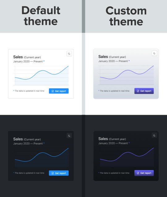
Swapping out a few custom property values opens up a ton of possibilities in Halfmoon, whether it’s theming things for a brand, or tweaking the UI to get just the right look.
That’s what we’re talking about here when it comes to customization: does the system still stand up and work well if the person using it overrides anything. I have written extensively about this (and much more) in the official Halfmoon docs page.
Variables aren’t a new concept to frameworks. Many frameworks actually use Sass or Less variables and have done so for quite a while. That’s still a good and effective way to establish a customizable experience. But at the same time, those will lock into a preprocessor (which, again, doesn’t have to be a bad thing). By relying instead on CSS custom properties — and variable-izing all the things — we are relying on native CSS, and that doesn’t require any sort of build dependency. So, not only can custom properties make it easier to customize a framework, but they are much more flexible in terms of the tech stack being used.
There is a balance to be had. I know I suggested creating variables for everything, but it can be equally tough to manage and maintain scores and scores of variables (just like anything else in the codebase). So, lean heavily on variables to make a framework or design system more flexible, but also be mindful of how much flexibility you need to provide and whether adding another variable is part of that scope.
Deciding what components to include
When it comes to building a CSS framework, deciding what components to include is a big part of that ordeal. Of course, for a developer working on a passion project, you want to include everything. But that is simply not feasible, so a few decisions were made on my part.
As of right now, Halfmoon has most of the components you can find in similar frameworks such as Bootstrap or Bulma. These frameworks are great and widely used, so they are a good frame of reference. However, as I have mentioned already, a unique thing about Halfmoon is the focus on building tools and dashboards on the web. This niche, if you could call it that, has led me to build some unique components and features:
5 different types of sidebars, with built-in toggle and overlay handlers. Sidebars are very important for most dashboards and tools (and a pain to get right), so this was a no brainer.
2 different types of navbars. There is one that sticks to the bottom of the page, which can be used to great effect for action buttons. Think about the actions that pop up when you select items on data-table. You could place those action buttons here.
Omni-directional dropdowns (with 12 different placements, 3 for each direction).
Beautiful form components.
Built-in keyboard shortcut system, with an easy way to declare new ones for your tool.
Tons of utilities. Of course, this is not comparable to Tailwind CSS, but Halfmoon has enough responsive utility classes to handle a lot of use cases right out of the box.
Moreover, the built-in dark mode, huge customizability, and the standard look and feel to the components, should all work together to make Halfmoon a great tool for building web tools and dashboards. And I am hopefully nowhere close to being done! The next updates will bring in a form validator (demo video), more form components, multi-select component, date and time picker, data-table component, etc.
So what is exactly missing from Halfmoon? Well the most obvious ones are tabs, list group, and spinners. But all of these are planned to be added in v1.2.0, which is the next update. There are also other missing components such as carousels, tree navigation, avatars, etc, which are slightly out of scope.
Providing user preferences
Giving end users the ability to set their preferences is often overlooked by frameworks. Things like setting the font size of an article, or whether to use a dark or light theme. In some ways, it’s sort of funny, because the web is catching up to what operating systems have allowed users to do for decades.
Here are some examples of user personalization on the web:
Being able to select your preferred color mode. And, even better, the website automatically saves and respects your preference when the page is loaded. Or better yet, looking at your operating system preferences and automatically accommodating them.
Setting the default size of elements. Especially font size. A small font might look good in a design, but allowing users to set their ideal font size makes the content actually readable. Technically, every modern browser has an option to zoom into content, but that is often unwieldy, and does not actually save your settings.
Setting the compactness of elements. For example, some people prefer large padding with rounded corners, while others find it a waste of space, instead preferring a tighter UI. Sort of like how Gmail lets you decide whether you want a lot of breathing room in your inbox or make it as small and tight as possible to see more content.
Setting the primary color on the website. While this is entirely cosmetic, it is still charming to be able to set your favorite color on every button and link on a website.
Enabling a high contrast mode. Someone pointed this out to me on GitHub. Apparently, many (and I mean many) CSS frameworks often fail the minimum contrast recommended between foreground and background colors on common elements, such as buttons. That list includes Halfmoon. This is often a tradeoff, because overly contrastive elements often look worse (purely in terms of aesthetic). User personalization can allow you to turn on a high contrast mode, if you have difficulty with the default contrast.
Allowing for user personalizations can be really difficult to pull off — especially for a framework — because that would could mean swapping out huge parts of CSS to accommodate the different personalization settings and combinations. However, with a framework like Halfmoon (i.e. built entirely using CSS variables), this becomes trivial as CSS variables can be set and changed on run-time using JavaScript, like so:
// Get the <html> tag (for reading and setting variables in global scope) var myElement = document.documentElement; // Read CSS variable getComputedStyle(myElement).getPropertyValue("--variable-name"); // Set CSS variable myElement.style.setProperty("--variable-name", "value");
Therefore, user personalization can be implemented using Halfmoon in the following way:
The user sets a preference. That basically means a variable value gets changed. The variable is set with JavaScript (as shown above), and the new value is stored in a cookie or local storage.
When the user comes back to the website, their preferences are retrieved and set using JavaScript (again, as shown above) once the page is loaded.
Here are visual examples to really hammer the point home.
Setting and saving the default font size
In the example above, whenever the range slider is changed, the variable --base-font-size is updated to the slider’s value. This is great for people who prefer larger text. As explained in the previous section, this new value can be saved in a cookie or local storage, and the next time the user visits the website, the user preference can be set on page load.
Setting the compactness of content

Because there are CSS custom properties used as utilities, like spacing and borders, we can remove or override them easily to create a more compact or expanded component layout.
Only two variables are updated in this example to go from an expanded view to a compact one:
--content-and-card-spacing changed from 3rem (30px) to 2rem (20px).
--card-border-radius changed from 0.4rem (4px) to 0.2rem (2px).
For a real life scenario, you could have a dropdown that asks the user whether they prefer their content to be Default or Compact, and choosing one would obviously set the above CSS variables to theme the site. Once again, this could be saved and set on page load when the user visits the website on their next session.
Wait, but why?
Even with all the examples I have shown so far, you may still be asking why is this actually necessary. The answer is really simple: one size does not fit all. In my estimate, around half of the population prefers a dark UI, while the other half prefers light. Similarly, people have wild variations about the things they like when it comes to design. User personalization is a form of improving the UX, because it lets the user choose what they prefer. This may not be so important on a landing page, but when it comes to a tool or dashboard (that one has to use for a long time to get something done), having a UI that can be personalized is a boon to productivity. And knowing that is what Halfmoon is designed to do makes it ideal for these types of use cases.
Moreover, you know how people often complain that websites made with a certain framework (eg Bootstrap) all look the same? This is a step toward making sure that websites built with Halfmoon will always look distinct, so that the focus is on the website and content itself, and not on the framework that was used to build it.
Again, I am not saying that everything should be allowed to be personalized. But knowing who the framework is for and what it is designed to do helps make it clear what should be personalized.
Looking ahead
I strongly feel that flexibility for customization and accounting for user preferences are often overlooked on the web, especially in the framework landscape. That’s what I’m trying to address with Halfmoon.
In the future, I want to make it a lot easier for developers to implement user preferences, and also promote diversity of design with new templates and themes. That said, here are some things on the horizon for Halfmoon:
A form validator (demo video)
New components, including range sliders, tabs and spinners
High contrast mode user preference
Multi-select component (like Select2, only without jQuery)
A date and time picker
A data-table component
A GUI-based form builder
More themes and templates
You can, of course, learn more about Halfmoon in the documentation website, and if you want to follow the project, you can give it a star on GitHub.
The post Considerations for Making a CSS Framework appeared first on CSS-Tricks.
You can support CSS-Tricks by being an MVP Supporter.
Considerations for Making a CSS Framework published first on https://deskbysnafu.tumblr.com/
0 notes
Text
alright listen up kiddos i’ve griped about this a lot on my rp blog now sit down buckle up i’m about to rant about it here
Your blog theme
Needs
to be readable.
Listen. I am a former graphic design student, I still enjoy design in my freetime, I can point you in the direction of handy resources if you want, but here are some basic guidelines:
1. if you have a light background, you need a dark or at least mid-tone font. If you have a dark background, you need a light or at least mid-tone font. If you have a mid-tone background, do either a light or dark font.
2. Please for the love of all that’s holy avoid straight up RGB colors. They’re eyestraining and ugly. Especially when you do #FF0000/(255,0,0) red on black.
3. Actually, I’d say avoid straight up #000000 black in the first place, find a nice dark gray instead.
4. 10PT FONT IS NOT AN APPROPRIATE BODY SIZE. 10-12pt is industry standard for print media. PRINT, not digital. Digital is usually closer to 16, depending on the font. You wanna know why print can be smaller? Think of how close you usually hold a book to your face compared to your laptop screen. Also think of how print media doesn’t usually emit harsh blue light straight into your eyeballs--it’s just easier. Header size, by the way, usually starts at around 20pt.
5. Sans serif fonts (think Helvetica) are usually preferred for digital media, but if you’re using large blocs of text you should at least consider a serif font. Don’t ever use decorative fonts as body fonts. Ever. Or script fonts, for that matter.
6. If you’re going to use a thin font, it absolutely must stand in stark contrast with the background, and it needs to be a bit bigger than a normal font would be.
7. Ditto with high contrast fonts (fonts where letterforms contain extreme thin and thick lines, otherwise only the thick parts will stand out and that’s just a mess).
8. Don’t fuck with a body font’s kerning (the space between characters) or word or line spacing ever (unless it was designed by someone who thinks words should all smoosh together or that one word should take up an entire line. Then feel free to fw it)
9. If your contained theme can be totally obscured by me holding my phone up against my computer screen, then, honestly, what’s the point?
10. This kinda relates more to rp blogs, but if you have a navigation menu, it needs to be easy to find and use.
11. Actually, your whole blog needs to be easy to use. Clear navigation, a visible scrollbar, etc. If you don’t like the way this looks because it’s not ~minimalist~ enough go design an artsy magazine spread instead.
12. YOUR DESIRE FOR AN ~AESTHETICALLY PLEASING~ BLOG SHOULD NEVER EVER OVERRIDE CREATING A BLOG THAT IS FUNCTIONAL. EVER.
12 notes
·
View notes
Link
Reading Time: 10 minutes

Have you ever wanted to learn Sass, but you didn’t find a good tutorial? Chances are that you are quite good with CSS. However, you feel like there is a better way of working with CSS. You want to take your skills and efficiency to another level. In that cases, learning how to use preprocessor like Sass is one way to achieve that goal. This will be the goal of this mini series, to help you learn Sass. Today, you will learn about topics like variables, mixins, extends, imports and more. Let’s start!
Table of Contents:
Why Sass?
The Beginner’s Guide to Learn Sass
Nesting, ampersands and variables
The power of ampersand
Variables and more maintainable code
Mixins and extends
Mixins vs Extends
Imports and partials
Closing thoughts on how to learn Sass
Why Sass?
What are the main reasons why you should learn Sass, or at leas consider doing it? CSS is great and, with time, it is getting even better. One of the biggest changes in the recent time was that CSS finally “learned” to use variables. This is a big step forward. And, I think that there is even more to come. Yes, the future of CSS seems to be quite good. Still, I think CSS is far from being perfect. The biggest disadvantages of CSS are probably lack of any way to re-use style rules.
Sure, you can create special class with set of styles and then use it repeatedly. However, even this approach is quite limited. You can’t change the styles on the fly unless you add additional CSS to override the original. Also, you can’t use any conditions or parameters to switch between “versions” of the styles. Again, the only way is adding more CSS code. Also, you need to either put on the right place in the cascade. Or, you have to increase CSS specificity.
Another common problem with CSS was that there was no way to specify variables. If you wanted to re-use specific value across the project, you had to do it in the old fashioned way. Sure, there is nothing bad with it. However, imagine you would decide to change that value. Now, you would have to find every instance. This can be quite a feat in large code base. Luckily, the majority of text editors offers search & replace functionality.
Another problem with CSS is math. When you use plain CSS, you can’t use even simple calculations, adding, subtracting, multiplication or division. This problem also disappears when you learn Sass. You can use calc(), but Sass is more advanced. And, lastly, CSS can be quite hard to maintain. Without preprocessor, you can’t use atomic Design (modular CSS), SMACSS or anything like that. You have all CSS code in a single file. And, no, @import is not really a fix for that.
The Beginner’s Guide to Learn Sass
If you want to learn Sass, you have to install it first. You can install Sass in a coupe way. In case of Mac users, this is quite fast. You only need to install Sass gem via terminal. In case of Linux, you will need to install Ruby first and then Sass gem. You can install Ruby via package manager. For computers with Windows you need to install Ruby first as well. I suggest downloading Ruby installer as this is the easiest way to do it. After installing ruby, install Sass gem.
In cmd:
gem install sass
In terminal:
sude gem install sass
You can check if you have Sass gem installed on your computer with a simple command below. It should return specific version of the Sass gem. For example, Sass 3.4.23 (Selective Steve). If you see something similar to this, congrats, you are ready not only to learn Sass, but also to start using it. However, if you want to try Sass without installing anything, you can use online Sass playground called Sassmeister. This website will allow you to use and test Sass immediately.
In cmd/terminal:
sass -v
Nesting, ampersands and variables
Let’s start this journey to learn Sass with a couple of things that are easier. These are nesting, using ampersand and variables. I guess that you already know nesting from working with HTML or JavaScript. You can nest elements inside other elements or functions inside other functions. In CSS, there is no such a thing as nesting. Sass brings this feature to CSS. When you learn Sass, you can nest CSS selectors just like you do in HTML.
Sass:
// Example of nesting nav { ul { margin: 0; display: flex; list-style-type: none; } li { padding: 16px; } a { color: #212121; text-decoration: none; } }
CSS:
nav ul { margin: 0; display: flex; list-style-type: none; } nav li { padding: 16px; } nav a { color: #212121; text-decoration: none; }
Side note: Those two slashes (//) are used to mark comments in Sass. In Sass, you can use both. The difference between Sass comment (//) and CSS comment (/**/) is that Sass comments are not compiled into CSS. So, every comment you make using Sass syntax will stay in your Sass files. Any comment you make using CSS syntax will be compiled into CSS. In other words, you will find CSS comments in final CSS file, not Sass comments.
I should warn you that it is easy to go over the board with nesting. When you fall in love with it, you can create code that will result in over-qualified CSS. And, this can make work with CSS even bigger pain that before you learn Sass and started to using it. For this reason, I suggest nesting CSS selector to three levels at max, no more.
Sass:
.level-one { .level-two { .level-three { color: red; } } }
CSS:
.level-one .level-two .level-three { color: red; }
The power of ampersand
One very useful feature you will probably use very often, after you learn Sass and nesting, is ampersand. Ampersand allows you to reference parent selector. You simply replace the parent selector with this character. You can use this for with pseudo-classes such as :before, :after, :hover, :active, :focus, etc. You can also use ampersand for adjoining, or adding, CSS classes to create selector with higher specificity.
Sass:
ul { &.nav-list { display: flex; } & li { padding: 8px 16px; } } a { position: relative; &:before { position: absolute; bottom: 0; left: 0; content: ""; border-bottom: 2px solid #3498db; } &:focus, &:hover { color: #3498db; &:before { width: 100%; } } &:active { color: #2980b9; } }
CSS:
ul.nav-list { display: flex; } ul li { padding: 8px 16px; } a { position: relative; } a:before { position: absolute; bottom: 0; left: 0; content: ""; border-bottom: 2px solid #3498db; } a:focus, a:hover { color: #3498db; } a:focus:before, a:hover:before { width: 100%; } a:active { color: #2980b9; }
I have to mention that ampersand also allows you to use CSS combinators, such as the child combinator (>), adjacent sibling combinator (+) and the general sibling combinator (~).
Sass:
section { & + & { margin-top: 16px; } & > h1 { font-size: 32px; } & ~ p { font-size: 16px; } } // You can also omit the ampersand before the combinator and the result will be the same. section { + & { margin-top: 16px; } > h1 { font-size: 32px; } ~ p { font-size: 16px; } }
CSS:
section + section { margin-top: 16px; } section > h1 { font-size: 32px; } section ~ p { font-size: 16px; }
Finally, you don’t have to put the ampersand as first. You can use it in the end to change the selector entirely.
Sass:
section { body main & { background: #fff; } }
CSS:
body main section { background: #fff; }
Variables and more maintainable code
The last of the three I mentioned are variables. I have to say that variables were one of the main reasons why I wanted to learn Sass. Actually, I think that they were the number one reason. Work with CSS gets so much easier when you can make changes on a global scale by changing a single line of code. You no longer have to search for all occurrences of this or that value. You store the value inside a variable. Then, you have to change only that variable. Sass will do the rest.
As you can guess, this can immensely simplify and speedup your work. Also, it makes your styles much easier to maintain. Variables work with numbers, strings, colors, null, lists and maps. The only thing you must remember is to use “$” symbol every time you want to define a variable. Then, when you want to use that variable, well, you know what to do.
Sass:
// Declare variables $color-primary: #9b59b6; $color-secondary: #2c3e50; // Use variables a { color: $color-secondary; &:hover { color: $color-primary; } }
CSS:
a { color: #2c3e50; } a:hover { color: #9b59b6; }
One thing to keep in mind on your journey to learn Sass and use variables is scope. Variables in Sass works like variables in any programming language. Variables declared in global scope are accessible globally, local not.
Sass:
a { // locally defined variables $color-primary: #9b59b6; $color-secondary: #2c3e50; color: $color-secondary; &:hover { color: $color-primary; } } p { color: $color-secondary;// Undefined variable: "$color-secondary". }
This also means that you can use the same name for different variables without the worry of changing some. Just make sure to declare your variables in the right scope.
Sass:
$color-primary: #9b59b6; $color-secondary: #2c3e50; a { // local variables $color-primary: #fff; $color-secondary: #212121; color: $color-secondary; } p { color: $color-secondary; }
CSS:
a { color: #212121; } p { color: #2c3e50; }
Mixins and extends
Let’s take this journey to learn Sass on another level. When you are ready for more advanced Sass, a good place to start are mixins and extends. Do you remember when we were talking about the biggest disadvantages of CSS, namely re-usability of the code? This is where mixins and extends enters the game. Both these Sass features allow you to create re-usable chunks of code. It is safe to say that mixins and extends are similar to functions you know from JavaScript.
You create new mixin using “@mixin” directive and some name and put some styles inside it (inside curly brackets). Then, when you want to use that mixin you reference to it using “@include” followed by the name of the mixin. Extends work in a similar way. The difference is that extends don’t require creating some “extend”. Instead, you use CSS classes you already created. Then, when you want to use extend you use “@extend”, not “@mixin”.
Sass:
// Example of mixin @mixin transition($prop, $duration, $timing) { transition: $prop $duration $timing; } // Use mixin a { @include transition(all, .25s, cubic-bezier(.4,0,1,1)); }
CSS:
a { transition: all 0.25s cubic-bezier(0.4, 0, 1, 1); }
Sass:
// Random CSS class .btn { padding: 6px 12px; margin-bottom: 0; display: inline-block; font-size: 16px; } Examples of extend .btn--success { @extend .btn; background-color: #2ecc71; } .btn--alert { @extend .btn; background-color: #e74c3c; }
CSS:
.btn, .btn--success, .btn--alert { padding: 6px 12px; margin-bottom: 0; display: inline-block; font-size: 16px; } .btn--success { background-color: #2ecc71; } .btn--alert { background-color: #e74c3c; }
Mixins vs Extends
The advantage of mixins is that you can use parameters to make mixins more flexible. For example, you can add a simple condition and if statement to switch between two or more sets of rules. Every parameter starts with “$” symbol. Then, use that name inside the mixin. And, you can also set a default value to make the parameter optional. Setting a default value is like assigning value to variable. Use “$” symbol followed by colons and default value. Extends don’t have this ability.
Sass:
// Example of mixin with optional parameters @mixin transition($prop: all, $duration: .25s, $timing: cubic-bezier(.4,0,1,1)) { transition: $prop $duration $timing; } a { @include transition(); }
CSS:
a { transition: all 0.25s cubic-bezier(0.4, 0, 1, 1); }
When you want to change only some parameters and use default values for the rest, you can use the name of parameter when you use that mixin.
Sass:
@mixin transition($prop: all, $duration: .25s, $timing: cubic-bezier(.4,0,1,1)) { transition: $prop $duration $timing; } // Use different value only for parameter for duration a { @include transition($duration: .55s); }
CSS:
a { transition: all 0.55s cubic-bezier(0.4, 0, 1, 1); }
Another very useful feature of mixins is to use it along with “@content” directive. This way, you can provide the mixin with block of content. A good way to use this is for creating media queries.
Sass:
// Mixin for media query @mixin media($screen-width) { @media only screen and (max-width: $screen-width) { @content; } } // Use the media query mixin with @content directive .container { @include media(768px) { max-width: 690px; } } // Mixin for retina display media query @mixin retina { @media only screen and (-webkit-min-device-pixel-ratio: 2), only screen and (min--moz-device-pixel-ratio: 2), only screen and (-o-min-device-pixel-ratio: 2/1), only screen and (min-device-pixel-ratio: 2), only screen and (min-resolution: 192dpi), only screen and (min-resolution: 2dppx) { @content; } } .hero { background-image: url(/images/image.png); @include retina { background-image: url(/images/[email protected]); } }
CSS:
@media only screen and (max-width: 768px) { .container { max-width: 690px; } } .hero { background-image: url(/images/image.png); } @media only screen and (-webkit-min-device-pixel-ratio: 2), only screen and (min--moz-device-pixel-ratio: 2), only screen and (-o-min-device-pixel-ratio: 2 / 1), only screen and (min-device-pixel-ratio: 2), only screen and (min-resolution: 192dpi), only screen and (min-resolution: 2dppx) { .hero { background-image: url(/images/[email protected]); } }
Imports and partials
The last thing we will touch upon to help you learn Sass is @import directive. Along with variables, this was another major reason for me to learn Sass. With Sass, you can split your stylesheet into unlimited number of files. Then, you use @import directive to import these chunks into single file. When you compile this file, Sass will automatically import content from all files and create one CSS stylesheet. Make sure to use correct names of files to import. Otherwise, Sass will throw an error.
Sass:
// This is _base.scss file html, body { padding: 0; margin: 0; } html { font-size: 100%; } body { font: 16px "Roboto", arial, sans-serif; color: #111; } // This is _typography.scss file h1, h2, h3 { margin-top: 0; font-weight: 200; } h1 { margin-bottom: 26px; font-size: 40px; line-height: 52px; } h2 { margin-bottom: 18px; font-size: 27px; line-height: 39px; } h3 { margin-bottom: 18px; font-size: 22px; line-height: 26px; } // This is main.scss // Note: you don’t have to use “_” in filenames when you import files /* Main stylesheet */ @import 'base'; @import 'typography';
CSS:
/* Main stylesheet */ html, body { padding: 0; margin: 0; } html { font-size: 100%; } body { font: 16px "Roboto", arial, sans-serif; color: #111; } h1, h2, h3 { margin-top: 0; font-weight: 200; } h1 { margin-bottom: 26px; font-size: 40px; line-height: 52px; } h2 { margin-bottom: 18px; font-size: 27px; line-height: 39px; } h3 { margin-bottom: 18px; font-size: 22px; line-height: 26px; }
Important thing to mention is that you can use imports whenever you want. You can import file A in the middle of the file B and then import file B into your main Sass stylesheet. The only thing you must remember is to use the right order of files.
Sass:
// File _base.scss html, body { padding: 0; margin: 0; } @import 'typography'; nav { list-style-type: none; } nav a { text-decoration: none; } // File main.scss /* Main stylesheet */ @import 'base';
CSS:
/* Main stylesheet */ html, body { padding: 0; margin: 0; } h1, h2, h3 { margin-top: 0; font-weight: 200; } nav { list-style-type: none; } nav a { text-decoration: none; }
Closing thoughts on how to learn Sass
This is all I have for you today on how to learn Sass. My intention for this article was to give you enough information to get started with Sass. Hopefully, this article makes this journey to learn Sass as easy as possible for you. Keep in mind that what we discussed today were only the basics. We barely scratched the surface. If you want to not only learn Sass, but master it, there is more we need to talk about. Don’t worry. We will cover these advanced topics in another article next week.
For now, take some time, go through the topics we discussed today and practice your new knowledge. Doing so will help you prepare for the more advanced techniques and features Sass can provide you with. So, stay tuned for the sequel. Until next time, have a great day!
Thank you very much for your time.
Want more?
If you liked this article, please subscribe or follow me on Twitter.
The post The Beginner’s Guide to Learn Sass – Mastering the Basics of Sass appeared first on Alex Devero Blog.
1 note
·
View note
Text
MailChimp Subscription Forms
I create new subscription forms infrequently… long enough apart that I forget the procedure from one time to the next. Here’s how I do it:
Log in to MailChimp, then click Lists. Select the list for which you want to create the subscription form. In the top menu, click “Signup forms” (that’s their term for subscription forms). Select “Embedded forms,” which takes you to the form creation window.
If the signup form is the only thing on the page, like on this page, I don’t check “include form title,” letting the page title serve as the form title. But when the signup form is embedded later in a page, like on a blog post, I’ll use the form title.
I always select “Show only required fields,” which for me is email address, first name, and last name. The more information you ask for, the less likely they are to sign up. I click “Show interest group fields,” but we’ll do something special with them in a minute. I click “Show required field indicators” so that people understand they need to give me all three pieces of info. I don’t click “Show format options” because that’s more clutter for the subscribers to think about. I don’t click any of the “Enhance your form” options, but I do click “Enable reCAPTCHA” because it adds a Google reCAPTCHA checkbox that says "I'm not a robot" to your signup form, preventing spam bots from adding email addresses to your lists. Next, I click into the “Copy/paste onto your site” field which automatically selects all of the code. Copy.
Or not. If you’ve already created a signup form for that particular list, you can just reuse the form by copying the Raw HTML object that is the current signup form and pasting it on the page where you want the new form, then adjust a little of the HTML. The old form I was using was the one where you can sign up for Walk Appeal book updates. I’ve copied and pasted it onto a blog post where I’ll be collecting subscriptions to Outdoor Room Design book updates. Here are the changes I’m making:
First, here’s something I always do. Near the top, there’s this bit of code:
<style type="text/css">
#mc_embed_signup{background:#fff; clear:left; font:14px Helvetica,Arial,sans-serif; }
/* Add your own MailChimp form style overrides in your site stylesheet or in this style block.
We recommend moving this block and the preceding CSS link to the HEAD of your HTML file. */
</style>
I don’t want any special MailChimp formatting… I want the text of the form to flow with the text of the page. So I delete this entire segment of code. With the recycled code I’m working with today, that segment has long been deleted. That’s another reason it’s good to recycle signup forms… it keeps all your customizations.
Next, I decide whether to include a form title. Because this form will be at the end of a blog post, I’m including it as noted above. That line of code is:
<h2>Subscribe to get Outdoor Room Design book updates</h2>
This tag occurs right after the form action tag.
There’s a <div class=“mc-field-group"> tag for each of the three required fields. One little refinement: in my MailChimp lists, I use all lowercase for the field names (email address, first name, and last name) but I want them to appear in title case on the signup form (Email Address, First Name, and Last Name) so I change it once, and then it’s automatically the way I want it on all recycled signup forms.
MailChimp has a nifty feature known as Groups. A Group is a group of people on your list who match certain characteristics. I use three Group Sets (collection of Groups) in the Mouzon Design list:
I’m a(n)… This group let people tell me what they do. Academic, Appraiser, Architect, Attorney, Banker, etc. I have 25 Groups in this Set that focus on disciplines or interests involved in placemaking and architecture. “But wait,” you ask. “How can they tell you what they do if only the required fields show up on the signup form?” Good question. Roughly once per year, I send out my Eye Candy Swap email. It’s a curated collection of my best recent Mouzon Images work, and I ask them something like “hey, while you’re enjoying these, why don’t you tell me a little more about you? The more I know, the more I can tailor mailings so that I only send you stuff you’re interested in.” This includes a link to a page where the entire signup form is visible, including not only Group Sets, but also all of the other basic info like street address, etc. But I will NEVER ask for telephone numbers again because I hate unsolicited calls.
I’ve bought… I only use this group for the Mouzon Design list. For the Guild Foundation list, the New Urban Guild list, and the Studio Sky list, this Group Set is omitted because those entities sell mostly services instead of products.
I’m interested in… For Mouzon Design, this Set includes the Catalog of the Most-Loved Places, Mouzon Design house plans and plan books, Mouzon Images, New Media for Designers + Builders, the Original Green, the Outdoor Room Design book, and the Walk Appeal Book.
At the beginning of each Group Set input checkboxes, there is this tag: <div class="mc-field-group input-group”> I add a style attribute at the end of each of the three Group Sets to say this: <div class="mc-field-group input-group" style=“display:none”>. What that does is to tell the signup form not to display this section.
Each Group has an input tag, with the attributes type, value, and name, and ID. This signup form has the following added to the end of the id attribute: “ checked” where the quotation marks are not in the code; I’ve simply used them to show that there’s a space before the word. So for this form, I want to cut the “ checked” from the Walk Appeal input tag and add it in the same place to the end of the Outdoor Room Design tag. What this means is that when someone subscribes, it will subscribe them to that Group without them ever having to see the Group Set. Cool, eh?
Three more things: Near the end of the signup form code, there’s a scary-looking line that says: </div> <!-- real people should not fill this in and expect good things - do not remove this or risk form bot signups—> Problem is, the three things I need to do are below that. I experimented, and what I do doesn’t seem to break anything. Here they are:
There’s an <input type=“submit" tag, which defines the Subscribe button. If you want that button to say Subscribe, you’re fine. But if you want it to say something else like Enroll, Get Updates, or whatever, change the value attribute to whatever you need it to say.
For some reason I can’t figure out, the Subscribe button gets cut off at the bottom when I use the default signup form. So I add a <br/> tag between the </form> tag and the </div> tag. I suspect it’s a problem with my web app (Sandvox) and MailChimp, but since the fix is so easy, I haven’t worried about finding the root cause.
Sometimes, I’ll add the following text just below the <br/> tag: You'll receive an email from me with the subject line "Mouzon Design: Please Confirm Subscription." Click Yes to confirm your subscription for Outdoor Room Design book updates. This is helpful because several signup forms are on the Original Green site rather than the Mouzon Design site. I can’t get MailChimp to customize the subject line based on Group, so this seems like a decent workaround.
Does this all make sense, or did I explain anything in a fuzzy way?
1 note
·
View note
Text
How To Build An Accessible Front-End Application With Chakra UI And Nuxt.js
About The Author
Kelvin Omereshone is the CTO at Quru Lab. Kelvin was formerly a Front-end engineer at myPadi.ng. He’s the creator of NUXtjs Africa community and very passionate …
More about
Kelvin
…
In this article, we are going to be looking at how to use Chakra UI and NUXtJS in building accessible front-end applications. In order to follow along, you should be familiar with using the progressive front-end framework Vue.js with NUXt. If not, see the Vue.js and NuxtJS docs to get started.
For many people, the web is an essential part of their daily lives. They use it at work, home, and even on the road. Web accessibility means people with disabilities can use the web equally. So it’s crucial for developers and organizations building on the web to build inclusivity and accessibility into their applications.
In order to make the web more accessible, there are a couple of best practices and standards that you will have to implement in your applications, such as adhering to the following:
Learning to implement these standards can seem like a daunting task when you factor in project deadlines and other constraints that you have to work with as a developer. In that light, let me introduce you to a UI design system that was built to help you make your web applications accessible.
Chakra UI
Chakra UI is a design system and UI framework created by Segun Adebayo. It was created with simplicity, modularity, composability, and accessibility in mind. Chakra UI gives you all the building blocks needed to create accessible front-end applications.
Note: While Chakra UI depends on CSS-in-JS under the hood, you don’t need to know it in order to use the library.
Though the framework was originally created for React, Jonathan Bakebwa spear-headed the porting to Vue. So Vuejs/NUXtJS developers can now utilize Chakra UI to create accessible web applications.
Features Of Chakra UI
Chakra UI was created with the following principles in mind:
Style props
Chakra UI makes it possible to style components or override their styles by using props. This reduces the need for stylesheet or inline styles. Chakra UI achieves this level of flexibility by using Styled Systems under the hood.
Composition
Components in Chakra UI have been broken down into smaller parts with minimal props to keep complexity low, and compose them together. This will ensure that the styles and functionality are flexible and extensible. For example, you can use the CBox and CPseudoBox components to create new components.
Accessible
Chakra UI components follow the WAI-ARIA guidelines specifications and have the right aria-* attributes. You can also find the accessibility report of each authored component in a file called accessibility.md. See the accessibility report for the CAccordion component.
Themeable
Chakra UI affords you the ability to easily reference values from your theme throughout your entire application, on any component.
Dark mode support
Most components in Chakra UI are dark mode compatible right out of the box.
How Chakra UI Supports Accessibility
One of the core principles behind the creation of Chakra UI is accessibility. With that in mind, all components in Chakra UI comes out of the box with support for accessibility by providing:
Keyboard Navigation — useful for users with motor skills disabilities,
Focus Management,
aria-* attributes which are needed by screen readers,
Focus trapping and restoration for modal dialogs.
Getting Started With Chakra UI And Nuxt
Note: To use Chakra UI with Vue.js see the Getting Started guide.
For our demo project, we will be building Chakra-ui explorer — an accessible single-page web application to search Chakra UI components.
Getting Started With Chakra-ui Explorer
Assuming you already have NPM installed, create a new NUXt application by running:
$ npx create-nUXt-app chakra-ui-explorer
Or if you prefer in yarn, then run:
$ yarn create nUXt-app chakra-ui-explorer
Follow the installation prompt to finish creating your NUXt application.
Setting Up Chakra UI
Chakra UI uses Emotion for handling component styles. So to get started with Chakra UI, you will need to install Chakra UI alongside Emotion as a peer dependency. For this project, we will be using the official NUXt modules for both Chakra UI and Emotion which will reduce the friction in getting started with Chakra UI. Let’s add them to our project by running the following command:
npm i @chakra-ui/nUXt @nUXtjs/emotion
Note: @nUXtjs/emotion allows your component styles to be generated and injected in the server build.
After installing both modules, you will need to register them in the nUXt.config.js file under the modules array option:
// nUXt.config.js modules: ['@chakra-ui/nUXt', '@nUXtjs/emotion'],
To complete our setup process of Chakra UI, we need to touch our default layout component in layouts/ and add CThemeProvider, CColorModeProvider, and CReset components from Chakra UI.
It is recommended thatyou use the CReset component to ensure all components provided by Chakra UI work correctly.
The CThemeProvider component will make your theme available to every part of your application, while the CColorModeProvider component is responsible for handling our application’s color mode which can be in one of two states: light or dark. Finally, the CReset component will remove all browser default styles.
Let’s add the aforementioned components in layouts/default.vue. In our template section, let’s add this:
<!-- layouts/default.vue --> <template> <div class="container"> <c-theme-provider> <c-color-mode-provider> <c-box as="section"> <c-reset /> <nUXt /> </c-box> </c-color-mode-provider> </c-theme-provider> </div> </template>
Then in our script section, we will import and register the components like so:
<script> import { CThemeProvider, CColorModeProvider, CReset, CBox } from '@chakra-ui/vue' export default { name: 'DefaultLayout', components: { CThemeProvider, CColorModeProvider, CReset, CBox } } </script>
Your default.vue layout component should look like this:
<template> <div class="container"> <c-theme-provider> <c-color-mode-provider> <c-box as="section"> <c-reset /> <nUXt /> </c-box> </c-color-mode-provider> </c-theme-provider> </div> </template> <script> import { CThemeProvider, CColorModeProvider, CReset, CBox } from '@chakra-ui/vue' export default { name: 'DefaultLayout', components: { CThemeProvider, CColorModeProvider, CReset, CBox } } </script>
Note: Notice I am wrapping both <c-reset /> and <nUXt /> components in a c-box component.
Setting Your Application Theme
Chakra UI allows you the ability to set a theme for your application. By ‘theme’, I mean the setting of your application’s color palette, type scale, font stacks, breakpoints, border-radius values, and so on. Since colors and contrast are vital components of accessibility, it’s important to use colors that are easily perceived.
Out of the box Chakra UI ships with a default theme object that affords for most of your application needs in terms of colors, fonts, and so on. The default theme is set up with contrast in mind which allows for the easily toggling of color modes (more on this later).
Chakra UI, however, allows you to extend or completely replaced the default theme. This is possible by accepting a theme object based on the Styled System Theme Specification.
The values in the theme object are automatically available for use in your application. For example, the colors specified in theme.colors can be referenced by the color, borderColor, backgroundColor, fill, stroke, and style props in your components.
To personalize your application, you can override the default theme provided by Chakra UI or set new values in it. To do that, the Chakra UI NUXt module exposes a chakra object which will take in an extendTheme property which takes an object. The object given to extendTheme will be recursively merged to the Chakra UI default theme object. Let’s add our brand color palette to Chakra so we can use it in our application.
Note: Chakra UI recommends adding color palette into the colors object of your theme using keys from 50 — 900. You can use web tools like coolors and palx to generate these palettes.
For our demo homepage, I will be using a brand color of lime. To make Chakra UI aware of this color, I’ll create a customeTheme object in a folder called chakra(you can call it whatever you want) in the root of my project’s directory. In this object, I will define our brand color palette.
Create a file called theme.js in the folder you created and then add the following snippet:
// ./chakra/theme.js const customTheme = { colors: { brand: { 50: '#f6fcee', 100: '#e2f4c8', 200: '#cbec9e', 300: '#b2e26e', 400: '#94d736', 500: '#75c800', 600: '#68b300', 700: '#599900', 800: '#477900', 900: '#294700' } } } module.exports = customTheme
Now let’s merge our custom theme to Chakra UI. We do that in nUXt.config.js. First, we need our custom theme object:
import customTheme from './chakra/theme'
Next, we have to specify the chakra key provided by the Chakra UI NUXt module and pass in customTheme to the extendTheme property:
chakra: { extendTheme: customTheme },
Your nUXt.config.js file should look like this:
// nUXt.config.js import customTheme from './chakra/theme' export default { mode: 'spa', /* * Headers of the page */ head: { title: process.env.npm_package_name || '', meta: [ { charset: 'utf-8' }, { name: 'viewport', content: 'width=device-width, initial-scale=1' }, { hid: 'description', name: 'description', content: process.env.npm_package_description || '' } ], link: [{ rel: 'icon', type: 'image/x-icon', href: '/favicon.ico' }] }, /* * Customize the progress-bar color */ loading: { color: '#fff' }, /* * Global CSS */ css: [], /* * Plugins to load before mounting the App */ plugins: [], /* * NUXt.js dev-modules */ buildModules: [ // Doc: https://github.com/nUXt-community/eslint-module '@nUXtjs/eslint-module' ], /* * NUXt.js modules */ modules: [ '@chakra-ui/nUXt', '@nUXtjs/emotion' ], chakra: { extendTheme: customTheme }, /* * Build configuration */ build: { /* * You can extend webpack config here */ extend (config, ctx) {} } }
When you run your application with npm run dev, your homepage should look like this:
(Large preview)
Now that we have successfully installed Chakra UI and added our application’s custom theme, let’s begin building out Chakra-ui explorer.
Creating Our Main Navigation
We want our navigation to have our brand name, in this case, it will be Chakra-ui explorer, 2 navigation links: Documentation and Repo, and a button which is responsible for toggling our color mode. Let’s create a new component under the components directory called NavBar in which we’ll create our application’s main navigation using Chakra UI.
Let’s do this. Add the following snippet to NavBar.vue:
<template> <c-box as="nav" h="60px" px="4" d="flex" align-items="center" shadow="sm" > <c-link as="nUXt-link" to="/" color="brand.700" font-weight="bold" :_hover="{ color: 'brand.900' }" > Chakra-ui Explorer </c-link> <c-box as="ul" color="gray.500" d="flex" align-items="center" list-style-type="none" ml="auto" > <c-box as="li" mr="8"> <c-link color="gray.500" :_hover="{ color: 'brand.400' }" is-external href="https://vue.chakra-ui.com" > Documentation </c-link> </c-box> <c-box as="li" mr="8"> <c-link color="gray.500" :_hover="{ color: 'brand.400' }" is-external href="https://github.com/chakra-ui/chakra-ui-vue" > Repo </c-link> </c-box> <c-box as="li"> <c-icon-button variant="ghost" variant-color="gray[900]" aria-label="Switch to dark mode" icon="moon" /> </c-box> </c-box> </c-box> </template> <script> import { CBox, CLink, CIconButton } from '@chakra-ui/vue' export default { name: 'NavBar', components: { CBox, CLink, CIconButton } } </script>
Next, we need to import this component in our default layout component — default.vue and add it to our template so overall our default layout should look like this:
<template> <div class="container"> <c-theme-provider> <c-color-mode-provider> <c-box as="section"> <c-reset /> <nav-bar /> <nUXt /> </c-box> </c-color-mode-provider> </c-theme-provider> </div> </template> <script> import { CThemeProvider, CColorModeProvider, CReset, CBox } from '@chakra-ui/vue' import NavBar from '@/components/NavBar' export default { name: 'DefaultLayout', components: { CThemeProvider, CColorModeProvider, CReset, CBox, NavBar } } </script>
When you run your application now, you’ll get to see this:
[embedded content]
You can see that the navigation is already accessible without even specifying it. This can only be seen when you hit the Tab key on your keyboard; Chakra UI handles focus management while you can focus on each link on the navigation menu.
The as Prop
From our NavBar.vue’s snippet above, you will notice the as prop. This is a feature available to Chakra UI components that allows you to pass an HTML tag or another component to be rendered as the base tag of the component along with all its styles and props. So when we did:
<c-box as="li"> <c-icon-button variant="ghost" variant-color="gray[900]" aria-label="Switch to dark mode" icon="moon" /> </c-box>
we are asking Chakra UI to render an <li> element and place a button component inside it. You can also see us use that pattern here:
<c-link as="nUXt-link" to="/" color="brand.700" font-weight="bold" :_hover="{ color : 'brand.900' }"> ChakraMart </c-link>
In the above case, we are asking Chakra UI to render the NUXt’s <nUXt-link /> component.
The as prop gives you the power to use the right(or wrong) element for the context of your markup. What this means, is you can leverage it to build your application template using semantic markups which will make your application more meaningful to screen readers. So instead of using a generic div element for the main content of your application, with the as prop you can render a main element telling screen readers that this is the main content of your application.
Note: Check out the documentation for all props exposed by Chakra UI components. Also, take a closer look at how the brand color in chakra/theme.js was specified. You can see from the snippet above that we’re using it as any of the colors that Chakra UI provides. Another thing to be aware of is the moon icon that we used for the CIconButton on our NavBar. The moon icon is one of the default icons that Chakra UI provides out of the box.
Color Mode
One of the features of Chakra UI is color mode support. And you can tell from the use of the moon icon in Chakra-ui explorer’s navigation, we plan on integrating dark mode. So instead of leaving it for last, let’s get it over with and wire it up right now. To do this, CColorModeProvider using Vue’s provide/inject, provides, $chakraColorMode and $toggleColorMode functions. $chakraColorMode returns the current color mode of your application while $toggleColorMode toggles the color mode from light to dark and vice versa. To use these two functions, we’ll need to inject them into the NavBar.vue component. Let’s do this below in the <script /> section:
<script> <script> import { CBox, CLink, CIconButton } from '@chakra-ui/vue' export default { name: 'NavBar', inject: ['$chakraColorMode', '$toggleColorMode'], components: { CBox, CLink, CIconButton }, } </script>
Let’s create a computed property to return the color mode:
... computed: { colorMode () { return this.$chakraColorMode() } }
Now that we have injected both functions in NavBar.vue let’s modify the toggle color mode button. We’ll start with the icon so that it shows a different icon depending on the color mode. Our CIconButton component now looks like this at this state:
<c-icon-button variant="ghost" variant-color="gray[900]" aria-label="Switch to dark mode" :icon="colorMode == 'light' ? 'moon' : 'sun'" />
Currently, we are using an aria-label attribute to tell screen-readers to Switch to dark mode. Let’s modify this to support both light and dark mode:
<c-icon-button variant="ghost" variant-color="gray[900]" :aria-label="`Switch to ${colorMode == 'light' ? 'dark : 'light'} mode`" :icon="colorMode == 'light' ? 'moon' : 'sun'" />
Lastly, we will add a click event handler on the button to toggle the color mode of our application using the $toggleColorMode function. Like so:
<c-icon-button variant="ghost" variant-color="gray[900]" :aria-label="`Switch to ${colorMode == 'light' ? 'dark' : 'light'} mode`" :icon="colorMode == 'light' ? 'moon' : 'sun'" @click="$toggleColorMode" />
To test if our color mode set up is working, I’ll add an interpolation of the color mode and a text next to the CIconButton toggling our color mode. Like so:
<c-box as="li"> <c-icon-button variant="ghost" variant-color="gray[900]" :aria-label="`Switch to ${colorMode == 'light' ? 'dark' : 'light'} mode`" :icon="colorMode == 'light' ? 'moon' : 'sun'" @click="$toggleColorMode" /> Current mode: </c-box>
Here is what our app currently looks like:
[embedded content]
So we have done the heavy lifting in setting up color mode in Chakra UI. So now we can style our application based on the color mode. Let’s go to default.vue and use the color mode slot prop provided by CColorModeProvider to style our application. Let’s modify our template first in default.vue.
<template> <div class="container"> <c-theme-provider> <c-color-mode-provider #default="{ colorMode }"> <c-box v-bind="mainStyles[colorMode]" w="100vw" h="100vh" as="section" > <c-reset /> <nav-bar /> <nUXt /> </c-box> </c-color-mode-provider> </c-theme-provider> </div> </template>
We are destructuring colorMode from the slot props property provided by CColorModeProvider and then passing it as a dynamic key to a mainStyle object which we will create in a bit. The idea is to use a different set of styles based on the colorMode value. I am also using the width and height with the shorthand props — w and h respectively to set the width and height of our CBox component. Let’s define this mainStyles object in our script section:
<script> import { CThemeProvider, CColorModeProvider, CReset, CBox } from '@chakra-ui/vue' import NavBar from '@/components/NavBar' export default { name: 'DefaultLayout', components: { CThemeProvider, CColorModeProvider, CReset, CBox, NavBar }, data () { return { mainStyles: { dark: { bg: 'gray.900', color: 'whiteAlpha.900' }, light: { bg: 'whiteAlpha.900', color: 'gray.900' } } } } } </script>
Chakra-ui explorer now has dark mode support!
[embedded content]
Now we have our navigation bar and have successfully set up dark mode support for our application, let’s focus on index.vue in our pages/ directory where the meat of our application can be found. We’ll start off with adding a CBox component like so:
<c-box as="main" d="flex" direction="column" align-items="center" p="10" > </c-box>
Then we’ll add the CInput component inside it. Our index.vue page component will then look like this:
<template> <c-box as="main" d="flex" align-items="center" direction="column" w="auto" p="16" > <c-input placeholder="Search components..." size="lg" mb="5" is-full-width /> </c-box> </template> <script> import { CBox, CInput } from '@chakra-ui/vue' export default { components: { CBox, CInput } } </script>
Here is how our application looks like now:
[embedded content]
You can see from the above screencast how the CInput element automatically knows when it’s in dark mode and adjust accordingly even though we didn’t explicitly set that. Also, the user can hit the tab key to focus on that CInput component.
Adding The Components’ List
So the idea of the Chakra-ui explorer (as stated earlier) is to show the user all of the available components in Chakra UI so that we can have a list of those components as well as the links that will take the user to the documentation of the component. To do this, I will create a folder called data at the root of our project’s directory then create a file called index.js. In index.js, I will export an array of objects which will contain the names of the components. Here is how the file should look like:
// ./data/index.js export const components = [ { name: 'Accordion' }, { name: 'Alert' }, { name: 'AlertDialog' }, { name: 'AspectRatioBox' }, { name: 'AspectRatioBox' }, { name: 'Avatar' }, { name: 'Badge' }, { name: 'Box' }, { name: 'Breadcrumb' }, { name: 'Button' }, { name: 'Checkbox' }, { name: 'CircularProgress' }, { name: 'CloseButton' }, { name: 'Code' }, { name: 'Collapse' }, { name: 'ControlBox' }, { name: 'Divider' }, { name: 'Drawer' }, { name: 'Editable' }, { name: 'Flex' }, { name: 'Grid' }, { name: 'Heading' }, { name: 'Icon' }, { name: 'IconButton' }, { name: 'IconButton' }, { name: 'Input' }, { name: 'Link' }, { name: 'List' }, { name: 'Menu' }, { name: 'Modal' }, { name: 'NumberInput' }, { name: 'Popover' }, { name: 'Progress' }, { name: 'PseudoBox' }, { name: 'Radio' }, { name: 'SimpleGrid' }, { name: 'Select' }, { name: 'Slider' }, { name: 'Spinner' }, { name: 'Stat' }, { name: 'Stack' }, { name: 'Switch' }, { name: 'Tabs' }, { name: 'Tag' }, { name: 'Text' }, { name: 'Textarea' }, { name: 'Toast' }, { name: 'Tooltip' } ]
For our implementation to be complete, I will import the above array into pages/index.vue and iterate over it to display all the components. Also, we will give the user the ability to filter the components using the search box. Here is the complete implementation:
// pages/index.vue <template> <c-box as="main" d="flex" align-items="space-between" flex-direction="column" w="auto" p="16" > <c-input v-model="search" placeholder="Search components..." size="lg" mb="10" is-full-width /> <c-grid template-columns="repeat(4, 1fr)" gap="3" p="5"> <c-box v-for="(chakraComponent, index) of filteredComponents" :key="index" h="10"> <c-badge> <c-link is-external :href="lowercase(`https://vue.chakra-ui.com/${chakraComponent.name}`)" > <c-icon name="info" size="18px" /> </c-link> </c-badge> </c-box> </c-grid> </c-box> </template> <script> import { CBox, CInput, CGrid, CLink, CBadge, CIcon } from '@chakra-ui/vue' import { components as chakraComponents } from '../data' export default { components: { CBox, CInput, CGrid, CBadge, CIcon, CLink }, data () { return { search: '' } }, computed: { filteredComponents () { return chakraComponents.filter((component) => { return this.lowercase(component.name).includes(this.lowercase(this.search)) }) } }, methods: { lowercase (value) { return value.toLowerCase() } } } </script>
And now our application looks like this:
[embedded content]
You can now see how dark mode is automatic for the component’s list as well as how the focus management is added for the links (by default) to aid accessibility.
Putting Chakra UI To The Test
Finally, let’s see how our app scores by running the Lighthouse accessibility test on it. Mind you, this test is based on the Axe user impact assessment. Below is a screencast of the test. You can also run the test yourself by following these steps.
[embedded content]
From the screencast above you can see that our Chakra UI app has a score of 85 on the lighthouse accessibility test.
Conclusion
In this article, we have touched on the need for building accessible interfaces and we have also seen how to use Chakra UI to build accessible applications from the ground up by building an explorer (Chakra-ui explorer) for the Chakra UI components.
(ra, yk, il)
Website Design & SEO Delray Beach by DBL07.co
Delray Beach SEO
source http://www.scpie.org/how-to-build-an-accessible-front-end-application-with-chakra-ui-and-nuxt-js/
source https://scpie.tumblr.com/post/624279196442804224
0 notes
Last Seen Blogs

raullunainfo
Raul Luna

rata-pili
rata-pili

wannastayforanotherday
stay for another day

raufsposts
İsimsiz

frickletheworld
Uncommonly ironic