#I got so many thoughts ok
Text
Ok so I really just want to talk a bit about the Indigo disk dlc for a moment, as I finished the main story of it last night and I got allot of thoughts, so spoilers down below under the cut!
So firstly I enjoyed it allot, been sick off my ass with a massive cold and this dlc been the only thing keeping me sane, but the characters been so much fun, the new places to run around and hunt pokemon were so good, new mons been good, and the overall story was great! But, unless I have missed something as I haven't done the after stuff yet I only talked with Briar and gotten her book, but I feel there is just something missing with the last parts of the story even though I still loved it.
The biggest thing I truly feel was such a missed opportunity was Briar, firstly she didn't appear in the whole dlc until you beaten Keiran, and I truly felt and believed she would end up been evil as she just kept on looking classically evil with her expressions and behavior and disregard for others safety and invading others personal shit, but instead it's just "hoho i'm so silly I let my obsession take a hold of me, and now I have learnt my lesson to handle it better!", like what was that? I truly felt through the whole part when i played through the lowest part of area zero that she was going to turn on my character and the other two at any time, but no nothing of the like happened and it was just, just weird and such a missed opportunity as now I feel her whole character just falls flat and is doing a Sonya from Sword & Shield where she gives you her book, she is supposed to be the descendant of Heath give us something more please.
Also Geeta why the fuck did she send just the MC and two kids with 1 teacher into the depths like I know we can defend ourselves but lady pls! Also I want to know more about her she still shady af herself!
I wanted to talk about Keiran too, but I don't know what to say except I liked what was going on with him for the most part, I was kinda expecting that it would turn out he was been possessed by that new purple pokemon I seen floating around or something, since that boy was behaving pretty fucking deranged through the whole dlc and it just really felt like something was possessing him, but who knows I might have missed something since I haven't done any of the after stuff just yet, but I was kinda sure that was going to be the case and that it was why he was called into the classroom with MC and the others that they had found something off about him or something. Like that the pokemon was amplifying his feelings to the extremes and making him do things he like did want to do but usually wouldn't, but who knows I have to do some of the other stuff and see if anything will come up.
We also did not get any like answers properly to what the paradox pokemons are, I still believe very strongly that they are imagined up beings and not from the future or the past, they are not real creatures but made up by peoples imaginations or by Terapogos however you spelt it, I still think that since everything points to it but there is no proper answer that I have seen to it been so yet. I really want to know what is going on and the whole trip down deeper into area zero just have given me more questions.
And the whole dlc also just made me miss Nemona, Penny and Arven so much, think I saw some spoiler about Arven been part of something thanks to a dumb thumbnail on a video I glanced over earlier, but other than that I don't know if they will appear or not and I just miss them, wish we had gotten some banter between Briar, Carmine and Keiran while we went down into area zero, but I also get why that didn't happen as there were way more places for those characters to fall down as fuck there so yeah, sad.
Also speaking of Carmine, I love that girl she a fucking mess, but I truly do hope she will be nicer to Keiran now and that he will stand up to himself when she gets too much, it made me really glad when both of them burst into tears at the end there as that's good she was so worried about him and his obsession, but I just hope she chills out when it comes to him as she was part of the issue there which he yelled at her that she was which i so loved, but I just hope it will actually show when they interact in the future.
And that's all for now, might reblog this later on and add some more stuff as I just need to get these thoughts out, got no one to talk about them with so you who reads this will have to do xD but I do feel the whole "what is up with tera energy and what is paradox pokemon" still have not been answered, and I desperately want them to be answered!
#MessedUpEssy#pokemon#pokemon scarlet and violet#pokemon scarlet and violet spoilers#spoilers#indigo disk spoilers#I got so many thoughts ok#long post#also i rly hate poketubers habits of putting every spoiler possible into their thumbnails#like pls i almost succeeded in going into the dlc blind
1 note
·
View note
Text

i want us both to eat well
#more g4g art !#he tries So fucking hard for jl . so hard#i dont know if there are many moments of reprieve during jl’s childhood but i think#he thinks of what his sister did for him and his brother and he copies that . slowly slowly like hes worried he’ll mess up#and i think he hums jl to sleep and then bawls his eyes out every night#i thought a lot about how young he was post war pre canon#when i was drawing this#and i think . hes such a good parent#i think jl looks back at his childhood and thinks that he was happy . that jc made sure he was happy#and he only realises later that when jc was so silent and stared into space before baby jl ran up to him and jc smiled#small but a smile#that he was struggling so bad . but he tried so hard to keep jl happy#and i think jl goes up and sits with him quietly now because at least if his brother doesnt want to come home to hug him jl can#hug him just as tight#so what if theyre a family of two theyve got each other#ough . they make me all weepy and miserable#UMMM DETAILS the ribbons on the tree jcs eyebags and black nail polish#ok the end💥#allcheng gotcha for gaza#art tag#mdzs#jiang cheng#jin ling#jin ling and his jiujiu#mxtx#mo dao zu shi#魔道祖师#cql#the untamed#the grandmaster of demonic cultivation
609 notes
·
View notes
Text

being cared for
#BRO THAT LIL MONTAGE GOT ME OK OOOUGHGHGH 😭😭😭#so many thoughts#buddy daddies#rei suwa#kazuki kurusu#my art#fanart#its like 00:30 i need to sTOPPP but the brainwormssss
6K notes
·
View notes
Text
Kurvitz stresses that Kim doesn't actually have a character sheet hidden in Disco Elysium's code. Imagining that Lieutenant Kitsuragi has only one natural attribute point in Motorics helps the ZA/UM team to understand the depth of his character beyond what's referenced in the game's dialogue. "We just came up with this stuff for coherency," says Kurvitz. "And because we're nerds."
"I like to think Kim has a Thought Cabinet project called Revolutionary Aerostatic Brigades that he's worked on since he was a teenager," Kurvitz says. "This raises the learning caps for his Reaction Speed and Interfacing."
Kim's high Volition skill makes him impervious to prying, Kurvitz says, as the detective can find out on occasions being met with Kim's brick-wall resolve. Kim often chastises these whims of the detective's, but will occasionally play along. The Lieutenant finds his new partner funny, says Kurvitz.
Kim is naturally shit at Motorics and thinks Harry is funny source
#THE GUY WHO SO MANY THOUGHT WAS THE MISSING MOTORICS BUILD IS BAD AT THEM#and thinks cop types are stupid <3#the bajillion points in authority make even more sense. he probably has a lot of natural points in the purple skills?#(addition: so empathy too T_T !!!)#so this means he had to put a lot of points in composture on purpose. and had to learn how to sew and repair motorcarriages the hard way?#the interfacing learning cap is higher but he still had to put points in it to have more than 1#his perception is abysmal and it stayed so#his hand/eye coordination is also bad. his shooting posture is horrible. I wonder how he got to 7/10#I want to poke this nerd with a stick#disco elysium#release the kim character sheet now. what the hell is volta do mar I need to know#he must have volta do mar. h/e coordination. kinetic dressage#(and something related to authority)#first and last are red but it's a different shade than harry's red-pink physical skills#so they must have a different name. but h/e is yellow#maybe everyone has the 4 colors psy/phis/mot/int categories but they have different shades and names#<-all of this is from the official jacket they sell. it's in the description#ok no the color shades are just the website's fault. sad noise
1K notes
·
View notes
Text
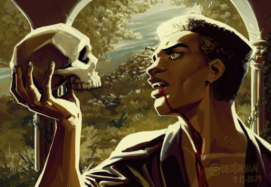
Thinking about vampires, death, life, and the space they occupy in between
#to be or not to be. that is the question#ty adam for being my model for dramatic vampire moment#musings on the thinkings about:#when to live you are required to hurt others. you must repeatedly ask yourself what the value of your life is#To sleep... perchance to dream...#ah. THERES THE RUB.#ok I actually couldnt come up with too many thoughts. I had a lot more while I was drawing this but I guess I put them in the painting LOL#reading that soliloquy and being like damn this is just like vampires#the reality of course is that the soliloquy is a debate over suicide and ultimately making the choice to live#even if just out of fear of the unknown#and vampires are about dying and then in undeath choosing to continue to live#despite the fear of eternity and loneliness and hurting others#theyre not the same. but like let me thiiink come onnnn I'm allowed to thiiink and have incomplete thoughts#I would have to write like a proper essay about this to organize my thoughts. this is the tags on a tumblr post.#anyways finished episode 79#working on patreon stickers for this month (and next month soon)#and working on book 4. taking a pause from episodes cause I've got 3 weeks of buffer now... UGH#I'm so mad that they changed it. it would have been 5 weeks before but it's fine it's whatever#anyways yeah taking a break from episodes to make my book now!#its good stuff.#and this painting is good stuff#banger after banger from me tbh#this was a little relaxing giving myself a couple hours to muse#it's necessary for my health and I always forget that til I do a painting...#I loved doing the little landscape in the background too I should do that more! I love how plants are just like whatever shape you want#like you can make up any plant you want and not only does that plant PROBABLY exist somewhere#a weirder plant exists somewhere too. so. literally whatever you want#ok bye again for a few days while I get back to work
250 notes
·
View notes
Text
so five and lila being a thing is going right next to allison literally sexually assaulting luther in the box of things we are absolutely under no circumstances accepting as part of canon right
#tw sa mention#cw sa mention#would love if when yall reblog this you could tag with tw or cw sa mention to keep things safe!!#i actually enjoyed s4 and thought the ending was perfect to be so real#s3 really lowered my expectations lmao#tua#tua season 4#tua spoilers#the umbrella academy#s4 was fun they flubbed so many storylines but it was fun and emotional and klaus got a ton of comic book moments and there was bonding#it was fun ok#honestly in my head s3 wasn’t even canon like the timeline split#sometimes s2 isn’t even canon to me but it’s so fucking fun#it’s all fun and fucking sad and goddammit i liked it more than s3 maybe because there was less incest the bar is really low huh#unless u subscribe to the technically all the kids r biologically related thing (i do) in which case lila/diego & lila/five are also incest#but for this show ‘we may kind of be biologically related bc of magic but we don’t have the same last name & dad & childhood home’ is a win#anyway i love klaus always everyday i love them they’re everything to me#i honestly just really let myself enjoy this season bc it’s the last one and i’ve been through hell#klaus hargreeves#five hargreeves#allison hargreeves#lila pitts#luther hargreeves#reginald hargreeves#diego hargreeves#yeet my deet
232 notes
·
View notes
Text
too many of you guys think nico is the loser and not lewis for letting the divorce go on for so long. like they're both losers about each other. emotionally constipated idiots who can't talk about their toxic homoerotic friendship that imploded on itself like 8 years ago and are now making it everyone else's problem. yeah nico's on television or in beer gardens talking about lewis all the time but like every other month some reporter is like "lewis, what's your favorite moment in your career?" and lewis no hesitation is like "oh man, karting, y'know? everything was simpler then" and then spends another six months skirting around nico's name. like this whole thing they're doing in the media isn't some kinda extended foreplay for them. they're both still pressing on the bruise to make sure it's still there!!! every few months, they're literally just asking on public television, does it still hurt for you like it does for me? and like clockwork, someone will release new information about them or one of them will say something about each other (in my heart, he's still my best friend/yes... and teammate) and the answer will remain the same, yes, of course, always.
#lewis is unarguably more famous than nico. like i feel like this a fact. and yet every other day nico is in the press saying some crazy shit#about lewis. if i was famous i woulda shut that shit down soo long ago. my ex-bf is in the press talkin bout me constantly??? that feels#like such bad pr and yet!!! lewis has not done anything. why? cause he likes it!!! cause they've never moved on from the 1st moment they#broke each other's hearts. like this is genuinely insane.#im always so nervous to post my thoughts on brocedes cause so many of you were here b4 me and have a better understanding on them#and like being a wrong is like a death sentence to me but still please tell me if i got them completely wrong#i have a lot of thoughts on lewis and his reluctance to talk about nico... most of them being that one quote from emma#if i loved you less i might be able to talk about it more#ok obligatory disclaimer: a lot of this is hyperbole. i don't think that they're asking lewis that ? every other month#but there are like at least 5 interviews where he talks about karting like they're his most precious memories#so make of that what you will#and obv i don't know these people but as someone who's brain chemistry has been permanently changed by them#i think i'm allowed to not only project onto them but also make stupid little posts analyzing them#anyway yeah#f1#lewis hamilton#nico rosberg#brocedes
727 notes
·
View notes
Text
andrew’s definitely gotten in trouble with his pr manager for tweeting things along the lines of:
“no mania inducing medication will compare to the euphoria i will feel the day donald trump drops dead”
#pr manager is like: andrew… this is the last time i’m gonna tell you#andrew: whats the point of democracy if i can’t exercise freedom of speech#pr manager: andrew it’s no longer about your image#at this point we are concerned the fbi is going to show up#andrew: neil has connections. i’m fine#they thought marketing andrew on social media would be good#they were sooooo wrong#because now andrew has a place to share every insane thing he’s ever thought#for instance—a tweet that just says ‘an alien googling: human clothes’#he’s on there advocating for lgbtq+ youth you KNOW HE IS#he’s cursing and mildly threatening members of congress for imposing these disgusting bills#one day he tweeted ‘does mitch mcconnell know he’s dead yet’#when mitch mcconnell stepped down from senate andrew tweeted ‘hopefully next he steps down from life’#unsurprisingly: this endears him to some people and makes others fucking hate him#and he’s such a shit. he does not care either way#he’s kind of just like: pr manager. you gave me a twitter and told me to tweet. i’m just doing what you asked me#they’ve threatened to change his password so many times#they actually did once but andrew reported the account so many times for defamation and fraud that it got suspended#and he made a new account out of pure spite#his pr manager is like: andrew nobody is going to want to sign you because of your public image#and andrew is like: ?? ok. they can lose every game then#(he knows he’s the best goalie)#ok i think that’s enough for now. however i will probably be back#andrew minyard#aftg#tfc#trk#tkm#the foxhole court#all for the game
400 notes
·
View notes
Text
why Aurora's art is genius
It's break for me, and I've been meaning to sit down and read the Aurora webcomic (https://comicaurora.com/, @comicaurora on Tumblr) for quite a bit. So I did that over the last few days.
And… y'know. I can't actually say "I should've read this earlier," because otherwise I would've been up at 2:30-3am when I had responsibilities in the morning and I couldn't have properly enjoyed it, but. Holy shit guys THIS COMIC.
I intended to just do a generalized "hello this is all the things I love about this story," and I wrote a paragraph or two about art style. …and then another. And another. And I realized I needed to actually reference things so I would stop being too vague. I was reading the comic on my tablet or phone, because I wanted to stay curled up in my chair, but I type at a big monitor and so I saw more details… aaaaaand it turned into its own giant-ass post.
SO. Enjoy a few thousand words of me nerding out about this insanely cool art style and how fucking gorgeous this comic is? (There are screenshots, I promise it isn't just a wall of text.) In my defense, I just spent two semesters in graphic design classes focusing on the Adobe Suite, so… I get to be a nerd about pretty things…???
All positive feedback btw! No downers here. <3
---
I cannot emphasize enough how much I love the beautiful, simple stylistic method of drawing characters and figures. It is absolutely stunning and effortless and utterly graceful—it is so hard to capture the sheer beauty and fluidity of the human form in such a fashion. Even a simple outline of a character feels dynamic! It's gorgeous!
Though I do have a love-hate relationship with this, because my artistic side looks at that lovely simplicity, goes "I CAN DO THAT!" and then I sit down and go to the paper and realize that no, in fact, I cannot do that yet, because that simplicity is born of a hell of a lot of practice and understanding of bodies and actually is really hard to do. It's a very developed style that only looks simple because the artist knows what they're doing. The human body is hard to pull off, and this comic does so beautifully and makes it look effortless.
Also: line weight line weight line weight. It's especially important in simplified shapes and figures like this, and hoo boy is it used excellently. It's especially apparent the newer the pages get—I love watching that improvement over time—but with simpler figures and lines, you get nice light lines to emphasize both smaller details, like in the draping of clothing and the curls of hair—which, hello, yes—and thicker lines to emphasize bigger and more important details and silhouettes. It's the sort of thing that's essential to most illustrations, but I wanted to make a note of it because it's so vital to this art style.
THE USE OF LAYER BLENDING MODES OH MY GODS. (...uhhh, apologies to the people who don't know what that means, it's a digital art program thing? This article explains it for beginners.)
Bear with me, I just finished my second Photoshop course, I spent months and months working on projects with this shit so I see the genius use of Screen and/or its siblings (of which there are many—if I say "Screen" here, assume I mean the entire umbrella of Screen blending modes and possibly Overlay) and go nuts, but seriously it's so clever and also fucking gorgeous:
Firstly: the use of screened-on sound effect words over an action? A "CRACK" written over a branch and then put on Screen in glowy green so that it's subtle enough that it doesn't disrupt the visual flow, but still sticks out enough to make itself heard? Little "scritches" that are transparent where they're laid on without outlines to emphasize the sound without disrupting the underlying image? FUCK YES. I haven't seen this done literally anywhere else—granted, I haven't read a massive amount of comics, but I've read enough—and it is so clever and I adore it. Examples:


Secondly: The beautiful lighting effects. The curling leaves, all the magic, the various glowing eyes, the fog, the way it's all so vividly colored but doesn't burn your eyeballs out—a balance that's way harder to achieve than you'd think—and the soft glows around them, eeeee it's so pretty so pretty SO PRETTY. Not sure if some of these are Outer/Inner Glow/Shadow layer effects or if it's entirely hand-drawn, but major kudos either way; I can see the beautiful use of blending modes and I SALUTE YOUR GENIUS.
I keep looking at some of this stuff and go "is that a layer effect or is it done by hand?" Because you can make some similar things with the Satin layer effect in Photoshop (I don't know if other programs have this? I'm gonna have to find out since I won't have access to PS for much longer ;-;) that resembles some of the swirly inner bits on some of the lit effects, but I'm not sure if it is that or not. Or you could mask over textures? There's... many ways to do it.
If done by hand: oh my gods the patience, how. If done with layer effects: really clever work that knows how to stop said effects from looking wonky, because ugh those things get temperamental. If done with a layer of texture that's been masked over: very, very good masking work. No matter the method, pretty shimmers and swirly bits inside the bigger pretty swirls!
Next: The way color contrast is used! I will never be over the glowy green-on-black Primordial Life vibes when Alinua gets dropped into that… unconscious space?? with Life, for example, and the sharp contrast of vines and crack and branches and leaves against pitch black is just visually stunning. The way the roots sink into the ground and the three-dimensional sensation of it is particularly badass here:

Friggin. How does this imply depth like that. HOW. IT'S SO FREAKING COOL.
A huge point here is also color language and use! Everybody has their own particular shade, generally matching their eyes, magic, and personality, and I adore how this is used to make it clear who's talking or who's doing an action. That was especially apparent to me with Dainix and Falst in the caves—their colors are both fairly warm, but quite distinct, and I love how this clarifies who's doing what in panels with a lot of action from both of them. There is a particular bit that stuck out to me, so I dug up the panels (see this page and the following one https://comicaurora.com/aurora/1-20-30/):

(Gods it looks even prettier now that I put it against a plain background. Also, appreciation to Falst for managing a bridal-carry midair, damn.)
The way that their colors MERGE here! And the immense attention to detail in doing so—Dainix is higher up than Falst is in the first panel, so Dainix's orange fades into Falst's orange at the base. The next panel has gold up top and orange on bottom; we can't really tell in that panel where each of them are, but that's carried over to the next panel—

—where we now see that Falst's position is raised above Dainix's due to the way he's carrying him. (Points for continuity!) And, of course, we see the little "huffs" flowing from orange to yellow over their heads (where Dainix's head is higher than Falst's) to merge the sound of their breathing, which is absurdly clever because it emphasizes to the viewer how we hear two sets of huffing overlaying each other, not one. Absolutely brilliant.
(A few other notes of appreciation to that panel: beautiful glows around them, the sparks, the jagged silhouette of the spider legs, the lovely colors that have no right to make the area around a spider corpse that pretty, the excellent texturing on the cave walls plus perspective, the way Falst's movements imply Dainix's hefty weight, the natural posing of the characters, their on-point expressions that convey exactly how fuckin terrifying everything is right now, the slight glows to their eyes, and also they're just handsome boys <3)
Next up: Rain!!!! So well done! It's subtle enough that it never ever disrupts the impact of the focal point, but evident enough you can tell! And more importantly: THE MIST OFF THE CHARACTERS. Rain does this irl, it has that little vapor that comes off you and makes that little misty effect that plays with lighting, it's so cool-looking and here it's used to such pretty effect!
One of the panel captions says something about it blurring out all the injuries on the characters but like THAT AIN'T TOO BIG OF A PROBLEM when it gets across the environmental vibes, and also that'd be how it would look in real life too so like… outside viewer's angle is the same as the characters', mostly? my point is: that's the environment!!! that's the vibes, that's the feel! It gets it across and it does so in the most pretty way possible!
And another thing re: rain, the use of it to establish perspective, particularly in panels like this—

—where we can tell we're looking down at Tynan due to the perspective on the rain and where it's pointing. Excellent. (Also, kudos for looking down and emphasizing how Tynan's losing his advantage—lovely use of visual storytelling.)
Additionally, the misting here:

We see it most heavily in the leftmost panel, where it's quite foggy as you would expect in a rainstorm, especially in an environment with a lot of heat, but it's also lightly powdered on in the following two panels and tends to follow light sources, which makes complete sense given how light bounces off particles in the air.
A major point of strength in these too is a thorough understanding of lighting, like rim lighting, the various hues and shades, and an intricate understanding of how light bounces off surfaces even when they're in shadow (we'll see a faint glow in spots where characters are half in shadow, but that's how it would work in real life, because of how light bounces around).
Bringing some of these points together: the fluidity of the lines in magic, and the way simple glowing lines are used to emphasize motion and the magic itself, is deeply clever. I'm basically pulling at random from panels and there's definitely even better examples, but here's one (see this page https://comicaurora.com/aurora/1-16-33/):

First panel, listed in numbers because these build on each other:
The tension of the lines in Tess's magic here. This works on a couple levels: first, the way she's holding her fists, as if she's pulling a rope taut.
The way there's one primary line, emphasizing the rope feeling, accompanied by smaller ones.
The additional lines starbursting around her hands, to indicate the energy crackling in her hands and how she's doing a good bit more than just holding it. (That combined with the fists suggests some tension to the magic, too.) Also the variations in brightness, a feature you'll find in actual lightning. :D Additional kudos for how the lightning sparks and breaks off the metal of the sword.
A handful of miscellaneous notes on the second panel:
The reflection of the flames in Erin's typically dark blue eyes (which bears a remarkable resemblance to Dainix, incidentally—almost a thematic sort of parallel given Erin's using the same magic Dainix specializes in?)
The flowing of fabric in the wind and associated variation in the lineart
The way Erin's tattoos interact with the fire he's pulling to his hand
The way the rain overlays some of the fainter areas of fire (attention! to! detail! hell yeah!)
I could go on. I won't because this is a lot of writing already.
Third panel gets paragraphs, not bullets:
Erin's giant-ass "FWOOM" of fire there, and the way the outline of the word is puffy-edged and gradated to feel almost three-dimensional, plus once again using Screen or a variation on it so that the stars show up in the background. All this against that stunning plume of fire, which ripples and sparks so gorgeously, and the ending "om" of the onomatopoeia is emphasized incredibly brightly against that, adding to the punch of it and making the plume feel even brighter.
Also, once again, rain helping establish perspective, especially in how it's very angular in the left side of the panel and then slowly becomes more like a point to the right to indicate it's falling directly down on the viewer. Add in the bright, beautiful glow effects, fainter but no less important black lines beneath them to emphasize the sky and smoke and the like, and the stunningly beautiful lighting and gradated glows surrounding Erin plus the lightning jagging up at him from below, and you get one hell of an impactful panel right there. (And there is definitely more in there I could break down, this is just a lot already.)
And in general: The colors in this? Incredible. The blues and purples and oranges and golds compliment so well, and it's all so rich.
Like, seriously, just throughout the whole comic, the use of gradients, blending modes, color balance and hues, all the things, all the things, it makes for the most beautiful effects and glows and such a rich environment. There's a very distinct style to this comic in its simplified backgrounds (which I recognize are done partly because it's way easier and also backgrounds are so time-consuming dear gods but lemme say this) and vivid, smoothly drawn characters; the simplicity lets them come to the front and gives room for those beautiful, richly saturated focal points, letting the stylized designs of the magic and characters shine. The use of distinct silhouettes is insanely good. Honestly, complex backgrounds might run the risk of making everything too visually busy in this case. It's just, augh, so GORGEOUS.
Another bit, take a look at this page (https://comicaurora.com/aurora/1-15-28/):

It's not quite as evident here as it is in the next page, but this one does some other fun things so I'm grabbing it. Points:
Once again, using different colors to represent different character actions. The "WHAM" of Kendal hitting the ground is caused by Dainix's force, so it's orange (and kudos for doubling the word over to add a shake effect). But we see blue layered underneath, which could be an environmental choice, but might also be because it's Kendal, whose color is blue.
And speaking off, take a look at the right-most panel on top, where Kendal grabs the spear: his motion is, again, illustrated in bright blue, versus the atmospheric screened-on orange lines that point toward him around the whole panel (I'm sure these have a name, I think they might be more of a manga thing though and the only experience I have in manga is reading a bit of Fullmetal Alchemist). Those lines emphasize the weight of the spear being shoved at him, and their color tells us Dainix is responsible for it.
One of my all-time favorite effects in this comic is the way cracks manifest across Dainix's body to represent when he starts to lose control; it is utterly gorgeous and wonderfully thematic. These are more evident in the page before and after this one, but you get a decent idea here. I love the way they glow softly, the way the fire juuuust flickers through at the start and then becomes more evident over time, and the cracks feel so realistic, like his skin is made of pottery. Additional points for how fire begins to creep into his hair.
A small detail that's generally consistent across the comic, but which I want to make note of here because you can see it pretty well: Kendal's eyes glow about the same as the jewel in his sword, mirroring his connection to said sword and calling back to how the jewel became Vash's eye temporarily and thus was once Kendal's eye. You can always see this connection (though there might be some spots where this also changes in a symbolic manner; I went through it quickly on the first time around, so I'll pay more attention when I inevitably reread this), where Kendal's always got that little shine of blue in his eyes the same as the jewel. It's a beautiful visual parallel that encourages the reader to subconsciously link them together, especially since the lines used to illustrate character movements typically mirror their eye color. It's an extension of Kendal.
Did I mention how ABSOLUTELY BEAUTIFUL the colors in this are?
Also, the mythological/legend-type scenes are illustrated in familiar style often used for that type of story, a simple and heavily symbolic two-dimensional cave-painting-like look. They are absolutely beautiful on many levels, employing simple, lovely gradients, slightly rougher and thicker lineart that is nonetheless smoothly beautiful, and working with clear silhouettes (a major strength of this art style, but also a strength in the comic overall). But in particular, I wanted to call attention to a particular thing (see this page https://comicaurora.com/aurora/1-12-4/):

The flowing symbolic lineart surrounding each character. This is actually quite consistent across characters—see also Life's typical lines and how they curl:

What's particularly interesting here is how these symbols are often similar, but not the same. Vash's lines are always smooth, clean curls, often playing off each other and echoing one another like ripples in a pond. You'd think they'd look too similar to Life's—but they don't. Life's curl like vines, and they remain connected; where one curve might echo another but exist entirely detached from each other in Vash's, Life's lines still remain wound together, because vines are continuous and don't float around. :P
Tahraim's are less continuous, often breaking up with significantly smaller bits and pieces floating around like—of course—sparks, and come to sharper points. These are also constants: we see the vines repeated over and over in Alinua's dreams of Life, and the echoing ripples of Vash are consistent wherever we encounter him. Kendal's dream of the ghost citizens of the city of Vash in the last few chapters is filled with these rippling, echoing patterns, to beautiful effect (https://comicaurora.com/aurora/1-20-14/):

They ripple and spiral, often in long, sinuous curves, with smooth elegance. It reminds me a great deal of images of space and sine waves and the like. This establishes a definite feel to these different characters and their magic. And the thing is, that's not something that had to be done—the colors are good at emphasizing who's who. But it was done, and it adds a whole other dimension to the story. Whenever you're in a deity's domain, you know whose it is no matter the color.
Regarding that shape language, I wanted to make another note, too—Vash is sometimes described as chaotic and doing what he likes, which is interesting to me, because smooth, elegant curves and the color blue aren't generally associated with chaos. So while Vash might behave like that on the surface, I'm guessing he's got a lot more going on underneath; he's probably much more intentional in his actions than you'd think at a glance, and he is certainly quite caring with his city. The other thing is that this suits Kendal perfectly. He's a paragon character; he is kind, virtuous, and self-sacrificing, and often we see him aiming to calm others and keep them safe. Blue is such a good color for him. There is… probably more to this, but I'm not deep enough in yet to say.
And here's the thing: I'm only scratching the surface. There is so much more here I'm not covering (color palettes! outfits! character design! environment! the deities! so much more!) and a lot more I can't cover, because I don't have the experience; this is me as a hobbyist artist who happened to take a couple design classes because I wanted to. The art style to this comic is so clever and creative and beautiful, though, I just had to go off about it. <3
...brownie points for getting all the way down here? Have a cookie.
#aurora comic#aurora webcomic#comicaurora#art analysis#...I hope those are the right tags???#new fandom new tagging practices to learn ig#much thanks for something to read while I try to rest my wrists. carpal tunnel BAD. (ignore that I wrote this I've got braces ok it's fine)#anyway! I HAVE. MANY MORE THOUGHTS. ON THE STORY ITSELF. THIS LOVELY STORY#also a collection of reactions to a chunk of the comic before I hit the point where I was too busy reading to write anything down#idk how to format those tho#...yeet them into one post...???#eh I usually don't go off this much these days but this seems like a smaller tight-knit fandom so... might as well help build it?#and I have a little more time thanks to break so#oh yes also shoutout to my insanely awesome professor for teaching me all the technical stuff from this he is LOVELY#made an incredibly complex program into something comprehensible <3#synapse talks
761 notes
·
View notes
Text
can i just say. and this is probably a niche hill to die on. that i am so gobsmacked every time someone vaguely hints at the idea that jotaro doesn't care meaningfully for the other crusaders, usually particularly kakyoin and joseph, when those two actually tend to be the ones he reacts to being hurt the hardest


like he cares for his loved ones!!!! that literally plays into his character motives in every single part he shows up in!!! stop lying to me!!!!!!!
#kiki.txt#jjba#i'm going to ramble in tags actually. excuse me#ok. rereading sdc and so confused at the general perception of jotaro and his friends/family. he's not NEARLY as flat or as dickish#i understand that the anime (particularly the dub) tends to slander him but even then he still clearly cares for them! i'm confused#i also understand that a lot of people dig against jotaro and kakyoin as a dynamic because 'they're popular' and that generally disliking#popular things across media is a thing that i've seen consistently everywhere but the discredit to them simply as a DUO and not even as a#pairing is so..... odd..... like they're considered to be a duo that clicks for a reason. i enjoyed them even before i got into the fandom#every time i see someone say jotaro is overrated/dull i take a shot and assume they're an anime-only or only read the manga like once btw#joseph and jotaro also have a neat dynamic and they obviously both love and care for each other. like they're not going to go around loudly#or anything but literally the entirety of the lovers and the prelude to the dio fight IS jotaro being worked up over joseph getting hurt#equally i don't know if it translates to the anime as much but joseph is VERY complimentary when it comes to jotaro. like he sings his#praises so often and reminds everyone that he's his grandson so frequently (d'arby the gamer is a good example of this). either way it's so#peculiar....... there's not enough avdol and jotaro content btw (also in canon) because jotaro obviously looks up to him and avdol jokes#around with him on the occasion they interact after their intro which doesn't start very well. it's very cute#i do think an important thing to note about jotaro's character is how he acts AFTER his intro because he's so drastically different. early#jotaro and later jotaro aren't the same character and i do not mean this in a character development way. excluding the jail incident he's#completely different and probably shouldn't really be taken into account (especially considering the amount of slapstick in araki's intros)#and i think that's really???? what people center on for his character? Which sucks balls bad!#anyways. i could ramble more about this if asked i have so much to say but sigh. jotaro cares so much for his friends and family he's not a#flat fully cold asshole character regardless of whether you watch the anime or ova or read the manga. you just have poor media literacy#i wouldn't recommend watching solely the anime for his character though. the dub also changes a lot so it's... questionable#i love the anime and it's still important for him though. also adds neat stuff. i need to stop myself. i have many thoughts on the matter#jotaro kujo#joseph joestar#noriaki kakyoin#adding in case anyone sees: i am not saying that he is perfect about this. in fact he is very ass about it with jolyne and holly and that's#very important. he also is in fact an asshole sometimes. NOT as much as you guys are making him though!#please don't get me started on how much of a dick etc people make kakyoin to veer away from the 'woobified' characterizations of him#in fact i think that's bad if not worse because it CLAIMS to be in character. hes a prim asshole at times but not that angry or dishevelled
176 notes
·
View notes
Text
I'm playing through Dragon Age 2 again and I just can't get over how... idk how to say it exactly, but the way you feel, in every moment of this game, how much Varric loves Hawke. It feels entwined with everything, it breathes through every part of the narrative, it blooms diegetigally through the integration of story and gameplay, makes you a co-conspirator in that love in a way maybe only a video game could.
It's in the way I don't think this story is a defense of Hawke only -- or even primarily -- directed at Cassandra, but at Hawke themselves. Beneath everything else going on there's the quiet, utterly unshakable refutation of Hawke's worst fears: Did you think you mattered, Hawke? Did you think anything you ever did mattered? . . . You're a failure, and your family died knowing it. Rising through the story as Varric tells it there's a fiercely tender voice saying: Yes, you did matter. In tragedy or in triumph, for better or for worse, in love or in hate, you always mattered. The ultimate tragedy of Hawke is always right there in the open before the story even starts letting you in on telling it; they couldn't fix anything. They couldn't stop the downward spiral Kirkwall was set on -- the real truth is that no one person ever could. And yet the point of DA2 is that it matters that they tried, and it matters that there were people who loved and were loved along the way, however badly it all failed in the end. Hawke is the Bioware protagonist who succeeds the least, and they're the character who matters the most, to me. (This is also why the Absolution reveal did not shake me in the least haha, my love for Hawke has nothing at all to do with whether they succeeded or failed at anything.)
What Varric is saying, in the only way he seems to be able to say the really real things -- through stories -- is so simple and so fundamental. You were here, and I loved you. There's the emotional heart of it, at the end of it all, that love and grief and recognition. It's so dizzyingly intimate. There's so much distancing, layers upon layers of obfuscation, to be able to say it. It drives me insane!!!! It makes me feel the same way that 'Poem' by Langston Hughes does:
I loved my friend.
He went away from me.
There's nothing more to say.
The poem ends,
Soft as it began,—
I loved my friend.
He loved his friend. They went away from him. What more is there to say. (Many, many, many things, when you're a compulsive liar and storyteller, but hey sometimes you have to deploy a whole armada of lies to tell one simple truth, I understand, I'm a writer too lol)
#dragon age#varric tethras#dragon age 2#dragon age meta#hawke#on second thought let's not go to kirkwall; it is a silly place#when merrill says she just says 'I love Hawke' to herself because it's the only thing in the world that makes sense sometimes...#varric clearly Felt That lol#how can I have played this game so many times and still have such intense feelings about this. help. the unreliable narrator got to me ok#dragon age absolution spoilers#it's real vague but let's be safe. anyway meredith can come back idc. the dragon from the bone pit could come back.#Hawke could keep falling on his face forever and I'll still be out here like 'You're doing amazing sweetie don't worry ;____;' the whole wa
2K notes
·
View notes
Text

lays on the ground
#pigeon screens#odette hollows#HAVE YOU SEEN HER AHHHHHHHHHHHHHHH#I LOVE HER#i'm on my hands and knees weeping#i love#i love!!!!!#anyway#i finally just caved because i was getting antsy about her makeup mod of all things (':#I had no idea what one I actually used for it because the one I THOUGHT it was was updated and is so different#so I went digging through my old files for stuff and got the png and updated it#and it looks!!!#ok#but maybe i'll bite the bullet and try and grab a commission for a custom makeup#maybe...... see if she can get her dimple added#I know it would be visible *all* the time instead of when she grins a certain way so maybe it would be easier to figure out how to#draw it on manually?#many thoughts to think#many things to rotate#but i am confident in updating olds things now at least#there are some weird spots right under her lower lip (hidden by tea cup) that I'll have to poke at#but!!!
98 notes
·
View notes
Text
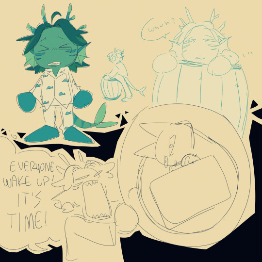
sleepy gill and gill with the bubbled evil cat
#hi remember when i thought i was in for a really bad bout of hsr fixation. lets see how thats going.. lets just check in and#oh . oh no. oh this was. this wasnt the plan. oh no#just roll with it#jrwi riptide#gillion tidestrider#gill in pjs got to me ok. gill fighting in pjs got to me. the thought of gill sleeping in a barrel of water with pjs on got to me.#wheni tell you this fkn podcast is the only thing ive been thinking abt for the past few days dude what thef uck#theyre all so stupid they get up to so much bs its fkn great i lvoe the three of them so mcuh WHEHhghh >:'O#my art#i keep nearly forgetting that tag help???#ive slowly been getting used to drawing them jsut you wait til i feel good abt the designs n shit ok its gonna be epic or smth#oop s its 1am soon whoopsies ehehee but like ..... the dumbasses... theyre in my head..#there are so many stupid scenes i want to draw 😭😭😭😭😭#im sorry to. my friends. for jsut . yknow. and everyone really#i wasnt ready for this 😭 idk what happened i just started going through eps so quickly all of a sudden and ive gone through like 12 eps in#2-3 days and i feel absolutely insane and i think abt them so much. theyve taken up all my time help
316 notes
·
View notes
Text
I’m just spinning q!bbh in my mind rn I’ve got theories and analysis and bits of it are a stretch and it is rambly and long so it’s going under a cut but here we go XD
Everything he’s done since the eggs were taken has been so incredibly deliberate and he developed this plan when he was in the depths of the greatest despair. According to what he told Baghera today, he developed this plan before the anger stream when he lava cast the presidential office as that was part of the plan to draw out the workers.
So Bad blatantly lying and gaslighting and just being incredibly suspicious to everyone today feels deliberate. It feels like he’s intentionally burning these bridges. The whole gun debacle is a great example of this. I saw a post that suspected bbh took Ron to test Baghera and her loyalty to him by doing something he knows she’d disapprove of and while I don’t think that’s why he took Ron, I defiantly think that’s part of it.
The whole gun thing I feel is Bad’s test for Forever. Bad has lied to his face and changed the story so many times that even when Bad tells him the truth Forever doesn’t care. I think Bad is intentionally pushing Forever just like he is Baghera. He’s pushing him to see what it would take for Forever to cut ties. It’s brutal and is actively hurting Forever just like how Baghera was hurt learning what Bad had done to Ron.
Bad feels no guilt for what he’s done to Ron. All he cares about is what others would think of his actions. He knows what he’s doing is “wrong” but he doesn’t care. Such black and white morality is beneath him. He’s doing what he thinks is necessary.
And that includes his own self destruction. He is testing all of these relationships knowing full well that he might destroy them. He knows Baghera is so much more moral than him and has such a higher value of life so he intentionally showed her something that would shatter her perception of him. Bad knows that trust is very important to forever so he intentionally lies and gaslights him knowing full well that Forever may never trust him again.
Bad created this plan when he was at his lowest point. On an average day, Bad’s value of his own life is nonexistent. He designed a plan to uncover how the federation spies on them knowing full well that it could turn everyone against him. That sure sounds familiar doesn’t it? Bad’s proposed this exact same plan under different circumstances(“joining” the feds to make them worse so everyone revolts against them inspired by his building inspector bit”). He doesn’t care about himself and is willing to throw himself to the wolves and make everyone hate him if it means defeating the federation and getting their children back. Previously, bad never went through with the plan because he wasn’t as desperate but now… during the depths of his grief after the kids were stolen, there was nothing holding him back from complete self annihilation.
I think Tubbo discovering/catching on to bbh’s kidnapping put a hitch in Bad’s plans because now his tests for others are being influenced by an outside variable he can’t control, that’s why he spent the whole day doing damage control. He’s trying to spin the story in such a way that he’s still somewhat in control of the situation. He knows that the cats out of the bag. Everyone is going to suspect him now so what does he do? He spends the day making himself even more suspicious. He admitted to torturing foolish in the past. He admitted to imprisoning forever during the happy pills arc. He admitted to planning on abducting a player in the future. He’s making himself look so much more guilty.
Everything he does is with intent. What could be the intent here? He’s told several people that he wants to be arrested so he has access to the federation prisons/facilities. He’s told several people that he is capable of kidnapping/torturing someone. He denies he’s guilty of Ron’s disappearance while simultaneously making himself look guilty. Is he trying to push the federation? To see if they actually will arrest him? All fingers point to bbh and the federation knows this - they basically say so in the journals Tubbo found. But they continue doing nothing. The workers are warned to stay away from him at all costs but… why wouldn’t they just arrest him? They’ve done so to others for less. That’s the question I want Tubbo to be asking. He’s smart enough to realize there’s something off here. Yes bad has a guy in his basement but why hasn’t the federation done anything about it?
Maybe that’s Bad’s test for Tubbo. Bad knows Tubbo is fiercely intelligent and that he can’t bullshit has way past him so he gave Tubbo so much. Yes there was a lot of bullshit but Bad intentionally gave Tubbo more ammunition against him. Is that Bad’s test? If Tubbo finds proof that Bad has Ron in his basement and the federation continues not to act, will that clear Tubbo of suspicion in his eyes? Tubbo knows the worker Bad is trying to find, is Bad giving Tubbo a chance to unknowingly prove himself by uncovering Bad’s secret? “Has anyone ever told you your too smart for your own good, Tubbo?” It sounded like a threat but it could have been an invitation.
Fred has become an incredibly important npc and I have a feeling he is the key to unlocking the mysteries of the eggs and the great evil. I’m pretty sure he’s the one in the radio transmission that talks about why the eggs disappeared and Ron said he overheard Fred talking about the evil. Fred knows so much more than he lets on and one way or another, the players are gonna find out.
I’m also fascinated by Bad’s conversation with Bagi about Boo. Only after Bagi confessed to telling Forever about the secret did Bad put in his clipboard that she passed the test. We’ll how did she pass the test? She told someone about his secret. We’ll, she came clean about it. She told someone she thought was Bad’s best friend then admitted it. She wasn’t trying to go behind his back and thus was trustworthy. However, as the day went on and Bagi learned about Ron, this changed. Her perception of Bad changed and Bad updated his notes about her in response. She went from trustworthy to sometimes trustworthy to be careful what you tell her. She still passed the test but the level of trust dropped dramatically - which is so fascinating.
At the end of it, I think… through all of this, Bad is gonna burn all his bridges in order to find the eggs and destroy the federation. He’s accepted that at this point. He was so dismissive of Baghera’s concerns for Ron and Bad and almost felt like he was placating her, just telling her what she wanted to hear. If Baghera interferes with Ron, I don’t think Bad will accept that and he would sacrifice their relationship to continue his plans. If anything, I could see him releasing Ron into Baghera’s hands only to capture Fred in his place - and this time he wouldn’t tell a soul.
Just the sudden switch in attitude when everyone triggered his radar was palpable. “Get out of my house or die” he was so furious that this test had been interrupted but he masked it while with baghera. When Bad went flying into the hall of grim shouting at everyone to get out and attacking them mercilessly, you could feel the rage (part of that was the lore secrets being accidentally revealed but still) the entire visit with Ron was a performance for both Ron and Baghera and I feel so bad for Baghera because she’s in an impossible position.
She wants to be there for Bad she wants to support him but this… this is so far beyond what she is willing to excuse from him. This has crossed so many lines but there isn’t any turning back. She doesn’t want to lose Bad either through breaking his trust or being taken by the federation but at the same time she can’t stand by and do nothing. She needs to help him. Unfortunately, that means it’s highly likely Bad will end up immolating their friendship if she pushes too hard.
And just the way Bad acts around Ron is so fascinating. It’s all a performance. The large furnished home. The fridge full of food. The fish. The weird attachment Bad shows - almost a reverse Stockholm syndrome - while simultaneously talking over/for Ron in such a dehumanizing way. It’s so fascinating in the moments when the mask falls away. When Bad was watching Baghera talk to Ron - idk if it was just me - but I felt like Bad was a hawk observing it’s prey. He plays up the sugary sweetness and dependence but he still feels like a tiger prowling the bars of his cage eyeing the snacks on the other side. It’s the way he moves and what he choosss to look at during these scenes idk bbh’s body language is insane and I could devote an entire essay to analyzing it
Like Bad’s stream title before he started stream, there are only two sides. Either ur with him or against him and the only thing he values is finding the eggs and tearing down the federation. He doesn’t care if everyone grows to hate him. He doesn’t care if he grows to hate himself. There are no lines he won’t cross. It’s all worth it. It’s all inevitable.
#qsmp#crimson speaks#badboyhalo#ok this got really long#and rambly#idk if it’s even legible#but I have so many thoughts about his current arc#it’s masterful storytelling#and I can’t wait to see where it leads#I hope he gets worse#I hope the federations fear of him spreads to the players#I hope he burns every bridge#and at the end when there is nothing but embers#he realizes the cost wasn’t worth it#and it breaks him#I want people to be scared of him#I want a villain arc damn it!!#but if it doesn’t happen that’s okay to#I’m sure what ever direction bbh takes us will be amazing
318 notes
·
View notes
Text
k so slay the princess is rotting my brain but currently one big thought is chilling in my brain, and like- hear me out (sorry if my wording doesn't convey my thoughts well skskfjdjg)
but I don't think the damsel is entirely as shallow as some may see her as. HEAR ME OUT- compared to the other princesses, yes, she definitely more shallow. and she is also (at least when looking at deconstructed) poking fun at those trying to have an easy and work free romance route where the princess does whatever you like and loves you so, so much. i'm not saying she's supremely deep and that no one understands her but me, but I also don't think she exists solely to mock players with absolutely nothing to say about the nature of human permanence either.
does that make sense? more thoughts below- they're a bit disjointed though so warning ^^;
I personally think the damsel can also represent a very real form love, so to speak.
gimme a min to explain. I think what initially led me to this is a line from the narrator equating the smitten and the damsel to acting like teenagers in love. and that line sorta shifted my perspective a bit on her a little? seeing that kinda made me go "ohhhhhhh makes sense" like it really did remind me of two kids who don't entirely get what dating entails but still want to be together, and given the endgame sequence the damsel's section just kinda cemented this mindset for me.
for clarification the damsel has two(?) bits of dialog depending on whether she's deconstructed or not. If she isn't she says something along the lines of (iirc) "you had a desire and you set that desire free/not caring about what it took or costed you in the process" annnd?? like that's kinda wholesome to me?
like the damsel's love with the player isn't nearly as in depth, complicated, or complete as say the thorn, but it's a passionate love. it's also a naive love. the sort of love you'd find with, well, teenagers having a crush. of course when people get older they see those old crushes as frivolous and flat, but to the people experiencing them in the moment, it's real! it's serious! they were still willing to risk a lot just to be together. and at least at the start, you're willing to be killed by the princess if it means she's safe after having a battle of control against the narrator. it just reads as very human to me. they truly felt that their love could conquer anything.
I feel the thorn is a more 'adult' version of the damsel. it's that passionate love taking on a more mature form. it has more hardships to go through and way more pitfalls and mistakes that one can make compared to the more childish love like the damsel's. there's less theatrics and fanfare, and to me it feels more somber and quiet. it's a contrast between the high stakes emotion filled damsel, and the more intimate, tense, and self-aware thorn. ultimately in the end for both of them, they come to a realization that love is a powerful tool almost in a way that mirror each other.
some of the same occurrences leading up to the route are also shared between the two. like having the princess stab you in the prior route. I also think it's worth noting that in the thorn, the thistles can be seen as/can be referred to a prison of her own making. something she can leave if she was willing to make the effort to do so. it's similar to the damsel's shackles being easily slipped off her wrist. she could free herself.
also by extension, say what you will about the smitten but he loves the princess no matter what form she takes. even when she kills him he still adores her. he is content with being cooked alive by the princess if that's what she wants. i think he's a lot like the damsel in that sense. whatever she wants, she will have. if the damsel is molded to love the player, the smitten is absolutely molded to love the princess in the same way.
#ok that got really long#halfway through i realized the thorn and the damsel have a lot of parallels and my brain exploded sorry#i really love this game and have so many more thoughts but those need other posts :((#someday soon someday soon...#slay the princess#stp spoilers#slay the princess spoilers#♡ -> post time !
218 notes
·
View notes
Text
Yall imagine Danny getting help from Batman and tells him about how hes on the run (it was a joke in passing smh) and how he has no home (it was ment to be funny man) then all of a sudden Bruce way shows up on a totally casual stroll in his neighbourhood. “Oh look a child who is in need laaa dee daa let me help you poor random child who I have no idea who you are.” As if Danny is an idiot. He isnt fooled in the slightest. He knows when something is up. Batman clearly is using Bruce Wayne to help kids off the street.
Danny is staying at Wayne manner and notices how no one really talks about the bats. Or tif they do Bruce gets this look then quickly changes the subject. Hes putting so much effort into it too. And at first Danny hardly noticed. Now it’s obvious theres a connection. At first he thought Bruce Wayne hated batman with how often he refused to comment or gave his kids a glare when they mentioned the big bad bat. But now it’s clearly something else. Danny got a chance to talk to the commissioner alone and then it clicked. Danny had asked whats Mr.Waynes beef with Batman and the commissioner seemed so confused. Quickly telling Danny about how the two have worked together. How Bruce has even helped the bat with information or a distraction from time to time. Why would Danny think that he hated him???
And BAM Danny had it. Bruce Wayne is dating THE Batman!!! Holy shit it makes so much sense. Danny would often find batgear around the house. Bruce probably got targeted a bunch and thats probably how they met.
Now hes trying so hard to be supported of his clearly closeted father figure. He also gets why it’s not public info too. Paints a huge target on Bruce. Plus his many many kids. Must be hard for them. What a crazy life they live. Jason would probably be so jealous of their literal fairytale romance.
Danny tells Bruce that he is supported by him and that his secret is safe until hes ready to tell anyone else. Bruce niw thinking Danny knows hes batman shows up no mask and Danny goes nuts. “You can’t out yourself in danger to protect him bruce!!! You are just some himbo man!!! He wouldnt want this!!!” Thinking Bruce is going to try and fight in Batmans place.
Then Danny walks up and places a hand on bruces should (he has to reach lmao shorty). “I will go. I will keep everyone safe. You can count in me” transforms snd flys off to defeat the big bad. Leaving a fully stunned and confused bruce.
#danny phantom#dp x dc#dpxdc#yall have seen the batman lego movie right?#I mean the jokerxbatman stuff was fantastic but I loved how ribin thought he got two dads#then he lost them both at the same time#beautiful#I was gonna have more to this and I might later#I have so mich stuff to fo and im standing here soaking my pgone in the shower to write this shit#thats why I have so many typos now a days byw cause my phone is sopping#also im missing a bit ig my goot cause I guess I just moonley brain and ripped it off???#idk why I did that but it started bleeding and it hurts all the time and I kist want it to stop#but also I started to do it a third time#yes I did it twice#lord help me im stupid#ok im a go dye my hair white. unrelated ti dp
175 notes
·
View notes
Last Seen Blogs
highpriestessbriyanna-blog
The Light in the Darkness

d-orianhavilliard
Boyo

atikahsnrd
Scratch Cavity

spiderdotexe
big among us fan

pdabrams
Untitled