#I need to get better at drawing in a consistent style
Text
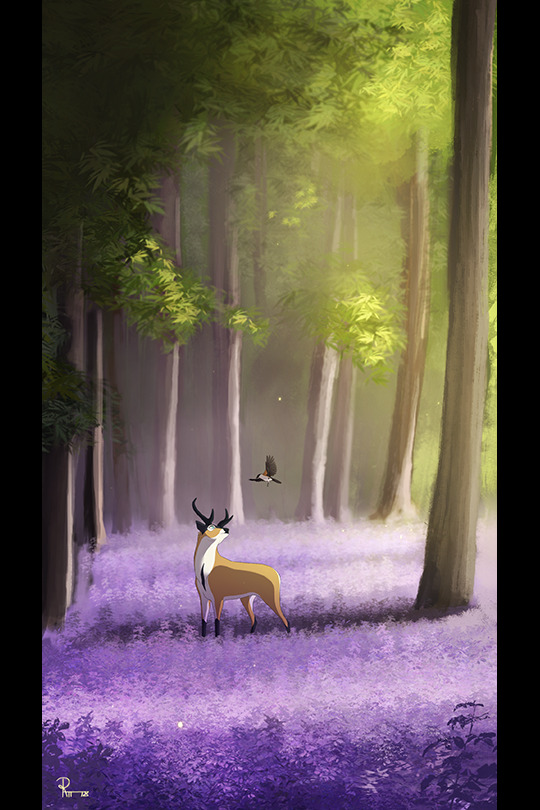
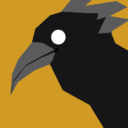
This was drawn to The Mind Electric and you can tell
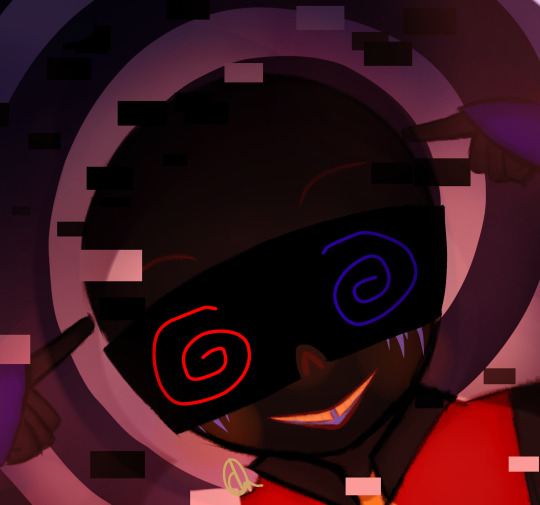
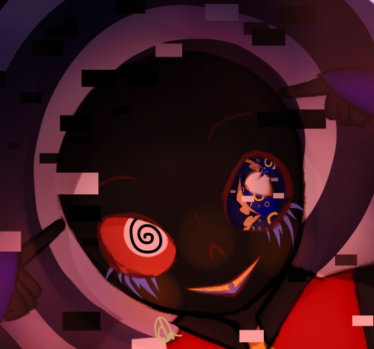
#this is a fanmade Fresh!Template I made for a rp#He honestly doesn’t feel enough like Template but y’know what? that’s completely fine#TEMPLATE BELONGS TO UNUART ON HERE BTW I DO NOT OWN TEMPLATES CHARACTER#template!error#undertale#I had a lot of fun drawing this#not my artstyle changing for the 10294839th time#I need to get better at drawing in a consistent style#I love Miracle Musical so much#i’m so normal about him i swear#I enjoy template very much#EDIT: TEMPLATES CREATOR IS ACTUALLY UNU-NUNU-ART I DID A MISSPELL BUT DONT WANNA FIX IT SINCE THE TAG WILL MOVE TO THE BOTTOM SUPER SORRY
12 notes
·
View notes
Text
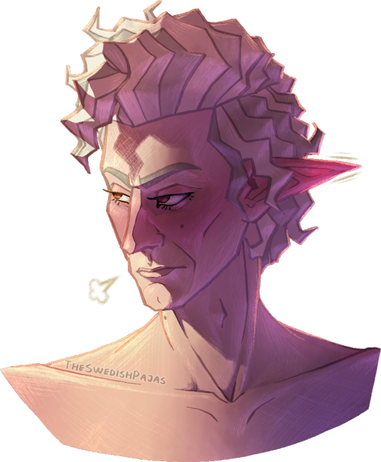
The man truly can’t take a genuine compliment 🙄
#my art stuff#digital art#baldur's gate 3#bg3#astarion#astarion ancunin#this is part of a series I like to call “I’m never settling on a singular detailed artstyle”#I have no consistency in drawing realistic people/characters other than my shapy cartoon style#but I truly don’t get enough opportunity to properly shade anything with art in that style-!!! it always looks weird to me-!!!!!#I think some rude lil worm in my brain is wriggling around telling me it’s a futile attempt at still doing realism#cus I’m one of those “gifted” artists that grew up promising his parents he’ll end up among the big names or whatever#constantly training to become better at art but with realism oil paintings as the goal#you know how it is 😔#I wanna shade my lil funky designs but they never feel good enough to really put energy into or whatever so I compromise with stuff -#- like this where I try to draw characters more accurately while still stylizing them and shading them however I feel like it#which is great and all but I should really learn to give my more relaxed and less perfectionist art a chance#I deserve to enjoy the process and the result without working myself dead#it’s so much easier and rewarding to copy cartoon styles - stylizing realism makes me too anxious of doing it “wrong”#at least cartoon styles give me a goal to reach or a reference to strive towards#man I really should just cut myself some slack altogether#either way - this man is a flustered mess and he’s embarrassed about being called adorable in public or something#being teased in an affectionate way about his sweeter side and stuff#don’t ask why he’s shirtless - anatomy is just a lot more fun for me to draw sometimes#tasteful nudity and all that is extremely gorgeous to me#i need to practice anatomy more cus I just kinda did some shit and went with it this time with a BIT of consideration for muscle structure
50 notes
·
View notes
Text
for like 3 weeks i was wondering why i was sleeping so much and felt listless. and just now I managed to email 3 people and responded to a month old message in the span of an hour because I got back to TAKING MY FUCKIN MEDS..........
#MOTHER FFFFUCKER#to be fair. my doc said I could stop taking them while im on break since i wouldnt need to be constantly pumped on stimulants#im not sure if it was a side effect but i managed to take like 3 different naps in one day and STILL managed to sleep thru the whole night#at least 2 days into my break. the weird thing is i didnt feel more or less rested afterwards. but mentally i think im in a good place rn#to really put the level of awakeness im at rn i feel weirdly confident i could start one piece. also bc of that sick new opening it BANGS#the song is really good and im in love with the animation style. did some digging and it seems one of the lead animators is masato mori#but i could be wrong. it seems he also did some work on mp100 which could explain a lot lol.. he uses smear frames really well to convey#consistent movement and fluidity!!! someone else might have done color design but it works really really well esp with odas style!!#just love the overall vibe and aesthetic and id really love to study it and incorporate a bit of it into my art.. especially the thick#outlines which i think helps to separate characters and objects on screen. though i have to say the style is definitely more suited to#animation bc of the simpleness and smears. maybe that will help me explore shapes and perspective when i draw... i wanna get better#at drawing poses and angles but i have a hard time wrapping my head around space and using perspective guide lines NGHHHH#i wonder if it has to do with my dogshit ability to judge distance. not depth perception but like. judge how far smth is in metres etc#im also wearing an N95 for the first couple weeks back bc of the wave. absolutely NO BODY is wearing a mask its so fucking over#where im sitting ive heard 5 different people coughing probably not into their elbows!!! and im just. head in my fucking hands#there was a kid sitting a couple seats away in class coughing as he pleases and i wanted to grab him in a chokehold so badly. PLEASEE#ive been annoying my family by asking them to mask up and reminding them to bring masks when they go out and showing them news articles#but at least its working bc we ordered some KN95s and my mom is at least taking me seriously so. please dont be afraid to speak up abt your#health. take care of yourself and others however u can!! wear that mask indoors at your maskless friends house!!! stay home when u can!!#im wearing a surgical mask at home too bc my parents have '''a dry throat cough''' and they are so bad at coughing into their sleeves#also im pretty sure dry throat isnt transmissible bc my brother started coughing too so.. i also tested negative but they havent tested yet#im also not a doctor but i have to keep reminding ppl whenever i can that covid and flu work differently. covid is new and too recent to#have nearly as much research done on it. it seems its also compounding so instead of building immunity it weakens the body and spreads to#to other systems which might explain brain fog and muscle weakness. i remember someone early in the pandemic got infected and it messed up#their smell/taste receptors so bad that they cant eat most foods and that stays in the front of my mind when i think abt covid. christ#yapping
45 notes
·
View notes
Text
OHOHO YES... ANIME NORTH ARTIST ALLEY APPS ARE OPENING SOON........ i already have so many fandoms i want to tackle if i get in 👀
#one of which is fma!#the series has literally changed my life. think it's about time to change and expand the kinda content i draw#bc i always felt like my art style didnt suit the more practical character designs#of course i want to make more dunmeshi and witch hat art..#i want to take more time with my merch and poster art too. to manage my time better & try not to rush my art if i can avoid it#this year i really need to streamline my art process too and not fret over 163683358 different brushes.#think im getting better at nailing down what i really want to achieve in art & being consistent with my art 'style'#ugh being wishy washy is the reason why some con catalogues are more productive than others#diary#i also want to make merch for fandoms that will give people whiplash.#like how people saw the breaking bad/better call saul stickers on the side of my display and they were like OH NO I HAVE TO GET THIS TOO
13 notes
·
View notes
Text

Leigh/Enna turnaround
#trying to do more ref sheets#partially because i really want to get my art style consistent from drawing to drawing#but also i wanna get better at drawing my characters on model#oc leigh/enna#my art#dia's sketchbook#digital art#dnd#digital sketch#character design#my oc's#oc artwork#oc design#dnd pc#dnd pc design#also like really needed to figure out her scarring on her face so this also helped with thal lol#draconic sorcerer
8 notes
·
View notes
Text
I don't know what's better or worse
The projects I can't really do anything with because the base concept and scope simply lie outside of my field of skill (Citadel Of Splinters or Re-Pioneer, which are games; and Black Lotus or [Minigun Angel Project], which are meant to be manga)
Or the projects I can work on easily but just haven't gotten as far with as I should due to procrastination and lack of focus (Metroid Silence, Magical Girl Parallel Inversion, retooling Magical Girl Diurnal Retribution away from its original badly-considered format, The Forbidden Lands, etc.)
Or the one that legitimately straddles the line between, it's doable but is gonna take a lot of effort and branching out: [Yuri Otome Project]
#not a reblog#citadel of splinters is basically the poster child for the stuff#that is cool to think about but simply outside my scope#being a big 3D first-person metroidvania#with a focus on parkour and bullet hell mechanics#like that's the kind of shit that would take a studio to pull off#or at the very least an indie team#re-pioneer wouldn't be as demanding in a physics sense#but still of the kind of mechanical depth and scope that I couldn't do it alone#and black lotus and minigun angel project#not only need me to get way better/faster/more consistent at drawing#but I'd want them to be in a specific art style#so its like#probably better to just find an artist#and have money on hand and scripts ready idk#point is those are kinda stalled for a reason#but it still feelsbad.png#meanwhile the rest also feel bad but because with those#I have no such excuses other than poor self-management#so *shrug*
5 notes
·
View notes
Text
art is so crazy in general. i have this revelation like twice a day and it never ceases 2 amaze me . tbh
#like ppl… make tht .. u liteslly made that. the omly person who couldve ever envisioned it the way u did#like a glimpse into ur mind . thats u in visual form .#also im always so impressed by people who manage to have such consistency in their work#like drawing on demand . and in the same style w the same rendering process#and it always feels complete it always feels like . Ueah u know what u were doing#im so envious of that tbh. (crossing my arms)#its smth i need to train me thinks . my creativity is lacking and i need 2 Pick it UPP‼️‼️‼️☝️☝️#like to be able to watch a movie n go home and just draw what u r feeling#I WANT 2 DO THAT!!! i can do that i need to do that more#i need to go to live drawing sessions i think .. 2 better visualize physical form#its always been smth ive wanted to do (eyes go big round and dark)#tht and i need 2 shut the hell up and jst not care . wheres thst tumblr post#thags like oh u cant draw the way u wanted to? who cares draw it anyways❤️#nodding .. yeah..#do u guys also have that imposter syndrome thing where even if u draw#u feel like u are somehow exempt from creating .#ur like oh yeah that was luck thats all but one day its going 2 run out and#HELPP#i keep having those ‘one day’ thoughts its so silly#like ih well one day ill get there#girl that day is TODAY!!!!
10 notes
·
View notes
Text
ok i'm finally doing my requests (college caught us up so bad but now it's summer break)
uhhhhhh i swear there was an ask that was something about a mouth stim??? (mouth click maybe?) but now tumblr has eaten it. whoever sent that, if you see this can you resend the request?
i'll try to draw some stims also, like mouth stims, in case i vaguely land upon what they asked for
as to the others who sent in requests! yes it has been. several months. but we are going to do them now! for real this time!
#i don't want to say like inbox closed or whatever bc the number of requests is like really small#we don't mind if we get more requests#we just really did not have the mental energy to do them lol#now we do#so they'll get done#and feel free to send in more if you want!#we have a bunch of wordmojis we made for a friend before we standardized their proportions#so we just need to remake those to be more consistent and we'll post them too#but we don't have. a lot of ideas on what to post lol#other than remakes (like actually remakes of/inspired by. not tracing) of emojis we've found elsewhere that we don't like the style of#since we originally started drawing emojis to better personalize our emoji collection and were just like#hey what if we post all these emojis we're planning to make#and we decided that was a good idea so we made this blog#and then basically abandoned it for like a year lol
3 notes
·
View notes
Text
Clam's Quick Tips for Starting Your Very First Webcomic
Howdy! Here are the three bits of advice I tend to give people who ask me about getting into webcomic-making. Maybe they can help you jump into the fray with a little less fear.
1) Make Your First Chapter a Pilot Episode
You will be told by webcomic veterans to start with a short, simple comic idea first - which is wise - but if all you can think about is your big magnum opus, then you might as well hop in, right? Otherwise you'll just be glancing back at the other cooler project forever.
But if you can't start with a small simple story, start on a small, simple part of that larger story. Your first chapter should be a snapshot of the main conflict - show us a simple scene with few characters, ease us in slowly, keep things clear and focus on emotion/impact/clarity. Get the audience to care by offering something easily digested, but full of promise.
Once you're done with that 'pilot' chapter, and you're feeling more comfortable with the whole comic process, you can open the gates and show us the larger world. At that point, you'll be way more ready.
2) Simplify Your Art Style For Your Own Sanity
Always try to make your webcomic's art style as simple as possible - the standard rule is to use only 75% of your artistic skill for every comic page you make. Otherwise you will burn out quickly and terribly.
But you also need to be PROUD of your art style. If you're really feeling itchy, add a couple bells and whistles to your style so you can look at the finished page and say "Yeah, looks cool." You'll find the right balance the more you draw.
Also, don't be afraid to change your art style as you go along. Ultimate consistency is often impossible in webcomics anyway - so embrace your desire to try new things, streamline your work, whatever you feel needs to happen to be happiest. Sometimes the coolest part of reading a webcomic is noticing that style change - so don't hesitate to embrace it!
3) Resist the Reboot! RESIST!
The curse/blessing of drawing the same things over and over is that you'll inevitably get better at drawing those things. The trouble comes when you look back at old stuff and start thinking "Damn, I could draw that way better now."
You must recognize that this feeling never goes away. Not after a hundred pages. Not after three hundred. Not after a thousand.
I think everyone should be allowed one soft reboot for their first webcomic. Redraw some panels that bother you. Change up some dialogue if it doesn't make sense with your new story ideas. Do maintenance, basically. One of the beauties of webcomics is that they can be easily edited, without reprinting a whole book or remaking a whole game.
But if the ultimate purpose of a webcomic is to tell a story, then constant reboots will just be retelling the same story - slightly better each time, but the same at its core. We've heard it before. Most audiences would rather you save your strength and just keep going, rather than circling back year after year and going "Wait wait wait! I'll do it better this time."
Reboot early, not often, and only when you absolutely must! You're a storyteller, and you're constantly getting better at telling your story. Don't be ashamed of it - look back how much ground you've covered, and keep walking!
---
That's a good start. Happy webcomicking - don't be afraid to jump in, but be prepared to learn a lot very quickly. And if this advice doesn't work for you or adhere to how you did it, that's absolutely fine - webcomics are diverse by nature, and so are their creation processes. Feel out what works best for you, and good luck!
3K notes
·
View notes
Text


Nicktoons unite main 4 in their respected styles ( minus jimmy neutron i'll explain more below)
i feel very mixed about these but it was still fun either way studying all of these cartoons respected styles. the final does make me happy, seeing all of them together ^__^ 💞
below i will explain my thought process working with each style so get ready for a wall of text:
first before anything you may be asking: why no jimmy neutron style!? it's because i tried and gave up! i was starting the rendering process for timmy and i hated it so i just didn't continue! no point of making myself miserable for something thats harmless fun style studies. but have these as a little treat:


Fairly Oddparents style: the easiest style to work on and research for, fop style is not that complex. i should also add i didn't draw each style in one sitting i drew each character together and then edited them all, so that might be the reason why some look better then others, i just got good. but i'm saying that because the character i started with was spongebob! specifically because i was tired of ppl thinking dp style and fop style are the same and how spongebob would look the same in both styles, just a flat square. which is wrong! fop style is very different! i would prob describe it as a flat paper style. has sharp and rounded thick lines. the main source of research i used for it was the designer for fop was Ernie Gilbert. he has designed a lot of iconic characters for the show and i highly would check out his work, this is his website
Danny phantom style: now this one was tricky, prob the hardest one to figure out and i honestly don't think i really DID figure it out. the possible reason is i am still trying to go through the show atm myself, but i'd doubt it. they all just look off to me, just a little. which no need for me to work myself in a circle trying to make it "perfect". im no professional character designer! especially not Stephen Silver.
Spongebob Squarepants style: this one was tricky but in the opposite way to dp style, where i didn't know what to reference! to start off the show is mainly nonhuman characters, so finding character refs were hard. the refs i did use were the mermaids and the superheros, so i used that for timmy. but in the middle of working on jimmys i was watching a video of someone ranking every single spongebob ep and TURNS OUT in the later seasons, i think season 13, there were human designs! (technically elfs but whatever).


and weirder thing is how they draw patchy but im not going to get into that. i am assuming that style is for characters that are supposed to be real life humans up on land in that universe (but why not just use real life humans? idk, maybe tom kenny is getting to old for the role). BUT ANYWAY, i used the elfs for a main source for jimmy and danny, they turned out a lot better then the timmy in my eyes. i wanted at least one of them to have the black eyes but they all have bright blue eyes and the show usually always colors blue eyes.
i get ahead of myself cause there was a lot more factors i still had to figure out. like the line art. the show doesn't have a clear line style like dp or fop, its just relatively consistent medium lines. so i just went with more recent show stuff then older stuff since it's HD.
ok but thats basically it, i can prob go on more but i'd feel no one gaf. i made these for fun and it was fun making them! i love all of these shows a ton so it was nice looking up the designers and artist for these shows. support the artists!!! fuck bitch fartman!!!!!
#nicktoons unite#nicktoons#nickalodeon#spongebob#spongebob squarepants#danny phantom#danny fenton#jimmy neutron#jimmy neutron boy genius#timmy turner#fairly oddparents
189 notes
·
View notes
Note
I have a question regarding how you draw.
How do you draw boys' mouths without making mistakes?
I try, but they always come out weird or I don't like the way they look.
Do you have a model or do you watch the series over and over again until you find the perfect mouth?
-cries in español-
So mouths are very fun in the Rise style! I will say, studying as many screenshots as you can will massively help, Ive watched the show so much that I don’t really need to look up references for expressions, and if I go off model I don’t much mind. And sometimes I’ll draw and erase over and over until I get the exact look I want. It really is just practice, practice, practice!
But just a few quick tips that I personally try to stick to!
Most of the turtles have this little Z on the prominent side (whichever side they’re facing), then the middle of their upper lip has an curve or arch. This will typically (but not always!) be a consistent starting point, no matter what expression you’re doing. Next, adding little creases and dimples on the sides can help make various expressions stronger. For teeth, I tend to keep them very simple, unless they are clenched, then I’ll have some fun with making them sharp and adding a few small peaks of gum showing. Less detail is usually better when drawing sets of teeth, unless you are going for comedic realism—in that case more details can add a humorous note to an angry expression.
Don’t be afraid to make the mouth or eyes bigger or smaller than they should be. If they take up more space or get mushed closer together, it can really help push the feeling you want to convey. Truthfully, as long as it looks good as a whole, things can shift off your guidelines. Squash and stretch are a huge staple of cartooning, and you don’t need to adhere so strongly to following realistic feature placement, as long as it makes enough sense, looks good, and it gets your point across.

404 notes
·
View notes
Note
I love Golden Shrike! I've had my own comic idea for about a decade now, but I'm wondering, for you, how long did it take you to be confident enough with your art to start your comics? had you attempted panels and backgrounds earlier and didn't put them out because you weren't happy with them yet? I'm almost done with my characters and writing but I'm worried I'm not good enough to actually start doing panels
(these are just my views and experiences! there's as many approaches as there's artists)
I was BAD when I started comics, but then I again I was a kid who didn't care if my bunny-cat-digimon comics weren't good enough, it was just fun to do. Which is what it should still be, fun and a fulfillment to you. I think the happiest an artisit can be is when they can draw like they have no audience.
My comics stopped in my teenhood when I actually wanted to make something good. I made so much groundwork but VERY rarely got to the actual page production because I thought everything should be perfect, but we all know there's no such thing. When I noticed all my attempts were doomed, I stopped making them for like ten years until I was zapped with Fuck It We Ball-mentality. And it's the best thing that has happened to me. Childhood whimsy. Make your own toys.
Did I make test pages for Golden Shrike before starting production? Well, the first page of the comic is a test page. And the second page. And the whole first chapter. I just never stopped. Not smart but it's what works for me. Starting these 'test pages' has kickstarted two bigger comics for me, Golden Shrike and Jet and Harley.
Sure I made couple of style tests for GS even though I had a clear visual vision from the start, but Jet and Harley I just started to draw without any real practice pieces, just based on couple of CSP brushes I wanted to use. This isn't very smart as you'll likely find out later that MAN, this style takes too much effort, but if you're unlike me and don't care so much for consistency, you can always simplify it on the fly. And even I've had to change it: I stopped shading after chapter 5, briefly used 3D assets in upcoming pages, now I'm gonna shrink the font a little. They're teeny tiny things for readers, but huge for me.
There's many comic authors who like to plan every little detail before getting to work, but it doesn't work for me so I can't say much about it. I have a skeleton to follow, but I fully flesh out each chapter one by one when I reach them with pages, because I like to revisit my old visions with fresh brains. When you actually get to work, you might realize some scenes aren't needed, or they'd be better changed. Don't be scared to crack some ribs off your story skeleton. Being too loyal to your old vision can often hinder you.
Starting production is the biggest monster in comic making, but after the first step you'll mow over it leaving it in your dust and create a baby you can be so proud of. I wish you, and everyone else on the cusp of their projects GOOD LUCK, HAVE FUN, LOVE YOUR WORK.
205 notes
·
View notes
Text
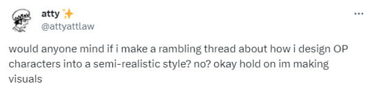
cross posting yesterday's rambling thread for posterity and because tumblr lets me edit things. anyway this is a sorta long thing and i might add things i forgot to mention in the twt thread
i tend to draw on-model canon because im a coward + just personal preferences. but the way i convert the canon designs into my artstyle is that i take the distinct features oda gives them and then combine it with personal headcanons to complete what should look like a unique human.
Starting with Trafalgar Law, who is unfortunately a bland-ass conventionally pretty boy
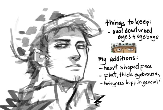
someone commented a while ago the law hat drawing tutorial i made a while ago didn't make much sense and i realize its bc of the specific way i draw law's face: heart shaped (ba-dum-tss). That meaning, a narrow chin widening into a mild defined jaw, wide cheekbones, and up to his know-it-all brain dome.
given that, the pudgy guitar pick shape of his head i mentioned here should make a lot more sense.
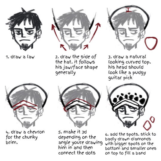
i don't think this design point is unique to me, as most conventional pretty anime boy gets given jaws like this. a lot of law artists tend to veer into this head shape. just how life be sometimes.
other points: flat, thick eyebrows is bc im a hairy gal and i need to feel better about myself.
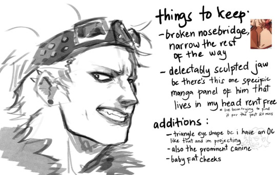
Killer gets to be more interesting, because he shouldn't be considered conventionally attractive. my idea behind killer's is that those individual features is smth he would be insecure with enough to hide himself in a helmet but i draw him with all the love in the world actually. i'd like to think its how kid sees him or yknow, law, bc he's my kin assigned blorbo and maybe you ship lawkill as a guilty pleasure too
i mentioned before (and ruined people's days) when i said whenever i draw killer he looks like griffith before i put on his goatee. the upper half of his face is distinctly feminine, with the lower half kinda over compensating. other than that uhh...idk. stan killer
Kidd is the bane of my existence, i feel like i can never draw his face consistently. yet at the same time he's so damn fun to draw everyone gotta try it.
my problem with kidd is that this mf does have eyelids. most kidd painters out there interpret this as him having deep set eyes (think Matt Smith or jeffrey star) . and yeh skill issue on me i should practice that.
other notes, i try to make him younger than canon makes him look. he is my babygirl and he deserves to look cuddly. my band au kidd version has the honor of being allowed some chubs. he's just tries to look older and more menacing with edgy makeup. also i try to give him dimples when i can because, well i can.
Rosinante last bc i lost steam after kidd. the thing abt cora is that aside from not having eyebrows, everything is structured with the generic one piece man template. which means i gotta do everything myself
doffy is there bc the way to figure out how to draw these two is to give them minor differences from each other, that being doffy gets slightly sharper features. in canon, these two are also rly wide boys (more of an oda style feat tbh) but i make them long. though bigger brained donquixote artists know that of these two brothers, doffy should be the wiry-er built.
anyway that's it. in conclusion, i need to draw more girls actually i feel like im becoming misogynistic by osmosis from oda's style and now i draw girls all looking the same too.
#one piece#trafalgar law#eustass kid#eustass kidd#op killer#massacre soldier killer#donquixote rosinante#donquixote corazon#donquixote doflamingo#was gonna do robin and perona too at least but like...i have a job and stuff
343 notes
·
View notes
Note
HI!!
I really like how you draw smg4 and 3 and was wondering if you have any tips that could help someone like me who can't seen to get it to look right? Its alr if not, i'm just curious! :D
(*Consumes your art aggressively but respectfully*)
Hi, thank you for asking me! I'm not the best at giving art advice/help but I can try my best! :'D
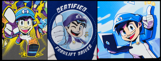
I guess my general advice for both of them is that there is no "right" way for them to look, both of them have fairly simple designs in comparison to other characters in the series, which in turn gives a lot of legroom for stylisation and stuff like that! All you really need to do is pick out their key features (which can be hard with simple characters since... there ain't a lot of obvious ones) and the rest will fall into place!
You can see this with the way SMG4 is shown in official merch, while yes he's more stylised compared to his official model, they all still read as being SMG4! It's through these as well that you can see what aspects of his design stay consistent throughout different drawings of him, namely his wider eye shape, short stature, bold eyebrows, etc. You get the idea, picking up on these and referencing them can help if you're struggling to get them to look right with your own art!
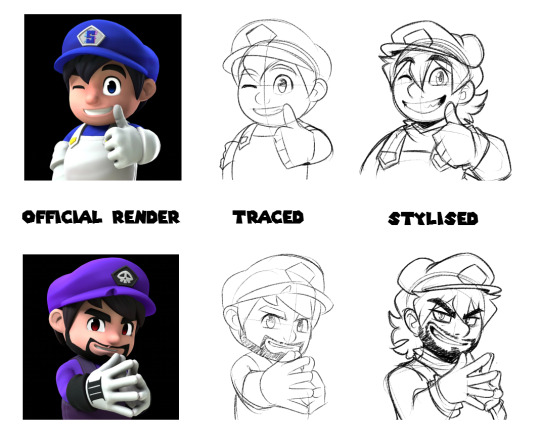
If you're still struggling to stylise them for your own style, I find it helps to heavily reference/trace the original design first, just to get as close to their intended design as possible, parts of your own style will already start to show through from that (I normally don’t condone tracing others' work unless it’s for stuff like this).
From there it's just a case of refining them and practising, adding/taking away parts as you go until you get to a style that you're happy with! It doesn't matter if they're not 100% accurate, as long as it's easy and consistent enough for you to replicate them, then it's fine!
You'll have much better results and an easier time drawing them if you let yourself be more experimental with their designs and learn as you go, rather than trying to get them perfect right away. I know it can be frustrating to not get them right the first time, but you'll find it much easier to adapt them to your style and get them how you want them to look if you just learn and adapt as you go.
I hope this helps in some way! I'm not the best at explaining stuff like this because my main method is just to say "fuck it we ballin" and then draw a character over and over again until I can do it in my sleep, so I hope my ramblings help in some way! You can apply this to any character by the way, not just SMG4, if in doubt just go back to the original reference and keep at it until it looks how you want it to.
Don't be afraid to make drawings that don't turn out right or ones that you're not happy with, it's all part of learning as an artist! You will get there in the end if you put in the effort to learn! <3
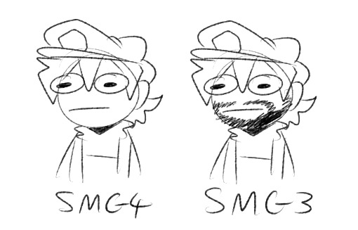
Also no one will tell you this so I will but, SMG3 is just SMG4 with a beard, so if you can draw SMG4 you can draw SMG3 no problem LMAO.
#mangos mystery ask box#... OOPS!!!! RAMBLED!!!!!!!!!! I'm so bad at giving advice sorryyyyyyy#THANK YOU FOR ENJOYING MY ART AS WELL!!! Means a lot I prommy ;w;
99 notes
·
View notes
Text


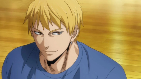
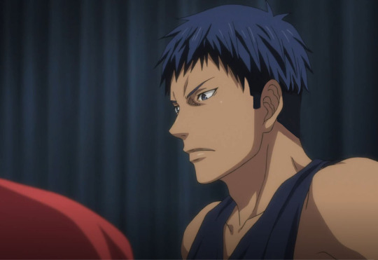


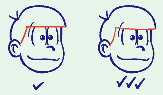
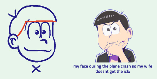
Last Game hair style fixes, in order of who needed it most.
I've never liked the canon hair styles in Last Game. They're either hideous, or just simply don't fit the characters/style of the main series. I get its a (mostly different) art department and meant to age the characters up, but most of the time, they simply just look off-model to me. I know I'm not the only one who's got issues with the hairstyles in this movie too, so I did my best to fix them up and give them styles that I personally think suite them. Originals below cut as well as my explanations! Important to note, these are my preferences/headcanons for them so take everything I'm about to say with a grain of salt.
**Akashi isn't here, because believe it or not, I actually think his hair looks the best out of everyone in LG.
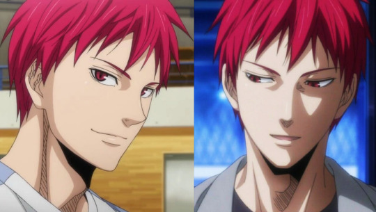
I wouldn't change it. I like to draw him with neater hair/his bangs pushed out of his face when I age him up, but for the summer after the Winter Cup - when LG takes place - the canon hair is exactly the sort of style I think he would/should have. I like the allegory that the rough chop is something he did when his mental health wasn't good, so now as his mental scars heal, it's growing back out. ❤️
Midorima
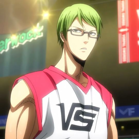
A neater/shorter hairstyle does fit Mido's character/personality, but the LG hair simply just doesn't look like the same hair type we see in the main series. Mido's hair has got the slightest wave to it (which I tend to over-exaggerate whenever I draw him).
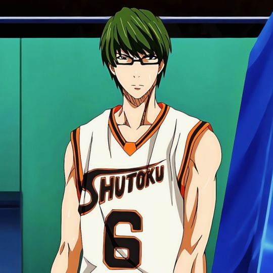
With this in mind, I went and gave his hair some more body/volume by extending the sides. (You'll see a lack of volume/body is the key issue with the other LG hairs as well).
Murasakibara
Mura's hair in this movie looks so so flat and greasy. Now I didn't do the best job fixing it up, but this is basically how you'd go about doing it; just add more flowy strands. His hair is pretty pin-strait in canon, but there's lots of flowing strands, even when he's not moving much, which give it a clean-look.

When it's all just one limp form, like the movie does, it appears unclean as opposed to just long and sleek.
Momoi
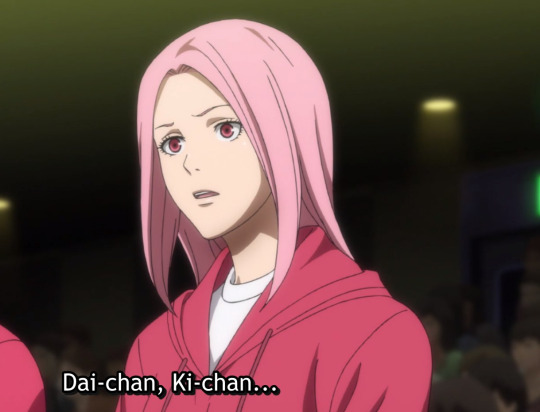
Another victim of the lack of body/volume. The style they gave her is also simply bad, like she just took a pair of scissors and cut in a straight line. There isn't even really any style to it. Its kinda just laying there on her head, which is not what her hair usually looks like in the main series. There's always strands/some lift to it. Also Momoi has always had some sort of bangs/framing pieces in her face, so for her whole forehead to be out was just a tiny bit jarring.

I think the style I came up with is a little more mature while still having personality and life to it. Plus, LG takes place in the summer, so a shorter hair style would be more comfortable in the heat.
Kise
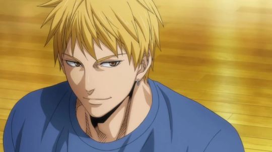
Kise I don't think I did a good job of fixing to my liking either. It was hard to edit it without making it look bad in general, because I really don't think this choppy sort of style suites him like at all, so it was too much to change. Now his hair is one of the better drawn ones in this movie for sure, but it feels more like a Kagami hairstyle than a Kise one to me. I just don't think his modeling agency would let him have such a choppy, hard-to-style haircut. I also think a more polished look fits his handsome, princely sort of appeal that makes him popular with girls.
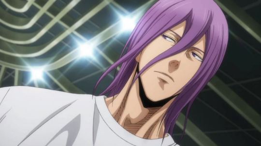
Aomine
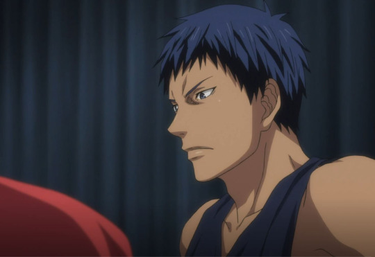
Alright, now its time for me to be playful and silly with some out-there hair styles. Aomine (and Kagami's hair) in Last Game I don't mind. After Akashi, I would say Aomine looks the best. BUT. We have NEVER seen Aomine with long hair, even in flashbacks when he's a child.

So for him to finally decide to grow out his hair - in the SUMMER HEAT - just feels like a weird move to me. Feels out of character. He strikes me as someone who likes his hair out of his face when he plays ball and just wants to roll out of bed and not worry about brushing/styling it or anything. The animators also aren't consistent in this movie and sometimes his hair looks particularly long in the front and back, which again, I don't think he'd like. This picture below and the ones above are from the same movie/take place within like a week of each other, yet look so different.
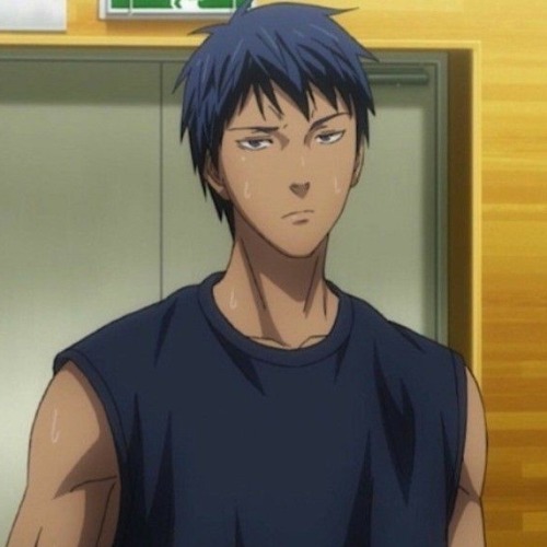
He looks cute and it definitely gives him a more youthful look; which is a weird choice, because they want to age up everyone else but Aomine in this movie. So, I think a fade would really suite him (I don't think I drew it that well tho). Keeps his hair short and out of his face but also ages him up a little more with a mature style.
Kagami

Alright, Kagami's look here is pure indulgence. @knbposting said "Kagami with a mullet" and I haven't stopped thinking about it. Sue me. His LG hair isn't bad and makes sense for his character and the time of year. But its just sorta plain. Honestly, Kise's hair style in this movie would probably suite Kagami more. I always liked how in the main series, Kagami's hair is a little scruffy in the back so I really wanted to lean into that.

Is a mullet suitable for the summer heat/something he'd like? Well, maybe not but I think it ages him up while also seeming like something he'd get at some point in his life. So here we are. I will end this with saying this is probably the longest he'd ever let his hair get.
Kuroko
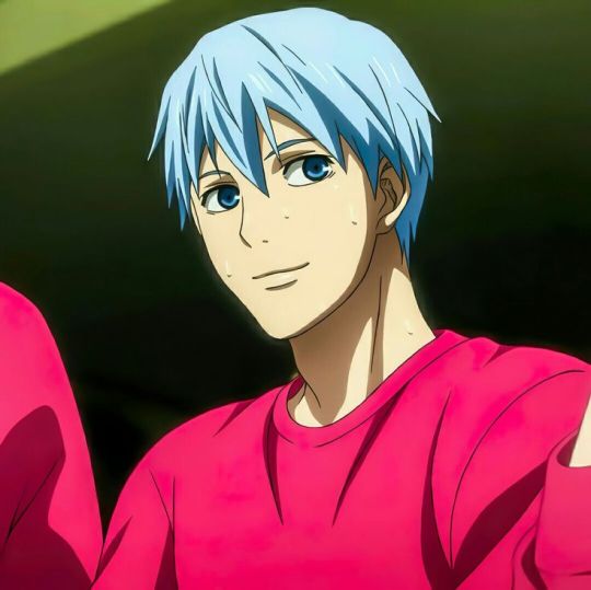
Finally, we have Kuroko, whose hair I've barely changed. Now, the animators/artists do a really bad job of keeping his face on-model (eyes too beady, features too sharp) but that's a whole 'nother issue, and I managed to find a scene where they kept him on-model lol. I think a shorter, neat style is good for the summer and suites him, but a main feature of all the hair throughout the main series is the spikes/strands of hair on nearly every character - Kuroko especially - so I just added a tiny bit more here.


And that's the end! If you read all the way to here, thanks for coming to my insane-person rant.
#kuroko no basket#kuroko's basketball#knb last game#kagami taiga#kuroko tetsuya#aomine daiki#kise ryōta#akashi seijuro#akashi seijurou#midorima shintaro#midorima shintarou#murasakibara atsushi#momoi satsuki#kise ryouta#generation of miracles#kiseki no sedai#wannabeartw0w#wannabespeaks
125 notes
·
View notes
Note
idk how but you draw in the Oso-san style so good i need to know your secret please
HAHA thank you very much!! im glad you think so :D unfortunately im not very good at explaining how i work, but ill try my best to show what i mean!!
once again this is long as hell. you know the drill at this point
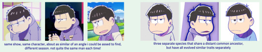
to be honest, half the battle i fight with drawing in the osmt style is just. Looking at it. the ososan art style actually fluctuates pretty wildly depending on what you're looking for, whether that be the mobile games (for instance, tabimatsu and hesowars look nothing alike in terms of style despite both being the same source material), official art and merch, or even the seasons of the show itself!
using ichi as my example here since i draw him the most, but its pretty easy to play spot the difference with the varying styles. even within a specific season you can do this across episodes, especially with season 1!
when i draw, i tend to be a bit sacrilege and use references across different media; usually ill use the show [especially season 2, if only because its a bit more "uniform"] as reference for the actual features and colors/poses/etc, but i like to use hesowars to reference proportions, since they seem to be most consistent there.
SOMETHING IMPORTANT TO NOTE: theres a WEALTH of fanartists that have styles that are INCREDIBLY similar to the show, so be careful to check your sources! these artists deserve credit for their hard work, which they often don't get since their work is reposted under the guise of being official art.
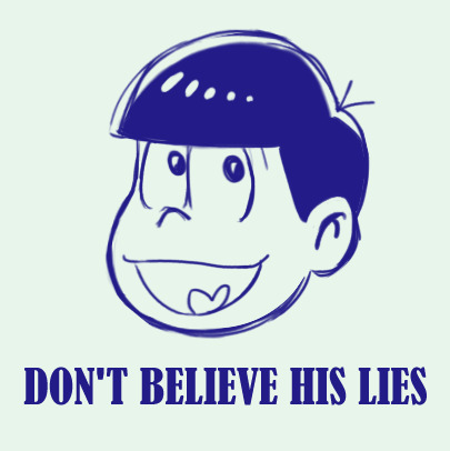
once you've pinned down the exact style you'd like to emulate, and the character you're looking to draw, its really just a matter of finding references, which is pretty easy! you can scrub through different episodes for good angles/shots, or if you're going for one of the game styles the AU wiki has most of the games catalogued to my knowledge. if you're looking to draw an oc, use characters you think they would look similar to in the show. if you really wanna waste your time, though, you can always scrub through crowd scenes in the show to see if any background characters might look like what you're going for; the season 3 episode Mt. Takao comes to mind, there were a lot of cute mob characters there.
using keiko as my example here, you can see that i pulled her features from multiple different characters to get her to look right in the style. with ocs, its important to reference a number of different characters, since the likelihood of a background character being a 1:1 for your little guy is unfortunately pretty low. there WILL, however, be a lot of characters that look KIND of like them. the key is to figure out what parts go where!
to this point, most prominent ososan women have very similar stock anime girl faces with very minor differences, so if youre looking to make a cute girl oc, most of the womens' faces can be used somewhat interchangeably. if you want your cute girl oc to have a more unique face, though, the movie gave us some women with more unique faces in the form of the NEETs' old classmates! theres also no harm in referencing male characters faces in this regard. #butchswag #kiruminikuya
BUT. going back to the assumption that you're drawing a canon character, today I'll be drawing oso for my example
when you're first getting a feel for the style, tracing some of your references can actually be a really great way to acclimate yourself to the characters proportions and features. think of like when you were a kid, and would trace over pictures of pokemon or cartoon characters so you could draw them better. its basically the same principle! this was especially helpful for me when it came to eyes; they vary the most wildly of any other trait that characters have in ososan, so going over the different shapes to get a feel for each of them was very important.
when you trace, though, I recommend doing so a bit more loosely, sort of like if you're doing a photo study for anatomy; block out the basic shapes and do small markers for different features (i.e small lines to denote where the eyes start and and, distance from nose to mouth, things like that), and from there draw the rest on your own.
after long enough you'll get a feel for the basic placement of where everything should go! the eyes and nose are undoubtedly the hardest when it comes to the sextuplets, since they shift around a LOT between games/seasons/etc. so don't feel bad if you have a hard time with that, since there isnt really a "right" answer with how frequently it changes. i still fuck it up all the time myself!
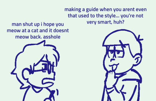
as for some basic tips, heres some stuff i try to keep in mind when drawing them that just helps the finished product look a bit nicer!
when drawing the hair + fringe line, its important to swoop it downwards a little bit; the flat across look Can work, but if you're not careful you risk showing the tops of their eyes, which is um. ew! ick! nast!
when a matsu is facing forward, their hair will usually tend towards one direction to keep the silhouette. in most screenshots i saw, the bowl cut points left! that said, dont be afraid to point rightwards if its better for your specific drawing!
and lastly:
USE THE LIQUIFY TOOL. LIBERALLY. i am not joking when i say this has saved my ass so many times, its hard to get the placement right on the facial features and even harder to get everything to LOOK good, so if its available to you i HIGHLY suggest just squishing everything around with a liquify tool until it looks right. you can always go back and correct the blurry lines. its really a life saver
BUT YEAH! i dont know if this was very helpful but i hope you're at least able to gain something from it :-))
67 notes
·
View notes
Last Seen Blogs

tyn2003
Untitled

its-totes-metzi
3000 miles

eldenlordofdragons
The Five Lords

chiwarino
Random Ne Box
crowgrey-s
crowcorecrowcorecr