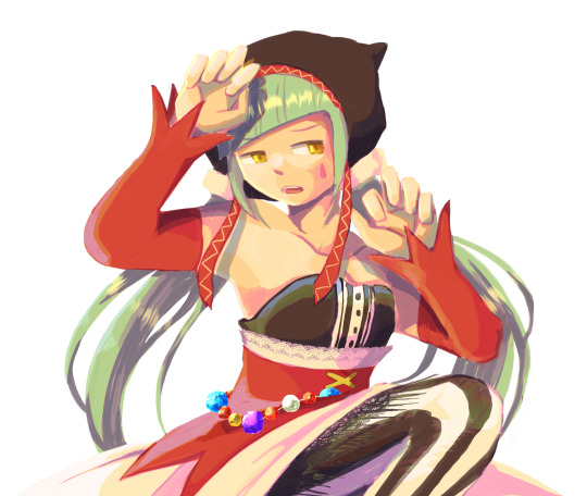
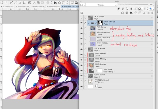
#I need to look at more shading and rendering tutorials…
Explore tagged Tumblr posts
Visit Tumblr Blog
Explore Tumblr blogs with no restrictions, modern design and the best experience.
Last Seen Tumblr Blogs


Fun Fact
In February 2021, Tumblr had 518.6 million blog accounts.
Text

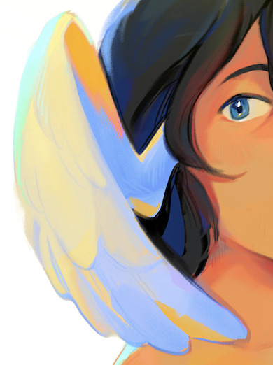
#trying to figure out photoshop#idk it’s kinda a mess but hey#it’s my guy#whipped cream cookie#cookie run fanart#cookie run#crob#fanart#I need to look at more shading and rendering tutorials…
12 notes
·
View notes
Note
Heya! Person who went/goes over gender swap?? Female version?? Of Ratiorine, or just the way you draw women in general here. I'm an artist (not really but I do draw and paint from time to time) I just wanted to ask, (sorry if this is really silly or inappropriate) How do you draw breasts semi realistically?? Or just draw them the way you do. I honestly don't know how to draw human anatomy at all, I just kinda wing it but breasts, male chest alongside legs and hands are a STRUGGLE for me. (Been slowly getting better) YET BREASTS ARE ALWAYS JUST NOT LOOKING RIGHT AND IT MAKES ME WANT TO SOB They're always very anime looking in a very very bad way (because I grew up watching mostly anime and using old anime drawing tutorial books) No need to respond/answer if you don't want to! Just wanted to ask!
breasts are affected a lot by the angle of the shoulders and the pull of gravity, which are both pretty daunting factors for learning artists
i'd recommend anatomy studying but that's not what you asked for(tell me if anyone's interested), so i'll take the opportunity to draw more fem!ratio
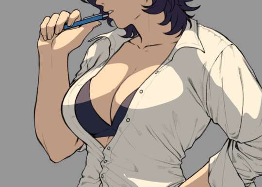
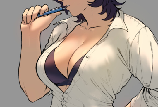
behold, a booba tutorial with veritas ratio. only open if youre interested in boobs
breasts don't really have a fixed form, so they're tricky to make them look natural. as i mentioned, i consider the gravity and angle of the shoulders, as well as clothing when drawing them

i'll go over an easy method to paint them. for demonstration, i unbuttoned ratio's shirt. for educational purposes.

i like to use shaded tones as base color and add light afterwards

with some lassoing and glow layer (overlay/add/anything that works) it already looks fairly alright, but i'm gonna do some blurring to make it look better
i blurred and erased around the edges to make the light blend in more naturally to the lineart and the shirt

i added a little bit of redness around the edges of the light to make it look more like flesh as well as reflected lights (the blue circles), they'll give clearer indications on where the breast starts and ends
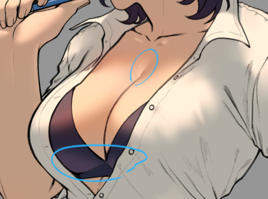
i usually end the details here when i don't feel like going for high quality render
and there it is, a pair of shiny boobs
im not sure how to lay out the higher quality render process, i haven't really figured it out enough to explain it to someone else yet
anyways i like how this one turned out, so i'll try fancying it up tomorrow, i'll post it when im done
2K notes
·
View notes
Text
Sims 4 Render Lighting Tutorial

"Environmental Lighting" won my most recent poll, so let's get right into it!
A few notes before we begin:
I render exclusively in cycles!
This tutorial assumes some basic knowledge of blender
Though this tutorial covers the basics, HDRIs can be used in conjunction with any scene/your built scenes
I decided to focus on environmental and other lighting in this tutorial, since they all kind of go hand in hand.
For this tutorial, I'll be using my recent Cupid Sim. Here's a render of her with no additional lighting:

1. Base lighting
In any full body, single sim render (like lookbooks, for example), I really like to use a glowing base. It grounds the sim a bit and casts some interesting lighting on them.
To do this, I add a circle under their feet by pressing shift+A and selecting circle.

An empty circle will appear, but we need it to be a solid disk, so go into Edit mode (by pressing tab while the circle is selected) then hitting F on the keyboard to fill it.


After that, you can go into the Materials tab and add in color and glow.
Mine is adjusted like this:

And gives this rendered result:

2. HDRIs
HDRIs (High Dynamic Range images) are extremely useful when it comes to environmental lighting, I always use them now to add better/more dynamic lighting to my renders.
HDRIs are 3D/panoramic, which makes them extremely useful.
You can find/download HDRIs online in a few diff places: PolyHaven, AmbientCO, and Blender Market.
There are also several available for FREE using BlenderKit (my preferred method).
So how do you use an HDRI?
We can add HDRIs to our render by navigating to the world tab and changing the color to "environment texture".


I chose this vaporware HDRI from BlenderKit, & here it is with no adjustments, but it's looking a little rough so let's adjust it.

By adding vector nodes, we can adjust how the HDRI behaves. Here I mostly use the Z rotation and the background strength:


Here's the same render with the Z-rotation set to 50, 150, 200, & 250.


You can put in any value for the Z-rotation, this is just an example of how the HDRI turns. This is maybe not the best example of the rotation, but putting her in a forest just didn't feel right lmfaooo, hopefully you can see how the light changes on her depending on the rotation.
You can also adjust the strength of the HDRI. Here's the HDRI (rotated to 150) set at .5 and 1.5 strength:


For this tutorial, my favorite lighting is the HDRI set to 150, and the strength set to .5, like this (this is a rendered image):

3. Transparent HDRIs + Point Lights
But I'm not fully happy with the lighting. I don't love how the HDRI is a bit blurry, so I'm going to set it to be transparent.
To do this, go to the Render Tab, scroll down to the Film option, and check Transparent:


The lighting effect from the HDRI will stay the same, but the background will be transparent.
From here, you can add a background (when I do this, I like adding a plane, & moving/shading it until I'm happy (kinda like this):


NOTE that you have to put the plane far enough behind your sim so it doesn't affect the HDRI lighting too much.
SECOND NOTE You can use this same method to use HDRIs in conjunction with scenes. They can provide the perfect backdrop!
This is still really dark, so I'm going to add three point lights: -Two on either side of her head/shoulders that will be smaller (in radius) and brighter -One in front of her to add actual light (so details aren't lost)

Here's how I set up my lights.


The pink light settings are for the two point lights on the sides The white light setting is for the light in front of her
For a basic render, this is almost good enough for me, but I really like the glowing effect I get in my renders.
To achieve this, we have to go to the compositing tab:
4. Compositing
Full disclosure, my compositing tab is set to glow by default (that's how much I love it), so all of the renders in this tutorial have it turned on.
I use the glare node and set it to fog glow.
Here's my preferred setting:

I prefer the fog glow effect, but bloom, ghost, streaks and star are also options.
Here's a guide to the glare node!
Tbh, I never use any of the other settings, so I'll leave this tutorial here for today.
Here's the final result (with no additional editing):

If you have any questions, please don't hesitate to send an ask, message or join my discord (no minors pls) for help! <3
#ts4 render tutorial#ts4 blender tutorial#sims 4 render tutorial#sims 4 blender tutorial#sims render tutorial#sims blender tutorial#salemsims tutorial#render school tutorial#blender
209 notes
·
View notes
Note
Would u ever make like a rendering tutorial ?? the way that you shade just looks so cool

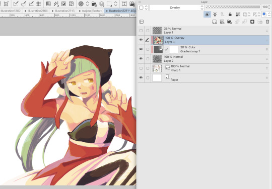
not exactly a tutorial, but this is my general process! my rendering is usually 2 coloring layers (1 for the base beneath the lines and the other above the lines to paint over), a tone curve layer + gradient map if i feel like exploring other colors, and a paper print texture + white noise (comes with csp, 40%).
none of these steps are that strict, but i hope it's self explanatory because i don't know how to go more in depth than this... rendering is like the most cumbersome part of drawing for me so it's a whole lot of "maybe this will work..." "i need to recolor this part" "a gradient map will Save this" type of process LOL anyway, i hope this answered your question + here's a small timelapse (sorry for the lq)
87 notes
·
View notes
Note
Hello :D
I have been following you for the last year or so (a few days after I got my Tumblr lmao) and I absolutely love your art!
I have been wanting to study your art style for a while but don't really know where to start,,,
Could you please show me a small portion of your art process, if it isn't too much trouble of course. Thank you and have a nice day!
hello. oh my god. this took forever to find.
im sorry it took 2 WHOLE FUCKING MONTHS for me to respond to this but i wanted to put it off until i felt happy with my art process again, so here it is
my fall 2024 rendering tutorial!
(this will be very very long)

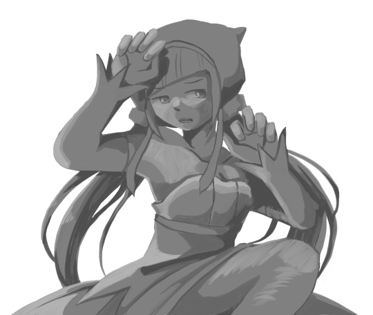
FLATS AND WHATEVER YOU WANNA DO WITH LINES GIRL. then make sure to recolor the lineart to better match your base. trust me it helps, bold dark lines are Not your best friend when rendering. wait for that post-rendering
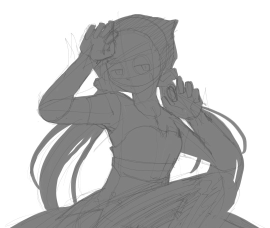
i start off with a doodle or a sketch, and then filling it in with flats and other details such as blush

FIGURE OUT YOUR LIGHT SOURCE. FIGURE IT OUT GIRL YOU CAN DO IT you can make it as simple as possible, make it as big as possible, dont even THINK about the details.........just make it really fucking big so you at least know where the shadows and the light goes THEN add smaller shading details LISTEN TO ME. LISTEN TO ME OKAY!!!!!!!!
my key point with this is for you to learn lighting fundamentals.
it's SOOO ANNOYING but alas......they are all correct. it helps a lot.
one thing i also really want to point out is that i like creating a big shadow shape first before fixing up the little details (such as folds and whatever) because it helps me focus on the way the lighting actually works instead of tunnel vision-ing into making the shading make sense on the clothing.

contact shadows (i dont remember if thats what theyre called okay) theyre fucking ugly because im not actually thinking sorry 💔
okay so basically:
contact shadows (if that's what they're called) are the spots in shading and lighting where light will NEVER hit.
shadows are still influenced by the colors and lights around it (it's why a blue shadow and a yellow shadow feel completely different, despite both being shadows) so it's not always COMPLETELY dark.
BUT! there are small points in shadows where light never hits, and they're almost always super dark or pitch black.
it's hard to explain shadow and light so briefly for a tutorial, but you'll notice it when watching fundamental studies and when trying it out for yourself


YES i unclipped the multiply layer YES its ugly and terrifying but it makes coloring the multiply layer easier okay the colors merged w multiply so now it looks cool and has depth overlaying colors that actually make sense
so basically what i did was color the multiply layer that i used to shade the overall drawing
adding a band of red/orange/yellow around where the light hits, and blue where the shadows get big and wide, gives it a fake ambient occlusion effect in the way that a person would get if they stood under the sun with a clear blue sky
the colors don't have to make sense, especially because i never draw backgrounds, but coloring the shadows really help it give a sense of depth and extra subtle detail and effect that just helps make the painting look nicer
around the end, i also put in colors (in an overlay layer with a low opacity brush) that actually make sense in context of the drawing, which is the lit cigarette and the yellow eyelights
mostly because none of the colors were making sense and i needed to actually make use of the lighting that DOES exist in the drawing lol

adding a muddy golden yellow pin light layer (opacity turned down to like 40-50%) to make the light colors less ugly lol
i SWEAR by the fucking pin light layer style. it's so useful and so so underrated.
i used an almost brown-ish gold color on stop of all the layers, and with the pin light layer, it helped make the bright (almost blue-ish) white colors more warm and more yellow. it just helps make things more warm (something i prefer)
i could probably show what it looks like without adjusting the layer opacity to truly show off what i mean (like in the coming section) but i sadly forgot to do that lol


make a layer on top of your drawing with this color in these ranges YES the drawing is fully merged NO don't be afraid, the base was fucking ugly anyway 💔 make this layer into an exclude/exclusion layer style TRUST turn down your exclusion layer opacity from a range of 10% to 40% literally until you're happy with the contrast and the way the color over the drawing. use your eyeballs. i know you can do it im so proud of you
this is pretty self-explanatory instruction-wise, so i'll go into why i do this instead
i really like art that seems like it has low contrast, with almost mid-gray shading and lines. i don't personally use dark and bold lines and shading, unless i find it necessary for the tone of the piece, so using this method helps lower the contrast of the art and make it look "pleasantly muddy" in the way that it's easier and softer on the eyes.
the inverted blue color also helps makes things warmer!
the exclusion layer style is still a bit of a mystery to me but i really like the effect it gives, even if i don't completely get how it works lol
if you want an alternative method to this, and if you have access to it (because i primarily use sai and sai only),
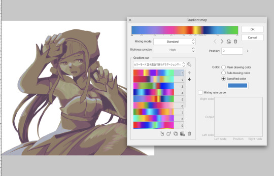
i absolutely encourage you to play around and experiment with gradient maps.
there are so many out there you can make yourself or even get from others that just give the painting an extra amount of depth and color variation. they're SO fun.
personally, if sai2 gets a gradient map update, it's over for y'all it will literally be so over no one will be able to stop me


then i merged everything and actually adjusted the contrast back up because it was looking too muddy for me 💔 but the color adjustments are still there so all hope is not lost here's a comparison of the adjusted contrast in black and white (adjusted on the left) (newly merged layer without adjusting the contrast on the right)
as you can see, i actually turned the contrast back up (despite talking all about how i liked things with less contrast lol)
i wanted to demonstrate that doing adjustments should be done in moderation, and is why i adjust layer opacity often when making color effects
you are free to play around with colors to help your style, but don't lose your initial idea and colors along the way.
you still need to trust your own colors and intuition!
along with that, i just want to say that it's completely okay to change your mind mid-painting, and it's okay to make somewhat drastic changes.
don't be afraid to change things you don't like or change your mind about certain aspects way later on
that's basically the whole thing of this!!! don't be scared!!!

now im gonna hold your hand when i say this..........but you need to learn how to render by yourself. it seems like i can teach you but i literally can't, because rendering is different on every piece and depending on how clean your base is. i have to render A LOT because of how fucking ugly my sketches are LMAO to simplify it, think of it as obsessively cleaning up every detail you can see, but with a color picker and a clean, hard edged brush. if you have shit lineart, you don't have to redraw it cleanly over and over, just paint over it. that's basically what rendering is
THIS especially is where you need to be brave and stop being scared.
like i said, i can't teach you how to render, and it's something you have to discover yourself because rendering is something that will always be personal to every single piece you make. the way you render on every piece is different.
on one piece, you will barely need to render, and on another, rendering is more than half of your ENTIRE process.
don't be afraid to paint over your old art.
rendering is a process that's both very perfectionist yet also very careless.
find your balance and just go for it.

and then that's it……..u did it………..now yuo know how to paint and render. it's literally just layering shading and lighting knowledge until you think it makes sense and looks okay lol additional note: since i render in only one layer (you don't HAVE to do this, but it'll be harder for you…), i also made slight adjustments with the transform (and liquify, if you have it) tool to make things more proportionate. (i drew the head too big lol)

if you compare the finished piece to the final unrendered base, you can see that a LOT changed, including a bit of subtle proportion adjustment.
particularly, the sleeves changed A LOT (because i really didn't like them)
but it's also over all cleaner and more coherent, instead of having haphazard colors and shading just thrown about.
rendering is when you finally use all 100% of your brain to finalize and figure out where the shading should go, where to clean up your lines, where to ERASE or ADD BACK in lines, and make sure all your colors look coherent.
it's not as intimidating as it seems, i only use a hard edged brush with a little bit of color mixing and my color picker.
it's like dragging and dropping colors to cover up mistakes, it's really quite fun when you get used to it
i wish i could explain it clearer but it's hard to describe without visuals!
i hope this helped, and i hope all my yapping isn't annoying (art as a special interest beloved)
have fun studying and trying to render in my art style!
#long post#art tutorial#rendering tutorial#art help#art tips#tutorial#kia doodles shit#artxstic-scr1bbles#tutoriel
200 notes
·
View notes
Note
I found your Tumblr recently and omg I love your art style., it's so inspiring :D I just subscribed to your patreon because I need more haha.
I was wondering if you have any tips for colouring your artwork?
Thanks so much for the extra support! I’ll go into rendering a face with a reference pic below (because I think that’s what people practice/look at the most) with an absolutely quick and dirty breakdown
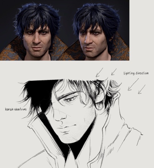
I already incorporate the heaviest shadows into my lineart a lot of the time, but I still have to think about shading where the light hits when coloring happens
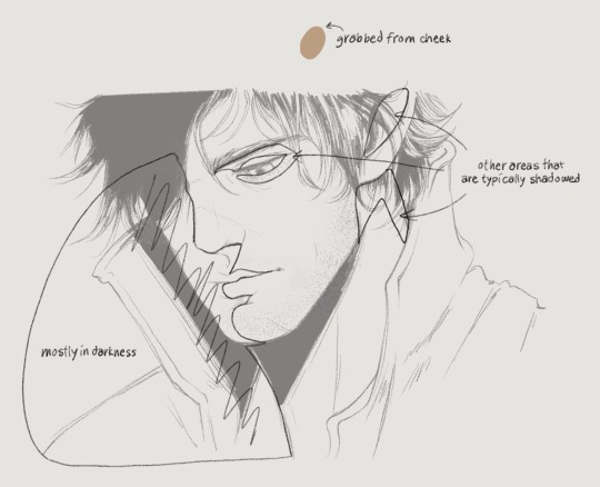
Since this is coming from top right, the left half of his face will also be heavily shadowed. Understanding 3d planes and how it affects a shadow assists with getting lighting down correctly. I’ve outlined the obvious quadrants that I’ll typically shade with the darkest color. But before that you have to lay down a flat, a color I grabbed from the front of Gortie’s cheek- I think this is a very mid tone. Using a mid tone first is how I think most everyone colors/shades. I can’t say this is how I always do it, sometimes I like to work dark to light, sometimes I start coloring from the top or bottom or side, it depends on what feels good and I get distracted very easily. If I rewatch my timelapses I can see where I got bored of an area for a while and jump somewhere else/come back later
If I know I want to fully render something I don’t bother with cell shading. Not saying this is a good practice, in fact don’t do this until you have lighting practice under your belt.
Colors- go with the reference picture and grab colors from the areas of the face that you’re shading, but increase or decrease the saturation as needed
Forehead- I darken the hairline and add shadows for the loose strands of hair. This is something simple I’ve found elevates the 3d aspect
Eyes- look at eye makeup tutorials, no joke. It’ll show you where to add highlights to make the eyes pop. This is a stylistic choice, but I like my characters looking like they walked out of Sephora. I’ll give them eyeshadow and add a highlight to the upper lid and the inner tear trough. For the actual iris I shade really simply just making the lower part brighter than the top
Nose- bring the bridge forward with the lightest color, add a shine to the tip, darken the side and carry that to the cheek
Lips- upper lip dark, lower lip not, add a shine, I dunno what else to say about this sorry 💧
Chin- shade under the lip and bring the shadow down in a crescent shape
Everything else is sticking to the personal character’s features, like shading his cheekbone and laugh line. I also add a blush tone over the cheeks and nose (again stylistic)
Link to Timelapse: https://youtube.com/shorts/q7E-g05W0m4?si=shZFpHQwNuyO6Qt1
youtube
I’ll try to do an actual infographic later when I have time because I keep getting asked about coloring. Just know that I’m still learning new stuff every day and these things should be taken as a “this is what I’m doing now” sort of thing!
153 notes
·
View notes
Note
hello i love ur art <3 may i ask how you shade/render? or if you can share any helpful tutorials you learned from ^^


Unhinged Art Tutorial
Well, anon and @merlucide! I'm not sure if I'm the best person to learn from (I'll attach some video links at the end to people who I personally look to for art advice) but I happen to have a series of screenshots for how i render with a strawpage drawing I did recently(at the time I drafted most of this a month+ ago), so I'll go over what I do, at least in this case.
Warning: A bit rambly. Not sure if intelligible.
Tutorial..? Explanation? under the cut.
I have a few different shading styles based on ease of program usage and effort level, but in this case i had to individually streak the shadows. I'll be focusing on hair and skin for the most part here.
My sketches are pretty poor, because I'm hasty:


Honestly I find the better the initial sketch, the easier the final profuct will come. So take your time, use layers when sketching to be clean. The airbrush layering shows vaguely how I tend to shade hair.

Backlighting *Applicable mostly when there is a bright background, light behind the subject, or in neutral lighting.
The 'underside'/inside I tend to use a peachier, brighter tone closer to the skin color (for tanned skinned characters I'd use a shade closer to a rosy orange, since that's just a more saturated peach. For darker skinned characters, I'd recommend a slightly redder & brighter version of their skin tone. This works pretty well with dark hair+dark skin, but in the case that your character's hair color is a lot lighter compared to their skin tone [also in the case of a fair skinned character with WHITE hair] it's totally fine to ignore the natural undertone of the character and shade it with a pinkish white.) This works for any hair texture but can be more time consuming for coily hair textures. (2c-4c)

Lineart when I take my time / Old rendering video


It looks more stable if you start off with a solid lineart base because you won't struggle with big-picture placement issues.
"Lineart" when I just try to pump out a drawing

I first did a rough sketch, kept it as an overlay layer and drew over it.

(Chickenscratching is valid though, honestly. I think it has a look to it!) I usually block out base colors, and vaguely where I want the shading to go, unless I need a special type of lighting, which then I'd do the base colors and either choose to wait until I'm finished rendering or do light processing* (*will discuss this later in this post) with different blending modes and layers.
For example if I'm doing the colors mostly FIRST (Choosing a grayed out palette) and then rendering, it'd look a little something like this: Left (Trackpad, on FireAlpaca) / Right (iPad, on Clip Studio & Procreate)


Sometimes, I'll shade with a dark, grayed out tone and then fill it in with something slightly more vibrant. This kind of gives it a bounce-light feel? Also with a lot of pieces I do recently I try to block out entire parts as white because lighting especially on white background pieces looks better if you pretend that it's white behind the character due to an intense sunlight.

Also, I use gradient layers to tweak with the colors. It's pretty useful and looks nice!!!! Gradient maps are available in every software I use: Procreate, FireAlpaca and Clip Studio Paint.

I find that the more intense the light (but not scattered, as in the source is either very bright or it's very close) the darker the shadows usually look? And if there's a brightness coming from behind the figure and the hair is splayed out in some way, it will appear semi translucent because it's just a bunch of strands made of keratin and collagen, something like that....


Anyway this is all very messy but I hope it helped

Here's a process photo for how I shade if that helps too.


More examples..

I broke down my thought process in my lighting so here's a close up of that.
i totally forgot about the video links so here's my idol the one and only:
And I think this guy makes quick but concise tip videos:
Finally I really like the in depth professional explanations from a long time illustrator:
I've personally taken advice from all three's videos and used them to improve my own art, so take a peek!!!!
77 notes
·
View notes
Text
NEETO’S KARMOR ART
I’m trying something new with my rendering style. I might be switching between this style and the other style I usually do. It looks good but I kinda got lazy at the hair and shirt (I PUT ALL MY EFFORT INTO THE SKIN IDK WHY)
I need to experiment more with hair man…Gotta go back to tutorials!
First is with shading and second is without!
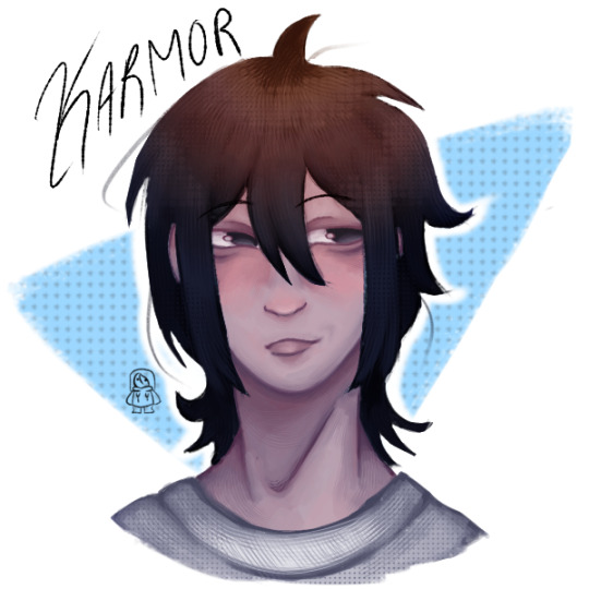
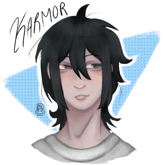
That goddamn smirk…
@iincogneeto hope you like it!
#good boy audios#goodboyaudios#gba bastards vs zombies#bastards vs zombies#bastard vs zombies#gba bvz#good boy audios bvz#bvz karmor#karmor bvz#karmor gba#goodboyaudios karmor#gba karmor#GRGRGR I MIGHT REDO THIS IF I LEARN MORE ABOUT HOW TO RENDER HAIR DUDE
59 notes
·
View notes
Note
Got any tips in shading stuff in black and white digitally?
Hi Anon!
You're in luck! I'm currently wrapping up a book which is shaded digitally, so I've been thinking a lot about this recently.
How I do this is by no means the only way, so take from these tips as much or little as you want! When I add grays and shadows to a line art drawing, I try to think about these things:
Preparing the image
I like to work with a file that has a white background and a layer with only line art on top of it. Between these two layers I add new layers where I use the pen tool and bucket to fill areas with black, then I lower the opacity for that layer to get a value that I want.


This method works well for me, and for simpler pieces I don't need more than 3 layers with different values - light, medium and dark grays.
I work in Clip Studio. Here's a picture of the layers of a recent drawing. Each layer is actually completely black but you can see the opacity percentages by each layer. Lower percentage -> brighter value. This makes it super duper easy to change the value of a layer, no need to repaint it, just change the opacity!

Value composition
For the best result, do a couple of value sketches with a limited set of values and find something that works well for the image. Getting the values right is what will improve the image the most! Here's a quick tutorial on muddycolors. Muddy Colors is a very nice art blog to check out. Looking at grayscale storyboard drawings or value sketches are great ways to pick up on this too.
I try to group values when working with grays. Take this image for example:
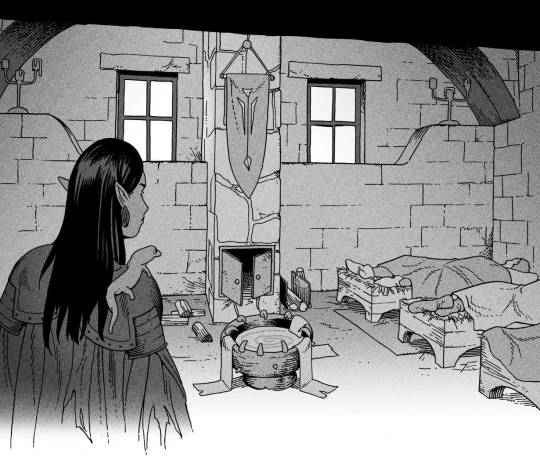
The character in the foreground has mainly dark grays, which separates her from the background, which has mostly light grays. Then the windows are white and the roof black.
Value composition is a huge and complex area and I recommend anyone wanting to learn to be more conscious about their values and to do value sketches. Analysing art you think has good values is great too.
Shadows
Not every piece needs shadows, but they can add a lot to an image! I use three kinds of shadows when I work in grayscale.
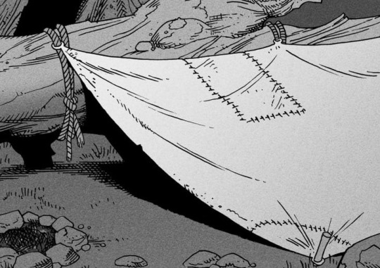
Inked shadows - these shadows are added during the inking stage and usually show areas where light would have almost no way of getting there, such as under this tent.
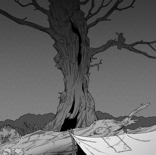
Gradient shadows - these shadows usually represent something getting further and further away from a light source or an area that would bounce light. This tree receives a tiny bit of light from a campfire on the ground and moonlight that bounces on the ground and up, fading as we get higher up in the tree. But mainly I add these gradients in ways that look cool and will help the overall composition.
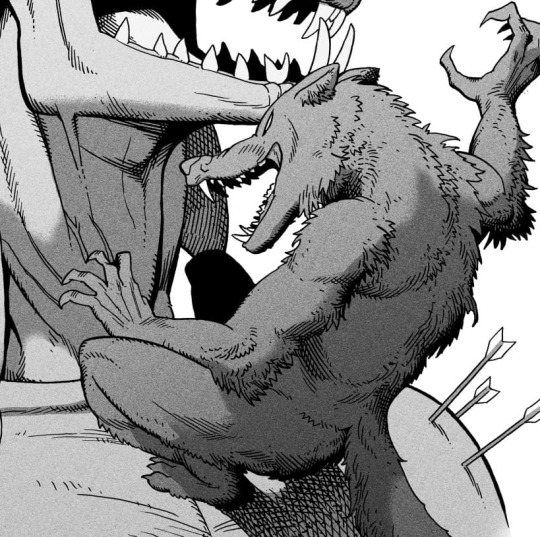
Hard shadows - these shadows appear when a strong light casts shadows and can be used on a shape or to cover something. Here's a werewolf with shadows on its back, which gives it a better sense of mass and is interesting visually!
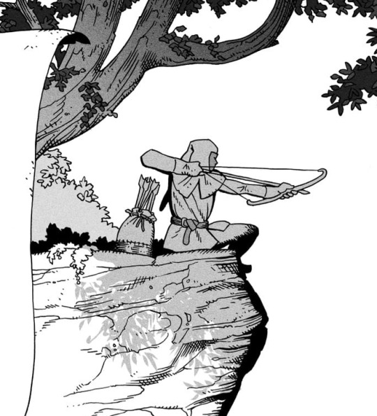
You can also cover an area in shadow like this, where the tree casts a shadow down on the archer and the cliff.
Texture
I like to add a layer of noise as a finishing touch. In Clip Studio you can create a noise layer with Filter->Render->Perlin noise... Find a balance of scale and amplitude that works for the image, then change the layer mode to "Vivid Light" and lower the opacity of the layer to around 30%. I like how this looks, it's not super visible usually but helps make the drawing feel less artificial and digital.

I hope that helps! Here are some nice links too:
Muddy Colors
Android Arts
Gurney Journey - Read his books!
Happy drawing!
351 notes
·
View notes
Note
First of all i can't believe you're 16?? That's fucking insane, you're so talented.Second, would you ever consider making some sort of coloring tutorial?
oh my goodness thank you,, that means a lot hahah. insert chiikawa reaction image here i dont have them on my computer
secondly, sure! my process involves a lot of bullshitting and kinda intuition based stuff so idk how to explain it that well but i will try.

ok here is how i would render a colored ball + grayscale ver. i dont use value ? or darkness to create shading as much as color contrast. ex yellow is lighter than green which is lighter than blue/purple. this is shown in grayscale but since im using the colors to indicate value it shows up better in color (idk how to say it)
this is personal preference but i don’t use color palettes at all, because every setting will have a different kind of lighting or mood that i need to adjust for. so why even bother? i think im just really used to picking things out by eye, buti would not recommend this because stuff can get inconsistent really quick
i dont use blend modes for shadows anymore, but heres an example with multiply for how i do shading (left)

in my art i dont like the look of straight up darkening shades so i always go for a darker, more saturated shadow. i love bright colors so im always pushing for more saturation. enhancing existing color in a 'properly shaded' areas is a fun way to do this
for example in this wing, i make the shadows bright ass blue instead of grayish blue/tan. this is because i made the faint light source from the left yellowish, so the shadow will be blue in comparison. i just amped that way up lol
you can also see it in the yellow on the inside of the wing. the lighting is yellow, so i took the faint bits of yellow that wouldve been present if i shaded it normally and just made it way more saturated
hope this helps, feel free to ask questions because idk what im doing half the time. usually its just 'oh this would look cool lets keep it'
128 notes
·
View notes
Text
Tutorial: How I Render Accents
PART 2: COLORS
I usually do not recommend 'pixel hunting' aka going over your work with a fine tooth comb and picking out stray pixels to erase. However, for setting up a proper base layer for accents it is imperative to do so.
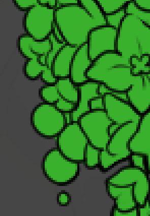
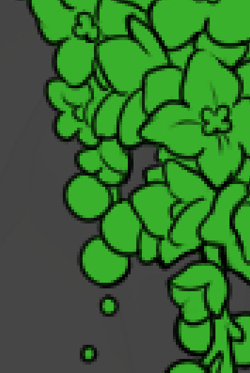
To explain my method of color blocking: I select everything outside of the lines, invert that selection, then fill in. This does a more accurate job than going into each and every section and filling them all in individually, and is also significantly faster. Only downside is small sections like above where you can see bits of the green (which I use bright green against a dark grey background to contrast the base color, lines, and background) poking out, as well as the inner section where it filled in a spot I did not want filled in. Getting all of this right in this stage will make your life easier as you go. (It's also the method I use to color block all my work, even beyond accents)
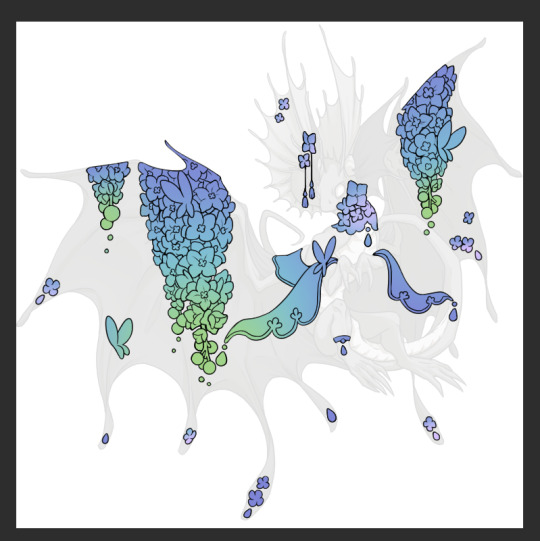
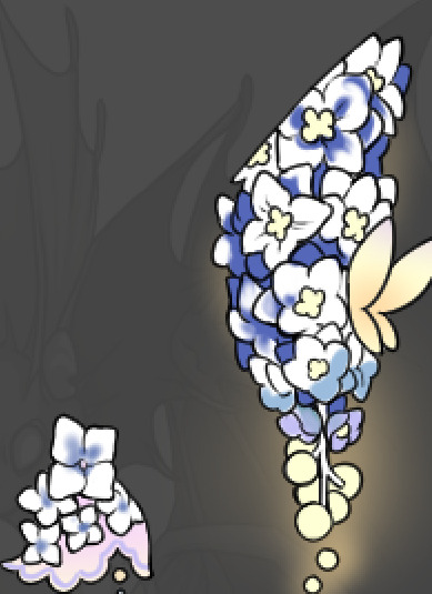
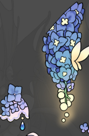
Now this where my style of rendering color may come off intimidating and, tbh it might be. I do gradients first and then I color over them with "normal" blend layers. I typically don't use multiply layers unless I'm shading something that has a lot of textures. If this scares you, it's okay I'll keep walking you through it. Here, my gradient goes from a pastel but deep periwinkle, to a soft more cyan blue, then to a lighter pastel green. Skipping steps and going from the periwinkle to green will give it a different look. There's also hints of a pinkish tone as an accent color.
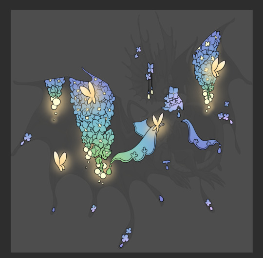
So as I said, these additional layers are done with regular "normal" blend mode layers. I've placed one in between the butterfly line art and the line art for the rest of the flowers, and then an additional layer under everything else. This allows me to create a glow effect specifically around the butterflies, and then specifically under the flowers. Going back and forth with the proper amount of opacity (by using the airbrush transparently) helps to make it glow but not be Too Loud. Also checking it against a dark background can help to check for spots where it spills past the borders, as well as really gauge how Bright it is. I've also color matched the butterflies with the flower pits and the bulbs. This adds extra cohesion and makes them all look uniform but different enough with the gradients.

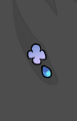

The stages of how I render gems/dew drops. Take the base color, make it a bit darker and less saturated (as well as changing the hue a bit depending on what the default color is. For yellows I go more orange/red, for blues I go more purple or even pink. It depends), add a small drop light at the bottom thats a fairly saturated version of the base color, and then a stark white/ near white highlight. That's it. Don't over complicate it, it will not matter when it gets shrunk down. Note that I do not use multiply/overlay/screen layers for these types of things as it adds too much bulk to the files and doing it manually helps to strengthen your color theory skills.
For shading and rendering, again, I create a "normal" layer and simply. Draw over what exists. Color picking and hand blending allow me to create the exact shades and effects that I want that multiply/screen/overlay layers may not be able to achieve. (which isn't to say I dont use them! i just don't use them for the main meat and potato part of my coloring) All of what is shown here is also achieved with the CSP asset SOIPEN (which can be found for free in the asset store)
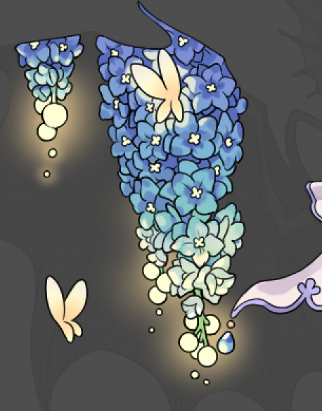

another example. The one on the right is showing how the layer looks without the gradient base layer under it. All of this is rendered by hand. I also specifically put a highlight color around where the butterfly is sitting to give a better illusion that it is properly sitting on the flowers rather than just in front of them.
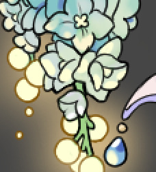
Next is changing the color of the lines, if needed. A method i'll use is I color just the sections I want (on a separate clipping layer) then lock that layer's alpha setting to them add in a gradient. It's a small and subtle effect that adds more depth without doing a lot of effort. (work smarter not harder)
Now we get to the Polish Layers!
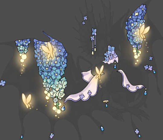
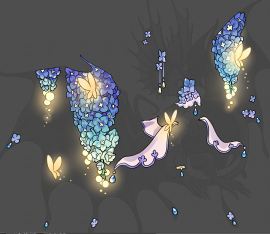
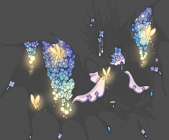
first image is how it looks as a base. second image is with an overlay layer applied. I've used some dark purples and mid tone desaturated greens to push the values a bit further (especially evident on the top left wing) Third image is with a screen layer applied, highlighting the inner most part of the flowers and adding some additional bounce light.
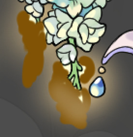
An important thing to note about making accents vs making full coverage skins: OPACITY AND LAYER TYPES MATTER OVER TRANSPARENT SPOTS. What I mean by this is that if you use a soft, light grey to shade with a multiply layer, don't clip it to anything, and have it go outside the lines - that will no longer appear as a 'shadow' when it comes to the final result. Instead you will have a section of soft light grey that is simply laid on top of whatever the image under it is. The same applies for overlay/screen/add layers and so on. If i use a very dark color on a screen layer (to give a soft highlight) and airbrush it over a bunch of stuff and don't clip it, it will end up with this horrible dark splotch over everything that isn't opaque. To this end, mastering normal layers is imperative to having well rendered and convincing accents.
Another thing of note: when it comes to sparkles/small details, note how 'large' the sparkles behind the butterflies are. They seem a bit chunky, yeah?
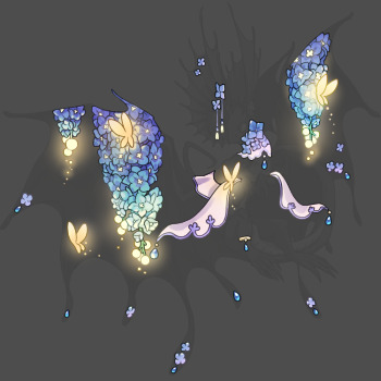
this is what they look like at proper size. If anything, I could have gone larger on the small metal beads connecting the dew drop jewels to the lace.
Another trick I also like to do is this:

a slight hint of transparency! It's just enough to let the dragon's lines underneath show through but not enough to be super noticable. I like to do this a lot when it comes to sparkly and magical effects.
Next is the worst part of all: destroying all that beautiful hard work with the shadow and line art layers! (sobbing)
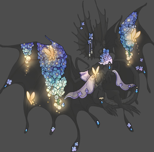
This stage always agonizes me. This is my first pass of the shadow/line layers and let's hope it's dark enough.
But yeah that's a start to finish look at how I create my accents. Unfortunately a lot it devolves into needing to know, yknow, line weight and silhouette importance, color theory and the ways that drawing applications actually apply color to a png vs how its rendered in app. All of these things impact the finesse of the accent, and are things you do have to learn gradually over time, but hopefully this has given yall some additional insight and perhaps some helpful tips.
And this should also explain why I get so mad when people go 'hey can I get this accent in another color' no! no you literally can't!
161 notes
·
View notes
Note
How do I properly shade when the light source is toward the bottom?
DIGITAL ART TIP #1 - Light from below
Hoi! Great question.
Here's what I would do..
∘
STEP 1 - Adding basic colors and determining the light source
Here's the character Catnap dancing on a neon dance floor. First, I colored the line art with the base colors for the character. Then, I added the blue flooring, which will act as the light source.
STEP 2 - Roughly laying out the light
To learn how to begin lighting, you first need to understand how light wraps around a shape.

Here, we have a ball sitting on a large glowing floor surrounded by light. The blue light is strongest near the floor and gradually wraps up around the ball.
For example, when adding light from the floor to the underside of his arm, adding a small amount of that same light to the top of the arm can enhance the drawing's volume. (This will become more clear once you start adding the shadow).
NOTE: The brightness of this light depends on how strong your original lightsource is.


STEP 3 - Roughly laying out the shadow
When you start adding shadows, they don’t have to be perfect. Fill in the shadow areas, but leave a small gap between the black outlines and your shadow.

STEP 4 - Smoothing out your rough lighting and shadow
Begin smoothing out the shadows so you can see how your lighting is taking shape. Between the blue light and the shadow, you can add a 50% blend of the two colors in the small gap mentioned earlier. This helps make the transition look smoother.
STEP 5 - Adding a darker shadow on top
To add more depth, place additional shadow where it makes sense for your shape to lose light. This is usually in the middle of the existing shadow or in sharp corners (play with it).
In my case I used a dark color, dark blue / black with an overlay effect on the layer (opacity lowered to 50%).
STEP 6 - Clean up and detail work
After finishing the basic rendering, I added blue light around the character, close to the outlines, and then lowered the opacity so it only adds a bit of extra depth to the drawing.
You might also notice that I softened the harsh shadow edges by creating a smoother transition from light to dark. You just need to keep adjusting this until the change from light to dark colors isn’t too obvious.
∘
That's my tutorial! Please note this is my very first tutorial ever so it might not be the best, but I wanted to share how I would render light that comes from below.
If you want to ask a question, or send in art for me to help you out with, here's a link to the original post!
Thank you!
63 notes
·
View notes
Note
Your art is wonderful!!!
A constant inspiration to my own creativity and art work. Could you explain some of your art style to me? I’m interested in looking at a bunch of different ones to try and finally find one for me.
Goodnight!!🌙
Thank you so much! That means the world to me! I’d be happy to share some of my process with you 😄
Keep in mind I’m completely self-taught, so this is just the process of how I make my drawings and not any sort of professional advice 😅 apologies for the long post ahead 😪
Starting with the basics, my biggest influences are Jin Kim and Ami Thompson. Both are amazing character designers and I really admire their stylization and expressions. Whenever I feel stuck on something, I always go back to their drawings for inspiration.
I typically start in Procreate with a canvas size of 3300px x 4200px or 11” x 14” with a DPI of 300.
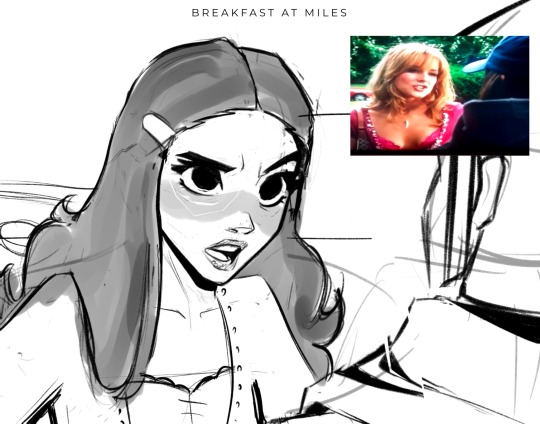
I put my reference in the corner of the canvas (in this case it’s a screenshot from the movie She’s the Man) and I start my rough sketch (emphasis on rough). Sketching is probably the longest part in my drawing process because I’m focusing on expression, composition, proportions, etc. This usually has about two to three passes before I move on.
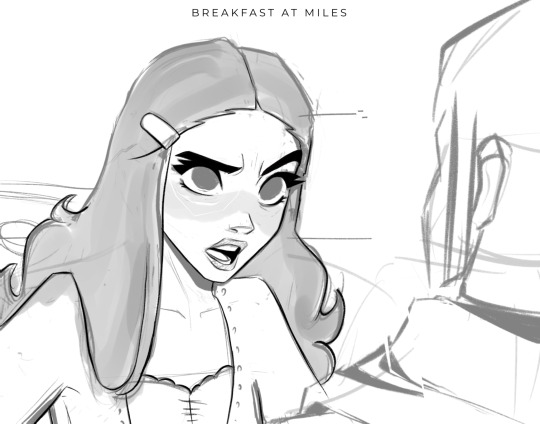
Then I lower the opacity of the sketch and clean it up with some lineart on a new layer. Lineart doesn’t play a huge part in my style, but I still like to play around with line weight. Since I knew this was going to be a fully rendered piece, I didn’t spend much time on lines that I knew were going to be removed later in the process.
Underneath all of that, I use the skin tone and color the base of the character. I make sure that I color ever so slightly past the lineart, for reasons that will be important later. This part can be tedious, especially because I use a textured brush, so there are a lot of gaps that I fill in later.
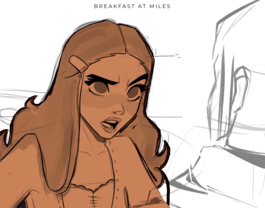
Then using new layers with clipping masks, I start the flat colors. Nothing too crazy here.
I’ve made color palettes for characters and backgrounds that I typically draw, so this way it speeds up the process and maintains style consistency. If I need a color that I don’t normally use, I’ll just play around with the colors until I find something that fits well with everything else.

Next, on a multiply layer, I add some basic shading (with the skin tone color) and blush (with an orange-pink color). I also move onto the background. Some are more complex than others. If I’m going for a more cinematic look, I’ll fill the background in with some basic shapes and blur it slightly. Thankfully the background was pretty simple in this reference.
I start checking proportions now that everything has basic colors. Then I duplicate my lineart layer and change it to a pinkish-red and put it on multiply mode and turn down the opacity. This is why the base color layer needs to line up with the lineart, otherwise there’d just be gaps underneath. Instead of erasing my black lineart layer, I put a mask on it and just keep the eyes and eyebrows.

Then I start working on the shading and hair, which is an entire process in itself. Maybe I’ll make a tutorial on that one day 😅
I also use some vivid light and soft light layers and put in some subtle colors for extra pizzazz.

Then I add a hard light layer to the eyes for that glossy look and on a normal layer add some white details just to make some things pop more (like the nose, lips, eyes, sometimes hair, etc.)
I did make an eye tutorial a while back, but my process is still the same!
Lastly, I spend a lot of time playing with different blending modes (multiply, add, soft light, vivid light layers) and really focus on the lighting. I used to focus on adding a lot more details and make the coloring more realistic, but I found that the more simplistic coloring was easier for me to do and fit my style better. Sometimes I still tend to go too far with the details and realize that it looks better when I tone it down a bit.
That’s pretty much it! Let me know if you have any questions! Hope this helps. Have fun making art!
#art#digital art#procreate#art process#danny phantom#fanart#danny fenton#my art#paulina sanchez#tutorial
46 notes
·
View notes
Note
hi! not exactly a request but i do wanna ask, whats your process when you're rendering more paint like art? (if that makes sense, English isnt my first language so apologies hdskhsjdbd) i really love how you use the colors and im curious how you do it :0
i’ve been meaning to answer this one for a while so here’s how i painted miku in today’s post (put under the read more because yeah prepare for a long post
i’d also like to preface this by saying that i never follow a set way of doing things, so in terms of what my personal process is like, these are only broad strokes of what i do! sometimes i’ll combine or skip parts entirely, depending on how i feel. also, this is not a tutorial, just how i do things, so please don’t treat it like one :’D this will read like the ‘how to draw an owl’ picture if you do
first, like every artist, i sketch. more specifically, i’m getting an idea of what i want to paint later on. this could be how a scene is set up or in this case, how a character is posed. here i’m not concerned about details or getting everything perfectly, i’m only planning how the thing will be composed. maybe a lot of canvas size changing, or adjusting what miku’s doing (note how busted miku’s right hand looks from all the transforming!) however, i still have to be concerned with how clear the sketch will be to future me, because the sketch won’t be any good if i can’t read what miku’s doing

after that, i lay down a flat gray under the sketch, mainly focusing on giving miku a clear silhouette. this is also a good time to make adjustments to the composition on the fly if i suddenly feel like something can be improved upon, like shortening miku’s left arm from the sketch!
after painting a flat silhouette, i start shading in grayscale, focusing only on lighting. i usually do it in two passes, one for the lightest and darkest tones i’ll use (not black and white) and then a second for midtones to blend them better with the base gray but i forgot to screenshot the result of the first pass 🗿 nevertheless, here is where i can start adding some amount of details. i’m not including any extra accessories yet, just focusing on the base design of the outfit and the character herself (for anyone wanting to draw characters from That Gacha Game, this is how i personally make the process more bearable for myself.) i still use the dark gray to separate where certain details (like the facial features and fingers) begin and end, mainly to make colouring more bearable later.
now here’s where i get the Good Colours. it’s a cheat lol. i put a gradient map layer over the grayscale painting so that there’s a little bit of color to start. some gradient maps can be applied as is, some need the layer settings adjusted to make it look good. this one, for example, is a (free) gradient map set from the csp assets store that needs you to set the layer opacity to 20% and to set the blending mode to color to achieve this result. in general, i tend to pick which gradient map i want to use based on vibes, or basically whether i want the work to be warmer or cooler, colour-wise. but this does do quite a bit of lifting for the colors in my stuff.
and then, finally, i add the colours. i add flat base colours in an overlay layer. at this stage, i’ve made the character silhouette clear enough that i don’t need to refer to the sketch anymore for what miku looks like. also, the gradient map layer does its magic by making the shading a bit more vibrant than it would’ve been without it. after that i paint over with a new layer to add details like the lace.
and then i put some extra shading on top. basically this is where the ‘better lighting’ happens. again, this isn’t a tutorial, so i’m not here to say what each part of the lighting is, but i’ve labeled which layers do which job. in other works where the lighting within a scene is more defined (from a window, from a small crack in the walls, etc) the glow dodge layer may be more opaque and sharper, but since this isn’t a work with that, the lighting was applied using an airbrush. the linear burn layer is also there to make the whole thing darker so the glow dodge doesn’t end up oversaturating miku. i also usually match the lights to the vibe i want, and use a complementary color for the shadows. so here you can see i have warm colors on the glow dodge layer, but light purple on both the linear burn and multiply layer.
and that’s it for the character—here’s a gif showing how each layer adds to miku! (sorry it’s so toasty)

as for the background, depending on the complexity, it may go through a similar process, or if i can settle with flat image backgrounds, i just go for that. it’s ok to use external image materials. i didn’t have a background in mind for this miku in specific, so i got some default csp materials and threw together something
and that’s about a rough overview of what my process for more finished works looks like! again, art is a fluid process so i never specifically stick to certain steps all the time, and you shouldn’t either. i can probably answer why i’d pick this colour over another in one particular work, but it’s something that kinda has to be learned on a grander scale. i think everyone can already feel what colors work with what atmosphere or what setting, even if they can’t immediately explain why. colors and composition do take some level of experimentation to find what works best!
125 notes
·
View notes
Note
GOD IS GOOOOOOODD 🤭 GOD IS GOOOD!! BOOM SHACKALACKAAA cause in this situation I devour yiur leech twins art AND THERE PARENTS GOD DAMN
ANYWAYS DO YOU HAVE ANY CUTE OR SMALL DETAILS YOU HAVE EVER DRAWN IN ANY OF YOUR ART PIECES?! Its my fav thing to see or figure out about artists to see if they added any cute or small details or acessories as extra parts! Continue to work and draw hard! I aspire to be as awesomesauce like you!!

AAAAAAAA TYSM LOVE 🥹 u are freaking AWESOMESAUCE the way that you already are right now
i wish i could say that i have a special quirk…but im unfortunately kind of a boring person 😓…
maybe i can interest you with patterns i have while drawing and what i consider when drawing specific characters?
while i draw:
-can i be honest? i have no idea what i’m doing. when i render hair (especially if im faded) its like i blink and then i did all of it. don’t know how i did it, i couldnt give a tutorial if i tried
-i like to add saturated red lines randomly to everything! i know there are rules to this, but when it comes to my art i sort of yolo everything (i really shouldn’t). does it look good or does it look bad when i place it here? thats really the only question i consider, but usually it’s in areas where i notice the coloring is repetitive, and it needs an outline to make it pop.
-twst taught me this first, but i really like adding a light blue to where a dark shadow will be. for example, in hair (for the back of it) i like to add a lighter blue instead of darkening the shadow, imo, it makes it less repetitive and pop out more
-my favorite (well, i hate actually doing them, it takes ages) types of pieces when i finish them, are the ones with multiple poses of a character and then a chibi interaction! like with jade’s halloween outfit, i envisioned floyd helping him get his hair done, waking up at the crack ass of dawn (tired as fuck)
-my artwork is very blue… i just love using blue most of the time. for the saturated color laying overtop an already blue toned black dress? yeah it’s gonna be blue. the back of the hair? light blue. i just feel like it’s the easiest color to use for shading 💀
-i don’t usually draw a white dot to represent light in the eyes. the only reason i specifically talk about this is because i TRY. i always try adding a white dot and no matter what i don’t like it. no clue why
-i rarely post line-art/sketches (in comparison to my fully rendered art), this is because i fix EVERYTHING when i render. the anatomy, the hair, the posing. i can’t see my mistakes until it’s halfway done in full color and almost completed shading 😓
-(random complaint): i’m noticing a problem where the colors seem super saturated in procreate and then it just becomes really dulled down when i post it…idk whats wrong with my eyeballs
character design:
-for leech mom: i really try to balance her sexy, scary side with her cute, bubbly mom side. when i first made her, i never even considered making a leech dad. i just thought, “jade and floyd’s mom would probably be super hot…” and that’s how she was made ^^. pearls are always a must on her, i think in every piece i have of her so far she’s wearing pearls in some way. the idea of her that i always go in with when i draw her is that she’s supposed to come off as someone that would converse very cheerily, have an upbeat attitude, but you there’s something that intimidates you about her… she gives off: will smile kindly while tearing your heart out
-jade and floyd: i like to give jade a darker blue palette than floyd! maybe my eyes decieve me, but i always feel like jade’s hair looks a darker shade of teal… i could be tripping. also, i do try to take into account most times that jade has broader shoulders and floyd is slightly taller! this is just a random tidbit lol, it never affects much really. also, i do make them more muscular whenever i draw them. i know they’re lanky and i love them the way that they are but it’s just a personal preference (along with the fact that they both eat very well and are extremely active? like….) i also prefer drawing their teeth larger
-leech dad: i’m glad i came to the current design of leech dad, but i was freaking looooost when i redesigned him. the first time i made him, i hated it while drawing it. it was more of a, “whatever i drew the mom now i have to draw the dad..”. but now, i can say with 80% confidence i’m happy with the way he is. he was supposed to be more of a navy, but that navy is now mixed with tones of purple, because i can’t move the slider more towards cyan, he’ll just end up looking like leech mom. he had to also be cool toned, his kids have teal hair, so he can’t diverge from that too much right? it’s be weird if he had mostly warm tones in his palette… the things i think about when designing leech dad are: expensive (same with leech mom), old money, hot but slightly psycho looking face, looks like he has a hobby of collecting watches, but surprisingly a guy that’s not extremely moody (cough his wife and son) and well tempered
both him and his wife are giants. i hope that i properly convey that as well 🤣
30 notes
·
View notes
Note
I've been using a mix of Krita and Paint tool SAI. I'd appreciate resources for Krita specifically too. Thank you for answering by the way. ♥️
Of course!
So! Here's my guide to making comics with Krita, down to the details such as layer setup, borders, speech bubbles, and SFX.
preface: it took me at least a year to figure this process out; but once when you've figured out the system & a template, it's smooth sailing. let's use this finished spread from the selfship comic last year to go through the process:

i'm going to assume a certian level of digital program proficiency (knowing what layers are, having a general idea of what vector vs raster graphics are, etc) since otherwise this post would be a book lol.
(if the read more does not work: the static permanent link for the full tutorial is on my website here: https://kradeelav.com/diary/tegalog.cgi?postid=312&1740096282
rest of the post under the cut; this one's going to be a long one as is.
let's start with talking about the layers for a single page of the above comic image.

(ignore the "orbs" and "titania bubble" layers - those were oddities for this specific spread.) Going from the top downwards:
SFX - sound effects. this is an optional layer to have if you don't have a lot of sound effects. you can use either render the sound effects by drawing them out (raster) or vector SFX; whatever you're most comfortable with. more on that below.
frame - this is the comic page borders.
speech bubbles - self explanatory. contains both the text inside the bubble and the bubbles themselves.
ink - main lineart & drawing layer; self explanatory.
tone - the shading layer.
(deleted) ruff/sketch - this is the sketchy thumbnail layer that is imported when i first start working on each spread, and naturally gets deleted when the lineart starts looking good on its own.
so!
there's two types of digital rendering krita can do: raster (most similar to drawing with a pencil or tablet) and vector (computer draws mathematical lines and shapes and text that you can manipulate). a lot of programs fully specialize in one or the other but the killer feature of krita is it can do both on a single page; you just need separate layers depending on the rendering..
that's what this "fx" symbol stands for by the way - these are the vector layers....

... and the symbols circled in purple clue you in that they're raster layers (ink, tone, sketch) where you do the actual drawing. with me so far?
speaking of those:
borders/frame
here's what the borders layer looks like + (the print layout layer above everything in black/yellow). the print layout layer is really only useful if you're physically printing this comic (it's basically bleed/trim if you've heard of those terms, ignore this otherwise).

i really struggled with doing borders in krita until finding this tutorial:
youtube
- since the thing is i make a lot of last minute changes. i need to be able to move and edit borders around easily if a panel's not working for me. so the method above makes it incredibly flexible to just ... up and move one, or to make a gutter wider.
i also really need to be able to see what's behind the borders while i'm drawing it to check anatomy sometimes -- the beautiful thing is you can simply turn the layer style to "multiply" and it's effectively transparent with one click.

like this, voila!
lettering
here's the lettering layer(s) with one bubble's text selected.

fair warning: krita is absolute ass with the text tool. it's the biggest failing but in newer versions i do believe they're slowly working on improvements. thankfully this program can do just enough to letter bubbles.
essentially, i use the same trick as the frames shown in the video above. if you slap a "layer style > stroke" on the whole "bubbles" layer, that's where that 2px black border comes from, and that layer-style-as-a-border "follows" every bubble so it's consistent.
(rule of thumb aesthetics-wise is speech bubble borders should be slightly thinner than frame borders, and on average about as wide as your lineart.)
SFX (sound effects)
technically you can hand-ink all of your SFX if vector art scares you or if you don't intend on doing much, but the vast majority of pros use vector work for efficiency. hentai/erotic work also has a lot of SFX versus other (non-NSFW) genres for the immersion factor with bodily functions.
the spread above didn't need a lot, though.

as you can see it's mostly the inorganic orb clinks and then the big SHING. (i put my for-the-web-kradeelav.com signature on the same layer for laziness).
here's part of my current sfx library below just to show you what i start with for erotic strips; usually i start with some base fonts and start moving the letters around individually.

(a lot of these are redone for every project; there's some in here that are already "outdated" in my eyes.)
miscellaneous
my favorite inking brushes are from this free resource pack. my favorite halftone (shading) brushes are from this (also free). thanks for reading!
26 notes
·
View notes