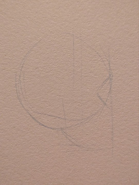
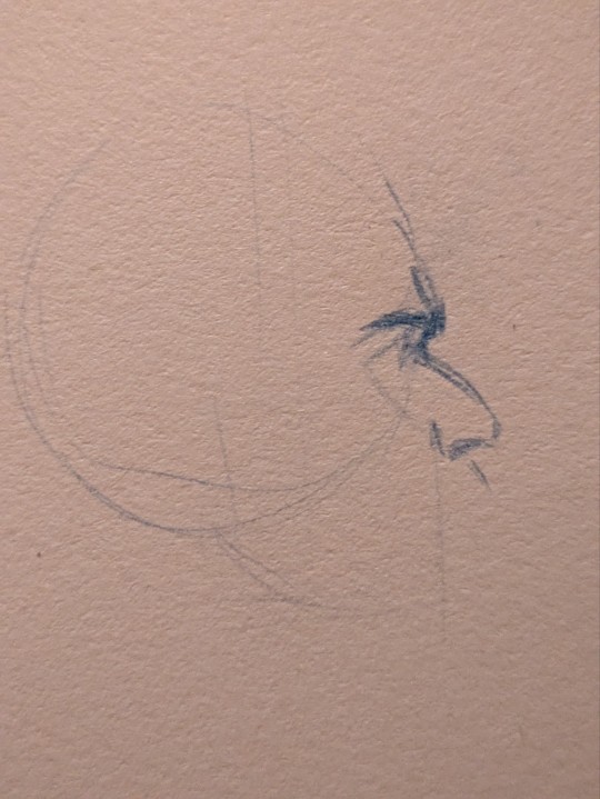
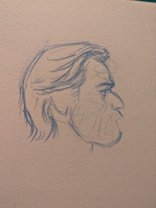
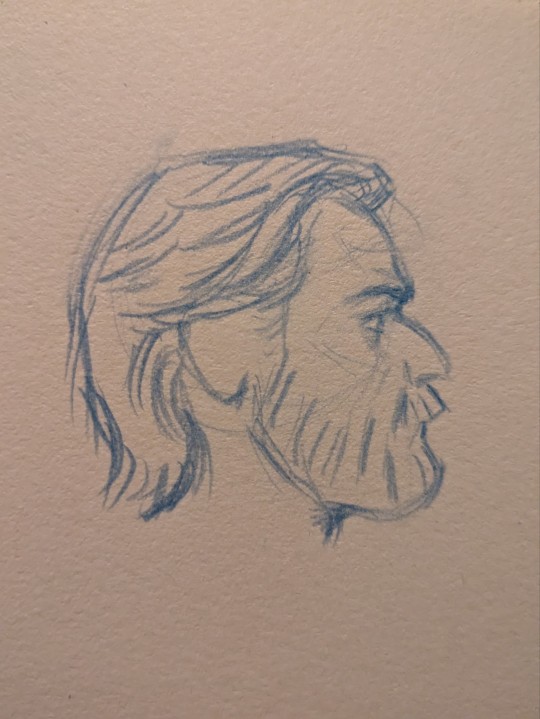
#I used to draw them based on YouTube tutorials
Explore tagged Tumblr posts
Visit Tumblr Blog
Explore Tumblr blogs with no restrictions, modern design and the best experience.
Last Seen Tumblr Blogs


Fun Fact
Tumblr is available in 18 languages.
Text
Technically? Pokémon.
what was your original fandom. like not the one you first started with on tumblr. the first bit of media that you made content for
#I used to draw them based on YouTube tutorials#I have a whole sketchbook of them#little me loved drawing tutorials#tbh before it was Pokémon it was LPS but LPS wasn’t much of a fandom in my eyes during that age
79K notes
·
View notes
Note
hii i hope this is ok to ask but i love how fucking HUGE you make curly look, do you have any advice on how to draw muscular frames? :o
thankies!! i love drawing him Robust-Looking <3
as far as advice goes, when it comes to anatomy i always recommend the channel proko on youtube, they have all kinds of videos about how to draw anatomy with each area of the body broken down. basically, if you're trying for anatomical accuracy with muscles and stuff, their vids are a great way to grasp how muscles work!
as far as general shapes and vibes though, i have a couple quick tips of my own <3
the biggest part, if you can imagine, is proportions. typically tutorials will tell you the average shoulder width for a person is about 2-3 heads wide, so if you're making someone Bigger and Beefier, you'll wanna go past that a bit. (and making a character's head smaller is gonna make their body look bigger by comparison, so if you wanna go crazy, shrank that thang)
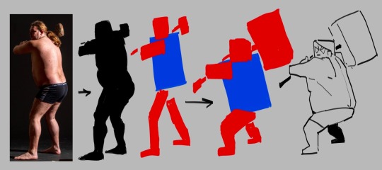
For example, Daisuke (who i draw as lean, but still with some muscle, especially in his arms) is 4 heads wide at his shoulders, while beefcake curly over here is 5 (sometimes more depending on the drawing lol). something as simple as broadening the shoulders already gives a character a beefier-looking silhouette.

[ID: Simple rough sketches of Daisuke and Curly from Mouthwashing with colored circles showing how many heads wide their shoulder width is. Daisuke is four, Curly is five. end ID]
~~~~
"but what if i don't know how to draw the muscles and am not going for realism/don't feel confident enough in that yet? how do i give a muscular vibe without as much detail?" FEAR NOT it's super easy. here we use the power of SHAPES!!
i draw jimmy and curly with the same "skeleton" or base frame, so i think they're a good example of this next bit. despite having the same bones, i broaden the fleshy parts on curly's limbs (focusing on his shoulders cuz he has big ass shoulders) and keep his upper arms wide before tapering down into his hands (muscles tend to be largest at the base of the limb and get smaller up to the hands/feet but there's plenty of design exceptions). i carry that shape language down into his legs (which i emphasize with his fitted calf-height boots). meanwhile jimmy stays fairly squared, especially when fully clothed

[ID: Simple sketches of Jimmy and Curly from Mouthwashing with notes describing their shapes. Jimmy has a rectangle over his body and is noted as being "relatively rectangular" and the shapes of his limbs are mostly straight. Curly has a trapezoid over his body and has a "top heavy shape" with limb shapes that taper down and in. end ID]
~~~~
and honestly, a good hack to make a character read as more muscular or robust is to give them a buddy that contrasts that. once again, jimmy will assist.
even in a simple drawing like this, giving jimmy the opposite tapering to his limbs just emphasizes curly's hugelargeness by comparison. it also shows that you don't need a lot of detail or realism to convey Beefiness

[ID: Another, more simplified doodle of Jimmy and Curly, pointing out that Jim's limbs taper outwards while Curly's taper in. end ID]
~~~~
another final quick tip i have is: the neck makes a difference!
people with more muscle tend to have thicker necks (it's because of the muscles there, if you can believe it) and it's kinda become one of my fav bits of drawing curly lol. idk why <3 necks fun to draw <3 for him, i draw his neck starting at the very edges of his face and widening out at the bottom to match the shape of his head and to flow a bit more into his trap muscles, but you could go Even Further Beyond if you so Choose. i've found this is a surprisingly good way to convey Beefy Person Beefy even if you don't have as much anatomical knowledge.

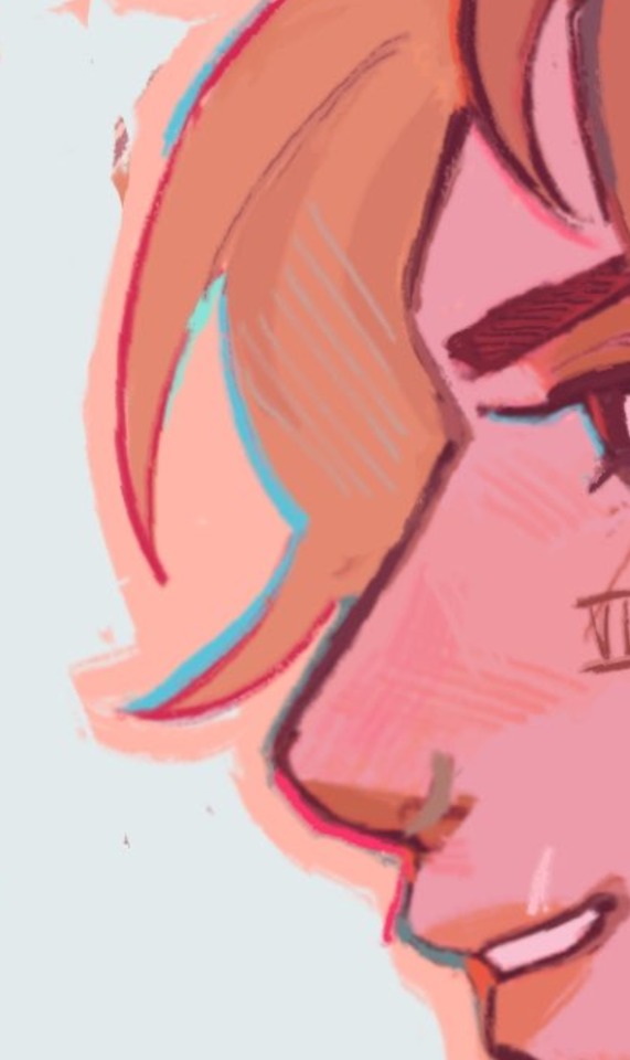
[ID: Four bust sketches of Daisuke and Curly comparing their necks. The first two show them both facing forwards. Daisuke's neck is slimmer and straight, while Curly's neck meets the edges of his jaw and has a wider base with higher trap muscles. The second two shows them in profile, with the back of Daisuke's cranium sticking out past his neck, while Curly's is even with his neck, showing how thick is is from the side. end ID]
~~~~
in review we got:
widen shoulders relative to the head to convey a Broad silhouette
taper limbs inwards from base to extremities to emphasize the shape/size of the muscles
give em a less muscular buddy for contrast
thick necks help a lot in conveying a muscular build
and of course, i know i only used men in these examples, but these tips will work just fine regardless of a character's gender. please draw more beefy women ily <3
i hope this made sense and helps you and whoever else might see this uwu
if anyone has any questions about it i will. Try. to answer them. making these posts is oddly difficult lol
#fg's art#mouthwashing#just gonna use the one tag since this mostly has nothing to do with them lol#art tips with major#art tutorial#fg's answers#asks#cursing#WOW AN ART ADVICE QUESTION I ACTUALLY ANSWERED WITH A TUTORIAL. AMAZING. I THOUGHT IT COULDN'T BE DONE AKSDJHAKDJH#the part of me that loves helping people and teaching people art stuff#vs the part of me that finds it SO DIFFICULT TO GATHER MY THOUGHTS INTO A POST#it's hard <3 but we work <3
192 notes
·
View notes
Note
Hello! Many people have said this but ill say it too, I LOVE YOUR COMIC SO MUCH ( ´ ▽ ` ).。o♡
I really wanted to ask you about how you do the backgrounds? (Something i struggle with) whats the process? Like from start to finish, also, to do the rise backgrounds do you use reference from the show and generally real photo of ny? Or do you come up with them? And last question- The shadow and light on the background- Like HOW
i know it’s a lot of questions but i’m just so curious qwq and wanna learn to be better, thank you again in case you read this and respond, in case you don’t, i hope you have a nice day and a wonderful life uwu keep up the great work! (≧◡≦) ♡
Backgrounds are a really broad subject and I'm always a little overwhelmed when asked this question. Just like drawing the human body, backgrounds take time, repetition, and practice!
My answer got a bit long, so it's going under a read more :) but if you digest info better in video format I found this on youtube
youtube
It pretty much goes over everything I wanted to say, but in a much better way. I wish I had found it before writing all this out lol
ok, first of all, I'm not a teacher nor was I built to be one of those cool helpful art tutorial people who do a full coloured tutorial filled with illustrations. This is just going to be a messy "how I do backgrounds / environment layouts from start to finish." kinda thing.
... lets start with a sight tangent.
Sketch from Life!!!
If you want to get better at backgrounds I recommend doing some sketching out in the real world!
When I was first getting into doing backgrounds I went to cafes and parks to just sketch the buildings and objects. Sketch rocks, flowers, clumps of grass, garbage cans, bottles, tables, street signs, etc. If you are drawing a tree observe how the trunks twist, how the bark flows, or how the leaves are bunched.
If you can't leave the house the same still applies! Sketch the interiors of your house, the walls, or common objects like chairs and bookshelves. How are objects stacked? items on the floor?
If you aren't comfortable with drawing outside or in public you can take some photos to draw from! They are good for practice and you can use them again as references later. Alternatively you can find pictures online of buildings and objects to sketch as practice.
All spaces have objects in them, it becomes easier to draw those kinds of spaces when you already have spent time observing and sketching them.
ALSO! They don't have to be good sketches! It's just to build out your mental catalogue and strengthen your perception of perspective.
now the actual thing...
BACKGROUNDS
(the pictures used for this are my own. I dug them out of my 2022 folder)
Backgrounds have slightly different rules based on what you are making them for. Videogame Environment Concept Art vs Animation Layouts vs Comic Backgrounds vs Illustration backgrounds.
They all follow the same basics, which I will go over here, but the intention and function of those designs are going to be different. It's all about how you set up the scene and what it's purpose is!
Brainstorming and Thumbnailing
I like to think about a location as though it is a character. An abandoned old house with creaky sagging floorboards is very different from a futuristic space ship with sharp metal floor panels. A gas station has a very different feeling from a library.
I usually start by asking what is this location's story? Why was it built and for what purpose? What kinds of things does this room need to fulfill that purpose? You don’t need solid answers, but its good to be thinking about it while you are working.
Next, sketch some ideas for how this place is going to look. For me, this usually involves drawing the idea from multiple angles and then making lists & small sketches of the objects I think should be filling the space.
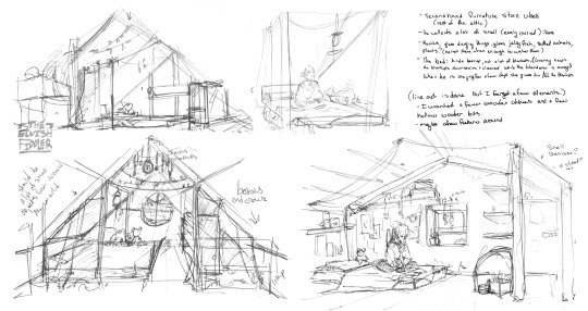
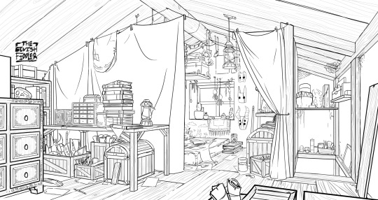
Example: The main character of my original work is a Wanderer. They collect a lot of things on their travels, but those items have to be small enough to be easily carried in a backpack. I wanted his room to be in the corner of an attic, walled off by curtains, and filled with trinkets. You can see some of my brainstorming above.
References
I only look for references after I've done some sketching and planning; this is to solidify my idea first so that I don't accidentally copy anyone else's work. I will make a moodboard with pictures of lighting, colours, items, rooms with specific ceiling beams, old chairs, etc. basically whatever I feel fits the vibe.
Honestly, I don't use references as much as I should. For ROTTMNT fanart I look at backgrounds and screenshots from the series to study the style. I also reference actual photos of NYC to get a feel for how Rise condenses the visual information.
In general, it's good to have references of real life objects/locations, because there are so many details like cracks in pavement, stickers on polls, crowning on buildings, fancy fencing, weird chair legs, etc. that you might not think of. It's the imperfect details that can make a location feel more alive.
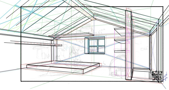
Perspective
Once you have your chosen sketch we move to.... the infamous perspective boxes. Doing backgrounds is just learning to be comfortable drawing So Many boxes and carving items out of them.
Many better artists than myself have made videos on perspective, vanishing points, and all the technical bits. Videos like THIS ONE and THIS ONE are helpful (this post is great too!!). There are probably a lot of classes to be found on Skillshare or Schoolism. I learned a lot of this in my college art course, so I can't give you a specific video which helped me.
You can get by and be a good artist without learning this stuff. There are quite a few successful artists who have admitted they never bothered to learn perspective (one of these people even made a whole graphic novel series).
I personally avoided properly learning this stuff until I was in my 20s because I thought it would be boring and difficult to do. tbh I really wish I had learned it earlier because it's so much fun to make those silly little boxes imo. It looks scary and complicated but, just like drawing humans, it just takes time, repetition, and practice to develop the knowledge and skills.
Cleanup
You have your boxes and lines! Cool! Now to make a scene out of it. Fill in the details, get everything placed were you want it! Generally, the lines of each item will point back towards the horizon line, but they can have different perspective points.
Generally you would want to clean it up and get your room completely sketched before doing the lineart. I tend to combine the steps (not recommended)
Lineart
I've mentioned how I do this before. Closer objects have thicker lines and more detailed inside. Further objects have thinner lines and less detail. I didn't quite achieve that balance with the image below, but it's close enough.
Colours and Shading will have to be a separate post. In the meantime, I highly recommend the book "Color and Light" by James Gurney. I used to borrow it from my local library and a good chunk of my knowledge was learned from it :)
#Artist's Comic Rambles#asks#art related asks#thank you for the ask!! I'm glad to hear you enjoy the comc :D#i hope this was somewhat helpful...#i get overwhelmed by broad questions very easily haha#if you would me to elaborate on something specific I mentioned feel free to ask#i wrote this all out weeks ago and then forgot about it... I just added a link or two but yeah here it is
312 notes
·
View notes
Note
could you share how you paint hair and skin? your art is so nice to look at
thank you so much!
maybe one day I'll make a more detailed post with screenshots as I render... but honestly my painting process is really pretty simple. I usually use a textured brush or something with hue jitter turned up 1-2% to put down base colours, and then I go in with a medium hard airbrush for shadows and for adding warmer colours where blood flows (nose, ears, cheek, around mouth sometimes, eyes).
after that i merge all my layers and basically draw on top of everything. bunch of refining details and texture and LOTS of cross hatching. hatching is a really good way to transition between colours i find!!
(another tip I use for skin rendering is adding gradients within shadows, anddd ofc I add hatching when I do that too)
I wish I could offer more technical advice but I really don't know what I'm doing in the slightest I just throw colours on there and hope for the best😭 I guess other good things to keep in mind for skin are the planes of the face (im rly bad at this one, but basically just look up planes of the face on pinterest and use that as a guide for shadows and form) as well as hard vs soft shadows!!
im also. Not good at this one. So don't take my word for it but i guess it's good to have a variety of shadows that end harshly vs shadows that are softer and blend in more? if that makes sense? you just need to think about 1. what is casting my shadow 2. what is it being cast on (or idk maybe its not. that's just kinda what I do) and render from there!
I like to outline my harsher shadows but thats rly just cause I love to outline everything. OOH THATS ANOTHER THING. use harmonious colours and outline shit it looks soooo good.
i do that shit all the time.Like don't be shy about grabbing colours that don't make sense being in your drawing. it's a drawing who gaf if vi arcane's hair is outlined in turquoise. NOBODY! and it looks fire!
for hair I just bullshit it and add hatching I really don't have a clue how to draw hair. I guess figure out where the hair strands are coming from and then draw them coming out from there (This is some real expert advice here damn) and then add shadows underneath the hair tuft clump things ?? no clue. someone make a tutorial for me im kinda the one that needs it in this situation.
uh I hope that helped at all!! Please watch YouTube videos and stuff by actual professionals take everything I say with a grain of salt because seriously I don't know how to do any of this I probably should study art more but I am LAZY
#art#digital art#art tutorial#painting tips#digital painting#art tips#tutorial#artist#ask#art advice
124 notes
·
View notes
Note
Ozz! I'm trying to get into drawing, but I'm absolutely horrid at it and have no idea where to begin. Do you have any tips for beginners? Also, what program do you use? I've heard Krita is good, have you heard of it?
Also, also, remember to hydrate properly and get a good amount of sleep and do lots of self-care! <33 we love you and your content; you make the world a brighter place ^^
~ 🐇
If you want to start from the very bottom, there's a website where the first lesson is drawing a line, quite literally. It builds your confidence with basic shapes, then moves on to more complex topics like textures, shapes in space, construction of real life objects and so on.
I've had it in my bookmarks for...gosh, years now. I should definitely pick it up again, haha.
I also follow Alphonso Dunn on YouTube, he has hundreds of art tutorials and exercises.
As for software, I briefly used Krita years ago and it was nice! It had a very easy interface and the brushes worked well if you wanted to reproduce traditional art. The only reason I didn't stick to it was because I already had PaintTool SAI and Photoshop at the time. When I got my first graphic tablet, I started with Paint.NET, though it was very simplistic.
The general consensus online seems to be Krita for painting or MediBang if you're into drawing anime. In terms of paid software, I think Clip Studio Paint is very popular and has a lot of resources, from brushes to 3D models. Photoshop is classic, but it can be overwhelming if you're new to digital art.
I personally use Procreate because it came with my iPad and it has a very simple menu. Some professional illustrators say it lacks the advanced options you'd find in other programs, and I do agree it may not be enough if you want to go beyond merely drawing. To add text and make small edits, I'll put the doodle through Photoshop, for example.
Free software: Krita, MediBang, Gimp, KRESKA.art (no installation required)
Paid software: PaintTool SAI, Adobe Photoshop, Procreate, Clip Studio Paint
If anyone has more suggestions or tips, feel free to drop them in the comments!
88 notes
·
View notes
Note
Hi!!!!!!
I really love your art and I was wondering if you had any art tips?
I'm pretty good at drawing realistically, but I struggle with more stylized or cartoon-y stuff...
Here I’m going to talk about the two, in my opinion, the most important aspects of stylization is: ‘Simplification’ and ‘Exaggeration’
First, simplification,
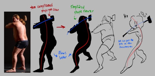
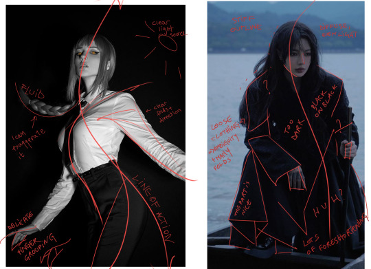
I took this picture of a man holding a hammer, if you just look the silhouette, it is very complicated the pose is stiff
Try summarize the pose with only two simple lines, one representing the head, torso and the leg, the other representing the arms. This is the line of action. Now you got the two lines, play around with it try make it flow better. (Google ‘line of action’ you can find a lot more better examples)
The next step is to simplify the previous drawing throw away all the bumps and little details, take what you think is the most important and draw it based off the line of action you just acquired. this step might take a lot of practices so look at tutorials and draw a lot you’ll get there (Go on YouTube and search ‘life drawing tutorial’ they teach this step really well)
This is how you simplify a complicated pose! I’ll talk about how to simplify character after the next point
Second is exaggeration
I’m using the same photo here again blocking the person black so we can see the silhouette clear. This time we’re not finding the line of action, we’re reducing this person into a simple shape, to me, he looks like a rectangle.
great, now we try drawing this man with only rectangles
After blocking out the simple rectangles, exaggerate them, make the big ones even bigger, the small ones even tinnier.
Make the main focus of the drawing clear and easy to see, the audience needs to be immediately on that thing the moment this drawing shows up! What’s the focus point of the drawing? The hammer, it’s too small for one to find so let’s exaggerate it make it huge.
Tada, now you have a clear and cartoony silhouette, the rest you can fill in however you like
To cartoonify a character is easy, similar to how you cartoonify poses, you take out the little details and leave what you think is the most important, the things that makes the character unique, and exaggerate them
((Here I’m using a genshin character because their character designs are known for being a hell to animate (genshin fans don’t come for my ass this is only for educational purposes))))
I’m… not the best at explaining things so if you can’t understand any of these please let me know!!!!!!!!!!
706 notes
·
View notes
Text
Someone asked me a question earlier, but it wouldn’t let me respond to it so I’ll try my best to sum up some of the things they asked me. they asked me about my comic making process. I should be honest I’m almost a complete amateur. I wanna say I’m self-taught, but that’s not to take away from all of the YouTube videos and tutorials that I’ve watched online. Somehow I just ended up putting them together and into what I have now.
To start off with I almost always try to write my script first. after the script, what’s most important to me is the expressions on the characters faces. I think more than anything that gives me the best direction to my writing. As you can see with my first image, sometimes it can be as simple as just drawing stick figures this just gives me a directional idea of how my paneling’s gonna look. I’d say on average. I do up to three drafts the first draft direction. The second draft is a better idea of that direction and the third draft is all the cleanup so it’s ready for line art 
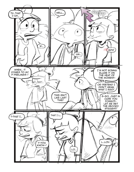
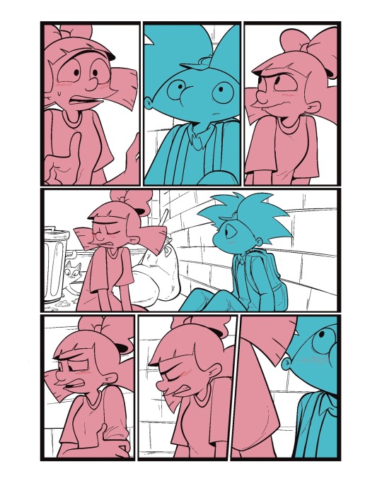
I usually separate my characters by specific color. This is so when I go into color, it’s easier to see which characters need what.
You can call me a bit of a cheater, but I like to use closed lines when I draw my characters. that way I can use a reference layer to just fill in the colors instead of having to do it manually or using my magic wand tool. 
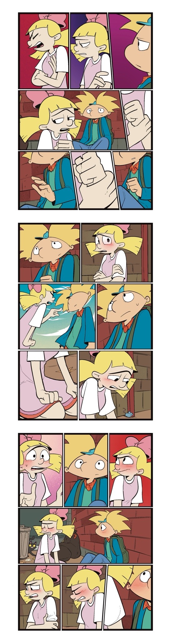
I also utilize the pallets on Procreate to pick their colors
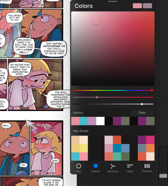
When it comes to shading, I like to use multiplayer layers and erase out the lighting. I might use some ambient lighting here and there with a dark pinkish purple this is going to depend on where your scene is taking place, but since mine is an alleyway, my multiplayer layer is at 40 opacity. For the characters, I usually use my syrup brush to blend in some of the less harsh shades. When it comes to my backgrounds, I like to use my glowing brush to erase out the lighting.
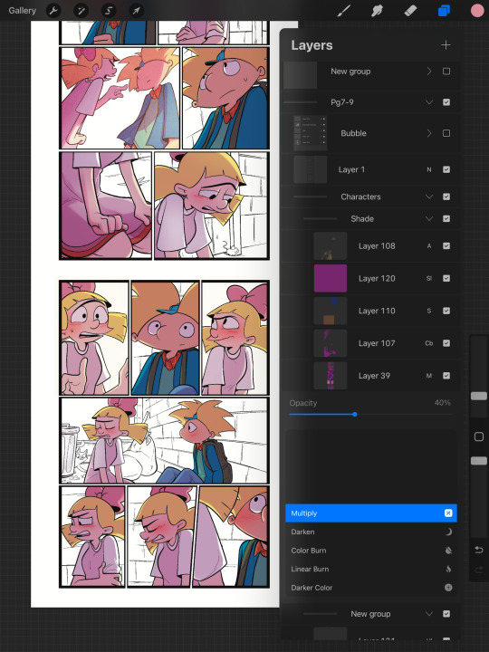
I still myself have a hard time drawing backgrounds I struggle to find where to put my characters in place some people find it easier to draw the background first and then the characters and although I do agree, that’s easier to establish the shot, I need focus on my characters. So what I usually do is draw my characters in a box and then draw that box in a space and that space becomes my background.
 I play around a lot with the Procreate effects that they have I use a pen called, burst for dramatic feelings, like a burst of energy or a burst of emotions I might use a comic dotted layer for something more comedic or action based. 
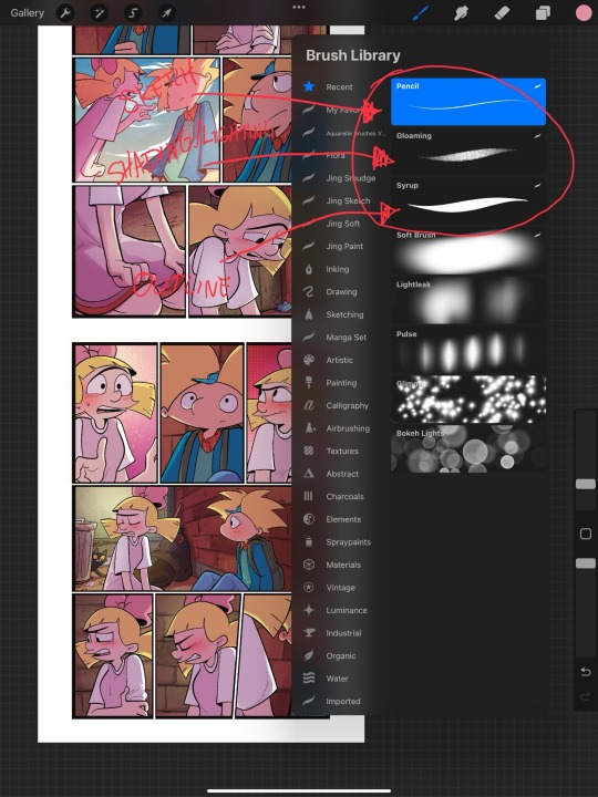
When it comes to brushes, I use a pencil for the sketch, a gloaming for the shading and syrup for the outline. Those are the main pens I use and everything else is effects. 
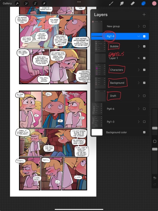
My organization isn’t always the best either, but this is how I usually do it. Panels and bubbles are at top, including the special effects like for example if I were to write the word ‘shake’ If Helga was shaking or blush, if Arnold was blushing, this would be in the bubble layer.  under that would be panels under that would be characters and in that folder I would have line art, then lighting and shading then color and that follows the same formula for background. 
This is a general breakdown of what I do in my comic, and I couldn’t say at all, but I hope it gives you an idea of what I do. again I’m no professional and you should take all my advice with a grain of salt. My best advice is learned by doing I think if you looked at my first chapter and saw my latest chapter, you’ll see my improvement and my paneling in my expressions in my establishing shots and in my color shading. So if you wanna make a comic, just make it and learn as you go, your first one isn’t gonna be a banger more than likely but it’ll be the best learning experience, in my opinion. If you guys have any questions, I am an open book! Feel free to ask me anything.I stream on my TikTok when I make my comics so if you want to watch the process, you’re more than welcome to tune into that but I’m not gonna lie. It’s a bit tedious to watch 😂 I’m @eden_fries on most platforms.  
#arnold x helga#helga pataki#hey arnold#web comic#helga g pataki#fanart#comic#my art#fan comic#my comic#the process
72 notes
·
View notes
Text
The thing about doodling the story of the Bloodbending Brothers is you occasionally have to draw Satan (WIP)

Rough sketch of 1/15 panels. Thought I'd throw something up here just to build a habit of posting, even if woefully unfinished.
Do people from water tribe still drink from those water pouches? Do they use metal canteens now? Is it too contemporary to instead drink out of those alcohol flasks? Or too heavy handed? Or unfitting for a kids show? These are the dumb pointless questions I ask myself. Also Yakone has mittens. He should probably wearing them. They should be easier to draw, but they aren't for a brainlets like myself. (self remind to fix in post)
Anyway any Tarrlok and/or Amon/Noatak enjoyers have any Youtube/Spotify playlists they like to listen to while drawing? Trying to get through these panels and already looped through mine a few times.
And again if anyone knows how to paint BGs and/or understands BG perspective and is willing to spare some time pls msg me. (Can exchange discords too if prefer, just DM) I have some basic ass bgs drafted up but my whole perspective is out of wack and i can't texture these bgs for shit. Youtube tutorials pls save me. ✊😔 (if you can't tell from my first semi-completed panel, I don't understand lighting either. I'm just making shit up and hoping an actual colorist doesn't notice, lmaooooo. Shading based off vibes)
Anyhow, Back to drawing! 🏃
If anyone draws these bloodbros on the reg lmk so I can follow!
44 notes
·
View notes
Note
Ok fine! You’ve convinced me! I’ll learn how to draw specifically so I can draw codywan kissing, you’ve spread your gospel successfully
…
How do you draw tho fr cuz I can doodle like, funky lookin birds but people is fully out of my depth send help
AAAA HELL YEAHHHH!!!!! LET'S GOOOO!!!!!
You've opened a can of worms asking me for art advice so *cracks knuckles* buckle up.
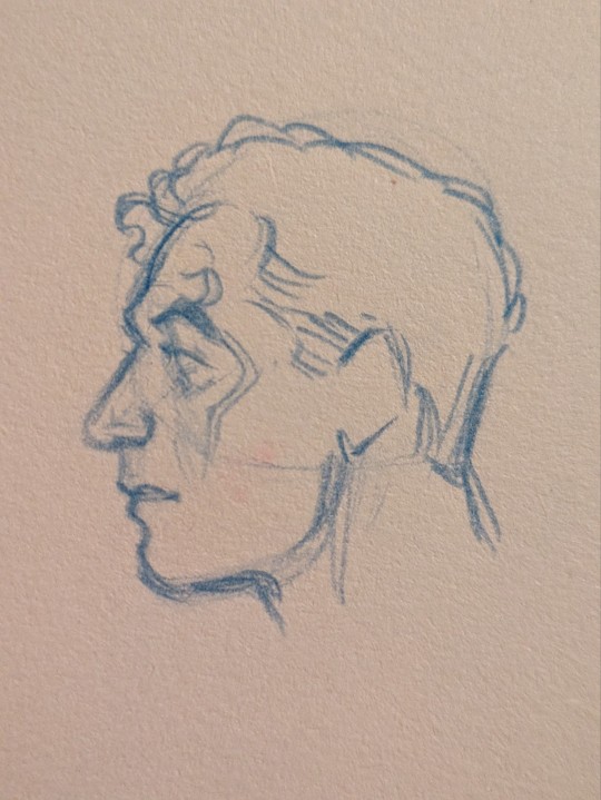
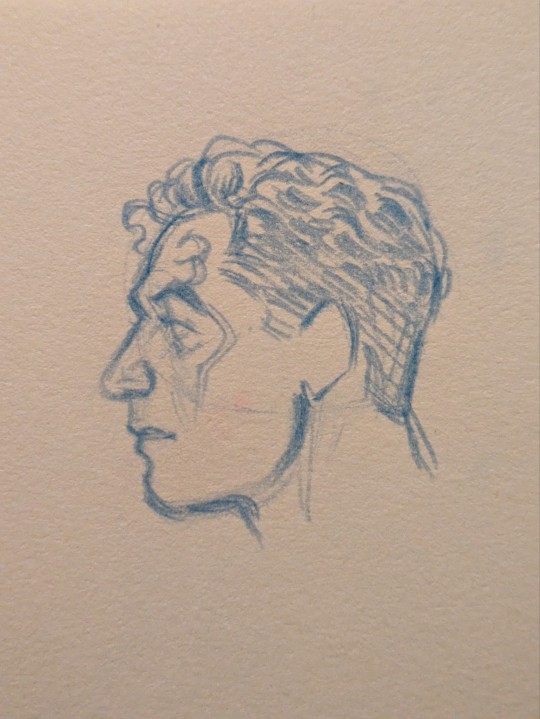
I sort of (only a little bit) use the Loomis method for easy head drawing. Here is a playlist of YouTube videos by Proko. Highly, highly recommend that channel for your art tutorial needs!
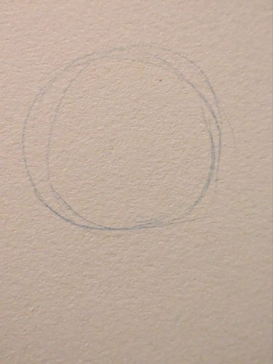
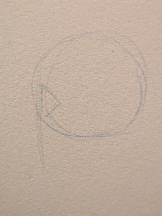
I start with a circle. For side profiles, I draw a line down the side of the circle to determine where the features will sit upon. I draw a triangular shape to mark where the orbital socket is. Around the middle point of the circle is where the jawline ends and the ear begins so draw a line there. There are proportion rules which are good guidelines when starting out in art but since I've been doing this my entire life, I have a feel for things and just wing it. That's to say, I put in a line implying the jaw based on vibes.
Next, I draw the eyebrows and brow ridge. Then the nose. I find I majorly base my proportions on this area so if anything is off, it throws the rest of the face off.
Then I draw the lips and chin... or in Obi-Wan's case, his beard. I will mark in his sideburns and hairline as well. Now, about ears: generally the top of the ear begins right around the top of the eyebrow and stops at the base of the nose. At this point I like to draw his eye, define the cheekbone, and refine the eyebrow. I'll finish scribbling in hair and that's it!
(Cody is much the same but I forgot to take useful progress pics 😂)
Extended Art Advice 👇
Tip #1: Draw lightly. Do not ever grip your pencil tight. This only leads to pain. You will notice I didn't erase at all. This is partly because I know what marks to make because I've done it a million times before and also because my lines are soft enough I can make lots of them and choose to deepen the ones that work.
Tip #2: Practice, practice, practice. Artistic skill is just loads and loads of accumulated knowledge and muscle memory from practice. This sounds boring but, in reality, you should make it fun.
Tip #3: Draw from observation/USE REFERENCE! The only reason I can get away without using reference when I'm feeling lazy is because I've drawn the same things over and over enough times it stuck. Aka I did lots of practice.
Now, to combine all these tips together, let's talk about how to use reference and how to make practice fun.
Reference is a huge aid when drawing at any point in your art journey. But I've found that in order to learn from what you're looking at, you need to think critically.
You obviously have something you want to draw. Reference helps you with that. You'll start out trying to draw what you see. Eventually you will run into an obstacle where you've messed up and things aren't looking good. This is to be expected. Every time this happens, think about what isn't working and find solutions with your reference. Analyze your subject to find your answers. Draw it again. Do not be afraid of failure. Each time you fail, you must look for a solution and this will lead you closer to your goal. This is how you grow as an artist.
I know, it sounds dreadfully boring and like a shit ton of work. It is a lot of work but you can make it fun! You love Obi-Wan and Cody so make Pinterest boards of Ewan McGregor and Temuera Morrison. Whatever you want to practice (may that be eyes, mouths, hands, hair, the face as a whole, etc) draw them. Ever hear tracing is bad? Fuck that. It's a perfectly valid tool to help you learn. If you're drawing digitally, pull up your reference in the art program of your choice, lower the opacity a little, make a new layer and trace what you see. I honestly find tracing to be very hard so when I've done this, I prefer to try to find shapes that will aid me when I'm actually drawing. If you're drawing traditionally, you can print out the photo and trace over it with a tracing paper or use a lightbox. You can also up the brightness on your computer screen and tape a piece of paper and trace that way.
Photos aren't the only references you can use! You can always look to your favorite artists' work and try to figure out how they do it. Often artists will break things down into more easily digestible shapes that will help you better understand how things work. Remember, if you ever copy or trace someone's art, it is for learning purposes only and you shouldn't post it. Feel free to take elements of people's art that you like and put your own spin on it though. For instance: I really love how this one artist draws men's tits so I studied a bunch of their art and now I'm much better at drawing them.
Oh and did you think you only get practice in while studying? Wrong! There's no reason you should shy away from trying to make the art you really want just because your skills aren't the most refined. Spoiler alert: you will grow the most when you push yourself out of your comfort zone. Draw codywan kissing. Draw it really enthusiastically and through profuse swearing and gritted teeth... but never a clenched hand. Don't hold back from the fun stuff just because it's hard. Aim high, land low, and shoot even higher next time.
In the beginning it will be especially frustrating. You'll feel like everything you make is a failure and nothing works out. You'll feel like you're not making any progress. Trust me, you are making progress and I believe in you.
If something really isn't working out and you find yourself growing distressed, take a break. It might last an hour or a week. Just take the break. Don't push it. Come back with fresh eyes and less stress. We all have days where nothing comes out right. Sometimes I can't even draw anything resembling a human face. It's okay. Whisper-yell expletives at your artwork and take the break. It will be okay.
With all that said, happy drawing and even happier codywan kissing!! 🧡💋🩵
#hope this helps!!!#(yes i did put my teaching hat on and break out my sketchbook to draw examples the moment i saw this in my inbox 😂)#ask box#lasagna rambles#my art#codywan
164 notes
·
View notes
Text
Love at First Paint: A Beginner's Guide to Painting

"Almond Blossom" by Vincent van Gogh (1853 - 1890), Saint-Rémy-de-Provence, February 1890
Have you ever dreamed of being like Picasso or Vincent Van Gogh? If you do, you are looking at the wrong blog because I am far from them. But hey there! I'm Eden Amor, a freshman student and a self-taught artist who just loves to paint.
Art has been my passion since I was a kid, and as I grew older, I fell even more in love with it and started trying out different mediums and styles. But there's just something about painting that really excites me! I started with graphite, then moved on to colored pencils, and even dabbled in charcoal (although I never got around to using those charcoal pencils I ordered online). Finally, I found my true love in watercolors, and I've been obsessed with working with wet mediums ever since!
If you are a beginner in painting (like me, have been a skill of a beginner for years), you can enjoy my blog and get some tips that I learned from my starting journey. But if you are just interested in painting or in art generally, you can still read this blog.
Just a disclaimer: I am no expert and just a self-taught artist. Some things might work for me and not for you, and vice versa, so take this blog with a grain of salt.
LEARN ABOUT PAINTING
Since I am a self-taught artist myself, I never applied for workshops in drawing or painting. But most of my art knowledge is from YouTube tutorials, shorts, and IG reels (I have no TikTok, I don’t know why). I suggest learning about the basics before painting whatever you want because you’ll get disappointed after the result or wondering why everything is not working the way you wanted.
But before anything else, find the medium that you want. Mediums like acrylic, oil, gouache, and watercolor. There might be more but these four are some of the common wet mediums. One thing to address about these mediums is that they all have different properties and the techniques you’ll approach, the materials you’ll use, and the finish or outcome of the painting will depend on the medium.
MEDIUMS
Watercolor
My recommendation for anyone wanting to start painting with no experience is to use watercolors. The only things you need are watercolor paint and water. Unlike acrylic paint, which, although water-based, can get pretty messy and dries quickly, giving you little time to blend and touch up unless you use an acrylic medium called Retarder, which is a medium that you mix with the paint to slow its drying time, but will cost you more. So, as simple as watercolor can be, it's a great starting point for a beginner in painting.
However, watercolor painting can be tricky when it comes to water manipulation. The amount of water your brush holds affects in creating an even layer of paint. The drying time takes hours, especially if you are working in layers, if you paint the still-damp surface too early, you will ruin everything and you cannot cover it up since watercolor is transparent. That is why watercolor painting is done light-to-dark because dark colors cannot be covered by light colors. So planning ahead of time is suggested and should not paint with watercolor impulsively.
Acrylic
If you want to take the next level or just explore other mediums, acrylic painting is great for high coverage and textures. What watercolor doesn’t have but acrylic has is the ability to cover mistakes. In acrylic painting, you can paint on top of a painting, which is great especially if you change your mind or decide to start all over again, as long you coat more than one layer of white paint then you have a blank canvas again.
However acrylic paint, as said earlier, dries quickly which can be a disadvantage if you are a slow painter (like me) and especially if you are making a seamless gradient, which is very difficult to achieve and not as easy as you think. Since acrylic is water-based, cleaning is very easy with just water as long as the paint is still wet. Hardened paints can be peeled off easily but only on smooth surfaces, but if you got it on something like fabric, it will be forever on it.
Gouache

I describe gouache (pronounced as ‘goo-aash’) as a combination of watercolor and acrylic. Because like watercolor, gouache is water-activated paint, which means that dried paints can be revived and used the paint again when wet. And just like acrylic, gouache has high coverage and a thick consistency which is great for texture. But unlike acrylic, which has a glossy finish, the gouache creates a matte finish once the paint is dry and it also dries fast giving you no more time for creating flawless gradients.
I use gouache for mini projects, or creating art trends I saw online, but I don’t recommend it for painting a big major project since it can be smudge once wet, and as of now, I don’t know if there’s an appropriate varnish for gouache so if you have any idea please let me know in the comment section.
Oil
The most expensive of the four mentioned paint mediums is oil paint. However, oil paint creates the most realistic paintings. Despite its high cost, what makes me love oil paint is how smoothly the paintbrush glides, like butter. Blending oil paint is very easy, and you can create flawless gradients between colors. Oil paint has a very slow drying time. For small projects, such as those the size of half a sheet of bond paper, it can take days to weeks to fully dry and be ready for varnish. This slow drying time can be both an advantage and a disadvantage, depending on the complexity of your painting. It allows you to fix mistakes or make adjustments even the next day. Additionally, a small amount of oil paint goes a long way.
Oil painting can be hazardous because it involves flammable oil-based paints, as well as mediums like thinner and linseed oil. While water is used to dilute watercolor, gouache, and acrylic paints, oil paint requires the use of thinner. It's important to avoid washing oil paintbrushes with water, as it can damage the brushes and won't effectively remove the paint. Additionally, it's crucial to store oil paints, thinner, and linseed oil away from sources of heat and fire.
Since I am only new to oil painting, I cannot give much in-depth information about it and if you do please I beg for some advice and tips in oil painting.
Materials in Painting
Painting can be an expensive hobby given that the materials used (especially the branded ones) are not really as cheap as a pencil and a piece of paper. But aside from being a painter, I am also a cheapskate.
I will never buy an art supply that is as expensive as my kidney, UNLESS if it is worth it or I can make money out of it. I don’t really have all the money to buy all the art supplies I want, I am still dependent on my parents and have no job yet (currently at college, 18, and an irresponsible young adult).
That is why I chose to buy art supplies online instead from the art stores near my place. And I think as a beginner, expensive materials are unnecessary because for me an artist should be able to make a masterpiece with his/her skill and not the tools. But that doesn’t mean the quality of materials will not make a difference. So if you are the same as me, you can use my tips.
Paint
The paints I use are not of great quality, but they are good enough. I honestly thought that some of the paints I bought were much better than the pricier ones.
In watercolor, there are two common types: in the tubes and in the pans. The tubed paints have a consistency of acrylic, unlike the ones in the pans, which are hardened. What I have is the Superior Watercolor in pans set. I bought them online for less than $10, and it is a set of 18 colors with a brush pen and sponge included. The quality is great, it is not chalky, and it doesn’t smudge once dried. I spent my money wisely, and I do not regret buying it even though $10 is already a lot to me.
When it comes to acrylic and oil paint, I suggest buying the primary colors (ultramarine blue, crimson red, cadmium yellow), titanium white, black, and magenta only. I highly suggest buying a large amount of white because you’ll need it most of the time. Buying a set is very costly, but with these 6 colors, you can create any color, save money, and at the same time improve color-matching skills, which is an essential skill as a painter. If you wonder why I added magenta, it is because the combination of red and white is not bright enough to be pink or it is just different from the color magenta, and I think having magenta in the collection is a good addition. I used the Mont Marte brand in acrylic and Marie’s for oil paint.
Paintbrush
There are different shapes of brushes: flat, round, filbert, and detail are the commonly used shapes, and it depends on the medium you are using. For watercolor, a round brush is recommended, and a flat brush is recommended for thick paints like acrylic and oil paint. A filbert brush is also a flat brush, but the trim is round, and it is good for painting clouds. A detailed brush is used for small details like painting dots and thin lines or for small paintings. There are more shapes of brushes out there, but having a variety of brushes can be overwhelming. Get only the brushes you need and have them in sizes small, medium, and large. The size of the brush will depend on how small or big your painting is. Using the appropriate shape and size of the brush will lessen your expenses and you’ll learn to depend more on your skills than the tools.
There are cheap but not too cheap brushes available online. They are not branded, but the quality is good enough (like the ones I use), and the bristles don’t come off easily.
Paper
We can paint on anything, but nothing beats paper. However, the paper used in painting is not just an ordinary paper. The thickness of the paper used in painting, particularly watercolor paper, is important so that the paint would not easily destroy it.
Watercolor paper is usually combined with cotton, making it more durable than regular paper or cardstock. The percentage of cotton in the paper varies as the price varies. It is recommended to use 200 gsm paper, which is what I have because it is affordable and good enough to hold a few layers of paint.
However, I highly recommend using 300 gsm paper because the 200 gsm papers I use still curl up or bend and get wavy, which is a hassle when painting. The higher quality, 300gsm paper or paper containing 100% cotton is easier to work with, as I have observed online, even without taping the paper down, it doesn’t curl up. But of course, high-quality paper costs more, so 200 gsm paper is good enough.
If you are wondering why I called the paper used in painting "watercolor paper," it's because you can also use watercolor paper for acrylic, gouache, and oil painting.
There are two types of watercolor paper:
Cold Press - Cold-pressed watercolor paper has a rough texture, which is great for watercolor painting because it gives more depth to the flat painting (water is water, they can't have shapes and textures like acrylic).
Hot Press - The hot-pressed one is recommended for thick paints because it has a fine, smooth surface, which is great for blending smoothly.
Aside from paper, you can also use canvas paper, stretched canvas, or a canvas panel for thick paints. However, since you are only starting in painting, paper is recommended for practice and is much cheaper than the canvas mentioned above.
OTHERS
Masking Tape
Why masking tape? It is used for tapping down the edges of the watercolor paper so it stays put and flat on the surface which makes painting much easier, and also it creates a clean border. You may see other artists use washi tape because they are less sticky and won't damage the paper once it is peeled off, but I think using washi tape costs more, instead, stick first the ordinary masking tape onto your clothes until it becomes less sticky, and then you are good to go.
Mixing Palette
Usually in watercolor paint sets, the lid of the container serves as the palette. However, when using thick paints like acrylic or oil, a better alternative to a traditional paint palette is a picture frame. Mixing paint on a glass surface is convenient for two reasons: (a) it is smooth and does not absorb the paint, and (b) it is easy to clean. Dried acrylic or oil paint can be easily peeled off the glass or scraped with a blade or glass scraper, leaving a fresh and clean surface for mixing. Additionally, the wood or plastic frame around the glass provides protection against breakage and sharp edges.
Towel/Tissue
A used towel or tissue is not only used for cleaning; it is also mainly used for soaking up the excess water on a brush or for wiping off the excess paint. It is very handy, so you should always have it by your side while painting.
Jar
A brush washer is a must-have for painting. This is where you wash off the paint with water from the brush. You can use an old cup or jar as a brush washer instead of buying the fancy ones which is unnecessary. I prefer using a jar because it is heavier than a regular plastic cup, which prevents it from tumbling or spilling.
Here's a tip I learned from YouTube: use two brush washers. When you wash your brush once in a single container, the water gets muddy. This can make your fresh paint muddy when you switch colors. To prevent this, wash your brush twice: once in the first container and then again in the second container. This ensures that the water picked up by your brush is clean and not muddy.
ART STYLE
Early in my painting journey, I started practicing by painting scenic landscapes because they seemed easy to me. Of course, I overestimated myself. So I continued practicing more. Painting nature has grown on me, and I realized that my genre is landscape painting. The good thing about it is there is less structure unlike a portrait of a person, and shapes are organic so I will have no problem with imperfections.
However, I still don’t have the ability to create my own work. I still have to watch tutorials online to have a guide. Most of my artworks were tutored by the artists I follow. Once I start painting with just a reference from Pinterest, I tend to get lost and suddenly don’t know what to do. I end up not continuing the work, which is a waste of time, energy, and material.
Lately, I returned to working with watercolor, but instead of nature, I used a reference photo of a person as a subject. Sketching the face first is my least favorite part, because if I mess up sketching the face, the whole painting is also a mess. Most of my subjects are K-pop idols, especially BTS, because I am also an ARMY! Working with faces is difficult but once you succeed, it is all worth it.
Social media has highly influenced my art style. The fact that I get envious whenever I see new art trends gives me a push and inspires me to continue doing my art and explore more.
Check Out These Artists I Follow
Correa Art
Youtube: https://www.youtube.com/@CorreaArt
Instagram: instagram.com/correaart_
Jess Chung
Youtube: https://www.youtube.com/@JessChungArt
Instagram: instagram.com/jesschungart
Emily Mackey Art
Youtube: https://www.youtube.com/@EmilyMackeyArt
Instagram: instagram.com/emilymackeyar
Genelyn Sandaga
Youtube: https://www.youtube.com/@GenelynSandaga
Instagram: instagram.com/genelyn_sandaga
Socials
If you want to know more about my art, you can visit and support my two Instagram accounts:
@ChiliCheeseLover
@paintwith_amore
💜💜💜
If you have feedback to share, please do! I am eager to hear your thoughts. If not, kindly give this blog a heart; it is greatly appreciated!
💜💜💜
49 notes
·
View notes
Text
♥️ Art resources ♥️
Hey I put together a beginner art resource list! Feel free to share, save, etc. but a lot of people don’t know where to start:
Man is this a holy grail it includes free programs, online courses, tutorials, and scholarships (us based):
A big thing you are taught early on is just hand/eye coordination. Speed drawing, or “gesture drawing” if you’re fancy, is the best practice you can do on a regular basis.As much as you hate hearing “just practice”- it matters.
The best online art course I can think of. It will literally go step by step in teaching you commands and digital painting:
YouTube anatomy holy grail:
The Loomis method for the construction of the head is very popular because it is easy to learn and remember and can be applied to any drawing of the head.
Loomis also has many published books under his name. I’m not saying you can get free books here but if you could well. Careful of fake links with this site, if you don’t see the single login.re it’s the wrong one.
If loomis method books aren’t your style and you are more of a video person try this (this is the first on a short series):
youtube
If you know me I’m barely cracking the surface with digital art but I’m actually trained in professional forensic art and hyper realistic portraits , so here is info on traditional art by media.
Little proof of some training, but if you like this, this is woodless graphite pencils on vellum- just a slightly better quality than a pencil and paper :)
Finally here are some amazing pose references. Adorkastock had moved from Pinterest and is working on their own website so check them out here:
Taco is single handed my my go to for simplified anatomy and it goes my section of the body (people have made Pinterest copies that is separated by parts of the body) but I highly recommend buying it if you’re able!
I hope that this helps at least someone find a resource they needed or wanted! Feel free to dm me or repost with comments or more resources!
#artistsoninstagram#artofinstagram#my artwork#my art#artwork#art#artists on tumblr#digital art#artfight#traditional art#art fight#art reference#art resources#art related#youtube#books#loomis method#art and design#art anatomy#anatomy#art help#resources#gesture drawing#practice#blah#mine#blah blah blah
64 notes
·
View notes
Note
hi :3 I saw your recent Wreck It Ralph vid (loved it) and seeing your avatar reminded me that I wanted to do something similar for my own vids? I am. Really bad at wording things my question is what size canvas did you use to draw them? And is there anything I need to keep in mind when implementing my own avatar into my YT vid like yt compressing the video or anything? I hope this makes sense like I said I suck at wording things 😭
Ooh okay!! Good question :] also I'm really happy you enjoyed!!
I am an amateur so idk how useful this info is but Here (dumps everything)
The emotes were made in Krita (any art software will work)
The canvas size was around 1000 x 1000 pixels
Starting out, doing a basic emotion sheet works well. Watching other PNGtuber videos helps you organize how many you may need and what emotions are used the most (expect to make 30 or more drawings, which is A LOT at first, and might take a couple weeks, but once you have them you can use them forever!)
Also start your video even if you're still working on emotes! It helps to sorta do everything at once :)


This grid doesn't cover everything I used (it was a very messy process) but it might be useful so here :)


I think its also a good idea to make a "base" and then mess with expressions from there. This one had a lot of usability. (and also a lot of layers)
Later on I found it most useful to listen to the stuff I recorded, and then make a drawing for that moment specifically. You can then apply that "emotion" to other places where it fits

this is probably my favorite example because i based the expression off King Candy LOL. USING REFERENCES IS FUN !!!!!!!!! And I ended up using this one a lot !
Also expect a lot of rejected designs and struggling w drawing expressions because it's Hard. Developing the style you want takes a lot of time!! (I scrapped these 3 i made early on)


//
Exporting and YouTube processing was a little tricky but here’s what worked for me:
- I used Davinci Resolve to export the project. My video was made at 24fps, the same framerate as my footage. (The Movie) Earlier on, I kept noticing my audio was too loud and weird glitchy visual artifacts kept showing up. After trial and error I found these settings worked the best:


Main takeaway, i legit dont understand how any of this works but:
ITU-R BS.1770-4 normalization for audio is Good
Lower your finished audio track to -13.5dB. It will sound quiet, but YouTube likes this and will make it a normal volume (?? I THINK?? Do your own testing, my final video was kind of quiet but nobody commented on it so its fine as long as it's consistent)
YOUTUBE EQUALIZES YOUR AUDIO IT DOESNT MATTER HOW LOUD IT IS IT WILL BE OK
H.265 encoding with .mov format (aka QuickTime) is Good
And that's probably enough infodumping for now. Its okay to feel overwhelmed and unsure where to start but making a video is SO FUN and i encourage it more than anything :))) Take your time and learn at your own pace! There are lots of great tutorials online.
I WOULD BE HAPPY TO ANSWER ANY EXISTING QUESTIONS
39 notes
·
View notes
Note
hi dema! i’m learning how to do digital art, would you mind sharing your coloring process? coloring (and lineart) is the hardest thing for me to do T_T… what brushes do you use for coloring and how do you not make it look muddy? i’ve been trying to follow tutorials from different artists on youtube but i find my work to look so muddy… thank u in advance >__<
Hi, and thank you for thinking about me for advice! I'm honoured to share a bit of my process, nerve-wracking as that is for my shy self, and hopefully help you out as much as I can. Forgive me if I don't express myself very clearly—I have a bit of a hard time explaining these things. Now, let's get started, shall we?
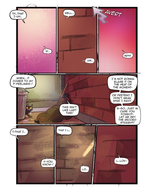
I'll be using the first panel of this artwork as an example.
My process is pretty straight-forward for most artworks. Make a sketch, draw the lineart, and follow a self-made guideline for coloring and rendering.
Sometimes I'll throw the guideline to the trash bin and start experimenting with brushes and chiaroscuro and color palettes, but that doesn't happen most of the time and, when it does, it's more a challenge than anything else, and not really what I think you're looking for.
I'll include my usual steps here, however, and like I said earlier, these steps are more like what you'd call guidelines than actual rules.
(I just realized I didn't save the sketch for this artwork. Oops)
This is the lineart!
I tend to think that details bore me and are actually pretty exhausting to do, but then I go and make things as clear and detailed as I can. Because I'm a hypocrite like that.
I did try to keep things simple here, though, mostly because I had to go through three other panels and didn't want to burn out my fuel mid-process.
Base colors! The blush (and Zuko's scar!) I draw in a different layer in case I need adjusting the brightness or saturation later.
It's time for shadows!
Pick a color depending on the atmosphere you want the artwork to have. Is it a cozy, warm scene in a honey-tinted room, or is it a moment shared under the moonlight? The color choice should come as an answer to those questions—deep red for the first one and dark blue for the second.
Choose a color and make it dark and saturated. Then, play with the layer opacity! A darker shadow means harsher light, while less opacity works best for a softer look. See the difference? It's subtle, but it's there.
Of course, this is my personal choice. The way shadows are drawn and color is chosen depends on the artist and the artwork. I choose to play with a more simple coloring style, keeping shadows from blending into each other, but you may like a more realistic approach to shadows and colors.
My best advice? Try doing it every way you can, but in the end choose what works best for you. Whatever feels more comfortable, whatever you enjoy drawing the most. And then work to improve it. Love the little proof that you've gotten better, even if it's subtle.
And talking about subtlety...
I love to play with gradients. I use them mostly to give the artwork some form of atmosphere, and make it look cohesive and whole. A light gradient in the color and direction of the shadows will help the characters blend with the background, as will another gradient in lighter colors for the light.
Get creative with gradients! Use them so the lights feel brighter and the shadows darker.

Now it's time to work with the lineart again.
The pure black lineart makes the artwork look harsher, sharper, so I tend to give it some color to soften its edges and compliment the rest of the drawing. In darker shades as the rest of the colors, growing more saturated as the light comes closer.
I love to make the characters' eyes pop and glow! It's really fun what you can do by just messing a bit with the tones of the lineart.
Finally, I play with the level correction. A high contrast will help your artwork stand out and look brighter. See the difference?
And it's done!
Sometimes I like to add other effects or details, but this is the very, very rough shape of my usual process, and thus what I thought you'd like to see.
Once again, I'd like to point out that this is what works for me, and a large part of improving as an artist is just fooling around and messing up until you find the tools and tricks you're most comfortable with.
So keep drawing those muddy shadows and colors! They're only a step of the process.
#dema answers#zutara#art advice#art process#I hope this helped you anon#Tbh I have zero idea of what I'm doing most of the time#So don't worry if you don't#Worry instead the day you feel like a drawing comes easy and poses no challenge anymore#Always strive to do better to improve to fix that lighting or find a new way to depict a scene or find other filters and effects#No artwork is ever perfect and perfection itself should never be the goal#“Don't trust a song that's flawless”#Don't give up on the strain and the frustration of struggling against your own skills#Never fall out of love with the process#That's where art is
29 notes
·
View notes
Note
Iztea I need your help💔💔 I'm genuinely trying to find my art style but I'm not very good at art in the first place, I'm a beginner and I just don't feel motivated to draw anymore because I'm not good at it,, can you pls link your tutorials so I can try to follow them the best I can..😓 I genuinely love your art and your a huge inspiration but I can't draw for shit. A lot of the tutorials on YouTube don't actually help me as much as they do for other people so I'm lowkey putting my faith in you to try and help me lmao, I just can't get the proportions of anything right, like I can't draw a body or head,, and when I trace things it just feels like cheating in art like ugghhjjnn,, can you help me😓☹️
If you struggle with proportions, then drawing over the reference photo (which you should totally have, btw) to get a feel for the distance between things is a great starting point. I also think you should have simplified anatomy references, as well as references from other artists. Basically, everything I mentioned here i don't want to repeat the same points
Tracing is not "cheating" if you're using it to learn. It can be very distasteful if it's used for finished art, where it is obviously meant to replace actual skill, or if it's traced from another artist. If you're using it to study and as a stepping stone to improve your skills, then it's totally fine and even encouraged (it's like doing assisted pull-ups at the gym). But you gotta to play it smart—tracing the actual outline without engaging in critical thought leads to ugly, mediocre, commercialized art that we don't want because we're cool based and always striving to improve ourselves
Okay anyways "But how exactly do I trace references in a smart way, iztea?" Well, like I said, you can lower the opacity of your reference photo and draw over it. Use the general shapes and volume of the body as your guide until you learn to draw without them. Don't follow the outline exactly—exaggerate or stylize the limbs to your liking. For example, I like drawing small wrists and long, slim necks because I think it looks more appealing. So whenever I'm using a reference, I (subconsciously most of the time) slim these body parts down, elongate the fingers, and so on. If you're still not sure what your style is, that's fine too. Use this exercise to find out what your hand naturally leans into
I'm not the cleanest sketcher, and it's been a while since I've done this sort of approach, so excuse the messiness but I wanted to show an example of how I'd tackle this technique. If you look closely, you'll see that I didn't exactly draw over the body parts, especially in the neck and arm area. I exaggerated the posture by adding more gestures—I made the shoulders rounder, the skull bigger, and the arms and neck longer and slimmer. I didn't focus on details like the face or fingers because that's not the point

The next important step after creating your guidelines is to redraw the lines from scratch on a separate layer, but this time without the reference. Set the reference aside and focus on copying your own guidelines. Afterward, compare the two drawings to check if your proportions are accurate. If they're off, take note of any recurring mistakes and correct them. For example, I have a tendency to draw the mouth too far down on the face, so it's something I am always aware of whenever I'm drawing. Other times, I draw the eyebrows too high from the eyes and so on. Another important thing to point out is that not all references are created equal—there are such things as bad or poor references. If the body’s silhouette looks like a blob or the limbs are heavily foreshortened, you'll find it much harder to draw so for practice, I recommend choosing poses that are fluid, clear, and expressive, with good lighting and features you can exaggerate. This will make it easier to understand the form and you'll have more fun in general I've provided a little comparison below. I'm not saying the 2nd pose is terrible and impossible to draw, it's obviously not, you can draw anything you want howeveerrr if you're just starting out, painting the 2nd one can be much more challenging due to it not being very clear in shape, value range, pose, gesture etc. So what I'm trying to say is to choose your poses wisely too
I don't remember doing any tutorials outside that hair one unless you consider my rambling sessions tutorials (i don't) but you can also scroll through the #ask iztea: art talk hashtag for whatever art-related question I might have answered I'm too lazy to link everything so YOU put the work and stalk my page
anyways yeah idk this is how i'd start.... so to summarize:
pull up references, from both real-life people, simplified anatomy sheets, and artists you like
draw over your reference photo and treat it as your training wheels
close the og reference, and use the newly traced, much more simplified outline as your new reference, and now draw the pose again, but "freehand" this time
compare the traced and the freehand version, take notice of your proportions and try to correct them
choose good, readable, easy to draw refs
never give up never what
#wjy would you ever put your faith in me though im just a girl#don't count on me bro#ask iztea#ask iztea: art talk
33 notes
·
View notes
Note
Hello again Star!! I have a little question about your art this time!! I was wondering if you had any process / procedure regarding how you draw in general? Do you use tutorials or simply go with the flow? I've been wanting to make art for a while now and I am as clueless as to where to start so I thought perhaps you could help me get through the lengths on how you are able to make it work and if you have any tips and tricks that could help me throughout my art journey! Sending you lots of positive vibes and a hug! Also I hope you have a wonderful day!!💗
OOH WONDERFUL! I am still learning how to draw myself, so I don't really have a lot to say on the subject, but:
I always recommend starting with the fundamentals! If you want to draw characters, it's best to learn anatomy and facial proportions first. Also, my tip is to avoid colouring and focus only on drawing first! My fave art YouTube channel is definitely Winged Canvas, check them out 🤩
And if it's my process, i normally do thumbnail sketch -> sketch -> line art -> base colours -> render -> special effects
#ask#hope this helps! i don't claim to have any sort of expertise#but i do like drawing a lot!#art q
37 notes
·
View notes
Note
How'd you get so good at art :00 I try practice a lot but I struggle with anatomy and stuff like that :") do you have any tips or something I really like your style!!
honestly i am probably the last person you should ask this to LOL. genuinely i improved because of sheer willpower and hyperfixation. no studying all, do NOT be like me. but thank you for liking my art!!
however i do know good tips! i just don’t follow them—you definitely should though, my footsteps are not ideal
1. find an artist you really like and break down components of their art style! you could copy it (as long as you don’t publish it anymore) but it helps you sort of learn how they draw and what parts you’d want to incorporate into your style. even better if they have speed paints
2. study study study! use references, use bases, poses, anything that helps you get a better grasp of anatomy and such. start easy and simply—no need to rush into the bigger things. lot of good youtube videos out there! pinterest is a great place to look for poses and art styles too
3. (most important) have fun with what you’re making! you will inevitably improve as you continue drawing, so even if you dislike a piece of work, just know that you are just getting closer to your ideal drawing style. draw fanart! draw your ocs! make something that brings you joy when you’re drawing it.
also, bullshitting things until it looks whatever is always okay in my book. things will come naturally to you once you keep drawing. like, having seen so much good art, i start to realise how to draw a proper torso in certain positions! i didn’t go out of my way to study—again, i do recommend studying if you want to see how quick improvements—and i just kept drawing until i felt comfortable with the posture.
it all takes time, unfortunately. but the time will pass anyways, so what’s the harm in learning?
i hope this helped you a little bit! feel free to ask more questions or if you want like, idk, a step by step tutorial on something and i can do my best?
9 notes
·
View notes