#I wanted to do a limited colour palette thing
Text
I finally finished a NEW CUSTOM MAP ART!!! "Visitor," a portrait of an enderman, is extra exciting because it's my first full-palette map painting, meaning I used block height to access all the highlight and shadow colours available!! More on the full process under the cut, but the short version of what this means is:
ITS A VERY COMPLICATED CONSTRUCTION. I created the art, then planned and built this manually, without any mods or schematics for construction. Huge props again to everyone else in the server for helping me gather all the materials to make this absurd thing possible!!!
This was the original art I made for it! I'm a huge fan of the "compressed" look of the vanilla paintings, so I've been starting with a large image and shrinking it down, though there were a lot of pixel tweaks to get it to read well. After shrinking it to 16x32 (for an art made of two maps), I convert it to a limited palette that I've set up to match the colours minecraft actually has available:

The map palette is actually tremendously limited, so figuring out a painting that will still look good with that constraint is a challenge in and of itself!
Anyway, the way minecraft maps work, a block that is Taller than the block to the north of it shows up with a slightly lighter colour, and a block that is Lower than the block north of it shows up on the map with a slightly darker colour. So when making a key for this one, I marked all the squares with a little arrow if it's the lighter or darker version:
Each "pixel" here is a full stack of blocks on the mapped area: 64 blocks, 8 rows of 8. In order to achieve the affect of every block in a given pixel being taller or shorter than the block to the north of it, dark and light shades need to staircase either up or down. Because staircasing downwards in survival sounds even worse than this madness, I did some planning to make sure each of the "downwards" staircases would touch the ground, so I could simply staircase up from south to north instead. This involved figuring out how many up and down movements were in each individual column and planning out 32 little layouts:
It's worth noting that if you look up minecraft map art on Youtube, most of what you'll find is either, the simple realisation that placing blocks allows you to make custom map art, or an explanation of how to use a generator that will let you plug in any picture and then produce a schematic for you. It's very cool that these exist, but I wanted to do full palette art myself, without an auto-generated schematic, and at the time THERE JUST WEREN'T ANY TUTORIALS FOR HOW TO DO ALL THIS?? Now, having the experience of finagling all this, i think perhaps the reason is that this is a mad undertaking.
ANYWAY: PROGRESS SHOTS!!
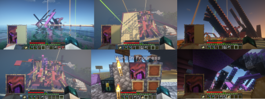
I actually love how the staircases look..... its like some kind of modern sculpture
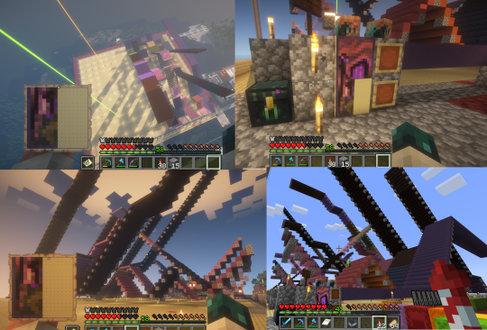
Fewer shots of the second half since I did it on call with friends; the last screenshot is one Thren took of me activating the new locked map to use for the gallery.
Once these paintings are done, I lock the finished maps, make copies, and stock them in the art gallery so other friends on our server can also put these paintings in their homes! It's a lot of work, but really rewarding to see my art decorating various buildings around the server. ;u;
I have one more custom full-palette painting I've done the art for and gathered all materials for; I still need to do the full key and plan staircasing for it before I can start, but HOPEFULLY if my resolve doesn't waver there'll be at least one more of these!!
#minecraft build#minecraft screenshots#minecraft#block game liveblogging#minecraft map art#GENUINELY SO PROUD OF THIS ONE#bsl shaders#im so tempted to make some sort of tutorial on doing this by hand sometime. you shouldnt do it by hand. but a tutorial should exist!!
319 notes
·
View notes
Note
I recently started learning to use rpg maker (vx ace!) and as a result have become increasingly interested in pixel art. I hadn't really done pixel work since my teens - I do more digital painting and vector art - so while I'm a little familiar and can do passable editing, there's a lot I don't know.
One thing that's kind of perplexing for me is understanding the differences in style between two creators of pixel art. I studied art history and I'm used to the differences being things like brush stroke length or degree of realism... I feel like I'm lacking in lexicon in this new frontier lol
What nuances of an artist do you think are most important to style in pixel art?
This kind of stuff is not really officially studied (yet) so it's all a bit of opinion from me.
Usually in pixel art the biggest differences in styles are which limitations the artists choose to impose on themselves; colour count, resolution, palette... Or more stylistic choices like hue shifting, anti-aliasing style or no, dithering or no, etc.
I personally think there are a huge variety of styles in pixel art, as it's literally just a medium, and I hope you'll agree by the end 8)
Also (imo) there is some seperation between the styles of art for art's sake, and art for videogames, where things have to be clear and readable to be actually playable.
🎮 Old school games:
Sometimes referred to as something like '8-bit' or '16-bit' (relating to the NES era / SNES era consoles), these artstyles usually follow the rules and limitations of the hardware at the time.
This all falls under retro art, most popular styles include: NES, SNES, GB, GBC, C64
Notable artists: Nickwoz, Sandy Gordon, Franken, Cisco
📚 Old school art:
There were also events called Demoscene (still are), where developers would go to a big convention and share their demos. A lot of pixel art competitions were held here, where artists would draw live.
Generally they used to favour a high realism/semirealism style, with lots of texture/dithering, fairly high resolution (if the hardware allowed for it), and adjacent pixels mostly being different from one another.
There are even older styles than this but they are fairly niche and I'm not that well educated. If interested look into some of the old PCs/consoles.
⭐ Modern pixel art:
Usually using more colours and higher resolution, larger clusters of pixels instead of individual ones. Strong use of art fundamentals.
Artists to look at: Adam Ferguson (yes it is pixel art), Snake, Slym, 6VCR, Yes I do Pixels, Gijotto, SovanJedi, JoeCreates, Franek, @8pxl
the rest below are "modern" pixel artists too but I think they have other things in their style that are a bit different!
🎨 Painterly:
Some artists choose to emulate the natural brushstrokes digitally, and keep their clusters large and loose. Usually don't focus on the minute details as much.
@makrustic, @hexh-pixel, Umbohr, Gawrone
🟦 Dithering
These artists all use dithering / texture in ways that make their styles totally unique.
Deceiver, Night, Reo,
💥 Experimental
These artists are always trying new things and honing in on their unique style.
AJ, hby, @ilta222, Alphons
I could really go on for ever, there are so many different styles, cute pixel art, horror pixel art, 1bit (2 colours only), and then adding animation takes it even further, but I think you get the idea
If you want to learn more, the Masters of Pixel Art books have works /interviews from pixel artists of different eras, including demoscene and contemporary.
😊👍
231 notes
·
View notes
Text
THE LION CHRONICLES
Pairings: girlfriend!Lute x f!reader, fatherfigure!Alastor x f!reader, motherfigure!Rosie x f!reader, siblings!Emily and Sera x f!reader
Summary: Y/N, older sister of Emily and younger sister of Sera, mysteriously disappears from Heaven. She is found by two quirky overlords, who give her a fresh new start. Meanwhile, those close to her mistake her for dead.
A/N: this is just many thoughts put together, this would be the first time I'm making a serious project with fanfiction, so it could take me a while to get the hang of it :3
Warnings: mentions of sex, grief, canon-typical violence, WLW, eventual smut (probably), angst, daddy issues, mommy issues, approval seeking
| OPENING // PART 1 |
˚₊‧ ꒰ა ☆ ໒꒱ ‧₊˚
˚₊‧ ꒰ა ☆ ໒꒱ ‧₊˚
They said I'm a traitor.
Maybe I am. All I know is that I did what I had to do.
I was raised to know that falling from grace was the worst thing that could ever happen to an angel. In my eyes, that was another of the multitude of lies I'd been told. The worst thing that happened to me wasn't falling, it was never seeing my sisters, my love or my home again. To never walk on the fluffy clouds. To be unable to protect Emily. To leave Sera to deal with responsibilities on her own. To never feel Lute's skin against my own.
What was true, however, was that falling was the most painful thing an angel could experience. The excruciating pain of my wings being torn off my back, the horror of seeing the six feathery stumps on the ground, golden blood spattered everywhere I turned my gaze, the agony of my halo being snapped, the tumble through the portal and the crash with the stony street of wherever I had stumbled upon.
Two people approached me as I laid stranded on the ground. Their shoes were right in front of my nose: one pair was black, red at the toes and above the ankles, the shape accommodated to hoof-like feet; the other pair was all black, a black and red striped gown draped over them. My blurry vision could just make out spots of colour and the lady's feminine appearance, while the one with hooves was more difficult to distinguish in the moment, but it was at best an effeminate man.
"A fallen angel?" A radio-filtered voice spoke right before I blacked out.
˚₊‧ ꒰ა ☆ ໒꒱ ‧₊˚
"Look who's up!"
I opened my eyes, finally seeing more clearly than before. I was lying on my stomach on a red-pink couch and weakly lifted my head to look at what I could: the room was of hues of red, pink and boysenberry, a somewhat pleasing palette for Hell. I rolled on my back to get a better look around but the pain that radiated from my shoulder blades stabbed me again, making me cry out and sit up, leaning my shoulder on the couch. I could feel that the tiny stumps that were left of my wings were bandaged with gauze, the difficult tying of the material limiting the movement of my arms.
"Be careful with those, darling, don't push yourself." The lady from before spoke, seated on the bed in front of the couch.
"Thank you for rescuing me, Miss...?" I trailed off.
"Rosie, darling. Welcome to Cannibal Town." She introduced herself with a smile. She seemed quite lovely, almost motherly with the way she spoke.
"Cannibal Town?" The notion made me a little uncomfortable, but if she wanted to hurt me, she'd have done so already.
"Don't worry, dear, no one's out to eat you," the voice from before spoke, the man with the hooves, I guessed. "Alastor, pleasure to be meeting you, quite a pleasure!"
This Alastor seemed like a quirky fellow: his never-ending smile, his moxie, his mannerisms and his radio-like voice, to name a few, were quite charming, but at the same time off-putting. I didn't know whether he was to be trusted or not, but he did save my life along with Rosie.
"The pleasure is all mine, sir." I replied with a weak smile and a small nod.
"Now, tell us, however did we stumble upon Sera and Emily's kindred in such an unbelievably unpleasant condition?" Alastor asked. The names of my sisters sent chills down my spine. I wondered what they were even thinking of me, their own sister, vanishing like that. What if they thought I died? Or worse... what if they thought I left them? That I didn't love them anymore and found a better way to live? And what if Lute thought that?
My breathing quivered and my eyes brimmed with tears at the mere thought. I sniffed quietly and began telling them what happened, voice thick with tears. "Sera approved the extermination. It's disgusting, it's inhumane, it's hypocritical... I couldn't let that happen, I couldn't let Emily find out about such a thing. I couldn't let Lute get involved in such danger... and for what? I know she can handle herself, but I couldn't risk losing her... and Emily's far too innocent know. I- I tried to stop it, I tried to make peace, but what I got instead..."
"Oh, you poor darling..." Rosie frowned and sat beside me, patting my head with affection, and I couldn't help but lean into her touch.
"Say, let's keep your... old titles a secret, dear Y/N, hmm?" Alastor said with an exaggerated tilt of the head, his neck emitting a loud crack with the motion. The noise made me flinch, but the fact that he seemed to be perfectly fine only added to my wonder and curiosity about him.
"Yes, sir." I agreed, looking down at my torn-up gown littered with clumps of feathers.
"To do that, you need a new look, darling." Rosie smiled, to which Alastor agreed with enthusiasm.
"Indeed you do, my dear!" He said and paced back and forth in front of the couch, examining my figure. He seemed to disapprove of the tousled hair, ripped angelic gown, gashes and stumps. "You need new clothes, a fresh new start, and- oh! Animal ears!"
"Animal ears?" I ask with a confused tilt of my head.
"Yes, darling. It's already hard to hide your glow, dim as it may be, and your wings are still a little visible on your back. You need a little something to redirect focus," Rosie explained, resting her chin on her hand. "I bet a nice purple will look great on you."
"Hmm, agreed." Alastor quipped and snapped his fingers. In a heartbeat, the gauze and wounds were gone, replaced by a bright purple striped dress suit, a white shirt, a black and purple bow tie and a darker cloak draped over my shoulders. I was still weak from the fall, but the pain was gone and the look made me feel a little better.
I got up and looked at my reflection in the mirror, a small smile spreading on my lips at the sight. Perhaps it wouldn't be that bad here. "You look stunning, darling."
"Thank you, Rosie." I smiled.
"We're not done yet, my dear," Alastor snapped his fingers again, another beam of light flashing around me. "There we are. Perfect."
I opened my eyes and gasped softly at the reflection in the mirror: fluffy golden lion ears twitched atop my head, the tiniest rebellious mane sprouting from between them; a long tail curled and swayed back and forth from under my spine, fuzzy brown tip flicking idly. "A lion?"
"Indeed, dear child. The lion has been a symbol of courage, dignity and nobility for centuries. All qualities that fit you like a puzzle." Alastor encouraged, tapping my back with the back of his cane to correct my posture.
"What about me says courage, dignity and nobility?" I asked, ears drooping with sadness as I gazed up at him with a small frown. A fallen Seraphim, alone and damned forever could never be worthy of such appellations.
"Ha, ha, my dear child, you attempted to stop the extermination-" he began.
"And failed..." I interrupted with a soft sigh.
"Failure is the greatest teacher, Y/N. However much it hurts, what you can do is run from the consequences or face them and learn from them." Rosie spoke with a gentle smile. The feeling of approval, of being guided was so foreign, yet so warm and incredibly welcome. What she said made me think, I had never looked at it that way.
"Nevertheless, you stood up against something you deemed incorrect and you bore the title of Second High Seraphim with class," Alastor continued, tapping the bottom of my chin with his cane. "Walk with your head high, as if you still own your title."
I look at my reflection in the mirror and smile, my new fangs sparkling with cleanliness. Whereas before I saw a broken princess, a gangrenous limb that had been deemed infectious and severed from the organism, now I saw a woman with elegance and panache, the feline traits accentuating the good of my character. There was my new philosophy.
Courage, dignity, nobility.
˚₊‧ ꒰ა ☆ ໒꒱ ‧₊˚
Lute had spent the entire afternoon combing through the denizens of Heaven to look for you. Her and Adam had split up to find you, and had had no luck. She hadn't tried asking your sisters yet, they must know where you are better than her, surely. Ever since Lute had made her relationship with you official, she had become a part of the family, treated like your consort.
"Your Highnesses, forgive me, but have you heard from Y/N?" She asked the two sisters.
"No. She was supposed to be here hours ago." Sera said, anxiously placing back and forth, throwing an occasional glance out the window for news.
"We were hoping you had." Emily spoke, approaching the taller soldier. She was trying to keep up morale for Sera, but it was becoming increasingly difficult to do so.
"No, I wish," Lute ran a hand through her hair, letting out a small sigh. If something were to happen to you, she didn't know what she'd do. "She spent the night before she left, she only told me she'd be back by noon."
"We'll find her. Don't worry." Emily offered with a soft, reassuring smile.
Before Lute could say anything else, a frantic knock on the door brought the women's attention to the matter at hand. Sera and Emily scrambled forward while Lute rushed to open the door, met with Adam's solemn gaze. When she saw the look on his face, she felt something eating her stomach from the inside. In all the time the three of them had known Adam, they had never seen him out of his obnoxious, conceited character.
"Sir? News?" Lute asked, the suspense so thick it could be cut with a knife.
Adam opened his mouth to speak, debating how to say the words, then closed it and sighed, handing a piece of a broken object to Lute and one to Sera.
Y/N's halo.
Sera cried out, the anguish in her sobs palpable as she dropped to her knees and buried her face in her hands. "No!"
"Adam, it can't be true...! She- she has to be out there somewhere!" Emily pleaded, trying to convince herself of what she was saying rather that everyone else.
"We found this outside the gates. It was in a pool of angelic blood with a clump of her feathers," he sighed, looking at the ground and closing his eyes. "I'm really sorry."
The eldest Seraphim felt her stomach dropping to her feet. She had failed to protect her own sister from this. Her gut-wrenching cries were difficult to hear, especially for Emily. The young Seraphim gently pried the halo from Sera's hand and held it in her own, trembling as her sister's blood stained her fingertips. The sobs racked her body as she clung to her older sister, the only one she had left.
Lute's airway felt like it was closing up. Whatever could you have done to deserve such a fate? The last time she had seen you was when you left her place to go to the meeting. The night before she had laid with you, spent feverish hours making passionate love to you. If only she had known, she never would have stopped. She never would have let go.
When Adam noticed her hyperventilating, he tentatively rested a hand on her shoulder in an attempt to comfort her. However, Lute shrugged off his touch and slammed the doors open, flying away with a choked sob while holding the chunk of bloodstained halo in her hand.
Her black and white wings flapped with reckless abandon, carrying her to a quiet, isolated corner where she could think. Sobs of agony racked through her during the flight, bloodshot eyes blurring with ugly tears as she reached a lonely building and landed on the rooftop. Lute dropped to her knees and held the piece of you in her hand, resting her forehead against the object while her breath trembled and stuttered. Her other hand buried itself in her pristine white hair and she screamed her throat raw. She screamed for the love of her life, for her grief, for her anger. For never getting to see your face again, to kiss you, to hold you, to feel you. Because she'd lost who she was fighting for.
And all because of sinners.
Filthy demon scum had taken away her reason to live.
A low growl rumbled from her burning throat as her grip tightened around the halo, knuckles going white with the force. The thought of some disgusting unholy creature even breathing the same air as you made her blood boil.
In that moment, she vowed to do whatever it took to avenge you.
Starting with the extermination.
#hazbin hotel x reader#hazbin hotel#alastor x reader#hazbin hotel lute x reader#hazbin lute#hazbin emily#haznin sera#hazbin alastor#hazbin rosie#hazbin hotel rosie x reader#hazbin hotel alastor#hazbin hotel rosie#hazbin hotel lute#hazbin hotel emily#hazbin hotel emily x reader#hazbin hotel sera#lute x reader#the lion chronicles
226 notes
·
View notes
Text

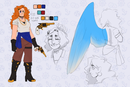

y’know generally i try to limit colour palettes to as few colours as possible to make things more cohesive but despite my best efforts only jay ended up being able to stick to that </3
ANYWAYS here’s the as-of-right-now fully updated designs for these dickheads. these will no doubt undergo even more tweaking as i draw them more but this is a start i guess. also pls open the pictures to look at them properly i worked so hard LOL
some random notes under the cut yaaaay
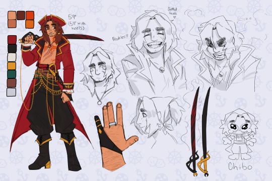
chip —
he jingles when he walks. somehow he’s still stealthy. i do not know how
kept the platinum ring that bonded him to gillion in the block! because hey he doesn’t really have a reason to take it off (and it’s a nice reminder of how much gill cares about him, and how far their friendship has come since that ice arena)
his tattoos shift and flicker like actual flames, and sometimes (harmless, purely aesthetic) sparks fly off them when he’s excited
i just think smoke coming out of his mouth when he’s angry would be cool :]
chipped teeth from biting rocks and coins all the time :/
he has scars from the red lightning, they’re just mostly contained to his back and shoulders. they’re a similar red to his coat even once they’ve healed
gillion —
the tail sleeve thing is so he can rest it on the ground without damaging his scales, he doesn’t usually wear it when he’s just on the ship because the wood is soft enough that it’s usually fine + it can hinder swimming a bit. it’s mostly meant for places where there’s cobblestone or gravel streets and such. i think his armour would probably have a version that looks similar but covers the whole tail minus the fins, maybe with some armour plating of its own. i didn’t draw it because there wasn’t any room lol
his scars from the lightning are pink mostly because red stood out too much tbh. they softly glow in the dark the same as his coral and the pink parts of his fins
also kept his ring! his hands aren’t really made for jewellery, though, because the webbing means it won’t sit very secure on his finger. so he keeps it on the same chain as the necklace he got from aslana to keep it safe
tried to make him look a bit bulkier and more his age than in my original design? i feel like i was leaning too much into the naivety and. shortness. originally lol. he also has thicker eyebrows now and i’m still trying to decide how i feel about them but i think? i like it? i don’t tend to give many character thin eyebrows so it could’ve been a unique thing for him but alas
i think i made the sword too small but like ignore that
also forgor to include pretzel </3 that’s okay though she can get her own design sheet later. she’s special like that
jay —
i believe in tall jay supremacy
blue magic! i was considering gold but that’d look a bit more like a canary than i wanted for her wings so. blue jay :]
her hair is supposed to look kinda like fire to mimic her dad ! kinda showing that even if she runs from her family and the navy they’ll always be a part of her. and also i just like drawing messy hair
i gave her sturdier gloves just because i feel like it fits her better. also changed up the shirt to more of a button up solely because i don’t like tank tops very much LOL
i did WANT to make her outfit a bit flashier to match the boys better but i couldn’t quite figure out where to Put the flash. maybe that’ll come later, the way the story’s going i might get to design some cool prosthetics for her or something
overall —
because there’s just so many fucking colours i triiied to add at least one or two colours from each of them into the others designs. jay has her necklace with each of their main colours on it, her wings are the same blue as gillions eyes, her jacket and right eye are the same dark blue as destiny’s blade, her hair is the same orange as the lighter part of chips tattoos. chip has a dark green sash under all the belts, the same as the hilt of destiny’s blade. they all use the same shades of black, gold, and brown
the only real exception is gillion doesn’t have anything from the other two because he has Such a specific colour palette and he already had so much going on as-is orz jay was obviously the easiest to do this with because she has both warm and cool colours in her palette by default lol (and i did her design last, so that helps)
#.png#jrwi#jrwi riptide#just roll with it#jrwi chip#gillion tidestrider#jay ferin#jrwi spoilers#THEYRE FINALLY DONE zoo wee mama#the lines are thicker on the little armour drawings because i did the sketch thing and then went yk what. good enough. and just coloured tha#also got rid of gills button nose it was too annoying to draw#i’m so used to straight and aquiline noses#another thing that could’ve been unique for him in terms of my character designs#but nah#pls ignore that i drew them all standing on diff planes/angles btw i wasn’t trying very hard w that#weirdly proud of myself for managing to give them all pretty unique profiles#that’s normally something i kinda get stuck on. drawing people from the side#in different ways besides nose shape
416 notes
·
View notes
Text
How to romanticise January 🦢✩₊˚☁️⋆☾🌬₊✧
Happy first week of January completed!
I know January can be one of the dullest & hardest months, especially because Christmas is over, it’s still wintery & cold and it’s back to “normality” but here are some things you can do to make January a beautiful and cozy month ✩₊˚.⋆☾⋆⁺₊✧
Embrace the beauty of new beginning’s. Have an everything shower, create a new schedule, tidy your bedroom/space, organise your work, clean, plan a glow-up/plan for the new year. It’s a new year which means new beginnings so embrace these changes. Change can be scary but it is needed and can be beautiful ₊˚⊹♡
Invest in YOU. Save up money (or use money from Christmas) to get your hair done, a new manicure, buy a new item of clothing, invest in self care products i.e - A new robe/fluffy dressing gown, skincare products, new January pyjamas etc ₊˚⊹♡
Journal. Purchase a journal and practice journaling. You can do morning/night journalling, or write about what you did that day. There are loads of Journal prompts on Pinterest ₊˚⊹♡
Wear white’s, creams, beige’s, baby pink’s, grey’s & browns. Neutral colours look stunning this time of year, especially when there it’s frost on the ground or it’s raining outside. Perfect for outfit pictures ₊˚⊹♡
Bundle up in your nicest coat and scarf and go on a wintery walk. Take outfit pictures and listen to romantic music as you walk. Bring back dead leaves from the trees and press them to create a winter journal page ₊˚⊹♡
Bake - Bake anything. The new year is the perfect time to try new recipes, maybe try some healthy baking recipes. Take photos of them and write the recipes down in a notebook ₊˚⊹♡
Have cozy movie marathons, watch your favorite comfort films under huge blankets with hot cocoa, in a cute mug ₊˚⊹♡
Heal your inner child. Listen to classical music, ballet music and movie soundtracks, to take you far away to whimsical places. Light candles, watch nostalgic movies & tv shows, read your childhood favourite books ₊˚⊹♡
Eat warming, nourishing and comforting foods. January can be one of the coldest and hardest months for your body and mind, nourish your soul with warm soups, hot drinks etc ₊˚⊹♡
Start new habits/hobbies, Yoga, Pilates, (Working out in general) Painting, Crochet. Having a new hobby means you can always go back to it in the year ₊˚⊹♡
Read - Create a new TBR if you haven’t and start it at the top. Read new books and make your way through the list ₊˚⊹♡
Try frosty “Cold Girl” makeup with beige undertones for January. Try a new lip colour or put something shimmery on your eyelids. Also, give your makeup a clean (your brushes, palettes etc) ₊˚⊹♡
Take care of your skin babydoll. Use a moisturiser after showering, wear hand cream, use a good winter primer for your makeup, always take your makeup off in the evening and never miss a morning/evening of winter skincare. This is when your skin needs it the most ₊˚⊹♡
Get a new daily coffee order/go to coffee order at your local coffee shop. Try something new ₊˚⊹♡
Try going on daily walks ₊˚⊹♡
Self care nights at least once a week (working week) and set aside Sunday’s to have self care DAY’S ₊˚⊹♡
Start a new TV series ₊˚⊹♡
Limit screen time ₊˚⊹♡
Make lists of things you want to go that day ₊˚⊹♡
#baby pink#coquette#coquette aesthetic#lana del rey#girly pink#girly#girly aesthetic#girly girl#girly kei#girly stuff#january#new year#january 2024#2024#coquette winter#coquette christmas#pink winter#winter#lana del ray aka lizzy grant#lana del ray aesthetic#snow princess#pink pilates princess#princesscore#new year new me#new year new you#new year new beginnings#dolly aesthetic#old money#old money aesthetic#christian dior
163 notes
·
View notes
Text
In which I once again combine my interests with fibre crafts. (Because I have 0 self control and get excited about starting new projects).
This time:
I decided to make a Dracula Daily blanket
I’ve always wanted to try making a temperature blanket but the year long commitment intimidates me and I’m not sure the temperature interests me enough to keep me motivated.
But! I had the idea of, this year, doing a Dracula Daily temperature/tracking blanket. For each entry, I’ll do another row on this blanket and hopefully (fingers crossed, coz I’m notoriously bad at dropping things) by the end, I’ll have a blanket out of it!
My friend suggested doing it so each character gets a different colour. I’m trying to use up the mountain of yarn I already own but I did want to stick to a very limited colour palette (inspired by the logo) so I did have to go out and buy a couple more colours for the different characters.
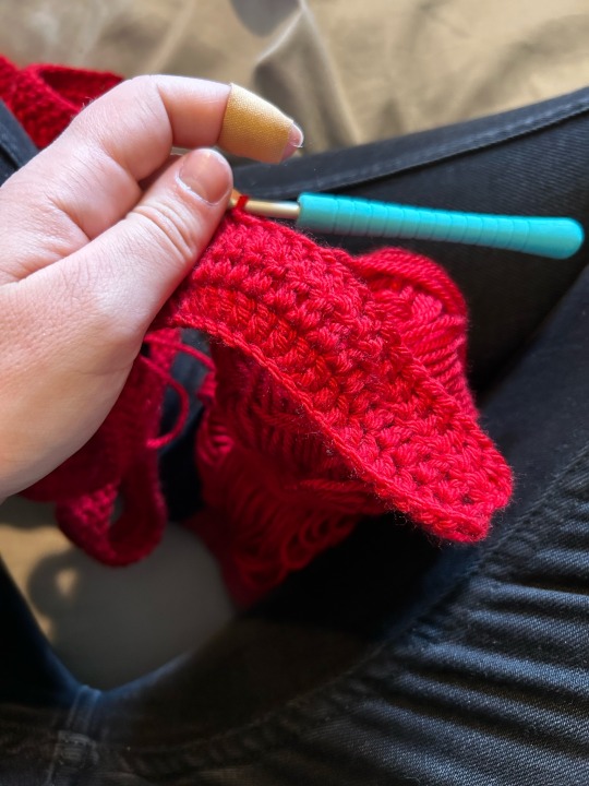
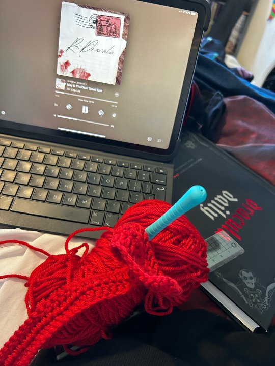
Jonathan’s colour is this lovely red yarn I’ve had for ages and didn’t know what to do with. I really like how it feels which is good coz it’s gonna make up the bulk of this month. I thought I had quite a bit but I’ve gone through this call very fast so I may have to buy some more (so much for ‘no more yarn’)
So anyways, it’s currently day 3 and so I’ve done 3 rows on this blanket so far. Here’s the in progress shots:
Through the power of friendship and counting, I reckon there’s about 109 entries which isn’t a lot for a blanket so I’m use double crochet (US terms) to bulk it up a little bit.
Rather helpfully, I managed to cut my finger yesterday. It’s not terrible but it makes it kinda uncomfortable to hold the yarn like I normally do so the last two days have been slightly slower going as I’ve had to adapt to crocheting differently than normal.
This blanket is also quite large so it’s gonna be Fun come summer when I have to have a massive blanket on my lap to work on it.
Well that’s all for now, I shall keep you updated!
#dracula daily#re: dracula#crochet#crochet blanket#temperature blanket#ish#tho for Dracula#Dracula blanket
59 notes
·
View notes
Note
hi! i'm currently taking a stab at a short comic for the first time and i was wondering — if you're willing to share — what goes into the “base” of your projects? your creative notes have been a HUGE help in pinpointing things i might want to outline in my own work before i actually start making the project, but i'm still incredibly curious about the initial work and planning that goes into the making of yours. love your art!
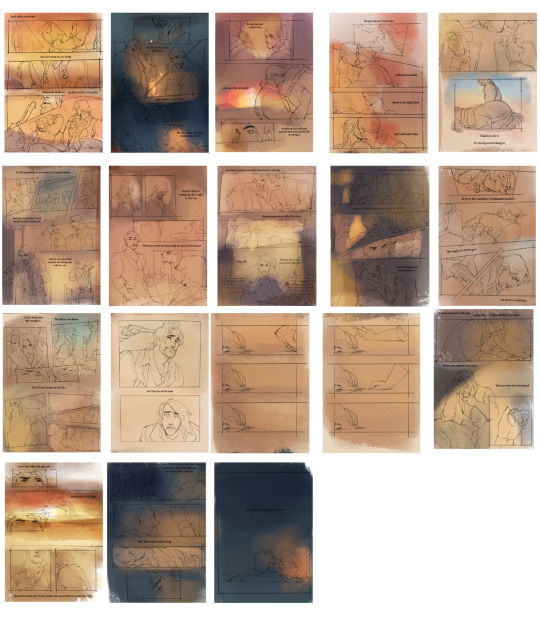
hello anon! first of all, congratulations on starting on a comic! I hope you find it very fulfilling, and a great learning experience. To answer this ask, I'm going to use bite of winter as the main example for my work process.
Text: More often than not, I start with the entire textual part of the comic finalised. This is kind of obvious, considering my comics are entirely built around it serving as a sort of narration substitute, but it stays true for comics that are just dialogue as well. Speech bubbles will always take up more space than you think. It's good to have all the dialogue finalised before you start so you can accommodate them in the thumbnailing process.
--
Thumbnails: I make thumbnails for all my comics so that I can, at a glance, see if things are cohesive. I'll often spend a lot of time at this stage, since it's also the part where I wrack my brain for smart things I can do compositionally (sometimes I go into comics knowing what sort of smart things I want to do e.g the comparison between the open grave + the empty bed was the entire inspiration behind making shallow grave).
Thumbnails are always quick and dirty for me. I know my own brain, so I always just do the bare minimum and know I'll be able to interpret it later. Here are the thumbnails I made for bite of winter.
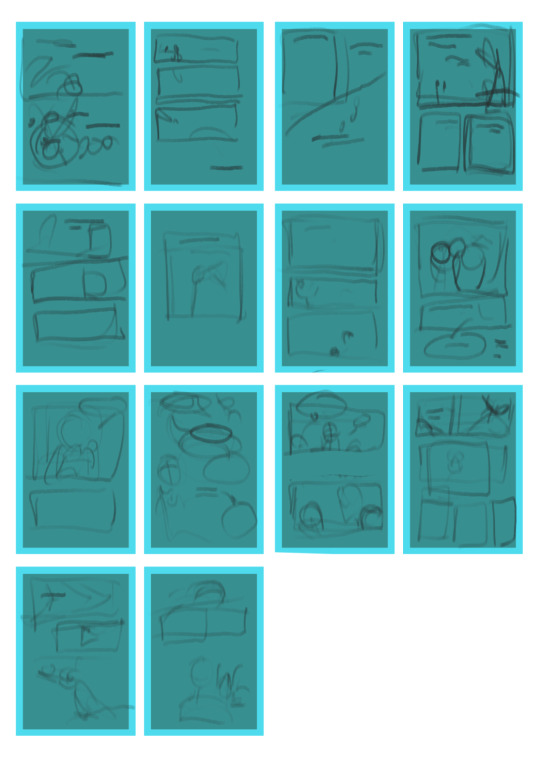
note: the bright blue border on all the 'pages' is just to indicated where i should try to keep my panels.
it's extremely shitty but it's decipherable to me, and the whole point of thumbnail is that you're hopefully saving yourself time in the future by getting all this planning out now.
--
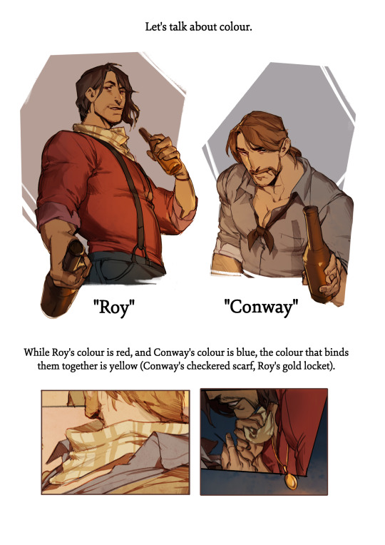
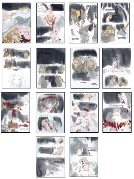
3. Colour: Colour blocks are how I plan out how a comic's colour scheme should look as a cohesive package. Although I didn't used to do this for comics, I do it now ever since I wasted around 8 hours on patchwork canary just fiddling with the colours (ugh).
I'll usually go into a project knowing what kind of tone I want to convey with it, which gives me a launchpad for what kind of colour scheme I'd like. For instance, RED, one of my best comics, only uses three colours (black, white and red) and that limited colour palette enhances the message behind it. I think it wouldn't be nearly as impactful if it was all standardly coloured - having that contrast pushes Red's impact as a significant character in the narrative by making her pop on the page.
In a similar vein, almost all of the sunset's emotional complexity gets expressed through its colour palette of red, blue and yellow.
Even though it might be more conventionally coloured with shading and whatnot, the choices behind making certain scenes darker/lighter and etc really sells the story more in my opinion.


These are the colour thumbnails I made for bite of winter. It's incredibly rough, but at a glance you can tell the comic doesn't have any particular page that is jarring or pulls you out of it.
As one more note: I'd advise doing all thumbnailing/colour-blocking at a much smaller size than the actual page is going to be. It keeps you from obsessing over fine details, and encourages you to just block in shapes and colours really quickly.
--
that's all from me for now. I hope this helped, and I wish you luck on your project. Pace yourself! Comics are more work than people ever say they are, and it's good to just take your time and enjoy the process.
368 notes
·
View notes
Note
Your art is crazy pretty and is super inspiring, if you dont mind me asking, what materials do you use for your traditional works?
thank you so much ;o; !! I don't mind at all, I love talking about this stuff
I use a small variety of things, but my big loves at the mo are watercolours and fountain pen ink!
I have a couple fountain pens I can refill with a variety of inks depending on what colour I want, and they tend to be water soluable so you can use a waterbrush to wash them out and create really nice effects. Makes it so nice and easy to make a 'painting' on the go.
For my watercolours I have a small box with 12 colours (a mid yellow, a cool and warm red, a cool and warm blue, cool and warm green, two earth tones and 2 neutral tones, and admittedly 1 white gouache for lightening and opacity) and I find these cover all my mixing needs, I find it so fun and rewarding to mix colours! Not only are they super versatile and easy to use but since they're all dry in pans and rewettable for use, they're suuper portable and easy to clean up (essential for me bc I'm lazy; if I don't make things easy for myself, I'll never use it) it's so easy to throw in a bag, keep in a pocket, quickly bring out to do a fast painting wherever I am, and throw it back in a bag without any cleanup.
I also have a very limited palette of gouache (6 colours: white, mid yellow, cool red, warm and cool blue, black (though I wanna switch this to a brown)) which is a lil harder to mix with but again it's so rewarding to mix colours right, and I don't feel like I need much more gouache. Adding white gouache to watercolours makes them almost into a gouache themselves.
For non-painty stuff I have a few neocolor 2s (watersoluable wax pastels, quite popular with sketchbookers) colour pencils, and tombow markers (also watersoluable, and also popular with sketchbookers/stationery enthusiasts lmao) they're really nice to combine altogether for a nice variety of textures! Even tho I can't mix colours with these I try to keep my palettes really limited, not only to challenge myself but so I don't go crazy spending money lmao
31 notes
·
View notes
Note
Hi Nic!! What's the thing you most look forward to doing when you're drawing/painting? I've never touched a paintbrush in my life, sorry if that's a super broad question. But say, your eye watercolours- is it trying to reproduce the tones with a limited (at least to a digital artist) palette? The initial drawing stage? Painting in the wispy lashes and brows? It all seems like magic to me!!! 😍
Hello I apologise for the late reply! Race week was busy, and I wanted to give your lovely message the care it deserves (& also I just love talking about watercolours)
That's a hard question! I really enjoy the process as a whole (except when I am complaining about it, which is an important part of the process), especially my eye paintings because they're so intuitive to me by now.
But, a few parts I really enjoy are:
1. Choosing the palette — both the actual paint palette I'll be using (I have so many), and the palette of usually 2-6 actual paint colours I'll be mixing my colours from. I'm a bit of a pigment nerd, so figuring out which paints are gonna have the perfect properties (granulation, staining etc) and mix the colours I want very enjoyable
2. The first wet wash, normally working wet-in-wet (applying diluted paint to already wet paper), where the goal is to simply place your colours in the approximate areas they should be, and let the watercolour work its magic.
Here's a couple WIP shots of my Yuki eye, in both that initial stage and the one I'm about to describe below:
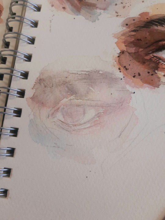
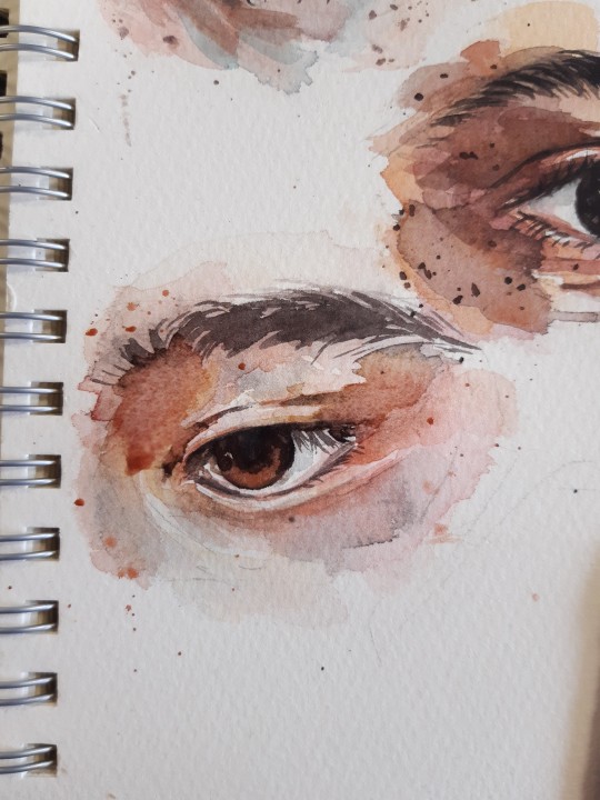
3. Getting the darkest darks in, and all of a sudden, just like magic, it becomes an eye! This is normally the third layer out of an approximate 4, and whilst I try to save the individual brow hairs and lashes until that final stage, I'll often mostly block them in here. An artist I follow on youtube, Arleebean, says often that if you feel your painting is going through the Ugly Stage, you've probably lost your values and need to get the (relatively) darkest darks in to bring it back to balance. It's a rule I live by, and that's what this stage is to me. I also get any freckles/spots/splatters in at this point, which is very fun to do too!
I hosted a watercolour workshop on eye paintings back in 2022 (and have another planned for this year), and here's a step-by-step I made of the first four stages (sketch, wet wash, mid tones, darks) in preparation for that. The final step after that would be, as you mentioned, any fine eyebrow hairs and eyelashes, which I think you can tell it's missing here

4. And possibly the stage I get most excited about, from about the middle of the painting onwards if it seems to be going my way, is posting it in the group chat or on here and watching my fandom friends and mutuals yell about it :)) Big fan of that, even if I am usually terrible at replying to nice comments :')
Here's a selection of older eyes I painted again as workshop examples, all using a limited palette of four colours (quin gold hue, pyrrol red, ultramarine, burnt umber)
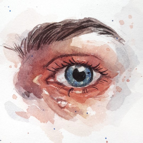
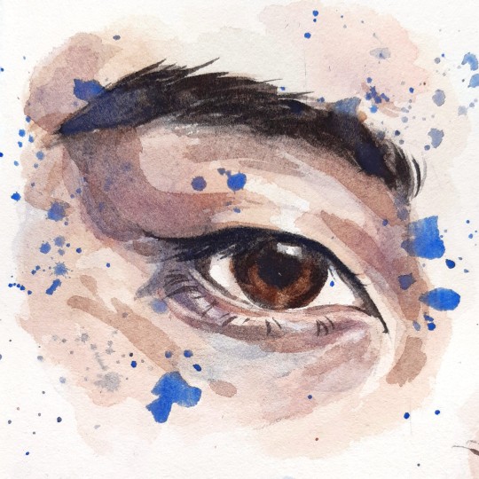
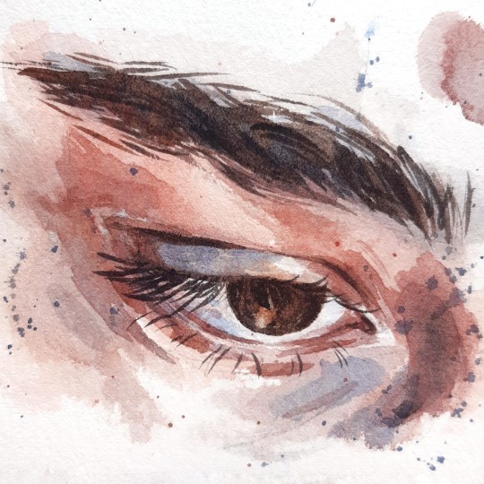
+ a selection of more recent eyes:
Thank you so much for the lovely message! I adore your art (& seriously, if you're ever in the mood for an art collab or something, you know where to find me), so I'm glad you enjoy mine too ☀
44 notes
·
View notes
Note
Hey Basil, got an AU idea that I had in my brain for a while and wanted your two cents on it.
The AU where Sif becomes aware he's a video game character in an old-ass game called "Saviors of Vaugarde" and every time they speak to the Head House Maidien, the game resets, because it's 'over'. Instead of Loop, they gain the ability to speak to YOU, the player.
"Loop" is an avatar for the player to communicate with Sif.
Oh. And worst ending has Sif use Wish Craft to enter the player's world... only to be overwhelmed by the colors. And be as small as normal.
i think this is a neat idea! not anything i have like a lot of thoughts about but i think it could be really interesting. characters becoming aware of the world they exist in is always something to play around with!
maybe im biased, but i do think itd be more interesting if siffrin was unable to enter the players world personally? but thats just a me thing, nothing you have to adhere to. its your au, im just some guy on the internet. i think itd be neat to take things from a more cosmic horror angle (this is again a product of me being biased i think) of siffrin being forced into awareness about things that exist in the players world. maybe they suddenly begin to see colours, which causes issues because their game runs in black and white by proxy of its engine (like a game boy or an old arcade game using a SUPER limited colour palette).
its fucked up to suddenly be aware of things you physically cannot process. in a game where the ending is set but, say, siffrin always remembers. and you can keep talking to them through proxy of loop. this awareness maybe starts to break the game down. until it starts to break down entirely. maybe an act give equivalent could be you as the player guiding the party through the house that is trying to run on half the code it should be, repeating rooms and failing to load areas. until they make it to the top and the game crashes before coming back up on something bigfrin-esque.
or do something similar with siffrin being booted to the real world! im not your boss.
26 notes
·
View notes
Text
RWRB costume/ colour meta!
Ok, lets do this!!
Man have I missed writing costume/colour meta, so its good to have something to write about again! This took me far far longer than it should have - I kept getting distracted by the film while I was working on this - I'd go looking for a clip or to grab a still and end up just watching the film again 😂😂😂 but I've finished it and I hope you all enjoy it! Grab a beverage of your choice because this thing is a beast coming in at over 7000 words - I totally understand if you want to skip, but I have ADHD and do not know how to be concise 😂😂😂
Red white and royal blue employs several fun and interesting costume and colour theories (also made use of in the set design) to help tell the story of Alex and Henry. I’m not going to write a detailed meta for each costume - I just don’t have the time - but I am going to look at some costume/ colour details in focus, especially for Henry and Alex as well as highlighting other interesting choices! I also do not have the picture limit (I need more than 30!!!) to include every image I would like to, so if you want to see what I'm talking about, you might have to go check out the relevant scenes (I'll try to give you timestamps where I can!) I’ve kind of tried to do things chronologically, but I’ve left Alex and Henry to the end so if I don’t talk about them very much in the rest of this meta - that is why! putting it under a cut because its so long!
The royal Wedding
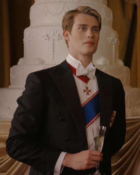
There are a couple of key themes here, the wedding party (consisting Lady Martha, Bea and Henry) have a distinct colour palette - dusty blue, dusty pink and Ivory, with the exception of Prince Phillip who is in his red Dress uniform - they’ve used a red uniform to make him stand out, convey that he is more important than the bride (what with his being in line for the throne and all that jazz) and hint at power - red is a power colour.
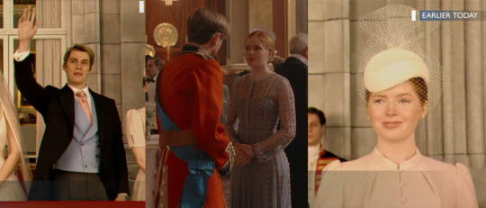
I’m not sure what royal orders the collar and riband that Henry is wearing are supposed to represent as they don’t belong to a specific British order - if I had to take a punt I’d say his red collar is meant to be a AU version of a Knight Grand Cross of the order of the bath but the one he’s wearing certainly isn’t a real order in the UK (it isn’t meant to be an order of the garter as that is the highest ranking order and Henry would then also be wearing the light blue riband we see on Prince Phillip) the royal blue riband with the red edging is more i line with the night grand cross of the order of Victoria, although in real life that riband should be for in the opposite direction. My feeling is that they wanted a red collar on Henry to play into the red as a symbol of power theme they’ve used on Prince Phillip, placing Henry as having the ‘power’ in his conversation with Alex (as he is on home turf) and the royal blue sash is a deliberate choice that I will talk about later when I focus in on Henry and I think its actually pretty significant as a choice. essentially the order insignia he is wearing are not real orders which is totally fine as this is essentially and au royal family!
We do have to talk about that wedding gown - not royal in the slightest - spaghetti straps and a low back would never be allowed for a royal bride, the dress is also too long on her (but that’s a different conversation about budgets and rental gowns so we’ll let it slide here!!) and her hair should also be fully up - not in the half up do she has going on! The colour is also wrong - she would have been tied to a very limited colour palette of white or ivory - no colour in a royal wedding gown, so the blush colour we see is a no go! I totally get why they did what they did with her gown in terms of colour and I’m fine with that choice (i’ll explain more in the next paragraph), I even get the fairytale princess look they were going for with that dress - but when you’re trying to portray a family so stuck in tradition and history etc, I can’t help but feel that they missed a trick to show her as buttoned up, conforming to the crown etc, especially as we never see her again!
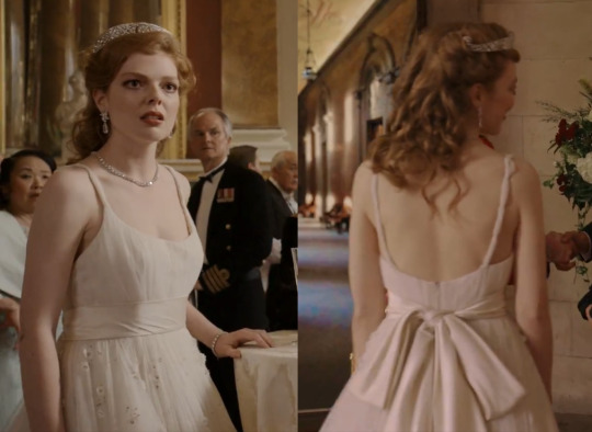
At the reception we see pretty much everyone in colour of some description, with the exception on Alex and Nora who are both in black - this is why Lady Martha’s wedding dress is a pale blush pink colour rather than white. The only reason that the men aren’t in colour (if they’re not in dress uniform) is because they are wearing white tie for the formality of a royal wedding, otherwise I think we would’ve seen coloured ties or some such on them. This is intentional because the room has a general (muted) wash of colour which serves to highlight Alex and Nora, making them stand out and look like they don’t really belong.
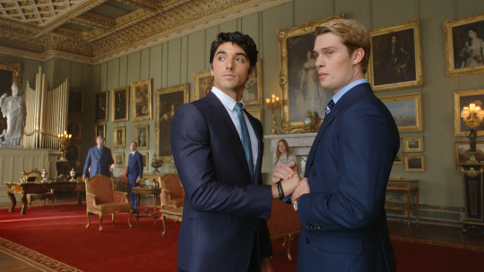
Its a way of creating a them and us vibe and helps to establish the rivalry between Alex and Henry - we have a British scene, full of colourful clothing and the only identified foreigners are in black and white. We actually only see a black and white colour palette for the clothing of the Americans until Alex returns from his PR fix it trip to London after cakegate, while nearly all the Brits all were colour of some description - we can see this clearly in the hospital - all the children in colour, Henry in blues and - Henrys security in coloured ties while Amy is there totally in black.
Alex himself does wear navy blue but its a dark navy and that jacket is actually two tone - black and navy and its paired with black trousers in this scene - we see it again later - paired with taupe trousers which really helps to establish this idea of colour entering Alex's world once Henry is in it.
Sets
I’m going to pause on clothing here to quickly talk about the sets in the film and their colour palettes because they fall into three distinct categories;
We have the sage dusty greens, gold and bright reds of the British spaces - they have a regency and victorian air to them, all very traditional, opulent and royal in feel - they are the definition of a gilded cage and are ostentatious and Henry’s bedroom even fits into this mould (its very telling that we only see very limited physical intimacy between the two of them in this space - because its a space that neither of them truly fit or belong in) with its sagely green walls that echo the green walls of the state room the big royal family showdown occurs in.
Then we have the creams, taupes and beiges (with a bit of minty green for the walls of oval office) of the America spaces combined with the very intentional colour choice of that rusty orange (there is also the red room but that is a whole other conversation - I’ll go into it later).
The Rusty orange is such a colour choice, its rich and eye-catching. All colours have meanings associated with them - these can vary wildly depending on where and how they are used and have both positive and negative connotations.
Generally speaking, orange is an attention grabber - its energetic and stimulating, but it also conveys transformation and endurance. This orange has brown undertones which means we should also reference brown colour meanings when thinking about what the colour means on screen - brown is a safe colour and it is also strong and reliable, but it can also portray a sense of loneliness - that is something I think is a really interesting concept - we see Henry in Alex’s world (through the text chats as well as in the first blowjob scene) on the rusty orange sofas and one of the underlying major parts of who Henry is, he is enduring like the orange (and his royal status make him an attention grabber without needing to try) but there is that underlying sense of loneliness - yes he might’ve had a crush on Alex since the climate conference, but as soon as the air had been cleared between them during the PR trip Henry reached out and pursued Alex because he was lonely and wanted a friend - not knowing if it could ever be more than a friendship.
Then, finally we have the spaces Henry and Alex occupy - spaces which are just theirs to occupy - spaces when they are themselves - these are predominately yellow and blue spaces, with some deep colours such as the teal we see on the walls of Alex’s room and the red room.
I’ll go into more detail about all the yellow and blue in this film a bit later on in this meta, but to provide a comment on the red room - red is a colour of passion and love, but this shade of red they’ve chosen maintains that orange undertone we see in the rest of the American spaces.
I wrote a post on the choice of red calla lilies and how they are both a symbol of love and commitment, as well as a phallic symbol of sexuality, and I know Alexander Hamilton was on the wall in the book, but he is there not only because he was very likely bi, but also because he was the subject of what is known as the first political sex scandal - something our boys are essentially also themselves going to end up becoming!
Once Alex does return stateside we start to see colour begin to fill his world. This is a really interesting thematic choice - think how the wizard of Oz (a film very much associated with gay culture - ‘a friend of Dorothy’ was a slang code used by gay men to identify one another and there is obviously the rainbow connotation) begins in black and white and then transitions to colour as soon as Dorothy wakes up in Oz. This film is playing on that same trope/ concept - this is a story essentially told from Alex’s perspective, so Henry and his world is already in colour - its only when Alex enters that world and becomes entwined with it that colour starts to seep into his life - its done in a much more subtle way, but it is there - even during the text bantering they have going one while he is watching a film with Nora - it is a black and white film (‘Some Like it Hot’ - its self a film that helped open conversations about queer identity and the queer community at a time when the Hays code was still in operation and when Sodomy laws still existed in the US, but that is a whole other conversation and lots has been written about it before, its one of my favourite films and if you want to know more then head to your search engine of choice or hit up my inbox! It’s also a film our director Matthew Lopez adapted for the stage which is possibly partly why it was chosen for this scene- as a nod to his other work!)and they are both wearing grey while Henry is in colour (cream and blue - playing into the queer coded yellow blue theming) and sits on the bright orange sofa.
I cannot tell you how much I am in love with the Koi carp on Alex’s dressing room wall because the symbolism - the symbolism!!!!! Koi are seen as a symbol of strength, patience, perseverance, love and bravery they symbolise success through courage. Koi are known to swim against the current and overcome great obstacles - there is a Japanese proverb ‘Koi no Takinobori’ which translates as 'koi swim up waterfalls' and as the word Koi in Japanese also translates to mean love the proverb therefore means that love can go against the current and overcome great obstacles and if that isn’t the perfect metaphor for Alex and Henry’s relationship then I don’t know what is!!
I am obsessed and I adore the set designer for including that wallpaper in general, but especially in their text banter flirty developing relationship - the writing is essentially on the wall for where their relationship is going and how its going to unfold - they are literally Koi swimming agains the current and overcoming great obstacles to be together!!
Back to the costuming!
As I said previously - when Alex returns from the PR trip we start to see increasing amounts of colour and it starts with blue - Oscar is wearing a blue shirt - a colour we only see him in for that scene and then again at the end of the film - during election night. Its an important choice - Henry's colour is blue - its the colour we nearly always see him in some form of blue so for this to essentially be the first colour that appears in the clothing in Alex's world is telling in its own way - it is the beginning of the slow saturation of Henry in the world of Alex. Oscar is always in tan colour-ways apart from those two scenes and generally speaking we see him wearing Mexican tribal and geometric prints/patterns and cowboy boots - playing into his Mexican heritage, but also establishing him as Texan.
Miguel is clearly set out as the baddie to us all - head to toe in black all the time expect at the PM dinner - when he has to wear a white shirt because its etiquette - but they do make sure to give him black buttons on that shirt - which separates him from everyone else in dinner dress very clearly and keeps the undertone of untrustworthiness going.
The other thing to note is the grey fuzzy jacket he wears when being interviewed on the news. I’ve spoken before in my 911 meta’s about how the use of the grey fuzzy patterning is symbolic of confusion or obfuscation and that holds true here - Miguel is called out as being the one who hacked and leaked the emails by the presenter and he tries to bluff his way out - to obfuscate the truth.
We see the idea of green and jealousy play out a couple of times in the film - the flirty girl that tries to commandeer Alex and kisses him at the NYE party is wearing a very blatantly iridescent green dress which sets her apart from the rest of the crowd and then when the crowd drops low we also get the green lights on the DJ desk - while the scene is a play on the I saw you across a crowded room idea, there is also that undercurrent of jealousy - Henry is Jealous of Alex’s ease and that he cannot have him loudly and in the way he wants - highlighting that jealousy helps to build into Henrys later actions when he throws caution to the wind and kisses him under the tree.
Ellen Claremont has a narrow colour palette as well - we only see her in black in that first scene and in the ‘new Texas strategy’ arguement with Alex, after that her dominant colour is cream and we also see plenty of red which is a power choice - she wears it in scenes when she needs to convey power and status such as at the PM dinner or when she is shutting down his Texas strategy. The cream is the base colour for her - its a colour of elegance, sophistication, it is also a neutral colour - playing into her position as POTUS, but also when she wears it in one on one scenes with Alex, it is a sign of her being a mother rather than the POTUS.
Zahra tends to wear blacks with one blue/grey cashmere jumper and when we do get colour on her they are jewel tones - purple and teal. We also get some more grey fuzzy patterning - again playing into my previous statements - here it is very much about confusion rather than obfuscation - she only wears the fuzzy grey when she finds out about Alex and Henry and has her mind blown by the knowledge. Its a perfect costuming choice for this scene as it conveys so much about where her brain is - that her mind has been blown by this huge thing she as just become privy to and it helps make her facial expressions even louder!
Nora wears a full spectrum of colours, the stand ones are obviously the red bodice and trousers she wears for new years and the pink shirt she wears in the office when Alex is having a mini bi panic and figuring himself and his attraction to Henry out. Generally speaking a characters costumes are meant to be about them and their own character, however with a film like this, everything is a driving point for the two main characters and so, other characters costumes will, at key points be less about the character wearing them and more about driving the story of the mains forward - this is very much the case with Nora’s red outfit (and we have already talked about the green of the flirty girl at new years representing jealousy).The red is very very red, it is meant to stand out and is a nod to romance - for both herself with Pez and for Alex and Henry, but Red is also a colour associated with passion and sexuality as well as fire and heat - essentially it is a marker that things are about to kick into action on the romance scale - we are heading from friends to lovers.
The pink shirt plays into the same theme - its a continuation, but a cooling down - less about the heat and passion of a sexual encounter, and more about the concept of romance and relationships - because that is what the conversation is ultimately about in this scene. We have the bi flag background helping to visually tell us what the conversation is about, but we also need to have that subtle reminder that this is not about fire and passion it is about the potential for romance - for love - because if Alex is going to hook up with Henry, it isn’t going to be a hook up, it going to be real. We do of course see things heat back up in the red room (as they should), but ultimately that is the last of the fiery heat we see - from then on anything connected with Alex and Henrys relationship is much more steadfast - the blues and yellows I will talk about in a minute!
Lets talk signet rings!! We see them worn on the male members of the royal family - so King James, Phillip and Henry - as well as Alex when Henry gives him his ring. their use is telling and significant. James and Phillip both wear their signet ring on the little finger of the right hand, while Henry (and Alex) wears his on the little finger of the left hand. in a general sense one would usually wear a signet ring on the little ringer of the non dominant hand - so if you’re a lefty you wear it on the right hand and vice versa if your right handed. This is not what is being portrayed here - all three of them are naturally right handed (yes I did spend far too much time on google to find this out!!) which would in theory mean all of them should have their rings on the left little finger and yet only Henry does.
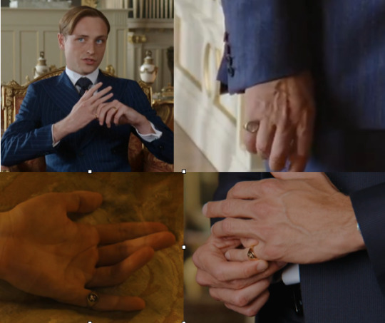
There is however another explanation - a ring worn on the right hand is symbolic of tradition conformity and rigidity and royalty (traditionally the monarch would wear a ring on the right hand and this was offered to subjects to kiss), wearing it on the dominant hand as a sign of power/ dominance. Henry and then Alex wear Henry’s ring on the left hand - the traditional hand that wedding bands are worn - because of the concept of the main artery running from the heart down the left arm and into the left hand, it is a symbol of love and life and connection to another person and is where the concept of the red string of fate comes from (which ties in nicely with Alex referring to the rope in his chest pulling him towards Henry). This all gains greater significance when Henry gives his ring to Alex and that he choses to also wear it on the left hand, its essentially a symbol of engagement and eternity - it is a sort of pre engagement I guess - and is a low key statement from Henry he is giving Henry Fox to someone for eternity - to Alex.
Right, shall we talk about the yellow and blue theming that I keep mentioning. This specific theming, tends to be seen more in sets and lighting than costumes - although we do see it used in costuming too (looking at you Bea!!). For those not aware, there is a tendency to use yellow and blue colour-ways for queer story arcs - if you look at Heartstopper (esp s1) they have been using it to great effect , and it can be seen in other shows and films with queer character arcs to such as 911 (and Lonestar), as well as plenty of other mainstream media if you’re looking for it. I don’t know when or how it became a colour way associated with queer relationships - especially mlm relationships - I’ve not had the time to deep dive into that particular research spiral - but suffice to say we see it put to very very great effect here in Red White and Royal Blue - we only ever see it used as a colour way when it is regarding Alex and Henry and their romantic relationshipI’ve included some of the blue and yellow we see (couldn’t fit it all in - 30 pictures is apparently not enough!!!) surrounding Alex and Henry and there is plenty of it. The first time we see this yellow/blue theming come into play is at the turning point - when Henry opens up the lines of communication with his text message. Alex is in his room - the first time we’re seeing into his room - a room painted dark blue and full of yellow accents - the lamp on his desk and the unit to the side of the sofa, as well as the very yellow and blue painting we see above his bed (which was commissioned for the film and so the colour choice was very much deliberate). Just to show how prolific the yellow/blue colour way is here is a list of most of the occurrences - I've tried to include as many of them in the pictures as I can as well.
The copy of People is yellow and blue, the Jacket Alex wears for new year has gold and blue embroidery. The PM’s dinner has blue lighting with gold curtains and there are a lot of blue and yellow dresses being worn in the crowd when Alex is watching Henry. The cushion on the sofa behind Alex is yellow and blue. Then we get to the French hotel room and the Eiffel Tower - it is literally all yellow and blue - everything - even down to the blue (extra safe) condom packets. the New York hotel room is dark blue and gold another is a blue bottle of lube on the side (the condoms and lube are very much a deliberate colour choice - there are a million different colours you can buy both in so if the colour wasn’t important they could’ve chosen any, esp as fuchsia and red is the most common colour for both in the durex brand in the UK).
In England - Henry mostly occupies green spaces - in keeping with the royal theme I wrote about earlier - however the room he is most himself and most comfortable in is the music room/ library which is yellow and any time we see him in that space, he is wearing blue. It is telling that when the emails between Henry and Alex are hacked, his sanctuary is full of ‘old white men in suits’ and Henry cannot go in there - symbolic that who he is - his true self - has been violated and he is being forced into ‘royal coded’ spaces - back into his box as it were!
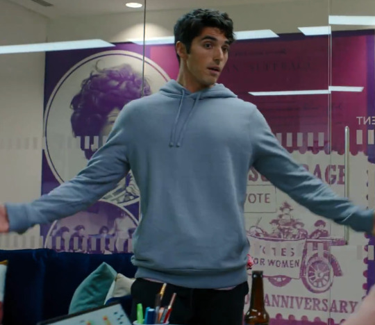
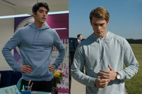
Back to costumes and he two blue hoodies. I’m gonna get a bit of hate for this, but the blue hoodie is actually two different hoodies! - they are slightly different shades of pale blue - Alex’s is much more dusty blue, while Henry’s is much more baby blue, they are also different cuts - Alex’s a traditional sleeve cut while Henry’s has a raglan sleeve cut (think baseball tee). There is the idea with these two hoodies that they are at different points in their journeys, but still connected and i love that we see them in them at really key points of crisis - they are a comfort blanket in a way - Alex wears his during is bi crisis and again when he's watching Miguel on the news and figures out who the hack was, while Henry wears his when he lets Alex in - when he opens up and unspokenly confesses his love for Alex, when he agreed to take the step and be brave - both are wearing these hoodies in moments when they need/want comfort the fact that they are wearing such similar hoodies speaks to the fact that in it is the other they want that comfort from (even if Alex doesn't actually realise it during his min bi crisis).
And now to our two mains - lets start with Henry.
Henry
The bulk of Henry’s wardrobe is double breasted suits - a key theme for the members of the royal family - not one else where’s them - its a fun costuming choice, cease generally speaking the double breasted suit isn’t in fashion at the moment - the film fit single breasted suits we see on the rest of the characters is. It's a very clear choice to create a them and us concept in a visual and telling way. the other thing to note about these db suits is that only Henry wears plain fabric - the ones we see on Phillip and James are pinstripe or woven stripe. I want to quickly mention the tie King James is wearing because of its very obvious pattern. it is the only loudly patterned tie in the entire film - all others are either, plain , striped or spotted. In the book Henry says that patterned ties are considered too political (i'm paraphrasing and can't find the actual quote!!) and here we have a king playing with politics wearing a patterned tie - I love tiny nods like this to the original source material that only those of us who love the book will pick up on - its just a tie to the ga!
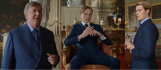
Henry himself wears pinstripes - when he is at his most royal - so for example when he is taking part in the PR exercise post cakegate. His ties also fit into this theming - he almost exclusively wears striped ties excepting at a couple of key moments - when he’s undertaking skulduggery and the yellow one he wears for the election. at all other times he has stripes on his tie. the stripes get wider or skinnier depending on the situation - the wide ones tend to be for royal events while the skinnier stripes tend to be connected to Alex.
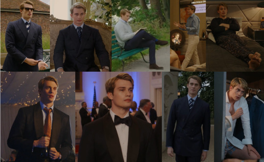
Another thing to note with Henry is the lack of black he wears - the only time is at the most royal of occasions - the wedding - all the rest of his suits are varying shades of blue or grey (and cream) even the tux he wears to the PM dinner is a dark navy with black lapel rather than black - it differentiates him from everyone else in the room (esp Miguel) and shows him as the object of Alex’s gaze. I also want to mention the royal blue theme we see on him - something I love Keith Madden for doing - Henry nearly always has something blue on him and a lot of the time (especially connected to times when he is doing something connected to his status as a royal) we see him wearing something royal blue - its why his riband at the wedding is royal blue rather than the lighter blue of the order of the garter - but we also see it in the royal blue socks we see him in several times, the royal blue pyjamas when the hack/leak comes to light and the blue shorts in Texas when he’s lying on the bed before he leaves to return to England. We also see him in a lot of blue shirts keeping that blue theme connected to him.
Then there is my most beloved check theory - (its a theory connected to 911 for those who don’t know my costume metas already) Check is connected to foreshadowing of trouble - Henry wears a check/plaid pattern at a couple of very very key moments - at the bar in Texas - when we see Alex realise his love is the forever kind, when he is back in England having broken his own heart in a misguided attempt to save Alex (gingham shirts in pink and blue) and then the suit he wears when he choses himself over the crown and steps out onto the balcony with Alex to greet the crowds has a subtle check pattern (not sure if you can see it its the pictures but if you watch the scene you should be able to) all of these are moments which foreshadow the upcoming or current trouble in his life.
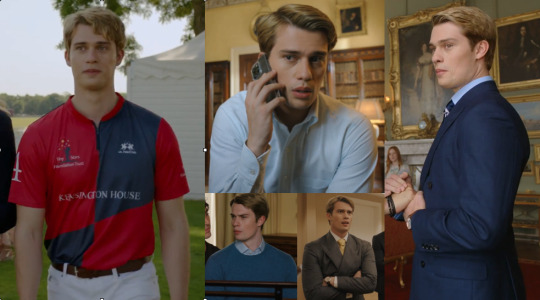
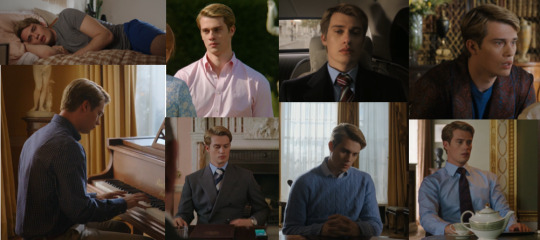
Yellow roses - symbol of Texas being flipped - from Mexican to independent (and eventually becoming part of US) - symbol of the fact Texas is about to flip blue from red. Yellow roses are also a symbol of good luck more generally and the yellow tie is a great choice to suggest neutrality in the election scenes (at this point in time Henry still has royal status). We see Henry in a grey suit with this yellow tie - this only further highlights his escape from royal life - when he is un the US we do not see him wearing the navy blue suits we see him in in England - the only exception is the dark navy dinner jacket he wears to the PM dinner . In the US he wears either a grey suit or the cream/light blue suit we see him in when he visits the lake house and the light blue linen jacket we see him on his light back to the UK is the only single breasted jacket we ever see him in - I would have loved to have seen the grey suit at the end also have been single breasted, but I'm guessing budget constraints prevented that from happening, as it really would've highlighted the difference between Henry George Edward James Hanover-Stuart Fox and Henry Fox!
At the lake house we get a piece of costuming that I love - the slightly differing short lengths we see on Henry and Alex - it Alex’s shorts are always shorter than Henry’s - it maintains that sense of Henry be more closeted and buttoned up - the overhead shot of them on the pontoon shows it really clearly - the two of them have similar leg lengths which serves me well here to show this point - the shorts Henry is wearing are at least 3 inches longer (possibly more) than Alex's - it isn't just that one pair of shorts - all 3 pairs of Henry's shorts are longer - its a costuming choice thats s perfectly in keeping with their respective characters.
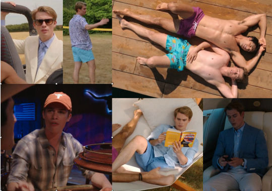
The final thing to talk bout is Henry’s rainbow turtle swim shorts - a cute nod to his being gay - especially as Alex is is his purple bi swim shorts. But there is also the fact that they are turtles. Turtles are a symbol of steadfastness, longevity, perseverance and transformation. they can also be seen as a symbol of everlasting love. there is also the concept of carrying the weight of the world - which is seen in its most explicit way in Terry Pratchett’s Discworld novels - where a giant turtle carries the world on its back. All of these metaphors and symbols perfectly fit Henry and his relationship with Alex - it is a symbol of the enduring nature of their love for each other, the perseverance we will see for them to overcome the obstacles thrown at them, the steadfastness of their love, as well the transformation we are seeing Henry go through - from closeted gay thinking he has to conform to the very rigid and dated ideals of his family - to the freer Henry we see in the US - the real Henry and the version of himself he so desperately wants to be but thinks he can’t - he has the weight of the world on his shoulders at that moment a la the disc world turtle.
Alex
Alex, obviously has the largest number of costumes, as well as the largest colour palette, but even that is pretty limited. In the same way we see Henry’s wardrobe go through a subtle transformation, we also see the same for Alex, almost in the opposite direction - while Henry’s wardrobe becomes freer, Alex’s becomes more grown up - more mature and conveys his growth as a person - becoming more certain in who he is. I’ve already written a fair amount throughs this meta about Alex’s costumes, so this section is a little shorter than Henry’s for that reason!
We get rebellious Alex to begin with - the leather jacket easily conveys this to us, its almost a universal symbol or rebellion in costuming speak at this point and one of the reasons I like its use here is that it very quickly sets him apart from everyone else in the film - yes its early on, but he is the most casually dressed character by a long way - and this jacket it the antithesis of the buttoned up penguin suit from the wedding - it emphasises how uncomfortable Alex was in that environment and as a result gives the heavy drinking we saw before the cake went flying purpose and visually sets him up as the lead and as a rule/ convention breaker. The same is true of the greyscale with leopard print Hawaiian shirt which is meant to contrast him dramatically with Henry, who is still stuck in that stuffy double breasted suit prison of convention and expectation to behave a certain way - the costuming does a big chunk of the work in giving us rebel v prince in those opening scenes. I actually like that they brought the leather jacket back for the drive to the lake house - it sets up Alex’s falling in love arc nicely - in that it allows the idea of rebellion to continue flowing through the story - Alex wanting to be outing proud in Austin and not grasping that that isn’t an option Henry at this moment in time and is a nod to his not really understanding the different places he and Henry are in when it comes to what being out means for them respectively.
I’ve already written about the black and white colour way we see him in until his PR stint when we start see colour appearing in his wardrobe. I’ve put the pictures roughly in chronological order because it helps to show his progression, but it also shows the increasing amount of blue in his wardrobe, especially in moments connected with Henry.
To pick out some of my favourites - the Mexican pattern shirt with the red cardigan is wonderful - we have the shirt hinting at Alex’s heritage - in blue with the chunky knit red cardigan - I’ve written above about the use offered as a colour of passion and how that passion ebbs and flows - this cardigan also plays into that idea - it is the first time their texting becomes flirty - even the text message is in a red bubble on screen. This idea carries on with the orange red tee he is wearing during the turkey conversation - I made a post about that outfit being the same colour way as the turkey in question and how to talk turkey means to talk honestly and openly with someone - the very thing we see in that scene.
I adore the subtle yellow and blue jacquard embroidered New years jacket - the moment our boys connect and we move further into the lovers part of the enemies-friends-lovers trope and it keeps the yellow/blue theming an active part of the storyline. - the contrast with Henry’s orange tie is a choice - while there is a lot of colour at the NYE party Alex blends into the background while Henry is quite literally tied into the orange theme we’ve already seen in the furniture and sets - orange stands out and now we the audience are being drawn into unconsciously making the same connection that Alex is making - Henry is lonely, but he is an enduring and attention grabbing part of Alex’s life - it only further reenforces the direction of Alex’s gaze - green wearing flirty girl who??
We have a fair amount of Alex and the bi colour ways and we subtly see it coming into play from more or less the moment they start messaging - the light purple tee and purple message boxes, flowing through to the women sufferage wall and the fact he is wearing blue and purple in that scene with Nora in pink to round out the there colours. then we have the blue and purple colour ways he wears at the lake house - bolder and brighter - contrasting with the more muted shades from before - showing that he has recognised and accepted that part of who he is - he’ now out and proud and his parent know about him. I’ve used the old subtle a lot, but this is yet another example of transformation and growth for a character done subtly through colour. We also see him bathed in bi lighting at the bar when he has his 'OH I feel forever about him' moment at the Texas bar - he is the only one in that whole scene lit in that way - Henry is blue lit, while there is a more general lighting scheme that is blue/red dominant for the bar as a whole.
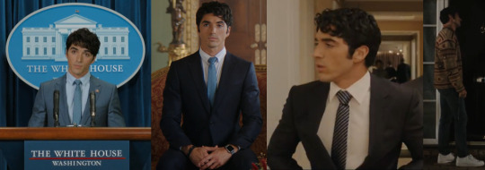
On to Alex’s suits and ties - he seems to have 5 suits and a jacket (not including the formal wear - tux and tails) a black one, 2 navy blue ones (one with a woven pinstripe that he wears in Paris) a bright bluish grey one and a grey one along with the black and blue waffle jacket we see him wear both on the PR trip and at the Polo match. I am obsessed with the fact that when he is in England he wears the navy suits and jackets whereas in the US he wears the other colour s suits - in the same way we see Henry less buttoned up and wearing grey and lighter blues in the US, here we see Alex fitting into Henry’s world and the navy blue suit uniform of the Royal family - its a wonderful piece of costuming that tells so much of how each of them are fitting into the others worlds, especially wen the black and navy waffle one is only worn early on - it is the cross over garment!
The ties have a similar story to tell - we see him wearing 4 ties - a yellow one we see in the beginning in the news reel and never see him in again and then we get the lighter blue striped one at the polo match - the one most similar to the striped ones we see Henry wear - suggesting he is trying to fit into this new world - Henry’s world - that he’s been invited into - its somewhat jarring for his character and plays on the idea of trying too hard - its therefore telling we don’t see it happen again - we only see hi in a striped tie again at he end during election night and accompanied by the black suit we saw him in a couple of times on the campaign trail in Texas. the blue tie is the only other tie we see him wear and it nicely connects all the key moments he has while in his suit - key political moments - his speech at the DNC followed by his speech to the press after the email hack and when he is at Buckingham Palace facing up to the King.
The final ting to talk about is the khaki green shirt jacket - I cannot tell you how happy I was with this costuming choice (and not because it was screaming Eddie Diaz from 911 vibes) khaki is so associated with military - with the army - anti is the most perfect choice for this scene - army are about war - they go somewhere to fight - to storm the palace etc so to have Alex - who has never worn anything remotely like this before rock up to KP to fight for his relationship - for his love - is the perfect choice, its a subtle yet clever way of emphasising the Alex has chosen to fight for what he wants - for his relationship with Henry and what makes it more telling is that we only see him change out of it once Henry has explicitly stated that he will try to be brave and that he wants history to include his love for Alex. It is why we see Alex in the yellow and blue Mexican patterned jacket - he no longer needs fight for his love because he has won - this yellow/blue jacket is a piece of costume tied into pivotal moments - we see the jacket twice - when he wins his bid to get the Claremont campaign to focus on Texas and Ellen tells him he’s going to Texas, and again when he has won the day with Henry and they are back together - in some ways that makes this his victory jacket - victory in his own personal battles - battles that are central to who he is and his development and I think that’s petty neat!
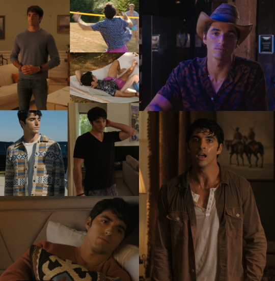
Hopefully you've enjoyed this deep dive into the sets and costumes of the film - I've loved writing it and I can only hope its coherent! Feel free to hit me up with any questions or comments and likes and reblogs are love ❤️🤍💙 thank you for reading and until next time...
#this really is a monster post!!!#rwrb meta#red white and royal blue#alex claremont diaz#henry fox mountchristen windsor#rwrb movie#first prince#costume meta#set meta#meta#long post#kym costume meta#costume theory#colour theory#colour theory meta#kym writes meta
177 notes
·
View notes
Text
CONCEPTS AND RAMBLINGS | "animal" cult pmv extras
thank you everyone for liking my pmv (and on yt and twitter) !! i got more attention than i thought it would and that means the world to me! <33
here’s some of my concept art + rambles for it!

the first thing i made up, the character designs!
i didn’t think to refine them because they were good enough to use LMAO... so i scribbled colours down, threw a filter and called it a night
i wanted a sharp change from the verses and chorus (since the song goes from calm to... louder) so i made it greyscale (with a red filter) that changed to brighter colours!
also changed the text font/colour for ignacio hmm. the font was hard to read, in my opinion.
ignacio's design
ignacio loses his bandage colours because that was too many colours for my liking… i completely forgot his hair highlights tho
ah and he doesn’t get a mouth until the fire scene too…
it was only meant to be done for a few frames but i thought it be cooler if it was consistent.
the missing mouth represents his repressed feelings/silence, or something like that.
skidad's design
i got a few questions on whether skidad was a goat. despite looks, skidad’s design is actually based on the herbiadean/jacob sheep! four horns!
i have drawn skidad as a jacob sheep before as well!

look at them ominous friends.
the resemblance to goats is something i considered as well (links with cult/sacrifice) so i think of it as a fun bonus
i gave him wolf teeth because the whole “wolf in sheep’s clothing” but also because i like it when prey animals are given predator features
i left the body as "human" because i only wanted the face to be censored… i considered clawed/darkened hands too but nah
skidad was originally going to be lined like ignacio, but i liked the lineless look for him so voila! makes it feel like he’s “not bound by anything”... actually, this is the same reasoning for the match to be “out” of the border, even though it’s ignacio’s hand
storyboards
i rarely storyboard (most are locked in my mind) but i figured it'd be fun to try!
halfway, i got bored of drawing digitally so i moved onto my notebook. i think it was a good decision; since i drew with my ink pen, it forced me to move on with my mistakes instead of clicking "clear canvas" lol
i had a pretty solid idea of what i wanted after weeks of listening to the song over and over again. the only thing that really changed was the mirror, which was replaced with a shadowy ignacio
the coloured thumbnails i actually did first, just to figure out out what i’m doing for the chorus part… limited palette my beloved
i didn't know where to put the text so i was scribbling everywhere lol

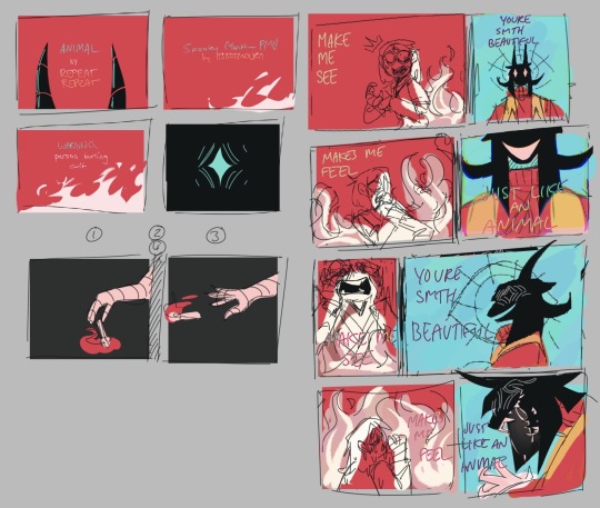
ratio changes
in the chorus, the ratio of ignacio and skidad’s frames changes! it’s more obvious if i combined them together, like this
less for ignacio, more for skidad


did you notice that the fire in this shot look like the cult ?!!! why did i do that, you ask? well:
the fire is the same “red”as the robe
too lazy to draw fire without abusing motion blur
mmm symbolism idk. it's somewhere there
it wasn’t in my plans but i’m happy i made the choice in the last minute. this was the last thing i needed to finish before syncing it up with the music

also this… i just wanted to point it out… make sure everyone knows... did you notice this? did you? did you did you? well now you do!!!
that's it !!! that's your trip into my mind!! okay byeeeee !!
#even though i gave my own reasons; i welcome any other interpretations!#/gen !! i'm very interested to hear! throw an ask or in the reblogs!#[ mourn's mourns ]#[ the art of mourning ]#spooky month ignacio#spooky month skidad#not apologising for the absolute chaos of my writing... its rambling for a reason........ /J LOL#i won't be free from skidad videos ough#but now im starting university so i guess they won't be out anytime soon HAHAHA#hope you enjoy reading this!
57 notes
·
View notes
Text
Beel is Anime
Levi is torn. Very, very torn about whether he should intervene with the scene happening before his eyes.
On one hand, what was happening was definitely anime-related. A laptop, a phone and some DVD-playing screen; all playing a different genre of anime. There was a now-empty Akuzon package on the floor with a receipt for ‘anime cosplay waifu makeup eyeshadow palette and brush set with manga kawaii sticker set’ taped to the top. The contents of said-box were laid strewn on the coffee table, being used by the last brother he expected to share his interests. At least, not without some limited edition snacks or a themed-cafe involved. Despite that, Leviathan’s heart soared! His little bro was finally seeing the light and appreciating the wonders of anime! Maybe they could cosplay together; eat at maid cafes together; read manga, have hotpot, and all the other things he knows families do from the stories he’s read or watched before.
On the other hand, his second-youngest brother, Beelzebub, was currently dipping his fingers in what looked to be makeup primer (from the bottle label) and putting it in… his hair? Like gel. Making a mess of the whole… whatever this thing was. Smothering foundation on his lips before outlining them in eyeshadow; fumbling with coloured contact lenses, only to stick them with… lash glue? On his eyelids???
The whole thing looked like it required at least twenty content warnings. Plus a message telling kids to not try this at home.
Suddenly, Beel turned around. Of course he did. He was standing in front of a mirror, and could one-hundred percent see his older brother’s mortified face in its reflection.
“U-Uh… B-Beel. Beel!” Levi couldn’t really decide on what to say. Or even what tone of voice to use. “Beel, uh… What, um, are you up to?”
“Bro.” The sixth-born nodded in acknowledgement. One of the eyelid contacts fell off as he did so. “Have I done it right?”
Levi gulped, his hands getting clammy. What was he meant to say? To any of this?!
“D-Done what, Beel?”
“Cosplay. I thought we could go to the upcoming Ruri-chan pop-up cafe together. So I’m gonna dress up like Ruri.” Beel announced, holding up his arms in a ‘T’ shape. He had painted the sleeves of his shirt. Levi’s eyes fell on the paint bucket by Beel’s feet. Literal paint. Literal, thick, still wet paint. It was so much worse than Levi initially thought. “I saw on a poster that if you cosplay as Ruri-chan, you get free dessert.”
Levi blinked.
“Y-You’re cosplay - this is Ruri-chan?”
“Yup. If I want to cosplay, I just have to be anime, right?” Beel shrugged. “‘I am anime.’ That’s what you always shout when you cosplay in your room.” He explains simply, still in the ‘T’ pose. Levi’s eyes go wide and he immediately flushes a deep red, holding his hands to his face and trying to hide behind his arms.
“WHAT?! How did you - ? Y-You weren’t meant to hear…! GAH!!!” He groans loudly in defeat, sinking to the floor with his head in his hands; any further words muffled.
“It’s okay, Levi. I get it.” Beel reassures fondly, reaching down to pat his brother’s shoulder. Levi’s embarrassed stammers turn to horrified shrieks when he hears a wet squish, realising that Beel had also put foundation on his hands, which now were rubbing it into his favourite hoodie. “The Fangol team does chants to hype up before big games, too. I’ll chant it, too - and you can rate it.”
… Levi sobs helplessly as Beel takes a deep breath, and opens his mouth.
_
Lucifer nods, satisfied as he roams around the House of Lamentation, passing by each door. After all the nonsense last time, he’s banned anyone from using loud speakers without his permission… And he’s also banned Beel from ever touching a paintbrush. His hungry, little brother seemed to be behaving himself since then, so all was good.
Or so he thought. He’s checked all the rooms, so he decides to reward himself with a nice, long shower before he has to head back to his study to finish off more paper work. It’s the only room he hasn’t checked, too; which was convenient.
Lucifer approaches the bathroom. He hears a mix of Beel chanting “Beel is anime!” and Levi’s horrified wailing. The smell of paint fills his nostrils.
… He leaves. That shower can wait.
(i will never get tired of this series. the usual: beel being adorkable and confused, lucifer being absolutely done, and horrible, horrible art. one of these days, i swear i’ll write lucifer being cool and suave and stuff. but today is not that day.)
#mc clicks on a deviltube video expecting a makeup tutorial from the thumbnail#but its beel doing a mukbang instead#levi is there trying to keep everything on track#the final frame is beel smiling and levi sobbing#obey me#obey me headcanons#obey me shall we date#obey me writing#obey me mc#obey me nightbringer#obey me beelzebub#obey me lucifer#obey me leviathan#obey me fluff#fluff#slice of life
37 notes
·
View notes
Text
A Discussion Of LavenderTowne and Hazbin Hotel
So, a little while ago, a YouTube channel called LavenderTowne ventured into the Hazbin Hotel fan space to propose some criticisms and fan redesigns of the characters.
I had thoughts on the original video, but those are irrelevant because its reception was… tumultuous, and in my opinion disproportionate. The video has since been taken down, and LavenderTowne uploaded a follow up to it (link). In which she stated that her experience with the Hazbin Hotel fandom wasn’t the most pleasant, something I would like to address.
So, this post will be an academic discussion of the designs from the second video. Because I think her criticisms were interesting and because I want to show that it is possible to disagree with someone without being unpleasent.
Also, I want to give LavenderTowne a more welcoming experience with the fandom, and try to make up for some other members of the community.
Let me explain.
SPOILERS AHEAD (Hazbin Hotel)
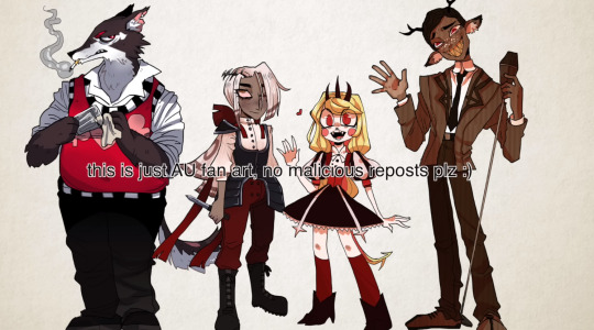
I'm going to start with something that needs to be said. You can disagree with the rest of my post, but this is non negotiable:
It is never, under any circumstances, acceptable to harass someone for their opinions, especially about art. I don't care if you take issue with conclusions or perceived motivations, actions like I observed are not ok, and are not welcome in this fandom.
I hope I made that clear.
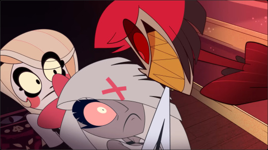
Anyway, I am going to be addressing the second video, because LavenderTowne took the first down, and I'm not about to intrude where I'm not wanted.
LavenderTowne mentioned the overarching stylistic choices, and I think that is a good place to start with this post, because they are good source of difference. Several of LavenderTowne’s criticisms are leveled at the Hazbin Hotel visual style itself, discussing what specific elements didn’t work for her and how she would personally draw things differently.
That is what I want to discuss here. Rather than the specifics of artistic technique, I am going to talk about the character design decisions brought about by the difference in style. This isn’t a question of skill, but an examination of the ideas presented.
Both LavenderTowne’s style and that of the Hazbin Hotel team range on the scale of realism, as is the nature of art, and that has caused a few of the design decisions that they have made. But it has also had a weird effect on the implied plot that is worth discussing.
Hazbin Hotel is more cartoony, for example, which means its logic is a bit more fluid. Vaggie's eye scar, for example, is shown over her hair, which isn’t how scars work in the real world.
This is a way of getting the tone across. Sir Pentious, at one point in the series, gets caught in the blast of an explosion and sent flying across the city. The design style lets you know that this is being played for a laugh and that he will probably be fine. If LavenderTowne had drawn Sir Pentious in her style, I guarantee that version of him would not survive the event, because hers is grittier (that’s the wrong word, but you get the point).
I do, however, really like the colour palette shift in LavenderTowne’s designs. Don’t get me wrong, I like the limited palette of the actual show, and I think it suits the setting more than the pastel aesthetic of LavenderTowne’s style.
But, those pastel colours are gorgeous and they are a really neat way of solving one of the problems that LavenderTowne identified and I agree with, that being how difficult character differentiation is when everyone has the same colouration as each other and their background.
Now, neither of the two options are implicitly better, there is just a different design sensibility going on.
As for the designs themselves, I actually prefer LavenderTowne’s Alastor over the original. I would like to see how it interacts with Alastor animation and transformation, but I think the design overall works better for the character. I like the horns being more pronounced, and I like that neat hairstyle. I think it's much more suited to an overly refined character who revolves around appearances.
“Just because you see a smile, don’t think you know what’s going on underneath. A smile is a valuable tool, my dear! It inspires your friends, keeps your enemies guessing, and ensures that no matter what comes your way, you’re the one in control.”
I think that Alastors original hair style is more about looking cool than looking refined. The shorter style, combined with the more prominent antlers, gives that air of someone actively concealing their more wild undercurrents.

That being said, I'm not as sold on Alastor's expression in LavenderTowne's design. This is a stylistic choice, but I don't think that the Cheshire Cat smile translates over to the alternate design as smoothly as his concept. In the original, that smile was the thing that denoted him as malicious, but LavenderTowne's design seems more huggable, at least to me.
LavenderTowne did raise an interesting point about the voodoo symbolism, a point that others have raised, and I think is worth noting. Incorporating that aesthetic as synonymous with dark magic in a setting based heavily off Christianity is funky, thematically. It's a use of stereotypes as shorthand, which carries the baggage of those stereotypes, intentionally or not. However, I am about as far from qualified to talk about this in detail as possible. I recommend that you listen to the opinions of people who know more about this than me, and who's case this is to make.
Husk’s design is another that I like, but this one I have slightly mixed feelings about. The body type change addresses another of LavenderTowne's criticisms of the series, again in relation to character differentiation. That is a strength of the video, LavenderTowne gives criticisms, and explains what she means and how she would go about doing it.
Interestingly, that body type issue is something I disagree with. I think the way that LavenderTowne has handled the issue she identified is fascinating, and one of the best parts of her process. But this is simply an issue I don’t see as a problem.
The criticism is that the silhouettes of the characters are exceedingly similar, meaning that identifying them is difficult, as well as limiting in terms of variety of proportions. I could point out Sir Pentious or Husk here, but that is arguing in bad faith because Husk is very clearly the exception to the rule, and Pentious actually conforms to her observation. Without his hood out, Pentious’ silhouette difference is in his tail, which is rarely onscreen.

The reason I am ok with this, is that Hazbin Hotel has a thing for transforming character designs. Charlie, Valentino, Emily and Serah, Lucifer, even Adam, Vaggie, and Lute, as well as a ton of others. All of these character designs shift as the story progresses, revealing aspects of them that they have kept secret. I like having the baseline similarities if everyone gets a moment where they show off how different they are from that baseline. I think that is a cool story beat that, for me at least, outweighs the problem of similarity. I’m sure LavenderTowne would disagree with me here, and that is more than fine.

Back to the point, Husk is a character who is surprisingly acrobatic and martially competent, and the slight shift in the alternative design switches him into more of a bar brawl type character. This feels like the guy who would just deck you and tell you to cool off, rather than throw something at you. He looks like the type of bartender he is, cool and calm, and ready to offer advice when needed.
The removal of the wings is an interesting choice. On the one hand, it clears up his design and makes him look more down to earth. On the other hand, it leads into my main bugbear with this design. I don't think this version of Husk looks like an overlord.

This is subjective, and I am struggling to quite explain it. But the wings, as well as his voice, give a sense of gravitas to Husk. Without that, Husk looks relatively unremarkable.
The outfit plays into this. While I prefer it and its subtlety, there is little that marks this version of Husk out as higher ranking.
Again, this isn't a case of the original designs being objectively better. This is a different design that communicates different things. LavenderTowne’s Husk is a humble bartender rather than an overlord playing pretend. I simply like the story that the original offers more.

Vaggie’s new design is both my favourite design of the four, and the one that is the furthest from the story of the show.
I love the quieter eye scar, I love the silhouette, and I think moving the ribbons to her back is a genius bit of visual storytelling.
The outfit is cool (I especially like those boots), but there's an asterisk to that, because I don't think it entirely suits Vaggie as she is presented in the show.
At the risk of oversimplifying, Vaggie is a fairly uncomplicated character. Not because she's written to be shallow, but because the show doesn't have time to explore her personality.
So, you get her past, which is fascinating, and it leaves some interesting things on the table.
For example, Vaggie has zero self preservation instinct and will burn herself to the ground for Charlie. This isn't complex, but it's remarkable how much the writers (and animators if you’re looking for that kind of thing) get out of this one detail.
Most notably, her character grows into realising that love means living for someone rather than dying to keep them safe. This culminates in the defeat of Lute, the embodiment of her past, who doesn't think to move out of the way of a collapsing building.

Similarly, Vaggie was an angel and wants to hide that aspect of herself. This makes her multifaceted in backstory, but the reveal doesn't have time to dwell on her characterisation, so it just feeds into what I said before.
I think that with another season of time to develop, Vaggie’s characterisation will become as complex as her backstory. But that doesn’t come quickly.
The point I am making is that I don't think this version of Vaggie would wear armour until the end. She doesn't think she can get killed, so why would she need to protect herself?
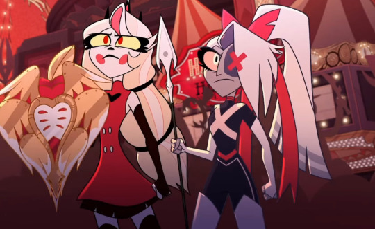
Which means that LavenderTowne's design would work for the last episode of the show, if it had wings, which is sacrificing the single best piece of foreshadowing I have seen in a long time. Seriously, I cannot stop gushing about those ribbons.
What we have, then, is a version of Vaggie with a slightly different story and personality. To me, LavenderTowne's Vaggie looks like a character who craves safety. She seeks Charlie because she offers emotional stability and kindness, the one person in hell who Vaggie doesn't think is against her. But she would wear the armour and outfit because of the injury. She realises she can be wounded and grabs the heaviest set she can find, the twin coloured trousers come from that desperation, and add to the imbalanced aspect of her design.
This version of Vaggie is defensive rather than offensive, and though it renders Out For Love obsolete, I find it more interesting than the original.
Charlie's design, however, I'm not such a big fan of. I'm sorry LavenderTowne, I really am. But this design really doesn't sit right with me.
Hazbin Hotel has a circus theme going on. The main foyer has a circus tent affectation, for example, and Charlie gives off the aesthetic of the ringmaster.
Charlie is very overtly the antithesis of a Disney princess, and that comes across in her design. Instead of wearing a floaty dress, she wears a suit and suspenders.
Yes, the hooves and horns being more prominent is a cool alteration that I appreciate, but the alternate outfit really doesn't feel like Charlie.
I think the difference is in the framing. To me, LavenderTowne's Charlie comes across as naive and optimistic, where the original design is more relentlessly hopeful, and that second one matches how she is in the series.
Charlie in Hazbin Hotel showcases true hope. Not optimism, hope. The type of emotion that keeps getting knocked down, but picks itself off the floor ever single time, and gets ready to try again. Charlie has no proof of her philosophy, no basis. She's not trying to recreate phenomena, she doesn't even know she can succeed. That's why she needs the hope.
I don't think that LavenderTowne's design has that vibe. Instead, this Charlie seems younger, which contributes to the naivety. It feels like it leans into her regular design, so the more fearsome transformation comes as a shock, mostly.
On the other hand, the three horn tiara element is genuinely really cool. It gives that air of reality, and hints at the transformation without giving it away. They round out the design and make the “this is a demon princess” clear.
Interactions between this Charlie and Adam, Lute, or Sarah would be interesting, as this version seems designed to foil off them, rather than the other way around. Especially Emily, this design seems genetically engineered to mirror her and make her question her ideals just through existing in the same place.
In short, this Charlie seems more gentle than the original, which might help in some aspects, but I prefer the original.
One again, this is my opinion, and not objective by any stretch of the imagination. If you disagree with me, good, that's the bread and butter of how analysis and discussion exists. But I hope I have shown that disagreement is possible without aggression.
Which brings me to my conclusion, and I have something here that I hope you will like.

LavenderTowne's designs feel like they are made for the same story, but paced differently. They feel like a different style of musical. They feel like they were made for a version of Hazbin Hotel that had more episodes and has time for subtlety, something that the original show unfortunately didn't have.
The story feels the same, but the minour changes make it seem more drawn out. The tone is different, and that effects the entirety of the rest of the story.
In other words, she is designing an AU, something she makes explicitly clear at least five times in her video.
LavenderTowne mentioned in her video that she might do a follow up with a few more characters. I would be intrigued to see this, because I want to know what Angel Dust would look like in this version of the story, as well as the actual angels and even the Vees.
I also am fascinated by how the art style affects the tone of the story. And with LavenderTowne's permission, I might have a crack at writing some of the key scenes from the show to fit this aesthetic and tone. I think that would be an interesting thought experiment.

Final Thoughts
LavenderTowne’s designs were dope as all hell, and the points she raised were worth discussing.
I love the series, but I understand that it's not everyone’s cup of tea. Content warnings should get that across, but also some people just won't like elements of it for any number of reasons, and that is ok.
I think @ohnoitstbskyen put it best in his discussion of the finale of the series. (Link). In his closing remarks, he spoke at length about people who will discover the show and the effect that it will have on them. That sentiment, boiled down, became the title of that video, and concisely says what I have taken just under 3000 words to talk around.
“This show will save someone’s life, but it isn’t for everyone.”
But let me be clear about why I wrote this.
I saw some of the shit that people wrote about LavenderTowne's original video, and though a lot of it was positive, a fair chunk was not, and I want to put my foot down. Disagreement about art is healthy, but if you think that involves harassment at all, then tell Husk he still owes me a drink.
On a lighter note, this is my first post about Hazbin Hotel, so for those who are reading my stuff for the first time, hello. I am Ari, I do media analysis, and I plan on doing a series on Hazbin Hotel, going through each song with lyrical and musical analysis once I finish my current one on Wicked. So, if that interests you, maybe stick around.
Next
#rants#literary analysis#literature analysis#what's so special about...?#character analysis#hazbin fanart#hazbin hotel fanart#hazbin hotel#hazbin alastor#hazbin charlie#hazbin vaggie#hazbin husk#lavendertowne#I will write for this AU if LavenderTowne lets me#meta#meta analysis
44 notes
·
View notes
Note
In your pallete post you say that if you want to build up your skills you could only use burnt umber and white :0? Is there a reason burnt umber would be better than pure black and white?
Hello anon, that is a GREAT question!
My short answer is that burnt umber is a very versatile and forgiving pigment to use, whereas black pigments [ivory black, mars black, etc] have less uses in colour mixing, are more difficult to handle, and can cause archival problems down the line, like cracking.

Further discussion and a commentary on this chart is under the readmore.
The colours mixed on the chart above were made with approximately the same amounts of paint as each other, to show how the different pigments interact.
The main thing to consider about black pigments is that they are NOT neutral in therms of hue, so if you try to darken a mix by adding black, the mix will also be pushed towards blue [for the purpose of paint mixing, we can think of black pigments as dark blue], which is usually not the colour direction intended by the artist.
A better alternative is to mix your own black colour using Burnt Umber and Ultramarine, which gives you more control over exactly what colour of black you want to make, be it more brown or more blue.
So if you are mixing your own black with burnt umber and ultramarine, the circumstance where an actual black pigment would be of use presents itself only when your subject is darker than what can be achieved via brown+blue. A similar situation to this one would be a circumstance where you need to paint something that is more blue green than ultramarine can produce, so its time to bring out the pthalo blue. These stronger pigments are sometimes called "Power Colours" and are used to supplement a limited palette.
The reason I recommend burnt umber as a beginner pigment is because it mixes well with other colours without overpowering them AND if you are just doing value studies with burnt umber and white, it's a much better time investment to learn the value scale in because burnt umber has way more applications in full colour painting than black does.
273 notes
·
View notes
Note
Could you review the ixi?


Briefly limited edition for a very short period after their release, Ixi are mostly just goats, and there's really nothing fancy about them beyond being goats (unless you want to count the collars). They are pretty nicely designed goats though, with distinct eye shapes, lots of black accents on the hooves, eyebrows, and horns, and some nice markings around the face and muzzle that really help to break up the body.

I also like the personality Ixis have, being mischievous and sort of sassy. This was more obvious in their old circle art, but you still get it a bit from the converted version as well. It's fun and helps make them stand out.

This might be a controversial Hot Take(TM), but I'd argue that Ixis mostly benefited from customization. The old art was just a bit janky all around—the circle pose mostly looks good, but the default happy poses could look kind of off. The converted version cleans up a lot of that, removing things like the second fur tuft on the head that's too close to the horn to be noticeable, the unpleasant lines around the mouth, the shaggy fur lines, etc.
It also refines some aspects, like giving the lighter tail tip an outline to match the rest of the lighter areas and fixing the hind torso, which was all kinds of screwed up on the original art. It also improves the eyes so they're closer to being the same size (it still looks a smidge off to me, but it's at least better). The shading is also less messy (what was up with that pink reflective light on the tail?), the eyebrows have been thickened to match the other black areas more, and it's easier to make out aspects of the design.
Another benefit is that the collars can be removed. I do think Ixi collars look better than Aisha collars (mostly because they can be interpreted as chokers when anthropomorphized, and they at least match the color of the eyes), but it's nice to have the option to remove it if one wants to.
However, there were a few things that don't look as good—namely, the head is both a bit too big and too wide compared to the original, giving it a weird rectangle shape that doesn't quite feel right. Here's a super quick edit of the converted version to try to get the point across:

Also, for some reason the chest fur also stops below the collar instead of under it, and the red Ixi's mouth is no longer the lighter shade like it is on every other Ixi. The sideways hair ruffle at the top is also weird due to them adding a line underneath. So overall an improvement—but not perfect.
Favorite Colours:

Mutant: What a great color! It's just messed up enough to look properly mutant-y, with the fangs, mismatched horns and ears, bipedal stance, spots, and a long, drooping tail. The color palette is subtle and muted, and it's detailed but still completely coherent as a whole. This design also didn't change with customization at all, so it's still as enjoyable as it ever was.

Grey: I already covered this one a bit in my grey color review so I won't get into it much here, but this color is great. The customized version is so-so (good as a neutral base, but the eyes look a bit weird due to lack of top lids), but the UC version is beautiful with its forlorned expression, huge droppy ears, and pretty dull red accents. Even the collar is drooping!


Robot: Converted robot Ixis unfortunately aren't very good—yes, they have to proportionally match the default base, but the chunky round legs, overly large head ridge, and completely botched shading look pretty bad. It looks weirdly rubbery in a really unpleasant way. On the plus side, the unclothed version is terrifying, so it has that much going for it.

However, the UC version is fantastic! It has a super sleek design that manages to look unusually elegant and cute for a robot pet, with a subtle dark green and black palette and high-contrast red eyes. There are lots of good details in there too, like how the neck matches the legs and ears.
#I didn't. realize I had so many opinions on Ixis before writing this#neopets#neotag#ixi#neopet reviews
51 notes
·
View notes
Last Seen Blogs
subordinate-functions-defender
hzd but (insert stupid thing here)

theazaraeru
Azaraeru

m-eia
𝑚𝑒𝑖𝑎

cadalsoazul
ATEMPORAL

tea-time-party-fans
tea-time-party-fans