#Mask Tool Tutorial
Explore tagged Tumblr posts
Visit Tumblr Blog
Explore Tumblr blogs with no restrictions, modern design and the best experience.
Last Seen Tumblr Blogs


Fun Fact
25% of US internet users with an annual income of $80-100K use Tumblr.
Text
youtube
Unleashing Presidential Creativity: Using the Mask Tool in Green Screen by DoInk for Presidents' Day ProjectsWelcome to an exciting tutorial that blends technology, creativity, and education! In this lesson video, we'll guide you through the process of using the Mask Tool in Green Screen by DoInk to incorporate students' faces into Presidents' Day projects. Whether you're an educator planning a unique classroom activity or a parent looking to engage your child in a creative endeavor, this step-by-step tutorial is designed just for you.Presidents' Day projects take on a whole new level of excitement with the innovative use of the Mask Tool in Green Screen by DoInk. By integrating technology and creativity, educators and parents can inspire students to actively engage in learning about the presidents in a fun and interactive way.
Embark on this educational journey with Green Screen by DoInk and witness the transformation of Presidents' Day projects into immersive, personalized learning experiences. Share your creative projects with us and let the presidential creativity shine!
#Green Screen by DoInk#Presidents' Day Projects#Mask Tool Tutorial#Interactive Learning#Educational Technology#Hands-On Classroom Activities#Creative Student Projects#Personalized Learning#Technology in Education#DoInk Tutorial for Educators#Presidents' Day Lesson Ideas#Doink#Do Ink#Best Edtech App#Best Presidents Day Project#Youtube
0 notes
Text
it's funny how after effects went from my least favourite Adobe software to my favourite over the span of 5 years. I used to HAAATE motion graphics and composting during my diploma years but now it's my favourite aspect of my degree.
#like at this point I don't think I even have a least favourite Adobe software.#I have new least favourite tools outside of the Adobe suite 😊#canva has its utility for like. presentations and stuff#but also. i kind of hate the frame tool oh my god#like I've seen people make canva tutorials for effects with the frame tool and it's just#you could do this 5 times faster and 5 times easier by using a clipping mask in photoshop
1 note
·
View note
Text
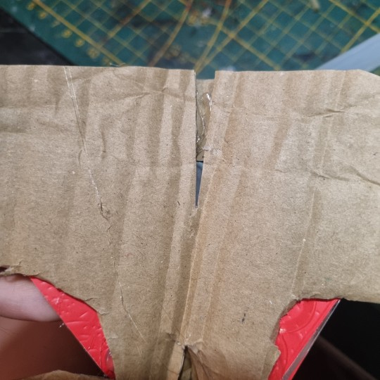
Long awaited Hera's mask tutorial (no cat base, low budget)
example of the masks I've made, here:
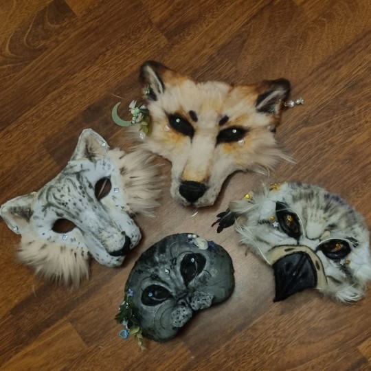
Author note: I have a 3 year experience, and I got used to making gear like this, so if you are trying masks for the first time, you might find some difficulties.
also, the whole thing Is REALLY "trust the process"... Anyway here we go!
You need: Cardboard, paper(optional), hot glue gun, felt/something to fur it/any material is okay if it works, foam (optional), basic tools like scizzors
1. Cardboard forming
You need a piece of cardboard that's kinda a little bigger shape than your face, and measure where the eyes should be, so you can see well.
you can make the mask symmetrical by bending it in half, but it's optional
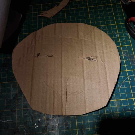
the first picture down there shows the back of the mask, don't be scared to pull it in and out, I'd say, you need to form the mask shape with your fingers VERY GOOD.
it really depends on what species you wanna make, I'm making a snow leopard rn!
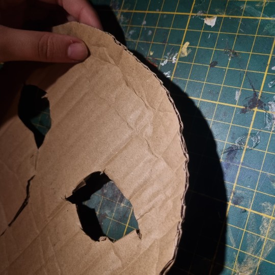
you can even cut it almost in half, and shape it to your liking
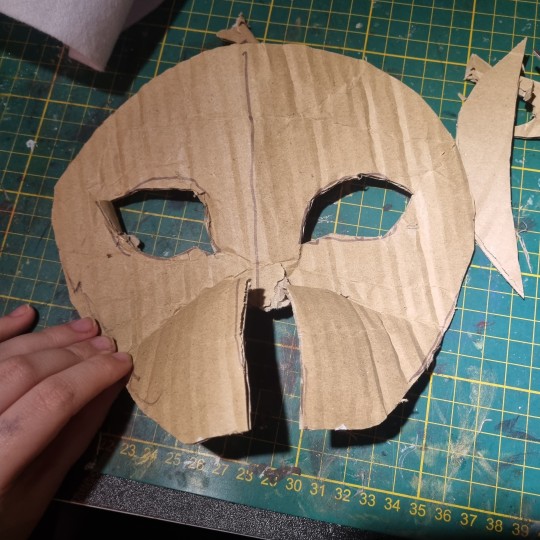
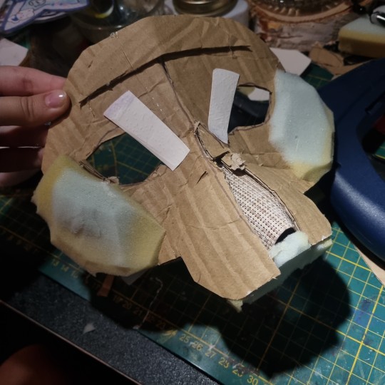
2. Texture
for this part, when you have your BaseOfTheBase ready, you need to make it more 3d, so it doesn't seem flat. small pieces are a key.
u can use various materials to recreate the real look, for example - foam that is easy to work with, and maybe more cardboard pieces layered on eachother. also you can use the pieces to glue the whole thing down together so it's sturdy.
I smooth it out with paper too, so the fleece/felt/fur sticks better to the mask and doesn't leave unnecessary bumps..
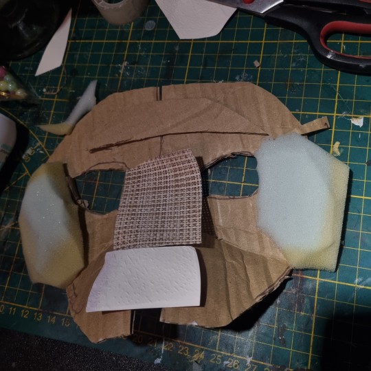
you use the bends like that to create a 3d effect, and expand the mask a little.
That's what I came up with! I added alot of paper pieces to smooth it down ^^
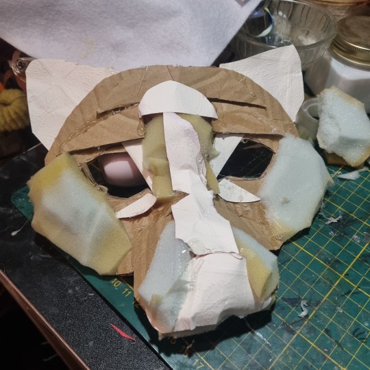
3. furring/felting, and the final touches
this part may be kinda tricky, so i reccomend you to watch various of felting tutorials on cat masks, cause this works basically the same!
I didint take any more photos rly, but here's the final product, and only felted one. (the nose is made out of hot glue)
I don't really want to elaborate on how to do the patterns, since you're the one who's customising the mask, but I like to use alcohol-based markers to make them! acrylic paint is also okay ^^
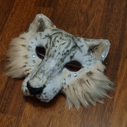
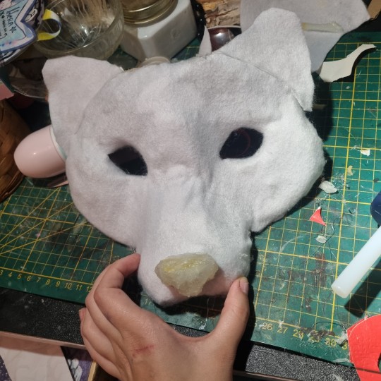
I hope I helped in some way !
If you have any questions, feel free to ask <3
#alterhuman#therian#nonhuman#bird therian#therian gear#snow leopard#art#therian art#tutorial#aviankin#birdkin#therian mask#mask making#otherkin
907 notes
·
View notes
Text
Art style breakdown /tutorial(??)

Some friends asked so here we go : disclaimer im bad at explaining (so feel free to send an ask or smth)
Final art (long read so theres a timelapse at the end)


If its not for something important (commissions), i dont usually make a lineart for a drawing but just clean up the sketch , it wont be used anyway

I usually separate them by colors , mostly so i can Alpha lock them and not worry about coloring over parts
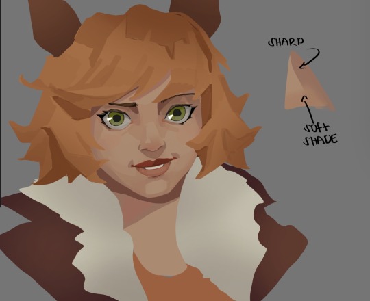
When coloring i use a soft airbrush to have gradients within the shading , so its not one solid color . How i shade is very blocky , lots of triangles lol (if im using CSP i love using the lasso fill tool ) but there are parts especially in the skin where I keep it smooth and blended, usually nose and cheek area . Using an asaro head is usually a good start to learning how to shade faces with planes in mind

Depends on the character, but I like adding shadows on the lashes/brows itself , make it look solid and 3d , it makes the eyes pop more imo

Using multiply layer to make the shadows darker for more contrast
At some point I’d merge everything together so i can just paint in one layer, easier to fix things with liquify too ; if im in CSP i keep the separate layers in one folder just in case i need em later but i cant really do that in Procreate cos of layer limits

This is the part where i make the shading more painterly .,To make the shading look sharper , i like adding lines on the edges .
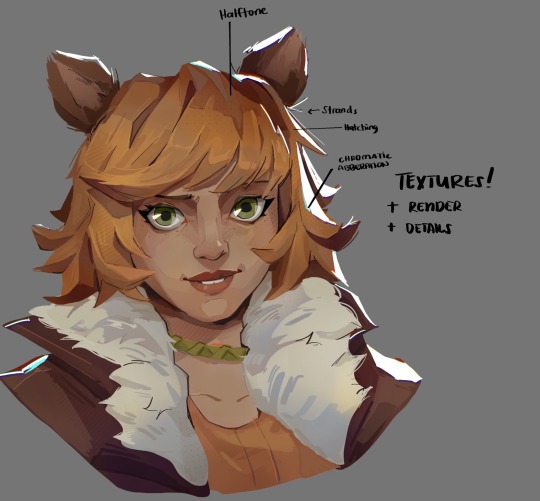
The fun part : adding the ✨
This is the part where I add textures , either from texture images or with screentone/hatching brushes. This is also around the part where i add the character’s accessories and stuff like scars and freckles (its just easier to add smaller things near the end than having them accidentally painted over at the start)
Whenever I feel like the drawing looks too much of a similar shade / temperature , I use a gradient map+layer effects (masked) on parts to give it variety . Technically you can do this by just having a layer effect on and manually adding colors but gradient maps make me go “ooooh didnt think of that color there “
CSP also has a posterization filter that i like using when i feel like some part looks too smooth to me.
I sometimes add in sketchy lines , and seeing how cool it looks in Marvel Rivals art ive been adding it more lol
Artists that influenced me are : Nesskain, Toni Infante , Valorant’s 2d art(their main artist is Suke) ,Arcane , Spiderverse and the most recent one ive been obsessing over is Marvel Rivals ( its got everything i want my art to be when it grows older lmao )
588 notes
·
View notes
Text
☁︎。⋆。 ゚☾ ゚。⋆ how to resume ⋆。゚☾。⋆。 ゚☁︎ ゚
after 10 years & 6 jobs in corporate america, i would like to share how to game the system. we all want the biggest payoff for the least amount of work, right?
know thine enemy: beating the robots
i see a lot of misinformation about how AI is used to scrape resumes. i can't speak for every company but most corporations use what is called applicant tracking software (ATS).
no respectable company is using chatgpt to sort applications. i don't know how you'd even write the prompt to get a consumer-facing product to do this. i guarantee that target, walmart, bank of america, whatever, they are all using B2B SaaS enterprise solutions. there is not one hiring manager plinking away at at a large language model.
ATS scans your resume in comparison to the job posting, parses which resumes contain key words, and presents the recruiter and/or hiring manager with resumes with a high "score." the goal of writing your resume is to get your "score" as high as possible.
but tumblr user lightyaoigami, how do i beat the robots?
great question, y/n. you will want to seek out an ATS resume checker. i have personally found success with jobscan, which is not free, but works extremely well. there is a free trial period, and other ATS scanners are in fact free. some of these tools are so sophisticated that they can actually help build your resume from scratch with your input. i wrote my own resume and used jobscan to compare it to the applications i was finishing.
do not use chatgpt to write your resume or cover letter. it is painfully obvious. here is a tutorial on how to use jobscan. for the zillionth time i do not work for jobscan nor am i a #jobscanpartner i am just a person who used this tool to land a job at a challenging time.
the resume checkers will tell you what words and/or phrases you need to shoehorn into your bullet points - i.e., if you are applying for a job that requires you to be a strong collaborator, the resume checker might suggest you include the phrase "cross-functional teams." you can easily re-word your bullets to include this with a little noodling.
don't i need a cover letter?
it depends on the job. after you have about 5 years of experience, i would say that they are largely unnecessary. while i was laid off, i applied to about 100 jobs in a three-month period (#blessed to have been hired quickly). i did not submit a cover letter for any of them, and i had a solid rate of phone screens/interviews after submission despite not having a cover letter. if you are absolutely required to write one, do not have chatgpt do it for you. use a guide from a human being who knows what they are talking about, like ask a manager or betterup.
but i don't even know where to start!
i know it's hard, but you have to have a bit of entrepreneurial spirit here. google duckduckgo is your friend. don't pull any bean soup what-about-me-isms. if you truly don't know where to start, look for an ATS-optimized resume template.
a word about neurodivergence and job applications
i, like many of you, am autistic. i am intimately familiar with how painful it is to expend limited energy on this demoralizing task only to have your "reward" be an equally, if not more so, demoralizing work experience. i don't have a lot of advice for this beyond craft your worksona like you're making a d&d character (or a fursona or a sim or an OC or whatever made up blorbo generator you personally enjoy).
and, remember, while a lot of office work is really uncomfortable and involves stuff like "talking in meetings" and "answering the phone," these things are not an inherent risk. discomfort is not tantamount to danger, and we all have to do uncomfortable things in order to thrive. there are a lot of ways to do this and there is no one-size-fits-all answer. not everyone can mask for extended periods, so be your own judge of what you can or can't do.
i like to think of work as a drag show where i perform this other personality in exchange for money. it is much easier to do this than to fight tooth and nail to be unmasked at work, which can be a risk to your livelihood and peace of mind. i don't think it's a good thing that we have to mask at work, but it's an important survival skill.
⋆。゚☁︎。⋆。 ゚☾ ゚。⋆ good luck ⋆。゚☾。⋆。 ゚☁︎ ゚。⋆
640 notes
·
View notes
Text

Barks Quick "Turing patterns in CSP" tutorial
you need some pixels to start with, either just grab the spray bottle tool or go to Filter>Render>Perlin Noise
Filter> Gausian Blur> value: 6
Filter> Sharpen> unsharp mask> Radius: 22, Strenght: 255, Threshold: 0
----
you need to repeat step 2+3 over and over. to make that easier you can go to:
Auto Action> create new auto action set
hit record in the bottom left of the auto action window
perform step 2+3
stop recording
right click the actions in the set and duplicate them
make sure they are sorted correctly and hit play a few times
-----
before you color your pattern or do anything with it go to
Edit> tonal correction> binarization
to get rid of any odd colored pixels
#this isn´t the cleanest tutorial and i just figured it out too but i couldn´t find any tutorials for csp so throwing this one out here#clip studio paint#turing pattern#or as the sailfin lizard paper would call it Vermiculation#get vermiculating my friends
1K notes
·
View notes
Text
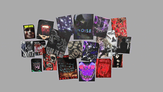
4t3 Conversion of Grouped posters by @cosmiccs4 + Recoloring PSD with tutorial
8 non-recolorable presets
1024 textures
Included PSD for retexturing (tutorial how to use under the cut)
113 poly, all LODs
Shiftable
Price - 5§
BGC
Compressed package
TOU, Ko-Fi
DOWNLOAD | ALT | SIMBLR.CC
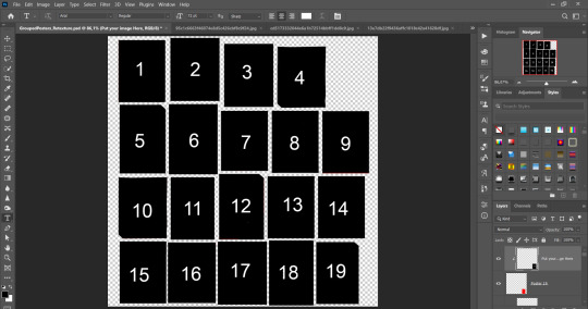
Tutorial: How to use my PSD for retexturing
You need:
Photoshop with .dds plugin
My retexture PSD and package file of posters
19 pictures to your liking, preferably vertical
TSRW
Sims3Pack Multi Installer and Compressionizer
Step 1: Open my PSD file, open your images:
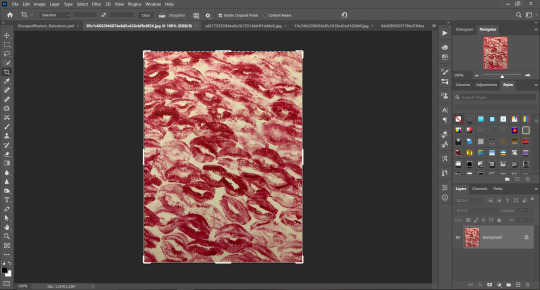
Step 2: Select (Ctrl+A) copy and paste to posters file (Ctrl+C, Ctrl+V) first of your images :
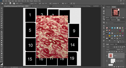
Step 3: Choose where you want to put it, for reference you can use one of the presets:
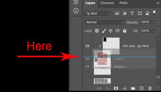
Step 4: After you decided with placement of your image. Move its layer in the Layers tab between "Poster x" and "Put your image here" layers, it will create a clipping mask, which allows the picture to be fit within the poster without cropping. Hide or delete "Put your image here" layer.
Step 5: Use Transform, Free Transform and Move tools to resize the image by your liking:

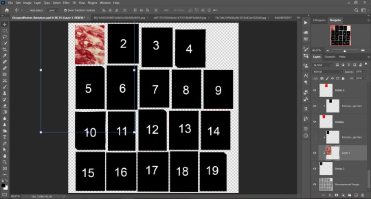
Step 6: Repeat the Step 2-5 with other 18 images:
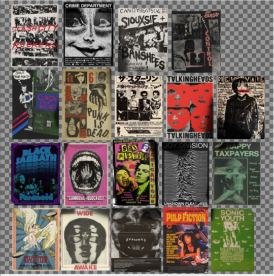
*vibes are totally random, all images from Pinterest*
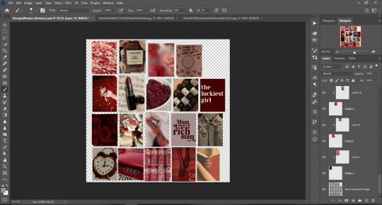
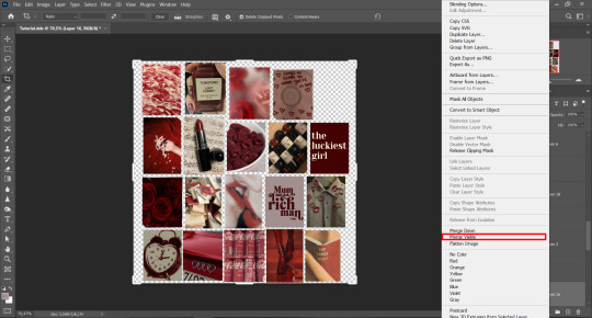
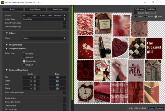
Step 7: After you've done, delete all the "Put your image here" layers, if you didn't it before. Right-click on the Layers tab and press Merge Visible (Shift + Ctrl + E). Now press Save As (Control + Shift + S) and save your image as .DDS with this parameters (2nd picture):
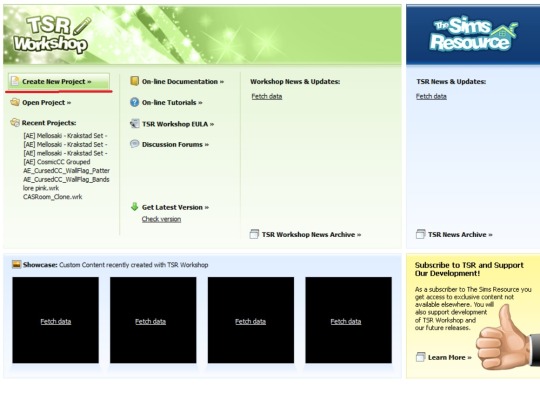
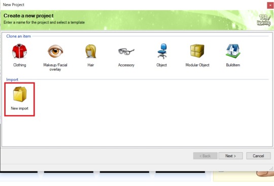
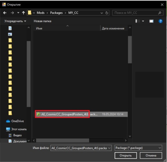
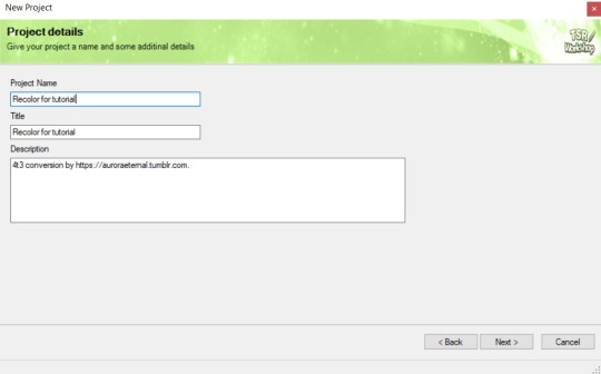
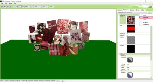
Step 8: Go to TSRW. Press Create New Project > New Import, and select package with my posters. Give for your recolor unique Title and Project name, otherwise it will override original posters:
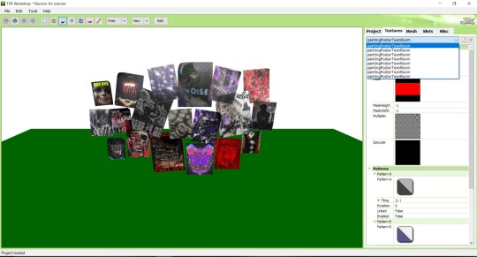
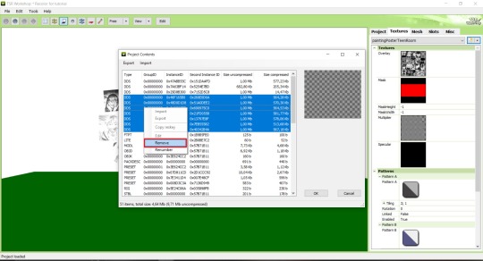
Step 9: In Textures tab go through all the presets except the first one and delete them. Then go to Edit > Project Contents and remove all the textures of removed presets. Its pretty common when someone make retexture of TS3 mesh and leave that unused textures in file, which leads to increasing its size:
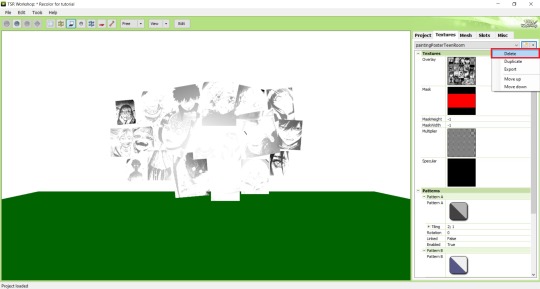
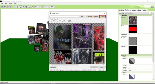
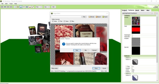
Step 10: Press Edit button next to the Overlay tab. Then press Import button and select your retexture. Press Done and when this pop-up appears, press Yes:
Step 11: If you want to add more presets press Duplicate and reapeat Step 10, but instead, when pop-up about replacing the texture appears, press No.
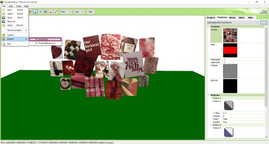
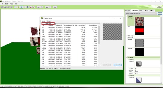
Step 12: After you've done, press File > Export > To Sims3pack or Edit > Project Contents > Export > To .package. If you choose the first method, convert your Sims3pack to Package and in both cases run it through Compressionizer. Test your recolor In-game, make thumbnails (if you want to share it) and have fun!
For those who read this tutorial to the end, click HERE to download this recolor.

@pis3update @xto3conversionsfinds @wanderingsimsfinds @kpccfinds @simfluencer-network @sssvitlanz @simblrcc-site
888 notes
·
View notes
Text

hello . today i shall give u a tutorial on how i make my userboxes . huzzuh ! i make mine in csp but you can use . anything .
okay to start i make my canvas (usually) 1000 x 400 pixels . you can do whatever but this is how big i like to make mine.

i also make sure my paper layer is turned OFF so the image saves as transparent !!!!

then i use the rectangle tool to make my shape. whateva u want it to look like . these are the settings i use !!!!
if you would like to make your userbox have a fun little insertable shape for you to shove a picture into, i use masks! you can just go on tumblr and find a f2u one !! heres how you insert those !
once youve picked out your mask, copy paste it/add it as a layer and position it where ever u want it to be

should look somethin like this ! (ignore its off center this is just an example)

right click on the layer that your mask is on, go down to selection from layer, and then click create selection! this wil select whatever is on your layer.
once you do that, click on the layer that your rectangle is on. erase the area that is selected. after that you can delete the layer that has your mask on it!
if you would like to add a funky lil design in the background, like how i did on this one—

you can search for a f2u overlay! i usually just look up rentry overlay on tumblr and get one from there.

copy paste it, adjust it to size, set the overlay layer as a clipping layer, and then mess with the layer settings and opacity to your liking. mine is set to overlay, as you can see.
obviously you dont need to have an overlay, but if you do wanna add any designs, its easiest when the layer is set to a clipping layer !!!
after that you can add your text. whatever you want. i get my cool fonts from dafont, but you can use whichever one you would like :)

after that youre good to go ! save as a png (make sure the paper layer is off!!!!!!!!!!!!) and then you can . post it or whateva :)
okay i hope this is helpful to someone if u have any questions lmk bye bye now
101 notes
·
View notes
Note
Your gif blending skills are *chefs kiss* so, so good! Any tips/tricks you could maybe give for a seamless blending? Thank you! 💕
Thank you for the kind message!! I'd be happy to share how I blend my gifs! I did a basic blending tutorial here that just covers how to put two gifs on top of each other on the same canvas, but I can explain more about how I clean up my blends and make them seamless.
The key components are black brushes, the eraser tool, and layer opacity

So the below gif is what I get when I simply put my two gifs on top of each other and position them the way I want, but I want it to look a bit cleaner.

This is how I have my gifs set up, with the gifs and the colourings within separate folders (b for Buck on the left, and t for Tommy on the right).

And this is what it looks like when I open up one of those folders.

Now when I blend, I add a new layer within each folder on top of all the colouring layers, (the layer blend mode is set to normal), and I do the same thing in the Buck folder

Painting with black brushes
So now I use a big, soft, black brush to paint on this new layer I created. Wherever I paint is the area I hide. Since I'm starting in the Tommy folder, I'm going to paint over the areas from the Tommy gif that cover Buck, so that these areas get hidden.

I want to hide that bright spot on top of Buck's face (which is coming from the tommy gif) so I take a brush that roughly matches the size of the area (the circle that I drew). So in this case I'm using a 300px brush at 0% hardness set to black. And all I do is move my brush to the area I want to cover, and *CLICK ONCE*. I don't drag the brush, I simply move it into position, click once, and let go.
Here you can see the before and after


As you can see, Buck's face is a lot clearer now. And this is what my layers panel looks like.

Let's say I want to hide a little more, and clear up Buck's face even further. I simply create another new layer within the folder (above layer 4 in my screenshot) and again, click once over the desired area with my brush.

This is what it looks like now, but let's say I want to add some of that texture back. I simply go to the layer, and reduce the opacity. I usually play around with anywhere from 20% to 80% opacity.

Now I do the same thing for the Buck gif, but this time I paint over Tommy's face, meaning that I'm hiding the areas of the Buck gif that are covering Tommy's face.


This time I clicked twice with my black brush because I didn't feel that one click hid enough of the gif. Also, if you feel like you brushed over too big of an area, just take your eraser (usually the same size as/slightly smaller than your brush, also at 0% hardness) and CLICK TO ERASE. This is the final blend that I'm happy with.

Final comments
I found that this is the easiest way to blend, because other methods using layer masks sometimes leave you with those transparent pixels to deal with. Just make sure to CLICK with your brush/eraser and NEVER DRAG. This method is also super helpful when you have two "incompatible" gifs, such as when one gif is really bright. By clicking with a big soft brush you can still show the gif behind it while not making it look too disjointed, like I did here:


Here's another tutorial that I find helpful, which goes over using the dark spots in your gifs to help with the blending. Hope this helps!!
#answered#tommykinardbuckley#*tutorial#useraljoscha#userchibi#carolook#userbaz#userahri#userrobin#userwintersoldado#userbunneis#tuserheidi#usermibbles#usertj#wardengrill
180 notes
·
View notes
Note
Hi, could you please tell me how to do this slanted layout? the-borgias*tumblr*com/post/695485491217334272/one-chicago-appreciation-week-day-one-favorite
Hi, Anon! I'm sorry this took me a few days to answer but I struggled making this tutorial (not because the process itself is difficult but it is difficult to explain it properly.) Anyway, here's the gifset Anon is asking about. I hope this is easy to understand and I also included a .psd file of the layout :)

PSD FILE OF THE GIF ABOVE & TEMPLATE
What you'll need:
Basic Photoshop knowledge (I use Photoshop 2023)
Basic knowledge on how to make layouts (here are a couple of tutorials: x x)
Basic knowledge about layer masks (tutorial)
STEP 1: Make a basic layout
You can do pretty much any layout you want but for the sake of the tutorial I tried to recreate the same template I used in that gifset. I'm assuming you already know how layouts/templates work so I created a 540x540px canvas and went to View > Guides > New guide layout. I used these settings:

And this is how my canvas looked like:

Now I pressed (M) to use the Rectangular Marquee tool and create the rectangles I wanted. This is my end result:

STEP 2: Tilt the layout
This is actually pretty easy. First we're going to select all our layers. I paired mine in groups so they looked like this:

Once we've selected all of them (groups, layers, whatever you're working with) press Ctrl + T. Your canvas should look like this:

And we're going to tilt it by changing the angle to -2.00 in here:

Now our layout is slanted! But as you can see we have transparent spaces we need to fill. I don't know if this is the easier method to do it but I use the Polygonal Lasso tool (L). I'll use the first orange box as an example:

As you can see I use a ridiculously big zoom so I can be as accurate as possible but it's basically impossible to create a perfect box, so this will work. Once we have selected our desired shape we'll use the Brush tool (B) to paint in the layer of our original orange box:

You have to do this with every box so it's a bit tedious but that's the way I did it 🤷♀️ This is the end result:

STEP 3: Place the gifs (using Layer Masks)
But now, how do I know which size my gif should be? Our initial measures won't work because our final boxes are bigger so here's what I do. I'll select the Polygonal lasso tool again and make sure I select a little bit more of the box I'm measuring, like this:

It's a little hard to see it but the dots are just a little bit bigger than the orange shape. To be more accurate, my original box was 178x87px and the shape I selected is 174x100px. So I'm going to make a 174x100px gif and place it right above the background, like this:

Now we're going to select the layers of our gif (I'm assuming you're working with a Group because it's easier) and click Ctrl + the orange box. You should see this in your canvas:

And now create a layer mask in your gif group (if you don't know how to do it check out the tutorials I liked at the start of the post.)

Now you can delete the orange box. And, once again, you have to do this with every box and write down the measures (and remember that all your gifs must to have the same number of screencaps!)
I hope y'all don't mind that I didn't create 8 different gifs lmao I was too lazy so I just used a big gif as a background and made 4 small gifs. This my end result:

For the background I merged the remaining boxes and used that to create the layer mask. I'm not going to explain it since I believe it's much easier if you check out the psd file.
And that's pretty much it! It's the same as making a standard layout you just have to be careful with your gif measures. Oh and also see how my gifset shows those white marks between the gifs under a dark background?

Well, that can't be avoided since we aren't working with straight lines (you can see the same effect in the 2nd gif of this set, different layout but also not straight lines) so we'll just ignore them.
I hope this was helpful (I lowkey feel like this tutorial is a mess) and if you have any questions feel free to ask :)
#ps tag#tutorial#resources#usershreyu#userelio#userhella#alielook#userabs#useraish#uservivaldi#tuserju#tuseruta#tuserhol#tusermels#userroza#quicklings#userbunneis#userhann#tusermona#usertj#userbuckleys#usertina#useralien#userchibi#userrobin#larlies#tuserheidi
241 notes
·
View notes
Text

✨[MOD]✨ ORNAMENTAL STYLE & NUMBER TATTOO STAMP SET🖌️
HELLO!
I was super excited when Business & Hobbies EP came out mostly for the custom tattoo system, but really bummed when I actually seen what they gave us to work with. The tools are finnicky, but not only that- they're pretty useless when it comes to the stamps themselves. There was really only a couple that I actually liked and honestly hand drawing on a PC is torture, so ever since then I knew I had to figure out some way to create some kind of brushes to make the actual process easier and more centered around real life tattoos rather than the literal poop emoji they gave us. It took some time and a few tutorials on how things work and I finally came up with this FIRST set, which are brushes I personally use to create art related to my own tattoos. Ornamental and blackwork style is my favorite, so I went with several stamps that makes it fairly easy to create that. I also threw in a few simple designs that were easy to add and combine, as well as a NUMBER set, because I know you guys would definitely want that (alphabet in the works). In the photo above I used ONLY my tattoo stamps to create this sim's bodysuit tattoo.
Here is the info you need to know:
-There are 36 total stamps, and 0-9 numbers. The files are separated in case you wanted one or the other, but you can download both if you'd like.
-They do not work with skin masks, only with skin overlays as skin masks go on top of the tattoo layers.
-They are stamps, so you can place them anywhere on the body, in any size, and any rotation, making your custom tattoos more personal and unique.
-You can combine them with custom tattoos from other creators. They honestly would work great to create fillers, or to add more personal details.
-You CAN change the color the outlines.
They can be used as erasers, creating really cool blank space tattoos on blacked out parts.
They do not override any of the current stamps, they are simply added to the stack of current stamps.

I believe that is all the info you need to know, if you have more questions you can ask me in the comments! Instructions: Download the package file(s) and just drop it into your Mods folder.
❤️I plan to make many more sets, in many more styles with different patterns, symbols, and themes!❤️ however i have no clue the limit on how many brushes we can have lol
And PLEASE, TAG ME IF YOU USE THESE! I REALLY WANT TO SEE WHAT YOU MAKE!😊😊😊 [DOWNLOAD FREE AT PATREON!]
credits for tutorials: DISL & Sims 4 Studio forums
#cc#my cc#simblr#sims 4#sims 4 aesthetic#sims 4 cc#sims 4 custom content#the sims 4#the sims cc#ts4#ts4 cc#ts4 simblr#ts4 mods#ts4 gameplay#ts4 screenshots#ts4 legacy#the sims community#sims community#ts4 makeup#sims4download#the sims 4 cc#mycc#tattoos#girls with tattoos#tattoo cc#ts4 tattoo#ts4cc#alwaysfreecc#sims 4 male cc#s4cc finds
127 notes
·
View notes
Text
youtube
Mastering Person Masking Videos with Green Screen by Do Ink
Unlocking the full potential of video creation has never been easier than with Green Screen by Do Ink. This app takes green screen technology to new heights, allowing you to seamlessly blend visual elements and effortlessly create captivating person masking videos. In this blog post, we'll walk you through the steps to master the art of person masking using Green Screen by Do Ink.
Green Screen by Do Ink empowers you to effortlessly create person masking videos that leave a lasting impression. Whether you're an educator looking to engage your students or a content creator aiming to produce visually stunning content, this app offers the tools you need. Unleash your creativity, experiment with different ideas, and watch your person masking videos come to life. The possibilities are limited only by your imagination!
#Person Masking#Green Screen by DoInk#Video Creation Tools#Creative Video Effects#iOS Video Editing#No Green Screen Required#Creative Video Techniques#Video Editing Apps#Creative Freedom in Video#Green Screen Alternatives#Visual Effects in Videos#Mobile Video Production#Video Creation without Green Screen#DIY Video Editing#Person Masking Tutorial#Creating Videos with DoInk#No Background Video Effects#Creative Video Production#Video Editing Tips#Mobile Video Apps#Visual Storytelling Techniques#Person Masking Features#Green Screen Effects on iOS#Creative Video Ideas#Video Editing for Beginners#Captivating Video Effects#Video Production Hacks#Mobile App Video Editing#iOS Video Creation#DoInk Person Masking Guide
1 note
·
View note
Text

Hello! I got an ask [x] for a tutorial for one of my recent gifsets for tgcf [x], so here it is, split into three parts:
Drawing a Curve
Template - optional: if you want the curve to flow throughout your entire gifset
Colouring - optional: specific to that particular gifset I did
Progressions
PART 1: DRAWING A CURVE
Trying this out as a screen recording for the first time since it's easier to show 🤡
PART 2: TEMPLATE
This part is optional and only applies if you want your curve to flow throughout all the gifs in your gifset. Of course, you can do your curves individually per gif, but it's generally better to have a template for how the entire curve will flow first so that the joining lines between each gif flow smoothly.
Create a new document for your template. For the height, calculate the height of the entire gifset, including the buffer areas between each gif (4px). E.g. for a gifset of 4 gifs, each of which are 540px in height, the total height would be 540px x4 gifs + 4px x3 buffers = 2172px
In your new document, go to View > Guide > New Guide Layout and change the number of rows to the number of gifs. Make sure Gutter is 4px.
In my case, for this gifset, I skipped step 2 and manually created the template for each gif instead, since every other gif has a different height.
Put in a single frame of each scene in your template (see image below).

5. Club the layers according to which gif they will be in, apply the corresponding layer masks for each gif, and draw your curve that will flow through all 5 gifs (see image below). The reason for doing this (having the previews of the scenes in at this stage) is so that as you're drawing your curve, you have a better idea of where it will flow.

6. Duplicate the curve such that each group (i.e. gif of your gifset) has one such curve layer.

7. When you're ready to edit your actual gif, import your scene into Photoshop and duplicate the layers for that particular gif to your imported document. You may need to shift your duplicated layers or crop your file to the right size.

PART 3: COLOURING
The colouring for this gifset is pretty straightforward since everything is in black and white.
1. Import all your scenes and position them accordingly. Add a mask on your curve layer so that you can mask out the parts of the curve you want to be "hidden under" your scene - so that your curve looks like it's interacting with your scenes.

2. These are the usual adjustment layers I use for black and white colouring, but it's up to you to use what you prefer or are familiar with. Play around with the numbers for each adjustment layer to see what works best for the particular scene.

3. Slap on a crumpled paper texture for an added grunge effect.

4. Colour the remaining scenes and done!


PART 4: OTHER GIFS THAT ALSO WORK THIS WAY
Progression 1: curves flowing to organic shapes
set: [x]
Using the same Curvature Pen Tool, but this time with the fill on, to create shapes first. Then, link up the shapes with lines.

Progression 2: flickering curves and organic shapes
set: [x]
On top of Progression 1, draw 2-3 variations of your curves and shapes and lay them out chronologically on timeline so that you get this flickering effect.

116 notes
·
View notes
Note
if you ever have time/feel so inclined, i would love to see a tutorial or some tips from you about how to do color isolation sets!! they are absolutely incredible and I love them so much! <3
absolutely! thank you so much 💙
here are a few examples of my color isolation sets:
the substance (yellow) || beetlejuice (red) || us (red) || conclave (blue) || sleeping beauty (cyan/blue) || crimson peak (yellow) || smosh (purple) || conclave (red)
beneath the cut, i'll walk you through my coloring process!
notes: tutorial assumes basic gifmaking knowledge & i'm using adobe photoshop 2023 (though afaik, your version shouldn't matter much)
i don't color my gifs until they're sharpened and i'll give you a quick overview of my process: file -> import -> video frames to layers -> trim any extra frames -> crop to desired dimensions -> run sharpening action (i used this tutorial and just made it into an action) which also converts to timeline
once i'm in timeline, i go through my normal coloring process. unless i'm giffing similarly colored scenes that i've already colored and saved a psd for, i usually color from scratch every time. obviously, some adjustment layers vary depending on the source material, but these are almost always my main adjustments, just with differing values
a brightness/contrast layer set to screen - this is a gamechanger for especially dark scenes. note: i do not adjust the values, i leave them both at 0 and just change the blending mode
a curves layer utilizing the black & white eyedropper tools. first, i select the black eyedropper and then click on the blackest area of the gif. i do the same with the white one, using it to select the brightest/whitest spot. this can help a lot if you're dealing with heavily tinted scenes!
a selective color layer (set to absolute, not relative) where i adjust the blacks usually anywhere from 1-5 notches higher and the neutrals either up or down the same amount depending on the scene. be careful with the neutrals when giffing poc as lightening them can result in whitewashing. if need be, i will also adjust the whites, making them slightly whiter with the black slider. selective color is by far my fave adjustment layer and i use it in every single coloring.
after this, i sometimes add a black & white gradient map adjustment layer set to soft light. i'll play around with the opacity, leaving it anywhere between 5-100% depending on the scene. i think this adds depth to your colors and adds some contrast, but i don't use it in every psd.
occasionally, i'll mess around with vibrance/saturation, and that'll be my final layer, but oftentimes i won't actually add this layer until i've finished the rest of the coloring. this is just where the layer will go.
these are the main 5 layers i almost always start every single coloring with and they act mostly as a base and to color-correct any weirdly tinted or exceptionally dark scenes.
now, let's talk about scene selection. i try to set myself up for success by choosing scenes that either already have a very noticeable pop of color or have a color i know can easily be manipulated. you'll want to pick scenes that aren't drenched with the color you want to isolate though, or you won't have the contrast of the black & white.
here are a few examples of good scenes:

the only red here is the covered bridge and it will be easy to adjust only that and not the blue, green, or yellow.

same as above, apart from ralph fiennes's face, which obviously contains red undertones. i'll go more in-depth on this in a bit, but because this scene doesn't have a lot of movement, this will be able to be fixed with layer masks.

again, here we have one bright occurrence of yellow surrounded by blue that we'll easily be able to neutralize.
and a few of bad/less than ideal scenes:

while this scene is an absolute dream for making super vibrant sets or color palettes, it's no good for color isolation. this yellow covers basically everything, leaving no other colors to cancel out.

while i definitely did try this one out, the scene is ultimately too dark and too cyan-tinted to properly isolate the red of the blood or the cyan in her eyes and on the walls.

just like the first one, this scene is fully just. color drenched. would make a great base for a vibrant or color palette set but not useful for color isolation.

bad and wrong!! coloring this movie, however beloved, was a test of my sanity. you have this yellow/green filter over everything and so much of it that isolating or changing one or the other is pretty much impossible.
with all that being said, play around! the best way to learn what does what is to try it out yourself. selective color, though there are other ways of getting the same or similar effects, will be your best friend. it's how i'm able to make sets like this & this!
let's look at this adjustment layer using a scene from conclave:

truthfully, you could either isolate the orange of the wall or the blue of her outfit. i'm going for the latter at the moment.
add a selective color layer by clicking this button:

i like to really emphasize the color i'm going to isolate, make sure it's as consistent with the other scenes i'm using and that it pops. from the dropdown in the layer properties, i select blue.

each color from the dropdown will look like this. you have adjustable sliders for cyan, magenta, yellow, and black. the more to the right, the more you're emphasizing that color in any blues in your image. the further to the left, the more of that color's opposite you'll adjust. each opposite pairing is as follows:
cyan + red magenta + green yellow + blue black + white
if you're struggling with this (i did at first), visualize it. pull up one of those "bad" examples. say we take the yellow scene from the gorge. add a selective color layer to it and select yellow from the dropdown. play with the sliders to see how AND how much each adjustment changes the coloring. decreasing the yellow slider all the way to -100% is adding blue to anything ps identifies as yellow. because yellow and blue are opposites, it pretty much neutralizes the scene. instead, if you use the magenta slider and push it all the way to the left, you make any yellows become green. if you move the magenta slider all the way to the right, you'll add magenta to any yellows, making the scene orange. it's all about knowing the color wheel and experimenting!
back to the conclave gif! i want to bring out the blue as much as possible, under the blue dropdown, i crank the cyan slider all the way up and bring the yellow all the way down.

is it a massive difference? no, but you can definitely see the difference between the left (with the adjustment) and the right (without).
depending on the scene and color i'm working with, i'll play around with other layers from the dropdown. but i prefer to do each color in a different layer and i right-click on the box with the eye in the layers panel and change it to the applicable color. that way, it's easier to adjust something later on. you can also rename your layers, but this is quicker and easier imo.

with this particular scene, this is the only adjustment i want to make to the blue for the time being. now, it's all about getting rid of any other colors. to do this, add a hue/saturation layer and select every color, one at a time, EXCEPT the color(s) you're isolating and bring the saturation all the way down to -100. in this case, it's everything but the cyans & blues.

and this is what i'm left with:

from here, you can leave it, but a lot of the time, i'll add a vibrance layer or even another blue/cyan selective color layer and crank that shit up.

this is after adding a vibrance layer (increasing both vibrance & saturation to 100) AND a selective color layer (decreasing the yellows to -100 in the blues).
i would consider this finished, but this can also be super fun to mess around with, again, using selective color:


and if the way her hair changed colors is bugging you, toggle your layers on and off until you find which one(s) changed it and add a layer mask, coloring over her hair with a soft black brush:

once you're happy with everything, save your gif in your preferred way. these are my save settings just for shiggles:


et voilà!
overall, the best advice i can give is to try. experiment! if you're not sure a scene will work, give it a shot. even if it doesn't, you've still learned something. i know it can seem confusing at first, especially if you're not super familiar with these layers or the color wheel, but please feel free to ask any questions. also, let me know if anyone wants another tutorial(s) where i go more in-depth on other colors. i'm happy to do it!
#answered#daynascullys#my tutorials#gif tutorial#gifmakerresource#completeresources#dailyresources#emilyblr#usercats#userholloway#tuseruta#usertina#userrobin#uservivaldi#userchibi#userbunneis#userbambie#useraljoscha#tusermira#userelio#userscourt#userishh#angelblr#heymaur#elwintersoldado#tuserhol#usermaguire#useraashna
109 notes
·
View notes
Text
A small but very useful tutorial
written with the help of chatGPT
Why Use Upscayl?
Upscayl is a great tool for improving textures and reference images. Whether you are working on character skins, environmental textures, or UI elements, this program helps to:
Increase image resolution without losing quality
Reduce pixelation and enhance details
Improve the clarity of textures for a more realistic look
How I Use Upscayl (look at the photo)
Finding or Creating a Reference Image I start with an image that I want to enhance. This could be a low-resolution texture or a reference image for a new design.
Adding Noise for Testing To demonstrate how Upscayl improves images, I intentionally added noise to a mask texture. This allows me to compare the before and after results more clearly.
Processing the Image in Upscayl I import the noisy texture into Upscayl and choose an appropriate AI model. The program processes the image, enhancing its details and removing unwanted noise.
Examining the Results After running the texture through Upscayl, the difference is clear: the texture appears sharper, more detailed, and free of noise, making it more suitable for in-game use.
Enhancing Existing Game Textures
Apart from improving references, Upscayl is also useful for enhancing in-game textures, such as character skins. If a skin looks too blurry or low-resolution, running it through Upscayl can significantly improve its appearance without having to manually repaint details.


#sims3#sims#ts3#simblr#s3#sourlemonsimblr#sls#sims4#the sims#sims 2#tutorial#not sims#sims tutorial#cc tutorial
113 notes
·
View notes
Text

Hi! I got asked if I have an icon tutorial so I thought I'd do my best to go through my (probably way too long) process :) I'm going to show how I made that icon up there 👆
When I first started making icons I used this great tutorial by @/strwrs and then slowly added my own preferences to make this chaotic process 💕
First for getting screencaps of things i normally just google "[name of show/movie] screencaps" but one of the ones I use a lot is this site.
1. Open the pic in photoshop and crop it
Here's the full image:

Here's where I'm cropping it:

I like to make the size of my icons 250x250 but it can be more of a preference thing, a lot of people use 200x200 or I've seen 100x100 too.
I also like to crop a little above the image sometimes to give more space above the head
2. Removing the background
Removing the background is way easier on animation than on real people sometimes so I can show 2 examples even though I do it the same way...
First I go to select > select and mask:

Then I use the quick selection tool to select as much of the head as i can and the brush tool to remove/re-add parts that got missed so it should look like this:


(is the quick selection tool great? not all the time but when it works well it's great 🤡)
For something like this where her hair has a lot of texture in it and it's difficult to get a good outline, I'll zoom in really far and use the brush tool to get as many of the big pieces as I can so it looks a little more natural when the background color is added

Sometimes there can be a white/black line around the icon that got missed from erasing the background and you can use the brush tool to erase that as well.
3. resizing and sharpening
Now everything should look like this:

I'm going to go to the right where my layers are at and create a new group by clicking on the folder at the bottom
Then I drag the layer mask up to link it to the group instead of just the image and drag the image into the folder:

Next I like to sharpen before I resize the image so I open the group and highlight the image layer and then go filter > convert for smart filters and then for sharpening: filter > sharpen > smart sharpen with these settings:

Now with the image layer still highlighted i go to image > image size and set it to 250x250

4. the fun part ✨
Now we can add the background color and everything else ✌️
I have a lot of previous templates saved to save me time so what I normally do is open a psd template I have then highlight the group layer i just made then right click > duplicate group and have the destination be the psd and then I can just change the colors of gradients i've already made (For this tutorial though I'll show you how I make the gradients/paint layers)
For coloring this is pretty much what my process usually looks like (im probably going way overboard with it but oh well lol) it really depends on the pic being used, some don't need to be colored as much.
I have found that over brightening/upping the vibrance isn't necessarily a bad thing sometimes (not all the time though) because of how small the icons are it kind of helps the image stand out more when they're used but it's up to you!
(I also put all the adjustment layers into one group because it gets a little chaotic if I don't)

Next we're going to make a gradient ✨ first i go to the adjustment fill button (?) and pick gradient

Then I just pick one of the generic photoshop options that kind of has the look I want ( it doesn't matter too much since it will be edited so it can be any color)

Now to change the color of the gradient click on the color part in the gradient section and you'll see this

I deleted the bottom middle square because I didn't want it, but to change the colors double click on the bottom left or right squares and a color wheel will pop up.
When I pick the lighter color i normally just go up to a lighter section above the darker color
This is the change i made, you can move the middle diamond slider to have the darker or lighter color be more prominent

Next is playing with the angle/scale until it's how you want it, these are what mine ended up being

I also normally adjust the angle so that the lightest part of the gradient is in the top corner where the light source is coming from in the icon pic to make it look more natural
Next I add a solid color layer over the coloring layers with a color that's similar to the background gradient color im using and switch to the brush tool with black paint and with the layer mask selected on the solid color layer paint over everything i don't want colored with black
Then I do a second solid color layer set to a lightish brown, normally on just the hair, to add a bit more contrast

then i set the color fill layer that matches the background to either overlay, soft light, or color (depending on which one looks best for the image) and adjust the opacity/fill to where I want it.
I always set the brown layer to soft light with the opacity at around 80%
And NOW just when you think I might be done...I'm not...because I have to make this process as long as possible 😂
Now I do another color fill layer but this time over the entire image group layer. I normally make the color a slightly lighter color than the darkest part of the background color, set it to soft light, lower the opacity/fill to about 50% or lower, (depending on how much it changes the pic) and then right click > create clipping mask so it only effects the image and not the background
This kind of just tints the image a little with the color to bring it together a little more

Now the icon looks like this:

You can add more fun stuff like doodles/background textures i've used these and these but there's a lot of resource blogs like @/completeresources and @/allresources that have long lists of different textures
If i wanted to add a texture though i would put it over the gradient layer and set it to overlay or soft light


And to add a doodle you just put it at the very top of everything and resize it/turn it using the move tool :)


Then you're done! you can go file > export > quick export as png and thats it 👏
Hopefully this makes sense! I've uploaded the template i made in the tutorial here if that's easier to follow but feel free to ask if you have any questions!
#icon tutorial#dailyresources#completeresources#icons#tutorial#tutorial*#photoshop tutorial#usertana#userzo#tusertha#ps*
60 notes
·
View notes