#Reverse Text Generator Tool
Explore tagged Tumblr posts
Visit Tumblr Blog
Explore Tumblr blogs with no restrictions, modern design and the best experience.
Last Seen Tumblr Blogs


Fun Fact
Forty percent of Tumblr users are between the ages of 18 to 25.
Text
Reverse Text Generator Online: Flip & Mirror Text Easily

A Reverse Text Generator is a specialized tool that inverts the order of characters in a given text, resulting in a backward sequence. This tool serves various purposes, such as assisting with coding exercises, improving cryptographic techniques, and supporting creative writing projects by enabling authors to experiment with text manipulation.
#Reverse Text Generator#Reverse Text Generator Tool#free seo tools#online marketing#digital marketing#seo tools#small seo tools#bulk seo tools#free small seo tools
0 notes
Text
AI can’t do your job

I'm on a 20+ city book tour for my new novel PICKS AND SHOVELS. Catch me in SAN DIEGO at MYSTERIOUS GALAXY on Mar 24, and in CHICAGO with PETER SAGAL on Apr 2. More tour dates here.

AI can't do your job, but an AI salesman (Elon Musk) can convince your boss (the USA) to fire you and replace you (a federal worker) with a chatbot that can't do your job:
https://www.pcmag.com/news/amid-job-cuts-doge-accelerates-rollout-of-ai-tool-to-automate-government
If you pay attention to the hype, you'd think that all the action on "AI" (an incoherent grab-bag of only marginally related technologies) was in generating text and images. Man, is that ever wrong. The AI hype machine could put every commercial illustrator alive on the breadline and the savings wouldn't pay the kombucha budget for the million-dollar-a-year techies who oversaw Dall-E's training run. The commercial market for automated email summaries is likewise infinitesimal.
The fact that CEOs overestimate the size of this market is easy to understand, since "CEO" is the most laptop job of all laptop jobs. Having a chatbot summarize the boss's email is the 2025 equivalent of the 2000s gag about the boss whose secretary printed out the boss's email and put it in his in-tray so he could go over it with a red pen and then dictate his reply.
The smart AI money is long on "decision support," whereby a statistical inference engine suggests to a human being what decision they should make. There's bots that are supposed to diagnose tumors, bots that are supposed to make neutral bail and parole decisions, bots that are supposed to evaluate student essays, resumes and loan applications.
The narrative around these bots is that they are there to help humans. In this story, the hospital buys a radiology bot that offers a second opinion to the human radiologist. If they disagree, the human radiologist takes another look. In this tale, AI is a way for hospitals to make fewer mistakes by spending more money. An AI assisted radiologist is less productive (because they re-run some x-rays to resolve disagreements with the bot) but more accurate.
In automation theory jargon, this radiologist is a "centaur" – a human head grafted onto the tireless, ever-vigilant body of a robot
Of course, no one who invests in an AI company expects this to happen. Instead, they want reverse-centaurs: a human who acts as an assistant to a robot. The real pitch to hospital is, "Fire all but one of your radiologists and then put that poor bastard to work reviewing the judgments our robot makes at machine scale."
No one seriously thinks that the reverse-centaur radiologist will be able to maintain perfect vigilance over long shifts of supervising automated process that rarely go wrong, but when they do, the error must be caught:
https://pluralistic.net/2024/04/01/human-in-the-loop/#monkey-in-the-middle
The role of this "human in the loop" isn't to prevent errors. That human's is there to be blamed for errors:
https://pluralistic.net/2024/10/30/a-neck-in-a-noose/#is-also-a-human-in-the-loop
The human is there to be a "moral crumple zone":
https://estsjournal.org/index.php/ests/article/view/260
The human is there to be an "accountability sink":
https://profilebooks.com/work/the-unaccountability-machine/
But they're not there to be radiologists.
This is bad enough when we're talking about radiology, but it's even worse in government contexts, where the bots are deciding who gets Medicare, who gets food stamps, who gets VA benefits, who gets a visa, who gets indicted, who gets bail, and who gets parole.
That's because statistical inference is intrinsically conservative: an AI predicts the future by looking at its data about the past, and when that prediction is also an automated decision, fed to a Chaplinesque reverse-centaur trying to keep pace with a torrent of machine judgments, the prediction becomes a directive, and thus a self-fulfilling prophecy:
https://pluralistic.net/2023/03/09/autocomplete-worshippers/#the-real-ai-was-the-corporations-that-we-fought-along-the-way
AIs want the future to be like the past, and AIs make the future like the past. If the training data is full of human bias, then the predictions will also be full of human bias, and then the outcomes will be full of human bias, and when those outcomes are copraphagically fed back into the training data, you get new, highly concentrated human/machine bias:
https://pluralistic.net/2024/03/14/inhuman-centipede/#enshittibottification
By firing skilled human workers and replacing them with spicy autocomplete, Musk is assuming his final form as both the kind of boss who can be conned into replacing you with a defective chatbot and as the fast-talking sales rep who cons your boss. Musk is transforming key government functions into high-speed error-generating machines whose human minders are only the payroll to take the fall for the coming tsunami of robot fuckups.
This is the equivalent to filling the American government's walls with asbestos, turning agencies into hazmat zones that we can't touch without causing thousands to sicken and die:
https://pluralistic.net/2021/08/19/failure-cascades/#dirty-data

If you'd like an essay-formatted version of this post to read or share, here's a link to it on pluralistic.net, my surveillance-free, ad-free, tracker-free blog:
https://pluralistic.net/2025/03/18/asbestos-in-the-walls/#government-by-spicy-autocomplete
Image: Krd (modified) https://commons.wikimedia.org/wiki/File:DASA_01.jpg
CC BY-SA 3.0 https://creativecommons.org/licenses/by-sa/3.0/deed.en
--
Cryteria (modified) https://commons.wikimedia.org/wiki/File:HAL9000.svg
CC BY 3.0 https://creativecommons.org/licenses/by/3.0/deed.en
#pluralistic#reverse centaurs#automation#decision support systems#automation blindness#humans in the loop#doge#ai#elon musk#asbestos in the walls#gsai#moral crumple zones#accountability sinks
277 notes
·
View notes
Note
What makes prose good unto itself (and not just as a delivery mechanism for plot/character)? Despite being an English major I never really grokked this, beyond basic advice like "use significant images."
I would break down prose quality into two major parts, each of which is very broad and can be achieved in many different ways.
Part 1: Is it good aesthetically?
This is very simple. Does the prose sound good? This is usually achieved via a lot of high school English test terms, stuff like assonance, consonance, alliteration, rhyme (internal or not), meter, repetition, etc. but can also be a factor of syntax and word choice: "dismal" is generally a more evocative word than "bad," for instance, though given context one of those words might sound better than the other. Bad is shorter, harsher, more abrupt, compared to dismal which has the S and L sounds that glide. Dismal also sounds more British, which comes with its own array of connotations that can affect how the reader reacts to the word. Compare "I pray you burn in the flames of eternal damnation" to "I hope you die in a fiery death."
Punctuation, sentence length, sentence structure all make some kind of change to the way a sentence reads. Parentheticals, abrupt stops, sentence fragments. They influence the aesthetic experience of reading the text, and the best prose wields all these tools (and more) strategically to create the greatest aesthetic impact. If someone is specifically trying to make their prose unobtrusive to the semantic content of plot and character being conveyed, they are surrendering aesthetic control.
Part 2: Does it contribute meaning?
It's one thing to craft a beautiful sentence, but if it's beautiful simply for the sake of being beautiful it can often come across as needlessly indulgent. (The purple prose criticism, though in my experience most truly purple prose is aesthetically bad.) The best prose is also contributing to the meaning of the work through its aesthetics. The most obvious way this is done is through tone. Tone is how a story feels, and in many ways is far more important to a work than plot or character. A horror story has a certain tone. A comedy has a certain tone. To an extent tone can be conveyed via plot (i.e., a story where people are murdered will innately have a different tone than one in which they are not), but most of the heavy lifting on this front is done by the prose: a dark, oppressive atmosphere will put a reader on edge, even before someone is slashed in the attic.
Beyond tone, prose can provide insight into character (especially in free-indirect discourse, AKA close third person, which is extremely popular in contemporary literature) or theme. Symbolism, metaphor, various other literary devices can be used to this effect, or even simply more mundane elements like sentence length. Cormac McCarthy wrote two novels about brutal, violent journeys through utter waste lands - Blood Meridian and The Road - but the vast differences in the prose of those two novels make starkly different statements about what that violence means. Blood Meridian being a work of excess, of hedonism, while The Road is a work of restraint, of emptiness, of lack. And this is even with both works doing many of the same of McCarthy's goofball punctuation gimmicks.
I don't think anything I said here is very deep or difficult to grasp, and in other artistic mediums correlated concepts are taken for granted. In film, if you want to convey information in the easiest-to-understand method, then just do shot-reverse shot as two characters talk. It's simple, basic, and if what the characters are saying is interesting, nobody will notice. But the best films use blocking, dynamic camera angles, and varied shot length and composition to subtly make statements about character, setting, tone, and theme, while also simply looking more aesthetically pleasing. That's what prose can do for a work of literature. And the truly best prose stylists, the people pushing the boundaries of what can be done with language, will come up with prose compositions that I would never even expect.
64 notes
·
View notes
Note
Can you list the websites where you get your graphics from?
Hello!

I had another question like this and wrote a big long answer & when I went to save it as a draft, it disappeared!!! X_X I'll do my best to write it out again!
I don't actually know how I do it... I go into a blind haze and wake up hours later with dozens of tabs open and hundreds of graphics in my downloads. Not really, but it feels like it sometimes ^^'''

Usually, I start out by reverse image searching a graphic I already have on image search engines like Google Images, Yandex, etc. and opening a bunch of sites that host that same graphic, or by going into the 'similar images' section and looking for interesting graphics, thumbnails and sites that way. I look out for text-hosting (blogging, fanfiction) sites, self-hosted websites, forums and foreign language sites - I find a lot of my favorites from Japanese, Hindi and Italian-speaking sites in particular! From there I look for hyperlinks to other sites and start going down rabbit holes. I avoid popular image-hosting sites like Giphy and Pinterest, as well as popular English social media sites like Twitter and Instagram.
Text-hosting sites like Wattpad and Asianfanfics are good for finding organized collections of graphics, mainly layout-related graphics like dividers, headers and footers.
I find a lot of my decorative text on forums.
Blogging and foreign social media sites (especially Japanese as Japan invented emoji and decomail!) support .GIFs more often and I find a lot of tiny inline-sized pixels there.
Personal sites are great for doll collections!
Finding specific user accounts on these sites and pawing through their post history, uploads and friends is my favorite way to find little 'gold mines'. I sometimes also enter a general query into image search engines i.e. 'christmas divider pixel say' and filter by Colour -> Transparent and Type -> Animated (Google Images) to look for graphics and sites that way, but I find it to be quite surface-level and don't get a lot to chew on.
I also have a (neglected...) Discord server with a tiny lovely community of people that share their finds, help others find specific graphics, troubleshoot and pass around interesting websites and tools with one another. I've been a bit absent from the Discord during the school year but want to swallow the social anxiety & become more active now...!

I hope this helps give a rough idea of my process, but it really isn't a science and is more just glorified web-surfing x) Have fun!
#mail#alwayssacred#Thank You all for the birthday wishes in my mailbox as well!!! I may not post them all but I see them and am very grateful. <3
120 notes
·
View notes
Text
Why So Blue?
Alright, Baby Varian writes about a lot science stuff in my Crescent Moon TTS comic (exemplified on this page and the next: https://berryjammer7.tumblr.com/post/637645850521272320/crescent-moon-pg-01 ), so now I am going to extrapolate excessively about it to provide you all with even more needless details--specifically about the science of blue! (This will be a long one and a lot of text, so grab some tea or something)
Firstly, let’s talk about what most fans know about Varian’s blue hair streak. The blue streak does exist. He’s had it since he was a baby as seen in a photo from the show, and the color eyedropper tool in my art app tells me that is blue (NOT green, you colorblind fools). Then there’s the whole theory that Varian’s dad Quirin absorbed some of the moonstone while working with the brotherhood after it exploded a little bit (as one does). Then he passed that on to Varian. All of which is well and good.
But let’s talk about the SCIENCE!
Ironically, this is not the first time I’ve dealt with blue hair [insert artist backstory]. Before TTS even came out, I created an OC I named Blueberry (my user-name-sake) who also has blue hair:
(Don’t judge the anatomy, I was a baby artist)
Blue, as it turns out, is actually very rare in nature, and this sci-show youtube video https://m.youtube.com/watch?v=9cdoPD51bng provides a pretty good summary of why that is (and how pigments work in general).
So while I had long since determined Blueberry had a plant based pigment that made his hair blue (anthocyanin), Varian clearly had some sort of mineral based pigment from the moonstone. I’m guessing he only ever had enough passed on from his dad to turn his hair slightly blue (until he snatched the moon shard in my comic, that is).
But I’m going to take this one step further. Varian’s hair is black, and if you’ve ever tried to dye dark hair, you’ll know that it is hard for any color to stand out without bleaching it first. And that’s where Poliosis comes in.
If Varian has a single strand of hair that produces no melanin, then the blue pigment can show more clearly. I find this to be a really cool option because I actually have poliosis (or something similar.)
(Kinda like reverse Rapunzel, amiright? My blonde streak is somewhere on the back of my head though, so not as cool.) This is also called a Mallen streak, but because that term is more modern coming from a book series set in the 19th century, using it in the comic is a bit anachronistic. The condition has been associated with witchcraft for a long time though, which seems fitting for someone dealing with the magic of the moonstone (whether he ‘works with magic’ or no.)
So yeah! That’s it! Seriously, go watch that sci-show episode, blue is SO COOL! I do wanna add a disclaimer though—if I am wrong on any of this science stuff let’s just all pretend it’s due to the limits of scientific knowledge at the time the comic is set rather than my own fallibility.😅 Maybe people already know all this stuff, but I just never see it talked about!
+++++
Bonus, this Wikipedia link for Al-Jazari: https://en.m.wikipedia.org/wiki/Ismail_al-Jazari Guys, this fellow is credited with making all sorts of automata (!?!), as well as the first flushing toilet—he deserves your respect!
#tangled the series#varian#varian comic#moon varian#varian fanart#rapunzels tangled adventure#tangled#tangled comic#tangled fanart#varian the alchemist
131 notes
·
View notes
Text
After responding to @puzzled-pegasus’ ask about my lighthearted Leo hcs, I came up with a WHOLE BUNCH MORE so buckle up (these are mostly Valgrace)
1. Okay so I recently did a rewatch of all six Tinkerbell movies for this project I’m working on and for no other reason not just because they’re awesome and I KNOW FOR A FACT that Leo loves those movies (they’re a beloved classic in Cabin 9). The plot of the first movie is LITERALLY JUST “Hey making things is really cool and you don’t always need flashy nature powers to be useful and you should be proud of your gifts!!’ (The Tinker fairies are literally just Hephaestus kids with a green colour palette).
2. “Tinkerbell” is one of Jason’s nicknames for Leo. Leo pretends to hate it but he secretly loves it.
3. Jason started noticing that whenever Leo steals his hoodies the tags at the back always end up mysteriously being cut off. Leo hates them bc of sensory issues. Now, whenever Jason buys a hoodie, the first thing he does is cut the tag off so that Leo can wear it, too.
4. Leo once collected all the tags that he cut off his clothing and sewed them together to make a plushie and gave it to Jason to say thank you.
5. Gift-making is Leo’s love language. Jason’s love language is showing off those gifts.
6. “How to Train Your Dragon” is also one of Leo’s favourites, and he likes to curl up with Festus in Bunker 9 and watch all three movies plus the spin-off shows.
7. He references Vines CONSTANTLY. So does Piper. They like to watch compilations on YouTube and quote along to them. Jason is SO CONFUSED when they quote them out in public.
He’s just like “Why did you yell “LOOK AT ALL THOSE CHICKENS!!” When we passed by that field of geese earlier?”
And they respond with, in perfect unison- “Wouldn’t you like to know, Weather Boy?”
8. I feel like he’d be the typa guy who’s memorised the entire Bee Movie Script.
9. His favourite musical is “In The Heights” bc he knows all the Spanish and he also relates to Usnavi on a SPIRITUAL LEVEL.
10. One time he was a little too overenthusiastic doing the HOT TO GO dance and accidentally wacked Reyna in the face. They found her in the process of trying to tie him in a bag with a rabid dog to throw him in the lake.
11. *types text out in all caps* *deletes it and types in lower case* *thinks “ah, fuck it” and types it out in all caps again*
12. Carries around Uno Reverse cards in his pockets just in case. It’s actually gotten them out of some tough situations.
Monster: I’M GONNA KILL YOU!!
Leo *reaching into his tool belt*: ha!
Leo: UNO REVERSE!!
Leo: NOW WE’RE GONNA KILL YOU!!!
13. His favourite Taylor Swift song is “I can do it with a broken heart”
14. Kinda a genius at Puzzle games, videogames in general (in TLH he gets exited when he sees Beckendorf’s old bed had a gaming rig, and also canonically played Mario Party with Jason). He used to play those Lego Videogames as a kid. (He still does).
15. Also he’s the only person who can beat Annabeth at Chess. She gets SO MAD:
“It’s literally a war strategy game! How are you better than me?!”
“[Witty Chess Pun here], mi amiga.”
*Annabeth flips the board over*
16. I mean we all know that he plays with Lego, right? I like to think that’s how he designed the Argo II, by building it with Lego first.
17. Jason and Piper only find out that Leo’s real name is “Leonidas” AFTER he died. And now Jason would never get to tease him about it…
(I know Rick confirmed it wasn’t but I like it so I’m sticking with it)
18. He was actually very careful to not teach Hazel all the memes right away, and save a few for the perfect opportunity. After he told her about his plan to sacrifice himself, he goes up to her and says very solemnly “At my funeral, please- I want you to play my favourite song as you burn my shroud. It’s a beautiful song called “Never Gonna Give You Up” by a man called Rick Astley- it’s about strength and loyalty and devotion. I think if- if I don’t make it… it would be a fitting send-off.”
She falls for it SO easily, and Leo got to play a few tricks on his friends from beyond the grave.
19. I know his death was a serious matter, but you can’t tell me that Leo didn’t use it to mess with Frank and Hazel.
“Hey, Frank! Are you gonna finish that cookie?”
“Well, I was planning on-“
And then he gives him an “I’m about to die tomorrow” look and Frank just caves and gives him the cookie. Little does he know that Leo’s already scored two muffins and a chocolate bar from Hazel by pulling the exact same trick.
20. In a world where Jason survived, he also uses it to mess with him.
“Hey Leo, can you take out the trash?”
“Can’t you do it? I died to save you.”
21. When he turned 18, he actually got a “Hot stuff” tattoo just like the fake one he drew in MoA
#percy jackson#pjo fandom#pjo hoo toa#percy jackson fandom#percy jackson and the heroes of olympus#pjo#pjo hoo#leo valdez#leo pjo#leo valdez pjo#pjo leo#all da ladies luv leo#leovaldez#team leo#leo valdez hc#leo valdez headcanons#leo valdez hoo#heroes of olympus headcanons#pjo headcanon#pjo headcanons#percy jackson headcanon#percy jackson hc#pjo hcs#pjo hc#riordan universe#pjo hoo toa tsats#valgrace headcanon#valgrace#leo x jason#jason x leo
43 notes
·
View notes
Note
thing is. i am so afraid of putting posts in main tags. i know i should get over that fear but somehow it's scarier on tumblr where ppl can search your posts and not like on twt where your posts kinda drown out after a while even if it got like 15k views or more.
in general, friction against others is so, so scary help. I feel like there is such a pressure in fandom to avoid anyone you disagree with, lest you spark drama that gets out of hand. I'm always worried about upsetting someone else. I know i can't make myself likable to everyone but i still like to try.
That and i somehow always end up disagreeing with mhyk accounts on twt that have a big follower acc and that's SCARY sorry i know i am repeating myself here
Lifts you up and spins you around and puts you back on the ground so gently. Honestly, yes, it is scary to put your thoughts out there, I get it. It took me a pretty long while to get comfortable with it and even then, quite a few times I'll try to get around my discomfort with knowing it's going to be seen by others by tagging the character with the series (so owen mahoyaku), because then I'm not /really/ main-main tagging, but it will still show up if someone plain searched mahoyaku.
I've typed and retyped this like three times today, because I have a lot of thoughts about it, so my apologies if I lost track of a sentence or two someplace. But I think it is exactly because it is scary and uncomfortable that we should try to push through it, not even in a "it's good for the fandom to have people speak" way but that it is a challenge to yourself.
Friction is scary, yes, but friction gets less scary the more you've had run-ins with people you've disagreed with and engaged in discussion with them. I don't think anyone who is posting theories in any fandom at the moment would be upset if someone disagreed with them and told them that as long as they were respectful and explained why - that opens it into a discussion, it allows alternative viewpoints in and possibly helps the OP strengthen their theory.
There's kind of like two sides of fandom to me for active participants - the transformative fanworks (fanart, fanfics, headcanons) and the "canonical" fanworks - fanworks that are more meta-based; the theories, the character analysis', the small details that people notice. And I think there's been a kind of blending between the etiquette of these two categories that has led to this feeling of being in a powder keg. It'd be rude to engage with a transformative fanwork you disagree with/dislike - that's not what they're there for - but canonical fanworks are meant to be discussed and thought about. I personally would rather get disagreement than get no response at all on a piece of meta I wrote. I think there are more people who would say the same than the reverse.
Even still, I know a lot of fandom has been kind of built off of the shackles of twitter fandom - and twitter isn't a place that encourages discussion. It is algorithmically built to show you things you hate, because it knows that rage is a powerful emotion to elicit to get people to keep earning the corporation $$ - things are just, different here on tumblr. There's more tools to facilitate discussion (here, you're on anon! i have no clue who you are! hi stranger! - maybe you would have still sent this ask without that option of anonymity, but likely not, right?), tags allow for better blocking of things people don't like, we're not character-limited so we can be precise in what we say, rather than chop it down into a chunk of text that can be misinterpreted. Tumblr is, for all we've been irony poisoned, a platform that is meant to be more sincere; the algorithm is a relatively new feature, and it is optional. Here, you can only see what you seek out.
because of that, too, even though I don't know a lot of the mhyk fandom on tumblr personally (or even very well?) I don't think there will be the same kind of wide-spread drama that could occur on twitter - or the same wide-spread drama that has occurred in the biggest of big fandoms here. imo, fandoms are bridges between people, and while some will always seek to burn them down, others will still seek to build them - but there has to be some foundation, some direction, for them to start building in the first place. Otherwise we just remain islands, far apart.
I don't think I've ever been as hard in on a fandom as I am now with our dear wizards, I mean, I changed a url I've had for a near decade to make it owen themed. So I want to help foster that bridge-building, however I can.
Stepping away from fandom-talk for a second - I do sincerely think it is to your benefit to put yourself out there. Your posts aren't going to cause a schism; your thoughts, your love that goes into articulating a post - those are all valuable things. And the more you find yourself having friction with others, the easier it is navigate when it is something offline where friction is completely unavoidable. The more comfortable you get with being uncomfortable, with doing something you're afraid to do, the better off you wind up being, because the world begins to open up. As to upsetting people... just as you can't make yourself likable to everyone (and believe me, I tried for a very long time - sometimes, I find myself falling back into those habits again still), that will happen regardless of our intentions. Even when it sucks, even when you know you didn't mean to; it happens. Although, I do think most people's reactions would be to just scroll on by if they didn't like a post. Maybe they'll remember the take, but they won't remember you specifically. (is that better or worse..? I find the pseudo-anonmity of the tumblr space soothing... and I only remember the takes that I've talked about because they were particularly mind-boggling to me; but I couldn't even tell you the account that had posted them on twt ) Learning how to apologize, how to disengage when you get upset - these are important skills that can only really be learned by doing, you know? in the wise words of @ / soracities "do it scared do it stupid do it badly whatever it is that’s worth doing, that’s worth anything at all, we do it. be it scared be it stupid be it badly. the sincerity remains the same."
#mhyk#mahoyaku#promise of wizard#sorry team i guess this isnt so wizard related but i dont know if anon is a follower or not so everyone gets to read it#im going to grab this hand that has been outstretched with all i got#unlike a certain wizard in the white day 2024 event#kachow i did it i made it wizard related#fandom meta#i couldve yapped for ages btw i love talking about the state of fandom#fandom is a collaborative space to me fundamentally#this didnt even really go into how the size of the fandom effects everything#twt mhyk is much bigger than tumblr mhyk fandom#and thats a good thing god willing
7 notes
·
View notes
Text
basic web-weaving page template:
Click for clearer quality.


Image 1: template with text Image 2: guide to web-weaving Image 3: template without text Image 4: example web weave here (sources: x x x x x x x x x x x) Image 5: example web weave with template overlay
Text under cut:
"Guide to Webweaving
This is a basic tutorial on webweaving. The first and most important thing is that there are MANY WAYS to webweave.
Webweaving (or web-weaving) is a process of creating a multimedia collage (usually a collection of text and images) based around a specific theme.
You can make them about practically any subject! Fandom (characters, settings, vibes, fanart or fanfiction) are some of the most common types.
Some people use Tumblr's photo feature (done by dragging photos next to each other), and others combine the text and images on one solid page.*
*or multiple!
Common Parts of a Webweave:
Overlapping Images and Text Page-based webweaves (as opposed to collages) usually have overlapping images and texts. Add many layers.
Connected and Unconnected Parts They also have connected and unconnected parts. They "weave" together by making your eyes go across the page multiple times in multiple directions. This motion is usually created by making connected parts the same font/color to connect them across the page. Connected parts might include quotes split up into multiple sections, still images of a gif, and so on. Unconnected parts are images and texts that are not directly connected to anything else on the page.
Images (Photos, Art, Twitter Posts, Tumblr Posts)
Text (Quotes, Poems, Song Lyrics)
These are the main parts of a webweave. Some webweaves have more text than images, and some have more images than text.
It's up to personal preference, but it's more common to see image-heavy ones. I personally like to us a 5:1 ratio. For the space I give to text, I like to give at least 5 times that amount for images. On this template, I would only have text in the green and white boxes. Everything else would be images.
Useful Web Tools:
coolgenerator.com/png-text-generator turns text into pngs (which have no background)
Google Image Reverse Search and other such sites/features can help you find the source of your images
searching quotes "[text here]" with a search engine can helo you find direct sources for your texts
CREDIT YOUR SOURCES! DON'T BE THAT GUY (that doesn't list his sources (that's lame))"
Notes:
The colored blocks are a spatial representation of where things might be on the page. You do not need to create boxes like this, and your images and texts also do not need to be in these exact shapes to follow the template.
#look i know it looks half-assed but rest assured i was putting 100% into it. i am just bad#my templates#my guides#webweaving#webweave
13 notes
·
View notes
Text
Things I do not like AI for:
-Making images
-Making music
-Writing
-Doing anything artistic
-Thinking or drawing conclusions for me
Things I would kind of like AI for:
-Identifying the font used in an image (there's a couple places that do this, but nothing that's been super helpful to me) or video
-Making reverse images searches more efficient
-Allowing more specific, tailored searches on stock image/video sites beyond what just the image tags and alt text can help with
-Helping me find primary sources I've been unable to locate out of my own efforts during research
-Being able to ask my GPS more specific questions about which lane I need to be in (but only if it was going to be SUPER accurate)
Most common ways people seem to use AI:
-Making images
-Making music
-Writing
-Doing anything artistic
-Thinking or drawing conclusions for them
-_-
I don't mind the concept of AI as a tool. If it would help me find the resources I needed to be creative or information sources I might not have found even after extensive searching, that would be amazing!
But when people outsource creativity or critical thinking, that's when it's not okay. That's embracing "good enough" instead of excellent, generic products instead of masterpieces, and bland content instead of genuine excitement.
And when, instead of finding ways for AI to make life easier for creatives, the internet is instead buzzing about how great it is that you can just type in a few words and you get an image, or feed your vague ideas to a machine to have it spit out something resembling a story...
Isn't it sad?
42 notes
·
View notes
Text
I made an @ellipsus-writes account yesterday and with one day under my belt here are my first impressions.
It's basically Google Docs, but without being associated with Google. You're able to edit documents from any device with a web browser, which is a lot more convenient than the WebDav server I'm currently using.
Things that are less than ideal:
There aren't a lot of customization options. You can switch between light and dark mode, but I would like to be able to set my document backgrounds to a color. Also it would be better if you could change your view layout. Right now it looks like this:

and I would prefer to have these documents in a list, rather than these big bubbles. The bubbles might be cool if you could change their color or add an image background to them, but as is they're just boring white and taking up a lot of space. I have only 12 documents in this folder and it's a bit silly that I can't see them all at once.
2. You might also notice that these documents appear to be in a completely random order. They're actually in the order I last edited them in. I prefer my documents to be in alphabetical order, and this is an option that exists, but a) when switching to this view it for some reason defaults to reverse alphabetical order and I then have to manually select regular alphabetical order, and b) this setting will not be remembered between sessions.
3. I can't seem to get rid of the, "Need help? Chat with us" popup at the bottom of the page. It takes up an annoying amount of space, and I wish it was collapsible.
Things that worry me:
Instead of having a password system, Ellipsus sends you an email link every time you go to log in. There's nothing wrong with doing it this way I guess, since you can access the link from the same device you're accessing the website from, but it kind of just smacks of being different for the sake of being different. Makes me worry about security. Not that I write anything worth stealing.
Instead of having a normal profile system, Ellipsus uses Gravatar, which is some "universal internet account" nonsense that I will absolutely not be using. This probably won't be a huge issue, though, as I don't really plan on using the collaboration tools, so I won't need to make a profile. I wish I could change my email address, though, as I accidentally used the wrong one to make the account. I might make a new account.
I don't understand how all this is being paid for. There are no ads, the account is free, but the hosting is all done by Ellipsus. While text does not take up a ton of space to host, it does take up some space, and that costs money. Are the creators doing it out of their own pockets? Do they have a donor? Will there be donation drives to support it later? Or will they adopt advertisements in the future or introduce a "premium" option where you can pay for additional features? The last one normally wouldn't worry me, but since it is currently so bare-bones I'm a bit antsy. What if you have to pay for the option to have your documents in alphabetical order by default?
Their advertising is. Vague. I put this off for a long time because looking around on their website there was a lot of talk about how you're a writer and super creative and also they'll never steal your data to train AIs, but it was really hard to find a place where it outright said what the product was. This concerns me because it makes me feel like the company has something to hide.
Good things:
It's a platform that does the same thing as Google Docs without actually being Google Docs. This is a powerful pro. I'll probably keep using it for now.
Oh yeah and they don't have an app. A few years ago this would have gone in the less-than-ideal section for me but these days with the way app stores are about user generated content it's probably best to avoid the whole thing. I followed their suggestion to set a link on my homescreen (through Firefox) and it works very well. I was worried it might be laggy (Tumblr was laggy when I used it through Firefox) but it's been very responsive. No server access if you're not connected to the internet, but if you have the document already open then you can keep typing into it and it will update when you reconnect. This is the same way I used Google Docs back in the day and perfectly serviceable in my opinion.
#idk if the team will read this but if theres one thing they take from it its clean up your advertising#its all over the place#what service are you offering. say it in plain language
11 notes
·
View notes
Note
sorry if this was has been asked b4 but how did you do your Raika Hojo pixels/blinkies? I wanna learn how to do ‘em :D

og post: https://www.tumblr.com/chichirid/767910269177528320/raika-hojo-pixels-and-blinkies-20x20-and-30x30
this is a tutorial on photopea, and its kind of vague so feel free to lmk if you need specific steps rather than a general process / if you dont understand anything :3
hiii so for the blinkies i used this dotted border, and this rectangle border i made (dont credit me, i traced it from blinkie cafe 😳)


i forgot which font i used.. sorry!! but i found a sampler online and typed "special for princess" and "raika hojo" then screenshotted it like the image below. then i removed the bg and was only left with the black text. then in photopea i selected the pixels of the layer so it only selected the text, and then i very carefully traced over the letters using the brush tool. (btw i colour-picked the colours from their logo image). i used the screen layer setting & a stroke setting of one pixel.
i just used a cursive font and tried to imitate a ribbon myself through colouring ><
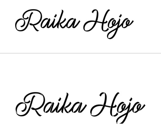

for the raika pngs i screenshotted some sprites then copied them in. idk how to use symmetry so i placed one png at one side of the blinkie, and found what X coordinate it was at. (ie 205px) and then subtracted that from my blinkie template's total X width (730px). then manually typed the X coordinate of the other png based off that formula (so to get a png symmetrical to an image at 205px, the X coordinate of the png would be 730 - 205px.)
for the flashing dots i made two frames:


then i combined these in ezgif "gif maker". the lower the delay time the faster the gif will go.
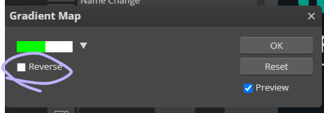
to make these two frames i used that earlier dotted border. essentially i used a gradient map on the dotted border's layer where the black was the red colour used and then the white. (like this image below as an example, both colours are set at 50% and 50% to get an even split). this makes one frame. to get the other i just clicked "reverse gradient".

to make the pixels, i saved some raika pngs using the enstars wiki, and then opened a new canvas in photopea with the dimensions of 30x30. (30 width, 30 height). then i opened the pngs and sized them how i wanted. important for this step: CLICK ENTER ON YOUR KEYBOARD ONCE FINISHED SIZING! this will make the pngs go blurry rather than pixelated, which will result in a more legible image when viewed from far away. its really up to you but i like making my images blurry. example:

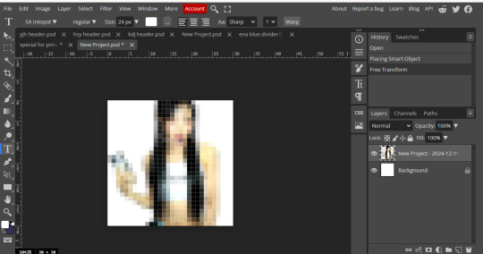
on the left i havent hit enter on my keyboard, on the right i have. save this basic png without the background layer
then just "ctrl + alt + t" again and either tilt the image, size it up, or use the arrow keys to move it sideways or up. save this moved image and once again i used ezgif gif maker to combine the two frames and make a pixel. oh also click "dont stack frames" when making the gif. here i moved the basic image 7 degrees to the left and used a delay of 30. hope this helped ^_^


6 notes
·
View notes
Text
Useful free tools for writing.
More of the incidental tools that I find useful, regardless of how one usually writes that are often known in the writing community, but you might not know?
One Look dictionary
Reverse word look up. You know when you're getting stumped on a word you kinda know, but only can get the definition of, or you want to make sure your 3-word phrase can't be said more succinctly? Yeah, this resource should help. (The underline is a link)
Google Docs
I should note that after about 100K words, it starts to struggle. But it's good for editing, collab work, spreadsheets, and also keeping track of your previous drafts so if someone says, "But, but you plagiarized from me," you have a log saying you didn't, so you can say, "you likely took from me."
And so on.
Libre Office–because not everyone wants to deal with Google Docs or can afford Microsoft office. It also has a recovery function, so if it crashes, you can get your words back. (Microsoft Office often doesn't?)
Use it for formatting your manuscripts. For the editors out there, accept ODT format. This is absolutely free and sometimes it doesn't port well.
Rhyming dictionaries–yes, they exist. The slant rhyming is also useful. There are slant rhyming dictionaries too.
The almighty square bracket. []
To all of you discovery writers out there that can't afford Scrivener. This is the tool for you. You've written and dumped all this information into the text that shouldn't belong there, but you want to keep it. What do you do? You square bracket it.
If not that, there is also the curly bracket if you need a sub category. {
It's great for:
Editing notes.
Please expand this note to yourself.
Examine this phrase later because you moved on, but it doesn't sound right.
Cataloging important information you might need at a later date.
Info dumping that you want to break up.
Storing long descriptions you want to use elsewhere.
You're too lazy to catalog in your world building notes great information.
You have ADHD and some other idea has occurred to you, but it's totally off topic. Square bracket.
To avoid plagiarism 'cause you forgot you pulled a source.
If you're one of those super detailed people, you can also color code it. The reason is that both curly and square brackets almost never show up in manuscripts. <> sometimes does, but also often doesn't.
The best part is no matter your program, format, or keyboard, you have it.
Note that this doesn't work for Japanese as well, but Japanese also have access to {} which is why I noted it here.
Spreadsheets
You need to make a calendar for your planet and need the quick calculations.
You need to make a morpheme list for your mythical language.
You want to delineate gender quickly.
This usually comes with Google Spreadsheets, Microsoft Office and Libre Office. But writers often (me included) forget they exist.
But they are useful for more than number crunching. And some writers use them for plotting too.
For Fantasy/SF writers: Donjon:
The whole website, but particularly the Fantasy Calendar maker is useful.
Google Search: Quotes.
You want to fact check a quote. Or you got distracted and forgot to put in the citation information.
To be or not to be
is horrible search for. So what you do is this: "To be or not to be."
And you might get Will Shakespeare.
BTW, Goodreads is a horrible horrible source for finding out where quotes came from. Make sure you have the actual page number/place it was said with the surrounding quotes.
Equally, the -[item] is also often useful when you're searching.
You're looking up say... Kimchi, and you want search results that don't have napa in it You would type "kimchi -napa"
You are researching... I hope, I hope.
Public domain books: Project Gutenberg
You need a back issues of Gustav Freytag's Dies Techniks des dramas.
You need the quote from Anne of Green Gables.
You want to check if this Winnie the Pooh quote is in the earlier or later works because of public domain issues.
You need to read The Art of War for the tenth time.
You need to read Machiavelli's The Prince, because you are writing politics and war.
This is the place to find it. Sometimes, sometimes it is public domain, but it's not in there.
Library
Libby (app), for example. Sign up for it. Get a library card and you'll save yourself money. Some countries don't have one, but for the ones that do, you can read print books and consume audiobooks at home.
Often self-pubbed books are on there too. If you have an amazon account then you can use the kindle app with it.
Sometimes you can also go to university libraries and though you can't check anything out, you can use their catalogs to look up things. You sometimes have to be there, but often they give links to free resources in their catalogs and might be easier to use than JSTOR. You don't have to be a student. Just be respectful of the people there, and try to put the books back where you found them. (usual library stuff).
This will save you going to Hawaii for the University of Hawaii, for example, because you know they have some awesome East Asian resources.
20 notes
·
View notes
Text
It's been a while, but I feel the need for some political analysis. Not the specific issue things I've been doing, but a broader look at the 2024 election. LONG RANT (TM) time?
INTRODUCTION
As I imagine you're aware by now if you read anything I write, I'm a bit of a data guy. I've been following the polls for a few decades now and I find it a good way to keep sane in the chaos of an election season. This time, though… this time I'm not so sure.
Oh, don't get me wrong, I'm still following the polling like a crack addicted muppet, I'm just no longer sure that it's accurate, even within its own margins of error. There are a few reasons for this, the long-standing ones like declining response rates, but also some new ones to do with the changing electorate. A bunch of things are coming together in ways that make me no longer certain that we're getting an accurate picture.
That said, there is still data I'm seeing that I find useful. Focus groups, for example, are still producing interesting nuggets of information that help fill in a few gaps, but more on that later. First, the polling.
HOW POLLING WORKS
So polling, at its heart is fairly simple. You call, text, or otherwise survey a bunch of people, usually on the order of a thousand or so, and ask them for their opinions. Then you figure out the race, age, and other demographic information of the people you got and use some statistical tools to normalize them to the broader population.
For example, if your thousand person sample was 5% black but you think the voting population is going to be 10% black, you'll "weight" the answers your black respondents gave. In other words, you'll give more impact to their answers to try to better represent who you think is actually going to show up on election day. If you get more of a group than you think will actually show up, you'll do the reverse and de-weight them.
If you think about that for a minute, you'll realize that there are two really big places where error can seep into your polling.
POLLING ERRORS
The first is called the response rate. It used to be that you'd have to call about 2,000-3,000 people to get 1,000 responses. Nowadays, you've got to hit closer to 10,000 people. And there's good research showing that the kind of people that respond to polls are meaningfully different than the kind of people who don't respond but still vote.
That said, pollsters have adapted and have gotten reasonably good at adjusting for this kind of error. Well, the good ones have, the bad ones just do low-quality polls and their results are terrible as a result. There was one particularly longitudinal poll during the 2016 election that apparently only had one black Trump supporter, who they weighted heavily, who would just stop answering their questions when he felt Trump was doing badly which led to some wild swings in their results depending on whether he answered that week or not. Generally speaking, though, this kind of error isn't as big of a problem in decent polling as we kind of thought it would be when it started showing up a decade or two ago. The other kind of error, though…
Look, in order to weight your polled population properly, you have to have a reasonable idea of who's actually going to show up to vote. Will 30% of white women between the ages of 18 and 24 show up or will it be 50%? Will the electorate in Georgia be 30% black or 40% black? Answering these questions makes a huge impact on how the final result turns out, and the way we generally answer these questions is we look at the past few elections.
The problem with that is, there's nothing consistent or predictable about the last few elections. 2012 and 2014 were pretty standard elections where the predictable groups showed up in predictable numbers and things went as expected. In 2016, though, Trump turned out a huge amount of people who had never voted before and shifted the result in key states that were not expected to go for him. Those same people, though, didn't show up in 2018 when he wasn't on the ballot and the result was a pretty solid win for Democrats in places that hadn't been expected to for them after 2016. Then, in 2020, those same people showed up to vote for Trump again, but this time they were outnumbered by ANOTHER new group of voters who hadn't showed up before but now showed up to vote against Trump. Finally, in 2022, yet another huge wave of new voters showed up, energized and outraged by the Dobbs decision that overturned Roe vs. Wade, and completely overturned the conventional wisdom of a strong Republican showing.
In other words, there's no way anyone could reasonably say that we can make a strong prediction of what the 2024 electorate is going to look like based on the last decade of elections. Are the voters who were outraged about abortion in 2022 still outraged? Will the new voters who showed up for Trump in 2016 and 2020 show up in the same kind of numbers? Will the anti-Trump voters of 2020? Maybe they have got it right this time, but there's absolutely no way to know that. Even worse, there's no way to know which way the error is running, the polls might be massively overweighted in Trump's favor or Harris's.
I certainly can't say and I'm fairly certain no one else can either.
OTHER DATA
That said, there is other data we can look at. My personal favorite these days are focus groups, particularly those conducted by people who are good at running them like Whit Ayers or Frank Luntz. Rather than look at what percentage of voters are voting for Trump, Harris, or undecided, they simply take a group of undecided voters and ask questions to determine why they're undecided and what could shift them and the results of those conversations are really interesting.
I've seen results from a few of these focus group results so far and they're fairly consistent. There's the standard undecided voters, the low-information voters who simply haven't paid attention enough to know where they stand and there's the so-called "double-haters" who just really dislike both candidates, but, surprisingly, these groups aren't the majority.
The majority of undecided voters apparently are generally moderate conservative voters who know that they don't like Trump but don't feel like they know enough about Harris to vote for her. Specifically, they feel like they don't know enough about her economic policies.
And that's a very interesting result, because it's the kind of result you see when an unpopular incumbent runs for re-election. Unpopular incumbents can and do win re-election; it's not enough that people don't like them, they also have to like the alternative. That's why John Kerry didn't defeat George W. Bush in 2004 and why Bill Clinton did defeat George H. W. Bush in 1992. Clinton persuaded voters that he would be better and Kerry didn't.
When Biden was running against Trump earlier this year, he was the unpopular incumbent and, while people didn't like Trump either, a critical mass of them seem to have liked him better than Biden. With Biden's withdrawal, the race has shifted. Trump may not technically be the incumbent, but people have seen him in office and they didn't like him. Harris has been Vice-President for about three and a half years now, but that's not being President, not even close. She's the unknown in this race.
WHAT IT ALL MEANS
Look, I don't know if there's enough undecided voters in this race to make a difference. Heck, it's possible that either Trump or Harris already have enough voters in the tank to win this thing in the key states and we just don't know it. All that said, there's a clear fight on for what undecided voters currently exist.
Harris needs to convince them that she has a plan to manage the economy. Job growth, wage growth, and consumer spending are strong and inflation is back down to reasonable levels, but the scars of high inflation remain. If she can convince voters that she has a plan to bring down costs and/or raise wages, she'll win. This is going to take more than the broad-strokes style answers she's been giving so far, my take is that she'll need to give a formal economic policy address, preferably more than one, and go into detail and depth about her economic plans.
Trump's only chance, on the other hand, is to smear Harris as well as he can. After four years in office and about a decade of a constant campaign, I'm pretty sure there's nothing left that could convince these voters to like him. Fortunately for him, he doesn't need them to like him, he just needs them to dislike her. That said, the relentless personal attacks he's been lobbing aren't going to do it, he's going to need to actually attack her economic policy, but that runs the risk of highlighting it to voters who may have otherwise not have heard about it.
CONCLUSION
Look, the polling data is iffy to me. It may be accurate or it might not, but we really have no way of knowing given the massive churn in the electorate this last decade. Assuming, though, that this race really is a tight one and will come down to undecided voters, it seems like this really is Harris's election to lose. If she can define herself, particularly her economic policies, in a way that appeals to undecided voters, it's likely that she can win them and, presumably, the election as well and there's not a lot that Trump can do about that without becoming a far different person than he is.
11 notes
·
View notes
Text
How Tumblr’s Platform Vernacular Shapes Digital Activism and Micro-Publics
Tumblr isn’t just a relic of 2010s internet culture - It’s a living, breathing ecosystem where *platform vernacular* fuels niche communities and redefines digital activism. But how do Tumblr’s unique language and norms empower marginalized voices while navigating the paradoxes of the “public sphere”?

Micro-Publics and the Rise of Hashtag Vernacular
Habermas’s “public sphere” idealizes open, rational discourse, but Tumblr’s fragmented micro-publics - like LGBTQ+ blogs or fan communities - show how digital spaces operate differently (Simpson 2018). Here, hashtags like #BlackLivesMatter or #MeToo aren’t just metadata; they’re rallying cries that shape political discourse (Rho & Mazmanian 2020).
For instance, the #bodypositive movement on Tumblr challenges beauty norms through user-generated selfies and essays, fostering a community-driven counter-narrative to mainstream media (Reif, Miller & Taddicken 2022). These hashtags act as vernacular glue, binding users through shared slang (e.g., “OTP” or “AU”), GIFs, and reblogs - a far cry from Habermas’s text-heavy ideal.

Anonymity as a Double-Edged Sword
Tumblr’s lack of real-name policies creates safe spaces for marginalized groups, like LGBTQIA+ teens, to express themselves without fear of surveillance (Cavalcante 2018). Yet, this anonymity coexists with algorithmic biases. While Tumblr’s reverse-chronological feed *seems* democratic, studies show platforms like Twitter skew political discourse leftward, raising questions about whose voices get amplified (Huszár et al. 2021).

Platform Vernacular in Action: Memes and Fandom
Tumblr’s vernacular thrives on remix culture. Take TJLC (The Johnlock Conspiracy), a Sherlock fandom theory that spiralled into a meta-commentary on queer representation. To be more specific, the video of Sarah Z’s dissection of TJLC highlights how Tumblr’s “shitposting” and roleplay (RP) cultures blend humour with activism. Memes here aren’t just jokes - they’re resistance tools, as seen in political movements like #FreeHongKong, where absurdist humour critiques authoritarianism (Zheng & Li 2023).
youtube
Challenges: Surveillance and Algorithmic Gatekeeping
Despite its grassroots ethos, Tumblr isn’t immune to corporate or governmental surveillance. The Department of Homeland Security’s social media monitoring underscores how “safe spaces” can still be policed (Boyce 2016). Meanwhile, algorithmic curation risks homogenizing discourse - echoing Habermas’s fear of institutional influence.

Conclusion: Tumblr as a Vernacular Public Sphere?
Tumblr’s vernacular - reblogs, dashboards, and niche slang - creates a *participatory* public sphere where aesthetics and activism collide. Yet, its fragmented micro-publics remind us that the digital “public sphere” is plural, messy, and perpetually evolving. As platforms phase out hashtags, Tumblr’s survival hinges on balancing creativity with resistance to algorithmic control.
Reference:
Anselmo, DW 2018, ‘Gender and Queer Fan Labor on Tumblr’, Feminist Media Histories, vol. 4, University of California Press, no. 1, pp. 84–114.
Boyce, GA 2015, ‘The rugged border: Surveillance, policing and the dynamic materiality of the US/Mexico frontier’, Environment and Planning D Society and Space, vol. 34, SAGE Publishing, no. 2, pp. 245–262.
Cavalcante, A 2018, ‘Tumbling Into Queer Utopias and Vortexes: Experiences of LGBTQ Social Media Users on Tumblr’, Journal of Homosexuality, vol. 66, Taylor & Francis, no. 12, pp. 1715–1735.
Huszár, F, Ktena, SI, O’Brien, C, Belli, L, Schlaikjer, A & Hardt, M 2021, ‘Algorithmic amplification of politics on Twitter’, Proceedings of the National Academy of Sciences, vol. 119, no. 1.
Reif, A, Miller, I & Taddicken, M 2022, ‘“Love the Skin You‘re In”: An Analysis of Women’s Self-Presentation and User Reactions to Selfies Using the Tumblr Hashtag #bodypositive’, Mass Communication & Society, vol. 26, Taylor & Francis, no. 6, pp. 1038–1061.
Rho, EH & Mazmanian, M 2020, ‘Political Hashtags & the Lost Art of Democratic Discourse’, pp. 1–13, viewed 16 February 2025.
Simpson, E 2018, ‘Integrated & Alone’, pp. 237–240.
Zheng, Q & Li, M 2024, ‘Foreign Movies and TV Dramas as the Source of Political Argot in an Authoritarian Context: Memes and Creative Resistance in Chinese Social Media’, Critical Arts, Taylor & Francis, pp. 1–19.
#mda20009#PlatformVernacular#DigitalCommunities#HashtagActivism#PublicSphere#TumblrCulture#SocialMediaTheory#MicroPublics#DigitalCitizenship#Youtube
2 notes
·
View notes
Text
My way in - Analysis and Concrete Action Plans
Anyone can be inspired by art. But can anyone create art?
I think that's a complicated question. Generally speaking, of course anyone can pick up a paper & pencil and draw something, or type out some poetry from their stream-of-consciousness. But is the artist in this scenario satisfied with what they've put out into the world? I wouldn't be. The artistic inspiration often comes paired with a clarity of purpose. And when our own lack of technical skill prevents us from matching the clarity we have inside, it feels helpless. Like there's some sort of "skilled artists" club out there in the world, and somehow they all got the mysterious membership card somehow, and it's just a gulf that can't be crossed. "Man, it would be cool, but I just don't have the stuff." It wasn't until last year when I completed the first project I was ever truly proud of creating that I realized that the gulf is crossable.
Basically, what I'm saying is that before I can make art that I am proud of, I need to understand my current limitations and learn my tools.
I have some music experience and some theatre experience, but I primarily studied a STEM subject in school. My experience with the arts has been enough to dabble, but not enough to express, and basically everything is hard. Tag urself in this meme, I'm both people
So what's my plan for dealing with this?
First: What skills will I need in order to create a project on the scale of Epic?
Writing (Plots)
Writing (Characters)
Writing (Lyrics)
Music (Composition)
Music (Singing)
Music (Production)
(There's other stuff like social media, advertising, etc. but I'm intentionally choosing to ignore other necessary aspects unrelated to the creative process, because honestly a lot of that stuff is interchangeable and can be figured out as it comes up. No use overplanning. The most I'll do for now until I've got something to show is to keep up these blog posts and crosspost to other sites. Hi Instagram!)
I have done minimal creative writing before. I know just enough music theory to play the trumpet, but I can't improvise my way out of a paper bag and don't know a chord progression from a lydian triad. I don't even feel comfortable right now singing in general, even by myself. And even if I did, I doubt I'd be good at it, and my space at home isn't exactly conducive to practice mush of anything loud. Lots of challenges, but with the confidence that even these large gulfs can be crossed, it feels not quite so overwhelming as it might have to me as a younger man.
Second: What are the concrete actions within my power to start to cross the skill gap?
Writing - I'm going to make a spreadsheet. I will start with systematically analyzing each song from Epic, laser targeting some basic information from the text (starting with lyrics only, musical analysis later once I have a better idea of what I'm doing). I will be focusing on identifying how the situations, characters, philosophies, and relationships are communicated through the lyrics. After I get through everything in Epic, I'll probably do a similar exercise for some of the other seminal works of musical theatre, and even non-musical theatre. If I want to make a competent contribution to the artistic conversation, I need a solid foundation of artistic context.
Parallel to this, I will map out the narrative shape of Epic and other stories I'm drawing inspiration from. By discovering patterns, I can reverse engineer what Morvic's journey through the Realm of Shades could look like.
I am also personally taking notes whenever specific ideas about Psychagogue, its characters, situations, and its themes come to me.
Music - I'm less certain about this one. At the very least, I'll sign up for a singing class and emphasize that musical theatre is the style of singing I would like to focus on. Music theory and composition is currently looking like the actual most difficult part to me right now. At this point, I'm honestly struggling to find appropriate resources for learning music theory and production that will stick with me this time. But I also was never able to consistently work out until about a year ago when I found a sustainable way in, so if it's possible for that, it's possible for this. It'll just take more time. I have some tentative ideas for what this might end up looking like, but I'm keeping the horse before the cart on this one.
Ramble over.
Next post, I'll show off initial progress on the spreadsheet and what kind of progress I've made on learning music.
#PsychagogueDigitalMusical#art#artistic process#art analysis#literary analysis#lyric analysis#Epic the musical analysis#learning writing#amateur writer#musical theatre#learning music#how to sing#no skill gulf is uncrossable
2 notes
·
View notes
Text
Secure Your Data with Our Free Hash Generator Tool 🔒
In today’s digital world, data security is more important than ever. Whether you’re a developer, a cybersecurity professional, or just someone who wants to protect their data, hashing is a crucial step. That’s where our Hash Generator Tool comes in!
🌟 Why Use a Hash Generator?
Hashing is a method of converting data into a fixed-length string of characters, which is nearly impossible to reverse. It's commonly used for:
Password protection
Data encryption
File integrity verification
Securing sensitive information
With our tool, you can generate hashes effortlessly, ensuring your data remains secure.
🚀 Features of Our Hash Generator Tool
Here’s why our tool is the ultimate solution for all your hashing needs: ✅ Generate MD5, SHA1, SHA256, and more ✅ Instant results – no waiting around ✅ Supports various input formats ✅ Free, easy-to-use interface
💻 How to Use the Hash Generator Tool?
1️⃣ Enter the text or data you want to hash. 2️⃣ Select the hash type (e.g., MD5, SHA1). 3️⃣ Click "Generate" to get your secure hash instantly!
It’s that simple! No technical expertise required.
🔗 Try It Now!
Ready to secure your data? Click the link below to access our Hash Generator Tool for FREE: 👉 Hash Generator Tool
🔒 Why Choose Us?
At Techronixz, we’re committed to providing tools that make coding and tech easy for everyone. Whether you’re a beginner or an expert, our Hash Generator Tool is designed with simplicity, speed, and security in mind.
💬 Join the Conversation! Got questions about hashing? Want to learn more about data security? Drop your thoughts in the comments or reblog this post to share with your friends!
✨ Don’t forget to explore more tools at Techronixz – your go-to platform for coding and tech resources.
2 notes
·
View notes