#Spatial Layouts
Explore tagged Tumblr posts
Visit Tumblr Blog
Explore Tumblr blogs with no restrictions, modern design and the best experience.
Last Seen Tumblr Blogs


Fun Fact
Tumblr was attacked by a cross-site scripting worm deployed by the Internet troll group GNAA on Dec 3, 2012.
Text
Jungian Archetypes and Spatial Layouts
Home design and identity
According to Carl Jung’s theory of Archetypes, spatial layouts in a home can symbolize deeper psychological structures and aspects of the homeowner’s unconscious mind. These layouts act as external representations of the inner workings of the psyche, and each type of layout can reflect different elements of the individual’s personality, emotional needs, and psychological state. Below is a description of how different spatial arrangements symbolize deep psychological structures.
1. Open Plan Layout
Symbolism: Represents freedom, openness, and flexibility.
Psychological Structure: An open-plan layout, which minimizes walls and boundaries between different living spaces, reflects a deep need for freedom, social interaction, and emotional openness. It symbolizes an extroverted personality that values communication, connection, and fluidity in relationships. This layout can also reflect the individual’s confidence in their ability to handle ambiguity and change, showing an acceptance of complexity and a desire for less rigid boundaries in life.
2. Closed/Compartmentalized Layout
Symbolism: Represents boundaries, privacy, and control.
Psychological Structure: A more compartmentalized layout, with distinct rooms and clear divisions between spaces, reflects a need for boundaries, order, and personal space. It symbolizes a more introverted or controlled personality that values privacy, structure, and predictability. This layout suggests a psychological preference for compartmentalizing emotions, thoughts, and social interactions, indicating a tendency to create clear boundaries between different areas of life.
3. Symmetrical Layout
Symbolism: Represents balance, order, and harmony.
Psychological Structure: A symmetrical layout, where spaces are arranged in a balanced and mirrored fashion, reflects a need for harmony, equilibrium, and stability. It symbolizes a personality that seeks internal balance, fairness, and order in their life. This layout often indicates a desire for psychological stability and a strong sense of justice, suggesting that the individual values order and predictability in their relationships and environment.
4. Asymmetrical Layout
Symbolism: Represents creativity, spontaneity, and individuality.
Psychological Structure: An asymmetrical layout, where spaces are arranged in an uneven or unbalanced way, reflects a creative, spontaneous, and individualistic personality. It symbolizes a deep psychological need for self-expression and flexibility, indicating that the individual is comfortable with unpredictability and diversity in their environment. This layout often points to an adventurous or non-conformist mindset, with a willingness to explore new ideas and experiences.
5. Circular Layout
Symbolism: Represents wholeness, unity, and interconnectedness.
Psychological Structure: A circular layout, where spaces are arranged around a central point or flow in a circular pattern, reflects a deep need for unity, community, and interconnectedness. It symbolizes the archetype of the “Self,” representing completeness and integration of all aspects of the psyche. This layout suggests a holistic approach to life, where the individual values the integration of different parts of their personality and seeks to create meaningful connections with others.
6. Vertical Layout (Multi-level Spaces)
Symbolism: Represents aspiration, growth, and transcendence.
Psychological Structure: A vertical layout, with multiple levels or loft spaces, reflects a deep need for growth, aspiration, and personal transcendence. It symbolizes a desire to achieve higher levels of consciousness or spiritual development. This layout often indicates a personality that seeks to rise above challenges and achieve personal or intellectual growth, pointing to a focus on ambition and progress in life.
7. Horizontal Layout (Single-level Spaces)
Symbolism: Represents stability, grounding, and practicality.
Psychological Structure: A horizontal layout, where all spaces are on a single level, reflects a need for stability, grounding, and practicality. It symbolizes a personality that values simplicity, order, and connection to the physical world. This layout often suggests a down-to-earth approach to life, with a focus on maintaining a stable and secure environment.
8. Labyrinthine Layout
Symbolism: Represents complexity, mystery, and introspection.
Psychological Structure: A labyrinthine layout, with winding paths and multiple small spaces, reflects a deep need for introspection, exploration, and psychological complexity. It symbolizes the journey into the unconscious mind, representing a search for self-discovery and hidden truths. This layout often indicates a personality that is deeply reflective, seeking to understand the complexities of their own psyche and the world around them.
9. Radial Layout
Symbolism: Represents centralization, focus, and authority.
Psychological Structure: A radial layout, where spaces radiate outward from a central core, reflects a need for control, focus, and authority. It symbolizes the centralization of power and decision-making, indicating a personality that values leadership, direction, and a clear sense of purpose. This layout suggests a strong sense of personal power and responsibility, with a focus on directing and organizing both the physical environment and internal world.
10. Modular/Transformable Layout
Symbolism: Represents adaptability, flexibility, and resourcefulness.
Psychological Structure: A modular or transformable layout, where spaces can be reconfigured or adapted for different purposes, reflects a deep psychological need for flexibility, adaptability, and resourcefulness. It symbolizes an ability to adapt to changing circumstances and make the most of available resources. This layout often points to a personality that values innovation and practicality, with a focus on solving problems and finding creative solutions.
Summary Table: Spatial Layouts and Deep Psychological Structures

Conclusion:
In Jungian terms, the spatial layout of a home reflects the deeper, often unconscious, psychological structures of the individual. Each layout, whether open or closed, symmetrical or asymmetrical, or even modular, carries symbolic meaning tied to the personality and emotional needs of the homeowner. These layouts can be interpreted as external manifestations of inner drives, desires, and challenges.
Arquétipos Junguianos e Layouts Espaciais
De acordo com a teoria dos Arquétipos de Carl Jung, os layouts espaciais em uma casa podem simbolizar estruturas psicológicas profundas e aspectos do inconsciente do proprietário. Esses layouts atuam como representações externas do funcionamento interno da psique, e cada tipo de layout pode refletir diferentes elementos da personalidade, necessidades emocionais e estado psicológico do indivíduo. Abaixo está uma descrição de como diferentes arranjos espaciais simbolizam estruturas psicológicas profundas.
1. Layout de Planta Aberta
Simbolismo: Representa liberdade, abertura e flexibilidade.
Estrutura Psicológica: Um layout de planta aberta, que minimiza paredes e divisões entre os diferentes espaços, reflete uma necessidade profunda de liberdade, interação social e abertura emocional. Simboliza uma personalidade extrovertida que valoriza a comunicação, a conexão e a fluidez nos relacionamentos. Esse layout também pode refletir a confiança do indivíduo em lidar com ambiguidade e mudanças, mostrando aceitação de complexidade e um desejo por menos limites rígidos na vida.
2. Layout Fechado/Compartimentado
Simbolismo: Representa limites, privacidade e controle.
Estrutura Psicológica: Um layout mais compartimentado, com divisões claras entre os cômodos, reflete uma necessidade de limites, ordem e espaço pessoal. Simboliza uma personalidade mais introvertida ou controlada que valoriza a privacidade, a estrutura e a previsibilidade. Esse layout sugere uma preferência psicológica por compartimentar emoções, pensamentos e interações sociais, indicando uma tendência a criar limites claros entre as diferentes áreas da vida.
3. Layout Simétrico
Simbolismo: Representa equilíbrio, ordem e harmonia.
Estrutura Psicológica: Um layout simétrico, onde os espaços são dispostos de forma equilibrada e espelhada, reflete uma necessidade de harmonia, equilíbrio e estabilidade. Simboliza uma personalidade que busca equilíbrio interno, justiça e ordem em sua vida. Esse layout frequentemente indica um desejo por estabilidade psicológica e um forte senso de justiça, sugerindo que o indivíduo valoriza a ordem e a previsibilidade em seus relacionamentos e ambiente.
4. Layout Assimétrico
Simbolismo: Representa criatividade, espontaneidade e individualidade.
Estrutura Psicológica: Um layout assimétrico, onde os espaços são dispostos de maneira desigual ou desbalanceada, reflete uma personalidade criativa, espontânea e individualista. Simboliza uma necessidade psicológica profunda de autoexpressão e flexibilidade, indicando que o indivíduo se sente confortável com a imprevisibilidade e a diversidade em seu ambiente. Esse layout geralmente aponta para uma mentalidade aventureira ou não conformista, com disposição para explorar novas ideias e experiências.
5. Layout Circular
Simbolismo: Representa integridade, unidade e interconexão.
Estrutura Psicológica: Um layout circular, onde os espaços são organizados ao redor de um ponto central ou fluem em um padrão circular, reflete uma necessidade profunda de unidade, comunidade e interconexão. Simboliza o arquétipo do "Eu", representando a completude e a integração de todos os aspectos da psique. Esse layout sugere uma abordagem holística da vida, em que o indivíduo valoriza a integração das diferentes partes de sua personalidade e busca criar conexões significativas com os outros.
6. Layout Vertical (Espaços de Vários Níveis)
Simbolismo: Representa aspiração, crescimento e transcendência.
Estrutura Psicológica: Um layout vertical, com múltiplos níveis ou espaços elevados, reflete uma necessidade profunda de crescimento, aspiração e transcendência pessoal. Simboliza um desejo de alcançar níveis mais elevados de consciência ou desenvolvimento espiritual. Esse layout geralmente indica uma personalidade que busca superar desafios e alcançar crescimento pessoal ou intelectual, apontando para um foco em ambição e progresso na vida.
7. Layout Horizontal (Espaços de Um Só Nível)
Simbolismo: Representa estabilidade, conexão com o chão e praticidade.
Estrutura Psicológica: Um layout horizontal, onde todos os espaços estão em um único nível, reflete uma necessidade de estabilidade, conexão com o chão e praticidade. Simboliza uma personalidade que valoriza a simplicidade, a ordem e a conexão com o mundo físico. Esse layout geralmente sugere uma abordagem realista da vida, com foco em manter um ambiente estável e seguro.
8. Layout Labiríntico
Simbolismo: Representa complexidade, mistério e introspecção.
Estrutura Psicológica: Um layout labiríntico, com caminhos sinuosos e vários pequenos espaços, reflete uma necessidade profunda de introspecção, exploração e complexidade psicológica. Simboliza a jornada pelo inconsciente, representando a busca pela autodescoberta e verdades ocultas. Esse layout frequentemente indica uma personalidade profundamente reflexiva, buscando entender as complexidades de sua própria psique e do mundo ao seu redor.
9. Layout Radial
Simbolismo: Representa centralização, foco e autoridade.
Estrutura Psicológica: Um layout radial, onde os espaços irradiam a partir de um núcleo central, reflete uma necessidade de controle, foco e autoridade. Simboliza a centralização do poder e da tomada de decisões, indicando uma personalidade que valoriza liderança, direção e um claro senso de propósito. Esse layout sugere um forte senso de poder pessoal e responsabilidade, com foco na organização e direção do ambiente físico e mundo interno.
10. Layout Modular/Transformável
Simbolismo: Representa adaptabilidade, flexibilidade e engenhosidade.
Estrutura Psicológica: Um layout modular ou transformável, onde os espaços podem ser reconfigurados ou adaptados para diferentes finalidades, reflete uma necessidade psicológica profunda de flexibilidade, adaptabilidade e engenhosidade. Simboliza uma habilidade de se adaptar a circunstâncias em mudança e maximizar os recursos disponíveis. Esse layout geralmente aponta para uma personalidade que valoriza inovação e praticidade, com foco em resolver problemas e encontrar soluções criativas.
Tabela Resumo: Layouts Espaciais e Estruturas Psicológicas Profundas

Conclusão:
Nos termos de Jung, o layout espacial de uma casa reflete as estruturas psicológicas mais profundas e, muitas vezes, inconscientes do indivíduo. Cada layout, seja aberto ou fechado, simétrico ou assimétrico, ou até modular, carrega um significado simbólico relacionado à personalidade e às necessidades emocionais do proprietário. Esses layouts podem ser interpretados como manifestações externas dos impulsos, desejos e desafios internos.
#Jungian Archetypes#Spatial Layouts#home design#identity#Arquétipos Junguianos#Layouts Espaciais#Identidade
1 note
·
View note
Note
have you guys been dragged to house parties by the tridentarii siblings before, or is this the first time?

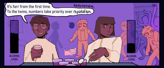


they won the beer pong game
part 1 | 2 | 3 | 4 | 5 |
#do me a favor and ignore the spatial layout of the background here. i have to ignore consistency for composition#palamedes sextus#camilla hect#gideon nav#ianthe tridentarius#the locked tomb#gideon the ninth#artlog#EVENT: tridentarii party#party#beer pong
518 notes
·
View notes
Text
I totally forgot how wild (kinda derogatory) the level design and gameplay loop of the OG Kingdom Hearts is
#I don't understand the spatial layout of literally location and my sister can't take two steps or backtrack without having to fight a mob#And the combat combos sometimes cause her to FALL OFF upper levels due to the lateral aerials#Truly insane design decisions happening
7 notes
·
View notes
Text
"we're open to edits" how very gracious; considering the instructions you sent are for producing an initial draft of the layout options you have in mind, I should fucking hope you're open to edits.
We're definitely going to have to go with the multi-page option because in case you didn't notice, your Word doc draft is already way longer than 1 page.
#work bullshit#i hate it here#how are people who do spatial layout shit for a living so bad at spatial layout problems#angst and woe
4 notes
·
View notes
Text
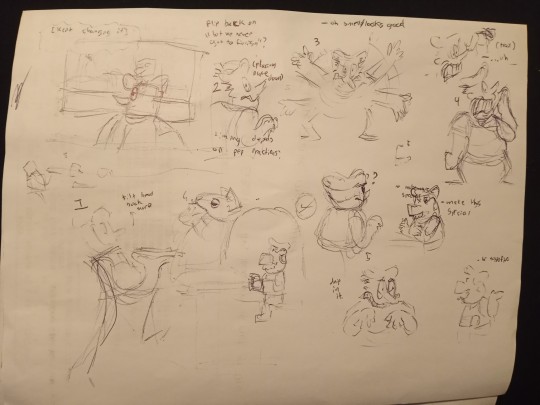
comic planning/roughs on the clock at work 👍 ok. this one's still a few posts out though
#god i really do just need to get a tablet or. something#some way to draw digitally on the go bc my laptop is um#at least 200% less portable than your typical old clunky laptop. its a whole ordeal#and as u can see tradish scribbles are barely usable#though i guess it would help if i ever remembered to grab something besides a shite pen at work lmao <-hates pen forever#mad bc i think this one is kind of mid+redundant for what i'd intended it to do bc of how some of the previous ones shifted#but i still gotta draw it bc one of the later ones uses it. buh#when i said these werent chronological or connected btw i lied#though only VERY VERY LOOSELY so. enough to bother *me* if i don't do them in order#but not enough that's really going to be noticeable to anyone else. they're each still intended 99% as standalone.#the arc is very minor but its there. for me. for anyone else it probably just amounts to a couple easter egg references/ consistencies#by the by the pizzaposts before this arent part of the series.#one small quickie thing and one i would...really like to get done sooner rather than later bc i need it out of my system#former's like 70% sketched im just waffling on execution#latter is uh...theres a lot there but it's harder to work on And harder tell how close to done it is.#unrelated its funny how i Always forget brick until i start putting anything down and then its like oh god yeah i can do bg Jokes with him#funny in the sense that one of my webcomic protag oc's is a...spatially similar deal as him [little kid with a big bear companion]#and i ALWAYS forget the bear when im scripting it. until i start messing with the layout and its like fuck theres a bear.#i have to do things with this now. fortunately thus far it hasn't been too hard to adapt#much rambling tonight goodbye. i haev to go block all these damn bots
14 notes
·
View notes
Text
SFX Magazine Issue 372 - Designing Good Omens ❤ 😊
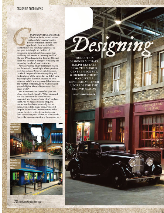


PRODUCTION DESIGNER MICHAEL RALPH REVEALS HOW THE SHOW’S CENTREPIECE SET, WHICKBER STREET, WAS GIVEN A DEVILISHLY CLEVER UPGRADE FOR THE SECOND SEASON
WORDS: DAVE GOLDER
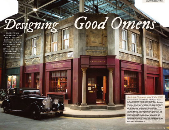
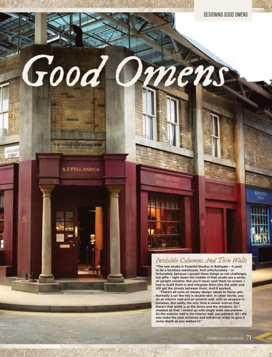
Invisible Columns And Thin Walls “The new studio is Pyramid Studios in Bathgate – it used to be a furniture warehouse. And unfortunately – or fortunately, because I accept these things as not challenges but gifts – right down the middle of that studio are a series of upright columns. But you’ll never spot them on screen. I had to build them in and integrate them into the walls and still get the streets between them. And it worked.
“There’s all sorts of cheeky design values to those sets. Normally a set like this is double-skin. In other words, you do an interior wall and an exterior wall, with an airspace in between. But really, the only time a viewer notices that there’s that width is at the doors and the windows. So I cheated all that. I ended up with single walls everywhere. So the exterior wall is the interior wall, just painted. All I did was make the sash windows and entrances wider to give it some depth as you walked in.”
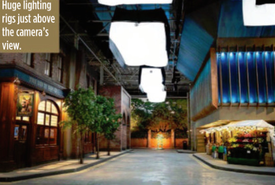
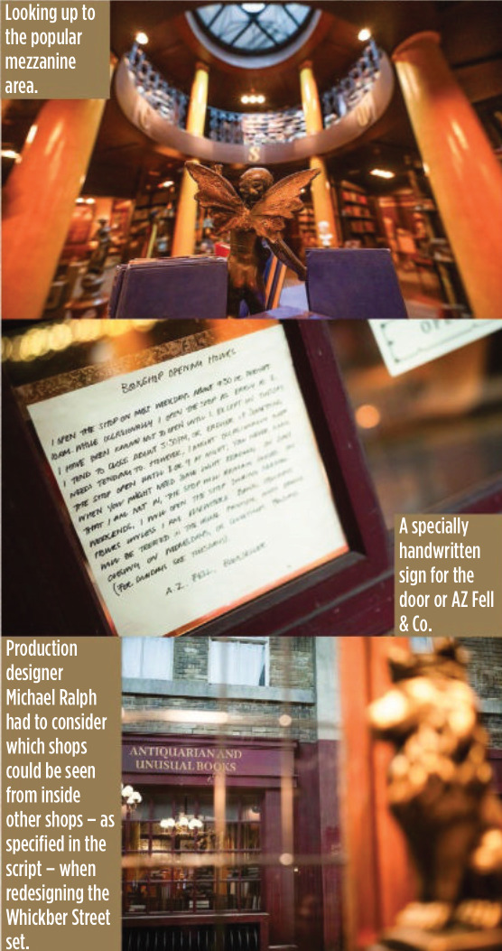
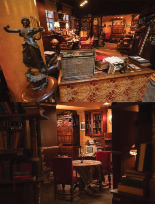
GOOD OMENS HAD A CHANGE of location for its second season, but hopefully you didn’t notice. Because Whickber Street in Soho upped sticks from an airfield in Hertfordshire to a furniture warehouse in Bathgate, Edinburgh. It’s the kind of nonsensical geographical shenanigans that could only make sense in the crazy world of film and TV, and production designer Michael Ralph was the man in charge of rebuilding and expanding the show’s vast central set. “I wish we could have built more in season one than we did,” says Ralph, whose previous work has included Primeval and Dickensian. “We built the ground floor of everything and the facades of all the shops. But we didn’t build anything higher than that, because we were out on an airfield in a very, very difficult terrain and weather conditions, so we really couldn’t go much higher. Visual effects created the upper levels.”
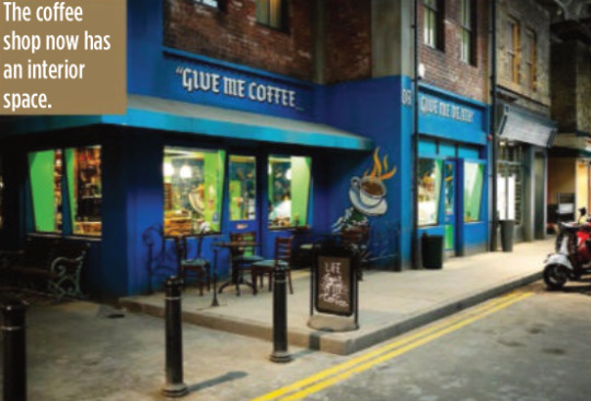
But with season two the set has gone to a whole other level… literally. “What happened was that the rest of the street became integrated into the series’s storyline,” explains Ralph. “So we needed a record shop, we needed a coffee shop that actually had an inside, we needed a magic shop, we needed the pub. To introduce those meant we had to change the street with a layout that works from a storylines point of view. In other words, things like someone standing at the counter in the record shop had to be able to eyeball somebody standing at the counter in the coffee shop. They had to be able to eyeball Aziraphale sitting in his office in the window of the bookshop. But the rest of it was a pleasure to do inside, because we could expand it and I could go up two storeys.”
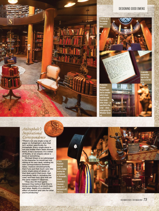
For most of the set, which is around 80 metres long and 60 metres wide, the two storeys only applied to the shop frontages, but in the case of Aziraphale’s bookshop, it allowed Ralph to build the mezzanine level for real this time. According to Ralph it became one of the cast and crews’ favourite places to hang out during down time.
But while AZ Fell & Co has grown in height, it actually has a slightly smaller footprint because of the logistics of adapting it to the new studio.
“Everybody swore to me that no one would notice,” says Ralph wryly. “I walked onto it and instinctively knew there was a difference immediately, and they hated me for that. I have this innate sense about spatial awareness and an eye like a spirit level.
“It’s not a lot, though – I think we’ve lost maybe two and a half feet on the front wall internally. I think that there’s a couple of other smaller areas, but only I’d notice. So I can be really annoying to my guys, but only on those levels. Not on any other. They actually quite like me…”
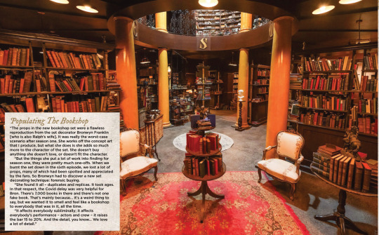
Populating The Bookshop “The props in the new bookshop set were a flawless reproduction from the set decorator Bronwyn Franklin [who is also Ralph’s wife]. It was really the worst-case scenario after season one. She works off the concept art that I produce, but what she does is she adds so much more to the character of the set. She doesn’t buy anything she doesn’t love, or doesn’t fit the character.
“But the things she put a lot of work into finding for season one, they were pretty much one-offs. When we burnt the set down in the sixth episode, we lost a lot of props, many of which had been spotted and appreciated by the fans. So Bronwyn had to discover a new set decorating technique: forensic buying.
“She found it all – duplicates and replicas. It took ages. In that respect, the Covid delay was very helpful for Bron. There’s 7,000 books in there and there’s not one fake book. That’s mainly because… it’s a weird thing to say, but we wanted it to smell and feel like a bookshop to everybody that was in it, all the time.
“It affects everybody subliminally; it affects everybody’s performance – actors and crew – it raises the bar 15 to 20%. And the detail, you know… We love a lot of detail.”
(look at the description under this, they called him 'Azi' hehehehe :D <3)
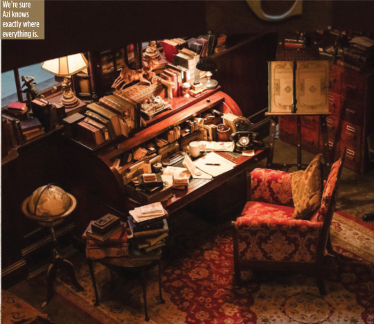
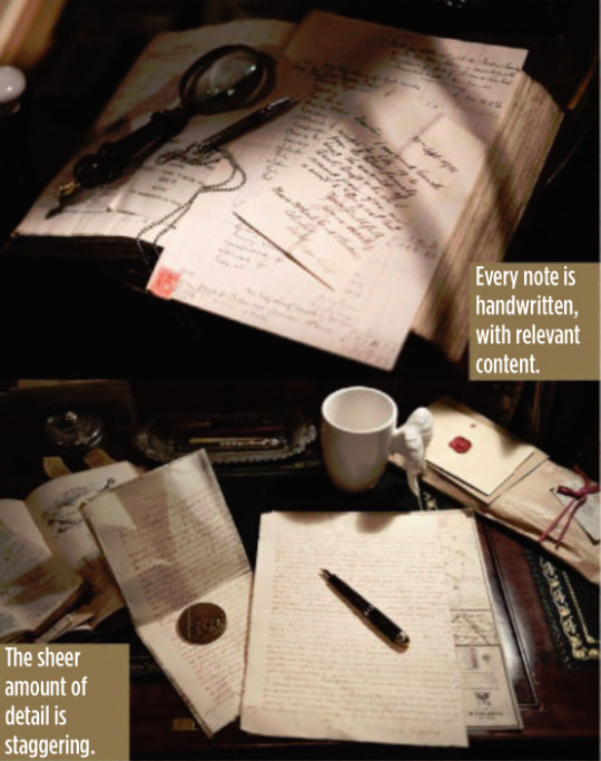
Aziraphale’s Inspirational Correspondence “There’s not one single scrap of paper on Aziraphale’s desk that isn’t written specifically for Aziraphale. Every single piece is not just fodder that’s been shoved there, it has a purpose; it’s a letter of thanks, or an enquiry about a book or something.
“Michael Sheen is so submerged in his character he would get lost sitting at his own desk, reading his own correspondence between takes. I believe wholeheartedly that if you put that much care into every single piece of detail, on that desk and in that room, that everybody feels it, including the crew, and then they give that set the same respect it deserves.
“They also lift their game because they believe that they’re doing something of so much care and value. Really, it’s a domino effect of passion and care for what you’re producing.”

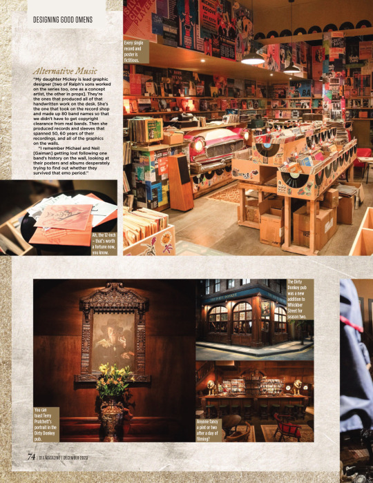
Alternative Music “My daughter Mickey is lead graphic designer [two of Ralph’s sons worked on the series too, one as a concept artist, the other in props]. They’re the ones that produced all of that handwritten work on the desk. She’s the one that took on the record shop and made up 80 band names so that we didn’t have to get copyright clearance from real bands. Then she produced records and sleeves that spanned 50, 60 years of their recordings, and all of the graphics on the walls.
“I remember Michael and Neil [Gaiman] getting lost following one band’s history on the wall, looking at their posters and albums desperately trying to find out whether they survived that emo period.”


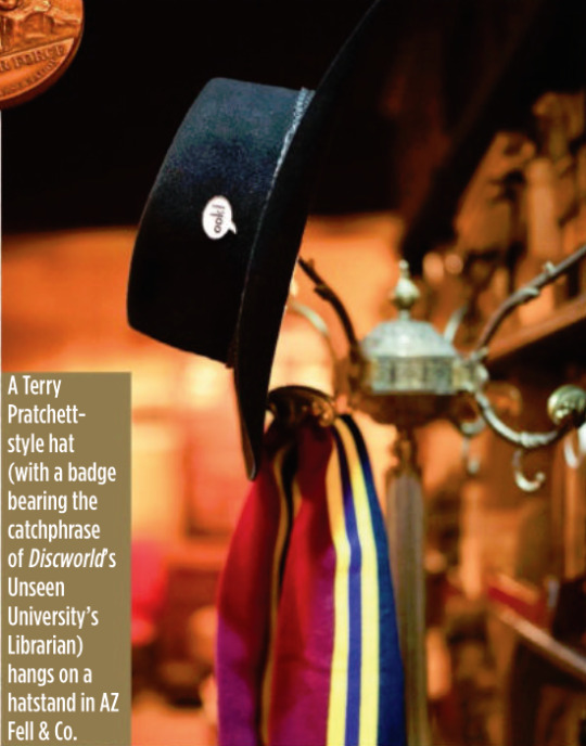
It’s A Kind Of Magic One of the new shops in Whickber Street for season two was Will Goldstone’s Magic Shop, which is full of as many Easter eggs as off-the-shelf conjuring tricks, including a Matt Smith Doctor Who-style fez and a toy orang-utan that’s a nod to Discworld’s The Librarian. Ralph says that while the series is full of references to Gaiman, Pratchett and Doctor Who, Michael Sheen never complained about a lack of Masters Of Sex in-jokes. “He’d be the last person to make that sort of comment!”
Ralph also reveals that the magic shop counter was another one of his wife’s purchases, bought at a Glasgow reclamation yard.

The Anansi Boys Connection Ralph reveals that Good Omens season two used the state-of-the-art special effects tech Volume (famous for its use in The Mandalorian to create virtual backdrops) for just one sequence, but he will be using it extensively elsewhere on another Gaiman TV series being made for Prime Video.
“We used Volume on the opening sequence to create the creation of the universe. I was designing Anansi Boys in duality with this project, which seems an outrageously suicidal thing to do. But it was fantastic and Anansi Boys was all on Volume. So I designed for Volume on one show and not Volume on the other. The complexities and the psychology of both is different.”
#good omens#gos2#season 2#photos#bts#bts photos#interview#sfx magazine#magazines#hq photos#neil gaiman#terry pratchett#michael sheen#david tennant#michael ralph#mickey ralph#bronwyn franklin#anansi boys#the small back room#maggie's record shop#soho#aziraphale's bookshop#dirty donkey#magic shop#aziraphale's correspondence#give me coffee or give me death#fun fact#michael ralph interview#sfx 372 magazine#s2 interview
4K notes
·
View notes
Note
Any tips on how to describe indoor spaces so they feel real and match the vibe of the story without throwing in too much detail?
Getting interior scenes just right is all about finding the balance between setting the mood, showing the unique personality of your story world, and keeping the plot moving. There are lots of ways you can use senses, action, and background to set a scene, all of which can work seamlessly with the type of story you want to tell. Here are some tips on how you can achieve that:
How does it look?
Lighting: does your space contain the soft glow of lamps, harsh fluorescent lights, or natural light?
Use colour and textures like peeling paint, plush velvet, or sleek marble.
Size and scale: is it claustrophobically small or impressively grand?
Architectural features: does the space have high ceilings, crown mouldings, or exposed beams?
Furnishings: are they modern, sparse, antique, or cluttered?
Style and decor: what style is represented, and how does it affect the atmosphere?
State of repair: is the space well-kept, neglected, or under renovation?
Perspective and layout: how do spaces flow into each other?
Unique design features: describe sculptural elements, or things that stand out.
Spatial relationships: describe how objects are arranged—what’s next to, across from, or underneath something else?
How does it sound?
Describe echoes in large spaces or the muffled quality of sound in carpeted or furnished rooms.
Note background noises; is there a persistent hum of an air conditioner, or the tick of a clock?
Describe the sound of footsteps; do they click, scuff, or are they inaudible?
Include voices; are they loud and echoing or soft and absorbed?
Is there music? Is it piped in, coming from a live source, or perhaps drifting in from outside?
Capture the sounds of activity; typing, machinery, kitchen noises, etc.
Describe natural sounds; birds outside the window, or the rustle of trees.
Consider sound dynamics; is the space acoustically lively or deadened?
Include unexpected noises that might be unique to the building.
Consider silence as a sound quality. What does the absence of noise convey?
How does it smell?
Identify cleaning products or air fresheners. Do they create a sterile or inviting smell?
Describe cooking smells if near a kitchen; can you identify specific foods?
Mention natural scents; does the room smell of wood, plants, or stone?
Are there musty or stale smells in less ventilated spaces?
Note the smell of new materials; fresh paint, new carpet, or upholstery.
Point out if there’s an absence of smell, which can be as notable as a powerful scent.
Consider personal scents; perfume, sweat, or the hint of someone’s presence.
Include scents from outside that find their way in; ocean air, city smells, etc.
Use metaphors and similes to relate unfamiliar smells to common experiences.
Describe intensity and layering of scents; is there a primary scent supported by subtler ones?
What can you do there?
Describe people’s actions; are they relaxing, working, hurried, or leisurely?
Does the space have a traditional use? What do people come there to do?
Note mechanical activity; elevators moving, printers printing, etc.
Include interactions; are people talking, arguing, or collaborating?
Mention solitary activities; someone reading, writing, or involved in a hobby.
Capture movements; are there servers bustling about, or a janitor sweeping?
Observe routines and rituals; opening blinds in the morning, locking doors at night.
Include energetic activities; perhaps children playing or a bustling trade floor.
Note restful moments; spaces where people come to unwind or reflect.
Describe cultural or community activities that might be unique to the space.
How is it decorated?
Describe the overall style; is it minimalist, baroque, industrial, or something else?
Note period influences; does the decor reflect a specific era or design movement?
Include colour schemes and how they play with or against each other.
Mention patterns; on wallpaper, upholstery, or tiles.
Describe textural contrasts; rough against smooth, shiny against matte.
Observe symmetry or asymmetry in design.
Note the presence of signature pieces; a chandelier, an antique desk, or a modern art installation.
Mention thematic elements; nautical, floral, astronomical, etc.
Describe homemade or bespoke items that add character.
Include repetitive elements; motifs that appear throughout the space.
What is its history?
Mention historical usage; was the building repurposed, and does it keep its original function?
Describe architectural time periods; identify features that pinpoint the era of construction.
Note changes over time; upgrades, downgrades, or restorations.
Include historical events that took place within or affected the building.
Mention local or regional history that influenced the building’s design or function.
Describe preservation efforts; are there plaques, restored areas, or visible signs of aging?
Describing indoor spaces doesn’t have to feel like a chore. Focus on the details that matter most, tie them to the mood or characters, and let your readers fill in the blanks. A well-crafted space not only sets the scene but builds your character's relationship to it. Use sensory language, background, and action beats to tie it into your narrative, and don’t be afraid to play around with motifs and contradictions, depending on who is experiencing it!
#writeblr#writers of tumblr#writing tips#writing resources#creative writing#writers#writing#writing community#creative writers#writing inspiration#writerblr#writing advice#writing reference#writers on tumblr#ask novlr#writer
492 notes
·
View notes
Text
Phantomhive Manor Layout
I'm the type of person who loves a good fictional map or floor plan and, unable to find one of the Phantomhive manor house on the internet, I naturally tried to make one myself. I figured that I would be able to to follow the routes the characters take to get to certain rooms and compare the interior and exterior window positions and designs to map the rooms.
I've been trying off and on for around a week now and, besides the entrance hall, I couldn't confidently tell you the location of a single room. Windows seen from the inside don't exist on the outside and windows on the exterior aren't present within the rooms. Certain windows and external doors exist in one chapter and are gone the next. Characters go up 3 full flights of stairs only to end up on the second floor. Entire stories appear where they weren't in previous in arcs.
This is obviously due to human error and things being changed to make them more historically accurate or to serve the story. It also doesn't matter where the rooms are, only the purpose they serve and what happens in them. The location of the dining room isn't important; we just need to know that's where people eat and have birthday parties, and one time Sebastian did a cool flip there.
That being said, I always want a Watsonian explanation even when there's a Doylist one. I could only come up with one in-universe explanation for the logical inconsistencies of the house: when Sebastian restored the manor house, he didn't just fix it. Whatever he did to it, the house is no longer a static, spatially-consistent structure.
If anyone is interested, more details about how confusing this building is are below the cut (with some out of context manga spoilers).
The Manor House

The first image is the front of the house, the side which carriages approach. The second image is the back where the garden is. Both are from Meyrin's backstory.
Here are more aerial views:


Note the appearance of extra windows along the side of the central section in the first one, which is from the same arc as the previous two images. The second is from the Blue Revenge Arc.
Here are details of the back view of the building:

Note the disappearing windows in some.
Ciel's bedroom.
Before the Green Witch Arc, Ciel's bedroom windows look like this on the interior and exterior:

Note that they open outwards (casement). Also note that they interrupt the hip-height decorative design inside. The three exterior shots are from Sebastian's record in the Luxury Liner Arc and don't match any corner on the more zoomed-out views of the building.
At the end of the Green Witch Arc, the windows are now hung (the bottom half slides upward to open) rather than casement style, but are otherwise the same:

In the Blue Revenge Arc (including the servants' flashbacks and r!Ciel's time there after he reclaims his identity from o!Ciel), the windows change:

The curtains are now a solid color and the decorative design is below the windows, rather than being interrupted by them. Those are insignificant details, but the panels showing the exterior directly contradict the interior and information from previous arcs:

The room is now on the middle floor while before it was on the top floor (not including the attic level), in addition to having a different architectural design around it.

The bedchamber together with the front room have 4 windows altogether, but the exterior only shows 3. The dressing room and bathroom each have a bay window, but the area where they would be seems to be up half a level. There's also a window on the exterior on the wall behind Ciel's bed, but no sign of it inside.

Interestingly, the layout of his quarters would be closer to the floor above, which has the four windows on the back and the two bay windows on the side. It's missing the dormer windows above, and the architectural details below, but it makes me think that there was some error in planning/drawing and the bedroom was actually supposed to be on the top floor.

It seems that the whole manor is actually two main floors for the family and guests, with a basement level and an attic level for the servants, and that one additional floor in the corner block got added at some point. In the earlier arcs, the roof of that section was the same height as the section to the left of it. It was only in the Blue Revenge Arc that they became different heights:

I thought things might be cleared up by following the routes of the characters to reach the room, but it's hard to understand where they're going.
In the Murder Arc, they go up one flight of stairs from the dining room (usually on the first floor in these types of houses) to reach Ciel's bedroom, and the second time they go up at least two floors from a bedroom (usually on the second floor) to reach the same room.


In Bard's backstory, Finny tells him Ciel's room is on the second floor, and then Bard goes up three flights of stairs from the first floor to reach it.

Something to note is that the three middle panels of Bard's route are identical to the first route of the Murder Arc, and then he goes up an entire extra staircase to reach what is supposed to be the same room.
In the Blue Memory Arc, Ciel has to come down from a higher floor to reach his parents' room (which became his room).

If the bedroom is on the second floor, he must have come down from the third floor, but I can't find the window in the stairwell anywhere on the outside of the building.
The Dining Room
The dining room is a long room with two entrances on one of the short walls, three large windows on the left, a fireplace on the right, and a huge bow window at the end. I initially thought there could be two of them, because I noticed that the height and design of the bottom of the bow window seemed to change depending on what meal was being eaten. However, I now think it's just inconsistent drawing.


As usual, there's no way to tell where this room is located. There are no bow windows on the outside of the building, or even a corner of the building which would allow for this configuration of windows.
The Drawing Room

This room has two enormous windows and conveniently has a panel of Ciel looking out of one them so we can determine its general location. However, I'm not sure which of the following sets of windows is correct:

The blue and orange are very big, but the yellow has the same window pane pattern as the most recent iteration of the room, which is the most accurate. However, the yellow is a set of three windows while the room has two. One of the windows could be in the next room, but it feels unlikely. The interior distance from the top of the windows to the ceiling is lacking from the the blue on the outside, so if the drawing is accurate, it would probably be the orange. The orange also feels most accurate to the panel of Ciel looking out the window, but the earlier volumes were less consistent in perspectives and proportions, so it's impossible to tell.
Ciel's Office
Ciel's office has a bay window overlooking the drive up to the house. There are two locations that fit this criteria.

In volume one (so take this with a grain of salt), there's a second window consistent with the teal option, but it doesn't seem to show up again. The side where the second window would in the orange option is never shown (to my knowledge).

Whichever option it is, the other side might be the room where Sebastian tutored Ciel.

The wall shown with bookshelves doesn't seem to have a window consistent with the teal side, so assuming the window is on the opposite wall and this room is the orange, Ciel's office would be the teal.
243 notes
·
View notes
Text
Breaking down Hotch's apartment layout until someone from Criminal Minds slides into my DMs with the damn floorplans

- CASE BRIEFING: HOW HOTCH'S APARTMENT GASLIT US ALL
As an architecture student, I have a very strong (borderline obsessive) interest in analyzing spaces and locations... especially when they don’t quite add up. And one that has always messed with my brain (sometimes in a good way, but mostly in a frustrating way) is Hotch’s apartment from seasons 4–11.
The transformation from the bare, depressing space in s5 to the warm, cozy atmosphere with antique furniture and clever spatial tricks later on… it’s fascinating.
But also confusing as hell.
Because one question has always haunted me:
Is the apartment we see in Season 4/5 (where Hotch was stabbed and possibly SA’d) the same one he’s living in by Season 10?
(And since I’m a visual learner, here are the pics, because this mystery needs solving... I'll try my best)
(05x01 ; 10x05 don't zoom in, you freaks)


Seems easy to solve, right? The civil number is the same! Great.
121
...But hold on - what’s this?
(07x23)


...Damn, Aaron, your mailman must be going through it - 121? 123? Pick a struggle.
So… is it the same apartment or not? Because at this point, I’m losing my mind.
- VICTIMOLOGY (TYPOLOGY)
As you all know, the starting point is always victimology—but in architecture, my go-to is typology.
So, what kind of apartment building does Hotch live in?
Because once we figure that out, we can finally make sense of all the architectural crimes committed in his apartment.
We get a glimpse of his building in 5x02, and - without dragging you through a full historical deep dive (unless you want me to, in which case, buckle up) - here’s what we do know: it looks like this...


The building looks pre-WWII, likely built in the late 1920s–1930s, or designed more recently to mimic that era.
My guess is primarily based on the architectural detailing of the ground floor - the stonework, arches, and classical elements that give it a grander, more “expensive” look - and the distinct visual separation from the upper levels.

Spencer Reid moment - you can skip it if you'd like -> This actually follows a common design principle (partly influenced by Louis Sullivan’s theories) where different sections of a building reflect their function. The ground floor, being more public-facing, is more decorative and inviting, while the upper floors (where the apartments are) are plainer, emphasizing privacy.
However, the upper levels look stripped down, almost too plain, like they went through a more recent renovation that removed some of the og character. While it was normal in the 1920s/30s to emphasize the lower level, the upper floors would still have had some kind of textured finish brick, terracotta, or even decorative stone accents. Instead, here, it looks like someone just painted over everything... a bit sad, honestly… much like the man living in one of these apartments. Sorry Hotch but it is the truth.

That said, based on the photos, I hypothesized a possible volumetry diagram and main floor plan of the apartment building, including its functions and layout.
Knowing that Hotch lives in 121 (or 123… whatever it is today), he could very well be on the first floor. Old man isn’t about to risk climbing seven flights of stairs, understandable.
(Or, if we lean into the conspiracy theory that he has childhood trauma related to fire, it’s very telling that he chose a first-floor unit, making for an easier escape in case of danger…)

Our lovely Emily Prentiss gave us a sneak peek at the ground floor interior in 5x01, which - combined with a study of the window placement on the facade - helped me piece together a small section of the central layout.

From what we see, I feel even more confident about the building’s era - especially because of the beautiful wooden decorated elevators (yes, those are elevators, not doors... check the buttons on the side)


And now, for another Spencer Reid moment, part two -> In the early 1900s, when elevators were first being introduced in residential buildings, they didn’t look like the modern ones we see today.
Why?
Because men fear change.
Just like with any new technology, people were hesitant, so architects and designers made elevators blend in by disguising them as something more familiar - often looking like grand wooden doors or classic entryways rather than the industrial metal boxes we think of today.
This same pattern happened with building structures - steel (and concrete too!) was widely adopted in the early 1900s because of its strength, allowing for taller buildings, but architects still hid the steel frame behind stone or brick facades to maintain the look of traditional palaces. Even early cars looked like carriages because people weren’t ready to embrace a completely new form.
So, Hotch’s apartment building? It’s yet another classic case of early 20th-century architectural reluctance to embrace modernity - which, honestly, fits him a little too well. The man bottles up his emotions behind the calmest face just like his home hides its innovations behind classic detailing.
I see you, Aaron. You’re not fooling me.
Now, you may be asking - "Phi, weren’t you supposed to expose all the inconsistencies in Hotch’s apartment and finally solve whether it’s the same place or if they changed it?"
To that, I say… we’re getting there.
Because before we dive into the madness, there’s something that really messes with my brain - the window placement in Hotch’s apartment.
But to even begin analyzing that, we first need to understand how a typical floor plan in a building like this would be structured. And once again, our queen Emily Prentiss in 5x01 unknowingly led us straight to the answer.


The bastard even has a vaulted ceiling - right where I believe the main distribution area (aka elevators and stairs) is located. You can spot it in the pictures near the exit signs.
Also, just a heads-up... in the diagrams, the apartments look smaller than they actually are because I was too lazy to make multiple detailed drawings. (But hey, if someone paid me - hi, CM - I absolutely would) So, for now, I’m using that as a quick reference.


Now… the interior! Or should I say… the everchanging interior.
In this issue, I’ll be analyzing the Season 5 version - I even sketched out a small section of the floor plan (which could be completely wrong, because things change every episode).
From these pics, we can see that his windows are on the opposite side of the entrance - which, so far, checks out.


But wait... look down here! Check out the window placement in the kitchen. Thanks to that little detail, we can hypothesize that Hotch’s apartment is located in what I’ve labeled as "Unit B" - aka the unit with double exposure (great for ventilation, Aaron, solid choice).
From this pic down here from the s4 finale, we also get a fun little bonus detail - there’s what looks like a tiny dryer (or washing machine?) just sitting out in plain sight. And right behind Hotch, there’s a door that, based on the dimensions, I suspect leads to a bathroom.

Enough details to sketch out a partial floor plan… and there you have it!
A (partial) floor plan of Hotch’s apartment in its saddest era: bare, empty, and drowning in case files from seasons 4–5

And seeing more of his apartment in later seasons should be a blessing, right? It should help us map out the whole thing, right?...
Right?
...Wait.
Is that... a full-ass door on the right that totally wasn’t there before?!
Aaron, you hypocrite - you shut down Spencer Reid’s physics magic, yet here you are summoning entire new rooms into existence in your apartment.
(05x02 ; 10x05)

Alright, fine... where does that door lead?
(10x20)


Hot damn.
Referring to the home office, of course… and here’s some solid proof of its placement. Now, I’m gonna… step away for a minute… process... this... architectural betrayal… but YOU - you make sure to study these pics. I’ll be quizzing you later, got it?


Alright… and now… now that you’ve hopefully been studying (and totally not getting distracted by Hotch’s shirt hanging on for dear life - OMG LOOK AT THE [REDACTED])… focus.
You nasty.
Window placement.
Where’s the home office window? Exactly... on the same side as the others in the living and dining area (you can tell by the way the light enters the room in the pic on the right)
And since you’re all very interested in the architecture (and definitely not drooling over a certain Unit Chief), let me ask you this:
WHY THE HELL IS THERE A WHOLE FIREPLACE IN HIS HOME OFFICE?!
Don’t worry - I’ll answer for you. Since y’all are nasty.
Can I just say that it UPSETS ME to the point where I’m considering a 30-day diet of just drywall that THAT MAN - THAT FEDERAL AGENT - HAS A FIREPLACE. IN HIS HOME OFFICE.
(HELLO?!?!?!?!?? Whore.)
Unhinged. Because:
1. A fireplace is quite literally a symbol of family and warmth (fun fact: Frank Lloyd Wright always designed homes starting with the fireplace! Oh, wait. You might not know who that is, so now this just sounds confusing. My bad. Anyway, he designed a lot of cool stuff... moving on). A fireplace belongs in a living room or dining area, where people actually gather. And considering Hotch’s building is old, there is no way it was originally designed to have one in a private office. That placement is categorically wrong. You’re a terrible designer if you stick a fireplace in an isolated office but not in the main living space where it actually makes sense.
2. The writers could try to lie to my face and say, “Oh, maybe the room was repurposed into Hotch’s home office.”Wrong. His apartment has a big open-concept living/dining area with the kitchen on the side. And unless his place is secretly Rossi’s mansion (spoiler: it’s not), there’s no way the original layout had a separate formal dining room. And even if it did, the fireplace is still in the wrong damn place because formal dining rooms are typically closer to the entry.
3. They could lie even harder and try to argue that Hotch having a fireplace in his office is some deep, symbolic artistic choice - like, oh, he’s so devoted to his job, he’d rather warm his ass doing paperwork than sit by the fire reading Jack a bedtime story like a decent human being. Like. Come on. He’s a family man, for god’s sake. Either give him a properly placed fireplace or JUST DON’T GIVE HIM ONE AT ALL.
(Less is more, people!!! Unless, of course, we’re talking about Hotch’s [REDACTED]... oof. Damn censorship. Right when I was about to say something deeply unholy. )
Goodbye. See you in the next issue.
Hopefully by the end of this series we'll manage to sketch down the entire floorplan
Phi.
280 notes
·
View notes
Text
In just eight blocks of sidewalk in quiet neighborhood, walking through the not-quite-rain of a sunshower, today I encountered four missing shoe soles. Little pieces of plastic and rubber, detached from pedestrians' shoes, now lonely on the concrete, with the weeds.
No such thing, really, as a "weed", though. "Weed" is not a botanical term. Instead, describes perceived pests, at the discretion of the observer. At the discretion of the authority. Designated as weed by the one with power over that land. The agronomist, the rancher, the plantation manager. The weed wastes space that could otherwise be given to a monoculture cash crop, an "economically significant" plant. The weed interferes with the productivity of the plot of land. The weed interrupts the extraction. The weed diminishes the value. The weed doesn't belong in this place.
People are made to be weeds, too.
Some cities will designate you as a weed, and then they'll take action to pull you out. They'll uproot you. But it's not always explicit, like "we're outlawing loitering" or "we're outlawing taking a nap in the park" or "we're defunding the library". Sometimes it's quite clever, it's written into the physical landscape. Self-congratulatory "progressive" cities learn to co-opt language, to obscure the violence, to use and abuse space.
Thinking about things you might encounter, you might perceive, after you've been destitute, broken, lived at a homeless shelter, for years. Little signs of other peoples' misery. Indicators of desperation that some might overlook. And the way that environment shapes, and is shaped by, these miseries.
A friend asks "why is there always an unusual amount of scuffed detached missing shoe soles on this particular stretch of sidewalk? There are hardly any homes around here, it's all asphalt and empty lots, so where are all these be-shoed people coming from?" Because even though this is a wide expanse without either home residences or any kind of commercial or recreation space someone would want to visit, these blocks are the straight-line direct path between a low-income apartment complex and the cluster of corporate big box stores, and there's no bus line that runs between the two areas. "But don't the vast majority of customers of shopping malls and box stores drive vehicles, hence the obscenely massive parking lots?" Sure, customers drive, but guess who actually has to work at those places? An underclass of people living at that apartment complex with harsh restrictions and cheap amenities, who can't afford car insurance or who might be too physically disabled to bike. And so that apartment complex is a de facto "company town", the residents are essentially in confinement. It is written into that landscape. It can be read. "Why is there always debris, wrappers, coins, etc. in this particular quiet couple of blocks of the boulevard?" Because these blocks are between a thrift store and a same-day drop-in clinic, so many impoverished people will routinely be walking between these two locations. They attend their appointment, and then have forty-five minutes to kill before the bus comes back around, so why not check out the thrift store? The city and county collaborated and placed all the low-income assistance offices on the far side of town, which conveniently forces the poor and disabled to both stay away from the luxurious downtown district and also to waste their time making a four-hour commute, catching various connecting buses or else riding the bikepath, across the city just to attend a ten-minute-long appointment.
Then this spatial layout, this city's physical environment, will shape the physical body. This violence writes itself into the flesh. The way the denim is chafed and discolored on the left shoulder of someone's jacket from carrying a small backpack around by foot, day after day after day. The way someone's heart rate increases when they see a white and black vehicle in the periphery of their vision, subconsciously recollecting institutionalization and institutional abuse, or fearing what a ticket fee would mean for their budget (they might not be able to afford rent). The way someone develops a painful limp, maybe occasionally depends on a cane, because they had to walk great distances every day to get to work and their shoe sole fell off on the sidewalk, but they can't replace the shoes because their employer is underpaying them, and they're forced to stand all day at work anyway, and they already had some modest nerve damage in their foot because they've been rationing their insulin and can't afford their prescriptions, and federal medical insurance keeps denying them because their physical letters in the mail always show up too late or not at all, and groceries are too expensive so it's hard to get good nutrition to heal, but the diabetic nerve damage has by now damaged their digestive tract too so they have a strictly limited bland diet and can't enjoy the simple pleasure of a home-cooked meal (if they can even afford a home, at this point), and all those "little" miseries add up, and now they're hungry, and in pain, because they were forced to walk kinda funny for a long time over all those decaying sidewalks with all those other weeds.
642 notes
·
View notes
Text
A thought on Elves and Dwarves (as inspired by my roommate and I and the one place where our brains really don't line up):
Elves with perfect memories, who know exactly where they put that thingamajig even when they last set it down twenty years ago, and thus can always find whatever it is they're looking for amidst what looks like total disarray to everybody else.
Dwarves with perfectly ordered spatial awareness, who are so accustomed to the layout of their workshop or forge that they can lay their hands on any tool in there without even looking, and always set everything back where it belongs out of ingrained habit.
Elves who never ever put things back where they belong, because "put that away neatly so you can find it again" is simply not a concept that exists in elvish minds, because it doesn't need to.
Dwarves who will look right past the thing they're looking for if it's not where it belongs, because it's not where it belongs, why isn't it where it belongs, where did you put it you daft elf...?
Elves and Dwarves in the smithies of Ost-in-Edhil, ready to go to war over the arrangement of their tools, and Celebrimbor on the brink of tears desperately trying to keep the peace here that he never managed to in Nargothrond.
(alt: could easily be done the other way around too, with elves always putting things away because then the thing is always where it's supposed to be, even twenty years later, so you can find it again, because they have so many more important things to hold in their memories than where they last put down their favorite hammer, and after a few hundred years you fall into the habit of expecting things to be where they belong so you don't even look to find them somewhere else; and dwarves who have such an innate sense of their tools and their workspace that they don't need to have "proper places" to put things away, because of course they remember where they put their hammer, what kind of a question is that, can't you just feel where your hammer is wtf???)
#elves#dwarves#lotr headcanons#fantasy world building#world building#celebrimbor#gwaith i mirdain#lotr#my stuff#my writing
626 notes
·
View notes
Text


LA BELLE DAME SANS MERCI /1902/ by FRANCIS BERNARD DICKSEE
The artwork portrays a knight entranced by a mysterious lady. It draws inspiration from John Keats' poem of the same name. Described as a "faery's child" in the poem, she is an embodiment of beauty and mystery, captivating the knight with her charm and allure.
The exploration of tragedy is seen in how the knight interacts with the femme fatale. Dicksee's painting does not depict the gloomy aftermath of the poem but instead concentrates on the alluring enchantment of the moment, implying the subsequent sorrow and desolation that befall the knight
The spatial layout is intricately designed, featuring the knight and the lady placed prominently in the front against a picturesque background. The vivid hues amplify the scene's emotional complexity. The knight is represented by natural greens and browns, which signify his tie to the human realm.
The painting received a mixed critical response upon its initial exhibition in 1902. While some praised the work, particularly for its technical execution and emotive storytelling, others found fault with the composition and the depiction of the femme fatale figure.
166 notes
·
View notes
Text
"The Cathedral of Robot Artisans"

Spatial Qualities: Dialogue Between Existing and New Structures
The project posed a complex challenge: to retrofit a 19th-century brick stable into a functional, contemporary fabrication space while preserving its historical integrity. Within a four-month timeframe, an international cohort of MAEBB (Master in Advanced Architecture and Biocities) students designed and built a hybrid structure that simultaneously honors traditional craftsmanship and embraces advanced digital fabrication.
At the heart of the project lies a tension between the old and the new, the solid and the porous, the static and the adaptive. The design retains the original brick walls, reinforcing them structurally while removing the decayed roof to introduce a new timber framework. This act of surgical preservation frames the contemporary intervention as both a response and a counterpoint to the pre-existing architecture.
Internally, the space is organized around the operational needs of the industrial robot. An open-span layout ensures unobstructed movement, while carefully positioned skylights and glazed openings allow natural light to penetrate the interior without compromising environmental control. Above the robot, a prominent skylight creates a dramatic shaft of light that recalls the sacred spatial strategies of ecclesiastical architecture, reinforcing the project’s metaphor of a “cathedral” for contemporary artisanship.
The spatial atmosphere is quiet and refined, a composition of filtered daylight, exposed timber, and restored masonry that balances technological precision with human engagement.
Materiality and Construction: Advanced Timber Engineering
Timber serves as the project’s primary material, chosen for its environmental performance, structural adaptability, and symbolic resonance with the surrounding landscape. A self-supporting arborescent structure, made from solid wood and Cross-Laminated Timber (CLT), defines the new roof and internal framework. Seven branching columns, reminiscent of tree trunks, hold aloft a Voronoi-patterned canopy, a formal language derived from nature but realized through digital craftsmanship....
58 notes
·
View notes
Note
hey. IKEA?
Ah yes. That.
As you may have read, some suspect Earth IKEA stores to be low-level psionically charged environments.
Reported phenomena include:
Spatial disorientation ('Excuse me, where are the wardrobes?' 'Right behind you, ma'am' 'BUT I JUST LOOKED THERE!')
Temporal confusion ('Let's just pop in for one thing' → emerging three hours later with 47 tealight candles and 3 throws)
Sympathetic bonding with display furniture ('I LOVE that Billy bookcase!' 'That's a Malm.' 'Don't you dare talk about Billy like that!')
Giant Doll's House Syndrome, characterised by pretending to make breakfast in fake kitchen layouts and the need to sit on display toilets
While Gallifrey has not officially classified IKEA as a 'dangerous environment', TARDISes refuse to land inside them.
Of course, this is all completely unverified and almost certainly not a real phenomenon.
Hope that helped! 😃
Any orange text is educated guesswork or theoretical. More content ... →📫Got a question? | 📚Complete list of Q+A and factoids →📢Announcements |🩻Biology |🗨️Language |🕰️Throwbacks |🤓Facts → Features: ⭐Guest Posts | 🍜Chomp Chomp with Myishu →🫀Gallifreyan Anatomy and Physiology Guide (pendin →⚕️Gallifreyan Emergency Medicine Guides →📝Source list (WIP) →📜Masterpost If you're finding your happy place in this part of the internet, feel free to buy a coffee to help keep our exhausted human conscious. She works full-time in medicine and is so very tired 😴
#gallifrey institute for learning#dr who#dw eu#gallifrey#gallifreyans#ask answered#whoniverse#GIL: Asks#doctor who
54 notes
·
View notes
Text

This is my second draft of layout of the apartment above Bob’s Burgers. This time with a color key eye droppered directly from screen shots in order to be as accurate a reference as possible.
Underneath each room label I’ve included a color swatch of:
1. The main wall color
2. The main trim color
3. The main door color if different from trim color
This is still not 100% accurate and somethings surrounding that staircase are just never going to make sense. Particular areas of concern are the hallway closet/ washing machine, the opposite side of Bob and Linda’s room, general spatial issues, and updating Louise’s room for the loft bed.
#bobs burgers#bob's burgers#reference#procreate#architecture#fanart#my art tag#that staircase is the bane of my existence#most colors are taken from#11.2 Worms of In-Rear-Ment#and from the lightest part of each surface#with some exceptions#like the kitchen table
275 notes
·
View notes
Note
how to describe? Houses, rooms, interiors, palaces, etc?
Creating immersive descriptions of indoor spaces is more than just scene setting—it’s an invitation to the reader to step into your world. Describing the interior of buildings with vivid detail can draw readers into your narrative. So let’s explore how to describe interiors using multiple sensory experiences and contexts.
Sights
Lighting: soft glow of lamps, harsh fluorescent lights, or natural light.
Colour and textures; peeling paint, plush velvet, or sleek marble.
Size and scale: is it claustrophobically small or impressively grand?
Architectural features: high ceilings, crown mouldings, or exposed beams.
Furnishings: are they modern, sparse, antique, or cluttered?
Style and decor: what style is represented, and how does it affect the atmosphere?
State of repair: is the space well-kept, neglected, or under renovation?
Perspective and layout: how do spaces flow into each other?
Unique design features: describe sculptural elements, or things that stand out.
Spatial relationships: describe how objects are arranged—what’s next to, across from, or underneath something else?
Sounds
Describe echoes in large spaces or the muffled quality of sound in carpeted or furnished rooms.
Note background noises; is there a persistent hum of an air conditioner, or the tick of a clock?
Describe the sound of footsteps; do they click, scuff, or are they inaudible?
Include voices; are they loud and echoing or soft and absorbed?
Is there music? Is it piped in, coming from a live source, or perhaps drifting in from outside?
Capture the sounds of activity; typing, machinery, kitchen noises, etc.
Describe natural sounds; birds outside the window, or the rustle of trees.
Consider sound dynamics; is the space acoustically lively or deadened?
Include unexpected noises that might be unique to the building.
Consider silence as a sound quality. What does the absence of noise convey?
Smells
Identify cleaning products or air fresheners. Do they create a sterile or inviting smell?
Describe cooking smells if near a kitchen; can you identify specific foods?
Mention natural scents; does the room smell of wood, plants, or stone?
Are there musty or stale smells in less ventilated spaces?
Note the smell of new materials; fresh paint, new carpet, or upholstery.
Point out if there’s an absence of smell, which can be as notable as a powerful scent.
Consider personal scents; perfume, sweat, or the hint of someone’s presence.
Include scents from outside that find their way in; ocean air, city smells, etc.
Use metaphors and similes to relate unfamiliar smells to common experiences.
Describe intensity and layering of scents; is there a primary scent supported by subtler ones?
Activities
Describe people’s actions; are they relaxing, working, hurried, or leisurely?
Does the space have a traditional use? What do people come there to do?
Note mechanical activity; elevators moving, printers printing, etc.
Include interactions; are people talking, arguing, or collaborating?
Mention solitary activities; someone reading, writing, or involved in a hobby.
Capture movements; are there servers bustling about, or a janitor sweeping?
Observe routines and rituals; opening blinds in the morning, locking doors at night.
Include energetic activities; perhaps children playing or a bustling trade floor.
Note restful moments; spaces where people come to unwind or reflect.
Describe cultural or community activities that might be unique to the space.
Decorative style
Describe the overall style; is it minimalist, baroque, industrial, or something else?
Note period influences; does the decor reflect a specific era or design movement?
Include colour schemes and how they play with or against each other.
Mention patterns; on wallpaper, upholstery, or tiles.
Describe textural contrasts; rough against smooth, shiny against matte.
Observe symmetry or asymmetry in design.
Note the presence of signature pieces; a chandelier, an antique desk, or a modern art installation.
Mention thematic elements; nautical, floral, astronomical, etc.
Describe homemade or bespoke items that add character.
Include repetitive elements; motifs that appear throughout the space.
History
Mention historical usage; was the building repurposed, and does it keep its original function?
Describe architectural time periods; identify features that pinpoint the era of construction.
Note changes over time; upgrades, downgrades, or restorations.
Include historical events that took place within or affected the building.
Mention local or regional history that influenced the building’s design or function.
Describe preservation efforts; are there plaques, restored areas, or visible signs of aging?
#writers#creative writing#writing#writing community#writers of tumblr#creative writers#writing inspiration#writeblr#writerblr#writing tips#writing advice#writblr#writers corner#advice for authors#helping writers#help for writers#writing help#writing quick tips#writing asks#writer#writing resources#writers on tumblr#writers and poets#how to write#writer stuff#writer's block#writers block#beat writers block#setting the scene#writing descriptions
343 notes
·
View notes