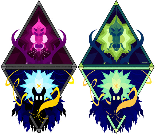
#Symmetrical Artwork Balance
Text

📌📺 Pixel Symmetrical Digital Artwork Project
#art#geometric#abstract art#geometric art#pixel art#pixart#pixel#pixel kaleidoscope#pixel blocks#pixels#kaleidoscope visuals#abstractart#📌📺 Pixel Symmetrical Digital Artwork Rotational#📌📺 Pixel Symmetrical Digital Artwork Project#📌📺 Pixel Symmetrical Digital Art#📌📺 Pixel Symmetrical Digital Art Design#📌📺 Pixel Symmetrical Digital Art Design Inspiration#📌📺 Pixel Symmetrical Digital Art Design Pattern#📌📺 Pixel Symmetrical Digital Art Balance#📌📺 Pixel Symmetrical Digital#📌📺 Pixel Symmetrical Digital Art Radial#📌📺 Pixel Symmetrical Digital Art Rotational#📌📺 Pixel Symmetrical Digital Art Project
2 notes
·
View notes
Text

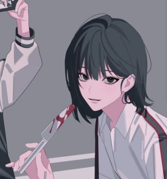
Because of my brain's fucked up chemistry, I bring you bilibili's most hilarious (sarcasm) ploy. This is one of my favorite official artwork. The palette is simple and our beloved characters seem to have fun!
🙂↔️ Don't be fooled.
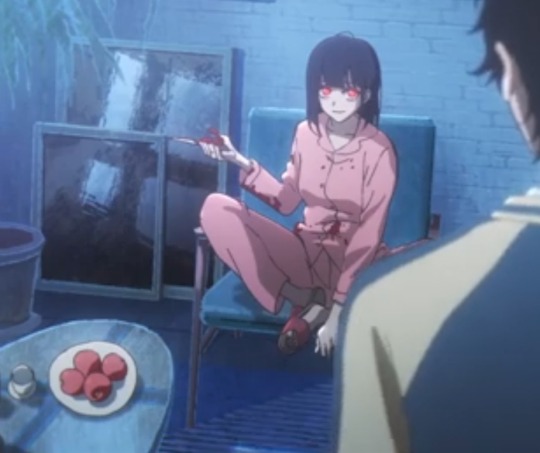
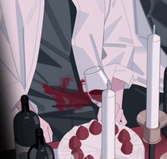
I'll start with the obvious, as always: red stains and apple knives. The pictures are telling enough.

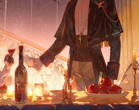
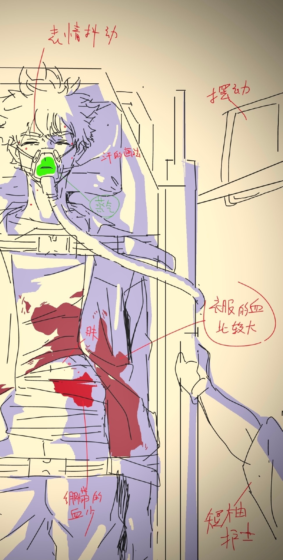
Then we have the number 8. Which, I have my theories on, but nothing significant enough to make a whole post about it yet.
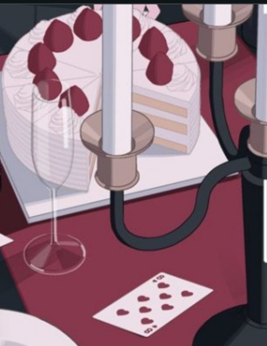
Let's start with the 8 of hearts. If you look carefully, you'll notice there are exactly 8 chandelier arms. 8 strawberries are visible on each cake (one is missing two parts and the other one is partly behind a shadow who must be Li Tianchen). Lastly, but Im not entirely sure of myself here, you can probably count 8 wine glasses (they are rounder than others).
Crossed theory: the missing pieces of the cakes are exactly between IV and VI of a clock. V is hinted yet again 🤌✨ but there are two cakes... making cakes... Yep, you guessed it: one entire Curve, as described in Rick and Morty:
The curve basically walls off the infinite number of universes, in which INSERT IMPORTANT CANONICAL NODE happens, from the rest of the infinite multiverse. A model often used to explain is that the definition of the Central Finite Curve has no set parameters; it's just wholly random and infinite therefore can be represented as a repeating, immeasurable shape modeled with a circle. The Central Finite Curve would then present a finite collection of dimensions.
(Gosh, I do have a lot of meta planned for this show, kill me now // Edit: DONE)
STEPPING AWAY FROM THE LYING CAKE-
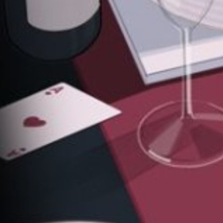
For archives purpose, I'll just point out that two Aces of Hearts probably means there are two of the same while there should be one. I don't know if this was a clue already or yet to be resolved. They're both near a candle, a glass and a bottle. It gives the whole table an odd symmetry. Like a mirror you cannot see the frames of. The 8 on cards are also symmetrical + the placement is repeated with both chandeliers. The symmetry of the table implies there is a fourth cake off-screen.
There is one mistake though, I don't know if it was made on purpose or not: none of the hearts are upside down. The 8 of hearts is wrong: there is supposed to be symmetry on the card itself!

Since we already got a tarot reading in the chibisodes, here we go: (a quick google research for this one)
"In divinatory tarot, it could be a mix between the Lovers and the World. Indeed, the ace of hearts relates to the World as it represents the triumph of the individual on the elements that surround him. It also relates to the Lovers thanks to its romantic attributes and consequences."
- latincards
THE DARKER SIDE OF THE ACE OF HEARTS MEANINGS: EXPLORING CONTRASTING
While predominantly seen as a symbol of love and positivity, the Ace of Hearts can also have darker or more complex meanings. In some interpretations, it might signify heartbreak, emotional manipulation, or unrequited love. This aspect reminds us that the heart's journey is not always smooth and that love can sometimes lead to challenging or transformative experiences.
- thedopeart
(Sidenote: You should be aware that the LOVERS doesn't exclusively concern romantic aspects of life in our modern world, but life partners in the general sense, people deeply tied to you.)
As for the 8 of Hearts:
The Eight of Hearts is often associated with emotions, love, and relationships. It signifies deep connections, harmony, and positive energy in matters of the heart. When this card appears in a reading, it suggests that love and emotional fulfillment are on the horizon. This card is a symbol of balance and stability in relationships. It indicates that there is a strong foundation of trust and understanding between partners.
Hearts are a recurrent shape used in Qiao Ling's artworks but I'll make another post for shapes/characters related stuff.
For the record, Cheng Xiaoshi isn't drinking red wine on the Halloween poster. Doesn't know where this is going but I've done my share of meta for today 🙂↕️
>>> In conclusion,
RED is the real clue here. May it be to indicate the presence of Li Tianchen or VEIN. The same shade of red is all we see, as if a filter was used, and since Li Tianchen's eyes glow red, I guess it's related somehow (metaphorically speaking). The fact everything is the same color was also designed to trick us about the blood on the knife. The aces could be CXS and LG... or LG and Liu Xiao (he seems to be obsessed with him so why not.) In any case, I do see a paradox hidden in plain sight here.
The cards are there as a positive outlook: they are together in this, their friendship is what will thrive on the dark side of the clock! It encourages them to open themselves to others and trust their bond.
#link click#shiguang dailiren#时光代理人#lu guang#cheng xiaoshi#qiao ling#meta#official art#li tianchen#easter eggs
127 notes
·
View notes
Text


A Schlachtschwert, early XVIth century.
Spring steel blade of flat hexagonal section for most its length, mild steel fittings with hollow brass ball finials on the cross. Leather over thread over wooden core for the grip, and leather over wood for the sleeve (more about that below).
This is a tentative reconstruction of what a "proper" Landsknecht Greatsword could look like, such a they appear on period artwork, be it paintings like the Siege of Alesia by Melchior Feselen (1533) or the Battle of Pavia kept at the Royal Armouries (or the tapestries depicting that same battle, now at the Museo Capodimonte, made after sketches by Bernard van Orley), the Victory of Charlemagne over the Avars near Regensburg by Albrecht Altdorfer (1518), or the many drawings, prints and woodcuts by artists such as Reinhart von Solms, Jörg Breu, the great Hans Burgkmair, Niklas Stör, Hans Holbein (both Elder and Younger), Virgil Solis, Hans Sebald Beham, the legendary Urs Graf, Daniel Hopfer, Erhard Schön, Hans Schäufelein and others...All of them combined to give this result.
Such swords would be seen not only in the hands of a Doppelsoldner, but also carried by your Feldwaybel or an Edelman.
And it would be called a Schlachtschwert in the very captions of the illustrations I mentioned earlier (see Erhard Schön).
*Not* a "two-handed Katzbalger", though the cross obviously echoes the S/8-shaped guard of the latter.
We clear on that ?
Good.
Very few of such swords are kept in museums out there, with a lot of them leaving me dubious regarding their authenticity. The one in Berlin seems to me to be the most genuine of all, and it is on its proportions that I based this piece, though the Berlin sword shows a fancy, diamond-pattern decoration on the quillions very much recalling the Katzbalger kept in the Museum of London.
Most if not all period illustration do not show such fancy details on the crossguards though ; they are actually rather plain, without even the ribbing/threading/filework you can find on Katzbalger crosses.
Hence I kept this one rather plain, with a square cross section with rounded corners, and some light filework at the center.
I also bent the quillions into an offset 8-shape rather than a symmetrical one, to be more consistant with the earlier examples visible in period artwork.
The main questioning was that sleeve at the base of the blade, present on a lot of the period artwork; its obvious function was to provide a spot on which to put the other hand - as can be deduced from Marozzo's teachings for fighting against polearms - but the main issue was how was it made/what was it made of.
Elaborating on my previous experience and studies of such things on later Schlachtschwerter, I went for a basic construction of leather glued/stitched over a wood core made of two flat slabs, and force-slid down the blade. There is more than enough friction to keep it well in place, but it is still possible to take it off albeit with some effort. The end of the leather is cut according to period artwork, and flares out to accommodate the mouth of a scabbard if needed.
A simple decoration of plain lines on one side, and checkered on the other makes it also consistant with the artwork.
It is 139 cm long, the blade is 1083 mm long, 45 mm wide with a thickness of about 7 mm at its base, tapering down to 3.4 mm near the point.
The span of the crossguard is about 21 cm, though from one ball end to the other there's about 73 cm of steel.
Weight is 2547 grams, point of balance 13.5 cm from the cross.
Twenty-eight hundred EuroUnits and it's yours.
187 notes
·
View notes
Text
Writing Notes: Principles of Design
The principles of design describe the ways that artists use the elements of art in a work of art. Below are a few examples of principles of design.
BALANCE
The distribution of the visual weight of objects, colors, textures, and space. If the design was a scale, these elements should be balanced to make a design feel stable.
Symmetrical balance conveys a sense of stability. For example, a single large figure in the center of a painting is flanked by a smaller figure on either side. The shape of the artwork may also be symmetrical—a vertical line bisecting the image would create two equal halves that are mirror images of one another.
Asymmetrical balance often conveys a sense of movement since the elements of the composition are unbalanced. For example, an artist uses organic forms to create a composition that mimics the movement of vines growing in an unordered fashion around a clock's face.
EMPHASIS
The part of the design that catches the viewer's attention. Usually the artist will make one area stand out by contrasting it with other areas. The area could be different in size, color, texture, shape, etc.
For example, in a sculpture, the central figure stands out due to its relative size and position above other figures. The diagonal lines of contorting bodies and a serpent lead the viewer's eye to the central figure, further emphasizing it and conveying the intensity of its struggle against the snake's stranglehold.
MOVEMENT
The path the viewer's eye takes through the work of art, often to focal areas. Such movement can be directed along lines, edges, shape, and color within the work of art.
For example, in a photograph, the diagonal lines may lead the eye into a space to the point where lines converge.
#writing notes#writeblr#writers on tumblr#writing prompt#poets on tumblr#spilled ink#literature#poetry#dark academia#light academia#art#studyblr#lit#writing reference#writing inspiration#creative writing#art reference#art resources#writing resources
29 notes
·
View notes
Text
How to Understand an Artwork: A Brief Guide
I've recently read a book by a French author that promised to teach the reader how to understand a painting.
Art is my special interest. I keep up with contemporary art, attend art fairs etc. I've been to major and minor museums, galleries and churches in Europe and the US. But I feel that there's always room for improvement when it comes to understanding art.

The Physical Impossibility of Death in the Mind of Someone Living (1991) by Damien Hirst
I went through this heavy tome full of the author's own convoluted interpretations of artworks. The book taught me nothing about how to interpret and understand a painting on my own. But it did inspire me to create my own guidelines for reading works of art.

🦋 Why Bother Understanding Art?
Artworks are rich in meaning, symbolism, and emotion. Learning how to read them can enhance your appreciation and understanding of art and, consequently, life. This includes your own life.

The Embarkation for Cythera (1717) by Jean-Antoine Watteau
I find art an incredible place to seek answers to life's questions. I'll show you how you can do this too.
Additionally, this guide contains some of my favorite artworks, old and contemporary.
🦋 1. Observe the Artwork Closely
First Impression: Start by taking in the artwork as a whole. What is your immediate emotional response? What catches your eye first?
Details: Examine the piece in detail. Notice the colors, lines, shapes, textures, and composition. Pay attention to the focal point - where your eye is naturally drawn.
🦋 2. Identify the Subject Matter
Figurative vs. Abstract: Determine if the artwork is representational (depicting recognizable objects or scenes) or abstract (focusing on shapes, colors, and forms without representing something specific).
Iconography: Look for symbols, figures, or objects that might carry specific meanings. For example, a skull might symbolize mortality, while a dove often represents peace.

Lake George (1922–1922) by Georgia O'Keeffe
🦋 3. Consider the Composition
Balance and Symmetry: Notice if the composition is balanced or symmetrical. How do these elements affect the mood or message of the artwork?
Perspective and Space: Observe the use of space. Is there a clear foreground, middle ground, and background? Does the perspective create a sense of depth or flatness?
🦋 4. Analyze the Use of Color
Color Palette: Identify the dominant colors. Are they warm or cool, bright or muted?
Color Symbolism: Consider the emotional or symbolic meanings of colors. For instance, red can signify passion or danger, while blue might evoke calmness or melancholy.

🦋 5. Explore the Technique and Medium
Brushstrokes and Texture: Look at how the artist applied the paint or medium. Are the brushstrokes smooth or rough? What effect does the texture have on the artwork’s feel?
Medium: Consider the medium used: oil, watercolor, pencil, sculpture, etc. How does the medium influence the artwork’s appearance and impact?
🦋 6. Contextualize the Artwork
Artist's Background: Research the artist’s life, style, and the historical period in which the artwork was created. Understanding the artist’s intent and the era can provide valuable insights.
Cultural and Historical Context: Consider the cultural, social, or political context of the time. How might these factors have influenced the artwork?

The Parakeet and the Mermaid (1952) by Henri Matisse
🦋 7. Interpret the Meaning
Narrative: If the artwork tells a story, try to piece it together. What is happening in the scene? What might have happened before or after the moment depicted?
Themes and Messages: Reflect on the themes or messages the artwork conveys. Is it making a statement about society, human nature, or a personal experience?
🦋 8. Engage with Your Personal Response
Emotional Reaction: Pay attention to your emotional response. Art can evoke a range of feelings, from joy to discomfort. Your reaction is a key part of the interpretation.
Subjective Interpretation: Remember that interpretation can be personal. Your background, experiences, and emotions can influence how you read an artwork. There’s no single “correct” interpretation.

I Want My Time With You (2018) by Tracey Emin
🦋 9. Ask Questions
What does this artwork remind you of?
Why did the artist choose this subject or style?
How does this artwork make you feel, and why?
🦋 10. Discuss with Others
The most useful tip I have for you: Share your thoughts and interpretations with others. Discussing different perspectives can deepen your understanding and appreciation of the artwork.
Reading an artwork is both an intellectual and emotional exercise. It’s about connecting with the piece and the artist, finding meaning, and appreciating the craft.
The more you practice, the more fluent you’ll become in the language of art.
#art#art study#contemporary art#art history#dark academia#hot and educated#smart and pretty#contemporary painting#knowledge is power#visual arts#painting#artwork#symbolism#academics#academic weapon#pink academia#did you know#study guides
24 notes
·
View notes
Note
Hello! I love your use of geometric shapes and saturated colors in your illustrations. Which artists influence your work?
Honestly while I can name a lot of artists who serve as some sort of inspiration for things like creature design or color, I can't really place ones for specifically the geometric aspect! I'm sure there are some out there, but I think a large part of specifically that is probably just me personally liking balanced/clean/symmetric stuff along with most of my sketch papers growing up being gridline paper, so doing sharp geometric shapes was common. I also tend to think of my lineless art as similar to layered paper art, which has to be physically cut out. Its sort of one of the reasons I reuse colors often? Like you'd reuse the same piece of paper
Color wise I pull a lot from my friends, save a lot of art I think does interesting stuff with colors, etc. Generally I might skip through a couple artworks for a good "starter" color or a palette I like and go from there, adjusting it for personal preference. All the parts are drawn in little individual bits, so I can change them all independently. So often I have colors in mind at the beginning, but don't actually pick them till the very end. Here's some pieces to show how that gets fiddled with

And if you go back far enough, everything starts as a yucky mash of whatever colors made it easiest to tell one piece from another with zero regards to palette
I just really like bright saturated colors and honestly just kinda feel it out from there. Sometimes that's making it brighter sometimes that's making it a little more washed out. Sometimes I decide what I was going for doesn't actually look as nice as I thought.
It's sort of hard to name inspirations directly because so much of what I do I do effectively by feeling, and I have piss poor memory so naming exacts is real hard. If I tried to list people whos art I think about a lot we'd be here all day. I know a lot of my recent stuff has had more direct inspo from Boxheadpaint who has just amazing shape language (but almost the exact opposite of 'geometric' but I try and match their vibe a lot when I'm trying to draw a little looser and less stiff. Also looooove how they texture stuff)
36 notes
·
View notes
Text
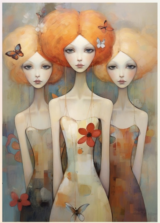
Pretty symmetrical ladies 😍
#artists on tumblr#digital art#my art#digital painting#my painting#illustration#my illustration#digital artist#artwork#symmetry#symmetrical women#whimsical ladies#soft girls#soft girl wall art
17 notes
·
View notes
Text
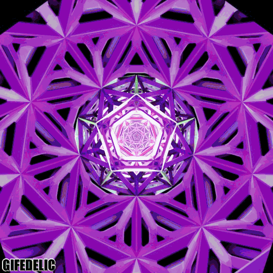
Terrence Howard Talks About the 6000-Year-Old Secret of The Flower of Life
youtube
The Flower of Life has mystified civilization for more than 6000 years. Terrance Howard explains the physics, math and logic behind this ancient tool. Existential Knowledge like this from Terrance Howard is surprising, since we never knew he was a physics buff.
Watch This and learn how this Beautiful symbol clarifies Life and Energy as Existence.
What is the flower of life?
The flower of life is one of the most recognized symbols in the ancient and modern world. The sacred geometric pattern consists of 19 intersecting circles spaced evenly from each other that reveal an intricate pattern of overlapping symmetrical flowers.
The striking visual is meant to represent creation, the sacred masculine and divine feminine, and cycles of life, death, and rebirth. Some believe the flower of life is also a key that can unlock hidden knowledge of time and space within its petal-like structures.
"At baseline, it is a geometric form of perfect—and some would say divine—proportion," intuitive energy healer and author of Energy Work for the Everyday to Elite Athlete Cyndi Dale tells mindbodygreen. "The flower of life is a beautiful and ancient symbol that has been depicted in many cultures across time. It's found in Egyptian, Hindu, Christian, Buddhist, Muslim, and Judaic artwork, religious structures, and manuscripts," she adds.
Based on Assyrian relics, historians can date the flower of life to 645 B.C.
Beyond its earliest origins, author of Sacred Geometry: How To Use Cosmic Patterns To Power Up Your Life Jemma Foster shares that the flower of life can also be found in countless temples and sacred sites across the globe, like the 5,000-year-old walls of the Osirian temple in Egypt, where it is burned into the stone as if by laser.
Meaning and symbolism of the flower of life.
"The flower of life represents the cycle of creation and the interconnectedness of all life," Dale says. Spiritually, the symbol can be used as a focus for attaining a sense of enlightenment and the awareness of peace. "It can also be used symbolically as a pathway to seek our personal and unique purpose within the greater universe," she adds.
Beyond its spiritual implications, Dale explains the flower of life also has associations with the chakra system—the main energy centers of the body. When there are no blockages and energy can effortlessly course throughout the entire body, it enables balance to exist between the mind, body, and soul. When looking at the geometric symbol, she says the image is seen to contain the seven chakras aligned in the middle.
"The reason that we typically link a lotus with a chakra—with different chakras shown with different numbers of petals—is that chakras are energetic. Based on nerve plexuses, they each spin at a different rate. Each chakra manages a specific bandwidth of energy, measured by color or sound," she says.
As such, we can work with these sacred patterns to boost our energetic health. Because the flower of life is the visual connection between all living things, it's said to have many benefits. And to reap those benefits, some recommend meditating on the image or wearing the symbol as jewelry to raise your vibration or even as a form of protection.
The flower of life in sacred geometry.
"Sacred geometry is the underlying form or geometry in nature—and not only the environment on Earth but in the cosmos," Dale explains to mindbodygreen, elaborating that the flower of life is considered sacred because these formations are considered one of the most significant patterns in the universe.
If you peer closer at the flower of life, inside you'll see many sacred forms nestled within. Dale notes the structure includes the tree of life systems, a universal code known as the Fibonacci sequence, the Golden Ratio of Phi (a mathematical radio that shows up constantly in nature), and Megatron's cube—which carries the five platonic solids, or foundational shapes of all organic life.
"It is thought that the flower of life holds a secret within it—a circle, which in many cultures, is considered the 'zero point' or the 'origin' of us all," Dale says. "This is the Oneness that ties us together."
What makes the flower of life so meaningful is how it potentially supports emerging scientific theories today. "Recent offshoots of quantum and 'spiritual' physics are suggesting that the universe is conscious, sort of a quantum information field with awareness and that all the energy or data that have ever existed is stored in geometric forms within it," she continues. "We are composed of these same forms and can exchange data with the universe because of it."
How to use the flower of life.
The flower of life is a reminder of unity. To add more connection to your life, Foster suggests drawing the flower of life since the art can be activating for meditation and processing. It also acts as an invitation to resonate at its frequency on a deep cellular level.
"The flower of life is a key ally in raising and protecting the energetic quality that you and your environment are operating at," Foster says.
To mobilize its creative energy, Foster also advises placing the flower of life in your space or onto objects. "This means to come into coherence and to move out of dissonance. [It] brings the surrounding area or object into greater coherence, for example, to restructure water, or to help negate some of the negative dissonances of a laptop," she adds.
8 notes
·
View notes
Text
Exploring Sacred Geometry: Unlocking the Mysteries of Divine Proportions 🌸🔺🔵◻️
Hello darlings 🥰
Today, let's delve into the fascinating world of sacred geometry and unravel the profound secrets hidden within its intricate patterns. Sacred geometry is a universal language that transcends cultures and time, reflecting the inherent order and harmony of the cosmos. It offers a window into the interconnectedness of all things and provides a profound tool for spiritual growth and understanding. So, let's embark on a journey into the realm of sacred geometry together!
🌸 The Flower of Life:
At the heart of sacred geometry lies the Flower of Life, a mesmerizing pattern formed by overlapping circles. It is a symbol of creation and the interconnectedness of all living beings. Meditate upon its symmetrical beauty and allow its energy to awaken your connection to the divine.
🔺 The Power of Triangles:
Triangles hold immense power in sacred geometry. The equilateral triangle represents balance and harmony, while the upward-pointing triangle symbolizes fire, passion, and spiritual ascension. The downward-pointing triangle represents water, intuition, and the divine feminine. Incorporate triangles into your spiritual practice to tap into these energies.
🔵 The Magic of Circles:
Circles are ancient symbols of wholeness, unity, and eternity. They represent the cyclical nature of life and the infinite possibilities within the universe. Meditate upon circles, draw mandalas, or use circular objects in your rituals to connect with the energy of completeness and divine unity.
◻️ The Power of Squares:
Squares symbolize stability, structure, and the material realm. They represent the four elements—Earth, Air, Fire, and Water—and provide a foundation for manifesting desires. Work with squares in your sacred space or incorporate them into your crystal grids to establish a strong and stable energetic framework.
✨ The Golden Ratio:
The Golden Ratio, often represented by the number phi (Φ), is a mathematical proportion found abundantly in nature and art. It is a ratio believed to embody perfect harmony and beauty. Explore the Golden Ratio in nature, art, and architecture and contemplate its presence in the world around you.
🌳 Sacred Symbols:
Discover sacred symbols derived from sacred geometry, such as the Sri Yantra, Metatron's Cube, or the Tree of Life. These symbols are potent energetic tools that can be used for meditation, manifestation, and spiritual alignment. Study their meanings and explore how they resonate with your journey.
🔷 Crystal Grids and Mandalas:
Combine the power of sacred geometry with the energy of crystals by creating crystal grids or mandalas. Arrange crystals in sacred geometric patterns to amplify their energies and intentions. Draw mandalas inspired by sacred geometry to express your inner connection with the divine.
◻️ Sound and Sacred Geometry:
Explore the relationship between sound and sacred geometry. Discover the resonant frequencies associated with specific geometric shapes and how sound vibrations can harmonize and heal. Experiment with sound healing modalities, such as chanting, singing bowls, or tuning forks, to enhance your experience with sacred geometry.
✨ Meditation and Contemplation:
Engage in meditative practices centered around sacred geometry. Visualize geometric patterns, focus on specific shapes, or use sacred geometry artwork as a focal point for your meditation. Allow these visualizations to calm your mind, expand your consciousness, and deepen your spiritual connection.

Sacred geometry is a gateway to understanding the divine order that permeates the universe. It invites us to recognize the inherent beauty and interconnectedness of all things. Embrace the language of sacred geometry, and allow it to guide you on a transformative journey of self-discovery and spiritual growth.
____
🌞 If you enjoy my posts, please consider donating to my energies 🌞
✨🔮 Request a Tarot Reading Here 🔮✨
____
With love, from a Sappy Witch 🔮💕
Blessed be. 🕊✨
#sacred#sacred geometry#geometry#tree of life#phi#mathematics#the golden ratio#meditation#contemplation#sacred symbols#crystal grid#mandala#metatrons cube#Sri Yantra#unity#eternity#magical symbols#divine symbol#witchcraft#tarot witch#witches#witch#green witch#witch community#witchy#journaling#spiritual journaling#baby witch tip#mine#sappywitch
38 notes
·
View notes
Text

MWW Artwork of the Day (10/2/23)
Claude Lorrain (French, c. 1600-1682)
Seaport with the Embarkation of the Queen of Sheba (1648)
Oil on canvas, 148 x 194 cm.
National Gallery, London
Claude was a prolific painter of seascapes, and this is one of three imaginary seaports owned by the National Gallery. The scene is bathed in the soft warm light of sunrise, capturing the gentle ripples of the water, undersides of the clouds and foliage, and silhouettes of the boats. There is hurried activity involving groups of figures: in the foreground two men carry a chest, while other figures prepare to row the Queen and her companions towards the larger ships used for the voyage. The classical buildings inspired by Claude’s time in Rome create a symmetrical and balanced scene. Columns support a balcony decorated with sculptures, from which figures watch the scene below. The bystanders on the bridge behind are conveyed through single dots of paint. The variety of the shells scattered along the bottom of the painting reflects Claude’s attention to the most intricate details.
5 notes
·
View notes
Text
ELEMENTS (7)
POINT - A point is the visual element upon which all other elements in a composition are centralized. Points and lines are used to create more complex shapes, and in design, they’re often used to direct a viewer’s attention towards a certain area in an image.
LINE- A line is a geometric element generated by a moving point that has extension along the path of that point. Lines can be curved, straight, or both. They can be solid or dashed, implied or psychological.
SHAPE- Shapes are 2-dimensional and can be measured by height and width. Shapes can be the outline of an object, and sometimes, the shape of a familiar object can become unfamiliar depending on the photographer’s perspective. In photography, the silhouette is the most recognizable type of shape.
FORM - As opposed to shape, form is 3-dimensional. It has height, width, and depth. It can be organic or geometric, and like shapes, forms create positive and negative space. When a form is captured by a camera, it becomes 2-dimensional; we differentiate forms from shapes with shadow.
TEXTURE - A texture refers to the visual or tactile surface characteristics of something. Texture can be smooth, rough, slimy, bumpy, etc. Like form, texture in photography is 2-dimensional and is revealed by variations in value. Smooth objects may have reflections, while rough objects may have highly contrasting areas of lights and darks.
COLOR - Color is a phenomenon of light or visual perception enables one to differentiate otherwise identical objects. Color can also be defined as a specific combination of hue, saturation, and value. Light alone has no color, but when you direct it through a prism or water, it separates into bands of color that form a rainbow.
SPACE/DEPTH - The depth of a scene relates to its size and the space within it. Most photos have a foreground, middle ground, and background; the clearer the boundary between these grounds is, the more depth an image will have. Additionally, space can refer to the use of an area within a plane, such as positive/negative space.
PRINCIPLES (8)
VARIETY - Adding variety to an image keeps it from becoming monotonous. Artists utilize variety by placing contrasting elements close to each other: bright colors next to muted or lighter colors, text next to images, organic shapes next to geometric shapes, and so on.
EMPHASIS - Emphasis is used to focus a viewer’s attention onto a specific area of an image. An artist can accomplish this by adjusting certain elements, such as line or color, so that they help make one part of a composition stand out more than the rest.
BALANCE - Balance creates visual harmony and prevents an image from feeling too chaotic to the viewer. A balanced image is one that holds the same amount of weight on either end; for example, one “heavy” big object on one side, and multiple “light” little objects on the other. Asymmetrical, symmetrical, and radial are the three types of balance that artists can utilize in their artwork.
SYMMETRY - Symmetry refers to a piece of artwork that mirrors itself on either side, or around a point (called radial symmetry.)
MOVEMENT - In art, movement refers to elements of a composition arranged in a way that encourages the viewer’s eye to take a certain path as they look at the image. An artist can guide the viewer’s eyes through use of line, shapes, and colors to encourage a specific way of seeing the artwork.
PATTERN - A pattern is composed of numerous different elements repeated in the same way within a composition. Colors and shapes are often the main elements used in the creation of patterns.
RHYTHM - Rhythm gives an art piece a feeling of action through the repetition of lines, shapes, and colors that creates a flowing path for the eye to follow. Random, regular, flowing, and progressive make up the different types of rhythm. Rhythm is what encourages a viewer’s eyes to traverse the entire piece, rather than staying in one place.
UNITY - Unity adds a sense of wholeness to a piece of art through the careful placement of elements that creates a harmonious composition.
2 notes
·
View notes
Text
Immerse yourself in the symmetrical elegance of my latest NFT collection. Experience the visual harmony and precision of geometric patterns that evoke a sense of balance and tranquility.
#nftrevolution #cryptotrading #digitalgallery #geometricinspiration #artcommunity #cyberculture #nftaddict #modernartgallery #cryptowallet #geometricshapes
#nftrevolution#cryptotrading#digitalgallery#geometricinspiration#artcommunity#cyberculture#nftaddict#modernartgallery#cryptowallet#geometricshapes
1 note
·
View note
Text
1.
A) Unity & Variety: Unity is the harmony of all visual elements in a composition, creating a cohesive whole. Variety adds interest by using contrasting elements to break up monotony. For example, a garden with a uniform color scheme of green (unity) but with flowers of different shapes and sizes (variety) demonstrates this principle.
B) Balance: Balance refers to the distribution of visual weight in an artwork. It can be symmetrical (evenly distributed) or asymmetrical (uneven but still balanced). In architecture, the design of a bridge with evenly spaced pillars shows symmetrical balance, while a city skyline with different-sized buildings may show asymmetrical balance.
C) Emphasis & Subordination: Emphasis is the focal point or area that draws attention, while subordination supports the emphasis by being less prominent. A billboard's main headline is emphasized through large, bold text, while the smaller text provides additional information without overshadowing the main message.
D) Directional Forces: These are lines or paths in an artwork that guide the viewer's eye through the composition. Roads or pathways in city planning often use directional forces to direct pedestrian traffic, such as a well-designed park that naturally leads people from the entrance to key attractions.
E) Repetition & Rhythm: Repetition is the use of the same element multiple times, creating a sense of unity. Rhythm is the pattern created by repeating elements, adding movement and flow. Repeated window patterns on a building or streetlights along a road create visual rhythm in an urban landscape.
F) Scale & Proportion: Scale refers to the size of elements in relation to each other, while proportion is the relationship between these elements. In a living room, a large sofa paired with a small coffee table might feel unbalanced in scale and proportion, whereas furniture that fits together comfortably creates a harmonious environment.
An artist like Piet Mondrian uses balance and unity in his paintings by employing grids of horizontal and vertical lines, creating a structured but varied visual composition with blocks of primary colors.
2. I remember a time when I repainted my room to a light blue hue. The cool hue created a calming atmosphere, reducing my stress levels after long days. The value of the color was perfect—it wasn't too dark or too light, just a soothing middle tone. The intensity was soft, not overwhelming, which helped maintain a serene environment. The low saturation kept the space feeling open and not too intense, which was crucial for a small room.
If I had to pick a "color scheme" for my life, I would choose an analogous palette of blues and greens. These colors reflect tranquility and growth, resonating with my desire for a peaceful and balanced life while constantly evolving and learning.
3.

4.
Good Layout Design
Why it’s good: Apple’s product ads are highly effective due to their minimalist design, which utilizes a clean layout with ample white space. This approach allows the viewer to focus entirely on the product, without any distractions. By featuring a high-quality image and minimal text, the ad communicates its message quickly and clearly. The limited color palette; typically black, white, and shades of gray, this adds to a sophisticated and modern look that aligns with Apple's brand image. The simplicity and elegance of the design make it memorable and easy for the audience to digest.
Intention: The intention behind Apple’s design is to highlight the product’s sleek design and key features while reinforcing its high-end, premium brand image. The minimalist approach positions the product as the centerpiece, creating a sense of exclusivity and luxury. By avoiding unnecessary elements and keeping the focus on the product itself, Apple aims to make its offerings appear cutting-edge, desirable, and unique. The design also seeks to appeal to customers who value simplicity and sophistication in both aesthetics and functionality.
Does it fulfill its purpose? Yes, the design fulfills its purpose by capturing the viewer’s attention and focusing it squarely on the product. The use of high-quality images and strategic white space draws the eye to the essential details, effectively communicating the product's premium qualities. By not overwhelming the viewer with excessive information or visuals, the ad ensures that the message remains clear and impactful. As a result, the design successfully conveys Apple’s brand values of innovation, elegance, and luxury.
0 notes
Text
Virtual Sketchbook 2:
Journaling
Principles of Design
Unity and Variety:
In art, unity is the harmony and consistency of the visual elements that evoke a shared feeling of oneness. On the other hand, variety adds a diverse elements to the artwork, making it more intriguing and captivating. A harmonious and compelling piece of art requires a balanced combination of both unity and variation, as too much variety can make a piece seem disorganized.

Pieter de Hooch, Interior of a Dutch House
This artwork balances unity and variety by enclosing all of the action in one room, it is not super crowded and the interactions between these people are simple and easy to comprehend. The artist introduces variety by adding various shapes and squares that vary in sizes and orientation. These shapes are drawn in an orderly manner, thus promoting unity.
2. Balance
The placement of components within a composition to create a sense of equilibrium between opposing factors is referred to as balance. It may be accomplished by using symmetry (which is the arrangement of elements so that they look symmetrical and harmonious when viewed from either side of a central axis) or asymmetry—the uneven placement of parts that still results in a composition that is both stable and aesthetically pleasing—can be used to establish balance.

The White House (symmetrical balance)

Edgar Degas, Jockeys Before the Race (asymmetrical balance since the left and rights aren't identical)
3. Emphasis and Subordination
Emphasis is a tool used by artists to draw our attention to specific areas within a piece. Several approaches, such as large size, bright colors, high contrast, and central location, can be used to accomplish this. A focal point is the area that receives emphasis when it is focused on a particular location or figure. Position, light-dark contrast, color intensity, and size are all crucial elements in emphasizing a piece of art and drawing the viewer's attention to the most important parts of the artwork.

The artist emphasizes a specific tomato by making it the only green tomato out of all the red ones.
4. Directional Forces
Directional Forces direct the viewer's attention along specific paths. The axis of the form, the perceived continuation of existing lines, or the imagined link between similar or neighboring shapes can all be used to create implied directional lines. These directional forces help in giving the artwork a sense of flow and movement.

Dance of the Lupine
There is a horizontal directional force towards the top of the painting, a diagonal force down the middle from the top left to the bottom right of the painting, and the vertical line below the diagonal.
5. Repetition and Rhythm
The repetition of visual components may offer unity, continuity, flow, and emphasis to a composition. Patterns originate from the repeating arrangement of these pieces. Similarly, rhythm in visual art is produced by repeating elements with related modifications, providing a dynamic and unified visual experience.

FourShadowing
The overall art is somewhat the same, with some repetition and modifications in color/ objects in each piece.
6. Scale and Proportion
Scale refers to the relative size of one thing in relation to another, indicating how pieces within a composition relate to each other in terms of size. Proportion, on the other hand, specifies the size relationship of parts to a whole. Both scale and proportion are vital for establishing balance and harmony in art and design.

This artist uses proportion to create a comical attitude of this piece. This baby chicken is large in proportion to the man standing to the right. The chick is way out of proportion realistically, which creates a sarcastic response.
0 notes
Text
JOURNALING – Make a visual outline of all the Principles of Design (Chapter 4) and define each one, interpreting the text’s definition of each one in your own words, so you fully understand it. Identify where you see examples of these principles in your everyday life or identify how an artist uses each element and principle by posting an example of an art form or drawing an example that uses that Principle next to the definition. (6 examples TOTAL)
Unity and Variety- Unity and Variety are complete opposites that complete a piece of artwork. Unity takes all the elements in the piece that look like they go together, which makes the piece fit together making it whole. Variety is different features of the artwork, which include colors, texture, shapes, etc. All these features are different from one another, making the piece interesting and complete. I see this unity in my everyday life at home. My room for example represents unity. I used pictures, bed frames, shelves, and more to make my room look complete and whole. I use variety in my everyday life for my flowers outside my house. I have many different flowers with different colors, shapes, and textures that make my house interesting and complete.
Balance- Balance focuses on the symmetry or asymmetry of an artwork. A symmetrical piece is when the piece has the exact same (or near) left and right side that match each other. This forms a two-dimensional or three-dimensional composition. Asymmetrical is the opposite, and the left and right sides of the piece do not match each other at all. However, the elements are balanced based on size and the meaning. I use balance in my everyday life when I wear my outfits. I evenly match my clothes symmetrically ensuring they match perfectly.
Emphasis and Subordination- Emphasis is used in artwork to create attention to a certain area of the piece to draw the viewer to that exact point. Color intensity, position, light-dark contrast, and size are all ways that artists create emphasis in their pieces. Emphasis can be used to help the viewer understand the meaning or message of a piece. Subordination is the opposite of emphasis. It is used to create other areas of lesser meaning to ensure that the viewer is not distracted from the emphasis of the piece. It is the other areas that surround the emphasis but used to ensure that the viewer still looks their attention to the area of emphasis. I use emphasis in my everyday life when I wear my jewelry. I put on certain necklaces and bracelets according to my outfit that stands out and adds onto my outfit. It stands out over my outfit. I use subordination when I wear different layered outfits. I use layers to bring out the emphasis of the clothes that I want to catch people’s eye.
Directional Forces- Directional forces are used for the viewer to guide their eyes in certain areas of their piece. It influences the way that everyone views art. Lines and implied lines are the guides that our eyes use to follow. Directional forces create movement around the piece and draw our attention to different areas. It is used to help guide the viewer and guide how they view and experience art. I use Directional Forces in my everyday life when I wear an outfit with different patterns on it. It grabs the attention of the viewer and guides their eyes in directions to give myself a cool look.
Repetition and Rhythm- Repetition is the repeating of certain elements in a piece to create emphasis, flow, composition unity, and continuity. Rhythm is the structure and organization of the repeating elements. Rhythm helps the repeating elements flow in a sequence that represents the piece well. I use repetition in my everyday life when I look at my art pieces on the wall. I have the same pieces arranged in an order which creates a good flow of rhythm. Both elements bring out my pieces and help suit my room.
Scale and proportion- Scale is the size of elements or shapes compared to one another. The size of certain shapes or elements in a piece helps the artist convey a message. It can show what elements are the most important and which ones they do not want you to focus on as much. Proportion is the relationship between the size of objects and how they relate. I use scale in my everyday life when I put an outfit on. I like to wear bigger shirts because I like that style, with shorts. The bigger shirt and the smaller shorts help me create a good look. Proportion is used in my everyday life when I choose which jewelry I want to wear. I would not wear big jewelry if I were wearing a basic outfit, but if it for a nice event that I would wear something that size.
WRITING AND LOOKING – Just as a good cook assembles the perfect ingredients for a delicious recipe, an artist assembles the right elements for a successful artwork. Choose any artwork from your textbook and make a recipe of the composition. For example, Velásquez’s artwork, Las Meninas contains implied lines, linear perspective, a distinct vanishing point, neutral colors, highlights, focal points described by geometric shapes (triangles and rectangles) and achieves balance through placement of figures and rhythm between foreground and background etc. Make sure to include the title of your choice with the figure and page number. Don’t use my example.
Figure 7.2 Winslow Homer, BOYS WADING (Chapter 7, 7.2 Watercolor).
Winslow created this beautiful artwork by using watercolors. He created the water effect by applying gouache once the first layer was dry. He used a wide range of blues and greens to create the water and sky effect. These colors helped convey the image of water movement. He also used similar colors to convey shallow water, to represent the image of them standing in water. He was able to use color contrast to emphasize the figures in the image, but also show the background of the piece. The shapes he used include the two human figures in the image. He used lines to show their reflections and waves to make the image very realistic. He achieved the goal of scale and proportions by creating the sailboat in the back larger than the children. This makes the painting more realistic and emphasizes the setting. He repeatedly created ripples in the water to represent water flow. He used natural colors and achieved this piece with many important elements.
Share a personal experience of how color has affected you (one paragraph). Make sure to use some of your new vocabulary (hue, value, intensity, saturation). If you had to pick a “color scheme” for your life, what would it be?
Color has affected my life in many ways. I believe that color has changed the way I view life. I like to think of color and relate it to personality or a person in general. I like to think of myself as yellow, blue, and pink. I feel that these colors represent me perfectly. They are very bright colors, but I also think that they are beautiful. To me, self-confidence is so important in life. I lost a friend 2 years ago to a mental health battle. It completely changed my life and made me realize how valuable life is. It changed me as a person, but in a good and positive way. I learned that no matter what, someone could be going through a battle that we don’t know about. It is so important to be kind to one another. The color scheme I chose, I believe represents kindness, happiness, and love. Those colors to me represent positivity and every day I strive to be a better person than I was yesterday. I also like to look at the saturation of the colors. Saturation makes things brighter and intensifies the colors in the painting, or image. The color scheme I chose represents me the best, and colors have changed the way I view life.
ART PROJECT – ARTIST’S CHOICE - Draw a cartoon or make a painting. The form: If you choose the cartoon (comic) it must be at least 3 panels. The size is not important. The painting can be executed with any of the materials (media) outlined in your textbook (see Chapters 6 and 7) and note that painting involves the use of WET media, drawing usually refers to dry media – I want to see PAINTING if you choose to make a painting, DRAWING is NOT the same thing). The content: The subject matter should be something that you are passionate about – something that has a deep personal meaning for you. The comic or the painting should be able to tell some type of story that relates your feelings about your chosen subject matter. Post pics of the finished product (in-process photos are also interesting!).

PHOTO/DESIGN - This will be a graded Group Discussion.
1. Color Photography

2. Black and White

The reason of using black and white vs. color can be used to express the desired emotional impact and the mood that the photographer wants to convey. The black and white photo highlights the seriousness and heartbreak of this horrible event, highlighting the emotional impact. In the colored photo, it captures the vibrant colors and joy of celebrating July 4th, and enhancing the festive atmosphere. Both of these photographs convey complete opposite moods, and I believe that the color of the photo truly emphasizes that.
0 notes
Text
Virtual sketchbook 2 - assignment
JOURNALING -
Unity and variety - the concept of unity is for a work of art to be fully engulfed or created in one design/color or idea a plain and one based idea that forms whatever piece of work is trying to be created. And for variety it is the opposite piece to unity that brings the true abstract and difference out in the piece of work that gives it life and makes the art more diversity it can be chaotic at times but it can really bring the piece together when at times unity can make a piece boring.

Balance - balance is the act of trying to make something either symmetric or asymmetric it is achieved through those terms and is what gives an outline for a work of art and is the main source for an artist visual desire it can either be wanted in a work of art to make the picture have a clear view or be altered to give the picture a diverse appearance.

Emphasis and subordination - Artists use emphasis to direct viewers' attention to focal points by employing contrast, scale, and strategic placement, such as highlighting a central figure with bright colors or large size. And subordination is achieved by minimizing detail, using muted colors, or placing elements in less prominent positions, which helps to push these parts into the background. By skillfully balancing these techniques, an artists can create a visual scheme that guides the viewer’s eye through the artwork. This manipulation of focus confirms that the most important elements stand out while secondary details recede.

Directional forces - Artists use directional force to guide viewers attention by incorporating lines, shapes, or patterns that lead the eye toward focal points within the artwork. they use Techniques such as diagonal lines, converging paths, or implied motion to create a sense of movement and direct focus. And, the use of strong directional elements can create a visual flow, which guides the viewer's gaze through the composition. This strategic placement helps to highlight key areas and create a dynamic, engaging visual experience.

Repetition and Rhythm - Artists use repetition to create visual consistency and coherence by repeatedly using elements like shapes, colors, or patterns throughout their designs. This repetition can establish a sense of unity and secure the overall theme. Rhythm, is achieved through the regular or irregular spacing of repeated elements, introduces a sense of movement and flow, guiding the viewer’s eye across the artwork. Together, repetition and rhythm create a dynamic structure that enhances visual interest and harmony.

Scale and Proportion - Scale and proportion influence how viewers interpret art by altering the perceived importance and relationship of elements within the composition. Larger or more dominant objects often attract attention and convey greater significance, while smaller elements may appear less important or more distant. Accurate proportion helps create a sense of realism and unity, while exaggerated or distorted proportions can bring out emotional responses or make specific themes clearer. By manipulating scale and proportion, artists can guide viewers' perceptions and convey deeper meanings or narratives.

2. WRITING AND LOOKING

Jacob Lawrence's "Going Home" pg 2 CHAPTER (4)
Jacob Lawrence's "Going Home," consist of bold, simplified geometric shapes which represent figures and convey movement. it also has a vibrant, contrasting color palette that creates visual impact and highlights the dynamic aspects of the scene. It contains strong, graphic lines to outline and define the forms, ensuring clarity and structure.
3. CONNECTING ART TO YOUR WORLD
During a recent trip to a botanical garden, I was amazed by how the lush, high-saturation greens of the foliage and the deep, vibrant hues of blooming flowers created an immersive spirit lifting experience for me . The contrast between the dark, values of the shaded areas and the bright, intense colors of the sunlight filled spots made me feel both energized and at peace. This encounter highlighted how color can profoundly affect our mood and perception. If I were to choose a color scheme for my life, it would be a harmonious blend of soft blues and warm, green earthy neutrals, reflecting a balance of calm and grounded energy.
4. ART PROJECT

0 notes
Last Seen Blogs

artlinesworld
Untitled

miniaturethingdragoncop
제목 없음
rootbeerhoe
follow me hoe 😄
savarnani
[://malware ]

thoughtkick
Deeplife Quotes