#Typography in PowerPoint
Explore tagged Tumblr posts
Visit Tumblr Blog
Explore Tumblr blogs with no restrictions, modern design and the best experience.
Last Seen Tumblr Blogs


Fun Fact
There are dozens of funny blogs to kill time on Tumblr.
Text
Advance Title Animation In PowerPoint | Creative School
In this tutorial, I have shown you, how to create advanced-level text animation using PowerPoint. After watching this tutorial, you can create this text animation using PowerPoint. I have attached the download link of the text animation template that you are watching in this video below. Download Link: https://drive.google.com/drive/folders/1-6PqHepKXirvtLcwk3uP1-sanMCVQ9w7?usp=sharing 00:00 Intro 00:40 Start the tutorial 01:33 Apply the animations 05:56 Apply the animation on a video 08:44 Outro =========== Tags ============= Advance Title Animation In PowerPoint, Text Animation In PowerPoint, PowerPoint animation tutorial, Animated PowerPoint titles, Typography in PowerPoint, PowerPoint animation, PowerPoint text animation, PowerPoint animation effects, advanced PowerPoint animation, PowerPoint tutorial, PowerPoint tips & tricks, PowerPoint animation tricks, animation tutorial, PowerPoint animations, PowerPoint 2019, PowerPoint tutorials, Creative School =========== Hash Tags ============= #powerpointanimation #powerpointtutorial #powerpoint2019 #powerpointanimations #powerpointtemplates #powerpointtextanimation #powerpointtitleanimation #powerpointadvanceanimation #creativeschool #creativeschoolrb
#Advance Title Animation In PowerPoint#Text Animation In PowerPoint#PowerPoint animation tutorial#Animated PowerPoint titles#Typography in PowerPoint#PowerPoint animation#PowerPoint text animation#PowerPoint animation effects#advanced PowerPoint animation#PowerPoint tutorial#PowerPoint tips & tricks#PowerPoint animation tricks#animation tutorial#PowerPoint animations#PowerPoint 2019#PowerPoint tutorials#Creative School
1 note
·
View note
Text


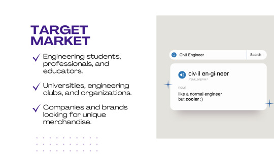
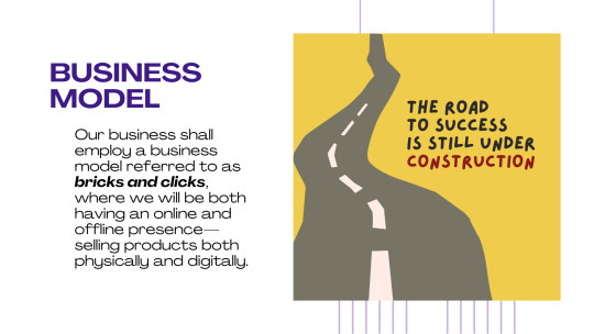


Hard Hat Designs: Stickers and Pins
This is a recent project meant for a school requirement. I created the logo and presentation for our business proposal. These images are some of my favorite slides from the entire presentation. I enjoyed doodling on the last image!
#adobe photoshop#art#graphic#graphic design#photoshop#portfolio#adobe illustrator#edit#editing#poster#illustrators on tumblr#typography#custom fonts#font design#fonts#creative logo#custom logo design#logo design#logo#business#pins and stickers#powerpoint#microsoft office#presentation#business ideas#enamel pins#stickers#engineering#civil engineering#product design
2 notes
·
View notes
Text
movement project - sketchbook work


I've complied all my sketchbook work here in powerpoint. I might've wrecked the image quality but the visual elements are probably more important than the writing.


The main things to note is I worked out the doily motif in my sketchbook by using them as stencils and sticking them in. They make nice ornate shapes and are in line with the cut-out forms I've been using.
I also stuck in some of my bird-cutouts and did rubbing of them and the doilies.

I also traced my scissors some more like I did for my 'cutout' design.

Then most of the work I did on Monday in graphics I stuck into my sketchbook as I did it on loose card, as I didn't have my sketchbook that day. I also stuck in the 'Hollywood' lettering from a magazine because. I liked the typography.
3 notes
·
View notes
Text
PowerPoint Presentation Design Services
Overview of PowerPoint Presentation Design Services
PowerPoint presentation design services are specialized offerings aimed at creating visually appealing and effective presentations for various purposes, including business meetings, educational settings, conferences, and marketing pitches. These services typically involve a combination of graphic design, content development, and strategic communication to ensure that the final product not only looks professional but also conveys the intended message clearly and effectively.
Key Components of Presentation Design Services
Content Development: This involves collaborating with clients to understand their objectives and audience. Content development may include writing text for slides, creating outlines, and ensuring that the information is organized logically. The goal is to create a narrative that engages the audience while delivering key messages succinctly.
Visual Design: A significant aspect of presentation design is the visual appeal. Designers use principles of graphic design to create slides that are aesthetically pleasing. This includes selecting appropriate color schemes, fonts, images, and layouts that align with the brand identity or theme of the presentation. Visual elements should enhance understanding rather than distract from it.
Slide Creation: Once the content and visual elements are established, designers create individual slides using software like Microsoft PowerPoint or other presentation tools. Each slide should be designed with clarity in mind—avoiding clutter while highlighting essential points through bullet lists, charts, graphs, and images.
Branding Consistency: For businesses, maintaining branding consistency across presentations is crucial. Design services often include customizing templates to reflect corporate branding guidelines—ensuring that logos, colors, and typography are uniform throughout all slides.
Interactive Elements: Modern presentations often incorporate interactive elements such as hyperlinks, embedded videos, or animations to engage audiences more effectively. Designers may integrate these features thoughtfully to enhance interactivity without overwhelming viewers.
Revisions and Feedback: After an initial draft is created, designers typically seek feedback from clients to make necessary revisions. This iterative process ensures that the final presentation meets client expectations and effectively communicates its intended message.
Training and Support: Some design services also offer training sessions for clients on how to present their materials effectively or how to use specific features within PowerPoint itself.
Delivery Formats: Finally, once the presentation is complete, it can be delivered in various formats depending on client needs—whether as a PowerPoint file (.pptx), PDF for easy sharing without formatting issues, or even as an online presentation via platforms like Google Slides.
Benefits of Using Professional Design Services
Expertise: Professional designers bring experience in both design principles and effective communication strategies.
Time-Saving: Outsourcing presentation design allows individuals or teams to focus on their core responsibilities while ensuring high-quality output.
Enhanced Engagement: Well-designed presentations tend to capture audience attention better than poorly constructed ones.
Increased Credibility: Professionally designed presentations can enhance perceived credibility during pitches or important meetings.
In conclusion, PowerPoint presentation design services encompass a comprehensive approach to creating impactful presentations through expert content development and visual design tailored to meet specific client needs.
2 notes
·
View notes
Text
Work wants me to learn 3D Program.
I've told them so many times I do not want to learn that.
My brain reached its capacity of learning new programs.
I do not find joy in creating 3d objects.
I've worked 4 years with two different 3D colleagues together and watched them often enough working with that Program to say for me this it not a thing I would like to learn neither enjoy to do.
There is a reason why I also said no to try learning modding.
Instead I would love to get more skilled on programs I already know or worked a little with (like figma).
And this company chooses not to ask if I would like to learn it even. Instead they decide to order my 3d colleague to install me the program so I can tweak into it it would be no force on me.
Brudi, I know very well if I give u the little finger you take my whole hand. Not gonna do it.
Nein heißt nein.
I'll search a new job and quit this one if they force me to learn 3D.
I've decided to become a graphic designer bc of typography, print and book design. I did study exactly that and not 3D design. If I had interest in 3D I'd have chosen to do game design ffs.
I can offer to get more into fucking hell of PowerPoint, I want to learn figma, hell I even would chose Premiere Pro over fucking cinema 4D
I'm so angry about this my words aren't taken seriously and that people decide for me what I should learn. This is a fucking no go
9 notes
·
View notes
Text
The Ultimate Guide to a Multifaceted PowerPoint Template Design
In a world where effective communication is paramount, a versatile PowerPoint template design stands as a powerful tool to captivate audiences, convey ideas, and leave a lasting impact. In this guide, we explore the key elements and strategies for creating a multifaceted PowerPoint template that adapts to various themes, content types, and presentation styles.
Section 1: Understanding Versatility in Design Exploring the concept of versatility in PowerPoint design, the importance of adaptability, and how it enhances engagement.
Section 2: Core Design Principles Delving into the foundational design principles that underpin a versatile template. Topics covered include color theory, typography choices, and the use of white space.
Section 3: Adaptable Slide Layouts Examining the creation of diverse slide layouts to accommodate different content types. Tips for designing title slides, content slides, image-centric slides, and data-driven slides.
Section 4: Seamless Brand Integration Discussing techniques for seamlessly integrating branding elements within the template design to maintain consistency and reinforce identity.
Section 5: Visual Storytelling Tools Exploring the art of visual storytelling and how to incorporate elements like icons, images, and illustrations to enhance narrative impact.
Section 6: Dynamic Data Visualization Detailing strategies to design dynamic and customizable data visualization slides, including various chart styles and graph types.
Section 7: Interactive Elements and Animations Examining the judicious use of animations and interactive elements to engage the audience without overwhelming the content.
Section 8: User-Friendly Customization Providing guidelines on creating a user-friendly template that allows presenters to customize content easily without compromising design integrity.
Section 9: Case Studies in Versatility Showcasing real-world examples of organizations and individuals utilizing versatile PowerPoint templates across various industries and purposes.
Section 10: Creating Your Own Versatile Template Step-by-step instructions for creating a multifaceted PowerPoint template from scratch, including practical design tips and considerations.
Section 11: Future-Proofing Your Design Addressing the ever-evolving landscape of design trends and technology, and how to future-proof your template for lasting relevance.
Conclusion: In a world where every presentation is a chance to make an impact, a versatile PowerPoint template design emerges as an invaluable asset. By mastering the art of adaptability and embracing the principles of design, you can create a template that resonates with diverse audiences and empowers you to tell your story effectively, regardless of the subject matter or context.
8 notes
·
View notes
Text
Free Online Blood PowerPoint Templates
Free online blood PowerPoint templates offer a valuable resource for individuals and organizations looking to create visually compelling presentations on topics related to blood, such as medical research, healthcare initiatives, blood donation campaigns, and more. These templates provide ready-made designs that can be easily customized to suit specific needs, making it easy for users to create professional-looking presentations without the need for extensive design skills or resources. With a wide range of templates available for free online, users have access to a diverse selection of designs that cater to various presentation purposes and styles.One of the primary benefits of free online blood PowerPoint templates is accessibility. These templates are readily available on the internet, allowing users to access them from anywhere with an internet connection. Whether you're a healthcare professional, a student, or a nonprofit organization, you can easily find and download blood PowerPoint templates to support your presentation needs. This accessibility ensures that users have access to high-quality design resources without the need for expensive software or design expertise.Additionally, free online blood PowerPoint templates offer convenience and efficiency. Instead of starting from scratch or spending hours designing a presentation from scratch, users can simply choose a template that fits their needs and begin customizing it to suit their content. With pre-designed layouts, graphics, and typography, these templates provide a framework that streamlines the presentation creation process, allowing users to focus on crafting compelling content rather than worrying about design details.Furthermore, free online blood PowerPoint templates offer versatility. Whether you're creating a presentation for a medical conference, an educational seminar, or a community outreach event, you can find templates that suit your specific requirements. From simple and minimalist designs to more elaborate and visually engaging layouts, there are templates available to cater to various presentation styles and preferences. This versatility ensures that users can find a template that aligns with their branding, messaging, and audience expectations.Another advantage of free online blood PowerPoint templates is the opportunity for customization. While the templates provide a starting point for presentation design, users have the flexibility to personalize them to their liking. This customization can include adjusting colors, fonts, images, and layout elements to reflect the user's unique style and preferences. Whether you want to incorporate your organization's branding elements or tailor the design to fit a specific theme or topic, free online blood PowerPoint templates offer the flexibility to make your presentation truly your own.Moreover, free online blood PowerPoint templates often come with features that enhance visual appeal and engagement. From animated transitions to multimedia elements, these templates offer tools that can help users create dynamic and interactive presentations that capture and maintain audience attention. By incorporating these features into their presentations, users can create a more immersive and memorable experience for their audience, ensuring that their message resonates long after the presentation is over.In conclusion, free online blood PowerPoint templates offer a valuable resource for individuals and organizations seeking to create impactful presentations on topics related to blood. With accessibility, convenience, versatility, customization options, and engaging features, these templates provide everything users need to craft professional-looking presentations that effectively communicate their message. Whether you're a healthcare professional, a researcher, or an advocate for blood donation, free online blood PowerPoint templates provide a cost-effective and efficient solution for creating compelling presentations that make an impact.
2 notes
·
View notes
Text
do NOT take typography as an elective your scrutinous ass will be downloading fonts and moving projects from powerpoint bc it doesn't support contextual ligatures
2 notes
·
View notes
Text
Week 1: #KnowYourClassmate
This week we started with our important class of the entire semester called ‘project 1- poster’.
We were introduced to our professor Milly Singh ma’am. She started the class with her introduction and went on to ask us about ourselves. We later recapped everything we did in our foundation year and in the end we were given our very first assignment. We were paired up with our classmates and were asked to interact with them and to make a poster on them. The outcome of this assignment was for us to know our classmates better and build better relations with them.
The notes taken during the interaction with my classmate:

The next day we were asked to show our ideations and later on ma’am went on to recap everything we had done until now in our course. She talked in depth about colors and typography. She told us what were jarring boundaries in color as well as what color psychology means. In typography we discussed the different typefaces like serif, sans serif, decorative etc. She asked us to research some fonts and typographers. This was a very informative session for me as I didn’t have a lot of knowledge about color and some of the terms were new to me. It was an interactive session with her asking us questions and us trying our very best to answer.
The notes taken:


On wednesday, we further discussed typography and she tested our research by dividing us into teams and we played a game where we were asked to identify the fonts put up on the board. This was a fun and again an interactive session. Here I learned ways in which I can identify the fonts and some new fonts.
On Thursday, we discussed our ideas for the poster with ma’am. She asked us to explain our ideas and how they represented our partner. She further gave us pointers on how we can improve our ideas and told us to finish the poster by friday. I presented her 5 of my ideas and she told me that she liked 2 of them and told me how instead of showing 3 different illustrations I can just show one.
The ideations:

On friday, we were asked to go get prints of our posters. While our classmates went and got the prints, she asked us to write power on the board and then asked us to further write synonyms related to it. When they returned with the prints she asked us to put up our posters and asked everyone for their input on everyone’s posters. She asked us to be brutal when evaluating our own work as well as our classmates' works as that will help us be better prepared when we go to the industry. She was honest when she gave all of us our reviews. Honestly, I wasn't myself happy with what I had put up so when she came to my poster and told me that it looked like a powerpoint presentation I didn’t mind it one bit as it was the truth. She further gave me points on where I can improve and later took us to the board where we had synonyms to the word power. Later, we went back to the board where we wrote the synonyms of power and she gave us a brief about what we were supposed to do. She asked us to form a group of 2 or 4 people and make a poster on ‘power’. But before that we were asked to mindmap 4 types of powers and further classify them if needed. (Ps. the poster was too horrible to put on here.)


That's all for now. See you all next time!
2 notes
·
View notes
Text

Minimal Design PowerPoint Template – Clean, Professional & Impactful
In today’s fast-paced digital world, presentations need to be more than just informative — they need to be visually engaging, easy to follow, and professionally designed. That’s where our Minimal Design PowerPoint Template comes in.
Crafted for professionals who value clarity and modern aesthetics, this template is perfect for business meetings, startup pitch decks, portfolio showcases, client presentations, and more. The minimal style ensures that your message is always front and center, free from distractions and visual clutter.
Why Choose This Minimal PowerPoint Template?
What sets this template apart is its clean layout, sleek typography, and purposeful design. Every slide is thoughtfully structured to help you present ideas with impact while keeping everything visually balanced. It’s not just about looking good — it’s about communicating better.
Here are some features you’ll love:
✅ 100% editable PowerPoint format
✅ Drag & drop image placeholders
✅ Master slide layout for easy customization
✅ Modern charts, graphs, and infographics
✅ Compatible with Microsoft PowerPoint and Google Slides
✅ Ideal for business, creative, marketing, and personal use
Who Is It For?
Whether you’re a startup founder preparing your next investor pitch, a corporate professional crafting reports, or a creative entrepreneur presenting your portfolio, this minimal template is built for you. It provides a flexible and clean foundation to build powerful narratives that engage your audience and leave a lasting impression.
Boost Your Professional Image
Using a professional PowerPoint template not only saves you hours of design time but also boosts your credibility. With this minimal template, you don’t need to be a designer to deliver stunning presentations. Just plug in your content, customize the visuals, and you’re ready to go!
🔗 Start creating polished, impressive presentations today: 👉 Download the Minimal Design PowerPoint Template
1 note
·
View note
Text
Build a brand and its brand manual
For this assignment we were given a list of categories of which we were askes to pick one category and build a brand.
The list of categories were:
Eco-Friendly Product Brand
Fictional Café or Restaurant
Automobile Company
Space Travel Agency
Time Travel Café
Indigenous Art & Culture Brand
Fashion and Accessories
Pet Accessories Brand
Of these categories, I chose to conceptualize a fictional brand in the Space Travel Agency category. This brand was developed as a luxury, futuristic space travel agency offering exclusive, life-defining experiences to pioneers, leaders, and visionaries who are shaping the future of the world and beyond.
The goal was not only to design a travel service but to create a narrative and legacy — where the journey itself becomes transformational. With this in mind, I envisioned Aphelion as a brand that blends science with aspiration, and experience with exclusivity. Every detail — from the brand identity to the tone of voice — was designed to reflect elegance, intelligence, and a futuristic spirit.
After doing thorough research, I made a PowerPoint presentation that includes the basic information of the brand, its vision and mission, brand voice, personality, tone, style, the target audience, brand architecture, swot analysis , Maslow's laws, pestel analysis, experience mapping, journey mapping, brand touchpoints and possible collaterals and a rough hypothetical itenary of a trip.
The powerpoint presentation is as follows-
After all the research, i headed to find a name for the brand.
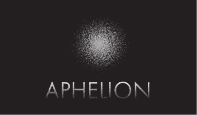
I chose the name 'Aphelion'.
The term “aphelion” refers to the point in a planet’s orbit farthest from the sun — a poetic representation of pushing boundaries and reaching beyond the known. This name aligned well with the vision and personality of my brand.
I then started making a variety of logo iterations. Some of those include-

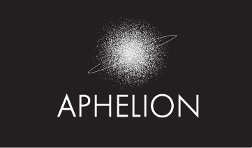
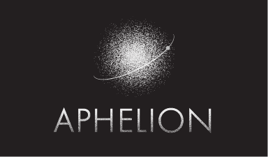
The final logo i decided to take forward was-
Of all the logo iterations, I chose this version because it best captures the essence of Aphelion — a journey to the farthest point. The diffused sphere evokes a celestial body, while the curved line suggests orbit and motion. Its minimal, elegant design balances science with imagination, aligning perfectly with the brand’s futuristic and aspirational tone.
Once the logo and tagline — “The farthest you’ve ever been” — were finalized, I focused on developing a color palette that would visually anchor Aphelion's brand identity. The final logo with the tagline is-

After i finalized the logo, I decided the primary and secondary colours based on the brands personality, values, tone and style.
The dark slate (#212529) and soft ash (#E0E1DD) form the primary palette, reflecting the vast unknown of space and the quiet elegance of distance.


For the secondary set, I selected a cosmic purple, deep space blue, and pale sky cyan — each evoking mystery, depth, and serenity. Together, these hues balance imagination and credibility, aligning with Aphelion’s futuristic, aspirational tone while remaining grounded in a sense of calm exploration.


I also developed a motion graphics video that visually represents the core idea of Aphelion. The animation features countless particles drifting through space, gradually converging to form the logo — symbolizing unity, momentum, and the vast collaboration behind space exploration. This not only reinforces the brand’s cosmic identity but also reflects the tagline, “The farthest you’ve ever been”, through a sense of emergence, scale, and wonder.
After establishing the core elements of the brand — including the logo, tagline, colour palette, typography, and motion identity — I designed a cohesive set of brand collaterals and mockups.
The brand collaterals and mockups for the same are-


These collaterals visually express the brand across multiple touchpoints and are carefully documented in the comprehensive brand manual. The manual brings everything together, ensuring consistency, clarity, and a unified vision for Aphelion.
The brand manual is as follows-
Through this course, I gained a deeper understanding of the branding process — from conceptualizing a brand identity to building a complete visual system. I learned how to translate abstract ideas into strong visual elements like logos, colour palettes, typography, and motion design.
I also developed practical skills in creating brand collaterals and presenting them cohesively in a brand manual. Most importantly, I understood the value of storytelling in design and how every brand element should work together to communicate a clear and consistent narrative.
1 note
·
View note
Text
Idea Factories: Inside the Brainstorming Rooms of a Creative Agency
When you step inside the heart of a Creative Agency, you aren’t just entering a workplace. You’re stepping into a living, breathing laboratory of ideas where imagination reigns supreme and boundaries are made to be broken. These brainstorming rooms, often dubbed “idea factories,” are where inspiration is engineered and creative sparks ignite campaigns that shift perceptions and influence cultures.
At Apppl Combine, one of the most innovative creative agencies in the business, the brainstorming room is not just a space. It is a mindset, a culture, and a method all rolled into one. This is where brands are born, slogans are shaped, and stories come to life in ways the world has never seen before.
The Anatomy of an Idea Factory
Forget everything you thought you knew about traditional office meetings. There are no sterile conference tables or painfully quiet PowerPoint sessions here. Inside the brainstorming rooms of a top Creative Agency like Apppl Combine, the atmosphere is electric. Walls are covered in sketches, doodles, post-it notes, and vision boards. One side of the room might feature a mood corner with color palettes and typography samples. Another might be a floor-to-ceiling whiteboard filled with ideas that seem to jump out and demand attention.
Music plays in the background to keep the creative flow going. There might be a scent of coffee or the comfort of a late-night brainstorming snack. The environment is deliberately curated to break conventional thinking and stimulate innovation. These rooms are part playground, part think tank, and completely dedicated to originality.
The Creative Process: Structured Chaos
At first glance, it might seem like chaos. People talking over each other, markers flying across whiteboards, team members bouncing around the room like electrons. But at Apppl Combine, this chaos is organized. Every brainstorming session is backed by strategic thinking. Research, client insights, market analysis, and brand goals are all embedded in the process.
Sessions often begin with warm-ups or creative exercises that free the mind from traditional constraints. Then comes ideation. No idea is dismissed immediately. Even the oddest thought is explored, dissected, and sometimes combined with another to create something unique. It’s this commitment to open thinking that allows Apppl Combine to deliver campaigns that surprise, resonate, and deliver measurable impact.
Talent is the True Ingredient
While space plays a big role, it is the people who make a brainstorming room truly powerful. A Creative Agency is only as strong as the minds that drive it. At Apppl Combine, the team is a mix of storytellers, analysts, visual artists, wordsmiths, digital architects, and dreamers. Everyone brings a different perspective and no one’s idea is ever too small.
This diversity fuels creativity. One team member might pitch an outrageous idea, and another might find the practical core that turns it into a winning strategy. It’s in this interplay of bold thought and sharp execution that real creativity lives.
From Concept to Campaign
Once a core idea is selected, it goes through rigorous development. Visual identities are crafted, copy is refined, mock-ups are created, and digital strategies are tested. Every campaign that emerges from Apppl Combine’s brainstorming room is designed to connect, provoke, and convert.
These campaigns are not just designed to look pretty. They are made to work hard. Whether it’s a digital rollout, a full-scale brand launch, or a socially disruptive message, every creative solution is strategically aligned with client objectives and audience behavior.
Why It Matters More Than Ever
In an age where attention spans are short and competition is fierce, brands must go beyond the obvious. They need to be bold, clever, and emotionally intelligent. That kind of thinking doesn't come from cookie-cutter methods or outdated templates. It comes from powerful, passionate brainstorming sessions driven by professionals who live and breathe creativity.
This is why companies that want to stand out choose a Creative Agency like Apppl Combine. They understand that success in today’s market requires more than good design. It requires exceptional thinking, deep insights, and a relentless desire to break the mold.
Conclusion: Step Into the Creative Core
Innovation doesn't happen by chance. It happens in spaces designed for brilliance, led by minds that refuse to settle for ordinary. If you're looking to redefine your brand, tell your story differently, or launch a campaign that leaves an unforgettable impression, it's time to step inside the idea factory.
Partner with Apppl Combine, a leading Creative Agency, and watch your brand evolve into something extraordinary.
Contact us today to spark the next big idea for your business.
0 notes
Text

Evoxyn | Brand Identity Template: Your Complete Solution for Professional Branding
Evoxyn Brand Identity Template is a ready-to-use, versatile solution designed to streamline the creation of your brand guidelines. Whether you’re a business owner, graphic designer, or marketing professional, this template offers everything you need to establish a strong and cohesive brand identity. Compatible with Adobe InDesign, Illustrator, PowerPoint, Google Slides, and Canva, Evoxyn ensures that you can create professional brand guidelines effortlessly, no matter your preferred platform.
With Evoxyn, you can focus on what matters most—building your brand—while we handle the structure. Our comprehensive template simplifies branding by offering a polished, professional layout that you can easily customize to align with your unique identity. Simply add your logo and images and adjust your brand colors and typography to complete your brand guidelines in no time.
#brand identity#brand identity layout#brand identity design services#template design#print template#graphypix#brochure design#template#presentation#presentation template#evoxyn#branding strategy#personal branding#business branding
0 notes
Text
How Leading Presentation Design Companies Are Redefining Brand Storytelling

In the digital age, where attention spans are shorter than ever, brands face the challenge of capturing and retaining their audience’s interest. Enter leading presentation design companies—these creative powerhouses are revolutionizing the way brands tell their stories. By combining cutting-edge design, strategic storytelling, and innovative technology, they are transforming ordinary presentations into unforgettable experiences. Here’s how professional presentation design services are redefining brand storytelling and why your business should take note.
1. The Power of Visual Storytelling
Humans are visual creatures, and leading presentation design companies understand this better than anyone. They use compelling visuals—such as infographics, animations, and custom illustrations—to convey complex ideas in a simple, engaging way. This approach not only makes your message more digestible but also ensures it resonates deeply with your audience.
2. Customization That Reflects Your Brand Identity
Gone are the days of generic, one-size-fits-all templates. Professional presentation design services focus on creating fully customized presentations that align with your brand’s identity. From color schemes and typography to imagery and tone, every element is tailored to reflect your unique personality and values.
3. Data Visualization That Speaks Volumes
Numbers and statistics can be dry, but not when they’re presented creatively. Leading presentation design companies excel at turning data into visually appealing charts, graphs, and infographics. This not only makes your information more accessible but also adds credibility and impact to your narrative.
4. Interactive and Immersive Experiences
Modern audiences crave interactivity. Top presentation design agencies are leveraging tools like clickable elements, animations, and embedded videos to create immersive experiences. These interactive features keep your audience engaged and make your presentation more memorable.
5. Strategic Storytelling Frameworks
A great presentation is more than just a collection of slides—it’s a story. Professional presentation design services use strategic storytelling frameworks to structure your content in a way that captivates your audience from start to finish. Whether it’s a problem-solution narrative or a journey of transformation, they ensure your message is clear, compelling, and impactful.
6. Consistency Across All Touchpoints
Brand storytelling isn’t limited to a single presentation. Leading presentation design companies ensure consistency across all your communication touchpoints, from pitch decks and sales presentations to webinars and annual reports. This cohesive approach strengthens your brand’s identity and builds trust with your audience.
7. Leveraging the Latest Design Trends
Staying ahead of design trends is crucial for making a lasting impression. Top agencies are constantly innovating, incorporating the latest trends like minimalism, 3D graphics, and bold typography into their work. This ensures your presentations feel fresh, modern, and relevant.
8. Focus on Audience Engagement
Understanding your audience is key to effective storytelling. Professional presentation design services take the time to research your target audience, ensuring your presentation speaks directly to their needs, preferences, and pain points. This personalized approach maximizes engagement and drives action.
9. Seamless Integration of Technology
From PowerPoint to advanced design software, leading presentation design companies use the best tools and technologies to bring your vision to life. They also stay updated on emerging technologies like augmented reality (AR) and virtual reality (VR), offering innovative solutions that set your brand apart.
10. Measurable Results and ROI
At the end of the day, a great presentation should deliver results. Leading agencies focus on creating presentations that not only look stunning but also drive measurable outcomes, whether it’s closing a deal, securing funding, or boosting brand awareness.
Why Choose Master RV as Your Leading Presentation Design Company?
At Master RV, we pride ourselves on being at the forefront of the presentation design industry. As a trusted provider of PowerPoint design services for brands, we combine creativity, strategy, and technical expertise to deliver presentations that captivate and inspire. Our team is dedicated to helping you tell your brand’s story in a way that leaves a lasting impression.
From concept to execution, we work closely with you to ensure every slide reflects your vision and goals. Whether you need a pitch deck, a sales presentation, or an annual report, we’ve got you covered.
Final Thoughts
In a world where first impressions matter more than ever, leading presentation design companies are playing a pivotal role in helping brands stand out. By leveraging the power of visual storytelling, customization, and innovation, they are redefining how businesses communicate and connect with their audiences.
Ready to elevate your brand’s storytelling? Partner with Master RV, a leading presentation design company, and let us help you create presentations that not only inform but also inspire. Contact us today to get started!
0 notes
Text
Presentation Design Agency vs. DIY: Which One Delivers Better Results?
Introduction
When it comes to creating a compelling presentation, businesses and professionals face a crucial decision: should they hire a Presentation Design Agency or attempt a do-it-yourself (DIY) approach? While DIY might seem cost-effective and convenient, a professional design agency brings expertise, efficiency, and high-quality results to the table. But which option delivers better results? Let’s compare both approaches to help you make an informed decision.
Understanding Presentation Design Agencies
A Presentation Design Agency is a specialized firm that creates high-quality, engaging, and visually appealing presentations for businesses, startups, and professionals. These agencies employ experienced designers, strategists, and content experts who craft presentations tailored to the client’s goals.
Key Services Offered by a Presentation Design Agency
Custom Presentation Design – High-quality slides tailored to brand identity.
Storytelling and Content Structuring – Organizing information for maximum impact.
Data Visualization – Converting complex data into easy-to-understand visuals.
Brand Consistency – Ensuring brand elements are seamlessly integrated.
Animation and Interactive Elements – Enhancing engagement through motion graphics and interactive features.
Pitch Decks and Sales Presentations – Designing investor-ready and persuasive business presentations.
The DIY Approach to Presentation Design
DIY presentation design involves using platforms like PowerPoint, Google Slides, or Canva to create presentations independently. Many individuals and small businesses opt for DIY due to budget constraints or perceived ease of use.
Tools and Resources for DIY Presentation Design
PowerPoint – A widely used tool with various templates and customization options.
Google Slides – A cloud-based alternative with real-time collaboration features.
Canva – A user-friendly design tool with pre-made templates.
Prezi – A dynamic, non-linear presentation tool with zoom-in effects.
Keynote – Apple’s alternative to PowerPoint with sleek templates.
Comparing a Presentation Design Agency vs. DIY
1. Quality of Design
Presentation Design Agency: Professional agencies ensure top-notch, visually appealing designs that align with branding guidelines. They use advanced tools like Adobe Illustrator, Photoshop, and After Effects to create stunning graphics.
DIY: Quality depends on the individual’s skill level. While templates help, amateur designs often lack a professional touch, making them appear generic or inconsistent.
Winner: Presentation Design Agency – Their expertise in visual design and branding results in polished, high-quality presentations.
2. Time Efficiency
Presentation Design Agency: Outsourcing saves time, allowing professionals to focus on content, strategy, and delivery.
DIY: Creating a presentation from scratch is time-consuming, especially for those unfamiliar with design principles.
Winner: Presentation Design Agency – Agencies streamline the process, delivering faster results with minimal effort from the client.

3. Customization and Brand Consistency
Presentation Design Agency: Ensures brand identity is maintained with custom colors, typography, and logos.
DIY: Users may struggle to maintain consistency across slides, especially when using multiple templates or free tools.
Winner: Presentation Design Agency – Professionals ensure seamless brand integration.
4. Storytelling and Engagement
Presentation Design Agency: Experts craft engaging narratives, ensuring the message is clear and compelling.
DIY: Without expertise, DIY presentations often lack coherence and storytelling finesse.
Winner: Presentation Design Agency – Strategic storytelling enhances audience engagement.
5. Technical and Creative Expertise
Presentation Design Agency: Uses advanced techniques like motion graphics, 3D elements, and data visualization.
DIY: Limited by available templates and the user’s design knowledge.
Winner: Presentation Design Agency – Advanced tools and expert knowledge result in superior presentations.
6. Cost Considerations
Presentation Design Agency: Costs vary depending on project complexity but offer high ROI.
DIY: Low-cost or free options are available, but quality may suffer.
Winner: DIY – Budget-friendly but at the expense of quality and impact.
7. Audience Impact
Presentation Design Agency: Professionally designed slides leave a lasting impression and enhance credibility.
DIY: Amateur slides may fail to capture attention or persuade an audience effectively.
Winner: Presentation Design Agency – First impressions matter, and quality design elevates audience perception.
When Should You Choose a Presentation Design Agency?
Hiring a Presentation Design Agency is ideal if:
You need high-stakes presentations (e.g., investor pitch decks, corporate reports, product launches).
You want to maintain brand consistency across multiple presentations.
You lack design expertise or time to create a polished presentation.
You need engaging visuals and storytelling to enhance your message.
When is DIY a Viable Option?
DIY is a reasonable choice if:
Your budget is extremely limited and hiring an agency is not feasible.
You need a simple, internal presentation that doesn’t require advanced design.
You have design skills and experience with presentation software.
You have sufficient time to create and refine the presentation.
Conclusion: Which One Delivers Better Results?
While DIY presentation design is an option, a Presentation Design Agency consistently delivers superior results in terms of design quality, brand consistency, audience engagement, and time efficiency. For businesses and professionals looking to make a lasting impact, investing in expert design services is well worth it.
For those needing a professional touch, hiring a Presentation Design Agency ensures a polished, persuasive, and visually stunning presentation that enhances credibility and achieves desired outcomes.
1 note
·
View note
Text
Improve Your Business Presentations with Corporate PowerPoint Design
In today’s competitive business landscape, effective communication is key to making an impact. Whether you're pitching an idea, delivering a corporate report, or presenting to stakeholders, a well-crafted presentation can set you apart. Creative presentation design and corporate PowerPoint design play a crucial role in enhancing your message and engaging your audience.
Why Creative Presentation Design Matters
A presentation is more than just a set of slides; it’s a storytelling tool that helps you convey complex ideas in a visually engaging manner. Creative presentation design ensures that your content is not only visually appealing but also strategically structured for maximum engagement.
1. Captivating Visual Storytelling
A dull, text-heavy slide deck can quickly lose your audience’s attention. With creative presentation design, your slides transform into compelling visual narratives that reinforce your key points effectively.
2. Enhanced Brand Identity
A professionally designed presentation aligns with your company’s branding, making your message consistent and memorable. With corporate PowerPoint design, you can integrate your brand colors, fonts, and logos seamlessly.
3. Improved Audience Engagement
Engaging slides with high-quality visuals, infographics, and animations capture interest and keep your audience focused. A great creative presentation design ensures information is digestible, reducing cognitive overload.
Key Elements of Corporate PowerPoint Design
To create an effective corporate PowerPoint design, certain design principles must be followed:
1. Minimal and Clean Layout
Avoid cluttered slides. Use white space strategically to highlight key messages and maintain a professional look.
2. Consistent Typography and Colors
Using a consistent font style and color palette strengthens your brand identity and ensures readability.
3. High-Quality Visuals
Images, icons, and graphics should be high-resolution and relevant to your content. Creative presentation design relies on strong visuals to enhance understanding.
4. Data Visualization
Complex data should be simplified with charts, graphs, and infographics to make insights easily digestible.
5. Smooth Transitions and Animations
Subtle animations can help guide your audience through the story while maintaining a polished, professional feel.
Elevate Your Presentations with Visual Spiders
At Visual Spiders, we specialize in creative presentation design and corporate PowerPoint design that transforms ordinary slides into powerful communication tools. Whether it’s a business proposal, investor pitch, or training deck, we ensure your message is visually compelling and strategically structured.
Ready to Make an Impact?
Don’t settle for generic slides. Elevate your business communication with creative presentation design that leaves a lasting impression.
Contact Visual Spiders today for professional corporate PowerPoint design solutions and PowerPoint creative design tailored to your needs!
0 notes