#Visual Language
Explore tagged Tumblr posts
Visit Tumblr Blog
Explore Tumblr blogs with no restrictions, modern design and the best experience.
Last Seen Tumblr Blogs


Fun Fact
The average Tumblr user visits about 67 pages every month.
Text
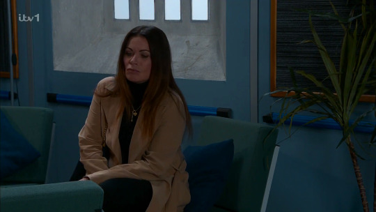
Visual Symbolism in Ave Mujica 12
One of the strengths in Ave Mujica is how well the visuals complement the story being told. The fact that animation necessarily conveys part of its story through visual means seems like an obvious statement, but some productions are definitely better at it than others. If you're interested in learning about cinematography, the theatricality of Ave Mujica makes it a pretty decent starting point. It is never particularly subtle, as every narrative beat is accompanied by a strong visual device to emphasize it. The scene composition, the objects in it, and the lighting and coloring are deliberately chosen to complement mood reversals, the relationships between characters, or even consciously reference the narrative's literary inspirations. The clear intentionality in the production team's visual staging are really instructional in how these choices work to complement stories in general. I'll share a few neat examples below the break for spoiler containment.
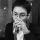
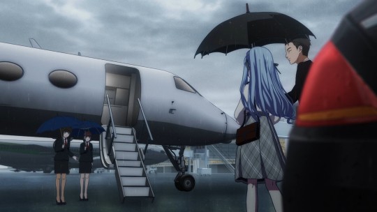
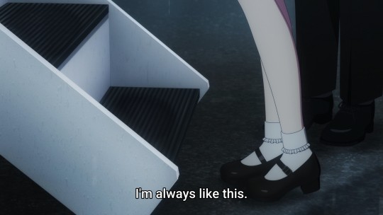
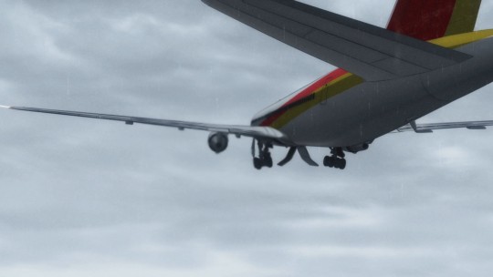
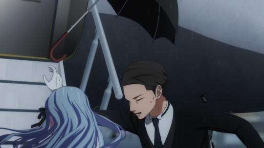
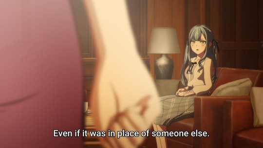
The episode's opening scene is a wonderful illustration of how the production team handles the visual pacing for a narrative beat, and I'll talk about it here because it also sets the wider theme for the episode, which I'll come back to in a bit. Sakiko is about to be carted off to Switzerland on her grandfather's orders. The sheltered but smothering environment her grandfather has created for her are conveyed by the desaturated tones of the scene and the claustrophobic framing of the shots. She is protected from a storm, at the cost of her personal freedom. At the same time, she muses whether this is the fate that God has chosen for her.
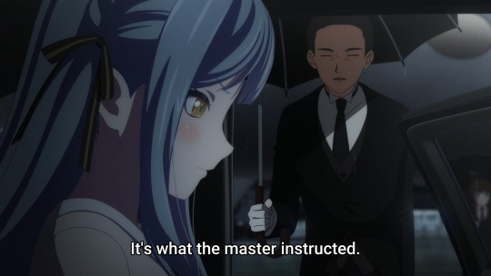
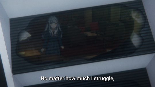
When Sakiko makes it to the airplane stairs, we arrive at the narrative decision point of the scene. She can either submit to her grandfather's orders by boarding, or she can reject the fate that has been decided for her. She hesitates, musing "I'm always like this. No matter how much I struggle, no matter how much I fight, everything gets swept away by the raging current." Each step to remain sheltered, to remain controlled, are a reminder of the unhappiness that following her grandfather's instructions have created.
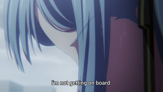
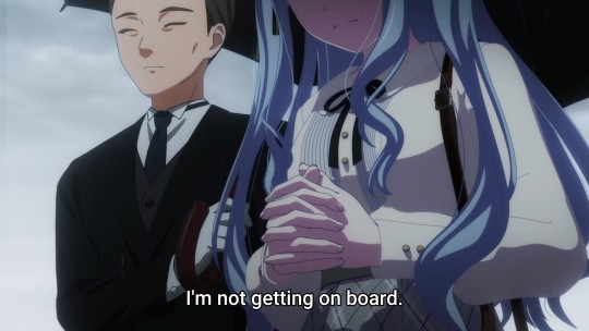
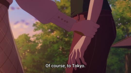
The scene's climax is reached when Sakiko makes the decision to reject her grandfather. Sakiko says, "I'm not getting on board." There is a short shot where she reaches her decision, a slightly longer shot of her hands clasped as if in prayer to find the resolve to follow through. There is a shot of an airplane flying away, symbolizing a departure without her, followed by the turbine wash blowing the umbrella out of her butler's hands. The sequence functions as a moment of divine providence. It answers the question posed as the decision point: a decisive no. Sakiko turns and runs before we cut to the series ending theme.
The decision to swap the running position of the ending and opening themes is itself an interesting narrative choice. Lyrically, the song is written from Uika's point of view, with a pastoral verse expressing a desire for Sakiko to come to her and goth metal chorus demanding a tight, everlasting bond between the two. The verse section is marked by visually spare images symbolizing the cast's loneliness, the bridge to the chorus accompanied by images of a mansion being demolished by flames, and the chorus conveying the various ways the cast feels trapped. Notably, the last shots are Uika reaching towards the light, a hand grabbing a sheet made into a rope, and then the Ave Mujica stage. Its placement at the beginning of the episode complements Sakiko's decision: she is irreversibly burning down the world her grandfather created to follow through with her lifetime commitment to the members of Ave Mujica.
That imagery neatly cues up the next part of the episode, which establishes a bond between Hatsune/Uika and Sakiko. I won't go into as much detail here, but there are a few neat things this segment does with visual metaphor, framing, and color that I would like to talk about.
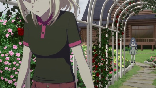
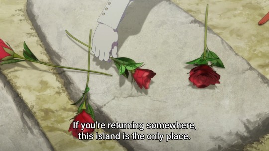
There is some really neat visual symbolism in the rose garden scene where Sakiko first encounters Hatsune. This setting is established as Hatsune's world, so it reflects her landscape. Sakiko's appearance poses them on opposite sides of the frame, and this division is mirrored by the colors of roses present. Hanakotoba, the Japanese language of flowers, is a useful key to this frame composition: red roses symbolize love, pink roses symbolize trust/confidence/happiness, and yellow roses symbolize jealousy. Hatsune's decision to leave Tokyo and give up on Sakiko is symbolized by her trimming the red roses from the trellis, and the pink roses that surround her could be interpreted as something like self-confidence in her decision to do so. The mix of all three colors on Sakiko's side of the frame represent the turbulent whirl of jealousy, trust, and affection Hatsune feels towards Sakiko.
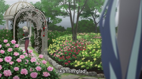
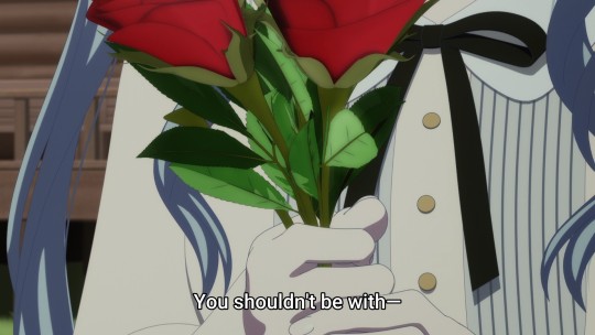
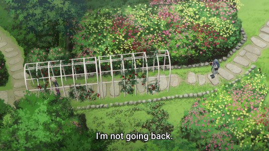
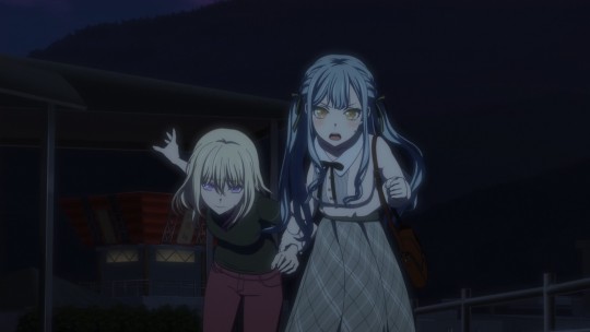
When Sakiko announces herself, she first calls for "Uika", causing Hatsune to drop the roses and begin running. It is the invocation of her "true name", Hatsune, that brings her to a halt. This is the moment where she, like Sakiko at the airport, needs to commit to her decision. Here, the framing emphasizes Sakiko's pull on her. A single, prominent red rose at her shoulder visually outweighs the pink roses behind her. The trellis of red roses, her love, shrinks into the background to converge on Sakiko, the villa, and the yellow roses. To stack the cards in her favor, Sakiko begins picking up the dropped roses, and holds them in a way that symbolizes she has received Hatsune's love. When Hatsune says that they shouldn't be together, Sakiko firmly commits by saying, "I'm not going back". The final shot conveys Hatsune, almost free of her love, with multiple paths ahead of her in a slightly less colorful world. Behind her, there is only one path leading to Sakiko and the Togawa villa, brighter, more well-tended... and deterministic.
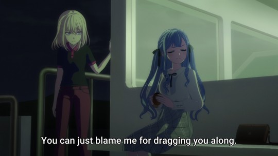
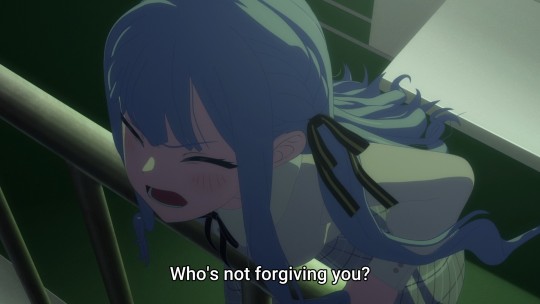
Although Sakiko manages to pull Hatsune back into her orbit, the ensuing conversations still have an underlying sense of tension to them. Hatsune and Sakiko are never shown directly looking at one another. The framing of these scenes use a variety of head-on close ups, shot/reverse-shots with the back of one character's head, low-angle shots at hip level, or wide shots that show them from a distance. The production team does everything but show the characters making eye contact while talking, intentionally creating a sense that they're talking at one another, not to one another. This decision also makes perfect sense in context: Sakiko is refusing to accept Hatsune's feelings of guilt and unworthiness, and Hatsune refuses to accept Sakiko's offer of forgiveness. This approach drags on so long - nearly ten minutes of runtime - that it begins to feel a little uncanny.
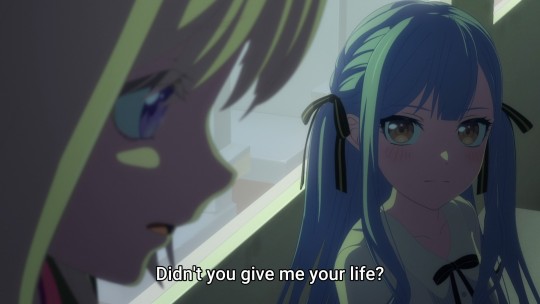
This tension continues to escalate until it's suddenly broken by the words Hatsune has desperately wanted to hear the whole time: "Our destinies are one. Didn't you give me your life?" After this point, the framing emphasizes their reactions to one another.
The unease created by the framing is emphasized further by the use of color in this episode. When they're shown together, the colors come across as slightly off - dark and muddy, even sickly. Before Hatsune accepts Sakiko's offer, the color choices are intense but desaturated. The color choices in these scenes might be conveying a sense of the darkness that Hatsune feels about her deception. After Sakiko makes the final decisive break with her grandfather to embrace "happiness" with Uika/Hatsune, there's a pale greenish tint to some scenes and an unnatural warmth to others. It suggests that there's still not something not quite right with their relationship.
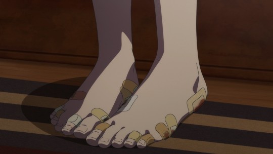
I think the sickly lighting in the "happy" section loops back around to the central narrative theme of the episode, which constructs the idea that Sakiko is playing God. Her rejection of the fate God - her grandfather - decided on is echoed at the end with her declaration, "I have come to realize there is no need to meekly accept fate. There is no God. So, I will become God myself." There are little messianic overtones throughout the episode, like the shot of her bandaged feet to emphasize her suffering, the extended sequence of her accepting Hatsune's "sin" of betrayal (Uika even referring to herself as Judas in the lyrics of KiLLKiSS), and the direct references to resurrection in her script for the new Ave Mujica show. She has decided to become the master of her own fate, and in so doing, the fate of Ave Mujica's members.
Ave Mujica consciously styles itself after Gothic literature. Within that literary framework, the decision to play God often marks the start of a terminal descent into madness. This descent into madness is often accompanied by the narrative point where the protagonist accepts the tragedy of their fate, surrendering their happiness to the inevitability of their own hubris. The letter Sakiko writes to Tomori at the end of the episode has an air of finality to it, echoing the Gothic protagonist severing the relationship to the one they truly desire. Sakiko's Faustian bargain for the lives of the Ave Mujica crew is the hubris she invited, her fate is to nurture them in perpetuity at the cost of her own happiness, as hinted by the lines in the script Nyamu is reading.
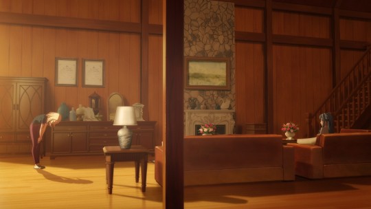
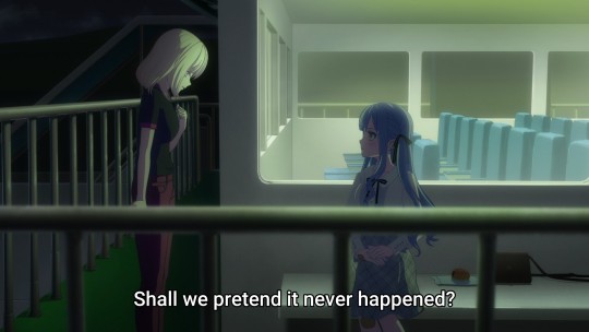
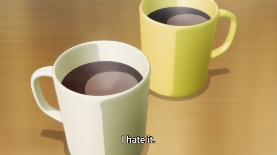
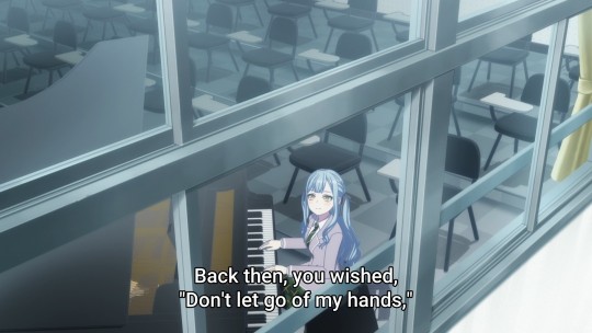
Again, the staging drives some of these points home. The first hint that something is awry is where Uika and Sakiko are laying together in Uika's loft. Their moment together is first interrupted by Umiri bringing band business to their attention. Her text comes at the exact moment the background music shifts to its outro. As Uika gets up to make coffee, she tells Sakiko she loves her, at which point the music cuts out completely. Although we see Uika's earnest intentions conveyed through her face, Sakiko's internal dialogue is telling. She stares up at the ceiling and says "Even if I turn away from fate, from the world, nothing will change. This little world will eventually come to an end, like waking up from a dream in the morning. Suddenly, and without warning." The camera then cuts to the pair of coffee mugs, established earlier in the series of symbolic of their relationship, as Sakiko says, "This smell, I hate it."
There is also a wonderful pair of mirrored shots in this episode, one of Sakiko playing in the Togawa garden with Uika, the other with her looking out the window as she praises Tomori's strength. The first shot symbolizes Sakiko's connections to her mother (the doll and piano) while showing the two splashing water on one another behind multiple barriers (the window, the garden fence). The second shot shows Sakiko looking outside wistfully from the piano, and placing her on the other side of the barrier from Uika. She closes her letter to Tomori with, "I may not be able to do it like you do, but I will protect my band in my own way."

Taken as a whole - the unnatural coloration of their scenes together, the coffee monologue, and this paired shot function to highlight Sakiko's position as a Gothic protagonist. Her romantic overtures towards Uika are less a matter of her true feelings (which seem directed at Tomori) than they are a necessity to uphold her end of the bargain for Ave Mujica. Sakiko is performing a necessary act to coax Uika into a cage to keep watch over her fate as a member of Ave Mujica. The artifice of Sakiko's relationship with Uika doesn't make it any less real, but it does make it clear that it is not the fate she would have chosen for herself.
I honestly have no idea how to wrap this all up. Maybe one last point, not related to the visual presentation but tying the narrative points of playing God and tragic fate together, is the Gothic concept of corrupting blood. Hatsune's monologue in episode 11 suggests that the power of the Togawa family is matrilineal, as Sakiko's father and grandfather are both "adopted" into the family by marriage. This stages both the act of playing God (the power of a Togawa to force the creation of Ave Mujica) and the tragic fate that follows from that power. Her rejection of her grandfather is accompanied by the statement that he's the only one of them scared of the Togawa family. This makes sense, as her grandfather's position within the family can be jeopardized, but Sakiko's position as the true heir cannot. Her embrace of her bloodline and its corrupting influence comes at the end of the episode, when she reminds her old manager who she is: "Oblivionis of Ave Mujica - Togawa Sakiko". She off the carrot of the lead member of a top-selling stage act, but doesn't hesitate to show the stick of old money connections and power.
Sakiko's challenge to her ex-manager leads neatly into placing the opening theme at the end of the episode. Its placement symbolizes the permanent return to the managed madness of Ave Mujica's stage act, its members trapped in a funhouse mirror of their own identity constructed through Sakiko's manipulations.
153 notes
·
View notes
Text
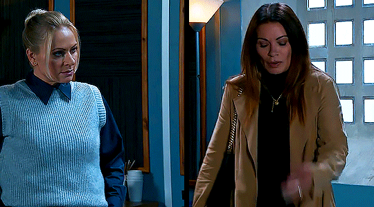
Swarla scene visual language analysis
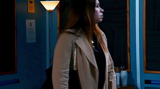
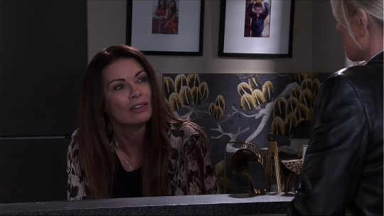
I was replaying this scene from 9th October 2024 (episode directed by Séan Healy) for the gazillionth time and because I had the sound turned off it became quickly apparent how the visual direction conveys the scene's evolving narrative and shifting temperament as Lisa and Carla struggle to reach some sort of resolution.
Just prior to this, we saw that Carla's desperate for them to talk about their Moment from the previous night, while Lisa is clearly reticent to address it but gives in at the other woman's persistence. She gestures for them to move into a different, more private, room.
From the moment Carla and Lisa enter this room, we don't see them within the same frame - even when they enter, Carla walks out of frame before Lisa enters the shot.
As they converse, they're both siloed within their own individual frames. It couldn't be clearer that in this moment they are at odds, divided. Framed apart, there's a disconnect between them. Vertical lines in the set design add to the feeling that they're partitioned from one another.
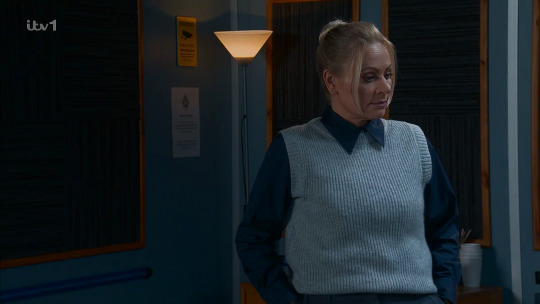
Carla sits down, placing them at different height levels and suggesting a subtle power differential - the ball is very much in Lisa's court... and she's refusing to play with it. There's no over-the-shoulder coverage shots to create a sense of intimacy or understanding between them while they talk - this isn't intimate; it's awkward. For now once Carla is seated, the camera remains static and at a medium distance from the two women, allowing us to see their body language. Lisa, with her hands in her pockets, is trying her best to appear aloof. Carla gesticulates as she tries to get a handle on what's happening between them.
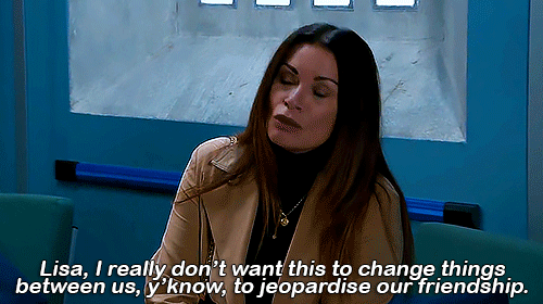
Neither woman is able or willing to be fully open about what they want, so they talk around their feelings for the first few exchanges of dialogue. But then Carla delivers a timely reminder that they're friends, and she doesn't want their friendship to become collateral damage. As she speaks, the camera now begins to gradually move in on her.

They're still not on the same page ("we had a moment, and now the moment's gone," "yeah...," "you straight birds, honestly") but as the camera continues to slowly move in closer to each of them, we start to hope that some kind of common ground can be established. Carla, now almost in close-up, reiterates her desire that their friendship not suffer, reminds Lisa that her divorce papers arriving had left her feeling vulnerable, offered as an explanation for her behaviour the previous night.
And now, when we cut to Lisa, suddenly she too is in close-up.

She visibly softens, and makes a concession that puts them on more level ground, admitting to her own recent vulnerable state.
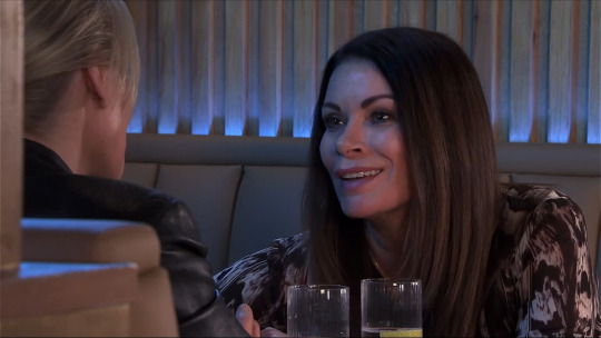
When we next cut to Carla, the camera angle has changed a little so that she's more face-on. She pleads with Lisa for them to draw a line under the whole situation, to which Lisa agrees, and then when Carla stands, we see why the camera has moved position now they have reached some sort of accord.

As she moves, the camera shifts with her into an over-the-shoulder position from behind Lisa, and finally, for the first time since they entered the room, they're both shown in the same frame - just.
Carla continues to appeal to Lisa, Lisa smiles, and with crisis averted Carla audibly exhales. With an awkward thumbs-up, she passes Lisa, and we see them framed together - reunited - as they both leave the room in another medium shot.

Of course there is plenty more awkwardness and unspoken feelings and swerving one another to come - as we soon see in the following scene - but for now the important outcome is that their friendship has been saved, and can live to develop into something else another day.
#Coronation Street#Corrie#Carla Connor#Lisa Swain#Swarla#Carla x Lisa#scene analysis#visual language#film studies#cinematography#soap opera#not me getting distracted while making a gifset and staying up til 5:30am to write this analysis & make these gifs instead#Cake Watches Corrie
93 notes
·
View notes
Text

Queer Emotionality as Form
This body of work reimagines post-impressionist expression not as nostalgic style but as a living, queer emotional language.

Rather than illustrating gay relationships through narrative scenes, these paintings embody the emotional architectures — yearning, rupture, tenderness, euphoria — that shape queer life. Emotion is treated not as theme or subject but as material: brushstroke, color, rhythm.

Queerness in this work is not located only in subject matter (two men in intimacy) but in the very structure of the paintings:


Fluid boundaries between figures and environment reflect relationality over rigid identity.

Luminous, symbolic palettes (pink, gold, silver, deep shadow) break from naturalism to celebrate emotional truth.

Non-linear emotional phases resist traditional narrative arcs, mapping queer experience as a cycle of struggle, healing, and liberation.


By centering emotional visibility, chosen connection, and the refusal of fixed form, the work queers expressive painting itself — expanding it into a space where feeling is not illustrated but inhabited.

In this world, as in queer life, emotion is the medium.
#metamorphicmuse#dall e#ai image#ai male#ai artwork#handsome male#male beauty#gay art#ai art#masculine#post impressionism#queer#art#emotions#visual language#gay art gallery#gay men#gay#art process#ai art challenge
69 notes
·
View notes
Note
On the topic of horror, how do you make a grim subject matter feel silly spookville experience instead of actually scary? For example, the Luigi Mansion games, the Disney Haunted Mansion ride, the Medevil games, etc?
The counter to anything terrifying, off-putting, or grim is cuteness. This is done by exaggerating certain features that humans typically find endearing and downplaying the features that humans find alarming, while keeping the visual recognizable. This works with animals.

It works with the undead.
It works with just about anything.
Humans tend to look at a few things to determine cuteness - the main two being proportion and the removal or masking of traits that we find scary or off-putting.

In terms of proportion, we tend to look favorably on things with the proportions of children, babies especially. Babies have much larger heads relative to their bodies, arms, and legs. If the scary thing is proportioned like a baby or child, we are much more likely to look at it favorably rather than with fear. Most examples of something cute based off of something scary use body proportions closer to a child's body (or the animal equivalent) than an adult's.

Second, we reduce the "fear" factor by simplifying, downplaying, or removing any elements of body horror or things that make people feel uneasy. This typically means any markers of injury, illness, pain, danger, or just obviously unnatural. Notice the mask on the left has many wrinkles in the skin, the unnatural white eyes, the off-putting shading, the heavy emphasis on the yellow teeth and blood-red gums, and the realistic proportions that intentionally push this mask into the uncanny valley for the unease it causes. Now consider the right mask - everything is simplified, with smooth lines and the only sharp edges being on the smile itself. Bright colors, a stylized happy face, with no features that could be considered off-putting.

Combine the use of proportions with the removal of things that induce unease in the viewer, and you get something cute and less scary. This also works in reverse - take something normally cute, change the proportions, and add in the things that induce unease in the viewer and it becomes scary. Artists take advantage of our inherent mental associations with these things to make things cute or creepy.
[Join us on Discord] and/or [Support us on Patreon]
Got a burning question you want answered?
Short questions: Ask a Game Dev on Twitter
Short questions: Ask a Game Dev on BlueSky
Long questions: Ask a Game Dev on Tumblr
Frequent Questions: The FAQ
51 notes
·
View notes
Text

36 notes
·
View notes
Text
The Vex and Percy foreshadowing for the "I should have told you, it's yours" moment is really hurting me right now and I do not appreciate it! I am enjoying the "Percy bathed in the light of the setting sun while Vex backs into the shadows" visual language though, this show is beautifully drawn.
#critical role#vox machina#tlovm#tlovm season 3#glintshore#tlovm s3e7#vex'ahlia#percy de rolo#visual language#foreshadowing#critical role spoilers
49 notes
·
View notes
Text
I think one of the most impressive things about Dave Filoni's Star Wars' works (beside his knowledge & respect for the lore of SW) is his understanding of the importance & impact of its visual language on pop culture, and our consumption & interpretation of SW as fans & the general public.
He gets it, he gets that for over 45 years SW fans have seared Luke standing under the twin suns of Tatooine, Yoda teaching Luke in the swamp, Vader & Luke on the bridge of Bespin, on the Death Star, and so much more into our brain, our heart & soul. Those images are iconic, not just from a pop culture front but from a SW lore pov.
It is why in ep 5 of Ahsoka we get so MANY scenes that are callbacks to the OG films but also to the animated series. It is bcos SW is built on echoes of what came before it, except we have reached a point where the callbacks/parallels are to SW media itself now.
So when we get scenes of Ahsoka & Anakin fighting on the walkways of the World Between Worlds, we are getting nearly half a century of cultural VISUAL callbacks & parallels. Luke vs Vader, Anakin vs Obi-Wan, the countless battles during The Clone Wars and so much more. We know & we understand the inherent importance of history that is on our screen. And we fucking breathes it in like life saving air.
It is why when Anakin & Ahsoka stand next to each other, arms folded in front of them, purviewing the destruction of Mandalore, we are recalling the visual familiarities of Anakin & Ahsoka like this in the animated series, the ways Obi-Wan & Anakin stood next each other, the ways Qui-Gon & Obi-Wan stood next each other, and so much more. It is a legacy, it is an iconic stance we all know, that we all connect to SW. Because we have seen it multiple times between Master & Padawan.
It is people walking through dust/gas - a nightmare coming to live, a dream being over, the ways we connect the fear & hope on Geonosis, the battles, and Vader striding through gas. We know the visual cues - a threat or a vision.
But isn't just recalling echoes now, Dave Filoni is creating new SW visuals that will be adding to the lexicon of SW visual language in our brain. Hera, Jacen & Jacen standing in front of the cliff, the ocean beneath & in front of him. It is Anakin striding away into war, smog & fire lighting his way, flashes of Vader present. It is Anakin striding through the smog towards us, Vader across his shoulders. It is the Purgills in the air, in space, their presence in the light. And so much more.
Filoni's visual understanding that SW is full of important & memorable scenes, scenes that are embedded into our subconsciousness, and then creating new scenes for us to latch onto is amazing. A scene in SW can't just be cool, it needs to serve an emotional, a plot, and a mythical purpose. It needs to be iconic.
(And the music. NEVER forget the music).
#star wars#dave filoni#ahsoka#ahsoka series#ahsoka spoilers#visual language#star wars is a like a religion#long text#sw meta#meta
69 notes
·
View notes
Text


MEATWRECK / selected
Los Angeles-based creative studio Meatwreck is a collaboration between artist couple Mitra Saburi and Derek Paul Boyle. The duo creates outlandish images every day, creating a disturbing yet intriguing visual language.
#photography #photooftheday #photo #photographer #photoshoot #nature #picoftheday #love #naturephotography #travel #photographylovers #beautiful #travelphotography #art #landscape #godsowncountry #portrait #photos #portraitphotography
What Was Her Name (feat. Chicks on Speed) by Dave Clarke 🎧

#fucking favorite#Derek Paul Boyle#Mitra Saburi#MEATWRECK#6/2024#fashion#fashionable#fashionphotography#fashionlover#fashionart#fashionaddict#fashionphotographer#fashionpost#fashionshoot#fashionlove#fashionlovers#fashioneditoral#editoral#catwalk#x-heesy#fine photo art#art arrangements#visual language#los angeles
17 notes
·
View notes
Text
More visual language exploration. I like the idea of sprites being a part of that system.
#sprites#visual language#graphic design#branding#identity#design#typography#typographic#illustration#art#jack bloom#spectra foundry#pixelart#pixel fonts#blue
9 notes
·
View notes
Text

In Kusanagi’s visual language Ao the squirrel shows you who is good
If Ao alights on a new character they are good.
The true protagonist once against shows the narrative destiny of the story
#akatsuki no yona#yona of the dawn#mizuho kusanagi#ao#puyku#the true protagonist#feeding animals equals a good person#visual language#manga panel#manga
32 notes
·
View notes
Text

“Oh Well”, 2013, acrylic on canvas

The above paintings are from Mel Bochner‘s 2024 exhibition ALL SALES FINAL! at TOTAH, in NYC. Sadly, the artist passed away this month at the age of 84.
Bochner was a conceptual artist with a career filled with works that challenged expectations. His work incorporated photography, installation pieces, and later the text-based paintings for which he became well known.
Border Crossings Magazine has an excellent interview with the artist from 2018 where he discusses his work and process, his early days writing about art, his famous Working Drawings and Other Visible Things on Paper Not Necessarily Meant To Be Viewed As Art from 1966, and more.
Below are a few excerpts-
On the text paintings and the viewer-
The “Thesaurus” paintings are a lot about voice, about who’s speaking and the tone of one’s voice. I don’t think it is anything that painting has dealt with very well. It’s one of the places where colour comes in because colour sets a tone, in an aural as well as visual sense. The viewer becomes a reader, a very different sense of involvement. The words grab the viewer. Once they see there is something to read, they’re liable to stop and read it. They engage with the painting in a different way, because seeing and reading take place in separate parts of the brain.
On where the words come from-
So is the process one in which you’ll get a word in your head from reading or overhearing something, and that will be the ignition for that particular painting?
I like that “point of ignition,” but you never know when it’s going to happen. Many years ago when both my kids were living at home, one was in high school and one was in grade school, listening to them talk was like living in a language factory. I would hear stuff and say, “Wow, that is a really interesting word, I can use that.” Sometimes I would overhear a conversation on the subway or read something in the newspaper and that would get me thinking. The words could come from anywhere. What I was trying to understand is how we talk now.
And here he discusses his use of color in the text works, specifically in Oh Well (2010)-
Is all language necessarily a palimpsest, so that when you enter its terrain, you’re always entering previously occupied spaces?
Yes. The thing with synonyms, which Roget himself first said, is that no two words ever mean the same thing. You’re moving through different shades and approximations of meaning. That was something I was thinking about in regards to the colour in the “Thesaurus” paintings. I never used the same colour twice in the same painting. They all had to shade off somehow, like synonyms. I would make a drawing recording every colour that went into every letter, and there are a couple of hundred letters in each painting. For example, Oh Well (2010). “Oh” was in Old Holland yellow green, “well” was in Williamsburg brilliant yellow, plus pale grey and cadmium yellow medium. “That’s” was in Gamblin quinacridone violet with a touch of Holbein grey and white. “Goes” was Williamsburg persian rose pure. Some of them got really complicated. “To” was Holbein light red earth and Old Holland yellow ochre deep and Williams cadmium orange and Gamblin Portland grey medium and Old Holland warm grey light plus white, plus Williams quinacridone maroon. This was my shopping list.
He also discusses his interest in philosophy and in this section he discusses Edmund Husserl‘s idea of brackets and applies it to creating art-
…When you can’t figure something out in math, you set it aside by putting it in brackets. You haven’t eliminated it; you haven’t discarded it; it’s just there waiting for you. So as I started reducing my work more and more, I put all those things aside: “Right now I can’t deal with colour; I can’t deal with shape; I can’t deal with surface. So what can I deal with; what can I do that feels authentic to me?” In the beginning it was just drawing numbers or writing words. Then as time went on I wanted to add things back in to increase the range and depth of the work.
To take them out of the brackets?
To move them into the equation. As you get older you build up a body of work and gradually give yourself more permission. I always thought that if Mondrian in his most classical year—1923 or 1924—if somebody had shown him Victory Boogie Woogie (1944), unfinished with all that masking tape, and said, “You’re going to paint this in 20 years,” he would have said, “You’re out of your mind, there’s no way I’m going to do that. It’ll never happen.” Or he would have had a heart attack and dropped dead on the spot. So if you’re fortunate to work for a certain length of time, there’s a trajectory but it’s not direct. If you want to continue making things that surprise you, you have to go against your own sensibility and see where the contradictions will take you.
The deferral that is contained within the brackets is a lovely notion. Does it mean that the act of being an artist is an engagement with contingency?
Yes, but there are always limits to contingency. Look, if you come into your studio, day after day, year after year, you want to have the feeling by the end of that day that you might have done something you’ve never seen before, something unexpected. If it’s the same old thing, then what are you doing? The place to be is where you don’t know where your work is going. If it doesn’t go anywhere today, that’s okay, too, because maybe it will tomorrow.
#Mel Bochner#Conceptual Art#Art and Language#David Totah#Art and Writing#TOTAH#Art with Words#Border Crossings Magazine#Drawing#Drawings#Edmund Husserl#Math and Art#Philosophy#Photography#Visual Language#Working Drawings#NYC Art Shows#Text Paintings#Art#Painting#RIP
2 notes
·
View notes
Text
Swarla scene visual language analysis pt.2
I know some of you were interested in my last post on this topic, and I thought we might as well take a look at this scene from Monday while it's still fresh. I haven't made gifs as movement is minimal here, so we're just using screenshots this time.
It's a shorter scene than the one I previously dissected but like the other, it presents the characters at odds with one another, though at a very different stage in their relationship. Visually, the narrative of the respective scenes is presented differently but what they have in common is how both characters' respective strong personalities/temperaments flavour how the scenes unfold - as you'd hope and expect.
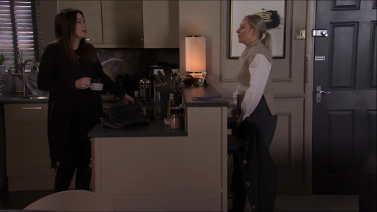
So, 26th May 2025 - here in Carla's kitchen (episode directed by Tim Royle) is the first time we see Carla and Lisa after the latter sprung a spur-of-the-moment and badly timed marriage proposal on Carla in the previous episode - which we left on a cliffhanger, Carla's expression one of shock.
We open now with a medium-wide shot to give us plenty of information about body language and who is standing where in the room. The camera pans across the kitchen as Lisa walks through the frame, and then settles in place as she comes to a stop on the opposite side of the breakfast bar to where Carla is situated. From this point on, the camera remains static through the rest of the scene - no more pans, and certainly no slow zooms to create intimacy. Everything unfolds through editing as we cut between different coverage set-ups.
Look at how much distance there is between them:

Due to the angle that the camera is facing them from, the kitchen counter and built-in bar appear even wider than it actually is, elongating that space between them. This combined with Carla asking "Are we just not gonna mention it?" tells us all we need to know about how the surprise of the proposal has been resolved... i.e. it hasn't! There's a disconnect between the two women.
The one other time we've opened their scenes with them positioned across the counter from each other like this was in the episode from 17th March 2025:
In that scene, they're at odds about how to handle Betsy's refusal to go into college, after she's had a frightening experience. They amicably discuss and temporarily resolve the issue, but later in the episode Lisa is upset with Carla dropping the ball on keeping Betsy company - their positioning in this opening scene hints at the ensuing dissonance that unfolds later in the episode. (So, we have a visual cheat code: it seems fair to conclude that if an episode opens with them on opposite sides of the kitchen counter, they are probably going to spend the episode in disagreement over something, and trying to reach a consensus/find common ground).
In this May episode, the body language is different. Lisa is fidgeting, and delaying making eye contact for as long as possible; Carla has a very relaxed posture as she leans on the counter and sips her drink - by bringing herself down to a lower height, Carla is presenting herself as non-threatening to Lisa, who she knows is prone to running away but - perhaps counter-intuitively given the height differential - she has control in this moment, and it's Lisa who's on the back foot.
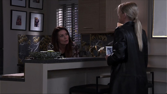
We cut to coverage from behind Lisa - it's still a medium-wide shot as we see her gathering her belongings, readying for her day. The camera angle still presents a sizable gap between the two women. Through dialogue, we learn that Carla didn't say yes to the proposal - hardly a surprise to us given all the visual information we've been presented with so far - and that her immediate response to it had been to point out how ill-timed it was.
Lisa, feeling the sting of embarassment at the perceived rejection is trying to downplay her emotions and brush the whole incident under the carpet; Carla wants to face the issue head-on and actually talk about it - not all that dissimilar to her approach in the October scene we previously analysed.
Pleading her case, Carla points out how emotionally devastated she was by Craig's death at the time of the proposal. As she speaks, we cut to a new coverage angle, this time facing Lisa with an over-the-shoulder, a shot type most commonly used to create a sense of intimacy or understanding between characters as they talk - we're now closer to them but it's a medium shot so it doesn't feel truly intimate. They're still not yet on an even level of understanding with one another:

"I knew that young man ... I watched him grow up around here," Carla says as Lisa nods subtly. Deep down, she knows Carla is right (but she's hurting, so she's in deflect, deny, and avoid mode).
Then we cut again to another over-the-shoulder as Carla comes to rest her case.
Lisa concedes that her timing was poor, and tries to make a quick exit but Carla - well used to her avoidant behaviour, and determined for them to address the situation - won't let her get away without agreeing that they'll meet again at lunch, planning to return to the discussion then.
We end with a final medium shot of Carla. It actually took me a few looks to notice that the set-up of this shot is just a fraction different to the previous: look at where the photos on the wall are cut off at the top of the frame, and at the diagonal line of the kitchen counter-top at the bottom of the frame. The camera has been lowered just slightly. Assuming this is an intentional choice, it subtly brings us down to Carla's level a little more as we sit with her for a second - after all, as audience members, we relate to her desire for clarity and resolution in this matter.

So, we see through dialogue married (pun intended) with visuals - presenting the scene's narrative - that things are unresolved as of yet, but the characters are a little bit closer to achieving that! We can reasonably assume that by episode end, they will reach that goal - despite Lisa's resistance.
The following bistro scene would be a good one to analyse too, so I'll try to do that somepoint soon. For now, here's a tease - look how much more intimate they appear in the final shots of that scene, despite still having a wide barrier (the table) between them:
Cosy!
Hope you found this interesting - let me know your thoughts :)
#Coronation Street#Corrie#Carla Connor#Lisa Swain#Swarla#Carla x Lisa#scene analysis#visual language#film studies#cinematography#soap opera#yikes this is a shorter scene yet I somehow wrote a few hundred words more than last time... sorry!#Cake Watches Corrie
60 notes
·
View notes
Text

#books#education#study#neptune#neptunianmind#books and reading#mercuryneptune#educate yourself#thesagittarianmind#visual language#visualcommunication#blackcinema#blackfilm#blackfilms#visual politics#visual culture
5 notes
·
View notes
Note
Would you agree that one of the only ways Concord stood out from its competition was through its character designs?
Going just off their clothing, their color palettes are hideous.
Concord really needed better character designs. When the player experience is greatly changed by the character or role the player chooses to play, the way that character or role is played must be clearly conveyed through its visual design. I thought Concord actually played quite well - several of their developers were former Bungie developers and Concord's gameplay was very much like early Destiny PVP. The game performed well and the characters played in fairly interesting ways once you started playing. The major difficulty was figuring out how a character played from how they looked.


For example, each of these characters from Samurai Shodown 2 really conveys what kind of gameplay a player can expect at a glance. One is a mid-range character who excels at keeping opponents at the right distance. One is a very fast attacker with short range and high combo potential. One is a heavy and slow heavy hitter. Earthquake, first, is clearly the slow and heavy hitter - his size is the biggest tipoff. Huge muscles, huge belly, and an extremely large weapon that can reach. Nakoruru, second, is the fast, short range fighter. She's got a hawk, a very fast animal, with her and she's got no visible weapon. The third character, Ukyo, is the mid-range character with his sheathed sword and sword hand ready to draw. It's immediately apparent that he's ready to draw that sword in a blink of an eye on anyone in range.


Here are three Concord characters - Daw, Duchess, and Vale. Among these three, there's a healer, a sniper, and an explosives expert. Is it easy to tell who's who at a glance? I would argue that it really isn't. The first character has a long rifle and goggles which suggests a sniper, but the white clothing and stylized red crosses suggest healing as well. The second character doesn't really fit the visual profile of any of the roles - judging by the size and bulkiness of the character's clothing, I would have thought he was a front-line tank of some kind instead, but I could see maybe that character being an explosives expert if there were any actual visible explosives. The third character's visual design doesn't say much at all - she looks like an old superhero with a gun. There are no real visual cues as to which role she fills. These characters are, in order, sniper, healer, and explosives expert respectively. This lack of visual clarity severely hurts the interest of anyone thinking about picking the game up because they aren't immediately drawn to a character or role they could be interested in.

From what I've gathered, one of the big issues during development with the character design was, as I suspected, design by committee. When the leadership wants things a certain way, those of us in the trenches must acquiesce. I've had situations where I've been assigned a particular task and thought it was a bad idea. I voiced my issues to the leads respectfully, I was overruled and told to do what they said, and I delivered what they asked. I know of another developer who got too close to a particular feature he worked really hard on and threw a massive tantrum when that feature was cut. That unfortunate dev was fired for his behavior. As much as those on the outside might think that we get to do whatever we want during development, individual contributors really are beholden to the decisions of our leadership.
[Join us on Discord] and/or [Support us on Patreon]
Got a burning question you want answered?
Short questions: Ask a Game Dev on Twitter
Long questions: Ask a Game Dev on Tumblr
Frequent Questions: The FAQ
67 notes
·
View notes
Text
CSM and Film Language
Gonna step outside the yuri bubble for a moment and talk about how I really like Chainsaw Man and how Tatsuki Fujimoto makes it so expressive through a particularly thoughtful use of film-inspired visual language.
There's a really nice example in the most recent chapter (#135). Spoilers after the break
Here's a quick recap for those who don't follow or haven't kept up with Chainsaw Man. Asa is a teenaged girl who is partially possessed by the War Devil, who forms an alternate personality named Yoru (depicted as a version of Asa with a scar across her face). Yoru has promised to give back Asa full control of her body once she has fulfilled her role in a plot to kill Chainsaw Man. At this point, Asa's life has been saved multiple times by Chainsaw Man, and she's getting increasingly hesitant about killing him. Only one of them is in charge of the body at a given time, but they spend their time bickering with a visualization of the other. In chapter 135, another devil (Famine), shows up offering Asa and Yoru a chance to both get what they want.
The chapter starts with Asa and Yoru arguing with one another about Asa's feelings for Chainsaw Man. They're shown standing on opposite sides of a table, and subsequent panels have a shot/reverse shot composition. It's a pretty direct visual indicator that their viewpoints are completely opposed to one another.

After a few pages arguing back and forth with one another, Famine interrupts their argument by suddenly appearing at the table. They're both surprised, and are subsequently framed side-by-side. They're now both on a similar wavelength: figuring out why Famine is there. In the final panel of this page, the framing also is used to show that Famine is now in control of the conversation.

I really like the gag on the next page and want to take a second to call out how nicely the paneling works to complement it, and how the gag also works to emphasize that Famine is now running the show. It uses the same shot/reverse shot framing from the earlier argument, with increasingly close shots of Famine's face to emphasize her insistence. The zoom in is mirrored in the first two Asa/Yoru panels, and then suddenly a far shot in the last panel. Each of the shot/reverse shots show Famine taking up more of the page, visually showing that her resolve to have her question answered first is winning.
A neat little touch here is that Asa is standing in a karate-chop fighting stance and Yoru in a fists-balled fighting stance. These kind of symbolize their differing approaches to managing conflict, with Asa's open hands representing appeasement and/or a technical approach, and Yoru's fists representing brute violence.

Famine remains in control of the conversation by getting up and digging through Asa's refrigerator, only looking at Asa and Yoru to make a point. Finally, Famine lays her offer on the table: a way for Asa and Yoru to both get what they want. During this entire conversation, Yoru has been in control of Asa's physical body, but once Famine makes her offer, she cedes control to Asa. There's a nice little visual touch of Yoru closing her eyes, and Asa appearing when she opens them.
Famine talks to Asa for a moment to convince her to go along with the plan. When Asa appears to be convinced (in part because Famine has played on Asa's sense of guilt), Yoru seizes control of the body again. This is shown in the opposite way of the graceful, multi-panel composition of Asa taking control, instead it's a jarring, single-panel transition.

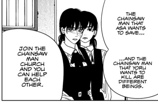
Famine then convinces Yoru of the plan by revealing that the Chainsaw Man Asa wants to save and Yoru wants to kill are actually two different entities. Asa and Yoru's mutual acceptance of the plan is shown visuall Asa is shown standing just over Yoru's shoulder with her face slightly blocked by Yoru's. The location of Yoru's eye overlaps with Asa's eye, symbolically showing that they're now more or less on the same wavelength.
In a nutshell, this chapter highlights one of the things I really love about Chainsaw Man - the use of cinematic language to efficiently portray character dynamics and to show without telling. Chainsaw Man is by turns gory, juvenile, goofy, tragic. What keeps it together is a core thoughtfulness to the storytelling conveyed through the careful use of the form. It makes any one part of the story - even the goofiest, most juvenile gags - feel less like they're in there just to get a cheap reaction from readers, but instead a core part of the story. Chainsaw Man wouldn't cut nearly as deep otherwise.
31 notes
·
View notes
