#Visual design principles
Explore tagged Tumblr posts
Visit Tumblr Blog
Explore Tumblr blogs with no restrictions, modern design and the best experience.
Last Seen Tumblr Blogs


Fun Fact
Total funding amounts to $125.3M.
Text

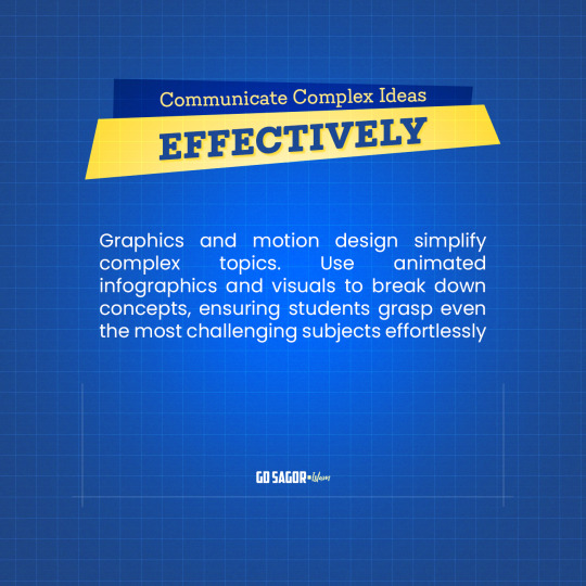

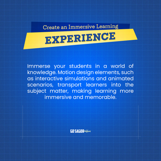
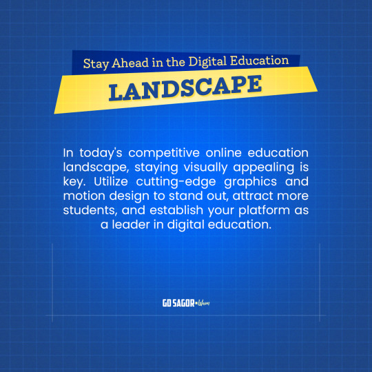
Visualizing Success: How Graphics and Motion Design Elevate Online Learning
In today's digital age, education has undergone a remarkable transformation. This title explores the critical role of graphics and motion design in this evolution. Discover how these creative elements are not just tools but catalysts for enhancing the online learning experience. Uncover the dynamic ways in which visuals and motion breathe life into educational content, making it more engaging, accessible, and effective than ever before. Join us on a journey to understand how these visual mediums are shaping the future of learning and paving the way for student success in the online education landscape.
#e learning#Online education#engagement#motion design#educational videos#visual communication#interactive learning#visual storytelling#animation#visual aids#digital learning#student engagement#effective communication#visual content#motion graphics#learning resources#Visual design principles#Graphic design impact#Online learning materials#Animated learning resources
0 notes
Note
On the topic of horror, how do you make a grim subject matter feel silly spookville experience instead of actually scary? For example, the Luigi Mansion games, the Disney Haunted Mansion ride, the Medevil games, etc?
The counter to anything terrifying, off-putting, or grim is cuteness. This is done by exaggerating certain features that humans typically find endearing and downplaying the features that humans find alarming, while keeping the visual recognizable. This works with animals.

It works with the undead.
It works with just about anything.
Humans tend to look at a few things to determine cuteness - the main two being proportion and the removal or masking of traits that we find scary or off-putting.

In terms of proportion, we tend to look favorably on things with the proportions of children, babies especially. Babies have much larger heads relative to their bodies, arms, and legs. If the scary thing is proportioned like a baby or child, we are much more likely to look at it favorably rather than with fear. Most examples of something cute based off of something scary use body proportions closer to a child's body (or the animal equivalent) than an adult's.

Second, we reduce the "fear" factor by simplifying, downplaying, or removing any elements of body horror or things that make people feel uneasy. This typically means any markers of injury, illness, pain, danger, or just obviously unnatural. Notice the mask on the left has many wrinkles in the skin, the unnatural white eyes, the off-putting shading, the heavy emphasis on the yellow teeth and blood-red gums, and the realistic proportions that intentionally push this mask into the uncanny valley for the unease it causes. Now consider the right mask - everything is simplified, with smooth lines and the only sharp edges being on the smile itself. Bright colors, a stylized happy face, with no features that could be considered off-putting.

Combine the use of proportions with the removal of things that induce unease in the viewer, and you get something cute and less scary. This also works in reverse - take something normally cute, change the proportions, and add in the things that induce unease in the viewer and it becomes scary. Artists take advantage of our inherent mental associations with these things to make things cute or creepy.
[Join us on Discord] and/or [Support us on Patreon]
Got a burning question you want answered?
Short questions: Ask a Game Dev on Twitter
Short questions: Ask a Game Dev on BlueSky
Long questions: Ask a Game Dev on Tumblr
Frequent Questions: The FAQ
51 notes
·
View notes
Text
I think Arty should have a little white stripe in his hair… to hell with realism it’d be cute and novel…
#artemis fowl#i operate on warrior cats and slightly-anime principles of character design. realism be damned the more fun the merrier.#and glasses! arty needs glasses. idk something *fun* I love him but his little suit isn’t visually interesting like it used to be…
83 notes
·
View notes
Text
this pic is frying me so bad LOL 😭😭😭😭😭😭😭
#this is vee speaking#was reviewing the bb vs dh battle in the manga for sumn and saw the way that artist drew sasara getting serious#and shortly after this post popped up on my feed lmao if there’s one thing that i simp over about sasara#it is his eyes lol he happens to have my fav eye shape design#these visuals tho LOL#how intimidating is sasara like RLY????#ik i personally have found him a little intimidating in his mcd days (specifically in the tdd manga lol)#but the story doesn’t really present sasara as a scary individual the way it has with rosho and rei#but i kinda?????? wanna say all three have been shown as intense when their eyes aren’t obscured#it’s why sasara told rosho to wear glasses lol#and i still get shivers thinking of that glare rei levelled at otome after repeating that he’s minding his own shit lol#sasara with his eyes open ig on the principle of it him being serious has the same effect huh?????#like maybe he’s not scary but you’d find yourself thinking his eyes are intense when open#eyes open sasara no glasses rosho and a pissed off rei with no shades are walking down the street towards you wyd LOL
24 notes
·
View notes
Text

.316. Out of alignment
#visual#continuum#visual art#celestial representation#geometry#geometric principles#illustration#digital art#dark#graphic art#digital design#linework#design#art#graphic design#alignment#align#out#misalignment#universe#cosmos#abstract#science#science art
53 notes
·
View notes
Text

Graphic design principles like balance, contrast, hierarchy, and alignment guide designers in creating visually appealing and effective designs. Mastering these fundamentals ensures cohesive, professional work that communicates clearly and resonates with audiences.
Visit Website:- https://graphicdesignerindia.in/
#brand identity#creative logo#design#designer#graphic art#graphic design#logo#logo design#web graphics#design principles#visual basic
8 notes
·
View notes
Text

Design Divina Comedia – A Series Of Posters By Alina Kompanets
A visual project inspired by Dante Alighieri’s Divine Comedy. In it, the author turns Rams’ ten principles of good design inside out and turns them into ten circles of design hell.
“During my research, I built a system of peculiar sins. For those who can’t see that they’ve been wandering down the same path for years. For those who mindlessly run after trends. For those who draw attention to distract from meaning. For those who steer others down false paths,” – Alina Kompa.
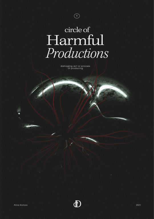
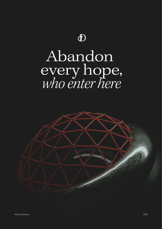

#alina kompanets#artist#art#design divina comedia#visual project#posters#dante alighieri's divine comedy#rams' ten principles of good design
4 notes
·
View notes
Text


I was asked by a friend yesterday if I could offer basic tips about comic paneling. As it turns out, I have a lot to say on the matter! I tried breaking down the art of paneling using the principles of art and design, and I hope it helps you out!
EDIT: uh uh there are a lot of people reblogging this, so i figure i may as well append this now while i can lol
This whole thing was very much cranked out in a few hours so I had a visual to talk about with a friend! If this gives you a base understanding of paneling, that's awesome! Continue to pull in studies from the comics you see and what other artists do well and don't do well! You can tell paneling is doing well when the action is flowing around in its intended reading format.
Here's the link to the globalcomix article from which I pulled the images about panel staggering! Someone sent in a reblog that it wasn't totally clear that the 7th slide mostly covers what NOT to do in regards to staggering, and that is my mistake!
I saw in a tag that someone was surprised I used MamaYuyu too, and I don't blame them lol. If I had given myself more than a couple hours maybe I would have added something else on, I just really admire MamaYuyu's paneling personally.
uh uh, final append: I am by no means a renowned master of paneling, so if you find anything off base here, by all means, counter it with your own knowledge and ways you can build upon from here! Art is always a sum knowledge of everything we find. 💪
30K notes
·
View notes
Text
Create Engaging Infographics for Your Business: Tips and Best Practices
Learn how to create engaging infographics for your business with our comprehensive guide. Discover the benefits, design principles, and promotion strategies to make your infographics stand out. Simplify complex information and boost your marketing efforts. Contact Koobr today to create compelling infographics that drive results.
#infographics Services#infographic design Services#infographic content#digital marketing Services#content marketing#data visualization#business infographics#graphic design#infographics design principles#Koobr infographics Services#visual storytelling#infographic tools
0 notes
Text

UI/UX Principles
UI/UX Principles are fundamental guidelines governing both User Interface (UI) and User Experience (UX) design. They dictate how visual elements and interactive features should be designed to optimize user satisfaction!
#https://www.techaheadcorp.com/blog/best-ux-design-practices/#ux design#user experience#design best practices#ui/ux principles#mobile app design#web design guidelines#user-centric design#interaction design#usability tips#human-centered design#responsive design#user interface design#ux research#prototyping#wireframing#accessibility in design#visual hierarchy#information architecture#design thinking#mobile app usability
0 notes
Note
Related again to Concord: back in 2016, when Overwatch and Battleborn released simultaneously, I read somebody online say that Overwatch succeeded not because it was a better game, but because it had characters that teenagers were horny about. I know this was a joke, but is there any truth in that? I imagine the main target user of online shooters is mostly male, and in their teens (or ok with juvenile themes). Do games with characters that male teenagers are used to find sexy sell more?
"Sexy" is a subset of the twelfth principle of animation that's applying here - "Appeal". "Appeal" generally means "visually interesting", which we can break down into different aspects. For things to be visually interesting, some things we want to consider are interesting shapes, exaggeration of key features, and paring down the unimportant details so the important stuff stands out more.

The first thing we want to look at is shapes. When we look at characters, the first thing we see is their silhouette. Silhouettes need to look different from each other or they're dull. Different shapes are much more interesting to look at. Our eyes are trained to pick out things that are visibly different, so having the characters be comprised of different shapes makes them stand out more. Look at how Hsien-Ko here has so many sharp angles and different elements to break up her design. The wide belt, the different colored tunic, and the enormous arms that show the broad A-shape of her body.

After shapes, we want to exaggerate their key features. Beyond than the basic shapes, we want certain details about the character to be memorable. It might be a fancy mustache, a waistline, a color swatch, a hairstyle, a particular bit of clothing that makes the character unique. The key features should stand out and draw attention to themselves! Hsien-Ko's attacks all come from inside her massive sleeves, which have the enormous yellow accent on the end. This is on purpose - you can tell at a glance where the attacks will be coming from when she fights. Her body also has extra detail - the belt and tunic stand out against the darker other colors to draw your eye and tell you that this is where she is vulnerable. The hat and talisman identify what she is - a Jiang-shi.

Beyond that, human eyes get confused if there's too much to look at. We want the signal to be as strong as possible. This means we want to pare down and simplify away extra unnecessary details. The important bits about the gameplay must stand out, and all the other stuff should fade into the background. Too much to look at feels overwhelming or "busy".

Look at what happens to her clean design when there are a lot of additional details added. She looks pretty, but there would be so much context lost if this were used in a game - how does she fight? What's important to look at? This takes us from a clean visual design that conveys a lot of information to a more generic "sexy" design that doesn't tell us much else.
Consider what this design looks like when built in the Soul Calibur character creator - the extra details from the hat, sleeve belts, hair danglies, shoes, etc. all break up the look and make things look messy. The "same" design here just doesn't work as well, because we can't apply these same principles as well.
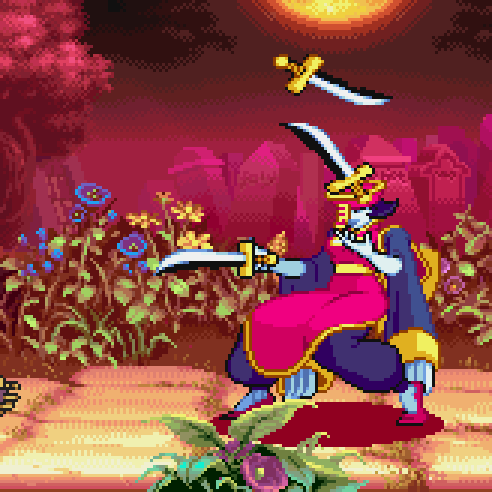
Making characters sexy is a shortcut to making them appealing, since sexy characters lean into the principles of appeal in specific ways. Sexy characters do work these core concepts of appeal, but appeal is essentially universal. The main purpose of appeal here is to convey information quickly about the character in a direct visual way. We do this through using interesting shapes, exaggerating the important details, and paring down the unnecessary extras.
[Join us on Discord] and/or [Support us on Patreon]
Got a burning question you want answered?
Short questions: Ask a Game Dev on Twitter
Long questions: Ask a Game Dev on Tumblr
Frequent Questions: The FAQ
61 notes
·
View notes
Text
Looooove it (/s) when people who haven’t taken an art class since 5th grade make all kinds of judgements about college-level art classes and say shit like “isn’t it an easy class though? Don’t you get an A just for showing up? Or just for participating? You don’t actually have to be good at art to pass that class right?” Like okay maybe when you’re ten years old your art teacher isn’t gonna grade you by technique and skill but contrary to popular belief you actually have to be *good* at art and work your fucking ass off every single day to get a good grade in an art class
#The kids in IB Music at my school get automatic A’s#Not even for showing up they can skip half the year and still pass their class their teacher just does not care#And they wrongfully assume that IB Visual Art is the same way#Like. no!! I actually have to work really really hard on my portfolio for two years to get even a B in this class 😊#Like good for you that your class is nothing but my teacher actually expects me to be good at my craft to get a good grade 👍#And also contrary to popular belief being good at art is not just Drawing Realistically. You don’t get an A or an F based on how realistic#you can draw. It’s about utilizing media in a purposeful way; learning the rules and techniques for the media in question;#mastering the elements/principles of design; putting in effort; & having creative ideas that you can successfully communicate in your piece#Idk I guess what defines good art is subjective and a conversation and all that. But that’s how you get a good grade in this class at least#Like. It’s not as easy as ''turn in a ten second doodle and get an A for just trying''#and it’s not as basic as ''turn in a realistic drawing and get an A for being good at realism''#Anyways. Currently trying out printmaking and it’s going SO bad 😵💫😵💫#I don’t expect higher than a C on this project#but!!! For my final grade at the end of the first quarter I got an A & that’s the first time it’s happened with this class :-)#(it’s a 2 year course; last year I ended each quarter with a C. & a B once)#So whatever I’m proud of myself#tbf this quarter has mostly been about the Comparative Study & writing about art is easier than actually creating art so that’s probably wh#still an A’s an A
0 notes
Text
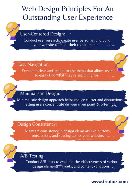
In today’s digital age, a web page is often the initial point of interaction between a business and its customers. To know which layout, and design suite to your website, consult a reputed Website Development Company in Coimbatore or a Web Development Company in Chennai and know the best for your business.
#A/B Testing#Accessibility for Everyone#Attractive Imagery and Visuals#Design Consistency#Easy Navigation#Minimalistic Design#Quick Loading Times#Responsive Design#User-Centered Design#Visual Hierarchy#Web Design#Web Design Company#Web Design Principles#Web Development
0 notes
Text
Abelia x grandiflora 'Kaleidoscope': A Dazzling Garden Marvel
Abelia x grandiflora ‘Kaleidoscope’ is a captivating ornamental shrub known for its breathtaking foliage and eye-catching colors. This hybrid plant is a result of careful crossbreeding and selection, bringing together the best traits from different Abelia species. ‘Kaleidoscope’ has become a beloved addition to gardens, landscapes, and even container gardens, thanks to its striking appearance and…

View On WordPress
#&039;Kaleidoscope&039; Abelia#Colorful Landscaping#Container Gardening#Creating Visual Harmony#Design Principles#Eco-Friendly Gardening#Foliage Diversity#Garden Design#Garden Focal Points#Landscape Inspiration#Ornamental Shrubs#Plant Care Tips#Plant Companionship#Pollinator-Friendly Plants#Residential Landscaping#Seasonal Transformations#Thriving in Various Climates#Versatile Garden Plants#Year-Round Interest
0 notes
Text
"this photo looks like 'classical Art's" yes that's because we have been using the same rules for visual composition in the west for hundreds of years and all professional photographers as well as amateur photographers who have read even one paragraph about composition are fully aware of the rule of thirds, horizon lines, tangents, weighted frames, etc or perhaps someone just took a photo by accident that also conforms to these incredibly well documented design principles. guy who has seen one image before "getting a lot of image vibes from this"
628 notes
·
View notes