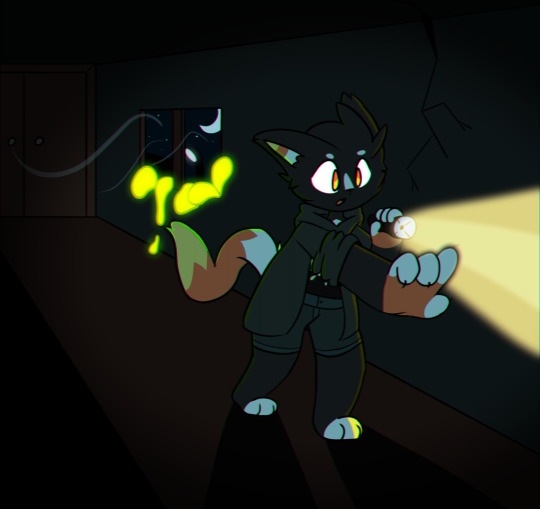
#a bit painterly and experimental
Text


KNIGHT DEITIES
It's been a hot minute since I posted Vivere 44 art. Been intensely busy with school for the past few months but now that I've graduated I've got a lot of time to kill! Since the Knights post surpassed 1k notes I figured I may as well elaborate on them more. I'm so blown away by how much love they're getting already! Thank you all <3
I'm gonna talk a bit about Mountain and Plains Knight religions, mythology and a snippet of evolutionary history. I will cover Polar Knight religions in another post. The focus is on two gods in particular, Uwet-Jana and Kiraiarik.
_______
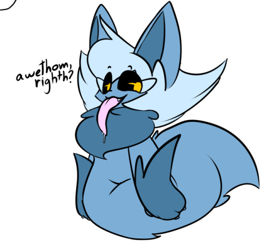
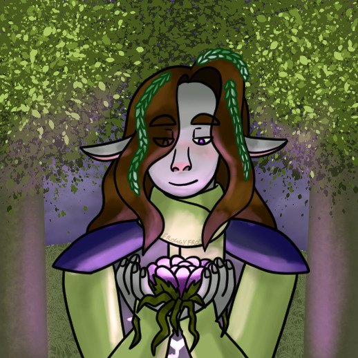
Uwet-Jana is the demigod of good health, vitality, and inner balance. In some regions they are also the god of fertility. The name of their Host is Uwetsil, and their Helmet is Serrjana. Mainly worshiped by Mountain cultures, Uwet-Jana takes the form of a Knight whose Host and Helmet are physically merged into a singular being.
Kiraiarik [pronounced ki-rai-ah-rik] is the personification of the host-helmet symbiotic relationship. They are the god of symbiosis, rebirth, and love. Kiraiarik was the name given to two immortal partners, a Host and a Helmet, who began as a singular being born to the sea in Ettera’s prehistoric era. Ettera decided to make them Two, one half (the Helmet) ruling over the sea and the other (the Host) having domain over the land. The story goes that in every form they take, they try to find each other - for their body remembers being One.
Both gods have lots of lore to their name. Further information below!
UWET-JANA
Uwet-Jana's Host body has long spines and red stripes like a Pike, and long fingerlike paws like a Helmet's manipulators. The Helmet section sports two long horns and elegant facial markings. Uwet-Jana has an iridescent sheen on their golden fur, catching the rays of the sun in a shimmering glow.
The story of Uwet-Jana is as follows: Both Uwetsil and Serrjana were born as runts, in a dark time when sickly Knights were seen as curses and not worth caring for. Their Order, believing them to be bad omens, cast them out to wander the tundra alone. They believed that the natural forces of Ettera (the Knight’s homeplanet) would quickly end them. However, Ettera took pity on the castaway, sending them three blessings. The first gift was a bone with marrow inside that ensured one is never hungry or thirsty again. Then, Ettera sent a warm, sweet wind into Uwet-Jana’s lungs which warded off all sickness and disease. Finally, a sun shower fell, the rains cleansing them and blessing them with a coat made of ivory and gold.
Transformed into a demigod with a hybrid body, Uwet-Jana was offered a place among the deities in the sky - but they refused, preferring to stay on the ground to share their gift with the mortals. Unbeknownst to them, their Order who had exiled them was struck by three curses from the Gods to mirror Uwet-Jana’s blessings: all the rivers in the area dried up and all their hunts were unsuccessful, leaving them with no food or water. Infections and diseases picked them off one by one, and a great storm ravaged the land, destroying their home and all remaining survivors. Uwet-Jana now blesses Knight Orders who take care of their sick and ailing members, and ignores those who don’t, leaving them to the wrath of the Gods.
Although they are nomadic and always on the move, many Mountain Orders will refuse to leave any sick members behind. They may also keep ivory statues of Uwet-Jana in their bags as a token of good fortune. Sometimes these statues are filled with bone marrow, or have holes which make a whistling sound as wind passes through it as a reference to Ettera’s gifts. Occasionally Pike Helmets are born with an extra long ‘horn’ spike, and are considered a child/reincarnation of Uwet-Jana. Additionally, whenever it rains while the sun is still shining, it is seen as a blessing from the demigod.
_______
KIRAIARIK
Kiraiarik's Host is depicted as a small creature with a striped pelt to mirror its ancestral form, and the Helmet as an aquatic beast with long, trailing red fins. It is frequently shown twisting around the Host, sharing its blood. Kiraiarik is also often simplified as two disembodied eyes looking at each other. (And yes, the artstyle is a nod to medieval depictions of heraldic beasts!)
To understand Kiraiarik, one must be aware of how much Plains religions are intrinsically tied to concepts of evolution and paleontology.
Digression on the origins of Etteran symbiosis:
Large stretches of Plains Knight deserts and scrublands were once submerged beneath the sea. As a result, there are countless fossil hotspots which have been unearthed over the centuries. These high concentrations of fossilised remains have lead to Plains cultures basing their religions around said discoveries. Although many features have been warped, the general timelines are strikingly similar.
For instance, a mass extinction event occurred on Ettera millions of years ago, caused by a series of catastrophic volcanic eruptions on a worldwide scale. This event is known in Plains culture as The Remaking, traditionally interpreted as the planet shedding its skin. Many species were decimated, but some groups survived; these happened to be phyla who possessed an exposed ‘Interfacer’ organ, a precursor to the specialised Integrator organ which connects the Host’s brain to the Helmet’s. Before The Remaking, there was no prior record of the deep symbiotic connection which Knights possess (scientifically deemed ‘Hyperadvanced Mutualism’). The Interfacer organ was used in the phyla for species to communicate simple stretches of data to each other, such as health and reproductive status. After the extinction, populations of these species were dwindling. To ensure their survival, an odd phenomenon occurred in which many individuals began to interface with different species who possessed the same organ - strangely enough, some were able to successfully exchange information. These individuals survived and passed on the practice to their offspring, eventually culminating in what would be discovered as a very primitive form of mutualism. Host and Helmet ancestors (pictured above) were some of the first species to achieve this.
As the planet recovered and populations increased, the relationship continued to solidify and become more complex, with symbiotic species sharing memories, emotions and complex thought. In modern times there is now an entire class of organisms on Ettera which possess an Integrator organ for Advanced Mutualism, including Knights.
Kiraiarik is said to be a manifestation of this relationship. After The Remaking, their two halves finally managed to find each other again, eternally locked in a joyous dance of love. (Side note: the love in question is not platonic nor romantic, but a deeper kind which is indescribable and not easily understood. Due to their intricate nervous systems, Knights have a higher degree of emotional intelligence and can experience sensations we would consider alien). When a Plains Knight is experiencing inner turmoil, they will often pray to Kiraiarik to restore a healthy connection. The god’s blessing is also called upon when an infant Host and Helmet first Assimilate.
Note: Many Plains ‘saints’ and deities have palindromic names which can be read both forwards and backwards, an indicator of holiness. Fun fact, the word Kiraiariku means “Your heart and mine are very old friends.”
Thank you for reading! More Knight content coming soon ;)
#come get yo foood#vivere 44#my art#knights#speculative biology#spec bio#speculative evolution#sophonts#spec evo#xenobiology#art#illustration#worldbuilding#artists on tumblr#good god I have been working on this for over a month.#also been playing around with a fun new brush#a bit painterly and experimental
1K notes
·
View notes
Text
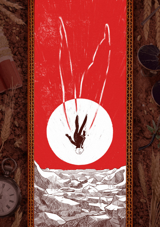
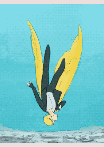
A Canary’s Final Flight
My piece for @trafficzine 4th edition! Get it for free here! 200 pages of excellent art and fics, incredible work from all participants and from the mods especially!! huge shoutout to the mods for real
Process notes under the cut! (I struggled a lot so it's a bit of a novel)
So the entire process was a Ride. I knew when I picked this prompt that I was going to have a hard time, because Jimmy’s final death had been illustrated a billion times over by extremely talented artists. But I had a Vision of the snapshot of the second before the impact, when everything is still but you know what’s about happen. It was very much inspired by the clip of Fog by Jabberwocky, bu the thing is, they have the advantage of all the build up of the fall, and that’s when the trouble started.

This was my first version, and obviously it wasn't working. And I was trying so hard, with so many iterations! Small wings, big wings, no wings, different poses, less backgrounds elements. I'd done compositions were everything seemed peaceful but something is Wrong, but it wasn't working this time.
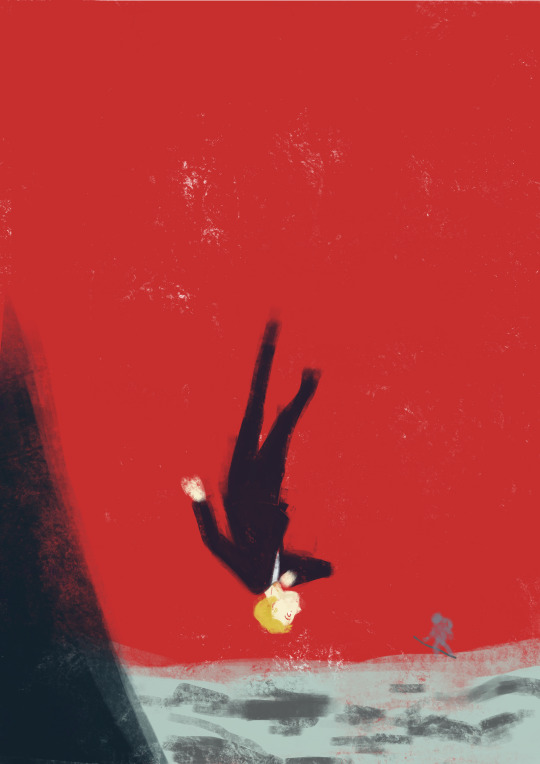
So instead I focused on what rendering I'd like to do - I tried a painterly approach, for that visceral feeling, but it wasn't working either (but hey, I did keep the red sky, so, progress)
At this point I'd been doing back and forths for weeks and I was just as lost as at the start. Now that's my tip for people who make art of any kind, in situations like that, stop thinking about how you can make the best piece possible, and think about you can have fun with it (because when you aren't it's visible). And for that was, 1 - going back to using ink and pen nibs and doing way too detailed inking, and 2- looking at Dave McKean's covers for Sandman (which, funnily enough, was also a reference for my previous trafficzine piece)
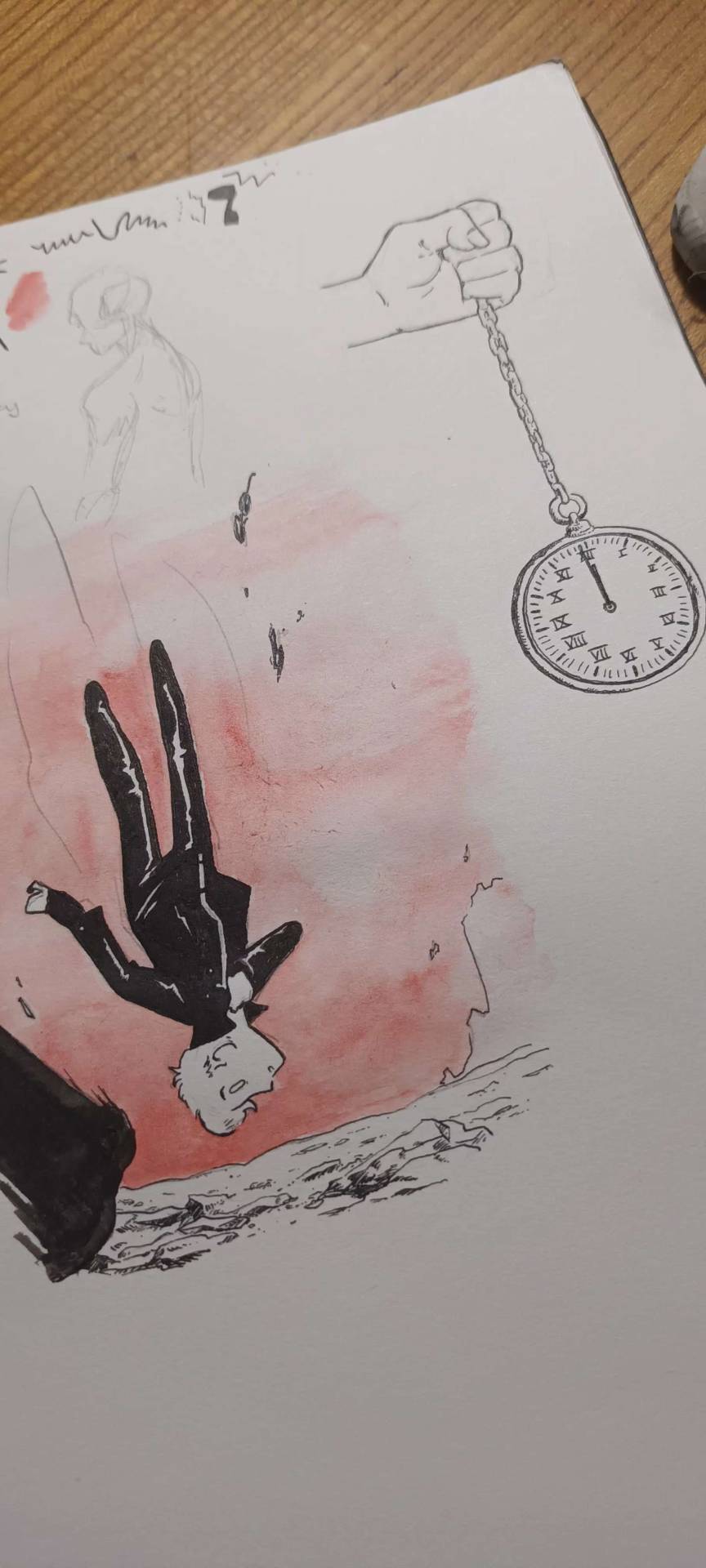
And from there I was actually going somewhere! Between the jagged rocks, the red sky, and the increased verticality with the borders, I had hit the vibes I wanted.
I did some experimentation with the border, and even though I really liked the bad boys I drew they were taking too much away from the lonely desolation, so I actually used Red (Unecessary Redstone)'s idea of all of Jimmy's worldy's possessions scattered on the ground post impact, with the idea to make it looks like the central image is his grave being dug.
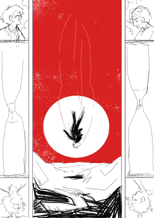
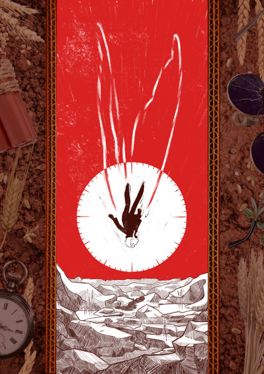
(and yes for a short amount of time the were supposed to be clock markings on the sun, but there was already enough going with the wings so I scrapped that) (also fun fact the reason why the wings aren't fully material but more ghostly is because my toddler cousin was watching me draw the very first draft and asked why he didn't just use his wings and i went :( so the wings are a metaphor now)
So from there I found a bunch of picture and took some myself, cut and assembled everything together, added shadows in all the appropriate places, and repainted some elements so that everything would look better intergrated (some of the wheats are basically 100% handpainted, the cardboard as well). This took a suprisingly long amount of time, but I was done!
Well I wasn't expecting to have that much to say, but I hope if you're still reading, it was at least interesting!
#trafficzine#limited life#limlife#limlife fanart#jimmy solidarity fanart#solidaritygaming#i forgot all the tags augh#curse of not posting often#mcyt fanart#mcyt#zine illustration#zines#my art
1K notes
·
View notes
Text

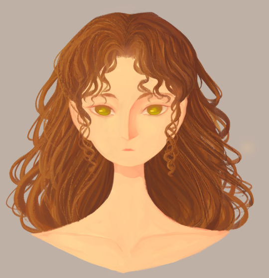
Picture for @styllwaters! The raffle winner.
I really like the design of the character and they were very fun to draw.
This is a bit of an experimental style for me but something painterly seemed more appropriate for a 1k raffle heh.
I hope it's liked! (Styll, if there is something to fix you can tell me and I will edit it!)
...
I hope to do this some other time soon to draw other people's creturas.
Unrelated to this part of the raffle, the silhouette competition is still going until the 9th. Rules are in my main -raffle post- and you can see some of the submissions on my secondary account @yellos2.
As a confirmation, I will be drawing the winning creature and something smaller of the winner's choosing.
#art#speculative biology#artists on tumblr#digital art#artwork#speculative evolution#@styllwaters#knights#art raffle#alien#not my creature#fren shaped but little evil guy
217 notes
·
View notes
Text
I present to you all. a super experimental piece of mine! I am tryna do a bit more of a painterly-thing with my art, yet alas it seems the universe is against me
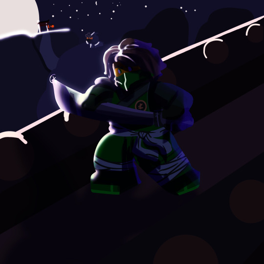
(rbs and/or kind words r appreciated!!!!)
#ninjago#ninjago art#raine's art#lloyd ninjago#ninjago lloyd#lloyd garmadon#god i love this sooo much#there r some cool bg details too lol
130 notes
·
View notes
Text
—DO NOT REPOST— (Reblogs ok!)
simple drawing of my number one ^_^ this was a bit experimental..! Was trying to do a slightly more painterly style of coloring

i didnt really get any requests the day i asked for them so i have drawn him anyway. Just chilling out. I’ve been enjoying not color picking anything lately, just straight up bullshitting all the colors. No reference was used ❤️
19 notes
·
View notes
Text
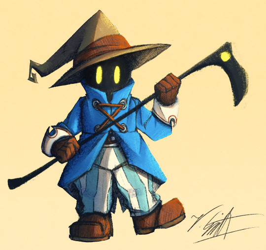
I've crawled out of my cave after playing Final Fantasy IX for a long ass time what have I missed?
Artist's Notes:
I'M BACK BABY! A while back I made a post with a new style experimentation thingy but I ended up deleting it because it was just kind of a boring face thing, I was planning on doing more art but then I started playing Final Fantasy IX and uhhhh yeah so that game has kind of taken of my brain for the past two weeks and I am 20 hours into the game because I love it so much. I wanted to draw Vivi because Vivi is just really fun to draw ok? I've kinda been feeling really burnt out with my lineless style, mainly because of how hard it was to do lighting. I'll show one of my initial art style tests on the bottom of this post. Again, used to have it be an individual post but it was just one face so it was kinda boring, so might as well include with this one on the subject of art styles. I wanted to kinda mix some aspects of my older style with the sketchy shading lines with a more painterly way of doing the lighting (mainly in the shadows). All in all, I think that's my favourite part about this drawing, it feels nice to finally be able to do some proper lighting again, and I want to experiment even more with my lighting and rendering in future pieces. Also, part of the pant shading got kinda lost in the sketchiness, so for next time I'll probably focus on the clarity of the more sketchy parts of the drawing, since I did go with my initial sketch for the final drawing. I also gave up on the background since I had no idea what to do for it, and I didn't put too much detail into the staff as I forgot which one I gave him in my current playthrough and I didn't want to risk spoiling myself via looking up references, but that's ok I like how the singular yellow circle on it matches Vivi's eyes. Also I was having a bit of trouble figuring out how to draw his body and how to pose him, but I like how the pose turned out a lot. It was inspired by his idle animation when in a battle in game where he does a little shimmy.
Ok I need to talk about Vivi's design because I love it so fucking much oh my god-
I absolutely love how his face is just in complete shadow and only his eyes stand out, it's so cool and unique and I love how they recontextualized the original black mage design from the classic Final Fantasy games. How they did it I won't say because I don't wanna spoil the game, but someone give this poor baby a therapist because he goes through a lot. Actually, same can be said for all of the FFIX cast, they all need therapy (again, I won't spoil anything, please go play the game for yourself).
While I do love almost all the characters in the game, even though Vivi is most fun to draw, my favourite character has to be Zidane (the main protagonist of the game). He's a really fun protagonist, and they could have easily written him as a misogynistic jerk who doesn't respect women but they didn't, and I really appreciate that. He's just an overall cool dude who's a really nice older brother figure to Vivi and also just has a cool character design (who I also want to draw eventually). Initially in the game I was planning on grinding levels for Vivi to make him the tactical nuke of the party, but then that title went to a different character (who was initially multiple levels behind the group since I grinded the party in the starting area way to much before they joined, but now they are two levels ahead of everyone and have pulled the team through a lot of tough battles, again I won't say who it is because it is kind of a spoiler and the way the gameplay actually ties into their character arc is just so good omfg). Once I eventually finish the game I'll probably write a full review on here, so no spoilers until then lol
Also, I've kinda been burning out a bit with making Touhou art, which also made me a bit burnt out with Touhou stuff in general (although I will continue keeping up with the manga) so getting into other things (i.e. Final Fantasy and even Fallout since I've watched the first season of the TV show which is a whole other post for another day) has helped me refresh and given me something new to think about. I've ended up in the exact place I feared ending up, where I would start drawing fanart for it not because I wanted to but because I felt like I had to, so I'm taking a bit of a break. When I do draw Touhou fanart again I'll try to draw for the sake of myself, and to all the other artists and fanartists on this platform (and on any social media for that matter), take care of yourself and don't forget to take breaks when you need to!
(Ok part of that last paragraph was definitley influenced by the good ol' "it's 9:00pm and I need sleeb, but the message at the end still holds up, always take care of yourself)
Oh yeah, and here is that one style experiment I did btw
Man I really fell down the "Yoshitaka Amano art enjoyer" to "Final Fantasy fan" pipe line didn't I?
8 notes
·
View notes
Note
Wait sorry I misread the prompt, what other rw artists have given you ideas/inspiration for your own work?

Oh my goodness you have no idea how many people in this fandom whose works I enjoyed, appreciate and inspired from, this includes my friends. Looking through rain world fanart everyday is my morning newspaper and these people are my highlights (the whole newspaper is yellow this way)
I really do wish to enlist all of them, but I'd be here FOREVER, so I'll just give a handful of who's at the top of my head rn (if youre not included in this list then im sorry but i insist you're up there in my clouds aaa ; if i mispronounce you then please lmk- i always use they/them and has become a habit)
im not tagging them because h (i hope im not weird)
dddeerbo - I am inspired by their shape language and how they design characters. I am willing to commission them again in the future (if I have enough money)- perhaps my version of Artihunter this time OR I want to see them draw my cookie run dogboys in their vision.
Kelocitta - (in a previous ask, she was the inspiration for my drive for artihunter), but aside from that, I am thoroughly impressed by their shape language and the choice of colors
Northflowo - I am not an animator but I am impressed by how smooth their animations are. It has somewhat encouraged me to join the Plioscene MAP, which is also my first ever MAP participation.
Lyss-Butterscotch - Inspired me with their gijinka designs, which encouraged me to make my own and give more attention to how I design my own iterators
Shkika - Like lyss, has been a motivation to give more attention to my iterators. I really enjoy the stories she makes.
Mewguca - a good friend and makes cute designs! their art is so soft and squishy, and very friendly-looking. has been very encouraging to me.
anomalouscorvid - I've been quietly observing faer designs outside of rain world and I can say its very creature (positive). I've been meaning to try my hand on more creature-like designs on other rain world creatures or other experimental styles.
sunfish - inspired by their painterly works- you did all that in mspaint?? wtf
bitteraerie - one of my first inspirations in the fandom- i enjoy its designs, shapes, colors and- once again- you made all that in mspaint????
dieselpvnk - HOW YOU SHAPES, COLORS AND IN MSPAINT WHAR HELLO?
fauxbia - I am extremely impressed by how they work around their colors in gradients and the textures she got. i think shes a good friend and has been a light to my encouragement to continue drawing.
ninten-draw - extremely cute drawings and makes really good comics. I enjoy their choice of colors AND THEIR COMICS.
faeling - their drawings are cute, edible and inspirational in terms of story telling and characterization. (i am grabbing some of their ideas as we speak)
chillysaint - colors, shapes and oughh do i really want to hug their scugs. i respect them heavily.
snail-fen - extremely encouraging but also has cute and shaped designs (i think you are starting to see the trend here lol). I love their stories and concepts (ruff n ruff is like my garfield comics (i say this in a positive way))
macchitea - HOW YOU DO COLORS I WILL EAT I CANT BELIEVE IM COLLABORATING WITH YOU ON PLIOSCENE
inkycorvid - extremely encouraging and gives me little bits of cool rw fandom knowledge
gionori - funky looking designs AND EXCELLENT CHOICE OF SHAPE AND COLORS
aquaticnebulae - GIVE ME YOUR DRIP DESIGNS
#ask#i love rw artists sm i can easily recognize their art styles and consciously categorize their portrayals as characters i can be likened to#rain world
45 notes
·
View notes
Note
the colors in your art are really pretty,,, whats your process for shading and picking colors and all that? the effect you achieve where everything looks so bright and lustrous is muah
hello, thank you so much! honestly its a little tricky to explain my art process but ill try my best

here's my recent specter's sands art from my oc alt without filters, i usually go with the flow but I usually go with shadows, then color noise, then highlights
my rule for shadows is to take the base color, move the hue on the color wheel towards blue/purple, and lower the saturation and brightness a little. keep doing this for as many layers of shadow as you want
"color noise" is what i call adding extra colors (blues, greens, purples, etc.) which gives my art a messier, "painterly" look. I like using a desaturated green in most areas, adjusting the brightness so it still feels harmonious with the other colors while still adding variation to the area. for reds, i prefer using blue as green clashes too much, or red for blue as green may look to similar and not add enough variation. this step is mostly based on experimentation, just play around with colors until you find what's best!
highlights are a lot simpler. take the base color, move the hue on the color wheel towards yellow, and raise the brightness and saturation a bit. sometimes i just go with yellow for sharper highlights, like in the art above

after that, I add filters! I've found that adding a layer set to "soft light" on ibis paint x (i dont know if other programs have it TT) and using a solid desaturated red has a gorgeous effect! then on the same layer i use the airbrush tool with a pale yellow for light - sunlight, as shown in this finished art! then over all of that, I use a white "star brush" (ajhshbcdbfgsb i dont know how to describe it but any brush thats a lot of dots randomly scattered around) on an overlay layer to further achieve that noisy effect
ive found that brushes affect a lot, i use a very textured brush which compliments my messy artstyle a lot, which is why i always say to experiment! i do hope this helps though, as messy as this explanation may be TT
6 notes
·
View notes
Text
We’ve been talking a bit about the visuals of Sovereignstuck lately. It’s pretty important to the story, since a huge part of it is focused on an Overabundance of Light, which is the Aspect of Perception…
… And something came up. What if some parts of the story were in entirely different resolutions than the MSPFA standard of 72 DPI?
Most people go into Fan Adventures expecting that same kind of visual style. It’s fair, it is the “MS Paint” look, and that’s in the name of the medium after all, but… The fact that I haven’t seen, like… any divergence from that is interesting. We really want to lean on the idea of visual experimentation. Allowing intentional inconsistency in something as monumental as the fucking DPI could lend to some really interesting results…
Plus, renders are used regularly in Flashes anyway. Painterly pieces are used in regular panels as well- it’s not like it’s unprecedented for something to not have that same pixelated look.
Any thoughts? Is there a reasoning for that style/technique being the absolute standard- such as the simplicity making production easier, file size management, some oddball moderation rules, etc- or is it just because that’s the way Hussie does it?
#i know that it has at least something to do with that technique making fast production very very easy and consistent#but genuinely that’s not always the case for me#and there are some things I feel will genuinely come across better if we allow it some more visual wiggle room#if there’s no reason other than simplicity…. then this could really lend to some strong sense of visual identity with soveriegnstuck…#and it could make some things. VERY fun.#sovereignstuck#mspfa#homestuck fanventure#homestuck fanadventure#nekro.txt#nekro.asks
16 notes
·
View notes
Text
something that Burroughs talks about is that in painting you can do stuff like—which he did for one of his paintings—shoot a can of paint with a shotgun, so that what’s on the canvas is the impression of a shotgun blast. the interviewer (i don’t remember who but she was actually a famous woman interviewing Burroughs as a sort of performance i think, since its Burroughs), asks him if that’s what he was doing with literature, with cut-up etc., finding the literary equivalent of shooting a can of paint with a shot gun. and he says no, because it’s not possible; there is nothing in literature which is so immediate, so direct and extreme as that, literature always has to be slowly and carefully composed (they didn’t have AI Dungeon yet!). he’s thinking of it from a ‘writerly’ or ‘painterly’ perspective here, as the guy who’s making the painting or writing the book. but as a reader it’s really the inverse; no picture can really be that extreme, or very unpleasant like that. not on a purely formal level, only if it represents something extreme. but an abstract painting like that, you can just look at it for a little bit and walk away, as most people do. it takes a lot of conscious use of the imagination, to effectively recompose the painting yourself in your feelings, to get more out of that painting. whereas with literature, trying to read something even a little bit experimental is something ghastly, which takes all the powers of endurance, and which exhausts the reader.
47 notes
·
View notes
Text
Kett’s 2022 Art Retrospective
I have definitely drawn things this year. I wanna show it to you!! Let’s take a look back together!
This is a long post! Separated month by month. If you wanna join me, just keep reading!
January
This January I have decided Kett should wear something, at least one time, just so they could feel it and gauge if they liked it or not.

They did not quite like it.
February
During the middle of January, I caught covid and felt miserable. So I wasn’t really feeling it in regards to drawing. I still did some experimentation, however and doodled up a little comic sort of thing

Abstrakett was initially developed as a form of representing myself even if I fell into a particularly bad slump. I was in a particularly bad slump in February, and I believe this was a form of rejecting it.
It didn’t quite work, because I hadn’t drawn much else for this month. And I didn’t draw the next month, either.
April
For April I decided to become bunny

I also took TWO commissions during this month, and worked on some personal projects, such as an alphabet for a language in my setting
Looks like I was back in full swing. Let’s not lose the momentum.
June
Looks like I lost the momentum. I may have not drawn in May.
For June, however, I put this out:

This is a drawing I’m still happy with. A little bit of playing around with perspective! I like this drawing so much in fact that I have made it the background for my website after I finally committed to redesigning it!
July
July is an important month for amateurish internet artists like myself, it’s the month during which Art Fight takes place. And this year I beat my record for submissions during the event, at an astounding... five.
And I believe this is my absolute fave submission for this year’s Art Fight, featuring @wytchwoods‘ character, Maggie. It is certainly the most experimental, at least, and I’m happy with the result.

Of course, this was also the month I smooched @floralope.
I also took a commission this month. So THAT was definitely one of my most productive months this year.
August
My month. I didn’t really do much, but I started drawing Kett with shinier eyes. I simply started to like the look.
September
Wasn’t a very good month for full colored drawings, but I did sketch a bunch, with a particular focus on Teal.

I love my little four-eared creature. I want to make a game that stars them. Hopefully I’ll be able to.

For now, they’re just a cute design.
October
🎃🎃🎃 SPOOKY MONTH 🎃🎃🎃
I am usually not passionate about Halloween at all, but I felt like I had to try something new this year. So I designed Ghost Kett!

I am REALLY happy with how they turned out, so much so I did PLENTY of doodles of them over October.

They do not care much about your privacy, but they’ll ask before possessing you.
November
Was a HUGE month for me

It’s when the Total Fluff Eclipse struck.
I also.

Cried like a little bitch soft boy.
It’s good for you!
December
Oh hey, it’s December right now. The year is almost over. I don’t know if I’ll still draw anything this year, but I know what I have already done.
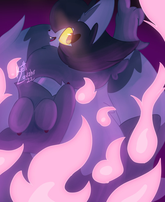
And honestly? Pretty satisfied with it. I haven’t done such painterly work in a few years but this blows any such work I have done out of the water. Probably the best thing I put out this year.
Hopefully much more to come in 2023.
And that’s a wrap!
I’d like to believe my output has taken a hit ever since I started working. Taking a good look at it, however, it’s easy to see that’s not the case. I have drawn a lot and put out work I am satisfied with. I have been a little harder on myself than I should.
My mood has definitely skyrocketed over the end of the year for whatever reason, and it shows through with my latest piece. I tried to go past the comfort zone I dug myself into and got something I’m proud of off of it.
If you’re still reading through, thanks a bunch for sticking around! I hope you’ll continue checking in on whatever I put out over the coming year, and I hope I’ll continue drawing and sharing it for the foreseeable future.
It was definitely fun taking a brief look over some of what I’ve done, maybe you should do the same? ;)
#talkett#kettarts#skettch#OC:Kett Lovahr#OC:Teal Haden#retrospective#artists on tumblr#raccat#atrean#beyond atrea#cat#floralope
19 notes
·
View notes
Text

OC Ivory in the Barbie 1960's swimsuit !!!
This is pretty experimental and my first time diving into a more painterly style, I know there's a good bit of mistakes but ! I want to share anyway !!
I'd like to try posting here more so I have somewhere to ramble about my art and ocs but we'll see I guess lmao-
2 notes
·
View notes
Text
Animation Inspiration: Fantasia
Fantasia by Walt Disney was an experimental film by Disney and Leopold Stokowski, an orchestra composer, that combined classical music with animation in a concert feature movie.
Paul recommended this film as I am creating an animation all about music. Maybe I could do the same as Disney bringing to life my vision of blending animated imagery with my favourite music.

I researched different scenes from the movie and my favourite was - Dance of The Sugarplum Fairy(Tchaikovsky), I loved the way the characters moved to the beat of the music it was very satisfying to watch, I found that they had to layer the music over when they animated to get the perfect timing to the rhythm of Tchaikovsky.
I also love how delicate the animation is, it has a pretty and soft look to it, there's a high contrast especially in this scene above, I also love the way each animations aesthetics correspond to the song and the way the colours are so cohesive and complimentary to each other.
Inspo pics for my animation:


Here on the bottom left, I love the painterly effect that the backgrounds had from these older animations, I think I might take inspiration from this and maybe make my own painted background for my animation.
I'm also thinking about layering my favourite music over the animation so I too can make my character move to the beat of the music in perfect time.
My tutor Yvonne suggested I use the app Premier Pro to help me make this, I can use the website Freesound to download the music and edit the animation and music on Premier Pro. I got to try it out for the first time today, It looked a bit confusing but I want to learn.
1 note
·
View note
Text
Super Mario Bros. Wonder: How Mario Got His Groove Back
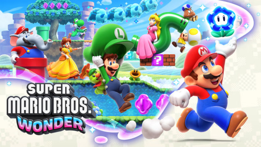
Mario has had a rough regression into 2D. Once the top dog in platformers, Mario has been in a bit of a lurch regarding a number of his titles for the last several years. While once seen as a breath of fresh air, as the New Super Mario Bros. series went on many regarded them as too same-y and stagnant. The same could be said for the 3D titles, as every title from Super Mario Galaxy 2 onward sanded off a lot of the wackier, more experimental aspects of the earlier 3D titles. The less said about the state of the Mario sports and RPG spinoffs the better. However, in recent years there have been glimmers of hope that everyone’s favorite plumber might be getting back to his roots. Super Mario Odyssey was a well-received return to form for the 3D sandbox titles, and the resounding success of the Super Mario Bros. Movie speaks for itself. But the real test was releasing a 2D Mario game that manages to actually FEEL new and exciting. Is Wonder that game, or will be left wondering when this supposed renaissance will truly begin? Let’s find out!
A NEW COAT OF PAINT, AND A FRESH NEW SOUND
The first thing that stuck out to me when first booting up Wonder was just how alive everything felt. The New series after a time felt anything but new, filled with lifeless animations and a bland visual style that was…fine but not exactly exciting. Wonder by contrast is vivid and adorns everything with either a painterly or even clay-like texture. It might not be the most visually striking game ever made, but as far as Mario’s 2D outings go this one really pushed past some boundaries. While in 3D, everything looks a lot more akin to the older 2D art for the Mario cast. Faces are rendered with this 3/4s style, always facing the camera and making sure we can see just how much more expressive each character is. From the determined looks on their faces when dashing about, the way Mario pulls his hat over his eyes when he crouches, or the little flourishes like how the extra-large elephant versions of characters have to squeeze through doorways or pipes, there’s so much attention to detail here.
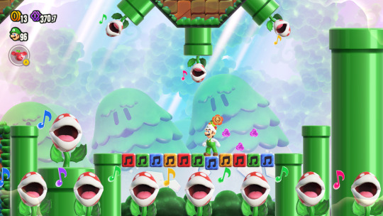
Adding to that is the sound design and music having a much greater presence here than normal. Over time, we’ve taken for granted how past Mario games have sounded, but Wonder shakes this up a bit. A jump is now the plucking of a string instrument that’s different for every character, while a ground pound is accompanied by a drum roll into a satisfying cymbal hit. Even the iconic sound of entering a pipe has been changed, replicated with a xylophone. The music in general matches the tone of each level well enough. From the early stages and their more laid back tones, to the more sinister themes of the Bowser airships, there are also several stages that feature musical setpieces that really stand out as the most memorable parts of the game. But that’s not all regarding the game’s presentation taking it up another level.
Wonder’s plot is about as simple as we’ve come to expect for the Mario series, and yet there is FAR more voice work and dialogue in this game than you’d think. Mario and friends are visiting Prince Florian of the Flower Kingdom when Bowser crashes their party, stealing one of many powerful Wonder Flowers. Harnessing their power, he merges with Florian’s castle, using his newfound status as…Castle Bowser to build up Wonder energy for…well, something that can’t be good! Florian accompanies the Mario crew in a manner similar to the assistant characters we’ve seen in the older RPG series, having something to say after major levels are beaten or when you enter into a new world. Each world itself also has its own subplot that gives a BIT more context to your platforming fun. In the Sunbaked Desert, we have to track down Bowser. Jr. and take back all the water he’s stolen from the residents. Whereas in the Fungi Mines, players have to investigate several ruins and progress further and further underground to save a group of miners that have been trapped by a cave-in. Even the talking flowers you see throughout the game help the world feel more real, like the adventure is unfolding in real time. At times they can be there for a joke, or as a more diegetic in-game hint, but they also serve as a way to test the waters for more natural voice work in the Mario series after mostly abandoning the prospect with Sunshine. On the note of new voices, this game actually marks quite the shake-up in the voice cast.
After nearly 30 years voicing the plumbers, Charles Martinet is now succeeded by Kevin Afghani. Afgahni’s take on the Mario brothers clearly takes a lot of inspiration from Martinet’s portrayal and in many cases is downright identical. His Luigi sounds uncannily like Martinet, though there are places here or there with Mario where you can hear a bit of a difference, but the transition is largely painless here. Giselle Fernandez also takes over for Daisy after Deanna Mustard’s similarly long tenure with the character, and they really capture the energy Daisy is known for overall. Nabbit is now voiced by Dawn Bennet, while Prince Florian and his Poplin subjects are voiced by Caitlyn Elizabeth and Christine Cabanos respectively. The likes of Peach, the Toads, Bowser and Bowser Jr. are all still done by their longtime actors, but this definitely feels like a new era for the series as the old guard is stepping down. It’s a bit strange to see more professional actors taking on some of these roles, as a good amount of Mario enemies and NPCs are often done by members of the sound team or even the Nintendo Treehouse, but if there was ever going to be a game to swap out a good chunk of the cast, it would have to be this one. The first of MANY changes and surprises in store!
ELEPHANTS AND BADGES AND FLOWERS, OH MY!
Within the first few moments of touching the game, I was reminded of my first impressions with the likes of Super Mario World and how different that game had been from the NES games. Wonder feels like another step forward for the series regarding not just level design and gimmicks, but core gameplay elements that aim to surprise and shatter past conventions. Don’t get me wrong though; this is still a platformer through and through. You run through stages, grabbing the flagpole at the end and gaining collectibles along the way. But each level has something that feels well and truly new and exciting to spice things up. Be it the rather large roster of new enemies, level-specific mechanics like pools of goop you have to slowly push through, or using water to cool down giant superheated platforms, there’s always something around the corner that makes for several standout levels. But the biggest takeaways for a given level will arguably be the various Wonder Flower segments.
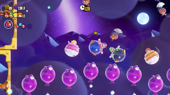
Just about every level features a Wonder Flower players can touch, which then triggers a large change to the stage that players will have to navigate in search of a Wonder Seed, which will turn things back to normal. Sometimes the stage itself starts moving like its alive, while at other times enemies might change in size or multiply, and there are even transformations that will affect the Mario crew. While a handful of effects are repeated throughout the game there are a number of completely unique ones that make for a fun climax to the stage. What’s interesting is that the vast majority of these segments are optional, allowing players to skip past them either on replay or when speedrunning, but you’ll be missing a huge part of the game’s charm if you don’t engage with them.
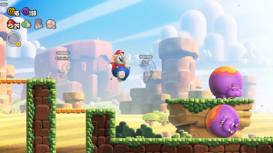
Outside of that, there are also new tools at your disposal to get through these stages. The Elephant Fruit power-up is the most documented part of Wonder in general, letting players become powerful pachyderms as they slam enemies away with a powerful trunk, which can also store and shoot out water. That said, its own uses feel a bit less revolutionary when compared to, say, the Cat Bell from 3D World. Other new power-ups include the Bubble Flower and Drill Mushroom, with the former letting you bubble up enemies and jump off of them for a boost, while the latter lets you burrow past obstacles and occasionally unearth secrets. Alongside the Super Mushroom and Fire Flower, Wonder uses the power ups smartly, especially with certain timed challenges that task you with taking out enemies as quickly as you can with your arsenal of abilities.
When it comes to character-specific abilities however, some might be a bit disappointed to see the cast is largely homogenous. While it’s great to play as the likes of Daisy and Peach, alongside the Mario Brothers and Toads, everyone is the same (barring the Yoshis and Nabbit, who function as “easy mode,” basically)…so that’s where the Badge system comes in. Players obtain Badges throughout the game, which come with a wide range of effects. From replicating those character-specific abilities (the very first one you get is essentially Peach’s floating from past games), to passive effects like drawing in coins or hinting at secrets, there’s even some Expert Badges that make the game harder on you. You can try out the Jet Run badge to speed through levels but there’s no way to stop running. Or try out the Invisibility Badge to sneak past enemies…just good luck platforming when you can’t see yourself either! Badges are probably my favorite addition to the game, allowing for a degree of customization with exploration and difficulty that really ups the replayability and even accessibility of the game, though I do wish there was a bit more freedom with the system. Only being allowed one Badge, even in multiplayer, is a bit of a shame, but if anything this is a great new system that I’d love to see become a mainstay to the series.
PLAYING “TOGETHER”
Speaking of multiplayer, that’s one facet of Wonder that’s drawn some ire from some circles. Compared to the past few multiplayer Mario platformers, Wonder doesn’t employ collision between players, and also limits the ways players can interact with each other. So this means no more running into people, or picking them up and “accidentally” throwing them to their deaths. This also allows the level design to no longer have to space things out for up to four players, keeping things from feeling too cramped OR too spaced out. It seems perfect and we should all be rejoicing…but for the griefers out there that love to mess with other players this is a dark day and they probably cancelled all of their pre-orders. Now, there is something to be said about being able to physically interact with players and create some spur-of-the-moment plans to grab a collectible or make it through a tough section. If someone plays as Yoshi you have the ability to ride on their backs at least, but otherwise it feels more like you’re playing alongside someone rather than truly together. But perhaps as a result of this, the online experience might be some of the best the Mario games have ever seen.
When connecting online, players will encounter “ghosts” or “shadows” of other players that can be seen but, similar to local play, can’t be interacted with normally. Players can see each other and use little emotes to communicate, but you’re all largely playing your own instance of the level. As a result though, there’s no real input delay or lag to worry about (except when players are loaded into a level you’ve already started) and you can go about your business without worrying about someone messing with you. That said, you can’t, say, ride on another Yoshi player online like you can in local play, but you do gain the ability help out other players. Players can share spare power-ups with other players even online, as well as revive players if they die if you can touch their ghost before a short timer goes down, in a manner somewhat similar to co-op in Cuphead. On top of that, online is where Standees showcase their use. Players can crouch down and press “X” to throw out a standee of their character on the spot, which can serve to either highlight a hidden block or area players can reach, but also serve as a way to revive other ghosts. Throwing down a Standee right before a tough spot can end up really helping other players out, even if it doesn’t do much for you. Players can gain “heart points” by helping other players out and finishing levels with them, which do nothing but give you a warm fuzzy feeling inside. While most online interactions are with random players that can come and go as they please, it IS also possible to make dedicated rooms with friends and engage in races through certain stages too. While the online and even co-op multiplayer might not quite be what every player wanted, I do feel that Wonder found a way to truly innovate after the last several Mario multiplayer experiences were often characterized as being chaotic and frustrating. It feels nice playing through levels and serving as a guide to less experienced players, and being able to race about with friends can be fun in its own way.
THE DIFFICULTY OF CREATING A CHALLENGE
Now, one major aspect of Wonder I was worried about pre-release was the overall challenge the game would pose. Seeing how strong the new power-ups and Badges were, combined with the ways that other players can help in multiplayer, I was worried this wouldn’t be very engaging and you could kind of sleepwalk through it. As subjective as difficulty can be for people, I do think that Wonder largely managed to keep me engaged and offered some real challenges, while also enabling players to really shape the game to their own skill levels. Mario is always going to be a series that appeals to as many people as possible. It doesn’t carry the kind of reputation that, say, the Donkey Kong Country series had regarding difficulty, but Wonder does give players a TON of options to make the game ease up on you and a lot of the difficulty can come from just NOT engaging with these options. Just avoid using Badges, the power-ups or the Yoshis and Nabbit for a more challenging run through the game. That being said, the game does pepper each world with far more challenging levels off the beaten path. Most of the world map actually allows you to tackle levels in any order you want, and levels have individual difficulty ratings so you know which ones to avoid if you want to have a chill time, or indeed which ones to seek out for a real challenge. The game’s final challenge was also suitably hard, so on the whole I was satisfied with my time with the game….with really only one exception.
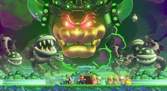
The vast majority of Wonder is designed around surprising players, constantly doing something unexpected and weird….which makes it all the more disappointing to see them drop the ball with boss battles. Now, this is a platformer and I don’t really ever go into a platformer thinking about the boss fights. If they’re fun, then that’s good enough for me, but they’re often not at the top of the list and I care way more about the levels leading up to them. In Wonder’s case though, not only are the bosses very simple and easy, they’re also infrequent and very same-y. In that regard, it’s the one thing that I think the New series handled better. You fight Bowser Jr. in most of the worlds, with the same overall idea of him attempting to run you over in his shell, with the only difference being a Wonder effect that changes up the arena a bit. But after about three or four jumps on his head the fight is over and they all fail to leave an impact. Not helping matters is that a few worlds just don’t even HAVE boss fights at all, not even minibosses like Boom Boom show up here. While the final boss at least was unique and fun, it still felt like it ended somewhat too soon and I was left underwhelmed by the finale before the post-game challenges. Again, most Mario bosses aren’t much to write home about but with every other aspect of Wonder really going out of its way to impress me, the bosses just stuck out like a sore thumb. Maybe if they had gone for a more setpiece driven platforming challenge for the final level, similar to the finales for 3D Land and 3D World, that would have been better, but at the end of the day I wish the game had just pushed the envelope just a bit further.
That being said, I applaud how accessible the game is overall, and for younger or more inexperienced players they’ll likely have enough to grapple with and be plenty engaged. Multiplayer can be both helpful but also make things a bit more tricky depending on the level, and having some easy-mode characters on top of certain badges SHOULD give everyone a chance at beating this game if they so desire. I do feel that the path to true 100% completion is a bit more fulfilling. Each level has at least two Wonder Seeds to get, one for beating it normally and one for completing the Wonder Flower segment. Some levels have secret exists that bestow another Wonder Seed though, and I had to really keep my eyes peel for hints to find those. Wonder Seeds are the only plot-critical collectible but the game also keeps track of whether or not you got three large purple coins in each level, on top of reaching the top of every flag pole at least once, so I had my hands full getting full completion and felt satisfied enough at the end, so I think they did well enough. Maybe in the future they could use the Badge system to let players tweak the difficulty a bit more minutely. Maybe give us some Badges that make enemies tougher or impose a time limit on stages (something this game notably removed compared to past games), just for some extra spice. Difficulty is always going to be tricky to balance, but for the most part Wonder excelled enough there.
A WONDERFUL START TO A NEW ERA
2023 really does feel like we’re entering into a new era for not just Mario, but Nintendo as well. A new console is all but confirmed to exist within the next year or so, and after the Mario Movie’s smashing success, on top of the debut of the Super Nintendo World theme parks, Nintendo is likely ready to make even bigger moves with their IPs, and that includes Mario. Wonder, at least according to the developers, isn’t necessarily the blueprint for every Mario title to come, but it does at the very least paint a picture that this franchise isn’t anywhere close to running out of steam. Mario’s “dark ages” are still far better than the heights of many other franchises but all the same it’s nice to see the light at the end of the tunnel here. With remakes of beloved RPGs, and games like Wonder and Odyssey taking chances and being real returns to form for both 2D and 3D platformers, the future of the series hasn’t looked this good in a while, and I’m excited to see where it goes next. I don’t know if I could say that Wonder is the best 2D Mario game, but it’s easily the best in a long while and will likely be considered a bit of a swan song for the Switch era. Endlessly creative and boasting some surprisingly novel online elements on top of playing like a dream, Super Mario Bros. Wonder is one of the easiest recommendations I’ve had in a while and even with releasing so late into an utterly packed year of amazing games, it stands on its own as far as being in the Game of the Year conversation.
Until next time,
-B
#blog#xb-squaredx#review#nintendo switch#video game#mario#super mario bros wonder#mario wonder#charles martinet#kevin afghani
0 notes
Text
14th Art Fight attack, featuring Judith Harmonia, a firbolg warlock, communing with her patron, Organic Persistence. A bit of an experimental one because I wanted a glowy effect and it generally looks a bit better in a painterly colouring style, I think it's worked well for the most part!
Judith belongs to Minisoda on Art Fight.
[ID: A digital drawing of a firbolg in a simple forest setting holding a glowing flower and she is shown from the bust up. She has grey skin and her nose and ears are reminiscent of ungulate animals like deer. She has long wavy brown hair with strands of leaves running over parts of it, and her eyes are purple. She's wearing a grey shirt with green sleeves and a glowing pink sigil in the centre. She is wearing a scarf to math the sleeves, and has purple pauldrons. She's looking down at a glowing pink flower with leaves that are half dead with a serene smile. End ID.]
#art fight#art fight 2021#team steam#team steampunk#artists on tumblr#my art#dnd#dungeons and dragons#d&d#firbolg#warlock#forset#nature#organic persistence#judith harmonia#digital art#csp#clip studio paint#digital illustration#illustration#cartoon illustration#cartoon#glow#glowing
6 notes
·
View notes
Text
Impressionism

1. Why wasn’t Impressionism taken seriously at the beginning?
Impressionism was not taken seriously in the beginning simply because it was something new. Modern ideas are never taken to kindly at first because people don’t like change (this even applies to today!) It rejected the tradition of paintings being extremely realistic image like recordings of things. The public basically thought that the artists were rubbish because of their short brush strokes and slightly more creative colour palettes weren’t a true recording of the image they were depicting.

2. Describe the subject of Manet’s “Olympia” painting.
The highly controversial Olympia painting by Manet depicts an upper class prostitute of Paris lying on a bed being handed flowers from her servant probably from one of her customers. Taking direct inspiration from the painting Titian’s “Venus of Urbino (1538) Manet challenges the way women were depicted in traditional art. He portrays a slightly asymmetrical woman who is actually looking directly at us confronting us that she is a naked sexual real woman and this was so vulgar and controversial in a time period where women were depicted more as innocent in their nakedness- completely perfect symmetrical angelic creatures if you will. He also challenged the rules of painting by shading her hands with black and barely shading her breasts or giving her any depth in her skin tone. It looked like a real apartment in Paris with a real prostitute on a bed and not an idealised, perfected version of this. His Questioning of art standards with his colour choice and painterly technique and the viewer being directly looked at by the woman depicted made this piece highly confrontational from the artist and his subject and it was not well received in the time it was first seen.
3. Cezanne said “Everything is modelled after the sphere, cone and the cylinder” What do you think Cezanne was meaning when he said this?
I think what Cezzane meant by this is that everything in nature follows the same pattern. If you take the idealised and intricate nature out of what you are portraying and simplify it right down to just shapes- if you can master these shapes then you can pretty much draw anything in theory. With all the frills of objects people and things in nature, beneath all that are simple shapes. For example the spherical orange, the cone-like thigh of a person. The logical simple translation of building paintings with simple shape shifting focus from the frills of traditional art was a language that seemed to very much inspire the cubist painters that came after him.
4. Describe Cezanne’s painting technique
Cezzanes painting technique was characterised by a use of parallel brush strokes and his experimental use of colour. His early works were characterised by thick brush strokes and focus on colour light and tone rather than attention to detail in what he was portraying.
The blurring of fore mid and background give a flat appeal to his paintings. He was known for simplifying perspective in his landscape paintings by blocking in colour with a limited palette. The figures in his paintings have a distinct quality, they can appear a bit distorted as he is using shape to portray objects and people shifting focus from the traditional detailed recording subjects in more of an image-like, idealised way. His painting techniques created simplified versions of things that he perceived almost like a stripped down version. He used changes in colour to show light and shadow. A painting technique in his use of colour that can be seen throughout works is his use of white mixed with in that have a glowing feel to his colour- particularly his greys.
5 notes
·
View notes
Last Seen Blogs

chokolat45
angel
steph420olivia
active in sesh. #in reblogs

prettypinkliquid
The Mando and The Dropper