Text
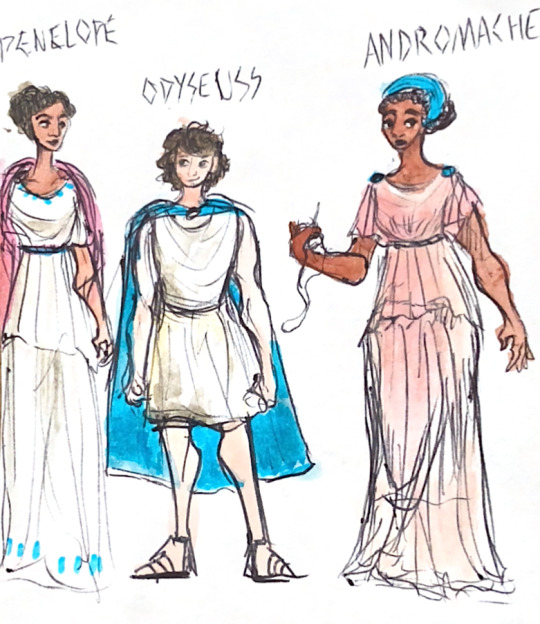
Andromache and Hector… Odysseus and Penelope… something something narrative parallels… they’re giving me Feelings again.
#very messy#i did this on scrap paper with ballpoint pen#a highlighter and watercolour because#my precious traumatised children#my art#the odyssey#odysseus#penelope#andromache of troy#the iliad#doodle#ballpoint doodle#andromache#homer#my post
31 notes
·
View notes
Text
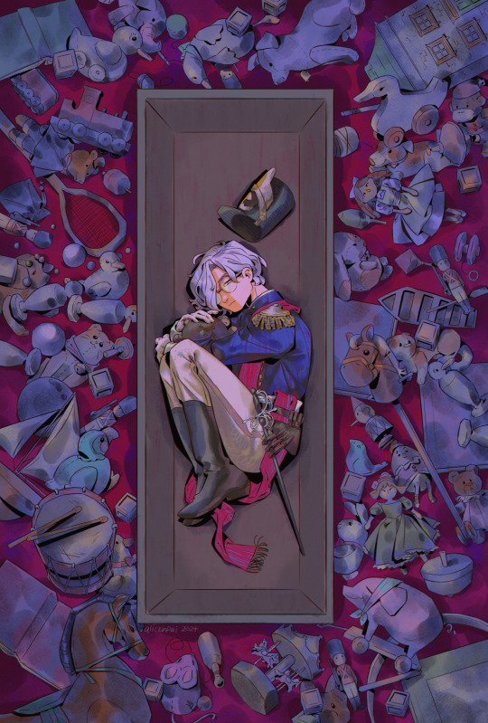
forgotten playthings, forgotten child 🧸
Jack from my series Lost & Found Children 🤍🖤
i hope to showcase more of my ocs in 2024 hehe! im FINALLY getting around to finishing art i left to rot in my folders (the pandora hearts drawing last month being one of em). if you saw the WIP of THIS particular drawing 2 yrs ago... no you didn’t 💔
my charas are very personal to me, but tbh ive always been a bit hesitant to share their stories. over time i realized ... it’s kind of a shame to not make art from one’s heart. which is something i regret a lot year after year whenever i make my yearly art summary reflection. i'm like damn i need to make more emotionally evoking pieces!!! so i'm gonna keep going in 2024 with that in mind ❤ i have to admit, although this drawing started 2 years ago, and there's a lot i would do differently if i were to supposedly draw it now - this concept goes pretty hard.

the final drawing stayed pretty close to the original concept which im so relieved for! i think part of the reason why i left it on the backburner for so long, was the fact that i included so many details, and i was unsure of how to colour the "background". (not to mention stuff like cons & real life getting in the way).
i'm glad for discovering a really handy watercolour brush, it's helped me a lot in my last few drawings, bc i dont have to colour in each detail. especially since the witch hat atelier: eternal ephemera zine piece i did. otherwise if i coloured this back in 2022 with my usual method, i'm pretty sure i really would have included a shading and highlight layer for each individual toy... HAHAHA. much to think about
oh yeah and in the last few days of drawing this i was listening to some visual kei bands. i love how some of the band members literally have been performing since like the 90s or something and DO NOT AGE and are literal vampires. every so often i fall back into visual kei (you can tangentially thank aggretsuko although yes i know it's not the same). and i kind of realized. i like Jack's edgy design so much because he looks like. a visual kei esque vampire.
#illustration#artists on tumblr#original#original character#my ocs#jack#i will post more on my ocs eventually... slowly.. this coming year#2024 will be the year of the oc..... definitely want to lean into developing my stories & charas & gothic aesthetic a lot more hehe#leaning into like. whatever late 2000s manga had going on with their dark aesthetics - pandora hearts. black butler. d gray man etc#those mangaka were drinking some good shit. permanently altered my little teenage brain forever#i also managed to record a timelapse of this drawing#but my computer cant handle timelapses on csp so i had to like. save this drawing in different parts#so ill have to stitch together the timelapse videos#sorry. got rid of the closeup bc it didn't look that great#ill post it in the read more later#lost and found children
299 notes
·
View notes
Text

"Who killed poor Alice?"
An illustration of Alice's defiance and hatred and conviction all culminating in the event that unfurled before Jack's eyes on that fateful day, 100yrs in the past
I did this as an experimental technique,more under the cut!!
I used to do the multi layer oil pastel scraping technique a lot as a kid,but only for fun,I never considered using it for a serious illustration. But a few years ago,I saw Mochijun use it for a VnC illustration: the one with Louis surrounded by stakes. And since then, I've wanted to try it,but didn't have a subject I wanted,so I pushed it to the back of my mind. Well.... inspiration struck recently,and I wanted to draw Alice this way..the composition was suddenly clear as day in my mind. So I started,the sketch as usual,and inked and coloured Alice with watercolour,as usual. Nothing remarkable here,I almost always use a lightbox for inking, so far it's the same (ignore the extra eyes)

Then...I busted out my old oil pastels. These are 12-14yrs old, haven't been touched at least 11 yrs or more,I have no idea.

Now, instead of removing the sketch from the back,I left it,and with the help of the light box,added in colours according to the sketch

The next step may or may not be done,but I didn't want to risk getting any ink into the paper,so I used a candle to rub the shit out of the oil pastel areas,and removed the sketch
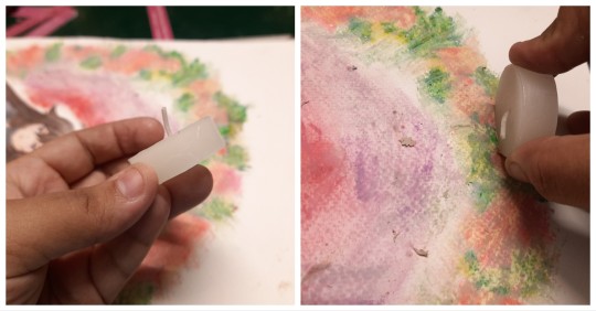
Once I was satisfied that nothing would get past the wax layer, I used ink mixed with acrylic matte medium to cover it up. The medium is important,else it won't stick to the wax at all

Once dried, I rubbed graphite to the the back of the sketch and pressed it on with a ball stylus(a ballpoint pen or back of toothpick can be used) to press on the pattern onto the background
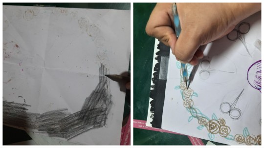
After that, it's just a matter of scraping and scratching with a scalpel until I was satisfied

Finally I sprayed it with some varnish,to protect the ink layer from peeling off(but scanned before that, because varnish scans weird),and adding some final highlights and lines here and there.

So...am I happy? Yes! It's almost exactly as I envisioned! I do feel like I overcomplicated it,I could absolutely achieve this with just paint and ink,no scratching. But hey,I had fun,and I'm happy with how it turned out!!
#Pandora Hearts#alice baskerville#artists on tumblr#jun mochizuki#my art#traditional art#oil pastels#there's an Alyss I'm itching to draw too#I was hoping to draw it as a companion piece of this but#I don't think I will#instead that'll be an independent piece
700 notes
·
View notes
Text

Hello friends! I have been planning on doing one of these in-depth rec lists for a while, and I figured that since this is our first week off from season 5 it would be a good time to finally post this!
This list includes some of my favorite fics that I read over the past several months, so some of these are going to be older, and others will be much more recent. I'm hoping you guys can use this to discover some new fics and writers, especially if you're just getting back to the fandom after the long hiatus we had.
---
Oneshots
In Watercolour - @bonheur-cafe
I'm not someone who ventures outside of Tarlos very often, but this fic was absolutely beautiful and I had to include it in this list. The journey of Marjan slowly realizing her feelings for Nancy was incredibly well written and something I could really relate to when I looked back on my own experiences of liking a girl for the first time.
I recommend this even if you're like me and not someone who typically reads NancyMarjan fic. Overall a very wholesome fic and a wonderful insight into what Marjan having a queer realization at this point in her life might look like.
Made From Stardust - @paperstorm
I absolutely adore 2nd person pov fics and this one was no exception! Andie's writing is always breathtaking and to be able to read all of these pivotal moments in TK and Carlos' relationship from such a unique and creative perspective was really interesting!
I recommend this fic if you like reading canon fics but you're looking for something a little different. This was a really refreshing read and definitely something I'll find myself coming back to.
All Turns To Silver Glass - @thevenstar
Another absolutely gorgeous 2nd person pov fic! The writing in this one is so beautiful and it really stuck with me so much that I found myself coming back to it recently.
I recommend this if you're looking for something unique! I don't think I've read anything quite like this in this fandom and this author really has a way with words so that so much emotion and introspection is packed into this 4k fic.
Recreate The Sun - @reyesstrand
This is a very beautiful AND hot first meeting fic! It really captured the way Carlos immediately fell for TK, as well as the excitement of kissing and touching him for the first time, and overall it was incredibly immersive.
Recommend if you love spicy first-time Tarlos fics!
Monday - @butchreyes
This fic was very emotionally heavy and action packed! It's a beautiful insight into Carlos' character that balances both the past and the present to tell the story, and it honestly felt like I was watching an episode of Lone Star if Lone Star decided to dedicate a whole episode to Carlos.
I really recommend this if you enjoy reading fics where the stakes are as high as ever for Tarlos, and if you love Carlos as a character and want to read more fics centered around him.
Your Back Beneath The Sun, Wishing I Could Write My Name On It - @emsprovisions
Tarlos on vacation my beloveds! This fic was such a fun read and there were so many beautiful moments that made me stop and close my eyes because I could really picture myself in that moment with the characters. Emily does such a good job at appreciating the smallest moments and highlighting their beauty, and her writing is incredibly immersive!
I recommend reading this if you enjoy TK and Carlos going on adventures as husbands and are a Tarlos gets a dog truther. Lizzie was the true star of this show!
Let Him Speak! - @goodways
This fic really showcases the thing I love the most about Shannon's writing. It's fun, and at times, incredibly hilarious! I also loved how this fic handled Carlos and TK bringing up the topic of kids again.
I recommend this if you want some Lou II shenanigans from the queen of hijinks and shenanigans herself! As well as some beautifully emotional moments that will make you smile like an idiot.
This Belongs To You - @chicgeekgirl89
This post-breakup fic had me in my feels! It shows how Tarlos are dealing with the newness of being back together, struggling with being apart for the first time since then, and recovering from TK almost dying.
Read this is you're craving some beautiful emotional hurt/comfort. Carlos is so sweet here, and this fic has some wonderful 126 family vibes too!
Chaptered Fics (ongoing)
Not Strong Enough - @honeybee-taskforce
This AU is in its early stages but I am in love with this universe and the individual superpowers TK and Carlos were given, and I can definitely say that I was hooked from the very first chapter!
I recommend this fic if you're looking for a type of AU that hasn't been explored much in this fandom yet and want to see creative worldbuilding, as well as new and interesting versions of TK and Carlos' characters. I'm excited to see how they continue to navigate this world!
Something To Give Each Other - @alrightbuckaroo
This wip contains some of my favorite smut scenes I have ever read. I love how the love and trust between TK and Carlos is written here and I love how so many different types of intimacy are being explored.
I reccomend this if you love smut obviously, but even more importantly I recommend it even if it's not something you'd typically seek out. It's very hot and unapologetic, but it's also beautiful and tender and really highlights how much TK and Carlos truly love each other. There's also no overarching story here so all of these chapters can be read as oneshots if you're someone who doesn't read wips.
Live To Tell - @cold-blooded-jelly-doughnut
If you know me, then you know I'm a sucker for angst, but another thing I absolutely love is horror! Jamie has really mastered that aspect of this fic and when I'm reading this I really feel like I'm in TK's shoes and feeling his fear right alongside him. There's still so much mystery to unveil about who this antagonist is and I can't wait to see how this story unfolds!
If you're not too squeamish about whump or horror then I definitely reccoment giving this fic a read! I love when authors aren't afraid to drag out the scairest and most painful moments, because to me that makes the reading experience so much more immersive and satisfying.
When Fate Cries - @theghostofashton
We all had a great time watching the Olympics this summer, right? If you're in the same boat as me and experiencing withdrawals from that excitement then you should absolutely check out this AU!
I love how this fic navigates the world of gymnastics shows how a traumatic injury can affect an athlete's mental health, as well as the overall pressure TK and Carlos feel performing at such a high level with such a large audience. It is really interesting to see how all of this affects them as individuals, as well as how their relationship has developed overtime.
Even In The Dark - @ironheartwriter
This is definitely one of my favorite AUs I've read for Tarlos so far! Lana has really put so much creativity into this fic and the worldbuilding is incredible! I also love how TK and Carlos are such different characters as opposed to canon and I really love how much their individual powers suit them.
I recommend this fic if you like reading fantasy, mystery, and an unfolding adventure that slowly makes you fall in love with both characters even if they are at odds with each other.
Chaptered Fics (completed)
So Much For Summer Love - @strandnreyes
I cannot reccomend this fic enough! Jen has written so many incredible AUs but this was one of my favorites. It just gave me so much nostalgia and was generaly such a feel good fic about TK and Carlos finding each other and falling in love.
I recommend this fic if you love the beach, Tarlos being idiots and love, and found family vibes!
Call Me (By My Name) - @welcometololaland & @rmd-writes
This fic was so much fun to read! Not only did it have a lot of amazing smut, but we also get to see a different take on how TK and Carlos meet in canon through both of their perspectives! The alternating pov was utilized really well here, and I remember feeling so much excitement and anticipation while waiting for each update!
I recommend this fic if you want to watch our favorite idiots unknowingly having phone sex with each other and slowly fall in love. There were so many hilarious moments where they were completely oblivious, and there were so many beautiful and emotional moments in this fic as well.
Love Can Pull You Out Of Yesterday - @alrightbuckaroo
This fic is so creative in the way that it incorporates the twist of a time loop into the already emotion-pakced storyline that is the breakup/ice storm arc. I think it adds a really unique element that also elevates the tragedy surrounding everything that happens. It's also very thoughtful in the way it tells this story from Carlos' pov, and the way it all unfolds is ultimately very satisfying!
I recommend this fic if you're a fan of the time loop genre, or if you want some delicious push angst!
Dance Me To The End Of Love - @bonheur-cafe
This fic is so beautiful! It will take you on an overwhelmingly emotional journey through different stages of TK and Carlos' relationship, all through the lens of dancing! This theme is perfectly incorporated and I love how it holds so much importance in this relationship.
I highly recommend this fic for something that is both conceptually simplistic, yet rich in gorgeously written scenes that had me crying and smiling like and idiot.
Series
Let Me - @heartstringsduet
This is the ultimate dom/sub fic! Michelle really does a wonderful job of exploring this dynamic and how exactly TK and Carlos would navigate all of these new feelings. This series also does a great job at showing the development of trust in their relationship and highlighting just how mental health and sex intertwine.
I recommend this if you want to see a really insightful look into TK and Carlos as individuals and as a couple, absolutely gorgeously written sex, and some wonderful and realistic development when it comes to communication.
Tu Corazón Es Mío - @lemonlyman-dotcom
This series is such a cool idea and I've been loving it so far! I think it's awesome how each installment is based on a different song, and the way this series takes you through different phases of TK and Carlos' relationship makes for a fun mix of emotions!
I recommend this if you enjoy songfic mixed in with some beautiful in-between canon moments!
Wherever You Stray, I Follow - @strandnreyes
Did somebody say vampires?? I have to say that this type of AU never used to be something I would seek out, but I absolutely love the way this story unfolds and you can immediately tell just how much care and effort Jen put into building this world for TK and Carlos. There were moments where I cried, moments where I couldn't breathe, and moments where I felt every other emotion you could possibly imagine. Every fic in this series is a gem, and I am loving the latest installment so far!
I recommend this if you love vampire AUs, obviously, but also if you love stories that have higher stakes, and stories that leave you guessing and get you on the edge of your seat. If you have an appreciation for gorgeous scene settings and a story that becomes more expansive and intricately detailed as it goes, then you're going to love this fic.
Missing Moments - @paperstorm
The ultimate filler fic series! Andie does such a good job at breaking down even some of the smallest Tarlos moments from the show and really slowing everything down to give us some beautiful insight into the things we didn't get to see.
This series is completed up to season 3, and I highly recommend reading it if you haven't already!
Season Five Codas
There are many writers who have gifted us with some beautiful season five fics. Here are a few of my favorites + some series that you can check out!
@morganaspendragonss [x] @heartstringsduet [x]
@theghostofashton [x] @bonheur-cafe [x]
---
He's The Air I Would Kill To Breathe - @morganaspendragonss
If I had to pick one fic from the above-mentioned series to recommend, it would be this one! The angst was particularly powerful, and it's very memorable for me because I had to take a minute to stop crying before I could finish reading. This episode definitely tugged on our heartstrings, and then this coda amplified all of those emotions in such a beautiful way.
Deeper Than Breath, Closer Than Air - @carlos-in-glasses
This coda takes you through a whirlwind of emotions. There are a lot of conflicting things at play here, and this fic beautifully tied it all together and touched on everything TK and Carlos are dealing with. They laughed. They cried. They had sex. They did it all and this fic will make you feel ALL of it.
Brighter In The Morning - @strandnreyes & @paperstorm
Even though this is technically a chaptered fic, it is a collection of season five codas so I wanted to include it here. I absolutely adore this concept, and the fact that it's cowritten just makes it even cooler! These season five codas are hot, angsty, emotional, and beautiful extensions of each episode.
Breaking Like A Wave - @reyesstrand
This coda was absolutely beautiful in the way it broke down all of the emotions surrounding episode five. I loved the way the sex is written to be both tender and desperate, and overall it really shows just how much love there is when TK and Carlos come back together after all of that tension.
55 notes
·
View notes
Text
I read an au where Havers is an artist. Let me tell you about Official War Artists.
Official War Artists are artists commissioned by the country’s government to document the conflict, war, and home front during WWI and WWII (mostly in WWI, but being an Official War Artist has been continued to this day!).
The process of a war artist is that they make a sketch, after the sketch some use watercolours to block the highlights, shadows, and colour to the scene or person. Now that they have their general guidelines and they know what to paint, they go to their own personal studio and begin painting.
If they’re in the frontlines they’re actually alongside soldiers. They paint the scene in front of them, drive back to their studio (they’re issued with a vehicle), and paint.
Because they are commissioned by the government, Official War Artists are given a rank so that they are permitted to go to the frontlines. They’re technically officers!
Now back to the point I’m making. So imagine Havers is an Official War Artist. He paints Button House, in his spare time he paints the birds and gives them to the Captain, he paints the Captain a portrait. He’s very cagey about showing his progress to the others but when the Captain asks he’s delighted and shows him. Havers paints their Sunday stroll and calls it “The Most Beautiful Day of my Life” and it hangs inside Button House. It used to be in the Common room and now moved into the Captain’s room. Havers’ work is displayed in art galleries and museums. Alison goes on a date with Mike and she finds Havers’ paintings and snaps a picture of them to show the Captain.
When Havers was at the frontlines he was caught in the crossfire and took shrapnel to his face and he was unable to paint until recovery. When he recovered he did a self portrait of himself with the scars.
#bbc ghosts#mint thoughts#the captain#capvers#caphavers#lieutenant havers#I’m so abnormal about this actually#because I also want to do an official war artist impression#like#aRGAHRGAHGEAHGEA
89 notes
·
View notes
Text

without the sour the sweet wouldn’t taste
why are you as a man eating another man’s ear after you failed to make him eat his ex girlfriend. 🤨🏳️🌈⁉️
im allowed a bit of toxic yaoi. as a treat
process discussion utc ⬇️
for those familiar with my work you’ll know that i like trying a lot of new styles and experimenting in order to achieve a certain vibe. usually those are heavy painterly styles such as the sunday art inspired by Yuming Li, which is what i’m familiar and comfortable with, both traditionally and digitally
what im NOT familiar with is watercolour. i’ve never had a good time with it 🥲 i just cant seem to wrap my head around the process since its requires me to work backwards (light to dark vs dark to light)
for this piece i just couldn’t imagine myself rendering it in my usual style. i needed to do something new so that i’d stay invested enough in the piece considering that it has two people, meaning double the work. for some reason i thought it’d be fun to do double the work with a style i am completely uncomfortable with but oh well!! i managed to do it 🤷♀️ i was specifically looking at the works of Ko Byung Jun, an artist i’ve seen all over my pinterest feed
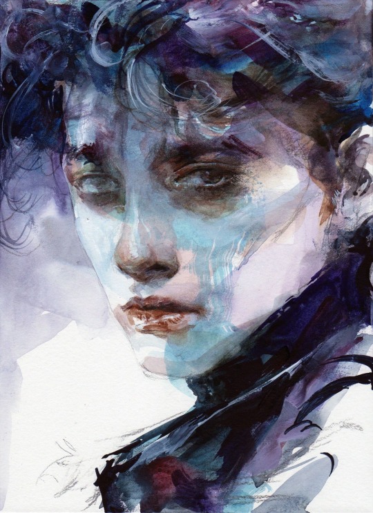
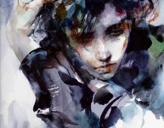
while i didn’t end up really following the style super closely i still learned quite a lot just by looking at it while i drew. i tried my best to stick to watercolour brushes and an ink pen but as i was nearing the end i needed to make some alterations that i wasn’t bothered to try fixing with the watercolour brushes so i just went over it with my digital ones 🫡 i did my best that’s what matters!!!
i had to repaint rody a few times cause i just couldn’t get it right and the colours never ended up matching vincent. i painted them separately and i think i got possessed while painting vincent cause it happened in like. 40 minutes. and i couldn’t get it to happen again 😔 it didn’t really matter cause i ended up going ham with the curves tool as always but you know 🤷♀️
here’s the image without all the effects:

i find lately it’s been more and more common for me to be sketching several iterations of a concept for days, even weeks before i land on something i like. i have an entire separate canvas that i’ve spent 5 hours just doing thumbnails trying to figure out how i wanted to pose these two in a way that would showcase the characteristics that mattered in the story of this piece.
that’s my process for coming up with drawings: i find inspiration somewhere, i figure out the key concepts/characteristics/symbols etc i want highlighted, and i work around those. sometimes i have a composition in mind or just a general vibe i want to portray. for this one i wanted to make sure the towel, rody’s injured finger and vincent’s face could all be clearly seen, while also portraying the fight scene and the vibe i get from the reference song. almost all of my work revolves around a specific lyric from the song which drives the story of the piece. here i interpreted the line “without the sour the sweet wouldn’t taste” as a connection to all the little actions vince takes with rody that can be seen as “sweet.” drying rody’s hair, bandaging rody’s cut. i then asked myself how i could take those actions and make them “sour” or show them in a different light, in which vince is biting the finger he bandaged and pulling rody closer, preventing his escape with the towel he used to dry his hair. what im trying to communicate in this illustration is the idea of “if it weren’t for how i’m treating you now, you wouldn’t understand how kind i was to you then” in an attempt to illustrate the complexities of the way vincent acts towards rody.
i’m truly in love with the story telling of this game. it’s hard to really say anything about how the characters acted during the story because it’s so complex in how it’s done. it’s very hard to summarize their relationship because there’s so much about it i can’t explain without just quoting the game directly. i think it’s such a beautiful portrayal of obsession and just being fucking weird about someone. i wanted to ensure the elements i mentioned in the above paragraph because i didn’t want to be portraying vincent as solely a villain and rody as a victim. i wanted the storytelling of this one illustration to live up to my impression of this beautiful game and i hope i did it justice.
thank you for reading this if you’ve made it this far. i love rambling on all my art posts cause i think it’s so valuable for artists to expand on their work outside of the result alone. i hope what im saying is at most helpful to someone and at the very least a good read. i’m probably gonna take a bit of an art break after this since it took a lot out of me, plus im on the last days of my trip. thank you again for reading!
here’s my dog
#my art#fanart#dead plate#dead plate vincent#dead plate rody#dead plate fanart#dead plate game#vincent charbonneau#rody lamoree#digital art#artists on tumblr#digital illustration
74 notes
·
View notes
Text
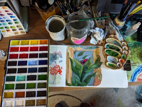
I got this set of Kuretake Gansai Tambi in the fall and day down to play with them in my etchr sketchbook this week. The 100% cotton paper that usually is my best friend, however, felt less useful with these than with my usual watercolours.
which isn't to say i didn't have fun! the colour range of the set is great and the vibrancy is *amazing*.

but i realized i really don't know much about these paints besides the fact that they're at least a little different from Western style watercolours; so i did some googling, and i thought I'd share some highlights:
a great breakdown of the actual chemical differences:
youtube
a great demo of how they can be pushed far beyond what you think in terms of layering and vibrancy:
youtube
They sound like a product related to traditional paint prep methods for nihonga, which is painted on washi paper :
https://en.m.wikipedia.org/wiki/Nihonga
this playlist is a very clear overview of nihonga materials:
these days they seem very strongly associated with etagami, which I'm just starting to research:
youtube
In summary, no, they definitely don't work like my Daniel Smith or Mijello or Holbein watercolours, but that's because they're very definitely not the same thing. I'm excited to play around with the paints in combo with different materials and see what they unlock for me!
Also, god, I'm already tempted to get more; they really do have a jewel-like quality, shining in those big flat pans....
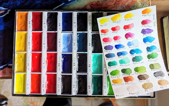
(i did rearrange them into this colour wheel order to help me learn the palette, if you noticed the labels in the box no longer line up with the colours)
46 notes
·
View notes
Text

(late) painting for day 7 of dr. carmilla week. prompt was death, but she's more of an un-dead type gal, so i tried to draw her alive(ish) in an empty grave.
@drcarmillaappreciationweek
[Image ID: A watercolour painting of Maki Yamazaki as Dr. Carmilla lying in an open grave from a bird's eye view, only showing mid-chest and upwards. She is a slim, tan, Japanese woman who has chin-length dark blue hair that has hints of teal, pointy ears, brown eyes, a sharp nose, and has makeup around her left eye that looks a bit like an upside-down lowercase T, with swirls as well as two dots right underneath her lashes. Carmilla's right eye is entirely closed, but her left eye is cracked slightly open as she looks at the camera, eyebrows furrowed as she tries to focus. She has a small smirk on her face. Carmilla's hands are crossed over her chest, loosely clasped together near her neck, with fingernails that are painted a dark brown. She wears a high collared white shirt, that looks purple in the lighting, which has small purple flower print on it, as well as a dark red vest. The background is a rough body shape of brown colours, meant to show the upturned dirt from a fresh grave. The linework of the painting is thick, and several parts are shaded with markers applied on top of the paint. Some of the paint is still wet, especially the background. Some of the linework runs, and the entire drawing has a pinkish tint, presumably from the pink lighting that can be seen in the paint's reflection. End ID]
original attempt below cut because i got a bit too ambitious with the posing i think

i had a vision for this piece. unfortunately i am not that good at perspective
[Image ID: A photograph of Kae's, the OP's, desk. On the left of the photo, there is a sketchbook, which has a half-finished painting of Doctor Carmilla in a grave, similar to the one above. Her hair is bluer than the previous painting, and the perspective is as if one was looking from the crown of her head down the rest of her body. She is winking at the camera, but her features are not as recognizable as being Dr. Carmilla as the first painting. She is wearing a dark brown shirt, with a longer-sleeved red shirt underneath, and blue pants. Below the drawing is a sketched nameplate/grave that says "Carmilla XX12-XX24". To the right of the drawing is an open case of watercolors. They are a bit messy, with the colour blue specifically splattered across much of the pallette. Near the top of the photograph, there is the partial view of several book spines as well as a cup of murky paint water and the edge of a mug. Several pens and highlighters are scattered across the desk, which is wood painted turquoise, with the grain visible. End ID]
#organisation tags:#their esteemed creator#exhumed unplugged and dangerous#the crew of the starship aurora#drawn in the light of the tube sun#reach tags:#dr. carmilla and the mechanisms#doctor carmilla#traditional art#watercolor and markers#described#notes: anyway i had a super rad time this week! thank you so much for hosting such a fun event! 💗💗 much love
7 notes
·
View notes
Text


Inner Glow
"I'll shine like a burning fire."
Hello everyone, long time no see! I know this is a little different from my usual stuff, but I joined a freestyle painting activity this month and a friend convinced to share the result with you all.
It was fun to do something in traditional again, and to mess around with the acrylic paint (for the hair, freckles, and white highlights) and the watercolours (for the skin). The paint glows super brightly in the dark and I wish I could have done a thicker layer so it was more uniform, but alas, time constrictions and very crappy brushes meant I had to call it finished as is. I'm happy with how it turned out tho! I think I should experiment with painting every once in a while for enrichment purposes xD
Anyway, I don't know how active I'll be for the rest of the summer because the heat is trying to destroy me, but I promise I'll come back eventually! You just have to wait for a little while longer ❤️
6 notes
·
View notes
Note
I love the way you draw fire though! and your colouring is beautiful, I was wondering if there are any tips you could give for colouring?
OMG THANK YOU SO SO MUCH!!! ;A; i'm still figuring out how drawing fire works tho and the feedback i got was super helpfull and got me a step closer to it i think!! during my last 2 drawings i've always had some super helpful feedback about the fire so i feel really blessed about that~ as for the colouring tips, well these are some of the tricks and methods i use;
1- instead of using a darker colour for the shading i just use a more saturated colour, kinda like this;

the added saturation makes the colour appear darker when in reality it's not! think about it like colouring traditionally with colour pencils. when you use a colour pencil the places where you added a lot of pressure look much darker than the places where you added only very little pressure - despite it being one and the same colour! done with the same pencil! the reason it appears darker is because it simply just has more pigment. that's what we're doing here too, we're making the color appear darker by adding more pigment.
BUT
if we just simply stick with the exact same hue then the colouring would look bright and vivid - but still be horribly boring. so i play around with the hue too!!
the circle determines the hue you're selecting and the colors you see there are all at 0% darkness but 100% saturation despite them, technically, being equally light/dark according to the software they still look differently dark rotate the hue in the direction of blue/purple for the shadows and in the direction for yellow to select the colours for the highlights
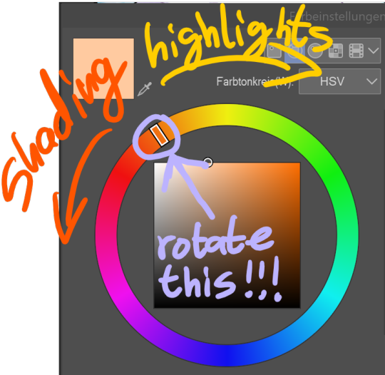
blue, purple and red are the best colours to shade white with, for black however it'd stick to blue or else it stops looking like black and starts looking like a very dark colour instead
2- give each colour it's own layer.
that way, if you notice halfway through that the colours you've chosen don't look so good together you can still make adjustements and edit every single colour without losing any of the progress you've done with the shading (note: do all of the shading on the same!!! layer as the base colour tho!!!)
many artists solve this issue by using predetermined colour palettes, that way they're guaranteed that the colours look good toghether but colour palettes save absolutely no time at all (adjusting the colours of a layer takes only a few seconds) and are extremely limiting when colouring so i just don't see any benefit to them
3- USE THE RIGHT BRUSH!!!! your choice of brushes can honestly make or break the colouring. the impact they have should not be underestimated, it's huge. which brush is best for you depends on your artstyle but personally i think brushes that simulate either watercolours or copic markers are the best ones.
if you use a software where it's possible to use custom brushes made by fellow artists then PLEASE do that. most art software comes with awful default brushes, and even for those that come with decent default brushes (such as photoshop) most free custom brushes made by fellow artists are still so much better than the default brushes that they're worlds apart Clip Studio Paint (the software i use) has an assets "store" where you can download brushes made by fellow users. for other art software i'd recommend checking out deviantart for user made custom brushes if it's a software that existed before the downfall of deviantart. it's a huge goldmine filled with insanely amazing brushes for many different types of software. personally i use a brush called froggy pencil for the colouring 4- add overlay layers to your art after finishing with the colouring. they can make a drawing really come to live and it's insane just HOW much they add to a drawing. usually i always either use a gradient, a solid colour or a soft airbrushed colour on the overlays and let them do their magic.
to show just how much of a difference overlay layers make; here's a comparision between my most recent drawing - and a version of the same drawing where i removed all overlay layers. see the difference?

...soo uhhh ... that's all the tips and tricks i have up my sleeve lol hope it helped a bit?
31 notes
·
View notes
Text
Finally, an Into post!!
because this blog is over a year old and I've been putting off making an intro post!!
--'bout me-- I'm J! This is my main blog, I use any pronouns, am Canadian and am the self proclaimed most delusional Kabuto Yakushi fan, and I will fight for my title. --interests-- - kabuto!!! As silly as it is, watching Naruto in the 5th grade permanently altered the path im taking in life, by introducing me to my favorite medical ninja/spy/necromancer/orphan/war criminal/live-in caretaker/medically altered father. After a few sad attempts to quite litteraly make myself into him, I've decided to settle for having a Tumblr blog dedicated to him instead. - art! I do traditoinal and digital art, my favorite mediums are watercolour, oil, and acrylic paints, sharpie and alchohal markers, pencil crayons and highlighters! I love to do mixed medium pieces! I mayy post my art at some point, but I can be overly self conscious, so dont count on it! - Writing! I love to write, I write everyday, I occasionally write fanfiction, satire and serious, but I doubt I'll post much of it here! - D&D! I've been playing since late 2022 and I really love it, I play a cleric-charlatan named Shiel who I love dearly. - Music!!! I love music, favorite artists are: - Will Wood/ Will Wood and the Tapeworms
- Kimya Dawson
- Fleatwood Mac
- Shayfer James
- Lunachicks
- That Handsome Devil
- Nine Inch Nails
- AJJ
- Alex G
4 notes
·
View notes
Text
@chortlebot
You asked how I did the transparency on Flygon’s eyes and it’s because the acrylic markers I use take a few layers to cover something, so you can easily do transparent effects! I used Simptap acrylic markers for the whole piece (watercolour for the background). The base layer was green and I did the red over the top of it (then some orange and yellow for highlights). Hope that helps! There are probably other acrylic markers that have transparency to them!


#flygon#trapinch#cool artists don’t gatekeep and I hope that helps#acrylic markers#simptap acrylic markers#marker art#pokemon#my art#neku speaks#neku replies#art advice
5 notes
·
View notes
Text
Darker skintone without a dark marker?
You want to draw your dark skinned fave but have no marker? That's very sad but I see sometimes (really sometimes because who does traditional art in 2020s?) people just settling with what's basically just whitewashing. Which is even sadder.
And - in case of alcohol markers like Copics, Promarkers or Ohuhu - usually completely avoidable.
Let's see. I'll take two markers and I'm going to make photos on a cloudy day with a potato so pardon the quality of the pictures. The value change of the colours tho should be still clear.
From the set below I take the colour number 121 for super light and 148 for light brown.
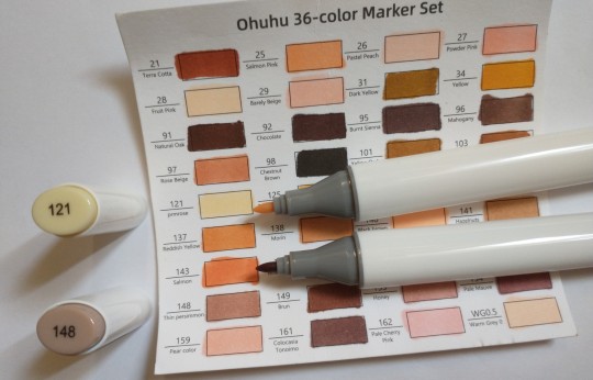
The one that's basically cream coloured obviously won't be fitting ever. The one of the pale pinkish brown is obviously also not sufficient to draw a dark skinned person, right? Maybe tan would go, but actual deep shade of brown? Nah.

Or....?
Well, actually... you can work with it. Because markers can layer. And they layer pretty nicely. Look what happened after one additional layer after it dried:

Better, right? Let's apply more after it dries. 3 layers look already pretty promising, no? And even more. 5 layers! After the third layer the difference is gradually getting smaller but it's a huge improvement from what it looked at one layer.


I actually got a decent brown there.
You can see as well that the super pale cream colour that'd be only useful for something like ghostly pale or shading a white sheet turned into a quite natural shade too and now can be used without making the character sickly pale. You can work on every colour like that. If you have an average light/beige skintone marker, there are still good chances that a bit of trial and error with layering colours on top of each other would eventually give you a more accurate tan/brown colour.
Imagine the possibilities with a mid value marker like the one I used. You could for example make a nice dark skin tone. You could make a tan skin tone. You could make a light brown skin tone. There are plenty of skin tones you can cover with something that looks like some uninspiring beige.
Now look.

I used this colour as a base colour for this guy. That pale brownish, pinkish marker that had no right to give him the right colour... until it had. You can still see its unlayered tone on some highlights but the rest is a nice saturated brown on the reddish side.
While pencils or watercolours might indeed make it impossible to get any darker than what it is marked as (but you still can mix and blend colours, y'know), alcohol markers give you plenty of options to darken the colour - one marker can provide you with a whole spectrum of tones. The basic tone it has is just the beginning and the lightest value out of the whole range. Just use this unique advantage of this medium and you won't "need" to whitewash.
Edit: do I have to recommend reblogging? It's not going to reach anyone without that.
25 notes
·
View notes
Note
top 5 eyeballs you've drawn/painted lol
eyeballs!! I was sitting on this ask because i haven’t been home in a while and needed to look through my sketchbooks. but tbh i don’t draw/paint consistently so i don’t really have a lot of sketches or finished works to show but here’s a few i’ve done somewhat recently.
it gets long...
First is my george russell study from a few weeks ago. He’s so expressive and fun to draw/paint. I kind of like some of the sketches i didn’t paint so there’s one too but adding watercolour really adds that ✨✨✨
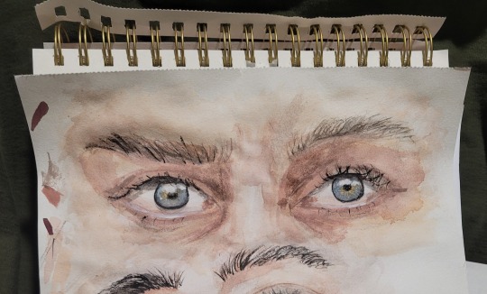
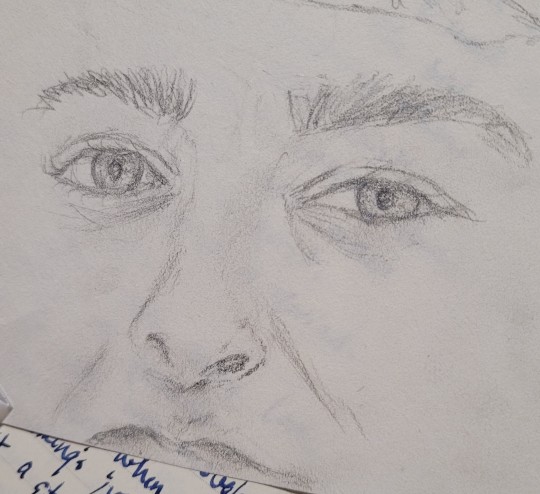
On the theme of painting f1 drivers, i’m working on a max verstappen study but i just gave up on it. I don’t really like posting wips but i don’t know if i’ll come back to it so here’s an eye i liked. you really have to trust the process with watercolour so this is just...lacking details and depth. i like the expression though.
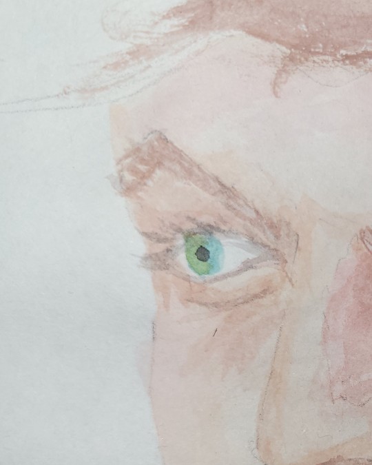
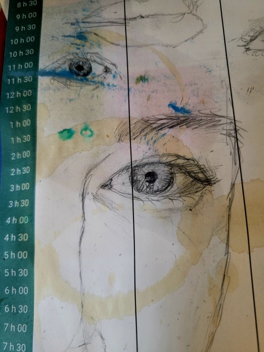
I was really inspired the other night but I forgot my sketchbook at home and the only thing i had was my agenda i used for a week and forgot about in the bottom of my backpack. I really liked this one but i accidentally used it as a coaster so now it’s stained oops and i’m sad the highlights and details got smudged. it looked good at one point.
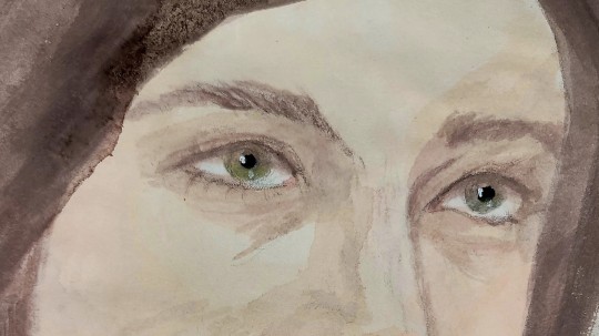
Finally, i’m attempting to do a self-portrait but i hesitate to call it a face reveal because it’s not very accurate lol. I was struggling to add the small details because i couldn't find my finer brushes but i like the way the colours turned out.
#i really love these questions!!#talking about art feels really vulnerable but i also love to talk 😳#art tag
5 notes
·
View notes
Note
your art style is so cute their skin looks so pretty and ethereal 🤩🤩
😭 Ohhh thank you! Trying out some different stuff with procreate right now and I'm loving this watercolour brush because it's making them all look like they fell from a fairy galaxy.
I've been wanting to mention this but my best friend told me not to post my art with an apology or a self-deprecating comment: I still don't consider myself having drawn them. Like the first 20% of the work is rough tracing to block out shapes. It still leaves multiple hours of further drawing and shading and highlighting and styling work but I have many illustrator friends who judge people who start with a trace so I have a complex 😂 I want to get less reliant on reference images. But that's why I call it graphic design and don't list anything for sale under illustration. No misleading here!
But you better believe I sit and painstakingly draw every last hair strand with a thin brush until my hand hurts 😂😂
2 notes
·
View notes
Photo

Belyst av solen 2, akvarell, 12x17 cm
Jag gjorde ett tredje försök med det här motivet. Det första slängde jag, och det andra kan ni se i mitt förra inlägg. Jag var inte helt nöjd med det andra, för det stämde inte överens med mitt minne av hur solen fick den där trädstammen att se ut som att den glödde. Så för att få mer glöd i den här tredje versionen målade jag bakgrunden lite mörkare och lade till lite mer lila som komplement till de gula högdagrarna. Jag försökte också att förenkla marken så att uppmärksamheten förhoppningsvis ska riktas mot det glödande trädet.
...
Lit by the sun 2, watercolour, 12x17 cm
I made a third attempt at this subject. The first one went straight into the bin, and the second one can be seen in my previous post. I wasn't really pleased with the second one because it didn't look like my memory of how the sun made that tree trunk look like it was glowing. So to give it more glow in this third version, I painted the background a little bit darker and added some more purple to complement the yellow highlight. I also tried to simplify the ground so that the attention would hopefully be more focused on the glowing tree.
#kilsravinerna#granskog#natur#naturreservat#skydda skogen#biologisk mångfald#akvarell#konst#forest#nature#nature reserve#protect the forest#biodiversity#art#watercolour#watercolor#watercolor painting#watercolor art#aquarelle#acuarela#aquarela#acquerello#ακουαρέλα#suluboya#akwarela#акварель#peace#petter brorson edh
30 notes
·
View notes