#adobe illustrator tutorials
Explore tagged Tumblr posts
Visit Tumblr Blog
Explore Tumblr blogs with no restrictions, modern design and the best experience.
Last Seen Tumblr Blogs


Fun Fact
Mobile Tumblr US users spend an average of 4.04 minutes per session on the app.
Text
youtube
5 Useful Text Effect Tips & Trick
In this video, I will show you 5 Adobe Illustrator text effect tips and tricks that might be useful for you.
#graphic design#youtube#illustrator tutorials#education#3d text effect#text design#text effects#Text Effect Tips & Trick#adobe illustrator tutorial#adobe illustrator tutorials#free education#educate yourself#graphic designers#typography tutorial#typography tutorials#typography tips#Youtube
2 notes
·
View notes
Text
#marketing#artificial intelligence#ecommerce#interiors#commercial#graphic design#illustrator tutorial#illustrator#graphic designer#adobe illustrator#logo design illustrator#illustrator logo design#graphic design tutorial#graphic design basics#adobe illustrator tutorial#learn graphic design#logo design#how to learn graphic design at home#adobe illustrator tutorials for beginners#design#illustrator tutorials#graphic design tips#logo design tutorial#adobe illustrator tutorials#how to design logo#artcam#artcam pro#artcam 3d design#artcam 2008#artcam beginner tutorial
2 notes
·
View notes
Note
What art program do you use? sorry if you already answered something like this but im so mesmerized by the techniques you use in your art.
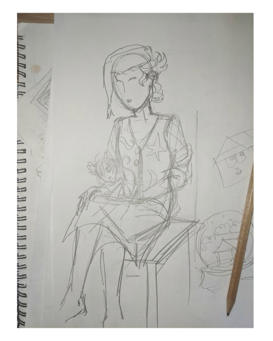
Thank you. No need to apologise; I don't mind answering this question because it's an excuse to walk through my latest image!
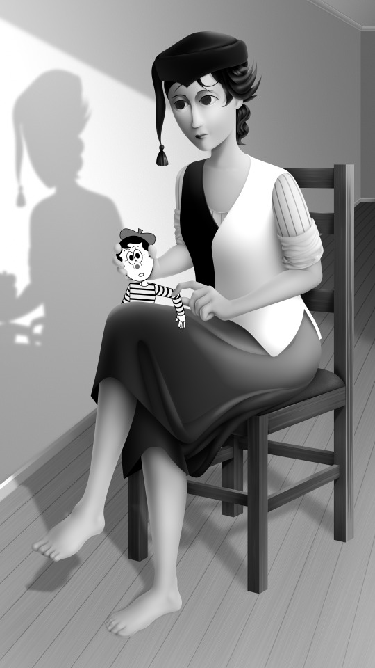
The concept for this piece is based on being perceived online through interpretations of posts and artwork, yet how artificial this can be. The relationship the viewer forms is more with the narrative of the work, and any insight into the artist through this feels highly awkward to me, which is precisely what I want to explore with this piece.
In this example, I wanted an attractive sitter to look like someone out of a new romantics music video or like an Enya video, because this genre and era of media is very aesthetically pleasing and nostalgic for me. I hold it as an unobtainable ideal— a hauntology. So, as wonderful as it is, it equally feels shameful and perverse because it's an aesthetic object of desire that I am contriving.
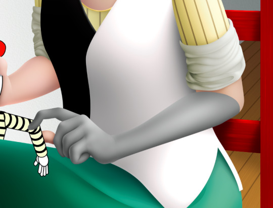
The sitter is holding one of my cartoon characters, Lauren Ipson, the protagonist of my Ersatz world project. A trope in writing is when a character acts as a self-insert of the author, and I'm conscious to try and avoid that with Lauren. I try to write Lauren as dry and sardonic yet also fun, dramatic, and friendly. I don't think of these as personal qualities of my own, but I imagine personal qualities bleeding into fictional characters is inevitable.
Yet Lauren Ipson feels much more alive a character to me compared to any attempt at self-portraiture or self-expression that I've done, which is very little because I'm not interested in constructing a perceivable identity. (I'm aware this text itself can be interpreted as self-expression; however, to me this is just another construct.)
So Is the sitter meant to be me, controlling Lauren? I'm definitely baiting the viewer to think this, and you can interpret it that way if you want, but really I don't think of the sitter as me at all. My intention is to show how it's all a facarde. The sitter is basically just as much a doll, a puppet, a mannequin as Lauren Ipson is, if anything more so.
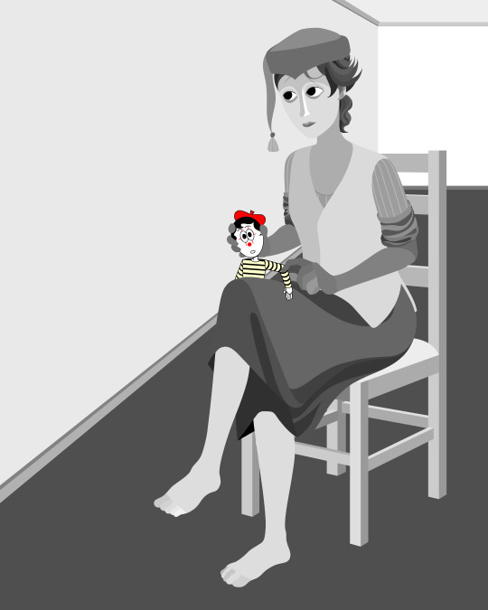
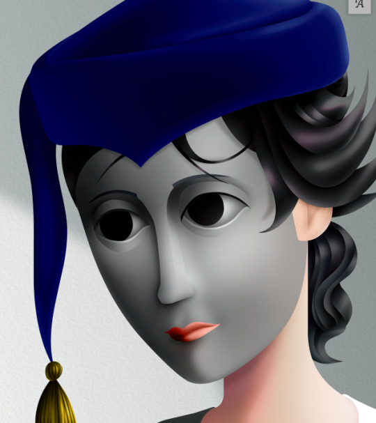
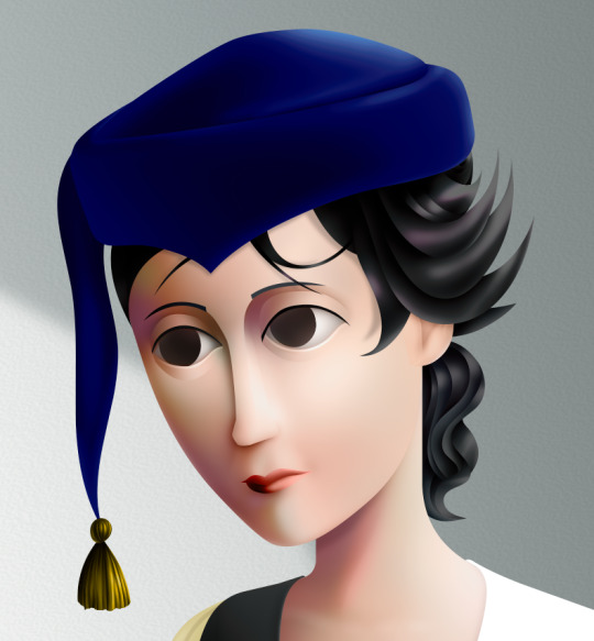
There's a deliberate irony between Lauren's cartoon rendering and the sitter, who I wanted to render with more detail and evoke a modernist style. I'm inspired by Hans Bellmer and Dorothea Tanning with their work with dolls. However, despite that implied visual hierarchy, the more detailed sitter shares a similar, stilted vector construct to Lauren. They're both born from vector drawing after all. And it's further undermined with the way Lauren the doll looks directly at the viewer, as if she's alive, while the sitter looks to the side with a blank, almost dead-in-the-eyes expression.
Anyway, with that in mind, almost all of my work starts as a thumbnail sketch. Although I often draft digitally and am fine with doing that, I feel more confident doing it freehand on paper. Digital rendering feels more like a refinement process to me. Funnily enough, although I often prefer to sketch with physical materials, I'm anxious of refining or rendering with them.
I like my designs to be very direct and conceivable, so a solid silhouette, pose, negative space etc. I often create a quick digital sketch with this in mind, either by tracing or referencing the thumbnail, although sometimes I skip this step and go straight to the rendered drawing. The aim is to establish a visual guide, dividing the drawing into various shapes for digital airbrush rendering later on.

With this composition, I made a second draft with more attention to details such as the face, hands and feet. Sometimes I'll use photo references if I'm struggling with posing or anatomy. These drafts are often blue because it's easier to render the black linework over a transparent blue sketch.

The chair took some time but was relatively simple to render. It uses the line tool set to magnetic anchor point, following two-point perspective vanishing points. I like two-point perspective because it feels sort of digitally native to me to have these impossibly perfect vertical lines. I also know the horizon line should be at eye level or something, but I just like the idea of the top of the chair to be perfectly horizontal.

Here I'm drawing the final rendered form. I use the stroke tool with it set as smooth as possible. Often I'll redraw lines over and over if it means getting certain curves to look right. Once the lines are drawn, I'll fill them in and remove the stroke, leaving just the solid vector shape. The shade of grey I use is done to simply denote the shape. It does not represent any kind of shading or anything; in fact, when I bring it into Photoshop, all these shapes are set to the same shade, but if I had that here in Animate as I'm drawing, it would be impossible to see what I'm doing. The red background is just for clarity.
Once it's all drawn, I'll make sure every shape is clean, overlapping nicely, and divided into its own layer. A composition can often be comprised of hundreds of separate shapes.
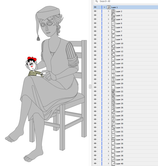
Each shape will be its own layer in Photoshop, which will operate as a clipping mask. The clipping masks act like masking tape or shielded off areas for soft brush opacity rendering, similar to the soft atomised rendering from an airbrush, just done digitally.
I follow very rudimentary painting techniques of simple shading, lighting, and bounce-back highlights. I follow a simplified Grisaille technique, focusing on strong values in greyscale before adding a wash of colour with a color gradient map set to layer style color. Sometimes my values can be a little off, but as long as the values are all consistently acting together, I can correct them with transparent washes or color curves. If the greyscale looks harmonious with all the forms clear, colour will likely work.
Proper digital painters will say this is an amateur process, with results that look mechanical and stiff, as colours in the real world all bounce together off different surfaces, resulting in colour harmonies. However, I don't mind the inharmonious nature of the colours, as I find the values give the composition enough harmony. I'm working digitally, so why go to all the effort to make it not look digital? It's interesting to me to have the red chair look blindingly red, the green skirt look blindingly green.
Colours can look boring without some form of harmony though, so I will add in blue-greens with the darker areas, more turquoise greens towards the highlights.
Skin tones are far more complex, however, as it's something that's more informed by realism. This is why kigurumi dolls with their plastic flesh look so artificial to the eye, because we're familiar with how light passes through flesh and skin and all the subtleties of colour that it picks up. This piece is the first time I've explored flesh tones, as typically I avoid all this by rendering skin as grey porcelain.
I needed to really up the contrast, with shaded areas becoming purples and highlights verging on washed out. Areas with more blood, like feet and cheeks, appear more orange and red. Areas closer to bone and cartilage, like the bridge of the nose, can look almost blue and green. Exploring these colour values and tints in the aim of natural tones was fun to do, and ironic given how blank the face is.

Although in the moment I feel very much like I'm rendering a realistic reality, when I step back, I'm reminded how stylised and unrealistic the painting actually is. It looks kind of insane, like everything is so uniform and overtly saturated. It doesn't feel present in a real space, despite the shadow and form implies one. But I'm not consciously thinking of these things, of style, as I'm working. To me, it's a process of world-building and problem-solving.
129 notes
·
View notes
Text
:-) Vector Art Help Pls :-)
Ok so,,,,
I’ve been desperately trying to get myself to do more vector art for the last idk how many years, and finally sat down and tried again yesterday.
AND HOOOO BOYYYYY did I forget how frustrated it makes me .^.

(It’s me being punched by illustrator and affinity)
Everything I make just looks so gd awful and I just feel like I’m probably doing everything in the most inefficient way possible (especially just Line art) :’-)
So, basically:
I would really appreciate some advice / tips on how best to use vector based illustration apps if anyone has any???
Genuinely anything, even the most basic “this is literally common sense but for some reason you might not have thought about this (because you sound dumb)” would be so helpful right now - I am getting so frustrated (´°̥̥̥̥̥̥̥̥ω°̥̥̥̥̥̥̥̥`)
Any advice at all would be so hugely helpful and I will love you forever
(Honestly, thank you if you’ve even read this far - I’m going to stop rambling now)
Ta!
・:*+.\(( °ω° ))/.:+
#or good tutorials that you recommend maybe???#I find it hard to find ones that aren’t either incredibly simple or ridiculously complex#I use procreate regularly and am fairly computer literate#but sometimes the amount of new stuff / terminology just feels overwhelming#thank you so so so much#:’)#art advice#art help#vector art#vector#vector illustration#vector advice#vector tutorial#art tutorial#art help pls#2D vector art#adobe#adobe illustrator#adobe illustrator help#Adobe advice#Adobe tutorial#Adobe illustrator tutorial#illustrator#affinity designer#affinity designer help#affinity tutorial#affinity iPad#affinity designer tutorial#art advice needed#art help needed
7 notes
·
View notes
Text
Easy 3D Gradient Logo Design in Adobe Illustrator
25 notes
·
View notes
Text
Jindiao process
#adobe photoshop#dreamworks fanart#kung fu panda#dreamworks animation#painting#illustration#illustrator#kfp jindiao#jindiao#kfp fanart#kungfupanda#Tutorial
20 notes
·
View notes
Text
PRO Tip For Fixing Color Bleeds in Photoshop 2024
SCRIPT and STEPS:
Masking out single color reflective subjects from backgrounds leaves behind a color bleed and using the brush or clone tools just don’t cut it Here is the fix Head over to select menu and hit subject Go to layers and create a layer mask Right click on the mask and click apply Create a new layer Hold alt and clip it to the subject layer Change the blending mode to color Pick the brush and sample the blue color Now paint away the color bleed And that’s it
#photoshop tutorial#photoshop#illustrator#adobe photoshop#adobe design#adobe illustrator#seotimerank
8 notes
·
View notes
Text
Look at the first design, and you immediately think: "Oh, it's simple, I know how to design it too."
And do you know what? 95% of people who think it's simple couldn't do it, or at least they did it wrong.
I just uploaded a tutorial video on Illustrator tips will blow your mind and change the way you design. I hope it proves helpful to you. If you like it, please give me a thumbs up. Thank you!
Video:👉 These Illustrator Tips will Blow Your Mind (Part 1)
#logo#logo design#logotype#logo inspiration#graphic design#logo designer#design#illustrator tips#illustrator tutorial#illustrator tips and tricks#adobe illustrator#design tips#illustrator for beginner#advanced illustrator tutorial#dainogo#tutorial#logo tutorial
29 notes
·
View notes
Text
instagram
This piece might be winning the award of least amount of layered textures used of all of my works. Reminds me : “The artwork is done not when there’s nothing left to add but when there’s nothing left to take away”
#timelapse#timelapse art#art timelapse#art tutorial#how to art#blender#blender community#adobe photoshop#adobe#women illustrators#women in art#female illustrators#artists on tumblr#women artists#behind the scenes#bts art#instagram
5 notes
·
View notes
Text
Letter J Magic: Turn Basic Shapes into Branding Gold
Ready to transform basic shapes into branding gold with Letter J Magic? Dive into our logo design tutorial for beginners and discover how to create a standout letter J logo in Adobe Illustrator.
From sketch to vector, explore the creative logo design process, typography tips, and unique ideas for small businesses.
Whether you're designing a gaming logo or branding your company, these advanced techniques will elevate your graphic design skills. Let's make your Letter J logo unforgettable!
6 notes
·
View notes
Text
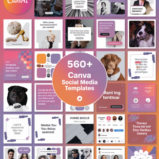
Massive Collection: 560+ Canva Social Media Templates
Elevate your social media presence with our extensive library of over 560 customizable Canva templates. Perfect for businesses, influencers, and content creators looking to save time while maintaining a professional and cohesive brand image across multiple platforms. Our diverse collection caters to a wide range of industries and styles.
Get Your Canva Now
#canva template#canva design#canva art#canva tips#canva tutorial#adobe illustrator#social media#template design
2 notes
·
View notes
Video
youtube
Join Two Points or Paths in Adobe Illustrator | Illustrator Tutorial
#youtube#illustrator tutorial#Join Two Points or Paths in Adobe Illustrator#graphic design#graphic design tutorial#adobe illustrator tutorials
2 notes
·
View notes
Text
Follow these steps and enjoy crisp, clear image outlines! 👍💕
#adobe illustrator#tutorial#online tutoring#outline drawing#digital art#digital illustration#graphic design#editorial design#art#artists on tumblr
2 notes
·
View notes
Text

lana del rey summer minecraft recipe❤️ yay!
#lana del ray aesthetic#lana unreleased#lana del rey#lana del ray aka lizzy grant#lana is god#lana del slay#lana stan#lana del ray moodboard#original art#coquette#digital art#adobe illustrator#cartoon#drawing#pink aesthetic#aesthetic#cute#gamergirl#minecraft#minecraft recipe#minecraft memes#minecraft tutorial#art of tumblr#art of the day#scrapbook#sketchbook#coquette aesthetic#ldr aesthetic#kawaii art#digital artist
2 notes
·
View notes
Text
youtube
#cover designer#how to create b&w letters#how to create block letters#how to create a font logo#how to create letter logo#s optical illusion tutorial adobe illustrator#adobe illustrator optical illusion tutorial#optical illusion adobe illustrator#how to create an optical illusion in adobe illustrator#op art tutorial illustrator#how to create optical illusions in illustrator#optical illusion in illustrator#how to make optical illusions in illustrator#s#blend tool tutorial#adobe illustrator#blend tool in illustrator#how to use blend tool in illustrator#3d type in adobe illustrator#Youtube
2 notes
·
View notes
Text
Adobe Illustrator tutorial on creating a monogram logo design using the geometry grid system! Learn how to combine precision and creativity to craft a clean and balanced monogram logo with geometric shapes.
16 notes
·
View notes