#canva tips
Text
Tutorial: How to design a mini zine in Canva
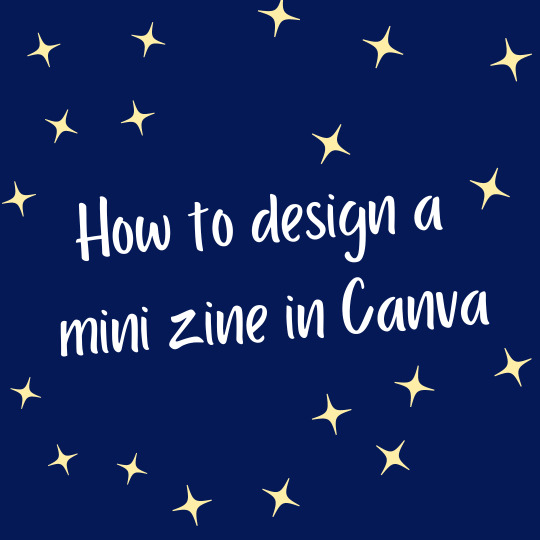
I made a tutorial about designing mini zines in Canva. It goes through how to set up guides and understanding page order.
You can watch it on YouTube, and it's also available as a downloadable PDF on Ko-fi (free or pay what you want).
68 notes
·
View notes
Video
youtube
Animated Text Tricks in Canva: Canva Tip to create text animation
#youtube#Canva#canva design#Canva tutorial#Canva tips#Canva design tutorial#Canva design tips#animation#text animation#Canva new feature#Canva update#tutorial#Canva hacks#Canva text animation#canva aniamtion#youtube video
3 notes
·
View notes
Text

aesthetic canva element sets
2 notes
·
View notes
Note
wrestling with canva like i’m crocodile dundee... this probably won’t end up being anything like a real UI because i don’t think a lot of it is Possible jsfdbgs
It looks amazing, how did you do that? 👀👀👀👀👀
hi, thank you for the compliment! i took a bit to answer this because i'm not really... equipped to be making Design tutorials haha. graphic design is my passion neither ironically nor unironically and i'm absolutely rubbish at art - however, canva has enough tools to help me feel like i'm building something visually interesting despite my. abject lack of talent XD i'll put a cut here and some like. explanation and tips underneath.
i have premium for my non-IF-related work, but the free version is what i started out on and it's honestly surprisingly good and has a generous licensing agreement. the biggest drawback for the free version for me is the inability to save files with a transparent background or resize files mid-edit, but for most people making banners or concept art you're not going to Need transparent files - that's more of a thing for actually creating assets.
the biggest ADVANTAGE of the free canva license is that you are licensed to use anything you make using the free assets in commercial products if you want/need (including games or promo for them). many similar design products only allow personal use for free licensing. (however, i'm not trying to sell canva to you; rather i'm pointing out that sticking with the free version is actually very convenient and the premium features are probably things you won't need lol)
basically canva allows you to search for graphic design elements by keyword and drag and drop them onto a design piece, mix them around, change their colours and sizes etc. and combine them together to make something. i'll talk a little bit about the UI design you're mentioning (the one i showed off here for anyone curious) not to brag about my Skillz(TM) but just to show how easy canva makes it for a total newb to make something that looks really neat!
there's about 30 different elements in that particular UI design - the "console-y" looking frame itself is half a dozen on its own: the basic frame (those cyberpunky lines at the top and bottom of the screen); a semi-transparent box i added to make it look like a holo-screen; the panel on the side, which was originally square until i cropped it down to make it look like a panel and colour-shifted to match the main box; the little connector between the side panel and the screen, which is actually two of the same asset with one upside-down and cropped; and then the various text assets, not to mention all the logos, which are also all separate (and also the little 2 unread messages symbol is another 2 separate design elements i put together lmfao).
canva will probably seem overwhelming once you first start using it because it has So Many tools, but most of these are for companies and you'll probably find you don't need to even look at the vast majority of them. for example, it'll probably ask you to choose a template to start a design, and there are like. 100s. that it'll want you to sort through. but you very probably won't ever use more than one or two. i think i've used three Ever for IF stuff - tumblr banner (for banners, obviously), social media banner, for the RO banners you can see on the ROs page, and 16:9 Blank Presentation, which is what i use for UI designs because it's just. a big blank page size. you can Literally ignore all the others unless you need something specific!
you can either use the pre-generated aspects of the template and simply replace their designs with ones you prefer, or do what i do and delete it all and put your own stuff in lmfao. the templates can help if you don't have much of an idea of what you want your design to look like but obviously for me with UI design it's a bit. Pointless because canva doesn't have a template for that XD
anyway once you have your blank canvas, you can search for "elements" in the search panel and look through them for ones you want to use. the pro version assets are labelled pretty clearly so you probably won't mistakenly pick something that requires paying to use and the search filters themselves are pretty hefty - i rarely run up against a search term that brings back nothing unless it's HIGHLY specific lol
here are just a couple of tips that help me get basically closer to what i want out of the whole thing:
when you're changing the size of an element, canva only increases or decreases its size by the exact ratio of its original dimensions - you can't Only make an image wider, for example, it will also automatically increase the height to match. that's why the "frame" asset in my Gone Dark UI design is centred in the page instead of taking up more of it - i couldn't make it wider without it getting taller and the top and bottom bars disappearing off the page. you can get around this by using elements that are mostly plain - i could have, for example, made the semitransparent screen box as wide as i wanted, because it's uniform in design and there'll be no visible difference in where i draw its boundaries as it all just looks like plain rectangle.
combining photo images and less realistic graphics can look jarring but there are handy image editing tools (found by clicking "edit image" in the top toolbar with the image selected, and then "show all" in the lefthand sidebar to show all of the filters) that you can use to make photos look Less Photolike - lowered blur and heightened clarity especially can make it easier to make photos fit better with other graphics.
some of the text effects (found by clicking "Effects" in the top toolbar with the textbox selected) can make it way easier for text to be visible against certain backgrounds - this is not much use if you're designing something for another medium like a UI, because you can't replicate them in other software, but if you're just producing an image like a banner they add a lot of neat flair.
when you have a lot of elements working together they often look a little better with at least a slightly lower transparency to hide that their borders/edges aren't uniform - 85-90% is usually opaque enough to not notice it's slightly transparent but soften the edges.
it can be hard to figure out the exact size (in pixels) of an element while you're In a design - there are rulers that can be applied through the settings menu, but the maths often fucks me up, so i find it's easier to resize the image by dragging the expand handles by like a single pixel and then putting it back to normal - while specifically holding the expand handles (until you let go of the mouse and "drop" it in the desired size) it will give you an exact reading of the height and width in pixels along the bottom toolbar that you can read easily.
this one is pretty specific but when you're making boxes to put behind text they often look better with a slight blur filter on them as well as transparency - for Gone Dark in particular the blur gives it a nice fuzz that makes it look even more like a projected screen. if you look closely you can see a slight difference between the text screen and the side panel screen background - that's because i forgot to blur the side panel lmfao.
aaaand that's probably all the advice i can offer. i'm far from an expert, but i do feel like i have fun with it XD i'm glad so many people have thought it looked cool! sorry this got so long but. it's hard to explain without actually Getting Into It haha
#what does the chaos mirror see#anon#long post.#time flows differently in the queue#canva tips#i'm sure people who use canva more than me or people who can actually do Art will be laughing at me for this lmfao#i am but a humble poker of things i am not. Good XD#honest to god the Hardest part of that UI design? the little 2 in the neon pink circle#i COULD NOT get any elements to cooperate and canva doesn't like you. changing things a lot#but hopefully that shows how much easier the rest of it was lmfao
23 notes
·
View notes
Text
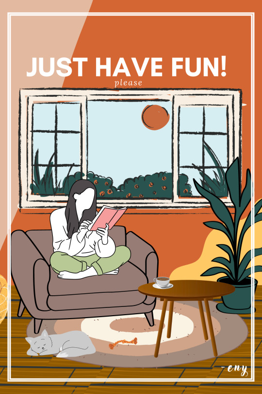
just have fun :)
-eny
#eny#graphic art#illustration#art#design#digital art#my art#poster#canva design#made with canva#canva tips#canva tutorial#artists on tumblr
3 notes
·
View notes
Text
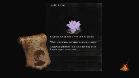
🖤Pom, The Unseen Aid 💜
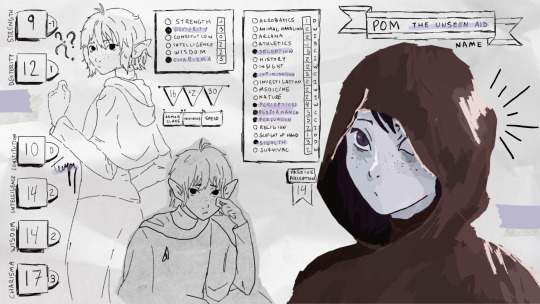
☆--~●○☆°•
Info:
Pom is an eladrin bard played by my partner in my homebrew acadamy setting!
They have a heart of gold, and often helps out others inconspicuously.
Their favorite spell is vicous mockery, which they use to roast their classmates
☆--~●○☆°•
How It's Made (sorta guide)
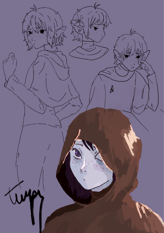
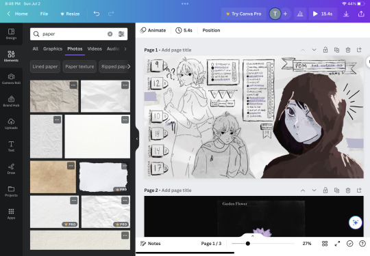
I started my drawing in procreate, sketching out Pom and figuring out their design.
I knew I wanted to make these drawings into a character sheet, so I opened up Canva and selected YouTube Banner as my canvas preset.
Then, I uploaded my pngs from procreate, and started too brainstorm how I wanted this to look. I had an idea of doing an inventory screen in the style of dark souls, but I didn't like it for the main piece.

Some scrapped ideas + unused assets
But I didn't abandon the idea completely:
Custom loading screen!
☆--~●○☆°•
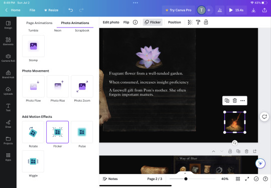
Once I was happy with the overall layout, I searched up some canva assets.

I wanted a scrapbook style, so I searched up "paper" and "scribbles gif"
Then when I gathered everything up, I added some image animation!
I love Canva for its animations!!! It's by far the easiest to use, and makes any drawing cooler instantly (to me anyway haha)
Video of gif version!
(my files were too big haha)
☆--~●○☆°•
I hope you got something useful from my post!! I haven't seen many people use Canva for their art, and I think it's a shame! It can enhance so much about your work 💫
If you've made work with Canva tag me or drop me a message with it!!! I'd love to see what other artists are coming up with~~
☆--~●○☆°•
My work here is all done with Canva's free version! It limits a lot of features and you can't use all the assets, so it can be annoying to work with. I have used the premium version before, and I would say it's worth it if you and some buddies want to chip in all together.
Unoriginal assets taken from the dark souls wiki, and from Canva (free license).
☆--~●○☆°•
2 notes
·
View notes
Text
Notice a Book By Its Cover
You know the age-old saying, “Don’t judge a book by its cover”? That statement is a great lesson to follow, as what is inside is the most important and more rewarding thing to see. However, that does not mean one cannot or should not strive to look their best or make their work stand out. Thus, creating a cover for a story is one essential step toward calling attention to a book.
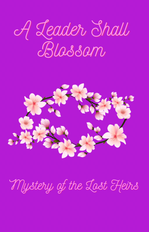
For example, take a look at the picture above. Take a minute or two to take in what you see. What do you think of when you look at it? How does it make you feel?
That cover is for a fictional story I have been working on for a while. It tells the story of a young girl who must overcome a speech barrier of hers and personal fears not only to prove she can be a leader, but to solve a mystery behind a fire that took the lives of the kingdom’s preceding heirs.
How and why did I create this cover, you may ask?
The setting of the story is a kingdom that is inspired by a combination of four Asian cultures (China, Japan, Korea, and India), so using what I can find from books and Internet research, I try to find symbolic things for various things in each culture.
In Chinese culture, for instance, the color purple is a symbol of immortality and divinity, and in many other cultures, it symbolizes power, which is fitting with this being a princess story.
The blossoms, on the other hand, not only act as a Chinese symbol of female empowerment, beauty, and/or mystique, but they also serve as a symbol of growth, blooming into one’s true self, coming out more beautiful than ever after blooming a little later than the rest of the crowd.
When creating a cover…
1. Reflect on every aspect of the story
- what is the plot of the story?
-what genre is your story?
- who is the main protagonist of the story?
- what is your motivation behind this story? Is it meant to teach a particular moral? Is it for expressing feelings towards a certain cause or real-life scenario?
- How do you want people to feel/ What do you want people to think when they read your story?
2. Look for images/colors/shapes that connect with the meanings of your story. Or, you can simply picture it in your head and jot it down on a notepad or as a drawing
-Find something symbolic (Ex. A red rose could be used as a symbol of romance, passion, and/or beauty)
- It can be something symbolic to a particular culture, or something that feels symbolic to you personally, which your story can help readers understand.
3. Figure out what design method works for you
- I used Canva to create the image above, but you can use any design platform you like.
-You can even draw your vision for a cover. Sketch, paint, even make a collage, and then make a digital copy of it, and you can use it for your book whether you print it or post it as an ebook.
All these aspects are important things to consider when designing a cover, but the most important thing is that it should say something about you and who you are as a writer. Let the cover capture your essence in a way that gets the point of your story across without revealing the whole story; that way, readers will go beyond the covers to see what twists and secrets hide within. Every writer is unique, and each has a certain purpose they wish to fulfill, even some they might not have realized yet. No matter what you choose to write, the cover is only one piece of the puzzle; the crown jewel that holds the symbol of your work’s completion.
#writerscommunity#writer things#writersofinstagram#writersociety#creative writing#creative design#book cover#cover design#writing advice#writing inspiration#writing inspo#canva tips#canva#canva app#writers#women writers#writing
2 notes
·
View notes
Text
Canva AI দিয়ে পোস্টার এবং ব্যানার ডিজাইন করুন
নজরকাড়া গ্রাফিক্স থেকে পেশাদার লেআউট পর্যন্ত, অনায়াসে অত্যাশ্চর্য ভিজ্যুয়াল তৈরি করতে ক্যানভা এআই-এর সম্পূর্ণ সম্ভাবনাকে কীভাবে কাজে লাগাতে হয় তা শিখুন। আপনি একজন শিক্ষানবিস বা পাকা ডিজাইনার হোন না কেন, এই টিউটোরিয়ালটিতে প্রত্যেকের জন্য কিছু না কিছু আছে! এখনই দেখুন এবং ক্যানভা এআই-এর সাথে মনোমুগ্ধকর ডিজাইনের রহস্য৷
youtube
1 note
·
View note
Text
1 note
·
View note
Text
Facebook Cover Photo Design in Canva
youtube
#canva#canva app#canva design#canva template#canva tips#canva tutorial#canvapro#graphic#graphic design#Youtube
0 notes
Video
youtube
Step-by-Step Canva Tutorial: Designing a Professional Business Book Cover
#youtube#canva#canva tutorial#Canva tips#canva book cover#canva design#Canva designer#Canva design tutorial#Canva love#book cover design tutorial#book cover designer#tutorial#learn design#graphic design#graphic design tutorial#step by step tutorial
3 notes
·
View notes
Text
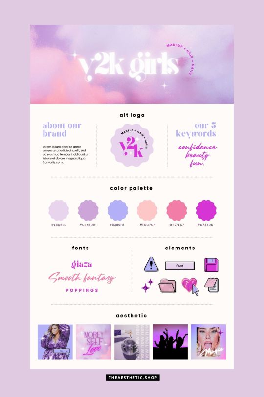
Y2K aesthetic canva editable brand board
2 notes
·
View notes
Text
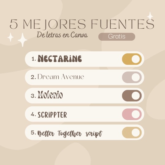
Estas son algunas de las fuentes de letras más bonitas totalmente gratis
0 notes
Text
What is Canva?
Canva is an online graphic design tool founded in 2012 by Melanie Perkins, Cliff Obrecht, and Cameron Adams. It quickly gained popularity for its user-friendly interface and the ability to create stunning visuals without the need for extensive design skills or software. Canva is accessible via web browsers and also offers mobile apps for on-the-go design.
0 notes
Last Seen Blogs
theaduskin-blog
thea duskin
jadethebrokencartridge-blog-blog
I'm Jade.
gaillardia-fields
Wife

annoyingluminaryperson
Untitled
teach463146
Matthew Goode