#all very ornate baroque style influences
Text
what if ethan winters molded in a witchblade way
#yeah send tweet that looks good#ethan winters#re8#ok so its kind of a joke. but specifically witchblade has a kind of baroque style of pattern to it#the best i can really explain it is the cyber sigil style in tattoos#or the gothic style ayami kojimas art often employs especially for castlevania#but that kind of gothic cyber style would REALLY suit the style of re8#especially when you look at the designs of castle dimitrescu and the church and mother miranda#all very ornate baroque style influences#aside from the joke i think it would be interesting if the mold curved in the sharp patterns of this style#HAHA I KNOW ITS VERY 'VAMPIRIC' but doesnt it do the trick?? i think it does#it would really add to the overall ambience of the game#imagine ethan with the witchblade hands and arms. just do it#AND IT WOULD LOOK SO COOL SINCE THE STYLE WARPS AND DISTORTS THE USERS BODY ANYWAYS#so if it was on his hands where we usually see the mold on ethan#then it would even add to the over all fucked up nature of his hands#like the culmination of all the trauma done to his hands.... it even visually looks like it.... but at least it looks cool right#re8 spoilers#resident evil village#resident evil 8#the witchbladedness even looks moldy....#ok well i dont remember if it was a virus or smth else. but close enough right. like it was in at least a fucked up state of symbiosis#WHICH IS WHAT ETHAN HASSSSSS COME ONNNNNN#koi talk
7 notes
·
View notes
Text
The Ultimate Guide to Bridal Mehandi Trends in 2024
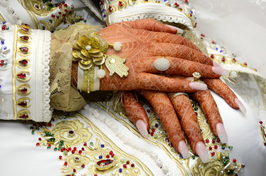
Mehandi, also referred to as henna, has a long history and is traditionally used to embellish brides. Due to its delicate patterns and ethereal representation, it remains a popular cultural symbol in wedding ceremonies, especially those of Indian and Middle Eastern origin.
With the new year’s approach in 2024, new trends have been introduced and the Mehandi of bridal wear has come out in a new look, where motifs with traditional and modern style elements have been incorporated.
The new addition in this article is that we are sharing the new trends in bridal mehandi with our readers along with useful tips regarding selection of the design and a brief insight into one of the leading Bridal mehandi artist in Chandigarh i.e. Geetanjali Mehandi Artist.
No matter whether you’re a woman about to get married soon or just someone who loves getting henna done on their body, this guide will help you by giving information about all the latest trends.
The Significance of Mehandi in Weddings
Now, I will get to know the trends, it is important to know why mehandi is of great importance in wedding event. In fact, mehandi is not just a form of body art; it’s so much more than that – it symbolizes love and joy and culture.
Mehandi is typically applied on the occasion of marriage and is usually preceded by music and dancing, which makes it a much-awaited part of the wedding sequence.
Originally, Mehandi is thought to have been used as protection from evil and seeing as a bride is getting married, having this mystical ability to bring luck is the perfect reason for her to adorn herself with this beautiful art form.
The Evolution of Bridal Mehandi
Bridal mehandi has come a long way, evolving from traditional patterns to modern, innovative designs.
This evolution reflects changes in bridal fashion, cultural influences, and individual preferences. As we look forward to 2024, it’s clear that bridal Mehandi will continue to embrace new trends while honoring its rich heritage.
2024 Bridal Mehandi Trends
· Minimalist Designs
Nowadays, simplicity is being embraced by mehandi designers and this can be evidenced by the minimalistic designs. Today’s brides are choosing delicate and refinement patterns of dresses that does not too much stress on the bride and goes well with the whole environment.
These designs are usually includerawing of flowers, insertion of cubes of natural geometric shapes and less complicated designs which give modern touch for Mehandi art. It can be helpful for brides who seek a more elegant and refined type of wedding gown with a delicate pattern.
· Personalized Elements
It has emerged that putting a personal touch to bridal mehandi design is on the rise. To be more precise, mehandi designs that brides use are personal as they try to involve elements that depict their personalities, love stories, and important milestones in their lives.
This could be initials, marriage dates or any other signs that one may find worthy to have engraved. Such type of mehandi designs also creates a message of intimacy to the art as compared to the normal mehandi designs.
· Fusion of Styles
The combination that is arising in 2024 is that of various mehandi styles together. Pakistani brides are now moving away from traditional baroque designs and simply adding Indian, Arabic and Moroccan styles together in a unique and memorable way.
With this, this art of mehandi design becomes more complex with different kind of patterns and motifs giving it a beautiful and detailed appearance.
· Intricate Finger Designs
Another trend that has not yet gone unnoticed is that intricate designs of the fingers are the other real favorite. These are can either be very fine, almost becoming lacy to broader and more striking designs that makes the attention turn to the hands.
The finger designs are especially popular for the brides, who wish to have an ornate mehandi design on palms but with comparatively less detailing.
· Themed Mehandi
Hence, mehandi designs based on different themes are the new rage amongst every girl who is getting married. The subject for themes can be inspired from different things including; nature, movies, mythology, books, etc.
This trend is quite unique to mehandi designs, which makes the creations very personal and unique, elaborate, and inventive.
The Role of Bridal Mehandi Artist
A mehandi artist especially the bridal mehandi artist always ensures that the mehandi is not only done nicely, but also a wonderful event. They possess artistry, expertise, and considerable insight about tradition in the culture they are depicting.
Here are some aspects of their role:
Design Consultation: Every mehandi artist is trained to discuss the bride’s requirements, occasion, and expectations for the designs. This makes sure that her taste in design is met and the dress she chose to wear to blend with the entire bridal gown.
Application Technique: By applying the procedures in the right manner, skilled artists are capable of producing well-defined designs that also do not have flaws. Mehandi artists understand how to manipulate the flow of the cone and the amount of pressure needed to create the right thickness of the design.
Aftercare Advice: A good mehandi artist wills therefore advice the bride on necessary care that has to be taken in order to get the best stain. This will contain information on when and how the mehandi can be protected in order to increase the duration that it last.
Cultural Sensitivity: Mehandi artists may work with different cultural clients since most of the women plan to get married. They understand the cultures and the various symbols and practices that accompany the motifs to ensure that the designs are not only proper but have something to do with the culture.
Choosing the Right Bridal Mehandi Artist in Chandigarh
When it comes to bridal mehandi, it is very important that the right artist is chosen for the perfect design. Hiring an experienced mehandi artist proves valuable in helping bring the fantasy to life and guarantee that your henna compliment the bridal attire and endure the various events.
While choosing Bridal Mehandi Artist In Chandigarh, the portfolio, experience, and customer feedback must be taken into account.
Trends in Bridal Mehandi Application
1. Pre-Wedding Mehandi Parties
Haldi Mehandi night has also become fashionable among the brides to be, where the bride and her friends and family sit for applying mehandi together. This entails dancing, songs, and celebrations, thus making it charming and exciting part of the wedding traditons.
It also offers guests the chance to get their mehandi done by an expert in the field The following practices are also common among the participants.
2. Mehandi for the Groom
Mehandi has been regarded as a art done by the brides, but grooms are also opting more to get mehandi designs done on them. There are simple and manly likes of grooms and those grooms simple attire usually have geometric designs or symbols that they find significant.
This trend proves change and progress in wedding traditions and the open-mindedness in mehandi.
3. Digital Mehandi Design Trials
It has been seen that with the advancement of technology brides can do the trial of mehandi designs on their hands through digital means. These help them to see various designs on their hands and feet before placing an order for the final one.
Digital trials are effective, and with the help of technology, allow choosing an exquisite mehandi design leaving no doubts.
Spotlight on Geetanjali Mehandi Artist
Geetanjali Mehandi Artist is one of the best bridal mehandi artist in Chandigarh and nearby areas.
Having practiced for many years and having a love for details, Geetanjali has built a reputation for providing beautiful hand crafted mehandi.
Our portfolio includes a number of styles, from classic to modern, which means that we will fit almost any bride desire. Through the aesthetic sense and sheer hard work Geetanjali tries to make sure that each bride’s mehandi looks as beautiful as it should.
FAQs on Mehandi Artists
Q : When it comes to bridal mehandi, what is the duration of time taken to apply the design?
Thus, the time taken to apply will depend on the bridal mehandi design style, meaning that larger styles and designs will take longer time than smaller ones. With our mehandi work having been described as intricate specifically for the bride’s hands and feet, from wrists to elbows and knees respectively a complete bridals mehandi takes between 4-8 hours.
It is also important to devote enough time and think through the time frame of the session to guarantee a positive outcome.
Q : Can anyone help me to get the mehandi stains darker?
To achieve a darker mehandi stain, follow these tips:
Leave the paste on longer: Please do not wash the mehandi from your skin immediately after henna application, it must be left on the skin for 6-8 hours at least.
Apply heat: One should also apply a heat lamp along with steam to make the henna get deposited further into the skin layers.
Lemon-sugar solution: After the Henna has dried, reapply a solution made from equal parts lemon juice and sugar to the mehandi to deepen the color and help protect the skin from drying out.
Avoid water: Do not wash the mehandi off with water, rub off the mehandi paste when it dries up and apply oil over the juice/wax stain.
Natural oils: Massage the face with coconut or mustard oil after washing off the paste to strengthen the dark tones.
Conclusion
It has been always a pleasure to have mehandi for the bride and bridesmaid’s ceremony and has never outgrown its tradition. In trying to predict the tendencies of automotive design for the year 2024, one would have to talk about minimalism, individualization, expressive styles’ integration, and experimenting.
Whether you are going for a more classic look or one that is more modern, you have to find an excellent and talented Bridal Mehandi Artist In Chandigarh who will be able to realize your ideas.
Geetanjali Mehandi Artist itself captures the essence and standards of the first-class mendi artist who can turn artistic corners and provide the client the accurate, artistic as well culturally sensitive design.
If you decide on Geetanjali, we can guarantee your bridal Mehandi will be memorable and symbolic for the special day.
0 notes
Text
Ten Reasons to Visit Manila from London
London and Manila, both are like the opposite ends of a spectrum when it comes to certain things. In aspects like history, culture, lifestyle, and infrastructure, these two destinations could not be more different. On one hand, London is known for its unparalleled cultural diversity, serving as a melting pot of many different ethnicities that contribute to the vibrant tapestry of traditions, cuisines, and languages of the city6 of London. The cosmopolitan atmosphere of this city is highly evident in many oof its very diverse neighbourhoods. On the other hand, Manila reflects a fusion of culture that was shaped by its colonial history. The country of Philippines has been influenced by a plethora of different cultures from Spanish t Asian to American traditions that each merge into a unique blend that is undeniably Filipino. Get your tickets for flights to Manila from London read and read along as enlisted below are the reasons to visit Manila all the way from London:
The enchanting beauty of San Agustin Church- Located within the walls of Intramuros, the San Agustin Church stands as a testament to faith and the rich history of the Philippines. This church is known all over the world as a UNESCO World Heritage Site. This architectural havn is not merely a religious sanctuary but also a living tale of the colonial past of the country, its resilience and its cultural heritage as well. The church is dedicated to Saint Augustine and is the oldest stone church iin the entirety of the Philippines. The construction of this religious marvel began a long time back, in the year 1586, during the Spanish colonial era which makes this place an integral part of the history of the Philippines. Ever since its construction, the church has weathered centuries over centuries of challenges ranging from natural disasters to wars to political changes and more. The church to this day stands resilient and has witnessed almost every single part of evolution in the nation of Philippines. You can say that the architecture of this church is a prime example of the Spanish colonial inspired by the Baroque style, offering ornate detailing and intricate carvings. The San Agustin Church is a harmonious blend between the European influences and modern distinct twists.
Pay your respects at the American cemetery and Memorial- The American Cemetery and Memorial is a burial ground that stands as a living testament to the ideals of sacrifice, remembrance, and freedom. This location is like a symbol of the long-lasting friendship between the Philippines and the United States. It is a place where each and every visitor can pay their respects to the fighters that gave their lives for the cause of liberty. It is a solemn depiction standing as a testimony to the sacrifices made by Filipino soldiers as well as American Soldiers during the Second World War. Sprawling across 152 acres, this hallowed ground is in the capital city of Philippines which serves as a final resting place for all the thousands of brave men and women that martyred their lives away in the pacific theatre. The American Cemetery and Memorial was established back in the year 1948 and to this day is regarded as a place with a unique and historical significance to the nation. The entrance to the memorial is marked by a grand chapel white in colour which is adorned with intricate stained glass murals that depict scenes of war and peace. Once the visitors of this memorial pass by the entrance they catch a glimpse of the meticulously manicured lawns and rows over rows of white marbled headstone where each headstone is marked by name of the person buried, their rank and their unit where you can pay your respects to the fallen heroes of the tragedy,
The bewitching of the Pagsanjan River- Nestled amidst the lush landscapes of the Philippines, you will find the Pagsanjan River meandering its way across the scenic tapestry of tropical beauty. This destination offers not only a waterway to gaze upon but will also provide an enchanting journey that captivates the heart and soul or each and every visitor that decides to visit this beautiful location. The Pagsanjan River is located about eighty kilometres away from Manila in the province of Laguna. A day trip to this location is more than enough to observe this natural beauty which is renowned for its stunning natural scenery. Every visitor can practically feel the excitement in the air as they immerse themselves in the exhilarating experience that is provided by the world famous Pagsanjan Falls. In the town of Pagsanjan you will also get the opportunity to board one of the traditional wooden canoes that are known as Bancas and experience the rush of water drifting from the sides as you ride the waves in a carefully manoeuvred boats by the local boatmen who are skillful enough to navigate the waters after years and years of practice and honed expertise inherited through generations. The highlight of your Pagsanjan expedition is sure to be the mesmerising beauty of the Pagsanjan Falls.
Unwind with a Hilot Massage- The term Hilot itself is derived from a Filipino word “hiLot” which means to heal using the power of your hands. It depicts the hands-on approach of the Hilot traditional Massage technique. This massage technique that has been practised since a long time back, centuries past to be more precise. Passed down through the generations, this massage technique is deeply ingrained in the culture as a form of totally natural way of healing and getting rid of the pain and tension you are holding within your body. During modern times and with many modern methods of healing, the Hilot Massage is an art of traditional healing that connects people to the cultural roots of the Philippines. Rooted in this modern yet still traditionally respectful country, this indigenous medicine or technique. Is. Much more than just a physical therapy, it is more of a holistic approach too wellness that uses many different elements of energy balancing and the magic of spirituality. This massage method is typically started with a thorough assessment by a Hilot Practitioner or as they say it in the Philippines, “Manghihilot.”Tgis traditional healer is believed to possess a spiritual ability that allows them to sense energy imbalances and identify any areas where you might feel pain or which body parts or areas where you carry your tension. Then according to that, the practitioner may use a combination of healing techniques that could include anything from massage or touch related cure, intuition or even the use of traditional herbs to diagnose and treat the condition of the client. Think of your flights to Manila from London as a transport to this magical and spiritual realm of relaxation where you lose tension and unwind.
Get mesmerised by the beauty of the Taal Lake- The Taal Lake of Manila is located within the captivating landscapes of Philippines. This mesmerising natural wonder is known for beckoning visitors from all around the globe as well as locals to experience its stunning beauty. It is a freshwater gem that is cradled within the caldera of Taal Volcano which is the most iconic and active volcano of the Philippines. This gorgeous lake is located just a scenic drive towards the south of Manila to the province of Batangas and its defining feature is the unique geological setting it is surrounded with. The lake rests inside the vast caldera which is a large volcanic crater that was formed by the previous eruption of this magnificent Taal Volcano. Located within the same crater you will also find another volcanic island called “Volcano Island” that emerges crowned by the original and main Crater Lake which basically creates a view which is mystical enough to feel surreal. Taal lake is a wide and expansive spread that covers approximately 234 square kilometres which makes it the third largest lake in the entire nation of Philippines. One of the most infamous ways to experience the beauty of Taal lake is to embark on a boat ride. The lake’s clear waters and the lush greenery surrounding the areas brings a feeling of entering a fairytale with the Taal Volcano as the backdrop to the surreal haven.
Awaken your inner intellect at the Ayala Museum- The Ayala Museum is located in the heart of Manila. It was established in the year 1967 by the Foundation of Ayala and to this day, it stands as a cultural beacon that showcases the rich tapestry of the history of Philippines, its art scenes and its heritage. The foundation of Ayala is an institution that has become a hub for cultural appreciation and education that draws visitors from all around the world into the diverse narratives that have shaped the archipelago. The Ayala Museumpretty much stands as a testament to the commitment of the Ayala Foundation to preserve and promote Philippine culture. The architecture of this museum is a blend of cultural aesthetics and modern design that provides an inviting space for exploration. Located within the warm embrace of the Ayala Center in a bustling commercial district which ensures accessibility for both tourists and locals alike making them eager to dive into the history and artistic expressions of the location. One of the main features of this museum is the diorama exhibits it showcases which holds meticulously crafted miniature scenes that vividly depict the pivotal movements of history of Philippines. The exhibits offer a dynamic and visually engaging journey through time. From the pre-colonial times to the struggle for independence and much more, the dioramas that are showcased provide a comprehensive overview of the historical narrative of this nation. A unique aspect of this beautiful museum is the emphasis it places on interactive and innovative experiences. Another key feature of this museum is the 360-degree exhibit which offers a multi-sensory journey through the history and culture of Philippines while utilising a cutting-edge technology that engages each visitor into an immersive narrative. The Ayala Museum is not just a repository of the past but a vibrant platform dedicated to modern time creativity.
Learn the truth behind the Coconut Palace- The Coconut Palace is situated in the heart of Manila, Philippines. It truly stands as a unique architectural gem that reflects both the cultural richness and the natural resources in the country which was commissioned in the year 1978, as the official residence of then-First Lady Imelda Marcos. This magnificent establishment shows the versatile and sustainable nature of coconut which is one of the most iconic crops of the Philippines. The palace is named so because of its extensive use of coconut shells, coconut lumber, and other coconut-derived materials in its construction. The exterior of this enchanting hotel is decorated with elaborately designed coconut palm leaf inspired patterns, coconut shell chandeliers, and panelling made up entirely of coconut lumber. A lesser-known fact about this hotel is that the decision to build with coconut components was not an aesthetic choice but an intended effort to showcase the versatility and economic potential of this all natural resource that is native to the nation. One of the spotlights of the Coconut Palace is their use of coconut lumber, known for its durability and sustainability. The unique design of this palace has made it a significant landmark which beckons both local and international people alike. The distinct architectural style of this hotel effortlessly mixes the traditional Filipino design along with contemporary, modern times elements that creates a visual that is not only stunning but also a culturally vibrant masterpiece. Beyond the architectural prominence of this humble yet stylish hotel, the establishment is also known all around the nation of Philippines for its lavish interior and luxurious rooms. Designed by the famous architect Francisco Mañosa, the Coconut Palace is like a beacon to the creativity of the design of the Philippines. The interiors showcase coconut husk-studded walls, shell inlaid furniture made up of coconut, and lumber flooring which is also made up of coconut which creates a harmonious design that pays honour to the country's natural bounty. The elaborate detailing in each room reflects the craftsmanship and the artistry of Filipino artisans. The entire structure, even including its beams, its walls, and almost all its furniture is constructed entirely using this locally sourced material. The palace serves as an exhibit for the versatility of coconut wood by challenging traditional notions about its use while also advancing it to a symbol of environmental recognition and imagination.
Dine in the themed surrounding of the Hobbit House- The Hobbit House of Manila is a unique and bewitching place that takes visitors into the whimsical world of J. R. R. Tolkien’s Middle earth. Located in the heart of Ermita, which is one of the many vibrant districts of Manila, this extraordinary pub stands tall like a testament to the creative fusion of the hospitality of Filipino people and the fantasy-like allure of the Hobbiton. The Hobbit House was founded in the year 1973 by Jim Turner and David milan. It was initially established as a response to the surge of tourist that followed the filming of the movie trilogy called “The Lord of the Rings” Inspired by tolkien's work, the Hobbit House is is quaint and cosy place where the founders envisioned bringing a piece of Middle Earth into the sprawling landscapes of Manila in the nation of Philippines. The exterior of the hobbit house feels like the essence of Tolkein’s Shire is perfectly captured. The facade is decorated by low ceilings, circular doors as well as rustic wooden architecture that mimics the iconic hobbit holes of the trilogy. What sets this place apart from regular restaurants is its commitment to providing employment opportunities for those individuals who are differently abled. You will find the majority of staff members are called ”Hobbits” in this restaurant, that is, the little people who contribute their unique talents to create an atmosphere that is both warm and welcoming for each and every visitor. This creates an inclusive employment model that not only offers job opportunities but also allows the staff members to challenge societal norms while promoting diversity at the same time.
Appreciate the oddity of the Hotel H2O- Hotel H2O is located in the heart of Manila that stands as a unique and innovative hotel that offers each and every guest with a one of a kind aquatic experience. This hotel is located within the boundaries of the infamous Rizal Park. This hotel seamlessly combines the aquatic themed accommodations that offers a refreshing and immersive stay for each and every visitor no matter if they are local or a tourist. The prominence of the Hotel H2O lies in its rooms and facilities that are inspired by the ocean. The hotel has rooms that are fully aqua themed featuring giant aquarium walls that allow the guests to stop and marvel at the diverse array of marine life in front of them, right from the comforts of their accommodations. The soothing underwater ambience creates an unparalleled experience that adds an element of tranquillity and relaxation to the stay that makes it a memorable experience for both leisure and business travellers. One of the standout features of the Hotel H2O is its oceanarium is a sprawling marine park standing right adjacent to the hotel itself. The oceanarium is a massive cylindrical tank that houses a vibrant underwater ecosystem that showcases a wide variety of marine species that are indigenous to the Philippines and Southeast Asia. The accommodations of this hotel also extends way beyond its aqua themed rooms, the H2O hotel also offers many well appointed suites and rooms catering to different preferences and needs. Whether the guests choose one of the aqua themed rooms or they choose one of the suites, the service is pretty much perfect for each and every guest that visits this magnificent hotel.
Pamper yourself with a luxe stay at the Manila Hotel- The Manila Hotel emits an air of old world charm and glamour along with sophistication. It is an iconic and historic landmark that is nestled in the warm embrace of the vibrant bayfront of Manilla. It stands as a testament to the cultural heritage and the enduring elegance of the city. This hotel was established way back in the year 1912 and since then this grand institution has witnessed a century of hosting dignitaries, celebrities, history and generations upon generations of guests that have experienced its timeless allure. The architecture of the Manila Hotel reflects a mixture of international influences while it features neoclassical and art deco elements that dates back to an era of grandiose. The exterior of the hotel holds an imposing facade and fascinating pillars that commands attention from visitors and sets the tone for the luxury awaiting you inside. The lobby is adorned with crystal chandeliers, classic style furnishings and intricate moulding into an area that encapsulates the rich history of the hotel. The rooms of the Manila Hotel also do not disappoint in terms of opulence. All the suites and even the regular rooms are both tastefully decorated mixing the traditional Filipino design elements with the amenities of the modern times. Dining at this restaurant is like a culinary journey that celebrates all sorts of cuisines from local to international flavours.
Now that you have more than enough reasons to visit this magnificent place, get your tickets to the flights to Manila from London ready and set sail on an unforgettable journey. To Book Flights Online Please Visit:-https://www.worldtourstore.co.uk/
0 notes
Photo

Zachary James is back on the scene with a new studio work: "Intergalactic"
December 2022 - Zachary James is an artist and songwriter who has developed a very special blend of sounds, by blending in genres as diverse as operatic pop, indie, jazz and fusion, only to mention a few of the styles that one can expect from this mercurial creative. Zachary’s most recent release, "Intergalactic", is a rare breed, in the way that it combines so many different influences into a kaleidoscopic and colorful format. This musician is a true master at leaping forward when it comes to exploring new ideas, and "Intergalactic" is a really good example of that. The studio album features 16 songs. This is particularly amazing, especially if you consider the way most artists tend to release music in this day and age. Modern streaming services are pushing artists to focus on singles rather than albums. As a result, they might miss out on the ability to cater to their listeners with a full-length experience. Listening to a full album is something that’s sadly getting lost in terms of modern music.
However, it is still a fantastic way to dive deeper in the world and sound of a given artist. Thankfully, Zachary set out to offer all of this and more with this album. There is room for so many variations and style changes. To add to the kaleidoscopic variety of the album, there is also room for various collaborators, which bring an even more diverse twist to this album. "Intergalactic" features catchy pop-inspired moments as well as ornate melodies and beautiful arrangements that are baroque and colorful, but never excessive or overpowering. This is the sound of an artist who dreams big and wants his music to be as bold and emotionally powerful as what he envisions.
"Intergalactic" is ambitious, yet remarkably direct and personal, showcasing a true insight into Zachary as a songwriter and performer alike. In particular, Zachary stands out for his versatility and ability to combine a huge range of styles and ideas into one formula. The artist is well-versed in opera, musical theatre and cabaret. Still, he loves to branch out into pop and jazz in order to bring a different dimension to his music.
"Intergalactic" by Zachary comes highly recommended if you are a fan of artists such as Lil Nas X, Beyonce, Mariah, Missy Elliott, and Jon Batiste, only to mention but a few. "Intergalactic" is a distinctive album with a one-of-a-kind spirit, and it feels like a powerful statement from an artist who has a lot to say. If this is any indication, we’re certainly in for something special, as Zachary continues to open up to new creative possibilities with his timeless songwriting skills. The album is also excellent in terms of production, sound design and creative direction. The recording quality is top-notch, and the visuals that match the music are endearing and immersive. For this release especially, Zachary focused on some colorful animations, which add to the diverse vibe of his sound. The artwork and imagery that drives this era of Zachary’s music is a perfect representation of what the audience can expect sonically from this new work.
Find out more about Zachary James, and do not miss out on "Intergalactic", which is going available on the web very soon. The album will drop on December 7th, 2022. What an amazing way for the year to come to a close and welcome a new one with so much creativity and vibe!
https://www.zachjames.com/intergalactic
https://www.youtube.com/channel/UCqu_ARedsvay90EhIChM-tg
https://www.instagram.com/theofficialzacharyjames/?hl=en
https://open.spotify.com/artist/2AqJTvSM5Lxc9aE2zxgSmx?si=n1uKIGLuS6ibVTB3EFJjwQ
https://mobile.twitter.com/_zachary_james_?lang=en
1 note
·
View note
Note
What architectural styles are predominant outside of Faysmond? What technological advances are happening throughout the time covered by your stories?
Corege has a broad mixture of architectural styles that reflect various periods of its history; they tend not to rebuild a lot (haven’t really needed to) and instead add on where needed. At present, the favored architectural style is Neo-Baroque, calling back to ornate eighteenth-century architecture in a display of grandeur. This is more common in official buildings or the residences of the wealthy. Ordinary new houses draw more from the Arts and Crafts movement.
Lienne has a lot of quaint medieval architecture, especially in rural towns, and it’s become emblematic of the country in many ways, but in the big cities Neo-Baroque is coming in with a vengeance. It differs from the Coregean counterpart in that there is much less emphasis on showy ornamentation and more on functionality and a sense of power. Artistry comes through in intricate details, and there is some classical influence too.
Norriber has had a lot of influence from Liennese architecture imposed on them, but a controversial new style is emerging, inspired by traditional architecture of many centuries before--lots of exposed timbers and steep roofs and prominent eaves, etc.
New Archangel, where Rachel’s family has been living, is currently a territory of Corege, but was occupied by Rurakravia for a long time and is geographically near that country. So amid the new Coregean buildings are smaller, humbler versions of Rurakravian onion domes (like the striped sky blue ones on a cathedral that Rachel privately thinks rather beautiful).
Otionovia has the most classical influence in their architecture. They’re proud of their long history of some of the world’s most artistic buildings (peaking about four hundred years ago), and their current styles are all callbacks to classical or Renaissance characteristics.
As for technology, airplanes are a recent invention at the time the series begins. I doubt they’ll have much immediate bearing on the stories, but they’re out there. Advances in automobiles are happening all the time. Movies are coming more prominent, although they’re still silent. Radios are in the very early stages. Telephones have been around for a while but are becoming more useful for communication over longer distances.
5 notes
·
View notes
Text
Today is 11/11 which marks 101 years of Poland regaining independence and I thought it is a perfect time to publish a post that I’ve been working on for a while.
Ferelden from Polish Perspective aka Why We Can Relate to Dog Lords So Much.
This is a sort of compilation of my own thoughts I had while playing the games and various talks with my Polish friends. It is not supposed to force any ideas or teach others how to interpret the game. I just thought it could be entertaining for anyone interested in history and culture. I was trying not to elaborate too much on the subject here but it still ended up being A Very Long Post TM. To make this post a little neater to read, I divided this post into 4 sections:
1. History
2. Fashion and Food
3. Politics
4. Relationships with Other Countries
I will be very happy if you find a minute or two to read some of my points. If you have any additional questions or comments feel free to leave me a message :)
And once again - enormous thanks to @aeducanka for proofreading. I would be a poor mess without you.
DISCLAIMERS
1. Yes, I know that Ferelden is based mostly on Anglo-Saxon England and I have no problem with that. True, I may be a little disappointed that the game includes references to so many European cultures and countries (France, Byzantine Empire, Venice, Roma culture etc.) and yet practically ignores Central and Eastern Europe completely, BUT this post is not meant to be a “Where is my representation?!” rant. If I wanted a game with Slavic culture vibes, I could always play the Witcher trilogy again. We are doing alright.
2. I am in no way an academic specialist on culture or history, even these of my own country. I did some research, but most of facts and figures can be easily found on wikipedia. You can treat this as just some observations and headcanons of a 29 y/o Polish woman, who has grown up and lives in Poland.
3. The main focus of this post is Poland in different moments of history. However, when talking about fashion and political system I will mostly refer to Polish culture between the 16th and 18th century. During that time Poland and Lithuania formed a dual state known as The Polish–Lithuanian Commonwealth. So, whenever I refer to this particular period, I will use the term “Commonwealth” instead of “Poland”.
PART 1 – HISTORY
The country’s name origin
Ferelden means „fertile valley” in Alamarri tongue [WoT vol. 1], Poland most probably comes from the Slavic word „pole” meaning „field”. They both refer to land that can be cultivated.
History of unification
Ferelden lands were divided between many tribes until they were unified by Calenhad Theirin. He fought and defeated other Alamarri tribes’ leaders, proclaimed Andrastianism as the new official religion of his kingdom and started the Theirin dynasty.
A similar story can be told about Mieszko I of Poland – the leader of the Polans tribe (one of many Slavic tribes of that time) who, by means of war and diplomacy, united many Slavic tribes and created the Polish country in 965. In the same year he was baptised, abandoning native paganism in favour of Christianity. Mieszko started the Piast dynasty which ruled Poland for over 400 years. He never officially became a king, though – his son, Bolesław, was crowned king in 1025.
Also, Ferelden is a relatively young country compared to countries like Orlais or Tevinter. Even if Poland has over 1000 years of history as a country, it has to be noted that some Western European countries have a longer history (eg. the Carolingian Empire or the Visigothic Kingdom). Polish lands have also never been a part of the Roman Empire.
Fun fact – the half-legendary sword of the first king of Poland, Szczerbiec, was stolen by Prussian troops during their invasion on Poland in 1795. Calenhad’s sword, Nemetos,was lost during the Orlesian invasion on Ferelden [WoT vol. 1].
Ostagar
Now, I will tell you a story. It is about a young king (in his twenties), a little reckless, wanting to be the leader who stood against the great invading threat to his country, a little blinded by the perspective of glorious victory. Just before the battle one of his allied forces betrayed him and did not provide the promised aid. The enemy army was too strong, too large. The king’s army was defeated, the king was killed in battle and his body was taken by the enemy. The king did not have children and his younger brother had succeeded him.
No, I’m not talking about Cailan, this is the story of Władysław III of Poland.
PART 2 – FASHION AND FOOD
Fashion
All cultures in Thedas have their own style and fashion. Ferelden is supposed to be this “We like fur and warm fabrics” culture, opposite to the extravagant Orlesian style. However, I have few problems with how Fereldan fashion is shown in the game.
1. It is too early-medieval looking. I know, it is a fantasy, you can mix ancient Egypt with steampunk and nobody should care. But we see, from cultural and technological perspective, that Thedas in Dragon Age is more renaissance/baroque than your typical medieval. Heck, some elements, like the infamous Formal Attire, look like clothes from 18th or even 19th century! In comparison, outfits like Arms of Mac Tir or Robes of the Pretender (though good looking) look like something from the Vikings era.
2. We do not see many good looking Fereldan outfits in the games. I like Alistair’s royal outfit and some of Fereldan armors and clothes from DA:2 but remember this?
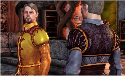
Or this?

Yeah, Dog Lords can do better :/
And that’s why I like to headcanon Fereldan fashion as something more resembling the Commonwealth fashion between the 16th and 18th century. It was an interesting mix of European and Asian influences and I think it would work perfectly with canon Ferelden because:
1. People LOVED fur elements in their clothing. Fur lining on coats, fur caps decorated with feathers, pelts of wild carnivores (lions, wolves, bears, etc.) on armour - fur was everywhere.
2. It is simple but regal. The quality of materials and patterns were more important than volume and the number of layers. A typical male noble outfit consisted of a long garment (żupan), a long, ornate sash, one of two types of cloak (delia or kontusz) and a fur cap decorated with feathers and jewels. If you compare it with the baroque fashion from France it is less extravagant and more practical. No wigs, no flounces, no man tights.
Compare these two dudes – the older one is dressed Commonwealth style, the younger – in French style.
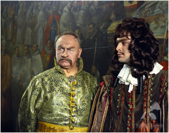
The Deluge, 1974
Of course some wealthy noblemen who spent a lot of time in France or other Western countries tended to adapt their style, but from what I know it was not that common. Women, on the other hand, tended to dress more similar to their Western counterparts (especially when they wanted to look fashionable) but their everyday dresses were not that much elaborate. They also wore kontusz (though the female version was shorter) and fur caps when outside.
Below I post some more costumes to better illustrate my point. They all come from Polish movie adaptations of H. Sienkiewicz’s novels (I looove both the books and the movies).


With Fire and Sword, 1999
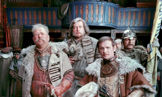

The Deluge, 1974
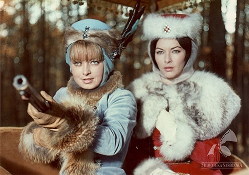
Fire in the Steppe, 1968
And I could not NOT to mention the wonderful interpretation of Fereldan armor and clothing for my OCs drawn by @ankalime - I still can’t get over how beautiful they look :3
Food
From what we know, Fereldan food is very similar to traditional English cuisine (lamb and pea anyone?), HOWEVER, I can totally see some traditional Polish dishes on Fereldan tables. Let us look at this part of Alistair’s banter with Leliana:
“Now here in Ferelden, we do things right. We take our ingredients, throw them into the largest pot we can find, and cook them for as long as possible until everything is a uniform grey color. As soon as it looks completely bland and unappetizing, that's when I know it's done.”
Dishes like bigos, flaki or goulash (mostly associated with Hungary but also present in various forms in Slavic countries) totally fit this description. Tasty and hearty but I know some foreigners see them as totally unappetizing :P
Poland is also culturally more into beer than wine (high five, British Isles!), so Fereldan ale fits this image, too.
PART 3. POLITICS
When I first played DA:O and heard about choosing the new queen/king on Landsmeet I was like “omg, they have wolna elekcja!”
The canon Ferelden is a feudal country, however, there seems to be less focus on the king's absolute power – instead, the nobles can choose the king they like, the hierarchy inside this particular social class is also less striking than one can expect.
And this brings me to the concept of Golden Liberty. (I will quote Wikipedia here, I am not that smart to explain this well in English on my own).
The Golden Liberty was a unique political system of the Commonwealth – a mixture of monarchy, oligarchy and democracy. The most distinctive elements of that systems were:
- All nobles regardless of rank or economic status, were considered to have equal legal rights (and you did not have to own a town or two to be considered a noble – a large part of the nobility owned nothing more than a farm, often little different from a peasant's dwelling, and some did not even have that much). The rights were, for example:
- Neminem captivabimus ("We shall not arrest anyone without a court verdict").
- right to vote – every nobleman, whether rich or poor, could vote. Of course if someone was rich, they could bribe others to gain more political influence, but it is the same as today.
- religious freedom – unlike many other European countries of the time, people in Commonwealth were legally free to follow any religion. The Commonwealth became a common refuge for people who were persecuted for religion in their homelands. The religious freedom was not restricted to nobility but to all social classes.
- rokosz - the right to form a legal rebellion against a king who violated nobility freedoms.
- the monarchy was elective, not hereditary, and the king was elected by the nobility. That “democracy” was not, of course, perfect, as only male noblemen had the right to vote and elect the king. However, it was still between 10-15% of the population who could vote. In comparison, “in 1831 in France only about 1% of the population had the right to vote”
The Landsmeet in DA:O is basically the free election (well, maybe minus the duel :D) and I would say the Fereldan nobility does not feel obliged to be obedient 100% of the time.
PART 4. RELATIONSHIPS WITH OTHER COUNTRIES
Orlesian occupation
We know from the game that Orlais invaded Ferelden in 8:24 Blessed and occupied it for decades. The Fereldan forces were rebelling against the occupant and finally, under the command of Maric Theirin, they won their freedom.
Again, it is a huge topic, so to summarize: Polish-Lithuanian Commonwealth suffered a similar fate in 1795 as it was conquered and divided between Habsburg Austria, the Kingdom of Prussia and the Russian Empire. For 123 years Poles have been trying to regain their country, have started several uprisings and lost many lives in their fight for independence. Finally, at the end of WW1, independent Poland reappeared on the map of the world. Then came the WW2, probably the most tragic event in Polish history – the cities were razed to the ground, a vast part of national heritage destroyed or stolen, and over 6 million people (1/5 of the pre-war population) were killed.
So yeah, a country invaded and occupied for decades by its neighbour sounds way too familiar to be ignored.
Ferelden in the eyes of Orlesians
The Fereldans are a puzzle. As a people, they are one bad day away from reverting to barbarism. (...) They are the coarse, wilful, dirty, disorganized people [DA:O Codex Entry: Culture of Ferelden].
Yeah... this, unfortunately, sounds familiar. I fear that the stereotype of a drunk, stupid, poor, thieving Poles (and other Slavic nations), which originated from WW2 propaganda, is somehow still alive in the West. I will not dive deeper in this subject because I want to believe my followers have their own brain cells and I do not need to explain how hurtful and offensive those stereotypes are.
My point is – I could identify easily with a fantasy country that is located east from the “centre of culture and civilisation” and is unfairly believed to be more barbaric.
So – for all two of you who bothered to read the whole thing - thanks for coming to my TED talk.I really appreciate the time you spent here :)
#dragon age#my writing#ferelden#headcanon#heavy slavic breathing#finally!#it took so long#but i am really happy i can post it here
534 notes
·
View notes
Text
Designers who influenced contemporary typography.
Wim Crouwel
Wim Crouwel is one of the most influential graphic designers of the 20th century. Born in Gorningen, Netherlands in 1928, and as during his six decades as a designer created experimental typefaces and grid-style visuals that are still referenced today.
Crouwel’s work had process and structure at its core. Being inspired himself by the work of Muller-Brockman and Karl Gerstner, prominent swiss-style designers, the use of the grid-system was prominent in his work. However, where Crouwel strayed from this was in his creation of typefaces. Although a lot of his work did featured Grotesk sans-serif fonts that was typical of swiss style, he also is notable for his work in creating modular letterforms (Design Museum, 2021).
Perhaps one of his most well-known works is the font set ‘New Alphabet’. This was developed after seeing the first digital typesetters at a print exhibition. The move to digital technology came with its limitations, with the level of detail on screens not being high-enough, and therefore the traditional typefaces produced looked less than perfect. The creation of the New Alphabet created a solution, using only horizontal and vertical strokes, perfectly aligning with the way screens and typesetting equipment displayed fonts (MoMA, 2021).
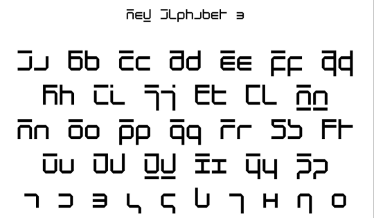
New Alphabet - MoMA
The typeface divided designer’s opinions. It was criticised for being to experimental and being ‘illegible’, and in his own words Cowell even described the type as “over-the-top and never meant to be really used’. However, in 1988, the typeface was digitized and can now be seen gracing the cover of Joy Division’s 1988 Substance Album Cover (Designculture, 2021).
Other works of Crowell include the geometrical typeface ‘Gridnik’. The name of the font was inspired by Crouwel’s affectionate nickname ‘Mr Gridnik’ which made reference to his strict use and love of grid systems. The font was based on the typewriter typeface Olivetti Politene. The font was digitised by The Foundry in 1996 and was used on Dutch postage stamp until 2002. Examining the work of Crouwel, even now you can see how his work was devoted to systems and process to create something refined, logical and bold. (Foundry Gridnik - The Foundry Types, n.d.). Crouwel showed how a classic system can be used to create new and exciting designs that push boundaries of what we expect and allow in designing.
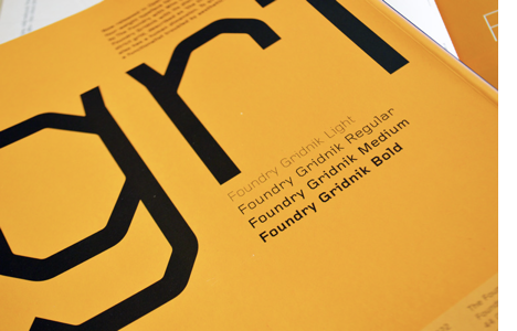
Foundry Gridnik - The Foundry Types.
Rus Khasanov
In total contrast to Wim Crouwel is the work of Rus Khasanov. Although Khasanov’s work is just as striking and memorable, the core of it relies on the fluidity and unpredictability of real-world materials. I’ve never come across such a unique type designer. The incredibly unique designer creates mesmerizing typefaces using scientific methods. Hailing from Russia, Khasanov has changed the face of typography by using unconventional methods and materials to produce amazing lettering in psychedelic colour schemes. (Rus Khasanov’s Scientific Design Experiments, 2021)

Lumen Type - Rus Khasanov
His process includes using anything from fire to soy sauce. Khasanov particularly likes making use of microscopic imagery and taking inspiration from everyday objects such as magnifying glasses and mirrors. Khasanov described his experiments as ‘creative chaos’, and he relies heavily on using analogue techniques to make playful and wonderful shapes which he then refines in illustrator and photoshop (Magdaleno, 2013).
Close to my own heart, Khasanov aims to create work that combines the worlds of science, art and design. His inspiration comes from all corners of his world. His ‘Sauce Type’ came to him when he noticed beads of soy sauce forming at the bottom of a glass.Some of Khazanov’s clients include magazines such as Bloomberg, Popular Science and Wired. Khasanov contributions to typographic design encourage designers to think outside the graphic design box, and take inspiration from as many places as possible.

Typography for Popular Science. Fall 2020. - Rus Khasanov
Marian Bantjes
Marian Bantjes is a designer, typographer, writer and illustrator who creates beautifully intricate and typefaces. From Saskatchewen, Canada, her career began as a book typesetter in 1983, before she eventually began her own design studio – Digitopolis. The design firm created materials for educational, corporate and arts companies. Eventually, Bantjes left her firm to pursue her own work, and began showcasing the design work she is most well-known for today. Her pieces are notable for being colourful and ornate, featuring in over 100 books across the world, including her own ‘I Wonder’ and ‘Pretty Pictures. Her work is also featured in the pemenant collection of the Cooper-Hewitt National Design Museum. (Creative Bloq, 2008).
In 2004, Bantjes created the typeface ‘Restraint’ which shows a perfect example of how her illustrative background influences her as a graphic artist. The unique typeface makes uses of complex patterns creating letters in the negative space, in contrast to usual ornamental typography which has details and flourishes added onto the letters themselves. (Typographica, 2008)
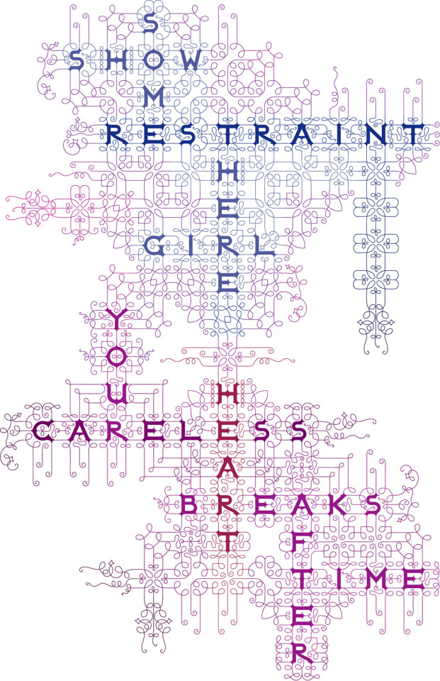
Retraint - Marian Bantjes
You can spot Bantjes’ style from a mile off, as is obvious from the example below. She has created countless images that show off her talent for using complex patterns and structures. She states that she is influenced a lot by calligraphy from the 14th-18th century, as well as islamic art and art nouveau, textiles from around the world and baroque, rococo and gothic styles. (Bantjes.com, 2021). These influences come through very clearly in Bantjes’ work. The most interesting thing about Bantjes’s work is its combination of structure with playfulness. There’s a freedom in her designs, a fluidity, but there’s obviously a lot of thought and process that goes into both their creation and use. One thing’s for sure is that Bantjes’ unique stye will continue to be celebrated for it’ creativity and boldness.

Before My Memory Goes - Marian Bantjes
References
Designculture • Wim Crouwel (n.d.) Designculture.it. Available at: http://www.designculture.it/interview/wim-crouwel.html (Accessed: 17 April 2021).
Foundry Gridnik - The Foundry Types (n.d.) The Foundry Types. Available at: https://www.thefoundrytypes.com/fonts/foundry-gridnik/ (Accessed: 17 April 2021).
Holms, C. (2008) Restraint, Typographica. Available at: https://typographica.org/typeface-reviews/restraint/ (Accessed: 17 April 2021).
Magdaleno, J. (2013) Rus Khasanov Creates Typefaces Using Laptop Screens, Tasers, And Soy Sauce, Vice.com. Available at: https://www.vice.com/en/article/xy489q/rus-khasanov-experimental-typefaces (Accessed: 17 April 2021).
Marian Bantjes | Creative Bloq (2008) Creativebloq.com. Available at: https://www.creativebloq.com/computer-arts/marian-bantjes-6089304 (Accessed: 17 April 2021).
Marian Bantjes (2021) Available at: https://bantjes.com/ (Accessed: 17 April 2021)
Rus Khasanov (n.d.) Ruskhasanov.com. Available at: https://ruskhasanov.com/ (Accessed: 17 April 2021).
Rus Khasanov’s Scientific Design Experiments (2021) Fold Magazine. Available at: https://www.foldmagazine.com/rus-khazanovs-scientific-design-experiments (Accessed: 19 April 2021).
Wim Crouwel (2021) Design Museum. Available at: https://designmuseum.org/designers/wim-crouwel (Accessed: 17 April 2021).
Wim Crouwel. New Alphabet. 1967 | MoMA (2021) The Museum of Modern Art. Available at: https://www.moma.org/collection/works/139322 (Accessed: 17 April 2021).
4 notes
·
View notes
Text
RWRB Study Guide, Chapter 8
Hi y’all! I’m going through Casey McQuiston’s Red, White & Royal Blue and defining/explaining references! Feel free to follow along, or block the tag #rwrbStudyGuide if you’re not interested!
James I (203): James I/VI (First of England, Sixth of Scotland) is known for both translating the Bible and being just... so, so incredibly gay. The book mentions that he promoted a dumb jock to gentleman of the bedchamber, but it leaves out that 13-year-old James would just make out with dudes in public, and that the dumb jock (George Villers) was James’s third serious adult relationship. His friends introduced him to George because his last boyfriend was bad for the kingdom.
George Eliot (205): Mary Anne Evans wrote under the pen name George Eliot to escape the stereotype that women could only write romances. She wrote seven novels, of which Middlemarch is the most famous, known for their realism and psychological insight.
Daniel Defoe (205): A pioneer of the English novel, Defoe wrote Robinson Crusoe as well as a series of divisive political pamphlets and tracts.
Jonathan Swift (205): Irish political writer most famous for A Modest Proposal, a satirical piece that suggests cannibalism of infants as a more humane response to the British treatment of Ireland than letting them grow to starve in adulthood.
Dickens... “woman who languishes away in a crumbling mansion wearing her wedding gown” (205): Charles Dickens wrote stories concerned with the lower classes. This quote in particular refers to Miss Havisham from Great Expectations, who was left at the altar and refused to take off her wedding dress or even put away the food set out for the wedding.
Sense and Sensibility (205): This is probably Austen’s second most popular novel (after Pride and Prejudice); it follows the four Dashwood women in their move to a new home following the death of Mr. Dashwood. Like most of Austen’s novels, the opinionated narrator follows the women through a series of romantic mishaps, culminating in a happy ending.
Green American Money (206): Fun fact, British money is blue and orange and purple and all sorts of fun colors! It also all looks different, because (at least in Scotland) four banks are allowed to print pound notes, so there are four different designs all in circulation.
Sean Hannity (206): A conservative American political commentator.
Harvard rowing (206): Rowing is like... the bougiest of sports.
Pleiad (206): In Greek mythology, the pleiades were the daughters of the titan Atlas who became stars following his entrapment under the earth. They are remembered for their beauty and loyalty. Myths of the missing pleiad explain why only six of the seven stars are visible to the naked eye. According to some sources, the missing pleiad is Merope, who was shamed out of the sky for her relationship with a mortal.
Minute Maid Park (206): The baseball stadium associated with the Houston Astros baseball team; it seats just over 41,000.
Politico (207): An American political opinion news source.
Drop-kick Murphys (208): An American Celtic punk band. (listen here and here)
The Klan (209): The Ku Klux Klan, an incredibly racist organization that has been responsible for the lynching of thousands of people of color.
Kim Nam-June (210): Kim Nam-Joon, known as RM or Rap Monster, is the leader and rapper of the K-pop group BTS.
Milwaukee (211): The largest city in and main cultural center of Wisconsin, which is a “swing state”, meaning that it could go either way politically in a national election.
Seth Meyers (211): An American talk show host and comedian whose creatively titled show, Late Night with Seth Meyers, is liberal-leaning. He hosts celebrities and often chats about politics or the news.
Clear Crystal Quartz (211): Apparently the most “iconic” crystal, it is believed to be able to help with clarity and the achievement of goals.
Wimbledon (213): The oldest tennis tournament in the world, considered by many to be the most prestigious.
Royal Box (213): The royal box at Wimbledon is a section of the best seats, reserved for royalty and specially invited celebrity/politically powerful guests.
David Beckham (213): A former professional soccer player and current fashion icon known for being hot and wearing nice suits.
McQueen (214): Alexander McQueen was an openly gay British fashion designer who rose from a lower class background to become one of the most famous designers in the world. Though he died in 2010, his brand continues to be known for unconventional fashion shows and theatrical imagery.
Dashikis (215): A colorful, ornate piece of clothing somewhere between a shirt and a tunic originally from West Africa.
Orangery (218): A very large greenhouse or conservatory designed for growing orange trees.
Woman at her Toilet (218): This painting shows a woman in her bedroom putting on her socks with a little dog next to her; you can see it here.
Baroque bed* (218): Baroque art was designed to show off a monarch’s power; it is incredibly extravagant (Versailles is pretty much the iconic Baroque thing; you can see more about it here).
The Killers (219): An American rock band formed in the early 2000s and known for having donated over $1 million to charity (they did “Mr. Brightside”). (listen here and here). According to McQuinston’s twitter, the song Henry plays is “When You Were Young”, which you can listen to here.
Dred Scott (219): In the 1857 Dred Scott v. Sandford case, the US supreme court ruled that the constitution did not extend to or protect Black folks.
Nina Simone (219): An American singer/songwriter/political activist whose music spanned a variety of genres and whose activism focused largely on the civil rights movement and was largely influenced by her “friend” Lorraine Hansberry, a Black lesbian playwright. (You know Hozier’s “Nina Cried Power”? She’s Nina) (listen here and here)
Otis Redding (219): Considered one of the greatest singers in American pop music and was one of the foundational soul artists in the US. (listen here and here)
Brahms (219): A German composer known for sticking to more classical forms of music while his contemporaries often leaned toward more dramatic or opulent styles. (listen here and here)
Wagner** (219): A German composer who wrote both the music and the librettos for his operas; his works tend to be very complex, and he has been credited with beginning modern music. (listen here and here)
Romantic (219): Artistically, the Romantic movement was a direct response to industrialization that called for a return to and celebration of nature. Queerness was very much a part of this movement, as it was seen as a return to or celebration of one’s natural state (think Byron).
War of the Romantics (219): A music history term used to describe the split between conservative composers like Brahms who wanted to stick with the Baroque, opulent styles of the past century and radical progressive composers like Liszt, who favored newer styles that blended music with narrative and morals.
Liszt (219): A Hungarian composer known for a diverse body of work and his position as the leader of the radical progressive group in the War of the Romantics. (listen here and here)
Alexander Scriabin (219): Russian composer known for his atonal or dissonant music. (listen to the piece Henry mentions here)
Elton John’s “Your Song” (219): A song written before Elton John came out, but with his queerness in mind. In a 2013 interview, John referred to it as “a perfect song”, and that the lyrics (written by Bernie Taupin) got even better as he got older and sang it more. (listen here)
Consecrated (220): made holy.
DNC (221): The Democratic national conference, when members of the Democratic (liberal) party get together to prepare for a presidential race.
College Republicans of Vanderbilt University (221): Vanderbilt University is a private (and therefore more expensive) school in Nashville, Tennessee. Its location in the South and its price tag would both mark it as being more conservative.
Cage match (221): A type of wrestling match that takes place inside a steel cage; the most common way of winning is by escaping the cage, usually by climbing over the top.
Paul Ryan (222): A conservative retired politician and former Speaker of the House.
The Second Amendment (222): The second amendment grants Americans the right to bear arms (have guns).
Salon (222): An American news and opinion website with a politically liberal editorial stance.
Air Force One (222): the president’s plane
“My Canadian girlfriend” (223): A running joke that someone (often a high schooler) whose partner goes to another school or lives somewhere else is made up.
Five Guys (225): Five Guys Burger and Fries is a popular fast food burger chain across the US.
Vampire Weekend (225): An American indie rock band.
The general (226): the general election in November, when Americans would vote for their president
Plainclothes (226): out of uniform
The Beekman (226): A very fancy hotel in Lower Manhattan, near the Brooklyn Bridge.
NATO (233): the North Atlantic Treaty Organization; an intergovernmental military alliance between 29 North American and European countries.
----
*every time I read this, I flinch just a little bit. Baroque architecture is just... so much, and the concept of a Baroque bed when beds/bedrooms are supposed to be simple to help you rest... It’s just so much and I hate it with all of my being. I’m sorry if you like Baroque furniture, but especially for Henry, who dreams of a simple life where he can just write and be anonymous... It’s a big yikes.
** Literally no one asked, but his stuff is just... it’s so boring? Like I’m sure it’s great to fall asleep to or calm down to, but I tried to listen to it while I wrote this and I just couldn’t. Liszt is better, but he’s no Mozart. Also? Mozart wrote BOPS. ONLY. “The Birdcatcher’s Song” slaps and no one can change my mind on that.
----
If there’s anything I missed or that you’d like more on, please let me know! And if you’d like to/are able, please consider buying me a ko-fi? I know not everyone can, and that’s fine, but these things take a lot of time/work and I’d really appreciate it!
—–-
Chapter 1 // Chapter 7 // Chapter 9
#rwrb study guide#English Major Brain™#English Major Brain™️#rwrb#red white and royal blue#rwrb analysis#analysis#red white and royal blue analysis#henry fox mountchristen windsor#henry fox mountchristen windsor x alex claremont diaz#alex claremont diaz#FirstPrince#june claremont diaz#bea fox mountchristen windsor#pez okonjo#nora holleran
22 notes
·
View notes
Text
Paris Haute Couture Week 2019: Favourites at First Glance
Hi to anyone reading,
And before we start...let me clarify.
Listen, I’m not Luke Meagher. I didn’t go to fashion school. I did history, philosophy and ethics, and psychology at A-level. Not a trace of even textiles experience in sight (I mean, I did it until we picked our GCSE options but I don’t feel that counts, lol). The only “fashion” knowledge I have is from coffee table books, youtube videos and twitter. AND I LIKED MARIA GRAZIA’S 2019 DIOR HAUTE COUTURE COLLECTION.


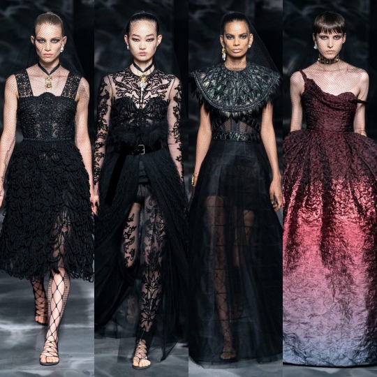
I think Haute Couture week is probably one of my favourites of the year because I’ve always been good at spotting a pretty dress I’ll never be able to afford and to be honest, not much else. And to me, the Dior collection is everything. Sure, it might not be the most groundbreaking or technically advanced thing ever, and yes, some of the shapes might not be the most flattering, but the best pieces (picked out above) are classic Dior. See, I’m not sure what my idea of “classic Dior” is actually based on other than a vague cultural knowledge but I feel this year’s haute couture collection fits in with that schema a lot more seamlessly than Grazia’s 2018 or 2017 collections, as much as I enjoyed them too. The colour scheme, the lace, the netted veils, the heavy eye makeup; these are dresses for turning up to the funeral of the rich husband you just secretly poisoned in/Eva Green would’ve worn in Penny Dreadful and I’m here for it. The spiked feather detailing that crops up a lot gives me Natalie Portman as the Black Swan and regardless of how flattering they may or may not be (because I'm kind of tired of fashion being thought of as a way to showcase a woman’s figure), I like the Edwardian inspired two pieces. I may be a bit biased, chokers, berets and some kind of netting are 3 of my favourite additions to an outfit, but I do think that as a collection, it all comes together beautifully and I commend Maria Grazia for that. I think now that she seems to have found her footing in terms of producing looks that are recognisably Dior, we only have increasingly creative efforts to look forward to.

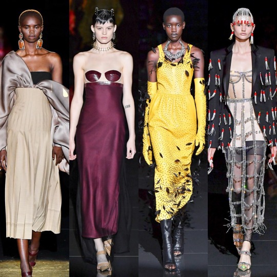
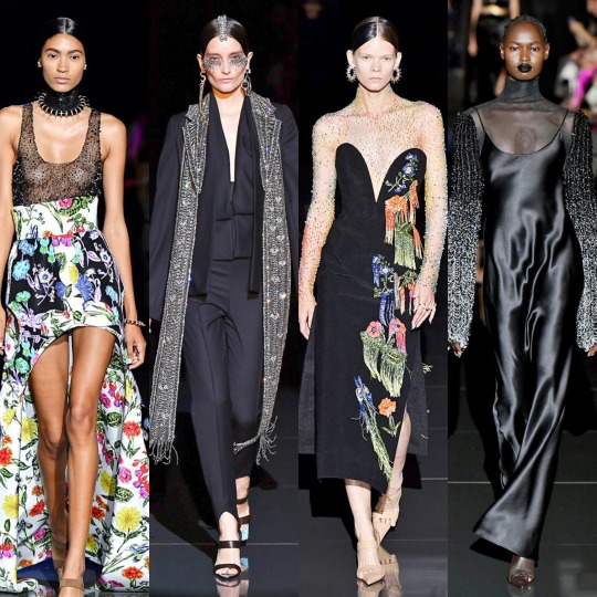
Similarly, I adored the styling at the Schiaparelli show. As weird and wonderful as ever, you can see the influence of nature and possibly the visuals of flowers in bloom on Daniel Roseberry’s designs and styling. My favourite thing about this collection was its presentation: for his debut show, Roseberry took a seat in the middle of the runway and sketched out his designs as they appeared on the models in real time. I can’t think of a better way to introduce the fashion world to your vision and creative process.

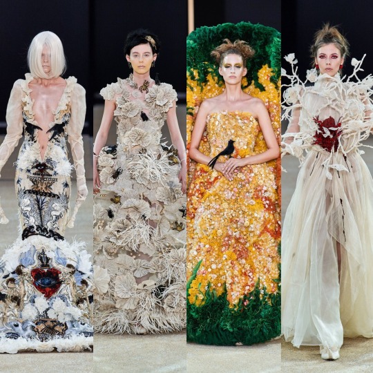
Moving on from the Schiaparelli collection, it only feels right to talk about Guo Pei next, whose collection also has that characteristic organic feel, almost like the designs could’ve grown right out of the ground of a Tim Burton film. My favourite is definitely the second from the right on the top row, which wouldn’t have been out of place at the 2018 Met Gala. Heavenly Bodies: Fashion and the Catholic Imagination is without a doubt my favourite theme of the last few years. Ornate as ever, each look displays a renaissance painting level of intricacy and craftsmanship; not that a plunge that deep would ever be remotely flattering on me, like there’s a reason I feel a certain type of way about belly button piercings and low rise jeans, but I am obsessed with the detailing of the dress on the far left of the bottom row. That being said, I don’t love this collection quite as much as Guo Pei’s 2018 haute couture offering, however, I think that’s just down to the colour scheme and structures of the latter.
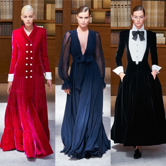

Next is Chanel’s haute couture show, which right off the bat I’ll say I was a big fan of. Surprisingly, I’ve seen a lot of people say they don’t like it but I think it’s a welcome departure from the past few collections which (in my very design naive opinion) were beginning to get a bit monotonous. There’s only so much unnecessarily prissy detailing I can take before it gets a bit like...did they run out of ideas? I think for Virginie Viard’s debut show this is a return to the fresh, clean, functional and even slightly androgynous looks that I think we forget Chanel was originally known for. We still had a couple of the classic elegant dresses too, as seen in the two middle shots I chose, which pays homage to the haute couture collections of the past couple of years. Again, as with the Dior collection, I love the Edwardian/early 20th century influence and the library setting is a fucking perfect backdrop to the collection.

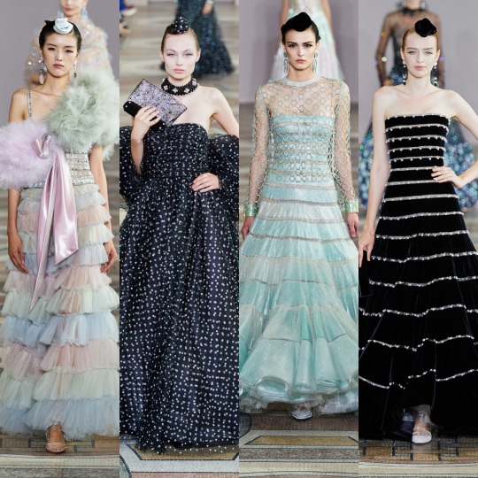
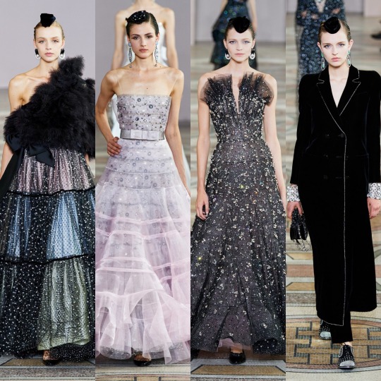
It probably feels a bit contradictory, me going on to praise this year’s Armani Prive collection considering I just criticised the past Chanel collections for being unnecessarily decorative but I see a clear direction with these looks. And yes, I generated a meme to describe how I probably sound right now:

Alternatively, I could’ve just put “how I sound right now”, semi colon, and then insert a photo of a clown underneath, but I’m clearly into 2018 memes, okay?
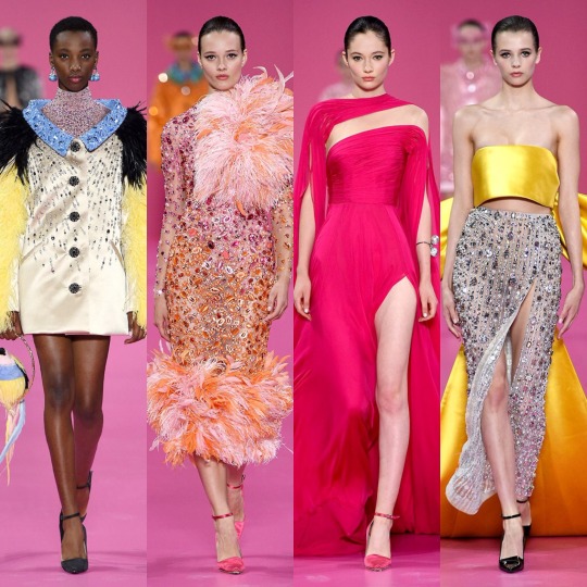
I’m not going to lie, the basic bitch in me loves these looks because I just know how good they are on the red carpet. Very Disney princess and I’m into it. I’m easily pleased: pastels, faux fur (I hope it’s faux though to be honest, I’m not quite sure), sequins and satin and I’m calling it a masterpiece. So it’s probably best to move on before I expose myself for just how much of a high fashion novice I am, if I didn’t already do that in the first paragraph by praising Maria Grazia. For the same reason, I was obviously a big fan of these looks from the Georges Hobeika haute couture 2019 collection:
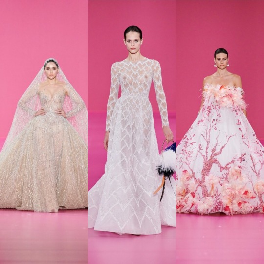
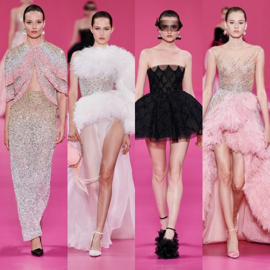
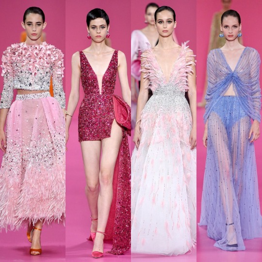
And of course, all of these beautiful Ralph and Russo designs:


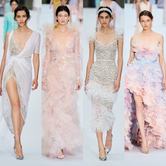

The dress on the right end, second row from the bottom is honestly probably my favourite of all the 2019 haute couture looks. Like frills!? PASTEL frills!? TIERED, PASTEL FRILLS? Fucking sold. Giambattista Valli is obviously the king of this:
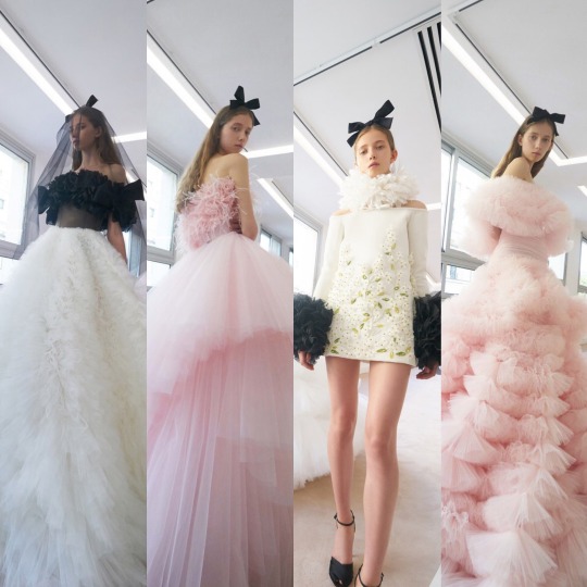
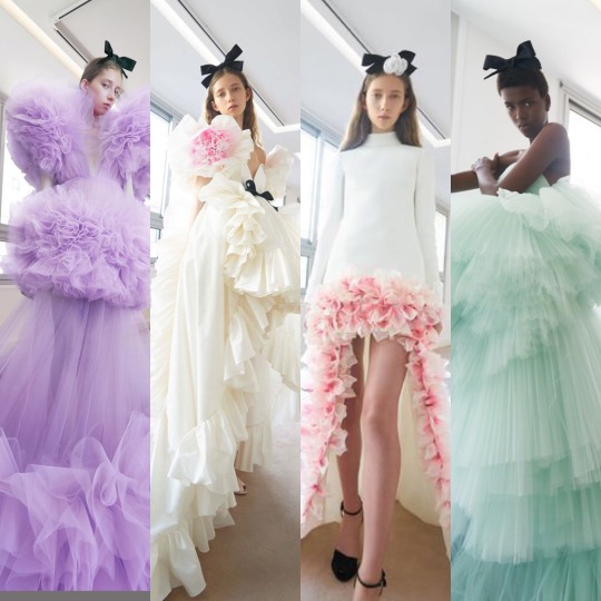
Though I think I’m right in saying that the slightly more unconventional, exaggerated nature of Valli’s dresses elevate them in the eyes of the fashion community that little bit more. Personally, I love the touch of the black bows and the Elizabethan style neck collar of the look second from the right on the top row. Next is Zuhair Murad:
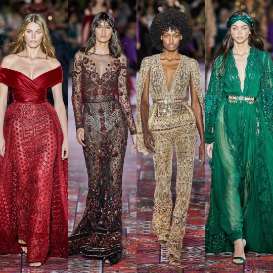
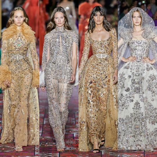
If I'm being brutal, I was a bit disappointed with this collection. I always love Zuhair Murad and love his dresses regardless but I found myself getting a bit bored with a lot of the looks this year considering how excited I was to see them. Though these are my favourites and they are still stunningly elaborate (clearly a lot of work went into the embroidery and stoning), I don’t feel as if any of them, apart from the green and silver jumpsuits, are really anything I haven't seen before. I thought the tribal/nomadic elements of some of the looks could’ve been slightly more conceptual. Like, I get that Zuhair Murad’s dresses, at face value, aren’t really about telling stories but I think if you’re going to go down the mildly culturally appropriative route, you should do it in new way. I read that he was inspired by a trip to Marrakech and I do see that, but it more seemed like an afterthought of throwing these details onto his usual style of dresses rather than the observations influencing the very basis of the collection. Elie Saab’s 2019 haute couture collection is, in my opinion, a good example of how to do this right:

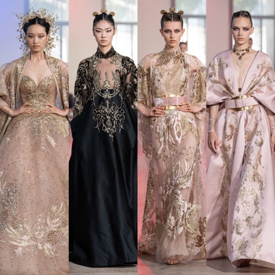
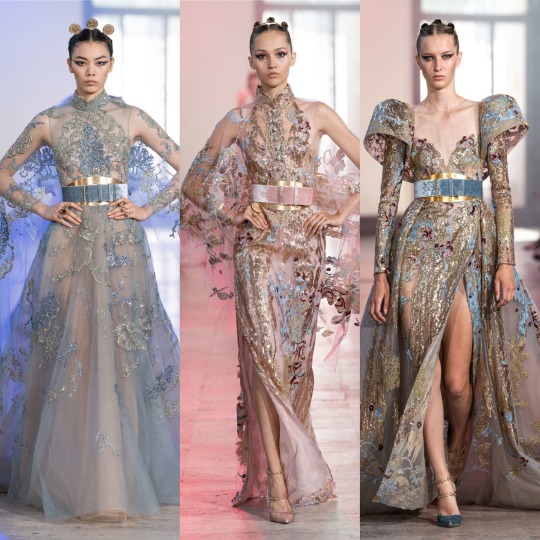
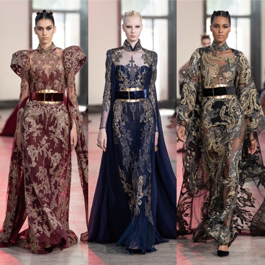
Everything about the construction of these dresses from the padded shoulders to the Mandarin collars draws on the dreamiest possible incarnations of the wardrobes of Chinese royalty, and to watch that translated onto the runway in such a stunning way I hope is a pleasure to see for those who do consider their culture’s past to be a part of their identity today. The jewell tones, the baroque-like patterns, the defined silhouettes, the hair and makeup, I am in awe of EVERYTHING about this collection. I’m glad that Saab had so many East Asian models showcase his designs too; I don’t think it would’ve been right any other way.
Talking of structure, next is Iris Van Herpen:
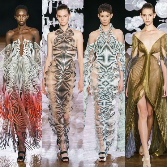
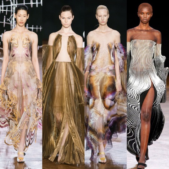
Like, I need to know the SCIENCE behind these dresses, because I know there was a shitload (lol jk, I really don't want to know anymore science unless I have to). I mean, aside from a few more unconventional, bubble-like shapes that I wasn’t necessarily such a fan of, I can’t fault this collection at all. It really speaks for itself; every part of each design is as mesmerising and as hypnotic as the next, from shape and structure to the colours chosen. Even the more “simple” numbers such as the golden dress second from the left on the bottom row looks like it’s permanently caught in the wind, and I can imagine it on the statue of some Greek goddess whose name I cannot in this moment be bothered to check I’m not pulling out of my arse. You know, Aphrodite, Athena...one of that lot, lol. Finally, let’s talk about Valentino, Givenchy and Fendi, starting with my least favourite of the three, Valentino:

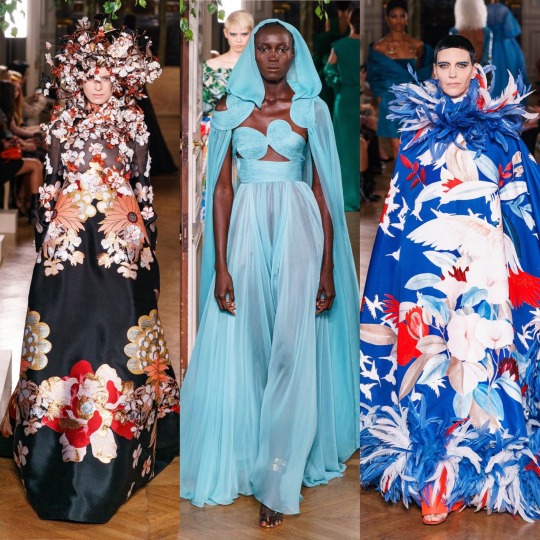
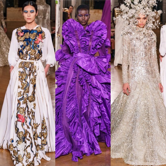
It’s not that there weren’t some wonderful looks. Of my favourites above, the white kimono style dress on the left of the bottom row, the blue dress with the cape and the green floral coat with the matching mesh dress underneath are the stand outs. It’s just that this collection isn’t particularly my style as I’m not much of a fan of block or primary colours; it’s personal preference and that’s not to say it’s a bad collection by any means. I can still appreciate that more thought and work and general energy than I’ve probably ever exerted in my life went into it.
Next is Givenchy:
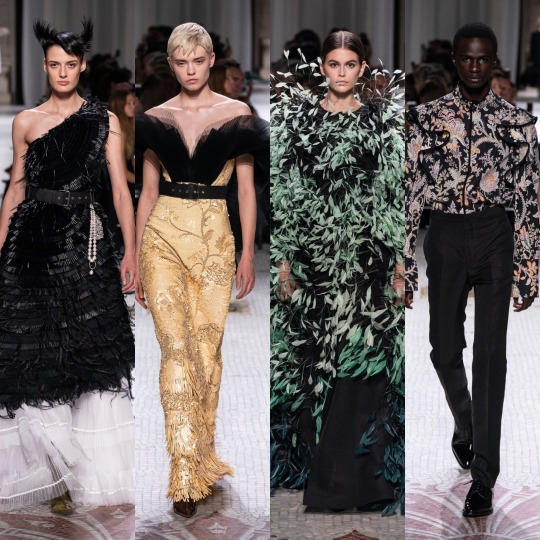
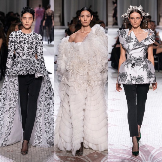
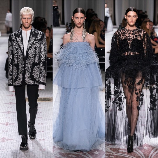

LOOK at that dress on the right on the row second from the bottom. LOOK AT IT! The pastel pink cape! The layered houndstooth dress! The feathers! The neckline of that top on the right, second row from the bottom! The MENSWEAR! I want it all. It’s modern and it’s cool and it’s wearable but it also looks like me or you could never bloody afford it and that’s how you know it’s Givenchy, lmao. It’s not hard to see why this collection was so popular within the fashion community; it really is a masterclass in less is more which takes a lot to admit because I’m usually a more person.
However, overall, my favourite collection of the three has to be Fendi:

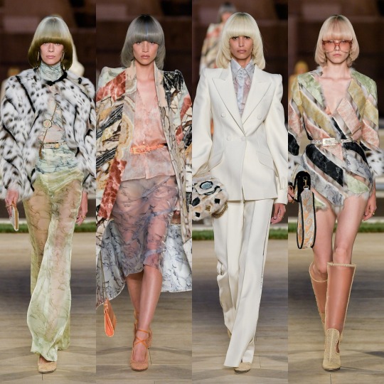


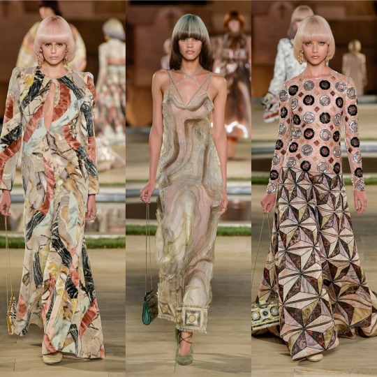
The 70s are my favourite decade for fashion and so this collection is absolutely delicious. I love the warm tones contrasted with a splash of almost metallic cools or pastels every so often and throw some faux fur (again, I don’t know if it is faux?) over anything and it immediately looks 10x more glamorous in my opinion. Half the looks are giving me groupie to a rock band and the other half are giving me bored Hollywood movie star in her Beverly Hills mansion, walking round with rollers in her hair and a pornstar martini. As you can probably tell if you’re still reading, outfits that give me a story are the ones that I love the most, lmao. The perfect balance between opulent and effortless, in an ideal word I would absolutely own and wear every single one of these outfits, regardless of where fashion critics stand on them, and feel like a badass bitch.
And to kind of round off the post, isn’t that what’s most important? That an outfit makes you feel empowered and like you could dramatically slap the shit out of anyone who disrespects you (FEEL being the keyword here, I’m really not recommending anyone goes round slapping every person who disrespects them)? I definitely do want to be more educated on fashion and its history, after all, I’ve always been a history student, but at the same time, I don’t want to suck the fun out of it for myself. Most of the time I don’t want to look at a dress and compare it to every single collection of years past or scrutinise who did what better, I just want to marvel at it. I think one thing that bothers me is that within something as relatively harmful as fashion, it seems kind of elitist and hierarchical to categorise opinions as good and bad based on how much education a person might have on the topic. Let’s be real, fashion isn’t really a realistic career path for most of us. The average person hasn’t always got time to research the history of a fashion house before they make a statement about one of its pieces. They’re working, lmao. If your career is in fashion, lucky you. But in a lot of cases, as within a lot of creative industries, luck is really just privilege, connections, money, leisure time and choice and only a select few people have those things, and I don’t think we should let those people dictate who has style and who doesn’t. These things are subjective. Let people like what they like without equating that love of something to a lack of taste, you know?
In a broader sense (and I really don’t know how I got off on this tangent) something makes you feel beautiful and YOU think you look hot af, WEAR IT!
It’s a bit of a cliche as a closing statement but if anyone read until the end, I hope you enjoyed the post. I am always totally open to hearing other opinions and points of view so feel free to send an...ask? Message? I’m not sure what it’s called in 2019, lol. Anyways, feel free to do whatever that function is called nowadays and rant away.
Lauren x
#eliesaab#kaia gerber#dior#paris fashion week#fashion#fendi#Zuhair Murad#givenchy#valentino#giambatista valli#chanel#iris van herpen#guo pei#schiaparelli
89 notes
·
View notes
Note
Any thoughts on the cover of Everless?
So i guess it’s time to talk about Billelis, the man responsible for all of these:
Homeboy is a freelance digital artist and a HOT COMMODITY in the ya/ fantasy sphere right now; a quick browse of his instagram shows a STRONG visual brand of skulls/bones, metallics, dense, intricate baroque-type detailing, florals/bugs, and religious iconography.


whispers fucking superb, you funky little goth.
His work is staggeringly cool, if of a fairly specific range, and it’s not hard to see why publishing has No Chill about it. It’s a kind of highly-executed middle ground with the drama and realism of photography but the #aesthetic and the high level of visual control of illustration, something technologically new enough to feel Fresh and Cool.
But knowing how good he is (and what his comfort zones clearly are) makes an interesting case study of his various covers re: how art direction + design + illustration all come together, and how an excellent illustration (or illustrator) does not necessarily a great cover make.
the King of Scars cover stands out as an obvious triumph, but my favorite from his portfolio is actually Pride:
I adore this cover, and I think it’s a fantastic case study of art direction, design, and illustration all working together perfectly to create an attention-grabbing, relevant, and conceptually sound cover. I don’t remember if i read this on the authors twitter or in some blog post back when it came out, but it’s based on those old tin ceilings:
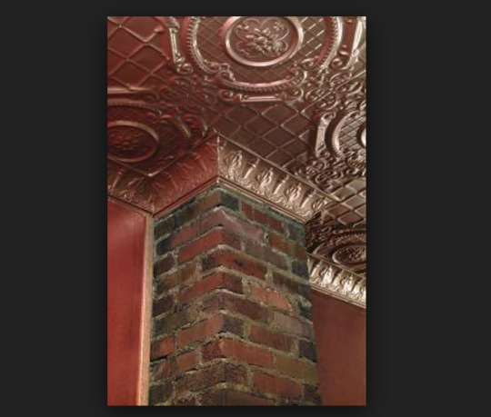
Which is a cool idea that speaks to the idea of antique wealth/ Fancy Old Ass Houses (and possibly to something region-specific that I’m not informed enough to speak to?), which is arguably the bedrock of any pride and prejudice retelling. The ornate, old-fashioned detailing and cameo-style portraits are gorgeous and create a really striking contrast to the bright blue, organically textured, modern, messy-but-still-feminine type that effectively communicates the contemporary setting and creates a strong hierarchy without detracting from how pretty the whole design is. Everything is working together, and none of the elements could be extracted without diminishing what the design is communicating about the book.
Contrast to pretty much every one of his Object Covers.
I don’t hate the cover of Ash Princess or anything, and i’ve talked pretty at length about what makes object covers work or not work in the past, but rather than a cohesive, clever design, you have super basic text overly relying on a pretty but meaningless illustration that isn’t integrated with anything else except some heavyhanded textures. This stuff is just like. There. The illustration is executed at a very high craft level, but it’s not really telling me anything except HEY YOU KNOW THE 192734628 OTHER BLAND, NEEDLESSLY GRITTY YA FANTASIES OF THE PAST THREE YEARS, WELL THIS IS THE SAME DANG THING >:)
(Which..... knowing the gist of Ash Princess, is perhaps the only thing there was to communicate. Whatever. It worked for them. eye roll emoji.)
And again, none of that is the artist’s fault-- illustrators in this scenario are more or less told Exactly What To Draw and art-directed through the process, and generally the designer does the type and some additional editing/ compositing. And sometimes the art directors are like “we’re going to elegantly communicate the cultural influences of a book to represent the tone, characters, themes, and setting” and sometimes art directors are like “SLAP A CROWN ON THAT BITCH IT WORKED FOR RED QUEEN.”
(I’VE SAID IT BEFORE BUT NOBODY ACTUALLY GETS WHY RED QUEEN WORKED AS A COVER AND IT WAS BECAUSE THE DETAILS WERE REALLY SPARSE AND VISUALLY WELL-BALANCED AND SUGGESTED THE THEMES AND CONFLICTS IN THE BOOK! QUIT STICKING MEANINGLESS OVERRENDERED CROWNS ON EVERYTHING I SWEAR TO GOD.)
But as those object covers go, I actually do like the Everless cover.
It too relies almost entirely on its illustration, but the type having dimension of its own and sitting on top in a thoughtful way at least creates a lockup effect that does make the cover feel like one “thing” as opposed to AN OBJECT plus AN TEXT. And the hourglass itself is interesting! I really like the idea of, if we must do an object cover, that it be something more abstract and thematically relevant that incorporates multiple ideas (here opulence as well as the passage of time as well as the idea of being trapped in the manor that’s key to the pitch) rather than THERE IS A CROWN IN THE BOOK SO,,,,,,,,,, CROWN O N T HE C O V ER,,,,,,,
They also really let Billelis’ great work shine in the intricate details he’s so good at, rather than drenching them in added texture and ~ special effects. And the 3/4s cropping of the bottom part of the hourglass is crucial-- it adds a vertical asymmetry/ almost imbalance that’s much more visually interesting than the full thing would have been.
I don’t really want to talk about any of the other covers in depth because they’re..... mostly mediocre, design-wise (again, with the exception of King of Scars, my life, my love) and I’ll start to sound repetitive, but some of them are better than others. I adore Billelis’ work in and of itself and i just want him to be happy and run free in a field of golden skulls; I’m glad he’s got a steady stream of work but boy YA could stand to utilize him better.
I also want to posit that his relatively EXTREME niche popularity points to a lack of highly skilled 3D illustrators, or at least ones willing to do work in this sphere-- I don’t know enough about that area to really know what the deal is, but I can’t help but feel like there’s clearly room here for more artists who do similar work at a similar high quality.
And i do mean high quality, because there are definitely books out there with Similar but Noticeably Worse aesthetics, hi Three Dark Crowns and company:
Like..... I don’t know enough about 3d sculpting to tell you mechanically why 3DCs’ graphics all have that unfortunately common plasticky and fake look of mediocre renders, but they do! Billelis’ work is just executed at a more sophisticated level, and i’m certain there are other people like him out there that publishing just...... has yet to discover, and I hope they do.
219 notes
·
View notes
Text
Allegory of Music: a conversation
- I'm going to show you a piece that goes through all the musical periods. It is a theme with variations, and each variation is a different period. Do you identify them?
https://www.youtube.com/watch?v=xT9IPQ0DAXI
- Can you tell me about them? The musical periods?
- Hmmm okay. They are practically the same as in all art.
- Modern music is divided into the Renaissance, Baroque, Classical and Romantic periods. It developed from around the year 1400, until the late nineteenth and early twentieth centuries.
Before that came medieval music, in which the modal system was still used. With the rise of new polyphonic techniques and experimentation, the modal system fell into disuse and gave way to the tonal system, which now governs Western music. The Florentine Renaissance greatly influenced the music, since it highlighted the beauty that it could possess in itself, an aspect that was previously ignored, since medieval music was centered in the liturgy.
Even in Renaissance music, you can hear vestiges of the modal system. Renaissance music is mainly vocal and polyphonic, but notably at this time the third interval was accepted as a consonant—what would Western music be without that?
Then comes the Baroque period and then the period of classicism. The Baroque exaggerated, pompous, ornate; the latter simple, light, demure. The Baroque was the period when instrumental music gained strength. Resources such as rhetoric and the theory of affections were used with the intention of creating an order in the musical discourse; the sonata was invented.
The music of classicism is accuracy, reason, homogeneity in style. The symphony is the predominant form; the era of great works, large-scale works. The grandiosity of the Baroque falls out of fashion and is considered grotesque, and is changed by simplicity, homophony.
The Romantic is a reactionary movement coming before classicism. If the classical is the reason, the romantic is the feeling. The certainty of death, the fragility of man against destiny, nature as a creative force. The predominant large format works are abandoned, giving way to chamber music: nocturnes, ballads, songs, preludes.
And that's it :) Then comes the twentieth century and is the disaster embodied.
- At the end of the Baroque, a return to the classical: "noble simplicity and quiet grandeur." And the 20th century is an Obscurus, that's for sure. There is a wolf inside of man.
- It is the death of the great stories, of generalizing ideas. And the triumph of the little stories.
- Traditions? Hence a longing for the folkloric? Romanticism
- Yes
- Only when we have a shared past can we share meaning. To find communion; to all be doing the same thing at the same time.
- We see it in Chopin, in Brahms, in Liszt, in Wagner
- The Genius
- Exactly
- Baroque music is emotional, theatrical. For the mass, to elevate its sensory impact.

[Image: Gian Lorenzo Bernini, Blessed Ludovica Albertoni, detail, c. 1671-74]
- Yes, exactly. The sonata is, in itself, a way to please everyone. The triumph of the baroque is the sonata. It was even believed that the different shades had different emotional burdens. Depending on what you tried to express, a certain tonality was used. Insane, in the baroque nothing is put at random.
- The removal of reason reveals the emotional; the irrational is the beyond rational. But it's done by awakening the senses? As in art? As in the revelations of saints. When you are freed from the material, then what else remains but the immaterial?
- The irrational is the rational, yes, true. But the music of classicism is extremely rational. Exceedingly happy, exaggeratedly homogeneous—that's why I told you that I do not like it that much, it is very artificial.

[Image: Caravaggio, Madonna di Loreto, 1603-1605]
- Naturalism
- Total
- We still use images in this way today, to appeal to devotion, to the human need for it.
- Yes? In which sense are you saying it?
- We are surrounded by naturalistic images, that appeal to our need for belonging; but the ideology is no longer Catholicism in this case, it is consumer capitalism.
- Aaah, yes
- But the mechanisms, the means are the same.
- It's very strong
- This is a very sophisticated concept, difficult to explain
- Well, there's no such advertising content anymore, but the propaganda also uses those mechanisms
- The church is still in the game, that's for sure
- Exactly, I was going to say that. You read my mind.
- Politics, another big battlefield for hearts and minds
- And the game, yes. Communism here hijacked elements of the people, such as cultural identity, national
- Like a common code—semiotics
- And it is, just like that
- Collective consciousness :) What synchronizes it; what coordinates minds, imaginations
- Do you like Poe?
- Of course :)
- Then you have surely read “The Fall of the House of Usher,” one of my favorites
- Gothic, Romantic
- And Lovecraft?
- A tradition
- What madness hahahahaha
- It makes me laugh
- Note: You must, actually, Hail Cthulu
- No shortcuts :) 20th century, collective dark energies realizing themselves inside mankind—connecting all the concepts here
- Bueno
#conversation#december 7#music#art#allegory of music#music history#art history#art theory#post modern analysis#semiotics#deconstructionism#ostranenie#muses#medieval#romanticism#renaissance#choral#sacred#gothic#baroque#classical#classicism#modernism#20th century#paragone#allegory
1 note
·
View note
Text
Favourite Albums Review - Seventh Tree by Goldfrapp

Seventh Tree - Goldfrapp
Main Genres: Folktronica, Indie Pop, Art Pop
A decent sampling of: Dream Pop, Chamber Folk, Neo-Psychedelia, Baroque Pop
“木漏れ日”, or “Komorebi”, is a word that only exists in Japanese. It describes the mystifying visual phenomenon that occurs when sunlight passes through a canopy of trees. Light filters through the leaves and changes slightly in hue according to the colour of the leaves.
At its core, Seventh Tree feels like a musical interpretation of the komorebi phenomenon. Shimmering in a haze of green and golden light, Goldfrapp’s fourth and greatest LP is a lush, fleeting, and pastoral record. With airy sound production and a prevailing sense of the ephemeral, the album pairs beautifully with the transition from Summer to Autumn. Likewise, I make sure to revisit it every year during the month of September, and every time I am once again completely floored by just how any group of artists could ever achieve and maintain such a perfect sound.
Goldfrapp’s debut was undoubtedly a hard act to follow. The British duo of Will Gregory and Alison Goldfrapp came on to the scene with Felt Mountain, an unexpected masterpiece marked by atmospheric alien worlds achieved via surreal studio sounds, filtered through film noir and golden age Hollywood aesthetics. The album went Gold in the U.K. and was even shortlisted for a Mercury Prize.
But where to go from there? Goldfrapp’s initial response to their immediate success, as well as their initial approach in attempting to exceed the heights of their debut, was to amp up the fun factor of their music tenfold.
Thus, the follow-up records Black Cherry and Supernature were mostly sassy electroclash romps chock-full of sexual innuendo (especially Black Cherry) and sing-along pop hooks (especially Supernature). Very solid records in their own right, yielding some excellent singles like “Twist” and “Ooh La La”, but ultimately lacking the consistency and grandeur of Felt Mountain.
But then something great happened.
Alison and Will had long been inspired by nature and especially animals as symbolic motifs throughout their career. But for their fourth record, Goldfrapp decided for the first time to make an album that actually sounded like it came from the natural world. They allowed their trademark electronic inventions to take on a more supportive role, blending into the background seamlessly with gentle acoustic instruments, creating a uniquely harmonious folktronica sound.
The lyrics also take on a much more prominent role than on their previous records, delving deep into themes of innocence, tragedy, superficiality, and the ever-changing state of nature. Revealing both elements of poetic sadness and dark humour inherent to the many unfortunate conditions of human behaviour, Alison is found pondering over topics such as plastic surgery (”Clowns”) and cults (”Happiness”) throughout the course of the album.
The title Seventh Tree itself came to Alison in a cryptic dream. Visually and musically, the duo became particularly inspired by woodland imagery, as well as the symbol of the harlequin, a free-spirited and whimsical character found in traditional Italian theatre. These influences translate to an atmosphere on the album that feels elusive, wispy, and at times even day drunk.
“Clowns” introduces the sensory world of Seventh Tree with the record’s purest, most delicate folk song. Accompanied by faint swells of chamber strings over a steady and serene acoustic guitar riff, Alison Goldfrapp just barely enunciates her way through slurred, childlike speech, with similes about fake breast implants and clown balloons. The narrator here is almost certainly a little girl, failing to understand the reasons why an older woman would want to undergo surgery just in order to gain bigger breasts, thus emphasizing the blissful naivety of childhood that can never truly be recovered by an adult. More than any other track on the record, “Clowns” embodies the very essence of Seventh Tree, presenting a sylvan vignette that captures a very simple moment of human vulnerability.
The following track “Little Bird” introduces synthesized elements, starting off soft and sweet before blooming into a rippling display of psychedelic folktronica, with words inspired by the surrealist poetry of English artist Edward Lear.
“Happiness” is a carnival world of sunshine baroque pop appearing almost too picturesque, with stomping parades of dizzying horns and synths. The entire song presents a brilliantly perverse and whimsical satire of the ways in which cults advertise themselves in order to prey on lost and impressionable people. Alison’s promises of everlasting happiness are soft and enticing, but ultimately betrayed by the sinister undertones of her phrasing; you can practically visualize her forced smile and a morphine injection needle being clenched in the fist that she hides behind her back.
“Eat Yourself” sees Alison revisiting the vocal stylings of “Clowns” with a sauntering folk tune that reverberates like the footsteps of a gentle forest giant. Touching on feelings of loss, the title refers to one of the song’s only decipherable lines (without the use of liner notes), offering a particularly grim sentiment: “If you don’t eat yourself no doubt the pain will instead”.
Seventh Tree’s most sober undertaking is “Some People”, an indie pop carol that gradually forms a chiming ecosystem of sounds around a series of golden piano chords. It also serves as the definitive representation of the record’s central themes, listing off human vices and eccentricities with a listless, breezy attitude, as if the duo are accepting all of the good, the bad, and the strange things in the world.
And then, with all the stillness of an early morning mist, “A&E” merges with the listener’s imagination. A sentimental love song on its surface, this piece actually tells the story of a miserable, heartbroken woman who wakes up in a hospital bed, slowly remembering the details of the night before when she had attempted to overdose on pills and kill herself. It alll feels incredibly real and tangible, the way it so vividly captures the state of having a mental “reset” in the flow of the mind's stream of consciousness.
Precious few moments in music have ever struck me so profoundly as did the moment when I realized what kind of story Alison had been weaving on this track. With the brilliant execution of its concept in marriage with some the most crystal clear and subtly detailed production I have ever heard, this track earns the title of being my favourite Goldfrapp song. Altogether, “A&E” is a dreamy and sweetly cruel ballad that manages to embody the very zenith of story-telling through songwriting.
Things take a lighter turn for the last three tracks. “Cologne Cerrone Houdini” is an ornate psychedelic trip that pays musical homage to the sound of 60s hippie culture and the summer of love (as do many tracks here, to varying degrees).
Penultimate track “Caravan Girl” is a great big pop song celebrating wanderlust, with an insanely euphoric grand finale of exhilarating snare drums and a wave of soaring crisp bit-pop synthesizers, like 8bit butterflies flying across a 4k blue sky. Keyword for the production on that last part of the song is “orgasmic”.
Things are wrapped up quite nicely with “Monster Love”, an all-too-tender, folky dream pop serenade of mixed feelings that Alison Goldfrapp dedicates to her time on tour as an artist, particularly reflecting on her time in the glamorous but shallow world of Hollywood. It’s a very fitting ending; the song ties together the lyrical commentary and the musical spirit of Seventh Tree, retreating back into the ether with its closing lines “Everything comes around / Bringing us back again / Here is where we start / And where we end”.
Seventh Tree is my personal gold standard for an album listening experience. The record is its own masterclass in creating a diverse but cohesive sonic world, with songs that are varied but thematically linked, and with textural motifs that are revisited in many different ways over the course of the album. Will Gregory is a stellar lead producer; the man is clearly a master of detailed perfectionism, and this record in particular still sounds fucking immaculate 13 years later. Alison Goldfrapp herself proves that she is a wise and contemplative spirit with the beautiful voice of an immortal forest faerie.
On some days, this is my favourite record ever (the days when it isn’t that other one). Give this a listen if you haven’t already. Allow yourself to be cast in the verdant light and the mystifying shade of the towering Seventh Tree.
10/10
highlights: “A&E”, “Clowns”, “Happiness”, “Eat Yourself”, “Caravan Girl”, “Little Bird”, “Some People”, “Cologne Cerrone Houdini”, “Monster Love”, “Road To Somewhere” i.e. everything
#goldfrapp#alison goldfrapp#will gregory#seventh tree#folktronica#indie pop#art pop#favourite music#album review#music review#favourite albums#best music#2008#komorebi
1 note
·
View note
Photo


Marian Bantjes
Marian Bantjes is a Canadian born Graphic Artist who is active today, having started her design career in 1984.She studied Art in 1982 but dropped out to then work as a book typesetter from 1984 until 1994 and later moved on to work for Digitopolis in Vancouver, Canada.She ran her own firm from '94 until 2003 when she decided to embark on a freelance career as a typographer, designing her own bespoke lettering, and as a graphic artist.
Her work uses extensive patterning, flowing and curvilinear calligraphy with a Arabian styled influence, and found objects to make typography as well as ornate digitally embroidered designs. For the 'Seduction' Symposium poster she used tight calligraphy style vector graphics to create a fluid and lively logo. In 'I Want It All', and the flower based lettering, she has picked individual petals and either scanned or photographed them in the shapes of letters in a decorative and beautiful fashion. I would describe her work as playful and light but also with a jagged edginess to it with the use of solid black and the sharper edged shapes of some of her letters. Due to the intricate pattern work it’s very engaging and draws you in.
Her style seems to be influenced by calligraphy, digital graphics (I assume using Illustrator for the vector work) as well as a nod to the arts and craft movement with her embroidery style typefaces. She herself states, “There's nothing in my life or the life of my family that was in the least bit Baroque or patterned or ornamented. The only source of influence I can find is my travel to exotic countries in my 20s, India, Thailand, Italy, Spain, Bali, and Africa, that are the possible seeds of my interest in intense decoration.”
She uses a wide range of materials from digital technology to fabrics, paints and even sugar for her piece for Stefan Sagmeister in 2007.
-Heller, S. (2014). Marian Bantjes, the Michelangelo of Custom Decorative Lettering. [online] The Atlantic. Available at: https://www.theatlantic.com/entertainment/archive/2014/01/marian-bantjes-the-michelangelo-of-custom-decorative-lettering/282917/ [Accessed 17 Feb. 2021].
1 note
·
View note
Text
How to Work a Cuckoo Wall Clock into Your Home Decor
Not all cuckoo clocks are created equal. There are many differences between the numerous styles of clocks that go far beyond the aesthetic differences, and then there are those to account for on top of that. If you’re thinking about working a Cuckoo Wall Clock into the design of your home, here’s how to do it.

First, you will need to pick out a room in your home. You’ll need to ask yourself whether you want to place the clock in a sitting or drawing room where it will see company, place it in a place like a kitchen or an office where the value of its ability to keep time and play music will be more valuable to the members of your family or keep it in a private room like a bedroom.
Then you will need to consider the design of the room you have chosen, and the role you want the clock to play in that setting. For example, if you have chosen a public room to serve as the setting for a cuckoo wall clock, you may want to match the themes in your decor with some of the themes of the clock you choose.
Consider the interior design of that room. For a room with classic, old-world furniture or wooden trim, you might want to go with some form of a vintage reproduction clock. Many vintage cuckoo clocks are richly ornamented reproductions of models that were popular in Europe during the baroque period and are ornately decorated with patterns and other motifs. Many of them would make quite an illustrious match for a number of very nobly arrayed settings. At the same time, a Chalet style clock might be in order for a setting like this, as there is something about the spirit of many Chalet style clocks that, though they often show scenes of revelry, are very distinguished in their character.
On the other hand, if your chosen setting is decorated with ornaments or other decor that is more natural or celebrates the influences of rural scenes, then a hand-carved traditional clock might be more to your liking. Though they still often have the same beautiful dark finishes of many vintage reproductions, they are undoubtedly more ‘wild’ in their nature.
Then of course you have modern clocks, which might be well suited to a setting that didn’t have the same old world decoration as some of the previous hypothetical settings. Many examples of Cube, Diamond, and Birdhouse themed modern cuckoo clocks are fine for these types of settings.
If you haven’t quite decided on the type of cuckoo wall clock you want to add to your interior design, then you should definitely check out Bavarian Clockworks, where you will find a wealth of different options for you to choose from. Not only will you find a rich catalog of different pieces representing these aforementioned styles in their online store, but you will be pleased to see them listed at some of the lowest prices around. On top of that, you can shop there tax-free and even get free shipping on all orders in the United States.
If you need a little additional help choosing between all the different styles or you have questions, say, on what makes an Authentic Black Forest Cuckoo Clock, then you should reach out to their team at 800-950-6753. They are committed entirely to customer satisfaction and their mission is to put you in touch with the cuckoo clock that will best suit your home; to find it, though, you need to do a little searching, so get started today.
0 notes
Photo

today’s preview is another setting description, this time for the tevinter imperium! as with orzammar’s yesterday, below the cut you’ll find detailed descriptions of the nation’s aesthetics, politics, religion, weapons/technology/magic.
The Tevinter Imperium, as the very first known human settlement in Thedas, is an incredibly proud and often decadent nation: this reflects clearly in both architecture, art, and common street style. While most of Thedas prefers to think of magic as a dangerous but sometimes necessary tool, Tevinter is ruled almost entirely by magic and its wielders.
AESTHETICS
Often times architecture in the Imperium can be separated into either “old” (a style that favors Gothic and Baroque influences, dark stone, high ceilings and deep colors, ornate detailings, gargoyles and otherwise macabre statues) or “new” (modern, eclectic forms of architecture that hardly make sense in terms of the laws of physics and often have no need for preference when it comes to form or function-- the magisters of Tevinter believe that their abilities can give them the best of both worlds).
The most detailed of the “old” style of architecture typically comes into play in regards to Chantry-affiliated buildings, though there are quite a few cornerstone settlements that have been upkept by Magisterum funds for the aesthetic and pride in Imperium history (which has always been a vital inspiration for artists). These buildings are decadent and dark, utilizing concrete, domes, and arches, as well as the ever-classic Tevinter design staple of decorated columns. The insides are typically as elaborate as the outside, and give the illusion of walking into a modern-day museum. The older style prefers rich colors-- burgundies, navys, violets, emeralds-- with heavy, dramatic accents of gold and silver.
Newer styles of architecture in the Imperium can be explained as unique, experimental, and dramatic. In Tevinter, mages use art as a way of showing off their many magical talents, often bending the possibilities of reality and the laws of physics. Buildings built by renowned architects will commonly be built appearing as if they are inside-out or upside down-- an illusion, but one that is certainly interesting to marvel at. Skyscrapers are also commonplace cornerstones in newer Tevinter architecture styles, and the Imperium is home to the highest-reaching skyscrapers in all of Thedas. Sleek building materials and innovative design concepts are invaluable to this style of architecture, both inside and out. While the lands of the Imperium are certainly vast, having your architectural designs featured in a city like Minrathous or Ventus is a social statement that simply cannot be bought. Because of this, artists are constantly challenging themselves to come up with something bigger and better, making Tevinter a thriving hub for both creation and experimentation.
Technology has consistently proved itself to be a crucial driving-force to the work of great Tevinter artists over the past handful of centuries. While you could never truly compare the works of Tevinter to those of the dwarves of Orzammar, you might call Tevinter a merging of the supernatural flair of magisters and the industrial ambition of the dwarves. In the early days, the Imperium heavily relied on Orzammar's seemingly innate understanding of technology and funneled pile fulls of money into commissioning their own, unique pieces of armor, weapons, and even golems. This gave the Imperium's magisters and arcanists a platform to find a branch for their own creations through the blending of magic and technology. Where the dwarves rely on technological victories for social efficiency and to financially sustain their way of life, Tevinter uses theirs to flaunt all that their nation has to offer.
POLITICS
Social classes in the Imperium are strictly maintained-- you are sorted into one of three classes based on your status and magical ability.
The SOPORATI are the lowest tier on the Tevinter social hierarchy outside of slaves. They are known as "sleepers" because they lack access to the fade and possess no magical abilities. These people can serve in the Tevinter army, but not achieve any government sway, position, or otherwise noteworthy points of power. Often times, Soporati will resort to becoming commonplace merchants due to a lack of other options. More ambitious (or desperate) Soporati might even pursue the black market trade, which includes the illegal selling and buying of slaves, weapon trade, Qun collectibles, and otherwise. The only way a Soporati can gain access to a higher social class is by having a child with magical ability. Because of their lack of access to the grander parts of Tevinter life, there exists a great tension between the Altus and the Soporati that has only grown over the years. Most believe that it's only a matter of time before some sort of social uprising takes place.
The LAETANS are the middle class of the Imperium. These are mages born into families that have no prior magical ability, or mages that have no link to the Altus. If a pair of Soporati group together to birth a mage, they are technically considered Laetans from then on.
The highest social class in the Imperium are the ALTUS -- what Orlais and Ferelden would consider nobles. These are mages believed to be direct descendants of the magisters that possessed the ability to speak to the Old Gods in the fade. Most of the Magisterum is made up of Altus mages, as they're considered to be the "best" at what they do. More often than not, Altus mages own slaves to sustain their own wealth.
While not a social class in the Imperium, SLAVES make up a massive part of Tevinter's population. It's still legal to own slaves in Tevinter, both elves and qunari. A slave may be freed-- though this is incredibly rare-- and put into a subclass known as the LIBERATI, where they can own land, join the circle, or apprentice in trade, but never be known as a true citizen of the Imperium. Many slaves are designated to work in factories or warehouses by their masters, helping in the production of technology and textiles. Slaves are also notoriously used by their masters for experimental blood magic practices, whether it be for further political gain or for power. While there have been many attempts to overthrow the Tevinter government on the part of the slaves, none have been entirely successful thus far. Between the Soporati and the slaves of Tevinter, the Altus are always sitting in a very fragile state of power that they attempt to maintain through verbal aggression and brute force.
Despite wide-spread prejudice against elves and qunari throughout Thedas, the state of slavery in the Imperium is one of much controversy outside of the nation, and is often considered vile or primitive, much like the rest of Tevinter culture.
The government of Tevinter is known as the Imperial Senate and is broken into three parts: the Magisterum, the Publicanium, and the Archon. The MAGISTERUM is a group of incredibly powerful mages that are responsible for creating laws, upholding them, and choosing the next Archon if there is no appropriate heir. Magisters in the Magisterum are chosen by popular vote by each of the seven circles of magi within Tevinter, and it's an incredibly detailed, highly dramatized, often manipulative and underhanded process that is quite similar to "the game" in Orlais. Each of the Grand Clerics in the Imperial Chantry and the Black Divine also hold a position in the Magisterum by default. A mage may inherit a seat from another member of the Magisterum, but it is often frowed upon, as the mage did not "earn their seat" by their own magical ability. In contrast to the Magisterum, the PUBLICANIUM is the lower house of the senate, full of elected positions, and thus has no real power-- most believe that it exists as a means to silence those that would question the authority of a full magocracy.
The true ruling head of the Tevinter government is the ARCHON who is considered the most powerful mage of the era. Given that Tevinter views magical ability as a gateway to power bestowed rightfully by god, the Archon has more rein and ability to influence laws and traditions in Tevinter than even the Black Divine. The Archon has the final say on all laws created by the Magisterum and can appoint magisters directly to the Magisterum, as well as take away their power at any given moment. Throughout history, Archons have been notoriously male, but the position is open to females too, technically.
While not an official branch of government, the LUCRENI is a new organization with goals to mend what is broken in the Imperium and restore it to its former glory, started by Magisterum members Dorian Pavus and Maevaris Tilani. Their organization is viewed with some disdain by other magisters.
RELIGION
After Orlais declared magic use outside of Circle guidance illegal, Tevinter decided to split itself off from the Andrastian Chantry and form its own: the IMPERIAL CHANTRY. Much in contrast to the Andrastian Chantry's official statement on magic ("magic is made to serve man, never to rule over him"), Tevinter thrives primarily by the creativity and exploration allowed to the nation's mages. In structure, the Imperial Chantry is run much like its predecessor: there is a DIVINE who is the head of the church (sometimes known as the "Black Divine" by Andrastians) and also serves as an Enchanter in the Minrathous circle. There are also two hands that serve as the Black Divine's main guidance outside of the Magisterum. In the order of power, after that there are Grand Clerics, priests, and so on.
The Black Divine resides in the Argent Spire in the city of Minrathous, which is where the headquarters of the Imperial Chantry is located. The Argent Spire is as decadent as one would expect of a Tevinter higher-up: an entire building made of intimidating black glass, guarded by pyres of blue-purple fire that alternate between aesthetic decor and a full-time mage-maintained shield. In contrast to the normal decor of the Imperial Chantry and the way, stylistically, it calls back to the Imperium's history, the Argent Spire is incredibly modern.
In the way of distinct differences between the two Chantrys, the Imperial Chantry has always been more tolerant of male priests and clerics, and believes that Andraste was not a holy figure, but a mortal prophet, and a mage at that. Mages of the Imperial Chantry also believe that blood magic was first learned from ancient elves of Elvhenan, rather than the Old Gods. The Andrastian Chantry teaches that it was ancient members of the Magisterum that were responsible for the creation of darkspawn and the Blight, though the Imperial Chantry claims that as a lie and insinuates that darkspawn always existed. They believe that the darkening of the "Golden City" was due to the lies of the Old Gods told to the magisters that entered it. The Imperial Chantry has also altered certain verses of the Chant of Light to reflect their views on magic, and suggest that it should always be used to achieve goodness, which justifies the use of a Magi-run government.
MAGIC & TECHNOLOGY
Out of all the human settlements in Thedas, Tevinter was the first to wholeheartedly accept TECHNOLOGY as a means for growth. From the moment they funneled funds into Orzammar in the first war against the qunari, Tevinter has been consistently on the look out for innovative, game-changing tech to improve their way of life as well as their armed forces. The Imperium views technology like they view magic-- while magic is revered as sacred and part of the Chantry's teachings, technology has become a tool to achieve greatness in much the same way. Tevinter is also notorious for blending magic and technology, and for utilizing creation in the most experimental, innovative sense-- one that even Orzammar and the Qun would be hard-pressed to recreate.
What this means for modern day Tevinter is that everything is always the latest and the greatest, everything is "updated". Half entrenched in history and half built into a modern, magical metropolis, the Imperium might be sitting on a precarious social ledge, but on a cultural level, it is certainly thriving. Billboards are entirely holographic, computer systems are almost always portable, smart phones are plenty (and frankly a must), as are tablets, computers, and the like. Black market weapons and fashion have implemented lyrium-infused looks that have become a part of the Altus (and sometimes even Laeten) social scene-- a very poorly hidden "secret" from the law, much like blood magic was in the past.
TRANSPORTATION in the Imperium is divided into public and private transportation, and which you take often depends on your social status. Tevinter's most recent pride and joy in the area of technological victories is the SKYWAY, a bullet train that runs half underground, half above ground, weaving through magister-built catacombs and skyscrapers alike, going up to 540mph. Private transportation exists almost entirely underground and utilizes small, cabin-like train cars of sleek steel and glass that run from underground "garages" built underneath Tevinter mansions, running on the same track as the skyway. Unique traffic laws make all of these components existing together possible, as well as self-driving technology and magic. You will never see a car in Tevinter (as the nobles would certainly scoff at such barbaric technology), though you might see the occasional motorized scooter.
This boom in technology has made Tevinter's armies even stronger and more deadly. Armor is modernized (ie bulletproof vests, complete tactic suits, utilities, etc) and almost entirely laced with technology-- either commissioned from or imitated by Orzammar tech-- as are the weapons. The Imperium has also recently renewed their interest in the ancient dwarven technique of golem-creation, though they have not yet been able to crack the code of creation and are having to make due with the handful they have from the days of old in Orzammar.
Since the Imperium is outside of Andrastian Chantry rein, large and by large they have been unaffected by their removing of circles. CIRCLES OF MAGI in Tevinter have always been a place for learning and growing rather than containing, and as such, the government (nor Tevinter mages) see no need to change how they are run.
WEAPON LAWS in Tevinter are technically strict, but very rarely enforced to their intended extent. All blood magic is outlawed in the Imperium, but you'll rarely find an Altus mage who has not at least experimented with it. All elves, slaves or Liberati, are banned from owning guns and performing magic, but Liberati may own knives, swords, and more archaic forms of self-defense. Slaves, on the other hand, are not permitted to own any kind of weapon. That said, any Liberati with common sense owns a gun, and most slaves have knives or even the occasional gun hidden in their quarters. For the Altus, more advanced weapons (such as lyrium-infused technology) can be seen as a status symbol or a fashion statement to carry into the latest party, but very rarely do any use them in place of their staff. It is only legal for Altus to openly carry guns, but unless there is an incident in which a gun is actually used for something malicious, law enforcement will generally look the other way.
0 notes
Text
Fashion Vocabuary
Accent
Emphasis given to a distinctive characteristic of a garment
Accessories
In fashion accessories refers to items with a useful or decorative purpose used in conjunction with one’s outfit. They complement and enhance the clothes worn. Include Belts & Suspenders, Bridal Veils, Eyewear, Footwear, Gloves & Mittens, Handbags, Handkerchiefs, Headwear, Jewelry, Legwear, Neckwear, Shawls & Wraps, Umbrellas, Watches
Acid wash
Treatment done on fabric to fade the colour with bleach solution.
Achromatic colours
This refers to having no colour ; in fashion it means black or white colours.
Androgynous style
Androgyny in fashion refers to dressing in styles that makes it difficult for the viewer to determine the gender of the person.Gender neutral fashion. Also called Unisex fashion
Anime
Anime is short for animation and refers to a dressing style that follows the fashion on Japanese Anime cartoons. Mostly features punk style clothing.
Anti Fashion
Dressing in styles different from the fashion of the day; showing an indifference to fashion and its varying trends
Antique style
A style of the past
Anti Pill
Treatment done on fabric to increase the wear resistance, preventing uneven and worn look of fabric surface
Army look
A style that resembles an army uniform (military style)
Art deco
Style incorporating geometric patterns in typical colours of yellow green gold silver and black
Art Nouveau
Style that incorporates linear and curvilinear designs
Academic costume
Characteristic clothes worn by those studying or teaching in colleges/ universities
Accent
This is an emphasis given to something like a colour or trimming or accessory
Accent shades
Bright dark colours like fluorescent colours. These are used as an emphasis rather than as the whole colour of a design.
Accessory
Refers to things like shoes, hats, jewellery, neckwear, belts, scarfs, gloves, corsets, lingerie boutonnieres that is added to an outfit to make it more fashionable
Accessorizing
The process of adding accessory to clothing on display
Active sportswear
Clothes worn by the participants in sports events
Adaptation
Garment/design similar to another original design/model but having some characteristic changes
Advanced colours
Warm colours like shades of red
a la mode
French term for fashion
Accouterments
A popular or the latest style of clothing, hair, decoration, or behavior.
American Style
A sporty easy going casual style of clothing
Androgynous style
A style that is neither strongly feminine or masculine
Apparel
Another word for clothes, clothing and garments
Apparel manufacturing
Involves assembling, cutting, finishing, grading, labeling, marketing of garments in an industrial set up
Asymmetrical
One sided , not balanced
Atelier
Large dressmaking organization
Attire
Clothing
Athletic clothing
Clothing worn for athletic activities. Brands like Puma specialize in athletic clothing
Au naturel
This french origin word is used to indicate something in its natural state. Like a nude body
Avant-Garde
Refers to never seen before innovative designs by designers who are original thinkers bringing change to fashion
Body clothes
Underclothing
Balance / symmetry
Having two opposing sides of same dimension
Bespoke
This refers to a made-to-order garment made as per the customer’s characteristic measurements and specifications. Usually said about men’s formal clothes or wedding clothes
Barfly apparel
Clothing suitable for wearing at cocktail bars
Baroque
Exaggerated style ; over ornate clothing style
Beachwear
Clothing suitable for beach
Beaumonde
The fashionable world
Black tie event
A dress code for evening events and social functions ; involves a tuxedo, tie and formal shoes. For girls, this is a long gown.
Bling
The term used for flashy ostentatious accessories
Body-con clothing
Tight filling clothing eg. Bodycon dress
Boutique
A store or shop ( usually high end expensive store) selling unique items to a specific set of customers
Boyfriend style
Meaning borrowed from boyfriend; Clothing style belonging to males adapted to suit females; eg. Boyfriend jeans
Bib and tucker
Colloquial term for clothes ( wear one’s finest clothes)
Border print
A design that is seen along the border of a fabric
Bohemian style of fashion (Boho)
An unconventional style of dressing that draws inspiration from bohemian and hippie influences. Boho chic is a stylish bohemian fashion with many celebrities and socialities following this trend. Check out
Business Formal dress code
Garments suitable for a formal event – suits for both men and women and tailored dresses for women.
Business Casual dress code
Clothes suitable for a semi-formal event – pants and shirts for men, pencil skirts and blouses for women ; not too casual like jeans or too formal like suits.
Bulky clothing
Loose fitting clothing
Capsule wardrobe
This is a term used for a collection of a few timeless and essential items of clothing .
Cut of a garment
Style and shape of a garment and how it hangs on the body
Camouflage clothing
Design with elements of camouflage in it like the print / khaki colour
Care label
A mandatory label found in all clothes that denotes atleast one method of caring for that garment/fabric in lieu of symbols. They usually have fabric details, its content, washing drying, bleaching and ironing instructions
Casual wear
Informal wear; everyday garments
Catwalk
A platform along which models walk to display clothes in fashion shows.
Channel suit
A prestigious coveted suit for women designed by the Famous french designer Coco Chanel
Chic
Stylish / sophisticated
Chinois
Chinese style
Cine mode
A fashion with origin in the movies
City wear
Street clothes with a sophisticated style
Cocktail dress code
This is a party event – a suit for men and party dress for women
Collection
Usually held twice a year in spring/summer and fall/ winter
Colour coordination
Design incorporating colour theory and colour harmony
Classic
A style which is deemed timeless
Clique
As per Wikipedia clique is a small close-knit group of people who do not readily allow others to join them.In fashion cliue refers to a group of very fashion conscious people who share a common sense of style.
Collection
A set of creations of a designer for a particular season.
Colour blocking
This is a technique in which large blocks of solid coloured fabric are joined (usually sewn) to form the garment ; placing blocks of different colours side by side this way provides a visually striking effect
Colour fast
This refers to a dyed fabric’s ability to resist fading or colour running when it is washed, exposure to sunlight etc.
Colorway
A fashion industry terminology for a product in a specific color.
Cosplay
A pastime of dressing up in costume (Oxford dictionary)
Country look
A rustic look ; wearing tweeds
Cool colours
These are colours in the blue family
Contemporary style
A current look
Continental style
This refers to the European style of clothing
Contrast
In fashion this refers to using colours which are in stark contrast to each other and hence both stand out.
Conservative styles
Traditional dressing style
Cosmetic colours
Colours that relates to makeup/cosmetics used
Cosmopolitan
Dress style that is universal rather than localized
Costume
Garments based a theme or a story
Couturier
This is a french term for male designers. The female designer is a couturiere
Craze
A fashion which becomes extremely popular for a short period
Composite style
A combination of distinct styles; simple and refined; cool and feminine; feminine and flirtatious ; funky and fun.
Costume jewelry
This is jewelry made to complement a particular fashionable garment/collection ; usually inexpensive than real jewellery
Dated fashion
Style of clothing which is Out of fashion (no longer fashionable)
Décolletage
Area from the neck to the chest.
Diffusion Line
A modestly priced line of garments made by an haute couture designer
Distressing
Process in which fabric is artificially aged or worn
Draping
The way a fabric falls/hangs on a body
Drop tail style
This refers to clothing with the back having more length than the front.
Dandy style
This is a term related to men’s clothing – indicating a flamboyant self-absorbent style of dressing
Deadstock
Clothing that has never been worn, often from previous season.
Design elements
In fashion, this refers to Color, Shape, line, texture, balance, harmony, proportion, pattern etc which are very important in designing well-liked clothes
Double Denim Trend
This is a style of wearing more than one clothing in denim at a time Eg. Denim Jacket with denim jeans. Also referred as Canadian Tuxedo
Earth colors
Colours in the brown family
Eclectic style of fashion
This is a fashion style composed of elements drawn from various sources;A mix of various styles
Electric colours
Brilliant colours
Elegant dressing style
A sophisticated graceful style
Ensemble
An outfit ( totally) that is coordinated and harmonious
Eponymous fashion brand
When a designer decides to name a brand his own name ie creator gives his own name to his brand. eg LOUIS VUITTON
Ethnic
Native or traditional
Exotic
Style that is fascinating and evoking the look of a foriegn land
Embellishing
The addition of decorative details or features
Ensemble
A set of clothes that give out a look of unity and coordination
Designer
A person who thinks up ideas for making extremely characteristic garments
Display
A presentation of clothes
Effortless dressing
This refers to a style which is high end but looks effortless.
Fabric swatches
Small pieces of fabric used as a sample
Fabric Finishes
This refers to the application of certain resins/chemicals or making the fabric undergo some processes so that its functional or aethetic appeal is enhanced.
Fad
A short lived fashion ; the popularity fades pretty fast after a burst.
Fashion 2.0
Fashion in the digital age with social media and websites leading the way for major upheavals in fashion.
Fashion capitals
Refers to high fashion cities like Paris, New York, Los Angels, London, Tokyo, Berlin, Barcelona
Fashion Cycle
This refers to the rise rule and decline of a style
Fashion Faux Pas
A misstep made in fashion like a wrong choice of clothing
Fashion Forecast
A prediction as to the fashions / styles/ trends that will be popular in the coming future
Fashion forward
A person who is ahead and knowledgeable of fashion trends
Fashion icon
Some one who is very popular for his/her fashion style that every one looks up to him/her.
Fashion Line
All of the clothing a fashion designer produces for a specific category
Fashion press
Those reporting the fashion events / shows / displays etc
Fashion show
Displaying Formal collection of fashion styles by designers to merchandisers/ customers
Fashion house
A company involved in fashion design
Fashionista
A devoted follower of fashion
Fashion icon
A term used to refer to someone or something that has become popular for being extremely fashionable
Fashion sense
Knowledge of how to dress fashionably.
Fashion police
An imaginary police force that ensures that people dress according to fashion.
Fashion sketch
An initial drawing made for the purpose of garment design. It will give a basic idea about the garment
Fashion subcultures
Subdivisions of society that influence fashion and have a heavy influence on the fashion elsewhere everywhere. The attitude and beliefs of he subculture is reflected in their clothing. Grunge, punk, goth, alternative, bohemian,rock, rap,and hip-hop are such subcultures
Fashion tribe
A group of people who share a common sense of dressing style / fad/ fashion
Fashion victim
A person who slavishly follows current fashion.
Fabric Prints
These are many prominent patterns which are very popular like animal prints African prints . Face of the fabric
The outer surface of the fabric
Fashion Label
A collection of expensive clothes belonging to a particular upcoming designer
Fatigues
Military combat apparel.
Flat sketches
Technical sketch of a design as if it were laying flat- the details include stitching techniques etc. Also called flats.You can make this by hand or with software like illustrator.
Florals
Fabric printed with floral patterns
Formal clothing ( evening clothes)
An occasion dressing style ;Long evening gown for females and suits / tuxedos for men
Foundation
Undergarment worn to smooth a figure
Garcon look
Garconne; A boyish fashion worn by women ; also called flapper look
Gradation
Shades of the same colour
Greek Chic
Style associated with the thinking man/woman, technology workers/professionals.Tailored suits, over sized glasses
Grunge
A messy unco-ordinated style of dressy seen in people who follow or like grunge music. Ripped jeans, layered clothing, black boots
Haberdashery
Sewing notions like buttons zippers etc; also refers to a men’s clothing shop
High stepper
A colloquial term for a person who is very aware or conscious of fashion and how he/ she looks.
Hand of a fabric
The feel of the fabric
Haute Couture
Expensive, fashionable clothes produced by leading exclusive fashion houses. It means the finest dress making in French language; simply termed as couture.
Heavy metal fashion
Fashion adopted by fans of heavy metal music ( metal heads or headbangers); skinny fit jeans, jackets, clothes with patches and badges
High Fashion
The designing, making, and marketing of expensive, fashionable exclusive clothes ( as opposed to mass-market clothing); haute couture
Hippie style
An unusual ( to western style) bohemian fashion style characterized by long hair, jeans bell bottom pants peasant blouses tie and dye fabric, long full skirts etc
Hosiery
Tight fitting knitted garments worn on the leg and feet. It is usually made of highly stretchable fabrics like spandex.
Hourglass figure
A female body shape with narrow waist and proportionately bigger hips ad bust ; considered to be the ideal shape for women eg Hourglass figure of Marilyn Monroe
House
In the fashion world, a fashion house is a name used for a company dealing in fashion.
Hot number
A style which sells very fast at that time
Imitation
A fake or copy ; usually used for describing fur and jewellery
Iridescent colours
Imitating the colors of the rainbow
Impact colours
A color used in a fashion design for an impact
Jewel tones
Deep colours
Kawaii
Kawaii is a cute fashion trend that originated in Japan. It follows the definite meaning of Kawaii – Japanese artistic and cultural style that emphasizes the quality of cuteness, using bright colours and characters with a childlike appearance.
Kitsch
In fashion refers to low quality style; garish style
Knock Off
A design that is a copy of a more expensive clothing
Lagenlook style ( Layered style)
This is a style in which different garments are layered over each other, in different lengths
Limited edition clothing
Line
A collection of styles shown to a producer in a given season
Line sheet
A reference guide used by people connected with fashion detailing garment styles price, colour, fabric details etc related to a line.
Look Book
A book with all the photographs of a model, photographer, style, stylist, or images representing the full clothing line of a designer. It is meant as a catalog for marketing to be presented to the buyers.
Long line clothing
Clothing meant for tall people
Loungewear
Garments worn around the house
Made to measure garments
This refers to the use of preexisting template patterns and then making the garments out of them after adjusting to the measurements of the customer
Marine style
A style that looks like the clothing of sailors
Mass produced / Fashion
Styles/ fashion that is widely accepted and hence made in large quantities
Masculine style
This refers to women’s clothing made to look like men’s ( also called mannish)
Melange
A fashion which is mixture, combination of things, elements or trends
Minimalist
A simple understated look; a fashion consisting of simple styles and plain colours.
Monotone clothing
Clothes of a single colour
Mood Board
A physical or digital collage of design ideas used by fashion designers to consolidate their collections or get ideas. Will have details of an idea, drawings or photos, fabric swatches etc.
Motif
A design used in a pattern/ print / embroidery etc ; usually found recurring
Muslin
This is a trial garment made to test a pattern ; it is originally made in the fabric muslin cotton
Neutral Colours
Neutral means without colour. In fashion Classic colours like black, white, gray, brown and beige and sometimes blue are called neutral colours
Off the rack
Another name for ready to wear mass-produced clothing in standard sizes that is made in a large number and is readily available in retail stores.
Ombre
This refers to the style in which color graduates from light to dark
Over size
Garments which are of a much looser fit.
Passe
Refers to anything that is No longer fashionable; out of date fashion.(pronounced pasei) This is deemed an insult in fashionable circles
Panache
Style which represents flamboyance or confidence
Pantone colours
Pantone colours refers to a colour reference system developed by the company Pantone Inc that standardizes the colours in the CMYK process. The pantone colours correspond exactly to the inks and dyes used to colour the fabric by various industries , basically for printing purposes and manufacture of coloured fabric.
Pattern
A template used as a guide to make a garment.
Pret-a- porter
Refers to ready to wear clothes
Peek-a-boo style
Refers to adding cut out details or sheer elements in garments which reveals parts of the body
Peasant style
A style which is reminiscent of the country women folk with embroidered blouses and long skirts
Placement prints
This refers to fabric patterns with print that consists of a large motif or design which is a stand out design and which is strategically placed on the garment which makes it a highlight
Post modern fashion
In this trend decoration is given more importance than function. Jean Francois Lyotard first explained this phenomenon; Vivienne Westwood, Alexande Mcqueen etc were proponents of this style, which had a lot of theatrical style to it.
Power dressing
Refers to a style of dressing that emphasizes one’s power. The word was coined in the 1970s and it meant a smart tailored dressing meant to impress.Now represents clothes that men and women wear to workplaces and meetings to make them look powerful.
Preppy style
A collegiate look; for boys polo shirts, chinos and navy blazers
Prespring collection
This refers to high-end collections of fashion designers marketed to upscale stores for customers expecting to spend the post-holiday season in warm-weather climates.
Print on print
Colorful and vibrant clothing with lots of different prints mixed in.
Punk style
This is style which epitomizes the punk subculture with its roots in music and emerged into prominence in the western world during the mid 1970s. Distressed jeans, metal studs, chains, body piercing and leather jackets all are characteristics of this style.
Resort wear (Cruise wear)
This is line of clothing meant as holiday or travel collection; it is meant for a relaxed living for the affluent people ; clothes meant for the poolside life. Also refer Pre-spring collection
Ready to wear or RTW
This is the term for factory made clothing in standardized sizes
Retro
Style imitative of or derived from the trends of the recent past.
Reversible clothing
Garments that can be reversed and used from both sides. The seam allowances etc will be hidden with clever construction methods.
Rockability fashion
The fashion following the dressing style of music icon Elvis Presley;
characteristics are tight jeans or black pants (drainpipe pants), brothel creeper shoes, motorcycle jackets
Safari style
The kind of clothing that resemble clothes worn during hunting
Sample
A garment made to be shown to the retailers/merchandisers
Silhouette
Outline or shape of a design or garment
Seamstress
A person who sews
Selvedge
The finished edge of the fabric ( on opposite sides of the lengthwise fabric)
Sanforized clothing
A shrink control process used on fabric
Sleek style
The style which gives a slender slim streamlined look
Slip on clothes
The type of clothes which are worn without any fastenings / just slip on through the head
Slim fit
Clothing made to fit close to the body.
Sloper
This is a type of basic pattern that is used as the building block for all other pattern making without any ease or design elements ( craftsy.com)
Slogan
This refers to the wordings printed or worked across the bodice of a garment. Eg slogans on the chest of a tshirt
Sportswear
A casual style of clothing meant for a relaxed look but can be used in a casual business setting too. American style dressing
Statement Jewelry
Bold and Attention grabbing Jewelry meant to grab all eyeballs. Eg Statement necklace.
Street wear
This is basically clothes meant for the streets – skater friendly garments. It is a broad difficult to define fashion and may mean simply urban fashion.
Stonewashed fabric
A fabric faded through a specific process
Stylist (Fashion)
A person who dresses clients in styles that she /he curates. It could be for editorial purposes, for celebrities, for branding purposes in marketing.
Surfer look
A carefree dressing style sported by surfers on beaches
Sartorial
Anything related to Tailoring, clothes, fashion or style of dress.;Of or pertaining to tailors and their trade (www.dictionary.com); it is also used in relation to the quality of a dress
Separates
Clothes that are bought separately and cover only part of the body but can be mixed and matched to create combinations. Eg: pants and shirts
Supportive clothing
This refers to clothing that gives support ; eg. muscular support for sports, support for bust, support for legs with ailments like a varicose vein
Style
“Fashion is what you’re offered four times a year by designers. And style is What you choose.” Lauren Hutton
Style Surfing
This refers to shifting from clothing style of one subculture to other; sometimes combining and transforming styles
Sweats
Cotton jersey sports wear
Tailoring
Making of made to measure/custom made garments
Throwback fashion
Fashion belonging to the past
Theme
This refers to a concept behind a collection of clothes designed by fashion designers – usually they have a message or an attitude
Theme board (mood board)
A board with fashion drawings, sketches, swatches used to create a mood about a product.
Toile
This is a clothing made by a fashion designer or a seamstress for testing purposes – it can be made to test a pattern or a design, to see how the garment will look and drape and whether it needs any alterations or additions. It is usually made in a cheap fabric
Tone on Tone
General term for Colour combinations with shades of the same colour.
Trend
A general direction in which something is developing or changing ( oxford dictionary)
Trendy
An adjective used to describe someone who is very fashionable or stylish
Trunk show
Display of a designers collection in a store
Twin prints
Two prints that share the same colour combination in one garment
Unisex style
Clothing suitable for both female and male gender. Also called Androgynous style.
Up cycled clothing
This is creative reuse of old clothes by changing certain design elements.
Utilitarian clothing
Functional clothing rather than decorative ; Clothes that serve a practical purpose. Usually points to work clothes. They are practical and functional rather than decorative. eg: a Raincoat protecting from rain
Vintage
Clothing inspired from a previous era. Fashion/Things belonging to the time 20 years or older can be considered to be vintage.
Wasp waist
Exaggeratedly narrow waist making the hips and bust look bigger in comparison ; usually achieved by using corsets. This was the popular way of dressing in the 19th century England
Warm colours
Red, yellow and orange and in between colours in the colour wheel
WWD
Full name – Women’s Wear Daily a magazine considered to be the bible of fashion
Weft
In the fabric, fibers that run the width of the fabric.
X-ray Fabric
Sheer fabric used to make clothes.
70’s style
Style of clothing characterized by Wide legged trousers, slouchy silhouettes, big prints.
Abbreviations used in fashion
LBD – Little Black Dress
OOTD – Outfit of the Day
0 notes