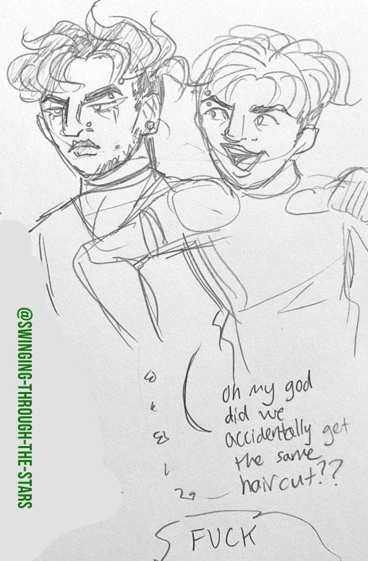
#also i just realized they kinda have similar hairstyles ...
Text

"You were my first"? Bro, I took your vamp-ginity? That's the funniest and saddest thing I've ever heard, Fs in chat.
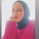
#why would you admit this??? ... but also thanks for letting me know this is a thousand times more weird now<3#everyone in this camp is a freak#worsties to lovers#also i just realized they kinda have similar hairstyles ...#oc: hiraeth#bg3#baldur's gate 3#astarion#bg3 edit#bg3 tav#tav x astarion#anyway sorry if this looks bad i haven't made a gif in literal years<3#i have more in store but i need to sort out the vibe first#edit: THEY CHANGED TAV'S EXPRESSION AND THE CAMERA ANGLES AUGH
888 notes
·
View notes
Text
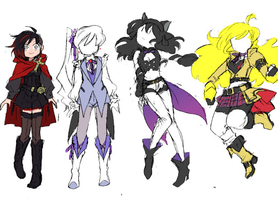
RWBY: Next Steps
This is just a design collection (remember when I used to do those? 'Winter Mission', 'Summer Tour'?? Fun times~)...and it may be my last.
Its only real purpose is to give me something fun to draw for the NeverFell Projects wrap-up series. The recent Adam and Cinder designs are technically part of this collection, too. ^^
These were much harder to do than those two, though...I've spent ~2 months chipping away at this set, trying and retrying to address several different RWBY design criticisms while still making the girls look good. ಥ_ಥ I've finally begun approaching success, though, so I wanted to talk a bit about these ideas.
Ruby
The only one I managed to design in one try. ^^; This was my answer to the question I felt was posed by Ruby's Vol. 7 design: i.e. "how do we do a new Ruby design that feels more 'mature'??" Because I never liked how the V7 design attempted to do that. :/
Between the new hairstyle and the new 'generic adventurer' clothes, it felt less like they were trying to evolve Ruby Rose and more like they didn't like her original design and wanted to get as far away from it as possible. V1-Ruby was such an iconic look (and STILL IS), and yet there's no trace of it in V7-Ruby. None of the goth-lolita style or playful edge that even V4-Ruby managed to preserve...instead they just scrubbed everything out to start from scratch, with a new design that's honestly 'meh' at best.
So what I did was stick closely to V1-Ruby, while adding just a few big changes to make the look distinct. You say a 'combat skirt' is too childish for an older Ruby? Well then we'll make it shorts...but shorts that are just as frilly and cute as the original skirt, with a similar overall shape.
You say her original hairstyle is too boring and 'safe'? Well, then we'll change it...by simply shaving half of it off. It's a much edgier look that simultaneously preserves the original shape of her hair: from every angle except front and back, her silhouette will remain the same.
You say you want to give her new shoes, but don't want the fandom to make fun of you for covering them in dozens of belts again? Here's a wild idea: cowboy boots. ^^ A totally unexpected, unique item that still fits in with the antique-ish vibe of her goth clothes.
Basically, I just wanted to prove that you can do something dramatically different with Ruby without completely abandoning her fashion sense.
Criticisms: The details are still lacking; I think I should work some red accents into her corset and boots. Also, I originally designed this outfit with a white shirt, and I kinda want it back (she had the team colors! R, W, B, and Y! ;_;)...the problem is that it clashes with the sheer thigh-highs. One must go...I'm sure I'll figure it out
Weiss
The toughest of the bunch: I did three different Weiss designs before landing on this one. ^^;;; The big epiphany came when I realized that Weiss looks her best when she mirrors Ruby. The girls' original design concepts share a lot of features; I feel like the characters were designed to look like they belong together, and figured I might as well honor that.
ALSO-- and this was the biggest priority for Weiss' design-- I firmly believe that she should not look like a princess anymore. From a character designers' perspective, it is ludicrous that they gave her the giant Disney ballgown in the same volume where they put classism at the center of the plot and have her send her bourgeoisie father to jail. That right there is the definition of mixed messages...
I thought the whole point of Weiss' character arc was to distance herself from the uber-rich parasites of her family and fellow 'Atlas elites'. I thought we cemented that when she officially lost her "heiress" title in V4. o_O I expected her next look to ditch the crown and visually show that she's past the point of 'rebelling'-- there's no more authority in her life for her to rebel against; she's free now! But alas...
So as usual, I had to do it myself. This Weiss outfit is definitely still fancy, with the coattailed vest and ruffled sleeves, but there's a lot less 'decoration'; fewer jewels, fewer details. The construction is straightforward and simple.
And of course, no more tiara. Instead I decided to give her a li'l snow pea flower and ribbon, which ended up inspiring her new periwinkle purple-y color scheme. Like her original design, it's actually fairly colorful, but does its job and puts the emphasis on the white elements.
Criticisms: ...Not many, this came out pretty good. ^^ I might reconsider the black coattails, but if I do I'll probably just switch it out with the indigo inner vest. I like the idea of her outfit construction mirroring Ruby's, but her color scheme mirroring Blake's, since they have a closer bond in NeverFell.
Blake
Blake designs are notoriously difficult; if you wanna hear some great reasons why, I suggest you check out this old Twiins iink RWBY design ranking video, which always helps guide me when I do redesigns for the main 4.
Anyway, this phenomenon makes it hard to describe what I did...I guess you could say I tried to combine all the best elements of all her outfits, while clinging to the 'fancy action girl' vibe of her original design.
I'm most proud of her new hairstyle-- I dunno why, I just enjoyed working on it and making those decisions. ^^ It's hard to tell, but it IS shorter; now shoulder-length instead of back-length. We make up for this with additional volume, emphasizing the waves in her hair texture by pushing them outward.
And most notably: she keeps the ribbon. She just wears it differently, using it to accentuate her ears instead of hiding them. This way, we keep the point of interest on her head while still showing her character growth.
Criticisms: Infinite, countless. This is a good look, but something is definitely still off. ^^;;; I think some additional detail in certain places (not sure where yet...) might help 'finish' it, so to speak. Maybe some extra yellow accents...?
Also, the bow obviously gets lost in her hair this way. I've tried several color changes and don't like any of them; I think I may just have to texture it differently in the final product. Fingers crossed...
Yang
Another tough one...I only made 2 design drawings, but the colors took several rounds of trial and error. I think my excitement over finally arriving at a good color scheme TODAY was what spurred me to make this post. ^^;
Anyway...there is a specific piece of Yang design criticism I hear fairly often that drives me up the wall: people commonly complain that she doesn't wear enough yellow; that she doesn't represent her character color well because all she wears is a yellow shirt.
And the character designer in me wants to rip my teeth out whenever I hear this, because it blindly ignores the giant fairy-tale-inspired mass of yellow that is her hair, and the purposely attention-grabbing pops of yellow that make up Ember Celica. They're not "clothes", technically, but they're still part of the design!
It's like saying a character with green skin can't represent the color green if all their clothes are black...without realizing that maybe their clothes are black BECAUSE they have green skin, in order to draw your attention to it...!! (╬▔皿▔)╯I just jifjkdsnfksahujknsjnfufh
...Anyway, anyway...the point is, it's difficult to take a character design with so much natural yellow in it and add yellow clothes and still have it read well. But because I like a challenge, I decided to take it on. I think the difference between the mustard leather and neon yellow hair is large enough to make it work, while still feeling casual enough for everyday wear. The champagne off-white she wears in her 'Hunter' outfit (which heavily inspired this) looks great, but it feels too 'classy' to me; like something specifically meant to dazzle the audience with her beauty for one special adventure, not for her to wear often.
On that note, my secondary mission with this design was just to make Yang look cute again, by following the structure of her V1 look, and even adding a little skirt on top of her battle shorts, which looks surprisingly natural considering she almost never wears one.
I don't know what happened in the canon to make the character designer forget the 'Yellow Beauty' part of her character concept; tbh even if her gender presentation gets more masculine she can still look pretty. Designs like Ozma, V7 Qrow and V4 Ren show that they understand this, but choose to cover Yang up in flavorless sheets of beige anyway. :T Making sure she always has a boob window isn't enough; the clothes themselves need to say something too.
Criticisms: ...Honestly, none? I think this might be solid. :> We'll see what happens when I draw it properly. I hope the white socks work out, because then she'll successfully be wearing the RWBY color scheme, which fits her (former, implied...) role as the glue holding the team together.
124 notes
·
View notes
Text
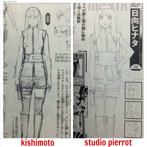
I was in Twitter, which doesn’t happen really often, and I saw this:
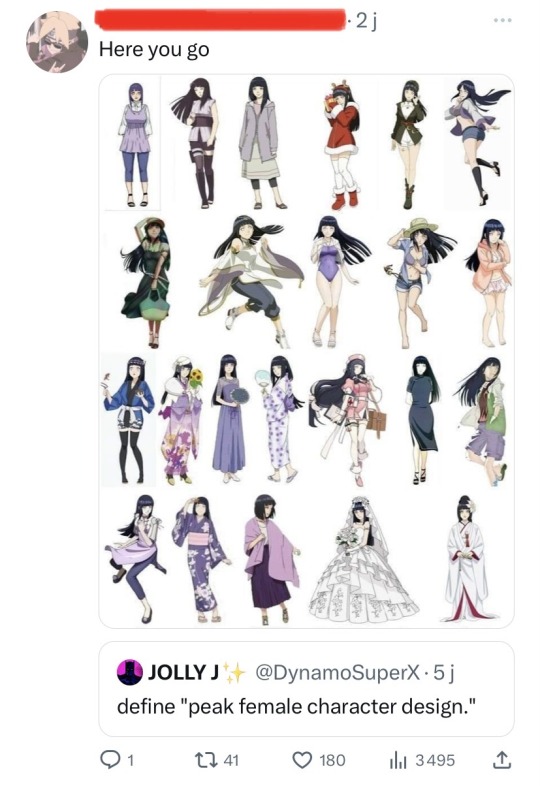
At first I thought "Well, half of the replies to the tweets seem to think that a good female character designs is an over-sexualized one, so it’s not surprising that people think Hinata has a good design…"
But then I realized that the problem of Hinata’s design wasn’t just the fact that she was over-sexualized in the anime and official arts. The problem of her design is that it’s BLAND.
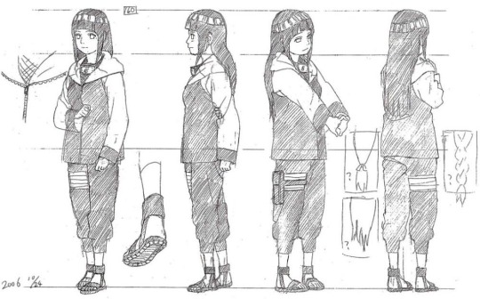
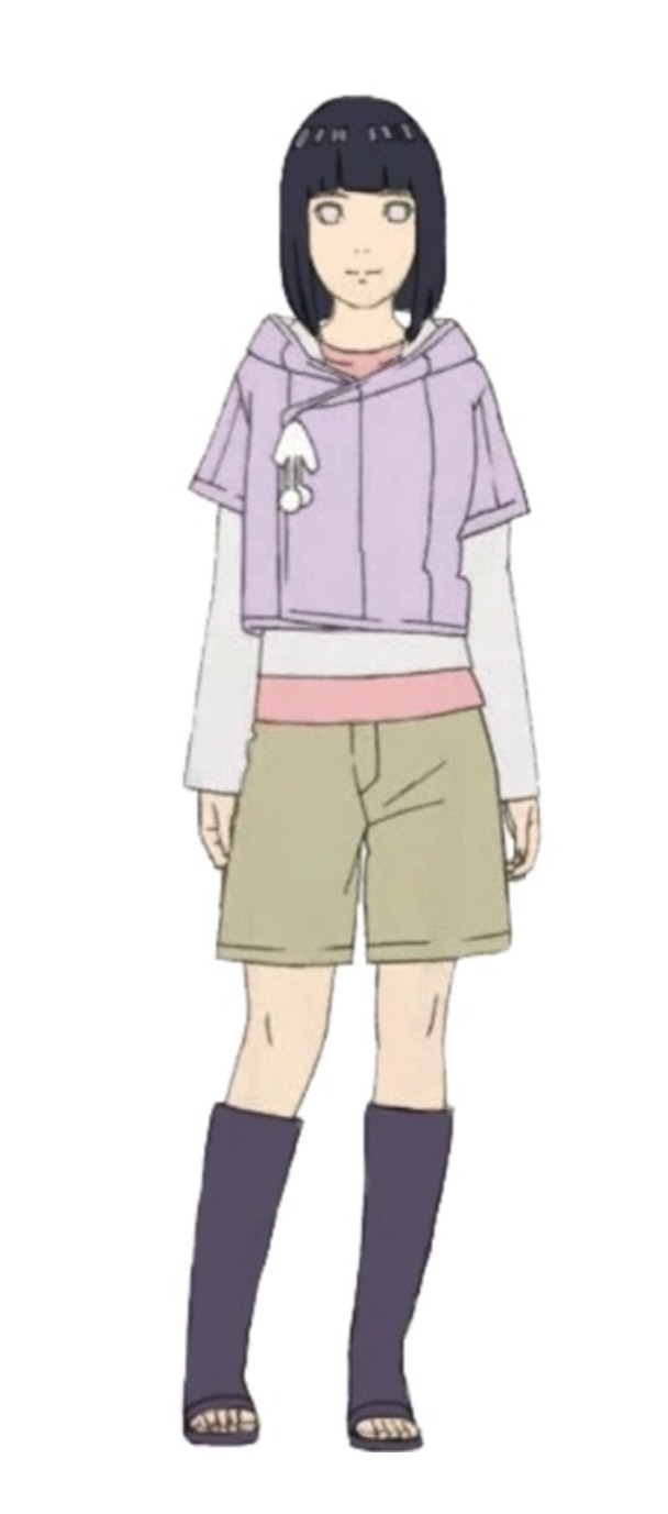
Let’s take a look at her Genin design first:
To be honest, her Genin design is okay. The pompons on her jacket accentuated her soft and childish side, it’s a nice touch to her outfit. Her hair looks good and it’s pretty original to not gave her a more "girly" hairstyle.
But SP decided to gave her a more conventionally attractive and feminine face, and to sexualize her even though she’s 12.


After the time’s skip…
Her design isn’t extraordinary. Hinata’s outfit doesn’t have pompons on her jacket anymore, which seems logical since she grew up. But her outfit is now pretty bland, it just looks like a regular sport outfit. Her haircut is really classical and doesn’t have anything special to it except the two bangs that shape Hinata’s face.
Nothing interesting to say except that Hinata’s design is generic and kinda boring.
The Last design:
With time, Hinata’s design just get more and more generic. Her round face was changed for a pointy chin, and she even completely lose her bangs in her design for The Last. We can’t really tell if she’s a ninja or not, since she doesn’t have her hitai-ate anymore, and that her outfit doesn’t look very… practical for fighting.
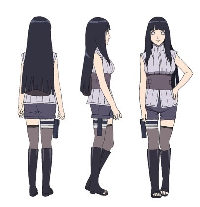
The worst part about her design is that it’s OOC. A comment that Kishi made in the first Databook makes us know that Hinata isn’t interested in fashion, and that she was apparently not the type to wear clothes that reveal her skin.

(Kishi even tells us that she looks bland)
But making Hinata’s clothes shorter to make her more appealing to the audience is more important than the coherence of the story I guess… The black socks she wears are similar to the ones that girls in hentai wear, but in the design Kishimoto had previously drawn of Hinata, we can see Hinata was wearing the usual fishnet socks that shinobi wear (and she still has the shape of her bangs)
At first I thought that SP decided to replace the fishnet socks by the black socks because it was easier to animate, or just because they wanted to change of art style to distance themselves from the original anime. But then I noticed that Tenten was wearing fishnet socks on her The Last design… So there’s not other explanation for this change except the fact that it makes Hinata looks even more hentai-related. Great.
And finally, the Boruto Design:
Hinata’s design in chapter 700th was… decent. Her outfit look like an "adult" outfit, and I think her tied up hair looks pretty good. Her design is still bland and forgettable, but it’s fine. But for some reasons, her design was changed for the Boruto movie:
Kishimoto designed it, so there must be a reason for the changes. So, Hinata now has shorter hair and shorter clothes. And frankly, it looks like she’s wearing the clothes she wore when she was a genin, even the pompons are back. Not only does the color palet makes it hard to look at Hinata without laughing, the shape of the outfits is also pretty weird.
I don’t know if Kishi redesigned Hinata to make her more childish in order to show us that her wedding with Naruto only accentuate the fact that she’s still a little girl in love, but if it’s the case… well played I guess??
#naruto#anti hinata#anti hinata fandom#antihinata#kishimoto#anti the last#anti boruto next generation#my post
88 notes
·
View notes
Note
Aside from how alike Cody and Steve look, wouldn't funny and scary if everyone saw how alike Graham and Banner look?? Like they almost have the same hairstyle and face shape, just that one is more depressed than the other.
I just picture a situation in which Hulk lets Banner out and everyone just looks at the skinny man that was Hulk and sees that he and Graham just look the same...
Dani also looks and acts a lot like Wasp, but Wasp has a different hairstyle.
I want to say that there is one for Kade too, but I don't remember any AEMH character that has a giant chin XD
hi
hi
O...M...G...!
I did not realize that until you said that. They do look alike. Now because of those similarities, Dani and Wasp would get along, but more of a friends/sisterly relationship. And Bruce and Graham, its a bit hard to define their relationship, not parent/child, but I can see Bruce kinda being a mentor figure, and Graham, along with Boulder, kind of being a supportive figure for Bruce. In the end, Cap and Cody would be the ones to have a parent/child bond.
I don't think Kade has a look alike from the Avengers. Kade would be bitter about that.
I can imagine some jokes like "Where's my lookalike?" between the Avengers.
#Answer#TFRB x AEMH#Transformers#Avengers#Rescue Bots#Avengers Earth's Mightiest Heroes#Transformers Rescue Bots#AEMH#TFRB
13 notes
·
View notes
Text
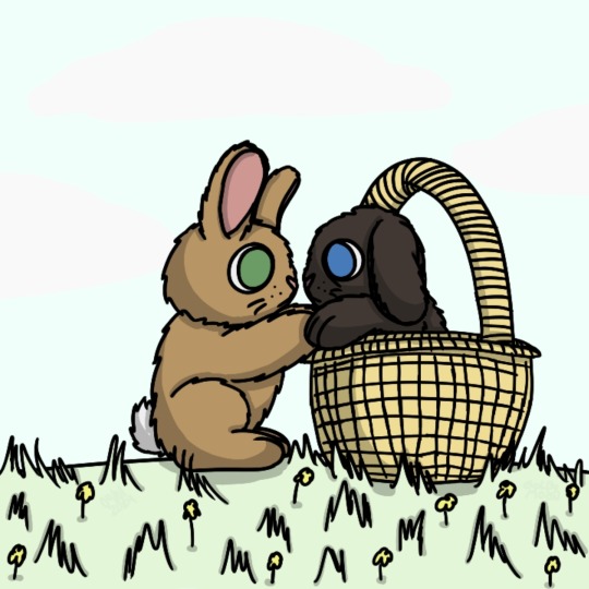
made a thingy that was supposed to be released yesterday for Easter and stuff but inexplicably wasn't because laziness ensured I didn't finish it oops (the laziness still shows up in the backgrounds ignore those)
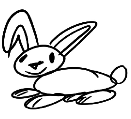
this is the point where I realized I haven't drawn a rabbit actually since I was like five and even then it was made out of a bunch of weird ovals and didn't have any legs to go with the feet. I unfortunately remember it enough to know it looked something like this
yeah. anyway
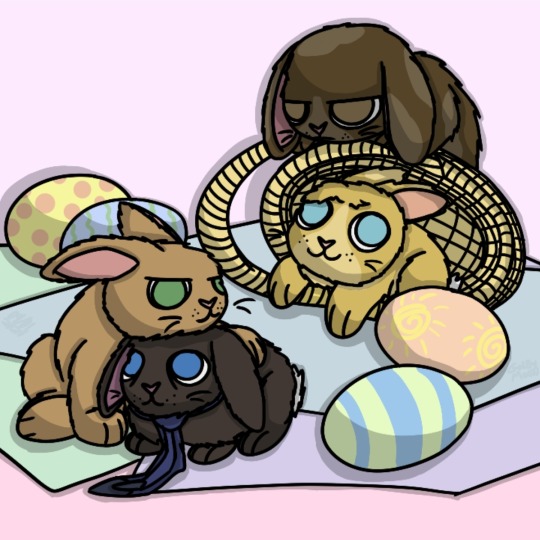
after tiny destiel rabbits I made one of TFW 2.0 because I don't draw Sam or Jack enough and I also wanted to try more rabbit poses. as you can see Sam is not impressed. also I was gonna give Dean and Cas some patterns but idk they just looked better without them so I skipped it. I was also gonna write 'Easter 2024' or something similar on the wall but idk I don't like making stuff specific to one time so I skipped that too
(originally Jack was gonna have one floppy ear and one erect one while Sam and Dean would both have erect ones and Cas floppy ones, so it'd kinda reflect that Jack is idk half human and half angel, but in the end I based it on their hairstyles instead. also there is no partially floppy ear for rabbits where it bends midway down or anything, it's either just erect or lop-eared (the ones Sam and Cas currently have), nothing else even if they can have one each of those. weird)
(04/01/24)
#my art#supernatural#spn#spn fanart#castiel#dean winchester#destiel#sam winchester#jack kline#easter#animal spn#animal dean#animal sam#animal cas#animal jack#rabbit dean#rabbit sam#rabbit jack#rabbit castiel#rabbit cas#bunny dean#bunny sam#bunny jack#bunny cas#bunny castiel#idk i'm never gonna remember these tags lol#also apparently rabbits don't have visible paw pads and instead have a thick layer of fur on their feet#that's why I didn't draw dean with them#kinda interesting though imo
14 notes
·
View notes
Note
Im making art 4 u!!
Do u have a persona/oc i could use as reference? Or maybe just ur hair + eye color + sense of style (what you find comfortable for sleeping or laying around in !) ?
(/Not forcing)
wow thank you!! that's so sweet!!! I actually didn't have one before but after reading your ask I felt inspired so I tried making one! it took a few days because of how I'm feeling at the moment, but I think I managed to make something I'm pretty happy with (though details might change in the future) they're kind of a combination of pinkie pie, fluttershy and me (like my username haha, which I guess is their name too now? 🤔)
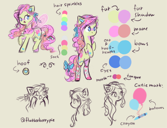
I gave them a hairstyle similar to how I wear my hair irl and added in some brown into their pink mane, since my natural hair is brown
their eyes are also blue like mine
cake batter yellow fur & hair sprinkles 'cause I like to bake (pinkie does too of course 🤭)
bows & details in similar shades as the blue I use for rainbow dash because she's awesome and I love her
strawberry socks because 1. love fun socks & 2. strawberry is my favourite fruit & flavour & 3. duh. I litterally love strawberries so much I named myself after them!! >♡<
they have fake fairy wings sometimes because same and also earthpony + pegasus who lives on the ground... idk kinda made sense to me at least
cutie mark is a crayon being lifted by balloons because childish + creativity + love to make ponies smile by doing what they love
likes to wear: mane charms, fun socks, childish princessy things (but sometimes I wear a bit more gender neutral clothes if I'm feeling particularly dysphoric) that one blue unicorn onesie because it's been my favourite thing to wear since I was 12 and I stopped growing when I was about 12 or something so I never grew out of it lol!
loves soft blankets, stuffies, pigs & anything fun and childish!
thank you so much for making me inspired to make a ponysona/oc! I've always thought about it, but never really tried, I had SO much fun making this and it really brightened my mood despite the bad circumstances I find myself in currently. 🩷🩷🩷🩷🩷🩷!!!
p.s. and of course if you still want to make something, you can make them human too, haha I just assumed we were talking about ponies but when reading your ask again I realize that might not have been the case 🤭
♡ ˢᶠʷ ᶦⁿᵗᵉʳᵃᶜᵗᶦᵒⁿ ᵒⁿˡʸ ♡
#ponysona#mlp oc#pony oc#flutterberrypie#my little pony#mlp fim#my art! ☆#fren-in-your-computr#☆.asks#my pony art ☆
81 notes
·
View notes
Text


Worked on some hairstyles for Gel's siblings today!!
I've realized that Gel, and in relation, her siblings, have ended up being very black coded. So I've decided to lean into that! doing a lot of research to make sure that it comes accrost positively and accurately.
[More rambles under the cut]
So today, i decided to start with hair! Since that was the most immediately noticeable feature anyways i figured that was pretty important. Also, i found out that i really enjoy drawing black hair, and i think it's fun.
I referenced several images and hairstyles before settling on what i wanted for Gel's siblings to have and what i thought best fit their personalities.
For the twins, opal and topaz, i know i wanted some sort of updo for both of them, but for it to be different at the same time. Opal is a lot more lively and active/outgoing, while topaz is a lot more chill. Calm, mellow.
I decided to give both of them cornrows/braids leading into the hairstyles to have a similar base, but after that, i went very different directions.
For opal, i actually mixed two hairstyles. I took space buns to highlight their horns, but then i saw bubble braids [is that the right term?] And though it'd be perfect to give her two big ones coming down from the space buns. I think it turned out really cute!!
For topaz, i just left the rest of their hair out into a low ponytail, essentially, but with a bandana to help contain it some, but also so i could have the tails flip up and kinda reverse mirror opals horns. It's a much simpler hairstyle but cute nonetheless!!
I love how diverse black hairstyles are!!
Anways, last one! Jade/jaze has technically the simplest hairstyle, but was the hardest to choose the final look of. I debated a lot on the length and shape, but i really like the final look!
I swept their hair to the side to show off and highlight the crack in their skull, to show that they've accepted that its there and they'd rather show it than hide it. So to make sure the hole didn't get swallowed up in hair, i gave them an undercut with a fade[is that right?]. It was fun to add the shaved details highlighting the crack pattern.
Anyways, this was super fun, and i can't wait to make their finished designs/references!!
#a shut up#art#drawing#original character#sketch#rewind arcade#opal ember#topaz ember#jade ember#jaze ember#oc rambles
11 notes
·
View notes
Text
remembered some of my host design thoughts from 2020 just gonna straight up copy and paste them some grammar mistakes don't mind that too much
host design progress/thoughts/etc/etc
schmitty - when i listened to his (scared) tmp2 voicelines i imagined him (and did like 2 doodles) as a humanoid red quip. whether or not that's because me and my friends memed said quip a lot and i began assoisating the quip with schmitty might...idk be up in the air lol.
anyways i basically made him a human verison of the red quip and my human verison for him came later
cookie masterson - i think i listened to his F U easter eggs? and then boom. cookie, made his tie a ...cookie tie bc of his name lol
REDACTED - i think i listened to the tmp1 " voice reveals "? i forgot, man it's only been two months. anyways i know i based their look soley on something said on their tumblr page, " based raised in the woods ". and i made their " not shadowy " form not too long after
to quote myself: " well hes a serial killer or something right " . oh and i believe i made his shirt purple bc that color is sometimes associated with evil! woo. as for my first take on his Totally normal man in society he did not seem like a guy that could play off being a Totally normal man in society. he had fricking pink eye and was bleeding from his mouth and looked really sickly
todd - ah the funny internet man! my first design for him ..funky hair. i know i went through like 3 hairstyles for him and whether or not i wanted to give him shorts.
the 3 things that stayed through out all the designs are: shades, fire tie/fire on the pants and green crocs. now that i think about it his clothes are weird lol..
nate - soley based on his F U easter egg. " i'm pretty (fricking) expensive. " i also wanted to use a different head shape.
from my first sketch of him, nothing has really changed except for the stripes on his tie
guy towers - oh fgod my first reference drawing of him, the colors and design are pretty much the same now except i changed his shoes a bit and give him a short ponytail
idk hes the sports guy and sports people wear visors...yea
oh my gosh i think i gave guy a ponytail bc of some " au doodle/ the whereabouts of the ydkj hosts "
binjpipe - oh uhhhhhh ,is pink , hair shapes a b, she is the only character with a eye color (i guess bc i didnt really bother giving eye colors to any of my hosts)
my design for it has not changed, the onyl thing i added recently was circuits on her hands! bc . idk circuits are cool
schmitty but human - ohhey i found it, i imagined in his ydkj days hes just...pretty tired. hence gray hairs! and i know the tie i very loosely based on Funny Faster Funnier or wahtever it is
dr ro (hc name: dr.rangsey) - short science girl! idk i think the phrase " lab safety is mint colored! " fits her and thats something i thought about..and her colors are based on her game
again her design did not change much i think i just made the labcoat look better
hfelicia - ohhh i remember really wanting to make a design for her . i was like I GOTTA DO THIS.. and tentacles were a requirement. and a eyeball in her hair
one sketch i have is her with eyes on her arms which i believe i did put in, in her monster form . ok i just found when i got around to linearting and coloring, i realized her outfit was too similar to the mother in her game so i changed it (and ngl i was thinking of maid outfit kinda) i looked up vintage clothes and gave her something from that, and red shoes lol
guesspionage host (hc name: abigail s) - oh!! i doodled him on paper first, my final design is pretty different my gosh
my next sketch for him then has boots and a different head shape , uhh yea, eventually i made the shoes Not fricking big and i gave him some cool glove thing with...circuits! bc to quote on my reference page " epic shocking prank ". ngl that was mostly bc of gandra dee in dt17 bc she has nanobots or whatever on her hand and its pretty cool and i thought this host would be the kind to get stuff like that
and could be used for self defense i think? shocking hurts and its like ..opposite of binjpipes' kinda. his are on the palm while hers are on the opposite of the palm (??i dont know my human terms)
dandelion - design hasnt changed much either! and i hc him to be schmitty's brother so i uhh yea made them look similar somewhat. BUT MAN THE SHOES IN HIS FIRST DESIGN............not great. i added a bit more to his suit..jumpsuit? in my latest design for him! swaggy
buzz lippman - when i first heard him there were 2 things i know were needed - a tophat and yellow glasses
my first design for him isnt different from his latest deisgn, i jsut gave him a blue tie. blue as to tie into nate bc theyre cousins and i gave nate a yellow tie os yea
dixie - aww my first sketch for her was cute, i wanted something flowy, i made her somewhat angelic! and her dress has clouds ..and the thing around his waist and her cape are supposed to represent the millions of words made up! (vaguely bc no way am i gonna write words there) oh and the cape is kinda uhh like her wings persay!
civic doodle hostress and old man - AHHA my first doodle of old man was just a stick figure bc thats how hes shown in the ride. and i gave them both stick figure forms bc why not? EHAj i wasnt sure what colors to give to them at first so i used ms paint colors, AND OLD MANS BEARD WAS MADE OUT OF POMPOMS..God haa i didnt give him a beard at first when i finalized both of their designs
gene - referenced from his ingame look in sti, thought hed be a office guy so yep! and his pants have pixels similar to todd's sleeves , bc they are kinda a duo right
helen - awhhg she looks pretty anger in her first sketch and latest design...i thought of her color being green at first and man her skin color was more sickly
otherwise her hair style and form havent really changed. ohh there was a short time where i thought she was the ceo of binjpipe ..glad i didnt continue on with that thought, anyways stan helen bc she has to deal with 5 men sending each other to the bottom constantly </3 , or did so in teh ride
dot! - ah! my first digital sketch of her, really the two things that changed were her hairstyle and her pants. hairstyle is a thing thats stumped me several times lol, ooh her colors changed a bit too
ahh i wanted to give her a tuxedo shirt at first but i didnt 😔
bob - hairstyle REALLY stumped me with this one . and for my first digital sketch i quote myself " honestly keep seeing bob as bald " , then i saw the tvtropes page where it says he implies he has 80s hair or something and i was like " shit "
bidiots host (hc name: quant) - not much here, i based his suit on one i saw on a show we were watching in one of my classes. idk why i gave him a red gem thing tho, why not i guess!
dode - i know i looked up reference images for short hair! her design has changed p much the same the most ive changed were her colors
eventually i drew her ingame look :P
word spud host - literally a cardboard cutout, i think it was seriously inspired by box from inanimate insanity / a humanization of box that was a cutout cardboard and i thought it was nice
as for a serious design for them? maybe,
Ok um i guess the canvases are down here it goes august 2020 -> september 2020 -> started in 2021 minor edits here and then so this is most recent one 2023 -> december 2023

8 notes
·
View notes
Text
ult kantrio headcanon masterpost
⬇ here i will be compiling as much as possible of my very specific hcs about my favourite play dolls from pokemon that ive rambled about everywhere else, usually at 3 in the morning. and will be updating this post whenever i will. this is still just a small percentage of everything going on in my head lmao. ⬇
does not include futureverse, give it time in the oven.
RED 💖
mute boy born to a family of jolly, talkative and enthusiastic fishers. they make this their entire personality and reds house is very fishing themed. hes... absolutely not as enthusiastic as a kid and sick of the smell of fish, but enjoys it as an adult.
his pikachus a much bigger beast than most pikas in comparison. Supreme Champion.
during G1 he is very polite and well mannered in contrast to green and leaf. his room is tidy and he goes to bed early. though he defends all dumb rowdy shit leaf pulls anyway. this is reflected in his pkmn being more of the gentle giant sort.
he has learned a lot of cooking + baking skills from his mom and the smell of his outdoor cooking can instantly summon leaf and green (reluctantly) to him during G1. he is a huge sweet tooth as well and prefers tea over coffee.
only looks retired as an adult; often sleepy and napping and walking everywhere in crocs. boring as hell but hey its endearing when red does it. but he is very much in peak physical strength and still quickly sweeping other trainers' teams. despite his usual serene demeanor he can still go for the most rash decision and just go apeshit w his pokemon.
TERMINALLY OFFLINE. no way is he going to understand what "ratioing team rocket epic style big W" is going to mean. types bluntly, like your dad. last tweet from him was six years ago, a 240p quality video about encountering an ursaring in a hut in the middle of the woods.
his usual pokeball throw resembles a baseball pitch.
exactly just as geeky as he is athletic. he enjoys the battle tree, but he still wishes for more. his dormant interest in wildlife biology and conservation that he had as a child is soon reignited and hes gonna get that PhD.
enjoys haunted locations too much. even leaf is confused by this! he decides to buy the shittiest abandoned house. which is also haunted. but reds eyes sparkle as always, man is FLEXING and determined to renovate this thing while green is frantically experiencing literally every emotion at once from jumpscares to "huh red knowing how to renovate is kinda ehehehe" then again pacing around sobbing over what were they thinking buying this house.
GREEN 💚
his and daisy's mother was a musician with a similar personality to him. his father, prof. oak's son, was more like daisy and a humble gardener w grass pkmn by his side. neither were too interested in battling or going on adventures.
he is extremely multifaceted when it comes to styles and music tastes, for example. somehow this man can combine prep, jock, geek, stoner and punk rock to his style all at once. his music taste is ALL.
nowadays his eevee is sporting the same hairstyle as him.
millennial still trying to make his podcast a big thing. his poke-twitter is fairly professional. relatively offline, not hip enough for zoomer trainers.
a francoboo. had his boy crazy era in kalos and thus more experienced than red when it comes to relationships. some of his french ex bfs still chase after him but shit bricks every time red answers the door instead.
at least he got them to take good fancy pictures of him in kalos. and he cooks kalosian recipes quite well, spoiling red with those nicely decorated crepes. but likely he experienced some paris syndome too. when you realize lumiose city kinda often smells like piss...
not very artistic. he draws like a 5 year old.
bad at figuring out what lesbians like. he buys leaf ellen degeneres merchandise :(
hes just kind of. eternally stuck in 90s slang and still having his default insults be so hilariously lame they wouldnt sting anyone. like buttcheek.
this is a more recent thing about my design for him but his left eyelid is perpetually droopier than the other.
LEAF 💙
showed up inexplicably in pallet town one day and simply asserted herself. no further elaboration. her origins remain a mystery. she biked all the way inside oak's lab and kept biking.
diversity win! in this universe leaf is closer to being an "ash counterpart" than red is.
since shes always seeking new thrills, she lives in a van as an adult. it looks pretty amazing and cozy from the inside and plenty of room to cook! on the outside theres like. airbrushed venusaurs and wizards and venusaur wizards of all sort.
a big ball of positive meatheadness to the point where shell def blow up a lot of things thinking everythings gonna be just fine. some people want her dead for this.
absolutely will put anything in her mouth and sometimes this is terrifying. tries to always make her cooking look like something "fun" and colorful that kids would enjoy but usually fucks up the look.
on-off relationships with women, she makes a new rival with lgbt undertones every two months. popular gal like that. dont ask her for relationship advice.
quite online and very charming. types like cher on social media. still, she remains popular and loved amongst the youth.
had a geocities in 2004 where she documented her adventures (bc i want G1 to be as 2004 as possible like that). it was an eyesore to look at.
often forms a trio with may and kris and they go on roadtrips eeeeverywhere. they either love her one day or think of her as a dumpster fire personified the next day.
#trainer red#trainer green#trainer leaf#red oak#green oak#trainer blue#blue oak#pkmn#pokemon#kanto trio
139 notes
·
View notes
Note
(ask might get cut off for length) i can only hope that what im about to say is not racist bc i wouldnt know but i dont understand the big deal with 'THIS CHARACTER IS UNRECOGNIZABLE' because who cares. your art is hurting no one. them not being able to recognize your character designs (that you make for fun) sounds like a them-problem. also homestuck is literally color coded. even if a character doesnt have an iconic hair shape or their features are different, people should still be able to tell that roxy is pink and jade is green and karkat has the nubby horns and so on. the characters are DESIGNED to be recognizable even if u remove all the features except for their little symbols, there are so many indicators for that. i don't like some of your designs but i cant wrap my head around people treating your art like it personally disrespects their firstborn child or something. even if they werent recognizable (they are, ppl just rnt used to having to search for other cues in character design like that) it's? a fictional character? the world isn't gonna fucking end if someone draws them black.
The thing is I don't care if someone dislikes my designs or if they don't recognize them right away that really isn't the problem! It's people who literally CAN recognize them but choose to decide that it's NOT the characters bc it's not canon enough or it doesn't "look like the characters" even though many people have looked at them, recognized them, and enjoyed them.
Simply disliking something is different from disliking bc of racism/anti-blackness.
A lot of the things people say is "not the character" don't realize that there are many fanarts that give the characters hairstyles that aren't that similar to the original shapes and even clothes. It's just not picked on bc of how the characters are more white-passing/racially ambiguous features or straight or even wavy/loosely curled hair within most of those arts.
People literally who openly scream about how bad my designs are say they're ugly and point out things that I've seen many times before only with more black (-coded) designs, it's kinda becomes obvious that everyone perceived white(-coded) designs as default and seeing anything else not close to that definitely bothers people.
Basically, it's all about them being aracial until you make them black. And that applies to most.
And yes you're right, genuinely, ppl can figure out and HAVE an understanding of whos who with the context clues I give AND NOT TO MENTION MY TAGS. But once again, most of everyones default is white.
48 notes
·
View notes
Note
Hello Mah! ♡
AHHHHHHHHHHHH I just started following this amazingly talented oc x canon artist (their oc x Jamil stuff is sooooo good!!) and they FOLLOWED ME BACK!?
I am in shock and awe!! Like it always blows my mind when a talented artist or writer follows me! (I was just as shocked when I realized you were following me, as your art is amazing and your ocs and oc x canon stuff is so cute!)
Anyway... lol To the Cater x Ruthie brainrot!
So something I never brought up/mentioned is that when it comes to Ruthie's UM, their is a catch to it if the person is already in love/has a crush on someone. Essentially it means that when she uses her UM on someone, if the person is already in love/has a crush on someone, then the person she used her UM on will appear to have similar traits as the person they're in love with/have a crush on.
Let's use your oc x canon as an example! So, Ruthie use's her UM on Adamina in the event so that she appears as the boy's ideal types. When Leona looks at Adamina, he sees a woman with traits identical to your oc Isabelle (Similar hair/hairstyle, similar facial features, similar build, etc), since he's in love with her.
So with this in mind, what if when Ruthie uses her UM on Adamina, she appears to have similar features as Ruthie, since Ruthie is Cater's "ideal type" (He could even make a joke about how they could be sister or ask if they're sisters, giving a hint to what's really going on)
Thank you! ♡
OH MY GOSH YAHHH I LOVE OC X JAMIL ARTISTS... (kinda why I created an oc to ship with Jamil myself lol) Idk if it's the same person bc low-key there are tons of oc x Jamil artist but something similar happened to me recently, they sent me an ask and every I was so shocked. I stayed like 30 minutes looking at my screen in awe 😭😭😭 ALSO TY?? I DON'T THINK IM THAT MUCH BUT I APPRECIATE IT...
Also HELP THAT'S SO FUNNYYYY it would be so embarrassing for Leona– but it would be so funny for Cater and Ruthie😭😭 like my dude just looks at Adamina and goes "wow I didn't know u had a twin Ruthie😊" like pookie.... Pookie u basically confessed....... I don't know if Ruthie would notice since she's very oblivious but that would be so funny😭😭😭
6 notes
·
View notes
Text
Hi. My human versions of dream and nightmare have been changed

As you can see, joku and my designs were very similar in a pretty obvious way that I kinda just overlooked because the facial features were different. So I decided to change up the hairstyles to fix it. and also ended up changing the faces too cuz I don’t rlly like how I did the old ones anymore ;D
These two are a couple of the only designs where I had the creators versions in mind. Now I am realizing it was not a great idea 🙃 (ink is the last one I did this way. Luckily it’s different enough to not have to change it, but you can definitely still see the similarities of mine and comyet’s)
I doubt that anyone rlly cares about this, but after having said “yeah credit me if you use my designs” having em stay like that just didn’t sit right with me 😅
#my art#utmv#dream sans#nightmare sans#human au#human dream#human nightmare#genderbend#some aspects are still similar cuz I rlly like them#wasn’t gonna full on copy again but dream needed that long hair and nm had to have some of his over his eye 😌#hgdndh#only 1 person has ever used my versions and it wasn’t even these#but I’m gonna be careful anyway#i am worry too much okaayyyyyyy have a great day I’m gonna draw some more now#⭐️
74 notes
·
View notes
Text


I feel like every two months for the past 12 years I keep redrawing and improving on my human Shadow the Hedgehog design and I think I'm getting to a good place.
And Sonic is there because I wanted to try to make them look kinda? similar? Or at least enough for people in SA2 to have not been able to tell them apart in a dark room with a crappy security camera. I think it's really just making them have similar hair because I've never really cared for the idea that Shadow and Sonic need to look EXACTLY the same.
ALSO I prefer a human Sonic design with the haircut on the bottom pic. I'm just imagining they both have shoulder-length hair from SA2 - ShadowTH and then Sonic cuts his hair. And then Shadow does too, realizes he's made himself look similar to Sonic's style, then immediately decides to grow it back out.
I would also think it's funny if they accidentally kept copying each other's styles, fueling their rivalry, but as they become friends they do some matching things (like jewelry or hairstyles) intentionally. Of course, Shadow will tell people Sonic was the one copying HIM but secretly he's the one doing the copying.
#sonic the hedgehog#shadow the hedgehog#humanized version#shadow the hedgehog human#sorry i was busy doing a boss-ass yakuza thing but then the shadow brainworms came back#i will never stop thinking about him#he is my ultimate favorite okay#honestly if you follow me you should expect anything i make to revolve around the four things i like
11 notes
·
View notes
Note
🔥🧡😈 <3333 (i can do more if u want!)
heyyy <3
🔥 - How has the way you think about yourself changed since you realized you were queer?
similar to below, because finding out i was queer coincided with being happy and feeling like an actual person and finding an identity, it’s hard to tell what comes from my queerness and what comes from just. general finding myself stuff. but i guess the main ones are i’m a lot more confident in dressing masculine and also dressing in a way that’s stereotypically queer, as well as being a lot more in tune with how romantic love works for me ig. i also like myself a lot more now i’ve figured out my gender identity lmao
🧡 - How has the way you presented yourself (ex. Clothing, hairstyle, etc.) changed since you realized you were queer?
this is kinda hard because i found out i was queer about the same time i was sort of trying to forcibly give myself a personality and identity after so long with no distinct style and stuff so it’s like. a chicken and egg situation. however i’ve definitely got less afraid of standing out and wearing interesting clothes and stuff. also i keep wanting to dress more masc. like in the way i have for ages. but i can’t because my parents control a lot of the clothes i buy :|
😈 - How Sasitified are you with your current Labels, if you have any?
pretty satisfied! i have some internalised biphobia, if i’m honest, so i’m always trying to gaslight myself into believing i don’t like girls and i’m actually straight or i don’t like guys and i’m actually a lesbian. which is dumb. uhh otherwise i like the greyace label because i’m not completely ace but i’ve never been that connected to the thought of sexual relationships tbh. i like bigender but i prefer demiboy and demigirl. and i like queer! ik some people don’t but for me i actually enjoy the connotations it has of being ‘different’
4 notes
·
View notes
Text
Watched Dragon Ball Super: Super Hero on a whim the other night. Things I liked:
Pan. She had so much fun whenever she was with Papa or Grandpa Piccolo! Not so much when they were both busy fighting the giant monster, but hey.
The movie focuses on Piccolo, Gohan, and Pan instead of Goku and Vegeta.
Magenta's rant about how Capsule Corp is clearly just a front for a coalition of alien invaders working to control the Earth. It's 90% recognizable conspiratorial nonsense (minus the antisemitism and unpleasant context) and 10% weird sh*t that's just canon.
Despite the Red Ribbon Army's advanced intelligence-gathering tech, they still consider Mr. Satan to be a threat on par with Goku or Vegeta.
Piccolo has a house now!
Super Sai-ants.
Gamma 1's occasional moments of genre savvy. The first thing he says is "You say you killed King Piccolo? Did you look for the body?"
The Gammas in general, really. Especially the background squabbling-siblings moments.
All the new characters have such delightful, quirky personalities. Dragon Ball is at its best when it's a comedy series spiced with action.
Piccolo doing that thing Frieza did in the Broly movie where he hurt Paragus to make Broly get a rage-induced power-up, just without actually hurting Pan.
I can't talk much about Max Cell without ruining the positive tone I'm aiming for here, but I like the way he serves as a fulcrum of conflict between Magenta and Dr. Hedo, and that his design makes Semi-Perfect Cell look intimidating. (And not just by virtue of being kaiju-sized.)
One storyboard artist really liked the idea of the Z-fighters jumping off of high things in skydiving poses before activating their flight, and the higher-ups were right to let them do it twice.
Namekian stretchy-arms and gigantification return! Piccolo even uses both at the same time! More Dragon Ball fight scenes should use weird little abilities like that; stretchy arms aren't gonna win a fight Piccolo would lose otherwise, but they make a fight scene more unique and interesting.
The animation is good, the haters just noticed that it's CG.
Pan. She's adorable.
Things I didn't like:
Enough "Ha ha, Dr. Hedo/Gotenks is fat" jokes to stand out as a Thing.
Act 3 is basically just one overstuffed fight scene.
Cell Max is fine as a plot point and setpiece, I guess, but also not interesting.
There is no way Goten and Trunks haven't been fusing for fun enough to remember how it works. If they messed up because they were rushing or because of a disruption from the active action scene or something, that would be one thing, but suggesting that they're just rusty is...kinda dumb.
Gohan's new transformation feels like that form Future Trunks got in the Goku Black arc, in that it's an unexplained power-up he randomly got that I assume is meant to justify him fighting god-tier foes, but they didn't want to give him Super Saiyan God or Blue because reasons. My feelings about Orange Piccolo are similar, but with more understanding about why they didn't give him an existing Super Saiyan form and less irritation about being an obvious retread of the Super Saiyan 2 transformation bit in the Cell arc.
Also, Gohan's new transformation's hair. On one hand, it's among the most obvious ways that said transformation is calling back to the SSJ2 transformation against Cell, which is irritating. On the other hand, it also looks absurd. It's just...scale up Gohan's preteen hairstyle by 250% and make it gray. Why gray? And why make it that big? If it had gone full SSJ3 I might have liked it, but it doesn't go far enough, and the hair stays too stiff, like it doesn't realize it's three feet long and should be pulled down by gravity.
Basically every scene on Beerus's planet, and not just because Goku and Vegeta were there. It's good to establish why they're not coming in to save the day, but they didn't need to spend so much time on it! And they definitely didn't have to use that time on a pointless fight scene and Beerus flirting with Cheelai!
Gohan getting more focus? Getting to be a character who's important to the plot? I like that! The interpretation of that idea as "Gohan needs to focus on training instead of studying all the time"? Not so much. At least it was mixed in with a dash of "You're so focused on the academic stuff that you're neglecting your family, too," which is a less frustrating point.
4 notes
·
View notes
Text
god i wasnt done talking about drag i guess
the thing is also that. No one starts drag good. no one goes into drag headfirst and comes out trixie mattel. God i wish i did but i did not. Even if you have experience with like casual makeup, you're gonna start out bad, because drag makeup is something very very different, more similar to theatrical or sfx makeup even. Not even including the amount of hairstyling skill and sewing and design that goes into it. And i feel like just maybe that pressuring amateur queens to come out full glam, perfect makeup, perfect body padding, passing as a woman is leading to a LOT of queens who could serve new ideas and bring something completely unique to the scene quitting before they ever really get to shine because theyre not living up to the expectations of what drag is. Obviously im not saying queens shouldnt improve but i think improving your drag looks different for everyone too. And just in general we need to stop rejecting drag we think is ugly not only because of that but also because like... yall it will become SO STAGNANT if we do that. If it just becomes queens in the same copypaste look because thats whats like. Attractive. ugly drag is kinda where drag originated. and that is where you get fresh ideas and innovation. And i am losing focus in this post but the point is ugly drag is really important to like. The drag ecosystem. i do NOT wanna see drag going down the route of everyone copying each other we need to keep that gene pool expanded
on a side note i wish when straight men are like "i wanna experiment with drag" they stop treating it like its a joke and drag is the punchline and actually put some effort in. A wig and a dress on a straight guy does not a drag queen make. And if you actually try you might realize there's something about it you enjoy more than you thought you did. Again im not saying dont try new shit. But if youre gonna try drag out actually TRY drag. Even if it turns out bad. just try a little
#ummmm tl;dr support local queens support ugly drag and if youre trying something new dont half ass it because youre afraid.#Whole ass it and even if its bad you did something new and thats worth being proud of
0 notes
Last Seen Blogs
misteraskman
Misteraskman
metal-bs
Cacodemonia
delphiniumarchangelmoon
In 2024 We’re Gonna Get Weirder And Gayer
meltemie
meltem