#also is this readable at all? is there a better format for all these links and stuff?
Note
Hey!! 💕 for the fandom ask game, 5, 9 and 20? 🤩
hi!!! thank you for sending me this ask!! once again apologizing if the format for this is all janky, assume I have no clue what I'm doing 80-90% of the time!! also I found out so many of these writer's have tumblrs that I wasn't following so that was exciting!!
please note: this is all about the harry potter fandom so if you don't follow me for that, please look at my pinned post!! tldr is fuck jk and fuck terfs, I won't let her steal our joy!!
5. something I see a lot in fics and love
hmmmm... this is hard to narrow down!! so here's a few things I've been enjoying in hp fics I've read lately!
harry potter who is just so fucking earnestly in love. like, he's tripping over his feet so he can hold the door open for draco and looking at him with big heart eyes from across the pub. harry's got draco's order memorized from that takeout place he loves and he's been pining for draco for years in such an embarrassing way and all his friends are rolling their eyes and placing bets on when harry will finally make a fucking move.
adult ron weasley taking after his mother!! he makes delicious food and makes people scarves and shows his love through his actions!!
draco being absolutely rocked when he finds out that harry is queer! especially when harry is confident and completely unashamed of his sexuality. also throat goat harry
magic being tangible in some way!! like, a strong spell giving off the smell of ozone, being able to feel it in someone's hands, everyone's magic having a unique vibe.
harry as the ultimate dad. like, that dude 100% has so many complicated feelings about family and his kid(s) would be everything to him.
9. a ship that isn't your OTP but that you enjoy
I've been dipping into alllll kinds of ships lately. I love to just go look at individual ship tags on a03 and read the stuff with the highest kudos and then some of the most recent fics. I think you gotta do both to understand the ship!! here's some I've been vibing with lately (also realizing how many of these are drarry+someone else hahaha)
harry/draco is my otp BUT harry/ron and harry/ron/hermione are tied for second. that's harry's family!! they were his first friends and the first people to show him love and they literally went through war together. they know each other!! two favorite harry/ron fics of mine are Sun Kissed by @static-abyss and A tangled mess by @orange-peony! two harry/ron/hermione favorites are nineteen years later by wendydarlings and try to fix you by @maesterchill!
snarry - I was sooooo not into this in my early fandom days because so much of the ship stuff I saw was underage teacher/student stuff and that's very much not my thing. the first dip into this ship was actually through @writcraft's harry/draco/severus fic, A Life Worth Remembering, which is almost a complete subversion: Severus gets de-aged to 25 through a potions accident and has to stay with draco and harry, who are middle-aged and in an established relationship. its a gigantic change for everyone involved and the way their all find their way to each other is sooooooo good. from there I read all their snarry stuff. one of their other snarry fics I love is How We Were Warriors. I've actually been back into this ship the past few weeks and have loved On the Deficiencies of Translation Spells and old fires and phantom limbs by @liladiurne, as well as A Turn of the Page and Severus’s Story (or, A Hero’s Tale) by avioleta!
neville/harry and harry/draco/neville - I think about @kittycargo's Love to Give soooooo often. also absolutely love When it Returns by @academicdisasterfic and Touch Your Lips Just So I Know by @saxamophone!!
harry/draco/charlie - everyone go read Licurici by @lou-isfake and tell me you aren't a changed man!!!
ron/draco/harry. I can't even begin to talk about this one because we'd be here for a million years!!
20. your very first fandom!
I started doing irl fandom things for harry potter with my mom and sister when I was a little baby (I learned to read with the harry potter books!!) but my first solo (and almost exclusively online) fandom was the the teen titans!! I was obsessed with the marv wolfman and george perez comics from the 80s and completely lost my shit when they announced the teen titans animated series. that show cancellation still hurts 😭
#hi everyone sorry if tagging you all isn't the right etiquette or whatever!!#I'm new to actually posting things instead of just reblogging them!!#also is this readable at all? is there a better format for all these links and stuff?#fandom asks#ask games#fic recs#hp#drarry
31 notes
·
View notes
Text
Tips on character voices when writing fic
This is written in mind for people writing fic in MCYT/QSMP/DSMP/Life series/etc kind of fandoms. But if anyone finds it useful for anything else, well then, hell yeah.
Character voice is big in all, uh, fiction, and mimicking it in any fanwork is big. But I think it’s especially big in these fandoms where the voices are so distinct – it’s usually how a Real Person Somewhere (the streamer) talks, versus something very scripted that you’d see in a TV show or novel. And it can be a big difference in your character sounding generic versus really feeling true to the original.
Listen to a bunch of your subject talking. If you want to write a character well, watch vods from their point of view, or episodes where they show up a bunch. Take note of what they say and how.
2. If you don’t know how to start doing that: try literally writing down what they say. Transcribe an actual exchange in fic-format. You probably won’t want to publish a literal exchange from canon, but it will give you a sense of how to physically write what they say.
3. If you do this (or just pay attention to how they talk), you will get a lot of: Stumbling, pauses, repeating words, filler words, weird sentence constructions, fragments, etc. I love em! Here’s something that comes through in improv much more than in novels or movies: Most people, even very charismatic people, are not very eloquent when they speak. Writing out conversations or sentences will give you a sense of the unique and delightful way in which your subject is not eloquent.
vvvvv way more under cut vvvvv
(People use a LOT of filler/etc when they speak. It’s reasonable to cut back on this if it’s interfering with a nice-looking or readable result. I believe this is the eternal struggle of people who write transcripts – you want the transcript to be accurate, but there are also a lot of things you can obviously simplify and not lose the meaning. So you’ll end up falling somewhere on this spectrum either way. But I do think a lot of mediocre/generic fic dialogue is very stylized – it doesn’t sound like your guy because your guy literally wouldn’t say that. They would say it worse and more confusingly.)
(I’m serious, if you’ve never sat down with a short non-completely-scripted clip or real conversation or whatever and just written out exactly what was said, do it. It will make you better at writing.)
4. Wonda-cat made a really incredible list [link] of characterizing speech patterns for the Dream SMP members. But you can also do your own reconnaissance and come up with your own patterns, common phrases, etc.
5. You do not have to get EVERYTHING right. You’re not going to, like, get so deep into the speaker’s brain that you can produce “exactly what they would have said if they were somehow in your fic.” That is impossible. You’re just trying to evoke a character, and if you get a few turns of phrase to ring true, you’re doing great.
6. A lot of these people are popular because they are hilarious. Include jokes. Yes, even if your thing is angsty or serious. A lot of the most serious lore I can think of from, e.g., the Dream SMP or 3rd Life or the QSMP - the really story-defining, life-and-death moments - were absolutely hysterical. If you’re writing characters who are usually funny, then add some humor. It can heighten angst via contrast and a sense of realism.
Ask yourself what a funny streamer would make jokes about if they were possessing a character in this situation.
7. Some people have the mystical ability to “hear” character voices in their head, and read things in their voice. If you can, do this with all of your dialogue during the editing process. This won’t always get you there, but sometimes it can catch things that sound wrong by invoking "that's really hard to imagine them saying". If you don’t have this power, try recruiting a friend who does.
8. So there’s dialogue and then there’s narration that’s still from a character’s point of view. I’ve mostly given you tips about dialogue, but a lot of this is also true for narration. IMO, narration is less about phrasing things the way the subject would, and more about recreating the way they think. I don’t have concrete rules on how to do this, but here is my wisdom:
You can get eloquent again - narration is more of an abstract and artistic process than dialogue.
Spend time with your subject’s source material.
Pay attention to what they notice and care about. How do you think they think?
Don’t be afraid to get weird with it.
That last one also applies to all art ever.
9. MCYT tends to give you a great boon you don’t see in other media: what the speaker says to their chat/audience when nobody else is listening. This can be incredibly characterizing even if you’re writing a story where people don’t have chats. It’s your person talking about their thought processes and feelings! Mine that shit.
10. Some questions that might help guide both characterizing narration and dialogue (that you’d get from dialogue):
How open are they about their feelings?
How often do they lie? What do they lie about?
What kind of metaphors do they use, if any?
How quickly does their mood change?
How can you tell when they’re in different moods?
What kind of things do they pay attention to?
How formal is their speech?
11. Finally, this is a little odd, but I find it’s much, much easier to write a character that sounds good if I, the author, like them and am rooting for them at least a little bit. If a character needs to be there who you don’t love, try to love them. Or at least get a sense of what other people love about them. It just makes everything else easier. I swear to god.
Happy writing out there!
#mcyt fic#fanfiction#writing advice#writing tips#fanfiction tips#qsmp fic#dsmp fic#works for whatever too I'm just not gonna try to tag everything#fanfiction advice
758 notes
·
View notes
Note
Where can I read the eighth doctor adventures?
So the Internet Archive has a bunch of them in just about as readable a format as you're likely to get reading digitally, but they're missing a number of early books as well as City of the Dead and Grimm Reality.
I have a massive zip file of every Target, VNA, VMA, EDA, PDA, and NSA (up through to the end of Ten's run at least)
...but the xdrive I have them all saved on is in uh. Poor shape, and needs to be professionally recovered which is giving me no end of anxiety and I've been putting it off for months fuck me so I currently don't have access to a better source of all these files because I really need to back up my shit better :|
That being said, this fandom is old hat at passing bootleg books around, so I open the floor to anyone else who'd like to come in for the assist.
Also if you prefer reading physical books, despite much fandom moaning about how expensive a hobby collecting is, most of the books individually won't break the bank, and you can find them in places such as ebay and abebooks and the like with a little dedicated hunting. Unfortunately, some of them are truly exorbitantly priced and there isn't really a way around that beyond being diligent and getting lucky. Some books are also available on the official BBC website, and I believe if you buy from there, the respective authors still get some royalties, so that's also a consideration.
[ Here ] is a (somewhat spoilery) breakdown of the books and their arcs.
@johannesviii also has a [ pretty good rec list ] of essential books up to Anachrophobia if you want to dip your toes in the water with some guaranteed good books first. They also have a very fun ongoing book by book liveblog [ here ].
There are also fanmade audiobooks of the first few EDAs, which I reblogged a link to [ here ].
Happy reading! I hope you like them!
ETA: @scarlet-moon has provided a link to every book in various formats:
#eighth doctor#eighth doctor adventures#edas#percivalsperfectposts#megan whines into the empty abyss of cyberspace
65 notes
·
View notes
Text
Mistakes Are Made Chapter One Dialogue Breakdown
This was hard to make it turns out. A combination of "how do i format this" and trying to comprehensively summarize the thought processes and decisions going on. I think this works though.
Honestly, this sort of thing would probably work a lot better as like, a live conversation but we work with what we've got XD
I won't be including every bit of dialogue from the chapter but it will be most of them.
Disclaimer that this isn't a "How To" or any kind of "you should do things this way" this is just an explanation of what I put into my writing, and dialogue specifically. Also that I write in limited first person most of the time, so in a way, all the narration can be considered dialogue and as examples of character voice.
This is also only the first part of a long story that is intended to a) be re-readable and b) involve a lot of discovery as the story progresses, so a lot of the decisions I made are based off of things that will come up/be revealed later in the series. I will be talking about those, sometimes with no helpful explanation, sorry XD
I'm using color coding to specify what parts I'm talking about at any given time, so hopefully that helps.
This is going to be a long, wordy post, its entire point is to be an insight into the intentionality and consideration that goes into writing dialogue for me, if this isn't something you're interested in, absolutely pass it by. It will also likely "take some of the magic out of it" for some people. But I like to think that it might also add a bit more magic to it for others. So here we go!
On with the show behind the scenes! [AO3 Link to the Chapter] if you want to follow along there with more context to the selections.
"Hello, Jimmy!"
He manages to clamber out of the fountain without tripping and falling flat on his face at least. He splashes Katherine in the process, where she is hovering off to the side but he can't really be bothered to worry about that. All he can manage to do is stare at Sausage's smirking face.
"Hello, Jimmy!"
Katherine's greeting is much less mocking
Starting off with the very first dialogue of the chapter, which doesn't occur until a few paragraphs in and then proceeds to be the exact same line said by two different characters.
This is one of the times that I am heavily relying on the fact that I am writing fanfiction and these greetings are words that we hear the characters in question (Sausage and Katherine) say multiple times. So I don't go into much detail with dialogue tags, counting on the reader to fill that in themselves. Even if they/you aren't imagining the exact tones I had in mind its a fairly easy extrapolation that these are said in wildly different tones. The emphasis on Sausage's is to imply the more mocking/antagonistic tone, helped along by the mention of his expression, but can also just convey that its louder and more emotive (As Katherine is trying very hard to be OfficialTM in this chapter) Also describing her greeting as "less mocking" helps fill in the appropriate tone for Sausages retroactively.
"What is he doing here?" He jerks his chin at Sausage, who is still giggling like a child. He sees Jimmy looking and grins at him, all teeth.
Behind the mask, Jimmy bares his own teeth and takes some comfort in the knowledge that he has more of them; and they are sharper.
This is the first instance of Jimmy's inhuman body language being used as an extension of the dialogue/conversation between the characters. The use of teeth as a threat being a hybrid trait.
Sausage's smile is also part of this, something that isn't actually said in this chapter but will be demonstrated later on is that, as the ruler of a kingdom with a heavy hybrid population, Sausage knows this and his own body language is chosen accordingly.
Sausage keeps giggling and Jimmy can barely hear it beneath the roar in his ears. He leans down to try and whisper into the faerie queen's ear.
"I really need your alliance right now, Katherine." He hopes his desperation doesn't show in his voice.
She gives him a reproving look that throws him right back to his brief time spent in a classroom. "I'm allied with everyone, Jimmy. You know that."
This is the first example of really incorporating distinct character voices into the dialogue. I'm a liberal user of italics and in this case I'm using them to indicate emphasis where the ccs tend to stress their words to encourage assigning that voice to the dialogue itself. These are also, if not direct quotes from canon, very similar to actual things the ccs and their cubitos have said so it isn't exactly what I would consider heavy lifting.
Jimmy at this point is still fully informal. He's surprised and he's talking privately to a friend.
This is also more natural dialogue from Katherine, whose exasperation with her friend is partly overcoming her attempts to be Formal Faerie Queen.
I'm trying to keep the early dialogue fairly simple and close to canon voices because that way I can transition slowly and naturally into slightly different voices that suit the atmosphere while also preserving their more casual voices as the way that they talk when they are more comfortable and in less official settings. Setting up the contexts for different manners of speech is a big thing in this chapter overall.
"He invaded the Swamp," Jimmy hisses, his ear-fins flaring, ignoring the shudder down his spine from her use of his Name, even in part. "He crossed our borders. Again. He's threatened war." He's no longer whispering by the end, standing to his full height, shoulders back, sword hand by his shoulder.
"And according to him, you've threatened it right back!"
Another instance of emphasis on Jimmy's inhuman body language.
This bit is actually more about Katherine than Jimmy. It does show a bit of Jimmy's sensitivity to magic but more than that, it incorporates Katherine's willingness to invoke her own flavor of threats, even in casual conversation with friends.
This is the first real deviation from canon dialogue in the entire chapter. This is the blending point where I'm taking the characters voices and using them myself instead of just channeling the pre-existing ones. The emphasis for this was important to me to try and keep it Jimmy's voice saying the words.
The body language here is a physical representation of Jimmy's shift from more informal speech to a more tense and emotionally and politically fraught situation.It's also the transition of Jimmy taking this from a private conversation to a more public one, now in earshot of both Sausage and Katherine's guards and staff. He's beginning to speak more as The Codfather than Jimmy and his physical stance is the biggest indication of that.
This is Katherine's last "private conversation" line and is, again, indicative of her frustration with her friends and the situation they have put themselves and everyone else in. It's a fairly sharp statement, geared to indicate that she is not really on Jimmy's side here. ("all sides" = "no sides" and a part of Katherine knows that, even if she refuses to admit it out loud, mostly because it is a role she has trapped herself in and can't leave.)
Sausage recovers quickly and shakes out the fur lining of his coat. "Is it just me or does it smell fishy in here, now?"
"Sausage," Katherine looks disapprovingly back over her shoulder. "That's rude."
"Oh," Sausage blinks at them both, "I'm sorry, Jimmy, I didn't realize."
Jumping ahead a bit we're in the "polite conversation because political masks" phase of dialogue.
Sausage is Not Being Polite. This is his attempt at "polite rudeness" but he's not very subtle in general so its blatant enough for Katherine to call him out on it. It's also a continuation of Sausage speaking more informally in general. He has something of an upper hand in the situation, and an abundance of bravado, and that is reflected in the way he talks. (Sausage just also has a very distinct voice in general that is already leant towards melodrama which works very well for the au's setting as a whole)
His apology is also disingenuous. In retrospect I should have probably used some italics or some other indicator to help convey that. (I might go back and edit something in. I do that sometimes on AO3. Major edits get notes made at the chapter end but minor fixes happen a lot.) He makes the "apology" and that connects Jimmy to his original statement, even if it hadn't been blatantly obvious.
"Oh, this one is new!" Sausage immediately changes the subject, pointing at one of the skulls hanging on the wall of the hall. It's some kind of middling-sized land animal...a sheep maybe? with poppies filling the eye sockets and woven in a crown, there are delicate lines of gold painted across the surface of the bleached bone.
Katherine beams, her irritation at the rudeness forgotten (or at least set aside, fae never truly forget breaches of etiquette) "It is! It's a gift from a childhood friend," she looks fondly upon the skull for a moment. "We've been reconnecting lately."
Sausage nods sagely, "It is always good to spend time with your friends."
"It is," Katherine's ears twitch and her wings flutter briefly before she resumes walking. "Which is why we are going to fix this."
This is a slightly better attempt from Sausage at maintaining political etiquette by complimenting the host. A distraction and a peace offering.
And this is the first mention of Scott in the chapter, in what I am now realizing (it was not intended that way but here we go) is a context that kind of foreshadows his role of peace offering. It also is an establishing line for Katherine and Scott's relationship, as well as a nod to their short-lived plushie business (my beloved) from canon.(And the adaptation of it that exists in the au, which will come up later in Katherine's backstory at the very least.)
Sausage is being ingratiating here. It's a kind of wink wink nudge nudge "we should be friends and you should do what I want" moment.
Katherine knows what he is doing. This is also an incorporation of Katherine's inhuman characteristics, though a bit more subtly, specifically because this is Jimmy's pov and he is neither familiar enough with her mannerisms to break down exactly what they mean the way his own are, or unfamiliar enough with them to register them as odd and worth commenting on.
And then we have the POV switch to Xornoth
The entirety of Xornoth's external, out-loud dialogue is one single line, but the internal dialogue is their narration of the situation at hand. Ft. "helpful" commentary from Exor.
Xornoth's voice is arguably the trickiest part of the entire chapter as it is the part with the least canon basis. Xornoth is a character I am functionally building from scratch, given that the majority of their canon appearances are arguably as much Exor as they are Xornoth. (at least in the context of this AU)
Xornoth's canon voice (on a purely literal level) is "Scott Smajor with a script and a voice changer" and, on the occasions they are on screen together, "someone else with a script and a voice changer", and then the single epilogue bit.
So I'm working with somewhat stilted, formal speech and a tendency for dramatic declarations.
For this first chapter there was actually a bit more effort put into characterizing Exor, as, despite it being in their pov, the majority of the Xornoth characterization is happening in Chapter Two. (which is also mostly from their pov)
Honestly, this is already really long, I'll probably do the dialogue in the second part of the chapter as a part two, but I do want to put a compilation of Exor's commentary down here to talk about.
I opted to make Exor's dialogue bold instead of italics both to distinguish it from Xornoth's own internal dialogue and to emphasize how unavoidable it is for Xornoth. It's not something they can truly ignore, its too loud in their head.
Meaningless frivolity.
Disparaging commentary on the priorities of the other emperors and Jimmy in particular, leaning into one that Xornoth themself is inclined to agree with.
Do not pretend such reluctance. I see the truth.
Denying Xornoth's knowledge of themself in favor of asserting their own.
You are still only a student. And you will be so long as you refuse to take what is rightfully ours.
Exor's goal is and always has been (as long as Xornoth as known them) world domination. This is his most blatant statement of it, coupled with a disparaging comment towards Xornoth's own authority.
Like a fish on a hook.
Dehumanization with a side of violent imagery.
They are going to hurt themselves, trying that hard to utilize what little intelligence they have.
General scorn towards the intelligence and competence of the other emperors.
If we pinned her wings to the wall like a butterfly and made her watch, that would phase her.
If we gutted him like a fish he'd squeal so nicely.
Violence. Rather graphic, worded in a way to make Xornoth/The Reader paint a stronger visual image to accompany it. These are the ones that both Exor (in-story) and I (out of story) designed to have a stronger impact. For Exor its about sowing thoughts in Xornoth's mind and having them doubt themself, for me its about really conveying Exor's intentions.
Rip them all to pieces, give the farmer the fight she wants.
This is a half-step back into a more friendly-aligned bit. Pearl is Xornoth's friend. A war would make her happy! Pearl is not Xornoth's biggest weakness, but she is one and Exor takes as much advantage of that as he can.
Wheat fields burn so easily, all it would take is a single spark in the right place and all of Mythland would be in flames.
Carefully, carefully, Xornoth sets their book down on the table beside them and places their hands in their lap. Katherine will stop allowing them to borrow her books if they start spontaneously combusting them. Hopefully she doesn't notice the slightly singed cover.
Arson yay!
With the previous comments designed to rile Xornoth up the invocation of fire is a deliberate reference on my part to Xornoth's powers (with the follow up in the next paragraph) and on Exor's part is a provocation towards losing control/making it harder to stay in control of their powers.
Why do you consistently choose to prove your incompetence.
Even gods that crave violence can be disappointed.
this was equal parts chosen to add to the overall comedy of that exact moment and as a final nod to the way that, while he spends a lot of time tearing down other people in Xornoth's head, he also puts a lot of time into tearing down Xornoth himself.
-
I'm going to leave it there for now, if just because of length. I can come back and make a part two for Xornoth and the other emperors during the second part of the chapter later.
#rain rambles#marriage of state au#writer things#not sure how coherent this is#but here it is#long post is long
17 notes
·
View notes
Text
Chipspeech Twitter Archive Update
Hi I should have done this months ago.. I do not know when (or if) I am going to finish that website lmao. So I am just going to share my notes from Google Docs. Should be easier to read than the original posts and helpful as a starting point if anyone else decides to make a website :3
The documents are all on commenting mode so feel free to make comments to bookmark things for yourself or write your thoughts or whatever. Under the cut I have put some formatting notes.
It's a folder, each year of Twitter posts is its own document (I tried to compile them into one but it lagged too much). There is also a document with all of the original Tumblr posts (from the accounts I could find, no tags yet but I will go back and get them eventually, also no dates but they're all from 2015), and one with the bios from the official website for ease of access.
The formatting is a little (a lot) weird and there are probably pictures that need resizing/transcription but I figured it's better to give people access now. The text is small (to keep the page count as low as possible) so you will have to zoom in.
It goes by day, organized with a bulleted list. The top level bullets are each character that tweeted that day. The second level bullets are original tweets/retweets by that character. The third+ level bullets are comment threads under that tweet, the organization here is inconsistent but imo still readable (if you think something needs an edit for clarity let me know and I'll fix it).
For each character's section of the list, normal text is that character's tweets/comments. Italicized text is anyone who is not that character. If it is labeled with unitalicized text, it is that character/important account (e.g. the official Chipspeech account), otherwise it is a fan. I also included some labels and/or clarifying comments for Vocaloid producers I like, they're not central to the story though
I got rid of the line breaks within the tweets when copying them down because it was easier to format. Sorry about that. Idk how to fix it other than going through everything again but it doesn't take away from the story so I'm leaving it for now.
If something came from a website other than Twitter, I tried to provide the link (unless its content was deleted). I did my best to transcribe the Clyp posts that were not deleted.
If something is a text-only retweet, it is marked with [retweet]. If it includes an image, it's probably a screenshot of the whole thing. I only included retweets that felt story-relevant (so no miscellaneous cat pictures, Apple-related aesthetic images, etc.), but if people really want it I can go back and add the rest.
Deleted tweets are noted with [deleted tweet], with the characters they came from if applicable. Idk how Twitter works but it the person in the thread is replying to the username of a certain character, I assumed it was that character's tweet that had been deleted. If something says [deleted Dandy thread], assume there is a deleted Dandy tweet in between each of the listed tweets (or another character, but it's usually Dandy). That was meant to be a temporary time-saver and I've gone back and fixed the ones I've found, but there's probably more I accidentally skipped.
Anything not in English is translated in a comment. Except the X-Sampa (I will fix that sometime but there's not much of it). Also it was done with the built-in Google Translate feature so it may be a little incorrect. Unclear pictures and whatnot also have clarifying comments. I can add more clarifying comments (or image IDs) if anyone needs them.
I tried not to include any unattributed fanart but there are some that I forgot to copy the handle for (I am also fixing these when I find them).
As for any future updates to this folder as a whole, I kind of want to go back through each account's liked tweets to see if there's anything funny in there but idk when that will be. That would probably be its own document.
Honestly I should have given everyone access back in June.. oops. If you have any questions you can put them in a comment on this post (or reach out to me another way, idk). As I mentioned before, feel free to use all of this as a starting point if you're making your own website.
I'll pin this post so it's findable in the future. Also sorry for disappearing for several months (it will happen again).
15 notes
·
View notes
Text
Happy birthday, Gravity Falls!/Summerhome HD 1.5 Re: Mix
Eleven years. How has this show been around for eleven years. How. I don’t understand. What’s happening to us. The sand in the hourglass is falling so much faster than it’s supposed to. I try to hold onto it but I can’t even break the glass. And yet, somehow, safe in its case, the sand still drowns me.
The sands of time drown us all. It’s only a matter of how long you can hold your breath.
Obviously, Gravity Falls means a whole lot to me, otherwise we wouldn’t be here. It’s been a part of my life for over a decade now, seven years since it ended, and the world and characters still have enough of a stranglehold on my heart and mind that here I am, doing this.
Summerhome is my way of trying to celebrate Gravity Falls, so along with a sincere thank you to the crew who made the show what it was, I also wanna use this time to elaborate on my last post.
This is going to be kind of a soft reboot of the series; along with updating the current episodes to be more reflective of my current skills as a writer and plans for the story, the format of each episode will be updated to more closely reflect actual television scripts. I’m gonna try and strike a good balance between authenticity and readability, and will absolutely be open to critiques about both the writing and the format.
Also: we now officially have our own logo by @tangelojack, and a blog header by @o-lanterns! Their work on the series has been phenomenal and invaluable and if you don’t applaud for them I’m blowing this whole building up
Probably the biggest change, though: I’m gonna be posting on Ao3 now! Episodes will still be posted as they have before, in the form of links to the Google Docs, but there will now be Ao3 mirrors for them as well.
(Disclaimer: I do not support Ao3 or its practices. Their refusal to take any action on the rampant racism, pornography of minors both real and fictional, and myriad other problems on their platform is fucking abhorrent. If Ao3 was a person, I would wrap barbed wire around my own hands just so it would hurt more when I choked it to death. The decision to start posting there was reached after some suggestions from readers and consultations with friends for the sake of better accessibility and further exposure, but I don’t want there being any illusions about my feelings on the site. I accept any and all complaints about my selling out and will be ready with a sincere but ultimately worthless apology)
That aside, though: thank you all again for bearing with me through everything. Again, can’t make any promises about the update schedule, but I really do appreciate your patience, and I have high hopes for this reboot-take two of the premiere should be ready to post not too long from now!
Thank you all for allowing me to drag you down with me as I spiral further into madness over a children’s cartoon, and I hope you’re all having a great summer!!
(Also happy birthday to Stan and Ford Pines you old fucks I hope you never die or get sad)
20 notes
·
View notes
Text
Bonus! - A Trip Through The Des Moines Register and Tribune With Peanuts (1957)
So I've been reading a book called “Only What's Necessary: Charles M Schulz and the Art of Peanuts”. It's basically a bunch of stuff from the Charles M Schulz Museum including comics, toys, original art and promotional material that got scanned in with a bit of commentary/explanation added for some of it. It's a fantastic book and I highly recommend it if any of that sounds interesting to you. It's available on Amazon HERE.
Anyways, While reading it I came across this cool promotional comic for the Des Moines Register drawn in 1957 by a man named Bob Davenport. I found it to be a pretty interesting peek into how newspapers were produced in a time before computers and figured that maybe some of you might also appreciate it.
Let's dive in!
Page 1
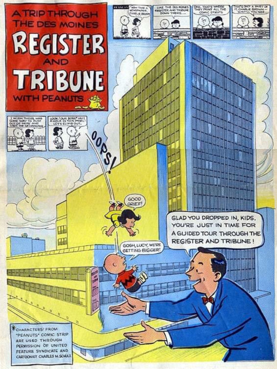
Charlie Brown: Free at last! We have escaped reality itself and shall no longer be bound to that monochromatic prison!
Some guy: Hi Charlie Brown! Want to tour a 1950's newspaper building?
Charlie Brown: Hell yes I do!
Page 2
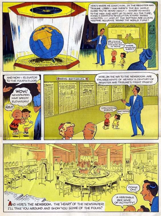
I love that they're bragging about the speed of their elevators.
Page 3

I want to explore the photography labyrinth.
Page 4
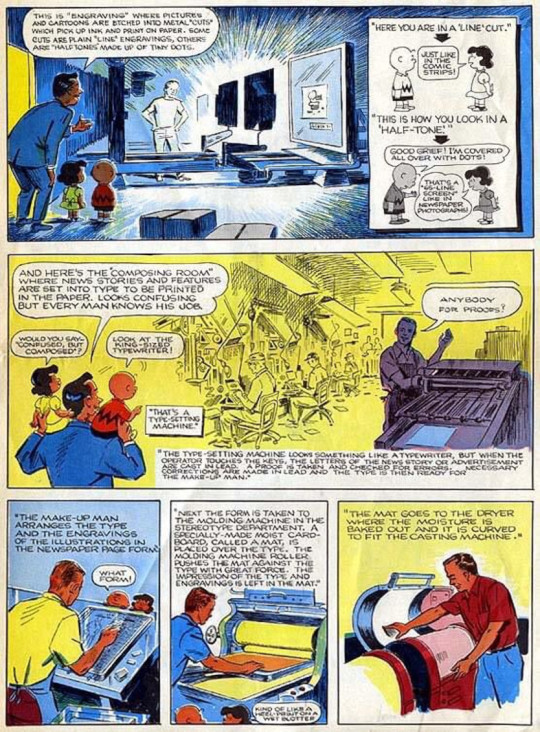
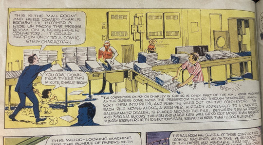
This stuff here is particularly interesting to me. We take for granted just now much more efficient computers have made the printing process.
Page 5

In case you were wondering what this stuff actually looked like:
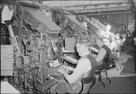
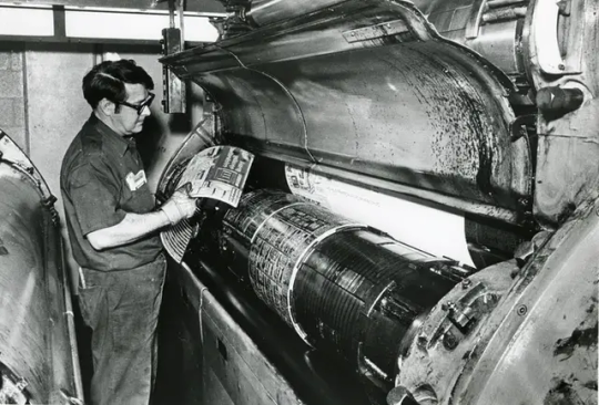

*EDIT: To be clear, these are not actually pictures of the Des Moines Register. Just newspaper equipment from around that time.
Page 6

The one thing that bugs me about this comic is that for some reason they decided to have Lucy be the mature one of the two.
Also, I literally just now noticed that that top panel is different from the one in the book for some reason. Some of the departments on page 3 and the first panel of page 5 also seem to be different from their online versions. I guess they did a revision at some point?


Bonus: Please notice this very good Charlie Brown drawing.

Page 7
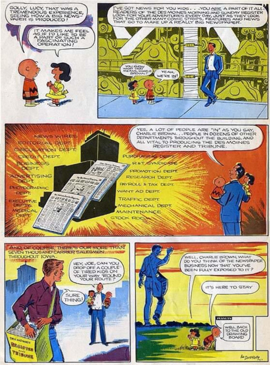
Morgan Freeman voice: “It was not here to stay”
Though to the DMR's credit it still seems to be alive and kicking.
Page 8

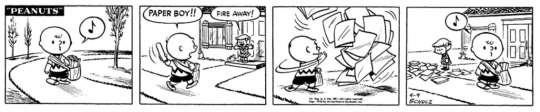
Charlie Brown: Incredible! I'm going to get myself a newspaper job right now so that I too can be a part of this noble profession!
Later:
And that's the whole thing! Apologies for the questionable quality. The only version of this that I've been able to find online was scanned in 2007 by this guy. If you click the link be sure to read the comments because a couple of Bob Davenport's family members apparently responded to the blog post providing additional information.
Here's hoping that someday somebody does a better quality scan because it's a neat little piece of comics history that deserves be be kept around in a readable format.
Hope you all enjoyed it!
#I was tempted to wait until we got to 1957 and post this then but I do NOT have the executive function for that level of planning.#peanuts#charlie brown#lucy#The Des Moines Register#comic strips#comics#peanuts comics#charles schulz
6 notes
·
View notes
Text
Why Dwell Time Matters in SEO and How to Improve It

In the dynamic world of search engine optimisation (SEO), staying ahead of the curve is essential for achieving online success. With Google's ever-evolving algorithms and user-centric approach, the significance of metrics like Dwell Time has surged. This blog post aims to shed light on why Dwell Time matters in SEO and provides you with actionable tips on how to improve it. So, grab your digital magnifying glass, and let's explore the fascinating world of Dwell Time!
What is Dwell Time?
Before delving into why Dwell Time is crucial, let's clarify what it actually means. Dwell Time is the amount of time a visitor spends on a webpage after clicking on a search result but before returning to the search results page. In essence, it measures user engagement. The longer visitors stay on your page, the more relevant and valuable your content appears to be in the eyes of search engines.
The Connection Between Dwell Time and SEO
Dwell Time is more than just a metric for keeping visitors engaged; it directly impacts your website's ranking in search engine results. Here's why it matters:
1. Quality Content Matters More Than Ever
In the past, SEO was more about keywords and backlinks. Today, however, Google is all about providing users with the best possible experience. Dwell Time is a direct reflection of this experience. When visitors spend more time on your page, it signals to search engines that your content is valuable and engaging. In turn, this can lead to higher search engine rankings.
2. Reduced Bounce Rates
Dwell Time and bounce rates are closely intertwined. A high Dwell Time often translates to lower bounce rates. When users find what they're looking for on your page and stay longer, it signals to search engines that your content is relevant to their search query, ultimately improving your SEO Brisbane performance.
3. Improved Click-Through Rates
Better Dwell Time can also lead to higher click-through rates (CTR). If users find your content engaging and informative, they're more likely to explore other pages on your site or click on related links. This not only keeps them on your site longer but also enhances your website's overall SEO performance.
How to Improve Dwell Time
Now that we've established the importance of Dwell Time in SEO let's dive into some practical tips on how to improve it:
Create High-Quality, Relevant Content
Content is king, and it's the cornerstone of a longer Dwell Time. Craft compelling, informative, and well-structured content that resonates with your target audience. Make sure it's relevant to their needs and answers their questions effectively.
Enhance Page Load Speed
Nobody likes waiting for a website to load. Slow-loading pages can drive visitors away and result in a lower Dwell Time. Optimise your site's speed by compressing images, minifying code, and using a reliable web hosting service.
Engaging Multimedia Elements
Incorporating multimedia elements such as videos, infographics, and interactive content can keep users engaged for longer periods. These elements not only enhance the user experience but also make your content more visually appealing.
Internal Linking
Strategically placed internal links encourage visitors to explore other parts of your website. When users navigate through your content and discover related topics, it increases the chances of extending their Dwell Time.
Clear and Readable Formatting
A well-structured and easy-to-read format encourages visitors to stay on your page. Use headings, subheadings, and bullet points to break up the content and make it more scannable. This makes it easier for readers to find the information they're looking for.
Mobile Optimisation
With the increasing use of mobile devices, it's essential to ensure your website is mobile-friendly. A responsive design that adapts to various screen sizes will keep visitors engaged, regardless of the device they're using.

Diving Deeper into Dwell Time
To truly appreciate the value of Dwell Time, it's essential to dissect it into its two main components: "Click Time" and "Content Consumption Time."
Click Time
This is the period from the moment a user clicks on your search result to the time they return to the search results page. It's essentially the time spent in your digital doorway, deciding whether your content is worth exploring further. A captivating title and meta description play a significant role in increasing this crucial aspect of Dwell Time.
Content Consumption Time
Once a visitor is inside your website, the Content Consumption Time takes centre stage. This represents the duration users spend actively engaging with your content, scrolling through the page, reading, watching, or interacting with your multimedia elements. The longer this stage lasts, the better it is for your Dwell Time.
The Role of User Intent
Understanding user intent is paramount in improving Dwell Time. User intent can be categorised into three primary types:
Informational Intent: Users seek information or answers to their questions. Tailor your content to address these queries comprehensively to keep users engaged.
Navigational Intent: Users are looking for a specific website or page. Clear navigation and internal linking can make their journey smoother and encourage them to explore further.
Transactional Intent: Users are ready to take action, such as making a purchase or signing up for a service. Providing a seamless experience and an easy path to conversion can extend their Content Consumption Time.
Analysing Dwell Time Metrics
To make informed decisions about your SEO Brisbane strategy, it's essential to monitor Dwell Time metrics. These metrics act as the compass guiding you through the vast sea of digital content. Tools like Google Analytics provide invaluable insights into your website's performance, including the average Dwell Time, pages with exceptionally high Dwell Time, and those in need of improvement.
When you dive into the world of Dwell Time metrics, you uncover a treasure trove of data that can revolutionise your content strategy. By regularly reviewing and analysing these metrics, you gain a profound understanding of how visitors interact with your content.
Average Dwell Time serves as your north star, indicating how engaging your overall website is. Pages with significantly high Dwell Time offer a blueprint for what works best for your audience. They reveal the topics and content types that captivate and retain visitors.
On the flip side, pages with lower Dwell Time indicate potential trouble spots. These are areas where visitors might not find the content engaging enough to linger. By identifying and addressing these underperforming pages, you can enhance user engagement and overall Dwell Time, subsequently boosting your SEO performance.
Moreover, Dwell Time metrics are not static. They evolve as your content and website do. By consistently tracking these metrics, you'll identify trends and patterns, helping you stay ahead of the curve in the ever-changing landscape of SEO.
The Future of SEO and Dwell Time
The future of SEO and its intricate relationship with Dwell Time is an exciting and ever-evolving landscape. As we venture further into the digital age, it's evident that search engines will continue to place an even greater emphasis on user experience and engagement.
In the years ahead, Dwell Time is likely to take centre stage as one of the most crucial metrics in SEO. Search engines are becoming increasingly sophisticated in gauging the quality and relevance of content, and Dwell Time is a clear indicator of these factors. Consequently, website owners and content creators must remain vigilant, adapting to the ever-shifting SEO landscape.
To navigate this dynamic environment successfully, staying up-to-date with the latest SEO trends and algorithm changes is imperative. These updates can bring significant alterations in the ranking factors that search engines consider.
What might be a winning strategy today may require adjustments tomorrow. The ability to adapt swiftly and effectively will be a key differentiator for those who want to maintain and improve their website's performance.
The Bottom Line
In the world of SEO, user experience is the new frontier. Dwell Time has emerged as a vital metric, signifying user engagement and content relevance. By understanding its importance and implementing the strategies outlined in this post, you can not only boost your Dwell Time but also improve your website's SEO performance. Remember, in the digital realm, quality content and an exceptional user experience are your best allies.
So, start implementing these tips today, and watch your website rise through the ranks of search engine results.
With the expansion of online content and the growing importance of SEO Brisbane for businesses and individuals, it's crucial to understand the intricacies of Dwell Time. This metric can be a game-changer for your website's performance.
Let's continue our exploration to further enhance your grasp of Dwell Time and its role in the realm of search engine optimisation.
Source: Why Dwell Time Matters in SEO and How to Improve It
3 notes
·
View notes
Text
Website Builder Create A Free Website At Present
If your design portfolio meets the search engine optimization requirements, so that you’ll appear in these search results, you’re in good condition for landing that gig. Weebly provides completely different themes relying on your site’s focus, such as enterprise portfolio, personal, event and blog. This is where you’ll construct your website, from the photographs to the text. Based on the theme you selected, some components will usually stay in place (the headings or the fonts, for example) but all the other features of the site might be customizable.
It does give you a leg up if you do have a number of years to construct clientele, improve your abilities with design software, and put cash apart to finally launch your own enterprise. By taking on aspect tasks from those major jobs, they turn out to be freelance Web Designers nearly steadily till they feel they have a big sufficient shopper base to go off on their very own. Artificial intelligence is shortly changing into a tool that many sectors, together with web design, are including to their feature sets.
Wix is an efficient alternative if you want a no-code website builder and a drag-and-drop editor. That being mentioned, you can construct a simple website with WordPress templates. A content management system makes it easy to create and manage the content material on your website with out requiring information of technical expertise. Here are our high choices free of charge and easy-to-use website builders that embrace CMS and can permit you to have your website up and operating shortly. If you’re able to create your own website but don’t know the place to begin, you’re in the best place.
These include updating your content material, like on your contact kind, responding to customer evaluations, checking on-line stock and eradicating broken hyperlinks or updating your privacy policy. Maintaining helps hold your viewers engaged and your site looking professional. To supply for and customize texts, shapes, colors and images needed for designing the sections and pages of your website, you’ll need certain apps and tools. With these tools, you can also make the best designs with out having to start from scratch. Before your site goes stay, check loading time, content material readability, linking and cell responsiveness, contact kind and any other factor that may affect person expertise. Have members of the family and colleagues give their feedback about your website’s design.
web designing and digital marketing
No design may be judged by itself or as a static comp any more; every element is defined by its relationship with the system, and that relationship wants motion to be conveyed properly. Motion can illustrate dynamic effects on content material or interactive states within your format. For that second purpose I recommend taking your designs a bit additional into prototyping. The easier the structure of the location, the better it's for customers to navigate. Each section wants to tell a narrative; it needs a purpose and a ultimate outcome for the consumer.
Ideally, you’ll additionally wait until you have at least a couple of months of emergency expenses built up (6-12 months is the gold standard). If you decide to reap the benefits of our SEO copywriting services, you additionally receive entry to our proprietary and industry-leading platform, MarketingCloudFX. The better part is that greater than eighty five p.c of shoppers are joyful to pay for better UX. It’s a incontrovertible truth that emphasizes how a lot value shoppers placed on web design.
#service website development#web design & development#website designs services#website development & designing#website hosting and development#web development and designing company#web design and developement#web design and developing#best web design and development#best web designing services#website design and development companies#website design and development near me#professional website development service#website designing company website#web firms customers with#web design service page#professional web services#corporate website designing#website developments#professional website service#web development web design#what is webdesign#website design vs development#how web design#webdes#how to website design#what web design#web page services#services section web design#web site design service
2 notes
·
View notes
Text
"abridged" version of "what if dominion members but notitg gimmicks" from me and @autisticlalna yelling at each other last night
(WARNING: a lot of these have general eye-strain inducing effects, from screen flashing intentionally, to arrows flying all over the place and/or things slamming into the foreground, to rapid flickering from something not recording at the right fps. please view responsibly!)
legundo's charts have minimal and very readable mods but their stepwork is more technical and difficult. brackets (hitting two adjacent notes with one foot on the corner) and laterals (i don't know how to explain laterals i'm sorry) and difficult patterns and the like. he also does driven drops a lot (notes losing color optional, someone else gets that one)
sneve is a mawaru or a random box -- he throws gimmicks (from other non-rhythm games) at you, Good Luck. The Heck is a really good non-mawaru chart for him though
viking's charts are . we gave him a lot of gimmicks he's a little nightmarish. probably a multi-chart boss character. sugarkill/receptor scrambling, a variant of the note obscuring from private eye (instead of it hiding one player's colors, it hides a specific color/rhythm of note), switching playfield vision (and also whatever you call this gimmick in super reactor), switching playfield vision again: peeesh edition, and weird receptor rotation. viking in general is just "better keep track of your notes buddy" (he also gets some haunted houses but i. don't fully understand what those are i just know he needs to have them because He Is A Ghost)
shadowmech is Good Luck Chunking, Asshole in specifically the screen damage way. he gets fafnir's screen slash and the screen damage from destroy. throws notes directly at your face
taneesha gets these petal effects as snow, but her main thing is clear notes/colorless notes.
mongo gets screen distortion along the lines of an "underwater" shader alongside having some simple dpads
grady gets portals and/or a rapidly moving playfield, alongside having a lot of meaner d-pads! (flashing warning on that last link, the flicker effect is busted on youtube)
jamie scrungles your notes with funky shaders and does proxy marches! she also gets daikyi wheels because they are (direct quote from leo) "emotionally similar to a Horrible D-Pad"
jamie and grady also have a couples chart. 🅱️.... TWO! (apologies for linking to a really long video/commentated upload in this one. i was unable to find literally any other upload of び)
nukeri gets proxy walls and a judgement line gimmick. basically a nicer version of this bit from golden rule. he also gets a more consistent version of the ending of hymn which is a bit hard to describe. notes in the background. notes AS the background.
joy also gets proxy walls but hers are a little bit more... scooty. a lot of scrolling and movement from them, basically
josh gets teal notes, a sentence that means nothing to most people and strikes fear into the hearts of a select few (teal notes are on odd beats, 64ths or rhythmless). his mods/shaders aren't that bad though, to make up for it
kiply is just ayaze. she's just ayaze. that does mean she has overlap with sneve but it's different because source dude just trust me (jokes aside, the difference is kiply is "forces you to read other rhythm game formats" and sneve is "forces you to do a silly little minigame or fifteen")
red hits you in the face with notes a lot at a very high bpm (HUGE FLASHING WARNING FOR THIS ONE BTW. THIS IS THE MAIN REASON THAT WARNING IS UP THERE) she's not evil though she's just got the zoomies. she also does footswitches (hitting the same note with alternating feet) and jacks (hitting the same note a bunch in a row) because again: zoomies
fixxitt has been saved for the end of this post because fix is our 19. fix is an absolute nightmare. earlier fix charts have switches from standard reading to unorthodox playfields. later fix charts have, um. so imagine the SHAME cube. but multiple shapes onscreen at once. and only one of the cubes is showing the correct playfield.
finally: we don't have much for ryan or brock because neither of us really have the Vibes yet, but brock could have this bouncy bit from JUGGLE on account of. slimes bounce.
#long post //??#orig#yt#txt#dominioners#sighs. im going to maintag but not for nITG i respect them too much#however:#dominion smp#solar scraps#autisticlalna#update: its been way too long and we nearly lost this post so we kinda have to maintag it now sorryyyyyy#notitg
10 notes
·
View notes
Note
stares at you. do you have any tips on how to make a good lifesteal propaganda post (am struggling with how to format all the information)
okay. sorry it took me a bit to think of an answer to this but uh i will do my best to give advice??
Don't overcomplicate things. As tempting as it may be, avoid making references to things that you haven't directly explained, because that just ends up being confusing.
Keep things readable. I'm used to doing this for my fics, so I just translate that to the propaganda posts, but break things up into small paragraphs. Even if you have information that COULD be one paragraph, if it starts to get too long then add a paragraph break. Maybe this is just an ADHD thing but I find it easier to read things with lots of shorter paragraphs rather than fewer, longer ones.
You can type things very informally/casually if you'd like (no punctuation, numbers instead of letters, abbreviations like LOL, emojis, etc) but I would say it's generally a better idea to keep things a bit more formal (in terms of writing. I'm talking about formal vs informal writing, to be clear. Not like, being professional).
Know your audience. These posts are being written to get people into Lifesteal, and it's best to assume that your audience has no prior knowledge of Lifesteal*. It's probably safe to assume that they know the basics of what Minecraft is and what SMPS are, so don't waste time explaining that. But, for example, if you were going to mention Branzy and Clown's casino. Take a few sentences to explain what that is, because your audience probably won't know about it.
Pick out a few things you want people to know about your Lifestealer, and stick to that. Don't overwhelm your reader. For example, with Branzy, I wanted people to know three things. One: he does redstone. Two: he likes traps. Three: he isn't a fighter. So I briefly explained each of those things and gave a few videos/projects of him that best showcased those things.
Tell me why I would want to watch your lifestealer. All of this is great, but why do I care about this guy? Make me want to watch your guy.
Optional advice, and this is totally a personal preference, but I love when posts are color-coded. Right here in this post I've highlighted in green the main takeaways of each bullet point!! Also, I like to color in links, they just look neat. Again, this one isn't a neccessity but it's fun to do!!
This one's for my writer friends, and I don't think I'm going to be able to explain it very well, but I think propaganda posts work best when you write them in a friendly, welcoming tone. If you don't know what I mean, feel free to ignore this. But I like to write them as if I'm talking to a friend. "Hey, hi, I really like this thing, and here's why I like it, and here's why you should too! And here's how you can watch it! Look, I put it in a neat little list for you, isn't that exciting? I know, I love it too!" (this might be an adhd thing not sure lol)
*You do not have to explain the heart system. I have a post that will do that for you. It will be linked on the masterpost for this project (which is unfinished because not all the propaganda posts have been written).
Anyways, I hope some of this helps you!! Now get out there and show off your blorbos ^-^
7 notes
·
View notes
Text
For a while, I've been wanting my own website that I can use to store and sort all the stories and stuff that I've written over the years. Like a place that I can share with others and also keep a record of all the things that I've written in a readable format that's sorted by different aspects like genre or length or whatever. I currently am using carrd with a lot of google docs links, but I kind of want something else. Carrd has a limit on how much you can put on it, even with the basic upgraded plan or whatever, so I can't put the actual stories and content on the website. I've looked at some other free website builders, and they all look really complicated. I don't understand the more complicated stuff, and what I want doesn't need to be that complicated. Below, I linked the carrd that I currently use, but I want to make it have like more categories and also maybe not on carrd. Basically, does anyone know any better website builders that would work for this?
#carrd#website hosting#website builder#help please#online portfolio#advice please#what do i use#idk what to tag this with#author#writing
3 notes
·
View notes
Text
A while back I wrote a blog on how I'd make a soulslike using retro hardware, I'm gonna repost it here :D

Yeah, so the twitter post where I first explained my idea was my most liked/shared post by like a factor of ten. Since there was so much interest, I figured I might as well make a mockup in Unity. Look what you made me do.
Here’s a link to the build, and the controls are detailed on that page too. For the full effect, I’d also recommend using JoyToKey or a similar program to convert controller inputs to key presses, because I was too lazy to implement key rebinding for a mockup. See the itch.io page for suggested bindings.
Also, if you (yes, you!) want to continue this work, the zip file for the build also contains inspiration art, models, game data, and source code. It’s low polish code and almost nothing is systemic, but maybe it’s a springboard for someone who wants to push this project farther. I’d love to see it. The work that I have the rights to (i.e. everything except the inspirational art) is hereby released in the public domain.
Findings
Animation
The first and most noteworthy thing I’ve discovered while implementing is that there were more animations than I anticipated. Like, I figured there’d be a lot, and there were more than that. As of right now, there are 532 player sprites, each at 100x100 pixels, giving us roughly 6.4 mb of sprite data. (assuming indexed image format and smartly cropping fully alpha 8x8 blocks)

Bruh
One of the things we could to further shrink these is to run-length compress them, and also reuse tiles. I considered writing a python script to go over all 8x8 tiles within all sprites, and saving them in a massive lookup table. Then, it would go through all sprites again, replacing the tiles in the sprite with any similar tiles. This would mean, say, the thigh tile from one animation might be the cloak in a different frame if the pixel colors and shapes were sufficiently similar. However, I decided not to because it doesn’t actually have any savings on modern hardware, only on tile based renderers.
I could have also hand deleted specific entire frames of animations and reused similar enough ones - just by eye - but I also wanted to include all of the animations in the data that I distributed, just for the sake of it all being there for anyone who might need it, for whatever reason. I think these techniques might get the total data down to 50-60%, but that still means a ton of data just for the main characters sprites.
I could also cut the animations in half by simply making the character designs so that the left-facing animations can be reused for the right-facing animations, but I felt that put a lot of constraints on enemy design and combat readability, so I didn’t pursue that either.
Turns out tons of animation variants work better on skinned 3D models (which is why I’m pitching my next souls game on the Nintendo 64. Hit me up Bandai Namco!) I chose to do one player model with no costume changes and just a boring sword. Any variants like clothing, weapons, or equipping a shield would have completely blown the animation data budget.
Framerate
You’ll also notice the game runs by default at a low framerate, 15 frames per second (The quality can be changed with the - and + keys during runtime if it causes discomfort). I did this for two reasons. One, it made the animations, which run at a consistent 10 frames per second, feel much more in line with the sprite movement and the camera rotation. Plus, it might accurately simulate the game running on actual hardware; making the game run a quarter at SNES framerate might be required for the “high-fidelity graphics” on show here. (Who knows if the hardware would actually allow that without awful artifacts though, ha). But throttling framerate is a tried and true tactic for better visuals.
Environment
Another thing that surprised me is the amount of reuse on environment assets I was able to get. I was ready to put together a bunch of textures for the walls and floors, but I finished up what I wanted to achieve and found I’d only used 20 64x64 textures. I think the real game would benefit by focusing on unique tilesets to give each zone or level a special feel, and I think that’d be within the budget of a real game.
Environment took about 20 textures total
I also quickly abandoned the differing-heights-of-walls idea I talked about in the first blogpost. The requirements of the way walls are rendered described in the post made certain arrangements of walls impossible, and those were kind of the only level designs I wanted to use. That’s confusing, here’s some drawings to explain what I mean. Basically, having shorter walls in front making a visually tiered level with hedges that obscure the walls behind them just isn’t possible using that technique.

The rendering technique causes gaps where there would be walls behind walls.
While we’re on the topic of environment, I guess I skipped over the way we’d have to z-sort sprites to allow walls to layer correctly over them, and for sprites to draw back to front. That’d be a performance issue too probably.
Palette and Rendering
One of the big wins I had was the palette I set up, I felt it was super moody and conveyed the tone I was going for. It felt muddy and sad and tired. It had pops of blues and greens, but even then they muted and melancholy. To achieve this look, there were three mechanisms here. First, all the sprites and environment textures were palletized to those colors. Then, in-game, I used a fog effect to fade the world to black. Finally, a post processing shader took any pixels outside the gamut and palletized the final game render, so every pixel displayed is within that palette.

The palletization is most noticeable in gradients, where it slightly changes the tone of colors. In a cool retro way, I think.
To create the sprites, I was kind of forced to do it by rendering 3d models (blender files included in the data!). This was due to time and money. As mentioned previously, I would have loved to dress up in costumes and downscale, pixelate, and rotoscope real pictures, but that costs stuff. Also, I’m sure hand-pixelled sprites would absolutely look more appealing, but like I said above, there were just so many animation sprites. The upside to hand authoring is you can have more control of implied movement during animation, and therefore probably fewer frames. All said, I don’t dislike the rendered results, it has a bit of a Diablo 2 look to it, but I wish I had been able to experiment with different techniques, mostly for fun.
I remember loving to see these render breakdowns in gaming magazines and websites back in the day
I think if I had lower-resolution-better-looking sprites, fewer animations using the techniques described above, and designing levels so as to not have to z-sort sprites, it just might be able to run on SNES. Just maybe. A commenter mentioned it might actually run on GBA, and I could see it being possible. Shoutout to the most impressive 3D gba game ever.
One final design note I liked: The ducking mechanic was inspired by Super Mario World. I felt that was a nice homage, and there wasn’t enough buttons for more soulslike interactions like parrying, so it felt like it was a good choice with some mechanical depth with the limited inputs I had available. And, this game being simpler is alright by me - we are theoretically in the realm of before King’s Field.
Summary
So there it is. I said I didn’t have time to implement it, and I did anyway. This is all your fault.
But for real, I really enjoyed tinkering with this, and I’d love to see anything that gets made out of this idea. Hoped you enjoyed reading this!
3 notes
·
View notes
Text
How You Can Combine SEO And Email to Supercharge Your Marketing
Now, Without Further Ado, Here Are Six Steps to Help You Combine These Two Extraordinary Marketing Strategies.
Integrate Keywords into Your Email Campaigns
People Searching for Your Services Are Usually the Same People You Are Emailing, So It Makes Sense to Use Similar Keywords in Your Email Subject Lines, Content, And SEO Campaigns.
Doing So in A Natural, User-Friendly Way Will Be Search-Engine Friendly for Your SEO Campaign, And Applying That Rule to Your Emails Will Make Them More Readable. You Can Use This Guide to Email Marketing to Get Started.
Long-Tail Keywords May Have Less Search Volume, But They Are More Targeted and Relevant. Likewise, You Don't Want Your Emails to Feel Like Spam, So Keeping Them Specific to Your Audience Will Improve Engagement. Use Anchor Text Strategically Throughout Your Email Campaign to Link to Your Website and Boost SEO. Digital Marketing Agency Will Provide You with the Best SEO And Email Marketing Service.

Automate Campaigns to Create a Flow Of Traffic To Your Site.
Industries Ranging from Healthcare to Sales Often Integrate Automated Campaigns Such as CRM Automation, Advertising Automation, And Marketing Automation Analytics. Even Including an Automated Phone Dialer in Their Campaigns Can Help Your Business Reduce Costs, Save Time, And Increase Productivity. Automated Email Campaigns Can Also Create a Steady Traffic Flow to Your Website, Boosting SEO. Automated Email Sequences Allow You to Showcase All of Your Best Content to New Customers Without Any Extra Effort on The Part of Your Business.
These Emails Generate Traffic to Your Website, Which Alerts Search Engines And, In Turn, Moves Your Website Up on The Results Page. Since Your Email Subscribers Are Already Interested in Your Content, They Are More Likely to Engage When They Visit Your Website. Search Engines Catch This, Which Helps Boost Your SEO.
Leverage Data and Insights to Optimize List Segmentation and Personalization.
You Can Analyze Your SEO Data to See Who Is Interested in You and What Aspects/Products They Are Most Curious About. This Analysis Can Inform Segmentation and Create More Relevant Personalization in Email Marketing to Drive Greater Engagement.
For Example, Different Age Groups May Be Interested in Different Products. By Analyzing Who Is Responding to Which SEO Terms, You Can Make Your Email Campaigns Better Targeted and More Effective, Avoiding Bombarding Anyone with Irrelevant Information.
Reproduce Your Newsletter Content Across Channels.
A Good Content Strategy Proposal Is Essential to Engage Your Audience with Your Product and Business. However, It Takes a Lot of Effort to Make It. Repurposing Content Across Different Channels Is a Great Way to Optimize It. It Also Creates Brand Continuity. We Have the Best Content Writers.
So, If You Have Good Content on Your Website Or In Your Newsletter, You Can Reuse It For Your Email Campaign. Plus, A Clear Brand Narrative Allows You to Maximize Your Efforts and Resources.
Integrate Language into Marketing Channels to Drive Engagement.
Consistent Formatting and Brand Voice Across Channels Such as Direct Selling and Marketing Events Will Help with Engagement And SEO. Article Titles and Email Headlines Should Be Catchy and Interesting. The Body of Your Text for Both Email and Website Content Should Be Easy to Read and Written in A Similar Tone While Being Slightly More Condensed in Email.
Your Emails Should Also Include Call-To-Action Buttons. Once You've Captured Your Audience's Attention Via Email, Provide Them with A Place to Go for Further Information. It Could Be Your social media Pages, Special Offers, or Blog That Is Driving Traffic to Your Website.
Monitor and Measure Email Campaigns to Track the Success of Your SEO Efforts.
By Measuring Which Emails Get the Best Results (For Example, By Increasing Traffic to Your Website or Increasing Sales Through Quote Apps), You Can Figure Out Which Key Phrases Work for Your Customer Base. This Is Useful Information That You Can Apply to Your SEO Campaign.

Testing Strategies Can Help You Directly Compare the Success of Two Different Emails to Find What Works Best for Your Overall Marketing Strategy.
If Your Emails Start Getting Flagged, You Can Use This Data to Run a Re-Engagement Campaign to Re-Establish a Connection with Your Audience.
The Takeaway
Marketing Channels Do Not Exist in Isolation. Rather, These Channels Crossover and Complement Each Other. Certainly, Best Practices for One Can Be Used for The Others to Promote Efforts in Both.
SEO Allows You to Perfect Your Email Campaign by Providing You with Useful Knowledge About Your Audience and What They’re Most Interested In. Email Campaigns Can, In Turn, Boost Your SEO By Increasing Traffic Flow to Your Website. Creating A Cohesive Tone Across Both Campaigns Is the Very Best Way to Set Your Brand Apart from The Rest. We Help You by Giving the Best SEO Service.
5 notes
·
View notes
Text
Tips to effectively improve your website's SEO ranking?
Have you been working on the SEO of your website for a long time, but you are not getting the desired result?
Are you worried and looking for a solution?
Do not worry because this is the time when you need to do a technical audit of your website on the following points:
Usability of the site
Content quality and readability
Page loading speed
Website images
Header tags
Broken links
Page layout and format
Content on the Contact Us page
Site navigation
Optimizing the site for mobile
Social shares
A technical audit of the website is necessary because in recent years it has been shown that, in addition to Off-page SEO activities, the above factors also affect the ranking of the website in the search results.
So, if you are still completely focused on searching, inserting and using keywords, optimizing metadata tags, building links, then you need to focus on website audit for effective SEO services and better results.
Below are some tips that can help your website SEO
a) Work on the usability of your website – A good website will keep users engaged and stay longer. It was also seen that visitors tend to visit the site again if they had a good experience. UX and UI also matter if a prospect is to be converted into a customer. So check the usability of your website and improve it for better user engagement.
b) Create engaging, readable and descriptive content – To improve the dwell time on your website, you need to create engaging and long content (as most preferred by Google). While word count doesn't matter if the content lacks readability and interest, the first requirement here is to create content that suits the user's interest, is well written, easy for visitors to understand, detailed and has a relevant call to action.
To make the experience of reading content even more enriching for users, it is recommended to add content in multiple formats such as videos, slideshows and audio. This step will not only improve the user experience, but also signal the availability of high-quality content to search engines. Therefore, this step will be of great help in improving your website's SEO.
c) Ensuring faster page loading speed – Search engines like Google and Bing take the loading speed factor into consideration when they rank a website because users may leave the page if it does not load quickly.
So if you find that your website is loading slowly, it works the same way. Some of the ways to improve page load speed are optimizing image sizes, limiting the use of plugins, minimizing redirects, adding caching plugins and adding clean and simplified codes, etc.
d) Optimizing Header and Other Images – If you want to optimize your website image for SEO, you need to add an ALT tag, title and description to your images. By adding all these elements, images are optimized for the web and are more visible in search engine results under Images.
e) Add Heading Tags – Content on a website looks impressive if it is carefully divided into smaller sections using headings. Header tags are necessary to add to a website as it ensures readability and keeps the reader's interest intact. While checking your website SEO, work on the content and improve its appearance.
f) Check for 404 Redirects – When working on your site's SEO, check for 404 redirects and ensure that your site is not redirecting visitors to it. No one wants to click on a link and be redirected to a 404 page. Even search engines consider a website with too many broken links to be a neglected and old website and lower its search ranking. Therefore, it is best to use tools like Google Webmaster Tool to find these links and fix them.
g) Check the layout and format of the website - a user-friendly layout increases the user experience and readability of the content for the visitor. Therefore, it is recommended to add proper layout and formatting options such as
Readable font size and typography
Distinct colors and types
Line spacing and short paragraphs
Subheadings
Techniques like tabs, sliders, dropdowns and more
h) Add an Informative Contact Us Page – The Contact Us page on your website must be informative and a one-stop-shop if your visitor is looking for information about you. Search engines also go through the contact page and look for detailed information so that they can list your site as trustworthy and therefore higher in the search results.
i) Proper Site Architecture and Navigation – Flat site architecture makes content more readable and helps visitors easily find the content they are looking for. This process in turn reduces bounce rates and improves website SEO.
j) Modify your website to be mobile friendly – Modification is used in practice as more and more customers prefer mobile devices when it comes to shopping and viewing content. Therefore, in order for a website to rank better in search engines, it must be optimized for mobiles.
k) Add social media sharing – Social media has become extremely important and to be more known, any business needs to popularize itself through social media channels. Adding social buttons to your website can help with social sharing activity as a visitor who finds interesting content might want to share the same with their group.
So apart from the normal activities above there are some tips that would help you in SEO activity of your website.
These activities are extremely simple to do and can really help improve grades. Don't wait and start taking these steps today. Hire Redgates for SEO services and digital marketing services for your website to increase search engine rankings and traffic which in turn helps in business growth.
3 notes
·
View notes
Text
Don't Design Another Website Without Reading This!
There is nothing like getting back to the basics, even when it comes to an experienced web designer. It can be difficult because there are a vast number of resources to choose from. However, you should not worry, as this article is full of some of the advice that you need. Featured below is a compilation of easy-to-implement website design tips that will help you to develop some amazing websites.
It is always good to add a favicon to your website. The favicon is a 16x16 image file in the .Ico format. This image is the one you see next to the URL bar, next to the title of the page on an opened tab and is also visible on your bookmarks tab if you choose to bookmark a page. The favicon will help users quickly recognize your page in their browser without reading any text or directly viewing the page.
Be careful with the color combinations you use when designing your website. It is important to have text that is easy to read on your chosen background color. There is data that shows that people have an easier time reading dark text on a light background. The opposite is still readable, but not optimal. Ask someone to look at your color schemes to make sure you are choosing something harmonious.
Make certain that visitors have a way to search for a particular topic on your site. If visitors want something specific, they will immediately scan for a search function. If you lack one, they may just move on to another website immediately. Put the search box near the top right side of the page, since that tends to be common.
To help your website visitors easily navigate through your site, design it so that it becomes easy to find "stuff." When you have a simple site that makes it easy to locate information, you keep your visitors there much longer. If you make it difficult for them, then they will get frustrated and leave.
To help your website function the way it is intended to, make sure all your links are working. If you have broken links then your visitors may get frustrated when they try to click on something that interests them. Frustrated visitors is not something you want because they end up leaving your site mad.
Be very critical of the fonts you choose. Most corporate sites use just a few basic fonts. Fonts that are overly artistic may seem like a good idea, but often aren't accessible on all computers. Fonts on your website can be set to match the default font used by the computer of your visitors. That will appear worse.
Pay attention to your background colors and your text colors when designing a site. Something like red text on a blue background doesn't work well. And if you think that white text will pop with a black background, it could be a little too bright for your readers. Go with blackiptv .
Practice by designing small websites to see where your strengths and weaknesses are. Besides keeping them small, your initial efforts should also be simple. Avoid complex multimedia and advanced structures to begin with, and stick with basic pages of text and pictures.
You want to ensure that your site is capable of being viewed on all types of operating systems and programs, ranging from browsers such as internet explorer to firefox. You also want to be sure that your site works on both windows and mac operating systems so as many users as possible can view your content.
Always utilize media and content that is both relative to your site's goal, but also interesting to the potential consumers who will be viewing your site. A site that has relative info, but that is not interesting, won't captivate its audience. A website that uses fun, but non-relative information, will captivate the wrong audience. Both methods equal profits that you are losing.
Reading through this article has probably helped you understand web design a bit better, one thing to note, though, is that you understand the basics more than anything. The basics are explained in many different ways, so it can be confusing which source of information to trust. With the tips from this article, you have a good base to start on your web design path.
3 notes
·
View notes
Last Seen Blogs

pd-annasilva
Palavras Detalhadas

spaceangelllll
space angel
sirthisisa-wendys
Sir, This Is A Wendy's

tiffy-2short-blog
Simply Tiffy2short

globalliancecontractors
Globalliance Contractors