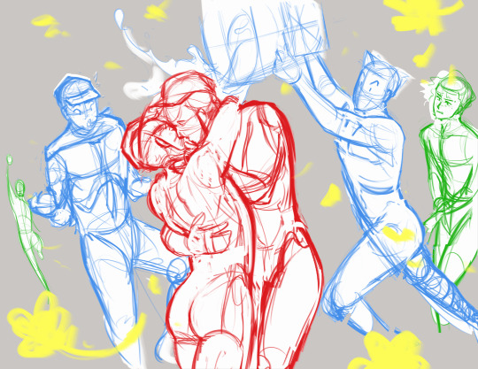
#also surprised this is the first time i've drawn this pose...
Explore tagged Tumblr posts
Visit Tumblr Blog
Explore Tumblr blogs with no restrictions, modern design and the best experience.
Last Seen Tumblr Blogs


Fun Fact
Women make up for the other 50% of Tumblr’s audience.
Note
i'll give up my soul for one (1) merasmus

"FIND THE GARGOYLE!!"
yeah okay. whatever you say, babygirl
#i love merasmus dearly#thank you for the suggestion#also surprised this is the first time i've drawn this pose...#but she deserves it.#my love...#sarge scribbles#tf2#tf2 merasmus
144 notes
·
View notes
Note
Greetings! To start of: I ABSOLUTELY ADORE YOUR ARTSTYLE!!! the way the characters look both round/softer yet very adorable, the color scheme, the way you render and so much more!!!
Sorry if this is a bit intrusive but... may you kindly with cherries on top give a lil' tutorial on how you do anatomy? If you want to do it of course...
HI GWAAHHH THANK YOU WHAT !
sacondly..... not intrusive at all!!! i'd be happy to explain (im praying you can follow along though cause im horrid at explaining stuff ashdfkahsdf)
im predicting this post will be EXTREMELY long so it will be under a cut :]
play this in the bg for the Full Experience if you want /silly /not forced
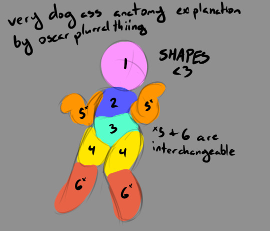
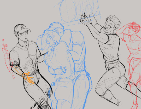
OK SOOOO the way i've learned to draw anatomy is by viewing the body as a bunch of "building blocks". this is honestly the way i've learned to draw like. everything (everything is just made of shapes if you look hard enough!!!!!), but anatomy and organic things in general are a big more complicated in the sense that these shapes connect in really weird ways and sometimes (often, depending on the style) can't just be summarized as "circle" and "square"
the way i view bodies is like this! the numbers are mainly there to show the order in which *i* place these blocks, but by no means is this the order anyone has to follow! fuck up the numbers if you want!!!! start from 6 and head to 1 if you want!! whatever makes you happy :]
but after this base sketch is done, you can basically continue drawing details like clothes, facial expressions, hair, etcetc, and soon you can have your very own gay man like the one here (or. whatever youre drawing)! (you'll also notice i tweaked the arm on the left a bit cause it was messing with me)
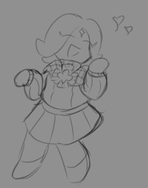
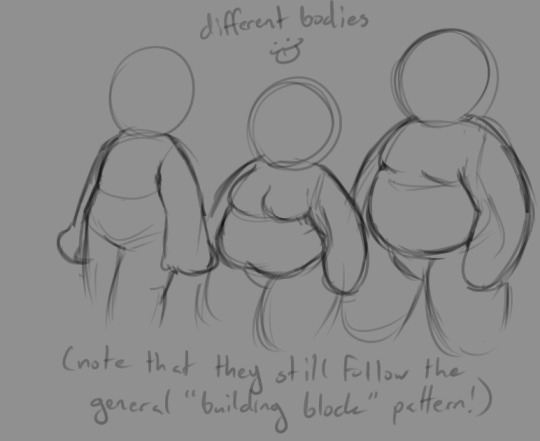
obviously though theres other body types out there! and luckily this "building block" thing also applies there too!

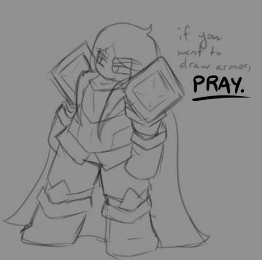
(drawing armor is also a series of building blocks as well except its less organic and more rigid/shape-y and requires a prayer to the god you hold dear)
(not very well drawn to scale cause i forgor)
you can draw all kinds of bodies if you view the body as just a series of shapes! obviously, your own personal style may impact how many shapes you see/draw, especially for more realistic styles, but generally i view em like this!
for especially complex poses, especially ones that involve perspective, its good to try to view the shapes in a more "3d" way. you can always grab a throwaway canvas/paper and practice some perspective on the side with some super simple shapes! (like how you mightve drawn 3d cubes n stuff on a 1-point or 2-point perspective plane when you were in like 6th grade or smthn i havent been to high school in years i dont remember what the grade is) drawing on the side, especially when you dont take it super serious and just kinda dick around, helps you learn a surprising amount :] if you dont get it down the first time, thats all good! there's always the 2nd, 3rd, 5th, 10th, 500th, 1 billionth, fucktillionth time you can do it :]
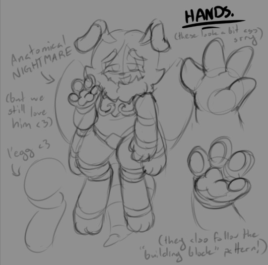
as for digitigrade/furry stuff, as well as more specific parts of the body (looking at you HANDS.), they also follow the building block stuff, just kinda in a really weird way!!
as much as i love to draw him, beenilla is literally just a mess of limbs and stuff and it takes a long ass time to draw him sometimes (especially with unique poses), but he also follows the general "building block" stuff too! his is more pronounced since his arms have visible joints, and are more divided into basically a bunch of ovals and circles, but the shapes thing still applies!
for hands and paws, they also do as well (again, just about everything out there is made up of simple shapes!). they definitely take! practice to learn! drawing them can be a pain in the ass but learning them is very worth it :] i personally only draw characters with 4 fingers since its easier for me to do (who needs the pinkie anyways)!
a good thing to check out as well are references from real life *and* studying from other artists and analyzing their works and how they use certain techniques! a majority of what ive learned is from analyzing other artists actually, it's incredibly fun to see how different artists do different things and how they execute them! speedpaints can be wonderful sources of learning for this reason :]
lastly, FUCK AROUND AND FIND OUT!!!!!!!!!!!!!!!!!!!!!!!!!!!!!!!!!!!!!!!!!!!!!!!!!!!!!!!!!!!!!!!!!!!!!!!!!!!!!!!!!!!!!!!!!!!!!!!!!!!!!!!!!!!!!!!!!!!!!!!!!!!!!!!!!! IM SO SERIOUS sticking with the same old stuff may reinforce the skills you're practicing, but NEVER be afraid of doing new things or diving into new styles and trying a new pose! sure it may look like jank the first couple of times around, but that is the learning process!!!!!!!!!!! to learn new things requires you to *do* new things, and i think theres always time to learn! thats why i think art is such a fun wonderful subject, cause you learn so much from it!!!!!!!!! and you can just do fuckin ! whatever!! just start doin stuff!!!!
i have to leave for work rn so im ending this really abruptly im so sorry but YEAH!!!!!!!!!!!!!!!!!!!!!!!!!!! my weird tutorial i hope it made sense ajshdfkahsd
#i dont have an ask tag uhhhhhhhhhhhhhhhhhhh hi one quastions#cookie run#digital art#cookie run kingdom#crk#anatomy
23 notes
·
View notes
Text
October Poll Results!
It's November 1st, and I was very relieved to see that we got another update! It's a small one, which is to be expected, given the announcement in the last Progress Report, but knowing that updates in general will remain monthly is still good to know!

I'll skip the teaser images to get to the Poll Results first, since they shouldn't be too surprising, if you checked them at any point. In a nearly 5:2 ratio, the option to ship Episodes 3A (Decay) and Episode 4 together has won. (An option with Nemlei interestingly calls "Poetry" several times.) Again, I expected this, even though I voted to ship Decay by itself. The most interesting part of this section to me, are the last couple sentences. In it, Nemlei seems to basically confirm that Decay is finished, or at least very close to being finished, and the majority of work will now shift onto Episode 4. I don't expect Episode 4 to take a year to make, unlike what Nemlei seems to cheekily be implying. The impression I've got to far is that it's the resolution to the story. The Climax ( ;) ) and Falling Action. It's not going to be very long, is what I mean. Nowhere near as long as Episode 3A, anyway. So, with that settled, let's check out those teaser images!

First, we see Andrew and Ashley hanging out in some strange looking lighthouse. The large eye in the middle might remind you of Six Eyes, which is very well might be, but... that eye doesn't look very demonic to me. It's got a big pupil and lashes, with a star in the middle, and the windows surrounding it are also plastered with stars, and are different shades of bright colors. Looks more... wizard-like, to me. It very well could be the same lighthouse... or a version of the same lighthouse, that we saw Ashley trying to climb as the unreachable stair taunted her, but we'll have to wait and see. More importantly... why are they here in the first place? Is it JUST a hideout?

Next image is a bit more interesting. Judging by Ashley's pose, it's possible that this is the middle, or the end, of a small argument between the two. It's the camping section again, which we've seen quite a bit of, now. Andrew saying "You bring my demons out." with that smug look has some BIG implications. Obviously, it's related to the demon world, but what specifically? Did we get a glimpse at Andrew's SOUL? Did Andrew summon a demon of his own, or is this the aftermath of Ashley bringing Andrew with her into the demon world, like she was asked? I'd say it's probably some combination of the first and third, given we don't see any evidence of a ritual here. Though they easily could've just cleaned it up. But, what could they be arguing about? Maybe the Demon's reasoning for wanting Andrew to tag along wasn't something Ashley was happy with. Or maybe she just saw something about Andrew she didn't like. Whatever it was, I reckon it'll probably have a choice for us to pick.

Lastly, we have this silly little comic. I quite like it when Andrew and Ashley are drawn like this lol. But hey, it seems that Decay will have more options than I thought! We also got a glimpse at the main conflict of this route, it seems. Andrew's morals decaying. We already got glimpses of that, given the whole murder-suicide thing going on. (Though I'd argue that would be the most noble thing Andrew would've done, even if for the wrong reasons.) But it seems we also have the ability to go deeper into the relationship between Andrew and Ashley... in more ways than one!
Ashley herself looks a little indifferent to it all. Could just be a joke for the comic, but Ashley has always shown relative indifference towards this idea... when she isn't trying to get Julia to kill herself, anyway. Knowing that we'll be having all these options puts some of the previous teaser images in a bit of a different light, and it also make me wonder what the main theme of Burial will be. I guess instead of having these options with their relationship, they'll just... bury their feelings? And depending on how successfully that goes, you get different paths.

That's all I have for now. Thanks for reading!
#video games#gaming#indie games#the coffin of andy and leyley#tcoaal#visual novel#ashley graves#andrew graves
19 notes
·
View notes
Text
Snippet from Chapter 2 of My Girl, My Girl, My Girl it's not really NSFW, Tim's just showering and there's like one mention of sex in it, but yknow, just in case
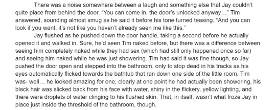
Also I've already drawn art for this chapter and omg you're in for a treat with this one. I'm literally so proud of the art, it was the first time I'd ever drawn a penis and i also didn't use a reference at all for the pose or anything, so I'm honestly surprised how good it ended up being lol
#writing snippet#mildly nsft#marble hornets#marble hornets fanfic#mh jam#fic/series rated e on ao3#in case anyone would prefer not to read that
9 notes
·
View notes
Text
"Sword Fight" short comic
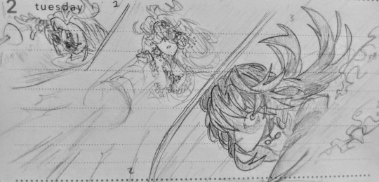

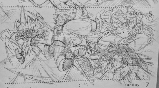
Lol, more Philomina content.
I drew this in my handheld calendar so that's why there's spotted lines.
For this comic, I was really inspired by the fights in Dandadan(great manga, though a very surprising first chapter). Paneling, perspective, foreshortening, speed lines, dynamic posing, I did my best in incorporating all those in this here mini comic. There's a lot of cut corners, like how Phil and Blade seem to be battling in a white void, and where the heck both their swords have gone, too. Next time, I'll draw the background so the space doesn't feel so barren!
I'm very proud of panel 7. In manga, I love how characters are sometime drawn out of frame to showcase speed or power. In this case, Phil looks like she's jumping into the frame to show her speed to the reader! It's just really neat. Hopefully, the way she's posing guides the readers to the next few panels. Also, the way Blade is flying backwards and the way the onomatopoeia "BAM" is drawn just accentuates the force behind Phil's kick, with the speed lines and negative space attracting your eyes to her shoes 😌 Absolute chef's kiss imo.
Honestly, this is the first time I've ever drawn Blade, so I don't really know if I did the man justice in the handsome department 😅. I didn't draw his mouth most of the time because I wanted his eyes to do the talking. I tried my best to draw him as a beast of sorts with determined and crazed eyes looking only at his prey, in this case Philomina(who we sometimes take the perspective of). His focused expression only falters when Phil does something that surprises him.
I don't know if I showcased it well in the comic but Phil is using her rapier to pierce through Blade and curving the rapier's blade to stab him multiple times in order to restrict his movements(panel 5). Then after that, Phil has the rapier spiral behind Blade to an unrecorded amount of length hence the star. Then, while Blade is confused because he's never fought an opponent who's done this before, Phil kicks him in the gut real hard, the force pushing him back. And you know what's behind him? That's right, a spiraling blade that breaks if applied too much pressure to the sides of it. So while, Blade is being kicked by Phil, he's also getting sliced up in the back by multiple shattered pieces of the rapier's blade. And because Phil is significantly smaller than Blade, she won't sustain as bad of injuries as him.
Little tidbit: Philomina despises the Stellaron Hunters. She believes that the actions they've done are unorthodox and vehemently believes that there are other options in changing fate than committing crimes. Speaking of fate, she doesn't believe it at all. Phil believes that the future can never be predetermined and claims that prophecies are psychological traps that prevent people from recognizing other options than what was shown to them by "fate". You can see why she has vendetta against Elio of the Stellaron Hunters. By looking into the future, you are cementing that future as the only option forward.
Because of that, she doesn't believe the Finality is actually real(never has she seen such evidence aside from stories from the Creed Exequys and Omen Vanguards) and argues a lot with a pink-haired master diviner from the Xianzhou Luofu.
#honkai star rail oc#honkai star rail fc#honkai star rail#starliaart#starliaoc#hsr oc#Philomina the Patient#Blade hsr#comic#short battle comic
7 notes
·
View notes
Text
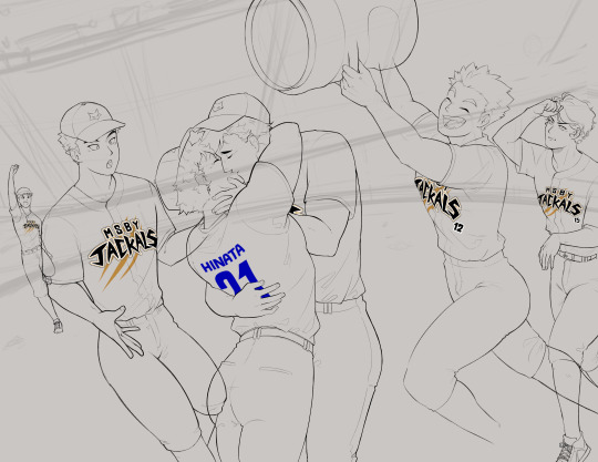
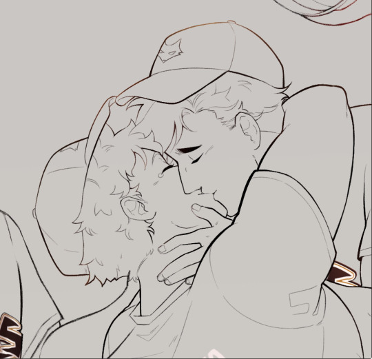
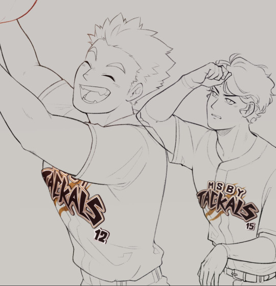
#002: AtsuHina Exchange - Baseball
Date of completion: March 16, 2024
Program: Clip Studio Paint (iPad)
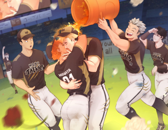
My piece for the 2025 AtsuHina Spring Exchange! I was feeling so warm and grateful for the community that I wanted to pour everything I had into this. Check it out on AO3 along with the rest of the amazing collection! Everyone here is so nice and talented, I can only hope this gives back a little bit!
Notes:
So... I know nothing about baseball! I started out trying to plan a whole thing in my head, like what positions they would all play, what scene I could draw that was more atshn than just MSBY/team dynamics but still more baseball than just slapping them in a different uniform (even if that is a little bit what ended up happening), etc., but I could tell I was going to think myself to death if I didn't just pick an idea and stick with it, so I went with a post-game celebration!
And when I say I know nothing, I really mean it qvq Pinterest ended up being my bestie for finding inspiration and references, and then I saw a pic of a gatorade shower and hubris said "I can paint that!!" and the rest is kind of history.
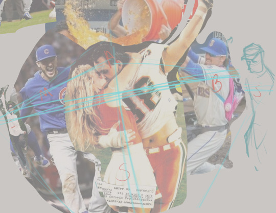
Composed everything using a collage of reference pics first, just going off of vibes until things felt right proportion- and perspective-wise
Loosely planned out background elements and adjusted poses to create implied or real lines that would point to atsuhina's faces as the focal point

A little layer management goes a long way, so almost every layer was named or sorted into a folder
Every character got a base fill, skin, hair, black, white, and gold layer. The brush I use blends color a lot, so I decided not to use separate shadow and light layers in this workflow
The group of uniform colors is marked with red so they'd be easy to see while scrolling through the panel, and lineart layers are marked in blue for the same reason
Once established, palette colors were added to my color mixer for easy access
Usually am more of a sketcher/one sketch straight to lineart person, but this time I put a lot of attention into refining details over multiple sketches
Eliminated a lot of guesswork before going into lineart this way, and realized important details like the exact pose and angle of Meian's hand and atsuhina's lips were lost in the mess
Most anatomy is drawn from reference, but adjusted according to the character's body type or modified for a more appealing silhouette (Shoyo in particular had to be thickened up a lot. And caked up lol.)
Sakusa wasn't drawn from reference and maybe it shows... I also had to change his pose because I realized he was looking a little... homophobic.....
Meian also got changed because, for some reason, he just didn't feel like Meian?? I think I also didn't want him to look too surprised at the kiss, more like an "Oh! Finally!" reaction
Focused on lineart to strengthn one of my weaker skills. I have a difficult relationship with lineart because I love sketching and most of the time don't color what I make, but I also don't have a good workflow without it... Plus for something polished like this, I didn't want to leave my lines rough like I had been
Atsuhina are drawn with the default Real G-Pen brush so they're a bit more crisp while still having texture. Everyone else is drawn with the HB Pencil brush I use for refining sketches, so they look softer
I've heard that thicker lines = closer to camera, and thinning lines where two objects contact each other show that they are touching better, so tried to apply this in my lines
I have a naturally light hand, so tried playing to my strengths with very thin detailing
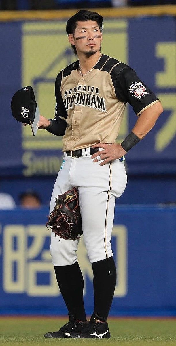
A lot of inspiration from this player and uniform when designing the Jackals baseball uniform!
It's impractical because black would get too hot to wear in the sun, but I wanted to keep the Jackal primary shirt color black, white pants, and gold accents
Only knew I wanted the end of their sleeves with gold trim, otherwise gold accents were added wherever it felt like I needed to break up the black. Putting gold into their socks was a little random, but I really liked it!
Inunaki's hat is colored differently because I originally thought the back should be gold with black in front... Then decided it looked better flipped, but Inunaki should stay black in front so it wouldn't be too distracting to have a lot of light colors there
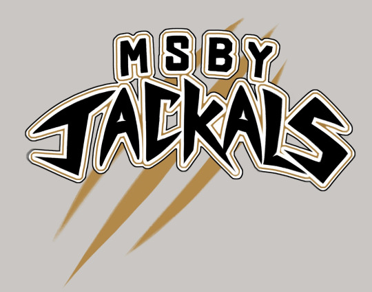
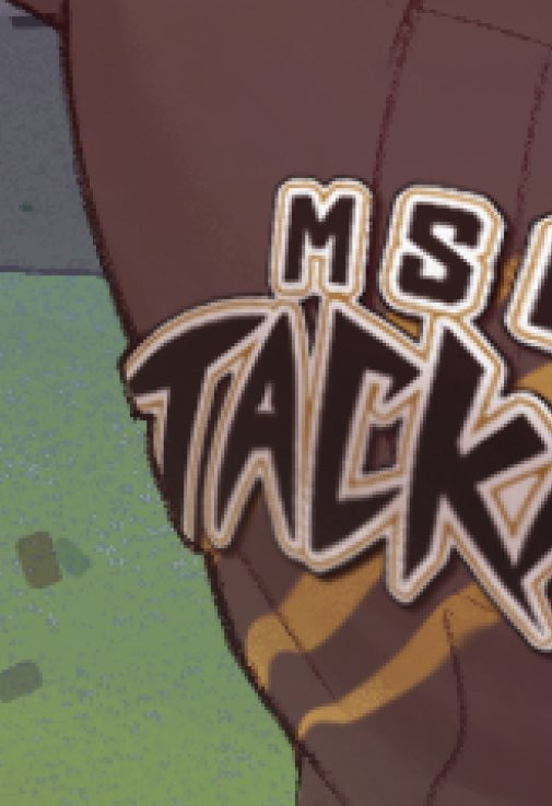
Graphic design is not my passion :( But I try, for atsuhina
Entire Jackals lettering was based off of the two letters we see with the official logo
Tried to analyze where straight vs curved lines were used, the asymmetrical shapes, and the sharp points
Designed the logo on its own much bigger than I needed so that I could shrink and mesh it around without losing quality
Mesh transformation to get it to approximately the right shape, then finished using liquefy
Adjusted lineart where it curves around the body to make it look 3D like a sewn on patch
Decided on background details using reference pictures, designed the ads based on vibes/whatever I wanted at the moment! Even the "refined" sketch was loose and more for placing elements than anything
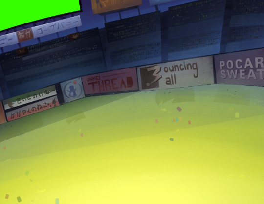
Fun facts: the sign under the screen originally had katakana for "rope bunny" because I didn't know what to put... then I got embarrassed realizing people can in fact read that and that it would be the only fully visible ad, so it got modified to "cope bunny" lol. If I had thought it out more, the "strongest dog"/"gleaming cat" signs would've been a fox and crow... Bouncing Ball and Pocari felt like they had to be included, but the easter egg I like most (and that ended up completely covered) was "Unmei Thread", just romaji for "destiny" + thread. That's Their Thing!!!
Starting furthest back in space to the front (in order: the sky and blocking in overall color transitions, the screen and ads in the back of the stadium, seating areas and crowd, grass, fence and ads, tufts of grass detail over the fence)
Struggle with freehanding architecture, so using the poly lasso tool until I have more practice. It gives it a unique sort of look, right? I think it's good for keeping things simple and "low poly"
Focus on shapes and selecting areas then adding color variation with the airbrush, or other brush as needed. Everything is done on basically one layer, so it's good to have brush variants like a Multiply/Highlight airbrush to make more interesting colors
This background technique is something I've been working on since I experimented with landscapes for a printmaking class. I was surprised to find people were actually drawn to the geometric style?? Been getting surprises lately that people are drawn to things in my art that I don't think are noteworthy at all

Tried out a different workflow! Where I usually focus on one character at a time, this time I tried painting everyone's skin first, then hair, then uniforms. I catch myself wondering how I got a certain look before when I work on a piece over a long time, so with so much going on it just made sense. I think I'll stick with this going forward!
After everyone was colored, used adjustment layers and a very light warm overlay to harmonize them more
Color saturation and luminosity: Areas of high saturation and contrast naturally draw the eye more, so I reserved these for atsuhina's faces and kept lighting/shading relatively subtle elsewhere
Sakusa and Inunaki in particularly were desaturated and painted over with blue from the background more to push them further back in space

In my sketches I favor hatching/contour lines a lot, and the delicate nature seemed appealing, so I tried bringing that in for rendering
Areas where its harder to blend colors smoothly or where things needed to be sharper, I used a very small size of my rendering brush to add hatching for texture. It's also good for darkening shadows or brightening highlights without being overbearing
If anyone wants to be an art nerd about it, that technique is probably classified as "optical mixing" where the viewer's eyes blend colors instead of blending them explicitly

Looked alright in the sketch then when it came time to render it turned out to be very hard...
Eventually approached with the idea of following "flowing lines" and staying mostly loose with it, just defining a couple spots where water would be splashing up
Followed this idea of "momentum" to block in shapes and large droplets with the Oil Brush
For the impression of a spray of tiny droplets behind Atsumu's head, I used the Dry Gouache brush, lightly brushed in the area with a large size, then erased out chunks or went back in with a smaller size of the brush to define the shape further
Oil Brush for more little details, especially highlights, until it looked alright
Airbrush set to "soft light" mode to give the effect of water "catching" in the droplets, then Droplet airbrush for larger drops into the Spray airbrush for very small but sharply defined particles
For the few rendered drops and happy tears, they were blocked in with white using the Oil Brush, erased in the middle, soft airbrush for the shadow of the highlight, highlight drawn in, then the "soft light" airbrush again in white lightly over the highlight
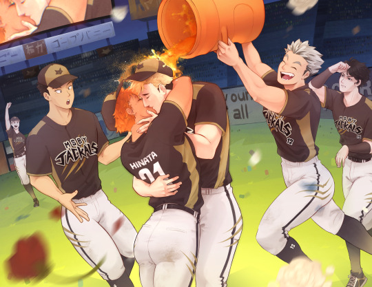

Raw image on the left, final on the right (Not blurry Sakusa exists!)
Spent much more time and effort than usual in compositing for this piece
Bounce lighting airbrushed over the characters from the grass, skin, orange keg, and pants. Light/bright colors will reflect more light while darker colors absorb more light. The airbrush can be large and loose too since bounce light scatters a lot.
Atmospheric perspective added to the background to push it further back
Nondestructive process: Creating flattened/merged copies of the background and characters to blur/use for other effects, and using masks to decide where effects would be applied without permanently erasing anything
Blurring areas aside from the focal point makes the focus very clear, and very light motion blur was added on Meian and Bokuto's legs
Blurred copies of the characters set to "soft light" mode at a low opacity gives a dreamy/soft look
Additionally, I had done a confidence building piece a little before I started this, just to remind myself that I'm most capable when I just go for things without fear, and to test drive some techniques before employing them for the first time on a work I considered much more important. I practiced some rendering techniques, giving the impression of lights, the dreamy glow effect, and reminded myself of things I often forget while making backgrounds, like working back to front and how messy my freehand gets haha.
Honestly, the process here looks long but it was a lot of fun! A lot of my weaknesses came from me just not having stamina to keep focused for a long time and lacking experience in certain things. if it takes a long time, it's because I haven't practiced enough. I want to study anatomy again and practice painting muscles more since my knowledge on the subject is fading and I'm scared of settling into what's comfortable instead of what's good.
In the end I'm not sure how to feel about this piece? I think it's good, definitely one of my better works, but after sitting with it for a while I can't help but think about what I wanted to do better. I think it shows some of my general weaknesses as an artist where I get absorbed in details and forget the bigger picture. I failed to plan properly and didn't take time researching different compositions, so I think in that respect it looks flat. I have resources for studying composition but feel intimidated by it, but it's one of the largest foundations of art so I have to try...!
I don't criticize my work to trash on it, but I do need to acknowledge where I could do better to set goals for the future!
2 notes
·
View notes
Text
Well
I finally finished I See You, Sundrop! by @shirajellyfish
Slight spoily warning!
It is 1:14 in the morning as I write this (editing about a day later) and I have my first day of my senior year of high school tomorrow, but I just had to get all of my thoughts out while they were fresh.
I have never, never hyperfixated on a fanfic so hard. I've never read 400k+ words of a single fic in under a week. Somehow I managed to do that and have time to draw fanart (something I'm pretty sure I've only done once before for a fic, actually) and do my irl life shit.
How, you may ask? By continuously staying up into the wee hours of the morning :D (like 4-6am type shit, don't recommend it even if I think it was personally worth it).
I think I was so hyperfixated on the fic that I honestly didn't absorb the emotions like I should have? I felt things, surprise, excitement, a Sense of Impending Doom (/hj), but I don't think I really felt them.
I was probably a little more dissociated while reading than I usually am lol. I was so absorbed that some things barely registered. I am 100% going to have to re-read everything.
At one point I worried the fic wouldn't have a happy ending. Doesn't have the "angst with a happy ending" tag afaik and it got much worse before it got better. Saw a comment on one of the end notes and was reassured thankfully TvT. I'm very happy everyone is ok.
Love how the after ending note basically boiled down to "everyone is fine and Felix finally got some sleep" lol.
This fic was just. So good. Riley is such a dynamic character, so awesome and so cool. I really want to headcanon them as autistic (some of their behaviors just. They just. It's hard to explain, but if you're autistic too I bet you probably felt it, just a lil. They got the vibes /hj) but I know some authors can be kinda iffy about people headcanoning their OCs (which I get).
It was really cool to see an honest to goodness nonbinary character, a full character and not a self insert or y/n (no shade, I love y/n stories too). It was just cool to see a complete OC, and I love that it was all platonic, even if Sundrop did catch a little bit of feelings.
Honestly I relate so much to that, as someone who gains and loses crushes pretty fast. I'm happy it stayed platonic though and Sunny wasn't hurt or stuck pining or something silly. Plus his absolute embarrassment and mortification at his slip up was pretty funny. Might try to draw it, if I have any left over motivation (the bottom of this post sure is interesting hint hint).
Update as I'm editing this about a day later: I can't stop thinking about this fic. It was just so good! I already want to re-read it but I know I should give it at least a little time so I don't burn myself out. This fic was probably the best story I've ever read. Period. Even better than the published books I've read.
Honestly without spoiling any more than I already have, read it. If you like the DCA, read it. If you like cool nonbinary characters and great platonic relationships, read it. If you like a plot that sneaks up on you before hitting you in the feels like a truck, read. It. Do it. It's sososo worth it, I promise you.
If anyone has some good fics to read (completed preferred but actively updated ones work too) PLEASE FEED ME. Now that I'm done with ISYS I am desperate for more DCA fics. I've read so many and I n e e d m o r e.
Bonus fanart to celebrate my completion I guess(?), embarrassed Sun boy!
I guess I just really like drawing embarrassed boyos. Sorry if it looks weird, I've never drawn a pose like this before :P
Shira if you're reading this, thank you. Your fic was just fantastic. Also thank you for helping me get out of my art block! I had it for the whole month of ArtFight (sadge) but I'm so happy to have some motivation again. Thank you.
#ian's shitty art#art#drawing#fnaf security breach#fnaf dca#fnaf sb#fnaf sun#sun fnaf#fnaf daycare attendant#holy shit shira you really done made the best fic I've ever read huh#you Do Not Understand how much I appreciated ISYS#i really needed that hyperfixation rn#thank you#so much
29 notes
·
View notes
Note
ok so i was just looking around a bit and i saw a post about AidaIro.. my apologies if youve already seen it by the way-!!
i will copy and paste it. :)
heres the post:
The rumor is/was that Aida, the artist, have a like for shotacon. The rumor is based on two things:
The first one is that Aida apparently draw in their Twitter an art (not a sexual one, since Aida haven't draw anything explicit, ever) of a character from a shota game. I saw the art, but since I don't know that game and it didn't have any name attached, I couldn't look for more information about it. So this first part is debatable, not confirmed.
The second part of the rumor is... Well, some TBHK artworks. Here I have to concede that Aida did draw characters, especially Hanako, in suggestive ways. In the past. Back in 2015-2016. Here you have some example tweets with arts that... well, when I look at them, I ask myself: "why? why make children pose like that, or make a focus at those parts of their bodies?"


You have to think that sexualization is not only explicit sex, naked people, etc. It's as well suggestion. In the same way, shotacon is not only drawing naked children or them having sex. That it's at the minimum, a proof of Aida not caring a lot about crossing visual sexual insinuations with characters that look like children. You can make a pass to the sexual puns and all of that, since well, they're teenagers (and if anything, that would be Iro's fault, not Aida's). But that's a different topic.
Anyways! thats the end of the post and im kind of questioning alot of things now..or maybe im overreating..? what do you think?
Hi :) I saw those tweets, no worries, but your question is very interesting and you don't have to apologize :) I'm glad you asked the question!
As for Aida, this is the first time I hear it from you. I've never come across a rumor before since I've been jshk fandom, but it's actually wondering. Unfortunately I cannot confirm this.
Yes, I saw it and I was very dissatisfied, but we are talking about Japan here and the subject is more complex. Shotcon means something different in Japan than in the west but more on that in a moment. The rumor may have some truth in those tweets from years ago on their Twitter, it may be a hint that it may be true, but it's also impossible to say if it's true, it really can't be confirmed and one can only wonder. I will say this way. These tweets are not 100% sure. They are only circumstantial, not 100% proof. Looking at Amane, I really wonder if the rumor was true, but that's my personal feeling and considering what they do in the jshk series and what game they released, I wouldn't be surprised.
You're right, shotcon doesn't mean sexualizing the erotic way, and that's mostly in Japan. This can be a very suggestive way as seen in Hanako. The problem is that in Japan the age of consent for s*x is 13. I've seen manga that contain erotic scenes from 13 year I personally don't like it and how Amane was drawn. I suspect that such scenes with Hanako's body and not only are just legal there.
You have a right to be the way you feel and I don't think you're exaggerating. I feel the same when I look at their old tweets. I feel so uncomfortable watching these tweets but what is weird and immoral is for us, to them is normal I guess.
I love Japan, but there are many things I don't like and just allowing these things at 13 is one of them and drawing children in a suggestive way or the availability of some manga containing THESE SCENES at 13.
I think it's both of them's fault, if Iro does it then Aida agrees so. I don't see here to w one person to blame. I blame both of them. They're both guilty, but like I said, it's normal for them and they don't see anything wrong with it.
Although I think they don't see anything wrong with exposing it in a suggestive way. They already have a problem with naked bodies. I guided by what they wrote in volume 1

I can only guess from what they did in this case and my conclusion is this: I guess they think that suggestive things like those in Amane are less evil and harmless than naked bodies? hmm. But I still think it's wrong. Suggestion may seem like the less evil to them, but it's still… it's wrong. I hope I conveyed it well.
Thanks for asking the question.
10 notes
·
View notes
Text
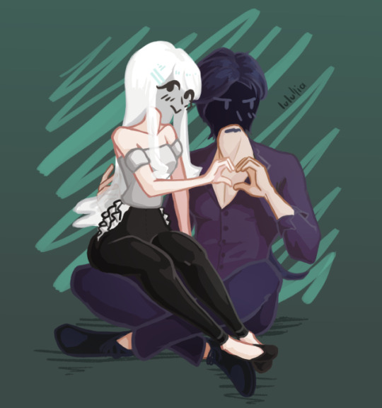
Vladleen Photo | Lyphuriaa
Isn't Lulu so cute?? She probably had to beg for days to convince Vlad to make such a cheesy gesture…
God this one was especially hard, not really because of what I was drawing but because of how. It made me learn about a bazillion things not to repeat ever again.
All things considered though, it came out pretty good! I wanted to give up so many times and there were so many catastrophes I'm really surprised in how clean it looks.
I'm even more surprised that I was able to push through and bring it to the finish despite it all, it's something to celebrate ;-;
A lil' summary of what this piece taught me ⤵
I really need to study the rest of the human anatomy. The legs were difficult, the feet too. I only realize this now because I mostly draw torsos and simple poses. Also, first time I draw characters interacting – it was fun but it's really something I need to practice more!
If I plan on using the sketch as lineart, please for the love of God use an opaque brush. The amount of time I spent fixing the lineart because it was semi-transparent, I might as well have drawn 3 layers of proper lineart.
Keep an eye on the background color. Because of some transparency stuff, I didn't realize some parts of the drawing only looked right with the current bg color – so when I thought I was done and changed it, I stared in horror at the ugly artifacts all around the drawing. It was painful to fix.
Sometimes it's easier to just draw over the sketch, taking the lines I like, instead of cleaning it up. Because using the sketch layer – especially with an opacity brush – leaves around a ton of barely visible artifacts. I had to "select opaque" to see them and clear them out, and it was also painful.
Generally, going into a drawing without a plan for what style it's gonna be is a bad idea and results in a lot of problems down the line.
Better fix any problems I have with the drawing as early as possible, because I'll end up fixing it anyway, only if I'm too far in the process it'll cost me more time.
I need to stop drawing too detailed an anatomy if I know it's gonna get covered by clothes anyway… T-T
Phew, I'm still shocked that I managed to make a decent piece even after all these problems. Somehow I feel pretty good about it, I think the joy of seeing it finished made all my bad experience with it go away.
It's great, especially since I've been struggling a lot with self-doubt about my creative projects recently; this shows me that no matter how crappy something seems to be, if only I push through and finish it, all that bad energy turns into incredibly good feelings of accomplishment and pride.
Hope that's useful; now I really want to make a mini story game and see how it turns out…
#lulullia#artists on tumblr#art#lyphuriaa#vladleen#illustration#cel shaded#drawing#i feel good about it
4 notes
·
View notes
Text
Thinking about MGS5, as i so often am, and the way it's 'shots' are constructed; because there's something so deeply fascinating about it. It's a very cinematic, movie-like game that relishes in letting itself play with lens flares and lighting and film language, imitation switches between steady cam and handheld, positioning shots to cement the camera man within them; this is something i adore about it. I'm sure it's not the first nor only game to have done this, but something feels so....gripping to me about it. Maybe it's just me experiencing it at the right time and place for it to really lodge in my head, but there's just... something about it. There's mods that let you move the camera around during cut scenes, i see posts online of people finding expressions on character models faces that weren't visible in normal gameplay; and that really all just adds to it, to the fact this scene is playing out yet we as the viewers through the cameraman's gaze can only see so much. The world and it's characters seem to continue on regardless of if we can see them or not, no matter where on the stage our eyes are drawn the actors are still performing even when out of sight. Isn't that fascinating? My experiences with moving camera angles during gameplay or cutscenes in games has always been that it'll reveal that pieces despawn, that faces go still and blank, that characters a pose and only that which you need to see in normal gameplay is truly there; because of course, this no doubt saves work and time and frees up resources. But seeing scenes from different angles, seeing expressions you can't normally see, constructing your own shots of the same thing playing out yet from a different view... it's a fascinating concept isn't it? It's no surprise this occurs in a game made under the watch of the man also behind the Silent Hills playable teaser, where the ghost is constantly right behind you despite it being impossible to see her unless you mess with the game enough to allow you to move the camera and look. But isn't it just the most intriguing thing, to wonder how much is going on when you aren't looking, to wonder what's just out of sight; I've never played a game that's made me feel that before, not in this way. It truly does feel like the world of MGS5 lives and breathes, and this is absolutely deliberately cultivated and created by those who worked on this game- you can see that in so many other points, such as the animations of minute micro-expressions and muscle flexes in faces. However nothing amongst all the high praise i have of this game can stand as high as my absolute wonder as to why hidden little expressions and different views from different camera angles can exist. Did the development of this game take into account people would go looking? Or was it simply a matter of construction, of building scenes to play out and then direct the camera within them, letting the scene dictate the shot, not the other way around.
I feel like this game never stops surprising me, never stops feeling like there's more beyond what I've seen; that someday some more big secrets will be found within it, or somehow when i return to it someday there's just going to be....more. It's very very dear to my heart.
#jay talkin#long post#ok ok just let me ramble stream of conciousness for a sec its ok if its Not Much <3#genuinely just saw a tweet this morning abt a tiny smile kaz does in the cutscene after the sahalanthropus fight#that u cant fucking normally see from the angle the camera is in and i. went into existentialism and deep thought over it#not just cuz thats my fuckingggggggggggggg guy but also. man this game. THIS FUCKIN GAME#and hey if anything i said sounds like i dont know enough abt this games dev cycle or system. well. its bc i dont <3 im no expert
2 notes
·
View notes
Text

Fifth Tumblr Post!
If this were a film or television show, I suppose this is what you'd call filler content. These sketches of three unrelated things (not really characters since one of them is real,) didn't come from anything in particular besides the fact that I thought that they would look really goofy next to each other. Although at a certain point of my original sketching process, I realized I could try to focus on a specific aspect of each sketch that I'm not particularly great at--and try to use what I had at the time to improve.
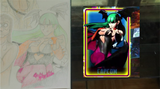
1st Sketch | "Weird Al" Yankovic; pose from the lyric sheet included with CD copies of the album "Off The Deep End" - I've recently bought 11 of his albums from an eBay listing and have been listening to them on a pretty frequent basis, and thus, decided it might be fun to draw the man himself. I had looked through each lyric sheet included in about half the albums when I originally got them in the mail, and thought that this one was the funniest. The actual process of drawing this wasn't too long as I've gotten more acquainted with anatomically-correct human bodies in recent times, although this was the first time I've drawn body hair and nipples, so I suppose that was both a pleasant surprise and challenge. But what I'm most proud of is the arms, since I managed to draw a pair in a manner where they look like arms instead of weirdly bent straws. It's a tweaked version of the technique I use to draw legs that I first used on a drawing of an OC (that I have yet to finish,) improved by the better look at a bent human arm that this image provided me. I'd also say the manic expression that I've managed to give him, as well as the transition into my style that I've managed to make is something that I'm somewhat proud of (especially when you take the last time I drew a real-adjacent person into account.) Overall, I'm pretty happy with my final result and do expect to return to the wacky world of "Weird Al" Yankovic soon, especially since I've been able to nab tickets to his latest tour!
2nd Sketch | Morrigan Aensland (Darkstalkers;) pose from "Ultimate Marvel vs. Capcom 3" - I first out out what exactly a "Darkstalkers" was through "Marvel" and played through the games through a couple of ROMS on my old PSP. While not my favorite character in the franchise, I decided to draw Morrigan since I just so happen to find her design fascinating. Also, the thought of her standing next to a nude Weird Al was really funny in the sleep deprived state I was in at the time. It was by this point where I realized that I could use each of these sketches to improve an a variety of my lackluster skills, deciding here that I would try to improve my--uh--"boob work." I absolutely hated they process of drawing the breasts, mostly because I can't really stand breasts in the first place, but despite this, I managed to squirt some that didn't look like a pair of cancerous warts out in good time. I also had to work on my application of pressure while coloring her due to her paler skin tone needing that I work a lot more gently on areas where more light would hit, and wider color pallet which required slightly more in-depth shading to not look as out of place. Since I gave my version some pretty broad shoulders and a comparatively tall head, my Morrigan is pretty off model, but nonetheless, it's still my favorite out of this batch of sketches, even if it is only because of the improvements I've made when it comes to coloring and drawing the human body.
3rd Sketch | Henry "Indiana" Jones III (Indiana Jones;) pose taken from a 1982 reissue poster for the film "Raiders of the Lost Ark" - Indiana Jones is one of my favorite film series of all time, with the first in the series sitting as my favorite film, period. I've actually drawn Indy twice before, both at radically different times in my art-style's evolution and with complete failure to look anything like Harrison Ford. It was memory of that which gave the goal of getting this new thing to look like Mr. Ford, which I paired with trying to figure out how to get a good angle on a human appendage. This took me by far the least amount of time to draw since I had slept well the night before and decided to "lock-in" because I guess I just really wanted to make my younger self look like an idiot by showing myself how much I've improved. I just so happened to be wearing an Indiana Jones shirt at the time, so I promptly took that off to get a better look at Indy's features and figured out what exactly was needed to get something that looked accurate--and ended up with subpar results (I think he looks more like the LEGO Indiana Jones than anything.) By contrast, I don't think the angle on the upper arm is too bad, probably since I tried to map out the oval base of it beforehand. I also had to work on my pressure application here since I used a gold pencil to color in his shirt and couldn't press down to hard without ruining the whole thing, and Indy's skin tone is much darker than the previous two things here. Speaking in a broader sense, I suppose that I'm happy with how this turned out, despite not really having any reason in particular for it (I don't know, maybe it's just 'cause I like this stupid lovechild between an actual archeologist and a grave robber.)
I suppose that this marks the end of my little filler journey across three unrelated things I like, I learned some junk and got to "geek-out" about nerd things I like. I'll probably be back soon with a post about some OCs I've been working or possibly a comic or two or maybe both, I've got a bunch of free time now that my finals are done with.
I hope you enjoy it, and any and all constructive criticism is welcome!


#fan art#artists on tumblr#traditional sketch#80s#sketch#sketches#weird al#weird al yankovic#indiana jones#raiders of the lost ark#darkstalkers#vampire savior
1 note
·
View note
Text
I have lived with a variety of people in my many years of having roommates, and I can without a doubt say yesterday morning was one of the funniest combinations of specific quirks and high comfort I've experienced with a set of roommates.
To set the scene, we have me, noted morning hater; my partner, #1 morning person or #1 depression coma depending on the day; my other partner, who has severe misophonia; and our roommate, whose average wakeup time is between 11am and 1pm and who slept through a high-speed blender getting turned on basically beside their head every morning for months. The last two aren't really participants in this incident, but the fact that there were two potential witnesses makes it funnier in hindsight.
So partner A is a heavy sleeper and hates repetitive noise. Which means the standard "loud annoying beeping" alarm is not an option unless violent rage is the emotion they want to wake up with. In order to make it to work and generally achieve conciousness in the morning, they instead have an alarm hooked up to a Spotify playlist, set to max volume and far enough away that they have to physically shift around to find it and turn it off. Thus the alarm is still loud enough to wake him and shuffle means nothing repeats enough to get categorized as background noise and therefore slept through. Notable songs from this week have included Imagine Dragon's Radioactive, Everywhere I Go by Hollywood Undead, and Mr. Blue Sky by the Electric Light Orchestra, so the vibe of the music is pretty clear (hint, it gets loud as hell quickly).
I, in contrast, despise mornings regardless of the situation and especially hate getting forcibly woken up v.s. choosing to get up myself. A different incident involving a late night and my partner waking me up with the best intentions during one of their morning person phases convinced them that I am in fact capable of war crimes when my sleep is disturbed (this is all in jest, nothing bad happened). I also, despite being able to fall asleep at concerts and in clubs, am easily woken up when my environment suddenly goes from quiet to loud. Meaning I usually wake up to my partner's alarms, but can immediately go back to sleep as long as they're turned off quickly.
Today was not one of those days.
This morning, I was slam-dunked from a dream I don't remember back into my body, where I was dimly aware of Lizzo's "Pink" (from the Barbie Movie) blasting from my partner's bedroom. I stumble out of bed to pee before I'm fully aware that I'm moving, and the cats descend (I have made the mistake of moving first and this must mean I am today's Morning Sustenence Provider). As I am not, I choose to finish my business and drag myself back to bed, which is by the way conveniently located adjacent to the partner's room from which the hellishly loud music originates. During my bathroom sojourn, the song had finished playing and had now begun to repeat. I lay in bed for the next two repeats trying to ignore it, barely concious, and seething with rage that I am not asleep. By the time the song starts with round four, my tired brain has had enough and I once again abruptly haul ass out of bed with surprising speed and burst through my partner's bedroom door like the Kool-Aid man.
But I am confused, you see, because it is 7am and the blackout curtains are drawn so it is dark as fuck and my partner has An Aesthetic (all his bedroom furniture is black wood and his phone case is black), meaning I can see next to nothing. So I am standing between the door and their bed in a vaguely concerning pose, looming over them like some mildly pissed-off sleep deprived cryptid as my semiconcious brain tries to decipher where in the room this fucking song is coming from. My partner wakes up and registers the music, rolls over while muttering a barely decipherable "sorry" in their own half-awake state, and shuts off the alarm. Seeing that the problem is now resolved, I silently turn, exit the room, close the door, and return to my own bed where I spend a blissful two more hours.
When I woke up and attained full conciousness at a much more reasonable hour, there was a text from my partner apologizing for waking me up earlier. We caught up that night after everyone's shifts and apparently, my partner hadn't heard the alarm at all and had instead woken up after sensing my vaguely threatening presence. They had no idea the alarm song had repeated, much less three times, and due to the weird twilight-zone mindset of "just woke up", was not 100% sure that I had actually been their room at all. They described it like dream logic and weren't sure if they'd imagined it.
As the sprinkles on this story, our other partner hadn't heard any of this go down and had happily gone about her usual morning routine. Keep in mind this woman shares a wall with our music-alarm partner and has such bad misophonia that she can sometimes hear music being played on adjacent streets through the (admittedly shittily insulated) walls of our house. That morning though? Nothing. Her alarm ALSO went off at 7am that day. I heard her get up shortly after I returned to the loving arms of my many blankets. No idea what our roomate heard of this incident, if anything, but I find the whole debacle hilarious and apparently I'm capable of waking someone up with the sheer force of my before-sunrise malevolence.
#like i feel really bad#but this is also the funniest interaction#woe. may the presence of a night person be upon ye
0 notes
Text

The Owl House Mermay Marathon: Aladarius (4/6)
I bet you weren't expecting this ship from me. So, Surprise! I'm a filthy aladarius shipper lmao. I think their relationship is super interesting (They're DEFINITELY exes possibly with lingering feelings for each other).
This is definitely the most controversial ship I'm doing for the mermay marathon (fully expecting some not so nice comments on insta.) It's kinda a stretch to even call this one of the main TOH ships, but it's definitely pretty popular from what I've seen. Also I like it so I'm adding it to the marathon anyway. (This is actually the first ship I've drawn for this marathon that I actually care about haha).
On to the drawing itself, I wanted to draw Darius pushing Alador away in a playful manner. Kinda like he's playing hard to get. However, I kinda ran into issues with what to do with Alador and Darius' arms that weren't interacting with each other. Darius' especially. I wanted to fill in the negative space in the upper right corner, so I put his arm there. However, I had no idea what pose to put his hand in. I originally made his hand a fist, but my girlfriend told me it made it look like Darius was about to punch Alador, so I changed it to what is in the final product.
Also, since Darius is buff, it wouldn't have made any sense if I didn't draw him with abs. But the problem was I have literally never drawn abs in the literal decade I've been drawing as a hobby. So that sure was a massive fucking pain, but I think I did a decent job for a first time. (Taking drawing II in college definitely helped me out here)
Final thing I wanted to mention is I made Darius' tail an abomination tail. It only made sense for his character lmao.
#the owl house#the owl house fanart#the owl house fan art#toh fanart#toh fan art#the owl house darius#darius the owl house#darius toh#toh darius#toh alador#alador toh#the owl house alador#alador the owl house#alador blight#darius deamonne#alador deamonne#aladarius#alador x darius#darius x alador#gay#bisexual#mermay#mermay 2023
234 notes
·
View notes
Text
PERSEPHONE YOUR FACE-

I had to fix this. IDK who's doing it but someone on the LO team keeps drawing Persephone like a goldfish and it's driving me nuts lmao Besides the weird jawline, obscured face, and pouty lips, this kind of pose basically demands the eyes to be closed. There's a reason you don't draw people kissing (or close to kissing) with their eyes open - unless they're being taken by surprise or something - because it often just ends up looking creepy/off. Exactly like it does here.
This is also one of those panels that is very obviously drawn by two different artists. Hades and Persephone aren't anywhere close to being stylized the same. IDK why they do this, but typically when working on a team, you should be allocating specific roles to specific artists. I've managed my own webcomic teams in the past, and typically I'd be the one handling my roughs, lineat, and final rendering, while I'd have another artist looking after flats, another doing backgrounds, and someone else doing things like typography and copy editing to check for typos.
Rachel's team, on the other hand, just seems to handle it panel by panel, with different people picking up different parts of each panel which results in these weird compositions where characters look like they've been copy-pasted into the scene together. Honestly, I can't say it would surprise me if the suspicions that Rachel draws and writes the comic one panel at a time are true (which they most likely with the quality of the panels and lack of foresight in the writing and the razor slim buffer Rachel is working with) but it still makes the comic such a mess to look at all the same.
So I did my best to fix it.
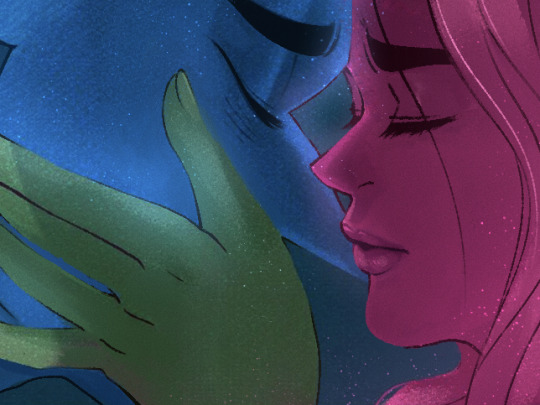
Working with the composition provided was pretty difficult, I actually ended up having to go back in for a second pass because my first attempt wasn't all that great. It's just not a great composition all around but I didn't want to redraw it completely because it would defeat the point of doing these panel edits in the first place lol
#lore olympus critical#lo critical#lore olympus edit#antiloreolympus#lo edit#lore olympus panel edit#putting the glow back in LO
123 notes
·
View notes
Note
I just wanna say I have an old post of yours saved in my drafts, about being a beginner artist…. I look at it sometimes to give me perspective and reassurance. Thank you. It has inspired me to continue my hobby/passion even if I don’t get many notes rn. I improve and I see it! Thats all that matters. Thank you. I hope I can be that for someone someday.
oh wow 😭 this just warmed my heart—thank you for sharing with me. i don't know what post you're talking about specifically, but i'm so glad that something i said could give you a little extra boost sometimes<3
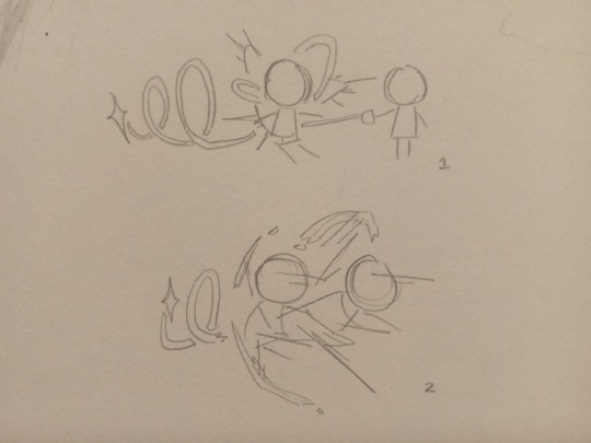
it's both cool and sort of embarrassing that this blog is a record of my entire art journey. i didn't start learning how to draw until i got into ML and joined tumblr again about 3.5 years ago, so it has my very earliest art as well as my most recent. the other day my sister and i went through my art tag and i was literally crying with laughter at some of those pieces alskjdf (particularly this one). they're sooo bad but they were my best work at the time! as much as i cringe to look at them now, it's nice to remember how far I've come. There are still so many things I struggle with and things i disappoint myself about, but that's normal because I am still growing. no one stops growing. the artists you look up to the most, whose work seems absolutely flawless to you, are still growing.
and YOU are growing too! whether you feel like you are or not. sometimes it takes looking back to realize it. i'm really glad you can see your improvement! honestly, that's a skill too! having a healthy mindset about your own development can take a lot of internal work so I'm really proud of you for that.
(i got very rambly so cut for the rest lol)
and honestly sometimes the improvement isn't even about what the art looks like—it can just be about how you feel about making it. I think one of my biggest improvements in the last year was getting comfortable with drawing and sharing things that are Bad and Ugly! for example:

the first one i drew 3 years ago, just a few months into learning how to draw. the second one i drew about a month ago. they both have obvious flaws and you could even argue that the old one is better drawn than the newer one. so it's like omg did i not improve at all after over 3 years?? did i actually get worse? lol. no! because a lot of the improvement is internal.
you'll notice that the first one was done in pencil and the second one is pen. it took me years to feel confident enough to sketch in pen because you can't erase! you have to commit to the lines! you can actually see tons of erase marks in the first one, but i didnt even use my white-erase tape at all on the second one. also, the first one is a screen redraw. i was just looking at the image and trying to replicate what i saw the best i can. the second one is new scenes/poses that came from my brain—not that they are very complicated/impressive lol, but there's a difference there. and what you can't see at all is just my attitude about drawing them! i can't particularly remember doing the first one but i guarantee i spent forever on it and was nervous about posting it. second one probably took me 7 mins and i knew it was ugly but i was zero percent embarrassed about that lol. that's progress baby!! cant even tell you how much of a difference it has made to me to let myself draw ugly things. i draw ugly things all the time. some of them get posted online. some of them get shared with one or two friends. some of them get shared with no one. and i've finally learned how to either embrace them as what they are or just shrug it off and go, "you know, this is not it! moving on." blank pages are so intimidating because you have a million opportunities to mess things up, but you also have a million opportunities to explore and learn and experiment and have fun and also to surprise yourself with what you're capable of.
i started out with nothing but a pencil and some powerful blorbo brainrot, and that was enough! that has been enough to power me through years of all the struggles and triumphs that artists go through. it was enough to help me push through every art block and keep drawing to the point that my instincts have improved and things that used to be almost impossible for me are just regular hard lol. i've actually illustrated for a print magazine a few times now, and a few weeks ago i finished my first animatic—which i always wanted to do but didn't have the skill or confidence for.
sorry this is so long, i'm just very passionate about this subject lol!! i just want every growing artist to know that if you keep trying and having fun, improvement is not only possible but inevitable. like, you don't even have to do formal studies if you don't want to. keep looking at art that you like and figuring out what is appealing to you. keep drawing what you feel like drawing. if you're no longer inspired by a piece or it's a little too tough for you right now, it's ok to drop it. you can come back later or never. you have infinite opportunities to make new and better art. and don't forget to give yourself credit for the progress you've already made. it's so hard not to compare yourself to others, and literally everyone—even the best and brightest—feels bad about their work sometimes. but try to compare yourself to your past self and pat yourself on the back for your improvement! it's okay to grow slowly, or in a way that's not so visible on the outside. just remember that you are growing, and you will only get better and better.
also, side note about notes/likes: i know it sucks to feel like your work is not getting attention when you poured a lot into it :( this might sound rich coming from me because i feel that people have been incredibly generous toward my work from the very beginning. but just know that popularity is not really about who "deserves" what, and it's not an accurate reflection of skill either. so if you feel unseen, that doesn't mean your stuff sucks. and you never know what your work might have meant to the people who saw it, even if there aren't that many. art doesn't have to be popular to be meaningful, and it doesn't have to be perfect either.
the world is a little richer and more beautiful because of the ways you are growing and the things you are sharing. so thank you, and please don't stop.
21 notes
·
View notes
Note
what was your inspiration behind monotora?
Since Rexx was the one to create Monotora, I've asked him to answer this question (everything below is what she's written):
When it came to replacing Monokuma for DR96 it took a lot of thought and planning on how we could have a character that can stand out to be a threat rather than something that's passive aggressive like Monokuma himself. Throughout the months of production they went through so many design ideas it was tough to find one where it wasn't too complex or it didn't fit in with the setting DR96 was taking place.
First one was done in around the end of September 2021, and originally they were going to be blue/dark grey - but I did not want to get any comparisons to Sans so I immediately changed them to a very desaturated orange/dark grey with blue eyes. It didn't really last long though since their colours felt like they weren't really popping out enough and were bland. I also went overboard with their markings so they needed to be simplified. (I would've shown what they'd be if they were blue but unfortunately it's been lost </3)
Second concept was a little after in around early October 2021 for a reference sheet, they were still going to be bipedal and had a lot more scars on their body (except those were done as a deliberate design choice rather than something you'll receive in a fight.) They were more scruffy with an ear notch included and had an overbite, but this didn't really last long until I did another concept design for them. Around this period I struggled a lot when it came to designing them without stepping into the complex design boundaries.

Third concept was originally going to be used for their splash art but I wasn't really fond of that pose and the yellow scars were so icky to me so then they were edited to be more fleshy coloured (as in a shade of red you'd get from freshly opened wounds) which leads to their splash art we used to reveal Monotora to the discord server during the announcement (which was drawn in November 2021 time) I was going through the period of learning to draw a lot of sharp teeth so the anatomy looked really rough.
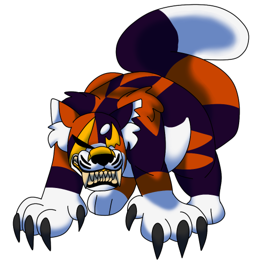
A lot of these are really old and outdated but the most up to date version is what they currently look up to chapter 3, they have a more animalistic look and they're no longer bipedal. Generally they're really fun to draw and goof around with and it's been fun using them for DR96 :)
I do have a list of characters/creatures that are main inspirations to fleshing out Monotora's personality and traits here:
Monokuma + Monokid; these two were mainly a guideline to starting off with designing a mascot for the killing game.
Doraemon; at the very beginning his design was Monotora's main inspiration but overtime things would've been changed or scrapped, however a few traits are still there such as Monotora being able to hid things in their stomach like how Doraemon can hide things in his little pocket on his stomach.
Nightmare Fredbear + Montgomery (FNAF); these two characters helped flesh out that 'threatening robot' kind of thing (Fredbears off-putting dialogue in UCN and Montgomery's temperament and determination to hunt you down in SB). A fun fact is that Monty's voice is my personal HC voice for Monotora lol
The indoraptor (Jurassic World); a pretty obvious thing from the indoraptor is it being built to be used as a weapon, Monotora has the capability of killing just like the indoraptor (only differences is that Monotora doesn't have the laser targeting system and they're smaller than the indoraptor). But generally Monotora gets their animalistic behaviour from this dinosaur. I've also seen a few people mention how Monotora looks similar to Mapleshade from Warrior Cats but she was never ever used for inspiration (which is surprising considering I have the books) LMAOOOO
#this tackles both their design development and what inspired their character#which is really cool to read tbh#i remember trying to draw monotora once on paper in one of their early designs and failing miserably lol#rexx goes by he/she/they btw
10 notes
·
View notes