#also that second one is a good example of how their design can be simplified
Text
Quick FAQ on Tumblr, "Value", and the Proposed Crab Day
Motivation: I see a lot of misinformation circulating on the dash re the proposed crab day and I wanted to offer a simplified and judgement free perspective using core principles of finance.
Q: We keep being told that tumblr's been making nothing but a loss for years, and yet, if it is so unprofitable, then why is no one is shutting the website down? Is it really in need of our money if it's already owned by a multi-billion dollar corporation?
This is in fact not as much of a paradox as it appears to be because "value" in corporate finance terms is a function of present and expected future profits (adjusting for the fact that profits you expect to be earn in the near future are worth a lot more than equivalent profits expected to be earned much later in time).
This means that you can have a company or a product that is currently making a loss (i.e. costing a lot more to run than the income it generates) and it might still be worth some (or a lot of) money as long as you expect it to generate enough profits going forward. Uber for example has been making a loss for years and is still valued at billions of dollars because people think it will eventually generate a lot of profit.
Q: What does all of that mean for tumblr, specifically?
Given how unprofitable tumblr has been historically it's actually a pretty good sign that management has a plan to try and make it profitable because it means they haven't thrown in the towel yet!
But if they fail or if they decide that no matter what they do tumblr will remain unprofitable, then they wouldn't have much business incentive to keep running it. This is why participating in crab day or spending some money on tumblr in general is a good idea, if you can afford it and if tumblr is a service you would like to keep enjoying into the future. And if the answer is no to either of those questions, that's ok too--don't let anyone guilt you on this.
Even more questions-and-answers under the cut! My inbox is also open for any (good faith) questions you might have.
Q: But we all use tumblr religiously--isn't that enough?
Not quite. Tumblr's current state means that the existing userbase is not enough to make the site profitable. For that to change, either the existing userbase needs to become more profitable, or tumblr needs to get a lot more new users--or have a combination of both.
Q: Can crab day really solve all this?
Once again, not quite. A one time cash-injection is not equal to sustainable income, which is what tumblr ultimately needs. This means tumblr will still need to court potential new users and that entails some change to the design and/or the perception of the site. (I love tumblr but guys, if we are real for a second, last time I told my coworkers that, they asked me if I also had a myspace account.)
Q: So why participate then?
Because it will still help. While some change is inevitable and necessary, if we the existing users put our money where our mouth is, it would send a strong signal to management that we value the service they offer and that they should take our preferences into account in designing the site's future also. Also some cash, even if it is a one time deal,
Q: I heard people who came up with the idea are transphobic Christian fundies--do you really want to associate with people like that?
I don't. But who the blogs behind this idea, as people, are has no bearing on the merits of the idea itself.
#crab day#save this hellsite#im gonna say something i never explicitly have#and ask that you rb this if you agree with it#finance is confusing! and the more we get the message across#the better i think#for keeping tumblr around for a long time
2K notes
·
View notes
Note
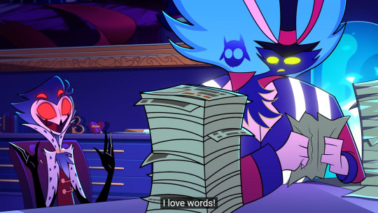
Oooh okay okay, permission to be a little petty? This has been eating me up for a minute! On the topic of the helluva/hazbin redesigns: there are a lot of times in the critical side of this fandom where I’ll see people talking about what they would “fix” about the character designs, and like you said- some of the specifics people think they need to fix just…undermine the point of the character?? (I.e making Stolas big and burly) But it also feels like they’re ignoring that these characters look the way they do because they have to be ANIMATED. There’s been a handful of times I’ve seen people with that “fix it” attitude where they just waaaaay over complicate textures and shapes then say it’s so much better. For example some were saying Blitz’s design was bad because you can’t tell his burn scars were burn scars because the edges were too round. So they completely rendered the scars in their redesign and said they fixed it. I absolutely understand wanting to make detailed artwork. I LOVE detailing the hell out of a character in a drawing!! But to animate?? Especially with helluva where the spindle horse team doesn’t often outsource its animation?? I KNOW it’s silly but sometimes in passing I want to be like- ok. YOU animate your incredibly complicated redesign for a 20 minute animation at 24 frames per second. Then you get to handle the budget you’d need to get it finished and add in lighting/effects/etc. Then you ALSO get to handle the complaints from people who say episodes take too long to come out. Animation is a HUUUGE process! I feel like the work it takes to make it look so good is really taken for granted :,)
(I should be in bed so I hope any of this makes sense lmao I’m so sorry in advance!! Love your account your takes are so well thought out and you’re very funny <3)
Yes, thank you for your excellent point, I totally agree!
I mean, I will always defend CGI animation (I'm a firm believer all animation mediums are beautiful and valid), but I feel like it's spoiled people in how detailed a character's design can be. While part of the charm of 2D animation is how simplified lines can still get so much across.
It's been more than a decade since I studied animation and we only really did puppet animation, but even with that I quickly realized my designs could never be as detailed as when I just made a stand alone drawing (also, rip to my old animations that are lost to time, because my hard drive died a few years back...)
I'd honestly argue that for 2D animation standards the designs are really detailed. Maybe not for every character, but that's part of the beauty of it. Just like how in real life not all people dress all fancy and complicated, some people prefer simpler outfits, and they know how to make that come across in the character designs.
Especially Blitz is a prime example of being tailor made for 2D animation, that's also part of why some of the best facial expressions come from him, they know how to play around with his face shape. Regarding the scars, it's not just a 2D thing, it's the fact that imps scar differently than humans. So, again haters claiming they "fixed it" by completely ignoring lore.
(Aw, thank you! I try my best to put my thoughts into words and it helps make sense of whatever the hell is going on up there. I take a lot of pride in it, because my mother complimenting me on "knowing how to word things" was one of our last conversations before she passed.)
#helluva boss#stolas goetia#stolas#blitzø#blitzo#blitz#ozzie#asmodeus#hazbin hotel#lucifer morningstar#charlie morningstar#vaggie#angel dust#husker#niffty#(just tagging some random characters I guess)#hellaverse#my mother#anon#ask
22 notes
·
View notes
Text
WORK-IN-PROGRESS : A Secretaire desk
Not really a guide, but can be interesting for those who would like to know how I create an object or a set. Originally I wrote this essay for a course at my uni but I translated and simplified it.
💡☝️ INSPO
The secretaire desk is an iconic piece of Biedermeier furniture. My fascination with the elegant yet straightforward style is beyond measure.

🧊🕸️ MODELLING
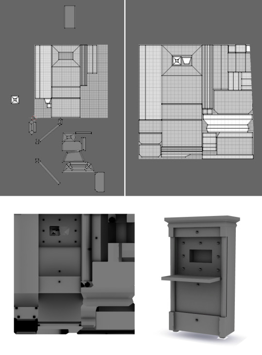
I used Blender for modelling. (I made it when I was still using the old 2.7 version.) The design process for the object consumed a significant amount of my time, spanning a total of three hours.

After I finish making the model, I need to do something called "unfolding." This means turning the 3D object into a 2D mesh. Once that's done, I "burn" the shadows onto it, which gives it the final look you see below.
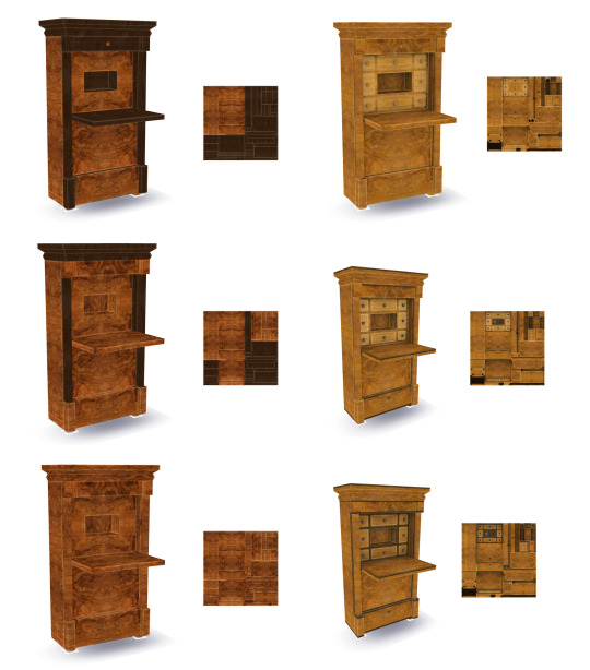
🎨🖌️ TEXTURE
After that, I use the Sims 4 Studio program. This is where I make sure that the object looks right with its texture and I decide how it should act in the game.
To create the special intarsia effect, I use patterns that I've already prepared in Photoshop. I carefully rotate and arrange them until they fit just right. It takes a lot of time, but the final outcome is totally worth it.
🌐✨ NORMAL & SPECULAR MAP
The Normal map is really important for objects with low levels of detail. It determines how light behaves on different surfaces. With the Normal map, even a surface that looks completely smooth can actually appear uneven when light shines on it. This creates the illusion of more intricate details without slowing down the game's performance.
In the game, they use a simpler version of the Normal map called the Bump map. To make it, I use a plugin in Photoshop and save it in a specific format called .DDS. I have to tweak the channels and choose the right settings to get it just right.
When I apply the Bump map to my Biedermeier writing cabinet with shelves, it creates small shadows at the edges of the shelves when light hits the center. This makes the shelves stand out from the flat surface and adds depth to the object.

The shine of an object is controlled by the specular map. It determines how reflective the surface appears, whether it's a shiny metal, a glossy glass, or a completely matte material. By adjusting the color values, we can create different types of shine.
In this project, I want to achieve a specific type of shine that looks like wax or honey. Fortunately, I already have a template ready for this. I just need to find it and apply it to the object in the program.
📊📐SIMS 4 STUDIO SETTINGS
After that, I need to make a bunch of tweaks to make sure the object works properly in the game. It involves doing both small and big adjustments. For example, I add tags to make it easy to find in the catalog, figure out how the surface should look, find the right spots where other objects can connect to it, decide where chairs and writing surfaces should go, and more. The first picture shows how things are set up by default, while the second one shows the changes I've made.
Throughout this whole process, I have to carefully figure out the exact positions for different parts using a coordinate system. It can be a bit tiresome and take up a lot of time.

📈 💼 WORK IN PROGRESS
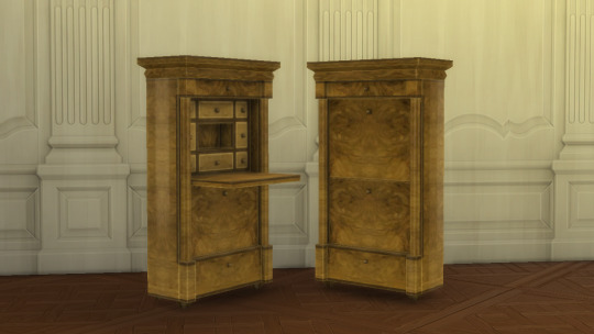
First, I made a work-in-progress picture. This is how I announce the new collection.

💃🎞️ GIF
In the post, there's a gif that demonstrates various color combinations. Creating this gif involves a careful and detailed process. I have to take individual photos of all 16 color combinations for each of the two cabinets. Afterward, I need to carefully match and merge these photos together. Finally, I use an online Gif maker site to edit and finalize the gif.

📷🖼️ PREVIEW PIC
I spent a good 2 hours setting up the scene, and it wasn't easy finding the right items and creating the perfect environment. Editing the image also took me another 2 hours, as I paid close attention to every little detail.
Out of the three images you see above, the first one is the default color scheme generated by the game itself. The second image, on the other hand, was created using a program called Reshade. It's an extra tool you have to install separately, and its main purpose is to change the lighting inside the game. It adds depth and creates a whole different atmosphere. As for the third image, that's what it looks like after I adjusted the colors in Photoshop. And finally, I added shadows and highlights to the image to give it a more three-dimensional and immersive feel.
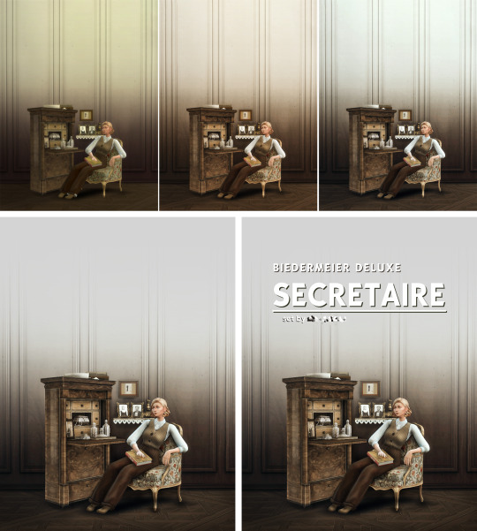
I hope you enjoyed this post and see you soon. The release date of the set is tomorrow!
101 notes
·
View notes
Text
Again, what frustrates me about Federation Force's mech gimmick is that it's rendered useless by scaling up every enemy as well. What's the point of saying you're using a mech, if you don't feel like you're using one; You're still the same size as enemies. Hell, even the environment is scaled up, and I'm talking about manmade structures! The doors are conveniently your size, as are railings, various devices, etc.
It just utterly breaks the illusion of being in a giant mech; You can only really tell because of the cutscenes where the mechs are actually contrasted with the pilots, and that one level where you're forced to leave your mech and sneak around those giant pirates as a normal-sized human. That IS good, but it's just one level!
And again, why is every door sized up??? Like from an in-universe perspective, the amplification beam made an entire army of pirates gigantic, so they probably needed tech and architecture to accommodate this new size. But from an artistic perspective, it just makes the whole mech angle even more pointless, especially when the mechs look like regular humans in armor; Their proportions match the human pilots, so for most people who only know Federation Force by a glance and osmosis, they probably don't even realize it's a mech game! I was one of those people for a while!!!
Even the Metroids, one of the series' most iconic and recurring enemies, the titular mascot, for whom we DO have a consistent understanding of relative scale... is also sized up, instead of being used as a reference point. It's one thing to have a new alien enemy be conveniently gigantic from the start, but the pre-existing Metroids being made that way just feels like you couldn't be bothered to consider how being in a big mech would change the way you interact with the Metroid universe, compared to how Samus would; Especially when your arsenal and gameplay mimics Samus'.
There's no art direction, is what I'm saying; The environments, the enemies, they aren't designed around the idea that you're in a giant robot. It's just another regular environment. One of the things I remember learning about VFX is that adding more details can help create the illusion of something being bigger, because it has more space for more detail, that sort of thing. But this is a game on the 3DS, plus it's a simplified chibi art style that throws off the proportions in general.
It'd have been cool if there were a lot of small doors and hallways that you couldn't access because you're too big; Imagine levels in buildings being designed around the idea that you're navigating giant hangars and all that. The immersion is lost if every room is conveniently enormous for these mechs. The doors themselves could’ve been different from the typical ones in Metroid, for example they’re clearly gateways, to differentiate them from smaller barrier-operated doors. Sometimes you just create doors by smashing through walls because you're a giant mech!!!
It's lazy. It's half-assed. There's no thought put into it; It’s generic. The mech aspect of the game feels tacked on, last-second, like the mechs were supposed to be regular-sized humans in special armor, but someone felt like there needed to be some gimmick to make the game seem more interesting. So they threw in some cutscenes with smaller human models, and one level where you have to sneak around the bigger pirates. But everything else fails to reflect the idea. Why.
The art direction could've been so fun, the gameplay could've revolved around your titanic size, and maybe synergize mech gameplay with gameplay as just a regular pilot who can get out and back in whenever you please. And that could play into the larger teamwork aspect, you could make puzzles based on your pilot having to leave the mech! But noooooooooooo! I was ambivalent towards Federation Force until I found out the player characters are supposed to be mechs, and now I'm pissed. You could've had a really fun concept to mix up the Metroid formula and stand out from other games, make this spin-off take advantage of and embrace that it's so unusual. BUT YA DIDN'T. Metroid Prime Pinball is unironically more creative and thought out around its core gimmick than this.
8 notes
·
View notes
Note
I have a similar-ish art style to you in the sense that a lot of my art just by the way I stylize certain features makes my it look creepy. This is a huge problem for me because I do genuinely love drawing cute stuff but I can’t because of my art style. I don’t want to completely change my art style because one that would take forever but two drawing things that are scary and creepy help me cope with my agoraphobia and paranoia. I know this is more of a do you have advice than a proper question but what would you suggest I do?
(side note: I ADORE YOUR ART!!!! I especially love your Sayaka work as a massive pmmm fangirl)
Hello, firstly, thank you for taking your time out to write out a long ask. (/ _ ; ) <- Grateful. I’m not a reliable person to ask things about in terms of art given I’m not a professional or good at it, but as usual I will try my best to answer your question here.
I suppose there is a perspective that what constitutes as “cute” differs from everyone, and often I’ve noticed that things that are cute can also be creepy simultaneously depending on context, not just by changing styles alone. Kyubey is an example of this, if you must. It has all the markers of “cute animal design” - round eyes, large bushy tail, cat-like ears, and in the show it behaves like a cat hopping around and perched on the shoulders of the magical girls. Yet it’s not restricted to the interpretation that it’s just cute, since later on there are different things which make it creepy. The context of what the alien creature represents, for one, or the way shots of it are accompanied by a gloomy, industrial background which contrast its bright, supposedly cheerful colour scheme, or how there’s nothing humanly sentimental in it whenever it focuses on Kyubey’s eyes. These transitional details are what balances something that can be deemed both creepy and cute, although not everyone might share this perception.
You don’t have to change your art style, just the way you want to stylise cuteness in your own way. This could mean cutting down “realistic” details for the subject but still keeping the way the background is coloured or textured, for one. Cute things can be achieved also by being simplified. I think Kyubey would look terrifying and not cute at all had they went with a realistic cat design and not an “anime” styled one. One reference I often think about is the way Gekidan Inu Curry captures the dichotomy of Sayaka.
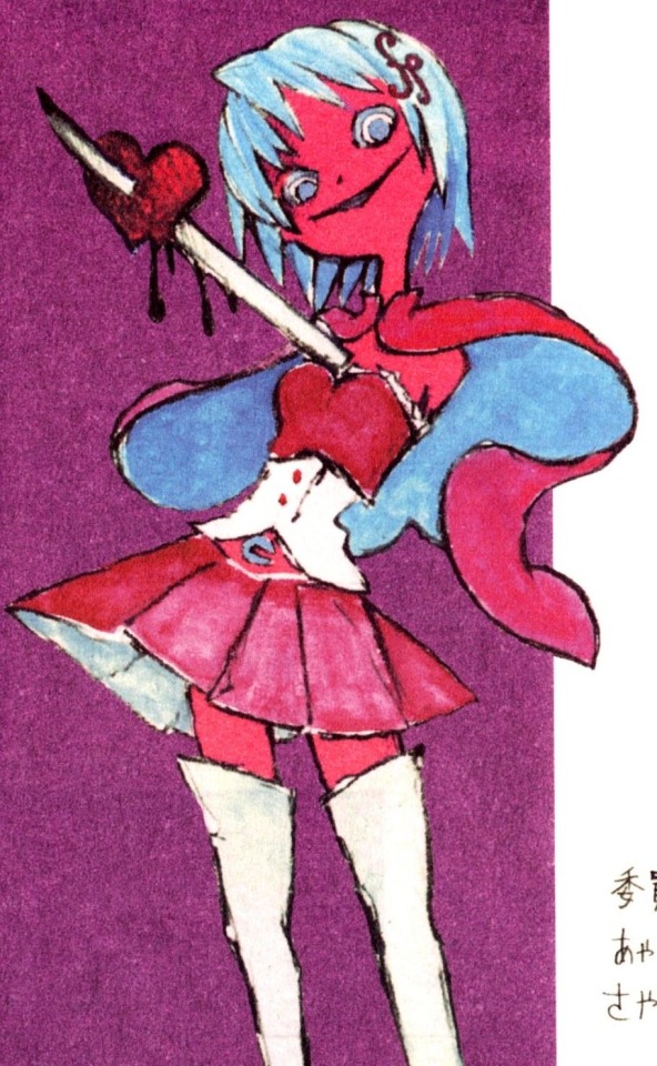
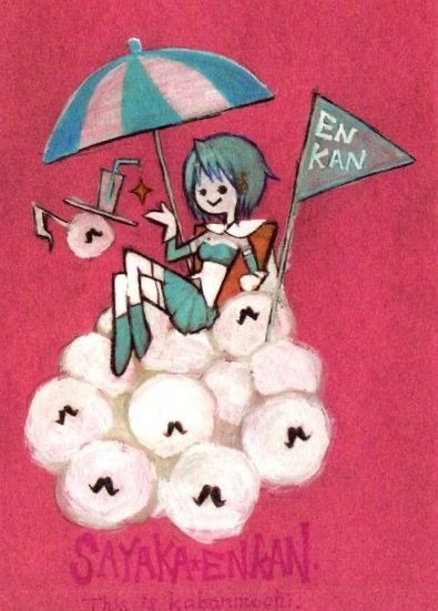
In this example, the highlight is the “size” or composition of the subject. Sayaka on the left is closer to the audience, so we can see her details clearly (how tall she is, how her eyes look, the shadows coloured over her heart). It makes her seem menacing because she’s so close and doing strange things. Yet it has a retain “moe” charm to it because the way it’s coloured and being sketched that it seems…cute. In its own way. Sayaka on the right is sitting further away and enjoying a drink atop a mountain of fluffy Anthony balls. It’s worth noting as well how her eyes in the second picture are more simplified, being drawn on as dots, but the style does not outright lose its creepiness [the weird, dated shading on the umbrella, her hair being textured darker, the background being a fuzzy red].
What you could do is try thinking about how something that is cute would look like in your style. If that makes sense. It is a sort of attitude that affects the approach of your art. Thus it’s strongly encouraged to experiment with what you can draw in your current art style instead of needing to change it. If a rabbit is cute, can you find a way to make it look cute in your style? What is the core appeal of the thing you like? What elements are making current results unsatisfactory by your standards? What do you have to adjust? — Those are questions you’ll venture the answer yourself, and the more you draw, the more your style changes on its own, organically, so don’t worry about it. You may not be able to draw cute things today or tomorrow, and you will likely struggle to get the process of it, but eventually you’ll certainly be able to draw the diverse things you really enjoy without having to sacrifice the personal components of your art’s identity and what it ultimately means to you. With all that said, I’m not sure how realistically useful my suggestion or advice will be, but I will nevertheless be supportive of your endeavours. Good luck!
And thank you! I love drawing Sayaka, so I’m happy people like seeing her just as much. ٩(๑❛ᴗ❛๑)۶!
#ASKS 💌#Walter white voice: this guys has no idea what he’s doing#I don’t remember anything I say ever so I apologise in advance for any contradicting statements
12 notes
·
View notes
Text
Winter by Marissa Meyer
5/5
What a beautiful story. I have nothing bad to say about this book. This might actually be the first time.
This is the sixth book I’ve read this year that was over 800 pages, but this is the first one that didn’t feel like it. It was perfectly paced and the plot didn’t feel overly complicated at any point. With books this long, the characters or plot or both can sometimes feel tedious, but this was so good.
I thought I might find this series too childish, but I didn’t at all. It’s a great story that didn’t rely on shock value through random and underdeveloped plot twists, as many YA books tend to do these days. I really like how she introduced characters throughout this series. For example, we met Thorne in book 2, and then he ends up being the main love interest in book 3, similar to how we met Jacin in book 3 and he’s a main character in book 4. They were subtle introductions where we could form opinions on the characters prior to knowing that they were love interests. I would give this book 5 stars just for this alone.
I immediately noticed from Chapter 1 that we are getting more detailed descriptions of surroundings. I’ve found Meyer to be an author who mostly relies on dialogue, which I personally prefer, as some authors tend to overdo it with the descriptions (Sarah J Maas' interior design book aka Tower of Dawn). Meyer strikes a great balance of both in this book. I often find with YA series that quality of writing tends to decrease as the series goes on and publishers rush things, but this was the complete opposite. I enjoyed Winter as much as Cinder and Cress, and much more than Scarlet.
In YA, authors tend to simplify wars. Often, huge wars happen and they end in a matter of days. That is not entirely realistic (not that fantasy has to be realistic, but this specifically tends to be skipped over lazily). Of course, wars can and have ended in a matter of days in real life, but that’s very uncommon. Here, Meyer maintained that battle element, while also not turning into a full on war, so that she could end the actual battle in one night. This is also beneficial for us as readers because action scenes in YA are not always popular, especially when they’re only introduced in the final book of the series. The main fight in this book was contained to one night and it was on a smaller scale, so it remained more realistic while also not adding a bunch of action scenes. My expectations were low in this regard, so I was expecting for there to be a huge war between Luna and Earth contained into this one book, bur Meyer made the right decision in not doing that.
The ending was perfectly done. I would like to read more books about the characters lives following the events of Winter, but I don’t absolutely need it. (Update: I've since seen that Meyer has written non-canon short stories in this world. This is the best way to do it for this ending. Veronica Roth should take notes). The ending didn’t leave any obvious unanswered questions, in my opinion. It was a very well written story from start to finish. Even though I didn’t enjoy Scarlet, I can appreciate that it was a good story that tied into the rest of the series well and Scarlet as a character became very likeable in this final book.
The length of this book is interesting because it’s more than twice as long as the previous books in this series. I wonder if this was for contractual reasons or if she just wanted to keep the theme of naming each book after a different character, and didn’t want to ruin that by separating this story and making it a 5 book series or introducing a fifth fairytale.
My favorite aspect of this book and this series as a whole is how Meyer integrated all the stories, while still maintaining their importance as independent characters. Perhaps this applies slightly less to Wolf (and Scarlet until the second half of Winter). With this many main characters, it would have been easy for some of them to get lost in the background, but it was very well executed here.
Overall, this entire plot was so unique. This is a take on fairytale retellings that will be very hard to beat. I can’t understand why this series is not more popular than it is. It would also be such an amazing TV show, although expensive. I hope this story gets the recognition it deserves one day. I’m really going to miss these wonderful characters, even Wolf
11 notes
·
View notes
Text
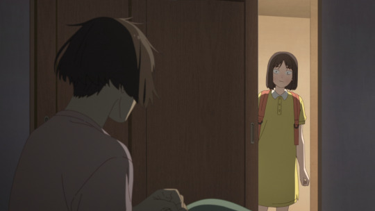
Skip and Loafer Episode 9 Part 1: Drowsy (and Peppy)

Forget being a good episode or even a great one, this episode of Skip and Loafer was two great episodes in one. Divided into an A and B part that flow into one another seamlessly, but each address their own separate pieces, it's more than a treat to watch, it's an incredible example of storytelling within the frame of high school life.
⚠️Notice: This episode has been split into 2 posts because of length and image limits. This is the A Part post - Drowsy (and Peppy). The B Part post, subtitled (Drowsy and) Peppy, can be found on my blog if you haven't come across it yet.⚠️
Where do I even begin? The first half is dedicated to Mitsumi's longing for home and the comfort she feels in returning from Tokyo, but the second half examines how Mitsumi's changed since she originally came from her hometown, and how the people around her have changed and grown as well, while Shima remains under lock and key. It's just an incredible approach to the story that almost inserts a prologue with Mitsumi's return home so that it can prep viewers for the latter half of the content. It's tight, it picks all the right moments to focus on, and it never loses sight of what it wants to do. In short, it's beautiful.
It's so wonderful that I really don't want to organize my thoughts on it, but at some point or another I really have to get down to it if I want to say anything worthwhile, but I'll let Shima speak the first words.


He said the thing! He said the starting lines to the opening song, and I think that's so incredibly cute. Whether or not the pair really realize what they feel for each other is inconsequential, because their words and actions speak so incredibly loud it's wonderful. Also also, Mitsumi's dress in the opening? It's a simplified version of the dress she wears in today's cold open.

Side note, in the actual JP dialogue he says 'zutto mabukushite', it's just that in translating it to English they add a subject to his sentence. Because of that, it's far closer to the lyrics for the OP, which just use 'mabukushite'. So yeah, incredibly cute call back(s) that has me super giddy about it.
Anyways, back to the topic at hand, starting from the beginning. This episode adds (or really removes) a very unique piece to it: the soundtrack. It's substituted for really incredible sound design that does its best to capture the environment as candidly and as detailed as possible, and because of that the soundtrack doesn't exist. The first music you hear in the episode comes from the opening song, as we follow a cold open of Mitsumi making her way back home. Hell, we don't even hear Mitsumi talk in this sequence. Such a bold approach but it pays off in droves.
Which I love by the way, it sets the tone for the first half incredibly well in speaking to the themes of "memories" and nostalgia. We're not shown the whole ordeal in detail, but rather in bits and pieces that are pasted together one after the other, like a collage being plucked from Mitsumi's mind. Also, it sets up a really cool callback/comparison later in the episode.


It's quite the adventurous approach, but I absolutely adore how it speaks to Mitsumi's character. How reserved and quiet she is by herself, and that that energy she has comes from the people that are around her. Also, I really like this little piece showing the "flight" starting and stopping via the seatbelt signs. Another really benign piece of direction but it adds a palpable sense of creativity and passivity in Mitsumi's journey back home.


God I could go on forever about this. About how the view of the cityscape transitions into looking out over the clouds as Mitsumi's mind wanders through the experience, before switching once more into the lush and green terrain beneath her as she heads to her hometown. Or about how of all the scenes/sequences in this cold open, the longest one is Mitsumi staring out excitedly at the scenery when she lands back near her hometown. It's telling a story through Mitsumi's memories and I'm so completely in love with it. What I love most about this last bit though is that we don't see the scenery through Mitsumi's eyes for it. We see her reaction to it, but we're missing the first person perspective that the cold open flirts with through scenes like her flight.

After the opening however, Skip and Loafer gets back to its core as it resets the vibe with a fun little joke from Mitsumi. Also, it's the first scene to make use of the OST, and it's for comedy's sake. I'll get it out the way now, but mild spoiler, the comedy is the only place the OST is really used this episode. There's bits and pieces through the A part, but the vast majority is only supplemented by stellar sound design.

Also, you would have guessed it from earlier in the episode, but space and scale are really played up through this A part, and I do quite enjoy it. It takes simple and almost filler scenes and creates something more unique and stylized to better fit the episode. Also, faceless characters appear quite frequently through this A part which I found interesting.

Similarly, I love how P.A Works and Deai have been using obstructions and depth in their environments. It's a really simple piece, but like I've said before, it adds awareness to the world that exists outside of frame and focus for viewers. It gives you context clues like, "hey, the camera's in a hallway right now isn't it? I guess they're in a room off the main entry", and things like that, and does it while providing really appealing pieces that can help narrow your focus in the scene.
They use a similar approach in the environments as well. They provide something that's lived in, that characters exist and thrive in outside of what they're presented as or used for. Just take a look at these two images. The first is a super simple pieces for sure, but the use of a small stool/seat on wheels really speaks to the grandmother's involvement in the garden. Similarly, the watering can helps with that as well, plus the flowers in the background.
Now the second image is the piece that I really love because its a totally unnecessary piece, but I appreciate it an incredible amount. The tree's been trimmed! You can see where limbs have been cut off and new growth is beginning on the tree. What a completely benign piece to the art, but such a creative and impactful addition nonetheless. Absolutely love the detail and effort placed in this sort of stuff.
And lastly, I love how they render shadows and light in this scene, breaking up the light through the leaves of the tree just creates such a satisfying pattern and texture to the environment.


Moving forward once more, I really do like the use of montages/slideshows in this episode through that theme of memories. It's able to present so many pieces and stories that we wouldn't get to see otherwise.


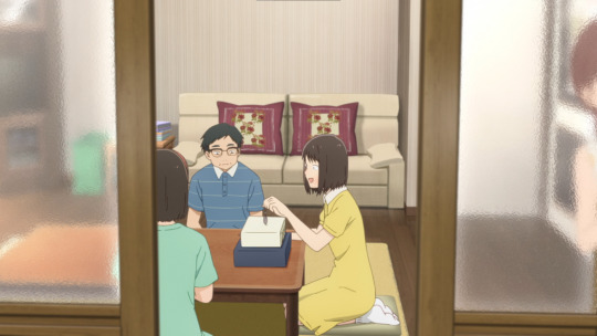
Okay okay, speeding things up, Mitsumi and Fumi. I love how cute and wholesome their friendship is, and I love how they use that first person perspective again to drive home the incredibly strong emotional bond that the pair share.


Okay I said to speed things up but I can't, I love seeing the nervous emotions creep across Fumi's face before she tells Mitsumi about her boyfriend. It's so incredibly cute and well done.

Also, P.A Work's favorite thing, shadows and reflections! Love the detail in the water as the pair cross over the bridge.

Okay okay okay, the last piece I promise, I just absolutely love this scene and what it personifies.
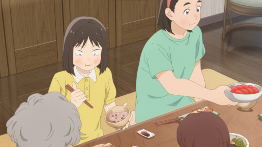
So what is it, really? It's Mitsumi's nostalgia. Being at home, eating watermelon while her mom does the dishes and the cicadas chirp outside. That feeling of comfort as the wind blows gently, coaxing the slightest sounds out of the wind chimes. Remembering all of those places you've been, and that you want to visit again. Mitsumi eating that watermelon, seeing her mother, hearing those sounds, they brought back all those memories of the past for her. It's so, so incredibly beautiful and speaks so loud to the feelings of home. That no matter how far away you may travel, it's still there waiting for you.
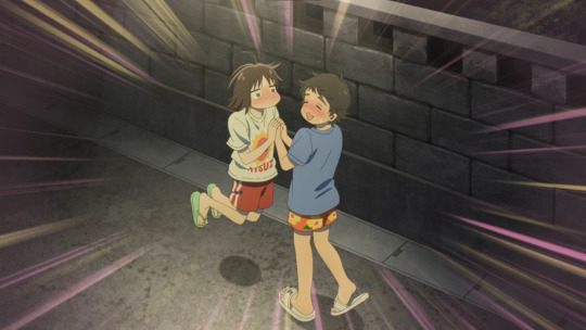
Also, callback time! I had said it earlier and this is what it's for. It's a pretty cut and dry comparison of Mitsumi's life in Tokyo vs her hometown, really. Though you might be able to stretch it and talk about the differences in colors, as Tokyo's blue while her hometown is so bright and colorful by comparison. But at the end of the day, it just speaks to the two experiences Mitsumi has between her homes. How in Tokyo she has to get up bright and early to make the train to get to the airport in time, while in her hometown she's able to wake up nice and late and laze around eating watermelon. The city versus the country bumpkin, and I think it's a really sweet little touch to the episode.


At the end of it all, this was an incredible stretch of episode content. Start to finish, just so well polished and approached that I could gawk at the whole part for days and still find more and more pieces to pick out and even more words to describe it with. But, you don't need all that to really get the emotion across. This first half is Mitsumi's memories, her fondness of returning home after a long time away, of melting back into the comfort of her family and hometown friends, and the nostalgia that comes with retracing the steps of her youth. Just beautiful stuff.
Now unfortunately, I've hit my image limit for a single post, so I will be following up with a B part for those interested in the latter half of the episode where Mitsumi returns to school in Tokyo.
If you're looking for the second part, here's a link to it for you!
#skip and loafer#skip to loafer#スキップ���ローファー#iwakura mitsumi#mitsumi iwakura#fumio kishida#anime review#anime recommendation#anime and manga#anime#romcom anime
41 notes
·
View notes
Note
hey girlie, hope you're doing well; having a good day/night:
i wanted to ask if you could give any advice with building and landscaping? i've always been a huge fan of your sim style, and i'm currently looking to get into building myself.
was there any videos you watched or accounts that were able to help you jump wholeheartedly into the wonderful world of build/buy mode?
thank you soooo much in advance <3
hi! i could go on and on about this topic so thanks for asking. last year i wrote about building here, if you recall. since that one was more about "vibe" maybe this one should be a little more technical? idk, i'm a dreamy creative so i'm sure this'll get emotional anyway lol.
i suggest picking a world or architectural style and let one inform the other. then research that style, look at floor plans and dive into pinterest for a while before you start building. if you don't already have one, get one and go collecting inspiration that you can reference later. here's mine, if you wanna check it out.
when landscaping i think about two key things: what style of gardening goes with this build (manicured, overgrown, minimal, etc) and i consider the trees and/or flowers i see in the world around my lot. i'll incorporate some to blend on and off-lot gardening. and i can't emphasize enough how important terrain painting is! in my opinion it really anchors everything down. for example, i paint all around and under landscaped areas, trees, the entire perimeter of the house/buildings, and anything else like pools, decks, driveways. it creates depth and makes it look like these things are really sprouting out of the ground. also paths! even if you don't have stones laid down, think about the routes sims will take to get from one place to another, like from the back porch to the pool, the marks little sneakers leave under the swing set when simmies play, from the mudroom to the trash bins by the garage. grass thins out and you'll see some dirt showing through regularly trodden routes, so paint those on to make the area look lived in.
the simpler the floor plan, the better. even if you pick a floor plan that's complicated, simplify it. you don't need a garage? remove it or convert it into something else. too many little rooms and hallways? open up those spaces or take them out entirely and push the necessary rooms you want to keep into that area. you'll find your builds will be much easier to play in this way and it won't take sims hours to get to the kitchen or up the stairs.
i have general dimensions for rooms that really work for me:
kitchen 5x6, 6x6, 6x7
dining 4x5, 5x5, 5x6
living 5x6, 6x6, 6x7
half bath 2x2, 2x3
full bath 3x4, 4x4
owner's suite 5x6, 6x6
bedrooms 4x5, 5x5
hallways 2 spaces wide
maybe a bit tricky, but think about adding rooms in the roof. a play room, guest room, second living room, or office space. hell, even just an attic you can convert later as your family grows. when building attics, i'll lay out the roof design first and then see where i can build rooms inside. for easier gameplay you'll want to then break down the roof into sections so when you lower the walls you can see inside and the camera won't bounce around.
twistedmexi's TOOL mod is an absolute gamechanger and i highly recommend using it to expand your lot outside the lines. EA has decorated the world outside of your lot with fences and other features that suggest you can absolutely push things further. i'll setup whatever i want outside the lot inside my grid first and then move it all out together. i do this for play areas, picnic tables and umbrellas, firepits and seating. i'll put cars parallel parked on the road or in the driveway EA has provided. and don't forget about debug items like electrical poles, post boxes, bus stops, fire hydrants and other stuff you'd see around a neighborhood.
i'm subscribed to a handful builders on youtube that i'll watch from time to time. it's great to see what other folks are doing because this community is so creative and you'd be surprised the little tricks you'll pick up. these are some of my favorite builders: simproved, simsphony, plumbob kingdom, simcubeez, bojana sims.
if you have any more questions on specifics or want an actual tutorial on something, don't hesitate to ask! and that goes for anyone reading this very long-winded post. kudos if you made it this far!
22 notes
·
View notes
Text
Worldbuilding in Crashlander - Language

Hey hey! It's been a little bit since I posted, took a solid little break after the jam ended (read: played a lot of minecraft and fire emblem)
I wanna talk a little bit about a different aspect of Crashlander, but something that's important to the core design of the game! From the beginning I wanted a key part of the game to be the way you interact with the Phytokin and slowly get closer to them. One way I'm doing this is by building a conlang which the player will learn a simplified version of over the course of the first few hours! (longish post ahead)
I've been interested in conlanging for several years and have made a couple of little toylangs before, but this is the first time I'm developing something meant to be read and understood by people other than myself and the ones who let me rant at them for hours with in-depth explanations - so keeping this in mind, I decided to follow the usual steps of making a sort of proto-language that then evolves into the main language.
There's nothing much to write home about in this regard except for some key design choices (Lots of /s/, /θ/, /ʃ/, and /x/ sounds to sort of mimic wind through trees when the language is spoken, and the alphabet was designed by dipping a dandelion stem in ink then writing with it), and we end up with this as our initial alphabet:

And here's what some example text looks like (no actual words within the language here, just gibberish that's valid within the set phonetic rules)

This is all well and good, I like the way it looks (though sometimes it can be heard to tell what letter a diacritic is actually attached to if the line spacing isn't wide enough), but now comes the second part - how do I turn this into something that a casual player would be able to learn and understand in-game, potentially before any translation starts showing up?
My solution is to make Phytokin Simplified, which is a pictographic language of ~150 words. The symbols build off of each other in a hierarchical sort of way (e.g. a symbol for "place", which is then built on for more specific words like "home", "shop", "garden", etc.), so a player would be able to notice patterns pretty quickly.
This also gives me the opportunity to more directly show the Phytokin's cultural connection to nature and plant life in particular - since plant life and animal life share a common ancestor in this world, for example, their language reflects this by having them both inherit from the same base symbol, differing in whether their roots (legs) are above ground or below it.

This version of the language is still very much a work in progress, but I like where it's headed! It's fun to try and hit just the right level of difficulty/complexity so that players are passively encouraged to try and understand the language rather than just write it off as something that isn't meant to be actually understood (even if it gets translated in-game later).
I'll probably post more about the language as it develops, but in the meantime, feel free to ask any questions/give input! And if you made it this far, thank you very much for giving me your attention for a few minutes :)
#my posts#worldbuilding#conlanging#gamedev#indiedev#crashlander#devlog#I know this is a little different from the posts that are like 90% gifs n screenshots#but i hope it's interesting nonetheless!
4 notes
·
View notes
Text
Things I noticed about the newest One D&D playtest (Cleric and revised species)
Avoiding using the term "Race" and moving to "Species" as far as the statement they put out about this change they seem pretty certain this is the way to go forward (and I agree) and it would take A very large negative reaction to change their mind.
There is a new type of action called the "magic action" this is to help codify and explain what was already in 5e. I think this reflects a larger change we're seeing in One D&D which is that though things are being streamlined, more "crunch" is being added (at least the way I see it) and bringing us to a nice balance between 4e and 5e's approaches, by this I mean, One D&D will likely retain 5e's tone of voice and aim to try and sound like it could be a real tome of ancient lore (like 5e) but also be more open in it's use if keywords to simplify things. Take for example, a magic item that stops other magic. In 5e you might say "any creature that fails the save cannot cast spells or use magical items or abilities" whereas in One D&D it would say "a creature that fails the save cannot take magic actions" this is another good change in my eyes
There's a channel divinity option called divine spark, which seems a little strong for me, it's an ability you can use at a very early level (1st or 2nd I forget to be honest) and it either heals (PB)d8 hp to any target within range OR forces a save (wisdom I believe) against taking that as DAMAGE (and it's half on a failed save as well so it's a pretty reliable combat option if you have the channel divinity to spare). It's very difficult to judge however seeing as we haven't seen the monsters yet (more on that in a sec)
Something that stood out for whatever reason was that they chose to use the word "can" instead of "may" which they had previously used all over the place. This is either an oversight, or One D&D is going to use slightly more natural language which might be both a blessing and a curse.
The Cleric now gets a "Divine Order" that seems reminiscent of the Warlock's pact boon in that it's not the subclass but rather a small little bit of customisation for your character. They get 1 of these at 1st level and another one later.
The choice of Divine Domain has been moved to second level rather than first. I see this as a good thing, for one, new players can now play a cleric faithfully (see what I did there) without worrying about who they worship until later. It just gives them more time to feel it out
Divine intervention is now an 11th level ability rather than 10th, doesn't seem like a big deal to me
The Dragonborn seems to have been given a slight buff, though I haven't had the time to read through it extensively
The Ardling has been given more of it's own identity in comparison to the Aasimar. All looks pretty good to me excuse for a couple of things. For one, I don't want a flying race in the PHB. I'm not gonna ban flying races but being honest, they do kinda make things like pit traps etc. Practically nothing, compared to the deathtrap they can be otherwise. Also I still think they should just put a new version of the Aasimar in the PHB rather than the Ardling. I'd love to see the Ardling in a sourcebook but it just feels unnecessary here.
Last thing is that I noticed when saying "or half damage on a successful save" they added "(round down)" this is odd to me as previously the rule had been to always round down unless stated otherwise, making me wonder if that is no longer the case.
I'm also very happy to have watched the video made in response to the survey feedback that genuinely seems to be addressing problems the fans had (nat 20 always succeeding, that was a big problem) and being a little transparent about the design process.
Overall I'm pretty happy with this UA and can see things going one if two ways
a) they build in more and more keywords and customizability (someone tell me how to spell that word please) but maintain the streamlined-ness to create my dream version of modern D&D
Or
b) they basically just do 5e but with more little rules and natural language making things confusing. Still fine but not as glorious as option a
Though ofc it's likely to be somewhere in between and things will change as we playtest more and more.
I'll add more to this list as I continue to read
4 notes
·
View notes
Text
A tale of two Reviewers.
That crazy guy in New York the "audiophiliac" put out a video on his latest listen. He is a nice person who will not say anything bad about a product even if it deserves it.
Back in the 1960s the BBC engineers designed a small speaker for mobile recording. It was called the LS3/5a. The design was straight engineering of a tiny box for confined spaces. Several companies made them under license. Part of that was rigorous quality control. They were popular then and you can still buy them today, but they are expensive.
The examples reviewed were cheap Chinese knock offs with many cost saving modifications. Short story He liked them. He compared them to others which were better, but he did not say they were bad or even poor. See his thing here.
youtube
Interesting now that the science guys at ASR also looked at this product.
They had tested an original design LS3/5a years ago. They knew the story. But these Chinese things did not do well at all in the tests. In the original BBC design the cross-over was complex and expensive. The Chinese was "simplified" and used economical parts. So aside from the name and superficial resemblance this is not a BBC speaker.
Quick summary these are poor speakers and even at the low low price are not worth buying. They may even damage your amplifier.
The original BBC unit is a niche device. Good for small apartments or the back of vans, but with well known limitations. This Sound Artist product is relative crap. It is a fraud to call it what they do.
So that brings up the question. How bad does something have to be to not be liked? Second to that, what is the value of a reviewer that endorses bad stuff as good?
In his video he mentions one of the amps he used was a vintage Dynaco St 70 a model I am familiar with. A 70 year old design. I bet he will love that one too. At least it is an OK amp but not high end in any fashion.
Who reviews the reviewers? ( I guess I do)
1 note
·
View note
Text
Serverless Computing : Developing Applications Without the Infrastructure Hassie

Welcome to the future of computing, where you can develop applications without any infrastructure hassle! Say goodbye to managing servers and tedious maintenance tasks because serverless computing is here to revolutionize the way we build and deploy software. Whether you’re a developer seeking greater efficiency or a business owner looking for cost-effective solutions, this blog post will unveil the wonders of serverless computing and how it empowers us to focus solely on creating remarkable applications. Get ready for an exhilarating journey into a world without infrastructure constraints – let’s dive in!
Introduction To Serverless Computing
Serverless computing is a hot topic in the world of cloud computing. But what is serverless computing? In this article, we’ll give you a rundown of what serverless computing is, its benefits, and some of the tools you can use to get started with developing applications without the infrastructure hassle.
Serverless computing is a Architecture where the cloud service provider runs the server, and dynamically manages the allocation of machine resources. cloudy platform that enables developers to build applications without provisioning or managing servers. You simply upload your code and the cloud service provider handles all of the Infrastructure-as-a-Service (IaaS) and Platform-as-a-Service (PaaS) for you. This means no more worrying about server CPU usage, memory leaks, or patching vulnerabilities.
What are the benefits of using a serverless architecture? First, there’s no need to provision or manage any servers, which greatly reduces operational costs. Second, since there’s no need to worry about capacity planning or scaling issues, development teams can focus on building features and functionality instead of infrastructure concerns. Because serverless architectures are event-driven, they can automatically scale up or down to meet demand, which further reduces costs and improves efficiency.
There are many different tools available to help developers get started with serverless computing including AWS Lambda, Google Cloud Functions, and Azure Functions. In this article, we’ll focus on AWS Lambda since it’s the most popular and widely used serverless framework on the market. With AWS Lambda, developers can upload their code to the cloud service and it will be automatically executed in response to events or web requests.
Serverless computing provides a great way for developers to build scalable applications without having to worry about managing servers or scaling issues. Hopefully this article has given you a good introduction into what serverless computing is and how you can benefit from using it in your applications.
Benefits Of Serverless Computing
Serverless computing is a newer approach to application development that can offer several benefits over traditional methods. One key benefit is that it can greatly simplify the process of developing and deploying applications, as there is no need to provision or manage any servers. This means that developers can focus on their code and not have to worry about the underlying infrastructure.
Another advantage of serverless computing is that it can provide a more cost-effective way to develop and deploy applications. This is because you only pay for the compute resources you use, and there are no upfront costs for Provisioning or managing servers. This can lead to significant savings, especially for smaller organizations or those with fluctuating workloads.
Serverless computing can also offer improved scalability and availability for applications. This is because the underlying infrastructure is designed to scale dynamically in order to meet the demand of your application. This means that your application can handle sudden increases in traffic without issue, and you won’t have to worry about over provisioning or underutilizing servers.
Examples Of Serverless Computing Use Cases
Serverless computing is a cloud-computing execution model in which the cloud provider runs the server, and dynamically allocates machine resources. That means developers can write code without provisioning or managing servers. Serverless computing is event-driven and works well for workloads that are sporadic or unpredictable.
A use case is a scenario that describes how a user uses a system to complete a task. The following are four examples of serverless computing use cases:
User registration: A user visits your website and registers for an account. This triggers an event that calls a function to create the user’s account in your database. Once the function completes, it sends a confirmation email to the user.
Uploading a file: A user uploads a file to your website. This triggers an event that calls a function to store the file in your cloud storage service. Once the function completes, it sends a notification email to the customer.
Analyzing data: You have a dataset that you want to analyze using Spark, but you don’t want to provision or manage any servers. You can use AWS Lambda and Amazon EMR to run your Spark code on demand, without having to provision or manage any servers. When you’re finished with your analysis, you can delete the resources and only pay for what you used.
Keeping track of inventory: You have an e-commerce website and need to keep track of inventory levels in real

Challenges With Serverless Computing
One of the main challenges with serverless computing is the lack of control over the underlying infrastructure. This can lead to problems such as increased latency and decreased performance. Another challenge is the limited visibility into what is happening behind the scenes, which can make debugging and troubleshooting difficult. Additionally, there can be issues with scalability if your application needs to handle a large number of requests.
Cloud Platforms For Implementing Serverless Applications
Cloud platforms provide a great way to develop and deploy serverless applications without the hassle of managing infrastructure. Platforms like AWS Lambda and Azure Functions offer scalable, pay-per-use compute resources that can be used to run code in response to events.
Code can be triggered by virtually anything, including HTTP requests, database changes, or file uploads. And because there is no need to provision or manage servers, serverless applications can be very cost-effective.
If you’re interested in developing serverless applications, be sure to check out these cloud platforms.
Security Considerations For Working With Serverless Solutions
When it comes to working with serverless solutions, security should always be a top priority. Here are some key considerations to keep in mind:
Identify and assess risks. As with any computing solution, it’s important to identify and assess any potential security risks before using a serverless solution. Make sure to consider both the risks inherent in the solution itself as well as how those risks might be magnified by your specific use case.
Implement security controls. Once you’ve identified potential risks, put in place the appropriate security controls to mitigate them. This may include things like adding authentication and authorization measures, encrypting data at rest and in transit, and more.
Monitor for threats. Even with robust security controls in place, it’s important to continually monitor for potential threats or vulnerabilities. This way you can quickly address any issues that may arise.
By following these key considerations, you can help ensure that your serverless solution is secure and compliant with your organization’s security requirements.
Conclusion
It’s clear that serverless computing is a powerful tool for developers, enabling them to quickly and easily develop applications without worrying about the underlying infrastructure. Serverless computing simplifies the development process while freeing up resources that would otherwise be used to deploy and manage a traditional server environment. With its scalability, low cost of entry, and fast deployment time, it is no wonder why more and more businesses are turning to serverless solutions for their application needs.
#Serverless Computing : Developing Applications Without the Infrastructure Hassie#robots#web design#best web development company in united states#web development#logo design company#asp.net web and application development#web designing company#digital marketing company in usa#magento development
0 notes
Text
Don't Let Identity Thieves Win: Secure Your Cards with These Card Holders & Tips

Are you kidding me? Sure, you can pay with your phone, but where's the fun in that? There's nothing like whipping out a stylish credit card holder wallet and dazzling everyone around you with your organized plastic. Plus, what happens when your phone dies or the signal is weak? You're stuck with a useless piece of plastic without a backup. With a card holder wallet, you're always prepared, always looking sharp, and always ready to show off your plastic prowess. So why settle for a boring, digital payment when you can have a wallet that's both functional and fashionable?
Silly but Successful: These Tips Will Organize Your Current Wallet!
First Simplify your wallet:
The first step to organizing your credit card holder wallet is to simplify it. Take a good look at all the cards you have and consider whether you really need them all. If you have any expired cards or cards you no longer use, remove them from your wallet. This will make it easier to find the cards you need and keep your wallet from getting too bulky.
Second Categorize your cards:
Once you have removed any unnecessary cards, categorize the remaining cards based on how frequently you use them. For example, you may want to keep your credit cards in one section and your loyalty cards in another. You may also want to group your cards based on the type of card, such as travel cards or reward cards. This will make it easier to find the card you need when you need it.
Third Use a labeling system:
If you have a lot of cards, it can be helpful to use a labeling system to keep them organized. You can use a label maker or simply write on a piece of tape to identify each card. For example, you might label a credit card as "groceries" if you use it primarily for grocery shopping. This will make it easy to find the card you need without having to dig through your wallet.
By simplifying your wallet, categorizing your cards, and using a labeling system, you can easily organize your credit card holder wallet and keep your cards within reach when you need them.
Top 5 RFID Blocking Credit Card Holder Wallets for Security
Identity theft is a growing concern, and one way to protect yourself is by using an RFID blocking credit card holder wallet. These wallets are designed to prevent thieves from scanning your credit card information without your knowledge. Here are the top 5 RFID blocking credit card holder wallets to keep your cards safe and secure.
Organization and Convenience.
One of the main benefits of a credit card holder wallet is the organization and convenience it provides. With a designated slot for each card, you can easily find the one you need without having to sift through a cluttered wallet. Plus, many credit card holder wallets are designed to be slim and compact, making them easy to carry in your pocket or purse. No more bulky wallets weighing you down!
Travelambo RFID Blocking Leather Wallet.

The Travelambo RFID Blocking Leather Wallet is a stylish and functional option for those looking to protect their credit cards from identity theft. Made from high-quality leather, this wallet features advanced RFID blocking technology to prevent unauthorized scanning of your credit cards. It also has plenty of space for your cards, cash, and ID, making it a great choice for everyday use or travel. With over 20 colors to choose from, you're sure to find the perfect one for your style.
Protection Against Fraud and Identity Theft.
Another important reason to invest in a credit card holder wallet is the added protection it provides against fraud and identity theft. Many credit card holder wallets are equipped with RFID blocking technology, which prevents thieves from scanning your credit card information without your knowledge. This can give you peace of mind knowing that your personal and financial information is safe and secure. Additionally, if you do happen to lose your wallet, having a credit card holder wallet can limit the amount of damage done as you only have a few cards in it.
Alpine Swiss RFID Blocking Leather Wallet.

The Alpine Swiss RFID Blocking Leather Wallet is a sleek and durable option for those looking for a high-quality RFID blocking wallet. Made from genuine leather, this wallet features advanced RFID blocking technology to protect your credit cards from unauthorized scanning. It also has plenty of space for your cards, cash, and ID, with 12 card slots, 2 ID windows, and a zippered coin pouch. With its classic design and multiple color options, this wallet is perfect for both men and women.
Space-Saving Design.
One of the main reasons to switch to a credit card holder wallet is the space-saving design. Traditional wallets can be bulky and take up a lot of room in your pocket or purse. With a credit card holder wallet, you can streamline your wallet and only carry the essentials. This not only saves space but also makes it easier to find the card you need quickly. Plus, it can help prevent unnecessary clutter and keep you organized.
Buffway Slim Minimalist Front Pocket RFID Blocking Leather Wallet.

The Buffway Slim Minimalist Front Pocket RFID Blocking Leather Wallet is a great option for those who want a slim and minimalist design. Made from high-quality leather, this wallet features RFID blocking technology to protect your credit cards from unauthorized scanning. It has 6 card slots and a clear ID window, as well as a money clip for cash. The slim design allows you to easily fit it in your front pocket, making it a great choice for those who want to avoid bulky wallets.
Stylish and Fashionable.
Credit card holder wallets come in a variety of stylish and fashionable designs, making them a great accessory to add to your wardrobe. Whether you prefer a classic leather look or a trendy patterned design, there is a credit card holder wallet to fit your personal style. Plus, many brands offer customization options, allowing you to add your own personal touch to your wallet. With a credit card holder wallet, you can stay organized and fashionable at the same time.
Radix One Slim Wallet with RFID Blocking.

The Radix One Slim Wallet with RFID Blocking is a sleek and modern option for those who want a minimalist design with maximum security. Made from durable polycarbonate and silicone, this wallet features RFID blocking technology to protect your credit cards from unauthorized scanning. It has a unique design with a sliding mechanism that allows you to easily access your cards. The wallet can hold up to 10 cards and has a money clip for cash. Its slim design makes it easy to carry in your pocket.
Eco-Friendly and Sustainable.
Many credit card holder wallets are made from eco-friendly and sustainable materials, such as recycled leather or vegan leather alternatives. By choosing a wallet made from sustainable materials, you can reduce your environmental impact and support ethical and responsible manufacturing practices. Plus, these materials are often durable and long-lasting, meaning you can enjoy your wallet for years to come without having to replace it frequently.
Lethnic Slim Money Clip Wallet with RFID Blocking.

The Lethnic Slim Money Clip Wallet with RFID Blocking is a stylish and functional option for those who want to keep their credit cards safe from identity theft. Made from high-quality leather, this wallet features RFID blocking technology to protect your credit cards from unauthorized scanning. It has a slim design that can hold up to 10 cards and has a money clip for cash. The wallet also has a clear ID window for easy access to your identification. Its compact size makes it easy to carry in your pocket or bag.
Read the full article
0 notes
Photo
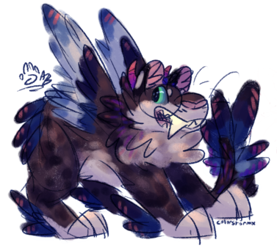
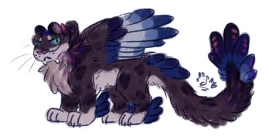
a couple of scribbled floofs for fun
#i love storm's new palette... it's so refreshing to work with#doodles#feline#my art#fursona#colorstormxart#also that second one is a good example of how their design can be simplified#i know their design ended up complex but like... i love it
15 notes
·
View notes
Note
i know your alien designs aren't very human, but do you have any advice on how design an upright and bipedal insect? or creatures with exoskeletons in general? so far i know that a hunched over posture will be needed to make room for all those arms and vestigial wings. the bipedalism is what is currently throwing me for a loop- both in how it evolved and the leg structure/gait. maybe creating something with a mix of internal and external skeletons would be better for this kind of creature?
Long post, but I couldn’t resist an opportunity to talk about LEGS: how and why?
One reason animals evolve bipedalism is because it’s very energetically efficient. Humans are champs at endurance walking partly because we’re letting gravity do half the work, falling forward with every step. In comparison, an animal like a beetle or a newt with splayed legs has a very stable standing position, but in all parts of their walk cycle, they’re actively pushing their body up against gravity. This is no biggie when you weigh a fraction of an ounce, but once you’re pushing 50 pounds it becomes a chronic problem. In the evolution of land vertebrates, you can see limb attachments starting at the sides of the body (i.e. ancient amphibians) where the fins used to be, but in later animals, the limbs moved underneath the body and became struts to passively support their body weight against gravity. (i.e. a horse)
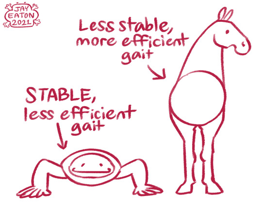
But why move onto only two legs? Well, feet are also heavy, and in order to walk you have to lift them up. This is the motivation for many animals evolving digitigrade or even unguligrade legs: if there’s less heavy bones and complex joints at the end of your leg, that’s less weight to pull up against gravity, which means you can run slightly faster and walk slightly more efficiently.

And for animals with only two walking legs, that’s even LESS weight that they have to lift around in order to get up and go places... at the price of having fewer backups in case of injury.

So, that’s great. What about arthropods though? Well, I think the main reason we don’t see any bipedal arthropods on our planet right now is because they don’t have any of the evolutionary pressures that cause it. First of all, they aren’t big and heavy-- arthropods are limited by their passive diffusion respiratory systems, and their need to wriggle out of their entire skeleton and be mushy for a while after in order to grow. Second, they’re not being pushed into the long distance walking lifestyle of humans or horses-- arthropods with distance to cover just fly over it, because they weigh nothing, so flying is super easy. But if you muck around and change some of those evolutionary factors, how would the leg structure of (for example) a beetle change to accommodate them?
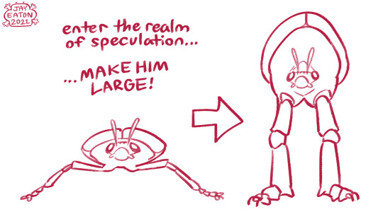

I’d imagine it would look strangely familiar. Legs straightening out, moving underneath the body, simplifying and strengthening the hinges, we’ve been here before. What’s new is that there’s more leg to work with. For walking efficiency at a larger size, I’d expect one of the pairs may reduce their role in locomotion, somewhat like the forelimbs in mantids or butterflies. If you’re aiming to make a bipedal bug, forelimb specialization is a good excuse to remove four of them from the ground. As for the legs on the ground, another familiar phenomenon may happen over time...

With similar motivation, mass would move away from the foot and towards the body in cursorial species just like for vertebrates. As for structure itself in the exoskeleton, I recommend looking at the larger arthropods of real life... terrestrial crustaceans like coconut crabs come to mind. For a truly huge arthropod, a mix of endoskeleton and exoskeleton and/or a water-dependent molt might be necessary to get away with the high body weight. As for posture, the world is your oyster! Humanoid or not, just make sure your handsome lad has a good center of balance!

That’s all folks!
PATREON | STORE
19K notes
·
View notes
Text
Mesh Optimization Info
(I am posting this by itself at the request of the tutorial database gang. This post contains information and links about optimizing 3d models, retopology, and texture baking.)
-
What I was taught in my video game art dregree is that for modern GPUs, handling a lot of geometry isn’t a big deal. However, it’s still best to optimize your models for ease of use. A model with a reasonable poly count and good topology is easier to skin (assign bone weights to) and will deform better during animations. It’s less to load for the game engine or 3d modeling software. More on good topology here.
(Modern game characters usually have very high polycounts because of detailed outfits and hair (including brows, beards and eyelashes) and the desire for curved surfaces to look smooth. These models are not plopped directly into the game from Marvelous Designer or ZBrush. Nathan Drake’s face geometry may be heavy, but it’s intentful. See the circular ‘flow’ around the eyes and mouth.)
Something that is costlier on the GPU is complex shaders, such as alpha blending of overlapping elements as seen with hair and foliage. (Here is a screenshot from Unreal Engine showing the rendering cost of foliage vs the rest of a scene.) This means that in certain cases, using more polygons to avoid their overlap is the better alternative. Here is an example I drew.
Texture size is alsosomething to keep in mind with tS2. The game isn’t great with texture memory: just look at how quickly you’ll get pink flashing in a forested neighborhood. The standard I was taught is that texture resolution should roughly correspond to the space the object will take up on the screen. The UV map should take up as much of the texture space as possible. Since tS4 uses one big texture for all of a sim’s component meshes, it’s better to rescale their UVs and crop their textures when converting.
-
Now onto some actionable advice :p
I’d highly recommend using Blender rather than Milkshape, at least when dealing with big meshes. It’s got a learning curve, but the software is very powerful and the internet is full of tutorials. Here are the plugins to use for GMDC meshes in Blender 2.8+, and Blender 2.79.
The first step to making an extremely high poly mesh game-ready is retopology: creating a version of the model with simpler geometry.
- It can be done using tools, such as Blender’s Poly Build Tool. This is quick, but good results are not guaranteed for every mesh.
- My preference is to do it by hand. This video by FlippedNormals explains in detail how to do manual retopology in Blender.
- I’ve also seen multiple tutorials from Sims 4 creators, but I can’t vouch for whether they are good or accessible: mauvemorn, SM&Kleos, jwofles.
- If the original mesh already has good topology (eg. it looks like a grid and not a bunch of uneven little ‘flowers’), you should be able to simplify it by simply deleting rendundant edge loops.
The second step is texture baking: translating shape and shading details from the high poly model into the texture(s) used by the low(er) poly model. In a modern game, most of this information would be ‘baked’ into a normal map. Since the Sims 2 is old, its capacity to render those is pretty basic. Most everything has to go into the baseline diffuse texture.
- This great tutorial by Lyralei explains how to create and bake texture details in Blender into the ‘multiplier’ texture of a tS3 outfit.
(I highly recommend creating a multiplier style base to all textures, even when you’re not working from a high poly model.)
- The add-on TexTools (old website with more info) has powerful baking tools which greatly simplify the process. Its ‘Paint Base’ preset does a decent job at producing multipliers.
- I personally do my texture baking and creation in Substance Painter, which sadly is paid. I use Luis Armstrong’s smart material as a base for most my textures. The set up is shown in case you want to recreate it yourself - which should be doable in any software as long as you can bake the relevant texture maps. I can share more about my process if there’s interest.
(Texture baking is also very useful in ‘adapting’ the multiple texture maps of modern PBR rendering into a diffuse that will look good in the Sims 2. For example, here is the original diffuse of this object, and here is my final texture.)
119 notes
·
View notes
Last Seen Blogs

djcologneandy
Unbetitelt

nerdolopedia-blog
Nerdolopedia

thinkingthroughpink
Thinking Through Pink

bookloversreviewer
Untitled

nijjhar
FIRST GNOSTIC PRINCIPLES OF ONE GOD ONE FAITH