#and so much more to build off of
Explore tagged Tumblr posts
Visit Tumblr Blog
Explore Tumblr blogs with no restrictions, modern design and the best experience.
Last Seen Tumblr Blogs


Fun Fact
The KCSC sent more than 20K requests to delete posts related to prostitution and porn to Tumblr from January to June 2017.
Text
Core Gems
So when a ghost becomes injured, they have a last ditch defense where they retreat into their core. And I mean, injured badly where their body is rip apart to the point they can’t hold a solid form anymore. And they basically go into a hibernation state until they are strong enough to form again.
Ellie, Danny, and Dan are all injured in a final battle against the GIW. The organization was destroyed and the ghosts were safe but the halfas ended up being so injured that they reverted to core form and then went to sleep for a bit. When they woke up, they were still weak but at least recovered enough to gain consciousness. And realize…they are in some kind of auction…in the middle of a heist. It appeared that two furries (one in a bat costume and one in a cat costume) were ducking it out. And they…they were a necklace. All three of them had been turned into a necklace with their cores as gems accompanied by sapphires, pearls, and opals. And frankly gorgeous craftsmanship as the metal was crafted around their cores as if to cradle them and the other gems.
Unfortunately, they were too weak to take a form properly, they could still feel the strain on their bodies. But at least they could still communicate through their auras. Then the cat lady punched a hole in the glass container surrounding them and grabbed their necklace.
However, the bat grabbed the other end and it resulted in a sort of tug-a-war. Meanwhile, Danny, Ellie, and Dan were having a back and form commentary on the situation and what they should do. Completely unheard by the other party.
In the corner of their eye, the three halfas finally noticed a third contender. Some kind of clown who was…hold on…holding a gun?! And it was pointed straight at the two fighting furies who had yet to notice him. The ghosts’ protective instincts went into overdrive and they frantically tried to shout, yell, move. Just do something to warn the two but their cries fell on deaf ears. All they succeeded in doing was faintly glow which immediatly caught the attention of the fighting duo. The two turned to look at the strange necklace but right at that moment, the clown fired and a gunshot rang throughout the auction room. Having no other options, Danny and the others poured every ounce of ectoplasm they had to try and phaseshift, making the two furries intangible as the bullets passed right through them, but in their shock, the two jumped away in opposite directions and accidentally ripped the necklace apart. Gems and pearls went flying and the three cores bounced along the ground.
Luckily, the two finally noticed the clown and went to deal with him and his minions who had appeared. Seemingly putting their fight on hold and forming a temporary truce. The three halfas could only watch as the battle finally wound down, ending with the cops barging into the place and arresting the clown and his grunts, the cat managing to escape with half the scattered gems and pearls from the broken necklace along with a few other jewelry pieces (none of their cores though) and the bat leaving through a skylight.
The auction continued and in the end, despite being broken, their necklace seemed to have caught someone’s interest. A man named Bruce Wayne bought up every piece of the shattered jewelry wear. The auctioneers appeared relived that the item managed to sell in the end and gratefully gave it to him.
Bruce had no idea what happened at the auction, but he could have sworn that some of the gems faintly glowed right before he and Selina were shot. If the necklace was some sort of magical item, then he needed to understand exactly what has been brought to Gotham. It was unfortunate that Selena had taken some parts of the necklace but he utilized his vast wealth to make sure all the other parts ended in his possession. Now he would take them back to the mansion for examination.
#Dpxdc#dcxdp#kizzer55555 ideas#Bruce thinks the necklace is magical. He’s technically not wrong.#When he gets home he immediately puts each gem in a glass container to examine them. For the longest time though nothing happens.#They all look like normal gems except for the main three of the piece. He can’t identify what kind of gem they are.#The gems are perfect spheres with various shades of blue (with hints of green and white) swirling around.#The colors almost look like they are moving in slow motion. Still. Nothing happens as he examines them and no strange events happen.#That is until one day he decided to take the gems to be examined by a professional and a villain attacked.#A piece of building was about to crush him when a wall of ice appeared as a shield over him. After that he took them back to the cave.#Bruce looks up thousands of documents about enchanted necklaces and artifacts but finds nothing. He even calls in favors from JLD.#Zatanna doesn’t recognize them but feels some kind of power coming off the gems however it doesn’t feel malevolent (at least for 2 of them)#(The last gem is neutral.) Also Constantine was unavailable (*cough* hiding from responsibilities *cough*)#The other bats get interested in the gems. Tim has a theory that they are some kind of protective charms. Damian agrees.#(Everyone is shocked Tim and Damian agree on something). So while Bruce is continuing his investigation the other bats decide to do some#‘Field testing’ and take the gems out. Consequently the gems end up saving their lives and they discover a few things they can do like make#The wearer invisible. Intangible. Create green barriers/constructs. Create ice. Vibrate when an enemy is coming. And much more.#The bats fashion them into new individual bracelets/necklaces and think they are the coolest thing. They have powered up protective charms!#The halfas just wish these kids would STOP PUTTING THEIR LIVES IN DANGER! What are they MORONS?!#Most of the ectoplasms they recover is used to protect the bats and nearby civilians.#(Dan also trolls people and is mostly protective his siblings though)#People notice the new power ups. A rougue gets his hands on a gem and tries to use it ONCE to attack something but the gems didn’t respond.#Then it froze the rough’s legs to the ground.#Much time later the gems are swapped between the bats and alternated and have just become a new item in their belt#(batman was not pleased but eventually got used to it and begrudgingly accepted that they were useful. Especially when they save his kids)#They come to a Justice league meeting and Constantine finally sees them.#His mouth drops in shock and he frantically asks where they got GHOST CORES?! And this is when the bats finally realise what they have.#And are horrified to realize EXACTLY what they are holding and that these ‘gems’ were technically ALIVE.#Meanwhile the three Halfas have been kinda chilling but also working their butts off to keep this family alive. It was a fulltime job.
1K notes
·
View notes
Text

doing chibi is a good design exercise bc it forces u to think on shapes n essential details, essentially thumbnailing ur designs. its also a terrible design exercise bc it ends up looking cute no matter what
#dimension 20#fantasy high#riz gukgak#very specifically class swap bard!riz#fh class quangle#mm. I may need tags for all the asides Ive been doing lmao#riz's canon design is so coherent and thematically clean that I genuinely struggle to keep up...#bard!riz's whole thing is working out his identity through abject fear so it kiiiinda makes sense that hes got a different thing going#on every year I guess? like lmao the directive I go into each of these designs with changes vastly#freshman bard!riz has to look extremely nonthreatening. and also make you wanna pick him up and chuck him at a wall#annoyingly inoffensive. slides off your memory pretty much immediately. a void of an experience#crucially Does Not Show Teeth While Smiling#sophomore year bard!riz I have been keeping the like. cameraman direction for#I want him to be swimming in clothes a little bit... he kinda lands at like. 80s/90s shlocky horror protag too which I do like#bc what is season 2 to riz if not a horror story lmao#junior year bard!riz I want to be somewhere between clark kent and tintin#the journalist aesthetics is not so clear and easy to build as the detective or spy aesthetics...#but also I just. really like boy journalist lmao this is the BD blood speaking again#and! I actually do draw his hair differently than in my canon junior year riz stuff. its a bit shorter here so it doesn't#obscure as much of his face#its so funny actually going from drawing canon stuff to class swap esp. with riz bc he's smiling SO much here#and it's 100% trained like its crucial for u guys to know he is equally if not more fucked up as a bard#barely anybody can wrangle him in canon it's already been mostly him keeping himself on track. imagine if he actually learned how to act#mmm. I think these designs are still gonna soft change as I draw them. thats fine we have fun#drawing sophomore year bard!riz for those comiclets was fun as hell. I think on this factor alone I call it a success lol
958 notes
·
View notes
Text
I'm entirely indifferent towards capvers but the ao3 ghosts tag pisses me off.
How can there be more fics of a character that has 2.5 scenes than of characters who have 5 seasons??
I get that many people like intentionally empty characters because it leaves the fandom freedom to fill the character in. But this is getting ridiculous
Actually it has gotten ridiculous a few months ago.
We have so many incredibly layered characters and relationships that could be explored so much more!
But half the fandom is just lazy and goes the easy way of using a character they don't have to hold themseleves to anything about!
listen i’m all for capvers but having to search through tags and write my own fics just for fan content about the actual main characters of the show is a bit-
and half the time they’re awfully inaccurate to canon anyway, like specific dates or numbers will be wrong or general canon or time period inaccuracies.
the way the ghosts tag on ao3 changed from a variety of content to Just capvers in like. two months is wild how did this happen
#bbc ghosts#ghosts#it’s so over saturated#love those two but there’s so many found family dynamics to explore#genuinely what happened#prev thags#also and you will come at me again#this obsession with a nondeveloped but semicanon gay ship#is part of the fetishizing gay men in fandom thing#i know a lot of ghosts fandom is queer#but just seeing the content it is the same way it is in other fandoms#where at least 2/3s of it is women fetishizing gay men#also controversial#exactly because havers is not developed why there are better captain ships#capvers is easy#because half the time havers is tha fan's self insert#because so many people are simping for ben#and havers is empty enought for the fan to be able to slip in#but with all the other cap ships there are so many dinamics and so muvh chemistry to explore#and so much more to build off of#y'all just scared
83 notes
·
View notes
Text
ok so the thing is, the kiss really was the best way crowley knew to convey his feelings to aziraphale because nina and maggie were right, they do talk but they never say what they mean.
but that doesn’t mean they don’t understand each other, at least to a certain extent.
and crowley knows aziraphale
he knows that he loves books and plays and the stories made by humanity. he watches his angel learn magic the human way and finds out he learned french the human way and knows better than anyone how much he loves human food. he throws a ball to get nina and maggie together because that’s what the humans in jane austen novels would do.
crowley knows that aziraphale romanticizes humanity, loves the drama and the stories and every little thing that makes humans human.
and what could be more human than a desperate kiss asking someone to stay
#good omens#and don’t get me started on crowley#crowley loves humanity too but it’s more than that#crowley loves the universe#crowley loves humans but he also loves the earth and the animals and the nebulas#he’s the first one to point out the goats were blameless too in the job situation#he loves every part of the creation that he helped build#and that’s why he questions it every time god wants to destroy all of their beautiful creations#because why make this beautiful world just to destroy it#in conclusion: aziraphale loves the world and crowley loves the universe and they both love each and i’m always in pain#i definitely went off on a tangent there but i just love them so much
1K notes
·
View notes
Text
why Aurora's art is genius
It's break for me, and I've been meaning to sit down and read the Aurora webcomic (https://comicaurora.com/, @comicaurora on Tumblr) for quite a bit. So I did that over the last few days.
And… y'know. I can't actually say "I should've read this earlier," because otherwise I would've been up at 2:30-3am when I had responsibilities in the morning and I couldn't have properly enjoyed it, but. Holy shit guys THIS COMIC.
I intended to just do a generalized "hello this is all the things I love about this story," and I wrote a paragraph or two about art style. …and then another. And another. And I realized I needed to actually reference things so I would stop being too vague. I was reading the comic on my tablet or phone, because I wanted to stay curled up in my chair, but I type at a big monitor and so I saw more details… aaaaaand it turned into its own giant-ass post.
SO. Enjoy a few thousand words of me nerding out about this insanely cool art style and how fucking gorgeous this comic is? (There are screenshots, I promise it isn't just a wall of text.) In my defense, I just spent two semesters in graphic design classes focusing on the Adobe Suite, so… I get to be a nerd about pretty things…???
All positive feedback btw! No downers here. <3
---
I cannot emphasize enough how much I love the beautiful, simple stylistic method of drawing characters and figures. It is absolutely stunning and effortless and utterly graceful—it is so hard to capture the sheer beauty and fluidity of the human form in such a fashion. Even a simple outline of a character feels dynamic! It's gorgeous!
Though I do have a love-hate relationship with this, because my artistic side looks at that lovely simplicity, goes "I CAN DO THAT!" and then I sit down and go to the paper and realize that no, in fact, I cannot do that yet, because that simplicity is born of a hell of a lot of practice and understanding of bodies and actually is really hard to do. It's a very developed style that only looks simple because the artist knows what they're doing. The human body is hard to pull off, and this comic does so beautifully and makes it look effortless.
Also: line weight line weight line weight. It's especially important in simplified shapes and figures like this, and hoo boy is it used excellently. It's especially apparent the newer the pages get—I love watching that improvement over time—but with simpler figures and lines, you get nice light lines to emphasize both smaller details, like in the draping of clothing and the curls of hair—which, hello, yes—and thicker lines to emphasize bigger and more important details and silhouettes. It's the sort of thing that's essential to most illustrations, but I wanted to make a note of it because it's so vital to this art style.
THE USE OF LAYER BLENDING MODES OH MY GODS. (...uhhh, apologies to the people who don't know what that means, it's a digital art program thing? This article explains it for beginners.)
Bear with me, I just finished my second Photoshop course, I spent months and months working on projects with this shit so I see the genius use of Screen and/or its siblings (of which there are many—if I say "Screen" here, assume I mean the entire umbrella of Screen blending modes and possibly Overlay) and go nuts, but seriously it's so clever and also fucking gorgeous:
Firstly: the use of screened-on sound effect words over an action? A "CRACK" written over a branch and then put on Screen in glowy green so that it's subtle enough that it doesn't disrupt the visual flow, but still sticks out enough to make itself heard? Little "scritches" that are transparent where they're laid on without outlines to emphasize the sound without disrupting the underlying image? FUCK YES. I haven't seen this done literally anywhere else—granted, I haven't read a massive amount of comics, but I've read enough—and it is so clever and I adore it. Examples:


Secondly: The beautiful lighting effects. The curling leaves, all the magic, the various glowing eyes, the fog, the way it's all so vividly colored but doesn't burn your eyeballs out—a balance that's way harder to achieve than you'd think—and the soft glows around them, eeeee it's so pretty so pretty SO PRETTY. Not sure if some of these are Outer/Inner Glow/Shadow layer effects or if it's entirely hand-drawn, but major kudos either way; I can see the beautiful use of blending modes and I SALUTE YOUR GENIUS.
I keep looking at some of this stuff and go "is that a layer effect or is it done by hand?" Because you can make some similar things with the Satin layer effect in Photoshop (I don't know if other programs have this? I'm gonna have to find out since I won't have access to PS for much longer ;-;) that resembles some of the swirly inner bits on some of the lit effects, but I'm not sure if it is that or not. Or you could mask over textures? There's... many ways to do it.
If done by hand: oh my gods the patience, how. If done with layer effects: really clever work that knows how to stop said effects from looking wonky, because ugh those things get temperamental. If done with a layer of texture that's been masked over: very, very good masking work. No matter the method, pretty shimmers and swirly bits inside the bigger pretty swirls!
Next: The way color contrast is used! I will never be over the glowy green-on-black Primordial Life vibes when Alinua gets dropped into that… unconscious space?? with Life, for example, and the sharp contrast of vines and crack and branches and leaves against pitch black is just visually stunning. The way the roots sink into the ground and the three-dimensional sensation of it is particularly badass here:

Friggin. How does this imply depth like that. HOW. IT'S SO FREAKING COOL.
A huge point here is also color language and use! Everybody has their own particular shade, generally matching their eyes, magic, and personality, and I adore how this is used to make it clear who's talking or who's doing an action. That was especially apparent to me with Dainix and Falst in the caves—their colors are both fairly warm, but quite distinct, and I love how this clarifies who's doing what in panels with a lot of action from both of them. There is a particular bit that stuck out to me, so I dug up the panels (see this page and the following one https://comicaurora.com/aurora/1-20-30/):

(Gods it looks even prettier now that I put it against a plain background. Also, appreciation to Falst for managing a bridal-carry midair, damn.)
The way that their colors MERGE here! And the immense attention to detail in doing so—Dainix is higher up than Falst is in the first panel, so Dainix's orange fades into Falst's orange at the base. The next panel has gold up top and orange on bottom; we can't really tell in that panel where each of them are, but that's carried over to the next panel—

—where we now see that Falst's position is raised above Dainix's due to the way he's carrying him. (Points for continuity!) And, of course, we see the little "huffs" flowing from orange to yellow over their heads (where Dainix's head is higher than Falst's) to merge the sound of their breathing, which is absurdly clever because it emphasizes to the viewer how we hear two sets of huffing overlaying each other, not one. Absolutely brilliant.
(A few other notes of appreciation to that panel: beautiful glows around them, the sparks, the jagged silhouette of the spider legs, the lovely colors that have no right to make the area around a spider corpse that pretty, the excellent texturing on the cave walls plus perspective, the way Falst's movements imply Dainix's hefty weight, the natural posing of the characters, their on-point expressions that convey exactly how fuckin terrifying everything is right now, the slight glows to their eyes, and also they're just handsome boys <3)
Next up: Rain!!!! So well done! It's subtle enough that it never ever disrupts the impact of the focal point, but evident enough you can tell! And more importantly: THE MIST OFF THE CHARACTERS. Rain does this irl, it has that little vapor that comes off you and makes that little misty effect that plays with lighting, it's so cool-looking and here it's used to such pretty effect!
One of the panel captions says something about it blurring out all the injuries on the characters but like THAT AIN'T TOO BIG OF A PROBLEM when it gets across the environmental vibes, and also that'd be how it would look in real life too so like… outside viewer's angle is the same as the characters', mostly? my point is: that's the environment!!! that's the vibes, that's the feel! It gets it across and it does so in the most pretty way possible!
And another thing re: rain, the use of it to establish perspective, particularly in panels like this—

—where we can tell we're looking down at Tynan due to the perspective on the rain and where it's pointing. Excellent. (Also, kudos for looking down and emphasizing how Tynan's losing his advantage—lovely use of visual storytelling.)
Additionally, the misting here:

We see it most heavily in the leftmost panel, where it's quite foggy as you would expect in a rainstorm, especially in an environment with a lot of heat, but it's also lightly powdered on in the following two panels and tends to follow light sources, which makes complete sense given how light bounces off particles in the air.
A major point of strength in these too is a thorough understanding of lighting, like rim lighting, the various hues and shades, and an intricate understanding of how light bounces off surfaces even when they're in shadow (we'll see a faint glow in spots where characters are half in shadow, but that's how it would work in real life, because of how light bounces around).
Bringing some of these points together: the fluidity of the lines in magic, and the way simple glowing lines are used to emphasize motion and the magic itself, is deeply clever. I'm basically pulling at random from panels and there's definitely even better examples, but here's one (see this page https://comicaurora.com/aurora/1-16-33/):

First panel, listed in numbers because these build on each other:
The tension of the lines in Tess's magic here. This works on a couple levels: first, the way she's holding her fists, as if she's pulling a rope taut.
The way there's one primary line, emphasizing the rope feeling, accompanied by smaller ones.
The additional lines starbursting around her hands, to indicate the energy crackling in her hands and how she's doing a good bit more than just holding it. (That combined with the fists suggests some tension to the magic, too.) Also the variations in brightness, a feature you'll find in actual lightning. :D Additional kudos for how the lightning sparks and breaks off the metal of the sword.
A handful of miscellaneous notes on the second panel:
The reflection of the flames in Erin's typically dark blue eyes (which bears a remarkable resemblance to Dainix, incidentally—almost a thematic sort of parallel given Erin's using the same magic Dainix specializes in?)
The flowing of fabric in the wind and associated variation in the lineart
The way Erin's tattoos interact with the fire he's pulling to his hand
The way the rain overlays some of the fainter areas of fire (attention! to! detail! hell yeah!)
I could go on. I won't because this is a lot of writing already.
Third panel gets paragraphs, not bullets:
Erin's giant-ass "FWOOM" of fire there, and the way the outline of the word is puffy-edged and gradated to feel almost three-dimensional, plus once again using Screen or a variation on it so that the stars show up in the background. All this against that stunning plume of fire, which ripples and sparks so gorgeously, and the ending "om" of the onomatopoeia is emphasized incredibly brightly against that, adding to the punch of it and making the plume feel even brighter.
Also, once again, rain helping establish perspective, especially in how it's very angular in the left side of the panel and then slowly becomes more like a point to the right to indicate it's falling directly down on the viewer. Add in the bright, beautiful glow effects, fainter but no less important black lines beneath them to emphasize the sky and smoke and the like, and the stunningly beautiful lighting and gradated glows surrounding Erin plus the lightning jagging up at him from below, and you get one hell of an impactful panel right there. (And there is definitely more in there I could break down, this is just a lot already.)
And in general: The colors in this? Incredible. The blues and purples and oranges and golds compliment so well, and it's all so rich.
Like, seriously, just throughout the whole comic, the use of gradients, blending modes, color balance and hues, all the things, all the things, it makes for the most beautiful effects and glows and such a rich environment. There's a very distinct style to this comic in its simplified backgrounds (which I recognize are done partly because it's way easier and also backgrounds are so time-consuming dear gods but lemme say this) and vivid, smoothly drawn characters; the simplicity lets them come to the front and gives room for those beautiful, richly saturated focal points, letting the stylized designs of the magic and characters shine. The use of distinct silhouettes is insanely good. Honestly, complex backgrounds might run the risk of making everything too visually busy in this case. It's just, augh, so GORGEOUS.
Another bit, take a look at this page (https://comicaurora.com/aurora/1-15-28/):

It's not quite as evident here as it is in the next page, but this one does some other fun things so I'm grabbing it. Points:
Once again, using different colors to represent different character actions. The "WHAM" of Kendal hitting the ground is caused by Dainix's force, so it's orange (and kudos for doubling the word over to add a shake effect). But we see blue layered underneath, which could be an environmental choice, but might also be because it's Kendal, whose color is blue.
And speaking off, take a look at the right-most panel on top, where Kendal grabs the spear: his motion is, again, illustrated in bright blue, versus the atmospheric screened-on orange lines that point toward him around the whole panel (I'm sure these have a name, I think they might be more of a manga thing though and the only experience I have in manga is reading a bit of Fullmetal Alchemist). Those lines emphasize the weight of the spear being shoved at him, and their color tells us Dainix is responsible for it.
One of my all-time favorite effects in this comic is the way cracks manifest across Dainix's body to represent when he starts to lose control; it is utterly gorgeous and wonderfully thematic. These are more evident in the page before and after this one, but you get a decent idea here. I love the way they glow softly, the way the fire juuuust flickers through at the start and then becomes more evident over time, and the cracks feel so realistic, like his skin is made of pottery. Additional points for how fire begins to creep into his hair.
A small detail that's generally consistent across the comic, but which I want to make note of here because you can see it pretty well: Kendal's eyes glow about the same as the jewel in his sword, mirroring his connection to said sword and calling back to how the jewel became Vash's eye temporarily and thus was once Kendal's eye. You can always see this connection (though there might be some spots where this also changes in a symbolic manner; I went through it quickly on the first time around, so I'll pay more attention when I inevitably reread this), where Kendal's always got that little shine of blue in his eyes the same as the jewel. It's a beautiful visual parallel that encourages the reader to subconsciously link them together, especially since the lines used to illustrate character movements typically mirror their eye color. It's an extension of Kendal.
Did I mention how ABSOLUTELY BEAUTIFUL the colors in this are?
Also, the mythological/legend-type scenes are illustrated in familiar style often used for that type of story, a simple and heavily symbolic two-dimensional cave-painting-like look. They are absolutely beautiful on many levels, employing simple, lovely gradients, slightly rougher and thicker lineart that is nonetheless smoothly beautiful, and working with clear silhouettes (a major strength of this art style, but also a strength in the comic overall). But in particular, I wanted to call attention to a particular thing (see this page https://comicaurora.com/aurora/1-12-4/):

The flowing symbolic lineart surrounding each character. This is actually quite consistent across characters—see also Life's typical lines and how they curl:

What's particularly interesting here is how these symbols are often similar, but not the same. Vash's lines are always smooth, clean curls, often playing off each other and echoing one another like ripples in a pond. You'd think they'd look too similar to Life's—but they don't. Life's curl like vines, and they remain connected; where one curve might echo another but exist entirely detached from each other in Vash's, Life's lines still remain wound together, because vines are continuous and don't float around. :P
Tahraim's are less continuous, often breaking up with significantly smaller bits and pieces floating around like—of course—sparks, and come to sharper points. These are also constants: we see the vines repeated over and over in Alinua's dreams of Life, and the echoing ripples of Vash are consistent wherever we encounter him. Kendal's dream of the ghost citizens of the city of Vash in the last few chapters is filled with these rippling, echoing patterns, to beautiful effect (https://comicaurora.com/aurora/1-20-14/):

They ripple and spiral, often in long, sinuous curves, with smooth elegance. It reminds me a great deal of images of space and sine waves and the like. This establishes a definite feel to these different characters and their magic. And the thing is, that's not something that had to be done—the colors are good at emphasizing who's who. But it was done, and it adds a whole other dimension to the story. Whenever you're in a deity's domain, you know whose it is no matter the color.
Regarding that shape language, I wanted to make another note, too—Vash is sometimes described as chaotic and doing what he likes, which is interesting to me, because smooth, elegant curves and the color blue aren't generally associated with chaos. So while Vash might behave like that on the surface, I'm guessing he's got a lot more going on underneath; he's probably much more intentional in his actions than you'd think at a glance, and he is certainly quite caring with his city. The other thing is that this suits Kendal perfectly. He's a paragon character; he is kind, virtuous, and self-sacrificing, and often we see him aiming to calm others and keep them safe. Blue is such a good color for him. There is… probably more to this, but I'm not deep enough in yet to say.
And here's the thing: I'm only scratching the surface. There is so much more here I'm not covering (color palettes! outfits! character design! environment! the deities! so much more!) and a lot more I can't cover, because I don't have the experience; this is me as a hobbyist artist who happened to take a couple design classes because I wanted to. The art style to this comic is so clever and creative and beautiful, though, I just had to go off about it. <3
...brownie points for getting all the way down here? Have a cookie.
#aurora comic#aurora webcomic#comicaurora#art analysis#...I hope those are the right tags???#new fandom new tagging practices to learn ig#much thanks for something to read while I try to rest my wrists. carpal tunnel BAD. (ignore that I wrote this I've got braces ok it's fine)#anyway! I HAVE. MANY MORE THOUGHTS. ON THE STORY ITSELF. THIS LOVELY STORY#also a collection of reactions to a chunk of the comic before I hit the point where I was too busy reading to write anything down#idk how to format those tho#...yeet them into one post...???#eh I usually don't go off this much these days but this seems like a smaller tight-knit fandom so... might as well help build it?#and I have a little more time thanks to break so#oh yes also shoutout to my insanely awesome professor for teaching me all the technical stuff from this he is LOVELY#made an incredibly complex program into something comprehensible <3#synapse talks
805 notes
·
View notes
Text

i finally actually watched hazbin hotel and had the worst experience of my entire life so i redesigned the only good character
#HES SO CUUUTTEEE MY CUTE CUTE BOYFAIL#let me know if you guys wanna see more of my rewrite/redesigns because oooohh boy do i have A LOT#my general rule of thumb for my hazbin hotel redesigns is to Stay away from red as much as i can#i know its hell but i need the main characters to stand out!!!!!!!!#i have at LEAST a basic idea for every characters redesign except alastor. hes genuinely so ugly i have no idea how to build off that shit#hazbin hotel#hazbin hotel redesign#hazbin hotel reimagined#hells happiest hotel#<- thats my rewrite name :]#hazbin hotel fanart#hazbin hotel sir pentious#sir pentious
94 notes
·
View notes
Text

Culture Shock
[First] Prev <–-> Next
#poorly drawn mdzs#mdzs#xiao xingchen#xue yang#a-qing#As I sit here and type out my thoughts I realize that the last panel looks like A-Qing is crushing XY's candy...oops.#she's supposed to be crunching her *own* wrapper for dramatic effect. XY's candy is still in XXC's hand.#Hes still standing there. 180 degrees out of frame. Which is where your heart is! MEANING: XXC is in your heart right now#holding out a little piece of candy that has yet to be taken.#This comic was so close to being on the chopping block. Honestly I'm still not sure I should have kept it in#but I liked this scene a lot*** and tbh the yi-city arc isn't around for much longer. Let them have fun while it lasts.#not to mention I have few opportunities to build up spanish speaking XXC. And we are close to the pay off.#XY is in his 'oh god I need to start learning the basics of this language or I will drown' phases. Lets see how well he does!#***The candy represents so much! It's a symbol of unobtainability! Of comfort and status! Both A-qing and XY crave candy as much as they-#-crave those 'unobtainables'! XY has money to by candy (part of status) but he lacks love and comfort is his life!#So XXC offering them this little piece of candy is more than just a treat! It's a piece of love!#But as sweet as candy is....it cannot last....#(this also makes the scene where XY disrupts A-Qing's comfort by offering candy very interesting to analyze)
1K notes
·
View notes
Text


Decided to visualize a bit of my AU ideas…
thank ya @tinybrainboy for giving me the motivation/inspiration to visualize more of this idea :333333
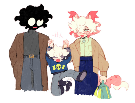
#This Is A Bad Team Building Exercise#The main idea is just brothers growing closer through dealing with reset jargon#theres a lot more but im keeping it all really vague cause i still dont know what imna do with it-#I just like#thinking about it#a lot#Gaster is SUCH A BITCH in this OH MY GOD#I HATE HIM SO MUCH#he is absolutely nothing like Forgettable AU Gaster/Wingdings but id be lying if I said part of this au wasnt inspired off of that#and the Insomnia trailer#and the How To Kill A Time Traveler video#and-#THIS HAS JUST BEEN A CONCEPT FLOATING IN MY MIND FOR AGES#and now im tryna actually put all the pieces together#All imna say about Gaster in this is#when he says ‘I love traumatizing my OCs’#take that as literally as possible#because thats basically what he does/what Papyrus and Sans are to him#its a whole thing#ITS WEIRD#**AND I LOVE IT SO MUCH**#im also thinking of renaming it to ‘This is a REALLY bad team building excercise’#or ‘This is a bad trust exercise’#i dunno#I just want a long and stupid name cause I really like long and stupid names for stories and aus
53 notes
·
View notes
Text
My fellow Destiny fans… I have something to admit… I presented my Witness project today and IT WAS A MASSIVE SUCESS WOWOWOWOOWOWOWOWOWO!!!!!!!! IM SO HAPPY AND EXCITED YIPPPEEEE!!!!!

#destiny 2#destiny#destiny the game#d2#the witness#destiny witness#destiny the final shape#omgggggg it was so scary but so so so worth it#genuinely running around in circles and doing flips IM SO HAPPY IT ALL WORKED OUT THEY LOVED IT#I COULDNT BE HAPPIER BC I LOVE DESTINY AND I LOVE BEING CARIBBEAN AND I LOVE THE FACT I GOT TO COMBINE THE TWO#I gotta reach out to everyone who helped me out and thank them and deliver some of the things I noted down#maybe I’ll revisit my notes and post them here but that’s kinda scary so I have to think about it#THANK YOU ALL SO MUCH FOR YOUR HELP YOU GUYS ARE THE BEST#I am going to sleep forever after this I’m so tired#this project opened so many opportunities for me too!!! more chances to bring this topic into art!!!! AHHHHHHHHHHHH#yeah I’d like to thank both the witness and the traveler for this moment#couldn’t have done it without them#my witness I love you mwuah mwuah mwuah mwuah *drops it off a building *#shoutout to poc who play destiny I love you all mwuah mwuah#participants will be hearing from me soon let me just start sleeping again and get a moment to condense everything#this was so much fun highly recommend
54 notes
·
View notes
Text
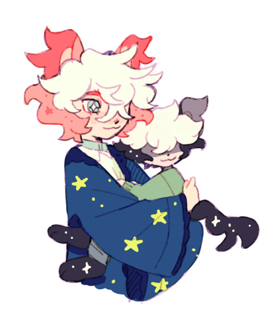

doodles of my fav sillies
anton belongs to @poicyss
#my brain is a barbie dreamhouse and theyre all just living in it#im especially fond of the second one because my mom used to hold me like that all the time <3#im drawing them a lot lately because im being crushed by the horrors and have to compensate for it somehow#homemade comfort blorbos......#watch me draw anton inconsistently bc i can never decide if i wanna draw him close to how he actually looks#or yassify him and give him soft fluffy hair and kind eyes and defined features. head in my hands#i dont really have a lot of drawing ideas for them bc they dont have like. a canon storyline or anything methinks#its just stuff me and bow toss around and giggle abt thru messages lol. maybe ill draw infant vincent one of these days#i just come up with stuff and draw them doing it. it makes me feel warm and fuzzy inside#cuz like anton works for lobocorp as an abnormality BUT hes super duper chill and cute and does his funny little tasks so its fine#AND hes unkillable. auggie is an oc ive had since like 6th grade and i smushed them together. and vincent was for fun but i got attached#i dont have much of a read on anton either bc i think hes meant to be more of an insert character??? if im using that right#on one hand i dont think too hard abt anything being ooc since im not taking it seriously. on the other hand i just hold them in my hands#and stare into space until i can come up with something to draw since i dont have much to go off of. but its fun to build on small tidbits!#i think bow called it an au so i guess??? its an au????? im not really sure. bow if youre reading this im just willy nilly#the only thing i know for sure is that they boink like rabbits. im talking gomez and morticia levels of boinking#maybe ill go back and look at my old doodles for them and redraw em lol#myart#my art#my oc#oc#friend oc#augusta#anton#vincent#sillies family#doodles
459 notes
·
View notes
Text
I think at a certain point we all gotta stop referring to the wc incest issue as "accidents." Like, it can only happen so many times before it's obvious someone made an executive choice to ignore it. it feels like...removing/lessening blame to keep calling it a clueless accident
with the way these books are written, I suspect the wc team mindset is "anything the middle-grade target audience wouldn't remember/question doesn't need to be considered." Like, if Nightheart didn't acknowledge last arc that Bayshine was related to him, then he effectively isn't related to him in the eyes of whatever new reader picked up this arc for the first time. Therefore, might as well not exist. Nothing in this world matters except whatever will get them through the current plotline.
the fact they are writing about animals and consistently refuse to use relatable familial terms like cousin/aunt/uncle/grandparent etc probably makes them comfortable shrugging it off.
the new team especially writes as if they are soft rebooting every other arc. it's the ultimate have your cake and eat it too: they don't want to do the work required to change the world/status quo to prevent this problem (doing so might slightly impede the ease of their break-neck writing speed), but they still want to do standard cliche romantic drama with their new next-gen-protag kits, so…they deal with that road block by ignoring it. There hasn't been a financial incentive not to.
this lack of care is all deeply annoying to me. but we gotta stop calling it an 'accident' b/c that implies they would be motivated to avoid it if it were pointed out to them. dog they know 😭 and they clearly decided it doesn't count if they don't acknowledge it
#the only thing that truly puzzles me is why they have a family tree on their website. they should get rid of that.#warrior cats#yarrow speaks#remember how they DID use uncle/nephew in the first arc to refer to Fireheart and Cloudtail#And then they notably stopped using those terms after that arc and never used them again. that's a decision someone made!#why? probably for this very reason.#its a small population with a rule about outside romances#a rule they dont want to get rid of because it has provided so much easy conflict and endless star-crossed-lovers drama#but they always knew this would happen. so make the 'tuck it out of sight' goal easier by not using memorable relation terms#''kin'' matters when a nightheart-type plot wants it to matter and ceases to be remembered just as easily when they're done w that plot#a kid isnt going to make real-world connections to 'kin' the same way they would 'cousin'#this isnt rly like a 'NORMALIZING INCEST" thing for me because they have made sure to never let mates acknowledge each other as relatives#its not /part/ of the story like game of thrones or something#and they at least dont pair siblings and parents. ig. like willowpelt/patchpelt actually WAS an accident that was corrected#and yeah the average new reader probably doesn't remember all the ways Moonpaw and Goldenpaws lineages overlap#im annoyed from a 'lazy writing' perspective.#w/e something doesnt have to be an active physical danger for it to piss me off and be shitty.#young readers deserve more care in the art made for them#i really dont think the world-building would fall apart if they allowed cats to have casual rogue/loner mates.#u can still keep your stupid cross-clan drama. but passing loners arent even a threat jesus christ.#maybe normalizing outsider friendships would be a smell step towards fixing the lazy xenophobia themes idk#wc criticism
34 notes
·
View notes
Text
I want to talk about what is, in my opinion, the Dot/Cleo scene of all time: their conversation by the Foldlight in Kinship.
Cleo lets her bubbliness fall, fully and deliberately, to reveal her insecurities for the first time in the series, and says, “I’m afraid everyone would be really disappointed in me. Do you… ever feel like that? Like if you let people find out who you truly are, it would just… ruin everything?” and—I think without intending to—in every way that they are able, with “Eye contact. [A tentative combination of two musical themes.]” Dot is saying “yes, absolutely.”
It is just this beautiful, vulnerable, intimate moment where these two very lonely people start to realize that they may be able to find a unique understanding in each other, if only they allow themselves to be understood.
Just before this Cleo says, “it sucks being reminded that people are only impressed by me because they don’t really know me.” But then! immediately after the eye contact of shared understanding, Cleo serves as that very reminder to Dot by breaking the moment with, “Oh, what am I saying? You’re amazing. You’re the coolest person ever. You’re going to be a Mother someday soon!” like cleo. please.
I act exasperated, but this is really such a tasty character beat, especially when you take Artifice’s reading of her in Safety into account (“compulsion to ensure your own safety by manipulating the emotional states of those around you”). the vulnerability (good, necessary) made her feel vulnerable (scary, unsafe) so she retreated into her fawn response.
I also want to look at Cleo’s assertion that “people are only impressed by me because they don’t really know me” from another angle—it is Cleo’s confiding in Dot about her lack of a Fold gift that allows Dot to compliment her in an especially meaningful way in The Disappearance of the Dazzling Duchess. When Cleo sees Dot’s fear and how they acted bravely in spite of it during Enlightenment, Cleo is so impressed that she seeks out Artifice to make sure he is aware of it. Cleo. Cleo, dearest. Your growing friendship with Dot serves as a sound rebuttal to everything you said here.
so, in essence—
Dot and Cleo: if people saw all the messiness I’m hiding, they would only be disappointed.
Dot and Cleo, about each other: the more I see of you as a whole, including the parts you try to hide, the more I like you, the more impressed I am by you, and the cooler I think you are (and I already thought you were soooooo cool)
#foldlight convo you will always be famous 💕#also Dot is one of the only people Cleo drops her register—both tonal and lexical—around#starting here her diction gets much looser and her voice loses some of its perkiness during her 1-on-1 scenes with dot#& off the top of my head I can think of three instances of Cleo swearing—one was when she was scared for her life#and the other two are when she is talking openly with Dot#I do think that Cleo bubbliness *is* genuine. I rarely think she’s lying about how she feels.#it’s just that there is more to her than that and she’s reluctant to show it#don’t talk to me about how cleo is not just lonely but very alone :(#mostly because it’s not a fully fledged thought#but she came onto the ship on her own. she’s 21. she has rarely been allowed to be vulnerable#and she’s trying so hard to learn how to let her walls drop and she’s trying to do that with Dot#who is simultaneously the worst and best choice for that#worst because they are actively building walls while denying their existence#but best because of that. because they are so similar in that way#but that means they are leaning in and flinching back in turns#it’s so GOOD! I LOVE THEM!#cleophee guilemoth#the granddaughter#unend#unend podcast#midst#midst podcast#eve watches midst
38 notes
·
View notes
Text
I miss Gold the tenrec
#i need to draw her and surge#tenrec peoples.. oh they would hate each other so much……#surge: and who’re you meant to be with your fancy ass robes??#gold in her mind: if i push her off the next building would anyone care.#also i think kit and whatsherface#sonar. she would make a lot of fun of kit i think. until he blasts her full force with water but thats Not important yk#mmmmsame animal species duos i need more of youuuuuuuuuuuuuhgggrggggggg#gold the tenrec#sth#sonic the hedgehog#sonic archie
43 notes
·
View notes
Text
Artemis will disassemble and clean a fountain pen with the same level of intensity as Butler disassembling and cleaning one of his guns.
#artemis fowl#Artemis will just automatically include the upkeep of Butler's his mother's Juliet's and Holly's fountain pens in the upkeep of his own#Holly and Juliet tend not to use their pens often (which they have because Artemis gifted them pens) so Artemis will help whenever they vis#visit. Then with Butler it is largely due to the man not having the habit of building 'frivolous' rituals of care into his day so Artemis w#will care for the pens as Butler does (at the end of it all) adore the devices#with Angeline I feel Artemis is just so wholly dedicated to that kind of small act of care when it comes to his mother#(thinking of him composing a unique ringtone for her calls)#I think Fowl Sr is more of a ballpoint pen or a pencil fellow and Artemis will sometimes include his father in the hobby by cleaning#and repairing pens in his father's study while the man works (so he will have the experience of being included through the upkeep)#Tim does appreciate when Artemis shows off some of the special/exclusive inks he purchases#he finds the beauty of the ink a much more accessible aspect of the hobby#that diane ackerman quote about crying in a museum while looking at a piece of yellow sulfur and thinking about how lucky we are to live on#a planet of a natural yellow that is so marvelously yellow#Artemis will do ink tests (when you get a new ink and experiment with it on good quality paper) when his father is in the room for this rea#reason
256 notes
·
View notes
Text
the more i think about Oppenheimer the more disappointed i get because at its core it’s such an interesting story to tell. like the whole manhattan project catapulted the entire world into a new atomic era that we could never go back from whether we were ready for it or not. and the fallout from the project not only changed and devastated the lives of hundreds of thousands of people (including of course the victims in hiroshima and nagasaki + the people living in new mexico where they tested the bomb) and the continued generational trauma of the bombs. also just the general mass panic and fear that the Cold War instilled into every citizen in the states who were literally waiting to one day be just annihilated by a nuclear attack. the whole creation of the atomic bomb had so much impact on the world. so doing a deep character study of both oppenheimer and his colleagues on the moral ambiguity of their work in the project and the outcome of it is such a great movie concept. but the film didn’t feel like that at all. instead Nolan gave us the watered down story that he’s best at and spent almost three hours forcing us to watch whether oppenheimer had to lose his disneyland government fast-pass due to his communist ties or not (spoiler: he does) and how strauss doesn’t like him because he got his feewlings hurt once. all the other scientists and physicists were given one or two minutes of screen time and were really just names to a face. the actual bombs creation was given a sidelong glance and trivial explanation at best. and of course to tie it all off the main female side characters were either naked/having sex for 80% of their screen time or was given the character depth of a piece of tissue paper
#oppenheimer#oppenheimer spoilers#oppenheimer negativity#I’ve had all day to think on this and the more i do the sadder i get#i wanted to like this film so much#i thought we were gonna be given a deep dive into this character and the bomb#but the result felt shallow and contrived#the movie focuses so much on fitting as much info as possible in three hours that the story just couldn’t breathe#scenes between characters lasted all of two minutes before we were launched into another scene to two new characters#and oppenheimers personal motivation/desires just felt ambiguous the entire time#like he busts his ass to build this bomb but then all the sudden develops a moral compass when it’s done?#where’s the character depth?? what makes him so passive about some things then suddenly driven for others?#and Florence and Emily Blunt were ripped off and characters were reduced to common tropes#it’s just so disappointing….i waited all year for this movie too
555 notes
·
View notes
Text


for the past couple of days, i've been working on Boe's house in limbo and getting it to look close to how i've been picturing it in my head - here's a couple of shots so far showing off the exterior and interior, with the top screenshot being further along in progress than the other exterior shots.
#boe#boe tai marrow#my characters#my art#everything's mostly just in developer flat textures since idk what textures i plan on using yet#also part of me doesn't want to texture everything only because i kinda like how this looks#not that i'd point to this as being the artstyle for limbo or anything. just my brain seeing nice colour combos#my first attempt at this was based off an image of an old victorian house doll house. and because i only ever had one image -#it made working on anything besides the front angle kind of annoying#so i eventually resorted to looking up old victorian house plans and building off those. and then mirroring the plans horizontally#at some point i gotta try working on the cellar and attic#but im not ready to go about hollowing out the attic & its brushwork just yet.#i'll likely make a copy of the roof portion and design it separately. then plaster it back on once ive got it the way id want#thats what i did with both floors. laying them out separately then combining them and adjusting the connecting bits from top to bottom floor#also the houseplans i was working off of (for reference is like. design 10 of the daily bungalow) has an illustration of the house#but for the life of me. the roofing above the front porch that's above the stairwell is apparently supposed to slope more sharply#but genuinely i couldn't get it to match the illustration (which im guessing isn't 100% accurate anyway) without the interior being cramped#would've also liked for the porch roof to be a bit more sloped as well. but i couldn't go much higher due to the second floors windows#i think ive mentioned it before but with my ms paint art with Boe in it. the house in that (and the art itself) isnt canonical to Boes life#this essentially is the first time im properly visualizing that world#atleast in terms of blocking it out atleast
25 notes
·
View notes