#art explainer
Explore tagged Tumblr posts
Visit Tumblr Blog
Explore Tumblr blogs with no restrictions, modern design and the best experience.
Last Seen Tumblr Blogs


Fun Fact
Kazakhstan’s Minister of Communications and Informatics has blocked the Tumblr site because it contained 60 sites of terrorism, extremism, and pornography in 2015.
Text


caught them doing the SIN, cos, tan (bad trigonometry joke, I'm sorry, you have permission to euthanize me)
bonus:

#I don’t know WHY on earth I drew this but sir mix-a-lot was playing so maybe that explains it#the book of bill#gravity falls#billford#Art Of The Sun Chip#gravity falls fanart#stanford pines#bill cipher#fiddleford mcgucket#fiddauthor#artists on tumblr#ford pines#art#drawing#fanart#my art#doodle#illustration#procreate#comic#please don't repost my artwork onto other sites thank you!
46K notes
·
View notes
Text

ghanaian miku
#zeno's art#hatsune miku#vocaloid#vocal synths#ghana#theres a trend on twitter where you draw miku as from your country#and i dont think anyone's done ghana yet!!!#her outfit is inspired by fashion + fabrics that my mother would wear and also stuff i found on pinterest#ghana kind of has a gold fixation lol so theres lots of gold#and the drink she's holding is supermalt. idk if its actually ghanaian but i know that ghanaians love it#(its very yummy btw idk how to explain the taste cuz i havent had it in a while but you should drink it if you ever come across it)#ok tumblr gets this early#ill post at like 4pm for twitter
27K notes
·
View notes
Text

Temperance needs to pay child support.
Follow-up
#That one audio clip#toad’s notes#Comic#traditional art#the gaslight district#tgd ken#ken the butcher#tgd melancholy#melancholy hill#Tgd mud#cuz I wonder how he was able to explain a baby out of nowhere without everyone freaking out#And it’s debatable if he just managed to keep her under wraps until adulthood
8K notes
·
View notes
Text
I LOVE GANGLE SO SO MUCH!!!!!
#tadc#the amazing digital circus#gangle#tadc gangle#the amazing digital circus gangle#tadc jax#my art#THE NEW EPISODE!!!! AUGH AUGH AUGH#I CANT EXPLAIN HOW BAD IT HIT ME#GRRRREEEEETHSJFJSJGJSKGJSJFJ#I LOVE HER!!!!#I dont need to make a TADC oc because Gangle is just me /silly#I JUST!!!! AAAAAAAAAAAAAAA#Awaaaaaaa#sniffle sniffle
9K notes
·
View notes
Text
Her smile is everything<3

#doodles#funfact: i rarely laugh irl so whenever i do people around me get surprised#the amount of times i had to explain i'm just watching a funny video is concerning#crk#cookie run kingdom#shadow milk cookie#burning spice cookie#mystic flour cookie#art#fanart#stuff i draw
7K notes
·
View notes
Text

shut my eyes and count to ten
#can’t imagine what laws current situation is doing for his BPD#we need to save him#also lowkey the main point of this comp was to explain why i draw law with glasses lol#like his glasses are from his dad and his feather coat is a homage to cora#anyways#one piece#one piece fanart#trafalgar law#law#surgeon of death#corazon#corazon rosinante#my art#who else listening to bastille good grief mad as fuck rn
4K notes
·
View notes
Text

Been reading some original works on Ao3 recently
#artists on tumblr#writers on tumblr#ao3#my comic#my art#original comic#writing#love when i read something and its like 'wow i didnt realize ur allowed to write like this'#i love scholomance so much and it was like#wdym u can just explain how the world works w/o being boring????
4K notes
·
View notes
Text
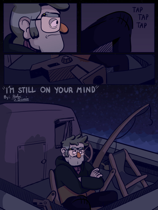
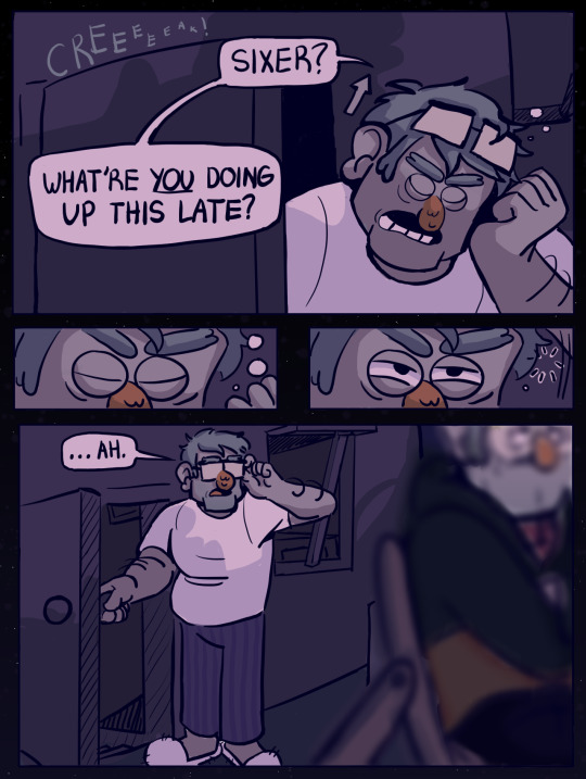
L'P VWLOO RQ BRXU PLQG
#basically the premise of this is that ford is still kinda paranoid and on edge even after the 'great evil' has been defeated#(because he's been paranoid and on edge for 30+ years of his life)#so even when its not really needed; he stays up to be on the lookout for something that might be after them#i hope i explained that in a comprehensible manner#HAHAHAH#love this guy cant get enough of hum#js one of my hcs hehehhrhehrjeheh#gravity falls#gravity falls fanart#fanart#my art#stanford pines#ford pines#grunkle ford#stanley pines#stan pines#grunkle stan#sea grunks#comic#digital art#krita art#krita
4K notes
·
View notes
Text
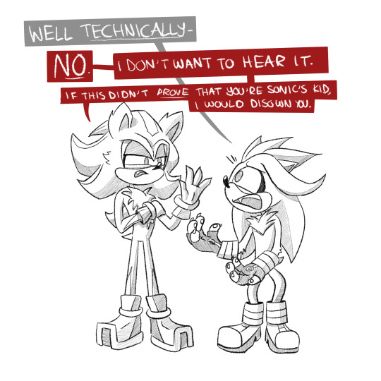
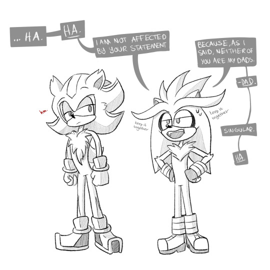
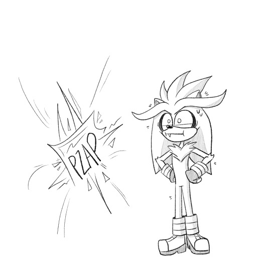

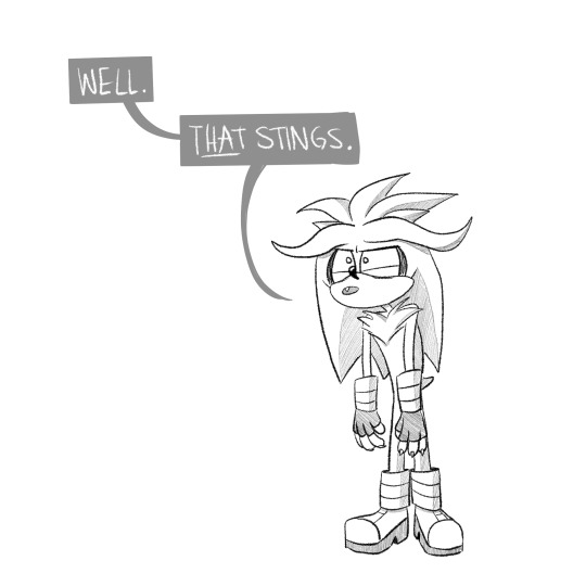
being disowned by your dad before he’s even your dad….
silver’s doing his best, bro.
#sonadow#my art#sonic the hedgehog#shadow the hedgehog#sonic fanart#shadonic#sth#silver the hedgehog#silvers parent trap#how much of making this post was to somewhat explain how silver got here?#definitely some#and I warn you it’s about to get a lil less silly and a lil more :0
8K notes
·
View notes
Text
we go just right.
#when the date went so wonderful that you don't even mind that you forgot your umbrella at home#crowley is doing his best and aziraphale appreciates it very much#aziraphale's very special version of pride and prejudice can't get wet#so you gotta use the four year old newspaper you found in your bentley#I am not mentally ready for season 2#it will change me in a way that I cannot even explain#thank you neil gaiman love of my life fr#good omens#good omens 2#good omens fanart#good omens 2 fanart#aziracrow fanart#aziracrow#ineffable husbands#aziraphale#crowley#david tenannt#micheal sheen#neil gaiman#digital art
73K notes
·
View notes
Note
unsure if my ask went thru bc i didnt see the popup that said it sended over so i’m typing it out again
i NEEED NEEDD a tutorial on how you draw & design mechs bc the way you draw them is literally perfection in every way. this is from an anon who wants to make mech ocs but is unsure where to start theyre so complicated to design
dusting off my tutorial brain
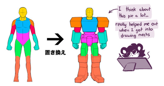
my style of mech is very influenced by transformers (mix of different continuities and tf artists that I like) so I look at a lot of characters for inspiration
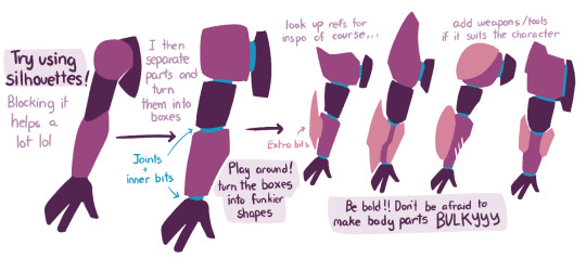
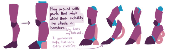
There's a lot of stuff you could add to it too like vents, pipes, antennas, fins, wires, joints, etc..
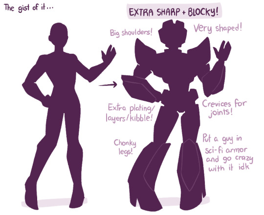
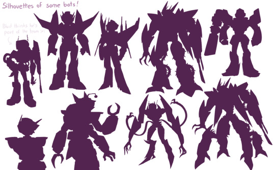
#in a mood to draw bots so weeeee#throws this and dies#am bad at explaining stuff so I try with visuals bleh#tutorial#mecha tutorial#i guess#asfjhasjh#my art
7K notes
·
View notes
Text

did this piece yesterday but colored it just now :3
#theres NO heterosexual explaination for the codpiece#oh you gotta show ur bulge to the other men in armor in front of you??? gay#knightposting#armor#knights#knight#medieval knight#artists on tumblr#art#whats the tag for armored sex
4K notes
·
View notes
Text

me too, luna.
#luna#celestia#mlp#my art#fanart#comic#grand galloping 20s#doodles#oscillating between serious “luna has depression” and funny “luna is a shut in who smells bad and reads books without a light”#luna would LOVE modern pajamas and sweatpants rip#also celestia usually uses first person “I” pronouns but Luna almost exclusively uses we/us#because nightmare moon is technically another identity sharing her body#it's like DID but not because it's not a disorder to them#edit: sorry should clarify that did doesn't need to be considered a disorder either#i don't know the preferred nomenclature for this topic there's someone in the tags who explains
9K notes
·
View notes
Text
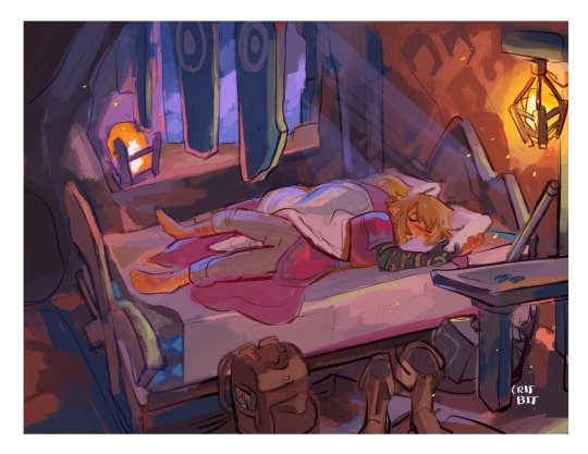
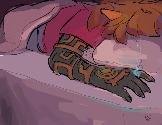
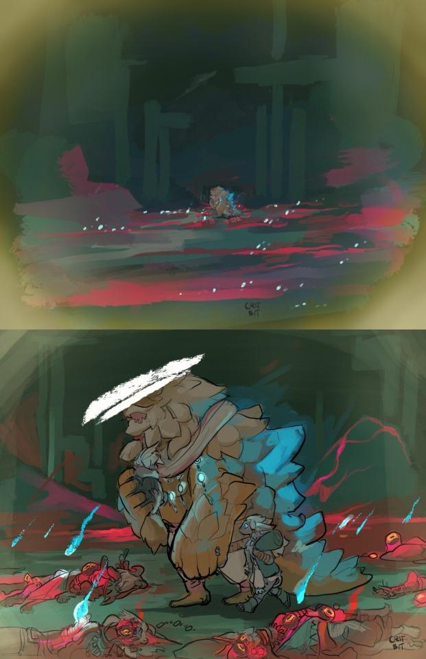
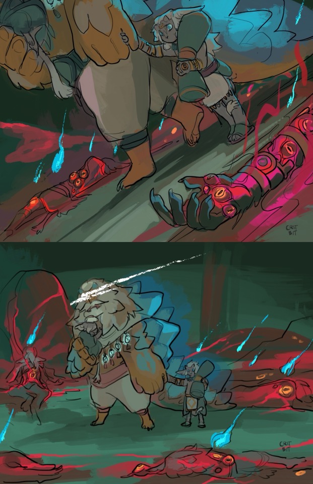
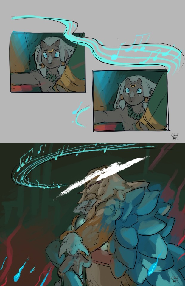
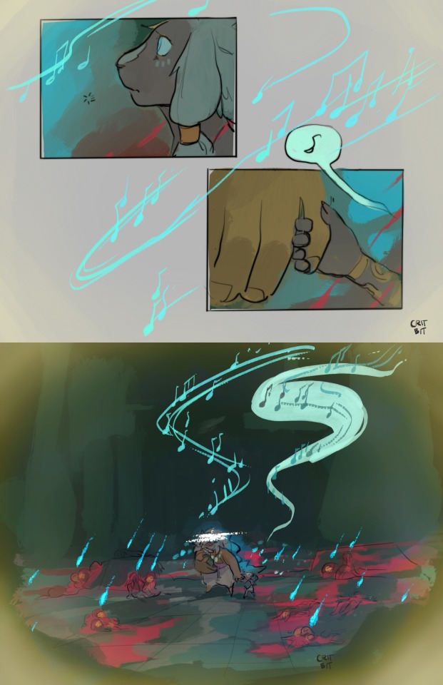
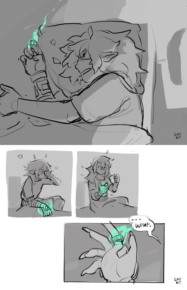
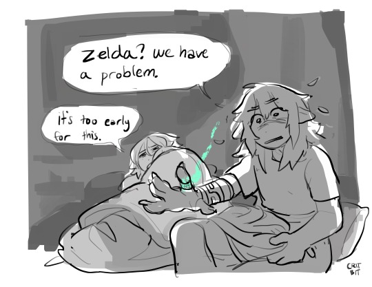
Linktober day 11: rollin’ inn
After a day fighting a volcano, the heroic group stumble back to the inn to take a Long Rest. Unfortunately for Link, his sleep is interrupted by mournful ghosts partying it up in his brain.
(Mineru and rauru were the last of their kind ever since the already small insular zonai kingdom was decimated by a strange, flesh bending plague. A lone miner found the two children, and decided to take them in despite concerns of the curse.
He raised them. When they asked him to help fight the source of their blood family’s extinction, who was he to say no?)
More about this totk au! (It all started when zelda did not get teleported into the past, and then spiraled from there)
Patreon!
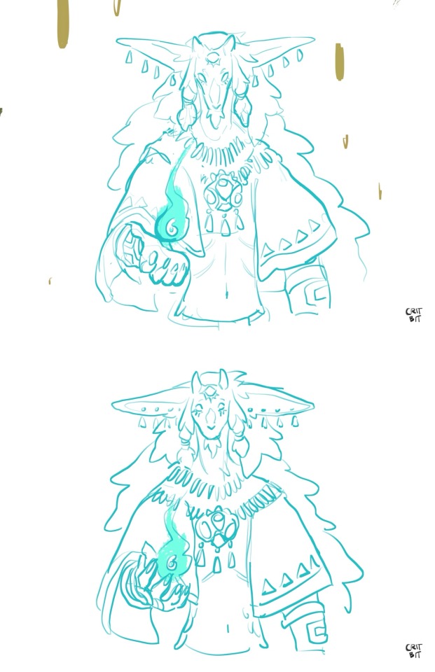
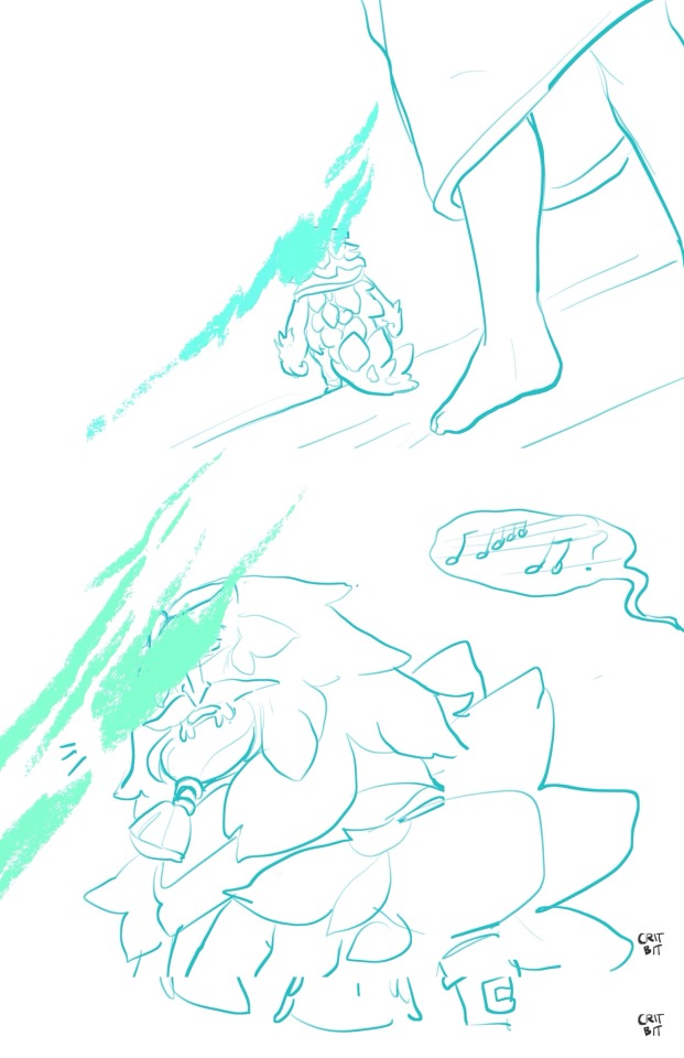
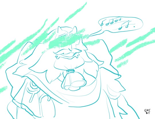
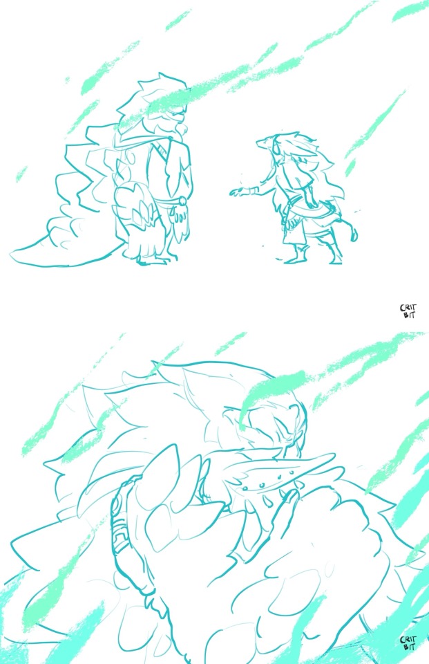
#art#critdraws#lonks diary#familiar familiar au#loz#zelda#link#yunobo#fire sage#the sage of fire#totk fire sage#totk sages#totk#botw#totk au#botw au#breath of the wild au#breath of the wild#tears of the kingdom#totk zelda#totk link#totk yunobo#rauru#totk rauru#king rauru#loz comic#tloz#ough i took liberties because the gorons are a mining race and the zonai are a mining race and im like omg#also i have to explain why rauru and mineru are the only zonai and thought "well if the zonai accidentally dig too deep and find the#horrifying sentient sludge called the malice gloom whatever.... hear me out
7K notes
·
View notes
Text
wild to me that there are people who have no desire to paint their walls in fun ways. and i don't just mean "people who choose sad neutral colors on purpose" i mean: why aren't more homeowners out there scribbling on their walls? it's your property, you can paint and color and draw whatever you want to! when did we as a species stop fingerpainting our homes that was a mistake
#everyone should have a crayon wall. a wall reserved primarily for scribbling on with crayons#we've lost the art of cave painting. and more importantly the SPIRIT of cave painting#*me explaining to my ancestors that i have access to a unimaginable variety of pigments & paints & dyes they could only dream of#but i live in a world where walls are whitewashed and most clothing comes in like. 4 colors. and isn't even tailored to fit *#anyways my biggest homeowner pipe dream is to paint cave art inspired murals in most rooms#and then have one wall specifically reserved for doodling whenever I'm bored. I'll invite friends over for a scribble party#it's honestly so confusing to me that this is not a normal thing for kid's bedrooms especially#we've all heard of young children coloring on walls it's basically instinctive#so if you can afford to why not let your kid have a wall in their bedroom reserved for doodling
3K notes
·
View notes
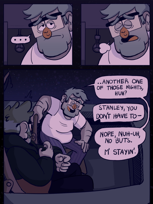
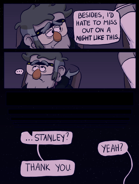
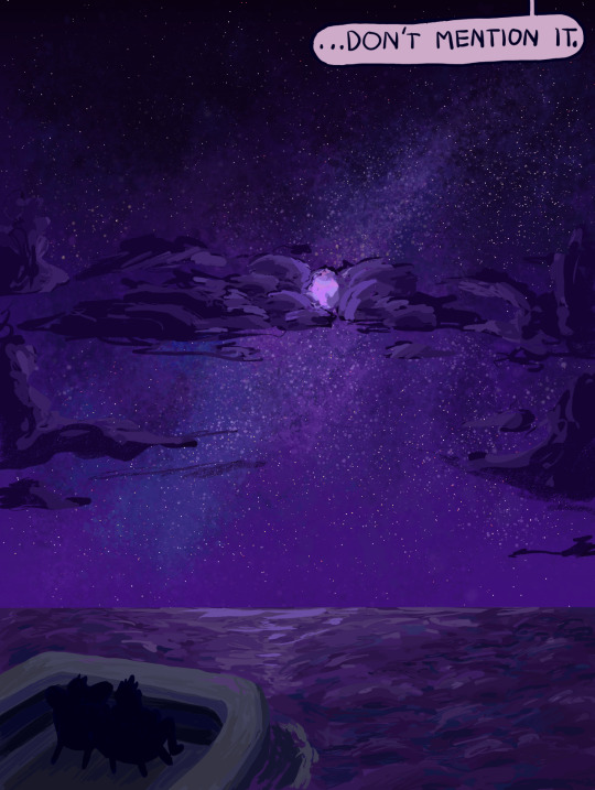
Text


Another “what other scenarios can I think of to make me already emotional about these two” idea
#gravity falls#stanley pines#stanford pines#stan twins#sea grunks#sketches#comic#my art#stan pines#ford pines#long post#i cant even explain how i got this idea#but that’s like most of my ideas lol#made a realization while drawing this:#that ford understands the sentiment#because he had to sort of say goodbye to stan with the memory gun#so some small parallels#or i’m just thinking too hard on it#no id
3K notes
·
View notes