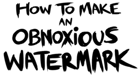
#artist tutorial
Text
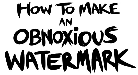
...that your audience won't hate.
This is a method I started using when NFTs were on the rise - thieves would have to put actual work into getting rid of the mark - and one that I am now grateful for with the arrival of AI. Why? Because anyone who tries to train an AI on my work will end up with random, disruptive color blobs.
I can't say for sure it'll stop theft entirely, but it WILL make your images annoying for databases to incorporate, and add an extra layer of inconvenience for thieves. So as far as I'm concerned, that's a win/win.
I'll be showing the steps in CSP, but it should all be pretty easy to replicate in Photoshop.
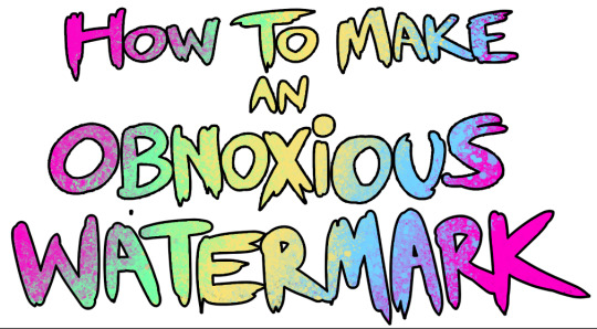
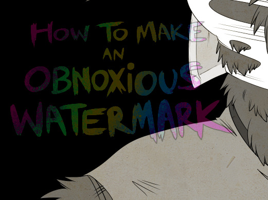
Now: let's use the above image as our new signature file. I set mine to be 2500 x 1000 pixels when I'm just starting out.
Note that your text should not have a lot of anti-aliasing, so using a paint brush to start isn't going to work well with this method. Just use the standard G-Pen if you're doing this by hand, or, just use the text tool and whichever font you prefer.
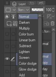
Once that's done, take your magic wand tool, and select all the black. Here are the magic wand settings I'm using to make the selections:

All selected?
Good.
Now, find a brush with a scattering/tone scraping effect. I use one like this.
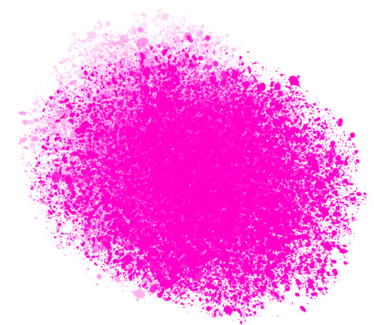
You can theoretically use any colors you want for this next part, but I'd recommend pastels as they tend to blend better.
Either way, let's add some color to the text.
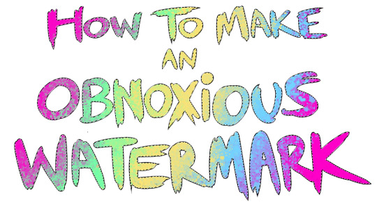
Once that's finished,
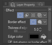
You're going to want to go to Layer Property, and Border Effect

You'll be given an option of choosing color and thickness. Choose black, and go for at least a 5 in thickness. Adjust per your own preferences.
Now create a layer beneath your sig layer, and merge the sig down onto the blank layer.
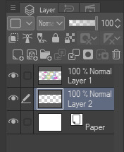
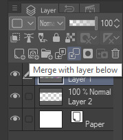
This effectively 'locks in' the border effect, which is exactly what we want.
Hooray, you've finished your watermark!
Now let's place that bad boy into your finished piece.
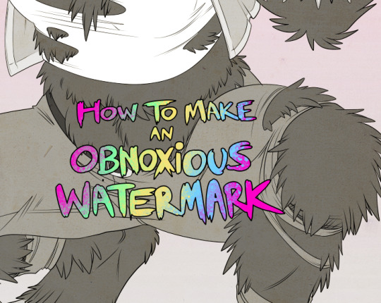
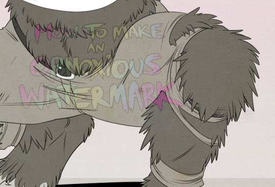
You'll get the best mileage out of a mark if you can place it over a spot that isn't black of white, since you'll get better blending options that way. My preference is for Overlay.

From here, I'll adjust the opacity to around 20-25, depending on the image.
If you don't have a spot to use overlay, however, there's a couple other options. For white, there's Linear Burn, which imho doesn't look as good, but it still works in a pinch.
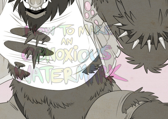
And for lots of black, you have Linear Light
Either way, you're in business!
EDIT since this has escaped my usual circles, and folks aren't as familiar with my personal usage:
An example of one of my own finished pieces, with watermark, so you can see what I mean about 'relatively unobtrusive'-- I try to at least use them as framing devices, or let them work with the image somehow (or, at the very least, not actively against it).
I know it's a bummer for some people to "ruin" their work with watermarks, which is part of the reason I developed this mark in particular. Its disruption is about as minimal as I can make it while still letting it serve its intended purpose.
There's other methods, too, of course! But this is the one I use, and the one I can speak on. Hope it helps some of you!
52K notes
·
View notes
Note
Hey! Just wanted to ask, got any tips for highlights in pixelart? Ive got shadows down decently enough that i can at least stand looking at them a week later, but i have struggled with highlights and brighter lights in general. Also, awesome stuff, your space elevator piece got me into trying pixelart and it has been a fascinating journey so far
honestly when i first started i worked a LOT in black/white/values. i also tend to work dark to light, so ill build a piece up from its darkest areas, then finish with the highlights.
here is some of my art edited so you can see the values:
contrasting highlights against shadows will always make them stand out more and be more striking. i usually add a lot of rim lighting to pieces bc it’s like easy mode for focal points so i def recommend looking that up and learning about that!! truly though working in EXTREME values will help you get to more nuanced values so def try to work with a small color palette for a few times and seeing how that changes your understanding. when i first started out a LOT of my art was monochromatic just because i was focusing on values instead of color and i think that helped a lot!! examples of that:

#artist on tumblr#art help#artist help#artist tutorial#pixel art tutorial#values#i hope this helps it’s hard for me to explain my thoughts a lot lol
659 notes
·
View notes
Text
🎨🖌️How to start your own buisness as an artist (stickers edition)🖌️🎨
What do you need:
Printer
Laminator+laminating sheets/self-adhesive laminating sheets
Sticker paper (matt or glossy. Depends on which your printer supports)
How to do it:
Option one (laminator) (please don't. It peels off)
Print your designs on sticker paper (paper put upside down for it to print on right side, which is paper side). You can print as many as you want.
Prepare laminating sheet (open it).
Put one sticker sheet printed side down, and other sticker sheet on top of it, printed side facing up.
Put little paper in between of those two paper sheets, remember for it to stick out a bit (in this way, you can snip the laminating frame more easly) (put it in down side in the middle).
Let laminator to get warm
Put laminating sheet (with paper inside) to laminator. For sure you can laminate it two times.
Wait for it to cool down, and then cut stickers by hand or use Cricut.
Option two (self-adhesive laminating sheet)
Print your designs on sticker paper (paper put upside down for it to print on right side, which is paper side). You can print as many as you want.
Get one self-adhesive laminating sheet out of the box. Can have pattern on it for colorful look.
Peel some of it off sheet, and put on top of the sticker paper.
Slowly peel off more and use scraper to prevent it from having bubbles inside.
Cut stickers by hand or use Cricut.
Where to sell it and how?
You can advertise your shop on sites like tumblr and get payed on paypal. You then ship your product to adress your client gave you. Remember to write good TOS (terms of service).
You can also sell it on sites like Etsy by making your small shop. Then ship the product to your client.
That's how you can make stickers in your own home. You can start buisness easly. I like laminator option because I can laminate 2 sticker sheets at ones using only one laminating sheet. Hope it helps ❤️✨
#artist on tumblr#artist advice#how to make stickers#waterproof sticker#small buisness#how to start your small buisness#artist tutorial#stickers tutorial
21 notes
·
View notes
Photo
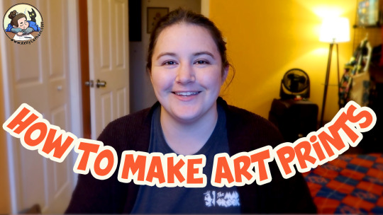
new video on how to make art prints 😊 https://youtu.be/Q4NLTM5WHPw
3 notes
·
View notes
Text
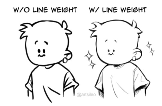


You don’t suck at Lineart, you’re just not familiar with line weight👍🏼!
#tips#artwork#digital art#digital artist#drawing#art tips#artists on tumblr#tutorial#art tutorial#tips and tricks#art tips and tricks
64K notes
·
View notes
Text

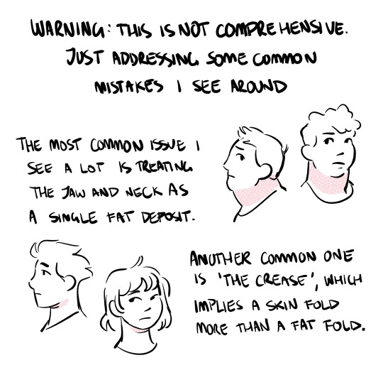

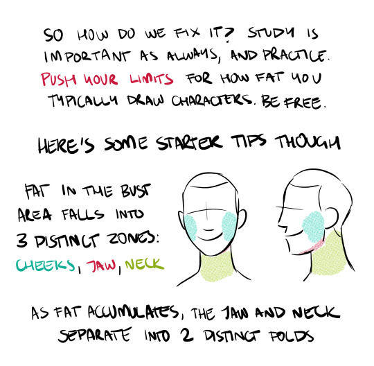
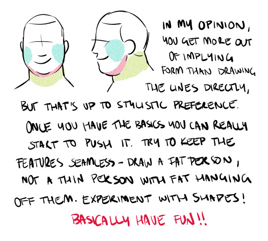
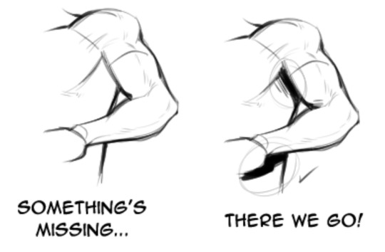
draw more fat characters ok. i love you
32K notes
·
View notes
Text
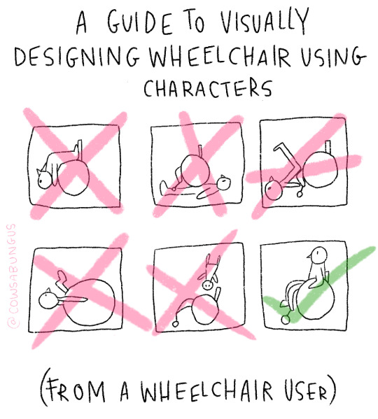
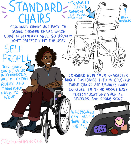
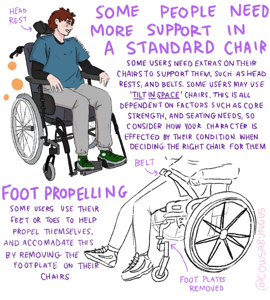

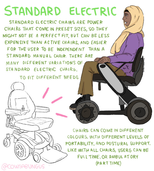

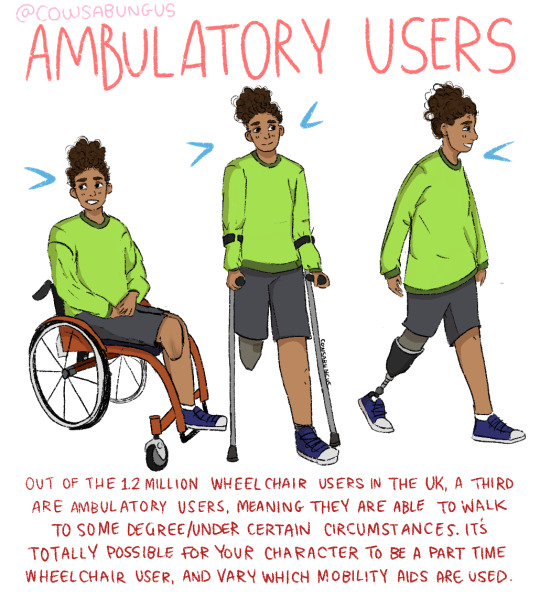
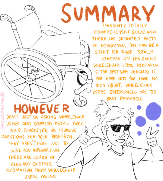
A guide to designing wheelchair using characters!
I hope this helps anyone who's trying to design their oc using a wheelchair, it's not a complete guide but I tried my best! deffo do more research if you're writing them as a character
#art#original art#artist#oc art#original character#queer#disabled#disabled rights#disability#disability pride month#tutorial#art tutorial#disabled character#design tutorial#drawing tutorial#Tumblr tutorial#character design#character illustration#concept art
89K notes
·
View notes
Text

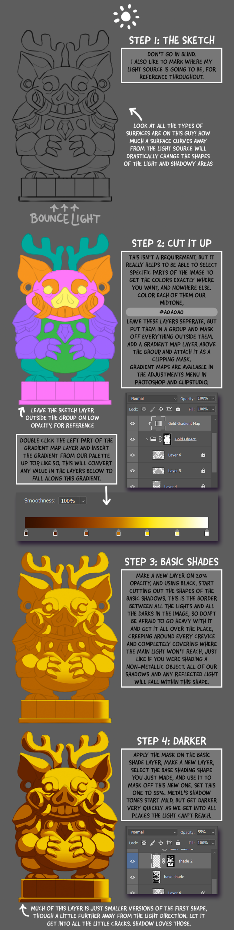
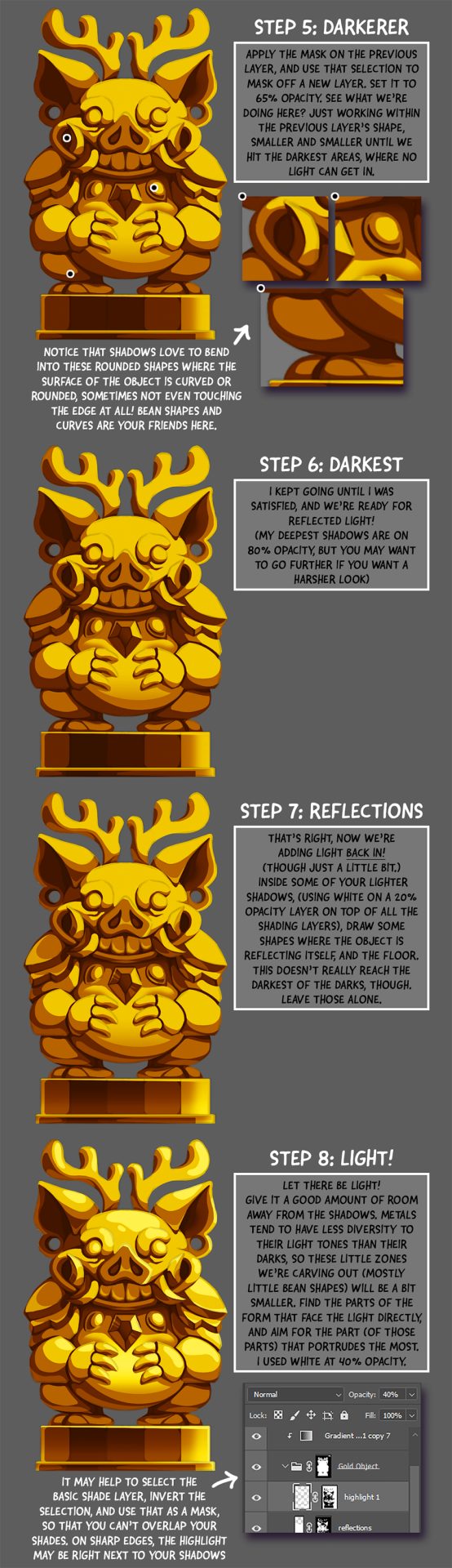
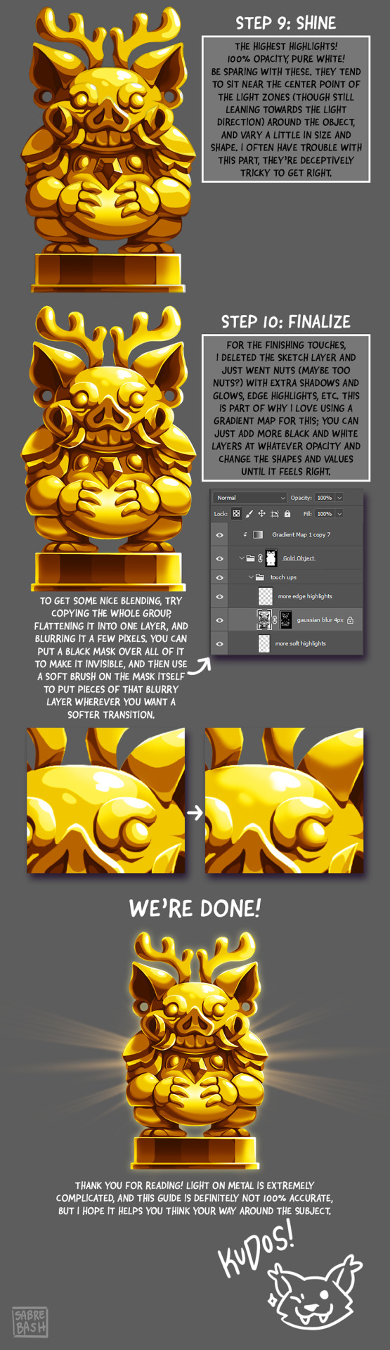
I have to draw a lot of gold and metal for my work, but wasn't happy with any of the metal tutorials i could find around. I prefer really specific instruction, so after some research i put together what i think works as a generalist's guide/tutorial. Not perfectly accurate, but i hope it's helpful!
#tutorial#tutorials#art#painting#artists on tumblr#reference#art reference#useful#art tutorial#art resources#tips#longpost
26K notes
·
View notes
Text
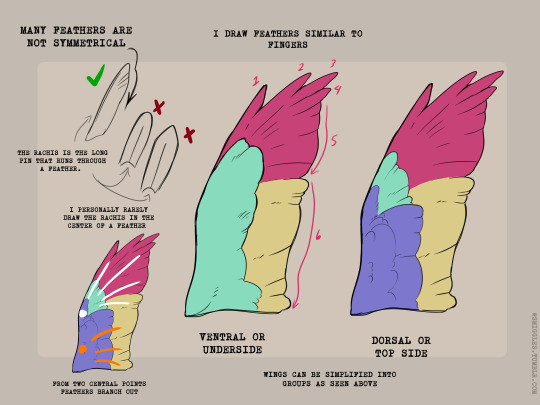
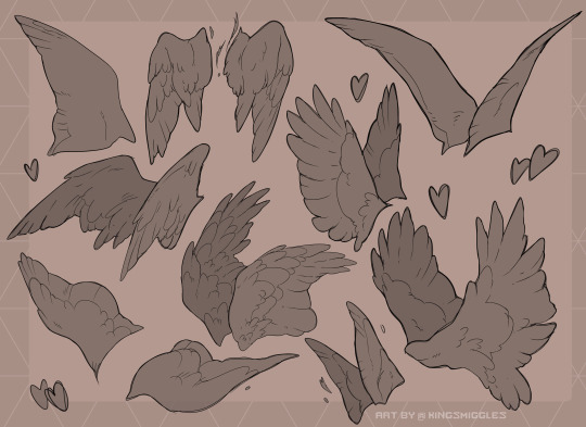
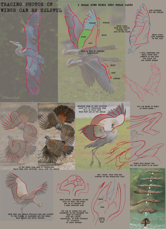
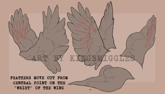
Wings anyone?
21K notes
·
View notes
Text
Here's some notes on some of the upper body muscles so you, artist, don't need to look them up

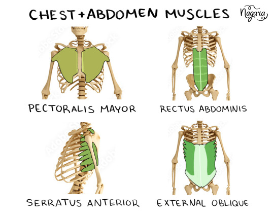
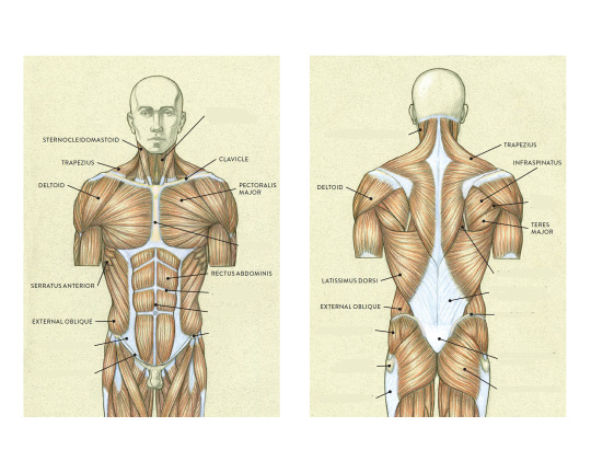


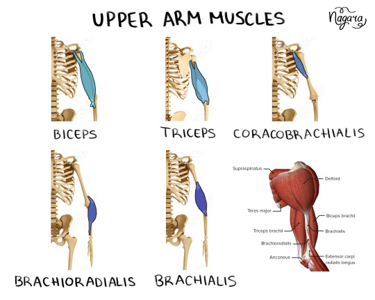
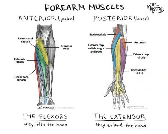

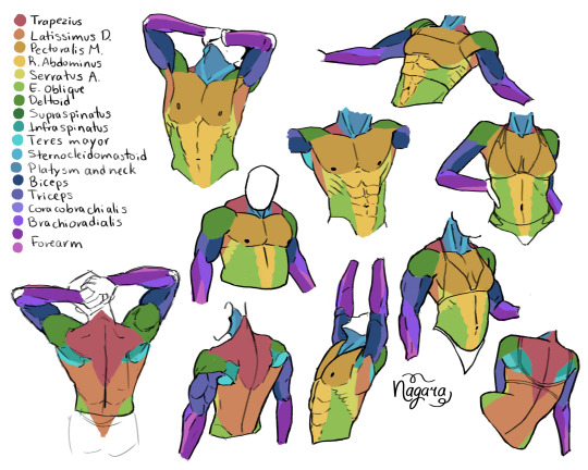
They are not medically accurate, just enough for artists to know the necessary muscles and how they work together
I 100% recommend doing the last exercise I did to be able to actually place the muscles
Here are my notes on the lower body muscles
#lower body muscles notes coming in a month#don't even ask about the forearm there's just too many muscles there#art study#muscles study#upper body muscles#art tutorial#anatomy notes#artists help#nagarart#drawing#digital art#my art#art
38K notes
·
View notes
Text
They also have an animal one that I linked a whole back on the same site !
21K notes
·
View notes
Note
Do you have any recommended tutorials on lighting? You have such a way of making your skies glow with sunlight and i admire it a lot.
honestly doing studies helped me a lot more than anything else!! i rly recommend that everyone does studies and continues to do studies bc it helps u improve !
youtube
445 notes
·
View notes
Text
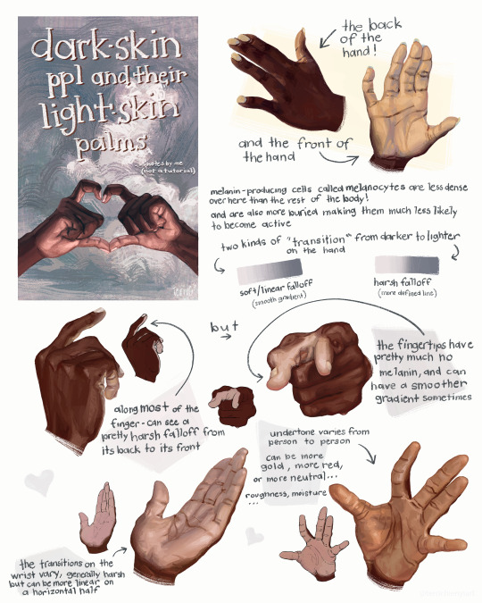
this is not a tutorial this is just me rambling
#art#art study#reference#painting#hands#digital art#illustration#bipoc#poc#black#black art#dark skin#information#art tutorial#art non tutorial#artists on tumblr#art tips#sketched this in january so its gotta leave my head someday
21K notes
·
View notes
Text
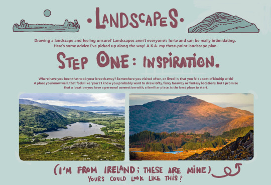
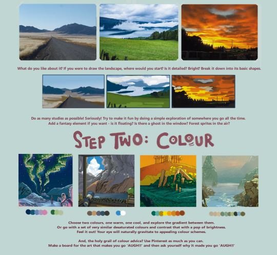

here's a landscape tutorial!
i focused on natural environments for this one, if you find it helpful I'll be back with how I learned to draw buildings.
let me know if it helps! and have fun drawing ✨
#this was really fun to put together actually hehe#tutorial#art#illustration#digital painting#digital art#artists on tumblr#digital artist#digital illustration#radarplz#sketch#my art#bethfuller
18K notes
·
View notes
Text
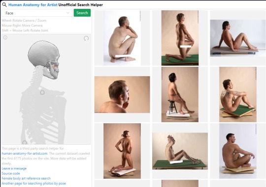
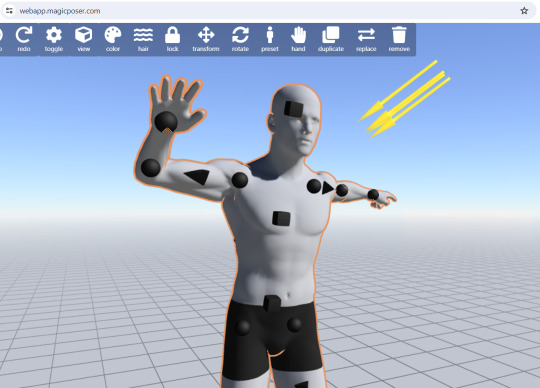
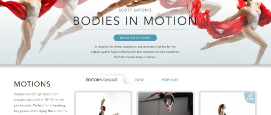
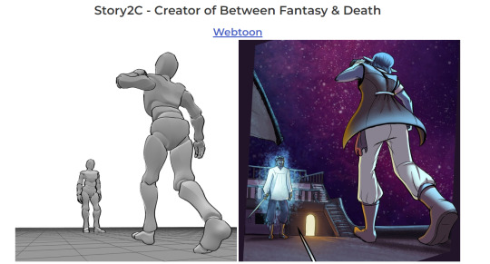
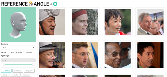
RESOURCES FOR POSES
Line of Action

JustSketch.Me

PoseManiacs

Human-Anatomy-For-Artist.com

MagicPoser
MIXAMO

Pose Archives

Bodies in Motion
Posemy.art
ReferenceAngle
CroquisCafe

#reference#tutorial#art reference#anatomy#art#poses#artist#art resources#resources#web#pages#help#guide#action#line#figure#body#muscles#human#animal#animation#photography#3d model#angles#views#expressions#faces#emotion
4K notes
·
View notes
Text
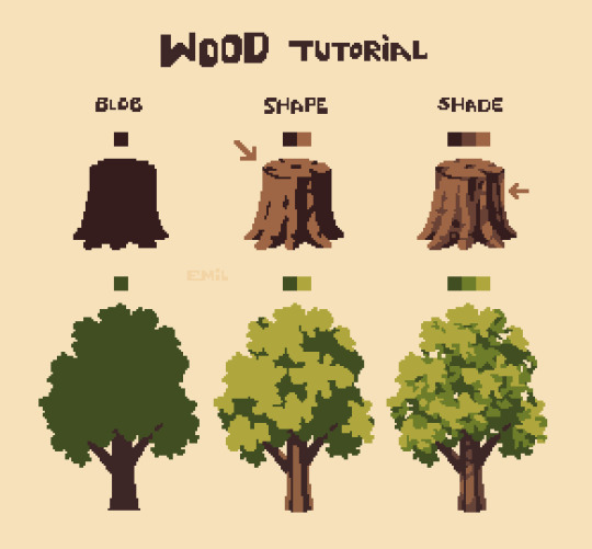
Simple tree tutorial
#pixel art#pixelart#art#art study#artists on tumblr#8bit#pixel#illustration#16bit#art practice#nature#aesthetic#trees#tree#tutorial#art tutorials
3K notes
·
View notes
Last Seen Blogs