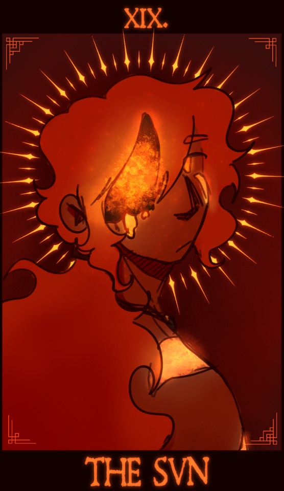
#bad webcomic
Text
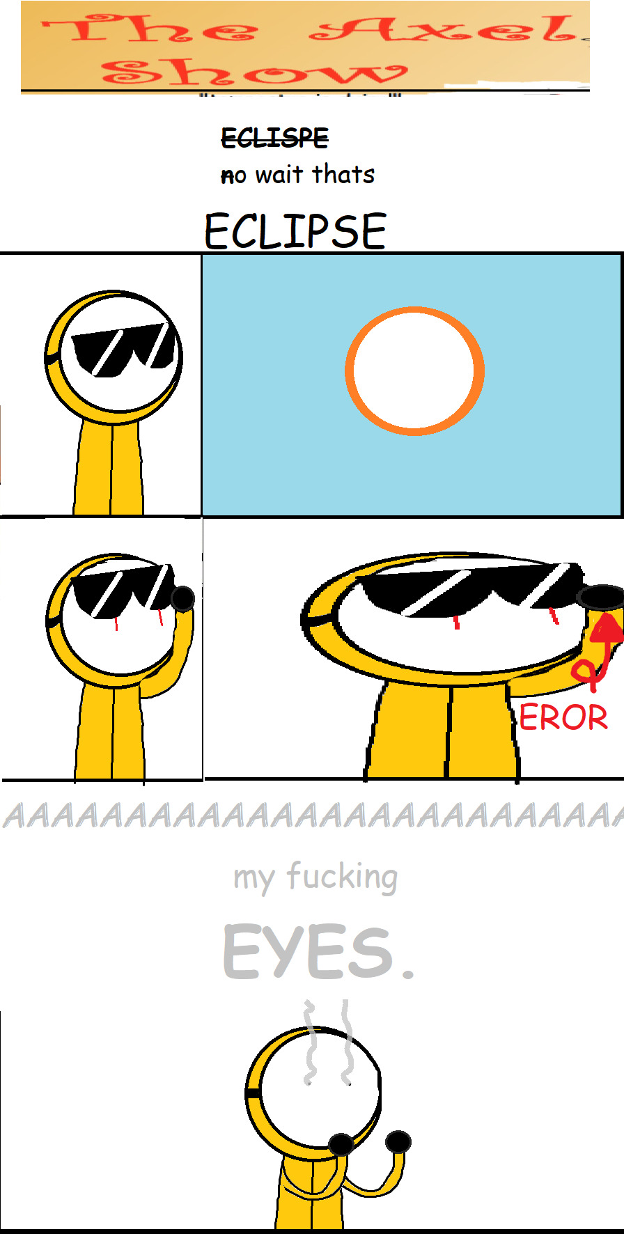
eclispe
#comics#joke comic#webcomic#art#comic#digital art#joke#joke art#joke webcomic#webcomics#bad comic#bad webcomic#eclipse#the axel show#solar eclipse
6 notes
·
View notes
Text
"Gon' E Chuu"
A tumblr comic about rubber hose animals that work as actors in cartoons. Main character is an alligator ex-antagonist star and it has a lot of vore, but also tries to tackle social issues (?). Seems to have lots of dry stretches and the style is trying to be rubber hose, but is too stiff looking to me to hit the right mark...
Where is the link to this? Googling this is impossible
Also, the name sounds extremely close to that certain other comic on the banlist, how come they didn't see that?
#bad webcomic#weird webcomic#furry webcomic#not exactly safe for work#submission#antisubmission#edit
5 notes
·
View notes
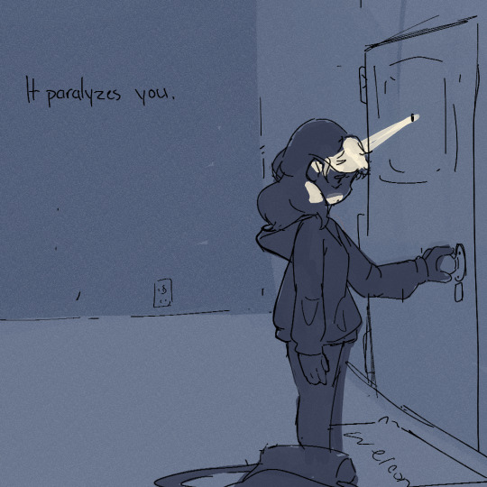
Text

Previous page - Next page (enter room)
1 note
·
View note
Text
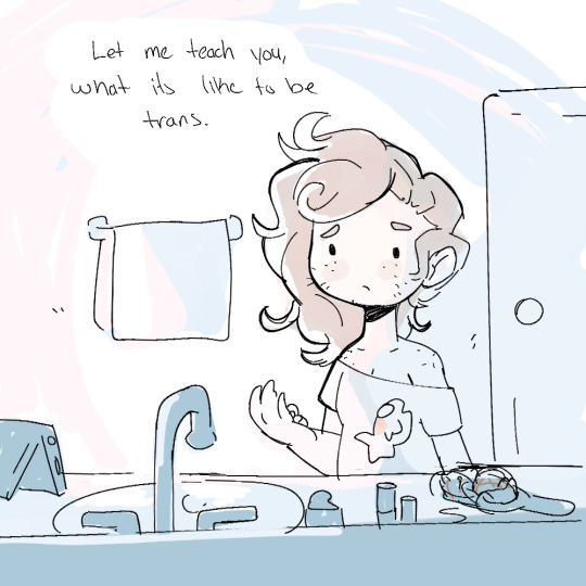

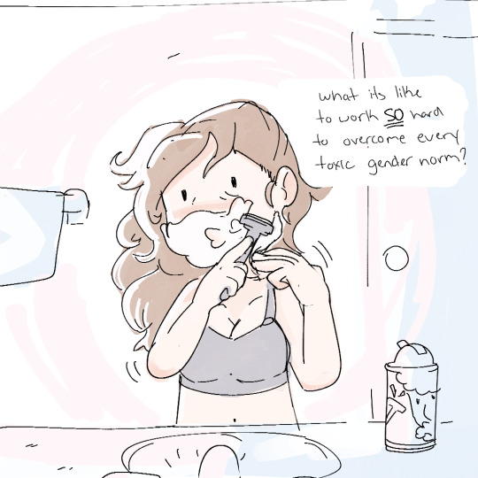

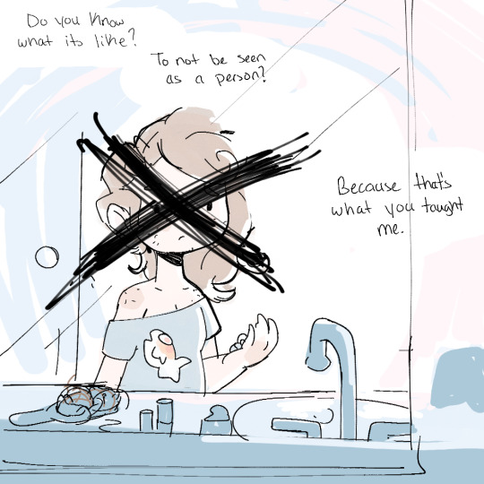
Do you know what its like to be trans?
[Comic description: A comic about being trans. Long descriptions follow.
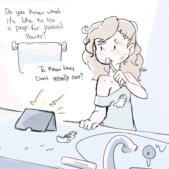
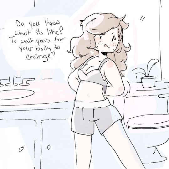
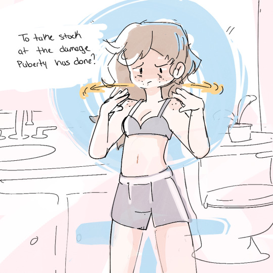
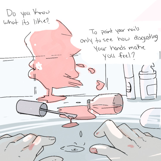
1. A light-skinned trans woman with shoulder-length brown hair stands at her bathroom sink wearing a T-shirt with a fish on it, draped so that her left shoulder hangs out. The text reads, ‘Let me teach you, what its like to be trans.’ 2. A blister pack of unlabelled pills sits next to this are two prescription bottles, one of Estrodial and one of Spironolactone, the latter of which is on its side with pills spilling out. The text reads, ‘What it’s like to spend years of waiting / For the right people to tick the box to tick the box to say your sick enough to get treatment. / Treatment to be you.’ 3. The woman brushes her teeth while looking at a tablet propped up by the sink. The text reads, ‘Do you know what its like to be a prop for political power? / To know they Dont actually care?’ The word ‘actually’ is underlined. 4. The woman sticks her tongue out in concentration as she works on the clasps of a bra behind her back. The text reads, ‘Do you know what it’s like? Do wait years for your body to change?’ 5. The woman starts shaving her cheeks and chin, which are covered in cream. The text reads, ‘What its like to work (emphasis) so (end emphasis) hard to overcome every toxic gender norm?’ 6. The woman touches her own shoulders with an unhappy expression. The text reads, ‘To take stock at the damage puberty has done?’ 7. A bottle of nail polish lies on its side dripping onto the counter. Polish has been splashed against the wall. The woman’s hands are visible in the sink, with just her right thumbnail painted. The text reads, ‘Do you know what its like? / To paint your nails only to see how disgusting your hands make you feel?’ 8. The woman bends over the sink, with her eyes shut and tears streaming down her face. The text says, ‘What its like, To do your makeup wrong / and see every feature you hate (emphasis) highlighted (end emphasis)?’
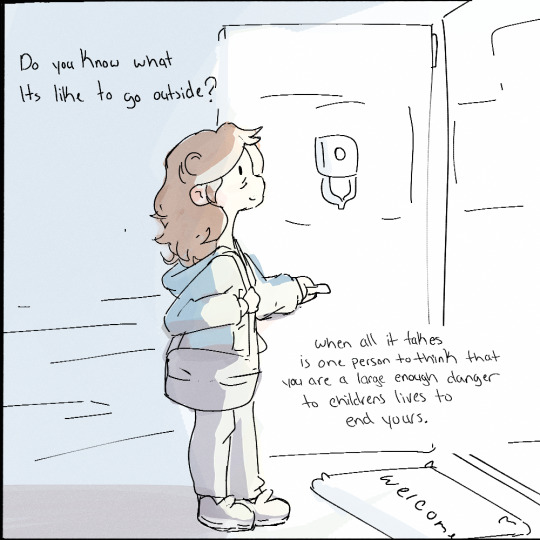
9. Fully dressed with a bag on her shoulder, the woman stands in her doorway with the door open and light streaming in. The text reads, ‘Do you Know what Its like to go outside? / When all it takes is one person to think that you are large enough danger to childrens lives to end yours.’ 10. The door is closed. A single point of light streams in from the peep hole and hits the woman’s head. She has one hand on the door and is looking down at the doorknob with a sad expression. Her bag lies on the ground beside her. The text says, ‘It paralyzes you.’
11. Back to the scene in the bathroom, similar to the first panel but mirrored and with a large black X scratched over the woman’s face. The text reads, ‘Do you Know what its like? / To not be seen as a person? / Because that’s what you taught me.’ \End descriptions]
#illustration#doodle#my art#art#oc#comics#webcomic#original art#transgender#transgirl#transisbeautiful#when im tired the bad thoughts cant be stopped#Welldrawnfishcomic
24K notes
·
View notes
Text
He has nothing on the pimps in Brooklyn, certain species grow up to 7m tall.


#Comic#Webcomic#Bad webcomic#Pimp#The streets#The biggest pimp#Like really big#At least his employees say so#Meet the pimp#Greet the pimp#Don't acknowledge his stilettos
0 notes
Photo
WHO LET YOU IN HERE? WHAT IS THAT, A HOME MOVIE?? ⚡
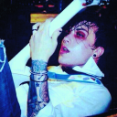
#sadako#ring#dbd#dead by daylight#the ring#the doctor#herman carter#sadako yamamura#the onryo#tv girl#((yes that is my tag for her now#((HAPPY VALENTINES DAY!#((were you expecting something romantic?? TOO BAD!#((have something paternal and wholesome instread#my art#big zappy#((sorry its been a while ive been grinding coms and my webcomic lol
4K notes
·
View notes
Text
@comicaurora art that started as a very specific au-related bit (hint: drawfing) but turned out really good?? watercolour brushes for fire effects are my new favourite
#comic aurora#aurora comic#aurora webcomic#aurora fanart#also i'm mad at myself suddenly for calling the file aurorot when tarora was RIGHT THERE. SMH#dainix aurora#dainix#e.png#digital art#originally the “sun” in his head was going to be much more stylized#but that looked bad. therefore! firey ball of gas
451 notes
·
View notes
Text
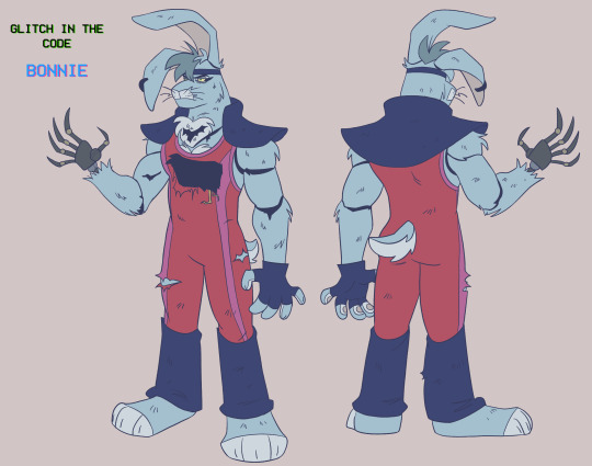
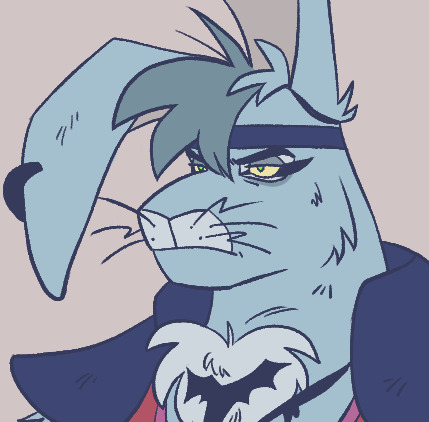
evil!bonnie ref finally !
him in his base colours and full body and what he officially look like now!
#stayed up way to late to finish it so im sorry if it looks bad KJDSFJSGD#hope you like ittt <3#art#fnaf#fnaf security breach#glamrock bonnie#evil!bonnie#fnaf au#glitch in the code webcomic
414 notes
·
View notes
Text
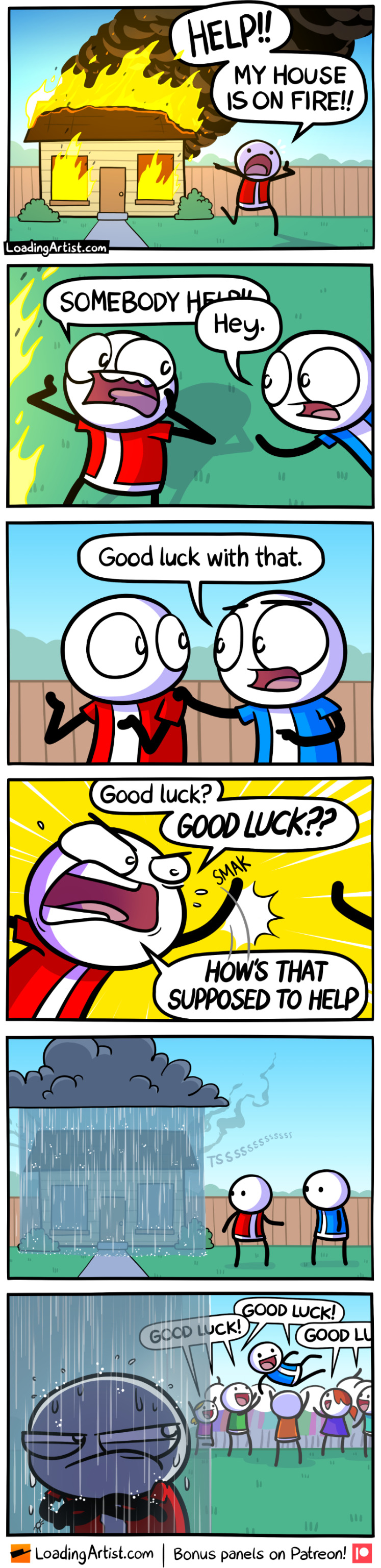
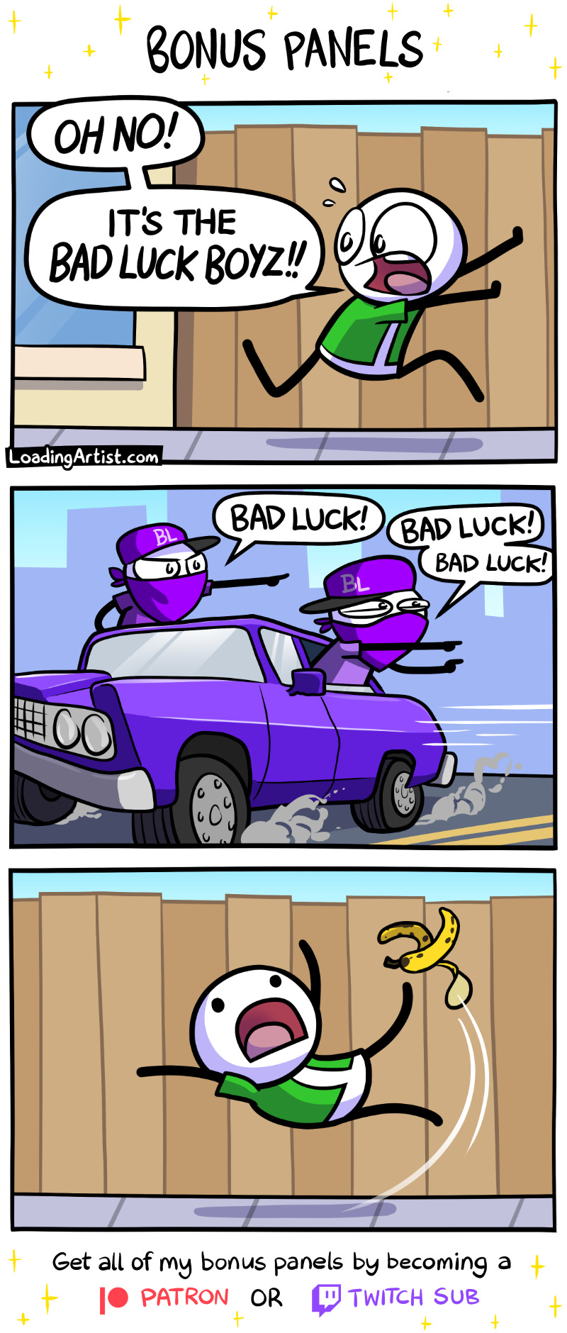
go luck yourself
Get all my other bonus panels (and my Plucked Up series) by supporting the comic on patreon ❤

#loading artist#comic#comics#webcomic#loadingartist#webcomics#bonus comic#bonus panels#good luck#bad luck boyz
948 notes
·
View notes
Text
why Aurora's art is genius
It's break for me, and I've been meaning to sit down and read the Aurora webcomic (https://comicaurora.com/, @comicaurora on Tumblr) for quite a bit. So I did that over the last few days.
And… y'know. I can't actually say "I should've read this earlier," because otherwise I would've been up at 2:30-3am when I had responsibilities in the morning and I couldn't have properly enjoyed it, but. Holy shit guys THIS COMIC.
I intended to just do a generalized "hello this is all the things I love about this story," and I wrote a paragraph or two about art style. …and then another. And another. And I realized I needed to actually reference things so I would stop being too vague. I was reading the comic on my tablet or phone, because I wanted to stay curled up in my chair, but I type at a big monitor and so I saw more details… aaaaaand it turned into its own giant-ass post.
SO. Enjoy a few thousand words of me nerding out about this insanely cool art style and how fucking gorgeous this comic is? (There are screenshots, I promise it isn't just a wall of text.) In my defense, I just spent two semesters in graphic design classes focusing on the Adobe Suite, so… I get to be a nerd about pretty things…???
All positive feedback btw! No downers here. <3
---
I cannot emphasize enough how much I love the beautiful, simple stylistic method of drawing characters and figures. It is absolutely stunning and effortless and utterly graceful—it is so hard to capture the sheer beauty and fluidity of the human form in such a fashion. Even a simple outline of a character feels dynamic! It's gorgeous!
Though I do have a love-hate relationship with this, because my artistic side looks at that lovely simplicity, goes "I CAN DO THAT!" and then I sit down and go to the paper and realize that no, in fact, I cannot do that yet, because that simplicity is born of a hell of a lot of practice and understanding of bodies and actually is really hard to do. It's a very developed style that only looks simple because the artist knows what they're doing. The human body is hard to pull off, and this comic does so beautifully and makes it look effortless.
Also: line weight line weight line weight. It's especially important in simplified shapes and figures like this, and hoo boy is it used excellently. It's especially apparent the newer the pages get—I love watching that improvement over time—but with simpler figures and lines, you get nice light lines to emphasize both smaller details, like in the draping of clothing and the curls of hair—which, hello, yes—and thicker lines to emphasize bigger and more important details and silhouettes. It's the sort of thing that's essential to most illustrations, but I wanted to make a note of it because it's so vital to this art style.
THE USE OF LAYER BLENDING MODES OH MY GODS. (...uhhh, apologies to the people who don't know what that means, it's a digital art program thing? This article explains it for beginners.)
Bear with me, I just finished my second Photoshop course, I spent months and months working on projects with this shit so I see the genius use of Screen and/or its siblings (of which there are many—if I say "Screen" here, assume I mean the entire umbrella of Screen blending modes and possibly Overlay) and go nuts, but seriously it's so clever and also fucking gorgeous:
Firstly: the use of screened-on sound effect words over an action? A "CRACK" written over a branch and then put on Screen in glowy green so that it's subtle enough that it doesn't disrupt the visual flow, but still sticks out enough to make itself heard? Little "scritches" that are transparent where they're laid on without outlines to emphasize the sound without disrupting the underlying image? FUCK YES. I haven't seen this done literally anywhere else—granted, I haven't read a massive amount of comics, but I've read enough—and it is so clever and I adore it. Examples:


Secondly: The beautiful lighting effects. The curling leaves, all the magic, the various glowing eyes, the fog, the way it's all so vividly colored but doesn't burn your eyeballs out—a balance that's way harder to achieve than you'd think—and the soft glows around them, eeeee it's so pretty so pretty SO PRETTY. Not sure if some of these are Outer/Inner Glow/Shadow layer effects or if it's entirely hand-drawn, but major kudos either way; I can see the beautiful use of blending modes and I SALUTE YOUR GENIUS.
I keep looking at some of this stuff and go "is that a layer effect or is it done by hand?" Because you can make some similar things with the Satin layer effect in Photoshop (I don't know if other programs have this? I'm gonna have to find out since I won't have access to PS for much longer ;-;) that resembles some of the swirly inner bits on some of the lit effects, but I'm not sure if it is that or not. Or you could mask over textures? There's... many ways to do it.
If done by hand: oh my gods the patience, how. If done with layer effects: really clever work that knows how to stop said effects from looking wonky, because ugh those things get temperamental. If done with a layer of texture that's been masked over: very, very good masking work. No matter the method, pretty shimmers and swirly bits inside the bigger pretty swirls!
Next: The way color contrast is used! I will never be over the glowy green-on-black Primordial Life vibes when Alinua gets dropped into that… unconscious space?? with Life, for example, and the sharp contrast of vines and crack and branches and leaves against pitch black is just visually stunning. The way the roots sink into the ground and the three-dimensional sensation of it is particularly badass here:

Friggin. How does this imply depth like that. HOW. IT'S SO FREAKING COOL.
A huge point here is also color language and use! Everybody has their own particular shade, generally matching their eyes, magic, and personality, and I adore how this is used to make it clear who's talking or who's doing an action. That was especially apparent to me with Dainix and Falst in the caves—their colors are both fairly warm, but quite distinct, and I love how this clarifies who's doing what in panels with a lot of action from both of them. There is a particular bit that stuck out to me, so I dug up the panels (see this page and the following one https://comicaurora.com/aurora/1-20-30/):

(Gods it looks even prettier now that I put it against a plain background. Also, appreciation to Falst for managing a bridal-carry midair, damn.)
The way that their colors MERGE here! And the immense attention to detail in doing so—Dainix is higher up than Falst is in the first panel, so Dainix's orange fades into Falst's orange at the base. The next panel has gold up top and orange on bottom; we can't really tell in that panel where each of them are, but that's carried over to the next panel—

—where we now see that Falst's position is raised above Dainix's due to the way he's carrying him. (Points for continuity!) And, of course, we see the little "huffs" flowing from orange to yellow over their heads (where Dainix's head is higher than Falst's) to merge the sound of their breathing, which is absurdly clever because it emphasizes to the viewer how we hear two sets of huffing overlaying each other, not one. Absolutely brilliant.
(A few other notes of appreciation to that panel: beautiful glows around them, the sparks, the jagged silhouette of the spider legs, the lovely colors that have no right to make the area around a spider corpse that pretty, the excellent texturing on the cave walls plus perspective, the way Falst's movements imply Dainix's hefty weight, the natural posing of the characters, their on-point expressions that convey exactly how fuckin terrifying everything is right now, the slight glows to their eyes, and also they're just handsome boys <3)
Next up: Rain!!!! So well done! It's subtle enough that it never ever disrupts the impact of the focal point, but evident enough you can tell! And more importantly: THE MIST OFF THE CHARACTERS. Rain does this irl, it has that little vapor that comes off you and makes that little misty effect that plays with lighting, it's so cool-looking and here it's used to such pretty effect!
One of the panel captions says something about it blurring out all the injuries on the characters but like THAT AIN'T TOO BIG OF A PROBLEM when it gets across the environmental vibes, and also that'd be how it would look in real life too so like… outside viewer's angle is the same as the characters', mostly? my point is: that's the environment!!! that's the vibes, that's the feel! It gets it across and it does so in the most pretty way possible!
And another thing re: rain, the use of it to establish perspective, particularly in panels like this—

—where we can tell we're looking down at Tynan due to the perspective on the rain and where it's pointing. Excellent. (Also, kudos for looking down and emphasizing how Tynan's losing his advantage—lovely use of visual storytelling.)
Additionally, the misting here:

We see it most heavily in the leftmost panel, where it's quite foggy as you would expect in a rainstorm, especially in an environment with a lot of heat, but it's also lightly powdered on in the following two panels and tends to follow light sources, which makes complete sense given how light bounces off particles in the air.
A major point of strength in these too is a thorough understanding of lighting, like rim lighting, the various hues and shades, and an intricate understanding of how light bounces off surfaces even when they're in shadow (we'll see a faint glow in spots where characters are half in shadow, but that's how it would work in real life, because of how light bounces around).
Bringing some of these points together: the fluidity of the lines in magic, and the way simple glowing lines are used to emphasize motion and the magic itself, is deeply clever. I'm basically pulling at random from panels and there's definitely even better examples, but here's one (see this page https://comicaurora.com/aurora/1-16-33/):

First panel, listed in numbers because these build on each other:
The tension of the lines in Tess's magic here. This works on a couple levels: first, the way she's holding her fists, as if she's pulling a rope taut.
The way there's one primary line, emphasizing the rope feeling, accompanied by smaller ones.
The additional lines starbursting around her hands, to indicate the energy crackling in her hands and how she's doing a good bit more than just holding it. (That combined with the fists suggests some tension to the magic, too.) Also the variations in brightness, a feature you'll find in actual lightning. :D Additional kudos for how the lightning sparks and breaks off the metal of the sword.
A handful of miscellaneous notes on the second panel:
The reflection of the flames in Erin's typically dark blue eyes (which bears a remarkable resemblance to Dainix, incidentally—almost a thematic sort of parallel given Erin's using the same magic Dainix specializes in?)
The flowing of fabric in the wind and associated variation in the lineart
The way Erin's tattoos interact with the fire he's pulling to his hand
The way the rain overlays some of the fainter areas of fire (attention! to! detail! hell yeah!)
I could go on. I won't because this is a lot of writing already.
Third panel gets paragraphs, not bullets:
Erin's giant-ass "FWOOM" of fire there, and the way the outline of the word is puffy-edged and gradated to feel almost three-dimensional, plus once again using Screen or a variation on it so that the stars show up in the background. All this against that stunning plume of fire, which ripples and sparks so gorgeously, and the ending "om" of the onomatopoeia is emphasized incredibly brightly against that, adding to the punch of it and making the plume feel even brighter.
Also, once again, rain helping establish perspective, especially in how it's very angular in the left side of the panel and then slowly becomes more like a point to the right to indicate it's falling directly down on the viewer. Add in the bright, beautiful glow effects, fainter but no less important black lines beneath them to emphasize the sky and smoke and the like, and the stunningly beautiful lighting and gradated glows surrounding Erin plus the lightning jagging up at him from below, and you get one hell of an impactful panel right there. (And there is definitely more in there I could break down, this is just a lot already.)
And in general: The colors in this? Incredible. The blues and purples and oranges and golds compliment so well, and it's all so rich.
Like, seriously, just throughout the whole comic, the use of gradients, blending modes, color balance and hues, all the things, all the things, it makes for the most beautiful effects and glows and such a rich environment. There's a very distinct style to this comic in its simplified backgrounds (which I recognize are done partly because it's way easier and also backgrounds are so time-consuming dear gods but lemme say this) and vivid, smoothly drawn characters; the simplicity lets them come to the front and gives room for those beautiful, richly saturated focal points, letting the stylized designs of the magic and characters shine. The use of distinct silhouettes is insanely good. Honestly, complex backgrounds might run the risk of making everything too visually busy in this case. It's just, augh, so GORGEOUS.
Another bit, take a look at this page (https://comicaurora.com/aurora/1-15-28/):

It's not quite as evident here as it is in the next page, but this one does some other fun things so I'm grabbing it. Points:
Once again, using different colors to represent different character actions. The "WHAM" of Kendal hitting the ground is caused by Dainix's force, so it's orange (and kudos for doubling the word over to add a shake effect). But we see blue layered underneath, which could be an environmental choice, but might also be because it's Kendal, whose color is blue.
And speaking off, take a look at the right-most panel on top, where Kendal grabs the spear: his motion is, again, illustrated in bright blue, versus the atmospheric screened-on orange lines that point toward him around the whole panel (I'm sure these have a name, I think they might be more of a manga thing though and the only experience I have in manga is reading a bit of Fullmetal Alchemist). Those lines emphasize the weight of the spear being shoved at him, and their color tells us Dainix is responsible for it.
One of my all-time favorite effects in this comic is the way cracks manifest across Dainix's body to represent when he starts to lose control; it is utterly gorgeous and wonderfully thematic. These are more evident in the page before and after this one, but you get a decent idea here. I love the way they glow softly, the way the fire juuuust flickers through at the start and then becomes more evident over time, and the cracks feel so realistic, like his skin is made of pottery. Additional points for how fire begins to creep into his hair.
A small detail that's generally consistent across the comic, but which I want to make note of here because you can see it pretty well: Kendal's eyes glow about the same as the jewel in his sword, mirroring his connection to said sword and calling back to how the jewel became Vash's eye temporarily and thus was once Kendal's eye. You can always see this connection (though there might be some spots where this also changes in a symbolic manner; I went through it quickly on the first time around, so I'll pay more attention when I inevitably reread this), where Kendal's always got that little shine of blue in his eyes the same as the jewel. It's a beautiful visual parallel that encourages the reader to subconsciously link them together, especially since the lines used to illustrate character movements typically mirror their eye color. It's an extension of Kendal.
Did I mention how ABSOLUTELY BEAUTIFUL the colors in this are?
Also, the mythological/legend-type scenes are illustrated in familiar style often used for that type of story, a simple and heavily symbolic two-dimensional cave-painting-like look. They are absolutely beautiful on many levels, employing simple, lovely gradients, slightly rougher and thicker lineart that is nonetheless smoothly beautiful, and working with clear silhouettes (a major strength of this art style, but also a strength in the comic overall). But in particular, I wanted to call attention to a particular thing (see this page https://comicaurora.com/aurora/1-12-4/):

The flowing symbolic lineart surrounding each character. This is actually quite consistent across characters—see also Life's typical lines and how they curl:

What's particularly interesting here is how these symbols are often similar, but not the same. Vash's lines are always smooth, clean curls, often playing off each other and echoing one another like ripples in a pond. You'd think they'd look too similar to Life's—but they don't. Life's curl like vines, and they remain connected; where one curve might echo another but exist entirely detached from each other in Vash's, Life's lines still remain wound together, because vines are continuous and don't float around. :P
Tahraim's are less continuous, often breaking up with significantly smaller bits and pieces floating around like—of course—sparks, and come to sharper points. These are also constants: we see the vines repeated over and over in Alinua's dreams of Life, and the echoing ripples of Vash are consistent wherever we encounter him. Kendal's dream of the ghost citizens of the city of Vash in the last few chapters is filled with these rippling, echoing patterns, to beautiful effect (https://comicaurora.com/aurora/1-20-14/):

They ripple and spiral, often in long, sinuous curves, with smooth elegance. It reminds me a great deal of images of space and sine waves and the like. This establishes a definite feel to these different characters and their magic. And the thing is, that's not something that had to be done—the colors are good at emphasizing who's who. But it was done, and it adds a whole other dimension to the story. Whenever you're in a deity's domain, you know whose it is no matter the color.
Regarding that shape language, I wanted to make another note, too—Vash is sometimes described as chaotic and doing what he likes, which is interesting to me, because smooth, elegant curves and the color blue aren't generally associated with chaos. So while Vash might behave like that on the surface, I'm guessing he's got a lot more going on underneath; he's probably much more intentional in his actions than you'd think at a glance, and he is certainly quite caring with his city. The other thing is that this suits Kendal perfectly. He's a paragon character; he is kind, virtuous, and self-sacrificing, and often we see him aiming to calm others and keep them safe. Blue is such a good color for him. There is… probably more to this, but I'm not deep enough in yet to say.
And here's the thing: I'm only scratching the surface. There is so much more here I'm not covering (color palettes! outfits! character design! environment! the deities! so much more!) and a lot more I can't cover, because I don't have the experience; this is me as a hobbyist artist who happened to take a couple design classes because I wanted to. The art style to this comic is so clever and creative and beautiful, though, I just had to go off about it. <3
...brownie points for getting all the way down here? Have a cookie.
#aurora comic#aurora webcomic#comicaurora#art analysis#...I hope those are the right tags???#new fandom new tagging practices to learn ig#much thanks for something to read while I try to rest my wrists. carpal tunnel BAD. (ignore that I wrote this I've got braces ok it's fine)#anyway! I HAVE. MANY MORE THOUGHTS. ON THE STORY ITSELF. THIS LOVELY STORY#also a collection of reactions to a chunk of the comic before I hit the point where I was too busy reading to write anything down#idk how to format those tho#...yeet them into one post...???#eh I usually don't go off this much these days but this seems like a smaller tight-knit fandom so... might as well help build it?#and I have a little more time thanks to break so#oh yes also shoutout to my insanely awesome professor for teaching me all the technical stuff from this he is LOVELY#made an incredibly complex program into something comprehensible <3#synapse talks
743 notes
·
View notes
Text
I'm crying right now
So we have Eulalie, looking gently at a doll with a damaged eye and smiling sweetly, before saying those lines :
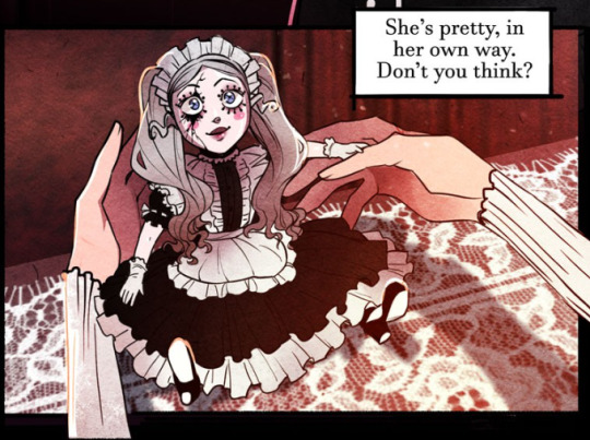
And right after, we have the look on Pluto's face, who is eternally trying to hide his injured eye behind his strand of hair :

Yes Pluto. You're pretty in your own way. *sobs*
#read this episode for the hundredth time and noticed this little detail#i'm really not joking when i say i almost started crying#my boy you're so cute so perfect so aaaaaaah <3333#not a fan of the ship about them two because i don't like shipping him with anyone#but i feel like he needed to hear that line#like he needed it so so bad#pluto nevermore#nevermore webtoon#nevermore webcomic#whispers from atlantis
641 notes
·
View notes
Text
I made a dumb little April fools day comic


(Dukes text reads: a traitor of the worst kind)

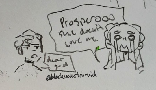
Poor Prospero hes gonna be her therapist.
#Dw annabel she doesn't mean it#Lenore is bad at lying#nevermore webtoon#annabel lee nevermore#annabel lee whitlock#lenore nevermore#lenore vandernacht#nevermore webcomic#lennabel#white raven#april fool's day#my art
255 notes
·
View notes
Text
Wishes and Tree of Life
by Zummeng
Two equally...bad, ongoing fantasy comics by the same artist. Wishes is a meandering erotic comic about a djinn and a theif hooking up. Not sure if that's really all that readily available since I believe a lot is locked behind Patreon(?) I've not delved into it at all beyond some skimming, and it looks dumb.
Tree of Life is the more interesting one about a dying fantasy world being threatened by a corruption, and a band of misfits being chosen as new guardian knights to stop it. You know it's bad when the supposed Big Good of this comic supernaturally blinds a guy for trying to grab a knight's sash, tosses him in jail, then decides to make him a knight anyway the following day...
All chapters of Wishes are actually on the same suspicious site as Monster Girl Academy chapters so riffing them won't be a problem. Tree of Life is already on the rifflist and it's a real shame because the Tree's design looks very good.
#bad webcomic#weird webcomic#furry webcomic#not exactly safe for work#submission#antisubmission#edit
7 notes
·
View notes
Text

Positive vibes/longitudes only
Bad Map Projection: ABS(Longitude) [Explained]
#xkcd#xkcd 2807#bad map projection: abs(longitude)#map projections#bad map projections#maps#longitude#positive vibes#webcomics
665 notes
·
View notes
Text
I don't want to reblog it because there are so many bad takes on it but there's a post in my for you quoting a tweet that says 'I'm an ally, but gay people make a lot of really bad webcomics. Not my business but you should figure this out internally probably'
counterpoint: bad webcomics are the backbone of society, let people cook.
#let people be bad at things!!!#I thought we had this settled already#especially marginalised creators haven't we seen enough shitty steven universe takes to have learned this lesson#AND webcomics are one of the last low barrier to entry art hobbies#grr.#I don't have a tag for this#guerrilla takesblogging
263 notes
·
View notes
Text

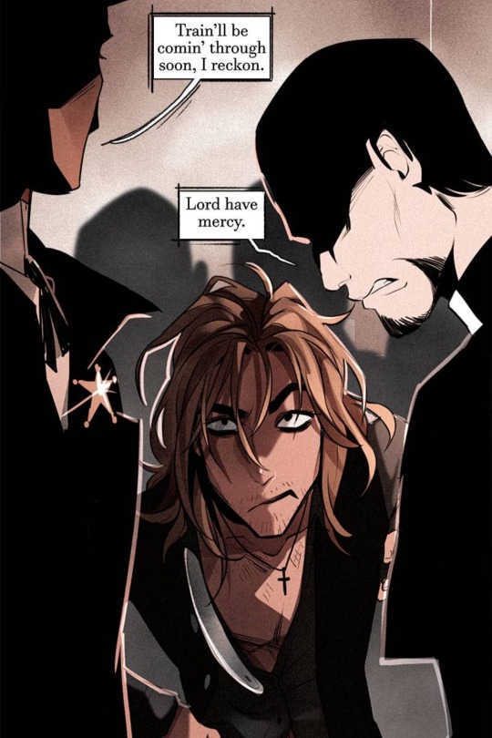
ik they use it as a metaphor, but let's not forget about our og tied-to-the-tracks damsel ☝
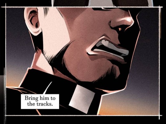
#too bad no one wanted to save him tho#nevermore webtoon#montresor nevermore#nevermore montressor#nevermore webcomic#can you tell i like the word damsel a lot
174 notes
·
View notes
Last Seen Blogs
rechererdureveperdu
searching for lost dreams
c-assssie
✨🦂🖤✨
auntylover756
Bhabi lover

joseadtr
JOSEADTR95
idiotmaggot
just an idiot killjoy xd