#map projections
Explore tagged Tumblr posts
Visit Tumblr Blog
Explore Tumblr blogs with no restrictions, modern design and the best experience.
Last Seen Tumblr Blogs


Fun Fact
Tumblr was named as a finalist in Lead411’s New York City Hot 125 in Aug 2010.
Text

Although Kansas is widely thought to contain the geographic center of the contiguous 48 states, topologists now believe that it's actually their outer edge.
Bad Map Projection Exterior Kansas [Explained]
Transcript
[A distorted map of the contiguous United States with the states labeled, where the Atlantic and Pacific coasts and the Canadian and Mexican borders are located closest to the center, with there being a gray void in the middle of the map, while the central U.S. states are distributed in the edges of the panel, with Kansas being in all of the four corners of the map.]
[Caption below the panel:] Bad Map Projection #45: Exterior Kansas
1K notes
·
View notes
Text
I am not particularly interested in the whole “Americans are bad at geography” discussion, but I do just want to ask why the fuck they did that to the map??? It's in pain, you're hurting it, please reproject it with a new centre before it gives up the ghost. You can't just chop the left hand side of a projection off and stick it to the right.
55 notes
·
View notes
Text

As Elon Musk struggles with the concept of round Earth, some people still consider him a tech/science genius
6 notes
·
View notes
Note
Apologies, as this is only tangentially related to what you're talking about, but people overuse the (normal) Mercator projection far too much. It became the standard for navigation because it is the only map to show north as always up and south as always down while also preserving local directions and shapes. It maps rhumb lines to straight lines, which makes it amazing for marine navigation. However, it is one of the worst projections for general world maps! In it Africa and Greenland are of comparable size, but in reality Africa is approximately 14 times larger! The distortion is so great, that it tends to only show the earth from 85°S and 85°N. This is because to show the full earth the map would need to be INFINITELY TALL!!!!!! Mercator himself used the sinusoidal projection for area. There is a time and a place for the Mercator projection, but it is not fucking general use
100% all of this. I deeply detest mercator
58 notes
·
View notes
Text

The Spilhaus Projection. In 1942, Athelstan Spilhaus produced a world map with a unique perspective, presenting the world's oceans as one body of water
8 notes
·
View notes
Text
The Dymaxion map projection is created by projecting the globe onto a d20 and unfolding it in a particular way. It was created by Buckminster Fuller in 1954.
Instead of working this evening, I spent the night finding the best way to remap the standard d20 number layout back onto the map in a way that rewards the best places and gratifyingly hates on the bad ones.
It took a few attempts but I now feel privileged to unveil to you the totally objective and ideal d20 map of the world.

#d20#dnd#maps#sorry britain try being less conquery next time#dymaxion#new zealand carrying#be better america#good job canada dont get cocky#map projections#adhd#indian ocean moment
3 notes
·
View notes
Text
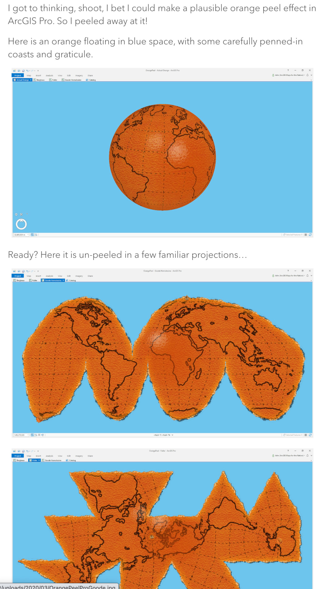
Downloadable Earth Peel project in ArcGIS Pro :)
0 notes
Text

Positive vibes/longitudes only
Bad Map Projection: ABS(Longitude) [Explained]
#xkcd#xkcd 2807#bad map projection: abs(longitude)#map projections#bad map projections#maps#longitude#positive vibes#webcomics
671 notes
·
View notes
Text
Watch on Youtube
Song- Dr. Sunshine is Dead by Will Wood
It is done!
Thank you all these wonderful people for being apart of this and working so hard on it!
Part 1: Me! Hello! Part 2: @kibbits Part 3: @piixelpaint Part 4: @nebuladreamz Part 5: @smoljeanius Part 6: @garbagechocolate Part 7: @garbagechocolate Part 8: @amberluvsbugs Part 9: @cookiiemancer Part 10: @cloudyvoid Part 11: @skizabaa Part 12: @circleheadd Part 13: @gopsnippers Part 14: @just-a-drawing-bean Part 15: @nosleepygayy Part 16: @soupdweller
Go send them some love if you love the MAP!
#dca animators project#fnaf daycare attendent#daycare attendant#sundrop#moondrop#fnaf sun#fnaf moon#fnaf eclipse#eclipse#five nights at freddy's#fnaf#dca map#daycare attendant map#mulitple animators project#daycare attendant multiple animators project#so many secrets to find#will wood
6K notes
·
View notes
Photo
Here's a system that's becoming more energetic...
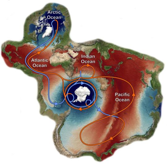
Map of the world in the Spilhaus projection with the interconnected global ocean as the main focus, centered around Antarctica. It includes arrows of the global currents and sea surface temperature & velocity.
by huwiceandstuff/bluesky
2K notes
·
View notes
Text
Here's what I've been up to lately! Three years after I created the original version, here's a revamp of the first planet I mapped out for @jayrockin's "Runaway to the Stars" project, the homeworld of their Centaur aliens. This post covers Phase One: Geology.


Firstly, the Equirectangular elevation maps with and without the color gradient layer, and tectonic plate map. This color gradient marks sea level, of course, and while there are inland areas that are *also* below that elevation, I have yet to determine which of those basins have lakes and seas therein, and how their shorelines compare; *that* will be seen once I figure out the climate : ) As for the Plate map, most of the smaller, oblong plates without any rift boundaries represent island chains or continent fragments that accreted onto larger landmasses; discretely marking those was helpful for placing and shaping the mountain ranges.


Next, the Poles-Centered Perspective maps, made possible with Photopea's Polar Coordinates tool. The planet's Southern hemisphere, centered on the south pole, is seen at left, and its Northern hemisphere is seen at right. Like the previous set of three, this set includes the color elevation map, greyscale elevation map, and solid color tectonic plates.


Last of all, the basis for the planet's current appearance: it's tectonic history! These gifs, in six frames, cover about 200 million years of continental drift, starting with the breakup of two Supercontinents, and was primarily achieved in Blender. This isn't my first time trying to reconstruct a tectonic history, but it *is* my first time doing so this quickly and efficiently, thanks to the process I developed here using this planet's continents as a test case.
There will be more phases in this project completed and shared in the coming months, thanks for checking out this one! Also, I've already shared these maps on Reddit, where you should be able to see them in even higher resolution. Photopea and Blender, 2025
#mapmaking#imaginary maps#photopea#blender#elevation maps#equirectangular projection#poles-centered perspective#rtts centaurs#fictional planets#runaway to the stars#worldbuilding#world map#imaginary plate tectonics#tectonic history sequence#physical geography#long term project#commissioned mapmaking#Christopher Maida Artwork
631 notes
·
View notes
Text
- DIE TOTENINSEL -
Usually I don't like posting my parts for animation projects on their own, but I think that with the audio changed this one stands pretty well on their own.
#Confession time: this was supposed to be fully animated#but I had a deadline and I ran out of time#i still think it looks pretty nice tho#Also when I mean “animation projects”#most of the time I'm talking about Multiple Animators Projects (MAP)#but I can't just say MAPs because sadly that acronyms also has terrible connotations out of the context the YT animation community uses it#oh well#signalis#signalis fanart#elster signalis#lstr#ariane yeong#my art#animation#(... mostly at least)
983 notes
·
View notes
Text

the narcissist fools himself
#IM GETTING A BAD GRADE IN POLYSHO WEEK WHICH IS NORMAL TO FEAR AND POSSIBLE TO ACHIEVE.#project sekai#pjsk#prsk#proseka#polysho#polysho week 2024#tsukasa tenma#emu otori#nene kusanagi#rui kamishiro#domt scroll dowm to when i pisted the sketch a year ago actually. should i delete that#Nah who give a fuck#They dont need to know that i drew this over a year ago and touched it up c all of my other drawings for this theme sre too ambitious#I cant draw a fucking merrygoround. Who am i kidding.#I posted this now so i can stop adding minute gradient maps to it for a 0.2 percent color difference. must sleep. farewell.#more polysho week to come. the day 5 prompt.. well. heh#also FUCK i want to do day 4 too bc i love the yokai theme but thats Today and i AAAAAHG ok stop itz GOONIGHT.#funny drawing for the guy that turned romeo and juliet into fortnite. stop crying and hop on duos
1K notes
·
View notes
Text
i dont usually post my map parts here but i spent like 4 months on this shit and im really proud of it lol
here's it on yt if you'd like
also PLEASE if youre interested in animating utmv PLEASE join the map we got a couple of parts still open and itll be really cool if it got finished
Map part for @thetroubledpencil
#i do not envy jakei at all this shit was obnoxious#surprisingly ink was the worst#hes too detailed lol#undertale#undertale au#inktale#errortale#ink sans#error sans#animation#map part#multi animator project#art#my art#battle animation#errorink#errink#errink qpr#sansshipping#mirrorshipping
554 notes
·
View notes
Text
my part for the hayloft ii artificer map :]
#rain world#rain world downpour#rw artificer#fanart#my art#animation#multi-animator project#map part#the artificer#slugcat#five pebbles#iterator#2024#video#undescribed#road untraveled (oc)
1K notes
·
View notes
Text
OP has already pointed this out numerous times in the replies and reblogs but Mercator Projection is not used because the kind of distortion it creates is seen as morally superior, it's used because it makes certain kinds of math easier.
This includes Rhumb Lines (i.e. if you draw a straight line between two points on a Mercator Projection map and then measure the angle from that line to the latitude longitude lines you can theoretically find that direction on a compass at the first point, go in that direction and reach the second one even if it's not the shortest distance). This is extremely useful for navigation without computers.
However for navigation with computers, it's still very useful because of a related property: while the shapes of very large things are distorted, it shows the shapes pretty accurately for small areas at most latitudes: e.g. North America or Asia are both heavily distorted, but if you look at, say, Borneo and Iceland on a Mercator map, they're both approximately the right shape, the projection just makes Iceland look almost as big as Borneo. This is very convenient for making a computerized map system like Google Maps that you can freely zoom in and out on to almost any scale, which is why most map websites / softwares use a variant called Web Mercator, which I think is just Mercator that doesn't bother accounting for the Earth being not quite spherical.
There's some other "Makes the math easier" projections too, like Equirectangular, which, as Randall Munroe puts it, maps X and Y to latitude and longitude, or Azimuthal Projections, which preserve direction and distance to a specific point.
Other map projections are used plenty, especially for things like infographic maps showing the entire world, which Mercator isn't very good for. This is where the controversy really happens: if you're making a map of something like the geographic distribution of Tumblr posts arguing about map projections, the map's primary job is to "look right" and "look fair," which means the most important things are subjective, which means there's room to fight over why your favorite projection is better. Some of the more commonly used ones include:
Equal Area Projections: these show the relative sizes of things correctly but have a lot of shape distortion.
Cylindrical ones have the same amount of distortion at any given latitude, but they have only one latitude (positive and negative) where shapes aren't distorted (the standard parallel). Everything near the poles is both squashed vertically and stretched horizontally to make the map fit a rectangle while keeping area the same, and if the standard parallel isn't zero anything closer to the equator than the standard parallel is stretched vertically. The Gall-Peters Projection puts its standard parallel at 45 degrees, and has been promoted for reasons of avoiding Eurocentrism, but ironically while it may avoid making Europe look bigger but ironically Southern Europe and the northern US / Southern Canada have their shapes preserved most accurately while equatorial countries get vertically stretched.
The Mollweide Projection avoids the vertical squishing/stretching problem by making the map an ellipse that gets narrower in proportion to the shrinking circumference of a latitude circle as you get closer to the poles. The downside is this makes the choice of the central longitude line much more important: areas near the central meridian are close to their true shape even near the poles but ones far from it get heavily distorted: with the Greenwich Meriddian in the center, Greenland and Iceland look fine but Alaska and New Zealand look horrible.
Some equal area projections try to make the shape distortion less bad by compromising between some vertical compression at the poles and some horizontal compression compared to an equirectangular projection. This includes the Eckert IV and Equal Earth Projections. There's also other ones with wonky shapes.
Perspective Projections (including Orthographic) are basically just "draw a picture of a globe." They inherently can only show half the world (for Orthographic) or less (for any other perspective projection) and some of that is heavily distorted, so you need multiple maps for a whole world map.
Polar Azimuthal Projections: the favorite projections of the UN and the Flat Earth Society. Centered on the one pole, shows the region near that pole well, regions near the equator with heavy distortion, and regions past the equator with REALLY heavy distortion unless you stop the map at the equator and include another one for the other hemisphere.
Compromise Projections: not to be confused with the equal area compromise ones: these don't preserve area OR shape but try to compromise between them so it looks okay to everyone. You've probably seen these a lot. Popular ones include the Robinson Projection, Kavrayskiy VII Projection, Winkel Tripel Projection, and Natural Earth Projection.
Projections With Splits: I'm lumping together polygonal projections like the Dymaxion and various ones named "Butterfly" with the Goode Homolosine because they have a similar philosophy of keeping the shapes of the continents as accurate as possible and going "fuck the oceans" and splitting the map apart in the middle of them to avoid stretching and deforming anything too much: if you imagine unwrapping a sheet of material covering the globe, the other projections only cut it in one place and otherwise stretch and squash it, whereas these tear or cut it until it lays approximately flat.
As for the "Northern Hemisphere on top vs Southern Hemisphere on top" debate: the Prime Meridian being in Europe is Eurocentrism, but North being on top is like... the Northern Hemisphere objectively has the majority of the land and the vast majority of the people, including most of the "Global South," and most of the rest is still pretty close to the equator. I think almost 90% of humanity lives north of the equator and by my back of the envelope math around 97-98% of people live north of the Tropic of Capricorn.
(and as always there's a relevant XKCD: 977)
maps being "misleading" about the size of countries and continents is not a global conspiracy to make you think western countries are more important (bc size = importance obvs), it's because you can't accurately depict a sphere in 2d. it's literally not that deep.
843 notes
·
View notes