#but also be used as an example in their pattern's background checks
Note
Question! I have been getting into DC comics cuz of dpxdc, and I saw your tags on frank Miller on a recent post. One of my irl friends told me to read the dark knight returns and while it was occasionally hard to follow I assumed that was a result of when it was written rather than who wrote it? But I did overall enjoy it.
I guess what I'm asking is why you say frank Miller is a bad writer when it seems like the dark knight returns was so acclaimed?
(I saw the nazi thing too but that's something I can google so while it's news to me it's not my main question)
ok so. A lot of this is my personal opinion and I'm not too equipped to say shit about this because I'm not very political but I'm going to give it my best shot.
Put under a cut so folks who don't want to hear about comic ranting can simply scroll past
I’m just gonna write a quick thing for the Nazi stuff, He isn't exactly a Nazi but boy oh boY does he set off many warning flags. Frank Miller is also the writer of the comic 300, if that sounds familiar that's because the movie you're probably thinking of is indeed based off these comics. The Spartan's ideology helped create the baselines of Fascism. Fascism is a pretty leading cause of commentary in Frank Millers work. In Batman: The Dark Knight he is a fascist. In Hard Boiled there's swastikas in the background every so often. (I even went back to reread it just to make sure and yep. they definitely were there) In 300 there's a shitton of Fascism... I could go on but still. His comics are incredibly gorey, have a discussion about a world gone wrong that can only be changed using force and weaponry (the whole Dark Knight "I am a surgeon" monologue for example), and the fact that he has Fascism as the main point of nearly all of the comics he's written... it doesn't sit right with me and it's a consistent pattern.
Now, onto the bad writing.
I must firstly preface that these are my own opinions and that I didn't grow up reading Frank Miller's work. I think he was a good writer but isn't one anymore. His writing did incredible things for DC and you can see his influence in Batman even today. Works I've read and enjoyed of his are: Daredevil, Batman Year One, and Dark Knight. Nowadays you'll see many folks like myself talk about how Frank Miller has fallen off the deep end.
A vast majority of Frank Miller's comics have reoccurring themes: politics, fascism, extreme violence, and so so much weaponry. Politics is in every comic book. There is no unpolitical comic, there ARE comics that are batshit wild with their politics and that's what I'm talking about. I'll get back to this later.
He wrote many good comics, ones that first come to mind are Daredevil , Wolverine, Batman: Dark Knight, Batman: Year One, Sin City, Ronin, and 300. All of these comics are still credited by folks as amazing comics and hell, I recommend folks to read them go and check them out.
Then 9/11 happened. That along with rampant alcoholism.
Those reoccurring themes I mentioned? They become exponentially more blatant in his works. Especially on the political angle.
You can see the difference between his works from pre and post 9/11. If you read Dark Knight and Dark Knight 2 back to back. It's night and day.
He even made a comic during the post 9/11 panic called Holy Terror. The comic's title was originally pitched as Holy Terror, Batman! with the Gotham hero himself as the main character but it swiftly denied by DC, denied being published by DC, and changed to what it is now. The basic plot of this comic: A Vigilante named The Fixer fights Al-Qaeda after attacking Empire City.
He doesn't even mention the word Al-Qaeda until 80 pages into a 150 page comic. The comic is some INCREDIBLY blatant post 9/11 propaganda that's ridiculously Islamophobic and anti-muslim. That isn't even my opinion, Frank Miller has said that's what this comic was. It is scattered with a ridiculous amount of hate speech written by a hate fueled man in 2007.
Now onto comics that you'd more likely read. All Star Batman and Robin (2005). Oh boy.
Let's compare shall we?
Batman Dark Knight Returns (1986)
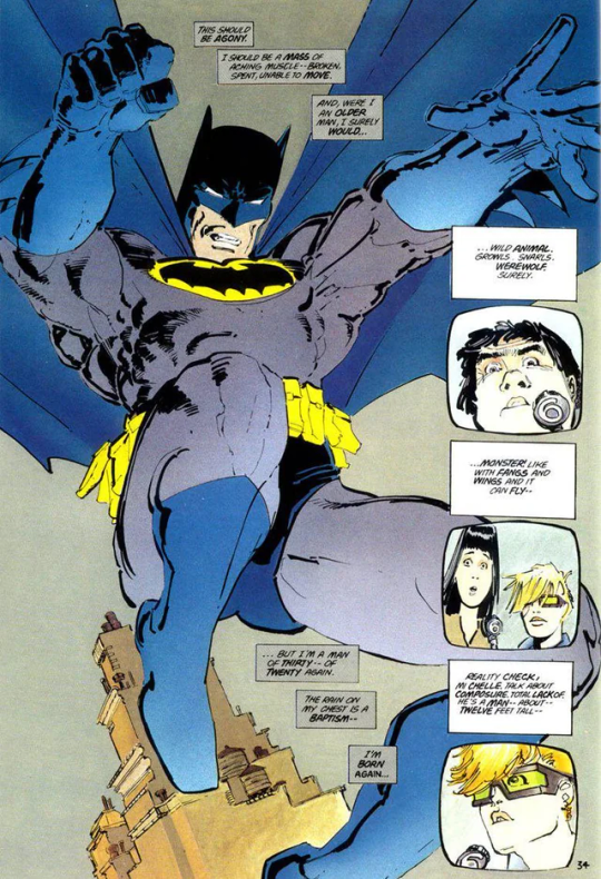
All Star Batman & Robin, The Boy Wonder #1 (2005)
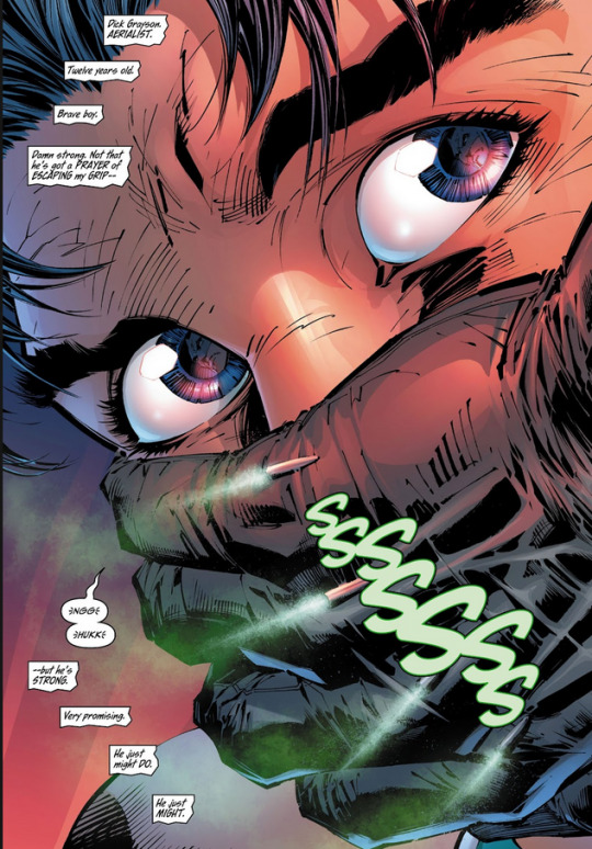
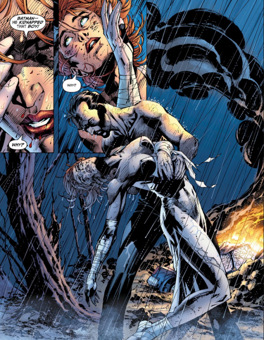
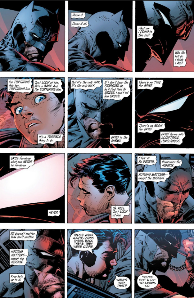
mind you this is as Dick is being driven to GCPD for questioning RIGHT AFTER HIS PARENTS DIED. He gets kidnapped by Bruce out of the police car. Not calmed in his arms after the murder and brought to the manor. Kidnapped.
All Star Batman & Robin, The Boy Wonder #2 (2005)
( a brief intermission of this sickass pose of a shirtless Alfred Pennyworth comforting Vicky Vale)
now back to the kidnapping:


[Skipping Bruce getting chased by the GCPD, Jumping the Batmobile ONTOP of a GCPD car, and laughing and talking to his car all the while Dick is absolutely terrified. They then use boosters that propel the Batmobile into the sky.]
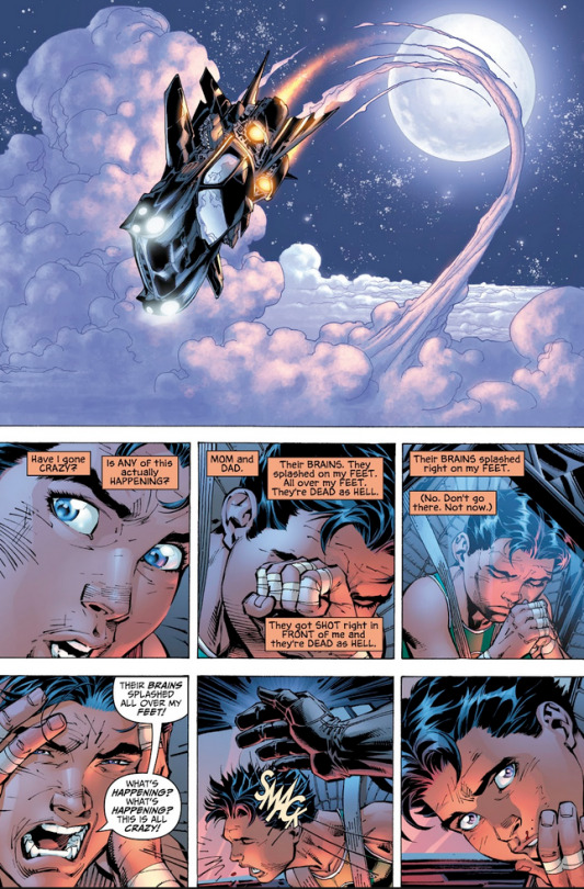
Smashcut to #4 where they actually enter the Batcave.
I don't even think I need to explain myself. This is Spider-Man: One More Day levels of mischaracterization. Like seriously. Bruce kidnapping Dick after his parents were killed? Calling him a retard and hitting him during the aftermath (we can go on about how in 2005, the r slur was used commonly but this was just out of pocket), Leaving him in the cold batcave and told to eat rats?
Frank Miller used to write some incredible works. Nowadays his writing is as decent as Rob Liefeld's art.
#bones speaks#dc comics#bones comics#bones replies#genuinely some of the worst Batman characterization I’ve ever seen
117 notes
·
View notes
Text
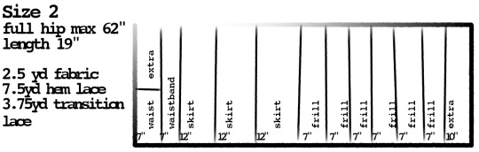
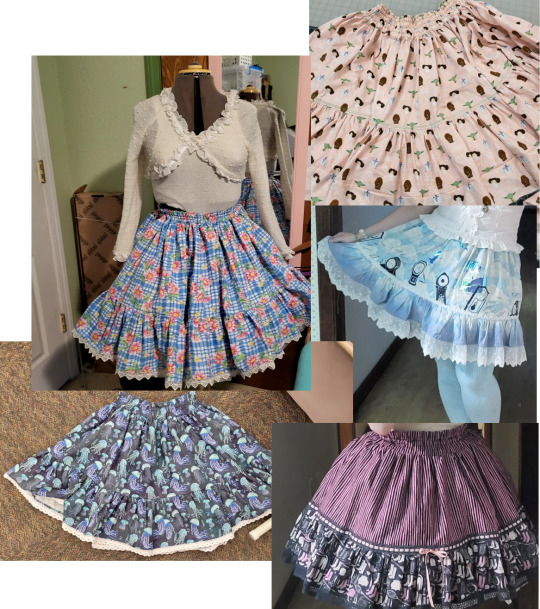
Frill Skirt Tutorial
Here's a tutorial for making a lolita skirt with a fully elastic waistband.
Recommended background reading:
How to pick quilt prints for use in lolita fashion.
And here's some things I've previously said about this project.

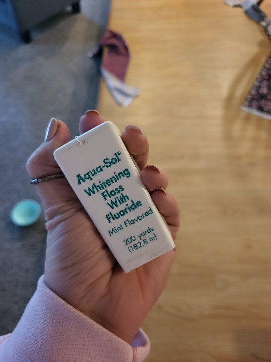
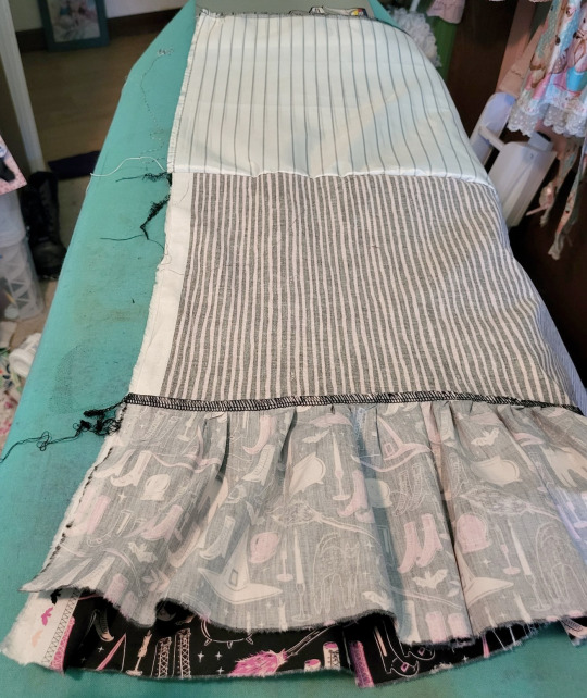
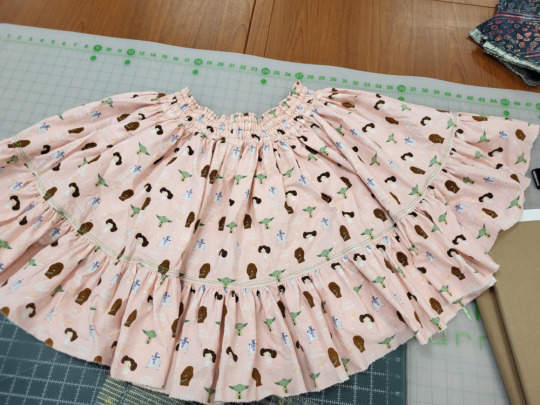
We're going to make some skirts that look like this. This is a really fun project because you can use a lot of quilt prints, and fully elastic skirts are comfortable and flexible wardrobe pieces.
In this skirt, my pink striped fabric is "Skirt", and the navy with the shoes is "frill". The black lace at the bottom of the skirt is the hem lace, and the lace with the pink ribbon is the transition lace.
You can use the same fabric for the frill and the skirt, making it look more like the skirts referenced above. If you use different fabric for the frill and the skirt, it's is a little bit like faking a border print.
Here's some cutting dimensions. Please excuse the fact that I forgot to turn off "emulate brush dynamics".
Because this is elastic, we're going to be basing the sizes off how much fabric you cut. When you're working with a big, gathered rectangle, you have a lot of options for how much ease you're going to put in the garment.
I forgot to list it, but these skirts really look better when they're lined with a slippery lining fabric. For lining, you just need the "skirt" measurement. For size 1, you need 23" of lining, or 2/3 of a yard.
For size 2, you're going to want 36" of lining, or one yard.
All these sizes include some fabric for extra things like bows and hair accessories. I highly, HIGHLY recommend getting into the habit of making matching accessories as part of the project of making a lolita garment. You're going to need them anyway, so they might as well match.

For size 3, you will want 40" of lining fabric, or 1 + 1/8 yards.
All of these sizes assume that you're using 45" wide fabric. If you're using 60" fabric, you can likely go down a size. (This would be max hip of 52" for size 1, 82" for size 2, and 172" for size 3).
For any view, you will also need enough 1/4" or 3/8" elastic to go around your natural waist (or wherever you wear your skirt) about 4 times. Let's be honest, we all have a massive roll of 1/4" elastic hanging around from making covid masks, so let's use it up.
These skirts are a little bit on the shorter side, because that's just how Meta releases them. Since you're the one making the skirt, you can make some decisions. If you're tall, want to wear a fuller petticoat, or are building a skirt for a substyle where you usually want a longer skirt, you can add a few inches. You'll get a slightly different look if you're lengthening the skirt versus lengthening the frill, versus lengthening both equally. If you're not sure, now's a good time to check out lolibrary and look for dresses and skirts and see where they place the details around the hem. Lolibrary lets you search by brand, so search by brand and just take a note of what you see most often in pieces that you like.

For example, Alice and the Pirates often has the hem detail to be pretty close to the hem on their solid pieces, while Baby the Stars Shine Bright will have the detail going up quite a bit higher. (Please do more than the 10 seconds of searching that I did to get these examples). Therefore, if you want to lengthen the skirt and have a slightly more AatP tone, you can add the length to the skirt part of the skirt, and if you want a slightly more BtSSB tone, you can add the length to the frill part.
Researching your garments is the secret to having handmade garments that actually read as lolita fashion. Lolita fashion history is documented to an extent that no other fashion I've ever heard of is, and it really helps to take advantage of that extraordinary resource.
With our pattern ready and maybe lightly adjusted, let's get to work:
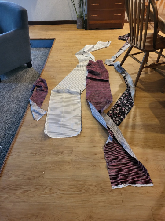
Foundational fact #1: fabric that rips will rip in a straight line along the grain of the fabric. Our skirt is made entirely of rectangles, so we're going to take advantage of that fact. If you want to cut your fabric with scissors, or with a rotary cutter, you're completely allowed to. If you don't have a serger with a functional cutting blade, you might want to cut it so that you don't need to trim the edges. I have a serger and I like to rip it. It might not be the best way, but it's how I've been making my lolita skirts since 2011, and I don't like change and I do like the stress-relieving experience of ripping.

So, lay your fabric out, and mark your cutting lines. If you're ripping the fabric, like I am, you just need to cut a little snip to get the tearing started.
This pattern factors in a half inch for seam allowance. If you're ripping the fabric, you will lose a little bit of usable fabric, so add yourself an extra inch to each cut.

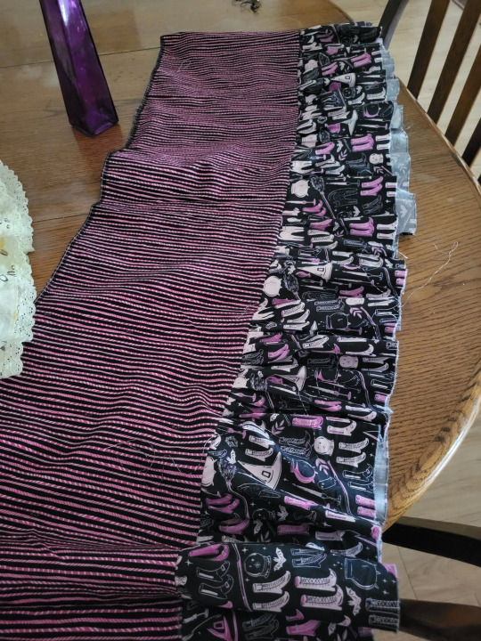
Take your nice straight cuts/rips and lay them out in an organized fashion. You should have a frill pile, a skirt pile, a waistband pile, and an extra pile. If you like piles, you can also pile up your lace next to it.
You're going to sew every pile together so that you have each it its own long strip. Your lining (white fabric) should be the same size as your skirt piece. If it's longer (if you're using 45" quilt fabric for the face and 60" lining fabric for the lining), go ahead and trim them so they're the same total length in the long dimension.
Put the skirt on top of your lining and sew the top edges together.
You'll notice that this skirt is made up in doubles. The skirt is twice the long dimension as the waistband, and the frill is twice the long dimension of the skirt. This makes things easy to gather up.
If you're not using an overlocker to assemble this skirt, you will also want to run some kind of seam finish on the long ends of this skirt, to stop fraying.
(please pardon my hypermobile thumb)
A lot of people do gathering stitches by sewing two lines of basting stitches, and then pulling the thread on those stitches to cinch up the gathers. This does work really well on small things. However, as the amount that you need to gather gets longer and longer, it's gets more and more difficult to pull those threads without them breaking. Instead, I like using an applied gathering string. My current favorite string is waxed dental floss. Most dentists recommend unwaxed floss since it grabs more plaque, so make the smart decision and retire your waxed floss to be in your sewing box.

If you are making this project on a serger or an overlocker (and this is a GREAT first serger project), you can overlock over the dental floss. Here you can see the white floss going between the two needles. The needles are not going through the floss, just on either side of it. Tip: that little hole in the front of the presser foot is actually intended for you to put elastic or thread through so you don't need to hold it as carefully. I forgot and so I didn't do that here).
We're applying the dental floss onto the top edge of the ruffle.

If you aren't using an overlocker, you can do some form of hem finish (my favorite is the 3-step zigzag) and then apply the dental floss by doing a zigzag over it. Again, the needle isn't going through the floor, just on either side of it.

Now, pin your ruffle onto your skirt. I divide the ruffle and skirt up into equal portions, and then pin it first. My ruffle is twice the long measure as the skirt is, and they're both cut out of the same width of fabric. This means that dividing the ruffle up is pretty easy, because I can use the seams of the ruffle. The first seam in my ruffle goes halfway between the edge of the skirt and its first seam. The second seam of my ruffle goes on the first seam of my skirt, and so on.
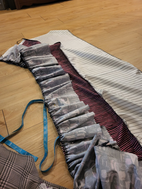
Then, you just pull your dental floss so that it gathers up the fabric, and pin it down. Since we divided the fabric up earlier, we don't need to spend as much fight getting all the ruffles to be even. Go ahead and pin everything down, and then sew it together.
Now you're going to fold the skirt and lining in half to seam it all together. Match up your seams, and unfold your lining (see picture). This will let you sew the frill, the skirt, and the lining all together in one go.
The easiest time to put the hem and transition laces on is before you attach the waistband. The basic rule with gathered skirts is that it's a lot easier to apply anything flat that you can before you gather it.
In a lot of older lolita tutorials, a lot of people treated lace as optional. However, now that it's not 2007 anymore, we have a bit more of an expectation for detail in the garments we wear. Quilt cotton especially has a very flat texture, even when it has a nice print. If you can add a bit of texture and detail, you want to do so. If you're doing the skirt and the ruffle out of the same fabric, you can probably get away without using the transition lace, but you will still want hem lace.
I didn't have any lace when I was making this one, so I used a couple of lines of decorative topstitching between the skirt and the frill. I got the idea from this blog post from 2010. I didn't execute it as well as Lolita Noveau did, but that was the general concept.
Anyway, waistband time.

Take the edges of your waistband and press them in. You don't need to apply a seam finish before you do this. I have overlocking on mine because I ripped my fabric, and used the serger to clean up the edge. If you don't rip your fabric like a savage and use technology like scissors instead, you don't have that problem.

Fold your waistband in half. It's now time to sew the elastic channels.
Here's the secret to this waistband. Start out by stitching a line about 3/16" away from the fold in your waistband.
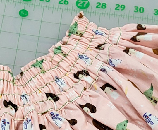
When you put your elastic in, this little line of stitching makes your waistband stay on straight, and adds a tiny ruffle to the top. I picked this up from the Metamorphose frill skirts, and it's amazing.
After you've made that line of stitching, start making channels for your elastic. Add about 1/8" of width from the width of your elastic (so 1/4" elastic, sew your channels at 3/8". 3/8" elastic, sew your channels at 1/2"). Leave a space for you to be able to actually put the elastic in. Don't forget this, or you'll have to redo it. Ask me how I know. I found that three channels works pretty well. Don't sew the channel closest to the edge, because you need to attach your skirt.
You're going to need to gather the top of your skirt, just like you gathered the top of your frill. Get your dental floss and your zigzag stitch ready.
Your waistband (flat) will be twice the length of your skirt, so you can pin and pull the gathers just like you did for the ruffle.
So this part is important: You are going to sew the right side of a single thickness of the waistband onto the wrong side of the skirt. I don't have a good picture of this, but here goes trying to explain it.
You need to sew the waistband so that the top seam of the skirt (the part that's sewn to the lining) is sandwiched between the front and back of the waistband. You are going to have your edges of the waistband turned under to hide the raw edge.
While you CAN do this by just putting the top of the skirt edge into the waistband seam and sew it down, you can make it look prettier by doing it like this:
You sew the right side of a single thickness of the waistband to the wrong side of the skirt. This means that, when you unfold it, the seam will be pointing outward, towards the viewer. This feels like it would look bad.
You then press that seam so that it's flat, and then wrap the front of the waistband to the front of the skirt. You tuck the raw edges into the waistband, so that they're all sandwiched between the back and the front of the waistband. You then sew the front of the waistband down from the front.
What this does is it allows you to have very precise control of where your final line of topstitching is. If you've ever sewn a skirt facing and been told to stitch the back of the facing by doing a stitch-in-the-ditch, this is like that but in reverse. It's the same process, but with the top stitching definitely showing.
Anyway, you can now cut your elastic to your waist measurement (or maybe about an inch shorter than your waist measurement) and start feeding it through your elastic channels. Since you're using such thin elastic, it helps to have negative ease (which is the technical name for "cut it smaller because it'll stretch) in your elastic measurements. Start by putting in the elastic at the top casing, and go down.
Sew your elastic ends together when you're done, and there you go! If this is your first lolita garment, congrats! See if Wunderwelt Closet Child has a blouse in your size that goes with your skirt, because they ship fast and some items are really discounted. 42lolita is a lolita-themed taobao reseller that's easy to shop. Basically just don't overpay from devilinspired. If you're going to have to wait crazy long lead times anyway, you might as well be not spending their big marked up prices.
Finish up any little last things, like threading the ribbon through your beading lace, if you used it.
Anyway, now you have a skirt! Yay. Make yourself several and learn how colors, prints, scale, and texture work with each other.
980 notes
·
View notes
Note
heya! I'm wondering, from where do you reference clothing for your art pieces? (Specifically for Inver!) I enjoy the outfits you draw your characters in
hii so for the fancier victorian-era outfits i used a whole bunch of sources but among them the metropolitan museum costume collection, this is a great online gallery of historical costume that you can search by era. you can also find illustrated fashion plates from the era to get a sense of how people styled the outfits, facial hair, accessories etc. here's one for hats i used. i also followed the twitter account WikiVictorian which.. due to new twitter policies you can't view accounts while not logged in, but it looks like they have a pinterest and also instagram?? anyway great resource, posted a lot of dresses, furniture, and historical recipes with sources & context.
(cut for length)
but those dresses and stuff are for the upper classes. For ordinary people i just googled what I knew every old lady wears: shawls
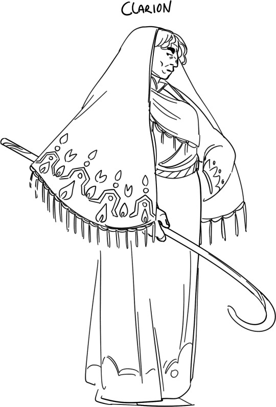
this is a galway shawl which is like. THE thing every single person wore back in the day and if you check out the wiki page it's a great reference for what patterns & dyes would have been used. from there you can find historical photos. i love photos like this which show a whole scene in context with people from multiple generations hanging out (yooo check out the Sparch in the background!!). now I know this isn't 1860s stuff, but the fact is that fashion doesn't move so fast for people like Clarion who live on a farm and have to make their simple clothing items last for a lifetime or more.
for the military outfits I mainly just googled 'military outfit 1860s' and iterated (groundbreaking). for things to be accurate i tried to pick reference illustrations drawn during the era.
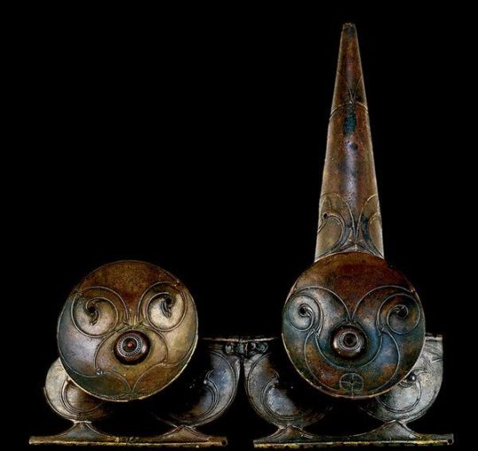
i figure you might mean specifically the ancient Inver stuff so for them I used a lot of old illustrations and stuff from art history class in school. this era is more in the region of the 1500s. here is a kind of kitchy site which nonetheless has real-life examples of some of the clothing i drew. this painting is in my list of references (sorry for the stock image link but it's one of the nicest online reproductions of it) and you can see the guys on the right wearing the same léine that i've drawn Finbarr in. once you know the time period & what the various outfit components are called you can search them more easily. now the headdress i've drawn Finbarr wearing (Olivier wears it as well!) is in fact a real thing, it's the Petrie crown broken in half.
the crown is not of the same era as the other outfits because i'm not so interested in historical accuracy as much for these guys (booo).
for Olivier I searched for old French armour from the same historic era as Finbarr, I know less about the history of Brittany so kind of just copied what I saw with some small alterations (because he wears werewolf armour, which is not a thing irl).
#setting: inver#i know there's a website for renting costumes that goes around every so often on tumblr but i find them really lacking in menswear usually
211 notes
·
View notes
Text
the importance of basic fact-checking
it's kind of crazy how doing research to learn if something is bullshit or not is not, like, a thing most people do as a matter of course?
for example, let's say someone says "did you know that in the medieval era, people used to sleep for a few hours, get up and do things for an hour, then go back to sleep?"
now, you might say "wow, that's really interesting!" and you might tell your friends about this cool fact.
but this factoid, if it is untrue, might give someone a distorted view of history, and of sleep. it might make them think that perhaps people in the medieval era were healthier because of this sleeping pattern.
so, you google it. or you duckduckgo it. whatever.
and your searching may take you to the Wikipedia article for polyphasic sleep. and this Wikipedia article contains a section dedicated specifically to this topic.
you may learn that this idea that people in medieval times slept in two phases is in fact a theory put forth by the historian A. Roger Ekirch, which suggests, based on 500 historical references, that this biphasic sleeping pattern truly existed, though it is as yet unconfirmed - until the nineteenth century and the advent of electric lighting, he suggests, these two distinct sleeps a night were common.
what you may also learn, is that Ekirch also believes that the way we currently sleep is actually way healthier for us, and believes that it contributes to our longevity.
and of course, we must not forget that Ekirch is a historian, not a scientist, much less a somnologist, and while his theory is interesting, it is not actually a medical prescription one way or another.
this is just one example - it is common to see people claim certain absolute facts about history or science, and extrapolate from that information some kernel of truth about how we ought to live our lives, how we ought to live in accordance with "our nature" (which is, in fact, mutable).
scepticism is something you have to practice at. you have to get a nose for sniffing out bullshit. you need to learn how to engage with novel information in a way that is not credulous, but questioning it. i am not saying question everything - that way lieth conspiracy theories - but i am saying that before you uncritically believe a claim about the world, you have a personal responsibility to read further into it.
and if you don't have time to do that, then you shouldn't believe everything you read, and you certainly shouldn't spread misinformation.
in our modern world it is easy to instantly share information without running background checks on it first. this is a major drawback of "reblogging" and "retweeting". so, the next time you see something like this, look into it.
remember that there is no Santa Claus. and the world is no less beautiful for his absence.
#scepticism#essay#think before you speak#research#check your sources#sceptical mindset#evidence#reality#honesty#truth#cooperation#misinformation#fact checking#debunking#misconceptions#skepticism#skeptic#skeptical
44 notes
·
View notes
Note
How can you tell the ghost chicken PETA poster is AI generated? I'm trying to get better at detecting AI images so I would appreciate any advice you might have thank you!
i actually am not 100% certain about the PETA image specifically. i am 90% sure, enough to claim that i think it is, but i want to be fair here- i could be wrong. im not the only person who caught it, but i could be wrong. that being said! i do actually have tips on how to better identify AI generated images. the tips can differ between artistic images and realistic images, but they do overlap
generative AI struggles in three key areas, imo
details
backgrounds
logic
everyone knows the check fingers and teeth, but as the tech improves, those easy indicators have become less reliable (though it still struggles with those features). AI does still flounder with details, though, you just have to look a little closer. checking patterns, textures, and occasionally lighting has been very helpful. it often fails to convincingly make patterned fabrics, and will create inconsistent or unnatural textures on skin, wood, and any other detailed surface. hair especially is a great indicator, since it falls and moves in very specific ways and has a deep level of texture inherently (watching the hair move in very realistic 3d animation can also help you clock it for what it is)

ie. these knives seem to melt into each other
ai seems to prioritize the subject of any generated image, which does make sense, but this often leads to the backgrounds or additional, non-focal aspects to be particularly nonsensical or imperfect on inspection. i struggle to come up with a examples of what exactly to look for here, but i do have a very helpful question to ask yourself when considering whether something is suspicious; in human made art, every aspect is hand made/posed, and the details of any illustration or photography must inherently be considered, at least a little bit. in AI art, no such consideration is taken, because it is incapable of doing do- ask yourself "would a human being do X detail? why? why not?"


ie. these nonsensical wooden details and the warped perspective of the background wall(s?) stand out to me. often the answer will not be a cut and dry "they would never do this," but noticing busted backgrounds is only part of the investigation
this ties into the first two tips, but i think it's worth reiterating that AI often makes illogical choices for how to interpret prompts. it's a pattern recognition machine, not a thinking machine. you know this, we all know this- just looking for things that don't belong or don't make sense can be the first sign something is up

the ghosts are chickens, but what is this meat? thighs maybe, but they almost look like hearts. they certainly don't look like poultry
some other miscellaneous tips
you've probably noticed, but a lot of AI (not all but a lot) has a distinctive style to it now, as generative models cannibalism each others work
companies that use ai usually have a history/reputation for being cheap or untrustworthy, or otherwise are brand new or small (people who want to save as much money as possible)
when generating people, especially realistic people, not only do they tend to have a horrible case of sameface, but they're also often exclusively "attractive" people. idk why. our bias towards beauty, maybe
none of these tips are perfect because a human being could create an AI-like image if they so choose, or i suppose even by accident, but i find them reliable
hope this helps 👍
43 notes
·
View notes
Text

𝑀𝑜𝓁𝓁𝓎 𝒪’𝓈𝒽𝑒𝒶
(the character overlook)
♡₊˚ 🦢・₊✧⋆⭒˚。⋆
these are all my opinions, totally open to the conversation about molly’s character also totally fine with people fact checking me, anyways i’m starting to fw o’shones
in the words of @krayzie-jelli the autism is autisming (don’t cancel me i have referrals to get tested 😔😔)
♡₊˚ 🦢・₊✧⋆⭒˚。⋆
small credit;
the red dead fan wiki
@/reaperqween on tik tok (for the almost ten minute tik tok about mollys outfits which i ate up)
^ her tumblr is @river-of-wine send some love yall want 💕

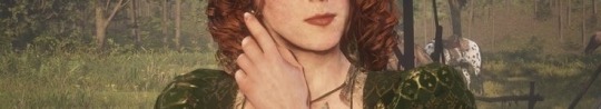
colour analysis & general observations
🪞💋🍓🌹🍰
colour theory is heavily used based on honor, the best example of this is dutch, he consistently wearing red, mostly on his back until guarma when the red is on the front, when dutch’s true intentions become more apparent, anyways onto molly.
🩰𓈒⋆⑅˚₊୨୧
COLTER
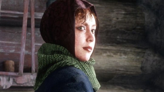
(i went quite quick through colter so im actually unsure how she is with dutch, but from what i remember she doted on him a whole ton, constantly staying at his side and at one point saying “dutch is all the company i need”)
💋though a lot of people relate the red in different characters with low honor i think the fabric, the pattern itself points back to her privileged past
💋the necks scarf being green, i feel like it doesn’t imply much at this point but as the game continues it implies way more
💋the rest of the outfit being blue means a lot to me, there’s never anytime molly oversteps or is aggressive to anyone (obviously except from the obvious with karen, i’ll go back to this later)
💋i’d like to note that she’s still doing her makeup freezing and starving in the mountains
🩰𓈒⋆⑅˚₊୨୧
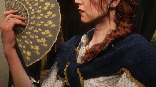
HORSESHOE OUTLOOK & CLEMENTS POINT
(i honestly will end up mixing these up so i grouped them together)
(tbh my honest opinion is horseshoe is one of the best chapters based on the relationships in camp (tho sadie’s still going through it, you can’t have everything))
💋her first outfit has a good amount of blue in this outfit, her necklace has its first appearance with the red (i always got the vibe that dutch had gifted it to her as it’s more shiny than a lot of the metal in her outfits and it’s like a part of him)
💋she wears a thick belt with this outfit and the brass (?) seems worn, even coming from a wealthy background she holds onto clothes that look old and worn
💋she always wears white boots, she’s doesn’t have to do any work, and she’s not expected to do anything
💋the majority of the mornings in game, molly is constantly checking herself in a mirror
💋i’m going to be honest i hate this shirt
💋but i’d like to think this shawl has always been with her and that she holds it close to her
💋her outfit is quite shapeless, and i think that’s how she liked to dress personally

💋i would love to talk about this outfit
💋does this eat? yes, but i don’t think this was a honest choice for her
💋this outfit mirror mary-beth’s a lot, who seems to be dutch’s new interest
sorry for the bad quality i used my own screenshot for this
💋this outfit particularly ^
💋there’s now a lot of cleavage in her outfit and she’s dressing more akin to other girls in the camp
💋and the gold in her outfits bright, and with mirroring marybeth, I also think this mirrors dutch’s style, with more red and gold incorporated
🩰𓈒⋆⑅˚₊୨୧
💋her relationship with dutch is starting to crumble, i heard a voice line where she says that she loves him and he thanks her (?!) you wouldn’t see me again personally
💋but to contrast that there’s some scenes were dutch kisses her hands and they’re all giddy and cuddly, and they eventually dance when sean’s rescued from blackwater
💋she’s also not well received by a lot of the gang, we get the first glimpse of that when you take mary-beth, tilly and karen to valentiene and karen says that molly’s “too high and mighty” to come with them
💋she attempts a to interact with numerous members
💋she also attempts to talk to tilly, tilly quickly brushes her off as she’s working and molly isn’t attempting to help her
💋i also saw an encounter with dutch and molly where, he approaches, and honestly he could be covered in shit and molly would still look up to him like he’s a messiah. dutch says “should i compare thee to…” he quickly cuts himself off asking her what he should compare her with, even asking arthur if you pass by (he actually says that dutch could compare her to an idiot if she actually believes dutch cares about her)
💋 throughout clements point, dutch talks down to molly as if she’s a child and then will quickly back himself up by calling her dear (to which if arthur intervenes when she goes off at him, dutch says she’s just leaving and she’s stomps away)
💋when she approaches abigail about the subject of dutch, abigail tells her “dutch don’t love you, not in the way you want to be loved”, molly gets defensive saying that she doesn’t get what she’s talking about, to which abigail says she does (implying drunk john?) and molly stomps away
💋i think this is the first time molly actually goes a bit crazy about dutch, she calls him a degenerate liar and stomps off when dutch wont argue back and (i think) goes to sleep, he at least turns away from her
💋i think people who discredit mollys character (men) don’t realise that her and dutch’s relationship show early signs about how manipulative dutch can be, he dumbs down what she says then calls her dear, eventually he only calls her miss o’shea, which she obviously goes off at him for
💋adding onto this i’d love to talk about her character item request of a pocket mirror and her asking arthur if bad lucks a thing, i feel like this is meant to reflect how young she actually is, like how kieran still referred to his parents as ma and pa, and that she genuinely seems nervous asking arthur for a mirror and the superstition of a broken mirror giving bad luck (which i guess you could say she had
💋and i feel like her vanity that the gang and from an outsiders perspective that she’s self absorbed but i think she’s more conscious about how she looks, she doesn’t have to lift a finger and not having much to do around camp because everyone distances themselves from her (i’ll obviously elaborate more when i get to writing about shady bell) i think she’s left alone with a mirror, which i feel is more implied that she’s had for a long time, i’d say since childhood, you become more conscious the more you look at yourself and if your man seemed to be going for someone younger than you, you’d loose it too
(tl:dr - molly doesn’t deserve any hate, the girls that get it, get it, men don’t, im so ready to talk about chapter 4&6)

The poem
-
Uaibhreach
(the irish gaelic word which means “being proud and arrogant to the extent that it alienates & isolates you from those around you, leading to loneliness)
I was a girl - until your call
(i’m not going to annotate this everytime but the religion of this actually makes me feel like my hearts being ripped out)
Commanded me to cross the sea.
(she was driven out of ireland looking for freedom and adventure and she was enthralled by dutch’s charm, to be honest i always saw her “privileged upbringing” being her family owning a big farm, or in a big industry, a lot of irish people immigrated to canada after the potato famine, then crossed to america)
I've nothing left. I gave you all.
(i think she means this in, like, every sense)
My darling Liffey was so small.
Your land and love are vast and free.
(‘MERICA)
I was a girl until your call.
You stood so strong, and dark and tall.
You stole the heartbeat out of me.
I've nothing left. I gave you all.
Your lips enchant, your eyes enthrall,
Your empire is of ecstasy.
I was a girl until your call.
Your parasites and lackeys crawl,
(now do i think this is the gang or her fault that they don’t like her, i think its a mutual thing, they see her as a spoiled woman and she doesn’t help that opinion but i think she’s a young woman manipulated by an older guy, and that she thinks they’re all just jealous (which im sure she even says a few times)
Mocking a love they dare not see.
(going back to when she try’s to seek abigail’s help, or when she confronts karen later on and that she can’t see that he’s really not interested in her)
I've nothing left. I gave you all.
I sit in solitude and scrawl
These wretched words, and wait for thee.
I was a girl until your call.
I've nothing left. I gave you all.
#lesbian#bambiitalks#red dead redemption 2#rdr2#wlw blog#molly o'shea#ill treat u better molly oshea#molly oshea#dutch van der linde#mary beth gaskill#karen jones#o’shones#oshones
48 notes
·
View notes
Text
Why Am I This Way - Psychology Answers
Note: Another one <3 we are almost done with the How Am I section !!
“How Am I” Section
“Am I Really A Good Person?”
What happens in the unconscious brain:
To start off, it's important that we understand that being wrong and right are social constructs and they will depend on your cultural background, on you ethnic and the way you were born and social class.
Now these feelings of being a good person, of caring from the social norms and looks come from childhood where the family plays an essential role on how we want to be cared for and loved.
In a dysfunctional family they usually have a closed system. For any interest in these topics you can always check the works that are based on little information and the resources are shared between the family members (communication isn't used often). In this cases (these families) communication tend to be rare and the rules of the family are usually strict and not just, working in the favor of the parent authority
In contrary, in a functional family, the system us open and the information and the ressources shred is shared through communication between the family
Basically in dysfunctional families the rules are not said. They learn in silence. In function, the parent actually verbalizes the good and the wrong.
back on the dysfunctional family, the communication is so fragile and limited that the little things that are said are usually harsh, violent and painful to the child (for example the child is make a mistake, the parent will proceed with accusatory screaming or physical abuse)
Because of this, the children who got raised in such an environment learn to mold themselves to reach security. They are always weary of their environment and they tend to read people to accommodate and adapt their behaviors.
Basically they learn to recognize a bad action and a good acio based on their parents' punishments and because of that they tend to always please others or provoke a better reaction in their counterpart to avoid the violence.
These children (from dysfunctional families) can develop four types of communication patterns when evolving with other people. Those are:
“Appeased” : they are people pleasers and they will put a lot of effort in for that to happen during arguments. To be a good person they use extreme generosity by neglecting themselves and their needs (because their parents have neglected them so much so why shouldn't they do the same?)
“Accuser”: A mirroying of narcissistic parenting/ defensive category. People like that will try to manipulate the situation and turn the tables to avoid being on the receiving pain end. They try to be a good person by using reverse psychology
“Congruent”: the person is aware of their surroundings, they are aware of signals that can be potentially triggering. These types of people when arguments happen tend to use verbal and non verbal communication at the same type to smooth the situation and avoid being hit. more of a “fight” response to avoid panic and be a good person.
“Evasive”: they are usually people that often retreat in arguments. They will keep themselves shut because they have learnt that speaking will bring them more pain so they usually try to keep themselves shut and repress emotions in order to be the good person. some of them can also use humor as a mechanism
Usually people that are always questioning their worth as a good people come mostly from a dysfunctional family weather neglect and violence were the main resource and where the people had to learn strategies to survive in that environment
if you are interested in more of these topics you can check the works of Virginia Satir and Karen Horney
So what can we do?
We cannot allow the limited perceptions of others define us
You need to understand that you have lost touch with your inner self in order to avoid conflict. the important here is to learn that arguments and conflicts are often necessary to solve the issues and they are important to communicate feelings and that one should not stop putting their fears first and take time to open up
now this is hard but with therapy and the right relationship, this gets easier and those behavioral patterns can be changed
There’s also the need to stop blaming yourself for everything and prioritize your happiness.
Learn to say no, learn to stand for yourself and believe that you are worth more than what the dysfunctional family provided. you are worth love
and no, you're not a bad person you are just hurt
Now, you know where to work to become a better version of yourself
68 notes
·
View notes
Text
I am selling digital art commissions
I am a young neurodivergent adult in Texas looking to move out of her parents' house by the end of the year. My parents are limiting my freedoms, and I need to raise enough money to move into an apartment with amenities such as air conditioning, dishwasher, and laundry. I also need to raise money to buy my first car.
Examples of my art:

Details and Ko-fi link below
Prices
Line art (base price):
Bust: $20.00
Half: $25.00
Full: $30.00
Flat Color: +$5 base price
Light/shadows: +$10 base price
Extra character (up to 2 total characters per image): +$10 base price
Backgrounds:
Simple (single/multiple colors, patterns, etc.): +$5 base price
Detailed (environment): +$15 base price
Will and Won't
Will do:
OC art
Characters and character redesigns from ROTTMNT, Ninjago, and Voltron: Legendary Defender
Occasionally sonas
Realistic/semirealistic Minecraft mobs, blocks and items, skins, and scenes
Speculative anatomy designs
Mild blood
Mild eyestrain
Occasionally book/album covers
Won't do:
NSFW
Major blood
Gore
Ship art
More than 4 characters per image
More than 3 images per commission
Extreme eyestrain
Rules
Always check the Will and Won't list before making an order
I will choose the commissions at my own discretion. I am free to refuse a commission for any reason.
Only 3 slots available at the moment
Will need references for any characters
Only for personal use
No refunds unless I have not started on a commission I have committed to doing within 30 days of the commitment date
#flockofcrows#crow announcement#support artists#artists on tumblr#please commission me#ko fi commissions
38 notes
·
View notes
Text
commissions are: open, 4/5 slots filled


hello everyone!
i’ve had health problems that are making it very difficult for me to work and function outside of my home, which just isn’t viable with how expensive necessities are. so while i’m in this limbo, i’m opening up commissions! reblogs are greatly appreciated :]
a lot of my examples are bg3/dnd related, but regular ocs are more than welcome, too! i can also do fanart for other media if you’d like.
for right now, these will be through paypal. just send me a dm here if you’re interested! more information below the cut.
commission info:
- first come first serve, i will keep in contact with you throughout the process and start the sketch asap. for drawings with the highest level of detail, it’s possible that it may take a few weeks for me to complete. lower levels will take about a week or a few days over.
- while this is over dms for the moment, i’m going to make a proper form to fill out! reference photos are greatly appreciated for ocs, but detailed descriptions work too! i would also prefer if you provided a short personality description, and any ideas you have for poses or character interactions. i want it to be as close to what you envision as possible! if you want the drawing to be set at a specific time, or a specific aspect ratio for the image, let me know that too! busts cut off at the mid-chest, and half-bodies are cut off at the mid-thigh. i can also make icons (head-shot only) for a discount!
- payment comes after you’re happy with the composition! i’ll block out the characters and where they’ll be on the canvas before moving on to the full detailed sketch.
- i know my example images don’t have much shading. it’s because i enjoy the lineart process a lot more than anything else, so i don’t focus on it as much in my personal work. for fully rendered pieces, though, there will be actual light and shadow.
- more explanation on backgrounds: basic flats, simple patterns, and simple objects for framing are free of charge. keep in mind that detailed backgrounds are not my strong-suit, but i do need the practice, and i will try my absolute best. the more detailed the background is, the more it will cost, but everything is negotiable.
- i can do anthro characters (like tabaxi, dragonborn, etc) in my detailed style too! i don’t have as much experience in drawing robotics or machinery, but it’s not off the table. i like doing little details :]
- i will not draw illegal ships or anything hateful (racist, homophobic, the obvious), and i don’t do nsfw.
- don’t use my art for ai training or nfts.
- if you have any questions, feel free to ask!
- thank you for reading ^^
a better look at some of my examples - for more, check the #digitalart tag:


#pricing these was difficult#i got a few different suggestions and decided to go somewhere in the middle#i plan on making more finished pieces + any commissions i get#so i’ll likely update the example images when i have more for specific tiers#but i had art block for a while so i’ve really only been getting back into it these past few months#and i have more time now#this made me very aware of how many right facing 3/4 busts i do#art commisions#art commissions open#art commission prices#bg3#baldur's gate 3#bg3 commissions#gale dekarios#wyll ravengard#bg3 karlach#creature design#bg3 tav#dnd art#if i shouldn’t tag the characters in the examples just lmk
19 notes
·
View notes
Note
Hi there.
I was wondering if you have any advice on balancing an ensemble cast? As in, how do you manage having, say, 6 pov characters without the reader getting bored, impatient, or forgetting a character until it's a chapter of theirs again?
Thank you for the work you do :)
How to Balance an Ensemble Cast
Hey, thank you for your question! While I personally do not have a lot of experience writing ensemble casts, I think the following points would be helpful to consider when planning/writing one:
Getting into the characters Point of View: Lenses and Distinct Voices
One of the most important things about Multi-POV-narratives is to give each character a distinct voice so they don't just bleed into each other. This concerns:
a) the content of their narration: Ask yourself: What is this characters "lense", their specific frame of reference through which they see the events? This can depend on their background, their interests, knowledge, viewpoint etc. How do they see the world differently than the others? Try to imprint the narration of the POVs with the characters personality, especially if you are writing in first person. A very sarcastic character would view the same events quite differently as a very optimistic, bubbly character. Different characters would notice different things. This can be established by something as simple as focus points: maybe an artistic character narrates a lot about the colours around them and a detective character is very perceptive about peoples body language or stuff like that. Maybe the soldier is focused on battle strategies and the details of their surroundings, all while their love-interest is focused on them.
b) the form of their narration: Best case szenario, you would be able to identify who is talking, just based on their voice. This should be noticable in dialouge but also in narration. A very academic character would maybe use a slightly different vocabulary than a character who's more about street smarts. How do their speech patterns correlate to their person and background? Another example: In the popular contemporary novel "The Flatshare" one of the POV characters isn't really talkative. The author chose to reflect that in their narration via a fragmented narration style, using as little adjectives and full sentences as possible, while still keeping things readable. You can find more information about Character Voice in this post.
Overall, when it comes to differentiating between POVs, ask yourself: How can the personality, believes and expertise of a character affect the way they see the world and thus the way they narrate?
Anchoring your Scene
This is a little tip I picked up from the YouTube channel of author Sacha Black (great writing advice, check her out!). Multiple POVs can be quite challenging, especially if there are time/place jumps between the POVS. Thus, to not confuse your reader, it is important to quickly establish who is talking, where they are and when they are. Person, place, time. This needs to be clear so the reader isn't lost (unless it's your goal to confuse your reader, which would certainly be a valid goal). In some books the chapter header indicates POV, which is a very quick and easy way to establish at least one of those factors, but there are other ways to do this.
Making every POV count
If you want to avoid your readers being bored or even skipping POVs it's important to actually have a distinct reason of evers POV to exist. Thus, everybody needs a piece of the puzzle for the plot. Just like in the point about lenses and voices, you can use the differnt personalities, backgrounds and knowledges of your characters to let them uncover and drive different pieces of the story. Every POV character needs a reason to be here and a way to contribute.
Having multiple POVs is actually a great way to create tension, because the reader will know a lot of information not every character knows. It's the old Hitchcock-principle of letting the reader know about a bomb under the table the characters don't know anything about. Use the distribution and retention of information to your advantage.
Furthermore, everyone needs their own character arcs. A compelling character is all abouts goals, motivations and conflicts (more about the whole "GMC"-concept in this post) that tie them to the bigger story as well as having their own wants and needs (check out this post if you like) plus having flaws and the corresponding concequences (more about that in this post).
Those are just some of the big things I'd recommend you to think about. I hope this helped!
Have fun writing!
95 notes
·
View notes
Text

1 winner will be chosen on June 5th at 3 pm EST. Enter any animal character you’d like (OC or Not).
This is just checking interest to see if this YCH is maybe something I should put effort into actually doing if people like it. I’ve been wanting to try one for a while.
So, if you’re interested, even if you don’t win, let me know. I don’t have examples with backgrounds, but I can give it a background or a pattern you would like.
I will also use the winner’s character to advertise the YCH as an example if I ever go through with it. By entering this contest you are acknowledging that if your character is an OC your character will be used for this purpose (with a text credit to your name next to it)
Unfortunately, there isn’t really a way I can draw human characters for this, or like plants?? So, it’s just animal characters.
#platypus#ych open#ych art#raffle#free ych#free raffle#ych raffle#mao mao heroes of pure heart#ych#animal characters#character ych#character art#furry ych#oc artwork#cartoons
24 notes
·
View notes
Note
I've got kind of a big dilemma here. I've always assumed i was sapio and just strange. I've never liked lying, and I have some weird allergies so my diet's pretty low sodium and we don't have cast iron pans but other than that my life has been pretty "typical", for lack of a better word. But I graduated last year, so my parents were going through baby pictures, and my dad pulled one out I'd never seen before from the day I was born and the baby in the photo was Not Me. Like one thousand percent definitely not me. I mentioned it, and my mom freaked out and told me not to be ridiculous and buried the picture at the bottom of the box. But I know when I'm being lied to, and there is no way that's a picture of me. And the other day I got a box in the mail that smelled like pine sap and lilacs and the ground after it rains, and there was a letter and a stone with a perfectly round hole in it inside. I'm adopted, apparently, and the stone is supposed to help me see hidden things until my eyesight improves. My bio family has invited me to a party on the spring equinox so I can meet them. But I have this sinking feeling that if I go they're not going to let me go back home? I love the parents who raised me and I don't want to leave them, but I do also want to meet my bio family and my "twin" (the baby from the picture who I guess is about my age now?). Do you have any advice for how to set the proper boundaries with my bio family so I can meet them without losing the life I've been raised in?
I'm afraid I don't quite follow your thinking here, reader.
Infant substitution is practised in a variety of different cultures on this plane of existence and several others. Without more information about your biological family's background, I am hesitant to make any sweeping proclamations about their specific practices. That said, I see no reason in your letter to assume they are planning a spot of interplanar kidnapping to usher in the equinox.
There are a few tangible signs they might not be being entirely honest about their intentions - if they are insisting you wear specific clothing and jewellery for the event (undyed, natural fibres, for example, or a crown of columbine and foxglove) or if they are at all cagey about the details of any rituals and ceremonies involved in the celebration, for example.
But without these red flags, I'm afraid you may be falling victim to nothing more or less than a rather pernicious strain of anti-liminal scaremongering.
By all means, ask your relatives about any etiquette you might need to be aware of, and whether the event will include a formal refutation of obligatory reciprocity. These perfectly ordinary things to take into account before travelling to another realm. Indeed, if your biological family shows any reluctance in answering, that might be another red flag.
Beyond these formalities, though, you run the risk of causing serious offence if you show up at the equinox celebrations with pockets full of salt and breadcrumbs, refusing to eat or drink and festooned in protective amulets.
With all due kindness and respect, I urge you to consider where these ideas and anxieties have their roots. Regardless of your true genus, you have been raised in a profoundly sapio-centric society. We are none of us immune to the prejudices and preconceptions taught to us by the society we're steeped in.
But we do have a choice about if and how we carry those ideas with us in the future. Take the time to educate yourself on infant substitution in general and, if possible, on your biological family's culture in particular. I think you'll soon find these fears are unfounded.
Finally, please, don't be too hard on yourself for internalising these misconceptions. We can't help the world we were raised in or the assumptions it taught us. But we do have the power to unlearn those harmful patterns of thought, and to work together to create a better present.
[For more creaturely advice, check out Monstrous Agonies on your podcast platform of choice, or visit monstrousproductions.org for more info]
25 notes
·
View notes
Text
Ornamentation and "soul" in design
Many lament the loss of great ornamentation or "soul" in design: the "intricate" carvings and patterns of handiwork that adorn nearly all mediums of art in the past:

Now, everything seems so "hellbent on minimalism".
However, I wish neither to praise nor to insult minimalism, but it has thrived recently for two gravity-like reasons...
Multi-faceted lives
For one, we now live more multi-faceted and "ADHD" lives than ever. No longer do we spend our entire lives in one culture and one line of work. We move around. We travel. We have access to more entertainment than ever. We switch jobs. We moonlight. We have hobbies. There are hundreds of activities competing for our attention every day!

Thus, a lot of the infrastructure in the background that today has "reduced" to minimalist functions. For example, a pillar serves as a load-bearing structure. Only in a more sensory-deprived time would we need to look at a pillar for entertainment. Today, we would simply take out our phones and check out one of several dozen apps. On average, we also don't nearly have enough time and patience to carve ornate features onto a wall like people did in the early 20th century and before. Even writing this blog post made me feel tired after a few minutes!
Pleasing the inevitable (?) global audience
For another, we are now a more global society, whether we like it or not. In the past, we would spend most, if not all, of our lives living in one culture and rarely ever crossing paths with another. If you were born an Englishman, you would 99% only know and do English things. If you were born Chinese, you would 99% only know and do Chinese things. Nowadays, any internet user would likely be exposed to at least a dozen different cultures around the world, without even trying or wanting!

So, it has come to the point where design is trying to be "all things to all people". Having this goal forced upon us might be the price for our globalist society. Successful design of today (and for the future) will invariably be exposed to a diverse audience of people from a wide range of cultures. As we know full well in the past few years, different people get offended by different things. Therefore, successful design has to look more "neutral" to please (or at least gain tolerance from) the most amount of people. We have less ornamentation, more flat surfaces and neutral tones today because it preserves the harmony of an increasingly multicultural populace.
It is alright to enjoy complex designs from the past in your own home. Unfortunately, in our increasingly connected world, the "clean" minimalism will continue to dominate. If you have to take on a minimalist space such as your new home, you can always decorate it with your own finishing touches. We just can't expect a new space to be "hard-coded" for us (e.g. with ornate pillars and stained-glass windows). The blank canvas requires you to add your own personal interests, all the while doing so without affecting the "resale value"!
11 notes
·
View notes
Photo
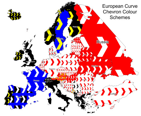
Map of European Road Curve Chevron Signs
by u/isaacSW
Not sure if something like this has been done before but I’ve put together a map showing the colour schemes used on the chevron signs used on road curves throughout Europe (this is the sort of thing I’m talking about). I think it could be quite powerful in some areas, like the Balkans and central Europe, where they are quite common and the colours vary a lot from country to country.
This won’t be 100% accurate, and I’m sure you will be able to find counterexamples, but I have checked multiple signs in each country and it appears to be a fairly reliable clue. If you do find anything I’ve missed, let me know and I will update the map and post the link below. Here is a list of observations I’ve made while making this map, with example locations.
Notes:
The white colour is often substituted for luminous green/yellow in high altitude/latitude areas (example). Austria and Montenegro have their yellow variants shown on the map as they appear to greatly outnumber the corresponding white variants. The yellow colour on south-facing signs will often fade to near-white.
Some countries will add a luminous yellow outline to the signs rather than replacing the white (generally in high altitude/latitude areas). Some countries that do this are: Italy, Romania, Hungary, Russia, the UK, Belgium and Turkey.
Most countries will also have a long variant of the curve chevron sign (example). This should be the same colour scheme as the single-chevron signs, however it may be less obvious which is the ‘background’ and which is the ‘chevron’ colour.
Notable Countries:
Spain uses both the white-on-blue and white-on-black interchangeably. It is always the long variant (as far as I can tell), and the colour distribution does not seem to vary by geographic location. (blue example, black example)
Montenegro uses the red-on-yellow (example) and black-on-white (example) signs in roughly equal amounts (no real correlation with geography), with some lower areas near the coast using the red-on-white variant (example), however this is much less common than the red-on-yellow.
Slovenia uses mainly the black-on-white variant (example), however areas around Ljubljana and Koper (and maybe other areas) use the red-on-white variant (example).
Austria uses the red-on-yellow and white-on-red frequently in the upland areas. They are also often found with a pattern of a few reds then a yellow (example), which appears to be unique to the country. The lowland areas may also use the red-on-white variant.
The Netherlands often uses a miniature variant (example)
Russia and Ukraine use the long variant quite frequently, which also sometimes appears in the Baltics (possibly other ex-soviet regions too). The single variant also has more background colour visible compared to other countries (example). It also often has a white outline.
North Macedonia has red-on-white and black-on-white variants, though the black ones appear to be less common.
Frequency:
Countries that use a lot of roadside bollards tend to use fewer curve chevron signs.
Rare in Andorra, Finland and Denmark.
Fairly uncommon in: Baltics, Sweden, Iceland, Russia, Ukraine, Belgium, Netherlands, Germany and Luxembourg.
Fairly common in: Norway, UK/Ireland, Spain, Portugal, France, Italy, Switzerland, Hungary, Romania, Serbia, Czechia, Slovakia, Poland, and flatter areas of the Balkans.
Very common in: the Austrian Alps, mountainous areas of the Balkans, and Turkey.
78 notes
·
View notes
Text
Happy Mistborn Fortnite Friday!
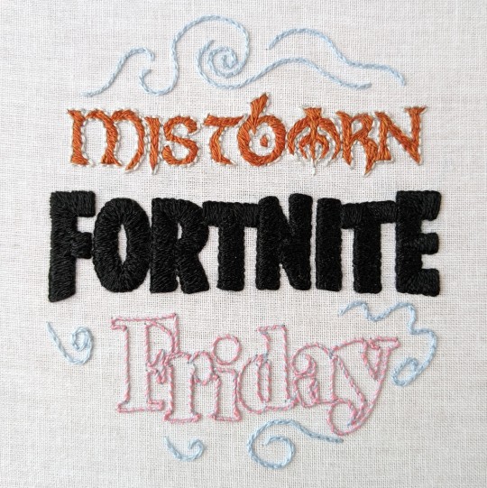
ID, more pictures, and rambling under the cut
[Image ID: a picture of an embroidery project on a white fabric background. Mistborn is embroidered with copper and silver floss on the top, Fortnite with black floss in the middle, and Friday with light pink and blue floss on the bottom. There are curls of mist embroidered in light blue floss around the top and bottom.]
Here's how it looks on the back:

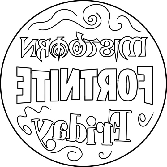
Here's the pattern I made, based on the original meme by @celestialkindliness / @dekartas:
And here it is displayed on the wall of my room, right next to my second embroidery project:
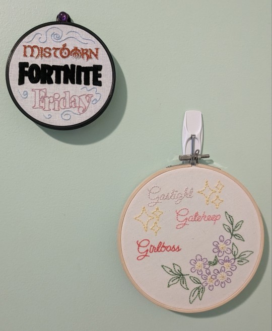
Now. Time for rambling>:)
This took about 7 months to make, from asking permission to the very last stitches. However, I had to adjust my initial plan A Lot to make it actually work, which explains the long time. For example, my first idea was to use black fabric for the background, but my options for that were a fabric that was way too flimsy (the marking pencil warped it) and something I realized much later was canvas- too thick. I probably could have gone to the fabric store and gotten other black fabric, but on top of that, I had a lot of trouble marking the pattern on it, so I eventually realized. Wait a minute. I can just use my regular white fabric. That would be much easier.
I also initially wanted to use a 6 inch hoop, which made the satin stitches much too big. The general maximum for the length of a satin stitch is 1cm, not 1in, so I adjusted the pattern to a much more sensible 4 inch diameter. I still worked it on a 6 inch hoop, though, because it had extra room.
The next big obstacle was that I wanted to use herringbone stitch for Mistborn somehow. After a bit, I realized it wouldn't really fit the shapes there, but I was like nooo... I have to use all these different stitches or else it won't be Good or Original... wait a minute that's not true lol. I also changed it from putting 1 stand each of 4 colors in the needle (2 copper, 2 silver) to using the silvers for the outside and the coppers for the inside, which looked better and wasn't too many strands (which might have warped the fabric).
The final adjustment was on Fortnite. I had made the outline in the middle of the project, using backstitch. One option was just to keep it as an outline. The other option was to use satin stitch to fill it in. Usually with satin stitch, if you have an "outline" it actually goes inside the satin stitch, to make it pop out more. I also kinda wanted something actually outside the satin stitch, though, because otherwise it can be pretty jagged, but that might have made the letters too big... So, about halfway through the F, I realized I could end my stitches in the middle of my outline for the best of both worlds! It also somehow made the fabric bunch up much less, which meant it was a lot less stressful to stitch.
So, there ya go, my epic tale of embroidery frustration and innovation. I used 2 strands of:
Light blue (DMC 800) with a split backstitch for the swirls of mist
The same light blue and pink (DMC 894) with a whipped backstitch for Friday
Plain black (DMC 310) for the satin stitch on Fortnite
1 strand each of light silver (DMC 168) and very light silver (DMC 762) with backstitch for the outline of Mistborn
1 strand each of orangey copper (DMC 301) and red copper (DMC 920) for the inside of Mistborn- I dunno what stitch I used really, I just did whatever there.
Finally, if you've somehow read this far, (1) i'm impressed, (2) you can check out my other embroidery if you want:]
122 notes
·
View notes
Text
I'M OPENING COMMISIONS!
I am finishing my semester and I finally have time to dedicate myself a little to what I like the most. If you want to support me, this could be a good opportunity!! (especially since I have to prepare for the next one)
Here are some examples of the work I'm currently offering: simple flat color drawings


NOTES:
• You can use them as icons, profile photos, etc.
• The standard measurement of the canvas is 1500×1500.
• The lineart is simple and the character's colors are flat with basic shading. Flat color background, design or a simple pattern.
• Additional characters and animals/creatures cost extra. You can have a maximum of three characters in the same illustration.
• Payment will be made through my kofi page.
.........
• I can do:
OC's, Kemonomimi (ears, tails, etc), Light Gore, Anime or fictional characters, Simple backgrounds.
• I can not do:
Realism, Mecha/Armor, Furry, NSFW, Explicit Gore, Seniors, Portraiture, Ships, and problematic themes.
Terms, conditions and suggestions:
- Send the number of references you want, the clearer you are, the closer I will get to what you are looking for. Even a stickman reference is acceptable!!
- Do not edit the final drawing.
- I cannot replicate the drawing style or an illustration made by another artist.
- I'm not very familiar with drawing muscles, you have been warned.
- I can refuse to do an illustration if I don't feel comfortable or able to work satisfactorily on it.
- You will have an opportunity to review the drawing during its sketch state.
.........
Do you need more info? you can check my Kofi page!
Do you still have doubts? You can leave a message in inbox and eventually I will answer it!
You can also support me by sharing this post!!
[Note: I used the translator to write all of this, so you may find some errors. During the communication it is possible that I also use the translator as a support, so please try to be a little easy with me]
My native language is Spanish, así que si hablas español podemos dejar el traductor de lado :)
#digital commisions#drawing commisions#open commissions#icon#sally face#sundrop#frisk#rengoku#zenitsu agatsuma#cult of the lamb#mabel pines#ane doodles yay!#ane commisions#commision info#commision sheet#info
49 notes
·
View notes
Last Seen Blogs

crasheysmashey
' Crashey Smashey

assistcandids
ASS🍑IST


delicatenightmarephantom
Untitled

blueaagave
Art Blog I Fucking Guess