#cel animation tutorial
Explore tagged Tumblr posts
Visit Tumblr Blog
Explore Tumblr blogs with no restrictions, modern design and the best experience.
Last Seen Tumblr Blogs


Fun Fact
Tumblr has a low social media market share in South America.
Text
A Long-Winded, Amateur Animation Cel Tutorial
I'll be going through the step-by-step process of how I made a replica animation cel, complete with a background and frame, listing the materials, while explaining the many, many blunders I made along the way so that if you attempt something like this, you'll hopefully have an easier time at it than I did.
For the most part, I didn't want to buy new materials, and instead wanted to mostly use what I currently have available, so this method is probably not very suitable for selling original works in the animation cel style that'll last a long time, this is just meant to be for fun for now, so I didn't buy any fixatives or respirators or transparency film packets. If you want to learn more about that stuff to sell cels, @yamino has tutorials. If I were inclined to sell my own cels, I’d rather sell original works rather than replicas.
There is a company called Chromacolour that sells animation supplies like cel sheets and cel paint, but that stuff is pricey, and I'd have to account for international shipping. So, all the materials here can be bought at many of the usual art stores you might use.
Let's get into it... (WARNING: Very long, I'm trying to be thorough!)
Getting Your Reference
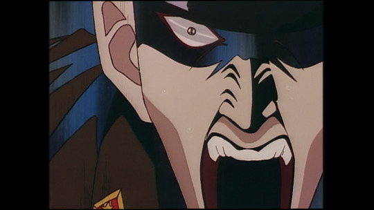
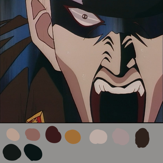
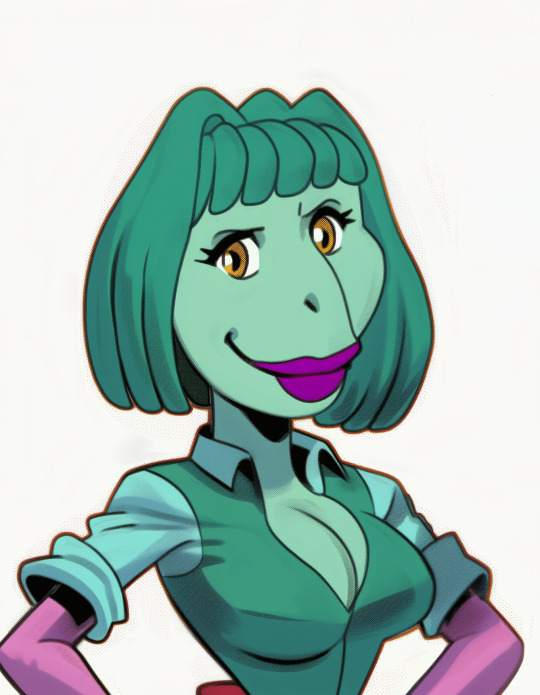
The screenshot I chose to recreate was of the villain Yasunori Kato from the anime Doomed Megalopolis:
This was attractive to me for a few reasons. 1. I love the effect of gaps being left in parts of the cel where some of the shadows are on the cape and face, letting the background come through, it's sick af. 2. Besides the sweat drops, badge/medal, and eyes, there weren't a lot of tiny areas that I would have to be especially careful about filling in. If you're just starting out, whether you're doing a replica or something original, pick something that doesn't require a whole lot of precision.
Also, if you're doing a replica, get the highest quality image you can for your reference so you can clearly see the linework and the colors. The best one I could find for this screenshot wasn't particularly great, this wasn't an HD transfer, but it was good enough. If you can find a picture of the actual, original cel for your reference, or something very similar, that would be helpful in getting to see the colors in their natural state, but it's not required.
If you're doing something original, this first step entails doing a drawing and filling in the colors so you have a game plan.
Line Art
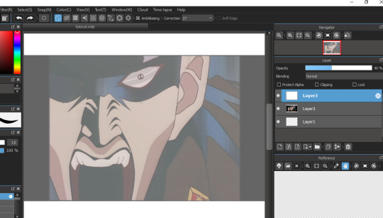
Here's where things started to go off the rails for me. My original plan was to trace the lineart in my drawing program of choice onto a semi-transparent layer, then increase the opacity to 100% after I was done drawing the lines, then print out the lineart onto a piece of paper so I wouldn't have to use up a lot of ink. My setup was this;
(As you can see, I flipped the image, I'll explain why I did that in a little bit) Then, wouldn't you know it, I found out my stylus's battery died and I didn't have any more. I didn't want to wait to buy replacements before continuing, so instead I trucked ahead with another method, printing out the image on a piece of copy paper. Unfortunately, some of the details were lost in the printing, so when I traced the lines, I had to have my original reference picture on my computer off to the side and just guess where those details were supposed to go. Maybe I should have played around with filters before printing to increase the contrast, hmmm..
If you have a tablet or ipad that's big enough, you probably wouldn't need to print the reference picture out first, and instead make the image the size you want, lock the screen in place if you can or wear a glove, put a piece of paper over the screen, and trace it that way, but I didn't think of that at the time i was doing it... But if you don't have a tablet/touchscreen laptop/ipad, or if your image is too big, then you'd have to print your reference out anyway.
I first traced the lines onto a piece of regular paper the way I would have done it digitally if I had been able. I didn't want to jump straight into putting the lines onto the cel just yet because I wanted to make sure I was satisfied with them and avoid having to make big changes on a cel sheet. I shaded some areas blue or yellow as a reminder to myself which areas are not part of the black shading which will be put in later.

I hear some of you asking "Why didn't you use transfer film to put your lineart onto and skip these extra steps?" I'm gonna be real with you guys, I didn't know what transfer film was until after I bought my acetate paper and I don't want to buy anything else for making cels right now unless I choose to make this a regular thing.
For those who don't know, transfer film allows you to print stuff onto a clear paper a la the Xerox method of animation popular in the mid 20th century. I probably should have done this instead because the process of inking by hand was a pain in the ass, which I'll get to later, BUT I was also paranoid that if I had transfer film I'd mess up and damage the family printer lol. If you can buy transfer film, look up and see if your printer is compatible with it! Maybe I'll start using it someday. But for those of you who can't get transfer film or don't have a compatible printer, you'll have to ink by hand, anyway.
As you may have noticed, I didn't fill the image across the entire acetate sheet. That's because animators only needed to fill up however much space was required for the scene, and they could leave some of the edges rough if the camera wasn't gonna be picking them up during the photography stage. Here's a real cel from Doomed Megalopolis which illustrates this:

I don't know what the original size for my reference was, but I wasn't looking to do a 1 to 1 recreation. If the original was actually a little bigger, oh well, at least I didn't have to put on as much paint. I knew going in that one of my last steps was gonna be putting a frame around the edges to hide them.
Inking
The acetate paper I've been using is Dura-Lar, specifically the kind that's supposed to be able to take permanent inks. I tested all the inks I had, and most of them either slipped off the sheet completely or didn't show up at all.
The only ones that kinda worked were the Uni Vision fineliner, the Uni Pin fineliners, and the Daler Rowney drawing ink, but even then, I had to be careful with those, they're very easy to smear until they dry.
I did also try out a Sharpie, and it DID seem to stick onto the sheet the best (boy I guess the Dura-Lar paper wasn't lying when it said it was best for permanent inks), but unfortunately, a black Sharpie will appear as blue on acetate, which I didn't want. Maybe in the future I'll look for another kind of permanent marker which actually shows up as black on acetate and comes with very fine nibs sizes.
For this cel, I stuck with the Uni Pin fineliner in the .003 size. Make sure that you wear latex gloves while inking, or at least some kind of thin gloves. You probably will get fingerprints on it, and you will certainly attract dust if you're working on it for long enough, but you can wipe that off the acetate with Windex or something, just be careful not to lift off the lines. If you make a mistake while applying the ink, use rubbing alcohol and a Q-tip to wipe it off.
The fineliner being so easy to slip off meant that in order for it to stick better, I often had to make chicken scratch marks for the larger areas, so I frankly find the line quality to have turned out pretty badly. If I don’t get transfer paper for next time, I'll either get non-Sharpie permanent markers or try the Daler Rowney ink with my dip pens to see if they stick to the acetate better. Here is the result:

If you like rough pen marks, then this look will be great for you! But for me, I felt lucky that many of the lines would at least partially be covered up by the black shadows or the dark background.
After you're done inking, let it dry overnight just to be safe. Before moving onto the painting stage, I'd like to go over another oopsie I made that I kicked myself for later, which was me deciding to flip my original image.
Normally in cel animation, one would ink on the front of the sheet, then put the paint on the back of the sheet, which is what I did for my previous attempts at cel painting, but this time, I decided to put the ink on the back as well. My logic was that if I flipped over the sheet to put the paint on, and the ink was placed in the front, it would likely rub off if I moved the sheet around, so I thought the ink would be better protected on the back side.
This was not the case. If I accidentally put paint outside the lines and went in with a damp brush to lift it off, I would very likely lift off the ink too even though it was "dry" and I'd have to reapply it, or I'd move the piece of paper that I had under my hand to protect the sheet too much and the lines would smear, causing me to have to redraw the lines and wait for them to dry all over again 🤡 All that is to reiterate: Ink should probably go on the FRONT of the sheet, paint should probably go on the BACK of the sheet. If you're doing that, there's probably no need for you to flip your reference image unless you're checking for symmetry in the eyes in your transfer stage or something.
Background
This part was pretty easy for me because I picked a simple background. It didn't have to match the original perfectly because the pattern changes a lot within the few seconds the original frame comes from. I used a mix of black, white, and phthalo blue acrylic paint on watercolor paper that was the same size as the cel, repainting some areas after it was dry to increase the contrast.

(A bit of dust got on my paper, I wiped it off later)
Painting
Whether you're doing a replica or something original, I recommend putting together swatches of all the colors in your reference image so you know how many colors you need to mix and what they look like by themselves. Here's mine:
I put the colors against a gray background so I could get a better sense of what the values were. I didn't manage to recreate the colors exactly for the most part, but with these swatches, I got much closer to the originals than I'm sure I would have gotten if I didn't have them.
When mixing larger batches of color, once you're satisfied with the result, put them in an airtight container so the acrylic doesn't dry immediately, as you'll most likely have to spend hours if not days on a cel project waiting for each layer to dry.
Also, if you're mixing a color, make more than you think you'll need. If you run out in the middle and have to re-mix the color all over again, it's very likely you won't be able to recreate it exactly how it was before. If there is so much as the TINIEST difference in hue, it WILL be noticeable. Trust me, I speak from experience 🤮
When applying the paint, start with the smaller details first like highlights, then gradually do bigger areas. Make sure each layer is completely dry before putting on the next one. Here is my coloring process while still in the early stages:

Yet another blunder from me, I should have gotten close-ups of the sheet so you could see what the painting process looks like better X_X but this pic should give you an idea of what it takes to paint a DIY cel LOL.
You will have to apply the paint generously in order to make it somewhat opaque on the sheet. Acrylic paint just doesn't work the same as the kind of cel paint they used to use, and I'm sure as hell not making the investment for Chromacolour unless, like, this becomes my job, which is highly unlikely. I saw a video from the animator Richard Williams where he explained that the cel paints were basically emulsion paints, which is the kind you put on walls, and I have seen a couple cel hobbyists confirm this, but I'm not buying cans of paint in a bunch of different colors, that would take up so much space!!! I hear the model paints by Tamiya also works pretty well, but again, I'd rather use what I have, so acrylic paint it is!
You may not be able to make your paint layers completely opaque, and they'll probably be somewhat see-through if you hold the sheet up to a light, but unless you're actually making a cel animation and you're photographing the sheets, I wouldn't be too concerned about that. Just make sure they at least LOOK opaque against a solid background, that there's no clear spots where you don't want them, and that you're within the lines (unless you wanna go outside the lines, you do you).
Since you're having to glob the paint on, it can be hard to tell if you're still staying within the lines, so make sure to frequently flip the sheet over to check (guess who was too lazy to flip the sheet very often and made some mistakes which went unnoticed until too far along the project to fix 🤡). Of course, don't flip the sheet over if your paint is very wet, which it shouldn't be so you can maintain control over it.
Something I did to help me stay within the lines was to place lines of paint right along the ink so I would know where to stop. Also, avoid having areas of different colors touch each other before they dry.
And here’s the cel with the background!

I see my mistakes in the color mixing, and putting too much of the highlight color in the eyes, and making some of the shadow lines wobbly, but if you look at it from a distance it’s not too bad, I guess 🤷♀️
You can stop here if you want to and stick the cel in a folder, but I put mine in a picture frame with the background. I also wanted to put an extra “frame” around the cel edges to make it look clean.
Normally, when real cels are sold, they’re put in what’s called a “mat package”, or “presentation mat package”, or “mat board”, which makes the cel look presentable. I didn’t have any of those, nor did I feel inclined to make one, or take any other steps to preserve it because again, I’m not planning on selling this. So instead, I measured the sides of the image, then transferred the measurements to a piece of canvas paper and cut out a hole in the middle. You can use whatever thicker kind of paper you might have. Here is the final assembly:

I had to trim off a bit of the sides of the cel, background, and canvas paper to make it fit inside the frame, so that’s why the hole isn’t totally in the center. But otherwise I’m pleased with the final result. You might have to wipe dust off the glass before putting it on if there is any (which I once again forgot to do XD)
This didn’t turn out perfect, but I learned a lot and this was the best of these attempts at making a fake animation cel I’ve done so far. Next time I might be more ambitious and go back to doing an OC, or perhaps fanart done in this style.
5 notes
·
View notes
Text
youtube
29 notes
·
View notes
Text


Found a sick tutorial on how to replicate 2D cel animation effects using blender, so I decided to revisit a past art piece!
Vid I followed is right here ⬇️
youtube
#my art#furry#digital art#scalie art#oc art#scalie#I’m gonna have some fun with this once ArtFight rolls around#Youtube
755 notes
·
View notes
Note
Hey sapgoon, just wanted to say I really love the whole 90s anime series thing you got going on in your Omori animations; Really great stuff.
I would like to ask how you did the natural looking jittery-ness of the individual moving/front objects/characters as if they were drawn on true cels and then scanned imperfectly. Very realistic... TOO realistic, I should say. I'm interested in how that's possible through editing (not too familiar with editing software).
Your rendition of the 90s anime aesthetic has got to be the best one I've ever seen, no joke.
hey! this is all stuff i tackle in this tutorial i made a bit ago
254 notes
·
View notes
Text

Making a Monster - A Midjourney/Photoshop Tutorial

Today, I'm going to be breaking down how I use Midjourney for character design.
I've recently figured out what I want to do with my joust at the Poke/Digi/Rancher-of- Mon type concept. A lot will be coming from that soon, I don't have a name yet, but the mathematical formula is:
"oops, all Gardevoirs" multiplied by LadyDeviMon + the square root of MOTU over Bluth.
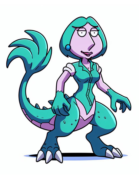
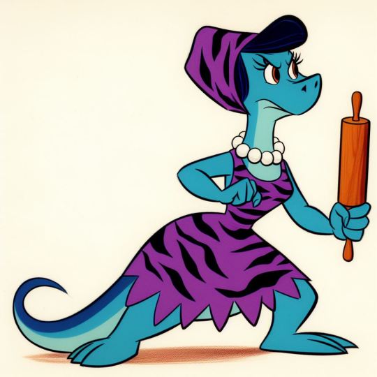
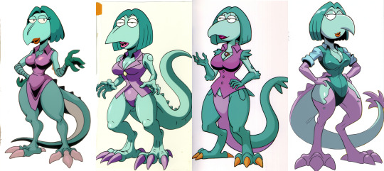
A couple of BioCritters are getting ported over to this new concept, specifically the Waifusaurus evolution branch:

Which was itself a parody of pokemon that are essentially just ladies anyhow, so its probably more accurate to say Waifusaurus spawned unnamed LadyMon Project.
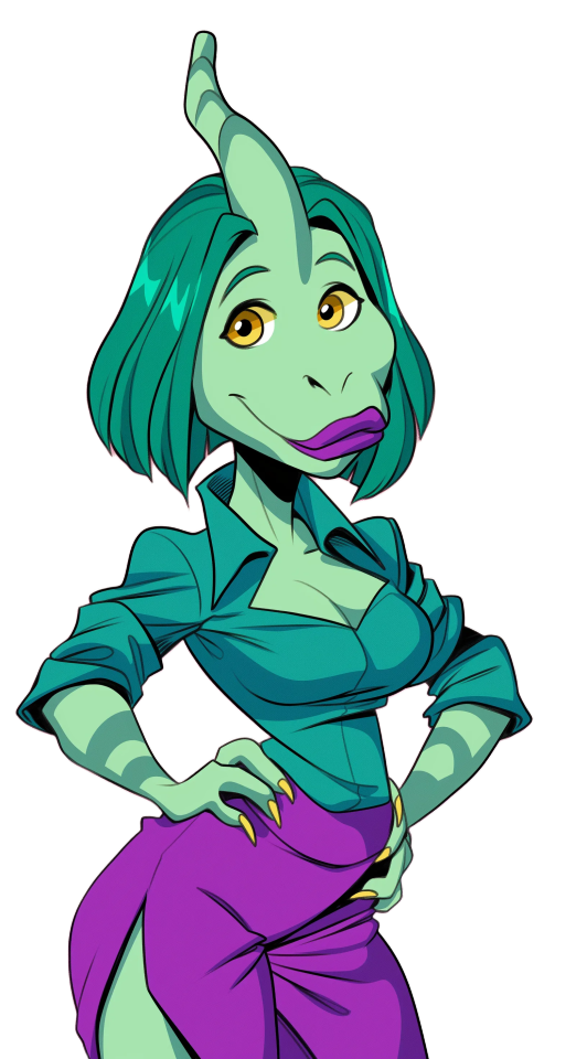
I made most of the first BioCritters in Dall-E3 through Bing Image creator, and Bing makes finding old prompts a pain, and while Straifu, the Lois Griffin parody form, is the subject of today's process, they followed the same prompt format I used with the Flintstones-inspired base Waifusaurus form:
vintage animation cell, a slender dinosaur-anthro housewife on flinstones, resembles humanoid dino the dinosaur, blue dinosaur-lady, purple tigerskin housedress, holding rolling-pin-made-of-rock 1963, in the style of 1960s hanna-barbera TV animation, character cel on white background, posed in a determined ready fighting stance
However, I have a specific look for this new project in mind, so its time to evolve the design.
Step one was to start with basic prompting. I built a new prompt that described what I wanted:
fullbody original production cel, white border all around, vintage animation cel, lavender humanoid woman-creature with large t-rex legs and tail, fan of feathers at the end, wearing teal button up blouse, bob haircut, clawed hands, lois griffin as a pokemon, female character design vintage cartoon screen capture (1993) by AKOM and TOEI , white background, beautiful variable-width black line art with cel shaded vintage cartoon color, painted backdrop, official media, UHQ 1996, official media, UHQ
I ran this in Niji 6, using the style moodboard I'd made for the purpose: --p m7298241701452185637 - largely a mix of full body character designs I'd generated in the style I wanted and 1980s animation model sheets. Moodboards are an expanded version of style prompting, which I outline here.

Examples from runs that produced nothing remotely like what I wanted. I could spend some time tinkering with the prompt to get closer but character prompting is right there, why not just load the original design in?
Yeah, Midjourney/NijiJourney cannot, as of v6, grok abstract cartoony art styles, and character reference always pulls at least a bit of art style as one of its limitations, so the general grotesqueness of its interpretations of these designs leak through.
Now, there's still several things I could do here. The easiest would be to take the straifu on the right and use a combination of in-painting and gradually swapping out the character prompt for a mix of "closer" options over a series of variations until it became something relatively close.
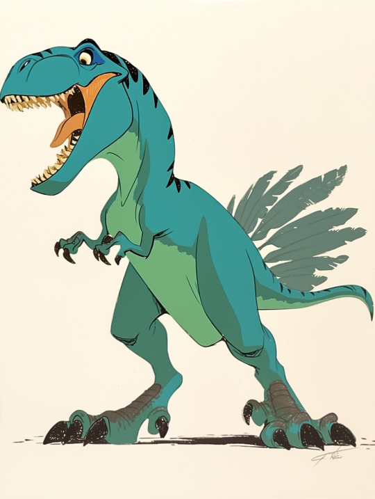
But around about now, I started getting ideas on how I wanted her to look. I liked the idea of a sort of "dinotaur", so I rendered up a regular rex, and combined it with one of the first-wave prompt-only failures and a recolored head in the style I was going for in photoshop.

This was a Q&D mockup, only intended for prompting purposes.


Using a combination of the mockups, the original design, and various results from their iteration-chain, I was able to get very close to the basic concept, only to run into two major issues: One, the huge lower body effect wasn't coming across as intentional (either disappearing into standard thicc-cartoon milfness or looking like AI screwups) and two: the design was boring when divorced from its bug-eyed cartoon aesthetics.
Now, you can do a lot with a flawed design, but a boring one means you need to start re-conceptualizing.
Which begins under the fold:
Straifu is a parody of Lois Griffin. In the broadest sense, that brings to mind the nasal voice, and in a battle-monster genre setting that means sonic attacks. Sonic + dinosaur means parasaurolophus to me.

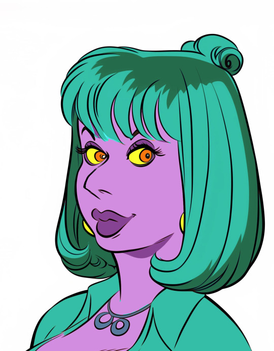
Above, I mentioned I could have in-painted one of the cartoony results. I had actually done that, using the mockup face as a character prompt, and one of its results was interesting, so I started refining based on that:

You can use edit to zoom in with Midjourney, it's just you can only do it horizontally or vertically in any given go. I zoomed in using this method, and redid her eyes in the process.
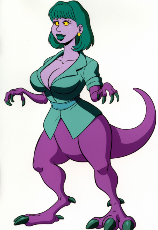
I did another mockup of her with a crest and in-painted, then iterated in the in-painting result.

I did a lot of iterations at this stage, some as basic variations, some as full strong variations, but eventually by combining various results into the character prompt, I got the variation I liked best.


My initial thought was to restore the "beak" from those earlier versions but her duckbill face was too perfect to pass up.
I then attempted to get her a full body via outpainting.

I didn't have much luck, once again the results were either too ai-fuckup-like or too basic.
The idea that came to me to solve the problem was to make her a full on parasaurolopus-taur, forelimbs and all. Midjourney wasn't going to cooperate on that, really weird designs aren't well understood by the current character reference.
Omnireference is supposed to fix that, but to paraphrase 'Oh Brother, Where Art Thou': Well ain't version 7 a temporal miracle? Two weeks from everywhen!
Now, it was time to do things the old fashioned way. With editing.
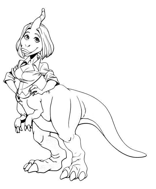
I went through a lot of attempts to make a base dinosaur:
Eventually landing on this fellow, and this torso forming this rough-cut:


Now, there's one thing to note, the line quality on the two is completely different. Fixing that means getting at the lines.
The best way to do this in photoshop is by upscaling the image 200%, and using a fill bucket set to around 10-25% (anti-aliasing on) and white to make any dark colors gradually lighter so threshold can drop them to pure lines.
From there, I selected individual sections of thin lines and duplicated them, using a combination of 1 px strokes and nuding sections a pixel in any given direction to match the line width without it looking like a coloring book.
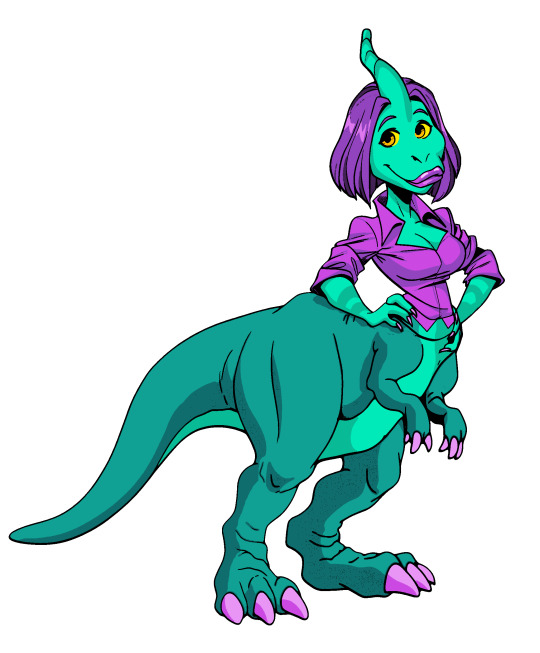
Which I then re-colored using your basic comic coloring process. I went with what is largely an inverse of the original colors because I already have a purple/lavender parasaurolophus character in DynoGuard.
Then, I started doing this tutorial, and realized one of the early versions shirt had formed a sort of plastron, and I went in and painted all that over on top.
I could go into more detail, but I'm out of images and this is already novel-length.
-
The gif at the start was made in Vidu, using the subject reference feature, the final image of Straifu, a background image, and this prompt:
a green creature with a purple shirt, she takes a deep breath and screams, the scream lasting 2 full seconds, Sakuga animation, eyecatch animation. Vintage traditional cel animation, TOEI, disney, don bluth, filmation productions, scene from Masters of the Universe (1983), ultra-high quality flawless animation sequence, Blu-Ray remaster. Every frame in focus and sharply detailed. Animated on 2s matte background painting.
#ai tutorial#midjourney#midjourney v6#nijijourney#character design#dinosaur#dinosaur-anthro#fakemon#waifu#lois griffin#family guy#parody#dinosaurs#parasaurolophus#vidu#vidu CCP#vidu AI#ai art#ai assisted art#multimedia art#art tutorial#photoshop#long post#do you like the color of the AI
16 notes
·
View notes
Text
question from my YT I wanted to give a more in depth answer to with visuals!
Why I like CSP animation better than photoshop: mostly just more organized/easier workflow! because:
Video groups can be clipping masks
Groups can be frames + CSP remembers previous frame's settings
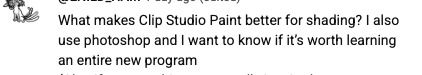
also tl;dr go watch finchwing's photoshop and then clip studio paint animation tutorials if you want to compare the two programs for animation!!
youtube
Photoshop can have INDIVIDUAL layers or regular non-video groups clipped onto video groups. But CSP can have video groups clipped onto other video groups, so for me the workflow in CSP is much simpler/cleaner. (+The visual clutter of photoshop animation can kinda get overwhelming for me lol but that’s personal pref).
Finchwing has an Amazing video tutorial on photoshop animation including a video on colouring+shading animation in photoshop; it’s where I first learned how to animate on photoshop and I highly recommend taking a look. But even just to compare what their photoshop timeline has to look like for shading compared to CSP, CSP looks much more organized while photoshop is a “giant staircase of frames” (as Finch describes) just because photoshop has to use individual layers to maintain their clipping mask functionality (turning it into a video group makes it unable to be clipping masks, which Finchwing mentions at 10:50).
Actually speaking of Finchwing, they made another animation tutorial with CSP if you want a more in depth comparison I’d really recommend just watching both their photoshop + CSP tutorial to compare the two programs!!
2. Groups can be frames in CSP. Again this makes for easier cleaner organization, and CSP does this cool thing where if I insert a new frame, it will REMEMBER the settings of the previous frame. So my previous frame was 1 group, with two layers in it (one for line one for colour). When I insert a frame it automatically creates 1 group with two empty layers in it. Very convenient. Photoshop can’t have groups within Video Groups, If you try it just puts the layers you’re trying to group together side-by-side like two separate frames. (which tbh i was fine with having separate video groups for line and colour in photoshop lol i can see benefits to just keeping them separate even in CSP as well)
IN CONCLUSION:
It really is more of an organization/quality of life thing. photoshop served me well for many years! Animation is so totally doable in photoshop (just look at finchwings photoshop animation work as evidence that you can POP off in there), but now that I won’t have access to adobe as I’m graduating and preferred a 1-time purchase over a subscription, I went and got CSP.
I admit after photoshop the learning curve was a little tough (CSP's distinction between 'frames' vs 'cels' confused me for a bit + I really missed how visual the ‘cutting’ of frames looks in photoshop lol?), but it only took me about 3-4 small test/practice projects, some googling, and a few custom keyboard shortcuts to get me preferring CSP over photoshop animation now C:
(also bonus gripe with photoshop: idk if there is a way to do this and i just never figured it out, but. i couldn't find a way to use arrowkeys/other keyboard shortcuts to scrub to frame to frame?? I had to use my mouse to drag the header along lol. CSP i set a keyboard shortcut for going to previous/next frame and bam that was that)
#tutorial#clip studio paint#animation#photoshop#adobe photoshop#art programs#ppmpost#if you or anyone else has any qs about comparing csp n photoshop feel free to ask while i still have photoshop until end of May lol#that way i can show more direct visual comparisons while i still have both programs
15 notes
·
View notes
Text
Table of Contents
Easily find all my posts. That way you won't have to scroll through my reblogs to find what you want! ( ꈍᴗꈍ)
Resources for Creatives
Video Tutorials
Surround Sound on YouTube
Downmixing Discrete 5.1 Surround Sound to Dolby Pro Logic II
Upmixing Dolby Pro Logic II to Discrete 5.1 Surround Sound
Manually Encoding Dolby Pro Logic II
Isolating or Removing the Center Channel In Audacity
Custom Closed Captions on YouTube
HDR on YouTube
Optimizing Video Quality on YouTube
Masters for Archiving
yt-dlp: Downloading YouTube Videos the Right Way
Animation and Film Tutorials
Free Animation Production Tracker Spreadsheet
Free Storyboards and Layout Templates
Underlighting
Cel Color Palette
Film Grain
Film Gate Jitter
Animation help reblogs
My Work
Neurodivergent Help and Personal Blog
Autism help
Health help
Personal blog
80 notes
·
View notes
Note
hi there! i had a quick question. so I've just started doing replica anime cels via your tutorial and i was wondering - is there a particular reason it's better to paint on the printable side of the film? is it just for the sake of having all of the pigment on one side? i wound up painting on the non printable side by accident, and so far i haven't noticed any of the paint cracking, which seems like a potential upside, but it's also only been a couple days. thank you for your time (and also for the killer tutorial!)
So, the reason I paint on the printed side is so the cel can be perfectly smooth and polished on the opposite side. The ink will always be slightly more matte than the cel itself, which means it will catch the light and be visible. I just prefer the displayed side to have that glossy mirror finish. But if it doesn't matter to you, do it however you prefer!👍
13 notes
·
View notes
Note
hey dude
how did you develop your art style? ive been drawing for years and I cant seem to get a handle on ANYTHING
4 almost 5 days late sorry dude you shot right into my inability to put thoughts into words properly HAHA
alright so first of all, i don't even think a style is something you need to do art. I'm a hobbyist apologist and as long those people enjoy creating it doesn't even have to look "good".
That aside i'm assuming you want to take art at least a little seriously so i'm just going to be straight forward and say that the only way is ping-pong between styles/techniques/themes and just stick with the stuff you feel more comfortable doing.
Now going into my personal experience, that's what you asked after all lolol (from now on this is just yapping so feel free to ignore it)
alr soooo im skipping my first steps into art and going into the humanoid phase. I actually started with sonic! Specifically the show Sonic X, of course i picked up mannerisms from the anime when it was time of doing comedic doodles (and cuestionable taste on fashion)
(im going thru my big inspirations so bear with me here)
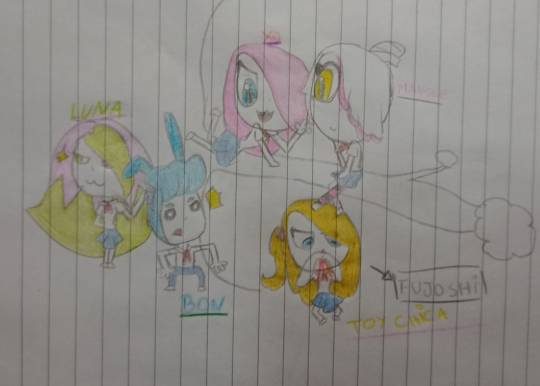
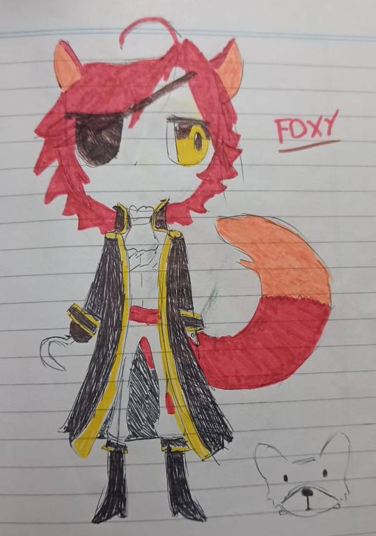
2015 came and i discovered my two main inspirations for a long time: fnaf and Ed00chan! (link to her abandoned deviantart so yall can see the style of the time). As i was completely enamored by her anime-yet-cartoony style i was also hyperfixated with fnaf and those two things combined perfectly into (the infamous in the spanish side of the fnaf fandom) fnafhs! bing bang boom there it goes my personality for the next 5 years!
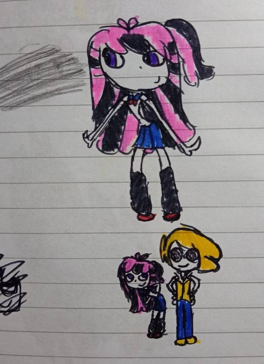
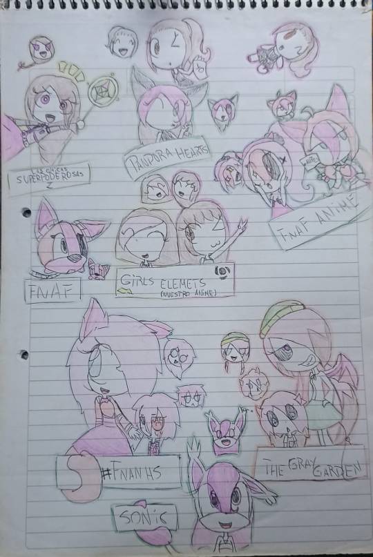
sprinkle a few power puff girls z too why not
anyway at that time i wanted to become a pro like ed00 so i had to understand anatomy, and my go-to channel was Bgm94! But the elders said that to broke the rules you have to understand them, so i just kind-of started doing more "realistic" bodies while maintaining the cartoony-ness i liked so much. Which to be fair, didn't last long before i got bored and jumped straight into cartoon/chibi again
also since we're entering my digital era i'm including some drawings with wild style changes since the experimentation never ends owo9


anyway that was 2018 and before! it was around 2017-18 that i dropped the general tutorials and just started experimenting on my own style/anatomy and trying to improve my skills (im ignoring my sketchbooks bc from now on they just become- well, sketchbooks, instead of doing full drawings i just doodled in classes and leaved the detail for digital stuff)


i would love to include all my 2019 folder bc i consider it was a year full of love for my silly doodles but tumblr has a limit for images HAHA. Hopefully you can see how i go trying out stuff and pick little stuff from every stage with me lolol


2020 hits and you can *see* my hyperfixation with twisted wonderland here, at least my folder is 60% twst drawings i made for my fanfic at the time LOL. Not so many style jumps here tho so let's keep going


2021 and 2022 here! at the second half of 2022 i found my oh so beloved crunchy brush and i also fell hard for Arashi Narukami, so basically my tumblr became an arashi fanpage lol


stuff at 2023 keeps pretty the same until now tbh, the only highlight would be the re-inclusion of noses bc of spiderverse 2. My style also has been pretty well maintained since i started doing commissions so i don't really do so much experimentation anymore, at least not with proportions and such.
alr so that was my journey on artstyle! Of course it's not like you're gonna guess all my process just by looking at the images so i'll say what type of stuff i feel influenced my decisions.
i'm very lazy and for a log time i just abandoned my projects if it prolonged more than a day or two, that obviously made me lean into the cel/plain shading rather than spending hours and maybe days rendering (not that i don't try rendering every now and then but i don't enjoy spending so much time in a single piece)
everyone around me always has been extremely supportive so i had the privilege of dedicating all my soul to drawing silly characters haha, i feel like since i never felt the need of comparing myself to others i could actually experiment so unapologetically with my style until i was satisfied
finding an actual brush that i like is always crucial to me tbh, even in traditional i'm pretty picky with how the ink and type of pen i'm using. Of course, i also tried multiple traditional art techniques (watercolor, acrylics, crayons, pencils, pastels, my favorite are pen+markers)
i dont like feets. that shows until today.
in general i think an artstyle is something extremely personal that every person has to shape themselves and that it can't really be a permanent thing, it's gonna fluctuate with the artist whenever they like it or not.
#rui thinks loudly#i have looong list of inspirations but i dont really think its that important rn#going thru my old sketchbooks and having a whiplash of cringe at the fanart i did to a ytber that got exposed as a groomer last year#also 90% of the fnafhs cast i mentioned was exposed for stuff like that. MAN cant people be normal#growing up is realizing i was right at being terrified of talking with strangers on internet HAHA#anyway its 3 am goodnight#rui answers
18 notes
·
View notes
Text

🎆🥂 Happy Holidays!! 🥂🎆
This is the 13th year in a row where I'm posting an Art Summary! 🥳 2024 has been very hard (if 2023 was the frying pan then 2024 was the fire, lol 🍳🔥), but it also had lots of good things; so I'll list them below:
👍I was awarded the Deviousness Award (DeviantArt). 👍I joined Cara and Tumblr and met a lot of cool people there. 👍One of my FF7 artworks reached +1000 notes on Tumblr, becoming one of my best received works! 👍I donated art to the Coloring Books for Charity Project and fulfilled my dream of seeing my art printed in a coloring book! 👍I added 2 new portraits to my series of hyperrealistic paintings. 👍I wrote many new chapters of my Hakuouki fic, both in Spanish and English. 👍I set up a ToyHouse account and drew many portraits for my beloved Hakuouki OCs' profiles. 👍I posted +10 new tutorials & WIPs! 👍I did my own anime version of one of my favorite Van Gogh's paintings: "Portrait of a Woman with Red Ribbon". 👍I took part in the Hatsune Miku Worldwide Event by drawing Uruguay!Miku. 👍I was gifted 2 awesome pieces of fanart featuring my Dragon Ball Xenoverse OCs! 👍I completed Huevember for the first time ever. 🌈
I'm glad to see that this year's art was a cool mix of Cel shaded Anime Art, Realism, and Art Memes! 💖 May the next months be full of improvement, imagination, and success!✨
#art summary#art summary 2024#summary of art#2024 art summary#2024 art#summary of art 2024#my art#no ai used#support human artists#artists on tumblr#human artist#digital art#paint tool sai#fanart#original art#art trend#art meme#art challenge#digital artist
4 notes
·
View notes
Text
I finally finished a replica animation cel for myself, complete with a background. I don’t hate the result but I def made things much harder on myself than I should have 💀, I might make an in-depth step-by-step tutorial soon so anyone interested in doing something like that can hopefully have an easier time than I did.
#I’ve done a few others in the past that were just my OCs rather than a replica of a preexisting one#this is the only one I feel didn’t turn out pretty badly lol
5 notes
·
View notes
Text
Fun fact, my "avatar" as tumblr calls it was my second attempt following a tutorial on how to make a faux cel. The tutorial was by DerpyBayamax.
The guy in the fedora is named David Montague, he's an oc that I made long ago.
Another fun fact, this variation of him was heavily inspired by the Batman The Animated Series episode "Nothing To Fear."

2 notes
·
View notes
Note
Just wanted to say your Epsilon cel is such a good shot from the anime. If it's not too much trouble, what's your experience been like buying cels from online sellers? I've only ever bought cels from booths at conventions, since I can physically check them. I know buying online would expand options though (I promise I am not after any Epsilons).
That was the only cel I've ever bought, so I'm not sure how much insight i can provide, sorry 😅 I would say I had a good experience though. I purchased it through Timeless Cel Gallery's eBay shop, and it worked out to $100 (sale, originally $120) + $18 shipping. That seemed pretty good to me, but idk cel prices vary wildly i have no idea how they're valued lol
It came packaged in one of these flat rate boxes, with some crumpled paper padding inside, and couple layers of cardboard sleeves to keep it from bending. The cel itself was in a clear protective sleeve also

From what I can tell I lucked out with the condition (no warping or smudges or anything), but they seem pretty meticulous about noting any defects in their other listings!
For framing, they also have a tutorial which I followed, but I bought my own materials and UV protective acrylic to save money :0
#replies#freyalir-posting#even if it was in bad condition i still would have bought it cuz its the only epsilon cel i've ever seen :')#that particular seller is based in Washington btw so i didn't get it shipped from Japan or anything
5 notes
·
View notes
Text
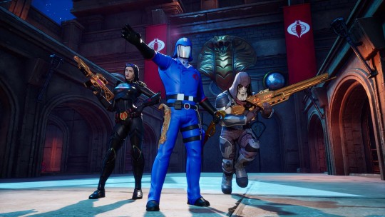
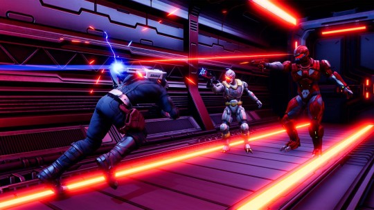
G.I. Joe: Operation Blackout Review (PlayStation 4)
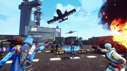
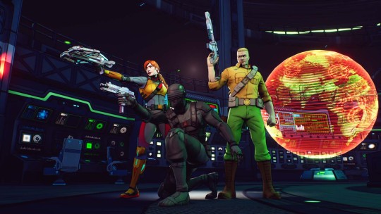
For this G.I. Joe: Operation Blackout Review we welcome G.I. Joe and Cobra back! G.I. Joe: Operation Blackout is a team-based third-person shooter where you play as your favorite characters from Team G.I. Joe and Team Cobra. Experience the action from both sides as you help G.I. Joe restore order and lead Cobra to world domination.
G.I. Joe: Operation Blackout Review Pros:
- Decent cel-shaded graphics. - 12.12 GB download size. - Platinum trophy. - Game settings-auto aim, subtitles, and tutorials. - Invert axis and sensitivity sliders. - Solo and Co-op campaign support. (local) - Four difficulties-action figure, government issue, man of action, and real American hero. - Solo gives you an AI partner. - Multiple controller layouts including custom rebind. - 3rd person shooter gameplay. - 12 characters from the series Eyes, Duke, Lady Jaye, Sci-fi, Scarlett, Roadblock, Cobra Commander, Storm Shadow, Firefly, Baroness, Destroy, and Zartan. - Reload-fast reloads by timing your reload. (think Gears Of War active reload) - Ammo and health pickups. - a short starting tutorial section to go over the controls. - Ultimate unique attack for each character that builds over time and when you kill enemies. - Cartoon-looking stills are used for cutscenes. - Unlock new weapons and character skins. - Team battle-four player local MP with six maps, three modes (team arena, assault, and CTF), and settings for kills to win or match time. - Collectibles-comic covers and earn videos. - Bio section for all the characters. - Can replay levels. - Each level shows how many Collectibles you have found, the side objectives completed, and the best time and score. - Can skip the cutscenes. - The story goes between Gi Joe and Cobra. - Stop start animation cutscenes. - End of level breakdown for your score. - Each mission/level lets you pick from the two available characters. - Modifiers-13 of them and they can make the game harder or easier. - On-screen icons for objectives. - Each character has unique attributes. - Decent loading times. - Interactive points and most of the time will trigger a mini-mission like an event. - Can change settings in the pause menu. - Pick up new guns in the level. - Horde mode-style events. - 29 comics to collect showing off classic comics. - Many boss fights with the main characters. - Combo counter for kills to build your score. - Vehicle missions.
G.I. Joe: Operation Blackout Review Cons: - No field of view slider and the view is quite close. - Hard to pick out enemies. - Auto-aim is not good as it loses lock on with any movement from you or the enemy. - No real replay value. - Characters don't move their mouth when talking. - Shooting in general is just not good. - Heavily scripted fights that break the immersion. - Small text. - They took good mechanics from popular games and mashed them all together. - Pain-in-the-ass trophies are like a load of multiplayer ones. - A lot of the levels are just go here fight a wave, go to next shoot some guys the end. - No online multiplayer or co-op. - Bad Ai pathfinding. - Your AI partner is completely useless. - Comic Collectibles are just the front cover and you can move it around. - Can't skip the ultimate animation. - Can't use modifiers on your first playthrough. - A lot of pop-ins and textures fill in as it loads. - It doesn't use the main 1980s TV show theme tune! Related Post: YO JOE! G.I. JOE Makes Its Way to World of Tanks
G.I. Joe: Operation Blackout: Official website. Developer: GameMill Publisher: GameMill Store Links - PlayStation Read the full article
3 notes
·
View notes
Text
This post touched on physical media for drawing which is good but I want to add my ramblings about physical drawings as well because these days there's a lot of emphasis on drawing digitally, to the point where I think it's been an actual decade since I've come across a tutorial where someone has drawn things physically on paper....Like, don't underestimate the power of drawing on paper and learning to use physical media. Yeah it's not going to do anything in terms of your popularity 👀👀💧 but at the moment, you've also got an extra layer of protection between you and AI since the best physical art AI could probably do with current technology is something akin to "printing" out a picture with a writing utensil of some sort since mimicking real physical technique from photos of paintings or drawings is quite a bit harder than weighting pixels and outputting them into a file.
I'm also telling you this for corporate reasons. The way the world is going, there's going to come a day when there are no free programs for drawing, and certainly tablets and computers won't be free or cheap, and they're going to demand all your personal information to even boot up. You'll be locked into selling all your data and locking yourself into subscriptions just to have some artistic expression. Do you want that? Adobe and apple can do a lot but they can't fucking take away your paper and pencil. You should learn to use them if only to take back power from corporations. It's why even though I do use digital tools a lot for comic color because it's faster and I'm just one person, I still do almost everything else physically (ink/pencil/layouts/etc). I have a box the size of a large coffin with all the comic book pages I've drawn in my adult life, and the only way Adobe is getting their hands on them or removing my access to them is by banging down my front door or burning my house down.
Sure, technology makes our lives easier, but if you learn to use physical mediums, no one can ever take art away from you or keep you from creating it (at least not EASILY without some seriously oppressive changes) and it's going to be a very long time (maybe not even in our lifetimes) that the corporate ability to do so is finally nerfed.
And yeah you don't need fancy shit. I do all my rough sketching on printer paper with a mechanical pencil, or with a cheap ass sketch book I carry around. Especially if it's just for you practicing and no one is going to see it, you do not need fancy things. Your ancestors ground stuff up and dipped their hands in it and smacked a cave wall. This is your RIGHT to make shit by whatever means necessary whether you think it's instagram worthy or not. (I even outlined what you can use for animation from dollar tree if you're broke in a series of posts if that's a thing you want to do https://www.tumblr.com/featureenvyproductions/752966738522619904/my-thoughts-on-how-to-do-basically-kinda-cel?source=share)
And that's another thing too, don't worry if it sucks. I promise it doesn't, because you made something. And also even if you think it does because you're not meeting your goal or whatever, you have to shake the 10000 bad drawings out of your wrist before you get to the good stuff. Even someone like me who's been drawing [seriously anyway] for 25+ years has to warm up a bit before churning out something serious. Just do it I promise it's fine. (And also if you have the ability to take a figure drawing and/or life drawing class do that because in my experience it helps)
(Also not that I'm that great at art still compared to a lot of artists, I have been at it for a long long time, so if anyone who sees my stuff ever wants to know how I did something, please ask me, I will tell you free tips, I love info dumping, there is no such thing as a stupid question,,,,the greatest compliment is being asked how I did something,,,you do not understand,,,,to me democratizing art means ensuring YOU no matter who you are, can make some of it)
Can't afford art school?
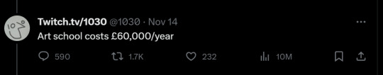
After seeing post like this 👇
And this gem 👇
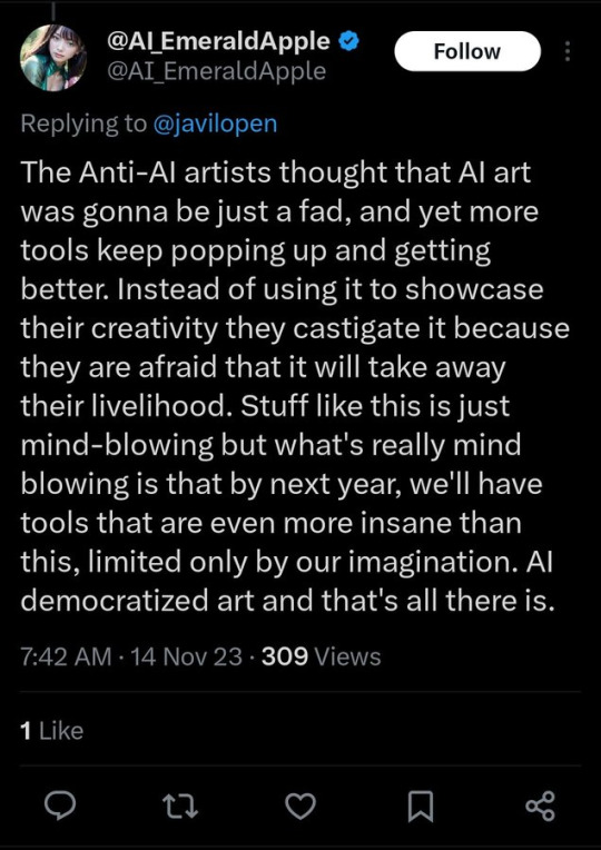
As well as countless of others from the AI generator community. Just talking about how "inaccessible art" is, I decided why not show how wrong these guys are while also helping anyone who actually wants to learn.
Here is the first one ART TEACHERS! There are plenty online and in places like youtube.
📺Here is my list:
Proko (Free)
Marc Brunet (Free but he does have other classes for a cheap price. Use to work for Blizzard)
Aaron Rutten (free)
BoroCG (free)
Jesse J. Jones (free, talks about animating)
Jesus Conde (free)
Mohammed Agbadi (free, he gives some advice in some videos and talks about art)
Ross Draws (free, he does have other classes for a good price)
SamDoesArts (free, gives good advice and critiques)
Drawfee Show (free, they do give some good advice and great inspiration)
The Art of Aaron Blaise ( useful tips for digital art and animation. Was an animator for Disney)
Bobby Chiu ( useful tips and interviews with artist who are in the industry or making a living as artist)
Second part BOOKS, I have collected some books that have helped me and might help others.
📚Here is my list:
The "how to draw manga" series produced by Graphic-sha. These are for manga artist but they give great advice and information.
"Creating characters with personality" by Tom Bancroft. A great book that can help not just people who draw cartoons but also realistic ones. As it helps you with facial ques and how to make a character interesting.
"Albinus on anatomy" by Robert Beverly Hale and Terence Coyle. Great book to help someone learn basic anatomy.
"Artistic Anatomy" by Dr. Paul Richer and Robert Beverly Hale. A good book if you want to go further in-depth with anatomy.
"Directing the story" by Francis Glebas. A good book if you want to Story board or make comics.
"Animal Anatomy for Artists" by Eliot Goldfinger. A good book for if you want to draw animals or creatures.
"Constructive Anatomy: with almost 500 illustrations" by George B. Bridgman. A great book to help you block out shadows in your figures and see them in a more 3 diamantine way.
"Dynamic Anatomy: Revised and expand" by Burne Hogarth. A book that shows how to block out shapes and easily understand what you are looking out. When it comes to human subjects.
"An Atlas of animal anatomy for artist" by W. Ellenberger and H. Dittrich and H. Baum. This is another good one for people who want to draw animals or creatures.
Etherington Brothers, they make books and have a free blog with art tips.
As for Supplies, I recommend starting out cheap, buying Pencils and art paper at dollar tree or 5 below. For digital art, I recommend not starting with a screen art drawing tablet as they are more expensive.
For the Best art Tablet I recommend either Xp-pen, Bamboo or Huion. Some can range from about 40$ to the thousands.
💻As for art programs here is a list of Free to pay.
Clip Studio paint ( you can choose to pay once or sub and get updates)
Procreate ( pay once for $9.99)
Blender (for 3D modules/sculpting, ect Free)
PaintTool SAI (pay but has a 31 day free trail)
Krita (Free)
mypaint (free)
FireAlpaca (free)
Libresprite (free, for pixel art)
Those are the ones I can recall.
So do with this information as you will but as you can tell there are ways to learn how to become an artist, without breaking the bank. The only thing that might be stopping YOU from using any of these things, is YOU.
I have made time to learn to draw and many artist have too. Either in-between working two jobs or taking care of your family and a job or regular school and chores. YOU just have to take the time or use some time management, it really doesn't take long to practice for like an hour or less. YOU also don't have to do it every day, just once or three times a week is fine.
Hope this was helpful and have a great day.
#also yeah watch drawfee#I just started going through all their YouTube videos and I love these people#This is exactly what art should be like#You know like they're really good artists and it's obvious and you can learn a LOT from even their goofy speed drawings#their technique is very good and they show drawing and colorization as an iterative process#but in a way I think anyone can comprehend#good technique but approachable#And they have fun with it and don't take themselves to seriously#If I was going to get someone to watch a drawing channel this would be it#To be honest it's not even that I give a supremely large fuck about AI art#What I care more about is corporations suffering#as in I love to watch them squirm#i am acespec but physically attracted to the feeling it gives me#when a corporate entity can't milk cash from something or get their grubby hands on things they have no right to#and you exercising your human right to make art without them makes them suffer#it's also better for the environment#this is an anti-capitalist/anarchist thing for me#this is why I will tell you art things if you ask
103K notes
·
View notes
Text
MODERN 2.5D GAMES / HAND DRAWN TEXTURES
Pixel art no no but what if?
I do not plan to add any traditional pixel art (drawing pixel by pixel) into my game.
however if i were, i'd probably end up using a similar tactic to what i did in my first project - where i'd draw a normal sized image; scale it down, and trace over it it correct any imperfections.
here's an example:
i will use this drawing of me i did in like 3 minutes.

the image is at 1024 x 1024.
i decided not to use any anti-aliasing for this. i'll be scaling it down to 64 x 64.

it's already perfect. but it might need a few more lines.

and with a few corrections, i've gone from perfection to something somewhat passible.
that's roughly what i'd do if i were to make this game using "traditional" pixel art. except instead of taking around 30 minutes i'd put a bit more time and effort into it.
------------------------------------------------------------------------------
RESEARCH VOID BASTARDS (look at toon shaders UE5)
void bastards is a first person shooter and a rouge like (according to wikipedia) that released in may 2019.
it's defining characteristic is its comic book like art style.

what's really impressive is that the game itself is 3D, and it gets its comic book style from a custom shader.
it looks really good in my opinion.
Unreal engine 5 has many different ways of making toon or cel shaders.
there are plenty of tutorials on youtube - like THIS ONE, or THIS ONE, or THIS ONE (which pairs nicely with this tutorial on outlines made by the same person)
however, i don't think i'll be using any custom shader for this project, as i don't think there'd be enough time to fully utilize it in the time i have left.
maybe in one of my future projects though.
------------------------------------------------------------------------------
RESEARCH BORDERLAND TEXTURES (how it looks)
borderlands is a first person shooter that released in october 2009.
much like void bastards, borderlands uses comic book-esque toon shaders.

however, what makes borderlands really cool is that it uses more than JUST toon shaders.
a lot, if not all, of its textures have details and lines actually drawn onto them.


it's particularly noticeable in the first two images, but the outline on the sides aren't the result of a toon shader, they've actually been drawn on.
i'll keep this sort of style in the back of my mind if i ever decide i want to make another 3D game.
------------------------------------------------------------------------------
OTHER MODERN GAMES THAT COMBINE 3D WITH TRADITIONAL ART.
there are many other 3D games that use 2D art to there advantage, but most of the ones i think of are anime games.
dragon ball sparking zero is impressive as the dragon ball art style (especially the faces and hair) makes no sense in 3D, here's a youtube short by totally not mark that goes into more depth about it:
youtube
yet despite that they've still managed to make some really good looking animations.


in motion they end up looking incredibly good.
another game with a good mix of 2D and 3D is demon slayer: the hinokami chronicles.


unfortunatly, since i can only upload one video per post, i can't show the animations on tumblr.
but i can put them on google drive and post the link here.
VIDEO IS HERE.
i don't honestly know how they've managed to make the effects look that good, or how they've managed to blend 2D and 3D together so fluidly, but i'd be damned if it doesn't look good.
------------------------------------------------------------------------------
while it's not traditional art, the game replaced blends 2D and 3D together very nicely.

the paper mario series (just in general) is a fantastic example of blending 2D with 3D


super paper mario's main gimmick is that you switch between 2D and 3D.
rayman legends uses 3D for it's boss fights, despite the rest of the game being primarily 2D.

0 notes