#colour science
Text
What Pride Flags Mean, Part 1: Gender and Attraction
Welcome to the latest installment of my autistic hyperfixation on flags! I wanted to figure out a common language of Colour X means Thing Y. Like how pink is consistently used for feminine.
Having a common language for flag meanings matters because it improves cognitive accessibility of flags. ♿️💙
But I didn't want to be prescriptive about what colours should mean what. Just because I think Thing X should go with Colour Y doesn't mean everybody else would.
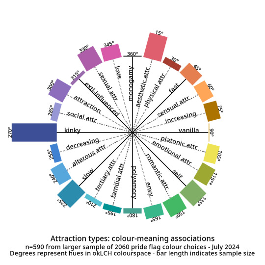
So this turned into a descriptive, empirical project. I gathered a data set of 2060 pride flag colour choices to figure out what are the most common colour-meaning combinations. Some of the results:
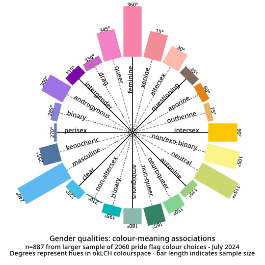
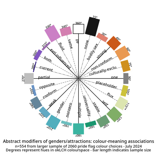
And here are the abstract modifiers: these are modifiers that were generally shared between the genders and the attractions. For example, black is used to indicate having no gender as well as having no attraction.
Click here for tables with okLCH values, hex values, definitions, and notes - I've put a more detailed write-up on my Wikimedia Commons userpage. (Mediawiki supports sortable tables and Tumblr does not.)
METHODS-AT-A-GLANCE
To make the figures above, I assembled a data set of pride flag colours. It contains 2060 colour choices from 624 pride flags, representing 1587 unique colours. Click here for a detailed description of how I gathered and tagged the pride flag colours and tagged them.
For each tag, I converted every colour to okLCH colour space and computed a median colour. OkLCH colour space is an alternative to RGB/hex and HSL/HSV. Unlike RGB/hex and HSL/HSV, okLCH is a perceptual colour space, meaning that it is actually based on human colour perception. 🌈
In okLCH space, a colour has three values:
- Lightness (0-100%): how light the colour is. 100% is pure white.
- Chroma (0-0.37+): how vibrant the colour is. 0 is monochromatic. 0.37 is currently the most vibrant things can get with current computer monitor technologies. But as computer monitor technologies improve to allow for even more vibrant colours, higher chroma values will be unlocked.
- Hue (0-360°): where on the colour wheel the colour goes - 0° is pink and 180° is teal, and colours are actually 180° opposite from their perceptual complements.
The important thing to know is that okLCH Hue is not the same Hue from HSV/HSL - the values are different! (HSL and HSV are a hot mess and do not align with human colour perception!)
You can learn more about okLCH through my little write up, which was heavily influenced by these helpful articles by Geoff Graham, Lea Verou, and Keith J Grant.
You can play with an okLCH colour picker and converter at oklch.com
🌈
MORE RESULTS: COLOUR DISTRIBUTIONS
Back when I started tagging my data, I divided my data into five main chunks: Gender qualities (e.g. masculine, androgynous), Attraction (e.g. platonic, sexual), Values (e.g. community, joy), Disability (e.g. Deaf, blind), and Other.
I'll talk about Disability and Values in future posts! But for an alternate view of the data, here are the full distributions of the colours that were placed in each tag.
They come in three parts: tags I created for Gender, tags for Attraction, and tags from Other. The abstract modifiers are spread between the first two, though their contents transcend Gender and Attraction.
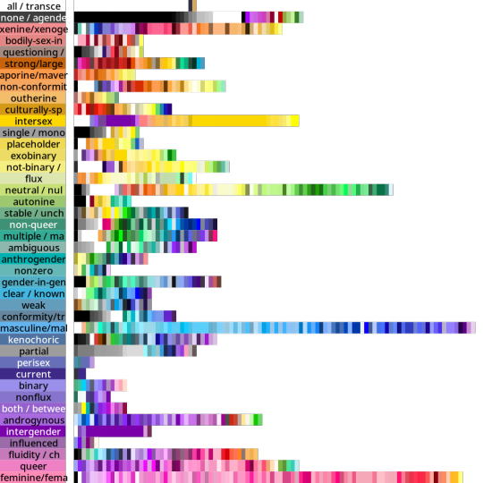
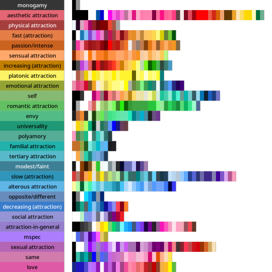
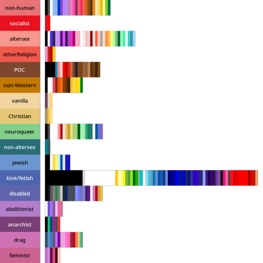
Some distributions have a lot more variance within them than others. Generally speaking, major attraction types tended to have the least variance: sensual attraction is really consistently orange, platonic is really consistently yellow, etc.
Variance and size do not correlate. Many of the smaller tags are quite internally consistent. I don't have a ton of tags in "current gender" but they're all the same dark purple. Xenine/xenogender has a whole bunch of entries, and there's a really big spread from blue to yellow.
Some tags, like intersex as well as kink/fetish show there are a small number of different colours that are very consistently used. Whereas other tags like masculine show a very smooth range - in this case from cyan to purple.
Overall I'm pretty satisfied with how things wound up! 🥳 It makes sense to me that an umbrella term like xenogender would have a lot of variance. What honestly makes me happiest is just how many tags wound up 180 or 90 degrees from their opposites/complements. 🤩
Not everything lined up nicely (the opposite of drag is .... neuroqueer? awkward.) 🤨 Some things lined up in hilarious ways, like how initially I had the opposite of kink/fetish being Christian (amazing.)
But as a whole, there's a lot of structure and logic to where things landed! I hope this makes sense for other people and can help inform both flag making as well as flag interpreting (e.g. writing alt-text for existing flags). 🌈
I'm hoping to post the Disability and Values analyses in the coming days! If you want to learn more, my detailed notes along with tables etc are over on my Wikimedia Commons userspace. 💜
Everything here is Creative Commons Sharealike 4.0, which means you're free to reuse and build on my visualizations, tables, etc. Enjoy!
#lgbt#lgbtqia#mogai#mogai flag#mogai flags#lgbtq flags#lgbt flags#lgbtqia+#vexillology#flags#colours#oklch#colour nerdery#colour theory#colour science#cognitive accessibility#design
163 notes
·
View notes
Text
On paint, primary colours, and why your art teacher didn’t lie to you after all.
An explainer by SainaMoonshine
Sources: dude just trust me
Introduction: colour theory and what the internet has been telling you about it
So if you’re an artist and make digital art, or have spent any time at all online in the last 10+ years, you probably know about RGB colours versus CMYK colours.
A quick recap, just to make sure that we’re all on the same page: RGB colours is the way that your screen shows colours to you, and the way it does that is by blasting light at your eyeballs. Different light waves are perceived by your eyes as different colours. It’s called an “additive” colour model because when your eyes perceive all of the possible wavelengths at the same time, you see white. When you see no light at all (and therefore no wavelengths), you perceive that as black. So, in order to make combinations of colours, I need to combine wavelengths. Your eyes have receptors for the wavelengths of green (useful to our evolution because almost everything on this planet is some sort of green), red, and blue. So when your eye sees a wavelength that’s in between green and red it tells your brain “eeeh that’s probably yellow I guess.”
(This is, incidentally, the reason why we see magenta. Light has no corresponding wavelength for that sort of super-pink that is magenta. When it waves faster than red it becomes infrared light, which we can’t see, and when it waves faster than violet it becomes ultraviolent, which we also can’t see. But when your brain perceives a bit of red and a bit of blue, it basically just shrugs and makes up a colour to fill the blank. This is not important to the rest of this explainer, I just wanted to mention it because it’s neat.)
Given that, computer screens don’t really need to shoot all of the wavelengths at you; they only need to shoot those three primary wavelengths at different intensity and your brain adds up how much blue, red and green it sees and then makes up what colour it “should” be seeing.
(so yeah, basically when you see yellow on a screen you’re more-or-less hallucinating it. Sorry.)
Anyway that is how old computer screens used to work, with each pixel made out of three teeny-tiny little dot of red, blue and green light. Is that still how screens work now that they are flat? Who knows. Technology is magic, etc.
Now, about that other colour scheme that you might have heard about. CMYK. It’s called a “substractive” colour model and it’s the mode that you should set your photoshop file on if you intent to print something. Why is is substractive? Well, that is because when you print, you don’t print with light. You print with ink, which is basically a bunch of tiny pigment particles (or dye particles, but the distinction isn’t important here) suspended in a liquid (or a goo, or in the form of a powder). Assuming that you are printing on white paper, each layer of ink that you put down basically prevents light from bouncing off that paper and entering your eye. So when you combine colours using a physical medium like ink, you don’t get white. You get progressively LESS white, in fact. All of the inks mixed together will grab ALL of the colour waves and prevent them from richoteting into your peepers, so basically that resulting mix will appear as more-or-less black. (An ACTUAL black ink is added to printers for several reasons, one of which being that mixing cyan, magenta and yellow makes some sort of super-dark-brown-but-not-quite-black black that’s not super great to look at, and another reason being that coating a page of paper in three colours of ink is often time way too much ink than what that page can absorb. One pass of nice black is better than three superposed passes of other colours, especially when it results in a yucky subpar black anyway.)
So, basically:
When you colour with light = Red, Green and Blue are considered primary colours
When you colour with ink = Cyan, Magenta and Yellow are considered primary colours
…
Wait. Hold on. Didn’t my elementary school teacher tell me that Red, Yellow and Blue are the primary colours?
Congratulations! We have reached the reason I’m writing this explainer in the first place. And it is to tell you to stop listening to the self-proclaimed art experts on the internet that will scream at you all day that Red, Yellow and Blue are BAD and if you use them as primary colours you should feel bad and your elementary art teachers lied to you.
Because, the thing is? Go to any art store right now and try to buy a “primary colours” set of acrylics paint. It’s red, yellow, and blue. All of them are, in fact. Every single acrylics paint manufacturer in the world is selling beginners sets with Red, Yellow, and Blue as the main primary colours. Are they all wrong???? Are they lying to me, too??? Is the rando on youtube right and it’s a conspiracy???
No it’s not. Calm down. Go back up a few lines, read what I said again: When you colour with ink = Cyan, Magenta and Yellow are considered primary colours
Ink.
INK.
Ink and paint aren’t the same thing. They behave differently, my dudes.
Read more to find out why!
Why does it matter?
Because people on the internet are wrong and it bothers me.
But also, let’s say that you want to buy paint a do some art. You are standing there, frozen in the middle of the aisle at the local art store, staring at all of these tubes of red and magenta and cyan and blue and you don’t know what to do. You WANT to get the nice box of “all the essential colours” because it’s on sale, but it doesn’t have magenta and cyan, and all of the super famous art influencers on tiktok have filled your brain with the idea that red and blue are BAD and only cyan and magenta are the TRUTH. What do????
First off, I want to give you a solid reminder that no amount of mixing paint will make a nicer colour than one from a pure pigment. I know you wanna buy some yellow and blue (cyan?) and make all matter of greens with them. No green you mix will be as nice as a tube of green made with a green pigment. That doesn’t mean “do not mix colours”! Not at all!
It means: I’m about to tell you it’s possible to mix yellow and red to make orange and I don’t want you to point at the tube of cadmium orange and tell me that you didn’t manage to get this EXACT hue and therefore I’m lying. I know you can’t mix cadmium orange. You can mix something that looks at LOT like cadmium orange, okay? Okay.
So, with all that said. What primary colours SHOULD you get? Because the internet is screaming about Cyan-Magenta-Yellow but all the acrylics kits are Red-Yellow-Blue, so like. What’s up with that?
Yeah, what’s up with that? How *do* inks and paints behave differently?
The main difference between ink and paint is the binder. That’s the substance that creates the “base” of the product, and little teeny-tiny particles of pigments float inside and those make the colour. With ink, the binder is typically translucent and liquid. With paint, the binder is typically a sort of paste that may or may not be translucent.*
*This is a gross over-simplification for the purpose of entertainment. I am not a colour scientist.
Which means that when thinking about colour mixes, one must keep in mind that you can’t really add white in an ink. (I mean, you can, but you’ll get a cloudy liquid that is no longer translucent, AND it will mess up your texture. I know there are white inks. DO NOT mix them with regular ink.)
Let’s say that I want to make a red ink less red. I want to make it paler. The way to do that is to dilute it. Adding more liquid to red ink = fewer red pigments per drop of ink. I now have a paler, more liquidy and translucent ink, and when I spread it on white paper it looks pink-ish. (I personnally think that diluted red looks like diluted red and not pink, but ymmv)
But even after diluting my ink like that, I can still colour something “red”. I’ll need to apply that ink several times on my artwork in successive passes, and it will be a pain in the ass, but eventually I will still be able to get “red” out of that ink bottle because I didn’t change the colour, not really.
But what about paint?
Paint is different in that usually you want it to be opaque. (DISCLAIMER I AM NOT TALKING ABOUT WATERCOLOUR PAINT HERE DO NOT @ ME)
So if the red paint you’re using has a translucent binder, adding more binder is kind of eeeeh. I mean you’ll get a less “aggressively red” red, sure, but also a less opaque paint. Which isn’t great. (Again, I am not talking about watercolours)
BUT! Here’s the thing: you can add white to your paint. It’s okay. In fact, it’s encouraged! And a lot of premixed paint will already be premixed with a white binder, usually Titanium white because it makes for a nice bright base that really makes those other colours pop (and also it’s not lead). Some kits of acrylic paints might also come with a tube of white specifically labelled as “mixing white”!
So if you, as an artist who likes tubes of premixed paint and didn’t even know someone could make their own paint, wants a paler red, what you’re gonna do is add white. Which will probably make a nice pink, or at the very least a red-with-white-in-it sort of colour.
You have now successfully made your paint paler, but now there is no amount of superposed layers you can paint that will eventually result in red, because we’re juggling two pigments here, not just the one. And also this paint is opaque. (Not watercolour)
Okay but what does that have to do with primary colours?
It has everything to do with them! A “primary colour” is a colour that cannot be created from mixing other ones. Given that I cannot add white to make inks brighter, then the primary ink colours are those that are the brightest and most luminous on the colour wheel: cyan, magenta, and yellow. Blue, being darker than cyan, can be created by mixing cyan ink with a little bit of magenta ink, but cyan ink will never happen from blue no matter how much I dilute it or try to mix it with something else. Because the way to create cyan from blue would have to involve making it lighter, which I can’t meaningfully do with an ink.
But I can do it with paint! I can take some blue paint and add a bunch of white and a liiiiiiitle dab of yellow and voilà! Something that looks a lot like cyan had been produced. (Remember my earlier disclaimer that no paint mix is going to be as nice and shiny and vibrant as a pure pigment from the tube? Yeah, it applies here. I’m not saying that you can use blue and white and yellow paint to make something exactly like what comes out of the tube of cyan, but you can come pretty dang close.)
Same with magenta! No way no how am I ever going to make a decent magenta from red ink, but all I need is some red paint and some white and a soupçon of blue and I can make myself a pretty damned good magenta-ish paint mix. (Idem, straight from the tube > colour mixes, but good enough is what interests us here, not perfect match because perfect match just isn’t possible NO MATTER which primary colour wheel you use)
Oh, so what you’re saying is that the primary colours of paint is indeed Red, Yellow, and Blue?
Not really. You can also make red paint with magenta (+ yellow) paint. And blue paint out of cyan (+ red) paint.
¯\_(ツ)_/¯
Truth is that when it comes to acrylics and other types of paint (not watercolour I don’t know anything about that and in any case I inagine it would behave much like ink), you can conceivably mix almost every colour from other colours except yellow (and white). It takes some messing around but yeah. A cyan-magenta-yellow or a red-yellow-blue starter set is equally functional in theory.
Wait, so which do I choose?
It all depends on what you’re trying to paint and how much mixing you are mentally prepared to do. For example, in order to make a nice pale but vibrant green, you either need to start from a cyan + yellow or dick around with the blue to bring it down to a cyan-level of brightness and THEN mix it with yellow.
Similarly, if you want a deep dark forest green and you only have a cyan, you’re gonna have to darken that up with a little bit of red towards a more royal blue type thing before mixing it with yellow. Otherwise you might make the mistake of taking the acid green result of a cyan+yellow mix and say “oh hey I’m gonna make this green darker by adding some black!” and that’s the devil talking.
Orange mixed are also brighter when made with red rather than magenta, given that magenta has a blue undertone. Similarly, magenta = better purple.
To be quite honest, the cyan and magenta paints are so very bright that they tend to create colour mixes that aren’t “natural”, so that’s why most paint kits start you off with red and blue. If you start painting straight off the bat with the most aggressively bright hues in the colour wheel because some rando on Instagram got it into your head that a starter paint kit HAS TO include cyan and magenta, you’re going to end up with acid-green tree leaves and magenta-petaled flowers and wondering why your landscapes look wrong, even though you bought the bestest of most correct paints ¯\_(ツ)_/¯
You could also just buy a kit that has all five colours, plus white and black (and maybe a decent brown). Reject conformity! Refuse to take a stance in the ‘Primary colours’ debate! There is no primary paint colour except yellow anyway! Wake up sheeple!!!
So that’s a couple of thousand words of colour theory infodumping just to say… what was your point again?
My point is that I was trying to google something about colour mixing with blue, red and yellow and saw that the internet was inundated with thousands of dumbass « oh my goooooood your art classes LIED to you about the primary colours!!!! Check out these kindergartners who are being gaslighted into thinking they should paint with red and blue paints!!! The colour wheel DEBUNKED!!! » videos and I got annoyed. It’s annoying. It’s inaccurate and it’s wrong and I’m mad about it. Red and blue are fine, the local art store isn’t scamming you by not including cyan in the starter paint pack, and your colour wheel « debunking » is ridiculous because you’re only mixing with red and yellow and blue without using white at all and then you tell me that red and yellow doesn’t result in magenta. Ofc it doesn’t, magenta’s a breed of pink, you absolute walnut!!
Anyway, TL;DR: red and yellow and blue are good starter colours for paint, CMYK is Big Ink propaganda, and yellow & white are the only true « primary » colours when it comes to paints.
#art#colour theory#if the read more doesnt work I am so sorry#art explainer#colour science#infodumping#source: i am autistic
37 notes
·
View notes
Photo
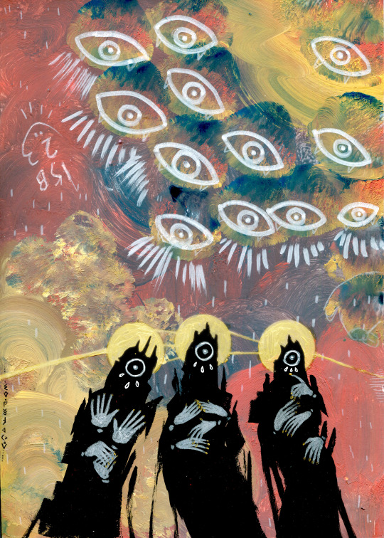
Tearful Choir
#illustration#eldritch angels#eyes#eye imagery#artists on tumblr#acrylic paint#poscas#colour pencils#ink and just a hitn of photoshop#my art#one day science will discover how to scan gold paint well
17K notes
·
View notes
Text
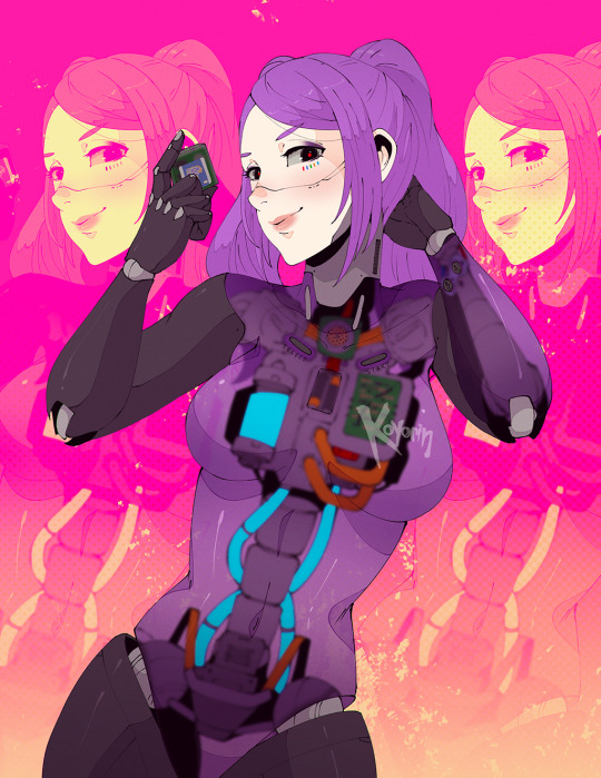
gbc
https://twitter.com/koyoriin
https://patreon.com/koyorin
https://instagram.com/koyori_n
https://bsky.app/profile/koyorin.bsky.social
#cyberpunk#illustration#character design#concept art#scifi#science fiction#game boy colour#game boy color#gbc#game boy#cyborg#cyborgs
2K notes
·
View notes
Text


CROW in DESTINY 2: SEASON OF THE WISH.
#destinyedit#destiny 2#crow#uldren sov#m*#m*gaming#m*d2#m*crow#video games#series: destiny#vg: destiny ii#ch: crow#thelvadams#usertravelllar#userico#miyku#userwolfkissed#useryuno#ayrennaranaaldmeri#driftingamongstars#lxdymaria#usermercymaker#wlwaerith#why was this scene so difficult to colour can science explain#there were two more gifs i made to go with this set but i hate them now#so take these instead ✌️
490 notes
·
View notes
Text
Tiny external structures in the wax coating of blueberries give them their blue color, researchers at the University of Bristol can reveal. This applies to a lot of fruits that are the same color including damsons, sloes and juniper berries.
In the study, published in Science Advances, researchers show why blueberries are blue despite the dark red color of the pigments in the fruit skin. Their blue color is instead provided by a layer of wax that surrounds the fruit which is made up of miniature structures that scatter blue and UV light. This gives blueberries their blue appearance to humans and blue-UV to birds. The chromatic blue-UV reflectance arises from the interaction of the randomly arranged crystal structures of the epicuticular wax with light.
Continue Reading.
715 notes
·
View notes
Text

I coulda just done a redraw of the meme I saw, but noooo~
(insp under cut)

#team fortress 2#tf2#tf2 medic#tf2 engineer#engiemedic#science party#also chance to draw funky colours weeeeee#I’ll post the ‘clean’ version if ppl want it
752 notes
·
View notes
Text

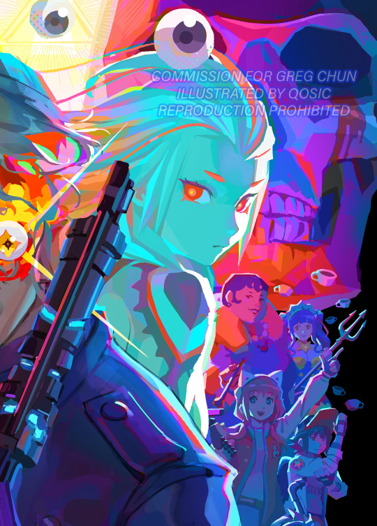
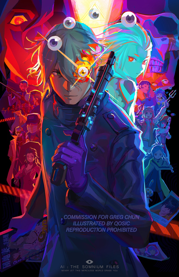
I put all my 愛 for the game into this one, to everyone who has beared my shouting about this modern classic for the last 4 years, I thank you!!!
Commissioned by Greg Chun (eng voice of Kaname Date)
He will be doing a signing session at a later date where you can get this as a print, go follow him for more info on that!
#ai the somnium files#aitsf#ai the somnium files nirvana initiative#art#qosicart#kaname date#iris sagan#mizuki okiura#aiba#PHUeuuuwwwwwwwwwwww this took a lot out of me#Hey can you draw this one character? oops suddenly ENTIRE cast#not only that the colours got me really mental locked if ya catch my drift#bless greg for being my second VA commission ever but also the best one I might ever get#Happy AI anniversary soon too (It's in september)#It's funny because as this game was being promoted via the leminiscate youtube ARGs I thought it looked so dumb#but then I played VLR and ZTD and they blew me away so furiously that I was like “I MUST PLAY ANYTHING THAT UCHIKOSHI TOUCHES”#and you should too if you like mind bending mystery pseudo science thrillers!
3K notes
·
View notes
Text
I really like that old trope that's like adopted child realises they're adopted bc both their parents have blue eyes and they learn in science class that 2 blue eyed parents can't have a child without blue eyes mostly bc I used to read it and go "what an idiot how did you not notice you were adopted I mean both your parents have blue eyes haha couldnt be me" then last year I noticed both my parents have blue eyes and mine are Hazel
#anyway turns out its bullshit#the whole blue eyes thing#its just one of those they teach you it bc the real science is harder to explain#anyway the funniest part of this story#is that i finally noticed that my dads eyes were blue#i told him like “i never noticed you have blue eyes”#and he goes “no i dont”#anyway turns out my dad is colour blind lol
768 notes
·
View notes
Text

Why are these clouds multi-coloured? A relatively rare phenomenon in clouds known as iridescence can bring up unusual colours, or even a whole spectrum of colours simultaneously. These polar stratospheric clouds also, known as mother-of-pearl clouds, are formed of small water droplets of nearly uniform size. When the Sun is in the right position and, typically, hidden from direct view, these thin clouds can be seen significantly diffracting sunlight in a nearly coherent manner, with different colours being deflected by different amounts. Therefore, different colours will come to the observer from slightly different directions. Many clouds start with uniform regions that could show iridescence but quickly become too thick, too mixed, or too far from the Sun to exhibit striking colours. The featured image and an accompanying video were taken late in 2019 over Ostersund, Sweden.
Image Copyright: Image Credit: Goran Strand
#astronomy#space#science#universe#clouds#Sweden#colours#color#iridescence#iridescent clouds#colourful#sunlight#refraction#follow#like#reblog#the first star#the first starr#thefirststar#thefirststarr#nasa#apod#tumblr#space blog#pretty#dashboard#space Tumblr#tumblr space#bold#colour
249 notes
·
View notes
Text
GUYS GUYS GUYS
IT'S AN ANNIVERSARY OF THE "SOMETHING STUPID" ANIMATIC BY @seagiri OMG GUYS LET'S GOOOOOOO!!!!!

(this animatic literally was the reason why I got into tf2 so GO WATCH IT IT'S BEAUTIFUL I PROMISE!!!)
#cj 24#art#doodles#my art#artists on tumblr#team fortress 2#tf2#tf2 engineer#tf2 soldier#tf2 helmet party#tf2 rocket science#damn that was my first ship and I didn't even draw it once?#we gotta fix it lmaoo#okay so um this was supposed to be a sketch but I added colour and yeahhh#it isn't my best work but I spend all my evening drawing this so eat guys lol#I LOVE THOSE TWO SO MUCH AND THE ANIMATIC OMGGGG#I saw the animatic on tiktok and I WAS LITERALLY OBSESSED#I knew abt tf2 long before that (I have an older brother lol) and I even knew some of the lore#but I nevwr really liked it idk why xD#but after the animatic I straight up became the biggest tf2 fan#so yeah THANK YOU SO MUCH SEAGIRI DUDE I LOVE YOU!!!! :D#your art style changed the way I see art xD#getting into tf2 in general helped me with my own art style and I even started to draw more :)))#so basically gay people saved me yay#something stupid#like I love youUuuuuUuuu#*dies*#WHY IS ENGIS EYES ARE SO WEIRD HELPPP#also literally no one asked but engis second hand is on soldiers ass because I said so
165 notes
·
View notes
Text
New art challenge : use picture of crystals and other rocks under polarized light as colour palettes for your ocs.


I invite yall to go and look for more they can be breathtaking ! Also making two colour schemes for your ocs one from the polarized light and one from the "analysed" polarized light sounds amazing
114 notes
·
View notes
Text
Sorry to put maths on your dash this early in the morning, but the polls to make colours are fundamentally biased, because all values should be independent to get the full spectrum. But in a poll, all values are related by the simple relation that a+b+c... = 100%
It means that most colours will not be obtainable from such polls !! Example given in RGB, to get white you would need 100% R, 100% G and 100% B. That is not a result you can get from a valid poll.
In more mathematical terms, if you project your RGB/HSV/whatever space on a cube where values ranges from 0% to 100%, the result set would be restricted to the intersection of this cube with the plane x+y+z=100. It's called Maxwell colour triangle.
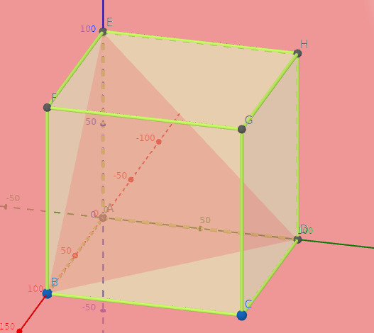
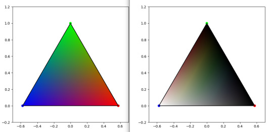
On left, Maxwell triangle for a RGB cube. On right, Maxwell triangle on a HSL cube. Plot code based on this website
So here you have it. The result from these polls will inevitably fall in these. cw spoilers I guess
EDIT : the joke about gay being bad at maths was a bit unconsiderate as it vehiculate stereotypical ideas. English is not my first language, and sometimes I would just replicate some things that I read elsewhere, but I should be more cautious. I edited it, but I thought it was important enough to acknowledge
Also edited some sentences a bit for clarity. Oh and also also : this is not inherently a bad thing, and poll makers are generally aware of this. I just want to share a fun fact !
#polls#colours#mathematics#rgb#HSL#science#maths#colour theory#color theory#color#spoilers lmao#science for your dash#please don't let me flop it took me 1h to gather all this data lol#I didn't eat because of that
2K notes
·
View notes
Text

There have been... mistakes.
#illustration#artists on tumblr#acrylic painting#colour pencil#painting#portrait#my art#markers#mad science#for her part specifically mad neuroscience :):)
217 notes
·
View notes
Text


SORRY TO BOTHER YOU (2018)
DIRECTOR: Boots Riley
CINEMATOGRAPHER: Doug Emmett
#sorry to bother you#boots riley#doug emmett#cinema#cinematographers#cinéma#cinematography#comedy#comédie#science fiction#fantasy#colourful#funny#movie#movie stills#dop#director of photography#cinematographer#film stills#2010s
155 notes
·
View notes
Text
A team of international researchers has uncovered a surprising genetic mechanism that influences the vibrant and complex patterns on butterfly wings. In a study published in the Proceedings of the National Academy of Sciences, the team, led by Luca Livraghi at the George Washington University and the University of Cambridge, discovered that an RNA molecule, rather than a protein as previously thought, plays a pivotal role in determining the distribution of black pigment on butterfly wings.
Continue Reading.
87 notes
·
View notes
Last Seen Blogs

landpremier
LandPremier

foxultra111
foxultra

dirac-sea
Bestow upon me magic

jaycee126
PWAN_GROUP_REALTOR

innovativenew242
Untitled