#css blur background
Explore tagged Tumblr posts
Visit Tumblr Blog
Explore Tumblr blogs with no restrictions, modern design and the best experience.
Last Seen Tumblr Blogs


Fun Fact
Tumblr is used by 21% of adults online aged 18-29 years.
Text

CSS Blur Background Image on hover
#css blur animation#css blur background#css animation tutorial#html css animation#html css#codenewbies#html5 css3#css animation examples#css blur background image on hover#css#frontenddevelopment#pure css animation
8 notes
·
View notes
Text

Blur Background Image CSS3
#css blur background#blur background image#css tutorial#html css#divinector#frontenddevelopment#css#html#css3#html5 css3#cool css effects
1 note
·
View note
Text

Blur Background Image using CSS
#blur background image css#css blur#css filter#css tricks#css effects#learn to code#code#html css#codingflicks#css#html#css3#webdesign#frontend#frontenddevelopment
1 note
·
View note
Text
Progress report on the Sky shrine: The structural parts of the site are done ~ ! Now I just need to make some assets and make this a proper shrine with like, writing and stuff.

What the above screenshot doesn't show is that the background behind the text boxes also gets blurred, which should hopefully aid in that frutiger aero look I wanted. Should also help with readability.

Side note: Those scroll bars are gonna make me so mad every time I look at this shrine. They're ugly, but they can't be helped... but I wish they could be!!! Firefox does have some CSS properties to customize how scrollbars look, but the fact that I'm also a Mac user means these changes don't seem to hold. I've gotten the scroll-bar property to work only once or twice, and never reliably the way I want it to.
#sky children of the light#sky cotl#that sky game#thatskygame#skyblr#not a photo from the album#mufo draws#still not really a drawing but making webpages is still an art regardless
24 notes
·
View notes
Note
Any tips on using fonts in ao3?
going to assume you're familiar with the basics — creating a new workskin at Dashboard → Skins → My Work Skins, and selecting a skin on the Edit Work page. if not, AO3 has a tutorial for this
(though skimming the tutorial, it doesn't seem to mention the <span> tag, which is your best friend when it comes to applying styles to a bit of text within a paragraph)
now for the more specific part of this question. also, be warned i'm going to be embarrassingly technical before i actually answer your question.
this is going to sound funny, but i am by and large not a fan of manipulating fonts as a stylistic device. my personal opinion is that what font a text is displayed in should be for the user to decide, both for preference and for accessibility reasons (e.g. there's fonts designed for dyslexic readers). i also tend to find most font changes to be a a bit goofy and immersion-breaking
it's different when i do it, but i'll explain my cope in a second
anyway, the style property you want to change to set in your work skin is font-family. e.g. font-family: monospace will give text a code/"typewriter" look, and on my own site i use "font-family: Newsreader, serif;". (the comma there essentially says 'if you don't have Newsreader installed, any serif font will do)
but as mentioned, i don't like messing with fonts, and in fact, there is no font styling as such in my fic at all. what gives?
(note: im going include mildly spoilery excerpts from my fic, Hostile Takeover)
but basically, i wrap cyn's dialogue in <code> tags, and most browsers will make that monospaced by default, but it leaves the door open for custom userskins to add their own flair to code blocks.
for example, my site puts little boxes around them
but with all that said, i think i might be taking this question overly literally. i think it's likely you aren't talking specifically about just fonts, and most of the interesting things people want to replicate from my fic aren't about what shape the letters are.
my secret weapon for styling this fic is the humble text-shadow property.
what it does is simple: it creates a copy of the text, and you have four knobs to turn: you can shift it over horizontally or vertically, blur it, and of course change the color
text-shadow: 1px 2px 3px red;
this gives you a copy of the text shifted to the right 1 pixels, down 2 pixels, blurred 3 pixels and colored red.
text-shadow: 1px 2px 3px red, -1px -2px 3px blue;
same deal but now there's another in the opposite directions colored blue, like a chromatic aberration.
you don't have to include the color or the blur if you dont want color or blur.
now i'll run through some real examples
the "pain" effect is what you get when you stack text vertically

text-shadow: 0 -3px 0px, 0 3px 0px;
the "beyond the grave" effect is text stacked horizontally

text-shadow: 2px 0px 0px;
the famous "i want you destroy you" text is of course colored, and here i offer an actual tip

you can predict the offsets, but the color is special
text-shadow: 2px -1px 0px #da38;
full explanation here, but basically, when you write a color with four values, the first three are RGB, but the last is the opacity. i think this matters because, if the earlier part of this post didn't make it clear, i care about readers getting a good experience no matter how they choose their custom styles (within reason, ofc)
by making the color slightly transparent, it blends with the background color, means whether you read with a light them or dark, it meets you half way

(try removing the transparency on that shade, and it's a pretty harsh contrast on both modes — though part of that might be that i made it super saturated to compensate for the transparency.)
i have some complaints about how ao3 handles css, and one of them is that it forbids you from using the very convenient filter: blur() function. to work around this, i cooked up a very "we have blur at home" solution
text-shadow: 0px 0px 6px, 1px 1px 3px, -1px -1px 3px; opacity: 50%;
(it looks much better on my site, where i can filter: blur all i like)
one of the reasons this sucks is that without a doubt the biggest limiter on doing really complicated stuff with text shadows is that they don't stack.
you'll notice that when the "pain" effect shows up, the "blur" effect disappears.
this matters most for what is definitely the most striking and involved use of text shadows in the work: the big man himself

the basic principle here isn't that special. the illusion of depth is accomplished by increasing blur and opacity the 'deeper' the text is supposed to be. the biggest trick here is that instead of the 'px' we've been using everywhere before, the offsets use 'em', which is a unit that relative to the font size.
but there is a nuance. you see:
text-shadow: 0px 1px 0px, 0px -1px 0px, #fd64 2px 2px 2px, #fd68 2em 1em 3px, #fd65 4em 2em 5px; text-shadow: #fd64 2px 2px 2px, #fd65 2em 1em 5px; text-shadow: #fd6 2px 2px 5px, 0px -3px 0px, 0px 3px 0px, #fd68 2em 1em 3px;
the "translate" looks like a combination of the new effect and the pain effect, but i had to give it a special style, specifying both by hand.
if you want to layer things, it will get out of hand, and if you ever opt to revise the specific colors or values, solver help you.
also, this doesnt show up anywhere in HT (yet), but i've used it in the past — only setting the blur of a text-shadow lets you give words an 'aura', and it's a neat and simple effect
(excerpt from Eifre Quest, an original work of mine from years ago. i have mixed feelings about it)
sorry if that was a long ramble or self-indulgent, but hopefully something there was new or helpful.
thanks for asking!
19 notes
·
View notes
Text
25/09/2023 || Day 87
LeetCode
I started doing the questions on Stacks and couldn't figure out how they wanted me to implement it, so I opened up Eclipse and just implemented a Stack on my own from scratch. Still didn't technically solve the LeetCode implementation, but whatever, we can't win everyday.
FrontendMentor Space Tourism Website - Log #1
Officially got started on this project today and I spent 3 hours trying to get the header to look right. I don't think it would've taken me 3 hours to get that done, but I decided to use React Routing for this project and I had to figure out how the CSS and elements worked with routes. I finally have a somewhat decent header that's close to the original, so despite my struggles I did achieve something. Also, getting the navbar to have a blurred background ended up being a lot easier than I thought it would be. I guess I struggled in a previous project to do that, so it went a lot better this time. I gotta be careful though because I haven't made it responsive...I normally go mobile-first route when building the layout, and I haven't done that today, so tmr I'll switch gears and do that. I find it easier to work mobile-first anyways...
Here's a photo of what the header looks like. The background image changes depending on what tab you click on the header:

9 notes
·
View notes
Quote
::after { content: ''; position: absolute; top: 0; left: 0; width: 100%; height: 100%; background: rgba(255, 255, 255, 0.1); border-radius: 2rem; backdrop-filter: blur(1px); box-shadow: inset -10px -8px 0px -11px rgba(255, 255, 255, 1), inset 0px -9px 0px -8px rgba(255, 255, 255, 1); opacity: 0.6; z-index: -1; filter: blur(1px) drop-shadow(10px 4px 6px black) brightness(115%); }
Recreating Apple's Liquid Glass Effect with Pure CSS ✨
0 notes
Text
So I heard about a site called bearblog.dev and decided to make an account. What's interesting about it, is that it's not connected to anything like most social media sites are. So really, the only way for people to find you is through word of mouth, or by paying (which tbh I prefer not being on a discover page tbh).
I liked their mission statement, about never wanting to sell, that it's run on donations and no ads, etc. But the biggest plus for me, was how you can customize things!
I haven't remotely worked on my own theme yet, but I poked around the code a bit, and it seems pretty straight forward; so I think I should be okay! Though, I can only play around the css, and not html without being a paid member.
Buuut I have experience though the sheer torture of having to customize everything through just css, so I think I'll manage.xD
I can't work on it rn, as I am finishing up on my Dreamwidth theme, as well as a drawing I need to get done soon.T.T But apparently, you can customize your dashboard!!! And, well, I couldn't resist.xD

This is, again, just the dashboard; so essentially, only I can see this lol. But I needed a break from my other 2 projects, and it seemed easy enough.xD
I definitely didn't go all out; as this is just my writing page. But I still wanted it to be calm yet exciting for me to work in! I chose colours similar to the Tumblr Classic (low contrast) theme, as I use that as my base on AO3 as well.xD (But I did shift the hue lol)
Initially, it was just gonna be solid plain colours but then...whoops! I had fun, and I did learn a few new things~
I had found a few codes a few months ago, and decided to play around with them, and made something new from them aha!
Which, if you would have asked me months ago, I would not have been able to figure out, but I managed to make something work.xD You can't see it here, but the headers have a subtle rainbow animation.:-P And when you hover over the boxes, they pop up, and have an animated rainbow shadow! Oh, and all links appear white, but when hovered, have animated rainbow on the text.:-) Yes, lots of rainbow!xD
Which like, technically these have been done in the past; but required Java Script back then. Now, they can be done through css only!:-D (Which was super helpful, since I can only play around with the css lol)
I could not install custom fonts, so went with a browser standard. I think for journal themes, it should work? But dashboard seems like a no go! (Idk tho, I'd have to test!)
Also, not very noticeable in the screenshot, but the body has a blur effect, so anything behind it will make it blur.:-)
And yes, couldn't resist adding Ranka.xD She makes me happy!
Also, yes, this is very busy for most. But I made it for me. The spacey background makes me feel calm and a bit nostalgic over some themes I had made in the past, or of other sites I enjoyed browsing. The rainbow is subtle, not too annoying; but still sparks something fun for me! The colours for the body do well for my eyes as I type/edit stuff, which is what I wanted. And having a character I love in the bg/cursor (which you can't see here either) is just a nice bonus aha~
There are still some very minor bugs I need to fix, but that will be for another time. I would like to make this code public eventually, but not sure how or where, or if anyone would actually want to use it.xD I'm thinking once I have an ACTUAL site one day, I'll post it there?
So uh yea, I'm working on a Dreamwidth, I have a Tumblr already; so why the fuck would I want another blogging platform?xD
A few reasons, which I feel like I've already kind of mentioned here lol. But another big reason, is I do enjoy having multiple spaces for different purposes if that makes sense? I like the idea of having Tumblr for whatever the fuck I do here.xD And Dreamwidth for more art and fandom related stuff (and maybe a few other stuff; but definitely long form posts; idk yet, I still haven't tested the waters. But think art/fandom blogging, mainly). And maybe a bearblog for more mmm...personal or intimate entries. Stuff I don't want too many eyes or engagement on.
Like, yea sure I could keep certain thoughts to myself. But I find myself always afraid of sharing thoughts, feelings, or ideas in my own spaces (I have soooo many drafts). Perhaps of fear of being "too much" or making someone mad; but I feel like I should learn to being okay being me, having opinions or thoughts on stuff, to be able to even change over time, and not worry about an algorithm showing it to the wrong person, ya feel?
And yea, I just want another site to test out coding/design without committing to having my own site again JUST YET lol. (I SWEAR I'll make one eventually...I'm just intimidated + unsure of which host to choose lol)
So yup! Uhhh idk when I'll be done all of this lol. I'll definitely finish my Dreamwidth first, which I will announce~! Once that's done, might work on my bearblog, and let you guys know of that.xD
0 notes
Video
youtube
This Divi Image Hack Looks CRAZY Good!
In this video, you’ll learn how to add a stunning background blur effect to your images using the Divi Theme. This powerful and subtle design trick is achieved using the free-form CSS tab in the Divi Builder along with some clever backdrop-filter CSS code. The result? A smooth, professional blur that draws attention while making your layout stand out.
No need for extra plugins or tools—just your creativity and Divi’s built-in features! We'll guide you step-by-step on how to apply this effect to background images for any module or section. Whether you’re designing a portfolio, landing page, or blog, this blur trick will make your images shine with style and depth.
0 notes
Text

Background Blur CSS
#css background blur#css tricks#css snippets#codenewbies#html css#html5 css3#css#coding#background blur css
4 notes
·
View notes
Text
Efeito moderação
Primeiramente cole o código abaixo no seu css.
@-webkit-keyframes dudse4a { 0% {-webkit-transform: rotate(-2deg);} 20% {-webkit-transform: rotate(2deg);} 40% {-webkit-transform: rotate(-2deg);} 50% {-webkit-transform: rotate(2deg);} 60% {-webkit-transform: rotate(-2deg);} 70% {-webkit-transform: rotate(2deg);} 80% {-webkit-transform: rotate(-2deg);} 90% {-webkit-transform: rotate(2deg);} 100% {-webkit-transform: rotate(-2deg);} } .moderadores {background: url('IMAGEM'); display: inline-block; height: METADE DA ALTURA DA IMAGEMpx; width: LARGURA DA IMAGEMpx; -webkit-transition: all 0.5s linear;-webkit-transition: all 0.4s linear;-moz-transition: all 0.4s linear;transition: all 0.4s linear; -webkit-filter: blur(0px);} .moderadores:hover {background-position: bottom; -webkit-animation: dudse4a 1s infinite linear;}
Agora você substitui as partes negritadas. A imagem tem que ser no modelo da de baixo, é como se fosse fazer menu rollover.
Agora onde você quer que apareça você cola o código abaixo.
<a href=”http://scrawl-of-life.tumblr.com” class=”moderadores”></a>
Talvez você tenha que substituir as aspas.
Tutorial de keyframes por naty (lo-v-e-r-s) e tutorial do efeito da moderação por Eduardo (scrawl-of-life)
Se usar/gostar de like e CREDITE!
0 notes
Text
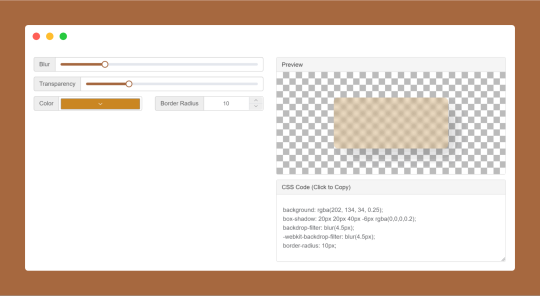
CSS Glassmorphism Generator is a CSS code generate tool designed to simplify the creation of glass-like, see-through effects in web design by adjusting parameters such as background blur, transparency levels, and border finishes.
#CSS Glassmorphism Generator#CSS Glassmorphism Code Generator#CSS Code Generator#free online tools#online tools#web tools#online web tools#online tool#ai tools#a.tools
0 notes
Text
Detalhes do APP da Phrest.
Na Phrest os usuários terão Tags, como o antigo Discord, todas as nametags tem o mesmo estilo:
user_name#000000
A diferença é que o Discord usava 4 números após a Hashtag, já nós usamos 6 delas, pois assim os usuários ficam ainda mais único nunca repetindo, temos em mente outros modelos como ID e Telefone como:
30 3030-3030 1
E
AZ00-RE10
Mas no momento serão mantidas as tags, o app vai mesclar YouTube, Omlet Arcade e Discord, permitindo que os usuários criem Sub-Foruns dentro do nosso, esses fóruns são chamados de E-Communities e os participantes são Phrestos ou Phrestas, sem lacração o app contará sim com um sistema de gêneros, onde você pode ser Macho, Fêmea ou marcar como Intersexo se prefere não dizer, cada um te dando um ícone único e belo, você também poderá definir Pronomes, mas assim como o Discord você insere oque quiser nessa área, te dando alta liberdade de customização.
A customização dos perfís é extensa, você pode mudar a cor do seu Nick, escolher Molduras, Efeitos, Estilos CSS customizados e Backgrounds, você pode escolher entre Background transparente ou com Blur, alterar a cor desse fundo e blur, alterar intensidade, e o Header tem uma foto diferente do fundo do seu Sobre, pois cada usuário tem uma página chamada "About" e ali ele insere Textos, Vídeos, Imagens, Links, Comunidades, e pode estilizar como achar melhor, é um espaço seu de customização
Algo que nenhuma plataforma tem, mas nós teremos, é o botão "Apagar todas as postagens" pois sim, eu já senti muita falta de resetar meu perfil, e teremos essa função pra facilitar vidas, podendo fazer backups físicos, ou seja, fica no seu aparelho um arquivo JSON, você baixa e reutiliza quando quiser, retornando posts apagados ou até atividades deletadas por essa função
Teremos sim um Sistema Anti-CP e ele será treinado usando CP da Dark Web, isso porquê empresas tem muita Frescura, ficam com medinho e fazem IAs de bosta que não funcionam, eles usam Manga, Anime e coisas toscas pra identificar crianças, quando nós vamos conectar a IA como um Hooker, e ele automaticamente vai buscar CP e aprender com ele, tudo isso tratado, não terão arquivos legíveis no cérebro da máquina óbvio, isso é um método altamente eficiente, porquê o conteúdo não é genérico
Embora nesse Forum você possa sim postar sobre Lolis, Gore e Temas Pesados, calma lá patrão, aqui não é Dark Web, não é pra cometer crimes também, então nossa IA vai filtrar sim isso
Mas ela vai permitir conteúdo Sugestivo e Gore Artificial, como Jogos, Desenhos, e até Embeds, tudo no Sugestivo, o explícito é proibido, principalmente que envolva criança, mas o Gore com criança é aceitável, desde que seja Arte, Jogo ou algo Ficcional
Mas não me venha mandar um Gore real de uma criança estripada, isso OBVIAMENTE é PROIBIDO, a gente não tem chororo, mas ai irmão tu quer demais também né
O sistema de Ban será autonomo, se um usuário é denunciado certas vezes a conta fica automaticamente inutilizável em Timeout, ou "banida" até que os Moderadores verifiquem a situação, isso impede pedófilos e criminosos de hostearem o conteúdo, pois assim a conta é Limitada por uma revisão Humana, sem IAs falhas, e os Moderadores decidem no final se banem de vez.
Permitiremos todo tipo de Email, e não vamos te banir por usar VPN, TOR ou um Email @onion, na verdade te damos apoio por fazer isso, desde que use com sabedoria da forma correta pra se Proteger, não cometer crimes
Nós podemos sim te rastrear, até porquê hoje o Tor é sim burlável, e temos conhecimento da Máquinas que rastreiam esse tráfego, e se você usar demais a mesma Port pra esse tipo de coisa ela será bloqueada, além de que banimos pelo ID do seu dispositivo ou seja, só com outro aparelho tu entra, nem adianta mudar IP, e temos Anti-Emulador, saberemos se é um.
O Feed só checa o conteúdo dentro do app, a IA te fornece conteúdo baseado no oque você faz no app, sem Tracking Legalizado, não compraremos dados de empresas e nem venderemos.
0 notes
Text
CSS 4 💻 colors and color properties
New Post has been published on https://tuts.kandz.me/css-4-%f0%9f%92%bb-colors-and-color-properties/
CSS 4 💻 colors and color properties

youtube
everything about colors and color properties in CSS color, background-color, filter, border-color, rgb, hsl, rgba and more Colors in CSS can be specified by predefined names → red, blue, green, yellow, orange, purple, black, white, gray and more by hexadecimal values → #00FF00, by rgb → rgb(0,0,0) and hsl → (0, 100%, 50%) rgb uses red, green, blue values from 0 to 255 hsl uses hue (around the color wheel), saturation(how vibrant is it) ... ...and lightness( how much white or black is in it) you can also use rgba and hsla to specify the opacity, 0 → fully transparent and 1 → fully opaque rgba(255, 0, 0, 0.5) and hsla(22, 55%, 64%, 0.7) color → sets the text color background-color → sets tje background color border-color → sets the border color text-shadow → adds shadow to a text and you can specify the color too box-shadow → adds shadow to an element and you can specify the color too opacity → specifies the element's opacity values can be from 0 to 1 caret-color → is used to set the color of the text input cursor CSS supports gradients backgrounds background-image → adds a background image, but you can also specify a color linear-gradient → defines a linear-falling gradient from left to right, top to bottom etc. radial-gradient → creates a radial gradient like a circle or an ellipse conic-gradient → creates a conical gradient from the centre towards a specific angle you can also have repeating gradients. For that exist the properties... repeating-linear-gradient, repeating-radial-gradient filter → applies graphical effects like blur , contrast and more hue-rotate → rotates the color wheel by a specified angle brightness → changes the brightness contrast → changes the brightness grayscale → convets an image to a grayscale saturate → changes the saturation invert → inverts the colors sepia → converts an image to sepia tones
0 notes
Note
Yo otra vez sobre Violet ends. Foroactivo ha añadido una nueva función para mostrar/ocultar la contraseña y asi se ve ahora el panel de login i52[.]servimg[.]com/u/f52/20/58/36/06/captur10[.]png Gracias por el gran trabajo que haces.
¡Hola anon! Eso he visto, voy a tener que adelantar la fecha de los updates de todos los skins tras esta update me da a mí 😂 Te dejo la corrección mientras tanto para VE.
.password-container { flex-grow: 1; align-items: stretch; gap:1px; & input { margin:0; } & img { padding: .75rem; background: var(--cuerpo); backdrop-filter:var(--ft-blur); filter:none; transition:ease .4s; &.show_hide_pwd.on { filter:none; padding:.6rem; } } }
PD: Para otros admins que tengan skins míos, si revisas tu index_body y buscando "indexlogin" (sin las comillas) te aparecen varios divs que se llamen así; esta solución seguramente te podrá servir también (quizá tienes que editar algo del CSS de estilo). Si ves que afecta otras zonas que no son los campos de login del índice, añade .indexlogin antes de .password-container en el CSS de arriba.
Igualmente, intentaré subir un post + mandar una misiva por Payhip con un txt para cada uno de los skins afectados.
0 notes