#css blur background image on hover
Explore tagged Tumblr posts
Visit Tumblr Blog
Explore Tumblr blogs with no restrictions, modern design and the best experience.
Last Seen Tumblr Blogs


Fun Fact
Mobile US users spent an average of 115.8 minutes on Tumblr app monthly.
Text

CSS Blur Background Image on hover
#css blur animation#css blur background#css animation tutorial#html css animation#html css#codenewbies#html5 css3#css animation examples#css blur background image on hover#css#frontenddevelopment#pure css animation
8 notes
·
View notes
Text
Weekly News for Designers № 727 - Fixing CLS Problems, CSS One-Line Upgrades, Future Roles for Designers
New Post has been published on https://thedigitalinsider.com/weekly-news-for-designers-%e2%84%96-727-fixing-cls-problems-css-one-line-upgrades-future-roles-for-designers/
Weekly News for Designers № 727 - Fixing CLS Problems, CSS One-Line Upgrades, Future Roles for Designers
Happy Birthday, Macintosh Forty years ago, Apple introduced the world to the Macintosh computer.
Free Instagram Story Templates A collection of Instagram Story templates for Photoshop, Figma, Sketch, After Effects, Premiere Pro, and Final Cut Pro.
12 Modern CSS One-Line Upgrades Learn about the CSS properties to enhance your projects, reduce technical debt, eliminate JavaScript, and improve the UX.
The Diagram that Shows the Value of Great UX
Fading Content Using Transparent Gradients in CSS Here are two methods for achieving text content fading with CSS. One uses mask-image and the other background-clip.
Top Logo Stinger Premiere Pro Templates We share a collection of logo stinger templates for Premiere Pro that stand out with their style, functionality, and ease of use.
Five Future Roles for Designers Jorge Arango shares five possible future careers for designers in our now AI-driven world.
CSS Blurry Shimmer Effect Learn how to create a CSS blurring effect, but not with box-shadow.
The CSS Snippets Every Developer Should Know Discover the CSS snippets that every front-end developer should know about in 2024.
What’s the Environmental Impact of Your Website? Eric examines the relationship between the web and the planet and shows how to measure your website’s impact.
Git and GitHub Essentials If you’re new to Git or GitHub, this extensive beginner’s guide of the most common commands is for you.
Fixing Cumulative Layout Shift Problems
The Most Underused CSS Media Queries: hover & any-hover Learn how to use the hover and any-hover media queries for responsive design and better experiences on all devices.
Improve Your Logo Design Skills Melinda Livsey shares how she improved her logo design skills by studying the work of Paul Rand and Saul Bass.
#2024#After Effects#ai#amp#apple#background#background-clip#bass#birthday#box#box-shadow#Careers#computer#content#CSS#CSS Snippets#Design#Designer News#designers#Developer#devices#effects#Environmental#environmental impact#figma#Future#git#github#gradients#hover
2 notes
·
View notes
Text
CSS filter
CSS filters are used to set visual effects to text, images, and other aspects of a webpage. The CSS filter property allows us to access the effects such as color or blur, shifting on the rendering of an element before the element gets displayed.
The syntax of CSS filter property is given below.

0 notes
Text
Explore 110+ CSS Image Effects

Welcome to CSS Monster, your go-to resource for exploring the world of HTML and CSS image effects! Our curated collection brings you hand-picked examples sourced from platforms like CodePen and GitHub, ensuring you have access to the latest and most innovative designs. As of November 2022, we've added 21 new items to keep your creative juices flowing. CSS image effects are powerful visual transformations that breathe life into your webpage's images using the magic of CSS. From subtle adjustments like brightness and contrast to intricate effects such as blurring, color shifting, or mesmerizing 3D transformations, our collection covers a broad spectrum of creative possibilities. These image effects aren't just about aesthetics; they're about enhancing the overall visual appeal of your website. They add depth, emphasis, and a touch of creativity to your images, making them stand out in the digital landscape. Whether you aim to draw attention to specific images, create a distinctive visual style, or infuse interactivity into your site, CSS image effects offer the tools you need. Dive into our extensive collection, featuring a diverse array of CSS image effects. Whether you're seeking a simple hover effect to captivate your audience, a dynamic slideshow to showcase your content, or cutting-edge 3D transformations to push the boundaries of design, you'll find something tailored to your needs. We invite you to explore and experiment with these CSS image effects, allowing your creativity to flourish. Find inspiration, learn new techniques, and elevate your web development journey. Happy designing! Author Amit Sheen August 30, 2021 Links Just Get The Demo Link How To Download - Article How To Download - Video Made with HTML / CSS (SCSS) About a code CSS ONLY 3D TRIVISION BILLBOARD Compatible browsers:Chrome, Edge, Firefox, Opera, Safari Responsive:no Dependencies:- Author Oral November 1, 2020 Links Just Get The Demo Link How To Download - Article How To Download - Video Made with HTML / CSS About a code CSS 3D IMAGE HOVER EFFECTS Compatible browsers:Chrome, Edge, Firefox, Opera, Safari Responsive:yes Dependencies:- Author Matthew January 22, 2020 Links Just Get The Demo Link How To Download - Article How To Download - Video Made with HTML / CSS About a code 3D SLICED IMAGE Compatible browsers:Chrome, Edge, Firefox, Opera, Safari Responsive:no Dependencies:-
Author Ana Tudor October 17, 2019 Links Just Get The Demo Link How To Download - Article How To Download - Video Made with HTML (Pug) / CSS (SCSS) About a code FLEXIBLE MULTI-PANEL BACKGROUND Compatible browsers:Chrome, Edge, Opera, Safari Responsive:yes Dependencies:-
Author Ivan Bogachev October 16, 2019 Links Just Get The Demo Link How To Download - Article How To Download - Video Made with HTML (Pug) / CSS (Less) About a code ONE BACKGROUND FOR MULTIPLE DIVS Compatible browsers:Chrome, Edge, Firefox, Opera, Safari Responsive:yes Dependencies:- Author Shounak Ghosh September 29, 2018 Links Just Get The Demo Link How To Download - Article How To Download - Video Made with HTML / CSS About a code 3D IMAGE HOVER CSS Compatible browsers:Chrome, Edge, Firefox, Opera, Safari Responsive:no Dependencies:- Author Eriksen January 29, 2018 Links Just Get The Demo Link How To Download - Article How To Download - Video Made with HTML / CSS About a code 3D PERSPECTIVE IMAGE Compatible browsers:Chrome, Edge, Firefox, Opera, Safari Responsive:no Dependencies:- Author damiano January 2, 2017 Links Just Get The Demo Link How To Download - Article How To Download - Video Made with HTML / CSS About a code CSS 3D SPLIT IMAGE ANIMATION Compatible browsers:Chrome, Edge, Firefox, Opera, Safari Responsive:no Dependencies:- Author Temani Afif September 30, 2022 Links Just Get The Demo Link How To Download - Article How To Download - Video Made with HTML / CSS About a code FANCY IMAGE DECORATION ON HOVER Compatible browsers:Chrome, Edge, Firefox, Opera, Safari Responsive:no Dependencies:- Author Temani Afif September 21, 2022 Links Just Get The Demo Link How To Download - Article How To Download - Video Made with HTML / CSS About a code CIRCULAR GRID WITH COOL HOVER EFFECT Compatible browsers:Chrome, Edge, Firefox, Opera, Safari Responsive:no Dependencies:- Author Temani Afif July 12, 2022 Links Just Get The Demo Link How To Download - Article How To Download - Video Made with HTML / CSS About a code TRIANGULAR GRID OF IMAGES Compatible browsers:Chrome, Edge, Firefox, Opera, Safari Responsive:no Dependencies:- Author Temani Afif April 11, 2022 Links Just Get The Demo Link How To Download - Article How To Download - Video Made with HTML / CSS About a code IMAGE MASK HOVER EFFECT Compatible browsers:Chrome, Edge, Firefox, Opera, Safari Responsive:no Dependencies:- Author Temani Afif March 21, 2022 Links Just Get The Demo Link How To Download - Article How To Download - Video Made with HTML / CSS About a code MASK EFFECT WITH TRIANGLES Compatible browsers:Chrome, Edge, Firefox, Opera, Safari Responsive:no Dependencies:-
Author Dharvesh August 15, 2020 Links Just Get The Demo Link How To Download - Article How To Download - Video Made with HTML / CSS About a code RIPPED IMAGES Compatible browsers:Chrome, Edge, Firefox, Opera, Safari Responsive:no Dependencies:- Author Jhey July 23, 2020 Links Just Get The Demo Link How To Download - Article How To Download - Video Made with HTML (Pug) / CSS (Stylus) About a code CSS IMAGE REVEAL Compatible browsers:Chrome, Edge, Firefox, Opera, Safari Responsive:yes Dependencies:- Author Sikriti Dakua June 9, 2020 Links Just Get The Demo Link How To Download - Article How To Download - Video Made with HTML / CSS (SCSS) About a code CARD HOVER INFO INTERACTION Compatible browsers:Chrome, Edge, Firefox, Opera, Safari Responsive:no Dependencies:- Author Mariana April 25, 2020 Links Just Get The Demo Link How To Download - Article How To Download - Video Made with HTML / CSS (SCSS) About a code IMAGE HOVER WITH CLIP-PATH. PURE CSS Compatible browsers:Chrome, Edge, Firefox, Opera, Safari Responsive:no Dependencies:- Author Ryan Mulligan April 24, 2020 Links Just Get The Demo Link How To Download - Article How To Download - Video Made with HTML (Pug) / CSS About a code CSS CLIP-PATH HOVER EFFECT Compatible browsers:Chrome, Edge, Firefox, Opera, Safari Responsive:yes Dependencies:- Author Noah Delagardelle April 22, 2020 Links Just Get The Demo Link How To Download - Article How To Download - Video Made with HTML / CSS (SCSS) About a code IMAGE HOVER 01 Compatible browsers:Chrome, Edge, Firefox, Opera, Safari Responsive:yes Dependencies:- Author Vlad Racoare April 20, 2020 Links Just Get The Demo Link How To Download - Article How To Download - Video Made with HTML / CSS (SCSS) About a code IMAGE HOVER - CSS (FILTERS & TRANSITIONS) Compatible browsers:Chrome, Edge, Firefox, Opera, Safari Responsive:no Dependencies:-
Author yoksel March 17, 2020 Links Just Get The Demo Link How To Download - Article How To Download - Video Made with HTML / CSS ( Read the full article
0 notes
Photo
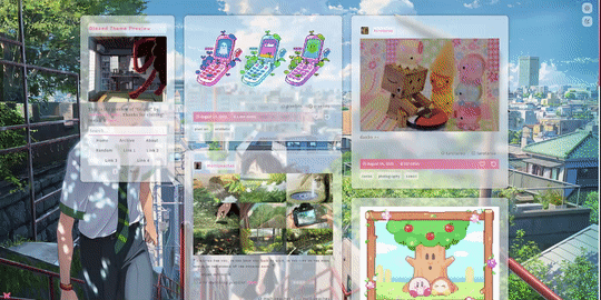
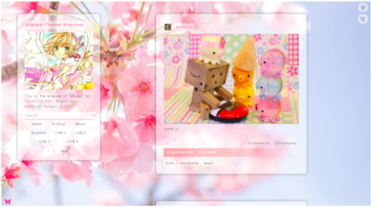

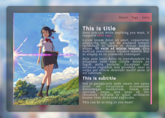

"Glazed” Theme
by Themes By Pale (or Palemomos Themes)
Live Preview | Static Preview | Install
This theme is for everyone! Highly customizable, it can be clean and minimal or go crazy with colors and backgrounds.
Features:
Glassy effect on posts that blurs when the mouse hovers it.
Responsive layout for all screen sizes (including mobile devices).
Display posts in one or two columns.
Switch between Dark Mode or Light Mode.
Support for NPF posts.Support for searches in blog and date pages.
Custom background image (big image or pattern).
Custom accent colors.
Select between 7 font types.
Select font size.
Optional about section.
Optional tags directory section.
Optional section to share blogs you follow.
Optional extra section to add anything you want.
4 optional custom links.
Support for page links.
Show/hide tags in posts.
Show/hide captions in posts.
Notes:
All can be customized in the Customization Panel :)
About the tags: to add your tag directory in the about section, in the textbox “Tags List” paste your tags in the following format: ["Section 1", "pixels", "pixel art", "kawaii", "landscapes", "photography", "art"], ["Section 2", "nature", "green", "animals", "fantasy", "magic", "dogs"], ["Section 3", "codes", "themes", "pages", "resources", "layouts", "html"]
You can separate your tags into subsections. Each section is a set of words wrapped by [ ], and each word must be wrapped by " " and separated by commas. The first word is always the section title. Also, each section must be separated by a comma, but note that the last section does not have a trailing comma. In the last example there are three subsections for tags, if you only want one subsection for your tags just copy and paste the following:
["Section 1", "codes", "themes", "pages", "resources", "layouts", "html"]
About hide captions: the captions will only be hidden in the main page, individual pages will show the full caption.
Edit: Here is the link to the source code in case there’s a problem installing it with the theme garden.
Credits:
css photosets @eggdesign & @annasthms
npf fix and griddery for gallery mode: @glenthemes
custom audio controls: @annasthms
custom like & reblog buttons tutorial: @shythemes
full credits in code
Feel free to contact me if something isn’t working n.n Please reblog if using!
Support me on Ko-fi :3
2K notes
·
View notes
Photo

Blur Everything Except hover Animation
#css image hover effect#image hover effects#css image hover#blur everything except hovered#css blur background#css blur#pure css animation#css animation tutorial#css animations#learn css animation#frontenddevelopment#frontend#WebDeisgn#divinector
0 notes
Text
How To Create Music Player Using HTML , CSS and JavaScript?
Live Preview
HTML: index.html
Music Player 0:00 0:00 100
CSS: Style.css
@import url(https://fonts.googleapis.com/css?family=Pacifico); @import url(https://fonts.googleapis.com/css?family=Noto+Sans+JP); * { margin: 0; padding: 0; box-sizing: border-box; -webkit-tap-highlight-color: transparent; } html { font-size: 16px; overflow: hidden; } body { background-color: #131418; font-family: "Pacifico"; width: 100vw; height: 100vh; display: grid; place-items: center; user-select: none; } .themes { position: absolute; top: -100px; width: 100%; height: 6rem; display: flex; justify-content: center; align-items: center; gap: 10px; transition: 0.3s; } .theme { width: 3rem; height: 3rem; border: 1px solid #888888; border-radius: 50%; cursor: pointer; transition: 0.3s; } .theme:hover { border: 1px solid #0cb18d; } .active-theme { border: 1px solid #11e2b5 !important; } .theme1 { background: #101010; } .theme2 { background: linear-gradient(135deg, #dc143c, #009688); } .theme3 { background: linear-gradient(135deg, #7f0096, #14abdc); } .music-box { width: 30rem; height: 30rem; position: relative; border-radius: 16%; border: 1px solid transparent; box-shadow: -10px -10px 15px #00000080, 10px 10px 15px #0000001f; display: grid; grid-template-columns: 50% 50%; grid-template-rows: 55% 10% 10% 25%; } .blur { width: 30rem; height: 30rem; border-radius: 16%; position: absolute; filter: blur(10px); z-index: -1; } .cover-wrapper { display: grid; place-items: center; padding: 25px; } .cover-image { width: 100%; aspect-ratio: 1 / 1; border-radius: 17%; cursor: pointer; background: #10101075; } .cover-image-big-size { position: absolute; width: 28rem; height: 28rem; border-radius: 11%; box-shadow: -10px -10px 15px #00000080, 10px 10px 15px #0000001f; cursor: pointer; top: 50%; left: 50%; transform: translate(-50%, -50%); transition: 0.3s; } .queue { color: white; font-size: 1.3rem; letter-spacing: 1px; padding: 25px 0; overflow: hidden; } .queue .active { transform: scale(1.1); color: #0fd5ca; } .queue .track-item { transition: 0.1s; cursor: pointer; margin-left: 45px; text-indent: -28px; } .queue .track-item:hover { transform: scale(1.1); } .track-items-wrapper { scrollbar-width: none; width: 100%; height: 100%; overflow-x: hidden; overflow-y: auto; } .queue .track-item:first-child { margin-top: 18px; } .track-items-wrapper::-webkit-scrollbar { width: 0; background: transparent; } .track-information { font-family: "Noto Sans JP"; display: flex; justify-content: center; align-items: center; gap: 5px; color: #adadad; grid-column-start: span 2; } .track-information > * { display: flex; justify-content: center; align-items: center; gap: 5px; cursor: pointer; transition: 0.3s; } path { transition: 0.3s; } .track-information > *:hover { color: white; } .track-information > *:hover path { fill: white !important; } .track-information-icon { width: 2.5rem; height: 2.5rem; } .track-information-texts { width: 7rem; } .track-progress { display: flex; justify-content: center; align-items: center; gap: 15px; grid-column-start: span 2; } .track-progress-bar { width: 65%; height: 10px; background: #dc143c7a; border-radius: 4px; overflow: hidden; cursor: pointer; position: relative; } .track-loading { width: 35px; height: 100%; background: #dc143c; position: absolute; border-radius: 4px; animation: track-loading 1s ease-in-out infinite alternate; left: -5px; transform: scaleX(1); } @keyframes track-loading { 25% { transform: scaleX(1.5); } 75% { transform: scaleX(1.5); } 100% { transform: scaleX(1); left: calc(100% - 30px); } } .track-current-time-progress-bar { width: 0; height: 10px; background-color: #dc143c; border-radius: 4px; } .track-time { color: white; margin-bottom: 4px; width: 28px; } .buttons { display: flex; justify-content: space-evenly; align-items: center; grid-column-start: span 2; } .button { width: 4.6rem; height: 4.6rem; display: flex; justify-content: center; align-items: center; cursor: pointer; position: relative; transition: 0.3s; } .button > * { width: 2.5rem; height: 100%; transition: 0.3s; } .volume-wrapper > * { position: absolute; width: 100%; } .volume-button > * { position: absolute; width: 100%; height: 100%; display: flex; justify-content: center; align-items: center; } .volume-button img, .volume-button svg { width: 2.5rem; height: 2.5rem; position: absolute; } .waves-volume-button > * { position: absolute; display: flex; justify-content: center; align-items: center; } .volume-number { color: white; font-size: 2.5rem; text-align: center; margin-bottom: 6px; opacity: 0; } .volume-cross { opacity: 0; } .volume-cross svg { transform: translateX(2px); } .volume-wrapper:hover .volume-button { opacity: 0 !important; } .volume-wrapper:hover .volume-number { opacity: 1 !important; } @media screen and (max-width: 575px) { html { font-size: 13px; } } @media screen and (max-width: 460px) { html { font-size: 10px; } }
JS: index.js
"use strict"; let audioTrack = document.createElement("audio"); audioTrack.preload = "metadata"; document.body.append(audioTrack); let blurElement = document.getElementById("blurElement"); let themes = document.getElementById("themes"); let musicBox = document.getElementById("musicBox"); let trackItemsWrapper = document.getElementById("trackItemsWrapper"); let trackArtistName = document.getElementById("trackArtistName"); let trackAlbumName = document.getElementById("trackAlbumName"); let coverImage = document.getElementById("coverImage"); let playButton = document.getElementById("playButton"); let playButtonIcon = playButton.firstElementChild; let pauseButtonIcon = playButton.lastElementChild; let previousButton = document.getElementById("previousButton"); let nextButton = document.getElementById("nextButton"); let volumeWrapper = document.getElementById("volumeWrapper"); let volumeButton = document.getElementById("volumeButton"); let volumeNumber = document.getElementById("volumeNumber"); let wavesVolumeButton = document.getElementById("wavesVolumeButton"); let highVolumeSymbol = document.getElementById("highVolumeSymbol"); let mediumVolumeSymbol = document.getElementById("mediumVolumeSymbol"); let lowVolumeSymbol = document.getElementById("lowVolumeSymbol"); let volumeCross = document.getElementById("volumeCross"); let currentTrackTimeNumber = document.getElementById("currentTrackTimeNumber"); let currentTrackDuration = document.getElementById("currentTrackDuration"); let trackProgressBar = document.getElementById("trackProgressBar"); let trackLoading = document.getElementById("trackLoading"); let currentTrackTimeBar = document.getElementById("currentTrackTimeBar"); let musics = ; musics.forEach((item, index) => { trackItemsWrapper.innerHTML += `${ index + 1 }. ${item.trackName}`; }); trackItemsWrapper.firstElementChild.classList.add("active"); function informationUpdate(target) { target = target ? target : 0; coverImage.src = ""; coverImage.src = musics.coverImage; audioTrack.src = musics.audioSource; trackArtistName.textContent = musics.artist; trackAlbumName.textContent = musics.album; } informationUpdate(); themes.addEventListener("click", (e) => { if (e.target == e.currentTarget) return; let targetTheme = e.target.dataset.theme; let activeTheme = document.querySelector(".active-theme"); activeTheme.classList.remove("active-theme"); e.target.classList.add("active-theme"); switch (targetTheme) { case "theme1": blurElement.style.visibility = "hidden"; musicBox.style.border = ""; musicBox.style.boxShadow = ""; coverImage.style.background = ""; trackProgressBar.style.background = ""; currentTrackTimeBar.style.background = ""; trackLoading.style.background = ""; break; case "theme2": blurElement.style.visibility = "visible"; musicBox.style.border = "1px solid #ffffff12"; musicBox.style.boxShadow = "inset -10px -10px 15px #ffffff0a, inset 10px 10px 15px #ffffff0a"; blurElement.style.background = "linear-gradient(135deg, #dc143c, #009688)"; coverImage.style.background = "#00968875"; trackProgressBar.style.background = "#0fd5ca73"; currentTrackTimeBar.style.background = "#0fd5ca"; trackLoading.style.background = "#0fd5ca"; break; case "theme3": blurElement.style.visibility = "visible"; musicBox.style.border = "1px solid #ffffff12"; musicBox.style.boxShadow = "inset -10px -10px 15px #ffffff0a, inset 10px 10px 15px #ffffff0a"; blurElement.style.background = "linear-gradient(135deg, #7f0096, #14abdc)"; coverImage.style.background = "#288bcf75"; trackProgressBar.style.background = "#0fd5ca73"; currentTrackTimeBar.style.background = "#0fd5ca"; trackLoading.style.background = "#0fd5ca"; break; } }); trackItemsWrapper.addEventListener("click", (e) => { if (e.target == e.currentTarget) return; let activeAudio = document.querySelector(".active"); activeAudio.classList.remove("active"); e.target.classList.add("active"); let targetIndex = e.target.dataset.index; informationUpdate(targetIndex); }); audioTrack.addEventListener("waiting", waitingEvent); function waitingEvent() { trackLoading.classList.add("track-loading"); } audioTrack.addEventListener("canplay", (e) => { trackLoading.classList.remove("track-loading"); audioTrack.removeEventListener("waiting", waitingEvent); }); let firstPlay = true; audioTrack.addEventListener("loadstart", (e) => { audioTrack.addEventListener("waiting", waitingEvent); currentTrackTimeBar.style.width = 0; if (!firstPlay) { audioTrack.play(); } firstPlay = false; }); let requestAnimationTimeArgument = performance.now(); requestAnimationFrame(function currentTimeUpdater( requestAnimationTimeArgument ) { let currentTime = audioTrack.currentTime; let currentMinute = Math.trunc(currentTime / 60); let currentSeconds = Math.trunc(currentTime % 60); if (currentSeconds { audioTrack.currentTime = ((e.offsetX / trackProgressBar.offsetWidth) * 100 * audioTrack.duration) / 100; trackProgressBar.addEventListener("pointermove", trackProgressBarPointerMove); function trackProgressBarPointerMove(e) { audioTrack.currentTime = ((e.offsetX / trackProgressBar.offsetWidth) * 100 * audioTrack.duration) / 100; } document.addEventListener("pointerup", (e) => { trackProgressBar.removeEventListener( "pointermove", trackProgressBarPointerMove ); }); }); trackProgressBar.addEventListener("wheel", (e) => { if (e.deltaY 0) { audioTrack.currentTime -= 5; } }); playButton.addEventListener("click", (e) => { if (audioTrack.paused) { audioTrack.play(); } else { audioTrack.pause(); } }); previousButton.addEventListener("click", (e) => { let activeAudio = document.querySelector(".active"); let trackItems = document.querySelectorAll(".track-item"); let activeIndex = +activeAudio.dataset.index == 0 ? trackItems.length : +activeAudio.dataset.index; let targetIndex = +activeIndex - 1; activeAudio.classList.remove("active"); trackItems.classList.add("active"); informationUpdate(targetIndex); }); nextButton.addEventListener("click", (e) => { let activeAudio = document.querySelector(".active"); let trackItems = document.querySelectorAll(".track-item"); let activeIndex = +activeAudio.dataset.index == trackItems.length - 1 ? -1 : +activeAudio.dataset.index; let targetIndex = +activeIndex + 1; activeAudio.classList.remove("active"); trackItems.classList.add("active"); informationUpdate(targetIndex); }); audioTrack.addEventListener("play", (e) => { playButtonIcon.style.opacity = 0; pauseButtonIcon.style.opacity = 1; if (wasPlaying) { wasPlaying = false; } }); // prevent from nested animations let firstTimeAnimation = true; audioTrack.addEventListener("playing", (e) => { if (firstTimeAnimation) { blurElement.animate( { filter: "blur(30px)" }, { duration: 5000, easing: "ease-in-out", direction: "alternate", iterations: Infinity } ); firstTimeAnimation = false; } }); audioTrack.addEventListener("pause", (e) => { playButtonIcon.style.opacity = 1; pauseButtonIcon.style.opacity = 0; blurElement.animate( { filter: "blur(10px)" }, { duration: 1000, easing: "linear", fill: "forwards" } ); firstTimeAnimation = true; }); volumeWrapper.addEventListener( "wheel", (e) => { e.preventDefault(); switch (true) { case e.deltaY 0: audioTrack.volume = (audioTrack.volume -= 0.05).toFixed(2); break; } volumeNumberUpdate(); }, { passive: false } ); function volumeNumberUpdate() { // trunc is just for (0.55 * 100)! volumeNumber.textContent = Math.trunc(audioTrack.volume * 100); } let wasPlaying; audioTrack.addEventListener("volumechange", (e) => { let currentVolume = audioTrack.volume; switch (true) { case 0.66 { switch (e.code) { case "ArrowDown": audioTrack.volume = (audioTrack.volume -= 0.05).toFixed(2); break; case "ArrowUp": audioTrack.volume = (audioTrack.volume += 0.05).toFixed(2); break; case "ArrowLeft": audioTrack.currentTime -= 5; break; case "ArrowRight": audioTrack.currentTime += 5; break; case "Space": if (audioTrack.paused) { audioTrack.play(); } else { audioTrack.pause(); } break; } if (e.code == "ArrowDown" || e.code == "ArrowUp") { volumeButton.style.opacity = 0; volumeNumber.style.opacity = 1; document.addEventListener("keyup", (e) => { let volumeChangeAnimation = setTimeout(() => { volumeButton.style.opacity = 1; volumeNumber.style.opacity = 0; }, 600); document.addEventListener("keydown", (e) => { if (e.code == "ArrowDown" || e.code == "ArrowUp") { clearTimeout(volumeChangeAnimation); } }); }); } }); coverImage.addEventListener("pointerdown", (e) => { e.preventDefault(); let coverImageBigSize = coverImage.cloneNode(); coverImageBigSize.className = "cover-image-big-size"; coverImageBigSize.removeAttribute("id"); document.body.append(coverImageBigSize); document.addEventListener("pointerup", (e) => { coverImageBigSize.remove(); }); }); That’s it for this tutorial. If you have any issues while creating this project you can download the source code by clicking on the download button below. Download Files Read the full article
#css#html#Javascript#javascriptprojects#javascripttutorial#js#music#musicplayer#musicplayerwithjavascript#musicplayerwithjs#player
1 note
·
View note
Photo
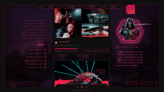
Theme [36]: Glitch by glenthemes
► PREVIEW | CODE | HELP | CREDITS
A cyberpunk theme inspired by Ghostrunner, a fast-paced first-person slasher where the protagonist tears his way to unveil the truth about the post-apocalyptic world — and himself. All shapes crafted from CSS ⊰ (〃´∀`〃)
Theme features:
quote: semi-faded for dramatic effect. custom enlarged keyword
custom links: up to 6. line effect on hover
posts: 1 column, multiple width options [420px, 450px, 500px, 540px]
sidebar image: hexagonal frame. contained option available
music player: sits at the bottom. up to 3 songs, with names
background: full-sized | pattern overlay | optional blur + shadow
in general: adjustable sizes, colors, spacing, etc
Credits:
fonts: Square Things, squarewave, Neuborn, Industry, Zuptype SIM, 7 pixels of Perfect
design: Ghostrunner’s end-screen | decorations from the upgrade menu | colors & line designs from the game’s site | hexagon inspiration
Be sure to follow the terms of use and like/reblog if you’re using this theme! Please contact me if you have any questions/problems with the theme and I’ll try to help you as much as I can! ♥
#theme#tumblr theme#ghostrunner#cyberpunk#gamingedit#*glenthemes#1k#i am EXHAUSTED#it's finally out#merry christmas everybody
2K notes
·
View notes
Text
tweaked theme code.
<!--
♡ CRUEL SUMMER BY DRUNKBLUSHED ♡
— do not combine with other themes. — do not take copy or take parts of this theme. — do not remove credits and redistribute as your own.
-->
<html> <head>
<meta name="color:background" content="#e7e7e7"/> <meta name="color:posts" content="#e7e7e7"/> <meta name="color:container" content="#f0f0f0"/> <meta name="color:borders" content="#ffffff"/> <meta name="color:accent" content="#93ad9d"/> <meta name="color:accent2" content="#3c3c3c"/> <meta name="color:bold" content="#93ad9d"/> <meta name="color:italic" content="#93ad9d"/> <meta name="color:text" content="#3c3c3c"/> <meta name="color:link" content="#93ad9d"/> <meta name="color:permalink" content="#3c3c3c"/> <meta name="color:permalink bg" content="#93ad9d"/>
<meta name="image:sidebar" content"https://via.placeholder.com/180x420"/> <meta name="image:graphic" content"https://via.placeholder.com/300x300"/> <meta name="image:tab image" content"https://via.placeholder.com/390x135"/>
<meta name="text:main title" content="LOREM IPSUM" /> <meta name="text:subtitle" content="Lorem ipsum dolor sit amet, consectetur"/> <meta name="text:subtitle2" content="Vivamus non vestibulum nibh eu dapibus" /> <meta name="text:stats" content"name. age. tz. counter." /> <meta name="text:extra link title" content="" /> <meta name="text:extra link url" content="" />
<title>{title}</title>
<link href="https://fonts.googleapis.com/css?family=Roboto:400,700,900&display=swap" rel="stylesheet">
<link href="//dl.dropbox.com/s/vpi3f9s7nhpe7v7/honeybee.css" rel="stylesheet">
<script src="https://ajax.googleapis.com/ajax/libs/jquery/1.7/jquery.min.js"></script>
<script type="text/javascript" src="https://static.tumblr.com/7qjmkr5/IUmmdsy41/jquery.style-my-tooltips.js"></script> <script> (function($){ $(document).ready(function(){ $("[title]").style_my_tooltips(); }); })(jQuery); </script>
<style type="text/css">
@font-face { font-family:"tokyoreg"; src: url('https://dl.dropbox.com/s/jgq18n62iha87v6/Tokyo-Regular.ttf'); } @font-face { font-family: "primetime"; src: url('https://dl.dropboxusercontent.com/s/uzoszwd2yfzqmmx/PRIMETIME.ttf');} @font-face { font-family: "sv"; src: url('https://dl.dropboxusercontent.com/s/qpgsh740pinr4ic/Serenade%20Demo.ttf') ;}
body{ background-color: {color:background}; font-family: 'roboto', sans-serif; color:{color:text}; letter-spacing:1px; }
/*----------------- TEXT STYLES -----------------*/
a:link, a:active, a:visited{ color: {color:Link}; text-decoration:none; -webkit-transition: all 0.2s linear; -moz-transition: all 0.2s linear; transition: all 0.2s linear; }
a:hover { color:{color:Link Hover}; -webkit-transition: all 0.2s linear; -moz-transition: all 0.2s linear; transition: all 0.2s linear; }
b,bold,strong{ color:{color:bold}; text-transform:uppercase; }
em,i,italic{ color:{color:italic}; }
big{font-size:12px;font-family: 'roboto', sans-serif;}
small,sup{ font-size:12px; }
h1{font-family: "primetime"; letter-spacing:1px; padding:12px; text-align:center; font-size: 22px; text-transform:uppercase; line-height: 120%; color:{color:accent};}
h2{font-family: "primetime"; letter-spacing:1px; padding:10px; text-align:right; font-size: 18px; text-transform:uppercase; line-height: 120%; color:{color:link};}
.posttitle{ font-family: "primetime"; letter-spacing:1px; padding:10px; text-align:justify; font-size: 22px; text-transform:uppercase; line-height: 120%; color:{color:permalink bg}; }
blockquote{ margin-left:0px; padding-left:15px; border-left: 2.5px solid {color:container}; width:95%; }
.p { padding-top: 5px;} .ol, ul { margin-left: 30px; padding: 5px; } .ul { list-style-type: square; }
::-webkit-scrollbar-thumb { display: none; }
::-webkit-scrollbar { display: none; }
#s-m-t-tooltip { z-index: 999999999999999999; background: #fff; font-size: 11px; line-height: 13px; letter-spacing: 1.5px; text-transform: uppercase; color: {color:permalink}; font-weight:900; background-color:{color:permalink bg}; max-width: 150px; word-wrap: break-word; padding: 2px 5px 2px 6px; display: block; margin: 24px 14px 7px 12px; -webkit-transition:.3s; -moz-transition:.3s; }
/*----------------- CONTAINERS & POSTS -----------------*/ #post img { border:none; max-width:250px; height:auto; position: center; text-align:center;
}
#bigcont{ margin: auto; left:0px; top:0px; bottom:0px; right:0px; }
#entries{ padding:30px; z-index:99; margin: auto; left:0px; top:25px; bottom:0px; right:0px; width:570px; position:absolute; height:390px; overflow-y:scroll; background-color:{color:container}; overflow-x:hidden; border:1px solid {color:background}; }
#post { font-size:12px; background-color:{color:posts};padding:25px; width:300px;z-index:99; margin-top:0px; margin-bottom:40px; margin-left:20px; line-height:150%; letter-spacing:1.5px; }
#post .tags {position:relative; text-align:left;opacity:0.5; color:{color:link}; padding:8px; z-index:999999999999999; font-size:10px; letter-spacing:2px; font-family: 'roboto', sans-serif; text-transform:uppercase;-webkit-transition: all 0.2s linear; -moz-transition: all 0.2s linear; transition: all 0.2s linear; margin-bottom:-20px; margin-top:5px; margin-left:-8px; }
#posts .tags a{ color:{color:link}; }
#post:hover .tags {position:relative; text-align:left;opacity:1; color:{color:link}; padding:8px; width:auto;z-index:999999999999999; text-transform:uppercase;-webkit-transition: all 0.2s linear; -moz-transition: all 0.2s linear; transition: all 0.2s linear;} .tags a {color:{color:text};text-transform:uppercase;}
.tags a:hover {color:{color:link hover};text-transform:uppercase;}
.info{ background:{color:permalink bg}; position:relative; padding:12px; margin-top:20px; margin-bottom:0px; text-transform:uppercase; letter-spacing:2px; color:{color:permalink}; font-size:10px; line-height:100%; }
.info span{ text-align:left; padding-left:-20px; text-transform:uppercase; margin-top:2px; padding-right:5px; }
.info rb{ right:0%; position:absolute; padding-right:0px; margin-top:-1px; }
.info b{ font-weight:900; color:{color:permalink}; }
.info a{ margin-left:0px; font-size:10px; color: {color:permalink}; }
/*----------------- CUSTOMIZATIONS -----------------*/
#maintitle{ font-family:"primetime"; font-size:58px; position:fixed; margin-top:-110px; margin-left:-30px; -webkit-text-stroke: 1.5px {color:link}; -webkit-text-fill-color: rgba(0, 0, 0, 0); max-width:460px; text-align:justify; word-spacing:-3px; }
#stats{ font-family:"roboto"; font-size:11px; position:fixed; margin-top:-70px; margin-left:425px; color:{color:link}; max-width:460px; text-align:center; word-spacing:0px; font-weight:400; font-style:italic; width:170px; }
#subtitle{ width:350px; font-size:12px; transform:rotate(-90deg); text-transform:uppercase; margin-left:-170px; font-family:"tokyoreg"; text-align:center; margin-top:185px; overflow:hidden; position:absolute; -webkit-filter: blur(0.0000000005px); }
#subtitle span{ background-color:{color:accent2}; padding:0px; padding-bottom:20px; font-size:12px; line-height:25px; padding:0px 5px 5px 5px; color:{color:accent}; -webkit-filter: blur(0.0000000005px); }
#subtitle2{ width:350px; font-size:12px; transform:rotate(90deg); text-transform:uppercase; margin-left:210px; font-family:"tokyoreg"; text-align:center; margin-top:185px; overflow:hidden; position:absolute; -webkit-filter: blur(0.0000000005px); }
#subtitle2 span{ background-color:{color:accent2}; padding:0px; font-size:12px; padding-bottom:20px; line-height:25px; padding:0px 5px 5px 5px; color:{color:accent}; -webkit-filter: blur(0.0000000005px); }
.centerimage {background:{color:accent}; margin-left:-30px; height:400px; margin-top:-30px; width:450px; height:450px; margin-bottom:50px;}
.centerimage img { margin-top:75px; margin-left:75px; z-index:999;}
.sideimage {position:fixed;z-index:99999999; width:180px; height:420px;margin-left:420px; margin-top:-30px;}
.sideimage img {width:180px; height:420px;}
/*----------------- NAVIGATION & PAGINATION -----------------*/
.tabz{ width:160px; height:10px; font-size:12px; z-index:99999999999999999; position:fixed; text-transform:uppercase; margin-left:420px; text-align:center; margin-top:390px; padding:10px; color:#0b0b0b; line-height:100%; color:{color:permalink bg}; background-color:{color:permalink}; }
.tabz a{ color:{color:permalink bg}; padding:10px; }
#pagination { font-family: 'roboto', sans-serif; font-size:12px; font-weight:900; width:350px; color:{color:accent}; margin-left:15px; text-align:center; }
#pagination a{ display:inline-block; color:{color:link}; padding:7px 10px 5px 10px; background-color:{color:background}; }
#pagination a:hover{ color:{color:pagination Hover};}
/*----------------- ASK POSTS -----------------*/
.qt { padding:15px; background-color:transparent; border: 1px solid {color:borders}; color:{color:text}; padding-left:15px; margin-top:10px; margin-left:0px; width:265px; padding-bottom:20px; margin-bottom:20px; padding-top:20px; }
.as img { position:absolute; border-radius:50px; margin-left:-40px; margin-right:40px; margin-top:-5px; border:3px solid {color:accent}; }
.as { padding-top:6px; background-color:{color:posts}; padding:5px; color:{color:accent}; font-size:16px; letter-spacing:1px; left:28%; margin-top:-35px; display:inline; position:absolute; margin-bottom:20px; text-transform:lowercase; font-family:"primetime"; }
.as a{ color:{color:accent}; }
/*----------------- CHAT POSTS -----------------*/
.answer span,.convo li{margin:0 0 5px;border-radius:1em;padding:.5em 10px;max-width:75%;clear:both;position:relative}.answer .them,.user_1,.user_3,.user_5,.user_7,.user_9,.user_11{float:left;background:{color:container};color:{color:text};left:3px}.me::after,.user_1::after,.user_3::after,.user_5::after,.user_7::after,.user_9::after,.user_11::after{content:"";position:absolute;left:-.5em;bottom:0;width:.5em;height:1em;border-right:.5em solid {color:container};border-bottom-right-radius:1em .5em}.answer .me,.user_2,.user_4,.user_6,.user_8,.user_10,.user_12{right:3px;float:right;background-color:{color:link};color:#000}.them::after,.user_2::after,.user_4::after,.user_6::after,.user_8::after,.user_10::after,.user_12::after{content:"";position:absolute;right:-.5em;bottom:0;width:.5em;height:1em;border-left:.5em solid {color:link};border-bottom-left-radius:1em .5em}.me p,.answer,.asked span{padding:0;margin:0}.answer{overflow:hidden} .asked p { text-align: justify; margin: 0 0px 10px 0px; padding: 0; color:{color:text}; font-size: 12px; line-height: 0px; } .footerright .viasrc { float: left; } .asked a { margin:0;padding:0; } .user_4{background-color:{color:container};color{color:text}}.user_4::after{border-color:{color:container}}.user_6{background-color:{color:container};color{color:text}}.user_6::after{border-color:{color:container}}.user_5{background-color:{color:link};color:#000}.user_5::after{border-color:{color:link}}.user_3{background-color:{color:container};color{color:text}}.user_3::after{border-color:{color:container}}.user_7{background-color:{color:container};color{color:text}}.user_7::after{border-color:{color:container}}.user_8{background-color:{color:container};color{color:text}}.user_8::after{border-color:{color:container}}.user_9{background-color:{color:container};color{color:text}}.user_9::after{border-color:{color:container}} .convo { overflow: hidden; list-style-type: none; padding: 0; margin: 0; }
/*----------------- PERMALINK PAGE -----------------*/ ol.notes { width:350px; padding: 0px; margin: 0px 0px; list-style-type: none; margin-left:20px; margin-top:-10px; font-size:12px;}
ol.notes li.note { padding: 10px; }
ol.notes li.note img.avatar { vertical-align: -4px; margin-right: 10px; width: 16px; height: 16px; }
ol.notes li.note span.action { font-weight: bold; }
ol.notes li.note .answer_content { font-weight: normal; }
ol.notes li.note blockquote { border-color: {color:posts}; padding: 4px 10px; margin: 10px 0px 0px 25px; }
ol.notes li.note blockquote a { text-decoration: none;}
/*----------------- TABS BASE CODE BY NCIGHBOURHOOD -----------------*/
.tabzcon { /* tablinks content aka the box under the tablinks */ margin: auto; left:-180px; top:25px; bottom:0px; right:0px; padding:30px; position:absolute; width:390px; height:390px; background-color:{color:accent}; color:#6c4b45; z-index:99999999999999999999999999999999999999999999999999; }
.tabzclose { /* the close button, u prob dont need to touch this */ font-size:12px; padding:3px; color:{color:background}; margin-top:-13px; margin-right:-5px; float:right; }
.tabzclose:hover { cursor:pointer; }
.tabzcon img{ width:390px; height:130px; background-color:{color:container}; }
/*----------------- TABS STYLING -----------------*/ #tabsub{ margin-top:-5px; margin-bottom:0px; background-color:{color:accent2}; color:{color:accent}; font-family:"tokyoreg"; text-align:center; padding:4px 6.5px 6.5px 6.5px; font-size:12px; }
.tabdesc{ margin-top:15px; width:155px; height:140px; border-bottom:15px solid {color:posts}; padding:15px; background-color:{color:posts}; color:{color:text}; position:fixed; text-align:justify; font-size:12px; overflow-y:auto; line-height:150%; }
#tablink{ width:200px; height:200px; text-align:center; margin-left:200px; margin-top:17.5px; }
#tablink a{ font-size:30px; font-family:"primetime"; -webkit-text-stroke: 1.5px {color:accent2}; -webkit-text-fill-color: rgba(0, 0, 0, 0); line-height:115%; -webkit-transition:.8s; -moz-transition:.8s; }
#tablink a:hover{ -webkit-text-fill-color: {color:accent2}; -webkit-transition:.8s; -moz-transition:.8s; }
/*----------------- MUSE TAB -----------------*/
#musetitle{ font-size:40px; color:{color:accent2}; font-family:"primetime"; text-align:center; margin-top:-10px; margin-bottom:20px; }
.musename{ font-size:15px; font-family:"primetime"; -webkit-text-stroke: 1.5px {color:accent2}; -webkit-text-fill-color: rgba(0, 0, 0, 0); display: inline-block; margin-left:20px; margin-top:-10px; max-width:200px; }
.musedesc{ width:190px; height:70px; padding:5px; overflow:auto; font-size:12px; line-height:150%; overflow-y:auto; color:{color:accent2}; text-align:justify; border-left:15px solid {color:accent}; }
.musesubtitle{ display: inline-block; max-width:200px; font-size:12px; text-transform:uppercase; font-family:"tokyoreg"; text-align:center; margin-left:20px; margin-top:-5px; }
.musesubtitle span{ background-color:{color:accent2}; text-align:justify; font-size:12px; padding-bottom:20px; line-height:25px; padding:0px 5px 5px 5px; color:{color:accent}; }
.museimg img{ width:130px; height:130px; float:left; margin-bottom:20px; display: inline-block; }
#muselinks{ width:15px; padding:5px; height:120px; margin-left:360px; margin-top:-145px; margin-bottom:60px; }
#muselinks a{ display: inline-block; color:{color:accent2}; font-size:12px; padding-top:14px; }
/*----------------- CREDITS / DO NOT TOUCH! -----------------*/ #credits{ position:fixed; bottom:0px; right:5px; width:35px; height:35px; text-align:center; }
#credits a{ font-family:"primetime"; font-size:18px; -webkit-text-stroke: 1px {color:accent}; -webkit-text-fill-color: rgba(0, 0, 0, 0); }
#credits a:hover{ font-family:"primetime"; -webkit-text-fill-color: {color:accent}; }
{CustomCSS} </style>
<link rel="shortcut icon" href="{Favicon}"> <link rel="alternate" type="application/rss+xml" title="RSS" href="{RSS}" /><meta name="viewport" content="width=820" />
</head>
<body>
<!--TABS BASE CODE BY ALYOFRP. DO NOT REMOVE THIS CREDIT!-->
<!--NAVIGATION TAB--> <div id="TabzOne" class="tabzcon alytut" style="display:none"> <span onclick="this.parentElement.style.display='none'" class="tabzclose"> <span class="th th-cross"></span></span> <div style="margin-bottom:10px;"></div>
<!--TAB SUBTITLES--> <div id="tabsub">POTENTIALLY TRIGGERING MATERIAL HEAVILY PREVALENT.</div> <img src="{image:tab image}"> <div id="tabsub">DARK PLOTS POINTS FREQUENTLY IN USE. READ RULES.</div>
<!--TAB DESCRIPTION--> <div class="tabdesc">Lorem ipsum dolor sit amet, consectetur adipiscing elit. Sed pulvinar velit tortor, nec pellentesque elit porta sed. Praesent a sodales est, a accumsan purus. Nulla finibus, augue nec pellentesque mollis, nulla risus dapibus est, a rutrum dui dui fermentum leo. Maecenas sapien dolor, venenatis vel sem ut, eleifend finibus risus. Quisque semper efficitur ante eget aliquam. Nullam et mollis erat. Vivamus ante massa, semper et gravida id, sollicitudin non dolor. </div>
<!--TAB LINKS--> <div id="tablink"> <a href="/link">rules.</a><br/> <a href="/link">memes.</a><br/> <a href="/link">verses.</a><br/> <a href="/link">wishlist.</a><br/> <a href="/link">navigation.</a><br/> </div>
</div><!--END NAVIGATION-->
<!--MUSE TAB--> <div id="TabzTwo" class="tabzcon alytut" style="display:none; overflow:auto;"> <span onclick="this.parentElement.style.display='none'" class="tabzclose"> <span class="th th-cross"></span></span> <div style="margin-bottom:10px;"></div>
<!------------TAB SUBTITLES------------> <div id="musetitle">muses.</div>
<!------------MUSE ONE------------> <div class="museimg"><img src="https://via.placeholder.com/130x130"></img></div>
<div class="musename">muse name</div>
<div class="musesubtitle"><span>&& scroll for more info.</span></div>
<div class="musedesc">FC. Age. Gender. Sexuality. Canon compliant / divergent / original character. Occupation. Education. Location. Availalbe / not available for romantic ships. Availalbe / Not available for sexual content. Open / closed for dark plots. Any other info you wish to include.</div>
<div id="muselinks"> <a href="/"><span class="th th-heart-1" title="wishlist"></span></a> <a href="/"><span class="th th-quote-down" title="ic posts"></span></a> <a href="/"><span class="th th-camera" title="face claim"></span></a> <a href="/"><span class="th th-pinterest-o" title="playlist"></span></a> <a href="/"><span class="th th-flash" title="open rps"></span></a> </div><!------------END MUSE ONE------------>
<!------------MUSE TWO------------> <div class="museimg"><img src="https://via.placeholder.com/130x130"></img></div>
<div class="musename">muse name</div>
<div class="musesubtitle"><span>&& scroll for more info.</span></div>
<div class="musedesc">FC. Age. Gender. Sexuality. Canon compliant / divergent / original character. Occupation. Education. Location. Availalbe / not available for romantic ships. Availalbe / Not available for sexual content. Open / closed for dark plots. Any other info you wish to include.</div>
<div id="muselinks"> <a href="/"><span class="th th-heart-1" title="wishlist"></span></a> <a href="/"><span class="th th-quote-down" title="ic posts"></span></a> <a href="/"><span class="th th-camera" title="fc"></span></a> <a href="/"><span class="th th-pinterest-o" title="playlist"></span></a> <a href="/"><span class="th th-flash" title="open rps"></span></a> </div><!------------END MUSE TWO------------>
<!------------MUSE THREE------------> <div class="museimg"><img src="https://via.placeholder.com/130x130"></img></div>
<div class="musename">muse name</div>
<div class="musesubtitle"><span>&& scroll for more info.</span></div>
<div class="musedesc">FC. Age. Gender. Sexuality. Canon compliant / divergent / original character. Occupation. Education. Location. Availalbe / not available for romantic ships. Availalbe / Not available for sexual content. Open / closed for dark plots. Any other info you wish to include.</div>
<div id="muselinks"> <a href="/"><span class="th th-heart-1" title="wishlist"></span></a> <a href="/"><span class="th th-quote-down" title="ic posts"></span></a> <a href="/"><span class="th th-camera" title="fc"></span></a> <a href="/"><span class="th th-pinterest-o" title="playlist"></span></a> <a href="/"><span class="th th-flash" title="open rps"></span></a> </div><!------------END MUSE THREE------------>
<!------------MUSE FOUR------------> <div class="museimg"><img src="https://via.placeholder.com/130x130"></img></div>
<div class="musename">muse name</div>
<div class="musesubtitle"><span>&& scroll for more info.</span></div>
<div class="musedesc">FC. Age. Gender. Sexuality. Canon compliant / divergent / original character. Occupation. Education. Location. Availalbe / not available for romantic ships. Availalbe / Not available for sexual content. Open / closed for dark plots. Any other info you wish to include.</div>
<div id="muselinks"> <a href="/"><span class="th th-heart-1" title="wishlist"></span></a> <a href="/"><span class="th th-quote-down" title="ic posts"></span></a> <a href="/"><span class="th th-camera" title="fc"></span></a> <a href="/"><span class="th th-pinterest-o" title="playlist"></span></a> <a href="/"><span class="th th-flash" title="open rps"></span></a> </div><!------------END MUSE FOUR------------>
</div><!--END MUSE TAB-->
<div id="entries">
{block:IndexPage} <div id="subtitle"><span>{text:subtitle}</span></div> <div id="subtitle2"><span>{text:subtitle2}</span></div> {/block:IndexPage}
<div class="tabz"> <a href="/" title="home"><span class="th th-home-o"></span></a> <a href="/ask" title="message"><span class="th th-chat-bubble-o"></span></a> <a href="javascript:void(0)" class="tablink tabzact" onclick="openAlytut(event, 'TabzOne');" title="navigation"><span class="th th-earth-o"></span></a> <a href="javascript:void(0)" class="tablink tabzact" onclick="openAlytut(event, 'TabzTwo');" title="muses"><span class="th th-diamond-o"></span></a> </div>
<div class="sideimage"><img src="{image:sidebar}" draggable="false"></div>
<div id="maintitle">{text:main title}</div>
<div id="stats">{text:stats}</div>
{block:IndexPage} <div class="centerimage"> <img src="{image:graphic}" draggable="false"></div> {/block:IndexPage}
{block:Posts}
<div id="post">
{block:text} {block:Title} <div class="posttitle">{Title}</div> {/block:Title} {Body} {/block:text}
{block:Link} <div class="posttitle"> <a href="{URL}">{Name}</a> </div> {block:Description}{Description}{/block:Description} {/block:Link}
{block:Photo} <center> {LinkOpenTag} <a href="{permalink}"> <img src="{PhotoURL-400}" alt="{PhotoAlt}" width="300"></a> {LinkCloseTag} </center> {block:Caption}{Caption}{/block:Caption} {block:ContentSource} <!-- {SourceURL}{block:SourceLogo}<img src="{BlackLogoURL}" width="{LogoWidth}" height="{LogoHeight}" alt="{SourceTitle}" /> {/block:SourceLogo} {block:NoSourceLogo}{SourceLink}{/block:NoSourceLogo} --> {/block:ContentSource} {block:ReblogParentURL} <!-- {block:NoSourceLogo}{SourceLink}{/block:NoSourceLogo} --> {/block:ReblogParentURL} {/block:Photo}
{block:Photoset} {Photoset} {block:Caption}{Caption}{/block:Caption} {/block:Photoset}
{block:Quote} <div class="posttitle">{Quote}</div> {block:Source} <center>- {Source}</center> {/block:Source} {/block:Quote}
{block:Chat} {block:Title} <h1>{Title}</h1>{/block:Title}<br> <ul class="convo">{block:Lines}<li class="line_{Alt} user_{UserNumber}">{block:Label}<span class="label"><strong>{Label}</strong></span>{/block:Label} {Line}</li>{/block:Lines}</ul> {/block:Chat}
{block:Audio} {block:AlbumArt} <img src="{AlbumArtURL}" width="80px" align="left" style="margin-right:10px" />{/block:AlbumArt} <span class="audio">{AudioPlayerGrey}<br></span> {block:TrackName}<b>Title:</b> {TrackName}<br />{/block:TrackName} {block:Artist}<b>Artist:</b> {Artist}<br />{/block:Artist} {/block:ExternalAudio}<b>Played:</b> {PlayCount} times {block:Caption}{Caption}{/block:Caption} {/block:Audio}
{block:Video} <center>{Video-250}</center> {block:Caption}{Caption}{/block:Caption} {/block:Video}
{block:Answer} <div class="pt"></div> <div class="qt">{Question}</div> <div class="as"><img src="{AskerPortraitURL-24}">{Asker}</div> {Answer}{/block:Answer}
{block:IndexPage} <div class="info"> {block:Date} <span><a href="{Permalink}" title="{TimeAgo}"> <b>{ShortMonth}{DayOfMonthWithZero}{ShortYear}</b></a> {block:NoteCount}with <b><a href="{Permalink}">{NoteCountWithLabel}</b></a>{/block:NoteCount}</span> {/block:Date} <rb> <span>
{block:RebloggedFrom} <a href="{reblogparenturl}" title="via"><span class="th th-share-o"></span></a>{/block:RebloggedFrom}
{block:ContentSource} <a href="{SourceURL}" title="source"><span class="th th-push-pin-o"></span></a>{/block:ContentSource}
<a href="{ReblogURL}" title="reblog" target="_blank" class="reblog"><span class="th th-reload"></span></a></span></rb> </div>
<div class="tags">{block:HasTags} {block:Tags}<a href="{TagURL}">#<font style="text-transform:uppercase;">{Tag}</font> </a> {/block:Tags} {/block:HasTags}</div> {/block:IndexPage}
{block:PermalinkPage} <div class="info"> {block:Date}<span> <a href="{Permalink}"> <b>{ShortMonth}{DayOfMonthWithZero}{ShortYear}</b></a> with <b><a href="{Permalink}">{NoteCountWithLabel}</b></a></span> {/block:Date} <span> </span> </div>
<div class="tags">{block:HasTags} {block:Tags}<a href="{TagURL}">#<font style="text-transform:uppercase;">{Tag}</font> </a> {/block:Tags} {/block:HasTags}</div> {/block:PermalinkPage}
</div><!----POST END---->
{block:PostNotes} {PostNotes} {/block:PostNotes} {/block:Posts}
{block:Pagination} <div id="pagination"> <div style="margin-top:50px;margin-bottom:10px;"> {block:PreviousPage}<a href="{PreviousPage}" class="jump_page"><span class="th th-chevron-left"></span></a>{/block:PreviousPage} {block:JumpPagination length="3"} {block:CurrentPage}<a><span class="current_page">{PageNumber}</span></a>{/block:CurrentPage} {block:JumpPage}<a class="jump_page" href="{URL}">{PageNumber}</a>{/block:JumpPage}{/block:JumpPagination} {block:NextPage}<a href="{NextPage}" class="jump_page"><span class="th th-chevron-right"></span></a>{/block:NextPage} </div></div> {/block:Pagination}
</div><!----ENTRIES END----> </div>
<div id="credits"> <a href="https://drunkblushed.tumblr.com/" title="theme by drunkblushed"><span class="th th-flower-1"></span></a></div>
</body> <script> function openAlytut(evt, alytutName) { var i, x, tablinks; x = document.getElementsByClassName("alytut"); for (i = 0; i < x.length; i++) { x[i].style.display = "none"; } tablinks = document.getElementsByClassName("tablink"); for (i = 0; i < x.length; i++) { tablinks[i].className = tablinks[i].className.replace(" tabzact", ""); } document.getElementById(alytutName).style.display = "block"; evt.currentTarget.className += " tabzact"; } </script>
</html>
0 notes
Text
知っておくと役立つ!CSSの疑似要素:beforeと:afterを使用したUI要素を実装するテクニックのまとめ
CSSの疑似要素は非常に便利です。疑似要素:beforeと:afterを使用したUI要素を実装する便利なテクニックを紹介します。
Webページやスマホアプリで使えるUI要素をはじめ、クリック・タップ可能領域を広げたり、:afterと:beforeのどちらを使うべきかなど、知っておくと役立つ疑似要素のテクニックです。
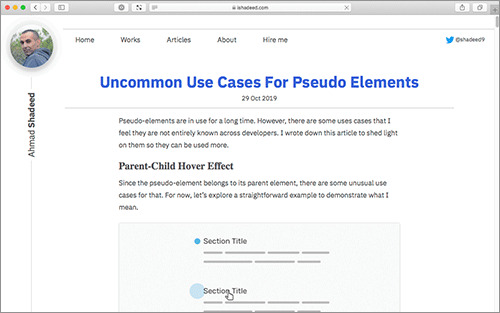
Uncommon Use Cases For Pseudo Elements by Ahmad Shadeed
下記は各ポイントを意訳したものです。 ※当ブログでの翻訳記事は、元サイト様にライセンスを得て翻訳しています。
疑似要素で、親子のホバーエフェクト
疑似要素はその親要素に属しているため、それを利用したテクニックがいくつかあります。分かりやすい例を使用して説明します。
子をホバーすると、親にエフェクトが適用される
見出し(Section Title)があり、その左に小さな円があります。見出しにカーソルを合わせると、この小さな円は大きくなります。 これは、下記のCSSで実現できます。
.section-title:before {
content: "";
width: 20px;
height: 20px;
background: blue;
/* Other styles */
}
.section-title:hover:before {
transform: scale(1.2);
}
CSSは簡単で分かりやすいと思います。 では、このコンセプトをより有用な使用例に拡張してみます。
一覧のリスト
私のWebサイトには、プロジェクトの一覧があります。プロジェクトごとにサムネイルを追加したかったのですが、最優先事項ではありませんでした。より重要だったのは、リンク自体です。このエフェクトはEthan Marcotteで、初めて見ました。
デフォルト時
上記のモックアップ画像は、私が適用したかったアイデアを示しています。本文のリンクには、それに対応する要素があります。
子要素のリンクをホバーすると、親要素にエフェクトを適用
HTMLは、下記の通りです。
<section class="hero">
<p>Hello, my name is Ahmad. I’m a UX Designer and Front End Developer that enjoys the intersection between design and code. I write on <a href="http://bit.ly/2P5yuAU" class="link-1">ishadeed.com</a> and <a href="http://bit.ly/380D1x3" class="link-2">a11ymatters.com</a> on CSS, UX Design and Web Accessibility.</p>
</section>
ヒーローにpaddingを追加
疑似要素のためにスペースを確保したいので、paddingを追加します。
paddingを追加して、スペースを確保
疑似要素を絶対配置にする
絶対配置にするには、どの親が相対的な親であるかを定義する必要があります。この場合は、ヒーローセクションに追加する必要があります。
下記のアニメーションGIFで、.heroからposition: relativeを削除すると疑似要素にどのような影響を与えるかに確認してください。
position: relativeを削除すると疑似要素にどのような影響を与えるか
擬似要素を追加
最後にホバーエフェクトとともに、擬似要素を追加します。
1
2
3
4
5
6
7
8
9
10
11
12
13
14
15
16
17
18
19
20
21
22
23
24
25
26
.link-1 {
color: #854FBB;
}
@media (min-width: 700px) {
.link-1:after {
content: "";
position: absolute;
right: 0;
top: 20px;
width: 150px;
height: 100px;
background: currentColor;
opacity: 0.85;
transition: 0.3s ease-out;
}
.link-1:hover {
text-decoration: underline;
}
.link-1:hover:after {
transform: scale(1.2);
opacity: 1;
}
}
これで、子要素のリンクをホバーすると、それに対応した要素にエフェクトが適用されます。
完成したデモ
実装のポイント
疑似要素のbackgroundプロパティにcurrentColorを定義していることに注目してください。このキーワードは常に、親のカラーを継承します。そのため、リンクのカラーを変更しても問題ありません。
リンクと同じカラーを常に継承する
実際のデモは、下記ページでご覧ください。
もし興味があれば、私のWebサイトにも実際に使用しているので、チェックしてください。ここで紹介したテクニックを使用しています。
ishadeed.com
疑似要素で、クリック可能領域のサイズを広くする
疑似要素をリンクに追加することで、クリック可能な領域が広くなります。これは非常に便利なテクニックで、ユーザーエクスペリエンスを向上します。
クリック可能領域のサイズを広くする
さらに、カードコンポーネントのクリック可能領域を広くするためにも使用できます。記事のタイトルや画像などのコンテンツは疑似要素の上にあるため、テキストの選択や画像の保存には影響しません。
カードのクリック可能領域のサイズを広くする
この実装方法については、以前詳しく解説した記事をご覧ください。
Enhancing The Clickable Area Size 日本語訳: クリック・タップ可能な領域のサイズを広くする実装方法のまとめ
疑似要素を使用したオーバーレイ
背景画像を持つ要素があり、そのデザインに描画モードがカラーに設定されたグラデーションのオーバーレイがあるとします。その場合、疑似要素で実装できます!
疑似要素を使用したオーバーレイ
CSSは、下記の通りです。
.hero {
position: relative;
height: 300px;
background: url("image.jpg") center/cover;
}
.hero:after {
content: "";
position: absolute;
left: 0;
top: 0;
width: 100%;
height: 100%;
background-image: linear-gradient(180deg, #851717 0%, #30328C 100%);
mix-blend-mode: color;
}
実際のデモは、下記ページでご覧ください。
疑似要素で、シャドウエフェクト
「Wrapped Shadows」の名称が正しいかどうか分かりませんが、私はそう認識しています。このエフェクトを実現するために、少し歪んだシャドウを作成していました、繊細なエフェクトです。 聞いてください! 疑似要素を使用するとこれも簡単に実装できます。
少し歪んだシャドウ「Wrapped Shadows」
このエフェクトの実装方法を解説します。
Step 1: 要素を作成
まずは、div要素で矩形のスタイルを定義します。
.elem {
position: relative;
display: flex;
align-items: center;
max-width: 400px;
background: #fff;
padding: 2rem 1rem;
font-size: 1.5rem;
margin: 2rem auto;
text-align: center;
box-sizing: border-box;
}
中央に配置された矩形が実装されました。
中央に配置された矩形
Step 2: 疑似要素を加える
次に、widthが50%の:beforeと:afterを加えます。 ※説明のために、それぞれ異なる背景色をつけました。
1
2
3
4
5
6
7
8
9
10
11
12
13
14
15
16
17
18
.elem:before,
.elem:after {
content: "";
position: absolute;
top: 2px;
width: 50%;
height: 100%;
}
.elem:before {
left: 0;
background: grey;
}
.elem:after {
right: 0;
background: #000;
}
:beforeがグレー、:afterがブラック
疑似要素にtransform: skew(x)を加え、xは2度です。1つをマイナスにすることで、目的のエフェクトが得られます。
.elem:before {
transform: skew(-2deg);
}
.elem:after {
transform: skew(2deg);
}
角度をつける
擬似要素にz-index: -1を加え、親の背後に移動します。
疑似要素を背後に移動
最後に仕上げです。
filter: blurを加える。
opacityを下げる。
透明から黒へのグラデーションを加える(親の上部中央にある擬似要素のエッジを非表示にするため)。
最終のコード
最終のコードは、下記の通りです。
1
2
3
4
5
6
7
8
9
10
11
12
13
14
15
16
17
18
19
20
21
22
23
24
25
26
27
28
29
30
31
32
33
34
35
.elem {
position: relative;
display: flex;
align-items: center;
max-width: 400px;
background: #fff;
padding: 2rem 1rem;
font-size: 1.5rem;
margin: 2rem auto;
text-align: center;
box-sizing: border-box;
}
.elem:before,
.elem:after {
content: "";
position: absolute;
top: 3px;
width: 50%;
height: 100%;
z-index: -1;
background: linear-gradient(to bottom, transparent, #000);
filter: blur(3px);
opacity: 0.3;
}
.elem:before {
left: 0;
transform: skewY(-2deg);
}
.elem:after {
right: 0;
transform: skewY(2deg);
}
疑似要素の:beforeと:afterにskewYに入れ替えると、また違ったシャドウを実装できます。
skewYに入れ替えたエフェクト
実際のデモは、下記ページでご覧ください。
:afterと:beforeのどちらを使うべきか
私は最近Twitterの議論で、:afterではなく:beforeを使用する方が良いということを学びました。どうしてでしょう?
なぜなら、:afterを使用した場合は疑似要素が他のネストされた要素と重ならないようにz-indexを他のネストされた要素に追加する必要があるかもしれないからです。
実際の例を見てましょう。 サムネイルとタイトルで構成されたシンプルなカードです。テキストの下にはグラデーションオーバーレイがあり、サムネイルの画像が明るすぎる場合でもテキストが見やすくなります。
サムネイルとタイトルで構成されたシンプルなカード
HTMLは非常にシンプルです。
<article class="card">
<img src="article.jpg" alt="">
<h2>Title here</h2>
</article>
タイトルの下にオーバーレイを追加するには、疑似要素を使用する必要があります。:afterと:beforeのどちらを使用しますか? 両方の例を見てましょう。
:afterを使用した場合
:afterを使用した場合は、タイトルは下記のように擬似要素オーバーレイの下に表示され��す。
タイトルがオーバーレイの下に表示されてしまう
これを解決するには、タイトルにz-indexを加えます。簡単で迅速な解決策ですが、それは正しい方法ではありません。
.card-title {
/*Other styles*/
z-index: 1;
}
:beforeを使用した場合
:beforeを使用した場合は、デフォルトで機能します。タイトルにz-indexを加える必要はありません。これが機能する理由は、:beforeを使用すると他の兄弟要素の上には表示されませんが、:afterだと表示されてしまうからです。
実際のデモは、下記ページでご覧ください。
ファイル拡張子を元にリンクのスタイル設定
このテクニックは例えば、PDFファイルへのリンクがある場合はPDFアイコンを表示して、ユーザーに分かりやすくすることができます。 さっそく、その実装方法を見てましょう。
<p><a href="example.pdf">Download PDF</a></p>
<p><a href="example.doc">Download Doc</a></p>
a[href$=".pdf"]:before {
content: "";
display: inline-block;
vertical-align: middle;
margin-right: 8px;
width: 18px;
height: 18px;
background: url(https://s3-us-west-2.amazonaws.com/s.cdpn.io/182774/np_pdf_377198_000000.svg) center/20px no-repeat;
padding: 3px;
}
これで、.pdfへのリンクにはPDFアイコンを、.docへのリンクにはDOCアイコンを表示します。
ファイル拡張子を元にリンクのスタイル設定
実際のデモは、下記ページでご覧ください。
疑似要素で、区切り線
「or」の両側にラインを引いた区切り線です、これは疑似要素とFlexboxを使用して簡単に実装できます。
疑似要素で、区切り線
実装は非常にシンプルです。
1
2
3
4
5
6
7
8
9
10
11
12
13
14
15
16
17
18
19
p {
display: flex;
align-items: center;
}
p:before, p:after {
content: "";
height: 2px;
background: #c5c5c5;
flex-grow: 1;
}
p:before {
margin-right: 10px;
}
p:after {
margin-left: 10px;
}
実際のデモは、下記ページでご覧ください。
アップデート
この実装方法より、よい方法があります。Scott ZirkelのTwitterで指摘され、<hr>を使用する方がよいことが分かりました。実際のコードは、下記のデモをご覧ください。
終わりに
これで終了です。コメントや提案があれば、@shadeed9に送ってください。
0 notes
Video
youtube
Divi Theme Text Over Image On Hover With Background Blur
How to create an awesome text ver image hover effect with the Divi Theme. In this video we will be demonstrating how to create this feature using the Divi Blurb Module. Today we will be demonstrating how to build this feature with a background image and some simple CSS Code (Below). This is a very eye catching feature and really easy to implement. In this video we will cover:
Adding A Divi Blurb Module, Adding A Column Background Image, Giving A Column A Fixed Height, Positioning The Divi Blurb Module Using Padding, Creating A Hover Effect, Adding The CSS Code To Blur The Image.
We are going to be using the Divi theme to create some great effects in this series of videos. The Divi theme has some great modules and effects. With a little work you can achieve some great eye-catching effects to enhance the look and user experience of your website.
CSS, or Cascading Style Sheets, is a vital tool for web designers looking to create beautiful and functional websites. By separating the presentation and style of a web page from its content, CSS makes it easier to create consistent and visually appealing designs across an entire website. In this video, we will explore the basics of CSS and how it can be used to style HTML elements, add layout and positioning, and create dynamic effects.
We'll start by looking at the syntax and structure of CSS rules, selectors, and properties. Then, we'll cover some of the most commonly used CSS properties, including font, color, background, padding, and margin. We'll also explore more advanced techniques such as flexbox and grid layout, which can be used to create complex and responsive designs.
Whether you're a beginner or an experienced web designer, this video will provide you with the knowledge and skills you need to take your CSS skills to the next level. So sit back, relax, and join us on this journey to mastering CSS in web design.
So, follow along with the video and see how to create this, using the fantastic Divi Theme. For more information on
the Divi theme, check out our Divi playlists below.
Divi Wow Carousel: https://divipeople.com/plugins/wow-divi-carousel/
Try out the Divi theme: https://bit.ly/TryDiviNow
Divi Supreme Modules Pro Plugin 10% Off: https://bit.ly/DiviSupremeCoupon
Divi Supreme Modules Light Plugin: https://divisupreme.com/divi-plugins/?ref=6
Divi Supreme Modules Playlist: https://www.youtube.com/watch? v=ZAO2MH0dQtk&list=PLqabIl8dx2wo8rcs-fkk5tnBDyHthjiLw
Playlist page for more videos on this: https://www.youtube.com/c/System22Net/playlists
Full Ecommerce Site Build Playlist: https://www.youtube.com/watch? v=rNhjGUsnC3E&list=PLqabIl8dx2wq6ySkW_gPjiPrufojD4la9
Contact Form With File Upload Video: https://youtu.be/WDo07nurfUU
Divi 4 Theme Create An Ecommerce Store In One Hour: https://youtu.be/qP-ViPakoSw
My Blog : https://web-design-and-tech-tips.com
Check out our playlist page for more videos on this: https://www.youtube.com/c/System22Net/playlists
Sub: https://www.youtube.com/channel/UCYeyetu9B2QYrHAjJ5umN1Q?sub_confirmation=1
0 notes
Text
- ̗̀ THE ULTIMATE CODING MASTERLIST ̖́-
source: grunde.tumblr.com/coding
GENERATORS, WEBSITES & BLOGS:
khanacademy.org
w3schools.com
htmlgoodies.com
simplehtmlguide.com
codeschool.com
csstutorial.net
learn-js.org
htmlqueens
css-tricks.com
webtoasts.com
cssarrowplease.com
buildthemes
codeacademy.com
treehouse.com
htmldog.com
css3generator.com
cssreflex.com
programmr.com
freecodecamp.com
learneroo.com
tutorialspoint.com
css generators
stackoverflow.com
cssreference.io
tools roundup by ninpen
css triangle generator
more generators
idevie.com
amazing-jquery-plugins
bk-designs
braziliandesigner
htmluv
things-to-help-you
singlethemes
making-themes
imperidohtml
land-of-designs
havingthemes
ilovethemes
decodering
THE BASICS:
theme 101 series (7 parts) by octomoosey
masterlist of tutorials by octomoosey
how to make a theme series (5 parts) by lmthemes
how to create a custom HTML theme by tumblr
tutorial series (8 parts) by themesbyeris
ren’s guide to html/css tabs by transjeanluc
ren’s html and css crash course by transjeanluc
ren’s guide to theme making by transjeanluc (part 1, part 2, part 3)
html css crash course (5 parts) by transjeanluc
learn how to make awesome tumblr themes by dash
how to make your own tumblr theme using dreamweaver cs5 by lovely-tutorials
wtf is html and wtf is css by itsphotoshop
html guide by remondpsds
tumblr text html reference
theme making tips & tricks by riverbellthemes
POPUPS, DROP DOWNS & TABS:
how to: different styled popups by htmlqueens
customizing popups by htmlqueens
tutorial: popup menu by itsphotoshop
category tabs by agirlingrey
create a pure css tag content by webtoasts
simple drop-down box by manatopia
tutorial: all-in-one effect for themes and pages by neonbikethemes
popup box tutorial by raiidens
popup tutorial by agirlingrey
detailed popup tutorial by octomoosey
menu drop down by fukuo
popup tutorial by selenapastel
simple popup navigation tutorial by creatre
drop down menu by lifenofear
pop it menu by thehelpcenter
popup boxes by chcodes
popup links by acklesjpeg
popup tutorial by mearauders
responsive menu bar by fukuo
hide/show on click tutorial by limesthemes
reveal upon clicking by lmthemes
navbar with drop down menus by sorrynotsorrytho
FONTS:
hailthehelpful’s font page
galaxias-themes’ font page
custom font tutorial by lmthemes
css font styling by decodering
an alternative to font-awesome by octomoosey
how to use fonts by selenapastel
stroke icons by pixeden tutorial by bychloethemes
tutorial: svg icons by thme130trbl
custom fonts for themes using google fonts by monolids
how to use adobe edge web fonts by octomoosey
how to use custom fonts by nutty-themes
using icons from font awesome by azurethemes
how to use custom fonts by roxiestheme
TUTORIAL TAGS:
roxiesthemes (more)
acuite (masterpost)
amplamentethemes
cathms
aogthemes
heartedhtml
nutty-themes
odeysseus
tutorial-baby
sentimentalthemes
rabbithelps
emmortalsresources
quirkyresources (more)
shythemes
lmthemes (their tutorials + more)
CODING FOR IMAGES:
turn square images into teardrops or circles using css by octomoosey
how to make images black and white using css by octomoosey
fix overflowing images by excolo
grayscale css 101 for you tumblr theme by mirsexual
grayscale effect on photos by theamazingtutorials
how to have crisp 540px photos on blogs by shenchang
clipping images into text using css by nimbupani
webkit filter properties by etrothemes
polaroid photo effect using css by bk-designss
HOVERS, EFFECTS & ANIMATIONS:
blurry on hover by html-tutorials
un-blur on hover by html-tutorials
how to animate theme objects using keyframes by octomoosey
how to add a “sliding” background hover effect to your links by octomoosey
how to use isotope javascript filter by creatre
animated links by agirlingrey
how to make things appear on hover in tumblr themes by beatriceofrp
small effects by gyapo
hover caption tutorial by shythemes
circle hover menu by fukuo
how to make things move on click with javascript by themesbyzsu
sliding menu bar by fukuo
slide tutorial by themes-mandrakescry
hover caption tutorial by boromihrs
slide up tutorial by themes-mandrakescry
animatable by github
jquery click effect by primrosetylers
how to make permalinks (likes and reblogs) appear on hover by sarcasticthemes
how to move things on click with javascript by creatre
hover effects tutorial by misscapaldi
hover effects by roxiestheme
hover effect tutorial by aogthemes
how to do hover tags by sentimentalthemes
keyframes fade-in animation by enchantedthemes
3d text effect by lmthemes
a crash course in css3 transitions by buildthemes
hover notes by selenapastel
ren’s guide to hover codes by transjeanluc
tutorial: sliding viewer by acuite
transition delays guide by limesthemes
shake on hover effect by bk-designs
PDFS & EBOOKS (COURTESY OF ME):
css
css by tutorialspoint
html & css – design and build websites by jon duckett
html basics
html by tutorialspoint
html, xhtml and css all-in-one for dummies (2nd edition) by andy harris
html 4.0 by w3c
EVERYTHING ELSE:
learn to code – interactive online website masterpost by code-bug
semi transparent music player by nff-themes
how to enlarge sub/sup text in a theme by pohoro
how to add a tumblr like (heart) button to a theme by like-button
how to add a horizontal navigation bar to a theme by sleepymallows
simple css tool tip stuff by kloningspoon
how to style a quote by bk-designs
how to style a quote by ilovethemes
improve readability on themes by rabbithelps
make your tool tips look like speech bubbles by tutorials-baby
how to display related posts on tumblr themes by buildthemes
contained theme - css overflow by lmthemes
“pre” tag wrap quick tutorial by deanlirium
how to keep personal tagged posts from showing on your blog by hailthehelpful
how to make fancy borders around theme objects by octomoosey
how to change the colour of your audio players by elletricity
sticky notes tutorial by yukoki
how to change your dash header / icon without changing your description by remondpsds
how to get rid of the via and source tags on themes by blissrph
how to decorate your updates tab by burntsam
tool tip tutorial by remondpsds
post notes customization by htmluv
how to fix emojis on your blog by zacharyfury
un-nest tumblr captions by neothm
how to make a custom ask page by a-pocketful
creating drop down lists for customize page by sarahthemes
make shapes with css by idevie
imessage chat posts by animalites
basic tooltip tutorial by tutorial-baby
how to add a poll to your blog by lejolas
how to change the width of a post on a tumblr theme by armyofghosts
audio by selenapastel
tutorial: hover notes by remondpsds
how to display a loading before the page is fully loaded by fukuo
how to add text on the /ask page by magnusthemes
how to make a sticky element by sarahthemes
how to make a custom “not found” page on tumblr by fukuo
alternate tumblr controls by bychloethemes
tutorial: tooltips by acuite
changing a one columned theme into a grid theme by creatre
redirect your old tumblr links to your new url–the correct way by oddhour
how to hide posts from your blog depending on tags by bychloethemes
how to stylize the audio player by ettudis
how to add a moving affiliates section by octomoosey
making tumblr theme chats look like phone messages by buildthemes
custom “read more” by starious
jump pagination by excolo
chrome extensions for theme makers by acuite
how to make a search box by lmthemes
answer posts with portraits by excolo
how to change default selection colour by starious
start using css3 gradients in your themes by buildthemes
customizing your lists by etrothemes
tutorial: how to change the colour of tumblr’s new audio player by roxiestheme
tutorial: display certain item on your home page only by roxiestheme
17 notes
·
View notes
Text
The Many Ways to Change an SVG Fill on Hover (and When to Use Them)
SVG is a great format for icons. Vector formats look crisp and razor sharp, no matter the size or device — and we get tons of design control when using them inline.
SVG also gives us another powerful feature: the ability to manipulate their properties with CSS. As a result, we can make quick and simple interactions where it used to take crafty CSS tricks or swapping out entire image files.
Those interactions include changing color on hover states. It sounds like such a straightforward thing here in 2019, but there are actually a few totally valid ways to go about it — which only demonstrates the awesome powers of SVG more.
First off, let’s begin with a little abbreviated SVG markup:
<svg class="icon"> <path .../> </svg>
Target the .icon class in CSS and set the SVG fill property on the hover state to swap colors.
.icon:hover { fill: #DA4567; }
This is by far the easiest way to apply a colored hover state to an SVG. Three lines of code!
SVGs can also be referenced using an <img> tag or as a background image. This allows the images to be cached and we can avoid bloating your HTML with chunks of SVG code. But the downside is a big one: we no longer have the ability to manipulate those properties using CSS. Whenever I come across non-inline icons, my first port of call is to inline them, but sometimes that's not an option.
I was recently working on a project where the social icons were a component in a pattern library that everyone was happy with. In this case, the icons were being referenced from an <img> element. I was tasked with applying colored :focus and :hover styles, without adjusting the markup.
So, how do you go about adding a colored hover effect to an icon if it's not an inline SVG?
CSS Filters
CSS filters allow us to apply a whole bunch of cool, Photoshop-esque effects right in the browser. Filters are applied to the element after the browser renders layout and initial paint, which means they fall back gracefully. They apply to the whole element, including children. Think of a filter as a lens laid over the top of the element it's applied to.
These are the CSS filters available to us:
brightness(<number-percentage>);
contrast(<number-percentage>);
grayscale(<number-percentage>);
invert(<number-percentage>);
opacity(<number-percentage>);
saturate(<number-percentage>);
sepia(<number-percentage>);
hue-rotate(<angle>);
blur(<length>);
drop-shadow(<length><color>);
All filters take a value which can be changed to adjust the effect. In most cases, this value can be expressed in either a decimal or percent units (e.g. brightness(0.5) or brightness(50%)).
Straight out of the box, there's no CSS filter that allows us to add our own specific color. We have hue-rotate(), but that only adjusts an existing color; it doesn't add a color, which is no good since we're starting with a monochromatic icon.
The game-changing bit about CSS filters is that we don't have to use them in isolation. Multiple filters can be applied to an element by space-separating the filter functions like this:
.icon:hover { filter: grayscale(100%) sepia(100%); }
If one of the filter functions doesn't exist, or has an incorrect value, the whole list is ignored and no filter will be applied to the element.
When applying multiple filter functions to an element, their order is important and will affect the final output. Each filter function will be applied to the result of the previous operation.
So, in order to colorize our icons, we have to find the right combination.
To make use of hue-rotate(), we need to start off with a colored icon. The sepia() filter is the only filter function that allows us to add a color, giving the filtered element a yellow-brown-y tinge, like an old photo.
The output color is dependent on the starting tonal value:

In order to add enough color with sepia(), we first need to use invert() to convert our icon to a medium grey:
.icon:hover { filter: invert(0.5) }

We can then add the yellow/brown tone with sepia():
.icon:hover { filter: invert(0.5) sepia(1); }

...then change the hue with hue-rotate():
.icon:hover { filter: invert(0.5) sepia(1) hue-rotate(200deg); }

Once we have the rough color we want, we can tweak it with saturation() and brightness():
.icon:hover { filter: invert(0.5) sepia(1) hue-rotate(200deg) saturate(4) brightness(1); }

I've made a little tool for this to make your life a little easier, as this is a pretty confusing process to guesstimate.
See the Pen CSS filter example by Cassie Evans (@cassie-codes) on CodePen.
Even with the tool, it's still a little fiddly, not supported by Internet Explorer, and most importantly, you're unable to specify a precise color.
This browser support data is from Caniuse, which has more detail. A number indicates that browser supports the feature at that version and up.
Desktop
ChromeOperaFirefoxIEEdgeSafari18*15*35No186*
Mobile / Tablet
iOS SafariOpera MobileOpera MiniAndroidAndroid ChromeAndroid Firefox6.0-6.1*46No4.4*7164
So, what do we do if we need a specific hex code?
SVG Filters
If we need more precise control (and better browser support) than CSS filters can offer, then it's time to turn to SVG.
Filters originally came from SVG. In fact, under the hood, CSS filters are just shortcuts to SVG filters with a particular set of values baked in.
Unlike CSS, the filter isn't predefined for us, so we have to create it. How do we do this?
This is the syntax to define a filter:
<svg xmlns="<http://www.w3.org/2000/svg>" version="1.1"> <defs> <filter id="id-of-your-filter"> ... ... </filter> ... </defs> </svg>
Filters are defined by a <filter> element, which goes inside the <defs> section of an SVG.
SVG filters can be applied to SVG content within the same SVG document. Or, the filter can be referenced and applied to HTML content elsewhere.
To apply an SVG filter to HTML content, we reference it the same way as a CSS filter: by using the url() filter function. The URL points to the ID of the SVG filter.
.icon:hover { filter: url('#id-of-your-filter'); }
The SVG filter can be placed inline in the document or the filter function can reference an external SVG. I prefer the latter route as it allows me to keep my SVG filters tidied away in an assets folder.
.icon:hover { filter: url('assets/your-SVG.svg#id-of-your-filter'); }
Back to the <filter> element itself.
<filter id="id-of-your-filter"> ... ... </filter>
Right now, this filter is empty and won't do anything as we haven't defined a filter primitive. Filter primitives are what create the filter effects. There are a number of filter primitives available to us, including:
[<feBlend>]
[<feColorMatrix>]
[<feComponentTransfer>]
[<feComposite>]
[<feConvolveMatrix>]
[<feDiffuseLighting>]
[<feDisplacementMap>]
[<feDropShadow>]
[<feFlood>]
[<feGaussianBlur>]
[<feImage>]
[<feMerge>]
[<feMorphology>]
[<feOffset>]
[<feSpecularLighting>]
[<feTile>]
[<feTurbulence>]
Just like with CSS filters, we can use them on their own or include multiple filter primitives in the <filter> tag for more interesting effects. If more than one filter primitive is used, then each operation will build on top of the previous one.
For our purposes we're just going to use feColorMatrix, but if you want to know more about SVG filters, you can check out the specs on MDN or this (in progress, at the time of this writing) article series that Sara Soueidan has kicked off.
feColourMatrix allows us to change color values on a per-channel basis, much like channel mixing in Photoshop.
This is what the syntax looks like:
<svg xmlns="<http://www.w3.org/2000/svg>" version="1.1"> <defs> <filter id="id-of-your-filter"> <feColorMatrix color-interpolation-filters="sRGB" type="matrix" values="1 0 0 0 0 0 1 0 0 0 0 0 1 0 0 0 0 0 1 0 "/> </filter> ... </defs> </svg>
Let’s have a closer look at the color matrix values.

The first four columns represent the red, green and blue channels of color and the alpha (opacity) value. The rows contain the red, green, blue and alpha values in those channels.
The M column is a multiplier — we don’t need to change any of these values for our purposes here. The values for each color channel are represented as floating point numbers in the range 0 to 1.
We could write these values as a CSS RGBA color declaration like this:

The values for each color channel (red, green and blue) are stored as integers in the range 0 to 255. In computers, this is the range that one 8-bit byte can offer.
By dividing these color channel values by 255, the values can be represented as a floating point number which we can use in the feColorMatrix.
And, by doing this, we can create a color filter for any color with an RGB value!
Like teal, for example:
See the Pen SVG filter - teal hover by Cassie Evans (@cassie-codes) on CodePen.
This SVG filter will only impart color to icons with a white fill, so If we have an icon with a black fill, we can use invert() to convert it to white before applying the SVG filter.
.icon:hover { filter: invert(100%) url('assets/your-SVG.svg#id-of-your-filter'); }
If we just have a hex code, the math is a little trickier, although there are plenty of hex-to-RGBA converters out there. To help out, I've made a HEX to feColorMatrix converter.
See the Pen HEX to feColorMatrix converterr by Cassie Evans (@cassie-codes) on CodePen.
Have a play around, and happy filtering!
The post The Many Ways to Change an SVG Fill on Hover (and When to Use Them) appeared first on CSS-Tricks.
😉SiliconWebX | 🌐CSS-Tricks
0 notes
Text
8 Degree Fly Menu - Responsive Off-Canvas Menu Plugin for WordPress (Menus)
8Degree Fly Menu – Responsive Off-Canvas Menu Plugin for WordPress is a premium WordPress Plugin by 8Degree Themes that allows you to add an off canvas menu to style your site with easy information and navigation.
Full Feature list
Use as Menu or Content
Unlimited Fly Menus
Smooth scroll
Integrated with WordPress Menu
4 Layouts and 9 templates
Custom Icons Support
Font icons (Genericon, Font awesome, Dash Icons, Themify Icons, Linear Icons)
Image Icons
Multiple Flyouts per Page
Easy Build Menu: Menu divided into 3 sections (Header, Body and Footer)
Header:
Site-title and Tagline
Login user display name
Custom text and title
Header Image
User Display Image
Custom Image
Wp – editor
Supports Shortcode
Search bar
Body
WP Menu
Wp – editor (supports shortcode)
Footer Section
Search bar
20+ Social icons with label and re-position option
Wp – editor (supports shortcode)
Menu Positions (left, right, top, bottom)
Push submenu or drop submenu
Menu entrance animation
Sub menu animation
Menu Icon animation
Content Blur option
Customizable Template
Typography option
Color options
Background option (Color, Image, Video, Transparent)
Menu item border option
Menu item hover color
Menu item hover background color
Child Menu color, border option
Additional content background/ color option
Custom Sub menu navigation icon option
5 notification label templates
Text color option
Background color option
Toggle Button option
Toggle Text option
Toggle Text Always show or show on hover option
Custom Toggle Element option
Toggle button behavior (Fixed, scroll, hide)
Custom Toggle button option (Image/ Font-icon/ Default)
Toggle text-color and background color option
Toggle Button position option
Toggle Button shape option
Toggle Button border option
Permission Settings (Logged in user/ Logged out user/ Everyone)
Display option (Hide Menu on specific page/ Default pages/ Archive pages)
Custom CSS option
Pseudo Header Grouping feature
Custom Menu item icons
Hide menu item name option
Menu item short description text
Menu item notification label
Menu item Additional content option supports HTML and Shortcodes
Translation Ready
Documentation
Please check our detailed documentation here.
Update Log
Please check our plugin update log here.
Lifetime Dedicated Support
- You can find us anytime when you have some queries, problems or with any valuable suggestions for plugin or us. You can find us through following ways:
Forum Support From here.
Dedicated Support Forum – You can contact us through our support forum through http://ift.tt/29Jg4De
Online Chat Support
Constant Free Upgrades
- Not fixed on dates, but we assure you to provide you new updates and feature upgrade in the plugin at regular basis.
Check out our other great plugins
Coming Soon Landing Page and Maintenance Mode WordPress Plugin
8 Degree Notification Bar Pro
from CodeCanyon new items http://ift.tt/2uBGJIC via IFTTT https://goo.gl/zxKHwc
0 notes
Photo

12 Best CSS Animations on CodeCanyon
In the past few years, browsers have come a long way when it comes to supporting newer CSS properties that allow developers to create nice effects and animations using just pure CSS.
There is a lot of browser support for using different transitions and keyframe animations in your projects now. You no longer have to rely on JavaScript libraries to add basic animations.
Animating different elements on a webpage is now easier than ever. However, it can still be very confusing or daunting for absolute beginners. In this post, we will cover some of the best CSS animation libraries on CodeCanyon that you can use to add fancy CSS animation to your webpages today.
CSS Animations and Effects on CodeCanyon
If you head over to the CSS Animations and Effects section on CodeCanyon, you will see that there are currently over 140 different libraries related to CSS animations.
New libraries are added periodically to the collection and you can select one from the best sellers or apply your own filters to fine tune the results.
There are libraries to animate all kinds of elements or apply different kinds of effects to elements like buttons.
12 Best CSS Animations Libraries (on CodeCanyon for 2020)
CSS3 Image Hover Effects
The first one on our list is CSS3 Image Hover Effects. You can use it to add around 17 different kinds of image hover animations.
This includes basic effects like fading and sliding overlays as well as more advanced animations like splitting overlays and joining overlays. Other interesting effects include image levitation on their shadow as well as image stacks.
Visit the description page to know more about the library. The included video on the description page shows all the animations in action.
SolidEffects—CSS3 Image Hover Effects
The SolidEffects CSS3 animation library is perfect for people who want to add truly unique image hover animations to their websites.
There are over 150 pure CSS based animation effects that look fantastic. They will definitely help you grab the attention of your visitors.
The image hover effects generally fall under following categories:
image integration effects (horizontal and vertical)
image dispersion effects
venetian blinds effects
slide and sweep effects
fold effects
zoom effects
blur, saturate and mosaic effects
Each of these animation categories include multiple animation effects that animate the overlay with different speeds in directions.
The customization is really easy because the downloaded product include LESS files to quickly change different aspects of the animation like the overlay color.
CSS3 Image—Text Hover Effects
The CSS3 Image—Text Hover Effects library is ideal for people who want to use a combination of image hover effects with some text effects.
There are 8 standard background animations that you can use with 14 different text effects. You can also combine multiple animation effects to show them on a single hover.
There is an option to choose between light and dark overlays for images to blend with your website theme.
Images can be displayed in 8 different types of boxes. This includes full-width images as well as image thumbnails.
Make sure you check out the live preview on the description page to see all the nice animations in action.
CSS3 Mega Tooltip Animation Pack
This CSS3 Mega Tooltip Animation Pack offers a great solution for people who want to integrate nice animations with different tooltips on their website.
The animation pack comes with 10 different tooltip animations. There are 8 different predefined color options. However, you can change the CSS files to add your own unique colors.
There is support for all major browsers. You can even support browsers as old as IE8 with a fix included in the download files after purchase.
The download files also contain detailed documentation and HTML samples that illustrate how to use the animation pack effectively.
tFigure—Image Captions
The tFigure—Image Captions library offers five different hover animations to display image captions.
You can use them to show nicely animated captions for different images. The overlays for each animation are available in four different colors.
The animations themselves are pretty simple. However, the way in which the captions are laid out on the overlays makes them very attractive.
These animations are framework independent so you can install them on any website you want. They are also easily customizable so you can make sure that the color scheme of the overlay matches the theme of your website.
Check out the animation's live preview page to see the awesome image caption animation in action.
Animated Loaders Kit
There are a lot of times where users might have to wait a while for a process to complete. This might be a very large image that has to load or some other computation process that needs to complete.
If the process takes a couple of seconds, it is a good practice to let users know that you are working on it. A good way to do that is with simple animated loaders.
The Animated Loaders Kit is perfect for this situation. It comes with 10 CSS-only animated loaders.
There are many advantages of using these pure CSS based animated loaders. They are easy to customize. It will change only a couple of minutes to change the color, font and size of the loaders. You can also change the animation speed. They have a very small file size compared to using GIF files.
The best way to appreciate how nice they are is to see the live preview on from the description page.
Image Hover Effects Collection
This Image Hover Effects Collection kit was added fairly recently to CodeCanyon and comes with 20 different animation styles.
They follow a responsive design philosophy and support all major browsers. So you can be rest assured that any effects you use on your website will look good on all devices and all screen sizes.
The animations are also fully customizable and you can easily change the overlay and text colors for all animations to better align them with the overall theme of your own website.
The code is well documented so it would be easier to make changes whenever necessary. You should definitely check out the live preview to see how good these hover animations are.
Dex Preloader Kit
This Dex Preloader Kit also contains over 30 different preloaders that you can easily integrate in your projects.
They are completely different in style from the Animated Loaders kit we covered above. For instance, these ones are created using a single background color. You can easily change this preloader color to the dominant color on your website.
The animations are also different and the preloaders use a variety of shapes like circles, squares and lines to create the animation.
You can also add a little bit of text under each preloader to let users know what is going on in the background.
This kit was also added fairly recently to CodeCanyon and has a lot of offer for a very low price.
Free CSS Animation Libraries for 2020
Generally, you can expect these paid CSS animation libraries to have a lot of variety in the animations compared to free alternatives. They also come with free support for six months and lifetime updates.
Many times, these premium libraries also support old browsers. However, this might not be the case with free animation libraries.
It might be easier for anyone who is just starting out to simply use these paid libraries. However, if you don't have the budget to purchase these paid plugins, we have also listed some free alternatives below.
Here are four free CSS animation libraries that you can use in your projects:
image hover.css
This library gives you the option to add simple image hover animations from different directions. It comes with 40 different hover animations.
SlipHover
This is also a free image hover animation library. However, it only comes with basic sliding animations.
The unique features of this library is that the hover animations are aware of the cursor direction. So, the overlay will appear to move in from the left side if the user hovers over the image from the left side.
animate.css
This animation library is not aimed at a specific use case like image hover animations or tooltips.
It is simply a general purpose library that you can use to animate different elements on a webpage. There are a bunch of classes that you can add to different elements to control the speed and delay of the animation.
loaders.css
This library consists of pure CSS based loading animations. You can use them in your project if you are looking for some nice preloader animations.
Additional Resources
It can be hard to figure out where to start for an absolute beginner. We are listing some tutorials here which will make it easier for you to understand how CSS animations work and how you can start using them in your own projects.
You should start by reading this tutorial that provides a beginner level introduction to CSS animation. After that, you should consider learning how to use CSS variables for animation.
Using different pre-built CSS animation libraries is not hard at all. However, having a basic understanding of the concepts will go a long way when it comes to making changes to these animations on trying to create something of your own in future.
You should also consider reading these two tutorials that teach you how to create your own CSS based animations for scratch. The first tutorial is for basic hover effects while the second one is a quick tip for page loading animations.
A Beginner’s Introduction to CSS Animation
In this tutorial I am going to introduce you to CSS animations; a highly performant way of animating on the web which is becoming more and more popular as...
Catalin Miron
03 Jun 2014
CSS Animation
How to Use CSS Variables for Animation
Not only are CSS variables a real and tangible option for developers, they can also be used in animation scenarios. Still skeptical? Follow along to find out...
Dennis Gaebel
22 May 2017
Animation
How to Create 7 Different CSS Hover Effects From Scratch
In today’s tutorial, we’re going to create 7 different CSS hover effects. We’ll learn loads along the way, including how to animate font icons, borders, and...
George Martsoukos
14 Nov 2019
CSS
Enhance the Way a Web Page Loads With CSS Animations
In a previous tutorial we created a full-screen responsive page with flexbox. Today, we’ll make this page more attractive by adding a few CSS animations to it.
George Martsoukos
11 Dec 2018
CSS Animation
Final Thoughts
Using a bit of animation for different elements on your website can make the content more interesting and engaging.
Coming up with our own unique animations from scratch can take some time. So, we listed some of the best free and premium CSS based animation libraries that will help you get started in no time.
New animations and effects are added all the time to CodeCanyon—you can choose from from one of the best sellers or try something fresh and new.
by Eric Dye via Envato Tuts+ Code https://ift.tt/38Y7POB
0 notes
Text
CSS Hover Effects: Techniques for Creating a Text “Wipe Fill”
In today’s tutorial, we’ll learn two different techniques for creating a “wipe fill” text effect on hover. We’ll even go one step further and give ourselves the flexibility to select the direction of the animation.
Here’s what we’ll be creating:
As you can see, when you hover over the text a fill is applied, wiping across from one side to the other. The upper menu links have no apparent fill to begin with, but instead have a text stroke which then appears to fill up on hover.
Using CSS transitions you can alter the speed and easing of the wiping effect to whatever suits your project.
Technique #1
Let’s walk through the first technique, in which we use a bit of extra markup to create each link’s “wipe fill” element.
Specify the Page Markup
We’ll start with a plain unordered list which will represent a typical page menu. Each menu link will include a text node and a span element. The text inside the span will match the list item’s text. We’ll give this element aria-hidden="true" because we want to hide it from any accessibility devices. In actual fact, the only reason for its existence is to help us build the desired hover effect.
As a bonus, we’ll give ourselves the ability to set the direction of the hover effect animation. We can pass the data-animation custom attribute to the list items which will determine the starting position of their animation. Possible attribute values are to-left, to-bottom, and to-top. By default, the effect will appear from left to right.
Here’s the required markup:
<ul class="menu"> <li> <a href="#0"> About Us <span class="outer" aria-hidden="true"> <span class="inner">About Us</span> </span> </a> </li> <li data-animation="to-left"> <a href="#0"> Projects <span class="outer" aria-hidden="true"> <span class="inner">Projects</span> </span> </a> </li> <li data-animation="to-bottom"> <a href="#0"> Clients <span class="outer" aria-hidden="true"> <span class="inner">Clients</span> </span> </a> </li> <li data-animation="to-top"> <a href="#0"> Contact <span class="outer" aria-hidden="true"> <span class="inner">Contact</span> </span> </a> </li> </ul>
Specify the Basic Styles
Let’s continue with the CSS styles.
We’ll add a stroke to the menu links by using the native text-stroke property. Nowadays, this property has great browser support. However, in case you need to support Internet Explorer or Microsoft Edge 12-14, you can use the text-shadow property to simulate a stroke.
If you don’t like the stroke around the text, I’ve created an alternative layout which will append a background color to the menu along with its links. To enable it, just attach the has-bg class to the menu.
The associated styles are as follows:
/*CUSTOM VARIABLES HERE*/ .has-bg { background: var(--stroke-color); padding: 40px 0 60px 0; margin-top: 20px; } .menu a { position: relative; display: inline-block; font-weight: bold; font-size: 60px; line-height: 1.4; overflow: hidden; color: var(--white); -webkit-text-stroke: 1px var(--stroke-color); /*text-shadow: -1px -1px 0 var(--stroke-color), 1px -1px 0 var(--stroke-color), -1px 1px 0 var(--stroke-color), 1px 1px 0 var(--stroke-color);*/ } .has-bg a { color: var(--secondary-color); text-shadow: none; }
And Now for the Animation Styles
The outer span inside the links will be absolutely positioned. Additionally we’ll give it a dark cyan background color and set its overflow property to hidden. By default, we’ll move it 100% of its original position to the left and its inner span 100% of its original position to the right. Then, each time we hover over a link, we’ll remove their initial transform values. That simple trick will produce a fill text hover effect which will go from left to right.
Here are the associated styles:
/*CUSTOM VARIABLES HERE*/ .menu .outer { position: absolute; top: 0; left: 0; overflow: hidden; color: var(--fill-color); transform: translateX(-100%); } .menu .inner { display: inline-block; transform: translateX(100%); } .menu a .outer, .menu a .inner { transition: transform 0.15s cubic-bezier(0.29, 0.73, 0.74, 1.02); } .menu a:hover .outer, .menu a:hover .inner { transform: none; }
Specifying Direction
Lastly, as discussed in the markup section, we can customize the direction of our hover effect by passing the data-animation attribute to a menu item. Depending on the effect direction (horizontal or vertical), we have to define reversed transform values for the .outer and .inner elements:
[data-animation="to-left"] .outer { transform: translateX(100%); } [data-animation="to-left"] .inner { transform: translateX(-100%); } [data-animation="to-top"] .outer { transform: translateY(100%); } [data-animation="to-top"] .inner { transform: translateY(-100%); } [data-animation="to-bottom"] .outer { transform: translateY(-100%); } [data-animation="to-bottom"] .inner { transform: translateY(100%); }
The resulting demo:
Technique #2
Let’s now examine the second technique, in which we keep our markup cleaner by using pseudo-elements to provide the “wipe fill”.
Specify the Page Markup
We’ll start again with a plain unordered list. Each menu link will include the data-text custom attribute. The value of this attribute will match the text of the related link.
Similarly to the previous example, we’ll be able to customize the starting position of an animation via the data-animation attribute. Possible attribute values are to-left, to-bottom, and to-top. By default, the effect will appear from left to right.
Here’s the required markup to get us started:
<ul class="menu"> <li> <a data-text="About Us" href="#0">About Us</a> </li> <li data-animation="to-left"> <a data-text="Projects" href="#0">Projects</a> </li> <li data-animation="to-bottom"> <a data-text="Clients" href="#0">Clients</a> </li> <li data-animation="to-top"> <a data-text="Contact" href="#0">Contact</a> </li> </ul>
Specify the Animation Styles
The basic CSS styles for this are the same as in the previous technique. For the animation we’ll define the ::before pseudo-element of each menu link and absolutely position it. Its content will come from the data-text attribute value of the parent link. Initially, its width will be 0, but then, when we hover over the target link, it will be set to 100%. Also, we’ll give it white-space: nowrap , so the text will never wrap to a new line.
The related styles for this are as follows:
/*CUSTOM VARIABLES HERE*/ .menu a::before { content: attr(data-text); position: absolute; top: 0; left: 0; width: 0; overflow: hidden; color: var(--fill-color); white-space: nowrap; transition: all 0.15s cubic-bezier(0.29, 0.73, 0.74, 1.02); } .menu a:hover::before { width: 100%; }
Add the Hover Effect Styles
Next, we’ll add the styles responsible for customizing the direction of our hover effect. So first, we have to check the direction of the desired animation (horizontal or vertical), then animate accordingly the width or the height property of the target pseudo-element. In addition, in case we’re interested in the “to left” or “to top” animation, we should swap the text color values of the target pseudo-element and its parent link.
The styles that handle these animations are as follows:
/*CUSTOM VARIABLES HERE*/ .menu [data-animation="to-left"] a, .menu [data-animation="to-top"] a { color: var(--fill-color); } .menu [data-animation="to-left"] a::before, .menu [data-animation="to-top"] a::before { color: var(--white); } .menu [data-animation] a::before { width: 100%; } .menu [data-animation="to-left"] a:hover::before { width: 0; } .menu [data-animation="to-top"] a::before { height: 100%; } .menu [data-animation="to-top"] a:hover::before { height: 0; } .menu [data-animation="to-bottom"] a::before { height: 0; } .menu [data-animation="to-bottom"] a:hover::before { height: 100%; }
The resulting demo:
Conclusion
And, we’re done! In this exercise we discussed two different ways for creating a wipe fill hover effect. Hopefully these have inspired you to build something similar, or at least, incorporate the effect in an existing project.
As always, thanks for reading!
Learn CSS With These Projects
Few things are as fun in the world of front end coding as messing around with CSS; take a look at these CSS projects on Tuts+ and learn while playing!
CSS
Two Ways to Create a Frosted Glass Effect in CSS
Adi Purdila
CSS Grid Layout
Create a CSS Grid Image Gallery (With Blur Effect and Interaction Media Queries)
Ian Yates
CSS
Sticky Positioning Without JavaScript (Thanks to CSS Position: Sticky)
Thoriq Firdaus
CSS
How to Use CSS Gradients on the Web
Adi Purdila
0 notes