#css glass effect
Explore tagged Tumblr posts
Visit Tumblr Blog
Explore Tumblr blogs with no restrictions, modern design and the best experience.
Last Seen Tumblr Blogs


Fun Fact
The KCSC sent more than 20K requests to delete posts related to prostitution and porn to Tumblr from January to June 2017.
Text
8 CSS & JavaScript Snippets for Creating Sticky Elements — Speckyboy
New Post has been published on https://thedigitalinsider.com/8-css-javascript-snippets-for-creating-sticky-elements-speckyboy/
8 CSS & JavaScript Snippets for Creating Sticky Elements — Speckyboy
Modern websites often feature extensive scrolling. Long pages are common on desktop devices, but are even more frequent on mobile screens. The practice creates usability challenges for tasks like navigation and referencing important information.
That’s where “sticky” design elements come in handy. They allow users to scroll without losing access to your site’s menu. You can also use them to keep ads in view, attach social media sharing buttons to the viewport, or create fun special effects.
Implementing a sticky element can be simple, as CSS has a dedicated position property for this function. JavaScript can be used for building more robust features. As usual, there are several methods to achieve your goals.
We searched the CodePen archives to find interesting examples of sticky elements in use. Below, you’ll find various options that enhance the user experience. So, get stuck in your easy chair and be inspired by these code snippets!
Pure CSS Header Animation to Sticky Navigation
Created by Amit
Sticky headers are among the most popular use cases. On Chromium browsers, this snippet uses CSS to transform a tall and narrow header into a full-screen bar upon scrolling. Unsupported browsers receive a narrower, taller, sticky header. Keyframe animation is used to create smooth transitions. The feature is useful, lightweight, and attractive.
See the Pen Pure CSS header animation to sticky nav by Amit
Sticky Responsive Sidebar Navigation
Created by Areal Alien
Sidebar navigation can also take advantage of staying put during scrolling. Hovering over the sidebar expands the navigation to include text labels – it works on mobile too. However, you might also reserve this concept for large screens and use the traditional “hamburger” menu for mobile.
See the Pen Sticky responsive sidenav by Areal Alien
CSS Sticky Table Header & Column
Created by Mike Golus
Long HTML tables can be a pain to read. You have to memorize the column headers to understand the context. Sticky headers make even the busiest tables easier to read. Using position:sticky (and a few other tricks) on the first row and column enables scrolling without losing sight of key information. The examples in this Pen demonstrate how it’s done.
See the Pen CSS Sticky Table Header and Column by Mike Golus
Long Scroll Sticky Sections
Created by Burmese Potato
Here’s a unique way to denote the various sections of a long page. Scroll down the page, and the episode number (displayed in the left column) sticks until you reach the end of the section. The snippet combines sticky positioning with the calc() property on the container’s height to keep the number in view. This little bit of CSS adds a nice touch to the user experience.
See the Pen Pretty Sticky by Burmese Potato
Just Another Sticky Section Layout
Created by Misala
Sticky design elements can also be used to show off product features. Scroll down this page and watch as featured text and videos change. The layout occupies the entire screen viewport and is responsive for mobile devices. It’s a high-end feature sure to capture a user’s attention.
See the Pen just another sticky section layout by misala
Multi-Navigation Sticky Bars & Layout
Created by Den
This snippet asks the question: What if you have more than one navigation bar? The first bar is sticky by default. Scroll past a few sections, and a second sub-navigation bar lines up underneath. That second bar also features a neat frosted glass look as content scrolls underneath.
See the Pen Sticky layout + filters #2024 by Den
Sticky Video with CSS @container scroll-state()
Created by Jhey
We’re seeing more websites implement sticky videos, where the presentation sticks to the bottom corner upon scrolling. It allows users to view the rest of your content without losing sight of the video. Here, CSS container queries are used to reposition the video player. Use the included config panel to see how different settings impact the animation effects.
See the Pen CSS @container scroll-state() faux PiP video by Jhey
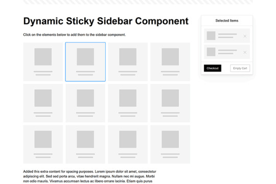
Dynamic Sticky Sidebar Component
Created by Ryan Mulligan
Features like shopping carts are a perfect fit for sticky sidebars. The UI makes it easier for shoppers to keep track of their cart and, most importantly, finish their purchase. This sidebar widget keeps track of cart contents and sticks to the screen while you scroll in the page content area.
See the Pen Dynamic Sticky Sidebar Component by Ryan Mulligan
Stick With What Works in Your Designs
We may think of sticky elements as being used for site headers and navigation. However, the examples above show that they can do much more. There are so many creative possibilities for informing and entertaining users.
What’s more, CSS can do a lot of the heavy lifting for you. Several snippets in this collection don’t require a single line of JavaScript. Still, it’s nice to know you can add some DOM manipulation when needed.
We hope this collection sparked your imagination! Check out our CodePen collection for even more sticky snippets.
Related Topics
Written by Eric Karkovack
Eric Karkovack is a web designer and WordPress expert with over two decades of experience. You can visit his business site here. He recently started a writing service for WordPress products: WP Product Writeup. He also has an opinion on just about every subject. You can follow his rants on Bluesky @karks.com.
Read more articles by Eric Karkovack
#2024#ADD#alien#amp#animation#Articles#attention#Building#Business#buttons#Capture#change#chromium#code#container#content#CSS#CSS Layout Snippets#CSS Snippets#Design#desktop#devices#easy#effects#Featured#Features#Filters#Full#glass#hamburger
0 notes
Text

Frosted Glass Effect
#css frosted glass effect#css effect#cool css effects#html css#divinector#frontenddevelopment#css#html#css3#learn to code#glass effect html css
1 note
·
View note
Text
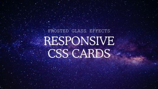
Responsive Glassmorphism CSS Cards
#responsive css cards#glassmorphism#frosted glass effects#codingflicks#html css#frontend#code#css#html#css3#frontenddevelopment#learn to code#webdesign#responsive web design#css cards design#responsive card design
1 note
·
View note
Video
youtube
🔴 Real Glassmorphism Card Hover Effects | Html CSS Glass Tilt Effects | ...
#youtube#css#hover#card#effect#$tilt#tilt#glass#devhubspot#ui#ui ux design#uidesign#html#html css#html5#html5 css3
0 notes
Text
CSS Glassmorphism Button Hover Effects. Glass Morphism: https://codepen.io/katarzynamarta/pen/rNdbbVq More CSS buttons examples: https://freefrontend.com/css-buttons/
5 notes
·
View notes
Text
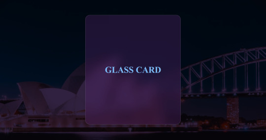
How i Create this Glass Card With only HTML and CSS
Code Here - https://medium.com/@codebeeofficial/today-i-will-demonstrate-how-to-create-a-glass-effect-card-128de8a1f436
#html5#html#html css#html5 css3#html website#code#java#javascript#css#webdesign#webcomic#website#computer#web developers#webdevelopment
4 notes
·
View notes
Text
A Beginner’s Guide to Responsive Web Design
Picture this: You've just discovered an amazing website pages on your laptop, but when you try to view it on your phone, you're greeted with tiny text, overlapping elements, and a horizontal scroll bar that makes navigation feel like a puzzle. Frustrating, right? This is exactly why responsive web design has become not just important, but essential in today's digital landscape.

If you're new to web development or looking to understand why responsive design matters so much, you've come to the right place. This guide will walk you through everything you need to know about creating websites that look stunning and function perfectly on every device.
What is Responsive Web Design?
Responsive web design is an approach to web development that ensures your website automatically adapts to different screen sizes and devices. Instead of creating separate mobile and desktop versions of your site, responsive design uses flexible layouts, images, and CSS techniques to create one website that works beautifully everywhere.
Think of it like water taking the shape of its container. Whether you pour water into a tall glass or a wide bowl, it adapts perfectly. That's exactly what responsive websites do—they reshape themselves to fit phones, tablets, laptops, and desktop monitors seamlessly.
Why Responsive Design Matters More Than Ever
The Mobile Revolution is Here
Here's a statistic that might surprise you: over 60% of web traffic now comes from mobile devices. Your potential visitors are browsing on everything from compact smartphones to large tablets, and they expect a smooth experience regardless of their device choice.
Google Rewards Responsive Websites
Search engines, particularly Google, prioritise mobile-friendly websites in their rankings. This means responsive design isn't just about user experience—it's crucial for your website's visibility and SEO performance.
Cost-Effective Solution
Instead of maintaining separate mobile and desktop sites, responsive design gives you one website that works everywhere. This means lower development costs, easier maintenance, and consistent branding across all platforms.
The Three Pillars of Responsive Web Design
1. Fluid Grid Layouts
Traditional web layouts used fixed pixel widths, which worked fine when everyone used similar-sized monitors. Responsive design uses percentage-based widths instead of fixed pixels, allowing content to flow and resize naturally.
Example: Instead of setting a sidebar to exactly 300 pixels wide, you'd set it to 25% of the container width. This way, it automatically adjusts whether someone's viewing on a small phone or a large desktop monitor.
2. Flexible Images and Media
Images and videos need to scale down (or up) without breaking your layout or becoming pixelated. This involves techniques like setting maximum widths and using CSS to ensure media elements never exceed their container size.
3. CSS Media Queries
Media queries are like conditional statements for your CSS. They allow you to apply different styling rules based on device characteristics like screen width, height, or orientation.
Simple Example:
css
/* Styles for screens smaller than 768px */
@media (max-width: 768px) {
.sidebar {
width: 100%;
margin-bottom: 20px;
}
}
Essential Responsive Design Techniques for Beginners
Start with Mobile-First Design
Instead of designing for desktop and then trying to squeeze everything onto mobile, start with the mobile experience first. This approach ensures your core content and functionality work perfectly on smaller screens, then you can enhance the experience for larger devices.
Use Relative Units
Replace fixed pixel measurements with relative units:
Percentages for widths and flexible layouts
Em or rem units for fonts and spacing
Viewport units (vw, vh) for full-screen elements
Create Flexible Navigation
Mobile navigation needs special attention. Consider these approaches:
Hamburger menus that expand when tapped
Tab bars for primary navigation items
Collapsible sections for secondary content
Optimize Touch Interactions
Mobile users interact with their fingers, not mouse cursors. Ensure:
Buttons are at least 44px tall for easy tapping
Links have adequate spacing between them
Interactive elements provide visual feedback when touched
Common Responsive Design Breakpoints
Breakpoints are specific screen widths where your design changes to accommodate different devices. Here are the most commonly used breakpoints:
Mobile: 320px to 768px
Tablet: 768px to 1024px
Desktop: 1024px and above
Large Desktop: 1200px and above
Remember, these are guidelines, not rules. Your content should dictate where breakpoints are needed, not arbitrary device categories.
Tools and Resources for Responsive Design
Browser Developer Tools
Every modern browser includes built-in tools for testing responsive designs. Simply right-click on any webpage, select "Inspect," and look for the device toolbar icon. This lets you preview how your site looks on different devices without owning every gadget on the market.
CSS Frameworks
If you're just starting out, consider using CSS frameworks like:
Bootstrap: Comprehensive framework with pre-built responsive components
Foundation: Flexible framework with advanced responsive features
Tailwind CSS: Utility-first framework for custom responsive designs
Testing Tools
Google's Mobile-Friendly Test: Check if your site meets mobile usability standards
BrowserStack: Test your site on real devices and browsers
Responsive Design Checker: Preview your site at various screen sizes
Best Practices for Responsive Design Success
Prioritize Performance
Mobile users often have slower internet connections, so optimize your site for speed:
Compress images and use appropriate file formats
Minimize CSS and JavaScript files
Consider lazy loading for images below the fold
Keep Content Hierarchy Clear
On smaller screens, every pixel matters. Ensure your most important content is prominently featured and easy to find. Use clear headings, plenty of white space, and logical content flow.
Test on Real Devices
While browser tools are helpful, nothing beats testing on actual phones and tablets. Borrow devices from friends or visit electronics stores to see how your site performs in real-world conditions.
Consider Touch and Gesture Navigation
Mobile users expect to swipe, pinch, and tap. Ensure your design supports these natural gestures and doesn't rely solely on hover effects that don't work on touch devices.
Common Responsive Design Mistakes to Avoid
Hiding Important Content on Mobile
Just because you have limited space doesn't mean you should hide crucial information. Instead, reorganize and prioritize content to fit smaller screens effectively.
Ignoring Load Times
Responsive doesn't mean loading the same heavy resources on every device. Responsive images, minify code, and consider what mobile phone users actually need.
Forgetting About Landscape Mode
Many users hold their phones horizontally, especially when watching videos or playing games. Test your design in both portrait and landscape orientations.
Using Tiny Fonts
Text that's readable on desktop might be microscopic on mobile. Ensure your base font size is at least 16px for comfortable mobile reading.
Getting Started: Your First Responsive Project
Ready to dive in? Here's a simple roadmap:
Plan your content hierarchy: What's most important for mobile users?
Sketch mobile layouts first: Start small and work your way up
Choose your breakpoints: Based on your content, not arbitrary device sizes
Build and test incrementally: Don't wait until the end to test responsiveness
Optimize performance: Ensure fast loading across all devices
The Future of Responsive Design
As new devices emerge—from smartwatches to large-screen TVs—responsive design principles become even more valuable. Techniques like container queries and intrinsic website designed are evolving to make responsive layouts even more flexible and intuitive.
Conclusion
Responsive web design isn't just a trend—it's the foundation of modern web development. By mastering these fundamentals, you're not just creating websites that work on different devices; you're building experiences that truly serve your users regardless of how they choose to access your content.
0 notes
Text
Realistic Liquid Glass Distortion Effects with CSS and SVG
Yet another liquid glass effect implemented with CSS and SVG. It transforms HTML elements into realistic glass surfaces with physical distortion and refraction effects. This effect is built to replicate the fluid, refractive glass aesthetic seen in Apple’s iOS 26 and macOS 26 design language. Features: Pure CSS and SVG implementation (no JavaScript required) Realistic distortion using SVG…
0 notes
Quote
::after { content: ''; position: absolute; top: 0; left: 0; width: 100%; height: 100%; background: rgba(255, 255, 255, 0.1); border-radius: 2rem; backdrop-filter: blur(1px); box-shadow: inset -10px -8px 0px -11px rgba(255, 255, 255, 1), inset 0px -9px 0px -8px rgba(255, 255, 255, 1); opacity: 0.6; z-index: -1; filter: blur(1px) drop-shadow(10px 4px 6px black) brightness(115%); }
Recreating Apple's Liquid Glass Effect with Pure CSS ✨
0 notes
Text

Glassmorphism login form UI
#frosted glass effect#glassmorphism#login form design#html css#divinectorweb#css#frontenddevelopment#webdesign#html#css3#login form ui#html css form#css form#transparent login form
1 note
·
View note
Link
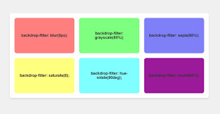
[ad_1] This article covers tips and tricks on effectively utilizing the CSS backdrop-filter property to style contemporary user interfaces. You’ll learn how to layer backdrop filters among multiple elements, and integrate them with other CSS graphical effects to create elaborate designs. Below is a hodgepodge sample of what you can build based on everything we’ll cover in this article. More examples are coming up. CodePen Embed Fallback The blurry, frosted glass effect is popular with developers and designers these days — maybe because Josh Comeau wrote a deep-dive about it somewhat recently — so that is what I will base my examples on. However, you can apply everything you learn here to any relevant filter. I’ll also be touching upon a few of them in my examples. What’s essential in a backdrop filter? If you’re familiar with CSS filter functions like blur() and brightness(), then you’re also familiar with backdrop filter functions. They’re the same. You can find a complete list of supported filter functions here at CSS-Tricks as well as over at MDN. The difference between the CSS filter and backdrop-filter properties is the affected part of an element. Backdrop filter affects the backdrop of an element, and it requires a transparent or translucent background in the element for its effect to be visible. It’s important to remember these fundamentals when using a backdrop filter, for these reasons: to decide on the aesthetics, to be able to layer the filters among multiple elements, and to combine filters with other CSS effects. The backdrop Design is subjective, but a little guidance can be helpful. If you’ve applied a blur filter to a plain background and felt the result was unsatisfactory, it could be that it needed a few embellishments, like shadows, or more often than not, it’s because the backdrop is too plain. Plain backdrops can be enhanced with filters like brightness(), contrast(), and invert(). Such filters play with the luminosity and hue of an element’s backdrop, creating interesting designs. Textured backdrops complement distorting filters like blur() and opacity(). Cloudy with a chance of meatballs. Ramenstorms at 3PM that will last for ten minutes. main background: center/cover url("image.jpg"); box-shadow: 0 0 10px rgba(154 201 255 / 0.6); /* etc. */ div backdrop-filter: blur(10px); color: white; /* etc. */ CodePen Embed Fallback Layering elements with backdrop filters As we just discussed, backdrop filters require an element with a transparent or translucent background so that everything behind it, with the filters applied, is visible. If you’re applying backdrop filters on multiple elements that are layered above one another, set a translucent (not transparent) background to all elements except the bottommost one, which can be transparent or translucent, provided it has a backdrop. Otherwise, you won’t see the desired filter buildup. Cloudy with a chance of meatballs. Ramenstorms at 3PM that will last for ten minutes. view details main background: center/cover url("image.jpg"); box-shadow: 0 0 10px rgba(154 201 255 / 0.6); /* etc. */ div background: rgb(255 255 255 / .1); backdrop-filter: blur(10px); /* etc. */ p backdrop-filter: brightness(0) contrast(10); /* etc. */ CodePen Embed Fallback Combining backdrop filters with other CSS effects When an element meets a certain criterion, it gets a backdrop root (not yet a standardized name). One criterion is when an element has a filter effect (from filter and background-filter). I believe backdrop filters can work well with other CSS effects that also use a backdrop root because they all affect the same backdrop. Of those effects, I find two interesting: mask and mix-blend-mode. Combining backdrop-filter with mask resulted in the most reliable outcome across the major browsers in my testing. When it’s done with mix-blend-mode, the blur backdrop filter gets lost, so I won’t use it in my examples. However, I do recommend exploring mix-blend-mode with backdrop-filter. Backdrop filter with mask Unlike backdrop-filter, CSS mask affects the background and foreground (made of descendants) of an element. We can use that to our advantage and work around it when it’s not desired. Cloudy with a chance of meatballs. Ramenstorms at 3PM that will last for ten minutes. main background: center/cover url("image.jpg"); box-shadow: 0 0 10px rgba(154 201 255 / 0.6); /* etc. */ > div .bg backdrop-filter: blur(10px); mask-image: repeating-linear-gradient(90deg, transparent, transparent 2px, white 2px, white 10px); /* etc. */ /* etc. */ CodePen Embed Fallback Backdrop filter for the foreground We have the filter property to apply graphical effects to an element, including its foreground, so we don’t need backdrop filters for such instances. However, if you want to apply a filter to a foreground element and introduce elements within it that shouldn’t be affected by the filter, use a backdrop filter instead. .photo background: center/cover url("photo.jpg"); .filter backdrop-filter: blur(10px) brightness(110%); mask-image: radial-gradient(white 5px, transparent 6px); mask-size: 10px 10px; transition: backdrop-filter .3s linear; /* etc.*/ &:hover .filter backdrop-filter: none; mask-image: none; In the example below, hover over the blurred photo. CodePen Embed Fallback There are plenty of ways to play with the effects of the CSS backdrop-filter. If you want to layer the filters across stacked elements then ensure the elements on top are translucent. You can also combine the filters with other CSS standards that affect an element’s backdrop. Once again, here’s the set of UI designs I showed at the beginning of the article, that might give you some ideas on crafting your own. CodePen Embed Fallback References [ad_2] Source link
0 notes
Text
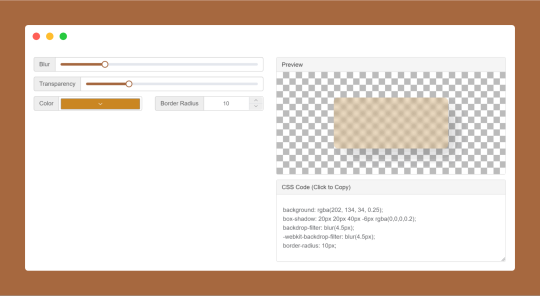
CSS Glassmorphism Generator is a CSS code generate tool designed to simplify the creation of glass-like, see-through effects in web design by adjusting parameters such as background blur, transparency levels, and border finishes.
#CSS Glassmorphism Generator#CSS Glassmorphism Code Generator#CSS Code Generator#free online tools#online tools#web tools#online web tools#online tool#ai tools#a.tools
0 notes
Text
Create Apple Liquid Glass UI with Pure CSS & SVG Filter
This is a CSS and SVG implementation of an Apple Liquid Glass-style UI with a realistic liquid distortion effect. It recreates the look of frosted, distorted glass with specular highlights without the need for JavaScript. Features: Multi-layered glass effect: Combines backdrop filters, displacement mapping, and specular highlights for realistic depth SVG-based distortion filters: Uses fractal…
0 notes
Video
youtube
Divi Pro Trick: Add a Smooth Magnifying Glass Hover Effect to Any Image!
Transform your website images with a Divi Theme Cool Magnifying Glass Effect for Your Image Module! In this tutorial, we'll show you how to add an interactive zoom effect using the Divi Image Module, combined with some simple CSS and JavaScript. This eye-catching effect allows users to hover over an image and see a magnified portion, creating a sleek and engaging user experience. No need for plugins—just a few lines of prewritten code that you can easily copy and paste into your Divi Builder.
#youtube#DiviTheme DiviTutorial ImageZoomEffect MagnifyingGlassEffect DiviImageModule WebDesign DiviMagic
0 notes
Text
CSS Blur
CSS (Cascading Style Sheets) is a language that describes how a document composed in a markup language such as HTML or XML (such as SVG, MathML, or XHTML) ought to be presented. Alongside HTML and JavaScript, Cascading Style Sheets (CSS) is one of the foundational technologies of the World Wide Web.
The role of CSS is to provide a way out of mixup between contents and their appearance, which could be done through distinguishing components like a layout, colouration and character style. Splitting these components may increase the accessibility of content and bring many opportunities for making individual choices concerning presentational.
Websites are more than mere lines of code as they form the digital canvas for the modern world. Such spaces are virtual and allow for engaging design features that keep the user interested as they pass through the viewing hole in a frosted glass. The artistic application of CSS blur effects is a neglected transformation design aspect but is very effective. This article will delve into the world of CSS blur filters, exposing it to its ability to craft amazing-looking websites.
0 notes
Text
[vc_row color_scheme="footer-top" us_bg_overlay_color="#ffe200" columns="2" content_placement="middle" css="%7B%22default%22%3A%7B%22background-color%22%3A%22%23fbc617%22%7D%7D" el_id="section-02" tablets_columns="1" columns_gap="4vw" us_template_preview="8048"][vc_column css="%7B%22default%22%3A%7B%22max-width%22%3A%22600px%22%7D%2C%22tablets%22%3A%7B%22margin-left%22%3A%22auto%22%2C%22margin-right%22%3A%22auto%22%7D%7D" width="1/2"][us_text text="Custom Glasses Cloths in Gables Estates, FL" link="%7B%22url%22%3A%22%22%7D" tag="h1" css="%7B%22default%22%3A%7B%22font-size%22%3A%22calc%28%201.7rem%20%2B%201.7vmax%20%29%22%2C%22line-height%22%3A%2270px%22%2C%22font-weight%22%3A%22700%22%2C%22text-transform%22%3A%22capitalize%22%2C%22margin-bottom%22%3A%222%22%7D%7D"][us_text text="Custom Glasses Cloths... Just One of Our Many Products to Shine a Spotlight on Your Brand" link="%7B%22url%22%3A%22%22%7D" tag="h2" css="%7B%22default%22%3A%7B%22color%22%3A%22%23be2b2d%22%2C%22text-transform%22%3A%22capitalize%22%2C%22margin-bottom%22%3A%222%22%7D%7D"][us_separator size="small"][us_btn label="Check US Out For More" link="%7B%22url%22%3A%22https%3A%2F%2Fyellow3.co%2F%22%7D" style="5" align="justify" css="%7B%22default%22%3A%7B%22font-size%22%3A%221.2rem%22%2C%22box-shadow-v-offset%22%3A%220.75em%22%2C%22box-shadow-blur%22%3A%221.5em%22%2C%22box-shadow-color%22%3A%22rgba%280%2C0%2C0%2C0.15%29%22%7D%7D"][/vc_column][vc_column width="1/2"][us_image image="27026" has_ratio="1" style="shadow-2" link="%7B%22url%22%3A%22%22%7D" css="%7B%22default%22%3A%7B%22max-width%22%3A%22500px%22%7D%7D"][/vc_column][/vc_row][vc_row height="small" color_scheme="footer-bottom" columns="1-3"][vc_column width="1/4"][vc_column_text] [/vc_column_text][us_text text="Check Our GMB Profile" link="%7B%22url%22%3A%22https%3A%2F%2Fmaps.app.goo.gl%2FUgwVKPf7G9iXGveH7%22%2C%22target%22%3A%22_blank%22%7D" css="%7B%22default%22%3A%7B%22color%22%3A%22_header_middle_bg%22%2C%22text-align%22%3A%22center%22%2C%22font-size%22%3A%221.2rem%22%7D%7D"][/vc_column][vc_column width="3/4"][vc_column_text]Yellow3 Marketing serves the following South Florida cities and municipalities: The Hammocks | Doral | Doral Park | Fontainebleau | Tamiami | Sweetwater | West Miami | Westchester | University Park | Coral Terrace | Westwood Lakes | Kendall West | Kendale Lakes | South Miami Kendall | Kendall Lakes | Kendall | Country Walk | The Crossings | Three Lakes | Palmetto Bay | Silver Palm | Princeton | Cutler Bay | Pinecrest | Coral Gables | Richmond Heights | South Miami Heights | Richmond West | Goulds | Naranja | Leisure City[/vc_column_text][/vc_column][/vc_row][vc_row color_scheme="footer-top" content_placement="middle" el_id="section-11" tablets_columns="1" us_template_preview="8246"][vc_column][vc_column_text css="%7B%22default%22%3A%7B%22text-align%22%3A%22center%22%7D%7D"] Custom Glasses Cloths Are Our Thing [/vc_column_text][vc_column_text css="%7B%22default%22%3A%7B%22text-align%22%3A%22center%22%7D%7D"] Get In Touch With Us [/vc_column_text][us_separator size="large"][vc_row_inner columns="2" columns_reverse="1" ignore_columns_stacking="1" columns_gap="4.2vw"][vc_column_inner width="2/3"][vc_column_text] Yellow3 Marketing offers the ultimate solution for boosting brand awareness in Gables Estates, FL through innovative promotional products like Custom Glasses Cloths. Our carefully curated selection of promo gear is designed to leave a lasting impression on your target audience. From custom apparel and eco-friendly merchandise to tech gadgets and lifestyle accessories, we provide high-quality products that reflect the unique identity of your brand. These items not only serve as effective marketing tools but also as tangible reminders of your brand, creating a strong and significant connection with your audience. By choosing Yellow3, you are investing in products that are not only eye-catching but also relevant and useful to your audience. This relevance
translates to increased brand recall and loyalty, as recipients are more likely to use and appreciate items that fit seamlessly into their daily lives. Partnering with Yellow3 Marketing means you benefit from our expertise and commitment to excellence. We take pride in our ability to deliver customized solutions that meet your specific marketing goals. Our promotional products are more than just giveaways; they are strategic tools designed to enhance your brand's visibility and reputation. With our extensive experience and proven track record in Miami, FL, you can trust Yellow3 Marketing to help your brand make a powerful and lasting impact not only in your neighborhood Gables Estates, FL, but beyond. Let us help you turn everyday items into extraordinary marketing opportunities, and start driving brand awareness and growth to your business as soon as today. [/vc_column_text][us_separator size="small"][us_html css="%7B%22default%22%3A%7B%22text-align%22%3A%22center%22%7D%7D"]JTNDaWZyYW1lJTIwd2lkdGglM0QlMjI1NjAlMjIlMjBoZWlnaHQlM0QlMjIzMTUlMjIlMjBzcmMlM0QlMjJodHRwcyUzQSUyRiUyRnd3dy55b3V0dWJlLmNvbSUyRmVtYmVkJTJGdk1wSFI5ZmVXZUklM0ZzaSUzRDVuVXFZTHRQTXlsZ1VQT2klMjIlMjB0aXRsZSUzRCUyMllvdVR1YmUlMjB2aWRlbyUyMHBsYXllciUyMiUyMGZyYW1lYm9yZGVyJTNEJTIyMCUyMiUyMGFsbG93JTNEJTIyYWNjZWxlcm9tZXRlciUzQiUyMGF1dG9wbGF5JTNCJTIwY2xpcGJvYXJkLXdyaXRlJTNCJTIwZW5jcnlwdGVkLW1lZGlhJTNCJTIwZ3lyb3Njb3BlJTNCJTIwcGljdHVyZS1pbi1waWN0dXJlJTNCJTIwd2ViLXNoYXJlJTIyJTIwcmVmZXJyZXJwb2xpY3klM0QlMjJzdHJpY3Qtb3JpZ2luLXdoZW4tY3Jvc3Mtb3JpZ2luJTIyJTIwYWxsb3dmdWxsc2NyZWVuJTNFJTNDJTJGaWZyYW1lJTNF[/us_html][/vc_column_inner][vc_column_inner us_bg_overlay_color="_content_link_hover" link="%7B%22url%22%3A%22%22%7D" width="1/3"][us_text text="Let Us Know How Can We Help" link="%7B%22url%22%3A%22%22%7D" tag="h3"][contact-form-7 id="6234"][/vc_column_inner][/vc_row_inner][/vc_column][/vc_row][vc_row][vc_column][us_gallery ids="27331,27332,27334,27337,27317,27312,27307,27302,27299,27064,27063,27062,27061,27060,27059,27058,27057,27056,27055,27054,27053,27052,27051,27050,27048,27047,27046,27045,27044,27043,27042,27041" orderby="rand" quantity="3" no_items_action="hide" columns="3" items_gap="5px" items_click_action="link" items_link="%7B%22url%22%3A%22https%3A%2F%2Fyellow3.co%2F%22%2C%22target%22%3A%22_blank%22%7D" img_size="medium"][us_cta title="Can You Imagine Your Logo On Them!" btn_label="View More" btn_link="%7B%22url%22%3A%22https%3A%2F%2Fyellow3.co%2Fcontact-us%2F%22%2C%22target%22%3A%22_blank%22%7D" btn_style="4" btn_size="1.2rem" css="%7B%22default%22%3A%7B%22font-size%22%3A%221.2rem%22%2C%22line-height%22%3A%221.7%22%2C%22padding-left%22%3A%226%25%22%2C%22padding-top%22%3A%226%25%22%2C%22padding-bottom%22%3A%226%25%22%2C%22padding-right%22%3A%226%25%22%2C%22border-radius%22%3A%2210px%22%7D%7D"]Call Us for a FREE Consultation TODAY[/us_cta][/vc_column][/vc_row][vc_row color_scheme="footer-top" us_bg_image_source="media" us_bg_size="initial" us_bg_overlay_color="linear-gradient(15deg,rgba(255,255,255,0.90),rgba(0,0,0,0.00))" columns="2-3" el_id="testimonials" hide_on_states="mobiles" tablets_columns="1" columns_gap="3vw" us_template_preview="8300"][vc_column width="2/5"][vc_column_text] What Our Clients Think About Us [/vc_column_text][/vc_column][vc_column width="3/5"][us_carousel post_type="us_testimonial" items_quantity="50" items_layout="testimonial_1" columns="1" overriding_link="%7B%22url%22%3A%22%22%7D" carousel_arrows="1" carousel_arrows_size="30px" carousel_arrows_offset="20px" carousel_autoheight="1" carousel_speed="150ms" breakpoint_1_cols="1" breakpoint_1_autoplay="0" breakpoint_2_cols="1" breakpoint_2_autoplay="0" breakpoint_3_autoplay="0" css="%7B%22default%22%3A%7B%22max-width%22%3A%22500px%22%2C%22margin-left%22%3A%22auto%22%2C%22margin-right%22%3A%22auto%22%7D%7D"][/vc_column][/vc_row][vc_row width="custom" width_custom="880px" el_id="section-08" columns_gap="0rem" us_template_preview="8089"][vc_column][us_text text="Why Choose Us?" link="%7B%22url%22%3A%22%22%7D"
tag="h2" css="%7B%22default%22%3A%7B%22text-align%22%3A%22center%22%2C%22font-weight%22%3A%22700%22%7D%7D"][us_separator size="large"][us_iconbox icon="fas|coffee" link="%7B%22url%22%3A%22%22%7D" title="Customized and Culturally Relevant Products" style="circle" iconpos="left" alignment="none"]Leveraging Gables Estates, FL's vibrant and diverse cultural landscape, we specialize in creating promotional products that reflect the unique tastes and preferences of the local market. Our team works closely with clients to design custom products like Custom Glasses Cloths that promote their brand and resonate deeply with your city's multicultural community, enhancing brand loyalty and engagement.[/us_iconbox][us_separator size="large"][us_iconbox icon="material|speed" link="%7B%22url%22%3A%22%22%7D" title="Fast Turnaround and Reliable Delivery:" style="circle" color="light" iconpos="left" alignment="none"]Our strategic location in Miami allows us to provide speedy turnaround times and reliable delivery services. Whether it's a last-minute event or a planned campaign, our efficient processes ensure that clients receive their Custom Glasses Cloths or any other Promotional Products on time, every time. Our logistics expertise and local partnerships guarantee seamless distribution, making us a dependable partner for all promotional needs.[/us_iconbox][us_separator size="large"][us_iconbox icon="material|recycling" link="%7B%22url%22%3A%22%22%7D" title="Eco-Friendly and Sustainable Solutions:" style="circle" color="secondary" iconpos="left" alignment="none"]As a company committed to environmental responsibility, we offer a wide range of eco-friendly and sustainable promotional products. From biodegradable materials to reusable items, our green alternatives help clients reduce their carbon footprint while promoting their brand. This commitment to sustainability sets us apart and appeals to the growing market of environmentally conscious consumers.[/us_iconbox][/vc_column][/vc_row][vc_row css="%7B%22default%22%3A%7B%22text-align%22%3A%22center%22%7D%7D"][vc_column][us_text text="Proud To Have Helped These Brands Thrive" link="%7B%22url%22%3A%22%22%7D" tag="h2" css="%7B%22default%22%3A%7B%22color%22%3A%22%23666666%22%7D%7D"][us_carousel post_type="attachment" images="7588,7587,7144,6618,6617,6616,6615,6614,6612,6611,6610,6608,6606,6604" orderby="title" items_quantity="0" items_layout="gallery_default" items_valign="1" columns="6" items_gap="2rem" img_size="thumbnail" items_ratio="1x1" overriding_link="none" carousel_arrows="1" carousel_loop="1" carousel_autoplay="1" carousel_interval="4s" el_class="items_valign_center"][/vc_column][/vc_row]
0 notes