#css media queries responsive design
Explore tagged Tumblr posts
Visit Tumblr Blog
Explore Tumblr blogs with no restrictions, modern design and the best experience.
Last Seen Tumblr Blogs


Fun Fact
Tumblr posted its first advertisements in May 2012 and subsequently earned $13M in revenue.
Text
Essentials You Need to Become a Web Developer
HTML, CSS, and JavaScript Mastery
Text Editor/Integrated Development Environment (IDE): Popular choices include Visual Studio Code, Sublime Text.
Version Control/Git: Platforms like GitHub, GitLab, and Bitbucket allow you to track changes, collaborate with others, and contribute to open-source projects.
Responsive Web Design Skills: Learn CSS frameworks like Bootstrap or Flexbox and master media queries
Understanding of Web Browsers: Familiarize yourself with browser developer tools for debugging and testing your code.
Front-End Frameworks: for example : React, Angular, or Vue.js are powerful tools for building dynamic and interactive web applications.
Back-End Development Skills: Understanding server-side programming languages (e.g., Node.js, Python, Ruby , php) and databases (e.g., MySQL, MongoDB)
Web Hosting and Deployment Knowledge: Platforms like Heroku, Vercel , Netlify, or AWS can help simplify this process.
Basic DevOps and CI/CD Understanding
Soft Skills and Problem-Solving: Effective communication, teamwork, and problem-solving skills
Confidence in Yourself: Confidence is a powerful asset. Believe in your abilities, and don't be afraid to take on challenging projects. The more you trust yourself, the more you'll be able to tackle complex coding tasks and overcome obstacles with determination.
#code#codeblr#css#html#javascript#java development company#python#studyblr#progblr#programming#comp sci#web design#web developers#web development#website design#webdev#website#tech#html css#learn to code
2K notes
·
View notes
Text
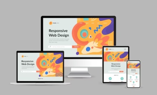
Resource: Responsive Web Design
Starter kit basically.. for those working on jcink skins. Viewport plus using media queries, css variables, grid, and flex will ease the process of making responsive skins but I advise keeping them in mind early on.
10 notes
·
View notes
Text
no shockers that by the end of the week, marketing consultant never responded to literally any of my emails. Pretty much par for the course, though. I mean she never speaks to me directly. Like there are exactly five of us and I'm not ~Important~ enough for this person to respond to.
Supervisor emailed me back without including anyone else to basically be like "um, excuse me, do what this person says." And then proceeded a back forth for the whole day of me basically reiterating my previous comments and responses. Like she thought I was just being "difficult" or something when, in reality, out of the five of us, I am the only one who knows how any of this works. I was trying to outline the issues with what was being asked and then asked for an alternative direction so I could make a plan for my time. It's like, idk, I have actual knowledge and experience to draw on when giving an answer!!11!
Like, sorry, Outlook does not support media queries in html/css so what you are asking for literally will not work in outlook emails. But, right, I just "can't take feedback".
Or how about the time we had to print new bags with our new branding and we only had the budget for 1 color, 1 side and the marketing consultant did not approve of the design being 1 color so her "feedback" was to do 2 colors. And then i was like "the issue is that we only have the budget to print 1 color, 1 side" and then three weeks went by until my supervisor had to prompt the conversation. And then her only response was, "my earlier feedback still stands." like what the fuck?
They ask me for things without knowing shit all about how any of it works and then assume I'm just uncooperative when I try to explain why what they are saying won't work. I, very often, give recommendations for what I think we should do only to get SILENCIO in response. Then we get into zoom meetings where I'm asked to present progress or some shit and I'm like "hello, I sent u all a document and email outlining all the things and included questions and recommendations" and no one remembers or listens to shit so I have to repeat myself 5 thousand times only to be treated like I'm just "unwilling" to do what I'm told!!!!1111!!!! FUUUUUUUCCCCCCK
#work rant#these are like 12 different issues and instances rolled into one rant#tbd#sorry for always fucking ranting on tumblr. com
7 notes
·
View notes
Text
AGARTHA Aİ - DEVASA+ (2)

In today’s digital landscape, a captivating and functional website is crucial for any business looking to thrive online. Full service web design encompasses a comprehensive approach, ensuring every aspect of your site is tailored to meet your unique needs. From the initial concept to the final launch, this service provides an array of offerings, including website service, responsive web design, and custom design services. Whether you’re a startup seeking to establish your brand or an established enterprise aiming to enhance your online presence, understanding the elements of full service web design is essential.
Full service web design
Full service web design encompasses all aspects of creating a website, from initial conceptualization to ongoing maintenance. This approach ensures that every detail is carefully considered to meet the specific needs of a business or individual. With a team of experienced designers and developers, full service web design offers a seamless experience that integrates aesthetics, functionality, and user experience.
One of the key advantages of opting for a full service web design is the cohesion of the website elements. Since all parts of the project are managed by a single team, there is less chance for miscommunication or inconsistency in design. This results in a more polished final product that reflects the brand’s identity while providing an engaging experience for visitors.
Additionally, full service web design allows for customized solutions tailored to unique requirements. Whether you need an e-commerce platform, a portfolio site, or a blog, a full service provider will offer dedicated support and expert advice throughout the entire process, ensuring your vision comes to life exactly as you imagined.
Website service
In today's digital landscape, website service is essential for businesses to thrive and maintain an online presence. A well-structured website serves as a powerful tool that encourages customer engagement and drives sales. By investing in a comprehensive website service, businesses can ensure that their website not only looks great but also functions seamlessly across all devices.
A key aspect of website service is the ability to optimize for search engines. By implementing SEO best practices, businesses can enhance their visibility and attract more organic traffic. This is where a reliable website service provider plays a crucial role, as they possess the expertise and techniques necessary to elevate your search engine rankings.
Furthermore, ongoing support and maintenance are vital components of a reliable website service. As technology evolves and user needs change, having a team that can promptly address issues or updates will keep your website relevant and effective in reaching target audiences. This ongoing relationship is instrumental in achieving long-term success in the digital realm.
Responsive web design
Responsive web design is an essential aspect of modern web development that ensures a seamless user experience across a variety of devices. With the increasing use of smartphones and tablets, having a website that adapts to different screen sizes is not just a luxury but a necessity.
The core principle of responsive web design is fluidity. This means that the layout of your website adjusts dynamically based on the screen width, ensuring that content remains accessible and visually appealing regardless of the device used. This approach improves usability and can significantly boost conversion rates.
Incorporating responsive web design techniques involves using flexible grids, images, and CSS media queries. These elements work together to create a layout that responds gracefully to changes in screen size, making your website not only functional but also competitive in the digital marketplace.
Custom design services
In today's digital landscape, custom design services have emerged as a vital component of creating a strong online presence. Businesses understand that a one-size-fits-all approach does not cater to their unique needs and branding. Therefore, opting for custom design services allows them to differentiate themselves in a crowded market.
These services offer tailored solutions that resonate with a company's specifics, from colors to typography and layout. By leveraging custom design services, businesses can ensure that their websites not only reflect their brand identity but also provide an intuitive user experience. This is crucial for keeping visitors engaged and encouraging them to take the desired actions.
Investing in custom design services ultimately contributes to better customer satisfaction and improved conversion rates. With a website designed specifically for their target audience, businesses can more effectively communicate their message and achieve their goals. This bespoke approach is invaluable in today's competitive environment.
43 notes
·
View notes
Text
How to Create Mobile-Friendly Websites with Responsive Design
In today’s digital era, where mobile devices dominate web traffic, creating mobile-friendly websites has become more important than ever. As users increasingly access the internet through smartphones and tablets, businesses must ensure their websites are optimized for a seamless mobile experience. This is where responsive design comes into play. At Nividaweb, a leading responsive web design agency in Vadodara, we specialize in crafting websites that look and perform flawlessly on any device.

Here is a comprehensive guide on how to create mobile-friendly websites with responsive design:
What is Responsive Design?
Responsive web design is a design approach that ensures a website's layout and content adapt dynamically to different screen sizes and resolutions. Whether your users are browsing on a desktop, tablet, or smartphone, a responsive website delivers a consistent and user-friendly experience. This adaptability is essential for improving user engagement, reducing bounce rates, and enhancing overall website performance.
Why Responsive Design Matters?
Before diving into the how-to, let us understand why responsive design is crucial:
Improved User Experience: A responsive website ensures that users can navigate and interact with your site effortlessly, regardless of their device.
Higher Search Engine Rankings: Search engines like Google prioritize mobile-friendly websites in their rankings, making responsive design a key factor in SEO.
Increased Conversion Rates: With a user-friendly interface, responsive websites encourage visitors to stay longer and take action, boosting conversions.
Cost-Effective Maintenance: Instead of maintaining separate websites for desktop and mobile users, a responsive design simplifies updates and reduces costs.
Steps to Create a Mobile-Friendly Website with Responsive Design
1. Start with a Mobile-First Approach
The mobile-first approach involves designing the website for smaller screens first and then scaling up for larger devices. This method ensures that the core elements are optimized for mobile users. A responsive web design company in Vadodara like Nividaweb emphasizes this approach to ensure a seamless user experience on all devices.
2. Use a Flexible Grid Layout
A flexible grid layout is the foundation of responsive design. It allows website elements to adjust proportionally based on the screen size. Instead of fixed-width layouts, use percentages and relative units like ems or rems to define dimensions. This ensures that your website adapts smoothly to different screen resolutions.
3. Optimize Images and Media
Large images and media files can slow down your website, especially on mobile devices. To enhance performance:
Use responsive images that scale according to screen size.
Implement modern image formats like WebP for better compression.
Use CSS media queries to serve appropriate image sizes based on the user’s device.
At Nividaweb, a trusted responsive website design company in Gujarat, we leverage advanced tools to optimize images and improve loading times.
4. Implement CSS Media Queries
CSS media queries are essential for responsive design. They enable you to apply specific styles based on the device’s characteristics, such as screen width, height, or resolution.
5. Prioritize Touch-Friendly Navigation
Mobile users interact with websites using touch gestures, so it is essential to design navigation that is easy to use. Key considerations include:
Larger buttons and clickable areas.
Simplified menus with collapsible options for smaller screens.
Avoiding hover-dependent features, as they do not work well on touch devices.
6. Test on Multiple Devices and Browsers
Testing is a critical step in creating a mobile-friendly website. Use tools like Google’s Mobile-Friendly Test and browser developer tools to simulate various devices and screen sizes. Additionally, test your website on physical devices to identify and resolve any usability issues.
7. Ensure Fast Loading Times
Mobile users expect websites to load quickly. A slow-loading site can lead to higher bounce rates and lost opportunities. To optimize loading times:
Minimize HTTP requests by combining CSS and JavaScript files.
Enable browser caching and compression.
Use a Content Delivery Network (CDN) to deliver content faster.
As a responsive web design company in Vadodara, Nividaweb employs performance optimization techniques to ensure your website loads swiftly across all devices.
8. Leverage Responsive Typography
Typography plays a crucial role in readability and user experience. Use scalable fonts that adapt to screen sizes and maintain legibility on smaller devices. Tools like CSS’s viewport units (e.g., vw, vh) can help create fluid typography that adjusts dynamically.
9. Incorporate Mobile-Friendly Features
Enhance your website's usability by integrating features tailored for mobile users:
Click-to-call buttons for quick communication.
Location-based services like maps.
Fast and secure payment options for e-commerce websites.
10. Work with Experts in Responsive Design
Creating a truly responsive and mobile-friendly website requires expertise and experience. Partnering with a reputable responsive web design agency in Vadodara, like Nividaweb, ensures that your website meets the highest standards of design and functionality.
Why Choose Nividaweb for Responsive Website Design
Nividaweb is a leading responsive website design company in Gujarat, dedicated to transforming your online presence. Here is why businesses trust us:
Tailored Solutions: We understand that every business is unique. Our team works closely with clients to deliver customized designs that align with their brand identity and goals.
Cutting-Edge Technologies: We stay ahead of industry trends and utilize the latest tools and techniques to create responsive websites.
Experienced Team: Our skilled designers and developers have extensive experience in crafting mobile-friendly websites across diverse industries.
End-to-End Services: From design and development to testing and optimization, we provide comprehensive solutions for all your web design needs.
The Future of Mobile-Friendly Websites
As technology evolves, so do user expectations. Emerging trends like voice search, augmented reality, and progressive web apps are reshaping the way users interact with websites. At Nividaweb, we are committed to staying at the forefront of these developments, ensuring our clients remain ahead of the curve.
Conclusion
Creating a mobile-friendly website with responsive design is no longer optional; it is a necessity. By following the steps outlined in this guide and partnering with a reliable responsive web design agency in Vadodara, you can create a website that delivers exceptional user experiences, drives engagement, and boosts conversions.
Ready to take your website to the next level? Contact Nividaweb, the trusted responsive website design company in Gujarat, and let us help you create a website that stands out in today’s competitive digital landscape.
#Responsive web design agency in Vadodara#Responsive web design company in Vadodara#Gujarat#Responsive website design company in Gujarat#Vadodara#Website design and development company in Gujarat#India#Web design and development agency in Gujarat#Website design and development company in Vadodara#eCommerce web design in Vadodara#eCommerce website developer in Gujarat#eCommerce website developer in Vadodara#Best web design agencies in Vadodara#Web design company in Vadodara#Best website design company in Vadodara
5 notes
·
View notes
Text
Responsive Web Design and Development: Creating a Seamless User Experience

In today's digital age, where mobile devices dominate the online landscape, responsive web design and development have become paramount for businesses and organizations. With a plethora of different screen sizes and resolutions, it's crucial to ensure that your website provides a seamless user experience across all devices. In this article, we will explore the concept of responsive web design and development and its importance in creating a successful online presence.
Understanding Responsive Web Design
Responsive web design is an approach to web development that focuses on building websites that adapt and respond to various screen sizes, orientations, and platforms. The goal is to create a fluid and flexible layout that adjusts seamlessly to provide optimal user experience, regardless of whether the site is accessed on a desktop, laptop, tablet, or smartphone.
Traditional web design techniques often involved creating separate versions of a website for different devices, leading to higher development and maintenance costs. Responsive design eliminates the need for multiple versions by utilizing a single codebase that intelligently rearranges and resizes content based on the user's device.
The Key Elements of Responsive Web Design
Responsive web design relies on a few key elements to ensure that websites look and function flawlessly across devices:
Flexible Grids and Layouts:
Responsive websites use flexible grids that adapt to different screen sizes. By employing relative units like percentages or ems instead of fixed pixels, elements on the page can resize and reposition fluidly. This allows content to adapt and fit into the available space, providing an optimal viewing experience.
Media Queries:
Media queries are CSS rules that apply different styles based on the characteristics of the user's device, such as screen size, resolution, and orientation. By using media queries, developers can create specific layouts and styles for each device type, ensuring that the website adapts accordingly.
Flexible Images and Media:
Images and media elements, such as videos and audio players, need to be flexible as well. Responsive web design utilizes techniques like CSS max-width property and fluid images to ensure that media content scales proportionally to fit the screen without distorting or overflowing.
Mobile-First Approach:
With the majority of web traffic coming from mobile devices, adopting a mobile-first approach has become a best practice in responsive web design. Starting with the mobile layout and progressively enhancing it for larger screens ensures that the core content and functionality are prioritized for smaller devices, resulting in a more efficient and user-friendly experience.
The Benefits of Responsive Web Design
Implementing responsive web design and development strategies can offer numerous advantages:
Enhanced User Experience:
A responsive website adjusts seamlessly to different devices, providing an optimal browsing experience for users. Content is easy to read, navigation is intuitive, and interactions are smooth, regardless of the screen size or platform used.
Improved SEO Performance:
Search engines like Google highly value responsive design, as it eliminates the need for separate URLs or duplicate content. A single, responsive website consolidates all your site's traffic onto one URL, making it easier for search engines to crawl and index your pages, leading to better search rankings.
Cost and Time Efficiency:
By adopting a responsive approach, you only need to develop and maintain a single website, reducing costs and saving time compared to creating multiple versions for different devices. Changes and updates can be applied universally, simplifying the maintenance process.
Future-Proofing Your Website:
Responsive design ensures that your website is ready for the future, as new devices with varying screen sizes and resolutions continue to emerge. By building a flexible and adaptable website, you can easily accommodate new technologies and ensure your online presence remains relevant and accessible.
Conclusion
Responsive web design and development is no longer optional but essential for creating a successful online presence. By adopting this approach, businesses and organizations can provide a seamless user experience across devices, enhance their SEO performance, and save time and resources. As technology continues to evolve, responsive design ensures that your website remains user-friendly and adaptable, enabling you to stay ahead of the curve in an ever-changing digital landscape.
Source
#AppDevelopment#WebDevelopment#MobileApps#WebApps#SoftwareDevelopment#UIUXDesign#MobileDevelopment#WebDesign#CodeLife#TechSolutions#AppDesign#MobileTech#WebDev#DigitalTransformation#ResponsiveDesign#Innovation#TechIndustry#AppSolutions#WebSolutions#CodeNerds
19 notes
·
View notes
Text
Mastering Web Development: A Comprehensive Guide for Beginners
In the vast landscape of technology, web development stands as a crucial cornerstone. It encompasses the art and science of building websites, ranging from simple static pages to complex web applications. Whether you're aiming to pursue a career in software development or seeking to enhance your digital presence, understanding web development is essential.
In this comprehensive guide, we'll take you through the fundamental concepts and practical skills needed to master web development from scratch. Let's dive in!
1. Understanding HTML (Hypertext Markup Language)
HTML serves as the backbone of every web page, providing the structure and content. It uses tags to define different elements such as headings, paragraphs, images, and links. By mastering HTML, you'll be able to create well-structured and semantically meaningful web documents.
2. Exploring CSS (Cascading Style Sheets)
CSS is the language used to style HTML elements, enhancing their appearance and layout. With CSS, you can customize colors, fonts, spacing, and more, giving your website a polished and professional look. Understanding CSS selectors and properties is essential for effective styling.
3. Introduction to JavaScript
JavaScript is a versatile programming language that adds interactivity and dynamic behavior to web pages. From simple animations to complex web applications, JavaScript powers a wide range of functionalities. Learning JavaScript fundamentals such as variables, functions, and events is crucial for web development.
4. Building Responsive Websites
In today's mobile-centric world, it's essential to create websites that adapt seamlessly to various screen sizes and devices. Responsive web design achieves this by using fluid grids, flexible images, and media queries. Mastering responsive design principles ensures that your websites look great on desktops, tablets, and smartphones.
5. Introduction to Version Control with Git
Git is a powerful tool for tracking changes in your codebase and collaborating with other developers. By learning Git basics such as branching, merging, and committing, you can streamline your development workflow and effectively manage project versions.
6. Introduction to Front-End Frameworks
Front-end frameworks like Bootstrap, Foundation, and Materialise provide pre-designed components and stylesheets to expedite web development. By leveraging these frameworks, you can create responsive and visually appealing websites with less effort and code.
7. Introduction to Back-End Development
While front-end development focuses on the user interface, back-end development deals with server-side logic and database management. Learning back-end languages such as Node.js, Python, or PHP enables you to build dynamic web applications and handle user interactions efficiently.
8. Deploying Your Website
Once you've developed your website, it's time to make it accessible to the world. Deploying a website involves selecting a web hosting provider, uploading your files, and configuring domain settings. Understanding the deployment process ensures that your website goes live smoothly.
9. Conclusion and Next Steps
Congratulations on completing this comprehensive guide to mastering web development! By now, you've gained a solid understanding of HTML, CSS, JavaScript, version control, frameworks, and deployment. As you continue your journey in web development, remember to stay curious, practice regularly, and explore advanced topics to further refine your skills.
Resources for Further Learning:
Online tutorials and documentation
Interactive coding platforms
Community forums and discussion groups
Next Steps:
Explore advanced topics such as web performance optimization, server-side rendering, and progressive web apps.
Build real-world projects to apply your skills and showcase your portfolio.
Stay updated with the latest trends and technologies in web development through blogs, podcasts, and conferences.
With dedication and perseverance, you'll continue to evolve as a proficient web developer, creating innovative solutions and contributing to the ever-changing digital landscape . Happy coding!
4 notes
·
View notes
Text

Responsive Web Design: Best Practices for Optimal User Experience and SEO
In today’s digital age, where the majority of internet users access websites through various devices, responsive web design has become paramount. It’s not just about making a website look good; it’s about ensuring seamless functionality and accessibility across all screen sizes and devices. Responsive web design (RWD) is a critical approach that allows websites to adapt to different devices and screen sizes, providing an optimal viewing and interaction experience.
Importance of Responsive Web Design:
Responsive web design is essential for several reasons. Firstly, it improves user experience by ensuring that visitors can easily navigate and interact with the website regardless of the device they’re using. This leads to higher engagement, lower bounce rates, and increased conversion rates. Secondly, with the proliferation of mobile devices, responsive design is crucial for reaching a wider audience. Google also prioritizes mobile-friendly websites in its search results, making responsive design a key factor for SEO success.
Key Principles to Follow:
Fluid Grids: Instead of fixed-width layouts, use fluid grids that can adapt to different screen sizes.
Flexible Images and Media: Ensure that images and media elements can resize proportionally to fit various devices.
Media Queries: Utilize CSS media queries to apply different styles based on screen characteristics such as width, height, and resolution.
Mobile-First Approach: Start designing for mobile devices first, then progressively enhance the layout for larger screens.
Performance Optimization: Optimize website performance by minimizing HTTP requests, reducing file sizes, and leveraging caching techniques.
Tips for Optimization:
Prioritize Content: Display essential content prominently and prioritize functionality for mobile users.
Optimize Touch Targets: Make buttons and links large enough to be easily tapped on touchscreen devices.
Viewport Meta Tag: Use the viewport meta tag to control how the webpage is displayed on different devices.
Testing Across Devices: Regularly test the website across various devices and browsers to ensure consistent performance and appearance.
Progressive Enhancement: Implement features in layers, starting with basic functionality and progressively enhancing it for more capable devices.
Impact on User Experience:
Responsive web design directly impacts user experience by providing a seamless and consistent experience across devices. Users no longer have to pinch and zoom or struggle with tiny buttons on their smartphones. Instead, they can effortlessly navigate through the website, leading to higher satisfaction and engagement. A positive user experience ultimately translates into increased conversions and customer loyalty.
SEO and Responsive Design:
Responsive web design plays a significant role in SEO. Google, the leading search engine, recommends responsive design as the best practice for mobile optimization. Responsive websites have a single URL and HTML code, making it easier for search engines to crawl, index, and rank content. Additionally, responsive design eliminates the need for separate mobile websites, preventing issues such as duplicate content and diluted link equity.
Real-Life Examples:
Apple: Apple’s website seamlessly adapts to different screen sizes, providing an optimal browsing experience on both desktops and mobile devices.
Amazon: Amazon’s responsive design ensures that users can easily shop and navigate through its vast catalog on any device, contributing to its success as a leading e-commerce platform.
HubSpot: HubSpot’s website is a prime example of a responsive design that prioritizes content and functionality, catering to users across various devices.
Conclusion:
In conclusion, responsive web design is not just a trend; it’s a necessity in today’s digital landscape. By adhering to best practices and optimizing for user experience, websites can effectively reach and engage audiences across desktops, smartphones, and tablets. As Google continues to prioritize mobile-friendly websites, investing in responsive design is crucial for maintaining visibility and driving organic traffic. Embrace responsive design to stay ahead in the competitive online ecosystem.
Web Development Services:
Blockverse Infotech Solutions has been a pioneer in providing exceptional web development and design services for the past five years. With a dedicated team of professionals, Blockverse ensures cutting-edge solutions tailored to meet clients’ specific needs. Whether you’re looking to create a responsive website from scratch or revamp your existing platform, Blockverse Infotech Solutions delivers innovative designs and seamless functionality to elevate your online presence. Trust Blockverse for all your web development and design requirements and witness your digital vision come to life.
3 notes
·
View notes
Text
Navigating Responsive Design: Best Practices for Website Builders
In today's digital landscape, where users access websites on a myriad of devices with varying screen sizes and resolutions, responsive design has become an essential aspect of modern website development. Mastering responsive design involves understanding the principles and strategies that ensure a seamless user experience across devices. From flexible layouts to optimized images, implementing responsive design techniques can significantly enhance a website's usability and accessibility. Let's delve into some essential strategies for mastering responsive design in website development.

First and foremost, creating a responsive layout is fundamental to accommodating different screen sizes. Instead of fixed-width layouts, developers utilize fluid grids and proportional sizing to ensure that content adapts dynamically to the user's device. By employing relative units such as percentages and viewport width (vw), elements on the webpage can scale proportionally, maintaining consistency and readability across various screen sizes.
Moreover, adopting a mobile-first approach is pivotal in responsive web design. This methodology involves designing for mobile devices initially and then progressively enhancing the layout for larger screens. By prioritizing mobile optimization, developers ensure that the website delivers a smooth experience on smartphones and tablets, which are increasingly prevalent among users.
Another crucial aspect of responsive design is media queries. These CSS rules allow developers to apply different styles based on the characteristics of the device, such as screen width, orientation, and pixel density. Media queries enable targeted adjustments to typography, layout, and images, optimizing the presentation for each device category. By leveraging media queries effectively, developers can create adaptive designs that seamlessly adjust to the user's viewport.
Furthermore, optimizing images is imperative for responsive web design. Large, high-resolution images can significantly impact page load times, especially on mobile devices with limited bandwidth. Techniques such as responsive images, where multiple image sizes are served based on the device's screen size and resolution, help minimize bandwidth usage and improve loading performance. Additionally, using image formats like WebP or JPEG 2000 can further reduce file sizes without compromising visual quality.
In addition to layout and media optimization, ensuring touch-friendly navigation is essential for responsive design. On touchscreen devices, traditional mouse-centric interactions may not translate well, leading to a frustrating user experience. Implementing touch-friendly elements such as larger buttons, ample spacing between links, and swipe gestures enhances usability on mobile devices, making navigation intuitive and effortless for users.
Moreover, performance optimization plays a crucial role in responsive design. As users expect fast-loading websites regardless of their device, developers must prioritize performance optimization techniques such as minification, caching, and asynchronous loading of resources. By reducing unnecessary HTTP requests and optimizing code and assets, developers can significantly improve the website's loading speed and overall performance on all devices.
By harnessing the latest technologies and best practices in responsive design, VerloopWeb guaranties your website adapts seamlessly to varying screen sizes and resolutions, delivering an exceptional user experience across desktops, tablets, and smartphones. With VerloopWeb, you can confidently navigate the ever-changing digital landscape, knowing that your website will always remain accessible, engaging, and visually stunning, regardless of the device used to access it. Partner with us today and elevate your online presence to new heights with our expertise in responsive website design.
#website development#web design#responsive web design#website designers#front-end development#website maintenance#dedicated web designer
2 notes
·
View notes
Text
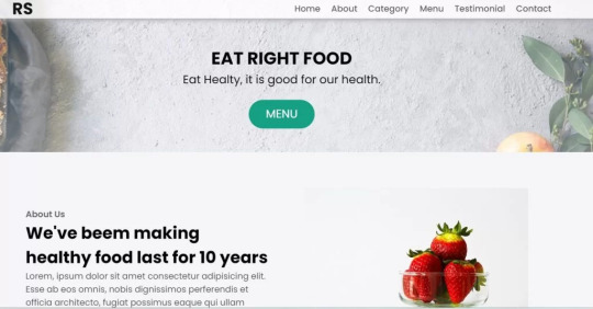
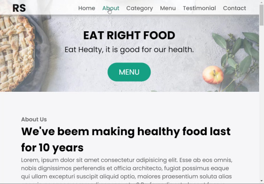
Restaurant Website Using HTML And CSS With Source Code
Restaurant Website Using HTML And CSS With Source Code
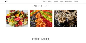
Hello coder, Welcome to the Codewithrandom blog. In this article, we create a Restaurant Website using HTML and CSS with Source Code. This is a Simple Restaurant Website with a main home page, types of food available, a food menu, customer reviews, and a contact form section on the restaurant website.
The HTML code for the Restaurant Website is the first thing we develop, and after that, the CSS for styling and JavaScript code. we add JavaScript for smooth scrolling on our website otherwise javascript is optional for this project.
Let’s Start a Responsive and Amazing Restaurant Website Using HTML and CSS. Let’s code a Simple website, We use 1,000+ lines of code to make our Restaurant Website Fully Responsive.
100+ HTML,CSS and JavaScript Projects With Source Code ( Beginners to Advanced)
Basic Knowledge About Project
It’s a front-end intermediate-level project that uses some advanced frameworks like CSS and JavaScript to make the project more elegant and responsive. We have provided you with the project with step-by-step explanations, which will help you better understand the project.
Before we dive into the step-by-step solution to the project, let’s understand some of the basic concepts about restaurant websites using HTML, CSS, and Javascript.
What is an online Restaurant Website?
An online restaurant website is a digital version of any restaurant that allows users to order food directly from the restaurant while sitting at home. These websites were created for customers who wish to eat restaurant food at home. The consumer can select items from the food menu and make payments for faster deliveries.
What are the benefits of Online Restaurant Websites?
reaches the maximum number of customers.
Easy to order
Hassle-free payments
increase in customer reach.
increase in profit.
Live Preview Of Restaurant Website Source Code:-
Restaurant Website Html Code:-
In this HTML code, we create a complete navbar for the footer structure of the restaurant website. first, we link our CSS and JavaScript files in html code. now we add a font awesome icon CDN link in the code because we create the What Our Customers Say section on the website and we show that review with a star so we use a font awesome icon.
Gym Website Using HTML ,CSS and JavaScript (Source Code)
then we create the structure of the navbar and it’s very important in our website because we create a responsive navbar in the project. then we create some simple sections of the restaurant website like what food is available and a food menu list.
and lastly, we create a contact form and a footer copyright line at end of the website.
This is almost 300 lines of HTML code for the restaurant website, and you can see the output below with only the HTML code output of the restaurant menu. Then we add CSS code for styling our restaurant website.
Output Of Only HTML Code For Restaurant Website:-

This is all image output that we create using only HTML code. Now the time is to style our restaurant website using css😍.
Restaurant Website HTML CSS Code:-
In CSS code we include Poppins font from Google font. then we style all sections of the website step by step. we write comments in CSS code so if you want to customize any of the restaurant website parts you can change that section code and it’s all done.
Responsive Resume/CV Website Using HTML & CSS
This is our whole CSS code with 600+ lines. We style our Restaurant Website step by step. We style the utility class and then style our navbar. After the navbar, we styled every html section🔥.
At the end of the code, we use media queries to make our Restaurant Website completely responsive and mobile-friendly. So you can see the output with CSS code. Then we add a little bit of javascript for the scroll effect otherwise our website is completely ready with code.
Ecommerce Website Using HTML, CSS, and JavaScript (Source Code)
Output Of HTML CSS Code Restaurant Website:-
You can see this awesome👏 output with HTML + CSS Code for Restaurant Website. Now we add JavaScript for smooth scrolling.
this is completely optional to add JavaScrpt to this project.
That’s it for our Whole restaurant website code. We write every useful code like making the website mobile-friendly and adding media queries for this. Add JQuery code for smooth scrolling on the restaurant website.
50+ HTML, CSS & JavaScript Projects With Source Code
[su_button id=”download” url=”https://drive.google.com/drive/folders/1Wx9W99uIH3WiO1nkz6aJYCuXVv_ibGmA?usp=sharing” target=”blank” style=”3d” size=”11″ wide=”yes” center=”yes” icon=”icon: download”]DOWNLOAD NOW[/su_button]
Final Output For Restaurant Website Using HTML and CSS Code
You can see this video output to see the complete output. You can see how smooth the website scrolls and this design.
Hope you like this Restaurant Website Project, we create your own and use this project in any project as a part project like the reviews section, and a contact form. If you need any more project-related frontend. Visit our homepage and you get 100+ projects💝.
Age Calculator Using Html Css Javascript ( Source Code )
if you have any confusion Comment below or you can contact us by filling out our Contact Us form from the home section. 🤞🎉
Code By – Sanket Bodake
was written by – Codewithrandom
FAQ For Restaurant Website
Which code editor do you use for this Restaurant Website project coding?
I personally recommend using VS Code Studio, it’s very simple and easy to use.
is this project responsive or not?
Yes! This project is responsive.
What is an online Restaurant Website?
An online restaurant website is a digital version of any restaurant that allows users to order food directly from the restaurant while sitting at home. These websites were created for customers who wish to eat restaurant food at home. The consumer can select items from the food menu and make payments for faster deliveries.
What are the benefits of Online Restaurant Websites?
1. Reach the maximum number of customers. 2. Easy to order 3. Hassle-free payments 4. Restaurant Like food at Home. 5. Increase in profit.
2 notes
·
View notes
Text
Weekly News for Designers № 727 - Fixing CLS Problems, CSS One-Line Upgrades, Future Roles for Designers
New Post has been published on https://thedigitalinsider.com/weekly-news-for-designers-%e2%84%96-727-fixing-cls-problems-css-one-line-upgrades-future-roles-for-designers/
Weekly News for Designers № 727 - Fixing CLS Problems, CSS One-Line Upgrades, Future Roles for Designers
Happy Birthday, Macintosh Forty years ago, Apple introduced the world to the Macintosh computer.
Free Instagram Story Templates A collection of Instagram Story templates for Photoshop, Figma, Sketch, After Effects, Premiere Pro, and Final Cut Pro.
12 Modern CSS One-Line Upgrades Learn about the CSS properties to enhance your projects, reduce technical debt, eliminate JavaScript, and improve the UX.
The Diagram that Shows the Value of Great UX
Fading Content Using Transparent Gradients in CSS Here are two methods for achieving text content fading with CSS. One uses mask-image and the other background-clip.
Top Logo Stinger Premiere Pro Templates We share a collection of logo stinger templates for Premiere Pro that stand out with their style, functionality, and ease of use.
Five Future Roles for Designers Jorge Arango shares five possible future careers for designers in our now AI-driven world.
CSS Blurry Shimmer Effect Learn how to create a CSS blurring effect, but not with box-shadow.
The CSS Snippets Every Developer Should Know Discover the CSS snippets that every front-end developer should know about in 2024.
What’s the Environmental Impact of Your Website? Eric examines the relationship between the web and the planet and shows how to measure your website’s impact.
Git and GitHub Essentials If you’re new to Git or GitHub, this extensive beginner’s guide of the most common commands is for you.
Fixing Cumulative Layout Shift Problems
The Most Underused CSS Media Queries: hover & any-hover Learn how to use the hover and any-hover media queries for responsive design and better experiences on all devices.
Improve Your Logo Design Skills Melinda Livsey shares how she improved her logo design skills by studying the work of Paul Rand and Saul Bass.
#2024#After Effects#ai#amp#apple#background#background-clip#bass#birthday#box#box-shadow#Careers#computer#content#CSS#CSS Snippets#Design#Designer News#designers#Developer#devices#effects#Environmental#environmental impact#figma#Future#git#github#gradients#hover
2 notes
·
View notes
Text
AGARTHA Aİ - DEVASA+

In today's digital age, a well-designed website is essential for success, but the cost of professional web design can often be a barrier for many businesses. Fortunately, affordable web design services have emerged as a viable solution, ensuring that everyone—from startups to established small businesses—can establish an impressive online presence without breaking the bank. This blog post will explore the various aspects of affordable web design services, highlighting what to look for in a reliable website service, the importance of responsive web design, and how budget-friendly options can specifically cater to the unique needs of small businesses.
Affordable web design services
In today’s digital landscape, affordable web design services have become essential for businesses of all sizes. With an increasing number of consumers turning to the internet for their needs, having a professional and attractive website is more critical than ever. Many small businesses and startups often worry that they cannot afford high-quality web design, but there are plenty of options available that offer both quality and cost-effectiveness.
One of the main advantages of choosing affordable web design services is the ability to find packages that fit various budgets without sacrificing quality. Many web design agencies understand the needs of small businesses and offer tailored solutions that ensure a professional presentation without overwhelming financial commitments. This is especially beneficial for startups that are eager to establish a digital presence without breaking the bank.
Moreover, many affordable web design services provide flexibility in their offerings, allowing clients to select features that meet their specific requirements. From simple informational websites to more complex e-commerce solutions, the variety available in budget-friendly web design ensures that every business can find a service that aligns with its goals and vision. Investing in affordable web design not only enhances a brand's credibility but also helps reach a wider audience effectively.
Website service
In today's digital age, having a robust website service is essential for both businesses and individuals. A well-designed website serves as the online face of a company and is often the first point of contact for potential customers. Investing in quality website service can significantly enhance your online presence and build trust with your audience.
Choosing the right website service provider is crucial. Look for companies that offer customized solutions tailored to your unique needs. This ensures that the website not only looks good but also functions effectively, providing an optimal user experience. A reliable website service provider should provide ongoing support and maintenance to keep your site running smoothly.
Moreover, an effective website service should prioritize SEO optimization, ensuring that your site ranks well in search engine results. This is vital as higher visibility leads to increased traffic and potential sales. Remember, a great website is more than just beautiful design; it's about delivering a seamless user experience
Responsive web design
Responsive web design is an essential approach to creating websites that provide an optimal viewing experience across a wide range of devices. With the increase in mobile device usage, it has become crucial for businesses to ensure that their websites function seamlessly on smartphones, tablets, and desktops. Designing with responsiveness in mind leads to a more user-friendly experience, which can significantly impact user engagement and conversion rates.
One of the key principles of responsive web design is the use of flexible layouts and grid systems. This allows elements on the page to resize and reposition themselves according to the screen size. By employing CSS media queries, designers can tailor styles for different devices, ensuring that content is displayed appropriately without compromising on aesthetics or functionality.
Moreover, implementing responsive web design is not just beneficial for users, but it also plays a vital role in search engine optimization (SEO). Search engines like Google prioritize mobile-friendly websites in their rankings. Therefore, having a site that is responsive can lead to better visibility in search results, driving more organic traffic to your website.
Affordable web design for small business
In today's digital age, every small business needs a strong online presence to compete effectively. However, finding affordable web designfor small business can be a daunting task for many entrepreneurs. It's essential to strike a balance between quality design and budget constraints.
One of the best ways to achieve this is by opting for responsive web design. This approach ensures that your website not only looks great on desktop but also provides an excellent user experience on mobile devices. Since a significant portion of web traffic comes from smartphones, investing in responsive design is crucial for small businesses seeking to maximize their reach.
There are numerous platforms offering affordable web design packages specifically tailored for small businesses. These services can help you establish a professional look without breaking the bank. By choosing the right designer, you can create a site that reflects your brand and meets your customers' needs while staying within your budget.
46 notes
·
View notes
Text
Responsive vs. Adaptive vs. Neither of those things
Aight so. Big topic. We hear the word 'responsive' a lot when talking about web design but it's kind of a wishy washy topic for lots of people outside tech, especially if you've mostly coded while interacting with jcink. John did it really weird, with two skins- one for mobile, and one for desktop. This is actually pretty convenient because it helps distinguish two ideas. If you go to a website like youtube or even tumblr and resize your window as large as you can and as small as you can. These sites are properly responsive- the layout changes and adapts to the size of the screen. Youtube is (unsurprisingly) better at this than tumblr. It changes to use all of the available screen width at every size, pretty much no matter what. Tumblr (the dash anyway) only expands to a certain size- but it also doesn't break when you make it really small. Now go look at the base jcink skin- jcink support forums for instance. If you look at it on a phone, it'll mostly look okay, and after a certain size, will mostly look okay on desktop too. But there's this whole area between the two where things start to get janky. The fixed sizes of everything start to spill over the window size. That's an adaptive skin. Everything is a fixed size, and which layout you see depends on the type of device you're using. Adaptive sites are generally seen as outdated at this point. Almost no one is coding this way anymore. Now go to a jcink skin. Do the same thing with making your window bigger and smaller. In every skin I've ever seen, *something* will break. Text will overflow, you'll have to scroll from side to side to read a post, images will start to overlap other content. That kind of thing. Some sites will resize to a certain point, but almost none of them will do so all the way down to a mobile size, or even half of a laptop screen. This is neither adaptive nor responsive. THIS IS OKAY. I mean it's not ideal, but almost no one coding for jcink is a professional, and these are legitimately difficult things to get right. You have to be thinking about it from the start of the design process. What's going to happen to that icon when the screen gets small? What about the topic information? How are you going to keep information which looks beautiful at a desktop size looking good at tablet and phone sizes? It's legitimately difficult, and if you're not building with that in mind from the start it's a non-trivial task to make an unresponsive skin responsive. If you want to start thinking about these things, I'd recommend reading about media query breakpoints. For jcink, I think it's fair to code for desktop first (usually it's mobile first today) because people using a jcink site will usually want to be typing in it somewhere. Anecdotally, I think even people who post on mobile usually are writing in a notes app first. My skin worked really well at a 600px breakpoint, but other skins might need different figures. That's okay! As long as you can identify (maybe two) places where your views start to breakdown and have consistent behavior in your css for those breakpoints, you should be fine. I think it's good practice to know what you want your mobile version to look like, and code at least the skeleton of both views as you go, so you don't back yourself into corners. That's already a lot of text, so I'll stop there. I'll follow this up with a few different ways you can approach responsive design beyond breakpoints- grid, flexbox, and percentage based css. I can't really effectively teach these things on tumblr, but I can talk about the pros and cons of each approach so you can start looking into the things that seem like they might fit your use case.
2 notes
·
View notes
Text
How to Begin Your Web Design Journey: A Step-by-Step Guide in Simple Terms
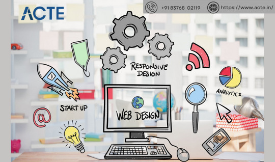
Understanding the Basics:
Learn about HTML, which is like a web page’s skeleton.
Understand CSS, which is like makeup for web pages.
Know how to make websites look good on different screens.
2. Choose your tools:
Start with simple text editors like Notepad (for Windows) or TextEdit (for Mac).
Later, try fancier editors like Visual Studio Code.
For making pictures, try Adobe Photoshop or Illustrator.
3. Learn HTML and CSS:
Use websites like W3Schools or Codecademy.
If you want to learn more about web design with certification and placement, ACTE Institute offers comprehensive machine learning training courses that can give you the knowledge and skills necessary to excel in this field. Consider the infinite possibilities for data analysis, automation, and decision-making that machine learning may create.
YouTube: There are many video tutorials covering HTML and CSS for beginners.
They teach you how to make web pages and make them look nice.
You can also learn from courses on Coursera or edX.
4. Practice your skills.
Besides learning, make simple web pages to get better.
Try harder projects as you get more confident.
Make your own website to practice lots.
5. Responsive Web Design:
Make sure your websites work well on phones and computers.
Learn about media queries (they help your design fit different screens).
6. Master CSS Layouts:
Get really good at arranging web stuff using CSS (like making boxes and arranging them nicely).
7. Web Design Frameworks:
Think about using ready-made kits like Bootstrap.
They have pre-made pieces to help you design faster.
8. UI/UX Design:
Learn to make websites easy to use and nice to look at.
Think about how people will use your site.
9. Web Hosting and Domain:
To show your website to people, you need a place to put it (hosting) and a name for it (domain).
Lots of companies can help with this, like Bluehost or HostGator.
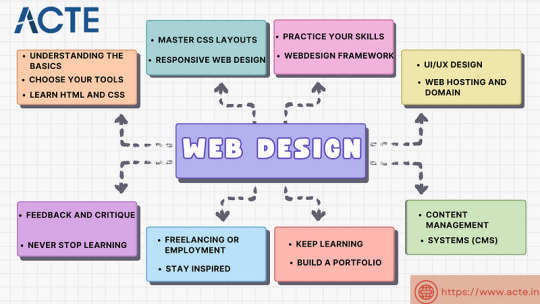
10. Content Management Systems (CMS):
Consider using tools like WordPress to manage your website easily.
11. Keep Learning:
Web design keeps changing, so keep learning new stuff.
Read blogs, watch webinars, and take more advanced classes.
12. Build a portfolio.
Make a collection of your best work to show others.
People who might hire you want to see what you can do.
13. Freelancing or employment:
Decide if you want to work alone or with a company.
Both ways have good things and not-so-good things, so pick what you like.
14. Networking:
Join groups of web designers to meet others like you.
Learning from others can help you become better.
15. Feedback and criticism:
Don’t be shy to ask for advice on your work.
When people give you tips, it helps you improve.
16. Launch your projects:
When you’re good enough, work on real websites.
Offer to make websites for friends or local businesses.
17. Stay Inspired:
Be creative and get ideas from different places.
Nature, art, and other designers can help you think of cool stuff.
18. Never Stop Learning:
Web design always changes, so keep learning new things.
Stay curious and open to learning more tricks and tools.
The secret to success in web design is to start with the fundamentals and gradually advance your abilities. Keep in mind that on this trip, patience and practice are the keys to success. As your skills advance, you’ll have the imagination needed to realise your ideas for websites. So put your hands in your pockets, launch your preferred coding editor, and start your web design experience!
4 notes
·
View notes
Text
The Marvel of Responsive Web Design: Navigating a User-Centric Digital Landscape
Hey there, fellow web enthusiasts it's your digital marketing agency in Dwarka, vrankup! 🌐 In today's fast-paced digital realm, where every swipe, tap, and click could lead you down a rabbit hole of information and entertainment, web design has evolved into an art of seamless adaptation. Welcome to this exciting ride through the dynamic universe of responsive web design! Buckle up as we delve deep into why it matters, the nitty-gritty of its principles, and a treasure trove of best practices that can transform your web creations. Whether you're sipping coffee on a desktop or thumbing through your smartphone, this guide will be your trusty co-pilot through the responsive web galaxy. The Responsive Revolution Picture this: You're hunched over your laptop, meticulously crafting the perfect website layout. Now, visualize your masterpiece on a smartphone screen. Wait, why does it look like a Picasso on steroids? That's where responsive web design swoops in like a superhero! 🦸♂️ It's the technique that makes your website adjust effortlessly to fit screens of all sizes, from colossal desktop monitors to those itty-bitty smartphone displays. The idea is to give users a seamless experience, regardless of their device. Imagine that - no more awkward pinching, zooming, or squinting. Responsive web design is the key to a harmonious user journey. Why It's the Real Deal First off, let's talk about our gadgets. They're our sidekicks - always with us, whether we're lounging at home or conquering the concrete jungle. With users switching between smartphones, tablets, laptops, and whatnot, your website must be adaptable. That's where responsive design steps in, ensuring your content shines, no matter the screen size. But there's more! Think about Google and its SEO ranking algorithm. It adores mobile-friendly sites, boosting their visibility in search results. So, if you're aiming for web stardom, responsiveness is your ticket to SEO success.
|Digital marketing agency in dwarka| Responsive Design: Unveiling the Magic Hold on to your digital hats, because here come the secret ingredients of responsive web design! 🎩💫 1. Fluid Grids: It's like having a shape-shifting foundation for your website. Instead of fixed-width layouts that look wonky on different screens, fluid grids use relative units (like percentages) to make your content flow smoothly. It's like having a web design dance party that adapts to every beat. 2. Flexible Images: Ah, images - the pièce de résistance of any website. Responsive design makes sure they behave like chameleons, adapting to their surroundings. CSS tricks like 'max-width: 100%' keep images from breaking the layout on smaller screens. And with HTML's 'srcset' attribute, you can provide different images based on the device, like a magician changing outfits for different acts. 3. Media Queries: These are like the responsive design spells in your web development wizardry book. With media queries, you can sprinkle CSS rules that alter your design based on the device's traits - be it screen width, height, or orientation. Imagine your website's design adjusting its makeup as it transitions from a smartphone to a tablet! Best Practices: Crafting a Responsive Masterpiece Ready to craft your own responsive symphony? Here's the sheet music - our top-notch best practices! 1. Mobile-First Approach: Think small, my friend. Start designing for mobile devices first and work your way up. This approach keeps your design lean, focusing on the essentials for the smallest screens and then adding embellishments for larger ones. 2. Use Relative Units: Pixels, schmixels! Embrace relative units like percentages, ems, and rems for fonts, padding, and margins. They're like the universal translators of responsive design, ensuring your website understands the language of all devices. 3. Extensive Testing: Before the big show, run dress rehearsals on real devices and simulators. Test, test, and test again! Check if your navigation is smooth, images scale gracefully, and your layout waltzes beautifully on screens of all sizes. 4. Performance Tune-up: Mobile users are all about speed - no one likes waiting in a virtual queue. Compress images, minify CSS and JavaScript files, and consider lazy loading to keep your responsive creation loading lightning-fast. 5. User-Centric Design: Keep your users at the heart of it all. Focus on delivering what they need most, especially on smaller screens. Trim the excess and let the essentials shine through. The Grand Finale Responsive web design isn't just a tool in your arsenal - it's a mindset. It's about embracing change and ensuring your digital creations are welcoming to everyone, no matter the device they wield. As technology continues its relentless march forward, responsive design ensures your website remains relevant, accessible, and captivating to users old and new. So, there you have it, intrepid explorers of the web cosmos! With the principles and best practices of responsive design in your toolkit, you're well-equipped to navigate the dynamic tides of the digital sea. As screens continue to shrink, expand, and evolve, your websites will stand strong, adaptable, and ready to provide users with an experience that's nothing short of extraordinary. Get out there and design responsively - the digital realm awaits your creative brilliance! 🚀 Catch you later, Digital marketing agency in dwarka, vrankup!
#website designing company in dwarka#seo company#seo#website designing company in gurgaon#noida#digital marketing#digital marketing agency in dwarka#vrankup#digital marketing company in dwarka#website designing services in gurgaon
2 notes
·
View notes
Text
Tried Every Major AI Model for Frontend Coding Only One Truly Delivered.
Let’s face it. As web developers, we’re all chasing the dream of faster, smarter, and more efficient coding. After all, the clock’s ticking, and there’s always more to build. Enter AI. You’ve probably heard all the buzz—AI tools that promise to help us write code faster, debug smarter, and even suggest better practices.
So, I did what any curious developer would do: I tested every major AI model for frontend coding. The verdict? Only one truly delivered. Spoiler alert: it wasn’t the one you might expect.

Let’s break it down.
The AI Hustle: The Tools I Tested GitHub Copilot – The AI-powered sidekick that lives inside Visual Studio Code, claiming to write code for you based on context.
ChatGPT – The famous conversational AI that answers all your questions and generates code snippets on demand.
Tabnine – The autocomplete tool that promises to help you code faster by suggesting relevant code as you type.
Kite – More of a Python fan favorite, but I thought I’d give it a shot for frontend tasks.
IntelliCode (Visual Studio) – Microsoft’s answer to AI code suggestions, integrated right into Visual Studio.
GitHub Copilot: Feels Like Magic—Until It’s Not At first, GitHub Copilot felt like something straight out of a developer’s dreams. You start typing, and bam—there it is: a perfectly crafted function, just like you wanted. For straightforward tasks like creating forms, loops, or boilerplate code? Copilot is on fire.
But… here’s the kicker:
The Caveat: When things got more complex—like building dynamic React components, handling state, or trying to integrate with APIs—Copilot just couldn’t keep up. It would suggest solutions that didn’t align with my project’s unique needs.
Code Quality: While the code worked, I often found myself rewriting it. It wasn’t exactly best practice material.
Don’t get me wrong—if you're cranking out basic pages or static HTML, Copilot is your friend. But for anything more nuanced? Not so much.
ChatGPT: Close, But Missing the Magic Touch I was honestly pretty pumped to try ChatGPT for frontend coding. It could explain things, generate code snippets, and even walk me through complex concepts. Plus, it was fast. But… as much as I loved it for learning and brainstorming, there were some glaring problems:
The “Old-School” Problem: Sometimes, ChatGPT would suggest outdated methods or libraries that were no longer considered best practice. So while it was fast, it wasn’t always on the cutting edge.
Context? What’s That?: ChatGPT is fantastic at answering questions, but it’s like that friend who has one really good idea and sticks to it. If you’re trying to build something specific, like a responsive navbar with flexbox and media queries, it often needed a bit of extra clarification from me.
Here’s the thing: ChatGPT can absolutely help with quick fixes or answering questions about web development. But when I needed it to generate more complex, customized code? It wasn’t perfect.
Tabnine: Fast, But Feels Like Auto-Pilot Tabnine was the next tool I dove into. It’s designed to speed up your workflow by predicting what you want to write and giving you the perfect code snippet. When it worked, it was like a breath of fresh air.
The Speed Factor: For simple functions or repetitive CSS rules, Tabnine sped up my workflow dramatically.
The Problem: But the minute I started getting into custom JavaScript components or more involved frontend logic, Tabnine became… well, a bit too generic. It felt like I was getting the same suggestions over and over. The more unique or specific the task, the more irrelevant the suggestions became.
So yeah, Tabnine is great when you’re doing basic stuff. But when you need it to adapt to your project’s unique context? Not so much.
Kite: More Python, Less Frontend Now, Kite is a popular AI assistant for Python developers. But hey, why not try it for frontend, right?
Turns out, that was a bad idea.
Wrong Fit for the Job: Kite’s suggestions were often off-track when it came to JavaScript, React, or even CSS. It’s not that it was a bad tool; it’s just not built for the frontend world.
Learning Curve: The lack of deep web development intelligence meant that Kite often gave me Python-flavored suggestions that weren’t very helpful.
If you're coding in Python, Kite’s your jam. But for frontend tasks? It felt like I was trying to put a square peg in a round hole.
IntelliCode (Visual Studio): A Little Too C#-Centric IntelliCode is another tool that’s integrated into Visual Studio. It’s solid—if you’re a C# developer. But I was working with JavaScript and React. Here’s how it went down:
Solid, But Static: IntelliCode tried to help, but it mostly focused on C# coding patterns. When it did suggest something for JavaScript, it felt like it was trying to adapt to a framework it didn’t really understand.
Not Frontend-Friendly: The AI behind IntelliCode just didn’t seem to “get” the way frontend development works, especially with React or complex HTML/CSS layouts.
If you’re in the Microsoft ecosystem, IntelliCode will help, but it won’t make you a frontend wizard.
And the Winner Is… ChatGPT (With a Twist) Here’s the plot twist: ChatGPT came out on top.
But before you roll your eyes, let me explain.
Here’s Why ChatGPT Works:
It’s Flexible: ChatGPT adapts to your needs. Whether I needed help with React state management, CSS animations, or even troubleshooting a weird bug, ChatGPT could jump in and help.
It Explains, Don’t Just Autocomplete: The real beauty of ChatGPT is that it doesn’t just give you code—it explains it. I could ask it to explain the difference between useEffect and useLayoutEffect, and it would break it down for me.
Context-Aware: While it still has room to improve, ChatGPT is surprisingly good at understanding your project’s flow, especially if you’re clear about what you need.
Pro Tip: Don’t rely on ChatGPT to write your code from start to finish. Treat it like a coding assistant—ask for help when you’re stuck or need a quick answer, then tweak the code to make it your own.
Final Thoughts: AI Isn’t Here to Replace Developers (Yet) It’s clear that AI tools aren’t perfect—yet. GitHub Copilot speeds up basic coding, Tabnine is great for fast suggestions, and IntelliCode can help if you’re in the Microsoft world. But for frontend development, ChatGPT emerged as the true game-changer.
The secret? ChatGPT is not just a code generator—it’s a powerful assistant that can teach you, help you troubleshoot, and give you contextual advice. It can’t replace your creativity or problem-solving skills, but it can certainly amplify them.
So, what’s the takeaway here? If you’re serious about AI tools for frontend development, ChatGPT is your best bet. Embrace it, and let it be the sidekick you always wished for.
0 notes