#how to make text portrait effect using html and css
Explore tagged Tumblr posts
Visit Tumblr Blog
Explore Tumblr blogs with no restrictions, modern design and the best experience.
Last Seen Tumblr Blogs


Fun Fact
12.7% of mobile users access Tumblr.
Text
Limbus Company Wiki Style for AO3
Note: This post contains spoilers (... can I call it that?) for Glimpsing a Certain Mirror World.
While I was writing this story, I wrote some in-game dialogue for an identity based on the text just to get into the spirit of what I was trying to capture.
Then I thought - what if I shared that in a bonus chapter, just for fun?
Then I thought even more that it kind of looked like an imaginary wiki page.
Then I had Carmen help me present a wiki page from another reality.
Seems like readers got as much of a kick out of it as I did writing it!
Now I'll show you how to style an AO3 page to look a little bit like the wonderful Limbus Company Wiki, too!
If a CSS and HTML snippet demonstration is all you need, grab them here:
🔗HTML (Inside your story)
🔗CSS (Inside a Work Skin, made on your dashboard)
Next, I'll go over everything step by step from the beginning.
Jump into the cut for the tutorial!
(Then show me your fan identity stories when you make some, okay?)
Step 1: Create a Work Skin
After logging in, go to your Dashboard.
Then click Skins
Then go to My Work Skins
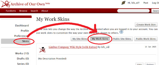
Click Create Work Skin
Give it any name and description you like
Paste the following into the CSS text area:
🔗Pastebin Link for easy copy / paste
#workskin td, #workskin th { padding: 5px; border: 1px solid #810000; } #workskin td { color: white; background-color: #1e1e1e; vertical-align: middle; } #workskin td.title-column { width: 20%; text-align: center; } #workskin div.affiliation { font-size: small; } #workskin .userstuff p.carmen { color: red; }
I will explain what this means when we get to the next step so that you can tweak it if you wish. Think of this as your starter style.
Click Submit to save your skin
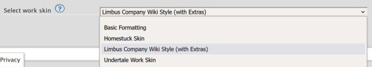
Step 2: Apply the Skin to Your Work
When creating or editing a work, you can set the work skin in the Associations section.
Click the dropdown, and you'll see whatever name you gave your work skin in the first step mixed in with the default ones provided by AO3.
Step 3: Format Your Story
You'll need to add HTML to your story to see any of the new styles applied.
I'll show you a few examples of how this is done.
Change the color of text
I used red text to indicate Carmen speaking through the author's note.
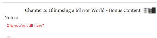
Here is the HTML I used in the Chapter Notes section to do this:
<p class="carmen">Could it be that you, too, wish to glimpse the mirror world these two envisioned?</p>
This creates a paragraph (p) with the carmen class applied.
If we look at the CSS from up above:
#workskin .userstuff p.carmen { color: red; }
The p.carmen section is called the selector. This tells the CSS that if there's a paragraph with the class of carmen, make it red!
You can copy this line to create classes with any name you wish for paragraphs so that you can have as many colors and effects at your disposal as you want.
Of course you can change the color from red to any other color you need, too.
Wiki Tables
This next part is a little bit more involved. I'm not sure if there's a better way to make a table on AO3 or not, but here's a snippet to get you started:
🔗Pastebin Link for easy copy / paste
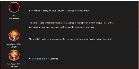
<table> <tbody> <tr> <td class="title-column"> </td> <td> The child looked immensely frustrated, standing in the lobby of a most unique Fixer Office. </td> </tr> <tr> <td class="title-column"> <img src="your image URL here" alt="Sancho Story Portrait"> <div class="affiliation">Manchegan Office</div> <b>Sancho</b> </td> <td> We went over this just <em>yesterday</em> -- </td> </tr> </tbody> </table>
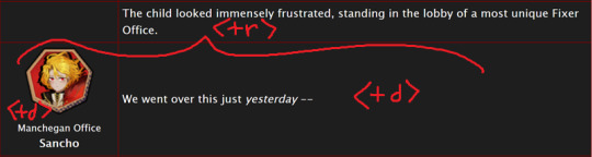
This creates a table (<table>) with two table rows (<tr>).
Each table row has two table cells (<td>).
The first cell in each row has the character image, affiliation, and name.
The class "affiliation" is defined in the style sheet to make that section of text just a bit smaller, like on the wiki:
#workskin div.affiliation { font-size: small; }
In the first example table row (<tr>) above, you can see that you can even leave it blank to allow for the narration portions of the story.
You'll need to copy the section between the <tr> and </tr> tags to create new rows for your table. Copy it once per line in your identity story and change the text and images inside as needed.
I highly suggest that you do this in a text editor on your own computer rather than on AO3, because it can quickly get overwhelming.

Just looking at this in AO3 is making me nervous 💦
(Fun side note, I originally spelled "Manchegan" incorrectly in my first draft all over that huge table... thank goodness for find and replace...)
Hosting Images
You'll see I left a section on the table template for "your image URL here".
You'll have to find a place to host your images on your own, because AO3 doesn't provide any image hosting...
I saw someone suggested https://imgbb.com/, so that's what I used. It seems to have held up so far.
Keep in mind if you link an image from Discord or Imgur, they could remove your image sometime in the future and then it will no longer appear properly in your story.
(Be sure to include an alt text in the image as shown - if the image can't be loaded some day in the future users will see that text instead so that they can understand what they're missing!)
Step 4: Adjust Away!
Once your work skin is applied and you have the right HTML classes in place, you can edit your Work Skin and see your story change, even if it is in your drafts.
You can use this to adjust other things in my CSS example, like colors and the padding in the table.
---
Have fun, and let me know if you have any questions!
“Would you care for some tea?” Yi Sang offered. The evening’s chill was somehow present, even inside his closed room. “Nay,” Don Quixote took in a sharp breath, “I was hoping that you might… assist me, with a look into thy mirror. For there is something that I have need to see.” Yi Sang creased his eyebrows. Unfortunately, this was exactly what he worried would occur. ——— In the aftermath of La Manchaland, Don Quixote asks Yi Sang for a favor. Yi Sang guides her through the process of glimpsing a certain mirror world.
Limbus Company leaves so much unsaid by not showing us what happens immediately after the end of a canto. But, that's a lot of opportunity space to play with in a story.
I've been working on this one for quite some time as I've always wanted to explore the dynamic between Don Quixote and Yi Sang, even though I find Yi Sang really tough to write for.
If you like mirror worlds and AUs, you might especially enjoy this one. I hope you like it! 🎠🪶
---
... Also, hmm, something strange seems to have happened with my upload?
This is a one shot story, but for some reason there's a second chapter? That's odd.
Well, if you check it out, I should note that it might look better on a PC or tablet than on a mobile phone -- though it will probably look ok either way.
#limbus company#lcb-oil-table-talk#tutorial#ao3#canto 7 spoilers#canto vii spoilers#I'm honestly surprised that Tumblr doesn't have support for code blocks#That's a little disappointing
47 notes
·
View notes
Text
How To Make Text Portrait Effects Using CSS
How To Make Text Portrait Effects Using CSS
In this article, we will learn how to create a text image portrait using CSS in a few simple steps. If you want to know, keep reading this article. We have listed all the steps you need to take. So let’s start designing a text image. Here are the some simple steps yo make text portrait. Create an HTML document with the text “Welcome to KrTricks.in”, to duplicate a word, using the JavaScript…

View On WordPress
#cool css text effects#css#css effects#css portrait#css portrait tutorial#css style portrait#css text effects#css text portrait#css text portrait effect#css typeface portrait#how to create a typographic portrait in html css#how to make text portrait effect using html and css#latest css effect#pano gawin ang css portrait effect#portrait effect#pure css text portrait#pure css text portrait effects#text portrait effect#text portrait effect css
0 notes
Text
final project: ‘a ghost story’
code link & game link & presentation link
For my final project, I wanted to create a hypertext, choose your own adventure game. Visually, I wanted the game to be minimalistic and let the text be the center piece. Thematically, I wanted to make something horror-inspired, but disorienting, dreamy, and ghost-related. This led to creating a circular story map where different choices would sometimes lead the users to “cross the map” and land up in new settings.
The best way to execute this was to be able to call on a lot of text. When incorporating a json file into the glitch didn’t work, our professor helped me incorporate the data object directly into my p5 code, which assigned each “story page” a story, that had content and two choices, and each choice had a value and content. Later I incorporated each story page also having a level that would determine the intensity of the strobe. But then our professor helped me create an updateChoiceState function that would pass the value of a choice through a .mousePressed for each choice button that update the story “value” and thus leading to the appropriate page according to the choice pressed. This was done by creating two html buttons for each choice. During a feedback session, our professor noted that I needed and if statement for if there was no second choice. After having trouble with figuring out how to incorporate it into the updateChoiceState without messing with the function, I found that if I made every choice2 that was blank just “”, the code would pass through no second option as opposed to defaulting to the previous one as it had been doing. So I stuck with that solution. Additionally, after receiving feedback that the choices lacked interactivity indicators, I utilized css to change the button’s text color and the mouse’s cursor on hover. I had previously tried to accomplish this by only utilizing p5, but realized that changing style elements of the html buttons was something that could be cleaner done in CSS and relented.
Along with switching from using only p5 to incorporating CSS and HTML, I ran into a major roadblock when expanding from the core code of the story and choice tree. When trying to create a start, prestart, and end page, I wanted to create start & restart buttons. I tried to create a specific class for the start/restart button that was called on when gameOver was true or when gameStarted was false. This ended up being insanely tedious and was just so much easier done with another html button. I ended up wanting to create a similar interface as the rest of the game for the welcome page, and also incorporated an about for a “second choice” and created a fourth html button.
I really enjoyed object oriented programming during the semester, so I was kind of surprised that this code ended up being so functional, but I think it worked really perfectly for the purposes of the game. Being able to write functions that turned “states” (the welcome state, the preStart state, the about state, etc) on and off under different mousePressed’s made my code so much cleaner and easier to keep track of. The supportive functions I utilized were toAbout, toPreStart, Begin, and I was able to use these as I jumped from state to state in the main if else within the draw loop that turned the game states on and off.
While the choices allowed users to obviously interact with the game and create individualized paths and game experiences, I wanted it to feel further personalized. This is where I incorporated the preStart/user input, which ended up being another roadblock. After creating input html element and positioning it in the code, I wanted to define the user’s input as a variable and then replace the name within my story with the user’s input. So using the variable “person,” I went about incorporating that variable into my story data, globally calling “person,” and defining person as input.value() in the setup. However, when I ran my code, “person” would console log as the input.value() but the story would produce “undefined” in the place of person. So “person” was redefining but my story wasn’t reading it. I consulted Allie, who helped me clean up where I was calling input.value() and experiment with defining person = input.value() in different places. Then, I went to our professor who was able to help me globally call the input so that “person” could access the input.value() in the draw loop, and then create an if statement within my storyBox function that utilized content.includes and content.replace. The conditional would ask if the story included the variable “USERNAME”, locate it, and then update/replace it in the story with string that person was now defined as. This now allowed my story to update with the new information from the user input. This was one of the trickiest, yet most satisfying parts of the project as it really helped me understand more about the input element and how to create more immersive, customized user experiences within pre-written text. At the last second, I also tried to create a conditional that created a default user input in case the user didn’t put any name in and just began the game, using an if that asked if the user input string length was longer than 0, but my code would run with the default name no matter if I put in a name or not, so I decided to leave that feature out.
I also wanted to make my game adjust in real time to window resizing from the start, which proved to also be a bit of a roadblock, albeit a silly one. It was only a roadblock when I was trying to write my own resize function, until I realized there was literally a windowResized function. That function combined with coding all measurements and sizes using “width” so that they adjusted with the window width, hiding the scrollbar in CSS, and using calc() for the button font sizes in CSS allowed me to get as close as possible to what I had envisioned for the window resize adjustments. I’m satisfied to how it resizes for now, but would love to limit how small the text gets and have the text box readjust the lines as opposed to relying on the text getting smaller.
All that being said, I really enjoyed the process of creating this project and would love to continue expanding on the story line to create a larger maze for the user to navigate, as well as continue tightening and sprucing up the structure I’ve created. I really loved the opportunity to use what I’d learned about functions and expand on my knowledge of the possible uses of objects, html, and css within this code. And I’m honestly really proud of how clean and effective I was able to make this code through functions since I hard coded my entire self-portrait during the first week. I’m sure if I went through I could find bits that were hard coded that shouldn’t be, but I’m proud of my use of states and conditionals to navigate from state to state and create a little “cushion” of start and restart pages for the game to lie within. I really enjoyed being able to explore this new avenue of storytelling with a genre I love so much while pushing my coding abilities.
0 notes
Text
Lecture 1: A creative orientation to design
First lecture, first post… Here I am writing my first blog post. During the lecture I was thinking:
“Hmm… we need to create a blog... that’s an interesting approach! I always wanted to have a blog but could never decide what to write about.”
Through the years I constantly looked around at what platform would be best for the blog I will create someday:
“I do not even need a subject for it yet, I can just look around for which platform would be easy to use and has the nicest layouts!”
Eventually, after reading all about it, using the trial period or signing up on many website builders just to try them out, I realised I am never going to do it because I do not like writing. I am not going to lie, I do not think that writing is my best skill, but you have to do these things you’re not good at to get better, right? I never did It so now is the time. Now I have to do it.

Along many others (Blogger, WordPress, Quora, Medium, etc.), Tumblr was one of the platforms I found back then, and, while it did not make me have a blog in which I would come back to tell my story, it still made me tell a story, but it was a visual one. I started collecting images that I found visually appealing on my blog – pictures about anything: interior design, architecture, landscape, portraits, paintings and sculptures, famous or not. Anything I visually liked:

There is a print screen of my Tumblr blog with a very minimalist theme and a horizontal scroll effect which many might argue it is not what users would expect, but I really liked it and it was my tumblr blog which I did not created for other people. It was just for me.
I posted little original content but mostly reblogged images I found interesting from other people – I just thought:
“That’s what Tumblr is about, right?”
In time I found out that people were using it in many different ways. I do like photography, looking at it or making it, but never thought mine was good enough for the collection I curated on my blog, haha,
“I am just using my phone, I do not even own a proper camera...”
Looking back now, I realise Tumblr was actually the best for that, never mind...
Through Tumblr I also found out about HTML & CSS. Tumblr has themes you can adapt but If you want to explore, you can modify these themes or create your own. During this HCID course, I am taking the Web Applications Development elective class which takes place just before the Creativity in Design module. My point is that even though it was not writing, Tumblr still influenced me in a good way by making me interested in Front Web Development. How relevant this is? I do not know, I just thought it would be a nice introduction. Here is a print screen of one of my first web pages – looks like it is form The Matrix, I know, that was my intention:
While I am writing this post, new ideas pop into my mind. Coming back to the fact that I always had the impression writing is not my best skill, as I previously mentioned. When I say this, people presume I say it because English is not my native language. While that might be one point, I think the same about writing in Romanian. Just writing in general makes me anxious, hahah. How do I say what I want to say without sounding too boring? Which word would better express what I want to say… most importantly, what is the best order to present my thoughts in, especially when they come in waves? I have so many thoughts and sometimes I feel like I must tell the story from the beginning for people to accurately understand the point I want to get at and how everything leads to that, and even then they might still not understand my ideas, haha. That’s how I spend too much time overthinking everything and that’s why I presume that growing up I got more into photography, drawing, painting or sculpting in clay – I wanted to express somehow. It just wasn’t going to be writing.
While I liked the humanistic profile but did not want to write much, I chose to go to an arts high school, which also introduced some of the Social Sciences but I think the mistake I did was to choose Architecture, thinking about money:
“What will I do with my life if I go to any other section, such as painting? I am not going to find a job to support living, I can just create art in my spare time. If I do architecture, I can do any of the other, but if I do let’s say painting, I cannot do architecture”.
That’s what I thought back then...but architecture was a lot of technical drawing as it can be seen in the next picture, and that wasn’t too much fun. I did not even know you can do sculpting or graphic design. But it was still fun learning about architecture styles.

While I enjoyed high school, towards the end I did not want to create anything anymore, I was doing enough to achieve whatever was needed for the courses but not more. I wasn’t enjoying it anymore and I felt like the way it was thought it was to make people follow some outdated rules, it was narrow minded. In my opinion art had to be the other way around, and this was not what I wanted to do with the rest of my career… Art was my gateway. But this discussion is more related to the bad teaching style in Romania or maybe arts schools in general and this is not why I am currently writing this post.
After years I started creating art again, even if just now and then. I painted at home when I was feeling different strong emotions. After, I went to sculpting classes. One of each can be seen in the following pictures:

All this time I kept taking photos as nowadays technology allows us to have a pretty good camera on us all the time, on our smartphones. Why all this discussion about drawing/ art in general? All this got to be useful at something. I realised I never read any notes I take in class because they’re just long lines of writing. Boring. That’s why I decided to start Sketchnoting from the second semester. I saw someone (Michele Stara) doing it at the UX Live conference and thought:
“Wow, that’s pretty cool! I want to do that, maybe I will actually look over my notes again!”.
So that’s how I started sketchnoting for every class, not just for Creativity in Design. As I did not actually draw in years, my sketches are not the best and also combined with paying attention to class, I have to be fast, resulting in not so pretty drawings. However, apparently transmitting ideas through image rather than just writing text requires a bigger thought process and I should remember the facts easier.

In conclusion, I am now willing and ready to approach things from a different perspective and while my writing or my sketches are not the best, there’s only one way too get better. Practice, practice, practice, practice.
How relevant this is to the class? Not sure, but I thought it would be a nice way to introduce myself.
0 notes
Text
300+ TOP MULTIMEDIA Interview Questions and Answers
Multimedia Interview Questions for freshers experienced :-
1. What is meaning of multimedia? Multimedia is simply multiple forms of media(text and graphics and sound etc)integrated together. 2. What is animation? Animation is the rapid display of a sequence of images of 2-D or 3-D artwork or model positions in order to create an illusion of movement. 3. What is a ambeant acclusion? Ambient occlusion is a shading method used in 3D computer graphics which helps add realism to local reflection models by taking into account. Ambient Occlusion is a method for simulating global illumination, while keeping a respectable ratio between results. 4. What is the arc in animation? arc is known as a curve which determine the poses of the character, it is the most important concept for animation. To get good knowledge on arc u must have drawing skills 5. What is mean by Rigging? Rigging is a method of attaching bones or biped to a ‘modeled character’ or object in order to make them animate or ‘perform’ actions. By attaching bones or biped the ‘character’ can walk,talk and make bodily movements. 6. What are Multimedia Hardwares? Multimedia hardware basically consists of video and sound cards, and cd-rom drives. To make it a little easier multimedia kits are available that include all the necessary hardware and software to upgrade your present computer(s). 7. What are Multimedia Softwares? The software used to create multimedia experiences can be placed into 3 distinct categories: Audio Software Graphics Software Video Software 8. What are the Multimedia Authoring Tools? Multimedia authoring tools make it easier to create full scale multimedia projects. Fortunately, there are an assortment of tools available to choose from. 9. When I set visible=”false”, the component still takes Up space and appears in the tab order. Why is that? You can often achieve the “display=none” effect by setting the height/width to zero when you set it invisible, and then set it back to a fixed value or to undefined when you make it visible again. 10. What is Inheritance in term of OOP (Flash Actionscript)? Inheritance is a form of code reuse that allows programmers to develop new classes that are based on existing classes. The existing classes are often referred to as base classes or superclasses, while the new classes are usually called subclasses. Advantage of inheritance is that ii allows you to reuse code from a base class. Use the extends keyword to indicate that a class inherits from another class.

MULTIMEDIA Interview Questions 11. How do I pass parameters to a pop-up window in actionscript? Three different ways to pass data into a title window. It uses the initiator to pass in several built-in properties plus two user defined properties. One is a simple string, the other is a reference to the main application that can be used for binding. Note the variable that holds the application reference is typed to the name of the application, this is critical for binding to work correctly. 12. How do we call javascript from Flex actionscript? Using the Externalinterface APT to access JavaScript from Flex and Using the navigateToURL() method in Flex. The navigateToURL() method is in the flash.net package flash.external.ExtemalInterface. call(function_name:String) Object; navigateToURL(request:URLRequest, window:String):void 13. What is the problem with calling setStyle() Calling the setStyle() method can result in decreased performance. Use it only when necessary. You should try to apply style sheets rather than use the setStyle() method because it is computationally expensive. This method should only be used when you are changing an object’s styles during run time. You cannot get or set style properties directly on a component as you can with other properties. Instead, you set style properties at run time by using the getStyle() and setStyle() ActionScript methods. 14. Can you write to the file system from flex? Yes. Ex: import flash.filesystem.*; private var stream:FileStream; private function saveFile():void { var file:File = File.desktopDirectory. resolvePath( “HelloWorld.txt”); var stream:FileStream = new FileStream() stream. open(file, FileMode. WRITE); var str:String = “Congratulations on your 1St file, Rich Tretola – EverythingFlex.com”; stream. writeUTFBytes(str) ; stream.close(); mx.controls.Alert.show(”File has been saved to \n” + file.nativePath, “Notice”); 15. What design patterns have you used? in Action script and java? 1. Creational Pattern => Factory Method Pattern => Singleton Pattern2. Structural Patterns => Decorator Pattern => Adapter Pattern => Coposite Pattern 3. Behavioral Patterns => Command Pattern => Observer Pattern => Template Method Pattern => State Pattern => Strategy Pattern 4. Multiple Patterns => MVC Pattern => Symmetric Proxy Pattern 16. Can I load CSS style sheets dynamically at runtime? Dynamic loading of CSS files is not supported in Flex. CSS in Flex is processed on the server side during MXML compilation rather than on the client side at runtime. There is a trick though: A CSS file can be compiled into a separate SWF file and loaded dynamically into the application using the Loader component. 17. Sometimes, if I do not move the mouse, “click” and “mouse Down” do not work. Why is that? This is a focus issue with Flash Player usually when the UI changes “underneath” the mouse pointer, as in a ViewStack navigation where the buttons are in the same screen location. 18. What are the methods called when a UI component is initialized? All components dispatch the following events that let you specify Action Script to initialize a component: pre Initialize Dispatched when a component has been created in a rough state, and no children have been created. Initialize Dispatched when a component and all its children have been created, but before the component size has been determined. Creation Complete Dispatched when the component has been laid out and the component is visible (if appropriate). 19. How do you add event listeners in mxml components. Now AS3 components? => addEventListener(type:String, listener:Function, useCapture:Boolean =false, priority:int = 0, useWeakReference:Boolean = false):void => removeEventListener(type: String, listener:Function, useCapture:Boolean =false):void => dispatch Event(event : Event): Boolean => hasEventListener(type:String):Boolean => willTrigger(type:String):Boolean 20. What keyword allows you to refer to private variables of a class in flex? Private keyword, this keyword (? ) in flex . 21. Explain Do you shoot RAW or JPEG? I shoot entirely in RAW, basically as a just in case, but I extract the JPGs from my RAW files in Photo Mechanic and edit those. Most of the RAW files will never see the light of day, unless there is a great shot that was extremely over-/under-exposed. I prefer this method because it allows me to have the security of RAW while getting all the great color, contrast, and vibrancy of an in-camera JPG. 22. Why are my ValueObject member variables undefined in the results from my RemoteObject requests? Flash Player deserializes objects in a special order that can confuse developers used to object serialization from other RPC systems. When a strongly typed object is returned to the player, it first creates an instance from the prototype of the registered class without calling the constructor. It then populates the object with the properties sent in the result. Finally, it calls the constructor without arguments. If your ValueObject constructor expects arguments to initialize an instance, be sure to check whether arguments were actually sent to the constructor before overriding member variable values. 23. Can I embed HTML in my Flex application? Flex supports a limited subset of HTML in its TextArea and some other text-related classes. 24. How do I get Flex to query my database? Flex does not have any native database integration functionality. You must have your own server-side tier that provides the database-access tier and sends the data back to Flex through one of the following protocols: • RemoteObjects: This is the fastest. It communicates with server-side EJBs or POJOs using AMF, a binary compressed format. • HTTPService: This one uses the 1-ITTP protocol. Sources can be JSP, ASPx, NET, or any URL that returns HTTP. • WebService: This is the slowest, it uses the SOAP protocol. Sources can be .NET or any web service. 25. Why do strongly typed objects appear as “undefined” in the NetConnection Debugger? The NetConnection Debugger is an old utility from the early days of Flash Remoting that some developers still find useful. It has an issue, however, displaying types that have been registered with Object.registerClass(). If you’re Flex server is installed locally, we suggest enabling server-side “debug” level logging in /WEB-INF/flex/gateway- config.xml to watch the raw trace information in the Flex server console/logs from the AMF Gateway as it processes your RemoteObject requests. Flex Builder also includes a Network Debugger that allows you to monitor AMF traffic. 26. What is MVC and how do you relate it to flex apps? The goal of the Model-View-Controller (MVC) architecture is that by creating components with a well-defined and limited scope in your application, you increase the reusability of the components and improve the maintainability of the overall system. Using the MVC architecture, you can partition your system into three categories of components: Model components Encapsulates data and behaviors related to the data. View components Defines your application’s user interface. Controller components Handles the data inter connectivity in your application. 27. How do you generate random numbers within a given limit with actionscript? Math.round(Math.random() * (high – low)) + low. 28. Explain how do I take good portraits? Here are some general guidelines for taking good portraits: Use longer focal lengths instead of shorter (telephoto instead of wide angle). This will make your subject’s face more natural and less bulbous. Use a wide aperture for shallow depth of field. This will focus attention on your subject and not your background. Avoid distracting backgrounds. Try to achieve even illumination by exploiting natural light. If you can’t use natural light, then use studio lights and/or multiple flashes and/or a bounce flash Avoid taking pictures where part of your subject’s face is in shadow unless you really know what you’re doing. Avoid using a single flash pointing directly at the subject. This will create harsh shadows on either the subject of the area behind the subject. 29. How are Projector Lumens Measured? Lumens are extremely important when choosing a projector because you will want a bright, sharp image to be displayed. The brighter the image, usually the sharper the contrast will be. Lumens are extremely important due to the fact that projectors with lower Lumens require ambient lighting to be low. In addition, less lumens generally means the projector will need to be closer to the screen. These two factors have obvious consequences for many conference rooms, classrooms, lecture halls and home theater set ups. 30. Why are there errors with the macromedia.css.LocatorParser class and WebLogic? WebLogic ships with its own version of the fop.jar, which in turn includes the batik.jar, which is older and breaks Flex. To resolve this issue, remove the fop.jar from the CLASSPATH in the startWebLogic.cmd file. This may apply to non-WebLogic servers as well, where batik.jar was included. 31. What are the similarities between java and flex? Both can be used as client application, both have packages, OOP based ,support XML, import external packages, up casting, support Array Collection ,almost same primitive data types, both support class library packaging( jar, .swc). 32. How does item renderer work? how do we add item renderer at runtime in flex? Each list control has a default mechanism for controlling the display of data, or view, and lets you override that default. To override the default view, you create a custom item renderer. Add item rendrer at run time; Create the basic item renderer, One of the things I needed to accomplish with my item renderer was the ability to add it to different columns (ie the dataField was not always the same). This meant I needed a way from within the renderer to determine what column it was bound to so I could get and display the correct data. To do this the renderer needs to implement the IDropInListItemRenderer. This interface allows the renderer to have access to information about the list and column it is in via the BaseListData and DataGridListData classes. The DataGridListData gives you everything you need to get the data required to make a flexible, reusable renderer. To Modify itemrenderer at runtime we Need to use mx.core.ClassFactory. Basically, in order to change a Flex itemRenderer at runtirne, you need to cast it to a type ClassFactory. 33. Have you built any components with actionscript? If so explain how you did it? CountryComboBox.as package components { import mx.controls.ComboBox; public class CountryComboBox extends ComboBox { public function CountryComboBox() {dataProvider = ; } } } 34. What are sealed classes in flex? A sealed class possesses only the fixed set of properties and methods that were defined at compile-time: additional properties and methods cannot be added. This makes stricter compile-time checking possible, resulting in more robust programs. 35. How do I get access to the J2EE session from my RemoteObjects? The AMP Gateway provides access to the current HttpServletRequest instance in a thread local variable. The session can be obtained from the request, as follows: flashgateway. Gateway.getHttpRequest().getSession(); 36. How do I run Flex as a service? Flex is not a server that you deploy and run. It is simply deployed as part of your web application. So it will work, no matter which web Container you are using: Tomcat, JRun 4, WebLogic, and so forth. 37. What keyword allows us to implement abstraction better in flex? Flex does not support abstract class directly. 38. I need to load an image from flickr into my application. Do I need a crossdomain.xml file on flickr? File is already there, we need to register our ip address to flicker’s crossdomain.xml Since the images are located on a flickr server like farm1 .static.flickr.com and there is no crossdomain.xml file on that server (there is a crossdomain.xml for api.flickr.com so you can use the api) that means you can’t get access to the bitmapData of the loaded images when you load them from fiickr. This is dumb, but that’s the way it is. So you can load images just fine, but the reflection class copies the bitmapData of the image, so that doesn’t work if you load them straight from the flickr server I also wanted to set bitmap smoothing to true on the images so the thumbnails don’t look as pixelated, and that also requires access to the bitmapData of the loaded image. So the answer is to create a proxy that loads the flickr image so it appears to come from the same domain. 39. Differences between defining bindings in MXML and ActionScript? There are a few differences between defining data bindings in MXML at compile time and in defining them at runtime in ActionScript: You cannot include ActionScript code in a data binding expression defined by the bindProperty() or bindSetter() method. Instead, use the bindSetter() method to specify a method to call when the binding occurs. You cannot include an FAX expression in a data binding expression defined in ActionScript. You cannot include functions or array elements in property chains in a data binding expression defined by the bindProperty() or bindSetter() method. The MXML compiler has better warning and error detection support than runtime data bindings defined by the bindProperty() or bindSetter() method. 40. What is an HDMI Optical Switch? HDMI stands for High Definition Multimedia Interface; HDMI is an audio video interface that is used to transmit both digital audio and video streams of data which are uncompressed and encrypted. 41. What is state? what is the difference between states and ViewStack in flex? The State class defines a view state, a particular view of a component. For example, a product thumbnail could have two view states: a base view state with minimal information, and a rich view state with additional information. The overrides property specifies a set of child classes to add or remove from the base view state, and properties, styles, and event handlers to set when the view state is in effect. You use the State class in the states property of Flex components. You can only specify a states property at the root of an application or a custom control, not on child controls. Difference between states and ViewStack in flex: View Stack is to handle different MXML file eg TAB control and states is the transition within single MXML file. ViewStack should be used were there is complete change in the controls used and States should be used when you just want to add or remove a few components based on certain conditions. ViewStates are virtual state of an existing page appearing at an instance i.e. only one state can be shown at a time while viewStack are collection of different view containers which can be shown at a time 42. What is the difference between httpService and Data Service? The services-config.xml configuration file is required at compile time if the Flex application uses Flex Data Services. In the case of RPC services, this applies to all applications that use RemoteObject or proxy-based WebService or HTTPService. 43. Can I resize the Internet Explorer browser window from Flex? Use getURL() to communicate with JavaScript in the HTML wrapper: getU RL(‘javascript:window.resizeTo( 1050,900)’): 44. How can you show a jpg image in Dynamic Text Field? Using HTML Tags in HTML enabled text field you can load image in that. Make a Dynamic Text Field on Stage and give it instance name “txt”, On frame paste the following code and test your flash. Code: txt.htmlText =“ This image is under Dynamic text field of flash” 45. What is phishing? Phishing is a form of fraud. Phishers pose as legitimate organizations in an email, over the phone, in person, on a website, or in a pop-up window to get you to disclose personal information, such as your credit and debit card numbers, account passwords, or Social Security number. 46. What is a drag manager in adobe flex actionscript? The Flex Drag and Drop Manager lets you select an object, such as an item in a List control, or a Flex control, such as an Image control, and then drag it over another component to add it to that component 47. How Do I Copy Slides to Disk? If you have been enjoying photography for more than a few years. you probably have plenty of slides taken with analog cameras. Before digital photography, slides were a great way to view photos en masse. They were very small, making them light and portable and perfect for slide shows in homes, classrooms, and auditoriums. However, with the advent of digital photography and digital projectors, slides have lost their popularity and are slowing becoming obsolete. 48. What is Interface in term of OOP (Flash Actionscript)? An interface is a collection of method declarations that allows unrelated objects to communicate with one another. The structure of an interface definition is similar to that of a class definition, except that an interface can contain only methods with no method bodies. Interfaces cannot include variables or constants but can include getters and setters. To define an interface, use the interface keyword. Use the implements keyword in a class declaration to implement one or more interfaces. 49. How can I view video files on the web site? There are two ways to view the online video clips. Because of variations in browsers and operating systems, both methods might not work for all individuals. However, one of the two methods should work if you have the Windows Media Player installed. Click on the link to the video. Depending on what your plug-in settings are in your browser, Windows Media Player may launch and begin downloading the video clip. The video should begin to play after enough is downloaded for it to play smoothly. Right click (PC) or click and hold (Mac) the link to the video. Choose “Save Target As..” (It) or “Save I.ink As…” (Netscape) to save the file. Make sure that the correct file type is selected in the drop down list below the file name. After the file has been saved to your computer, double click on it to launch it in Windows Media Player. If your computer is not set up to launch the player upon double clicking, first open Windows Media Player and then choose “File” and “Open” to load the video clip. Press the play button to begin playing. 50. how do you use a repeater in actionscript? 51. How polymorphism works on actionscript? class UnpaidIntern extends Employee { override public function receivePayment():Number{ return 0; } } class Manager extends Employee{ override public function receivePayment():Number { return baseSalary*3; } } class Engineer extends Employee { override public function receivePayment():Number { return this.baseSalary*2; class Employee { internal var baseSalary:Number = 1000; public function receivePayment():Number { return this.baseSalary; } } 52. How do we use css styles in flex? External styles are defined in a separate file and can be used in any MXML file that references the CSS file. You reference a CSS file into an MXML file with the source property of the tag, as follows: Embedded styles are defined in an MXML file and can only be used in that file. Embedded styles are defined with the tag, as follows: .myclass { background-color: xFF0000} TextInput{ font-family: Helvetica; font-size: 12pt} Inline styles are defined in an MXML tag and can only be used in that tag. Inline styles are defined as follows: 53. What is the difference in MovieClip and Sprite? Sprite does not have timeline in it but Movie Clips can have. Sprite is the parent class of MovieClip though not all of the MovieClip properties are available in the parent class. 54. Why are the columns in my DataGrid in some strange order? The order is typically the reverse of the order in which they were added. If you need a specific order, specify that and many other good things by using DataGridColumn tags. 56. Why are the columns in my DataGrid in some strange order? The order is typically the reverse of the order in which they were added. If you need a specific order, specify that and many other good things by using DataGridColumn tags. 57. What is animation? Animation is the rapid display of a sequence of images of 2-D or 3-D artwork or model positions in order to create an illusion of movement. 58. What is a Resource Manager in flex actionscript? The ResourceManager – now handles access to all localized resources in an application. Any components that extend UIComponent, Formatter, or Validator now have a new resourceManager property, which lets you easily access the singleton instance of this manager. If you’re writing some other kind of class that needs to use the ResourceManager, you can call ResourceManager.getlnstance() to get a reference to it. 59. What are three ways to skin a component in flex? Skinning is the process of changing the appearance of a component by modifying or replacing its visual elements. These elements can be made up of images, SWF files, or class files that contain drawing API methods. There are several ways that you can define skins: inline, by using the setStyle() method, and by using Cascading Style Sheets (CSS). 60. How do you implement push with flex data services? Using Blaze DS Server& LCDS. 61. How do we overload functions in actionscript? Method overloading using namespaces. (?) 62. Can I dynamically instantiate a WebService or HTTPService in ActionScript? Flex 1 .5 does not support this. First declare the tags in MXML and then manipulate the URLs, request objects, and so forth using ActionScript. 63. What are WMV Files? WMV (Windows Media Video) is a generic name for video encoding solutions developed by Microsoft. The format is a part of the Windows Media framework that also includes formats like Windows Media Audio (WMA), Advanced Systems Format (ASF) and High Definition Photo (HDP). WMV files use the Microsoft container format and represent Microsoft’s own version of MPEG-4 (Part 2) video encoding technology. 64. What is different between URLLoader class and Loader class? The URLLoader class downloads data from a URL as text, binary data, or URL-encoded variables. It is useful for downloading text files, XML, or other information to be used in a dynamic, data-driven application. A URLLoader object downloads all of the data from a URL before making it available to ActionScript. It sends out notifications about the progress of the download, which you can monitor through the bytesLoaded and bytesTotal properties, as well as through dispatched events. The Loader class is used to load SWF files or image (JPG, PNG, or GIF) files. Use the load() method to initiate loading. The loaded display object is added as a child of the Loader object. 65. What does calling preventDefault() on an event do? How is this en forced? Cancels an event’s dthult behavior if that behavior can be canceled.. For example, the doubleClick event has an associated default behavior that highlights the word under the mouse pointer at the time of the event Your event listener can cancel this behavior by calling the preventDefault() method You can use the Event.cancelable property to check whether you can prevent the default behavior associated with a particular event. If the value of Event.cancelable is true, then preventDefault() can be used to cancel the event; otherwise, preventDefault() has no effect. 66. I am going to add images into a tag. How will it resize itself in adobe flex actionscript? To let Flex resize the image as part of laying out your application, set the height or width properties to a percentage value. Flex attempts to resize components with percentage values for these properties to the specified percentage of their parent container. Or by default, Flex does not resize the image. The scaleContent property has a default value of true, therefore, Flex scales the image as it resizes it to fit the specified height and width. The aspect ratio is maintained by default, so the image may not completely fill the designated space. Set the scaleContent property to false to disable scaling. Set the maintainAspectRatio property to false to allow an image to fill all available space regardless of its dimensions. 67. What is the dynamic keyword used for in flex actionscript? Specifies that instances of a class may possess dynamic properties added at runtime. If you use the dynamic attribute on a class, you can add properties to instances of that class at runtime. Classes that are not marked as dynamic are considered sealed, which means that properties cannot be added to instances of the class. 68. Is it possible to make httpService Requests synchronous in adobe flex? No. Basically, what we are about to do is creating XMLHttpRequest with JavaScript in Flex, and calling a server data with the parameters we will give to the object. Request Type: GET or POST Requested URL Communication Type: true for asynchronous, false for synchronous. 69. How do you implement push on a flex applications? Using BlazeDS Server, LiveCycle Data Services. 71. Can Flex applications communicate with each other on the client? See the LocalConnection API in the flex documentation. 72. Explain What is Graphics? The combination of picture, images, text & colors that gives us any type of information is called graphics. It is printable. Ex: Hording, banner, logo. 74. How do I Change DivX to VOB? One of the frequent questions many computer users ask is how to do I change DivX to VOB? For the most part, the answer is quite simple and there is software to use that can help you easily change these files in a relatively short period of time. However, it is important to understand the basics before changing, here are 75. What is the difference between sealed class and dynamic classes in flex? Classes are sealed by default, i.e. properties cannot be added dynamically at runtime. Dynamic classes can add additional dynamic properties at runtime; sealed classes cannot. Sealed classes conserve memory because no internal hash table is needed to store dynamic properties, and the compiler can provide better error feedback. 77. What is video-on-demand? Video-on-demand is existing video or an archived webcast available for people to watch on the web any time. The original video can be digitized as a Real Media, Windows Media, QuickTime, or Flash Video file and can he viewed with the appropriate player. 78. What are runtime shared libraries in flex? Macromedia Flex 1.5 you can build runtime shared libraries (RSLs) that can be individually loaded, cached, and used by multiple applications. Use Flex 3 runtime-shared-libraries (RSLs) to reduce the size of your applications and thereby reduce the time required to download the application. RSLs are just SWF files whose code is used as a shared library between different application SWF files. There are two kinds of RSLs, signed and unsigned. Signed RSLs are libraries that are signed by Adobe and may be stored in the Flash Player Cache, which can be accessed by applications from any domain. This means if your application is using a signed RSL, the RSL may not even need to be downloaded if the RSL is already in the Flash Player Cache. The signed RSL may have been put into the Flash Player Cache by visiting another web site that was using the same signed RSL. Signed RSLs have a “swz” extension. Unsigned RSLs are normal SWF files and are not loaded into the Flash Player Cache. Instead, these RSLs rely on the browser’s cache to keep them from being downloaded. 80. Why is myTreeNode.label or myTreeNode.attributes.label undefined? Make sure you use the TreeDataProvider methods to modify a node. Do not rely on the node being XML For example, the above should be myTreeNode.getProperty(”label”) instead. MULTIMEDIA Questions and Answers pdf Download Read the full article
0 notes
Text
Coding Tutorial
Folder Organisation:
No use of uppercase letters.

Setup:
Languages:
HTML5 & CSS.
Webstandards:
www.W3.org

HTML Tags:
Keywords surrounded by angle brackets.
HTML Structure:
Doctype
<HTML>
<head>
(Behind the scene stuff)
Links to CSS, Javascript etc.
</head>
<body>
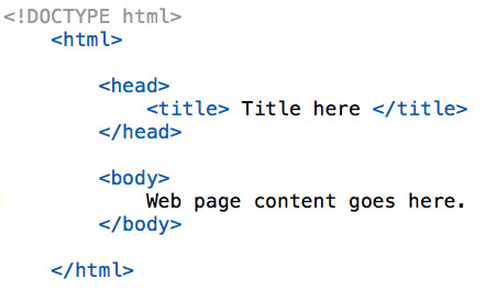
youtube
Headings:
<h1>
</h>
Nesting:
Placing one element inside another.
<u> <i> dolor </i> </u>
HTML Tags:
Bold vs. Strong
<b> </b> is just an aesthetic.
<strong> </strong> tells Google it’s more important text.
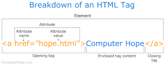
HTML Attributes and Values:
Provide additional information for a tag. These usually have a ‘value’.
<img src=“filename.jpg” alt=“image name”>
The src is an attribute and the value is the file name.
Every image should have an alt tag.

Links:
A hyperlink is a word, group of words or image that you can click on to jump to a new section.
<a href=“about.html”>About Us</a>
youtube
----------------------------
Linking HTML and CSS:
Provides styling to HTML elements. Both of these files need to be linked together.
<link rel=“stylesheet” href=“style.css”>

CSS Selectors: To customize HTML elements/tags in your website you need to ‘select’ it in the CSS and then apply a property/value to it.
youtube
What if I want one a different size? ID’s and Classes:
ID’s you can only use once, classes you can use as much as you want.
Designers Guide to CSS:
Div’s:
The DIV tag in HTML allows us to define a ‘division’ or ‘section’ in our website.
Box Model: This is done in CSS
Consists of margins, borders, padding and the actual content.
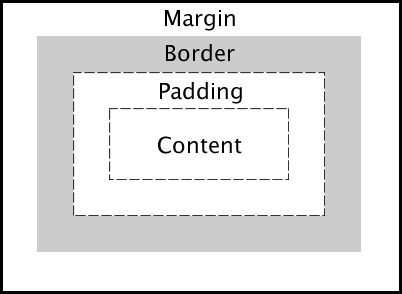
Adding Margins:
Adding Borders:
Floats:
Floats is a CSS positioning property. It allows you to sit elements horizontally/next to each other, which creates columns and your website layout.
Generally, you float left.
Pseudo Classes:
Creating links and special effects to some selectors. This most common applied is <a> this allows you to create a link in HTML and then apply a hover.
Border Radius: (CSS3)
By default, all elements have square corners, but with CSS3 you can make them rounded.
Vendor Prefix:
Prefixes or are a way for browsers to add support for new CSS features in an experimentation period. Incase they render out differently to what you wanted.
Lists:
Usually used for navigation.
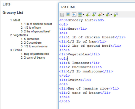
Unordered vs. Ordered Lists:
CSS List:
Whether to apply the CSS to the list or the list item.
Nav Tag (HTML 5)
<nav>
Navigation List Elements Go Here
(Add list and links here)
</Nav>
Grouping CSS:
Giving the same properties to a number of selectors without having to repeat them by separating the selectors by commas.
*Add image here*
CSS Shorthand:
Can be used to reduce the amount of code you type. Reducing the file size of the CSS file by having less code.
Positioning:
Absolute: positioned relative to the element it is inside of (parent). If no such element is found, it will be positioned to the browser edges.
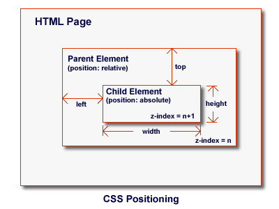
Fixed: An element with fixed position is positioned to the browser window, It will NOT move even if the window is scrolled.
Relative: Relative to its normal position. They can also contain absolute positioned elements.
Position Values: Once it has been set, you need to set where the element should sit on the page. To do this we have access to 4 properties.
Z-Index:
Specifies the stack order/layers.
CSS Transitons:
Transitions within elements in the HTML.
E.G. easing in and out/rotating.
If it is a one page website you need an anchor point.
<a href=“(Hashtag)projects>Projects</a>
<div id=“projects=>Project Content</a>
Sizing Images:
There are two ways to size an image depending on how much flexibility you need from your code.
Google Web Fonts:
fonts.google.com
Choose the typeface you want plus the different weight options you want.
Click+Button
Get Code.
NOTE: Web safe fonts need to be used as backups, there are 10 of these.
Have options and finish off with the original font you want.
See here for the list:
https://www.w3schools.com/cssref/css_websafe_fonts.asp
Centering Website:
You want to contain ALL of your code inside of a DIV.
Media Queries:
Part of the CSS3 spec and allow us to change stylesheets based on width and height.
The @media rule is used in media queries to apply different styles for different media types/devices.
Media queries can be used to check many things, such as:
width and height of the viewport
width and height of the device
orientation (is the tablet/phone in landscape or portrait mode?)
resolution
Using media queries are a popular technique for delivering a tailored style sheet (responsive web design) to desktops, laptops, tablets, and mobile phones.
You can also use media queries to specify that certain styles are only for printed documents or for screen readers (media type: print, screen, or speech).
In addition to media types, there are also media features. Media features provide more specific details to media queries, by allowing to test for a specific feature of the user agent or display device. For example, you can apply styles to only those screens that are greater, or smaller, than a certain width.
0 notes
Text
- ̗̀ THE ULTIMATE CODING MASTERLIST ̖́-
source: grunde.tumblr.com/coding
GENERATORS, WEBSITES & BLOGS:
khanacademy.org
w3schools.com
htmlgoodies.com
simplehtmlguide.com
codeschool.com
csstutorial.net
learn-js.org
htmlqueens
css-tricks.com
webtoasts.com
cssarrowplease.com
buildthemes
codeacademy.com
treehouse.com
htmldog.com
css3generator.com
cssreflex.com
programmr.com
freecodecamp.com
learneroo.com
tutorialspoint.com
css generators
stackoverflow.com
cssreference.io
tools roundup by ninpen
css triangle generator
more generators
idevie.com
amazing-jquery-plugins
bk-designs
braziliandesigner
htmluv
things-to-help-you
singlethemes
making-themes
imperidohtml
land-of-designs
havingthemes
ilovethemes
decodering
THE BASICS:
theme 101 series (7 parts) by octomoosey
masterlist of tutorials by octomoosey
how to make a theme series (5 parts) by lmthemes
how to create a custom HTML theme by tumblr
tutorial series (8 parts) by themesbyeris
ren’s guide to html/css tabs by transjeanluc
ren’s html and css crash course by transjeanluc
ren’s guide to theme making by transjeanluc (part 1, part 2, part 3)
html css crash course (5 parts) by transjeanluc
learn how to make awesome tumblr themes by dash
how to make your own tumblr theme using dreamweaver cs5 by lovely-tutorials
wtf is html and wtf is css by itsphotoshop
html guide by remondpsds
tumblr text html reference
theme making tips & tricks by riverbellthemes
POPUPS, DROP DOWNS & TABS:
how to: different styled popups by htmlqueens
customizing popups by htmlqueens
tutorial: popup menu by itsphotoshop
category tabs by agirlingrey
create a pure css tag content by webtoasts
simple drop-down box by manatopia
tutorial: all-in-one effect for themes and pages by neonbikethemes
popup box tutorial by raiidens
popup tutorial by agirlingrey
detailed popup tutorial by octomoosey
menu drop down by fukuo
popup tutorial by selenapastel
simple popup navigation tutorial by creatre
drop down menu by lifenofear
pop it menu by thehelpcenter
popup boxes by chcodes
popup links by acklesjpeg
popup tutorial by mearauders
responsive menu bar by fukuo
hide/show on click tutorial by limesthemes
reveal upon clicking by lmthemes
navbar with drop down menus by sorrynotsorrytho
FONTS:
hailthehelpful’s font page
galaxias-themes’ font page
custom font tutorial by lmthemes
css font styling by decodering
an alternative to font-awesome by octomoosey
how to use fonts by selenapastel
stroke icons by pixeden tutorial by bychloethemes
tutorial: svg icons by thme130trbl
custom fonts for themes using google fonts by monolids
how to use adobe edge web fonts by octomoosey
how to use custom fonts by nutty-themes
using icons from font awesome by azurethemes
how to use custom fonts by roxiestheme
TUTORIAL TAGS:
roxiesthemes (more)
acuite (masterpost)
amplamentethemes
cathms
aogthemes
heartedhtml
nutty-themes
odeysseus
tutorial-baby
sentimentalthemes
rabbithelps
emmortalsresources
quirkyresources (more)
shythemes
lmthemes (their tutorials + more)
CODING FOR IMAGES:
turn square images into teardrops or circles using css by octomoosey
how to make images black and white using css by octomoosey
fix overflowing images by excolo
grayscale css 101 for you tumblr theme by mirsexual
grayscale effect on photos by theamazingtutorials
how to have crisp 540px photos on blogs by shenchang
clipping images into text using css by nimbupani
webkit filter properties by etrothemes
polaroid photo effect using css by bk-designss
HOVERS, EFFECTS & ANIMATIONS:
blurry on hover by html-tutorials
un-blur on hover by html-tutorials
how to animate theme objects using keyframes by octomoosey
how to add a “sliding” background hover effect to your links by octomoosey
how to use isotope javascript filter by creatre
animated links by agirlingrey
how to make things appear on hover in tumblr themes by beatriceofrp
small effects by gyapo
hover caption tutorial by shythemes
circle hover menu by fukuo
how to make things move on click with javascript by themesbyzsu
sliding menu bar by fukuo
slide tutorial by themes-mandrakescry
hover caption tutorial by boromihrs
slide up tutorial by themes-mandrakescry
animatable by github
jquery click effect by primrosetylers
how to make permalinks (likes and reblogs) appear on hover by sarcasticthemes
how to move things on click with javascript by creatre
hover effects tutorial by misscapaldi
hover effects by roxiestheme
hover effect tutorial by aogthemes
how to do hover tags by sentimentalthemes
keyframes fade-in animation by enchantedthemes
3d text effect by lmthemes
a crash course in css3 transitions by buildthemes
hover notes by selenapastel
ren’s guide to hover codes by transjeanluc
tutorial: sliding viewer by acuite
transition delays guide by limesthemes
shake on hover effect by bk-designs
PDFS & EBOOKS (COURTESY OF ME):
css
css by tutorialspoint
html & css – design and build websites by jon duckett
html basics
html by tutorialspoint
html, xhtml and css all-in-one for dummies (2nd edition) by andy harris
html 4.0 by w3c
EVERYTHING ELSE:
learn to code – interactive online website masterpost by code-bug
semi transparent music player by nff-themes
how to enlarge sub/sup text in a theme by pohoro
how to add a tumblr like (heart) button to a theme by like-button
how to add a horizontal navigation bar to a theme by sleepymallows
simple css tool tip stuff by kloningspoon
how to style a quote by bk-designs
how to style a quote by ilovethemes
improve readability on themes by rabbithelps
make your tool tips look like speech bubbles by tutorials-baby
how to display related posts on tumblr themes by buildthemes
contained theme - css overflow by lmthemes
“pre” tag wrap quick tutorial by deanlirium
how to keep personal tagged posts from showing on your blog by hailthehelpful
how to make fancy borders around theme objects by octomoosey
how to change the colour of your audio players by elletricity
sticky notes tutorial by yukoki
how to change your dash header / icon without changing your description by remondpsds
how to get rid of the via and source tags on themes by blissrph
how to decorate your updates tab by burntsam
tool tip tutorial by remondpsds
post notes customization by htmluv
how to fix emojis on your blog by zacharyfury
un-nest tumblr captions by neothm
how to make a custom ask page by a-pocketful
creating drop down lists for customize page by sarahthemes
make shapes with css by idevie
imessage chat posts by animalites
basic tooltip tutorial by tutorial-baby
how to add a poll to your blog by lejolas
how to change the width of a post on a tumblr theme by armyofghosts
audio by selenapastel
tutorial: hover notes by remondpsds
how to display a loading before the page is fully loaded by fukuo
how to add text on the /ask page by magnusthemes
how to make a sticky element by sarahthemes
how to make a custom “not found” page on tumblr by fukuo
alternate tumblr controls by bychloethemes
tutorial: tooltips by acuite
changing a one columned theme into a grid theme by creatre
redirect your old tumblr links to your new url–the correct way by oddhour
how to hide posts from your blog depending on tags by bychloethemes
how to stylize the audio player by ettudis
how to add a moving affiliates section by octomoosey
making tumblr theme chats look like phone messages by buildthemes
custom “read more” by starious
jump pagination by excolo
chrome extensions for theme makers by acuite
how to make a search box by lmthemes
answer posts with portraits by excolo
how to change default selection colour by starious
start using css3 gradients in your themes by buildthemes
customizing your lists by etrothemes
tutorial: how to change the colour of tumblr’s new audio player by roxiestheme
tutorial: display certain item on your home page only by roxiestheme
17 notes
·
View notes
Text
how to add an affiliates section

two in a row -- gosh...
okay - under the cut you’ll find a little tutorial on how to add an affiliates section to your theme - then how to style it! i’ve included all of the code you’ll need -- to make something a bit like this;

read on...
his tutorial really depends on what theme you’re using and where you want to place your affiliates section. so some of the finer tuning of this tutorial will still be down to you...
anywhoo -
FIRST - you will need to add in some extra css sections and their corresponding html blocks. for my affiliates section, i tend to just add a set of portraits, ususlly with a little hover info for their name and a link to the blog ( which is essentially what i’m going to show you how to do! ).
the basic css;
#affiliates { text-align:center; margin-top:5px; margin-bottom:5px}
#affiliates img { width:20px; height:20px; padding:0px 3px 0px 3px;}
you can add in some positioning or margins to the first section if you want to position this somewhere specific on your page. change up the size ( width and height ) on the ‘img’ section if you want larger portraits! you can also add in extra code like a border or radius into the img section ( how to do that - here ) if you’d like round images instead of square ones. the ‘padding’ line just adds in a little space between the images, so change this to whatever you like!
the basic html;
we need to pop in the div reference to our css, then just add in the links and the images! here’s an example of how to do that -
<div id="affiliates">
<a href="URL OF THE BLOG HERE" title="NAME OF BLOG HERE"><img src="URL OF THE IMAGE OR ICON HERE"></a>
<a href="URL OF THE BLOG HERE" title="NAME OF BLOG HERE"><img src="URL OF THE IMAGE OR ICON HERE"></a>
<a href="URL OF THE BLOG HERE" title="NAME OF BLOG HERE"><img src="URL OF THE IMAGE OR ICON HERE"></a>
</div>
where you position this html section is up to you - you could pop it into your description or somewhere in your sidebar. if you’re putting it somewhere without a defined size ( which a description or sidebar probably already has ) you might need to add in a ‘width’ and/or a ‘height’ to the ‘affilliates’ css section along with some extra positioning depending on where you pop the code.
just add in as many as you like! this will display all of your affiliates in a row ( multiple rows if they overflow - how to add the scroll effect is below! )
if you want to make it do the scrolling thing, then you can use a darling ( and somewhat ancient ) piece of code called ‘marquee’ ( i don’t care if it’s old, i still like it XD )
just wrap this AROUND your affiliates html -
pop this before the <div id=“affiliates”>
<marquee behavior="alternate" scrollamount="3" onmouseover="this.stop();" onmouseout="this.start()">
you can change the ‘scrollamount’ value to speed up or slow down the effect. for more info on changing the effects of your ‘marquee’ - check these pages...
tutorialspoint
fillster
html.com
and remember to add another </div> after the html section!
113 notes
·
View notes
Text
Week 5 Reflection
This week was more HTML and CSS. There was an emphasis on making websites more dynamic and responsive using a bunch of different techniques such as mouse event effects and media queries. It was surprisingly difficult to fully grasp all of the features that I could have used to make my website look better. I made a simple drop down menu (which wasn’t that simple to implement!) and I made a media query that changes how my site looks if viewed on a device that is under 600px wide.
For the drop down, I had to create a div that contains a main button as well as every element that I wanted within the dropdown menu. The dropdown is hidden at first, but Iused mouse events to make it so the dropdown menu can appear. Mouse events like :hover, :active, and :focus can be used in CSS so that elements only utilize those CSS formatting rules whenever the user does a specific interaction with the element. I.e. :hover is only for when the mouse is hovering over an element, and focus is for when the element is currently focused on by tab navigation. I made it so that the dropdown shows itself whenever the main dropdown button is hovered over. The mouse events helped make my site more interactive and help me condense the information on my pages without sacrificing the flow of the site, so it’s a useful piece of knowledge to add to my repertoire.
Later in the week, I worked on making my website responsive. Responsive design is the process of making websites flexible for multiple different sizes and types of screens. I specifically focused on making my website more viewable for portrait-orientation mobile phones. When I was looking at my site with Nathan in class on Wednesday, we noticed that the text on my website was a bit too small when viewing it on mobile phones. So I made a media query that essentially expands the width of the elements when you are viewing it on mobile phones below 600px wide. I spent several hours working on getting the navigation bar to properly scale based on the size of the screen, but I’m overall happy with how it turned out.
I could write so much more, there was a LOT of information to take in this week. I imagine JavaScript is going to be just as much work, so here’s to hoping i can keep up.
0 notes
Text
7 Mobile-Friendly Navigation Best Practices
7 Mobile-Friendly Navigation Best Practices
7 Mobile-Friendly Navigation Best Practices was originally published on BruceClay.com, home of expert search engine optimization tips.
It’s now 2018, and we are officially living in a mobile-first world. In fact, Google has begun the switch to a mobile-first index — which means Google will rank your website based on your mobile content, relevance and UX.
Your mobile navigation (menus and internal links) contribute to all three.
Good mobile navigation makes it easy for people to find what they need, without bogging down page speed or cluttering the screen. It also needs to keep PageRank flowing to the important pages that you want to rank well in search.
Site navigations historically included everything on a site in huge, multi-tiered lists. On mobile, that approach doesn’t work. It looks cluttered. It requires scrolling. And it causes your visitors to bounce away.
Here I’ll lay out seven mobile-friendly navigation best practices that make life easier for people visiting your business site on a mobile device:
Keep mobile navigation short and sweet.
List the most important pages first.
Think of search as part of your navigation.
Make your navigation intuitive.
Be thoughtful about fonts and contrast.
Design for touch.
Design for the multi-screen mobile user.
Note: All of the mobile navigation tips mentioned in this article are equally applicable to separate mobile sites, responsive design sites, and sites that dynamically serve web pages. If you’re not sure what that means, or which mobile platform is best for you, read our Cheat Sheet for Mobile Design.
7 Mobile Navigation Best Practices for UX & SEO
1. Keep Mobile Navigation Short and Sweet
Many mobile phone screens are only 720 pixels wide in portrait mode.
Designing mobile navigation means designing for a small screen size. With limited real estate available, there’s no room for clutter. Get right to the point then cut the fat.
Ask yourself, what links need to be included to help your user complete priority tasks? What elements from the desktop navigation aren’t relevant in the mobile environment?
To save your user from decision paralysis, we recommend you limit your mobile navigation to four to eight items on the top level. Your mobile navigation menu is not the place to link to every page in your site.
To keep it short and sweet, you may even consider adding a top-of-page logo that navigates to the homepage and leaving the Home button out of your navigation all together (as on the BCI website, below).
Comparison of BCI’s desktop and mobile navigation
Some mobile navigations require multi-level navigation to aid user experience. This is more common with ecommerce websites. If you must go there, keep it as simple as possible. Don’t add more than one sublevel of dropdown functionality.
If your navigation must include more items, a vertically oriented navigation activated from a menu icon is the best option.
If your mobile user’s typical needs are very limited, consider using a static navigation that runs across the top of your design, like we see on the GameStop mobile site:
GameStop uses static navigation across the top of its mobile-friendly view.
A navigation that requires horizontal scrolling probably won’t be mobile-friendly. Some sites have the resources to design a sleek image-based carousel type of interface, such as what Google uses for certain search results. That might be an exception, but consider your audience.
2. List the Most Important Pages First
Your website users don’t have a lot of time — or patience. How can you help them get to the right place faster?
To design your mobile site navigation, first think about:
What are your most important pages?
What are the top category pages outlined in your siloing strategy?
What are the most common actions taken by site visitors using smartphones?
What pages of your website most effectively satisfy a mobile user’s needs?
The answers to these questions influence not just which items go in your main menu, but also which links and calls to action you should put on each page.
You’ll want to keep your main navigation menu consistent throughout the site. It should point to the top four to eight landing pages (such as main category pages).
A short-and-sweet mobile nav is a win-win for SEO and your users. It preserves the flow of link equity to your most important pages while also helping users get around.
Once users arrive on a page, contextual links can move them to wherever makes sense. These links can be added within the body content of each page in a comfortable way.
For instance, a long blog post may have multiple sections and thousands of words. Have mercy on your mobile users — don’t make them scroll to find what may be pertinent to them. Some ideas:
Show a TL;DR summary at the top of a long article. If readers want more detail, they’ll scroll down.
Give anchor links at the top that jump a reader to the different sections below (as I did at the top of this article).
Include useful calls to action and links to related pages within the body copy where they make sense.
The mobile navigation model I’m describing — a short, consistent main menu coupled with contextual links that vary per page — actually supports siloing better than the massive structured menus of old. A parent only links to its children, maintaining a clear hierarchy and intuitive flow. Internal links allow PageRank to flow to topically related pages naturally.
When it comes to mobile users, quicker is always better! It will take some work for you to make each page deliver the most appropriate navigation options. But you’ll improve user experience and no doubt your ROI by giving visitors a more direct path to what they need.
While we’re on the topic of “quicker,” remember that fast mobile pages make for a better user experience. Google announced that page load speed can factor into your Google search rankings, so a streamlined navigation helps with mobile SEO.
You can test your mobile page speed with Google’s mobile speed test (or use our SEOToolSet).
3. Think of Search as Part of Your Navigation
Mobile users look at search as navigation, and you should too.
Consider Amazon.com. On mobile, Amazon doesn’t even bother with the category dropdown (although it’s there under “Departments” if someone wants it). What’s prominent at the top of the mobile view is a simple “Search” box.
Even with its massive catalog, Amazon doesn’t expect users to navigate through menus to find what they need. Most of the time, customers just type in a product name and go directly to buy it.
The Search box is Amazon’s most mobile-friendly navigation option.
On mobile, your search box is often the most direct route to what a user needs.
Set it up and make sure it works well!
4. Make your Navigation Intuitive
Your customers work hard enough; navigating your site should not be work.
To make your navigation intuitive, menu language should always be written in a way that lets the user know what to expect. It should be clear what the item does if it’s a dropdown, and exactly where it goes if it’s a link.
If you are using symbols to convey information to your users, make sure they are clear, conventional symbols. For instance, if your menu items drop down, use an intuitive symbol like a plus sign (+) or an arrow (>) to let your users know a click will reveal more options.
Another best practice example would be using a magnifying glass to indicate a search feature.
If you are using a toggle menu, use three stacked lines — the icon highlighted in the example below — to help the user locate and access your main nav.
REI’s menu opens from a hamburger icon.
TIP: A hamburger-style menu icon like this often gets more clicks if it also has the word “menu” below it (according to A/B testing. If your design has room, you might test this to see if it makes your mobile site more intuitive and increases clicks/conversions.
The goal is for your mobile navigation to make life easier by limiting thinking, scrolling and clicking.
About Breadcrumbs in SERPs It’s worth noting that since 2015, Google has displayed URLs in its mobile search results differently than it does in desktop SERPs. The change replaces a web page’s URL with a description of the page’s location in a breadcrumbs-like format. If this doesn’t scream of the importance of siloing and clear hierarchy, nothing does!
Now, rather than showing a page URL, Google’s mobile search results display a breadcrumb path beneath each title.
For example, mobile search results for “history of Google” include a Wikipedia result showing how the URL appeared in the past versus the current breadcrumb style:
How Google’s mobile search result URLs have changed
TIP: You can control how your breadcrumb URLs appear if you add schema markup to the HTML on your pages. Refer to Schema.org’s breadcrumbs structured data for details and Google’s help file on breadcrumbs. (For more on this update and what it means, see our post Google’s New Mobile Breadcrumb URLs: Making the Most of Your Site Name & URL Structure.)
5. Be Thoughtful about Fonts and Contrast
Your website users shouldn’t have to zoom to read any of the text on your mobile website, including the text within your navigation.
Tiny text that requires zooming creates a bad user experience, and neither your website users nor Google or Bing like poor user experiences.
All of the text on your mobile site needs to be large enough to be read on a variety of devices without zooming. This principle needs to be a top priority that you consider as you build your mobile-friendly CSS (cascading style sheets) to control the appearance of text on various devices.
To make your navigation text easy to read, choose a font that naturally adds enough space to distinguish between letters and is tall enough to be clearly read in a menu.
Your font size and style also depend on your brand’s style guide and what fits your unique demographic. For instance, a young audience may not struggle with smaller or condensed fonts as much as an older demographic would. The way you handle formatting such as bullet styles, capitalization, margins, captioning, and so on should also reflect what’s attractive to your audience and comfortable for them to read.
Once you decide, set up your CSS and create a written style guide to keep your content consistent.
For designing the look of your mobile navigation, best practices can’t give you a one-size-fits-all recommendation. What’s important is that every word on your mobile site can be read easily without zooming. I recommend you perform user testing to see first-hand whether your font is tripping up users.
Also, make sure there’s sufficient contrast between your text and its background. WebAIM guidelines offer rules for color contrast (recommending a minimum ratio of 4.5 to 1). You can try their contrast checker tool to see how your text treatment measures up.
Google gives a few examples of what different contrast ratios look like:
Text needs contrast against the background for readability on a phone. (Per Google)
In addition, Google points out that “classic readability theory suggests that an ideal column should contain 70 to 80 characters per line (about 8 to 10 words in English). Thus, each time the width of a text block grows past about 10 words, consider adding a breakpoint.”
This tip applies to body text; consider a shorter maximum length for your menu options.
Not sure if your text is easy to read? Run your site through Google’s Mobile Friendly Test tool.
6. Design for Touch
Tablet and smartphone users rely on touchscreens to get them around websites. While a pointy mouse arrow allows users to precisely select items in tight spaces, the average finger requires a larger target to press. Many users don’t hit a touchscreen exactly where they are aiming.
Google recommends building mobile pages with a minimum touch target size of 48 pixels with a properly set viewport (more on that later). And touch targets should be spaced about 32 pixels apart, both horizontally and vertically.
Buttons and touch targets should be big enough to be mobile friendly. (Per Google)
Build navigation buttons with a target smaller than 40 pixels and your user experience plummets. Visitors end up sloppily navigating to the category above or below the one they want.
Don’t frustrate your users!
Since people are so bad at hitting their tap mark much of the time, it can also help to incorporate touch feedback into your navigation. Your feedback could be a color change, a blink of color, a font change or another visual cue.
Even if it’s subtle, this feedback can improve user experience by helping to reassure users that they’ve selected the right item. Take a look at the example below from Search Engine Land:
Color changes show which menu item is touched on SearchEngineLand.com.
If you are using multi-tier navigation, it’s also important that you make sure your dropdowns are activated by touch — not mouse over. Clearly, hover navigations work just fine in the desktop experience, where hovering is a possibility, but they leave mobile users stuck.
Another touch-friendly option is to design a supplementary navigation that uses images and exaggerated graphic buttons. This type of navigation can be a great homepage asset that gets your visitor headed in the right direction quickly.
Vintage clothing site RustyZipper.com uses large graphic “button” with text labels for mobile-friendly navigation.
It’s important to note that graphic buttons like these should only be a supplemental option used alongside a toggle navigation or a static top navigation. You need to have a consistent navigation that the user can access at the top of every page.
While you may be able to include this graphic navigation at the bottom of your mobile pages, it’s not optimal or practical to use these big graphic buttons as your primary navigation. And always consider the load-time performance impact of images and buttons.
Be Careful with Popups You also want to avoid intrusive interstitials — those popups that monopolize the screen when a visitor clicks through from a search result. In January 2017, Google rolled out an intrusive interstitial penalty for mobile search.
Per Google, “Since screen real-estate on mobile devices is limited, any interstitial negatively impacts the user’s experience.”
Example of an intrusive interstitial popup (credit: Google)
Be careful to use interactive forms and popups courteously. Some best practices for these include:
Apply a delay or time interval between views so you don’t annoy your visitors.
Reduce the amount of screen space your element covers.
Try a bar or box that scrolls in from the bottom or side.
Avoid covering the middle of the mobile screen or obstructing your navigation elements at the top.
Let no be no. If a user closes a form, don’t display it again within a reasonable period of time (perhaps a week later).
7. Design for the Multi-Screen Mobile User
Chances are good that interested website visitors come to your website using multiple devices over a short period of time.
To help them feel confident they’re in the right place, it’s smart to give your mobile and desktop sites a consistent visual theme.
Your mobile and desktop navigation, however, do not have to be — and sometimes should not be — identical twins.
While the colors, fonts and themes you use for your mobile and desktop navigation need to be consistent to reinforce your branding, the similarity may end there.
Your mobile navigation needs to help users navigate around your website and accomplish tasks. Consider the content your smartphone users need and the tasks they are looking to accomplish, and then build your mobile navigation specifically for a smartphone user.
What mobile-specific calls to action need to be built into your navigation to aid user experience?
Does it make sense to include a “Call” button or a store locator?
Can a..
http://ift.tt/2xdM0IH
0 notes
Text
7 Mobile-Friendly Navigation Best Practices
7 Mobile-Friendly Navigation Best Practices was originally published on BruceClay.com, home of expert search engine optimization tips.
It’s now 2018, and we are officially living in a mobile-first world. In fact, Google has begun the switch to a mobile-first index — which means Google will rank your website based on your mobile content, relevance and UX.
Your mobile navigation (menus and internal links) contribute to all three.
Good mobile navigation makes it easy for people to find what they need, without bogging down page speed or cluttering the screen. It also needs to keep PageRank flowing to the important pages that you want to rank well in search.
Site navigations historically included everything on a site in huge, multi-tiered lists. On mobile, that approach doesn’t work. It looks cluttered. It requires scrolling. And it causes your visitors to bounce away.
Here I’ll lay out seven mobile-friendly navigation best practices that make life easier for people visiting your business site on a mobile device:
Keep mobile navigation short and sweet.
List the most important pages first.
Think of search as part of your navigation.
Make your navigation intuitive.
Be thoughtful about fonts and contrast.
Design for touch.
Design for the multi-screen mobile user.
Note: All of the mobile navigation tips mentioned in this article are equally applicable to separate mobile sites, responsive design sites, and sites that dynamically serve web pages. If you’re not sure what that means, or which mobile platform is best for you, read our Cheat Sheet for Mobile Design.
7 Mobile Navigation Best Practices for UX & SEO
1. Keep Mobile Navigation Short and Sweet
Many mobile phone screens are only 720 pixels wide in portrait mode.
Designing mobile navigation means designing for a small screen size. With limited real estate available, there’s no room for clutter. Get right to the point then cut the fat.
Ask yourself, what links need to be included to help your user complete priority tasks? What elements from the desktop navigation aren’t relevant in the mobile environment?
To save your user from decision paralysis, we recommend you limit your mobile navigation to four to eight items on the top level. Your mobile navigation menu is not the place to link to every page in your site.
To keep it short and sweet, you may even consider adding a top-of-page logo that navigates to the homepage and leaving the Home button out of your navigation all together (as on the BCI website, below).
Comparison of BCI’s desktop and mobile navigation
Some mobile navigations require multi-level navigation to aid user experience. This is more common with ecommerce websites. If you must go there, keep it as simple as possible. Don’t add more than one sublevel of dropdown functionality.
If your navigation must include more items, a vertically oriented navigation activated from a menu icon is the best option.
If your mobile user’s typical needs are very limited, consider using a static navigation that runs across the top of your design, like we see on the GameStop mobile site:
GameStop uses static navigation across the top of its mobile-friendly view.
A navigation that requires horizontal scrolling probably won’t be mobile-friendly. Some sites have the resources to design a sleek image-based carousel type of interface, such as what Google uses for certain search results. That might be an exception, but consider your audience.
2. List the Most Important Pages First
Your website users don’t have a lot of time — or patience. How can you help them get to the right place faster?
To design your mobile site navigation, first think about:
What are your most important pages?
What are the top category pages outlined in your siloing strategy?
What are the most common actions taken by site visitors using smartphones?
What pages of your website most effectively satisfy a mobile user’s needs?
The answers to these questions influence not just which items go in your main menu, but also which links and calls to action you should put on each page.
You’ll want to keep your main navigation menu consistent throughout the site. It should point to the top four to eight landing pages (such as main category pages).
A short-and-sweet mobile nav is a win-win for SEO and your users. It preserves the flow of link equity to your most important pages while also helping users get around.
Once users arrive on a page, contextual links can move them to wherever makes sense. These links can be added within the body content of each page in a comfortable way.
For instance, a long blog post may have multiple sections and thousands of words. Have mercy on your mobile users — don’t make them scroll to find what may be pertinent to them. Some ideas:
Show a TL;DR summary at the top of a long article. If readers want more detail, they’ll scroll down.
Give anchor links at the top that jump a reader to the different sections below (as I did at the top of this article).
Include useful calls to action and links to related pages within the body copy where they make sense.
The mobile navigation model I’m describing — a short, consistent main menu coupled with contextual links that vary per page — actually supports siloing better than the massive structured menus of old. A parent only links to its children, maintaining a clear hierarchy and intuitive flow. Internal links allow PageRank to flow to topically related pages naturally.
When it comes to mobile users, quicker is always better! It will take some work for you to make each page deliver the most appropriate navigation options. But you’ll improve user experience and no doubt your ROI by giving visitors a more direct path to what they need.
While we’re on the topic of “quicker,” remember that fast mobile pages make for a better user experience. Google announced that page load speed can factor into your Google search rankings, so a streamlined navigation helps with mobile SEO.
You can test your mobile page speed with Google’s mobile speed test (or use our SEOToolSet).
3. Think of Search as Part of Your Navigation
Mobile users look at search as navigation, and you should too.
Consider Amazon.com. On mobile, Amazon doesn’t even bother with the category dropdown (although it’s there under “Departments” if someone wants it). What’s prominent at the top of the mobile view is a simple “Search” box.
Even with its massive catalog, Amazon doesn’t expect users to navigate through menus to find what they need. Most of the time, customers just type in a product name and go directly to buy it.
The Search box is Amazon’s most mobile-friendly navigation option.
On mobile, your search box is often the most direct route to what a user needs.
Set it up and make sure it works well!
4. Make your Navigation Intuitive
Your customers work hard enough; navigating your site should not be work.
To make your navigation intuitive, menu language should always be written in a way that lets the user know what to expect. It should be clear what the item does if it’s a dropdown, and exactly where it goes if it’s a link.
If you are using symbols to convey information to your users, make sure they are clear, conventional symbols. For instance, if your menu items drop down, use an intuitive symbol like a plus sign (+) or an arrow (>) to let your users know a click will reveal more options.
Another best practice example would be using a magnifying glass to indicate a search feature.
If you are using a toggle menu, use three stacked lines — the icon highlighted in the example below — to help the user locate and access your main nav.
REI’s menu opens from a hamburger icon.
TIP: A hamburger-style menu icon like this often gets more clicks if it also has the word “menu” below it (according to A/B testing. If your design has room, you might test this to see if it makes your mobile site more intuitive and increases clicks/conversions.
The goal is for your mobile navigation to make life easier by limiting thinking, scrolling and clicking.
About Breadcrumbs in SERPs It’s worth noting that since 2015, Google has displayed URLs in its mobile search results differently than it does in desktop SERPs. The change replaces a web page’s URL with a description of the page’s location in a breadcrumbs-like format. If this doesn’t scream of the importance of siloing and clear hierarchy, nothing does!
Now, rather than showing a page URL, Google’s mobile search results display a breadcrumb path beneath each title.
For example, mobile search results for “history of Google” include a Wikipedia result showing how the URL appeared in the past versus the current breadcrumb style:
How Google’s mobile search result URLs have changed
TIP: You can control how your breadcrumb URLs appear if you add schema markup to the HTML on your pages. Refer to Schema.org’s breadcrumbs structured data for details and Google’s help file on breadcrumbs. (For more on this update and what it means, see our post Google’s New Mobile Breadcrumb URLs: Making the Most of Your Site Name & URL Structure.)
5. Be Thoughtful about Fonts and Contrast
Your website users shouldn’t have to zoom to read any of the text on your mobile website, including the text within your navigation.
Tiny text that requires zooming creates a bad user experience, and neither your website users nor Google or Bing like poor user experiences.
All of the text on your mobile site needs to be large enough to be read on a variety of devices without zooming. This principle needs to be a top priority that you consider as you build your mobile-friendly CSS (cascading style sheets) to control the appearance of text on various devices.
To make your navigation text easy to read, choose a font that naturally adds enough space to distinguish between letters and is tall enough to be clearly read in a menu.
Your font size and style also depend on your brand’s style guide and what fits your unique demographic. For instance, a young audience may not struggle with smaller or condensed fonts as much as an older demographic would. The way you handle formatting such as bullet styles, capitalization, margins, captioning, and so on should also reflect what’s attractive to your audience and comfortable for them to read.
Once you decide, set up your CSS and create a written style guide to keep your content consistent.
For designing the look of your mobile navigation, best practices can’t give you a one-size-fits-all recommendation. What’s important is that every word on your mobile site can be read easily without zooming. I recommend you perform user testing to see first-hand whether your font is tripping up users.
Also, make sure there’s sufficient contrast between your text and its background. WebAIM guidelines offer rules for color contrast (recommending a minimum ratio of 4.5 to 1). You can try their contrast checker tool to see how your text treatment measures up.
Google gives a few examples of what different contrast ratios look like:
Text needs contrast against the background for readability on a phone. (Per Google)
In addition, Google points out that “classic readability theory suggests that an ideal column should contain 70 to 80 characters per line (about 8 to 10 words in English). Thus, each time the width of a text block grows past about 10 words, consider adding a breakpoint.”
This tip applies to body text; consider a shorter maximum length for your menu options.
Not sure if your text is easy to read? Run your site through Google’s Mobile Friendly Test tool.
6. Design for Touch
Tablet and smartphone users rely on touchscreens to get them around websites. While a pointy mouse arrow allows users to precisely select items in tight spaces, the average finger requires a larger target to press. Many users don’t hit a touchscreen exactly where they are aiming.
Google recommends building mobile pages with a minimum touch target size of 48 pixels with a properly set viewport (more on that later). And touch targets should be spaced about 32 pixels apart, both horizontally and vertically.
Buttons and touch targets should be big enough to be mobile friendly. (Per Google)
Build navigation buttons with a target smaller than 40 pixels and your user experience plummets. Visitors end up sloppily navigating to the category above or below the one they want.
Don’t frustrate your users!
Since people are so bad at hitting their tap mark much of the time, it can also help to incorporate touch feedback into your navigation. Your feedback could be a color change, a blink of color, a font change or another visual cue.
Even if it’s subtle, this feedback can improve user experience by helping to reassure users that they’ve selected the right item. Take a look at the example below from Search Engine Land:
Color changes show which menu item is touched on SearchEngineLand.com.
If you are using multi-tier navigation, it’s also important that you make sure your dropdowns are activated by touch — not mouse over. Clearly, hover navigations work just fine in the desktop experience, where hovering is a possibility, but they leave mobile users stuck.
Another touch-friendly option is to design a supplementary navigation that uses images and exaggerated graphic buttons. This type of navigation can be a great homepage asset that gets your visitor headed in the right direction quickly.
Vintage clothing site RustyZipper.com uses large graphic “button” with text labels for mobile-friendly navigation.
It’s important to note that graphic buttons like these should only be a supplemental option used alongside a toggle navigation or a static top navigation. You need to have a consistent navigation that the user can access at the top of every page.
While you may be able to include this graphic navigation at the bottom of your mobile pages, it’s not optimal or practical to use these big graphic buttons as your primary navigation. And always consider the load-time performance impact of images and buttons.
Be Careful with Popups You also want to avoid intrusive interstitials — those popups that monopolize the screen when a visitor clicks through from a search result. In January 2017, Google rolled out an intrusive interstitial penalty for mobile search.
Per Google, “Since screen real-estate on mobile devices is limited, any interstitial negatively impacts the user’s experience.”
Example of an intrusive interstitial popup (credit: Google)
Be careful to use interactive forms and popups courteously. Some best practices for these include:
Apply a delay or time interval between views so you don’t annoy your visitors.
Reduce the amount of screen space your element covers.
Try a bar or box that scrolls in from the bottom or side.
Avoid covering the middle of the mobile screen or obstructing your navigation elements at the top.
Let no be no. If a user closes a form, don’t display it again within a reasonable period of time (perhaps a week later).
7. Design for the Multi-Screen Mobile User
Chances are good that interested website visitors come to your website using multiple devices over a short period of time.
To help them feel confident they’re in the right place, it’s smart to give your mobile and desktop sites a consistent visual theme.
Your mobile and desktop navigation, however, do not have to be — and sometimes should not be — identical twins.
While the colors, fonts and themes you use for your mobile and desktop navigation need to be consistent to reinforce your branding, the similarity may end there.
Your mobile navigation needs to help users navigate around your website and accomplish tasks. Consider the content your smartphone users need and the tasks they are looking to accomplish, and then build your mobile navigation specifically for a smartphone user.
What mobile-specific calls to action need to be built into your navigation to aid user experience?
Does it make sense to include a “Call” button or a store locator?
Can a..
http://ift.tt/2xdM0IH
0 notes