#css portrait tutorial
Explore tagged Tumblr posts
Visit Tumblr Blog
Explore Tumblr blogs with no restrictions, modern design and the best experience.
Last Seen Tumblr Blogs


Fun Fact
In 2020, 44% of users from Denmark used Tumblr daily.
Text

CSS Portrait Image Effect
#css portrait image effect#css effects#pure css effects#html css#codenewbies#frontenddevelopment#css#html5 css3#latest css effects#css tricks#html css tutorial#css filter
1 note
·
View note
Text
Limbus Company Wiki Style for AO3
Note: This post contains spoilers (... can I call it that?) for Glimpsing a Certain Mirror World.
While I was writing this story, I wrote some in-game dialogue for an identity based on the text just to get into the spirit of what I was trying to capture.
Then I thought - what if I shared that in a bonus chapter, just for fun?
Then I thought even more that it kind of looked like an imaginary wiki page.
Then I had Carmen help me present a wiki page from another reality.
Seems like readers got as much of a kick out of it as I did writing it!
Now I'll show you how to style an AO3 page to look a little bit like the wonderful Limbus Company Wiki, too!
If a CSS and HTML snippet demonstration is all you need, grab them here:
🔗HTML (Inside your story)
🔗CSS (Inside a Work Skin, made on your dashboard)
Next, I'll go over everything step by step from the beginning.
Jump into the cut for the tutorial!
(Then show me your fan identity stories when you make some, okay?)
Step 1: Create a Work Skin
After logging in, go to your Dashboard.
Then click Skins
Then go to My Work Skins
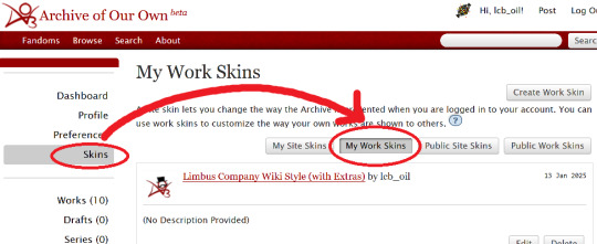
Click Create Work Skin
Give it any name and description you like
Paste the following into the CSS text area:
🔗Pastebin Link for easy copy / paste
#workskin td, #workskin th { padding: 5px; border: 1px solid #810000; } #workskin td { color: white; background-color: #1e1e1e; vertical-align: middle; } #workskin td.title-column { width: 20%; text-align: center; } #workskin div.affiliation { font-size: small; } #workskin .userstuff p.carmen { color: red; }
I will explain what this means when we get to the next step so that you can tweak it if you wish. Think of this as your starter style.
Click Submit to save your skin
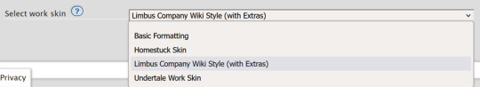
Step 2: Apply the Skin to Your Work
When creating or editing a work, you can set the work skin in the Associations section.
Click the dropdown, and you'll see whatever name you gave your work skin in the first step mixed in with the default ones provided by AO3.
Step 3: Format Your Story
You'll need to add HTML to your story to see any of the new styles applied.
I'll show you a few examples of how this is done.
Change the color of text
I used red text to indicate Carmen speaking through the author's note.
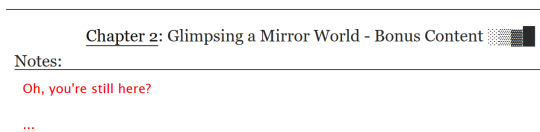
Here is the HTML I used in the Chapter Notes section to do this:
<p class="carmen">Could it be that you, too, wish to glimpse the mirror world these two envisioned?</p>
This creates a paragraph (p) with the carmen class applied.
If we look at the CSS from up above:
#workskin .userstuff p.carmen { color: red; }
The p.carmen section is called the selector. This tells the CSS that if there's a paragraph with the class of carmen, make it red!
You can copy this line to create classes with any name you wish for paragraphs so that you can have as many colors and effects at your disposal as you want.
Of course you can change the color from red to any other color you need, too.
Wiki Tables
This next part is a little bit more involved. I'm not sure if there's a better way to make a table on AO3 or not, but here's a snippet to get you started:
🔗Pastebin Link for easy copy / paste
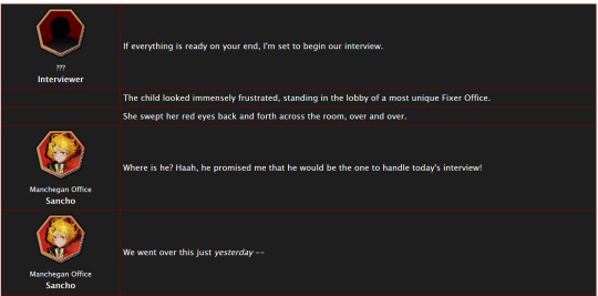
<table> <tbody> <tr> <td class="title-column"> </td> <td> The child looked immensely frustrated, standing in the lobby of a most unique Fixer Office. </td> </tr> <tr> <td class="title-column"> <img src="your image URL here" alt="Sancho Story Portrait"> <div class="affiliation">Manchegan Office</div> <b>Sancho</b> </td> <td> We went over this just <em>yesterday</em> -- </td> </tr> </tbody> </table>
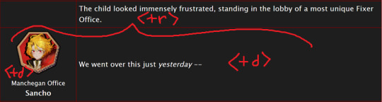
This creates a table (<table>) with two table rows (<tr>).
Each table row has two table cells (<td>).
The first cell in each row has the character image, affiliation, and name.
The class "affiliation" is defined in the style sheet to make that section of text just a bit smaller, like on the wiki:
#workskin div.affiliation { font-size: small; }
In the first example table row (<tr>) above, you can see that you can even leave it blank to allow for the narration portions of the story.
You'll need to copy the section between the <tr> and </tr> tags to create new rows for your table. Copy it once per line in your identity story and change the text and images inside as needed.
I highly suggest that you do this in a text editor on your own computer rather than on AO3, because it can quickly get overwhelming.

Just looking at this in AO3 is making me nervous 💦
(Fun side note, I originally spelled "Manchegan" incorrectly in my first draft all over that huge table... thank goodness for find and replace...)
Hosting Images
You'll see I left a section on the table template for "your image URL here".
You'll have to find a place to host your images on your own, because AO3 doesn't provide any image hosting...
I saw someone suggested https://imgbb.com/, so that's what I used. It seems to have held up so far.
Keep in mind if you link an image from Discord or Imgur, they could remove your image sometime in the future and then it will no longer appear properly in your story.
(Be sure to include an alt text in the image as shown - if the image can't be loaded some day in the future users will see that text instead so that they can understand what they're missing!)
Step 4: Adjust Away!
Once your work skin is applied and you have the right HTML classes in place, you can edit your Work Skin and see your story change, even if it is in your drafts.
You can use this to adjust other things in my CSS example, like colors and the padding in the table.
---
Have fun, and let me know if you have any questions!
“Would you care for some tea?” Yi Sang offered. The evening’s chill was somehow present, even inside his closed room. “Nay,” Don Quixote took in a sharp breath, “I was hoping that you might… assist me, with a look into thy mirror. For there is something that I have need to see.” Yi Sang creased his eyebrows. Unfortunately, this was exactly what he worried would occur. ——— In the aftermath of La Manchaland, Don Quixote asks Yi Sang for a favor. Yi Sang guides her through the process of glimpsing a certain mirror world.
Limbus Company leaves so much unsaid by not showing us what happens immediately after the end of a canto. But, that's a lot of opportunity space to play with in a story.
I've been working on this one for quite some time as I've always wanted to explore the dynamic between Don Quixote and Yi Sang, even though I find Yi Sang really tough to write for.
If you like mirror worlds and AUs, you might especially enjoy this one. I hope you like it! 🎠🪶
---
... Also, hmm, something strange seems to have happened with my upload?
This is a one shot story, but for some reason there's a second chapter? That's odd.
Well, if you check it out, I should note that it might look better on a PC or tablet than on a mobile phone -- though it will probably look ok either way.
#limbus company#lcb-oil-table-talk#tutorial#ao3#canto 7 spoilers#canto vii spoilers#I'm honestly surprised that Tumblr doesn't have support for code blocks#That's a little disappointing
47 notes
·
View notes
Text
CSS Graphic Media | clipping path vs Photo Retouching Services | Professional Photo Editing Service |
Photoshop: This is a website that offers various photo editing and retouching services for different types of photos, such as portraits, weddings, products, jewelry, and more. They also have examples, pricing, and a blog with tips and tutorials.
You can try their service for free or get a quote for your project
#photoretouching#photo restoration#photoediting#clipping path#image masking#product photography#ecommerce#wedding photo editing services#photo making
1 note
·
View note
Text
How To Make Text Portrait Effects Using CSS
How To Make Text Portrait Effects Using CSS
In this article, we will learn how to create a text image portrait using CSS in a few simple steps. If you want to know, keep reading this article. We have listed all the steps you need to take. So let’s start designing a text image. Here are the some simple steps yo make text portrait. Create an HTML document with the text “Welcome to KrTricks.in”, to duplicate a word, using the JavaScript…

View On WordPress
#cool css text effects#css#css effects#css portrait#css portrait tutorial#css style portrait#css text effects#css text portrait#css text portrait effect#css typeface portrait#how to create a typographic portrait in html css#how to make text portrait effect using html and css#latest css effect#pano gawin ang css portrait effect#portrait effect#pure css text portrait#pure css text portrait effects#text portrait effect#text portrait effect css
0 notes
Photo

css3 image to portrait
#CSS tutorial for beginners#basic html css tutorial#image to portrait#CSS Tricks#css tutorial#css3#css#html css#divinector
0 notes
Text
New AO3 Script / Screenplay Tutorial
Some time back I posted a tutorial for how to format CSS and HTML for a screenplay on AO3, but since then I have improved upon it and I wish to now share with you all the (hopefully somewhat better) new version.
I previously had a significant problem with the spacing of certain elements, which would end up breaking the formatting. So recently I spent two days studying and trying code after code until I got it right.
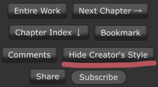
Note that though this formatting makes the screenplay look authentic enough on a computer monitor or on mobile in landscape mode, it does not (in my experience) tend to show up well in portrait mode. This version is at least readable in portrait mode, however, whereas the old version was not. Still, you might like to make an author’s note mentioning that readers in portrait mode may need to use the “hide creator’s style” button, which will take away the formatting:
Okay, let's get to work! First you are going to have to create a new AO3 work skin. Name it whatever you like, then insert this code:
#workskin p { font-family: "Courier Prime", Courier, monospace; text-align: justify; text-justify: inter-word; }
#workskin p { margin-left: 5%; }
#workskin p { margin-right: 15%; }
#workskin .indented { padding-left: 15%; padding-right: 25%; text-align: justify; text-justify: inter-word; }
#workskin .par { display: block; padding-left: 15%; padding-right: 25%; }
#workskin .character { display: block; padding-left: 25%; }
You can adjust things like the margin and padding percentages to fit your own style, of course!
Now comes the fun part. After you have written your script, make a new draft using your screenplay skin. Then get onto the HTML editor.
The SHOT, SCENE HEADING, and ACTION elements will be left alone. The only tagging necessary for them is < p > (close up the < and >, of course... Tumblr is giving me a hard time about showing it as it really should be) for paragraph transitions. But do be sure to use the < p > tag, or it will break the formatting.
Next are the CHARACTER, PARENTHETICAL, and DIALOGUE elements... which are a bit more involved.
Before blocks of character/parenthetical/dialogue, you need to put the following tag (with closed up < & >): < div class="indented" align="left" > . Note that if there is more than one Character involved with no action breaks in between (in other words, if there is a conversation going on), you do not need to put the tag between each character, just before the first one. Like so:
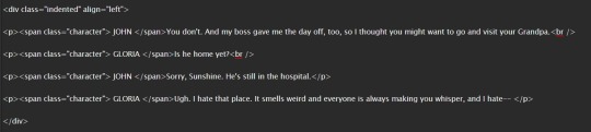
And be sure to close it back up after the blocks of conversation with < /div >
Next up is CHARACTER, which, as you can see above, is tagged: < p >< span class="character" > CHARACTER NAME< /span >
Notice that there are no line breaks between the < /span > and the dialogue. Due to the nature of < span > if you try to put a line break in there it will turn it into a paragraph break, which doesn't work well for the screenwriting thing. I am sure there is a workaround, but that's what I got for the time being!
Now we come to PARENTHETICALS, which are the bits of action within dialogue:
To tag those, once again do not make a line break, but simply insert this: < span class="par" > then close it after inserting the parenthetical with < /span >
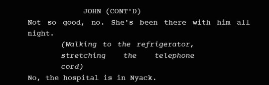
It might be easier to simply visualize, but note that as a personal preference I tend to italicize my parenthetical elements with < em >... you don't have to, that's just my style:

And that is basically it! If you would rather just look at the code than to try and figure out what I was trying to explain (I am not sure I did a good job of that!), here is a basic visual:
This:

Should get you this:
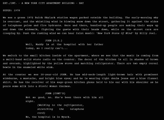
Or something similar, anyway. It may vary on your screen. If you would like to see a live example of how it will look on your monitor or with your device, you can click below to get to a small fic I have formatted this way (it isn't the story sampled above, however, since that is a WIP I have not posted anywhere yet!)
If I have made any mistakes or anything is in need of clarification, let me know! I will do my best to fix it!
#ao3#fanfic#ao3 tutorial#tutorial#writing#writeblr#screenplays#screenplay format#screenplay tutorial
37 notes
·
View notes
Text
Happy New Year!!
Wishing you all the best as 2022 begins💜
As many other writers have done today, I decided to summarize a bit of what I've done this year and share some of my feelings/thoughts about moving forward.
TLDR: Thank you. You're all lovely. I've got big plans for the new year and feel like I've accomplished a solid amount. I also feel like I'm in a good headspace for the first time in a long time and that's mostly thanks to you all. So, thank you! Here's to a better year!
Full summary, plans, and thoughts under the cut!
So, I found the IF community in early October (see here and here) and since then:
I've written over 42,000 words of Hades' Kitchen material (about 75% is the demo, the rest is research and notes, etc.)
I've written and released Hades' Guide (currently just under 30,000 words), which was a truly terrifying experience since it was the first big writing project I've published
I've grown very comfortable with Twine and learned basic JavaScript and CSS (click here for some insight into how I did that; answer: weirdly)
I made progress on two of my other projects (The "Secret IF" and The Summit)
I've written 288 (now 289) Tumblr posts and recently went through and reorganized, reviewed, and revised all of them (here are some of my personal favorites)
I've written several short stories, many of which shall be released in January (find the released ones here, here, and here)
Made some pinterest boards, picrews, aesthetics, and a kinda weird combined Spotify playlist for the characters (don't worry, individual ones are coming)
Some other more personal accomplishments:
I realized I'm genderfluid (x)
I started therapy
I made some new friends
I finished my semester with high marks
Now here are some of my goals for 2022:
and for once, I'm gonna try to make them "realistic"
Publish the demo for Hades' Kitchen
Publish the demo for Zorlok (aka The Secret IF)
Finish Hades' Guide
Publish a tutorial template (and maybe a style template) for Sugarcube
Participate in Interact-if's game jam, though I'm undecided if I'll do the ranked or unranked jam (Or both? No, remember, Albie, realistic!)
UPDATE: I'm competing in the ranked jam, to learn more about the game or follow it's development, check out the Mousetrap blog!
Release the remaining short stories
Commission an artist to make cast portraits (I have low hopes that I'll do them well myself 😅)
Be kinder to myself and try not to despair and spiral quite so much
I don't think you need me to tell you that 2021 was a really shit year (if you do, wow, I have terrible news...). There were stretches of time that I really struggled to get through, where my depression, anxiety, and/or apathy felt overwhelming and all-consuming. But in spite of all that - and despite everything that was 2021 - for the first time in a long time I feel like I'm leaving this year in a better mental position than I was entering it, and I honestly owe a lot of that to you.
Discovering the IF community has drastically improved my mental health/quality of life and I genuinely don't know how to convey just how thankful I am for that. I feel so lucky. Everyone I've interacted with on here has been so lovely and kind and I never would have dreamed that there'd be so much support for my creative projects. Thank you (yes, I know I'm a broken record at this point, but my gratitude cannot and will not be stopped). I look forward to creating more content for and with you, seeing everyone's incredible work, and getting to know even more people.
So, here's to a new year!! (I think it's our turn to kick its ass 😁)
#happy new year!#thank you#hk demo#hades kitchen#zorlok demo#zorlok#the secret if#hades guide#review#update#albie's corner
27 notes
·
View notes
Photo


minimal themes / basecodes...
as i released my original basecode 4 years ago ( !!! ) i thought i’d publish updated ( and slightly tidier ) versions. all sections in the code are labelled for ease of editing - no further instructions are included in the code, but for help with editing, please see my theme 101 tutorials & other coding tutorials.
these codes are very basic but are fully functional themes in their own right. they are html and css based codes ( with the exception of the tooltips script ). there are also examples of ‘calc’ functions and ‘if’ options in the themes as well as different post block sizes.
they’re also pretty much where i start when i make my own themes ♥
all codes feature:
metatags to change colours/font size etc.
user portrait
3 extra links
optional show/hide tags
optional show/hide captions
post width options for 400px or 500px
includes tooltips script
includes linearicons
theme 1 / base code 1 - a simple centered theme with sidebar: preview + code
theme 2 / base code 2 - a simple centered theme with header: preview + code
theme 3 / base code 3 - a simple centered container theme with sidebar: preview + code
terms of use:
if you alter the themes for either ( free ) public release or personal use and would like to include your own credit, feel free to change the bottom credit url. if using the theme 'as is' or with minimal changes, then please leave this credit in tact. credit at the top of the code will not be visible but must remain in all public/personal themes. please do not repost unedited as your own theme/base code. please reblog or like this post if using!
if you’d like to tag me in any creations please do, i’d love to see how the codes are used! thank you and enjoy!
2K notes
·
View notes
Note
Who is Xingqiu? And share more about the Nitrogen theme by xuethms please!!
Xingqiu (Chinese: 行秋 Xíngqiū, “Progression of Autumn”) is a playable Hydro character in Genshin Impact. He is the second son of the Guild Manager of the Feiyun Commerce Guild, an influential group in Liyue, and is also a self-proclaimed practitioner of the Guhua Clan’s arts. (text from the Genshin Impact Wiki)
The lovely art in this preview is by emeldraws (header, sidebar).
About Nitrogen
This is the theme where I finally learned how to use the position: sticky css attribute! So you can see how I went kinda wild applying it to the sidebar, header, and post source portraits. I also learnt how to use annasthms’ customaudio.js, I feel like I upgraded a lot hehe.
Only up to 6 custom links, view this tutorial to learn how to add them.
For full list of theme features, read my about page.
4 notes
·
View notes
Text
Responsive Design App Mac

Noun Project
Design App For Mac
Responsive Web Design App Mac
Responsive Design App Mac Desktop
Seashore is an open source image editor that utilizes the Mac OS X’s Cocoa Framework. Responsive design, react native, web dev, mobile app development, tutorial Published at DZone with permission of Gilad David Maayan. See the original article here. Oct 04, 2017 Responsive design support — allowing you to display the same pages differently on devices with different-sized screens — was rudimentary at best; you can swap between desktop and tablet versions, but if you've finished creating one layout, you'll have to start all over from a blank page to create the other.

The Noun Project is the perfect resource for designers that need generic UI/UX icons. They host an enormous collection of well-designed icons for everyday needs, like status icons, media buttons and menu icons. Their macOS app lives in your menu bar, ready to pop down and provide access to the huge array of icons from your desktop. If you pair it with a paid subscription to the Noun Project, you’ll get access to every icon on the site. Free accounts contains a smaller subset of icons.
Sketch
Sketch is a powerful vector editor designed for the web. It’s built to help designers create vector assets for websites and apps. It’s powerful and flexible, with a ton of tools tuned specifically to the needs of UX and UI developers. Stop fighting with Illustrator and check out a better—and cheaper—option.
JPEGMini
JPEGMini is a tool for compression JPGs before sharing them. Like it’s web-based client TinyPNG, it uses image optimization tricks to cut down the file size of large JPGs. The app can also resize images, saving them to a unique destination or overwriting the originals in the process. The Pro version even includes plugins for Lightroom and Photoshop, compressing your images straight out of the gate. If you need to process a ton of photos for your website but don’t want to suck up all your users’ bandwidth in the process, JPEGMini will be a huge help.
LittleIpsum
LittleIpsum is a free menu bar app that generates Lorem ipsum text for use in webpage mockups. It’s cool because it can quickly create text in a variety of lengths, and it’s always at your fingertips. Just click twice to copy a preset Lorem ipusm block of the chosen length to the clipboard, and then paste as normal.
Tower

Tower is a GUI for Git version control. It helps users work with Git by abstracting away the cryptic command line codes, simplifying Git version control while retaining its abilities. Considering how widespread Git is as a version control methodology, having a good client in your tool belt might make your life just a little easier.
Coda
Coda comes from beloved macOS developer Panic, which builds well designed and superbly functional Mac apps for designers and developers. Panic calls Coda “everything you need to hand-code a website, in one beautiful app.” It’s essentially a super-powerful IDE for building websites from scratch, including a powerful text editor, a WebKit-based preview module, and robust file and project management. If you’re looking for an all-in-one tool to help you build websites by hand, this is what you need.

Sublime Text
Sublime Text‘s praise have been sung far and wide across the development landscape. It’s a powerful, flexible text editor with a huge feature set geared specifically towards developers and programmers. It pioneered now-mandatory features like multi-caret editing (write in more than one place at a time!), massive customization and a built-in file manager. For users that need to get down and dirty with code, you couldn’t ask for a better text editor. The only downside is the $70 price tag. For users with shallow pockets, GitHub’s Atom is a free alternative with almost as much power and even greater flexibility.
CodeKit
CodeKit is just about essential for macOS web developers. It speeds up your web development workflow significantly by automatically refreshing browsers every time you save your code, but that’s not all it does. It also complies languages like CoffeeScript, Less, and Sass, and includes cutting edge tools like an auto-prefixer for vendor-specific prefixes and Babel.js for “next-generation” JavaScript. All in all, it makes web development on the Mac a much less tedious process.
FileZilla
FileZilla is a free, open-source FTP clients. You can use it to sync with remote servers using FTP and SFTP. If you’re doing any major web development, you know that an FTP client is a must for updating remote files. If you want a powerful but free alternative to slow or expensive apps, FileZilla fits the bill.
Design App For Mac
Sequel Pro
It’s developer calls Sequel Pro is a “fast, easy-to-use Mac database management application for working with MySQL databases.” It’s by far the most mentioned and most recommended Mac app for working with MySQL, the dominant database language of today. Great for advanced users and beginners alike.
MAMP
If you work on back-end or server-side development, you’ll need to have a functional testing environment on your mac. You can get a lot of the tools you need in one go with MAMP. MAMP stands for My Apache, MySQL, PHP, which are the three software packages it installs on your Mac.
You might also like:
The 20 Best OS X Apps for Designers & Web Developers
Top Mac Designer Apps
4 Alternatives To The MacBook Pro For Designers
Author: Alex Fox
Web Development Tools
Apple has brought its expertise in macOS and iOS development tools to the web. Safari includes Web Inspector, a powerful tool that makes it easy to modify, debug, and optimize a website for peak performance and compatibility on both platforms. And with Responsive Design Mode, you can even preview your webpages for various screen sizes, orientations, and resolutions. To access these tools, enable the Develop menu in Safari’s Advanced preferences.
Web Inspector
Web Inspector is your command center, giving you quick and easy access to the richest set of development tools ever included in a web browser. It helps you inspect all of the resources and activity on a webpage, making development more efficient across macOS, iOS and tvOS. The clean unified design puts each core function in a separate tab, which you can rearrange to fit your workflow. In macOS Sierra, you can discover new ways to debug memory using Timelines and tweak styles using widgets for over 150 of the most common CSS properties.
Elements. View and inspect the elements that make up the DOM of a webpage. The rendered HTML is fully editable on the left and details about the webpage’s nodes, styles, and layers are available in the sidebar on the right.
Network. See a detailed list of all network requests made to load every webpage resource, so you can quickly evaluate the response, status, timing, and more.
Resources. Find every resource of a webpage, including documents, images, scripts, stylesheets, XHRs, and more. You can confirm whether everything was successfully delivered in the format and structure you expect.

Timelines. Understand all the activity that occurs on an open webpage, such as network requests, layout & rendering, JavaScript & events, and memory. Everything is neatly plotted on a timeline or recorded by frame, helping you discover ways to optimize your site.
Responsive Web Design App Mac
Debugger. Use the debugger to help you find the cause of any JavaScript errors on your webpage. You can set break points which allow you to pause script execution and easily observe the data type and value of each variable as it’s defined.
Storage. Find details about the data stored by a webpage such as application cache, cookies, databases, indexed databases, local storage, and session storage.

Console. Type JavaScript commands in the console to interactively debug, modify, and get information about your webpage. You can also see logs, errors, and warnings emitted from a webpage, so you can identify issues fast and resolve them right away.
Responsive Design Mode
Responsive Design App Mac Desktop
Safari has a powerful new interface for designing responsive web experiences. The Responsive Design Mode provides a simple interface for quickly previewing your webpage across various screen sizes, orientations, and resolutions, as well as custom viewports and user agents. You can drag the edges of any window to resize it. In addition, you can click on a device to toggle its orientation, taking it from portrait to landscape and even into Split View on an iPad.
1 note
·
View note
Photo

CSS Portrait Image Effect
#CSS Tricks#css portrait effect#css filter#pure css effects#html css#html5 css3#100daysofcode#learn to code#codenewbies#code#FrontEndDeveloper#frontenddevelopment#basic html css tutorial
0 notes
Text
self-portrait
With my coding experience limited to WordPress and Tumblr html and some beginner css, I was terrified of p5. And while my tale of making my self-portrait is one of love, loss, and triumph, I was surprised to find how much I enjoyed it!
Also being a visual artist, the concept of creating graphics with coding was incredibly frustrating to me at the start because (as Daniel Shiffman mentioned) I just wanted to jump into Adobe Illustrator and use my beloved Paintbrush tool. However, the limitations of beginner coding turned into a fun challenge of seeing what I could create out of 2D shapes. I was SO surprised to find how much I enjoyed the CodingTrain videos. The confusing code was so much clearer after the tutorials, and once I finished p5 Web Editor and Shapes and Drawings I jumped into his Coloring video because I knew I would be really interested in relying on colors for my self-portrait and wanted all the knowledge I could get.
When planning the self-portrait, I sketched out my concept for it and picked out the colors for all the shapes. I’m a big fan of color palettes, so I pulled some choice shades from my palette Pinterest board and played around on color-hex a lot to find complementary shades to match them up.
After understanding how p5 worked on the Cartesian Coordinate Plane and how to size the shapes. I mostly eyeballed it and played around with what I liked, particularly for my hair (which was a bit of a challenge because I wanted to capture curled hair but was left with 2D shapes – but the circles worked perfectly!). For the spotted background and when reflecting my hair, however, I relied some more on math and subtracting/adding from the center y-line (x, 210) to reflect my curls and offsetting the dotted rows for the background from the initial center diagonal using the same adding/subtracting method.
My downfall came 3 hours into coding. After watching Daniel Shiffman, I had made sure to click the auto-save feature, and had thought that would create the file as well. However, when my laptop died, I found that was not true ... and I lost all my work. I mourned, made a dramatic playlist about it, and remembered I had written down most of the sizes for the shapes and the colors on my post-its. So it was a quick re-code, but I will never in my life forget to make sure I create the file before putting a single line of code down.
Overall, I’m pretty happy with how my self-portrait turned out and like how it represents me!
1 note
·
View note
Photo


Topic: E3 - Narrative Project - Website - Web-coding. Part 1/4.
This post is to show some of the web design & the overall concept for the front page on the website for the E3 Narrative Project. The graphic design imagery was created with Adobe Photoshop. I have used the LinkedIn tutorials recommended by the lecturing team and have learnt how to work with Photoshop to create my layout and web graphic design imagery. From the homepage (landing page), the website is divided in four main areas: Animation, Graphic Design, Photo Essay and Podcast. Each area showcases one artifact. Each artifact was created by a different member of the team: Mahmoud, Precilla, Raul and Youssef. The user can access the four main areas using the left-hand side menu, where the artifacts are organized in alphabetical order, coded using the CSS style buttons. Also, in the central part, the members of the team are displayed in alphabetical order, depicting which team member was responsible for each artifact. Additionally, the user can click on their portrait image or artifact name to go straight to their specific artifact page: This is intuitive, user-friendly and facilitates navigation throughout the website. Finally, I preferred to use white background on the Che Guevara (-esque) portraits rather than the texturized background because I thought, in this case, the white background looked better and more harmonious with the website identity & branding. Then, I shared the texturized background Che Guevara (-esque) poster - as requested in-class workshop - in another entry on the blog.
0 notes
Photo

CSS3 Text Portrait Effect
#text portrait effect#css text portrait effect#CSS Tricks#basic html css tutorial#CSS tutorial for beginners#100daysofcode#learn to code#frontend#WebDeisgn#codenewbies#webdev#webdevelopment
0 notes
Note
I’m having trouble finding anything to help but how do you go about putting pictures in your game on twine? Like chapter title images? For twine sugarcube? I haven’t found anything to really help me out
Hi!
Because Twine games are web-based, inserting any image (backgrounds, headers, character portraits, inventory images, etc) has less to do with Twine and the SugarCube language and more with CSS and HTML. This tutorial should be applicable to all Twine languages, but regardless of what language you're using, there are a few important things to keep in mind about images and displaying them in both your game and the Twine editor itself.
I. Adding Images
If you want to add an image directly into a passage, you can do so like so:
<img src="image name.png">
The "src" is the image source. It's the path that tells your game where your image file is located and will insert it into your game. There are a few different methods you may end up using depending on your game's requirements.
1. From Online
If you are sourcing your images from an online hosting site (like imgur), your file path may end up looking like this:
<img src="https://i.imgur.com/BL7LMvb.jpeg">
While this is the easiest way to add images to your game, it's not really recommended. By outsourcing to another site, you are reliant on that site to stay functional. If it goes down at any point, you'll lose your image. Furthermore, if you want to run your game file locally (meaning directly from your computer or phone and not on a site like itch.io), you will need to have an internet connection for your image to show up.
2. From a Local Folder
If you are only ever going to run your game from your personal computer, you can use a local file path. You could put all your game's image assets in one folder and then reference that specific location in your image source. For example:
<img src="C:/game/images/logo.png">
In this example, I want to use the PNG file named "logo" in my game. I've put it on my C: drive in a main folder called "game" and a subfolder called "images". I use the file path C:/game/images/logo.png in order to insert it into my game.
If you're not sure what the file path for a specific image is, you can find out by right clicking on the image and opening its Properties.
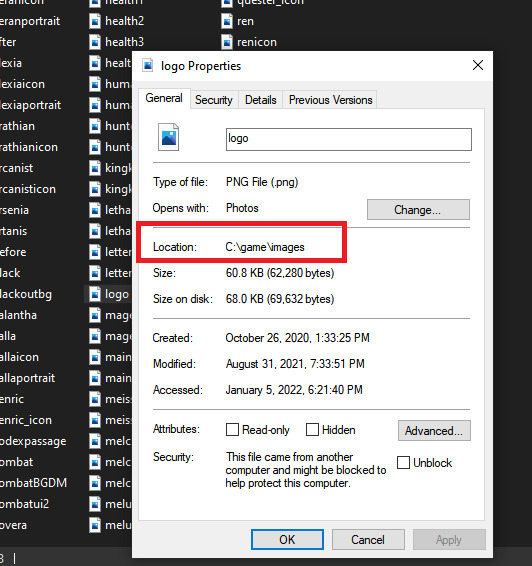
Under the General tab, you'll find something called Location, which will give you the image's path.
IMPORTANT: Windows uses backslashes ( \ ) in its file paths. Twine uses forward slashes ( / ) like in all web URLs. If you're copy/pasting the file location from the Properties menu in Windows, you need to replace the backslashes with forward slashes in order for your image to show up.
Using a local file path will only ever work on YOUR personal computer. If you use this path and then give your game to someone else, it will not work unless they have exactly the same folder set up as you. For this reason, you should not use local paths as your image sources if you intend to publish your game publicly. It should only be used for personal use.
3. From a Relative Path
This is the recommended way to insert images into your game, particularly if you intend to have a lot of assets. If you make an "images" directory, you can use relative paths to source your game's assets and this will work for both online publishing on a hosting site (like itch.io) and offline use. However, there are a few extra steps involved.
Like in the local folder example, you MUST use forward slashes. Backslashes will not work.
"Relative paths" in this context essentially means that the image source will look for your image in a directory relative to where your game is located.
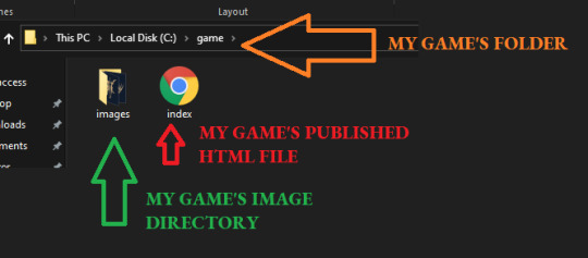
Twine publishes to HTML, so if you make a folder called "game", then put your published Twine HTML file in that folder, you can create a subfolder/directory to store all your images. For example, this is what my game's directory looks like on my computer:
C:/game/
My game folder located on my C drive. I put my game's published HTML file here.
C:/game/images/
The folder for my image assets, located as a subfolder. I put all of the images for my game here.
If I open the game's HTML file from the "game" folder, then the images directory is relative to the folder where my game is located. That means that I can use just the relative part of the file path, rather than the entire path on my C: drive.
For example:
<img src="images/logo.png">
This means that if I move my game's HTML file to another location on my computer, my images will not load because they are no longer relative to the image directory. The game HAS to be launched from this location for the images to show up.
FOR DOWNLOADS/OFFLINE GAMES:
If you're making an offline version to be downloaded by your players, you can handle this easily by zipping your game's folder together with all your assets in their appropriate subfolders.
When the player downloads your game and unzips it, they will have all the assets in the right place and can launch the game from that folder.
FOR ONLINE BROWSER GAMES:
If you intend to host your game on itch.io as a browser-based game, you can do the same thing by zipping your game's contents together and uploading the ZIP file. Itch.io will host your images internally, so as long as all your relative paths are correct, your images will show up your game without you having to source from an outside site.
If you're uploading onto itch.io, you HAVE to rename your HTML file to index, otherwise this will not work. You should also scrub any personal information from your file paths.
For example, if your file path is called "adam's pc/game/images/logo.png", I would move things around so that the relative path becomes "game/images/logo.png".
II. Relative Paths & the Twine Editor
IMPORTANT: Because of how the Twine editor functions, using relative paths to source your images will make your images fail to show in the editor. They will show in the published version of your game, but not in the editor itself. If you hit test/play, you WILL NOT see your images in your game's preview.
There are a few work arounds.
If you are using a version of Twine 2 that opens its test/play previews in its own mini-browser (Twine 2.2.1 and before will do this), then you will need to use local file paths or online paths for your images while in the editor. You will then have to switch them out for the appropriate relative path when you go to publish.
If you are using a version of Twine 2.3.x that opens its test/play preview in your actual browser, you can use HiEv's "Displaying Images in Twine" code. Add it to your game's JavaScript section and adjust the directory names to the ones you are using. You will probably want to delete this code before you publish your game since this is solely a workaround to get images to display in the Twine editor.
III. Styling Images
You can control what your image looks like with a bit of simple CSS. Here are some basics:
Adding the img class to your Story Stylesheet will target all imgs in your game and give them the same properties. If you want to style different images in different ways, you'll want to create multiple img classes.
img {
max-width: 100%;
height: auto;
}
This targets all imgs in your game and make them responsive (i.e. automatically adjust to fit the size of the viewer's screen). If you wanted to make them smaller than the maximum, you could change it to 80% or another percentage until it fits what you want.
img.title {
border: 1px solid #808080;
}
This adds a 1px border in the hexcode #808080 to an img with the title class.
You can add classes to your images with the class selector:
<img src="images/example.png" class="title">
You may want to look at this guide here to get started with the various different styles you can add (border styles, colours, and thickness; using the border-radius property to make the image circular, etc).
IV. Alt Text
Alt text is an invisible image description that is read aloud by screen readers. It also displays if your image fails to load. Adding alt text to your images is important for accessibility, particularly if your image provides some kind of important functionality in your game.
For example, if you're using a fancy graphic as an chapter title, you will want to include alt text that states the chapter title. You can add alt text to any image with the alt selector.
<img src="images/chapter_one.png" alt="Chapter One: Title" class="title">
V. Adding Background Images
If you want to add background images to your game, you cannot use the <img src> to do so. I covered some of that in this post here on making main menu screens, so that should be a good place to start if you want to use backgrounds.
Hope that helps! 💕
119 notes
·
View notes
Text
AO3 script/screenplay tutorial
A while back I started working on a “screenplay” fic that I wanted to post to AO3, but I was disappointed to find no template or skin to make it look like an actual, real script. Well, after a lot of fiddling around I managed to work out the CSS and HTML, but I felt kind of wrong keeping it to myself. So here you go, folks… this is what I worked out.
Note that though this makes the screenplay look authentic enough on a monitor or on mobile in landscape mode, it does not show up well in portrait mode. You might need to either tweak it a bit, in that case, or else make an author’s note mentioning that readers in portrait mode may need to use the “hide creator’s style” button, which will take away the formatting, but will at least make it readable:

Alrighty, then! First you are going to need to create a new work skin…

With this code:

After you have set that up and saved it (and after you have written your screenplay, of course), go ahead and make yourself a new story draft with that skin selected, then copy and paste your script into the rich text area. It will then look something like this:

So now to make it look like this…

The HTML code would be something like this:

The transitions (SMASH CUT TO, FLASHBACK TO, etc.) will be tagged like:
<div class="Right" align="Right">
<p> DISSOLVE TO:</p></div>
That will place them on the right side of the document. Although I also tagged my FADE IN / FADE OUT that way, which might be a style matter, but I just like the way it looks. All other SCENE HEADINGS I leave untagged to keep them on the left.
Anyway, be sure to close the tag with </div> or else everything is going to end up over on the right.
-
Like the regular scene headings, I did not tag my action lines, keeping them on the far left.
-
Then we come to the CHARACTER, (parenthetical), and dialogue lines.
In my case, I put fifteen spaces before the CHARACTER and ten before the (parenthetical). I figured it would be easier than trying to HTML format absolutely everything (yay shortcuts!). The dialogue is left as-is, however.
The HTML for this should look like:
<div class="indented" align="left">
<p> ADAM<br />
(Dejectedly)<br />
This isn’t as easy as I thought it would be.</p>
<p> MARTIN<br />
(Standing beside Adam’s chair)<br />
Writing seldom is. But you’re really brave to make a novel your first real foray into fiction-writing.</p></div>
Note that you do not need to make a new tag for every character/parenthetical/dialogue if it is back-and-forth with no action lines in between. And again, don’t forget to close your tag with </div>
-
I noticed that sometimes when I edit directly on AO3 it adds extra paragraph tags for some reason (those errant <p> </p> tags in the example above), so I tend to try to do all my tagging locally before pasting it into the HTML section of the draft editor.
-
I am sure there is an easier way to do it, but this is what I figured out, so I hope this helps at least a little! And I wouldn’t mind if you gave it a reblog so that others can find this tutorial (does this count as a tutorial?).
Good luck, and happy writing!
562 notes
·
View notes