#data graphs
Explore tagged Tumblr posts
Visit Tumblr Blog
Explore Tumblr blogs with no restrictions, modern design and the best experience.
Last Seen Tumblr Blogs


Fun Fact
BuzzFeed published a report claiming that Tumblr was utilized as a distribution channel for Russian agents to influence American voting habits during the 2016 presidential election in Feb 2018.
Text
World surpasses 40% clean power as renewables see record rise

This is from the Global Electricity Review 2025 by Ember. Although this isn't something you are going to see in newspaper headlines, the progress we made with renewables in 2024 is a pretty big deal and if you're someone who likes a lot of data and graphs it's really worth reading.
I'm going to leave this video here because Hank Green does a better job of covering it than I am going to.
youtube
"This to me feels like news. It feels like a big deal. It feels like things are changing, like we are hitting a moment with electricity generation that really does matter. And over the next five years we will hit the point where we are generating less and less energy with fossil fuels every year. That's great. And that's not news. I didn't see anyone covering this [...]. It's not news because it's not bad and it's also not news because it's not like 'we did it, we hit the moment!'."
I think this quote from Hank's video does a good job of encapsulating how the slow, gradual progress that is happening often doesn't make it into the news--because it's not a dramatic emergency or a "we did it, we fully solved climate change!" kind of moment that makes for good headlines.
But that then gives people the idea that we're hardly making any progress on addressing climate change, which is not true at all. The fact that we need to continue to double-down on this progress to do it more and faster does not negate that so much progress has already been made.
#climate change#global warming#carbon emissions#data#graphs#science#ecoanxiety#ecogrief#climate anxiety#hope#good news#renewable energy#solar energy#wind energy#nuclear energy#hydroelectricity#video#clean energy#green energy#Youtube
3K notes
·
View notes
Text
apologies for the delay. had to make a whole new graph to extend the y-axis because buck will never stop saying this man's name.
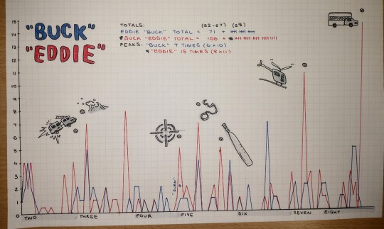
(click for quality pls)
(also check out my lino prints if you'd like ehehehe- https://forms.gle/Jov7NHahyqr1xTFPA)
#Hehehheheheheh#graphs and such#graphs#911 graph#911 data#911 abc#9-1-1#9 1 1#eddie diaz#jwpyyy#911 show#buddie#evan buckley#911 season 8#911 season 7#500#1000#2000#tops
3K notes
·
View notes
Text
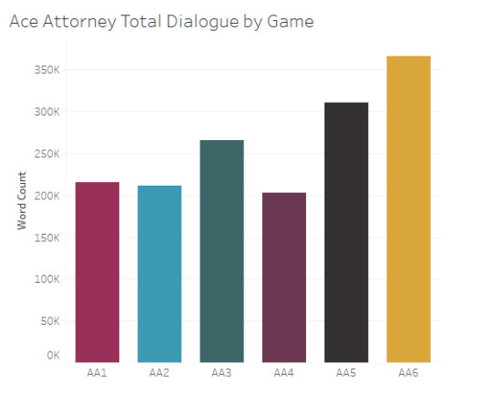
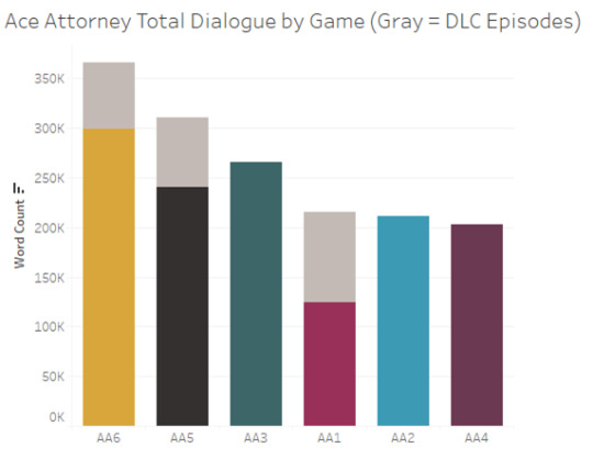
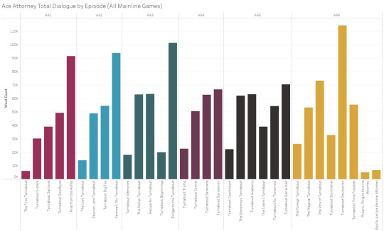
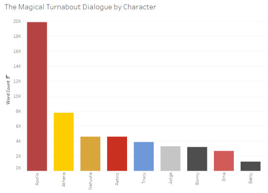
How much dialogue there is in the mainline Ace Attorney games
I made some graphs about how much dialogue there is across the "mainline" Ace Attorney games (AA1-AA6):
graphs split out by episode/character + data notes below the cut
Total Dialogue by Episode (game order)
Total Dialogue by Episode (length order)

Total Dialogue by Character

Overall, there's over 1.5 million words of dialogue across the mainline AA games (about 1,570,000 words, by my count)
Data source: I’m using a dataset that I put together pulling from the episode transcripts on the Ace Attorney wiki (which I did almost entirely via Python, but with a bit of manual cleanup). There’s bound to be some error resulting from that process, but the numbers should be pretty close.
#Ace Attorney#Ace Attorney in Graphs#Graphs#sC original#I kept going back and forth about whether to include Investigations + PLvPW in this or not#since I have the data for those games but not for GAA/DGS#and it felt arbitrary to include some side games but not others#so my compromise is that I'll add Investigations/PLvPW data in a reblog lol
100 notes
·
View notes
Text
So there is a post going around with a realy suspicious map, and OP of the post has me blocked so here is a link to their post since I cannot reblog it.
Okay so, I looked into this as from my own experience the map looked suspicious.
The orignal post of the map has been deleted. You can find the deleted post on reddit about it here.
I managed to find a repost of the map on tumblr, which had linked to the deleted reddit post, and you can find the repost of the orignal map here. Now onto debunking OP's claim of the map.
The title of the map is not solely about the west bank, it is about full john oliver episodes being unavailable in countries. Not just the west bank episode, all full episodes.
When I try to watch the video, i get the below error from youtube
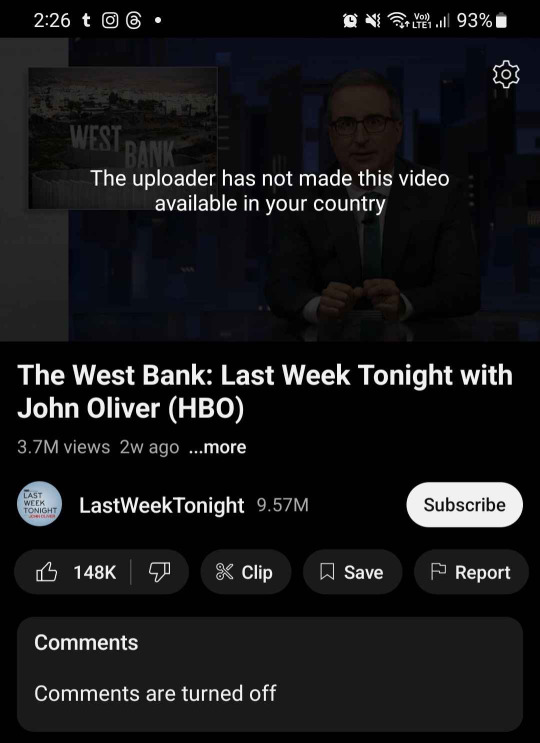
Yep your eyes do see correctly. It is the uploader who made it unavailable. This means that either John Oliver himself, his production team or HBO who has the rights to his show, decided to make his content not available to be viewed in certain countries.
A comment on the reddit post which I think people should read is
"The title of this post makes many people think OP means ‘countries that have banned this’. Instead, this is just ‘countries where a network pays for the broadcast rights for this show’. The highlighted countries are ones where the show is most popular. The blank countries are where it’s not popular, so they give it away for free to try to drum up support"
Aka this is not purposeful censorship by (((zionists)) like tumblr op is trying to frame it. Its not keeping what happens in the west bank a secret. It is a decision made by someone in charge of the show, to make as much money as possible. Which still sucks! But, it sucks for different reasons than what tumblr OP is alluding to.
3. Tumblr OP is being antisemitic. Whilst it is definately written in a more subtle way, it is still invoking the whole "jews control the media" trope. A well known antisemitic trope is still antisemitic even if "jew" is replaced with "zionist". This is because whilst not every use of "zionist" is a proxy word of jew, it happens more than you think, to the point where meta (instagram and facebook) updated their hate speech policy to puroposefully include "zionist when its being used as proxy (aka dogwhistle) for jew is now hate speech on our platform". Meta still allows it to be used when talking about zionism as a political ideology, and have only banned the use of it as a proxy for jew.
OP of this post has already blocked me (only found out when i saw this post), so I wanna thank @coffeeconcentrate for reblogging this and not having me blocked so I can actually have a chance at reaching even a small group of people to make them aware of this so they don't fall for this poorly made post.
#whenever you see a map or graph which lacks both of those 9/10 its because the data doesn't fit the narrative they're trying to push#antisemitism#jumblr#jewblr#disinformation
200 notes
·
View notes
Note
I saw your DD graph asking for other ideas, so... if you still have any desire to do further Dracula graphs I'd be curious to see how the word count per character breaks down (not how much they speak but how much they write. Adding all their diary entries together, etc.). Obviously Mina wins by default from having typed up the whole novel but outside of that detail, how much did each person author?
Thank you so much for this ask! What an interesting data set this one is! Lots of unexpected information.
So first off, if you just want to visualize the author breakdown, ta-dahhhh!
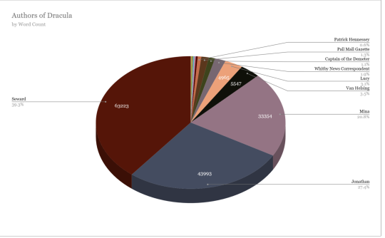
Seward was staunchly in the lead, talking his head off and burning through those wax recording drums like no ones business. Poor Mina for having to transcribe it all. In total his words made up 39.3% of Dracula. Nearly 40%!
Seward unsurprisingly had the most individual entries overall at 47, and had the longest streak for being the narrator in an entry at 10 days (09/02 - 09/11) with Mina following right behind at 9 days (08/10 - 08/19)
Mina surprisingly was 3rd overall both in word count and number of entries. She wasn't even in the top 3 for most words in a day which is as follows.
1 - Seward October 3rd - 9942 words
2 - Seward September 29th - 7206 words
3 - Jonathan October 3rd - 5944 words
Van Helsing only had 9 entries total but still came in number 4 for word count, in front of Lucy. It's interesting to note that the amount a person writes doesn't correlate to the amount of time they are being written about/appear. Which is why Arthur and Quincey don't even beat out the newspaper clippings for words, lol.
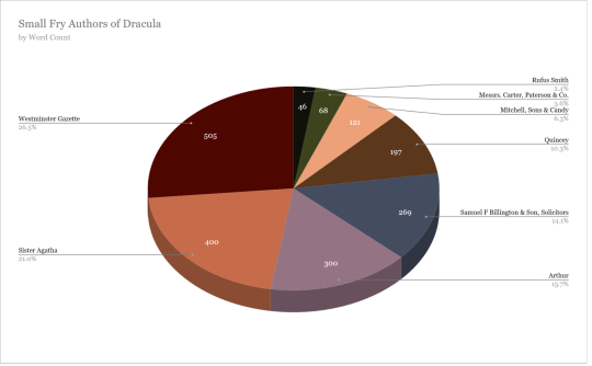
There are lots of authors we only hear from a single time, like Sister Agatha. So I've decided to make a small fry pie as well. (Authors under ~500 words)
The captain of the Demeter and Van Helsing both had more days written than Lucy! Though I didn't break up number of entries, like when the log of the Demeter had 3 or 4 on one day or Lucy wrote a letter and in her diary.
If there is any data I haven't presented here that you're interested in feel free to tag me or shoot me an ask like this lovely person did!
#dracula daily#this took me 4 hours#potential spoiler#graphs#book data#word count#meta#averages#percentages#dracula daily tracker#dracula entry lengths#dracula authors#dracula meta#jonathan harker#mina harker#john seward#abraham van helsing#mina murray#lucy westenra#dracula#bram stoker#marketpeaches#arthur holmwood#van helsing
406 notes
·
View notes
Text
Random Data About Aziraphale and Crowley being referred to as "Friends"
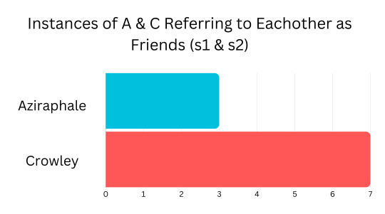
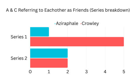
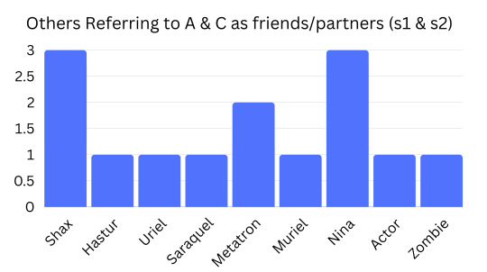


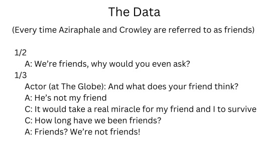

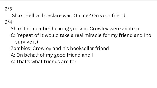

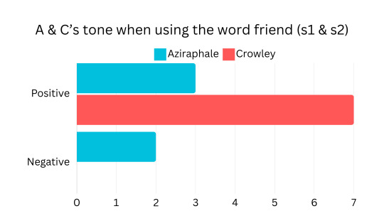
#more data from my rewatch#aziraphale and crowley being called friends#Crowley does it most#Crowley your so in love#best friend? only friend? more like husband!#and Shax calling them an item and Uriel calling Crowley Aziraphale's boyfriend#we love to see it#let me know if I missed anything or messed up#good omens#data#ineffable husbands#aziracrow#crowley#aziraphale#friends#bar graphs#added the last one in response to a request :)
351 notes
·
View notes
Text
Show the Y-axis Lily.
This graph means nothing without view counts. Getting 8X the average daily view count for this video doesn't mean much if that average is 10 views/day. I'm just going to assume this is the case until you post a complete graph or the actual view counts.
Congrats on getting 80 people to watch your terrible video yesterday Lily! You're quite the YouTuber!
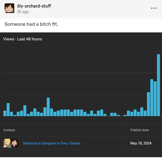
[Source]
#lily orchard critical#lily orchard#lilyposting#graphs#data presentation#statistics#Youtube#bad stats#the lily zone
95 notes
·
View notes
Text
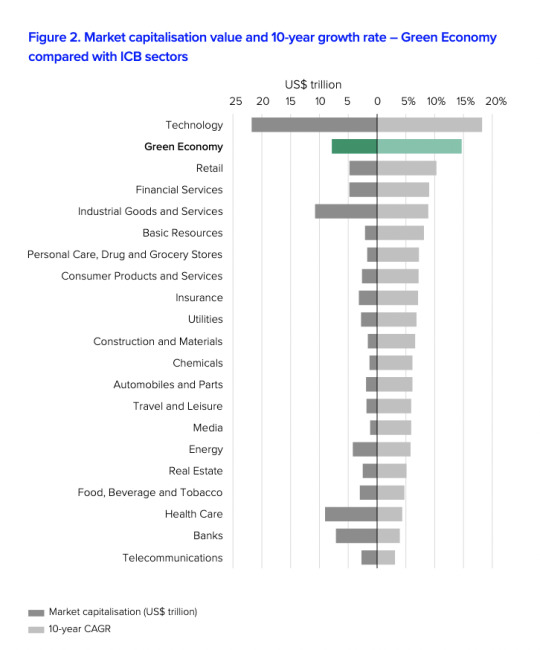
The Green Economy is Now the Fourth Largest Market Sector Globally
From this report by the London Stock Exchange Group:
As of Q1 2025, the global green economy, if considered as a standalone sector, would account for 8.6% of listed equities with a combined market capitalisation of US$7.9 trillion. This would make it the fourth largest sector by market capitalisation, following Technology, Industrial Goods and Services, and Health Care.
#economy#hope#good news#hopepunk#data#graphs#economics#green economy#climate change#global warming#progress#environment#ecology#renewable energy#clean energy#green energy#energy revolution#global climate action
147 notes
·
View notes
Text
Hey guys have been doing some data analysis on hit TV show 9-1-1 today as one does, and basically:
- based on data from 7x01 to present (8x04, excluding 7x08 as none of the related characters are in this episode).
- Buck says "Eddie" an average of 0 (ZERO) times per episode if Tommy is not present.
- if Tommy is in a scene, Buck says "Eddie" an average of 2.75 times per episode.
- this is over double Buck's over all "Eddie" average per episode since season 2, which is currently 1.08 EPEs (eddie-per-episodes).

(here is my graph with data from S2 to S7, I will make a new one maybe at end of 8A but definitely by the end of season 8)
More data/analyses under the cut
If anyone is curious on similar data for Eddie:
- 0.4 BPEs if no T.
- 1.125 BPEs if T present.
(currently overall, Eddie is at 0.73 BPEs)
Sorry if I counted anything wrong lmao ANYWAY we bear in mind that when Tommy is present it is due to a Buck/Eddie plot in that episode (because they are often deliberately paired together by the writers) and just have more lines anyway so may be more likely to speak each others' names.
To me this highlights that Buck and Eddie are being heavily linked together whenever Tommy is there, which indicates that the writers want the audience to associate Buck's romantic relationships with Eddie. Also when interpreting Tommy as a storytelling device used to represent part of Buck's queer awakening, having Eddie be tied to this is another potentially interesting writing choice.
Basically gay Eddie is haunting bi Buck's narrative and Buck is narratively condemned to be unable to separate his queerness from his attachment to Eddie
#anyway words and statistics are always fun and im procrastinating and also sorry if data is wrong#also my interpretation of said data is probably definitely biased btw#911 abc#9-1-1#9 1 1#eddie diaz#jwpyyy#buddie#911 show#evan buckley#911 season 8#911 season 7#anti tommy kinard#anti bucktommy#graphs and such#911 graph#tops
213 notes
·
View notes
Text
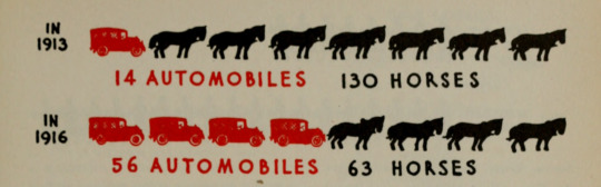
The rapid change in how people got around in New York City, 1913-1916. Graphic presentation. 1939.
Prelinger Library via Internet Archive
#charts#chart#transportation#nyc#automobile age#horse#horses#graphs#visual data#graphic design#nemfrog#1910s#1939
224 notes
·
View notes
Text

Stats Sunday
Happy March!! Thanks for the tag @nausikaaa! Unfortunately, my goal is to make this banner worse every month, so be prepared—we've only just begun.
Early post for me. I should be sleeping but I started making my graphs and then... well, here we are.
Here's my February Recap loll. Stats and graphs and musings incoming. (this post is so long but i promise there's a snippet in here)
Rest of post is under the cut. It is long. You've been warned.
I've posted two things last month! A valentine's day fic for Ebb/Fiona and Chapter 3 of the Way We Are. (Technically i posted 3 but this stranger things oneshot was posted on the 1st and written in January so it feels like January's accomplishment)
Total words written for February: 14405 (this beats Jan by 460 words!)
Days I met my writing goal (200 words): 20
Days I didn't write or edit anything: 4
Day I wrote the most: Feb 11th with 2249 (this beats last month's high score of 1717!)
Number of Fics worked on: 10 technically, but i have not been consistent with most of them. mainly worked on 3.
Daily Average: 514 words (but like last month i am highly inconsistent and my WC varies wildy depending on the day)

(I really like the little curve in the middle. also two the days that look like zero are actually 1 words, which is my placeholder if i spend all day editing)
And here's a pie chart to show my WC distribution across projects. Tbh a lot of these were fics that i've had in my fic ideas doc and all i did was make a google doc for them and word barf onto it my ideas, that's why there's so many small slices.
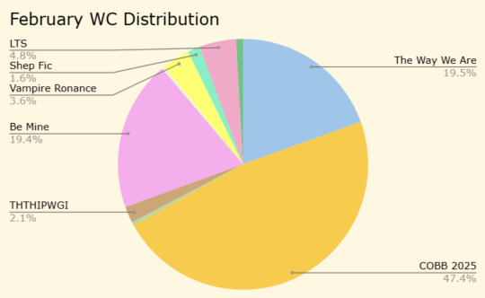
some slices are so small you don't even get to know my placeholder names. also i hope the title THTHIPWGI intrigues you, i'm always excited when i can title a fic right away and refer to it by a fun accyromn on my spreadsheet.
Other notable things from February:
I finished writing all of The Way We Are!! (kind of. i have one more scene to write. Monica's fault.)
I took over the @carry-on-sapphic-week event!! Check out the prompts if you haven't yet <3
I've received So Many beautiful valentines from the CO discord servers exchange. my mailbox and my heart has been full
The CO fandom was able to raise $500 for Fandom Trumps Hate!! (and I got to make a spreadsheet bc of this!!!) (also i won two auctions from this, one for each fandom i'm in)
My car battery died and I had to get a new one :/
I started a new journal!
I finally figured out how to spell February
my savage worlds campaign finally got our ship back and made it off this stupid planet that we've been on forever.
i've started watching Yellowjackets and I'm really enjoying it
I read so many CO AU fest fics and each one of them was so good. I think i've read all except one so far, and honestly this fest has been so fun i'm obsessed with you guys, you're are so talented.
SPEAKING of CO AU fest fics, @fiend-for-culture's fic, Everything In Between, is SO good, i've been thinking about it all week. you should read it (and leave a comment so i can read it bc i'm stalking the comments on this fic and there's not enough to sate me)
i have spring break in just one week!!
Okay, i promised you words, so here's a snip from my COBB.
“And I’m sorry,” Simon says. “For what?” “Driving you off yesterday.” “That wasn’t your fault. I was being terrible.” “Yeah,” Simon agrees. “But I shouldn’t have dismissed you like that.” I make a face. “I’m not having a heart-to-heart with you, Snow.” Simon groans. “Why do you have to do that?" "What" "Everytime I think we're making progress you say something nasty like that."
sorry this post is so long, thank you for reading if you made it this far
tags, hellos, and apologies:
@alexalexinii @aristocratic-otter @argumentativeantitheticalg @artsyunderstudy @arthurkko
@beastmonstertitan @blackberrysummerblog @best--dress @bookishbroadwayandblind @bookish-bogwitch
@the-beard-of-edward-teach @brilla-brilla-estrellita @cccloudsss @ciescen @confused-bi-queer
@cutestkilla @drowninginships @facewithoutheart @emeryhall @fiend-for-culture
@hushed-chorus @iamamythologicalcreature @ileadacharmedlife @theimpossibledemon @jyae23
@larkral @lovelettersto-mars @meanjeansjeans @m1ndwinder @monbons
@noblecorgi @orange-peony @prettygoododds @raenestee @rimeswithpurple
@run-for-chamo-miles @rbkzz @shrekgogurt @simonscones @skee3000
@supercutedinosaurs @sweetronancer @talentpiper11 @toc-the-scrambled @thewholelemon
@valeffelees @youarenevertooold @you-remind-me-of-the-babe
added some new ppl to this tag list, feel free to share a wip you're working on—art, fic, etc. it does not have to stats like mine is loll. i use wipsdays as my soapbox.
#stats sunday#six sentence sunday#my writing#lily's google sheets adventures#fic writing things#lily's cobb fic#also i have no idea if the way i'm doing alt text on the graphs is useful#i feel like the way i'm trying to describe the line chart in particular is super unhelpful#but i don't think putting my entire data set in there would be helpful either?? unless that's what i'm supposed to do?#ALSO i will share what THTHIPWGI stands for soon#i'm so pleased with that title#it's my ebb/fiona fic i'm writing for carry on sapphic week and i'm so pumped about it#wanted to share a snip from it today but i don't have anything usable#also we did so good as a fandom for FTH!#i will be making a spreadsheet again next year if you all offer again
51 notes
·
View notes
Text
Making weekly progress graphs
All it took was one (1) person asking about it and I decided to make a post for how to make my progress graphs. Maybe I've done this before. I don't know. I'm doing it now.
For what I do, I use a spreadsheet. It's google docs right now, but I assume you can use anything because I'm not using anything unique to google docs.
You need at least 2 tabs. I have more than that, but let's start here.
Tab 1: Wordcounts
My first tab is called "WIP Progress". Here's what it looks like:

That's one line per WIP per day, if I work on it.
Month and Week are columns derived from the Date column using formulas.
Want the actual formulas? Month is "=concatenate(year(C2), ", ", month(C2))" and Week is "=concatenate(year(C2),", ", text(weeknum(C2-1), "00"))", at least in row 2.
Date column is the day you worked on it, hand entered.
Fic is a title per WIP. You should keep the title the same for each WIP because this will be used to track progress in graphs.
Detail is a note column, doesn't have to be unique. I use it to figure out working ideas and track parts of things. Like, parts 1 and 2 of the Prophetic D&D game are under the same Fic name with the actual title in the Detail column
Start wc is the number of words on that WIP at the start of the day
End wc is the number of words on that WIP at the end of the day
Total is a math formula that does the difference between Start wc and End wc. Literally just "=G2-F2"
And then every day, I add as many lines as things I'm working on and copy the formulas from a previous row and adjust them. So, for today, it looks like this:

Insert rows, copy, paste, change the dates, copy End wc to Start wc, and I'm ready to go.
How long have I been doing this? ...

A while.
More formula and some graphs behind the cut.
Tab 4: Last Week Progress
Let's skip to tab 4 because that's where my graphs come from. Tab 2 is "Progress by Day" and Tab 3 is "Progress by Week" but we'll come back to those if anyone is interested.

Okay, so the general idea is that it looks back 7 days and does a count of how many words, the average (ignoring 0s), and the counts per work per day. Then it graphs them. So how does this work?
Well, the top row is my constants:
Formula in F2: "=averageif($D3:$N10,"<>0")"
Formula in H2: "=MINIFs($D3:$N10, $D3:$N10, "<>0")"
Formula in J2: "=MAXIFS($D3:$N10, $D3:$N10, "<>0")"
The words "Word Documents" is in L2 because I use it in my unique filter. I used to keep track of my work writing but I didn't want it in this graph, so it's filtered out.
Rows 2 through 10 are my data rows. Here's what they look like:
A3: "=TODAY()", A4: "=A3-1", A5: "=A4-1". Follow that pattern as far back as you want to look.
B3: "=sumif('WIP Progress'!C:C,A3,'WIP Progress'!H:H)". Copy that down the column as far as you put down dates. That's give you your daily wordcount.
C3-C10: "=$F$1". Literally that's it. Just inserting the calculated average so that I can graph it nicey.
Tricky bit! D2 is a complicated formula. It looks like: "=transpose(sort(unique(filter('WIP Progress'!D:D, 'WIP Progress'!C:C>=today()-8,ARRAYFORMULA(if(not(exact('WIP Progress'!D:D, 'WIP Progress'!$D$1))*not(exact('WIP Progress'!D:D, $L$1)), True, false))))))"
EDIT! There's a better way that doesn't use ARRAYFORMULA. It's still a monster, but ARRAYFORMULA only works in google sheets. See my reblog of this post for an update:
... Yeah, that's a monster. What it's doing is taking the rows in my WIP Progress tab and filtering out anything that's not within the last 8 days. If you go back more than a week, change the number in the part that says ">=today()-8" to something higher. Then it also removed anything that matches my header row in WIP Progress, and also anything that matches my filter field ("Work Documents"). And then it takes all the unique values of what it finds, sorts them into alphabetical order, and transposes them so that they go in as column headers. This means the column headers change if I add more things to my daily wordcounts, and they stick around for the week.
Anyway, that's what determines the column headers for columns D through M. I've never written on more than 10 WIP in a week, so I've never needed more than that.
For cell D3, I have this formula: "=sumifs('WIP Progress'!$H$1:$H, 'WIP Progress'!$D$1:$D, D$2, 'WIP Progress'!$C$1:$C, $A3)". That is then copied and pasted into the rectangle of numbers there. Everything that needs to change will change, and everything that doesn't won't.
What's it do? Well, it matches the header of the column (D$2, E$2, F$2...) to the date on the lefthand side ($A3, $A4, $A5...) and then does a sum of the values for wordcount that match that column and that date. So if for some reason I have two entries for a WIP on the same date, it'll add them up.
Why would I have this? Sometimes I move stuff to a different document and start a new line with new start wc and end wc. It happens.
Okay, all the formulas are in! Now I have a bunch of numbers. How do I make a graph? This is easier through screenshots:

Go to Edit chart. Again, this is the googs, so if you're in Excel you'll have to look up how to do it differently.

In Setup, this is a Smooth line chart. The data range has the columns from my table above, with a little extra because I think maybe I started with 2 weeks worth. Whatever, extra is fine.
X-axis is Days, which is the first column. Then the series that get plotted are basically one of each column, except for Words because it threw things off.
Series view:

All the blank ones are on here because they don't show up if they've got no data. Well, technically they do but they're all at the 0 line so it just looks darker.
Also helpful:

Next, Customize the chart:

Mostly boring defaults, but here's the place to set the title.
And that's how the chart gets made. I have more charts than this, though...


So many more charts...
I'm willing to write more about them or help with formulas if anyone wants to know more.
#my writing#data visualization#someday i'll actually read that data viz book#i'm an amateur at this#charts and graphs#math
25 notes
·
View notes
Text
About Reblog Graphs
Have you ever clicked on the "reblog graph" button of a post? I think they're one of the... well, maybe not greatest features on tumblr ever (polls are probably better), but they're still pretty darn neat.

I want to show some cool patterns I noticed on some recent posts of mine, but first I'll explain how reblog graphs work so you can more easily follow along.
This is pretty long with a bunch of pictures, so click the cut to read more.
How reblog graphs work
If you've never done so before, I invite you to click the notes button on this or any other post and then the icon with four circles. You will then see a bunch of dots connected by lines.
For example, if you click the graph for the "blorbo in Elvish" post, you get something like this:

Now, let's zoom in a bit. You can do this by using the mouse wheel and clicking and dragging around the graph until it's showing what you want. (I don't know how it works on mobile, but presumably it's similar to using Google maps?)
This next screenshot is the bit in the lower right of the graph shown above. However, the graph may not always display in the same way because reblog graphs are re-generated each time you click the "reblog graph" button.
Here you can see that I'm viewing the root post, which is the original post made by me. It's indicated by a circle with a dot inside. You can also see that six people reblogged that post. Each reblog shows as a dot with a line connecting it to the post it was reblogged from.

Now here's a cool thing about reblog graphs: they're interactive! You can click on any dot and see the post it represents and the reblog chain that led to it.
For example, clicking this dot that has several lines emanating out from it shows that it is "2 reblogs deep" and was posted by @cycas.

Got it? Close enough? Cool, now let me show you some neat things I noticed. :D
The Swedish Chef poll and very popular bloggers
My polls tend to average between 500 and 2000 votes, depending on subject matter. The Swedish Chef poll, however, took off and eventually garnered over 22,000 votes. How did that happen? A very popular blog reblogged it about five days in.
Initially, the graph looked like this. (This is the first 200 reblogs.) There's nothing unusual here. You can see that the root post had several reblogs, and that there's another cluster developing around a post by @zagreus. There are also several reblog chains where just one person reblogs someone else's reblog. Some of these chains peter out, while others find their way onto the dash of more popular bloggers, creating clusters.

A quick note about "popularity"
Yes, yes, it's all about "popular." However, it's not just about having a bunch of followers. What's more important is that the "popular" person reblogging your post has followers who are specifically interested in your post.
For instance, if I, @sillylotrpolls, make a poll about LazyTown, it's probably not going to get very many reblogs because my followers aren't here for that. However, if @silly-lazytown-polls reblogs the poll, that reblog might then get quite a lot of reblogs itself. It's not that silly-lazytown-polls has more followers than sillylotrpolls, it's that it has more followers specifically interested in LazyTown content. Make sense?
Back to the Swedish Chef poll
The poll eventually got over 5,000 reblogs. Since you can only add 200 reblogs to the graph at a time, you can roughly see how a post spread over time.
With 600 reblogs loaded, a new cluster bursts onto the scene. This is @bunjywunjy, who reblogged the post from @beecreeper who reblogged it from @soggypotatoes who reblogged the original.
Bunjywunjy didn't add any tags or comments, so I didn't even notice at first because it didn't show in my activity feed. However, I did notice a sudden uptick in notes on the post, which caused me to investigate. It had been five days since I posted the poll, and usually polls that are going to take off do so sooner than that.

By continuing to click the "load more reblogs" button I can see how the post further spread, especially from bunjywunjy's post.
When the post reached @beggars-opera (whose icon I am somewhat proud to announce I identified on sight), they added a screenshot of @stylishanachronism 's tags which said:
# all of these are incorrect it's the 'meat's back on the menu boys!' scene
This would become the dominant version of the post as it further spread. Interestingly, this was the only reblog of stylishanachronism's reblog. Literally thousands of people loved their tags and agreed with them, but they quite plausibly never saw it unless they specifically went looking.
By 3,200 reblogs, you can see even bigger clusters developing. @thebibliosphere shows up 10 reblogs deep, and leads to yet another cluster via @teaboot (12 reblogs deep).

Eventually, with all 5,371 reblogs loaded, the reblog graph looks like this:

Like I said: neat. :D
Cool, but if you've seen one, you've seen them all - right?
So what prompted this (extremely long) post was actually the reblog graph for my poll on inspirational LotR quotes.
Here's the reblog graph with 200 reblogs loaded:

And here's the graph with all 1,890 reblogs loaded:

It's just one big cluster around the root post. I've never seen that before!! Almost everyone reblogging this post saw it either because they follow this blog, saw it in the #lotr tags, or because their non-influencer friend reblogged it. (Or maybe it was in some kind of algorithm/the explore feed, but I have nearly zero experience with those.)
And this wasn't just a small post. This poll got over 15,000 votes and more than 4,000 notes. That puts it in the top 10 polls for this blog.
What does it mean? I have no idea. I would really like to know! But really, I got nothing. If you have a theory for why this particular poll should result in a reblog graph like this, I would very much like to hear it.
Orphan clusters
To round things off, I'd like to show another interesting facet of reblog graphs: orphan clusters.
This blog's current undisputed poll champion is the fmk wheel poll. That's not really a surprise, as it combined sex with a fun game where you just had to tell everyone what you got, which meant either a reply or a reblog. So it spread pretty far.
However, if you look at the graph, there's something odd going on.
This is with just 200 reblogs loaded:

Notice how some of the dots don't connect to the root post? That's because somewhere along the chain, a reblog was deleted.
This cluster in the bottom left got pretty big! This screenshot is at 800 reblogs loaded. The missing link is from a blog called @gendertaliban that doesn't exist anymore, as near as I can tell. That makes it impossible to trace the full path of any of these reblogs.

In conclusion
This concludes today's deep dive into a tumblr feature you probably never paid any attention to. Admittedly, there's not a huge use for it outside of determining which of your mutuals is an "influencer," and they get quite difficult to navigate after loading about 1000 reblogs, but I hope you enjoyed staring at dots and lines with me. :)
#data analysis#tumblr#reblog graphs#data visualization#not a poll#admin#yes I KNOW I keep saying I'm going to come up with a proper 'misc' tag#there will come a day when I properly categorize and tag my 'admin' posts#today is not that day
51 notes
·
View notes
Text
How insane would it be to make and then post a graph showing the change in poll votes over a period of time? And the poll isn't even mine.
#the tragic thing is that i already gathered some data for the graph#actually embarrassing what sickness makes me do
25 notes
·
View notes
Text
How much Dialogue there is in Spirit of Justice (in Graphs)
I'm back with more Ace Attorney graphs. They're about Spirit of Justice this time ~
Total Dialogue by Episode:

Total Dialogue by Character (base game only vs with Turnabout Time Traveler):
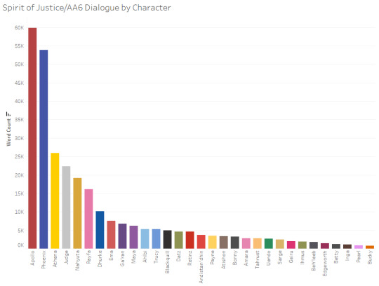

(Character graphs broken out by episode and additional details below the cut)


The Khura’inese and "regular" Judges’ dialogue totals are combined in the graphs above, so here’s what their specific totals are:
Khura’inese Judge: 14,510 words (putting his total just behind Rayfa’s)
OG Judge: 7,786 words in the base game (a bit more than Ema has), which increases to 11,667 if you include Turnabout Time Traveler (more than Dhurke but slightly less than Maya)
Overall, there's just shy of 300,000 words of dialogue in the base game, which jumps up to about 355,000 if you include the "special" DLC case, Turnabout Time Traveler.
Data source: I’m using a dataset that I put together pulling from the episode transcripts on the Ace Attorney wiki (which I did almost entirely via Python, but with a bit of manual cleanup). There’s bound to be some error resulting from that process, but the numbers should be pretty close.
Other graphs: I made similar graphs for the AA trilogy here (for dialogue by character) and here (for the dialogue by episode), for AA4/Apollo Justice here, for AA5/Dual Destinies here, and for the Investigations duology here
#y'all now that I have data for the whole mainline series there are SO MANY graphs I can make. you don't even know#I've been building towards this point for so long lol#Ace Attorney#Ace Attorney in Graphs#sC original#Graphs#Apollo Justice#Spirit of Justice#SoJ#AA6#Phoenix Wright#Athena Cykes#Nahyuta Sahdmadhi
46 notes
·
View notes
Text
I think when people conceptualize pain and disability, what they think of is something like this:
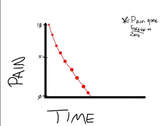
It's conceptualized as something you are cured from, that pain can be only temporary, and you will one day "get better."
In reality, it's something more like this:
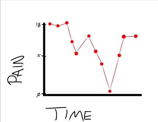
Pain is often non-linear in nature. When you see somebody in low-pain days, weeks, or perhaps longer, that doesn't mean that they have "healed." Not all pain is curable, and the idea that it is is only hurting people who experience pain. Yes, it is uncomfortable to imagine that we might not be able to heal, that we might, in fact, become disabled by pain that will never heal. But running from this possibility is not the solution.
#disability#chronic pain#described images#image description in alt#sorry about my handwriting i was using an art program on my phone <3#plus it isn't a graph based on like... empirical data. it's illustrative of an attitude i see from often abled people#i'm having a good-ish week so far with my pain but that doesn't mean it is gone#i know i have talked about this before but i wanted to do it more as an image than text#i think it can help people understand better (at least it does for me)#man i don't think i've made a graph since mid high school LMAO
286 notes
·
View notes