#descript tutorial
Explore tagged Tumblr posts
Visit Tumblr Blog
Explore Tumblr blogs with no restrictions, modern design and the best experience.
Last Seen Tumblr Blogs


Fun Fact
There are dozens of funny blogs to kill time on Tumblr.
Text
youtube
#descript tutorials#descript decoded#descript tutorial#descript video editing#how to use descript#descript#learn descript#descript app#descript video editing tutorial#descript review#descript ai#text to speech software#descript overdub#ai video generator#video editing software#video editing#ai video editing software#ai video tools#ai content generator#ai video editing#audio editor#audio to video ai#best ai video editor#ai tools#Youtube
0 notes
Text
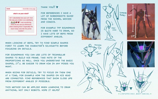
this is generally how i approach complex designs, start simple and then build the details on it. hope you'll find this helpful!
#transformers#maccadam#tfp#soundwave#art tips#art#tutorial#text in description if anyone wants to translate
545 notes
·
View notes
Text
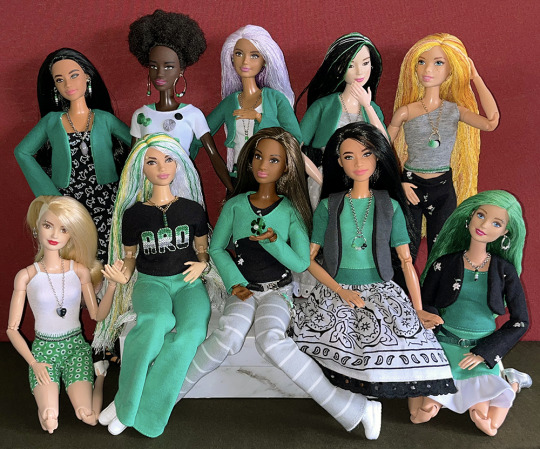
Over the past eighteen months, I've made enough green, white, grey and black clothing pieces to outfit ten Barbie dolls in aro colours. In addition, every doll has earrings, necklaces, belts or embroidery featuring pride stripes. Now I just have to figure out how to make a one-sixth-scale aro pride march display...
(More information about the making of aro-themed doll accessories and clothes is available on my website.)
#aro week#asaw 2025#aromantic#green aro pride flag#sewing#embroidery#cross stitch#pride crafts#needlework#needlecraft#fashion dolls#barbie#pride#link#aro worlds wordpress#image description in alt text#I'll be sharing a tutorial for the floss rehairs later this week
206 notes
·
View notes
Text
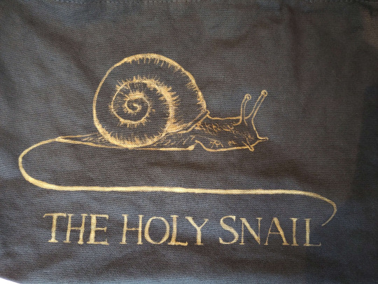
cheapskate bleach tutorial
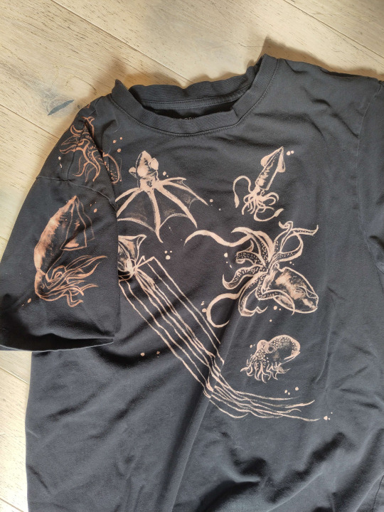
Sticking it under a readmore but this is how i make my shirts etc for like a fiver's worth of materials. I am far from being an expert btw im just playing with chemicals. also probably do this in a ventilated area or something
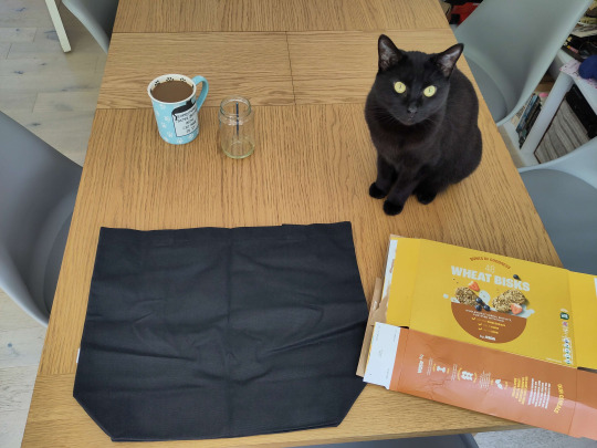
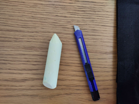
You will need:
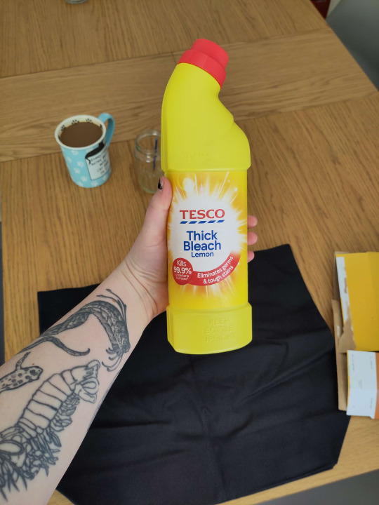
Bleach (I use thick toilet bleach it's like 80p)
The thing you want to bleach onto (In this case, a tote bag for a friend. usually i thrift old black shirts.) You should do a patch test before any real bleaching -- dab a tiny bit on the inside of a hem somewhere before you commit. I don't show that below because i forgot to do it but you should. You should ALSO iron the thing before you bleach it. So it's flat. Do as I say not as I do etc.
Something to put inside / between your garment and the table (Asda brand weetabix box babyyy)
Paintbrush (Mine is from a multipack from Poundland. I also accidentally left it in bleach last time and it kind of dissolved so I had to cut off the most egregious of the stray bristles.)
Chalk (For snacking) (I'm joking please don't eat the chalk) (I only have big pavement chalk, again, from Poundland, but you can get a good point with a craft knife)
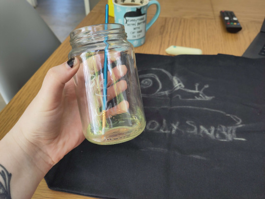
Step one: move the cat

Step two: insert cereal box into / behind the thing you are bleaching.
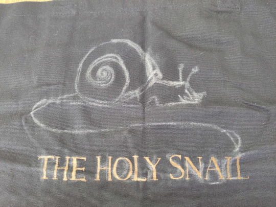
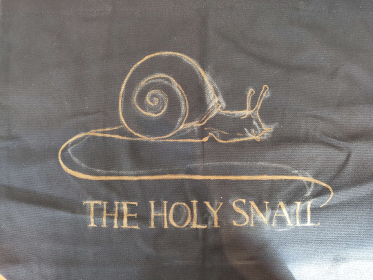
Step three: chalk on your design. this is the logo of a wine brand i have never tried but i like the snail. It can be super rough or very precise, whichever helps you know where to put your lines.
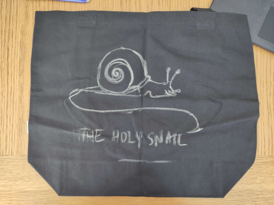
As you can tell it's easy to move stuff and redo it by just smudging the chalk away, or, worst case scenario, giving it a wash. Though that sucks if you're impatient like me bc you do NOT want to bleach this while it's wet. Once you're happy with your design, smack it around a bunch to take off most of the chalk, so you wind up with a vague outline. I didn't get a pic of this stage but here's what the iasip one looked like:
Step four: Acquire your bleach and put it in the special bleach jar your hosuemates labelled so you would stop drinking normal water out of it. Accept that Nyx hates you for not letting her drink it.

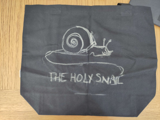
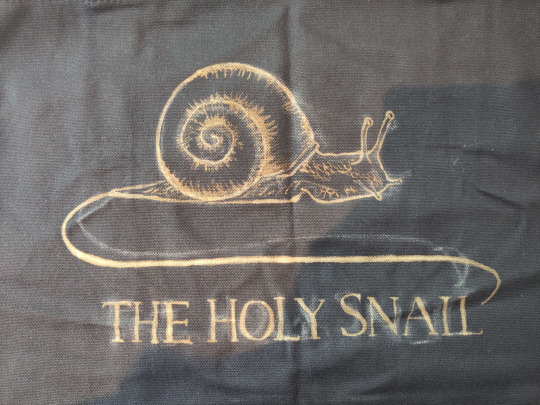
Step five: Go for it man. The bleach is kinda goopy so don't expect it to come out like paint, but it does mean that you can control the line crispness and width quite easily depending on how hard you press the brush down. I find it really helps for stuff like serif fonts.
You can dilute your bleach with water, which can help it get into all the little crevices esp if your fabric is a little bumpy, but do another small patch test before committing to anything on the main piece, because some fabrics absolutely suck up water and your lovely crispy lines will blow out like an old tattoo. don't do it. Unless you want that look, in which case get silly with it

The other weird thing abt it is obviously that you can't see what you painted right away, it takes a couple seconds to show up, so it's a pretty slow process. The fabric will first go darker where you painted, then lighten from orange to a pale yellow over about 30 seconds. DON'T go "this bleach aint shit" and paint over it to make it lighten faster -- overbleaching it can weaken the fabric and make it tear.
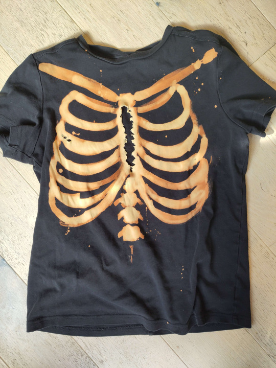
Tragic.
Here are some progress shots of the snail! When you're finished, you should wait for it to develop properly, but it depends how light you want it to be. I let the lines sit for a while before doing the details, and then washed it a bit prematurely so they'll stay a little darker. For nice pale yellow you want to wait around an hour.
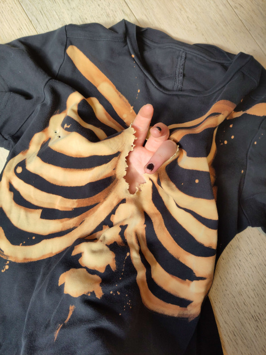
Step six: drown her
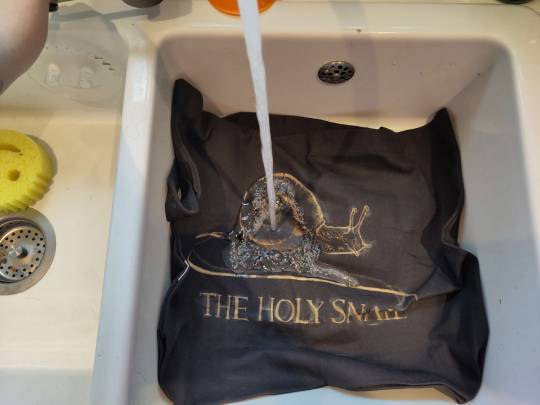
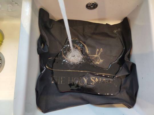
Nice cold water, wash out all the remaining bleach and chalk. I chucked it in the wash for ten minutes because it's a weird shape and size to wash in the sink and I'm a lazy bastard. but handwashing works just as well.
Step seven: revel in your new bootleg merch. You made that. You did that. thrive. go forth and make weird shit.
#bleach#art tutorial#clothes#diy#i've never done a tutorial before so hopefully this is coherent lol#img descriptions are all in alt text#it got dark while i was making this so pls excuse the varying image quality loll
210 notes
·
View notes
Text
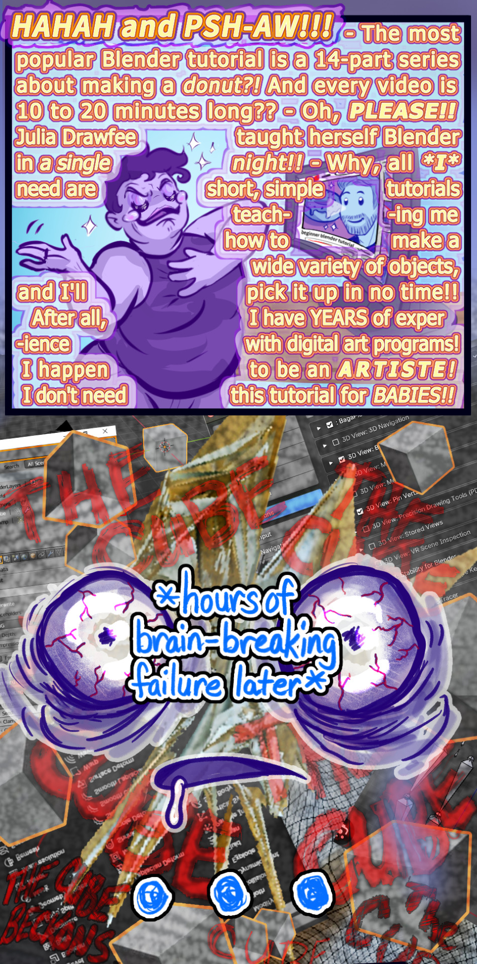
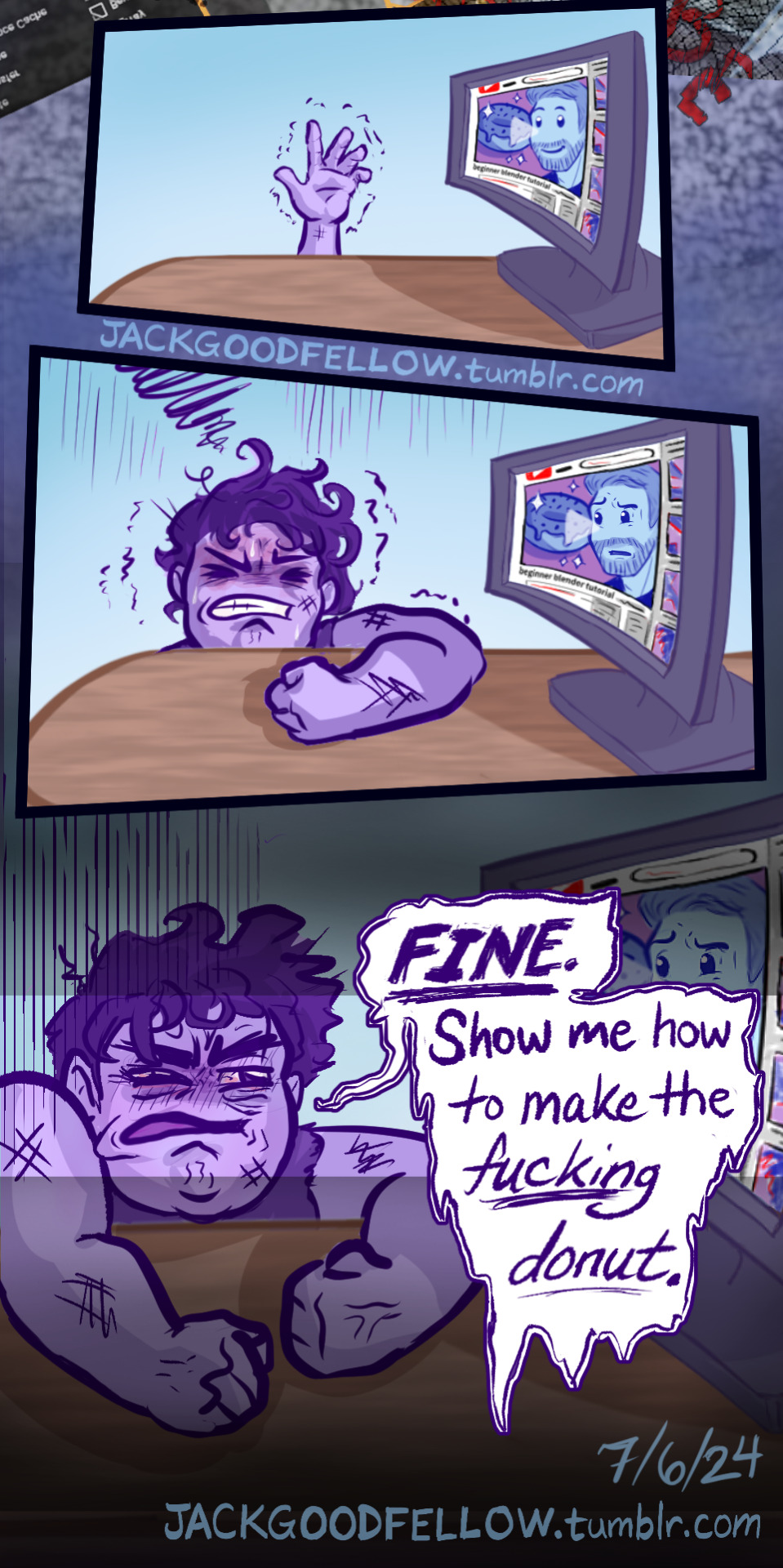
Anyway, it turns out setting art goals according to what Julia from Drawfee can do is like setting swim goals according to what sea otters can do.
#my art#alt-text#image description#blender#blender tutorial#blender donut#blender donut tutorial#learning blender#blender 4.1#blender 4.0#3d modeling#3d animation#3d memes#blender modeling#blender meme#blender community#blender cube#THE CUBE BECKONS#3d artist#julia lepetit#julia drawfee#drawfee
184 notes
·
View notes
Text
if you see a screenshot of a tweet that has ALT text, before you reblog thinking "Oh, great, it's already described!" check the ALT text.
If the tweet includes a picture, the picture is probably not included in the ALT text.
When you share a link to a tweet (as of December 7th 2023, who knows if/when Elon Musk is gonna break this feature), it automatically converts itself into a "screenshot", with ALT text automatically generated listing the poster and the text content.
It does not do anything for any images in the tweet, because it's literally just copying the text.
You have to manually describe the images that were in the original tweet.
And because most people don't need image descriptions, they will just see that the image has ALT text, not check to make sure it's accurate, and reblog without realizing they're reblogging an inaccessible post.
Please check that ALT text is correct before reblogging. Even if it's not automatically generated, some people are just using it completely wrong because they don't know what it's for.
If the ALT text is incorrect, create a plain text image description, explain the problem, and ask the OP to add the full ID to the original post.
#accessibility#image descriptions#Twitter#Tweets#ALT text#ableism#systemic ableism#image description tutorial
146 notes
·
View notes
Text
how i draw hijabs/headscarves!!
DISCLAIMER: i am not an art professional, these are just some tips i have accumulated drawing hijabs :)

IMAGE DESCRIPTION: a rectangular image split into 4 equal sections on a grey background. in all four images, the faces do not have facial details, and have been left blank
the top left section shows a person wearing an al amira hijab with thicker red lines showing the direction of the folds. the person is looking slightly to the left. the words 'Al-Amira' are written at the top, underlined, and the text by the side of the image reads (each sentence is a bullet point): fits close to the scalp. bump where the bun is. quite tight, good for sports and practical wear. lots of folds in the fabric. a character would probably use this if they were quite active or if they find it difficult to wrap a scarf (e.g. hand/muscle coordination or if they're a child). the character who wears this style in my books is a Palestinian girl in the genocide and finds it easiest if she doesn't have to worry about her scarf slipping or having to readjust it.
the top right section shows a person wearing a khimar hijab with thicker red lines showing the direction of the folds. the person is looking straight at the viewer. the word 'Khimar' is written at the top, underlined, and the text by the side of the image reads (each sentence is a bullet point): completely covers the neck and chest. minimal folds. remember the triangle shape! good choice for characters who want more modesty, who come from a pretty conservative family or characters (like the one on the left) who have sensory issues with fabric on their neck.
the bottom left section shows a person wearing a tightly wrapped scarf hijab with thicker red lines showing the direction of the folds. the person is looking to the right. the word 'Tight wrap' is written at the top, underlined, and the text by the side of the image reads (each sentence is a bullet point): flowy but covers the neck. pinned with pins or hijab magnets (in this character's case she has magnets). helps to use a thicker brush on low opacity to work out where the scarf fabric goes. folds go where the fabric bends.
the bottom right section shows a person wearing a loosely wrapped scarf hijab with thicker red lines showing the direction of the folds. the person is looking to the right. the word 'Loosely wrapped' is written at the top, underlined, and the text by the side of the image reads (each sentence is a bullet point): loose and flowy. keep track of where the fabric folds. *DISCLAIMER, a hijab in Islam should not show the neck; th [typo: intended word was the] character who wears their headscarf this way is new to her hijab journey and is comfortable with this level of modesty (for now)
@lemedstudent2021 here ya go!! as promised <3
#hijab#headscarf#headscarves#drawing#art#art tutorial#artists on tumblr#digital art#my art style is pretty basic#i have been drawing for about a year so please be nice :))#image description#image described
7 notes
·
View notes
Note
hello! saw that you add image descriptions and I was wondering if you think the alt text feature tumblr has is good for image descriptions or if it’s better to just write it out in the post? I’m not the most knowledgeable on how to do good image descriptions but I wanna start making the habit of putting them on things
Hello!!! This is a great question, thank you for reaching out!!! The alt feature is great for descriptions, but the most recent consensus I've seen is that doing both alt text and plain text (body text) IDs in the post is actually the most broadly accessible way to describe a post!! Here's an example of what I mean (you'll notice there's some more detail in the plain text, and that the alt isn't appended by brackets or extra ID formatting):
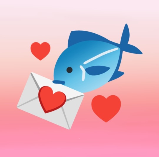
[ID: My icon, an emoji fish carrying an emoji love letter in its mouth surrounded by hearts and set against a pink gradient. End ID]
The blind community has competing access needs, which means there isn't a one-size-fits-all format, and your final choice comes down to what you prefer on your blog, as long as your IDs are useful and clear :)
Some bullet points to help you get your bearings:
Alt text is occasionally plagued by glitches and is sometimes considered less accessible to people who may not use a screenreader. It's still the most useful form of ID for screenreader users, from what I've gathered!
Plain text IDs should be written in fully plain text-- no small text or excessive italics/caps lock! However, I've seen that bold is generally more acceptable as special formatting. Utilize line breaks if necessary, but try to emphasize clarity and conciseness rather than exhaustive detail. Also, IDs go directly below (or above) the image, not at the end of a post!
People who do use both forms of description will frequently, as I did above, write a relatively bare-bones alt and a more in-depth ID so screenreader users can choose whether they want to sit through repeated information or not!
And last: Thank you again for reaching out!!!! Every person who chooses to make their spaces accessible makes the world a better place :))))
#hi i really really hope this helps!!!!!#feel free to peruse my#accessibility#and#image descriptions#tags for more assorted info!! there are some very good tutorials in there :D and also some more asks i've answered!#obligatory disclaimer that i am very much sighted and am working off what i know and have gleaned#i'm always open to correction and you should take me with a grain of salt!#sinhasfluffyheadfur#asks#kay talks#described#described by me#jesus christ why is my ask tag not 💌#NOOOO WAIT I JUST REMEMBERED. BC I ALREADY MADE THAT A TAG HERE AUGHHHHHHHHHHH
40 notes
·
View notes
Text
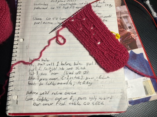
I realized I had forgotten to swatch for the button hole before starting the second sleeve. And an Hour later I have a swatch with 8 button holes before I got happy with how they look. The pattern basically says "make buttonhole" and I'm not experienced enough with garment knitting to go on just that.
I did manage to confirm that despite sizing up my yarn, I'm still going to need 1 inch/25mm buttons. I don't currently have 6 matching 25mm buttons that would look good with this yarn, so decisions have to be made. And unfortunately my brain has decided the best possible button would be a rose gold coloured shank back(?) button preferably that looks like an actual flower. Which, good luck to me for finding that relatively affordably.
I think I'm just going to knit the cardigan and decide once it's all sewn up. If it fits well and I think I'll wear it, I'll spend the money to get Nice buttons.
#swatching the button holes only took an hour of testing and writing and googling tutorials for things#but looking at buttons on ebay/etsy/random craft stores... that was three hours#i had fun tho tbh i love shopping :)#there IS novel reasons for the Ideal Buttons!!!#theres no actual description of buttons or anything. but still Novel Reasons#the Guy who Knit the Cardigan is representing by gold. like his hairs and eyes are described as golden regularly#i think its actually like a pale gold? but i think rose gold with the pinkish would look better with this pink#(i don't actually own anything rose gold i plan on taking a swatch with me to Somewhere with Rose gold to see them together)#also this is a designer pattern. the buttons deserve a bit of Class. i found some chanel buttons that would be great if i give up on flower#another thing about the Guy who Knits is that he like. CONSTANTLY is bringing the protag flowers. somehow not bl btw#off the top of my head i'm 100% sure he brings him carnations and i'm prettyyyyy sure roses?#sadly there's no canon colour on the carnations. the list of questions i have for the author grows every day#but the flower buttons Speak to me. maybe if i go for more simple buttons i can get a carnation applique or something#also i really really hope that i can read my own handwriting in the (v optimistic) two months it'll be before i knit the button bands
10 notes
·
View notes
Note
do you happen to have like. a really tall robot penguin cousin or somethin? i saw a guy like that walkin around bizville earlier. huge bowtie.
" Wh. NO??? How would we be related if it's a robot????? "
#ooc: this description sounds so familiar but i CANNOT figure out why#block tales#tutorial terry#askblog#block tales askblog#blocktales#roleplay#block tales roleplay#asks#tutorial terry block tales
13 notes
·
View notes
Text

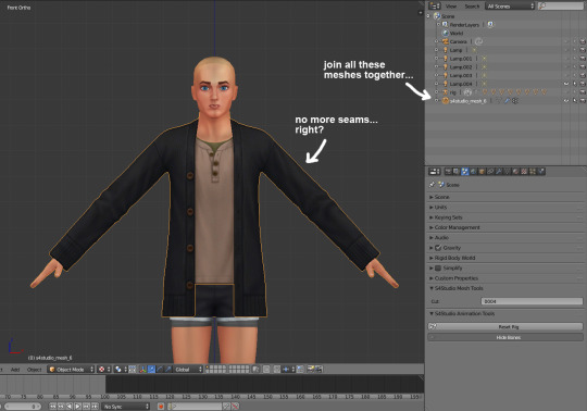
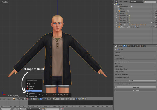

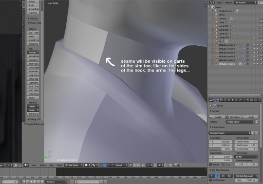

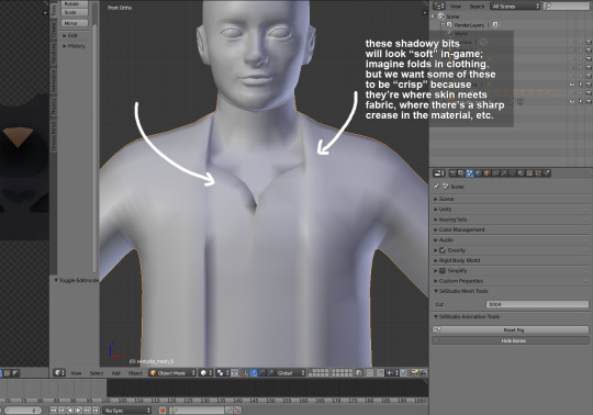
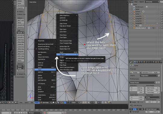

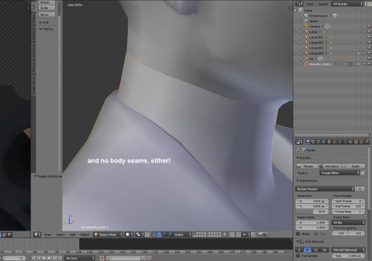
i've been making custom content for almost a year now, so i thought it might be helpful to start sharing little things i've learned to do in blender! i created this step-by-step guide on how to remove seams from a maxis mesh and how to edge split parts of meshes which should appear "crisp." i think they really help to make custom content look neater in-game.
you don't need to do this if you're making recolors, but if you export the mesh from sims 4 studio (i.e. to make something from a pack base game compatible), these seams will appear.
i hope this is helpful for others who are starting off editing maxis meshes themselves! 💪💪
#let me know if this is like. an obvious tip. lol#i never saw it in tutorials so i thought i would share :3c#oh god i have to think of a new tag.#tips and tutorials#there. descriptive.#also this assumes that you know a lot of blender basics.. if anyone is interested in like a toe to tip ''how i make cc'' thing i can do tha
102 notes
·
View notes
Text
youtube
#descript tutorials#descript decoded#Descript setup#descript tutorial#descript video editing#descript#digital nomad packing list#digital nomad guide#how to become a digital nomad#digital nomad jobs#digital nomad tips#digital nomad visa#working remotely from another country#remote work#work from home#desk setup#digital nomad#setup#setup tour#work and travel#how to work remotely#minimal desk setup#travel essentials#desk setup with laptop and monitor#Youtube
1 note
·
View note
Text

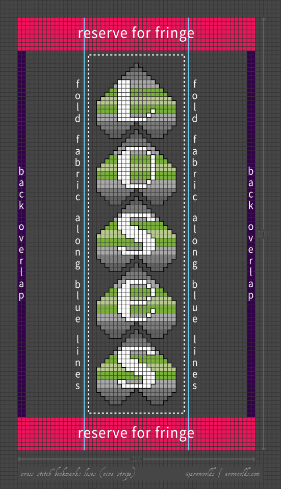
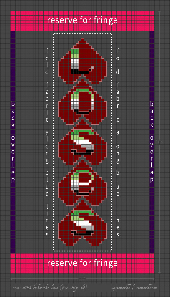
I'm kicking off Aro Week with some new bookmark designs plus a proper tutorial explaining the folding, stitching and fringing techniques for making bookmarks from a single piece of aida.
This design is perfect for loveless aros, but the upside-down hearts can be filled with any three, six or nine-stripe horizontal flag. The lettering can be filled with any five or ten-stripe horizontal flag.
#pride crafts#aromantic#loveless aro#loveless aromantic#tutorial#cross stitch#sewing#needlework#needlecraft#embroidery#bookmarks#pride#aro week#asaw 2025#link#aro worlds wordpress#heart#hearts#upside down hearts#loveless aro symbols#loveless aro symbolism#long post#image description in alt text#green aro pride flag#love loses
63 notes
·
View notes
Note
Hello do you have any guides/tips for writing image descriptions, I’m always at a loss of how much/little to include
Here's a post I made a bit ago going over the basics for what and what not to do.
Here's a tutorial showing different levels of detail.
I usually will include first, what is the medium? A photo? Digital painting? A traditional painting? (in which case I'll usually just say 'painting')
Here's another little tutorial for this post, showing images of increasing detail, and descriptions to match, which will hopefully help.
The main thing is to make sure you describe everything that's important in the image.
A good way to learn is to follow a lot of blogs that do image descriptions, so you can see how different people describe different things.
A new tutorial for April 2024:
simplest:
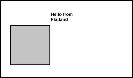
[ID: An MS Paint drawing of a grey square on a blank white background, saying, "Hello from Flatland". There is a simple black border around the image. End ID.]
a bit more detail:
Note that there's nothing inherent in the image to tell you this character's gender, but because I, the describer know it, I can simply use the correct pronouns and convey it that way.
If you're describing people whose genders you don't know, it's best not to assume.
[ID: An MS Paint drawing of a grey square on a blank white background, saying, "Hello from Flatland". He has a simple eye drawn on the upper right corner where his dialogue is, and has a pink heart and a brain represented by a circle with squiggle lines inside his body. There is a simple black border around the image. End ID.]
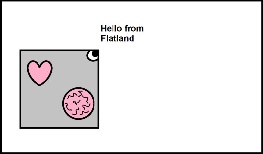
Some more detail:
[ID: An MS Paint drawing of a square on a blank white background, saying, "Hello from Flatland". He has a grey outer layer, with his insides purple, with a small eye just inside an opening on the corner where his dialogue is, with the corners appearing almost like a beak. He has a pink heart and a brain represented by a circle with squiggle lines inside his body. There is a simple black border around the image. End ID.]
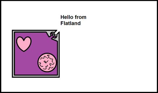
Yet more detail:
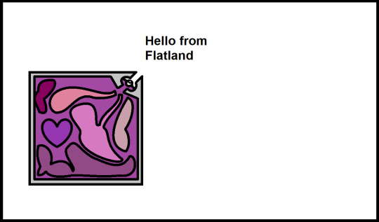
[ID: An MS Paint drawing of a square against a blank white background, saying, "Hello from Flatland". He has a grey outer layer, with purple insides, and various blob-shaped internal organs in different shades of pink and purple to reddish-purple, with all of them general blob shapes except the purple heart, which is in a simple heart shape. There is a simple black border around the image. End ID.]
Ooh look at this:
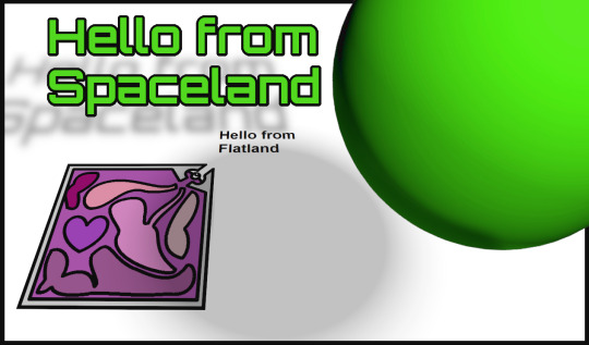
[ID: A digital drawing A green sphere, which says in matching green text, "Hello from Spaceland". The sphere and its dialogue both cast shadows on the white ground below, where a square, tilted at an angle as though lying flat on the ground while we view him from an angle, says "Hello from Flatland". The square has a grey outer layer, with purple insides, and various blob-shaped internal organs in different shades of pink and purple to reddish-purple, with all of them general blob shapes except the purple heart, which is in a simple heart shape. End ID.]
I'm too lazy at the moment to twist my brain to draw a tesseract so you'll all have to use your imagination for the image that would come next lol...
Hopefully this helped demonstrate a bit!
25 notes
·
View notes
Text

gotta be about the worst theme anybody ever made but it's mine :)
#do people still look at desktop themes lol.....i know i do!!#anyway. i have 0 coding knowledge and i'm not just saying this it's a fact. so this was dskbfj...a process.#there's a lot i want to improve and change and i really need to figure out how to properly center the container & background...#because it may look fine now but it didn't work how it was supposed to and that can't be good lol#in my wildest dreams the site would be responsive but bkjsbfkjbsk at this rate i think not. and also no one cares. i know this :)#what bothers me tho are the source and via permalinks but i couldn't quiteeee figure them out. even w/tutorials 😭#so that's gonna stay on ice for now#oh and i need a better description to put on the sidebar there. this is just redundant with the links below#but at least it's functional rn (??) and in MY computer and browser it looks ok :')
9 notes
·
View notes
Text
Y'all.
That post description post was right. So right.
Don't let those blogs do all the work. Describing just your own posts is not very hard, but when you try to add descriptions to more posts it gets really hard and a little tiring.
Try to make an ID whenever you remember. It can become an habit. Let's make images acessible y'all.
And if your blog has a lot of screenshots of like, tumblr and twitter posts, it's even easier. Specially if the original post already had an ALT description for whatever images it had in it.
Try.
22 notes
·
View notes