#experimented with new brush techniques
Text
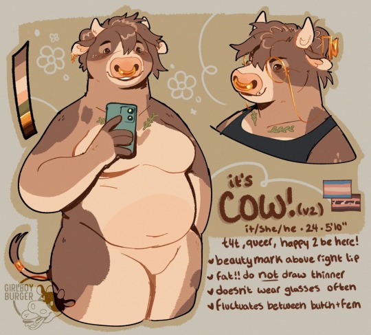
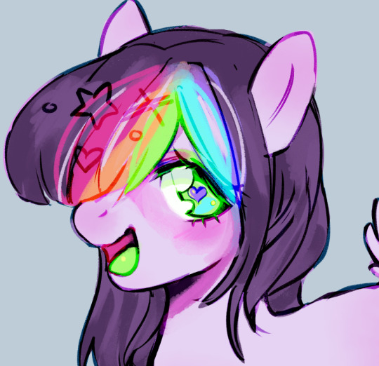
had an identity crisis, prime time for a slight sona redesign!
it's cow! (again!)
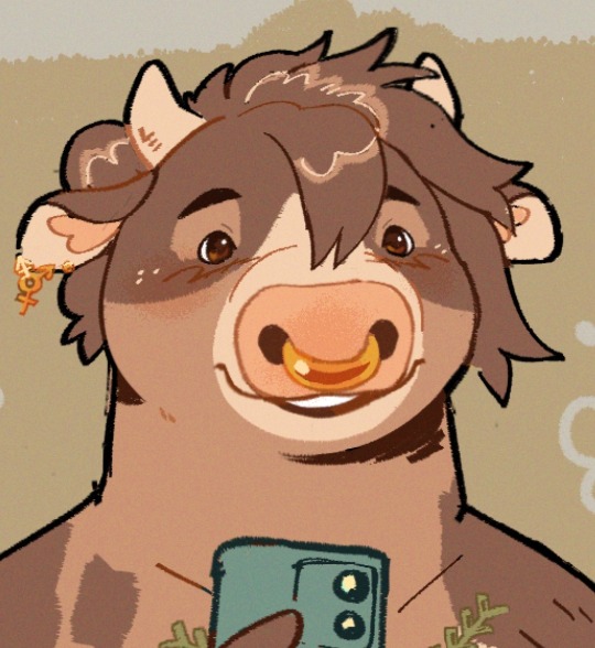
+ a closeup because i'm really proud of the eyes
#i felt really extremely disconnected from cow and was like welp. time to make new fursonas#and made like four drafts before drawing cow with short hair and going 'oh.'#i ...... just need a hair cut. so i gave my fursona a haircut while i'm waiting to go#fucking. SADGE that im redesigning it so soon after its last ref but#shrugs#i do not control the heightened emotions about fursona and what it means to me#also there's a lot of experiments in this piece!! new brushes new coloring techniques new style of ref#loooots and lots of alts over on my ponytreon#my art#furry#fursona#anthro#oc#cow#cattle#oc: cow#bovine#ref#ref sheet#reference#i tried like...7 other palettes before just taking the old one and tweaking it and now i rllllllllly like it :03#i just needed less pastels/contrast and more soft/desaturated tones...who woulda thunk#(it's everyone. everyone wouldve thunk. i <3 desaturated tan tones)
2K notes
·
View notes
Text
I'm starting to understand how to render in MS Paint bear with me here,
#i'm experimenting !#also hi his overalls are . not backwards this time . i swear i'll learn to draw them better eventually#also the way the sweater folds makes the anatomy look weird but I SWEAR HIS ARM WAS OK IN THE SKETCH#i'm trying to learn new rendering techniques and looks :] i dont usually use many textured brushes so ms paint forcing me to is Good#mod snuuy#omori#daily basil#art#drawing#omori basil#digital#basil#basil omori#also. basil with freckles anyone
135 notes
·
View notes
Text

Thank you @taiyomoyo for sending me the gorgeous reference pic, I hope you like it! This went in a very different direction from what I initially envisioned, but I had Peanut Butter & Tears by DPR IAN stuck in my head the whole time I was drawing and that tells you everything you need to know
#I'm constantly experimenting with new styles and brushes and techniques#this piece has given me so much freedom to go over the top#that and getting into dpr ian#the way his music makes me feel will definitely bleed over into my art in unexpected ways#onlyoneof#onlyoneof fanart#junji#kim junhyung#artchoerim
43 notes
·
View notes
Text
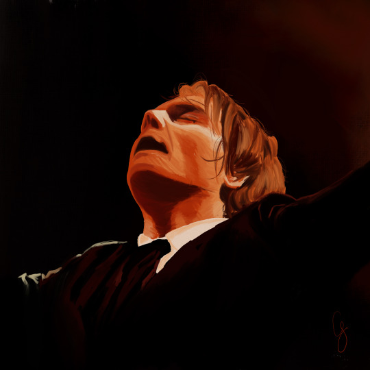
TERROR!
#my art#mcr#mcr art#gerard way#reference pic from brisbane night 2. i believe?#listen im not. in love with it but im experimenting with technique#and new brushes
57 notes
·
View notes
Photo
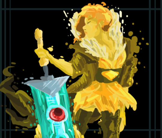
thinking of them (voiceless singer and sword boyfriend)
#transistor game#transistor supergiant#supergiant games#red transistor#mr nobody transistor#kant art#ive been experimenting with a kind of blotchy and funny painting technique#bc. i have no idea what actually makes a good brush so i just use the default#so im not sure what to call this bc i guess its technically a painting but also ehhhh?#im very new to this sort of thing orz
143 notes
·
View notes
Text
good morning everybody!!
#art#oc#original character#digital art#experimenting with new brushes and techniques... trying to foreshorten..#also new icon :]
6 notes
·
View notes
Text

Image ID: An illustration of a long dragon character wearing a bunch of scarves, a fancy hat, and rounded glasses with a cheerful expression. She is mainly shades of pink, with blue, green, and orangey-yellow accents, and she is on a teal flower-patterned background. End ID.

Image ID: An illustration of a human character holding a teacup and wearing a blue and purple flower-patterned outfit. She is in a somewhat angular style against a blocky pink and blue background. End ID
Image ID: Three graphically-styled drawings of a small, red, one-eyed squid demon character laid out like a playing card. The card is embellished with line details, a fancy fork, and states it is the 3 of spades. End ID.

Image ID: A drawing of a hyena character on a dirt bike wearing dirt-biking attire. A cloud of dust is being kicked up, and the character and bike are in a purple, green, yellow, and black color palette. End ID.
finally getting around to posting some of my artfight pieces!! meant to do this throughout july but uh. oops
Featured characters are:
Rosa - Sweetspea on Artfight
Tetsu Itō - @sleepytr4sh
Frank - @weepyapple
Zephyr - BeeGrave on Artfight
#froxart#froxposting#artfight#illustration#character art#described#im really happy with a lot of my pieces from this year! i used this time to experiment with brushes and textures and techniques that i neve#get to use#mayhaps found a new favorite brush type...... default CSP india inks my Beloved.#finally......... no longer is my materials deck going unused!!!!!
11 notes
·
View notes
Text
#myart#robin's art#mlp#my little pony#design#mlp design#this is a BIG wip but i'm drooling over the brush i found#it's so cronchy..............#also experimenting with new coloring techniques hehe
19 notes
·
View notes
Photo

more clangen... this time the savior of sootclan, honeyhawk! this also happens to be a late night drawing, i dunno why that seems to be the only time i ever get motivated to draw.
#warrior cats oc#warriors clan generator#late night doodles#experimenting with medibang's watercolour options!#it's a really neat set of brushes but i'm gonna need to mess around with the settings#i dont like the lack of texture when painting#i had to draw him from memory since i was away from my laptop lmao#surprisingly got super close but his actual colours are a lot more muted?#forgot his cheek scar though rip#OH and also tried a new technique with shading!!#was super fun i'd love to do it again with painterly art c:
17 notes
·
View notes
Text


More zhizhi doodles!!
#oc#hubble draws#razhi#experimenting with a new brush I made at the top! as well as technique I've seen some people do!#which is laying colour down first then lining on top of it lmfao
5 notes
·
View notes
Note
Charcoal, lilac, steel (major envy), and lemon
your art is great too!! something that really helped me develop my style was using chinese and korean portrait photography as references. they’ve got insanely good colors and lighting


also, for other people interested in my style: I use the procreate brushes round paintbrush, nikko rull, and gouache to get my textured rendering. I don’t gatekeep
also also: here’s a photography site I use for inspo. It might be dodgy so beware: http://www.cnu.cc/works/416994
#I only really developed my style because I was experimenting with a ton of different brushes#and I forced myself to start rendering over my line art#but also art isn’t linear guys#even if you’re constantly learning new techniques it’s really hard to apply them to your art right away
4 notes
·
View notes
Text

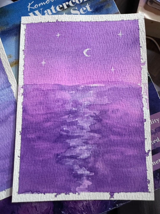


Seascapes
#star speaks#star arts#still need to properly finish the purple and blue one#I actually think the brush work on it is quite good so I just need to add stars#the pink and purple was the first one and a bit messier#but I like the shape of the brighter ripples in the middle#it does look like the sea right?#I need feedback though#also can we appreciate I did this having only done a seascape ONCE before#I just had memorised it as best I could. obviously like#because I’m already practiced in watercolour basics if I *do* forget a step I can figure it out#but it’s still difficult to paint something especially in watercolour without practicing the technique and such first and the dry brushwork#for the sea is still a new technique for me#it felt like a learning experience for me too as I was teaching#learning how to guide others while confidently demonstrating#and working with whatever I’m able to produce in that moment
1 note
·
View note
Text
25 Prose Tips For Writers 🖋️✨ Part 1
Hey there!📚✨
As writers, we all know that feeling when we read a sentence so beautifully crafted that it takes our breath away. We pause, reread it, and marvel at how the author managed to string those words together in such a captivating way. Well, today I'm going to unpack a few secrets to creating that same magic in your own writing. These same tips I use in my writing.
But before I begin, please remember that writing is an art form, and like any art, it's subjective. What sounds beautiful to one person might not resonate with another. The tips I'm about to share are meant to be tools in your writer's toolkit, not rigid rules. Feel free to experiment, play around, and find what works best for your unique voice and style.
Power of Rhythm 🎵
One of the most overlooked aspects of beautiful prose is rhythm. Just like music, writing has a flow and cadence that can make it pleasing to the ear (or mind's ear, in this case). Here are some ways to incorporate rhythm into your writing:
a) Vary your sentence length: Mix short, punchy sentences with longer, flowing ones. This creates a natural ebb and flow that keeps your reader engaged.
Example:
"The sun set. Darkness crept in, wrapping the world in its velvet embrace. Stars winked to life, one by one, until the sky was a glittering tapestry of light."
b) Use repetition strategically: Repeating words or phrases can create a hypnotic effect and emphasize important points.
Example:
"She walked through the forest, through the shadows, through the whispers of ancient trees. Through it all, she walked with purpose."
c) Pay attention to the stressed syllables: In English, we naturally stress certain syllables in words. Try to end important sentences with stressed syllables for a stronger impact.
Example:
"Her heart raced as she approached the door." (Stronger ending)
vs.
"She approached the door as her heart raced." (Weaker ending)
Paint with Words 🎨
Beautiful prose often creates vivid imagery in the reader's mind. Here are some techniques to help you paint with words:
a) Use specific, concrete details: Instead of general descriptions, zoom in on particular details that bring a scene to life.
Example:
Instead of: "The room was messy."
Try: "Crumpled papers overflowed from the waste bin, books lay spine-up on every surface, and a half-eaten sandwich peeked out from under a stack of wrinkled clothes."
b) Appeal to all five senses: Don't just describe what things look like. Include smells, sounds, textures, and tastes to create a fully immersive experience.
Example:
"The market bustled with life. Colorful fruits glistened in the morning sun, their sweet aroma mingling with the earthy scent of fresh herbs. Vendors called out their wares in sing-song voices, while customers haggled in animated tones. Sarah's fingers brushed against the rough burlap sacks of grain as she passed, and she could almost taste the tang of ripe oranges on her tongue."
c) Use unexpected comparisons: Fresh similes and metaphors can breathe new life into descriptions.
Example:
Instead of: "The old man was very thin."
Try: "The old man was a whisper of his former self, as if life had slowly erased him, leaving behind only the faintest outline."
Choose Your Words Wisely 📚
Every word in your prose should earn its place. Here are some tips for selecting the right words:
a) Embrace strong verbs: Replace weak verb + adverb combinations with single, powerful verbs.
Example:
Instead of: "She walked quickly to the store."
Try: "She hurried to the store." or "She dashed to the store."
b) Be specific: Use precise nouns instead of general ones.
Example:
Instead of: "She picked up the flower."
Try: "She plucked the daisy."
c) Avoid clichés: Clichés can make your writing feel stale. Try to find fresh ways to express common ideas.
Example:
Instead of: "It was raining cats and dogs."
Try: "The rain fell in sheets, transforming the streets into rushing rivers."
Play with Sound 🎶
The sound of words can contribute greatly to the beauty of your prose. Here are some techniques to make your writing more musical:
a) Alliteration: Repeating initial consonant sounds can create a pleasing effect.
Example: "She sells seashells by the seashore."
b) Assonance: Repeating vowel sounds can add a subtle musicality to your prose.
Example: "The light of the bright sky might ignite a fight."
c) Onomatopoeia: Using words that sound like what they describe can make your writing more immersive.
Example: "The bees buzzed and hummed as they flitted from flower to flower."
Art of Sentence Structure 🏗️
How you structure your sentences can greatly affect the flow and impact of your prose. Here are some tips:
a) Use parallel structure: When listing items or actions, keep the grammatical structure consistent.
Example:
"She came, she saw, she conquered."
b) Try periodic sentences: Build suspense by putting the main clause at the end of the sentence.
Example:
"Through storm and strife, across oceans and continents, despite all odds and obstacles, they persevered."
c) Experiment with sentence fragments: While not grammatically correct, sentence fragments can be powerful when used intentionally for emphasis or style.
Example:
"She stood at the edge of the cliff. Heart racing. Palms sweating. Ready to jump."
Power of White Space ⬜
Sometimes, what you don't say is just as important as what you do. Use paragraph breaks and short sentences to create pauses and emphasize important moments.
Example:
"He opened the letter with trembling hands.
Inside, a single word.
'Yes.'"
Read Your Work Aloud 🗣️
One of the best ways to polish your prose is to read it aloud. This helps you catch awkward phrasing, repetitive words, and rhythm issues that you might miss when reading silently.
Edit Ruthlessly ✂️
Beautiful prose often comes from rigorous editing. Don't be afraid to cut words, sentences, or even entire paragraphs if they don't serve the overall beauty and effectiveness of your writing.
Study the Masters 📖
Please! Read widely and pay attention to how your favorite authors craft their prose. Analyze sentences you find particularly beautiful and try to understand what makes them work.
Practice, Practice, Practice 💪
Like any skill, writing beautiful prose takes practice. Set aside time to experiment with different techniques and styles. Try writing exercises focused on specific aspects of prose, like describing a scene using only sound words, or rewriting a simple sentence in ten different ways.
Remember, that developing your prose style is a journey, not a destination. It's okay if your first draft isn't perfect – that's what editing is for! The most important thing is to keep writing, keep experimenting, and keep finding joy in the process.
Here are a few more unique tips to help you on your prose-perfecting journey:
Create a Word Bank 🏦
Keep a notebook or digital file where you collect beautiful words, phrases, or sentences you come across in your reading. This can be a great resource when you're looking for inspiration or the perfect word to complete a sentence.
Use the "Rule of Three" 3️⃣
There's something inherently satisfying about groups of three. Use this to your advantage in your writing, whether it's in listing items, repeating phrases, or structuring your paragraphs.
Example:
"The old house groaned, creaked, and whispered its secrets to the night."
Power of Silence 🤫
Sometimes, the most powerful prose comes from what's left unsaid. Use implication and subtext to add depth to your writing.
Example:
Instead of: "She was heartbroken when he left."
Try: "She stared at his empty chair across the breakfast table, the untouched coffee growing cold."
Play with Perspective 👁️
Experiment with different points of view to find the most impactful way to tell your story. Sometimes, an unexpected perspective can make your prose truly memorable.
Example:
Instead of describing a bustling city from a human perspective, try describing it from the point of view of a bird soaring overhead, or a coin passed from hand to hand.
Use Punctuation Creatively 🖋️
While it's important to use punctuation correctly, don't be afraid to bend the rules a little for stylistic effect. Em dashes, ellipses, and even unconventional use of periods can add rhythm and emphasis to your prose.
Example:
"She hesitated—heart pounding, palms sweating—then knocked on the door."
Create Contrast 🌓
Juxtapose different elements in your writing to create interest and emphasis. This can be in terms of tone, pacing, or even the literal elements you're describing.
Example:
"The delicate butterfly alighted on the rusted barrel of the abandoned tank."
Use Synesthesia 🌈
Synesthesia is a condition where one sensory experience triggers another. While not everyone experiences this, using synesthetic descriptions in your writing can create vivid and unique imagery.
Example:
"The violin's melody tasted like honey on her tongue."
Experiment with Sentence Diagrams 📊
Remember those sentence diagrams from school? Try diagramming some of your favorite sentences from literature. This can give you insight into how complex sentences are structured and help you craft your own.
Create a Sensory Tour 🚶♀️
When describing a setting, try taking your reader on a sensory tour. Move from one sense to another, creating a full, immersive experience.
Example:
"The old bookstore welcomed her with the musty scent of aging paper. Dust motes danced in the shafts of sunlight piercing the high windows. Her fingers trailed over the cracked leather spines as she moved deeper into the stacks, the floorboards creaking a greeting beneath her feet. In the distance, she could hear the soft ticking of an ancient clock and taste the faint bitterness of old coffee in the air."
Use Active Voice (Most of the Time) 🏃♂️
While passive voice has its place, active voice generally creates more dynamic and engaging prose. Compare these two sentences:
Passive: "The ball was thrown by the boy."
Active: "The boy threw the ball."
Magic of Ordinary Moments ✨
Sometimes, the most beautiful prose comes from describing everyday occurrences in a new light. Challenge yourself to find beauty and meaning in the mundane.
Example:
"The kettle's whistle pierced the quiet morning, a clarion call heralding the day's first cup of possibility."
Play with Time ⏳
Experiment with how you present the passage of time in your prose. You can stretch a moment out over several paragraphs or compress years into a single sentence.
Example:
"In that heartbeat between his question and her answer, universes were born and died, civilizations rose and fell, and their entire future hung in the balance."
Use Anaphora for Emphasis 🔁
Anaphora is the repetition of a word or phrase at the beginning of successive clauses or sentences. It can create a powerful rhythm and emphasize key points.
Example:
"She was the sunrise after the longest night. She was the first bloom of spring after a harsh winter. She was the cool breeze on a sweltering summer day. She was hope personified, walking among us."
Create Word Pictures 🖼️
Try to create images that linger in the reader's mind long after they've finished reading. These don't have to be elaborate – sometimes a simple, unexpected combination of words can be incredibly powerful.
Example:
"Her laughter was a flock of birds taking flight."
Use Rhetorical Devices 🎭
Familiarize yourself with rhetorical devices like chiasmus, antithesis, and oxymoron. These can add depth and interest to your prose.
Example of chiasmus:
"Ask not what your country can do for you – ask what you can do for your country." - John F. Kennedy
Even the most accomplished authors continue to hone their craft with each new piece they write. Don't be discouraged if your first attempts don't sound exactly like you imagined – keep practicing, keep experimenting, and most importantly, keep writing.
Your unique voice and perspective are what will ultimately make your prose beautiful. These techniques are simply tools to help you express that voice more effectively. Use them, adapt them, or discard them as you see fit. The most important thing is to write in a way that feels authentic to you and brings you joy.
Happy writing, everyone! 🖋️💖📚 - Rin T
Hey fellow writers! I'm super excited to share that I've just launched a Tumblr community. I'm inviting all of you to join my community. All you have to do is fill out this Google form, and I'll personally send you an invitation to join the Write Right Society on Tumblr! Can't wait to see your posts!
#writing tips#on writing#creative writing#writers block#writing#how to write#thewriteadviceforwriters#writers and poets#writers on tumblr#writeblr#aspiring author#author#book writing#indie author#writer#indie writer#authors of tumblr#fiction writing#writing a book#writing advice#writing blog#writing community#writing guide#writing help#writing characters#writing ideas#writing inspiration#novel writing#romance writing#writing reference
2K notes
·
View notes
Text
My Favorite Cheap Art Trick: Gradient Maps and Blending Modes
i get questions on occasion regarding my coloring process, so i thought i would do a bit of a write up on my "secret technique." i don't think it really is that much of a secret, but i hope it can be helpful to someone. to that end:

this is one of my favorite tags ive ever gotten on my art. i think of it often. the pieces in question are all monochrome - sort of.

the left version is the final version, the right version is technically the original. in the final version, to me, the blues are pretty stark, while the greens and magentas are less so. there is some color theory thing going on here that i dont have a good cerebral understanding of and i wont pretend otherwise. i think i watched a youtube video on it once but it went in one ear and out the other. i just pick whatever colors look nicest based on whatever vibe im going for.

this one is more subtle, i think. can you tell the difference? there's nothing wrong with 100% greyscale art, but i like the depth that adding just a hint of color can bring.
i'll note that the examples i'll be using in this post all began as purely greyscale, but this is a process i use for just about every piece of art i make, including the full color ones. i'll use the recent mithrun art i made to demonstrate. additionally, i use clip studio paint, but the general concept should be transferable to other art programs.


for fun let's just start with Making The Picture. i've been thinking of making this writeup for a while and had it in mind while drawing this piece. beyond that, i didn't really have much of a plan for this outside of "mithrun looks down and hair goes woosh." i also really like all of the vertical lines in the canary uniform so i wanted to include those too but like. gone a little hog wild. that is the extent of my "concept." i do not remember why i had the thought of integrating a shattered mirror type of theme. i think i wanted to distract a bit from the awkward pose and cover it up some LOL but anyway. this lack of planning or thought will come into play later.
note 1: the textured marker brush i specifically use is the "bordered light marker" from daub. it is one of my favorite brushes in the history of forever and the daub mega brush pack is one of the best purchases ive ever made. highly recommend!!!
note 2: "what do you mean by exclusion and difference?" they are layer blending modes and not important to the overall lesson of this post but for transparency i wanted to say how i got these "effects." anyway!
with the background figured out, this is the point at which i generally merge all of my layers, duplicate said merged layer, and Then i begin experimenting with gradient maps. what are gradient maps?
the basic gist is that gradient maps replace the colors of an image based on their value.

so, with this particular gradient map, black will be replaced with that orangey red tone, white will be replaced with the seafoamy green tone, etc. this particular gradient map i'm using as an example is very bright and saturated, but the colors can be literally anything.

these two sets are the ones i use most. they can be downloaded for free here and here if you have csp. there are many gradient map sets out there. and you can make your own!
you can apply a gradient map directly onto a specific layer in csp by going to edit>tonal correction>gradient map. to apply one indirectly, you can use a correction layer through layer>new correction layer>gradient map. honestly, correction layers are probably the better way to go, because you can adjust your gradient map whenever you want after creating the layer, whereas if you directly apply a gradient map to a layer thats like. it. it's done. if you want to make changes to the applied gradient map, you have to undo it and then reapply it. i don't use correction layers because i am old and stuck in my ways, but it's good to know what your options are.

this is what a correction layer looks like. it sits on top and applies the gradient map to the layers underneath it, so you can also change the layers beneath however and whenever you want. you can adjust the gradient map by double clicking the layer. there are also correction layers for tone curves, brightness/contrast, etc. many such useful things in this program.
let's see how mithrun looks when we apply that first gradient map we looked at.

gadzooks. apologies for eyestrain. we have turned mithrun into a neon hellscape, which might work for some pieces, but not this one. we can fix that by changing the layer blending mode, aka this laundry list of words:

some of them are self explanatory, like darken and lighten, while some of them i genuinely don't understand how they are meant to work and couldn't explain them to you, even if i do use them. i'm sure someone out there has written out an explanation for each and every one of them, but i've learned primarily by clicking on them to see what they do.
for the topic of this post, the blending mode of interest is soft light. so let's take hotline miamithrun and change the layer blending mode to soft light.

here it is at 100% opacity. this is the point at which i'd like to explain why i like using textured brushes so much - it makes it very easy to get subtle color variation when i use this Secret Technique. look at the striation in the upper right background! so tasty. however, to me, these colors are still a bit "much." so let's lower the opacity.

i think thats a lot nicer to look at, personally, but i dont really like these colors together. how about we try some other ones?

i like both of these a lot more. the palettes give the piece different vibes, at which point i have to ask myself: What Are The Vibes, Actually? well, to be honest i didn't really have a great answer because again, i didn't plan this out very much at all. however. i knew in my heart that there was too much color contrast going on and it was detracting from the two other contrasts in here: the light and dark values and the sharp and soft shapes. i wanted mithrun's head to be the main focal point. for a different illustration, colors like this might work great, but this is not that hypothetical illustration, so let's bring the opacity down again.

yippee!! that's getting closer to what my heart wants. for fun, let's see what this looks like if we change the blending mode to color.

i do like how these look but in the end they do not align with my heart. oh well. fun to experiment with though! good to keep in mind for a different piece, maybe! i often change blending modes just to see what happens, and sometimes it works, sometimes it doesn't. i very much cannot stress enough that much of my artistic process is clicking buttons i only sort of understand. for fun.
i ended up choosing the gradient map on the right because i liked that it was close to the actual canary uniform colors (sorta). it's at an even lower opacity though because there was Still too much color for my dear heart.

the actual process for this looks like me setting my merged layer to soft light at around 20% opacity and then clicking every single gradient map in my collection and seeing which one Works. sometimes i will do this multiple times and have multiple soft light and/or color layers combined.
typically at this point i merge everything again and do minor contrast adjustments using tone curves, which is another tool i find very fun to play around with. then for this piece in particular i did some finishing touches and decided that the white border was distracting so i cropped it. and then it's done!!! yay!!!!!
this process is a very simple and "fast" way to add more depth and visual interest to a piece without being overbearing. well, it's fast if you aren't indecisive like me, or if you are better at planning.

let's do another comparison. personally i feel that the hint of color on the left version makes mithrun look just a bit more unwell (this is a positive thing) and it makes the contrast on his arm a lot more pleasing to look at. someone who understands color theory better than i do might have more to say on the specifics, but that's honestly all i got.

just dont look at my layers too hard. ok?
2K notes
·
View notes
Text
Chiho Saito’s 1999 Revolutionary Girl Utena Original Illustration Collection
IT’S HERE. IT’S DONE. IT’S FINISHED. NOW…IT’S YOURS. Happy Holidays, my friends.
Vanna here! I have posted some already about this project, and the responses I got, public and otherwise, have been absolutely incredible. Y’all have been reblogging and hyping this before it even finished…I haven’t felt so encouraged about an Utena project since the musicals! (Yes, streams soon, I promise.) You can read the other post to get more details, and catch my post here with more details about the process if you’re interested. The long and short of it?
This is the first artbook I ever scanned. I did it in 2001. In Photoshop, using multiple scans per page that took hours to process. But it was 2001. A half megabyte file that was 1250px wide was considered extremely hardcore and impressive. That’s just always been the business I’m in when it comes to Utena art, you know?
It’s now the latest artbook I’ve scanned, and so much of the process, and effort involved, is unchanged. What has changed, is the result. Welcome to your new desktop background. Your new phone background. Your new poster print.
What I’ve done here is attempt to create definitive digitized images of Chiho Saito’s work as offered by this book--I have removed the print moiré of the original scans, and used my literal decades of experience to try and tease out as much information from them as possible. Without being physically in front of the original artwork (which is a thing I’ve had the great fortune to get to do) this is The Most Chiho Saito you are ever going to get. I’ve tried my best to make sure there is a way to get it that works for everyone:
Do you just wanna scope 'em out? Look at some disaster gays? Grab your favorite one or two? This is the path for you! Check out the ‘compressed’ (not very) 10k ‘web friendly’ (not really) copy at the Bibliothèque, the media archiving wing of the Something Eternal forums at Empty Movement*. All the following links are also available from here.
Do you want these copies? All of them? Don't just grab them individually, friend. This batch is 375MB and can be downloaded as a zip of the individual files here on our Google Drive.
Do you like digital archiving? Are you looking for a copy that preserves the archival quality of the effort but sits nice and comfy in a single file? This is for you. A minimally compressed 10k, 513MB version worked into a PDF is now up, shiny and chrome, on the Internet Archive.
Do you like the idea of the minimal compression, but want the individual files in a zip? Yep I did that too, here's the drive link.
Are you looking to print these in a larger size? This is probably the only reason on Earth you’d ever want them, and yet a bunch of you are going to go straight for these. Here are the zero-compression JPG full size copies, most of them are 15k across, like simply a ridiculous size. Pick your fave and download it from our Google Drive!
I am genuinely really proud of this work.** I was able to tease out so much new detail from these…her incredible layering techniques, the faintest brush of her highlights, and the full range of her delicate hand at whites and blacks… details commonly lost in digitization. I sincerely hope you find something here that you’re looking for, as an artist looking for inspiration, as a weeb looking for a desktop, as an archiver excited to see incredible 90s manga artwork saved forever in the digital realm. I feel like I have already said so much about them, and could keep going, but you know what? This work speaks for itself. Enjoy, use, explore, and definitely tell us what you think!
We love y’all. ~ Vanna & Yasha
* AHEM ASTERISK AHEM
You might be wondering what any of that is. Something Eternal? Biblewhatawhat??? EmptyMovement.com? You might even have done a double take at the word ‘forum.’ And you should!!!
I have a confession. This artbook was my ‘side project’ as I worked on this, *the main project.* For a couple years I’ve been banging around with a new domain, and originally I had other plans for it, but Elon Musk ruined my Twitter and Discord is well along on its way to enshittification, and well….we joke on the Discord a lot about ‘reject modernity, embrace forums’ and you know what? We’re right. So Yasha and I are putting our money where our mouths are once again, and doing something insane. We are launching, in 2023, a website forum. Obviously, this is not the official ‘launch’ per se, but I cannot announce the artbook without directing you to the forum, since it sits on the attached very cool gallery system. Oops! Told on myself. Another post more focused on the forum will be forthcoming, but if you are just that motivated to get in right away, you absolutely can! (This will help stagger new arrivals anyway, which is good for us!) If you would rather wait for the ‘official’ launch, by all means that’s coming, including a lengthy screed about how and why we’re doing this. In either case, remember: this is a couple weebs trying to make internet magic happen, we are not website developers by trade. Give us grace as we iron things out and grow into this cool new website thingie…hopefully along with some of you! :D
If you do join up, naturally, there is a thread about this project!
** If you like this kind of content, consider helping us pay for it! We do have a Patreon! If you’re wanting to use these in some public-facing distributive way, all we ask is for credit back to Empty Movement (ohtori.nu or emptymovement.com, either will work.)
I would like to say ‘don’t just slap these files on RedBubble to get easy money’ but I know that saying this won’t effectively prevent it. Y’all that do that suck, but you’re not worth letting it rain on the rest of this parade. :)
#revolutionary girl utena#utena#rgu#sku#empty movement#chiho saito#90s manga#digital archives#manga aesthetic#shoujo kakumei utena#utena art
2K notes
·
View notes
Text
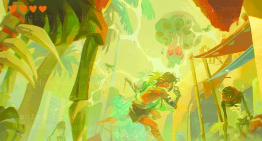
Ruined Town 🪲⚡️
I’m actually super proud of this piece, I wanted to push myself out of my comfort zone to do something dynamic & complex with hopefully a somewhat interesting composition, and I really worked hard on it. I’ve been feeling kind of down on my art recently tbh, like I’ve stagnated a bit, and this piece really helped me to experiment a bit more & try out some new brushes & techniques. Can’t wait to experiment & draw more soon! 🩵
#zelda#tears of the kingdom#TotK#Zelda TotK#TotK spoilers#TotK fanart#legend of zelda#zelda tears of the kingdom#zelda fanart#daeyumi art#link#TotK link#Gerudo town#gibdo fight#it’s only 3am & already my brain is too fried to remember how to tag things properly#i’m srsly so proud of this piece tho#i worked so hard on it#i srsly think seeing a gibdo in the ruins of Gerudo town for the first time is one of my fave moments from the game#bc srsly i saw that thing on the ground & then it stood up and i was like what the actual fuck is that#and honestly i think that’s my absolute favorite feeling in a zelda game for some reason?
2K notes
·
View notes
Last Seen Blogs

timmblanton26
The Journaling of Mayer 385

daily-islam
peace be upon you
daily-islam
peace be upon you
daily-islam
peace be upon you

limpehsiao
Untitled