#fixed-width fonts
Explore tagged Tumblr posts
Visit Tumblr Blog
Explore Tumblr blogs with no restrictions, modern design and the best experience.
Last Seen Tumblr Blogs


Fun Fact
Post activity is at the highest at 4:00 pm EDT; notes peak at 10:00 pm EDT.
Text
I CANT USE CSS ON ARTFIGHT...............
#I WAS REALLY HOPING TO FIX THE FUCKING. PARAGRAPH WIDTH. SIGH#idk why but it stretches across the ENTIRE page like. it takes up the full width of the browser and it BOTHERS ME. ON ALL THE PAGES#i could try manually putting shift breaks but im worried it might not look so good on mobile. ugghh... auyggghhh.....#im already learning CSS and API so i thought i could put it to good use but. AUGH#this whole time ive had to go into the inspect panel myself and change the padding so i dont have to read the length of the screen#like a fucking typewriter... i would have also loved to use custom fonts and animations......#i did find a guide for BBCode which the site uses on default and it covers basic styling but its not the same. sniffle#you CAN unlock CSS if you donate $25 to the page which seems fair. and if i could do it i would but. i do not have any way of#sending or receiving money online </3 i really need to figure out how to do that so i can set up comms like i said i would last summer#but it intimidates me.... and im already kept on a short leash when it comes to that so it feels like a lot of things could go wrong#i think toyhouse allows CSS or some sort of code...?? i remember seeing some oc pages with custom layouts#if thats the case i'll try fiddling with it but im not very familiar with using toyhouse so thatll take a while#(thanks again for the code sal ^_^ ill put it on my pin once its ready but im trying to learn my way around the site heh ;;)#at least i can use my pixel dividers.. ive been digging around for pixels to use and found some really cute ones#yapping
50 notes
·
View notes
Text
I talked about it with a friend this week. They use colored text because it does not feel as permanent. I use a code editor with a fixed width font. This type of font in my brain is for things that need editing anyway. Code is never complete. I also use markdown which in coding is usually used to jut down ideas and documentation. Stuff that's also never really permanent. The WIP vibe really helps.
Anybody else got that Evergiven sized writers block
201K notes
·
View notes
Text
Old Tumblr Dashboard (Userstyle)!!
I created a Userstyle for the Chrome/Firefox Stylus Extension that reverts the new dashboard to the old look!
You need to have Stylus installed. So if you don't have it:
Install the Stylus Firefox Addon or the Manifest V2 Chrome Extension (You can install Chrome Extensions on Edge as well)
Once it's installed into Firefox/Chrome/Edge you can proceed with adding this style or any other.
To add the style (Stylus), follow the instructions:
Go to this link: https://userstyles.world/style/11286/old-tumblr-dashboard-userstyle (If it says 'style not found' then the Userstyle.world server is just down, try again in an hour)
Click on "install".
Style will open a tag with it and in the left side you'll have a button that says "install style", click there. (Step-by-step copied from the lovely dorothyoz39 who wrote this in a reply!) If you don't want the sticky header you can remove the labelled script at the top of the css below /* Sticky Header*/
For Manifest V3 only Chrome Or Stylus incompatible browsers:
For Chrome Manifest V3 install the Tampermonkey Extension
Then add the Tampermonkey Backup Script instead of the Stylus version
https://greasyfork.org/en/scripts/492279-old-tumblr-dasboard-backup I highly recommend you switch to Firefox for continued use of good extensions! Stylus does not have a V3 update yet; however, the tamermonkey script works just as good.
Be sure to check for updates regularly and if you'd like, consider supporting me on Ko-Fi https://ko-fi.com/pixiel !
I'm currently taking donations so I can afford a much-needed wheelchair, so please check out my GoFundMe for more details! Any Ko-Fi donations will be added manually to the GoFundMe
..::::HOW TO UPDATE::::..
click the Manage button on Stylus and click the check for update button next to the userstyle, then click again to install!

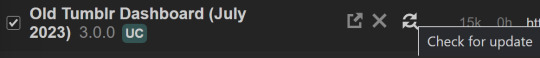
Make sure to check the Userstyle and see if the version number matches the one below if you don't see any changes!
NEW UPDATE: 25/05/25 (D/M/Y) 17:28PM BST v17.13
16.16: Fixed activity and notifications, they now look like the previous version 17.0: Final update to the new icons bs! Every page should be functional. If theres any missed parts or bugs - let me know! 17.9: Minor fixes and Tampermonkey update! You can also fix the positioning of the Communities button and subnav from this menu as well - it should remember your settings when you update!


Tumblr Post Width & More (OTD+ Userstyle) Is now available!!
OTD+ is an add on for Old Tumblr dashboard that you can use to edit the Post Width, Content Positioning & More - It must be used with Old Tumblr Dashboard installed as well on the latest update! This style might be merged with OTD in the future.
THE CREATOR OF THIS USERSTYLE SUPPORTS THEIR TRANS SISTERS. WE'RE ALL IN THIS TOGETHER!
Check the readmore for the changelog, custom code & known issues!
----- Known issues:
Only two columns in Masonry view. Semi-Unfixable, Tumblr creates columns based on monitor size, if I try adding another column (because it doesn't exist) it just perpetually loads on screen. Semi-fix: Zoom out in chrome/firefox and it adds more columns, you may need to change the font size of the page though
Search bar doesn't appear on some pages (like viewing a post), this is because Tumblr removed the search bar on those pages completely. Unfixable but not a big deal
Tumblr has ONCE AGAIN CHANGED THE ACCOUNTS MENU. The menus are now shorter and have less information on them. This is unfortunately permanent. I do not see any way to fix this. Unfixable.
If you want people's icons to stay fixed in place, instead of scrolling with the dashboard change this in Stylus;


Or if you're using the tampermonkey version

Find text:
.NLCTe > div.Evcyl > div > div > .So6RQ.YSitt > .ge_yK > .c79Av > article > header > .RYkKH > .nZ9l5 { pointer-events: auto; top: 55px; transition: top .25s; position: -webkit-sticky; position: sticky; } and replace it with;
.NLCTe > div.Evcyl > div > div > .So6RQ.YSitt > .ge_yK > .c79Av > article > header > .RYkKH > .nZ9l5 { pointer-events: auto; top: 0px; transition: top .25s; position: absolute; }
Solved issues: (Update)
Menus need to be manually closed SOLVED! in V.4 and updated in V.5! The menu & icon WILL scroll with you if you have removed the sticky header CSS, however, clicking anywhere on screen will make the Menu disappear still.
Masonry view in searches is now fixed!
Resized Messenger Chat Box!
NEW UPDATE 16/08/23, 23:55 BST v6.5: Figured out how to reorganise the icons in the header. Let me know if you have any problems with it and make sure to update your Userstyle! Some icons are hidden with Display: Block; you can hide more icons with this method!

Solved issues p2
Brought back SOME of the icons for Tumblrs latest update - Unfortunately, this does not bring back user icons for Reblogged posts! Make sure to yell at Tumblr for removing the icons as well as the horrible dashboard update here! v7.5 Fixed icons for all posts and put them back where they came from!
v6.9.6.9 (I promise this is the last funny number): Fuck Off Buggy The Clown Update + All languages support for the old header design!
v7.0: Fixed the search bar for tumblrs new collections feature, so it looks like the original search bar!
v8.0: Fixed masonry view icons, hidden the reblog icon on dashboard icons, fixed icons in blog viewport
V8.1: Fixed issue with icons not working on soft-refresh & with endless scrolling disabled - be sure to complain to staff!
v9.3: Changed a few things with the search feature, I also made the posts less round.
UPDATE2 11/04/2024: SO We mighhtttt have overrun their servers. 😅 I'm getting a 500 Internal Server Error every time I try to fix it or upload it as a new style - the massive influx of people downloading the userstyle was probably too much. The Tampermonkey backup on Greasyfork works just fine though! Probably easier for a lot of people migrating anyway! UPDATE 11/04/2024:: My code has broken on Userstyles.world, (it is now fixed as of 12/04/24) until this is fixed I have created a Tampermonkey Backup Version of the Userstyle so feel free to use this version if you've broken yours!
https://greasyfork.org/en/scripts/492279-old-tumblr-dasboard-backup
v9.6: Moved the Following | For you | Your Tags to below the create a post panel. Fixed the Accounts Menu! + Bugfixes V10.3: Patio compatibility. Added a way to hide the Patio button & "patio feedback?" button, just search for patio in the code and follow the instructions! v11.0: Temporary Chat feature fix after Tumblr broke it, fixed some positioning issues and j/k scrolling!
v12.3: Fixed a text issue (my bad!), I undid the changes to the replies function and added a way to fix icons order for when you get the communities update!
v12.5: Update to make compatible with the Content Positioning using Tumblr Post Width & More (OTD+ Userstyle) v12.6: Post buttons fixed, icons unable to be fixed yet as I haven't got the tumblr changes just yet - but I will fix them asap!
v11.7: Communities Update, changed the new search bar on communities page to resemble the old one. The search bar still doesn't work on these pages yet for some reason. Blog view icons fixed. v13.0: The icons change should now have a working patchfix! BIG THANK YOU to arcadian-asgardian for sending me the screenshots I needed and testing if it worked. + Minor tweak, communities button resized to fit the rest of the icons better v13.2: Mini fixes now that I have better access to the new changes! Communities icon re-centered, usernames nudged back into place.
V13.5 & v13.7: Nuked the Go Premium button - Re-positioned the search bar on search pages v13.10: Changed a lot of the new look for replies - it's not perfect yet mind. Small bug with the "..." menu moving to the left with shorter replies. Looks a lot more like the old replies section though! Made it possible to remove the reply to reply button just search for "NEW Replies UI" in the userstyle and remove the /* */ around "display: none" OR use Ublock to block the element! v14.1: Reverted the "Original Poster" border + text to look like old version. Edit: Whoops, fixed an issue with showing the timestamps
v13.4: Added a way to fix the communities icon position if you don't have the New Xkit button or have hidden any of the icons. Just remove the highlighted /* */ pair in the code for what you need.
v14.11: Made Premium Perks button available in the bottom left corner for all premium users v15.2: Fixed the Tumblr fuckup AND added a cool new feature that allows you to customise the look of your header & hide the reply-to-replies button if you like, here's how to customise this. Set to "Block" if you want the button/icon visible, Set to "None" if you want it hidden! V15.5: Given labels to options for clarity - now says 'show' or 'hide'!
v15.9: The Boopdate! V16.0: Fixed Search view pages and made them look normal, unfortunately, I can't bring back the dropdown menus for "top"/"All Time" etc - but it should look more like the original now
v16.3: Minor tweaks to make search pages look better
16.10: Fix changes to the notification icons 16.14: Fixed many issues with Tampermonkey Version - including a bug that makes the header go weird when you click on a post, fixed notification icons in small view
16.16: Fixed activity and notifications, they now look like the previous version
16.26: TEMPORARY UPDATE - only changes some aspects of the dashboard - THIS IS FULLY INCOMPLETE AND I AM WORKING ON A FULL FIX FOR THE REST OF THE SITE EDIT: added changes for timestamps!
25K notes
·
View notes
Text
I have gotten a lot of messages saying that they really love the presentation of CURSE/KISS/CUTE. Often the commenter in question can’t say what exactly it is about the formatting that they appreciate, but that it just reads well and looks good. Well!!! Allow me to bare my wealth of secret knowledge for you once and for all:
I sorta just did some research into book typography...?
Here’s something you should know about web development, alright: typography on the web is really, really bad. The tools we have at our disposal—HTML and CSS—are incredibly powerful, but they are set up to fight you every step of the way towards Good Typography. When you know what you’re looking for, you can fix all the common issues quickly and easily. But it’s not easy to know what to look for, because
problematic typography is overwhelmingly the norm on the web, and
good typography is invisible.
Here’s a screenshot from CURSE/KISS/CUTE episode 0:

Now, I don’t want this post to come across as prescriptive. It is not my intention to tell you, “This is what good typography looks like, so follow my lead exactly.” I made a lot of choices with the typography of my web novel: many of those choices would not make sense in other contexts. What I want to convey to you is what those choices are, so that you will know they’re available to be made.
I mentioned that the web “fights you” when it comes to good typography. What do I mean by that? Well, check this out:

This is how that passage of text renders “by default.” In other words, this is how a web browser would render that text without any input from me about what styles to apply. It kind of sucks ass! But it also looks pretty familiar, right? This is not that far off from how a lot of websites—even websites full of prose (looking at you, AO3)—render text.
I think the most illustrative thing to do here would be to walk you through my thought process and show you, step by step, what decisions I made to turn this unstyled text into the styled version you see in the novel.
So, first things first:
1. We have got to shrink that text column.
Computer monitors... are wide. They are wider than they are tall. They are so wide, and they have so many pixels. This means you can fit a lot of characters on them. If you wanted, you could just have a wall of characters from the left side of the screen all the way to the right side. Talk about efficient!!
You should never, ever, ever do this.
This is one choice that I actually will make a prescriptive statement about, because it’s supported by quite a lot of research: fairly narrow text columns are more legible. Specifically, research seems to support the idea that a width in the range of 50 to 70 characters per line is the most comfortable for people to read*. Every font is different, so it takes a little doing to turn that “characters” figure into a pixel measurement; I went with 512 CSS pixels for the maximum width of my text column:

Isn’t that just so much nicer to read already?
*A commenter reminds me that I’d be remiss not to point out that the research on column width legibility isn’t completely conclusive. You do want to limit the width of your text columns, but going over the 70 character-per-line recommendation isn’t necessarily the end of the world, and you might have good reasons to do so. I did not: as mentioned, one of my goals was to mimic book-style typography, and books by nature have fairly restrained column widths, on account of they’re books.
2. Picking a font.
I’m not going to give you the blow-by-blow on how I decided what font to use. The short story is that I asked some designers, and one of the recommendations I got was the free font Crimson Pro, which I took a liking to immediately:

It’s just an all-around attractive serif font, but one thing I really like about it for use in a novel is its highly-visible quotation marks. They’re just kinda jumbo! They’re real big! Easy to see! In a novel, those things aren’t just ornamentation. It makes a great deal of practical sense for them to stand out just a bit. It also has a fairly large x-height, unlike a lot of the more traditional options, which is good for legibility on a computer screen.
3. Adjusting the line-height
Web browsers default to a line-height of about 1.2em, which, as you can probably tell, is quite cramped. If you go and Google “optimal line height for legibility”, you’ll get a number of results right off the bat suggesting 1.5em. Sounds good! Let’s do that:

Well... hmm. That’s definitely an improvement, but between you and me, it actually looks a bit too spacey to my eyes. I wonder why?
I’ll cut to the chase: the 1.5em recommendation makes some assumptions about the font you’re using. In Arial, the letter “A” is about 0.6em tall; in Crimson Pro, it’s about 0.5em. That means that there’s no one-size-fits-all solution to spacing your lines, because different fonts have different amounts of empty space baked in. How annoying!
Let me tell you something about the kind of nerd I am. When I had this realization, I grabbed some books off my shelf and pulled out a literal micrometer. I started measuring the line-heights against various font features to see if there were any patterns I could spot in professional typesetting. Here’s what I found:

Almost every book on my shelf spaces lines such that the distance between one baseline and the next is about three times the x-height. How cool is that? I clapped my hands like a seal when I put this together.
Adjusting the line-height to match what I observed in the wild gives us this:

It’s a subtle difference, but to my eyes it feels just right. It’s almost like magic!
4. Paragraph spacing...
Let’s address the elephant in the room. Probably the most controversial choice I made with CURSE/KISS/CUTE’s typography was to opt for book-style paragraph indentation rather than web-style paragraph spacing—like so:

I did this for a few reasons:
It’s what I’m used to. I’ve read a lot of books, and this is just the way that books are formatted. I think for something aspiring to the title of “novel”, there’s value in making it look the way a reader probably expects a novel to look.
A novel has a lot of paragraph breaks in it. A paragraph in, say, an encyclopedia entry might go on for half a page or more; whereas it is unusual for a paragraph in a modern work of narrative prose to run for more than a handful of sentences, especially in any scene with dialogue. Because paragraph breaks are so common, spacing between paragraphs in a novel results in a lot of wasted space. Also, subjectively speaking, the additional space seems to me to lend an undue amount of weight to paragraph breaks. I’m just starting a new thought; there’s no need for a 21-gun salute, you know?
Having said that, here are some good reasons you might decide not to do paragraph indentation anyway:
Doing it right requires a bit of extra legwork. Notice how the very first paragraph in the image above has no indentation. That’s because it’s the start of a new section, and the first paragraph in a section traditionally goes unindented. This is an easy detail to miss, and it can be difficult to wrangle CSS into doing it for you automatically.
Web users don’t expect it. For the first decade of the web’s existence, there was no good way to do paragraph indentation; by the time CSS rolled around and made it easy, paragraph spacing had already become the norm. And while CURSE/KISS/CUTE may be a novel, it is also, specifically, a web novel!
But it’s my house and I get to make the rules, so I went with indentation. Incidentally, there seems to be a dire lack of research into the question of whether indentation or spacing is more legible for readers—but the data that does exist appears inconclusive at best. So, the choice really does come down to vibes.
5. The tragedy of justification.
You’ll note that one way in which I did not make my web novel look like a paper novel is the text alignment. It’s un-justified: the right margin is ripsaw-ragged.
This is because it is not possible to justify text on the web.
Oh, you can try. Look right here: there’s a CSS property for it and everything. Just turn on “text-align: justify” and...

Nightmare! The interword spacing on that first line is almost as wide as the indentation!
Reader, I’m afraid that your web browser is simply too dumb. That’s not the browser’s fault: robust algorithms for justifying text without creating these distractingly huge gaps between words have existed for many decades, and modern computers are powerful enough to run them in real time with little performance impact. It’s just, uh—nobody has ever bothered to implement them into web browsers. It is the damnedest thing.
I tried, I really did. You can mitigate this problem a bit if you enable automatic hyphenation, but browsers are unfortunately also kind of dumb at hyphenating. Firefox, for example, will refuse to hyphenate any word containing a capital letter, so any sentence with a lot of proper nouns in it is a lost cause. I tried manually inserting soft hyphens with a text preprocessor I wrote myself, but still these overjustified lines plagued me: when the text column narrows, for example on a phone, even hyphens can’t save you. The line-breaking algorithm is simply too naïve to optimize for well-justified text, and that’s not something you can fix as a web developer.
As a result, my heavy-hearted recommendation is to never use text justification. It’s just too distracting.
6. And then some extra stuff just for me
I added drop-caps because it looks neat and I made the ellipses spacier because I think it looks good when it, uh, when they are spacier. I think that looks pretty good that’s just my opinion though.
That’s all! Hope you learned something bye!!!
526 notes
·
View notes
Text


Theme #09: Astral by @pneuma-themes
May this Song lead us to our Paradise.
Live Preview (Temporary) / Static Preview: [Index] [Permalink] / Get the code: [Pastebin] [Github]
A sleek and minimalist sidebar theme created around the idea of having a music player and a monochrome aesthetic. Suitable for all kinds of blogs.
Features:
Optional monochrome images. Can be enabled or disabled from the Customize page.
One accent, 8 color options.
Customizable post width and font size. The live preview uses 600px posts and 13px font size.
4 custom links.
Optional audio music player. Can be enabled or disabled from the Customize page. Paste the direct link of your audio file to the song url field in the Customize page and type the name of your audio file into the song title field. To add the artist name of your audio file, type the artist's name into the song artist field.
Custom link menu title, can be filled by typing the title of your custom link menu into the custom link menu title.
Customizable photoset gutter.
Built-in lightbox for photoset posts.
Mostly NPF-friendly.
Notes:
Usual disclaimer applies.
The audio player only supports one song.
Credits:
Un-blue polls, NPF Image Fix 3.0, NPF Audio Player, Music Player #07, minified spotify player: @glenthemes
customAudio.js: @annasthms
NPF reverse compatible template: @eggdesign
photoset.css: @eggdesign, @annasthms
Icon fonts: Lucide
Sidebar image: たえ (tae402 @ X/Twitter)
Font: Rubik @ bunny.net
Toggle tags on click: @alydae
Responsive video script: @nouvae
Song on preview: Class::DISTLLISTA; by Shimotsuki Haruka from the game Ar nosurge: Ode to an Unborn Star.
Please like and reblog if you like or are using this!
#themehunter#theme hunter#tumblr themes#blog theme#dailyresources#*mine: all#*mine: theme#*theme: astral#she so prettyy i love the sidebar#fun fact this is the first theme i released after getting hitched!#life is good
828 notes
·
View notes
Text
Some Letterform Vocabulary

CATEGORIES
Typeface—an artistic rendering or design of a set of glyphs. Used to be only one style, now usually refers to a type family.
Font—The medium containing an iteration of a typeface. For metal type, this would be the set of glyphs for a single size typeface (as designs varied by size to create optical harmony from one size to another). Whereas for digital type it refers to the actual font file. So if the file contains a whole family, then “typeface” and “font” become interchangeable. But if there’s only one style per file, then each one is a font but the collection of font files comprises the typeface.
Family—a collection of related typefaces with the same core traits and name. (Usually consists of regular, bold, italic.)
Regular—also called roman in text types, the base style (most significantly in terms of weight and width) of a type family.
Bold—a heavier (thicker) weight than regular, used to emphasize text in contrast to regular type.
Light—a lighter (thinner) weight than regular.
Weight—a gauge of the thickness of the strokes in a typeface.
Italic—a style of type based on chancery hand calligraphy developed in Italy. Initially used on its own (beginning around 1500), it was not used for emphasis in contrast to roman type on the same page until much later.
Oblique—type slanted to the right (different and distinct from italic).
Backslant—type slanted to the left.
Condensed—type that takes up less horizontal space than its regular counterpart. Condensed type is designed to keep stroke widths in proportion, whereas artificially compressing the type causes the vertical strokes to become thinner, losing much of the character and grace of the original design.
Extended—type that takes up more horizontal space than its regular counterpart. Extended type is designed to keep stroke widths in proportion, whereas artificially stretching the type causes the vertical strokes to become thicker, losing much of the character and grace of the original design.
Display—type meant for large sizes, typically with finer details.
Caption—type designed for very small sizes, meant to harmonize visually with text type and address specific design problems arising at such sizes.
Superfamily—also called a Type System, a collection of type families, often across different type classifications (like gothic and script) or consisting of an extensive range of type styles along multiple design axes.
FIGURES (Numbers)
Lining Figures—numbers that sit on the baseline and are about cap-height, meant to be set on their own or with uppercase letters. Also called Titling Figures.
Text Figures—numbers with different heights meant to harmonize with lowercase letters. Also called Oldstyle Figures.
Proportional Figures—numbers spaced to fit according to their shapes, the way letters are spaced. Lining and Text Figures can both be proportionally spaced.
Tabular Figures—also called Monospaced or Fixed Width Figures, numbers spaced equally in order to work in tables. Lining and Text Figures can both be tabular.
CLASSIFICATIONS
Classical—also known as Oldstyle, these types are characterized by triangular serifs, low stroke contrast, and an oblique (non-vertical) axis.
Humanist—also called Venetian, these types include the earliest type designs, which emulate 15th century manuscripts written in a formal hand. Based largely on Carolingian minuscule, they have low stroke contrast, a slanted axis, short and thick bracketed serifs, triangular serifs on the ascenders, and typically a tilted crossbar on the lowercase e. The work of Nicolas Jenson in 15th century Venice (hence the name Venetian) is the prime example of this classification.
Garalde—a portmanteau of the names of Claud Garamond and Aldus Manutius (whose work epitomizes this classification), garaldes have a horizontal crossbar on the e, finer proportions and stronger contrast than humanist types.
Transitional—also called Realist, this classification expresses the spirit of the Enlightenment. Transitional types have higher contrast than humanist or garalde, and a near vertical axis. Baskerville typifies this classification.
Modern—types categorized by simple or functional structures.
Didone—a portmanteau of Didot and Bodoni (whose work exemplifies this classification), these types have a vertical axis, very high contrast, and unbracketed serifs.
Mechanistic—also called Slab Serif, the types in this classification embody the spirit of the Industrial Revolution, which is when they first occurred. They have very low contrast and thick, rectangular serifs. The serifs can be unbracketed, like Rockwell, or bracketed, like Clarendon.
Lineal—another term for sans serif type.
Lineal:
Grotesque—also called Gothic, originating in the 19th century, these types have some degree of stroke contrast and tend to be somewhat idiosyncratic; typically the curved strokes have horizontal terminals, and the G has a spur. (Franklin Gothic, Akzidenz-Grotesk)
Neo-Grotesque—derived from grotesque typefaces, these types have less stroke contrast, a more regular design, and a high degree of subtlety; the curved stroke terminals tend to be slanted, and the G might not have a spur. (Univers, Helvetica)
Geometric—sans serif types derived from geometric shapes such as circles and rectangles, the glyphs in these types have a high degree of repetition and regularity. (Futura)
Humanist—derived from hand painted monumental capitals and Carolignian miniscules, the proportions of these types come closer to being written rather than constructed. They are similar in derivation to, but not derived from, Humanist serif types. (Gill Sans, Optima)
Calligraphic—type meant to show clear evidence of being chiseled, written, drawn, or otherwise created directly by hand.
Glyphic—also referred to as Incise, the types reference forms cut or incised into a hard surface such as stone, wood or metal. (Trajan, Copperplate Gothic)
Script—types based on calligraphy, cursive, or other hand writing.
Graphic—also called Manual, these types are based on slowly hand drawn originals.
Blackletter—types modeled after late medieval broad nib formal hands.
Gaelic—types derived from the insular manuscript hand.
Source ⚜ More: Writing Notes & References ⚜ Writing Resources PDFs
#typography#terminology#letters#writing reference#writeblr#dark academia#spilled ink#literature#writers on tumblr#creative writing#writing prompt#worldbuilding#light academia#writing inspiration#writing ideas#writing resources
74 notes
·
View notes
Text
MY THE SIMS MEDIEVAL DOWNLOAD FOLDER (2025)
The old list somehow got "corrupted" and Tumblr wouldn't open it or let me edit it when I could rarely open it, so I created a new one! (I specify that in this list there will only be the cc and mods that I USE, not all those existing for TSM!)
I hope I didn't forget anything because I made this list from my phone, but if I did I'll update it from time to time!
LIGHTING MODS
Game lighting mod: You can use any The Sims 3 Lighting Mod, HERE you can find a masterpost with every TS3 Lighting Mod that exist! (You can only use one at a time, no more than one together)
CAS lighting mod: Realistic CAS Lighting by @nectar-cellar
COMPLETE KINGDOM RETEXTURES
(I use one theme at a time depending on which one inspires me at the moment. DO NOT use them all together.)
Autumn Kingdom by Harrykotiej: HERE!
Winter Kingdom & Fantasy Kingdom by ChickieTeeta: HERE!
ALL 4 Seasons Kingdom by MariaCherry: HERE! + Snow on all roofs for Winter theme
A Dark Kingdom Retextures by MariaCherry: HERE!
Fantasy Kingdom by MariaCherry: HERE!
ONLY TERRAIN RETEXTURES
(You can only use one terrain replacement at a time.)
Desert Terrain by @mariacherry
Mud Tracks replaced with stone ones by @mariacherry
Terrain replaced with TS4 terrain textures by @mariacherry
ONLY TREES RETEXTURES
(You can only use one trees replacement at a time)
Lilac trees by @mariacherry
DEFAULT REPLACEMENTS
Moon Default Replacement: Moon-Moon by @potato-ballad-sims
Stars Default Replacement: Milky Way by @nilxis
Default Babies by @mariacherry
Default Books by @mariacherry
Default Food by @mariacherry
Default bread by @mariacherry
Default rose by @mariacherry
Town Wall Replacement by Shimrod
Wooden Default CAS Room by @mariacherry
Wood Loading Screen by @mariacherry
Better Quality Headlines effect by @xiasimla
Frontal camera for the sim thumbnail
Less exagerated sims expressions for the sim thumbnails poses (Only retouched ver.)
Softer outline when placing objects by @mariacherry
MISC THINGS
NoIntro - Base+P&N
No Pause Line by @mariacherry
Increased font size by @mariacherry
ShimrodsTSMCamera
The Sims 3 Camera (This one doesn't go in Mods folder and it's compatible with the one above)
Reshade Presets: I use these presets!
CREATE-A-SIM CC
HAIRS: 4tM Hairs here, here and here
DEFAULT SKINTONES: I don’t use any.
DEFAULT EYES: I don’t use any but I use THESE contact lenses.
CLOTHES & ACCESSORY: I download them all on Sauris blog here and sometimes on @mariacherry blog.
3D EYELASHES: You can find S-Club Eyelashes for TSM HERE
MAKE-UP: Face Scars (Can’t find the link) - Ear Blush
18+ (NUDE DETAILS)
Female Skin Details (3D Nipples)
Male Skin Details (Private Parts)
SLIDERS
I use THESE body sliders (All of them)
THESE neck sliders (You only need Neck Width and Neck Tilt)
And THIS height slider
ESSENTIAL & BIGS MODS
Grim Medieval Core
Grim's Medieval Auto Save
Treeag - TSMAutoDisableClothingFilter
DeeDawg's Unlocks Manager
Watcher Hand
Watcher Hand - Urnstone
Medieval Life 3.8 (18+)
SMALL MODS
AutoCollect Interaction Mod
CallBirdLessOften
Forsaken+Shimrod SocialsBothFullVersions
Improved barrels
Books and Medieval Recipes + Forsaken Recipes
Well 50 buckets
Drunk as a Skunk
P&N All Birds Available
Cleanliness: Near The Watcher
Scrab and Sweep floor
MoreInteractionQueues20 (Old, I use another ver. now. It's this one below.)
Queque actions from 5 to 20
SimRecruit_TSMCombatAdded
A Wizard with Good Memory + Less Energy Cost for spell
“Refresh the bath water” available for everyone
Exp for Playing the Fiddle
Joint Walks and Hunting
Improved bath
Laundry
Ring the Bell
Play With Teddy Bears
Simmodder99's Mod Library
Shimrod's Mods
Blue Eyes Bug fix
Childhood V2
Collecting Stones & Herbs
Fishing trip avaiable for everyone
Important events
Medieval Route Fix
Increased chance of being eaten in the forest
Sleep when you want to
Training with a mannequin lowers hygiene
More Interactions (Can’t find the link anymore)
Another TSM route fix
79 notes
·
View notes
Text
AGT Team March - April Progress Report
As we head into May, we're wishing the best of luck to all those entering finals season. We hope this update will provide a reminder of some things to look forward to!
[PS2] Fullmetal Alchemist 3: The Girl Who Succeeds God
The first round of proofreading for FMA 3 has officially begun! As well as fixing typos and checking for bugs, there is also a fair amount of lines which need manual word wrapping or trimming down, as shown here.
[NDS] Death Note: Successors to L

Following our last update, our hacker, Illidan, was able to make even more improvements to the font rendering, allowing the variable-width font to display as intended. As you can see, the letters are now more condensed, giving us some much needed extra room for the translations!
[NDS] Mushishi: Amefuru Sato
As the final proofreading round of Mushishi continues to progress, we've been able to use the feedback we've received from testers to improve some instructions about the various stylus-based mechanics featured in the game.
Other
Although things may seem a little quiet on the home front, behind the scenes we have been working on two as-of-yet unannounced projects. If things go as planned, one of them should be ready for release by the end of summer, so please keep your eyes peeled!
26 notes
·
View notes
Note
hey quick question i assume you're pretty good at tumblr is there anyway to monospace your font?
Oh wait, do you mean this?
If you're on the app, there should be an "Aa" button when typing. Press it, then hit "Chat"

If you're on the website, select your text then open the menu that should say "Regular" and press "Chat"

If that doesn't suffice, there's websites you can copy and paste from:
15 notes
·
View notes
Text
Dark Mode Work Skin for the fic To Be a Dragon Among Men
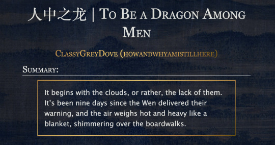
This is the code and urls for the custom dark mode work skin I made for my fic To Be a Dragon. Feel free to use it for your own works or for site skins, just remember to credit my user if you do.
[EDIT 25-03-18: Fixed padding for .frameborder class]
[EDIT 25-06-12: Added formatting rules for .poetry class and <p>]
Additional Resources
A Step-by-Step Guide to Work Skins from AO3 News - A great basic guide to what work skins are and how to make one.
How to Apply Work Skins to Others' Works by classygreydove - This is a guide I made on how to make a work skin into a site skin. You'll need to know this if you want to apply the work skin to any fic you want to read.
How to Change Work Skin Font by classygreydove - Don't like the font I use for the work skin? Don't worry, I'll show you how to change it.
Light Mode CSS - You can find the code for the Light Mode work skin here.
Light and Dark Mode Backgrounds - You can find the background images for the Light and Dark Mode work skins here.
Other Background Options - Here are a few mid-tone backgrounds that will have a lower contrast to the text.
Line Breaks (for Phone) - Do you like the custom dragon line breaks? Here's the phone-sized ones.
Line Breaks (for Wide Screens) - Do you like the custom dragon line breaks? Here's the laptop-sized ones.
[Code begins under Keep reading break]
#workskin .userstuff .hr, #workskin .hr, #workskin hr { height: 36px; width: 178px; background: url(https://64.media.tumblr.com/f19653c8c877dbe7a14e78434f1d0df6/d0f8688c32033f2d-b3/s250x400/6edcdac1e5614693d10491cff0725fd3633de77e.png); background-repeat: no-repeat; background-position: center; border: 0; }
#workskin { background: url(https://64.media.tumblr.com/f20ef324c5117a56d7dd2c8aa7e45151/4dcdf7c3c32cb0d1-68/s2048x3072/10c1120c78cd66a99c1067e6ed8b1addcd52ef57.png); background-repeat: repeat-y repeat-x; background-position: top; color: rgba(255, 255, 248, 0.85) !important; font-family: 'Georgia', 'Lucida Grande', 'Verdana'; }
#workskin a { background: linear-gradient(135deg, #b4853f 0%, #edc967 40%, #b4853f 80%, #705103 100%) !important; -webkit-background-clip: text !important; -webkit-text-fill-color: transparent !important; border-bottom: 0px; }
#workskin a:hover, #workskin a:active { background: linear-gradient(135deg, #b4853f 10%, #edc967 60%, #b4853f 80%, #705103 100%) !important; -webkit-background-clip: text !important; -webkit-text-fill-color: transparent !important; }
#workskin h2, #workskin h3 { line-height: 1.25; font-variant: small-caps; }
#workskin .userstuff blockquote { display: block; border: 2px solid #b4853f; border-image: linear-gradient(135deg, #b4853f 0%, #edc967 40%, #b4853f 80%, #705103 100%); border-image-slice: 1; padding: 15px 15px 15px 15px; margin-left: 1.5em; margin-right: 1.5em; }
#workskin .goldborder { display: block; border: 2px solid #b4853f; border-image: linear-gradient(135deg, #b4853f 0%, #edc967 40%, #b4853f 80%, #705103 100%); border-image-slice: 1; padding: 15px 15px 15px 15px; }
#workskin .frameborder { border: 2px solid #b4853f; border-image: linear-gradient(135deg, #b4853f 0%, #edc967 40%, #b4853f 80%, #705103 100%); border-image-slice: 1; padding: 0px; }
#workskin .mobilebreak { width: 178px; max-width: 100%; max-height: 100%; display: block; margin-left: auto; margin-right: auto; }
#workskin .textlink { font-variant: small-caps; }
#workskin .notesheading { font-size: 120%; font-variant: small-caps; font-family: 'Georgia', 'Lucida Grande', 'Verdana'; line-height: 2; }
#workskin .triggerwarning { color: rgba(240, 240, 240, 0.9); border-radius: 5px; background: rgba(128, 0, 0, 0.8); padding-left: 2px; padding-right: 2px; font-weight: bold; font-variant: small-caps; }
workskin .userstuff p { margin: 0; }
workskin .poetry { margin-inline-start: 1.5em; }
#ao3 skins#ao3 writer#ao3 fanfic#ao3 work skin#dark mode#the untamed#mo dao zu shi#To Be a Dragon Among Men
28 notes
·
View notes
Note
can you make a tutorial on how you made your header please (of course you don’t have to if you don’t want to)
hi anon! unfortunately as i was doing so my computer died so i've lost the original one </3 but we'll just make a new one using the same steps hehe! see under the cut.
i'm using photoshop 2024. open ps, and create a new canvas that is 640 x 360 px. add the image of your choice. the original picture i used was already rotated, but if you still want that effect and yours isn't, rotate it by 90 degrees. size it to your liking then click the check mark! after that, click your pen tool (or press p). create a rough outline of the areas you want outlined.

after that, click make selection at the top. the settings that pop up are fine. press ok. then, go to your marquee tool and right click on your outline. select stroke. choose the settings and color you want, im using 2px and making it white.

with that done, we can get to work on your text. the original font i used is called payback. here, i am using the font 'grandma house sans'. i am using gradient overlay, stroke and outer glow. after you have your main text, create a rectangle shape underneath. you will use this as the path for your subtext. with the rectangle selected, grab the font tool and place your text within the rectangle. i'm using the font asenine wide. once you have selected your text, look on the right side of your ps at the text properties. scroll down to paragraph and click 'justify all'

i'm adding a drop shadow and outer glow to the text to accentuate it but that's all i'll do. when that's done, you'll want to use the line tool to draw a line between the first space. duplicate the line and drag it over to the other empty space. i'm using a 1px purple line. i'll also add a drop shadow and outer glow to it bc the colors are light.

now, we are going to go back to our rectangle tool. create a rectangle the same length as the rest of the text. its color is up to you, i'm using a gradient overlay the same colors as the main text so it's cohesive! grab your text tool and again, with the rectangle selected, place your text within it. this text will be your tumblr url (unless you don't want it to be haha). i'm using the same font, asenine wide regular. i've added a drop shadow to the text. this is how it should look.

now, we're going to grab the rectangle tool one more time and place a rectangle at the top that is the same width as the canvas. the height is up to you, mine is 14 px.

now, change your shape to the ellipse and create a circle within the rectangle that's about 8px wide + long. duplicate it twice and place them about 4px from eachother. you can change the colors, i'm going to leave one white and then use two shades of light purple.
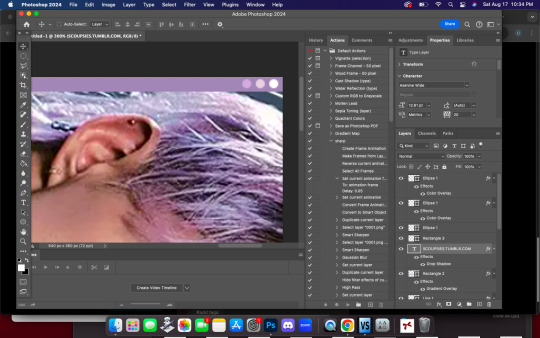
now, head on over to the other side of your canvas and use your type tool to add your date (and time if you wish, i didn't). mine is seventeen's debut date :) i used the same font, asenine wide regular. this is what i have so far.
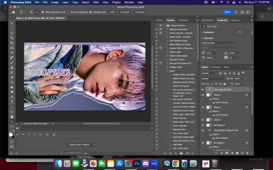
last but not least, we're going to add the particle effect. i screenrecorded effect #5 from this video. to make your life easier and save me from explaining the process, i've uploaded it as a psd here.
before you open the psd, open the timeline on your current canvas. this can be done by going to window -> timeline. mine is already open as you can see, once it is open click create video timeline.

then, you're going to go over to sparkles.psd and copy the 'group one' layer. paste it underneath your text! now, you're going to have the wonky problem of a gif that's significantly shorter than your other layers and cuts off, see here:

so to fix this, use this little thingy and drag it until it no longer goes over the edge of 'group one' in your timeline. it should look like this.

now, why is our overlay still blocking the rest of our image out? this is an easy fix, go over to layers, and with group one still selected, change the blend mode to 'screen'. bam!

finally, to achieve the background effect i have, create a new layer underneath all your other layers, then, go to the layer with your outline on it and use the magic wand tool to select everything outside of the line. go to your image layer with the selection still intact and go to image -> cut to remove the bg. i had to do this in 2 pieces.

then go to that new layer you created and make it whatever color you want. you can use a gradient map, solid color, whatever you want. i'm using a gradient fill similar to background colors, then over it i'm putting a crumpled paper texture (i just googled black paper texture haha) on screen mode. feel free to get creative. this is how it looks!

and that's all, your header is ready to use. go over to file -> export -> save for web (legacy) and save it to your computer. this is our end result! i did add a bit of noise to hoshi bc the image was low quality but otherwise, i did nothing that wasnt't outlined here!

i hope this was semi easy to understand! ♡
#answered#tutorial#tagging some friends for exposure <3#tuserflora#userzaynab#userace#usermery#heymax#cheytermelon#rinblr#long post#image heavy
36 notes
·
View notes
Text


I wanted to work on some NPC dialog stuff, which meant pinning down a little bit more about the 'real' UI proportions (so I could be sure what the actual resolution for NPC portraits would be), which meant finally moving on from the 8x8 pixel font I drew back in the day. All the UI is now 2x size, which means I now have a 16x16 pixel font. I ended up hardcoding a bunch of those sizes across the various UI functions, so now I'm fixing those up. I'm also preparing to add variable-width font support to this thing, since monospaced fonts don't really look... great.
5 notes
·
View notes
Text
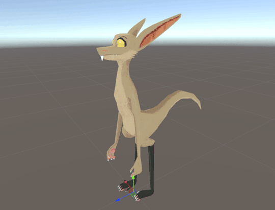
Pixel Yinglets 0.975 is now out for PC!
Hello, everyone! Hefty update today with a bunch of changes and customization options, getting closer to making this presentable as a cloneable public avatar. The Quest version will be live in the next few hours; you can buy this model for $30 on my fascinating Gumroad page, as early-access pricing before it hits 1.0. Details and changelog after the jump!
I finished 0.96 thinking "Ah, time to relax!" and then it was made clear to me during a meeting with friends that the leg rigging couldn't wait any longer -- so I devoted the entire week of working hours (and then some) to releasing 0.97 -- and the following night of experiences made it clear to me that some bugs needed fixing and more work was needed to improve the new-user experience, so now we're at 0.975. The model now has full digitigrade leg rigging on PC, but also a whole bunch of customization options for character creation, including face/body sliders and separate hue sliders for the body and eyes. In retrospect I'm embarrassed as hell that I waited so long to rig the legs properly, but I like to think I went through my hard knocks fixing it.
Because this is now cloneable, I can confirm that this is very functional in six-point full-body tracking. Putting this in the hands of experienced FBT users (my life-partner and several good friends) was revelatory, and has convinced me to get a set of trackers myself right after Vancoufur. Body language changes a lot!
The next update will probably not come as quickly as this one, but it will feature retopologized hands/feet and toggleable clothing. We aren't done with body customization yet, but I consider this a pretty good start!
The public version of this is currently in the wild, but I'll be waiting till .98 to buy Furhub ad space for it. I'm committed to maintaining feature-parity between the free and paid versions of this, with greater customization through production files as the draw for the paid version. Any questions or concerns, please let me know. <3
CHANGELOG:
02/28/2024 & 03/02/2024
VERSION 0.97: THE "LET'S DIGRESS" UPDATE and VERSION 0.975: THE "LET'S DIGRESS" HOTFIX
(PC-only currently, will have Quest version added in less than 24 hours.)
Feature additions:
Radial menus for body characteristic customization:
Hue sliders! Only visible on PC, since it requires the Poiyomi shader. Body and eye colors can be customized independently.
Shelltooth length.
Snout length.
Snout width.
Snout roundness.
Ear roundness.
Ear length.
Belly size.
Chin height.
Hip width.
Underfluff density.
Digitigrade leg armature on PC version, using constraints. Your hip bones should no longer completely dislocate when you crouch! :D
Front and back fur patterns! In the "Base Fur" layer category in the .psd is a "Patterns" subcategory, with "Front Pattern" and "Back Pattern" subcategories that can be toggled, recolored, and customized as you please.
Credits page, accessible from the main circle menu! Tell all your friends!
"Read this first!" page, which summons a plane containing helpful tips for first-time users.
Geometry tweaks:
Raised feet slightly to prevent them from clipping into the ground.
Adjusted shelltooth angle to prevent it from clipping into the lower lip.
Retopologized legs! Now significantly less boxy, and they stick out less far in front of the body (I used Valsalia's "Anatomy of a Yinglet" as reference).
Retopologized ears. The inner part's concave now!
Added blendshapes for all the customization sliders.
Added a bit more volume to the breast size blendshape.
Tweaked waistline to be more yinglet-y.
Tailtip now tapers more to a point.
UV/texture tweaks:
Added front and back fur-pattern layers, toggleable in the PSD.
Repainted legs and ears.
Repainted the weird transparent pixels bordering the tops of the hard black sections of the legs.
Made eyebrow anti-aliasing pixels actual transparency instead of the default fur color.
Changed credits page to use pixelated fonts.
Condensed color legend on texture.
Added "Read this first!" UI elements to texture. (Will be cleaned up when I expand the texture canvas for clothing.)
Armature tweaks:
Re-weighted feet. Still not ideal, but hands and feet will be retopologized for the next update.
Constrained feet to plantigrade ankles.
Added glasses bone. This and the skirt bones will factor into the next major update.
Added bones for individual whiskers.
Other tweaks:
Assigned default values to most properties between 0 and 1.
Radial menus have been reorganized. All customization sliders are nested in a Customization submenu.
Fixed default lid minimizer not firing in eyelid animations.
Restored eye sparkles on Quest.
Known issues:
Feet rigging is passable but could be better; I'll throw myself at it after feet receive the hand retopology.
Can't yet toggle front and back fur-patterns. (There's an issue with decals that causes them to not retain the hard edges of the rest of the model's pixelated texture.) Will be fixed in a later update.
53 notes
·
View notes
Text
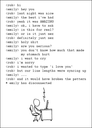
I wish I knew how to quit this so I wouldn't have to quit you.
Fixed Width [Explained]
Transcript Under the Cut
[A man, Rob, is sitting at a computer. The text is an IRC-style transcript of a conversation, in a fixed-width font. He is text-messaging a girl he slept with named Emily; their messages read as follows:] <rob> hi <emily> hey you <rob> last night was nice <emily> the best i've had <rob> yeah it was AMAZING <emily> ok, i have to ask <emily> is this for real? <emily> or is it just sex <rob> definitely just sex <emily> holy shit <emily> are you serious? <emily> you don't know how much that made my stomach hurt <emily> i want to cry <rob> i'm sorry <rob> i wanted to type 'i love you' <rob> but our line lengths were syncing up <emily> ... <rob> and it would have broken the pattern * emily has disconnected
35 notes
·
View notes
Note
Hello! I apologize if this is a presumptuous question or isn't the right place to ask, but is there a place you share the css code for your AO3 skins? I was very excited about your Hesperus skin, but I couldn't find where you might post about your skins beyond progress posts.
I'm going to be posting the new skin on GitHub in the future.
Unfortunately, Hesperus has been cancelled. There were a lot of issues with it and things I don't like, and then my computer self corrupted its entire storage and I lost pretty much everything, most of Hesperus included.
I still have an older version of it, but that specific backup didn't have any notation, which is how I remember what parts of the CSS do what, and was long before I properly optimised its layout. Not to mention, it has some bugs present that weren't there a year ago.
If you really really want it. Here's a file I just put together with all three parts. And here's all the images it's linked to. Make sure to download them all because if I ever take it down to free up space you'll have to host and re-link them yourselves.
To get the mobile overlay to work, you have to add both the tablet (set as max-width 62em) and mobile (set as max-width 42em) skin as parents to the main skin, (they overlap to get to the correct layout).
And please 🙏 don't bug me about issues with it. There's a lot. I know. Feel free to try and fix them yourselves.
Edit: The fonts used on desktop that you need to install [Josefin] [Open Sans]. Not fully needed since I've set them to default to something else, but probably the best to use since I tested the layout most with them.
5 notes
·
View notes