#flame turns blue
Text
youtube
David Gray _ Flame Turns Blue
3 notes
·
View notes
Note
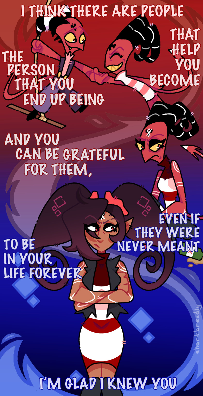
About that one ask where Machete murders everyone. I'm in my fire phase at the moment and thought blue would look good in contrast to Machete's usual red :)

.
#wwwwhhhh oh boy#there he goes#can't decide whether I should feel bad for him destroying everything he's worked so hard for or happy to see him finally unleash#decades worth of resentment and bad energy#when I first saw this it was around noon I think and I had my brightness turned way down so I didn't see the text on the background#and pretty much lost it when I took a better look at it later#the lighting though! I love how vibrant blue the flames are and how they contrast against the red background#excellent unhinged villain cackle A+#thank you!#gift art#lavenkel#own characters#Machete#(don't) let him cook
594 notes
·
View notes
Text
cody may get annoyed and exasperated and admonish Obi-Wan for it but he's secretly attracted to Obi-Wan's recklessness— pass it on
#I'm just saying#the battle snarl?#flourishing lightsaber?#looking like he's dancing with a blue flame?#risking his life to save civilians and vode alike?#auburn hair burning like the sun#blue eyes as bright as the sky#oh honey#he's irresistible#and that's another cause of exasperation for cody#he's annoyed at himself for being turned on#codywan
130 notes
·
View notes
Text
wouldn’t it be funny if this was the last time we ever talked to each other?
#crying shitting and throwing up#also i drew this before the episode came out so any inaccuracies are because of that#like this was when i still thought barb was an alcoholic#i don’t really like how this turned out but i spent too long on that flame to not post it#and i’m pissed because i assumed when barbie would transform between forms she’d have those blue flames like loona#but i was fucking wrong so that doesn’t make much sense anymore#btw this is a quote from bojack horseman before anyone asks#helluva boss#helluva boss fanart#helluva boss spoilers#helluva boss season two#helluva boss unhappy campers#helluva boss blitzo#blitzo fanart#helluva boss barbie wire#barbie wire fanart#blitzo#barbie wire#my art
740 notes
·
View notes
Text


I'll stop beating the dead fictional horse when I'm done venting about the unfortunately very real trauma it has wrought, ok? Ok
Also ignore my mediocre horse anatomy, I threw this together in an afternoon and don't usually draw animals hhh
#bnha#bnha critical#bnha spoilers#my hero academia#boku no hero academia#Kate draws#cw: gore#it's a progression horse meme that starts normal but turns halfway into a noumu affected by decay and it has a mane of blue flame
21 notes
·
View notes
Text
Ranking all Wof Cover (except winglets and graphic novels) because I’m bored :p (Some spoilers!)
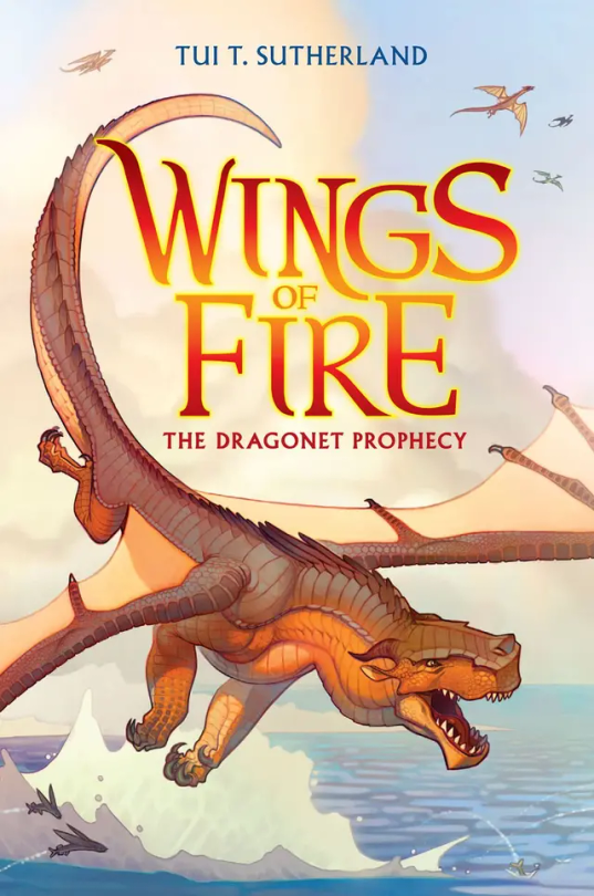
#1: The Dragonet Prophecy. Personally, I think it’s cool, although I think it could have a little more action on it. In the drafts, it was gonna have Queen Scarlet’s arena, which I think would’ve been a cool edition to the cover, but sadly they removed it. 7/10
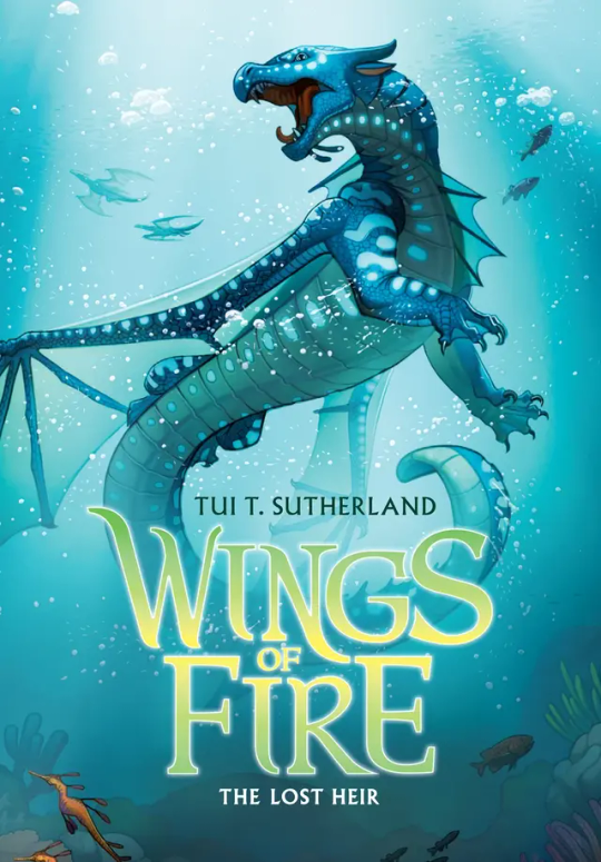
#2: The Lost Heir. Ok this one is awesome. It really shows Tsunami’s personality in her pose and it has so much action yet not to much. But they did forget to put the royal markings on her wings, which kinda makes her seem a little less important if you’re just looking at the cover. Originally it was gonna be called “The Last Heir” which sounds epic, but then again Anemone is in the book, so it wouldn’t make sense. 9.5/10
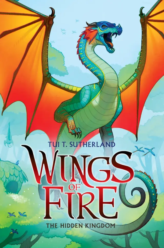
#3: The Hidden Kingdom. One of the coolest covers, I’m a sucker for the wings contrasting with the background (which is a reason I love The Dangerous Gift) but to be honest, Glory just kinda doesn’t stand out. Even with Tsunami being blue on blue, she stands out while Glory just… doesn’t. I think it would be cool if we saw her using venom, and if you say “But she doesn’t use venom in the Rainforest in the book!” Boy are you gonna do a flip when you see The Lost Continent. 5/10.
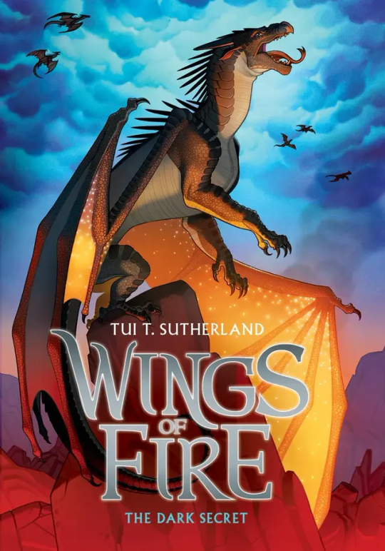
#4: The Dark Secret: Honestly… just kinda… meh. I mean sure Starflight’s pose is cool, as it shows how the Nightwings are supposedly these evil mind reading future seeing beings that are going to rule the world, but it’s not really as cool as Tsunami’s or Clay’s. If anything I think the background makes up for it. The blue cloudy sky contrasting with the dimly red lit stone just catches my eyes immediately. 5/10.
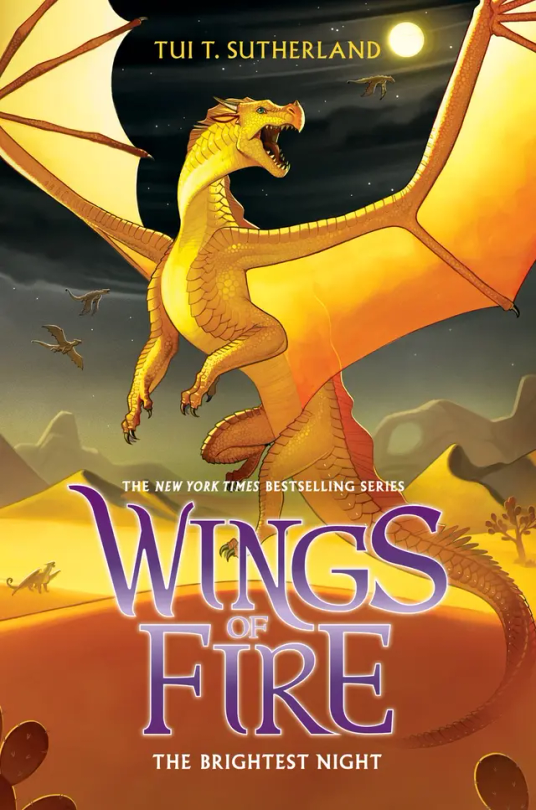
#5: The Brightest Night: I love this cover. Mainly because I love the way Sunny is portrayed on it as she is a hybrid but also I love the three moons in the background and the Sand Kingdom. Sunny’s golden yellow on the black night in the back is just perfection to my eyes. 10/10.
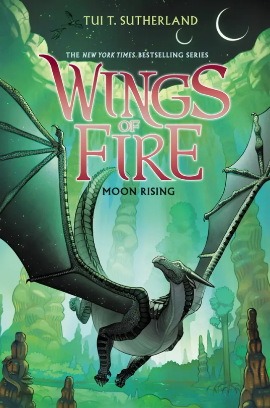
#6: Moon Rising: I adore this cover. And not because Turtle is on the back but that’s a reason I love it as well. Moon having that green fade on her wings is just really cool imo, and this is one of the covers that actually takes place in the book. I think it would be a little bit better if MoonWATCHER was look in the direction of the MOONS, but other than that I love this cover. 9/10.
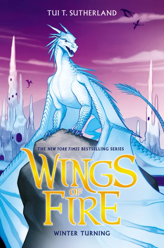
#7: Winter Turning: The draft for this wasn’t going to have purple on it, and to be honest, I’m glad they added that. The purple really brings out Winter and the Ice Kingdom, and it really makes everything pop. 10/10.
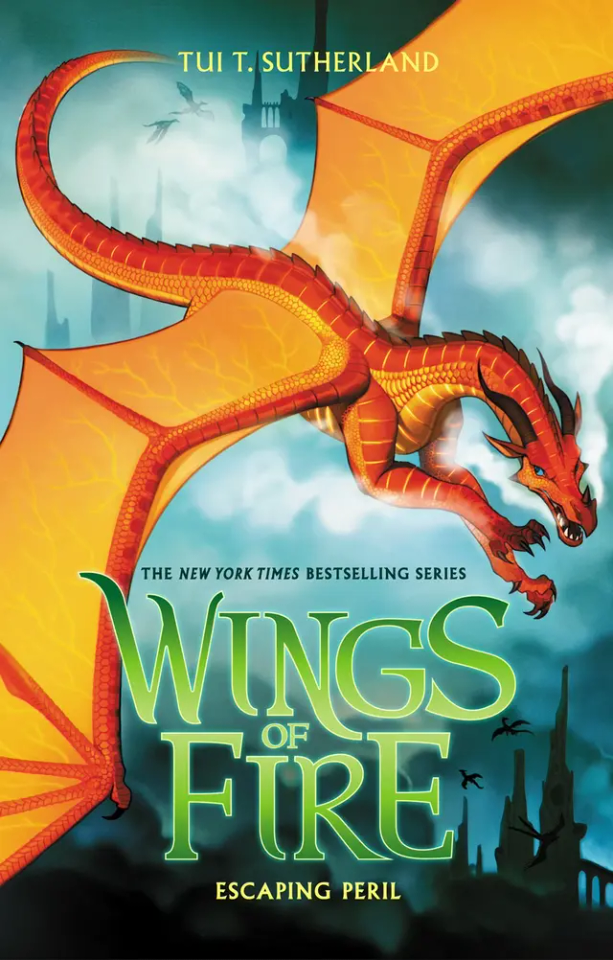
#8: Escaping Peril: Ok so maybe I’m a sucker for red on blue but Peril’s cover is just, wow. Her being chased by Scarlet is awesome, but I’m a little sad it didn’t happen in the book. (I think? Haven’t read this in like a year) My only complaint is that it doesn’t look like the Sky Kingdom in the back. Like if I first saw this cover and didn’t read WOF, I would think they’re flying over human city’s. 7/10.
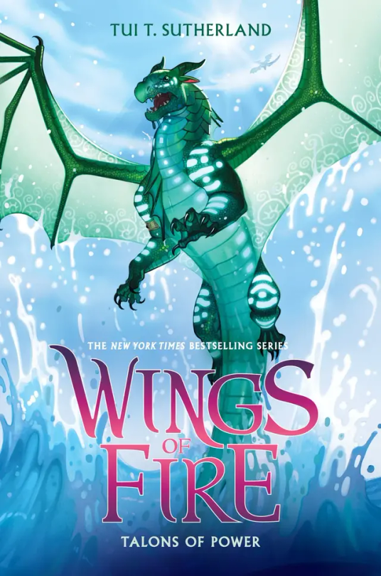
#9: Talons of Powers: Don’t be bias about this one because Turtle's in it, Don’t be bias about this one because Turtle’s in it, can you tell that this is my favorite cover? Other than the fact that Turtle’s on it, I love the fight between Turtle and Anemone on the cover, giving away a key point, but not too much spoilers. I also love all the action on the cover, with Turtle soaring out the water. But they did forget Anemone’s royal patterns, so it’s not perfect. 9.9/10
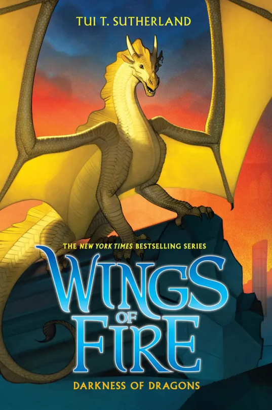
#10: Darkness of Dragons: Qibli’s yellow on the sunset background is just perfect, alongside the dark pieces of stone from the ancient Nightwing city. His pose really shows how Qibli is brave and daring, but they did forget his snout scar, which is like the one thing that makes Qibli, Qibli. 8/10.
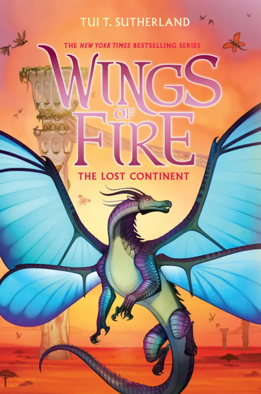
#11: The Lost Continent: Blue’s, well blue is the perfect contrast to the orange Pantalan savanna and the tan hives. Now, most people don’t like this cover because, “Blue doesn’t get his wings in the book!” or, “Cricket described him as blue, but on the cover he’s purple and green!” And my response to these are, 1: Tui actually was going to make Blue have no wings on the cover, but she thought he looked more pretty with wings than without. And 2: I personally love purple and green blue, It makes him look more related to Admiral and it makes him less of an eyesore imo. (If you seen the book description version of him on the wiki, you know what I mean). 10/10.
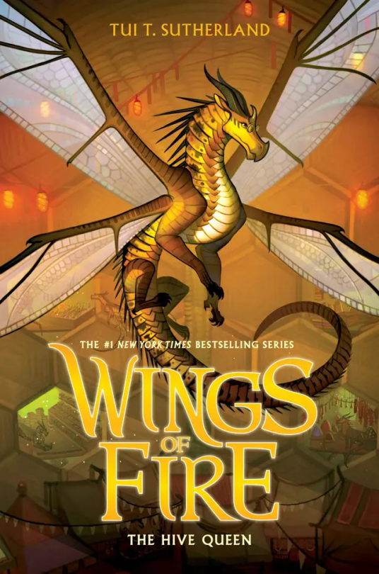
#12: The Hive Queen: Again, even though it’s yellow on yellow, Cricket still manages to stand out. I think it’s because Cricket’s more yellow, while the hive is more orange. I think the lights and the.. hole dens? Really just make the background so visible but not the main focus. 10/10
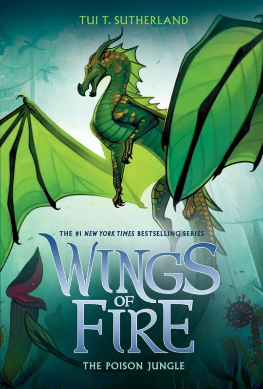
#13: The Poison Jungle: How does Joy Ang manage to put the same colored character on the same colored background and still make them stand out? Magic. Anyways, Sundews pose and the Poison Jungle in the back just really shows how fierce she is. Her small gold scales make her pop from the background, and I think the light behind her is the key to not have her blend it. 10/10
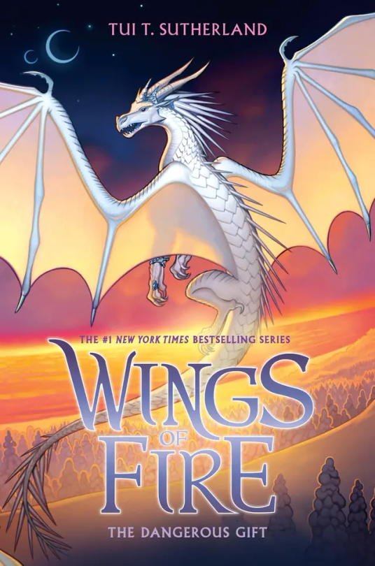
#14: The Dangerous Gift: Like I said in THK, I love wings that stand out from the background, so this is one of my favorite covers. Snowfall flying with Lynx by the coast where the Silkwings would fly in gives away so much yet so little. Also I love Snowfalls pose, no reason why it just looks cool :). 10/10
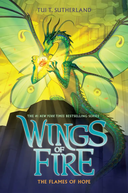
#15: The Flames of Hope. Honestly…. This cover is the worst in the Lost Continent Arc. Honestly Lunas pose is cool, and I think it would look really awesome if it wasn’t for the lighting of the flamesilk. That kind of blends her into the background at makes it a little boring to look at. But I do have to say I love Sky with Wren on the back and even thought Sky is described as pale, I love a red Sky. 6/10.
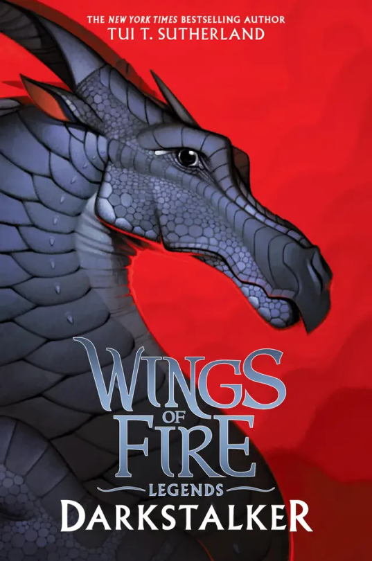
#16: Darkstalker: Darkstalker in on his mewing streak on this cover 🤫🧏♂️👌. I love his black on red background, but it’s boring. There’s nothing going on in the back, and he’s just standing there doing nothing. 6/10.
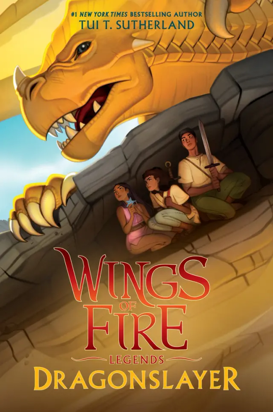
#16: Dragonslayer: I don’t have much to say about this cover. It has so much action but so little at the same time. It catches my eye but at the same time it doesn’t. I’m honestly very meh about this cover. 5/10.
#wings of fire#wof#the dragonet prophecy#the lost heir#the hidden kingdom#the dark secret#the brightest night#moon rising#winter turning#escaping peril#talons of power#darkness of dragons#the lost continent#the hive queen#the poison jungle#the dangerous gift#the flames of hope#Clay wof#tsunami wof#glory wof#starflight wof#sunny wof#moon wof#winter wof#peril wof#wof turtle#qibli wof#blue wof#cricket wof#sundew wof
25 notes
·
View notes
Text


double literature and religion major stimboard for @littlelovegod :)
the humanities of it all <3
🕯️ 📕 ✍🏻 . ⛪ ❤️ ⛪ . ✍🏻 📕 🌿
#stimboard#requests#i hope you like it!! i had so much fun making it and really like the way it turned out#i may have messed up some of the credit links but they should still go to the creators so ig just. if youre seeing this lmk if it broken#red#white#brown#beige#tan#blue#green#flame#religion#religious imagery#visual#writing#hands#stained glass#literature#books#fruit#sweet#food#calligraphy#writing stim#red stim#yellow#yellow stim#dark academia#pomegranate stim
9 notes
·
View notes
Text

Barbarian Rage (born out of love)
#ttrpg#dnd#ocs#gambit#habagat#my art#habagat - gambit's dad - got savagely attacked by a werebat during one of our recent sessions#and gambit raged. i make it rage very sparcely#(it's only the second time in fact after playing more than a year)#because it's such a tender being. i technically could make it rage at every fight very easily (and it would make fights easier)#but i prefer using it when it matters. and here it did#first time i let it rage since it turned lvl3 and gave it wild surge#so as it raged surrounded by many blue sparks a small flame-like spirit blew out of its body#and went to explode on one of the foes#lots of energy for its dad. habagat wasn't in too horrible a state but he sure got shook by this encounter#so did the rest... so many things i could draw about this short fight so many things happened#so much character development#i'm still thinking about it#anyway i tried things with this piece and fell short of what i wanted - not entirely satisfied - but it's not too bad#some symbolics here and there#hope yall enjoi ♥
98 notes
·
View notes
Text

Freak ~ Lana Del Rey
#freak ldr#lana del rey#lana lyrics#gif warning#glitter text#lyrics#yellow#no outline#bloggif.com#50px#flames so hot that they turn blue#palms reflecting in your eyes like an endless summer#album: honeymoon
17 notes
·
View notes
Text

[Outfit Credit]

[Mask Credit]
#RP Blood Ball: Attire#With her natural affinity towards blue flame the blue swirly fire-like motif was a given#But with a bit of old-timey pseudo Victorian flair#Cuz Vizzy can't turn down an opportunity to be extra LOL
7 notes
·
View notes
Text

save me from color scheme hell
#gravity falls#i am suffering#the first one is just the og little shop poster colors and is not actually a viable option#the pink and blue ones are cool but dont read as 'weirdmageddon' at all#the green is fun but keeps going to far into 'nuclear wasteland' territory and doesnt feel weirdmageddon either#every time i look away i decide a different one feels best when i look back at the screen#i want the blue flame look but they turn the palette too chill immediately#the red and yellow pyramid look is so fun#but for obvious reasons does not exactly contrast well against the weirdmageddon color palette#end meeee#fluffle art
4 notes
·
View notes
Text
"So put on your dress and your makeup/ we'll go out tonight/ cause I've been thinking it's been a while (oooh oooh oooh)/ and why, oh why, oh why, shouldn't we just burn until the flame turns blue"
"I want to take you down that old street one more time/ and I want to make it feels the same/ cause we both know if we're still trying/ we could burn until the flame turns blue"

Image description: a drawn crying emoji face with its mouth open very wide, tears coming down its face. /end description
#at the roadhouse#paper kites#the paper kites#music#till the flame turns blue#personal#words#image described#currently listening to
4 notes
·
View notes
Text
if bill turns red like his dad when he’s angry does he turn blue like his mom when he’s sad … :( ?
#i can’t remember if he ever turns blue#his eye/flame is blue sometimes + he’s blue when he’s half-formed sometimes#☆ misc / bill.
2 notes
·
View notes
Note
shiny mienfoo is basically the same except the red parts are blue
ahh, one of those Hard To Spot fuckers that you have to go like "is this a shiny, or is it just the lighting." that happened to me last night with a litwick. because of the event. i did end up getting a shiny litwick out of it though which is cool and nice
#not pkmn#it's the eyes and the fire that are different but obviously when it's that small you can't see its eyes really#so i just had the flame to go off of and i was like. is that slightly more blue than usual or am i crazy#turned out it was indeed more blue than usual. coming from someone who had no idea what shiny litwick looked like#before she got that one last night. (me)
18 notes
·
View notes
Text

My wife filled in my husband tattoo :3
#ship: moth to a flame#the blue turned out such a pretty colour#im v happy with this#its still technically healing
5 notes
·
View notes
Text
kinda wack how the devil's pitchfork evolved from the bident carried by Pluto, so Grim, whos tail references that devil's pitchfork, ironically has more hades imagery in his design than Idia, who is literally supposed to be based on Hades
#damn theyve both got the blue flame thing going on too#i wonder if grim was originally planned to be in idia's place lol#as the guy who woke yuu from their coffin and lives in a mansion full of ghosts and keeps eating rocks..#Grim is arguably MORE cthonic than Idia#hm. i wonder if this is the kind of thinking that lead to the dionysian mysteries#shitpost#twst#twisted wonderland#WHAT does idia have in common with the mythological god hades...#actually wait. does idia have anything in common with the movie hades either?? just the flame hair...#damn. the writers saw the campiest most powerful disney villain ever... a GOD of DEATH... and turned him into a swagless nerd#maybe i need to learn more about idia. i haven't seen anything past book.. 5???? damn i'm REALLY behind
6 notes
·
View notes
Last Seen Blogs

luos-ytpme
LUOS YTPME

jafashionclothing
JA Fashion Clothing
blogpuebladealmenara
Blog Puebla de Almenara

approxpropertyjaipur
Approx Property Jaipur

mgmcintyre
A Word Or Two