#flexbox website design
Explore tagged Tumblr posts
Visit Tumblr Blog
Explore Tumblr blogs with no restrictions, modern design and the best experience.
Last Seen Tumblr Blogs


Fun Fact
In 2020, 44% of users from Denmark used Tumblr daily.
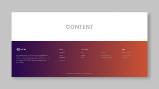
Text

Flexbox Website Design
#flexbox website design#responsive layout#responsive website design#css#html css#divinector#webdesign#html#css3#frontenddevelopment#css flexbox examples#flexbox tutorial#flexbox css#flexbox layout
0 notes
Text
Responsive Footer Design
#flexbox footer design#responsive web design#frontend#html css#css#html#css3#frontenddevelopment#webdesign#neduzone#website footer#css footer#footer html css
9 notes
·
View notes
Text

🌟 Webflow Tip of the Day 🌟 Master Flexbox for Responsive Layouts
Want more control over how your elements align and wrap across screen sizes? Learn to use Flexbox in Webflow. It’s one of the most powerful layout tools for responsive design.
🔧 With Flexbox, you can:
Align items horizontally or vertically
Easily center content in both directions
Let items wrap on smaller screens
Space elements evenly
✅ Pro Tip: Set a parent element (like a div block) to display: flex, and then use justify and align options to control how its children behave.
This small step can drastically improve your layout control without writing a single line of code!
💼 Grow your business with custom Webflow builds: 🌐 Portfolio: www.webflowwork.com 🎯 Upwork: https://bit.ly/4iu6AKd 🎯 Fiverr: https://bit.ly/3EzQxNd
#WebflowTips #Flexbox #WebDesign #NoCode #WebflowExpert #UIDesign #FreelanceWebflowDeveloper
#webflow#freelancewebdeveloper#web design#web development#webflowdesign#webflowexperts#webflowlandingpage#website#nocode#flexbox#uidesign#ui ux design#ux#ui
0 notes
Text
Revisiting CSS Multi-Column Layout
New Post has been published on https://thedigitalinsider.com/revisiting-css-multi-column-layout/
Revisiting CSS Multi-Column Layout
Honestly, it’s difficult for me to come to terms with, but almost 20 years have passed since I wrote my first book, Transcending CSS. In it, I explained how and why to use what was the then-emerging Multi-Column Layout module.
Hint: I published an updated version, Transcending CSS Revisited, which is free to read online.
Perhaps because, before the web, I’d worked in print, I was over-excited at the prospect of dividing content into columns without needing extra markup purely there for presentation. I’ve used Multi-Column Layout regularly ever since. Yet, CSS Columns remains one of the most underused CSS layout tools. I wonder why that is?
Holes in the specification
For a long time, there were, and still are, plenty of holes in Multi-Column Layout. As Rachel Andrew — now a specification editor — noted in her article five years ago:
“The column boxes created when you use one of the column properties can’t be targeted. You can’t address them with JavaScript, nor can you style an individual box to give it a background colour or adjust the padding and margins. All of the column boxes will be the same size. The only thing you can do is add a rule between columns.”
She’s right. And that’s still true. You can’t style columns, for example, by alternating background colours using some sort of :nth-column() pseudo-class selector. You can add a column-rule between columns using border-style values like dashed, dotted, and solid, and who can forget those evergreen groove and ridge styles? But you can’t apply border-image values to a column-rule, which seems odd as they were introduced at roughly the same time. The Multi-Column Layout is imperfect, and there’s plenty I wish it could do in the future, but that doesn’t explain why most people ignore what it can do today.
Patchy browser implementation for a long time
Legacy browsers simply ignored the column properties they couldn’t process. But, when Multi-Column Layout was first launched, most designers and developers had yet to accept that websites needn’t look the same in every browser.
Early on, support for Multi-Column Layout was patchy. However, browsers caught up over time, and although there are still discrepancies — especially in controlling content breaks — Multi-Column Layout has now been implemented widely. Yet, for some reason, many designers and developers I speak to feel that CSS Columns remain broken. Yes, there’s plenty that browser makers should do to improve their implementations, but that shouldn’t prevent people from using the solid parts today.
Readability and usability with scrolling
Maybe the main reason designers and developers haven’t embraced Multi-Column Layout as they have CSS Grid and Flexbox isn’t in the specification or its implementation but in its usability. Rachel pointed this out in her article:
“One reason we don’t see multicol used much on the web is that it would be very easy to end up with a reading experience which made the reader scroll in the block dimension. That would mean scrolling up and down vertically for those of us using English or another vertical writing mode. This is not a good reading experience!”
That’s true. No one would enjoy repeatedly scrolling up and down to read a long passage of content set in columns. She went on:
“Neither of these things is ideal, and using multicol on the web is something we need to think about very carefully in terms of the amount of content we might be aiming to flow into our columns.”
But, let’s face it, thinking very carefully is what designers and developers should always be doing.
Sure, if you’re dumb enough to dump a large amount of content into columns without thinking about its design, you’ll end up serving readers a poor experience. But why would you do that when headlines, images, and quotes can span columns and reset the column flow, instantly improving readability? Add to that container queries and newer unit values for text sizing, and there really isn’t a reason to avoid using Multi-Column Layout any longer.
A brief refresher on properties and values
Let’s run through a refresher. There are two ways to flow content into multiple columns; first, by defining the number of columns you need using the column-count property:
Second, and often best, is specifying the column width, leaving a browser to decide how many columns will fit along the inline axis. For example, I’m using column-width to specify that my columns are over 18rem. A browser creates as many 18rem columns as possible to fit and then shares any remaining space between them.
Then, there is the gutter (or column-gap) between columns, which you can specify using any length unit. I prefer using rem units to maintain the gutters’ relationship to the text size, but if your gutters need to be 1em, you can leave this out, as that’s a browser’s default gap.
The final column property is that divider (or column-rule) to the gutters, which adds visual separation between columns. Again, you can set a thickness and use border-style values like dashed, dotted, and solid.
These examples will be seen whenever you encounter a Multi-Column Layout tutorial, including CSS-Tricks’ own Almanac. The Multi-Column Layout syntax is one of the simplest in the suite of CSS layout tools, which is another reason why there are few reasons not to use it.
Multi-Column Layout is even more relevant today
When I wrote Transcending CSS and first explained the emerging Multi-Column Layout, there were no rem or viewport units, no :has() or other advanced selectors, no container queries, and no routine use of media queries because responsive design hadn’t been invented.
We didn’t have calc() or clamp() for adjusting text sizes, and there was no CSS Grid or Flexible Box Layout for precise control over a layout. Now we do, and all these properties help to make Multi-Column Layout even more relevant today.
Now, you can use rem or viewport units combined with calc() and clamp() to adapt the text size inside CSS Columns. You can use :has() to specify when columns are created, depending on the type of content they contain. Or you might use container queries to implement several columns only when a container is large enough to display them. Of course, you can also combine a Multi-Column Layout with CSS Grid or Flexible Box Layout for even more imaginative layout designs.
Using Multi-Column Layout today
Patty Meltt is an up-and-coming country music sensation. She’s not real, but the challenges of designing and developing websites like hers are.
My challenge was to implement a flexible article layout without media queries which adapts not only to screen size but also whether or not a <figure> is present. To improve the readability of running text in what would potentially be too-long lines, it should be set in columns to narrow the measure. And, as a final touch, the text size should adapt to the width of the container, not the viewport.
Article with no <figure> element. What would potentially be too-long lines of text are set in columns to improve readability by narrowing the measure.
Article containing a <figure> element. No column text is needed for this narrower measure.
The HTML for this layout is rudimentary. One <section>, one <main>, and one <figure> (or not:)
<section> <main> <h1>About Patty</h1> <p>…</p> </main> <figure> <img> </figure> </section>
I started by adding Multi-Column Layout styles to the <main> element using the column-width property to set the width of each column to 40ch (characters). The max-width and automatic inline margins reduce the content width and center it in the viewport:
main margin-inline: auto; max-width: 100ch; column-width: 40ch; column-gap: 3rem; column-rule: .5px solid #98838F;
Next, I applied a flexible box layout to the <section> only if it :has() a direct descendant which is a <figure>:
section:has(> figure) display: flex; flex-wrap: wrap; gap: 0 3rem;
This next min-width: min(100%, 30rem) — applied to both the <main> and <figure> — is a combination of the min-width property and the min() CSS function. The min() function allows you to specify two or more values, and a browser will choose the smallest value from them. This is incredibly useful for responsive layouts where you want to control the size of an element based on different conditions:
section:has(> figure) main flex: 1; margin-inline: 0; min-width: min(100%, 30rem); section:has(> figure) figure flex: 4; min-width: min(100%, 30rem);
What’s efficient about this implementation is that Multi-Column Layout styles are applied throughout, with no need for media queries to switch them on or off.
Adjusting text size in relation to column width helps improve readability. This has only recently become easy to implement with the introduction of container queries, their associated values including cqi, cqw, cqmin, and cqmax. And the clamp() function. Fortunately, you don’t have to work out these text sizes manually as ClearLeft’s Utopia will do the job for you.
My headlines and paragraph sizes are clamped to their minimum and maximum rem sizes and between them text is fluid depending on their container’s inline size:
h1 font-size: clamp(5.6526rem, 5.4068rem + 1.2288cqi, 6.3592rem); h2 font-size: clamp(1.9994rem, 1.9125rem + 0.4347cqi, 2.2493rem); p font-size: clamp(1rem, 0.9565rem + 0.2174cqi, 1.125rem);
So, to specify the <main> as the container on which those text sizes are based, I applied a container query for its inline size:
main container-type: inline-size;
Open the final result in a desktop browser, when you’re in front of one. It’s a flexible article layout without media queries which adapts to screen size and the presence of a <figure>. Multi-Column Layout sets text in columns to narrow the measure and the text size adapts to the width of its container, not the viewport.
Modern CSS is solving many prior problems
Structure content with spanning elements which will restart the flow of columns and prevent people from scrolling long distances.
Prevent figures from dividing their images and captions between columns.
Almost every article I’ve ever read about Multi-Column Layout focuses on its flaws, especially usability. CSS-Tricks’ own Geoff Graham even mentioned the scrolling up and down issue when he asked, “When Do You Use CSS Columns?”
“But an entire long-form article split into columns? I love it in newspapers but am hesitant to scroll down a webpage to read one column, only to scroll back up to do it again.”
Fortunately, the column-span property — which enables headlines, images, and quotes to span columns, resets the column flow, and instantly improves readability — now has solid support in browsers:
h1, h2, blockquote column-span: all;
But the solution to the scrolling up and down issue isn’t purely technical. It also requires content design. This means that content creators and designers must think carefully about the frequency and type of spanning elements, dividing a Multi-Column Layout into shallower sections, reducing the need to scroll and improving someone’s reading experience.
Another prior problem was preventing headlines from becoming detached from their content and figures, dividing their images and captions between columns. Thankfully, the break-after property now also has widespread support, so orphaned images and captions are now a thing of the past:
figure break-after: column;
Open this final example in a desktop browser:
You should take a fresh look at Multi-Column Layout
Multi-Column Layout isn’t a shiny new tool. In fact, it remains one of the most underused layout tools in CSS. It’s had, and still has, plenty of problems, but they haven’t reduced its usefulness or its ability to add an extra level of refinement to a product or website’s design. Whether you haven’t used Multi-Column Layout in a while or maybe have never tried it, now’s the time to take a fresh look at Multi-Column Layout.
#:has#ADD#almanac#Article#Articles#back up#background#book#box#browser#challenge#clamp#colours#columns#container#content#course#creators#CSS#CSS Grid#css-tricks#Design#designers#desktop#developers#digitalocean#display#easy#English#Explained
2 notes
·
View notes
Text
Learn HTML and CSS: A Comprehensive Guide for Beginners
Introduction to HTML and CSS
HTML (HyperText Markup Language) and CSS (Cascading Style Sheets) are the core technologies for creating web pages. HTML provides the structure of the page, while CSS defines its style and layout. This guide aims to equip beginners with the essential knowledge to start building and designing web pages.
Why Learn HTML and CSS?
HTML and CSS are fundamental skills for web development. Whether you're looking to create personal websites, start a career in web development, or enhance your current skill set, understanding these technologies is crucial. They form the basis for more advanced languages and frameworks like JavaScript, React, and Angular.
Getting Started with HTML and CSS
To get started, you need a text editor and a web browser. Popular text editors include Visual Studio Code, Sublime Text, and Atom. Browsers like Google Chrome, Firefox, and Safari are excellent for viewing and testing your web pages.
Basic HTML Structure
HTML documents have a basic structure composed of various elements and tags. Here’s a simple example:
html
Copy code
<!DOCTYPE html>
<html>
<head>
<title>My First Web Page</title>
<link rel="stylesheet" type="text/css" href="styles.css">
</head>
<body>
<h1>Welcome to My Web Page</h1>
<p>This is a paragraph of text on my web page.</p>
</body>
</html>
: Declares the document type and HTML version.
: The root element of an HTML page.
: Contains meta-information about the document.
: Connects the HTML to an external CSS file.
: Contains the content of the web page.
Essential HTML Tags
HTML uses various tags to define different parts of a web page:
to : Headings of different levels.
: Paragraph of text.
: Anchor tag for hyperlinks.
: Embeds images.
: Defines divisions or sections.
: Inline container for text.
Creating Your First HTML Page
Follow these steps to create a simple HTML page:
Open your text editor.
Write the basic HTML structure as shown above.
Add a heading with the tag.
Add a paragraph with the tag.
Save the file with a .html extension (e.g., index.html).
Open the file in your web browser to view your web page.
Introduction to CSS
CSS is used to style and layout HTML elements. It can be included within the HTML file using the <style> tag or in a separate .css file linked with the <link> tag.
Basic CSS Syntax
CSS consists of selectors and declarations. Here’s an example:
css
Copy code
h1 {
color: blue;
font-size: 24px;
}
Selector (h1): Specifies the HTML element to be styled.
Declaration Block: Contains one or more declarations, each consisting of a property and a value.
Styling HTML with CSS
To style your HTML elements, you can use different selectors:
Element Selector: Styles all instances of an element.
Class Selector: Styles elements with a specific class.
ID Selector: Styles a single element with a specific ID.
Example:
html
Copy code
<!DOCTYPE html>
<html>
<head>
<title>Styled Page</title>
<link rel="stylesheet" type="text/css" href="styles.css">
</head>
<body>
<h1 class="main-heading">Hello, World!</h1>
<p id="intro">This is an introduction paragraph.</p>
</body>
</html>
In the styles.css file:
css
Copy code
.main-heading {
color: green;
text-align: center;
}
#intro {
font-size: 18px;
color: grey;
}
CSS Layout Techniques
CSS provides several layout techniques to design complex web pages:
Box Model: Defines the structure of an element’s content, padding, border, and margin.
Flexbox: A layout model for arranging items within a container, making it easier to design flexible responsive layouts.
Grid Layout: A two-dimensional layout system for more complex layouts.
Example of Flexbox:
css
Copy code
.container {
display: flex;
justify-content: space-around;
}
.item {
width: 100px;
height: 100px;
background-color: lightblue;
}
Best Practices for Writing HTML and CSS
Semantic HTML: Use HTML tags that describe their meaning clearly (e.g., , , ).
Clean Code: Indent nested elements and use comments for better readability.
Validation: Use tools like the W3C Markup Validation Service to ensure your HTML and CSS are error-free and standards-compliant.
Accessibility: Make sure your website is accessible to all users, including those with disabilities, by using proper HTML tags and attributes.
Free Resources to Learn HTML and CSS
W3Schools: Comprehensive tutorials and references.
MDN Web Docs: Detailed documentation and guides for HTML, CSS, and JavaScript.
Codecademy: Interactive courses on web development.
FreeCodeCamp: Extensive curriculum covering HTML, CSS, and more.
Khan Academy: Lessons on computer programming and web development.
FAQs about Learning HTML and CSS
Q: What is HTML and CSS? A: HTML (HyperText Markup Language) structures web pages, while CSS (Cascading Style Sheets) styles and layouts the web pages.
Q: Why should I learn HTML and CSS? A: Learning HTML and CSS is essential for creating websites, understanding web development frameworks, and progressing to more advanced programming languages.
Q: Do I need prior experience to learn HTML and CSS? A: No prior experience is required. HTML and CSS are beginner-friendly and easy to learn.
Q: How long does it take to learn HTML and CSS? A: The time varies depending on your learning pace. With consistent practice, you can grasp the basics in a few weeks.
Q: Can I create a website using only HTML and CSS? A: Yes, you can create a basic website. For more complex functionality, you'll need to learn JavaScript.
Q: What tools do I need to start learning HTML and CSS? A: You need a text editor (e.g., Visual Studio Code, Sublime Text) and a web browser (e.g., Google Chrome, Firefox).
Q: Are there free resources available to learn HTML and CSS? A: Yes, there are many free resources available online, including W3Schools, MDN Web Docs, Codecademy, FreeCodeCamp, and Khan Academy.
#how to learn html and css#html & css course#html & css tutorial#html and css#html course#html css tutorial#html learn#html learn website#learn html#learn html and css#html and css course#html and css full course#html and css online course#how to learn html and css for beginners
3 notes
·
View notes
Text
Responsive vs. Adaptive vs. Neither of those things
Aight so. Big topic. We hear the word 'responsive' a lot when talking about web design but it's kind of a wishy washy topic for lots of people outside tech, especially if you've mostly coded while interacting with jcink. John did it really weird, with two skins- one for mobile, and one for desktop. This is actually pretty convenient because it helps distinguish two ideas. If you go to a website like youtube or even tumblr and resize your window as large as you can and as small as you can. These sites are properly responsive- the layout changes and adapts to the size of the screen. Youtube is (unsurprisingly) better at this than tumblr. It changes to use all of the available screen width at every size, pretty much no matter what. Tumblr (the dash anyway) only expands to a certain size- but it also doesn't break when you make it really small. Now go look at the base jcink skin- jcink support forums for instance. If you look at it on a phone, it'll mostly look okay, and after a certain size, will mostly look okay on desktop too. But there's this whole area between the two where things start to get janky. The fixed sizes of everything start to spill over the window size. That's an adaptive skin. Everything is a fixed size, and which layout you see depends on the type of device you're using. Adaptive sites are generally seen as outdated at this point. Almost no one is coding this way anymore. Now go to a jcink skin. Do the same thing with making your window bigger and smaller. In every skin I've ever seen, *something* will break. Text will overflow, you'll have to scroll from side to side to read a post, images will start to overlap other content. That kind of thing. Some sites will resize to a certain point, but almost none of them will do so all the way down to a mobile size, or even half of a laptop screen. This is neither adaptive nor responsive. THIS IS OKAY. I mean it's not ideal, but almost no one coding for jcink is a professional, and these are legitimately difficult things to get right. You have to be thinking about it from the start of the design process. What's going to happen to that icon when the screen gets small? What about the topic information? How are you going to keep information which looks beautiful at a desktop size looking good at tablet and phone sizes? It's legitimately difficult, and if you're not building with that in mind from the start it's a non-trivial task to make an unresponsive skin responsive. If you want to start thinking about these things, I'd recommend reading about media query breakpoints. For jcink, I think it's fair to code for desktop first (usually it's mobile first today) because people using a jcink site will usually want to be typing in it somewhere. Anecdotally, I think even people who post on mobile usually are writing in a notes app first. My skin worked really well at a 600px breakpoint, but other skins might need different figures. That's okay! As long as you can identify (maybe two) places where your views start to breakdown and have consistent behavior in your css for those breakpoints, you should be fine. I think it's good practice to know what you want your mobile version to look like, and code at least the skeleton of both views as you go, so you don't back yourself into corners. That's already a lot of text, so I'll stop there. I'll follow this up with a few different ways you can approach responsive design beyond breakpoints- grid, flexbox, and percentage based css. I can't really effectively teach these things on tumblr, but I can talk about the pros and cons of each approach so you can start looking into the things that seem like they might fit your use case.
2 notes
·
View notes
Text
The Future of Front-End Development: Technologies, Trends, and Services in 2025
Front-end development plays a crucial role in how users interact with websites and applications. The user experience (UX), speed, and responsiveness of a website all depend on how well the front end is developed. As technology evolves, businesses need to stay ahead by adopting modern front end development technologies and ensuring seamless experiences across devices.
With growing competition in the digital space, companies are also investing in front end development services to create high-performing, visually appealing, and user-friendly applications. This article explores the latest technologies, trends, and services shaping the future of front-end development.
1. What is Front-End Development?
Front-end development focuses on the visual and interactive aspects of a website or web application. It includes everything a user sees and interacts with, such as navigation menus, buttons, animations, and layout structures.
Key Responsibilities of Front-End Developers:
Writing clean, efficient, and responsive code.
Ensuring seamless cross-browser compatibility.
Optimizing websites for faster load times and better performance.
Creating accessible and user-friendly interfaces.
Integrating with backend APIs for smooth data retrieval.
To build fast and engaging user interfaces, developers rely on modern front end development technologies that simplify coding, enhance performance, and improve scalability.
2. Latest Front-End Development Technologies in 2025
With new frameworks, libraries, and tools emerging, front-end development is continuously evolving. Here are some of the best technologies shaping the front end in 2025.
A) Front-End Programming Languages
1. JavaScript (JS)
JavaScript remains the dominant language for front-end development, powering interactive and dynamic web applications. With the rise of frameworks like React, Vue, and Angular, JavaScript continues to be at the core of modern web development.
2. TypeScript
TypeScript, a strongly-typed superset of JavaScript, is becoming increasingly popular due to its ability to reduce errors and improve code maintainability. More developers are adopting TypeScript for large-scale applications.
3. WebAssembly (WASM)
WebAssembly allows developers to run high-performance applications in web browsers using languages like C++ and Rust. It is revolutionizing front-end development by enabling faster execution of complex applications.
B) Best Front-End Frameworks and Libraries
4. React.js
Developed by Meta, React remains one of the most widely used front-end libraries. Its component-based architecture, virtual DOM, and support for server-side rendering (SSR) make it ideal for building fast and scalable web applications.
5. Vue.js
Vue is a lightweight yet powerful framework known for its ease of use and flexibility. With Vue 4 expected to launch soon, its improvements in performance and modularity make it a great choice for progressive web applications (PWAs).
6. Angular
Maintained by Google, Angular is a feature-rich front-end framework best suited for enterprise-grade applications. It offers built-in solutions for routing, form validation, and dependency injection, making it ideal for complex projects.
7. Svelte
Svelte is gaining popularity due to its lightweight approach — it compiles components at build time, eliminating the need for a virtual DOM and resulting in faster execution and reduced file sizes.
C) UI/UX and Styling Technologies
8. Tailwind CSS
Tailwind CSS is a utility-first CSS framework that simplifies custom styling. It allows developers to build beautiful interfaces without writing large CSS files, making it a preferred choice for modern UI development.
9. Material UI (MUI)
Based on Google’s Material Design, MUI provides a collection of pre-built, customizable components that improve the speed and consistency of UI development.
10. CSS Grid and Flexbox
These layout techniques offer powerful tools for designing responsive web pages, allowing developers to create dynamic and adaptive designs with minimal effort.
3. Front-End Development Services: What Businesses Need
Building a successful digital product requires more than just coding. Companies offering front end development services help businesses create user-friendly interfaces, optimize performance, and ensure compatibility across devices. The services are explained in detail below -
UI/UX Design and Development
A well-structured user interface (UI) and user experience (UX) ensure smooth navigation and engagement. Front-end developers work closely with designers to implement:
Intuitive layouts for easy navigation.
Accessibility improvements for all users.
Mobile-first designs for seamless performance across devices.
Progressive Web App (PWA) Development
PWAs provide an app-like experience on web browsers. They load faster, work offline, and improve engagement. Businesses investing in PWA development benefit from:
Better mobile performance without requiring an app download.
Improved search engine visibility.
Increased user retention due to smooth interactivity.
Single Page Application (SPA) Development
SPAs dynamically update content without reloading the page, making them faster and more responsive. React, Vue, and Angular are commonly used for building SPAs.
Cross-Browser and Device Compatibility Testing
Ensuring a website functions smoothly across all browsers and devices is crucial. Developers optimize front-end code to prevent issues related to:
Browser inconsistencies (Chrome, Firefox, Safari, Edge).
Mobile responsiveness across various screen sizes.
Performance Optimization
A slow-loading website leads to poor user experience and lower rankings on search engines. Front-end developers focus on:
Reducing page load times by optimizing images and scripts.
Implementing lazy loading for improved speed.
Minimizing HTTP requests and using content delivery networks (CDNs).
4. Future Trends in Front-End Development
With technology advancing rapidly, front-end development is embracing new innovations. Here are some trends shaping the future:
Artificial Intelligence (AI) in UI/UX
AI is being integrated into front-end development for personalized user experiences, automated testing, and smart UI components.
Voice-Activated Interfaces
More websites are incorporating voice navigation, allowing users to interact hands-free.
Augmented Reality (AR) and Virtual Reality (VR)
AR/VR-based front-end development is growing in e-commerce, real estate, and education, offering immersive experiences.
No-Code and Low-Code Development
Platforms like Webflow and Bubble enable faster front-end development without extensive coding knowledge.
Front-end development is evolving rapidly, with new technologies and services transforming how businesses build digital experiences. Choosing the right front end development technologies ensures websites and applications remain fast, responsive, and engaging.
Businesses investing in front end development services gain access to expert developers, optimized UI/UX design, and scalable digital solutions that improve customer satisfaction. As we move into 2025, staying ahead with the latest tools, frameworks, and trends will be key to creating successful web applications. Whether you’re a startup or an enterprise, prioritizing front-end development will set your business apart in an increasingly digital world.
0 notes
Text
Frontend Development: Skills & Tools You Need in 2025
Frontend development is more exciting—and complex—than ever in 2025. With new frameworks, faster build tools, and AI assistants entering the scene, the demand for skilled frontend devs is at an all-time high.
At its core, frontend development focuses on building the parts of a website or web app users directly interact with. This includes:
Layout and styling (HTML, CSS, Flexbox, Grid)
Logic and interactivity (JavaScript)
Frameworks (React, Vue, Svelte, SolidJS)
Optimization (Lighthouse, Core Web Vitals)
Responsive and mobile-first design
Today, a solid frontend developer should know:
React or Next.js for building SPAs or server-rendered pages
Tailwind CSS or CSS Modules for styling
TypeScript for better code safety and scalability
Vite or Turbopack for lightning-fast development builds
Headless CMS like Sanity or Strapi for dynamic content
Accessibility (WCAG standards) to ensure usability for all users
The lines between design and development are also fading. Tools like Figma to Code, AI design assistants, and component libraries make collaboration between devs and designers seamless.
AI is also making a big splash. Tools like ChatGPT, Copilot, and AI-powered component generators can help speed up prototyping, debugging, and even documentation.
To succeed in frontend development in 2025, you’ll need more than just technical skills. You should also master UX thinking, SEO basics, and performance optimization.
In short, frontend dev isn’t just about making things look good—it’s about building fast, accessible, and responsive experiences that users love.
0 notes
Text
Best Courses for Front End Development: Build Skills That Bring Designs to Life

When you land on a sleek, fast-loading website or interact with a cool web app, you’re experiencing the work of a front-end developer. These are the people who bridge the gap between design and functionality—translating visuals into code that works on browsers, phones, and every screen in between.
If you’re interested in building user interfaces that not only look great but also function smoothly, learning front end development is a smart move. And in 2025, there’s no shortage of online programs to get you started.
Let’s explore the best courses for front end development, how to choose the right one for your goals, and where to find the front end developer best courses online.
What Is Front End Development?
Front end development focuses on the “client side” of web applications. This means anything users interact with directly:
Layouts, typography, and navigation
Buttons, forms, animations, and transitions
Mobile responsiveness and performance
Accessibility and browser compatibility
A front end developer typically works with:
HTML/CSS – the foundation of any web page
JavaScript – to add interactivity and dynamic features
Frameworks – like React, Vue.js, or Angular
Tools – Git, Webpack, VS Code, Chrome DevTools
Why Become a Front End Developer?
High demand – Every business needs a fast, functional, responsive website Remote-friendly – Freelance or full-time from anywhere Creative meets technical – A great career for people who like visual problem-solving Fast-growing career path – Junior to Senior Developer, UI Engineer, or even Full Stack
Skills You'll Gain from the Best Courses for Front End Development
A strong front end course should help you master:
HTML5 and CSS3 fundamentals
Responsive design with Flexbox and Grid
Advanced JavaScript and ES6+ syntax
DOM manipulation and event handling
Front end frameworks (React is most popular in 2025)
REST APIs and async programming
Git, GitHub, and version control basics
Performance optimization and accessibility
Top Online Front End Developer Courses in 2025
1. NIIT Digital – Full Stack Product Engineering (Front End-Focused Track)
Though it’s a full stack course, the front end module is exceptionally strong.
Live mentor-led sessions + interactive labs
Covers HTML, CSS, JavaScript, React, Git, APIs
Includes capstone projects and GitHub-ready portfolio
Certification + career services included
Best for: Beginners to intermediates looking to become job-ready fast.
2. Coursera – Meta Front-End Developer Professional Certificate
Offered by Meta, this course has a structured path.
Beginner-friendly, self-paced
Strong focus on React and UI design principles
Taught by experienced engineers
Includes certification
3. Udemy – Front-End Web Development Bootcamp
This is a popular choice for beginners.
Budget-friendly, with lifetime access
Covers everything from HTML/CSS to React
Tons of hands-on exercises
Taught by experienced developers
Best for: Self-motivated learners who like learning at their own pace.
How to Pick the Front End Developer Best Course for You
Use this checklist before enrolling:
1. Is the course beginner-friendly? If you're starting from scratch, look for courses that explain both the theory and hands-on parts.
2. Are there projects included? Employers love to see portfolios. Your course should help you build one.
3. Does it cover React or modern frameworks? React is the most widely used library in 2025. Knowing it can land you jobs faster.
4. Is there mentor or peer support? Sometimes, a little guidance goes a long way—especially if you're learning solo.
5. What’s the career support like? NIIT Digital, for instance, not only teaches but also helps you prep for interviews.
Career Opportunities After Learning Front End Development
Once trained, here are some job roles you can explore:
Front End Developer
UI Developer
JavaScript Developer
Web Designer with Dev Skills
Junior React Developer
Freelance Web Developer
You can also use your skills to launch side projects, freelance websites, or even your own startup.
Conclusion
Front end development is an exciting, creative, and fast-paced career with tons of flexibility and growth. But to thrive, you need the right foundation—and that starts with the best courses for front end development.
Look for programs that balance code with creativity, include lots of practice, and help you build real-world projects. Whether it’s through a comprehensive course like NIIT Digital or a self-paced bootcamp online, what matters most is consistency and hands-on learning.
So, if you’ve got a flair for design, an eye for detail, and a desire to code, front end development could be your path to a rewarding tech career.
0 notes
Text
Responsive HTML Church Website
#responsive church website#responsive web design#html css#css flexbox examples#css flexbox website#css tutorial#css#webdesign#html#css3#divinector
3 notes
·
View notes
Text

Flexbox Responsive Website Layout
#flexbox website#responsive website design#webdesign#responsive webdesign#html css#learn to code#code#frontend#codingflicks#css#css3#html#css flexbox layout
0 notes
Text
What Is Cross-Browser Testing? A Complete Guide for Seamless Web Experiences

In today’s fast-evolving digital landscape, users access websites from a wide array of devices, operating systems, and browsers. From Chrome and Firefox to Safari and Edge—each browser interprets your website code slightly differently. This is where Cross Browser Testing becomes essential.
This blog dives deep into what cross browser testing is, why it matters, what features it covers, and how to do it effectively—ensuring your website delivers a consistent, bug-free experience across all platforms.
What is Cross Browser Testing?
Cross Browser Testing is a type of non-functional testing that verifies whether a web application functions and appears correctly across different web browsers, browser versions, and devices.
It helps developers and QA engineers ensure that:
The UI renders consistently
Core functionalities work correctly
There are no browser-specific bugs or issues
Cross browser testing is not just about aesthetics—it’s about ensuring usability, performance, and accessibility for all users, regardless of how they access your website.
Why is Cross Browser Testing Important?
If you’re only testing your website on Chrome, you’re missing the bigger picture.
Here’s why cross browser testing is crucial:
1. Diverse User Base
Your users might be on Chrome, Safari, Firefox, Edge, or Opera, and using different devices like desktops, tablets, or smartphones. Testing across these ensures everyone has a uniform experience.
2. Browser Rendering Engines Differ
Browsers like Chrome (Blink), Safari (WebKit), and Firefox (Gecko) interpret HTML, CSS, and JavaScript differently. Even a small deviation in rendering can lead to layout breakages or functionality issues.
3. Prevent Loss of Traffic and Conversions
A buggy checkout page on Safari or broken navigation on Firefox can significantly hurt conversion rates and user trust.
4. SEO and Accessibility
Search engines value user experience. Broken layouts or slow load times on certain browsers can negatively affect SEO performance and bounce rates.
What Features are Analyzed in a Cross Browser Test?
Here are the key features and areas evaluated during cross browser testing:
✅ 1. Layout and Design Consistency
CSS rendering
Font sizes, spacing, padding
Media queries and responsiveness
Grid and flex layouts
✅ 2. JavaScript Functionality
Form validation
Dynamic content rendering (DOM updates)
Event handling
Navigation toggles
✅ 3. HTML5 and CSS3 Compatibility
Audio/video elements
Animations
Flexbox, grid, shadows, gradients
✅ 4. Third-Party Integrations
Plugins (chatbots, tracking tools)
Embedded maps or videos
Social sharing buttons
✅ 5. Performance and Speed
Load times across browsers
JavaScript execution speed
Rendering behavior
✅ 6. Security and Cookie Behavior
HTTPS redirection
Local storage and session cookies handling
How is Cross Browser Testing Done?
Cross browser testing can be performed manually or via automation tools. Here's a step-by-step guide:
Step 1: Define Your Browser Coverage
Choose browsers based on:
Your website’s Google Analytics browser report
Global browser usage statistics
Market demographics (e.g., Safari for iOS users)
Example Browser Matrix:

Read also: How Playwright Enhances Cross-Browser Testing Efficiency
Step 2: Set Up Your Test Environment
You can use:
Real Devices: For high accuracy
Emulators/Simulators: Quick tests for layout
Cloud Testing Platforms like:
BrowserStack
Sauce Labs
LambdaTest
CrossBrowserTesting.com
Step 3: Run Tests (Manual or Automated)
🔹 Manual Testing
Test scenarios using real devices and browsers, inspecting UI and performing tasks manually.
🔹 Automated Testing
Use frameworks like:
Selenium
Playwright
Cypress
TestCafe
Automation helps:
Reduce testing time
Run tests in parallel
Integrate with CI/CD pipelines
Step 4: Log and Fix Issues
Document browser-specific bugs, prioritize them, and retest after fixes.
Step 5: Continuous Cross Browser Testing
Use CI tools (Jenkins, GitHub Actions, GitLab CI) to schedule tests automatically on every build or code change.
Best Practices for Cross Browser Testing
✅ Always test on real user data (Google Analytics insights)
✅ Prioritize critical user flows first
✅ Automate repetitive tests, but don’t skip manual exploratory testing
✅ Regularly update browser versions in your testing matrix
✅ Perform regression testing after any major frontend update
Conclusion
Cross Browser Testing is not optional—it’s a necessity in today’s fragmented web ecosystem. Ensuring that your application works flawlessly across all major browsers not only boosts user experience and trust but also strengthens your brand’s credibility
As a leading Web application testing company, at Testrig Technologies, we specialize in comprehensive Cross Browser Testing Services that guarantee flawless digital experiences on any browser, device, or OS. Whether you're launching a new site or scaling an existing one, our QA experts are here to help.
0 notes
Text
Frontend Development: Shaping the User Experience on the Web
Every modern website or application you visit — whether it's a social media platform, e-commerce store, or personal blog — owes its visual appeal and user interactivity to frontend development. As users demand faster, more engaging, and intuitive digital experiences, frontend development has become one of the most essential disciplines in web and software development.
What is Frontend Development?
Frontend development is the practice of building the client-side of web applications — the part that users interact with directly in their browsers. It focuses on designing and developing the structure, design, behavior, and animation of everything you see on a webpage.
Frontend developers work closely with UI/UX designers to bring static mockups to life, ensuring websites are not only functional but also visually engaging and responsive.
Core Technologies in Frontend Development
Frontend development is primarily built upon three foundational technologies:
1. HTML (HyperText Markup Language)
Defines the structure and layout of web pages. Think of it as the skeleton of a website.
2. CSS (Cascading Style Sheets)
Handles the styling — colors, fonts, layout, and overall visual appeal. CSS makes websites look polished and professional.
3. JavaScript
Brings interactivity to web pages. Whether it’s a dropdown menu, slideshow, or form validation, JavaScript makes it dynamic.
Modern Frontend Frameworks and Libraries
To streamline and enhance frontend development, developers often use powerful tools like:
React – A JavaScript library by Facebook for building user interfaces with reusable components.
Vue.js – A progressive framework for building UIs and single-page applications.
Angular – A robust front-end framework by Google that’s great for complex, large-scale applications.
Tailwind CSS – A utility-first CSS framework that simplifies styling by using predefined classes.
Key Responsibilities of a Frontend Developer
A frontend developer is responsible for:
Translating UI/UX designs into functional web interfaces.
Ensuring cross-browser and cross-device compatibility.
Optimizing performance for faster load times.
Integrating with backend services via APIs.
Maintaining code quality using modern development practices.
Responsive Design and Mobile-First Approach
With mobile users making up a significant portion of web traffic, responsive design is a top priority. Frontend developers use tools like:
Media Queries
CSS Flexbox and Grid
Frameworks like Bootstrap or Tailwind
These techniques ensure that websites look and function perfectly on screens of all sizes — from phones to desktops.
Frontend Development Tools
To improve productivity and collaboration, frontend developers use:
Version Control: Git, GitHub
Package Managers: npm, Yarn
Build Tools: Webpack, Vite, Parcel
Code Editors: Visual Studio Code, Sublime Text
Testing Tools: Jest, Cypress
The Importance of Frontend Development
First Impressions Matter: Users often form opinions within seconds of visiting a site. Good frontend design builds trust.
User Experience (UX): A seamless, fast, and interactive frontend keeps users engaged and reduces bounce rates.
Accessibility: Inclusive design ensures all users, including those with disabilities, can interact with the site.
Future Trends in Frontend Development
Frontend development continues to evolve rapidly. Upcoming trends include:
WebAssembly for high-performance apps
Progressive Web Apps (PWAs) that work offline
Motion UI and Microinteractions
AI-powered UI personalization
Headless CMS and JAMstack architectures
Conclusion
Frontend development is more than just writing code — it's about creating meaningful, beautiful, and intuitive digital experiences. As the digital world continues to grow, so does the demand for skilled frontend developers who can turn complex ideas into accessible and engaging interfaces.
Whether you're a beginner exploring web development or a business owner looking to improve your online presence, understanding frontend development is the first step toward building better digital experiences.
Location : https://g.co/kgs/H5YVuuF
0 notes
Text
Everything You Need to Know: Pros and Cons of Using Webflow
Table of Contents
What is Webflow, and Why Should You Use It?
Benefits of Developing Your Website Using Webflow
How Webflow Compares to Other Website Builders
Is Webflow Worth It for Your Next Website?
Features for Web Design and Development
Responsive Website Design with Webflow
Webflow Pricing Options
Understanding Webflow’s CMS
Pros and Cons of Using Webflow
Hiring Webflow Experts
Webflow FAQs
Building a website has become easier than ever. Yet, choosing the right tool to create and manage your website can be confusing. Among many options, Webflow has emerged as a popular platform. It offers a unique mix of visual design freedom and coding power. But is it the best choice for your needs? This guide explains everything about Webflow — its benefits, limitations, and who should use it.
What is Webflow?
Webflow is a cloud-based website design and development platform launched in 2013. It combines the ease of a drag-and-drop visual editor with the ability to generate clean, production-ready code. Webflow appeals mainly to designers, developers, marketers, and business owners who want high-quality websites without fully coding from scratch.
Unlike basic website builders such as Wix or Squarespace, which limit design options, Webflow gives you detailed control over layouts, styles, and animations. It also offers CMS (Content Management System) features, e-commerce tools, and hosting services.
How Does Webflow Work?
Webflow works in three key parts:
Designer Tool: This is the visual editor where you build your website by dragging, dropping, and styling elements. It looks similar to design software like Adobe XD or Figma but outputs real web code.
CMS & Editor: Webflow includes a flexible CMS where you can create collections (like blog posts, products, or portfolios) that dynamically feed content into your site design. The Editor allows content managers or clients to update text and images without breaking the design.
Hosting & Publishing: Once your design is ready, you can publish your site using Webflow’s fast, secure hosting or export the code to host elsewhere.
Why Do People Choose Webflow?
Webflow bridges the gap between traditional no-code builders and fully custom development. Here are some reasons it’s popular:
It empowers designers to create visually stunning sites with custom interactions.
It generates clean, maintainable code, unlike some drag-and-drop platforms.
It supports dynamic content and e-commerce without plugins.
Hosting with Webflow is simple, secure, and scalable.
In-Depth Pros of Using Webflow
1. Full Design Freedom and Pixel-Perfect Control
Webflow gives you granular control over every design detail. You can:
Control positioning using flexbox and grid layouts.
Customize typography with full font control.
Add interactions and animations without coding.
Create reusable symbols (like buttons or navbars) that update everywhere.
This level of freedom lets you build unique, branded websites that stand out, unlike template-based builders.
2. Clean, Standards-Compliant Code Output
When you publish your Webflow site, it outputs semantic HTML5, CSS3, and JavaScript. This code is clean and organized, making it easier for developers to:
Optimize for speed and SEO.
Add custom features by editing the exported code.
Ensure cross-browser compatibility.
This is a major advantage over builders that generate bloated or obfuscated code.
3. Responsive Design Made Simple
Webflow has built-in tools for responsive design. You can create styles specific to desktops, tablets, and phones. This ensures your website looks great on any device, which is critical today as mobile traffic often surpasses desktop.
The visual interface helps you preview how the site behaves at different screen sizes and adjust layouts accordingly.
4. Flexible Content Management System (CMS)
Webflow’s CMS allows you to build collections of content (like blog posts, products, or team members) that automatically populate pages.
It supports custom fields (text, images, dates, references).
Non-technical users can easily add or update content via the Editor interface.
Dynamic lists can display content in grid, list, or custom formats.
Content updates instantly reflect on the live site.
This system is ideal for blogs, portfolios, or small online stores that require content updates without developer help.
5. Growing E-commerce Functionality
Webflow offers e-commerce features for online shops, including:
Product catalogs with custom fields.
Shopping cart and checkout flows.
Payment gateways like Stripe and PayPal.
Customizable product and checkout page designs.
Order and customer management.
While it’s not as full-featured as Shopify or WooCommerce, it’s great for small to medium stores needing design flexibility.
6. Fast, Reliable Hosting With Security
Webflow’s hosting runs on AWS and Fastly, providing:
Global Content Delivery Network (CDN) for fast load times worldwide.
Free SSL certificates for HTTPS security.
Daily backups and automated updates.
Scalability without manual server management.
Hosting on Webflow means less hassle maintaining servers and security settings.
7. Excellent for Prototyping and Client Work
Many freelance designers and agencies use Webflow because it allows:
Rapid creation of interactive prototypes.
Easy sharing with clients for feedback.
Quick iterations without developer bottlenecks.
Seamless handoff by exporting clean code if needed.
Webflow also offers team collaboration features, helping designers and developers work together.
Detailed Cons of Using Webflow
1. Steeper Learning Curve Than Simple Builders
Though Webflow is easier than coding from scratch, it is more complex than beginner builders like Wix or Squarespace. New users may struggle with:
Understanding CSS box model, flexbox, and grid layouts.
Managing styles and classes efficiently.
Setting up interactions and animations.
Users without any design or web knowledge might feel overwhelmed at first.
2. Pricing is Higher Than Some Competitors
Webflow’s pricing consists of:
Site plans: For hosting individual sites.
Account plans: For designers/agencies managing multiple projects.
The costs can add up, especially for e-commerce sites or multiple projects. Cheaper alternatives exist, but they may offer less design freedom or features.
3. Limited Third-Party Integrations and Plugins
Webflow has fewer third-party plugins than WordPress or Shopify. While it supports essential integrations (Google Analytics, Zapier, etc.), specialized marketing tools or CRM systems may require custom development or API use.
This can limit functionality for businesses needing complex ecosystems.
4. No Built-In Multilingual Support
If you want to build a website in multiple languages, Webflow does not offer native multilingual management. You have to:
Duplicate pages for each language.
Use third-party tools or custom scripts.
This approach is less efficient and can impact SEO and site maintenance.
5. Exporting Dynamic CMS Data is Difficult
You can export the static code of your site, but dynamic CMS content does not export easily. If you want to move your content to another platform later, migrating CMS data can be tricky.
This limits portability for growing sites.
6. SEO Configuration Requires Manual Effort
Webflow gives you control over SEO metadata, URLs, and alt text but does not automate SEO best practices. You must manually:
Set meta titles and descriptions.
Manage sitemap and robots.txt.
Configure redirects and canonical tags.
Users unfamiliar with SEO might need additional help.
7. No Built-In Blogging Features Like WordPress
Although Webflow has CMS for blogs, it lacks:
Built-in comments or community features.
Large ecosystems of blog-related plugins.
Extensive SEO tools specific for blogging.
If blogging is a major focus, other platforms might offer more convenience.
When Should You Use Webflow?
Webflow is best for:
Professional designers wanting complete design control.
Businesses that need custom websites with CMS or small online stores.
Freelancers and agencies creating interactive prototypes or client websites.
Users wanting all-in-one hosting and design tools on a managed platform.
Projects requiring custom animations or advanced interactions without coding.
When Might You Avoid Webflow?
You might want to consider other options if:
You are a complete beginner looking for very simple site building.
You want the cheapest possible hosting and domain setup.
You need large-scale e-commerce with complex inventory and shipping.
You require multilingual websites with SEO-friendly language switching.
You prefer a large ecosystem of third-party plugins and themes.
Conclusion: Is Webflow Right for You?
Webflow is a powerful and flexible platform that gives you design control and clean code. It is especially suited to designers, agencies, and businesses wanting a modern, responsive site with dynamic content or e-commerce.
However, the learning curve, pricing, and some missing features like multilingual support and large app ecosystems may be limiting for some users.
Understanding your project needs, budget, and skills will help you decide. If you want a unique, beautiful website that you can manage without deep coding, Webflow is an excellent choice.
0 notes
Text
Difference Between HTML and CSS
In the realm of web development, two foundational technologies form the backbone of nearly every website: HTML (HyperText Markup Language) and CSS (Cascading Style Sheets). While they often work closely together to build and style web pages, they serve fundamentally different purposes. Understanding the differences between HTML and CSS is essential for anyone interested in web design or development.
Introduction to HTML
What is HTML?
HTML stands for HyperText Markup Language, and it is the standard language used to create the structure of web pages. Developed by Tim Berners-Lee in 1991, HTML has evolved into a robust language that helps define the layout and content of a website.
Purpose of HTML
HTML is primarily used to:
Define the structure of web documents
Insert and format text
Add images, videos, and other multimedia
Create hyperlinks
Form interactive elements such as buttons and forms
HTML Tags and Elements
HTML uses "tags" enclosed in angle brackets (< >). Each tag has a specific function. For example:
<h1>This is a heading</h1>
<p>This is a paragraph.</p>
<a href="https://www.example.com">Visit Example</a>
In this code:
defines a main heading
defines a paragraph
defines a hyperlink
HTML follows a nested structure. Tags are often paired with closing tags (</tag>) to wrap content.
Introduction to CSS
What is CSS?
CSS stands for Cascading Style Sheets, a language used for describing the presentation and design of HTML documents. Introduced in 1996 by the W3C (World Wide Web Consortium), CSS allows developers to apply styles like colors, fonts, spacing, and layouts to HTML elements.
Purpose of CSS
CSS is used to:
Style text (color, font, size)
Manage layout (grid, flexbox, margins, padding)
Control visibility and positioning
Apply responsive design
Animate HTML elements
CSS Syntax and Example
CSS rules are usually written in a separate file (e.g., style.css) or within a <style> tag. A CSS rule consists of a selector and declaration block:
p {
color: blue;
font-size: 16px;
}
This rule selects all <p> elements and applies a blue font color and a font size of 16 pixels.
Key Differences Between HTML and CSS
Feature
HTML
CSS
Purpose
Structure of a webpage
Styling of a webpage
Language Type
Markup language
Style sheet language
File Extension
.html or .htm
.css
Usage
Adds elements like text, images, forms
Adds color, layout, fonts, and visual effects
Integration
Must be present for any webpage
Optional, but improves user experience
Position in Web Development
Backbone/structure
Design layer/presentation
Role in Web Development
HTML’s Role
Without HTML, there would be no content to style. HTML:
Provides the blueprint for web pages
Organizes content in a logical structure
Serves as a framework for CSS and JavaScript to enhance
HTML is essential for SEO (Search Engine Optimization), accessibility, and content hierarchy.
CSS’s Role
CSS enhances the user experience by:
Making content visually appealing
Ensuring the layout adapts to different screen sizes (responsive design)
Keeping style rules separate from structure, promoting clean code and reusability
Working Together: HTML + CSS
HTML and CSS are complementary. HTML provides the "what," and CSS provides the "how it looks." Here's an example of them working together:
HTML File (index.html):
<!DOCTYPE html>
<html>
<head>
<link rel="stylesheet" href="styles.css">
</head>
<body>
<h1>Welcome to My Website</h1>
<p>This is a simple paragraph.</p>
</body>
</html>
CSS File (styles.css):
h1 {
color: darkgreen;
font-family: Arial, sans-serif;
}
p {
font-size: 18px;
color: gray;
}
In this example:
HTML sets the content: a heading and a paragraph
CSS styles the content: changing colors and fonts
Inline, Internal, and External CSS
CSS can be included in three ways:
Inline CSS: Defined within an HTML tag using the style attribute. <p style="color: red;">This is red text.</p>
Internal CSS: Written within a <style> tag in the <head> section of the HTML. <style>
p { color: blue; }
</style>
External CSS: Linked via a separate .css file. <link rel="stylesheet" href="style.css">
External CSS is the most scalable and recommended method for larger websites.
Advantages and Disadvantages
Advantages of HTML
Easy to learn and use
Supported by all browsers
Crucial for webpage structure
SEO-friendly
Disadvantages of HTML
Limited to content and structure
Requires CSS for styling
Not dynamic on its own (needs JavaScript for interaction)
Advantages of CSS
Separates design from content
Enables responsive design
Allows for consistent styling across pages
Reduces redundancy and improves maintainability
Disadvantages of CSS
Can become complex for large projects
Browser compatibility issues may arise
Changes in structure can require rework in styles
Best Practices for Using HTML and CSS
Use semantic HTML (e.g., , , ) to improve accessibility and SEO
Keep structure and style separate by using external CSS
Use classes and IDs effectively for targeted styling
Test your pages on multiple browsers and devices
Keep your code clean, readable, and well-commented
Real-World Analogy
Think of building a website like constructing a house:
HTML is the framework — the walls, roof, and foundation.
CSS is the interior design — the paint, furniture, and layout.
Without HTML, there’s no house. Without CSS, the house is plain and undecorated.
Conclusion
In summary, HTML and CSS are two essential technologies for creating and designing web pages. HTML defines the structure and content, while CSS is responsible for the visual style and layout. They operate in tandem to deliver functional, attractive, and user-friendly websites.
Understanding the differences between HTML and CSS is the first step toward mastering web development. While HTML answers "What is on the page?", CSS answers "How does it look?" Together, they empower developers to build rich, engaging digital experiences.
0 notes
Text
4 Practical Use Cases for CSS Grids in Modern Web Design
CSS Grid is a powerful layout system that has transformed the way web designers structure and style websites. It provides a flexible, two-dimensional grid-based approach, making it easier to create complex layouts without the need for excessive code or tricky workarounds.

Download Infographic
Building Stunning Image Galleries

Image galleries are a staple in modern web design, and CSS Grid is an ideal tool for creating them. Unlike traditional layout methods, CSS Grid allows you to define precise rows and columns, making it easy to align images without breaking the overall design.
Why Use CSS Grid for Image Galleries?
Flexible Layouts: Easily control the number of columns and rows based on screen size.
Gap Control: Use the grid-gap or gap property for perfect spacing.
Responsive Design: Adjust column sizes and row heights without breaking the layout.
Layering and Positioning: Position images in creative ways, including overlapping elements.
Basic Image Gallery Example
<div class=”gallery”> <img src=”image1.jpg” alt=”Image 1″> <img src=”image2.jpg” alt=”Image 2″> <img src=”image3.jpg” alt=”Image 3″> <img src=”image4.jpg” alt=”Image 4″> <img src=”image5.jpg” alt=”Image 5″> </div>
.gallery { display: grid; grid-template-columns: repeat(auto-fill, minmax(200px, 1fr)); gap: 16px; } .gallery img { width: 100%; display: block; border-radius: 8px;
Advanced Image Gallery Layouts
Experienced web designers can also create more intricate layouts by spanning images across multiple rows or columns using the grid-column and grid-row properties, giving your galleries a more dynamic and polished look.
In this infographic blog post, we’ll explore four practical use cases for CSS Grids that can elevate your web design projects.
Try CSS Grid Generator
Creating Main Website Layouts

CSS Grid shines when it comes to designing the main structure of a website. Whether you’re building a blog, portfolio, or business website, grids provide the framework for responsive and organised layouts.
Why Use CSS Grid for Main Layouts?
Clear Structure: Define headers, sidebars, content areas, and footers precisely.
Responsive Design: Create layouts that adapt effortlessly to different screen sizes.
Efficient Code: Reduce the need for excessive wrapper divs and floats.
Complex Designs: Easily create overlapping sections and layered effects.
Basic Main Layout Example
<div class=”main-layout”> <header>Header</header> <nav>Navigation</nav> <main>Main Content</main> <aside>Sidebar</aside> <footer>Footer</footer> </div>
.main-layout { display: grid; grid-template-areas: “header header header” “nav main sidebar” “footer footer footer”; grid-template-columns: 1fr 2fr 1fr; gap: 20px; } header { grid-area: header; } nav { grid-area: nav; } main { grid-area: main; } aside { grid-area: sidebar; } footer { grid-area: footer; }
Advanced Main Layouts
For more complex designs, consider using CSS Grid in combination with Flexbox for greater flexibility and control over nested elements.
Designing Attention-Grabbing Banners

Banners are crucial for grabbing user attention, and CSS Grid makes it easy to create stunning, multi-layered designs without relying on complex positioning hacks.
Why Use CSS Grid for Banners?
Flexible Positioning: Easily place text, images, and buttons exactly where you want them.
Responsive Design: Maintain structure across different devices.
Layer Control: Use grid layers to create engaging, multi-dimensional designs.
Basic Banner Example
<div class=”banner”> <div class=”overlay”></div> <h1>Welcome to Our Website</h1> <p>Discover our range of services.</p> <button>Learn More</button> </div>
.banner { display: grid; grid-template-areas: “overlay”; position: relative; background-image: url(‘banner.jpg’); background-size: cover; background-position: center; height: 300px; color: #fff; text-align: center; } .overlay { grid-area: overlay; background-color: rgba(0, 0, 0, 0.6); position: absolute; top: 0; left: 0; right: 0; bottom: 0; z-index: 1; } .banner h1, .banner p, .banner button { position: relative; z-index: 2; }
Perfectly Centring Items

Centred layouts are a common design choice, and CSS Grid provides a simple way to centre content without relying on margin hacks or flexbox tricks.
Why Use CSS Grid for Centring?
Simplicity: One line of code can achieve perfect centring.
Cross-Browser Support: Reliable centring across all major browsers.
Versatility: Works for both single items and entire sections.
Basic Centring Example
<div class=”centre”> <h2>Centred Content</h2> </div>
.centre { display: grid; place-items: center; height: 300px; background-color: #f4f4f4; }
Conclusion
CSS Grid is an incredibly versatile tool that can streamline your web design workflow, reduce code complexity, and enhance the overall user experience.
Whether you’re building image galleries, main layouts, banners, or perfectly centred designs, CSS Grid offers a flexible and powerful solution.
Experiment with these practical use cases to unlock the full potential of CSS Grid in your projects.
0 notes