#css flexbox website
Explore tagged Tumblr posts
Visit Tumblr Blog
Explore Tumblr blogs with no restrictions, modern design and the best experience.
Last Seen Tumblr Blogs


Fun Fact
In February 2021, Tumblr had 518.6 million blog accounts.
Text
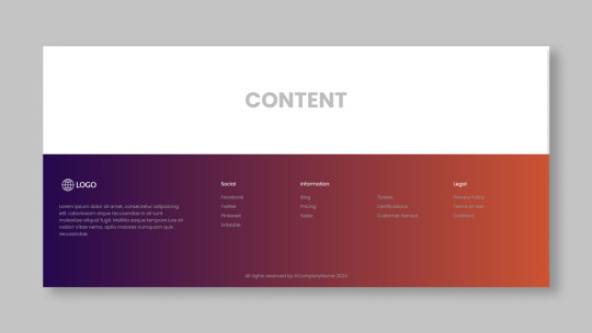
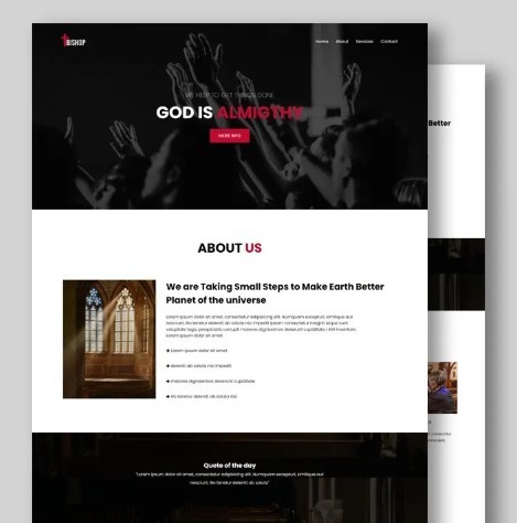
Responsive HTML Church Website
#responsive church website#responsive web design#html css#css flexbox examples#css flexbox website#css tutorial#css#webdesign#html#css3#divinector
3 notes
·
View notes
Text
Responsive Footer Design
#flexbox footer design#responsive web design#frontend#html css#css#html#css3#frontenddevelopment#webdesign#neduzone#website footer#css footer#footer html css
9 notes
·
View notes
Note
hello. Im steepling my hands like an evil villain. Would you happen to know what the restrictions of the 3ds browser are, exactly? Eg, why most sites don’t work on it aside from ao3? I do neocities and have too much free time.
i think it's largely due to the fact that modern browsers simply have more features. the best way to make a website able to work on 3DS would be to avoid using any modern CSS- avoiding things like flexbox and instead use <table> ect ect.
to do a bit more research, i'd recommend looking into the browser that its based on and what things it can render. (which i linked above)
it's also important to keep in mind that the 3DS will automatically resize any text to be readable, so that could mess up layouts ect.
when making a website for 3DS imagine you are making it for a very low resolution phone.

^ once you're done, then you could add this button to your site proudly ^-^
#i believe you can also call a check to see if the person is viewing on their 3DS so that you can force the website to render differently.#many websites do this for mobile#asks#webdev is my hobby lmao
158 notes
·
View notes
Text
YOU MUST MAKE A WEBSITE
Oh wow, look at that! YET ANOTHER post urging you to make a webbed site! What a completely new thing that people haven't made a thousand masterposts for already!!
• Making a website might look scary. It is Not.
At first, I too thought making a website was too much work. It really isn't! It turns out that all you need is
an HTML file,
a web hosting service and
w3schools tutorials,
and that's about it!
This post will point you towards these resources, and others I found useful while figuring out how to make a website.
• VERY QUICK EXPLANATIONS:
What's HTML and CSS?
HTML is the content of your webpage, the skeleton of it. What shows up in a webpage is what's written in the HTML file!
CSS is the way the HTML is styled; the colour of the background and the letters, the size of elements, the font, all that!
Do I absolutely NEED JavaScript for a website?
Not at all! You don't need to worry about learning it before getting started.
• What do I make a website for? What do I put in there?
ANYTHING AND ALMOST EVERYTHING. Here's some ideas for pages from a post of mine were I was very normal about websites:
You can make a page that's only pictures of your pets.
You can make an interactive adventure.
You can make your own academic blog full of your own essays or articles.
You can just post a ton of art or make a full music page.
You can make a blog and infodump eternally, give book reccs and reviews. You can host a thousand virtual pets and nothing else.
Upload entire books in a single html file. Make a wikipedia for your ocs. Make a fake site for a random fictional place (restaurant, hotel, whatever). You can make a thousand fanpages/shrines about your favorite media. You can upload your own webcomic and make it all like a fancy website and shit.
I could keep going but, for the sake of "brevity", I won't.
• WEBSITE EXAMPLES!
If I started listing the websites I know, this post would be bottomless. Here's only seven:
https://publictransit.neocities.org/ - A webbed site, for sure
https://ribo.zone/ - A personal site
https://leusyth.neocities.org/ - An art archive
https://solaria.neocities.org/ - Personal website with A Lot of stuff (it'll come up in a bit, because it offers web making resources)
https://hog.neocities.org/ - The Hogsite
https://thegardenofmadeline.neocities.org/ - Another personal site! It also has a web resources page and has made another masterpost like this one (but better)
https://spiders.neocities.org/ - My own website, which must be weird to see in mobile . sorry
• You've convinced me. I want a webbed site. Where do I start?
https://neocities.org/
FIRST OF ALL: Neocities. It is a free web hosting service, and it's the one I and the sites I linked use!
When I first started, my website was a black page with red letters and a drawing, and nothing else! It was like that for a month, till i started picking up on how to do things.
Here's what helped me get an idea of how to make things work:
https://sadgrl.online/learn/articles/beginners-guide-neocities
An absolute beginners guide to neocities -- while when you make an account there you get a tutorial page from the site, this one's extra support for that.
https://www.w3schools.com/
Learn HTML, CSS, JavaScript and MANY other coding things for free. All the tutorial/reference pages have live testing windows for you to mess with!! helped me a LOT while figuring this stuff out!
https://htmlcheatsheet.com/
https://htmlcheatsheet.com/css/
Cheatsheets for HTML and CSS, respectively. It includes a JavaScript one too!
https://sadgrl.online/webmastery/
Sadgrl's webmastery resources! Also includes the next resource listed here:
https://sadgrl.online/projects/layout-builder/
Sadgrl's layout builder; not a lot of customization at a first glance, but I've seen wildly different websites all using it as a base, plus it works using CSS Flexbox, so it generates a responsive layout!
(basically, a responsive layout is one that translates well in different sized screens)
https://www.tumblr.com/fysa/728086939730919424/wikitable-code?source=share
Tumblr user fysa made this layout imitating a wiki page!
https://brackets.io/
At some point, you might want to do things outside the Neocities code editor and get one outside the site. I recommend Brackets, because my old as fuck computer can run that and absolutely nothing else apparently, and it works wonderfully! Though I recommend either turning off the code autocomplete or using it after a good while of already using the Neocities code editor, so you get used to coding on your own.
http://www.unit-conversion.info/texttools/text-to-html/
Turn your text into HTML code! i use this kind of pages for my lengthy blog entries that I don't feel like formatting myself.
https://imagecompressor.com/
COMPRESS YOUR IMAGES.
The heavier an image is, the more your site weighs and the more time your page will spend loading. You don't want that, specially if your site is heavy on graphics. This might help!
https://solaria.neocities.org/guides
Some CSS, JavaScript and Accessibility guides! Worth checking out!
https://eloquentjavascript.net/
This is a free, interactive book for learning JavaScript! NOTE: It is very intuitive, but JavaScript is HARD!! I still haven't learned much of it, and my website does fine without so don't worry if you end up not doing much with it. It's still useful + the exercises are fun.
And now, accessories!
• Silly stuff for your page :]
https://gifypet.neocities.org/
Make a virtual pet, copy the code and paste it in your HTML file! You'll get a little guy in your webbed site :]
https://www.wikplayer.com/
Music player for your website!
http://www.mf2fm.com/rv/
JavaScript silly effects for your site :]
https://blinkies.neocities.org/geoblinkies
Blinkie search engine!
https://www.cbox.ws/
Add a chatbox to your site!!
https://momg.neocities.org/
Infinite gallery of gifs. i've spent hours in there looking at moving pictures and out of them all, the ONLY gif i actually ended up using on my site was a rotating tomato slice. it is still there. trapped.
https://wrender.neocities.org/tarotinstructions
A widget that gives you a random tarot card!
https://www.websudoku.com/widget.php
Sudoku widget!
That's about it for now! I don't know how to end this!!! Remember to have fun and google everything you don't know :]
623 notes
·
View notes
Text
I feel you, Feli....I feel you
I wanted to move a headline to the lower right of the header. CSS put it everywhere but where I wanted it to be. My entire flex box broke because I wanted to have my headline on the right instead of the left 🥲
you put in css whose sole purpose is "move button to the left", think it works (you are a fool) and once implimented the move button left code somehow started cannibalizing all headlines directly below it
#css be like that#did you use flexbox/ grid?#maybe moving it moved the whole following layout because of this#idk though I made one website for uni this semester and I am so glad its done
9 notes
·
View notes
Note
how did you make your own website? & how long did it take you to make it? i am interested in web dev,,, do you have any tips or any helpful sites for beginners/ intermediate? (sorry for asking so many questions!)
hey no problem, asking is a great way to learn always!!
i started on my portfolio site i think around september 2022, forgot about it because of work, then went back to it and deployed it around march 2023! i learned a lot at work, so i just applied what i learned from working in web dev to my own personal site
regarding how to start, if you're a complete beginner, i'd suggest playing around with HTML/CSS first since it's kind of the basic building blocks for doing frontend stuff -- for the first few projects you could try copying simple sites like Google's home page :) there are little interactive tutorials you can find online too like flexbox froggy that can help teach diff concepts in a fun way!
after feeling comfortable with it, i'd suggest playing around with ReactJS when starting out with web dev; it's easy to get into because of its extensive documentation and its large community! there are step-by-step guides into setting it up and several tutorials (both video/article)
if you decide to get into actually deploying your stuff and connecting it to APIs, you can start looking into other frameworks like NextJS/GatsbyJS etc.
getting yourself into a web dev project, like maybe making a small notes/checklist web app or your own portfolio site is a fun way to experiment!! the hardest part is always finding the motivation to start them imo :) wishing u the best on ur web dev journey!!!!! 💗
188 notes
·
View notes
Note
I’m a complete beginner when it comes to any coding and I’m not sure if you are or not, but was it easy to begin making the site using rarebit?
I'm a complete beginner as well! I've only coded a navigation bar back in middle school for an assignment and then never again, so Rarebit was overwhelming when I started.
However, you'll realize that it's pretty straightforward the more you read the code over and over again. I suggest opening up the Rarebit folder in an external terminal that isn't Neocities like Visual Studio Code and download the Live Preview plug-in from Microsoft. This let's you see your website in live time and not have to code blindly like in Neocities.
HTML is extremely straightforward and easy to grasp. It's CSS you have to learn and worry about since it's what makes your website look like your website.
I haven't touched Javascript yet, that's a bit more complex, but nothing a YouTube video or a forum can't help with.
It just takes time and patience like any other skill to learn!
I recently learnt how to use flexbox!

#asks#anon#idk it's just fun!#and more rewarding to create an experience for the readers to explore than to upload it on webtoon or tapas#like it reminds people that comics are a craft and aren't just content to consume#there's an experience to it
97 notes
·
View notes
Text
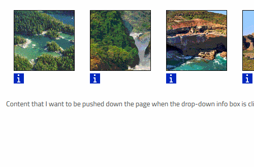
Not gorilla-related. Can anyone help me with a CSS/HTML problem?
I'm trying to do everything in my power to avoid creating an account on Stack Overflow or Reddit to ask this.
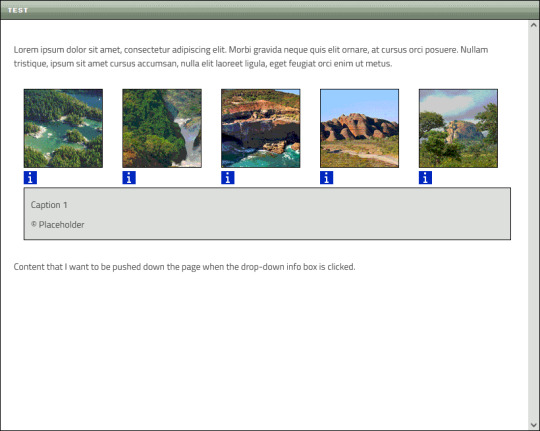
Here is my Neocities website. Those little blue icons underneath each thumbnail are supposed to trigger a drop-down box when clicked:
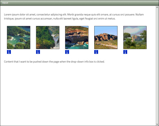
Now, while the box for the first thumbnail appears exactly where I want it to, it also causes the other thumbnails to be moved to the right:

This isn't the only issue. On the other thumbnails, the drop-down boxes are aligned with their respective icons, which I do not want:
Basically, I want each drop-down box to appear like this when opened:
The thumbnails need to maintain their position, and the content below them must be pushed down the page when the box appears.
I formerly aligned the thumbnails using float:left before switching to flexbox, but I don't care if I have to float them again (or use some other method) if it means getting everything to work.
>> You can view the code in this Pastebin <<
KEEP IN MIND:
I'm very new and very bad at this
I want to avoid things like JavaScript as much as possible
If you need to view the actual website, message me
CHALLENGE MODE:
If you rewrite my code for me so that I can copy/paste it and have it produce the desired results, I'll draw you a gift doodle of whatever you want!

Okay, I think that covers it. I've been fiddling with this all day and I'm exhausted, so I'll check out any replies tomorrow 🦍
#I want to keep this blog strictly gorilla-focused but I have way more followers here than anywhere else sooo#off topic#long post
31 notes
·
View notes
Text
Revisiting CSS Multi-Column Layout
New Post has been published on https://thedigitalinsider.com/revisiting-css-multi-column-layout/
Revisiting CSS Multi-Column Layout
Honestly, it’s difficult for me to come to terms with, but almost 20 years have passed since I wrote my first book, Transcending CSS. In it, I explained how and why to use what was the then-emerging Multi-Column Layout module.
Hint: I published an updated version, Transcending CSS Revisited, which is free to read online.
Perhaps because, before the web, I’d worked in print, I was over-excited at the prospect of dividing content into columns without needing extra markup purely there for presentation. I’ve used Multi-Column Layout regularly ever since. Yet, CSS Columns remains one of the most underused CSS layout tools. I wonder why that is?
Holes in the specification
For a long time, there were, and still are, plenty of holes in Multi-Column Layout. As Rachel Andrew — now a specification editor — noted in her article five years ago:
“The column boxes created when you use one of the column properties can’t be targeted. You can’t address them with JavaScript, nor can you style an individual box to give it a background colour or adjust the padding and margins. All of the column boxes will be the same size. The only thing you can do is add a rule between columns.”
She’s right. And that’s still true. You can’t style columns, for example, by alternating background colours using some sort of :nth-column() pseudo-class selector. You can add a column-rule between columns using border-style values like dashed, dotted, and solid, and who can forget those evergreen groove and ridge styles? But you can’t apply border-image values to a column-rule, which seems odd as they were introduced at roughly the same time. The Multi-Column Layout is imperfect, and there’s plenty I wish it could do in the future, but that doesn’t explain why most people ignore what it can do today.
Patchy browser implementation for a long time
Legacy browsers simply ignored the column properties they couldn’t process. But, when Multi-Column Layout was first launched, most designers and developers had yet to accept that websites needn’t look the same in every browser.
Early on, support for Multi-Column Layout was patchy. However, browsers caught up over time, and although there are still discrepancies — especially in controlling content breaks — Multi-Column Layout has now been implemented widely. Yet, for some reason, many designers and developers I speak to feel that CSS Columns remain broken. Yes, there’s plenty that browser makers should do to improve their implementations, but that shouldn’t prevent people from using the solid parts today.
Readability and usability with scrolling
Maybe the main reason designers and developers haven’t embraced Multi-Column Layout as they have CSS Grid and Flexbox isn’t in the specification or its implementation but in its usability. Rachel pointed this out in her article:
“One reason we don’t see multicol used much on the web is that it would be very easy to end up with a reading experience which made the reader scroll in the block dimension. That would mean scrolling up and down vertically for those of us using English or another vertical writing mode. This is not a good reading experience!”
That’s true. No one would enjoy repeatedly scrolling up and down to read a long passage of content set in columns. She went on:
“Neither of these things is ideal, and using multicol on the web is something we need to think about very carefully in terms of the amount of content we might be aiming to flow into our columns.”
But, let’s face it, thinking very carefully is what designers and developers should always be doing.
Sure, if you’re dumb enough to dump a large amount of content into columns without thinking about its design, you’ll end up serving readers a poor experience. But why would you do that when headlines, images, and quotes can span columns and reset the column flow, instantly improving readability? Add to that container queries and newer unit values for text sizing, and there really isn’t a reason to avoid using Multi-Column Layout any longer.
A brief refresher on properties and values
Let’s run through a refresher. There are two ways to flow content into multiple columns; first, by defining the number of columns you need using the column-count property:
Second, and often best, is specifying the column width, leaving a browser to decide how many columns will fit along the inline axis. For example, I’m using column-width to specify that my columns are over 18rem. A browser creates as many 18rem columns as possible to fit and then shares any remaining space between them.
Then, there is the gutter (or column-gap) between columns, which you can specify using any length unit. I prefer using rem units to maintain the gutters’ relationship to the text size, but if your gutters need to be 1em, you can leave this out, as that’s a browser’s default gap.
The final column property is that divider (or column-rule) to the gutters, which adds visual separation between columns. Again, you can set a thickness and use border-style values like dashed, dotted, and solid.
These examples will be seen whenever you encounter a Multi-Column Layout tutorial, including CSS-Tricks’ own Almanac. The Multi-Column Layout syntax is one of the simplest in the suite of CSS layout tools, which is another reason why there are few reasons not to use it.
Multi-Column Layout is even more relevant today
When I wrote Transcending CSS and first explained the emerging Multi-Column Layout, there were no rem or viewport units, no :has() or other advanced selectors, no container queries, and no routine use of media queries because responsive design hadn’t been invented.
We didn’t have calc() or clamp() for adjusting text sizes, and there was no CSS Grid or Flexible Box Layout for precise control over a layout. Now we do, and all these properties help to make Multi-Column Layout even more relevant today.
Now, you can use rem or viewport units combined with calc() and clamp() to adapt the text size inside CSS Columns. You can use :has() to specify when columns are created, depending on the type of content they contain. Or you might use container queries to implement several columns only when a container is large enough to display them. Of course, you can also combine a Multi-Column Layout with CSS Grid or Flexible Box Layout for even more imaginative layout designs.
Using Multi-Column Layout today
Patty Meltt is an up-and-coming country music sensation. She’s not real, but the challenges of designing and developing websites like hers are.
My challenge was to implement a flexible article layout without media queries which adapts not only to screen size but also whether or not a <figure> is present. To improve the readability of running text in what would potentially be too-long lines, it should be set in columns to narrow the measure. And, as a final touch, the text size should adapt to the width of the container, not the viewport.
Article with no <figure> element. What would potentially be too-long lines of text are set in columns to improve readability by narrowing the measure.
Article containing a <figure> element. No column text is needed for this narrower measure.
The HTML for this layout is rudimentary. One <section>, one <main>, and one <figure> (or not:)
<section> <main> <h1>About Patty</h1> <p>…</p> </main> <figure> <img> </figure> </section>
I started by adding Multi-Column Layout styles to the <main> element using the column-width property to set the width of each column to 40ch (characters). The max-width and automatic inline margins reduce the content width and center it in the viewport:
main margin-inline: auto; max-width: 100ch; column-width: 40ch; column-gap: 3rem; column-rule: .5px solid #98838F;
Next, I applied a flexible box layout to the <section> only if it :has() a direct descendant which is a <figure>:
section:has(> figure) display: flex; flex-wrap: wrap; gap: 0 3rem;
This next min-width: min(100%, 30rem) — applied to both the <main> and <figure> — is a combination of the min-width property and the min() CSS function. The min() function allows you to specify two or more values, and a browser will choose the smallest value from them. This is incredibly useful for responsive layouts where you want to control the size of an element based on different conditions:
section:has(> figure) main flex: 1; margin-inline: 0; min-width: min(100%, 30rem); section:has(> figure) figure flex: 4; min-width: min(100%, 30rem);
What’s efficient about this implementation is that Multi-Column Layout styles are applied throughout, with no need for media queries to switch them on or off.
Adjusting text size in relation to column width helps improve readability. This has only recently become easy to implement with the introduction of container queries, their associated values including cqi, cqw, cqmin, and cqmax. And the clamp() function. Fortunately, you don’t have to work out these text sizes manually as ClearLeft’s Utopia will do the job for you.
My headlines and paragraph sizes are clamped to their minimum and maximum rem sizes and between them text is fluid depending on their container’s inline size:
h1 font-size: clamp(5.6526rem, 5.4068rem + 1.2288cqi, 6.3592rem); h2 font-size: clamp(1.9994rem, 1.9125rem + 0.4347cqi, 2.2493rem); p font-size: clamp(1rem, 0.9565rem + 0.2174cqi, 1.125rem);
So, to specify the <main> as the container on which those text sizes are based, I applied a container query for its inline size:
main container-type: inline-size;
Open the final result in a desktop browser, when you’re in front of one. It’s a flexible article layout without media queries which adapts to screen size and the presence of a <figure>. Multi-Column Layout sets text in columns to narrow the measure and the text size adapts to the width of its container, not the viewport.
Modern CSS is solving many prior problems
Structure content with spanning elements which will restart the flow of columns and prevent people from scrolling long distances.
Prevent figures from dividing their images and captions between columns.
Almost every article I’ve ever read about Multi-Column Layout focuses on its flaws, especially usability. CSS-Tricks’ own Geoff Graham even mentioned the scrolling up and down issue when he asked, “When Do You Use CSS Columns?”
“But an entire long-form article split into columns? I love it in newspapers but am hesitant to scroll down a webpage to read one column, only to scroll back up to do it again.”
Fortunately, the column-span property — which enables headlines, images, and quotes to span columns, resets the column flow, and instantly improves readability — now has solid support in browsers:
h1, h2, blockquote column-span: all;
But the solution to the scrolling up and down issue isn’t purely technical. It also requires content design. This means that content creators and designers must think carefully about the frequency and type of spanning elements, dividing a Multi-Column Layout into shallower sections, reducing the need to scroll and improving someone’s reading experience.
Another prior problem was preventing headlines from becoming detached from their content and figures, dividing their images and captions between columns. Thankfully, the break-after property now also has widespread support, so orphaned images and captions are now a thing of the past:
figure break-after: column;
Open this final example in a desktop browser:
You should take a fresh look at Multi-Column Layout
Multi-Column Layout isn’t a shiny new tool. In fact, it remains one of the most underused layout tools in CSS. It’s had, and still has, plenty of problems, but they haven’t reduced its usefulness or its ability to add an extra level of refinement to a product or website’s design. Whether you haven’t used Multi-Column Layout in a while or maybe have never tried it, now’s the time to take a fresh look at Multi-Column Layout.
#:has#ADD#almanac#Article#Articles#back up#background#book#box#browser#challenge#clamp#colours#columns#container#content#course#creators#CSS#CSS Grid#css-tricks#Design#designers#desktop#developers#digitalocean#display#easy#English#Explained
2 notes
·
View notes
Text
Learn HTML and CSS: A Comprehensive Guide for Beginners
Introduction to HTML and CSS
HTML (HyperText Markup Language) and CSS (Cascading Style Sheets) are the core technologies for creating web pages. HTML provides the structure of the page, while CSS defines its style and layout. This guide aims to equip beginners with the essential knowledge to start building and designing web pages.
Why Learn HTML and CSS?
HTML and CSS are fundamental skills for web development. Whether you're looking to create personal websites, start a career in web development, or enhance your current skill set, understanding these technologies is crucial. They form the basis for more advanced languages and frameworks like JavaScript, React, and Angular.
Getting Started with HTML and CSS
To get started, you need a text editor and a web browser. Popular text editors include Visual Studio Code, Sublime Text, and Atom. Browsers like Google Chrome, Firefox, and Safari are excellent for viewing and testing your web pages.
Basic HTML Structure
HTML documents have a basic structure composed of various elements and tags. Here’s a simple example:
html
Copy code
<!DOCTYPE html>
<html>
<head>
<title>My First Web Page</title>
<link rel="stylesheet" type="text/css" href="styles.css">
</head>
<body>
<h1>Welcome to My Web Page</h1>
<p>This is a paragraph of text on my web page.</p>
</body>
</html>
: Declares the document type and HTML version.
: The root element of an HTML page.
: Contains meta-information about the document.
: Connects the HTML to an external CSS file.
: Contains the content of the web page.
Essential HTML Tags
HTML uses various tags to define different parts of a web page:
to : Headings of different levels.
: Paragraph of text.
: Anchor tag for hyperlinks.
: Embeds images.
: Defines divisions or sections.
: Inline container for text.
Creating Your First HTML Page
Follow these steps to create a simple HTML page:
Open your text editor.
Write the basic HTML structure as shown above.
Add a heading with the tag.
Add a paragraph with the tag.
Save the file with a .html extension (e.g., index.html).
Open the file in your web browser to view your web page.
Introduction to CSS
CSS is used to style and layout HTML elements. It can be included within the HTML file using the <style> tag or in a separate .css file linked with the <link> tag.
Basic CSS Syntax
CSS consists of selectors and declarations. Here’s an example:
css
Copy code
h1 {
color: blue;
font-size: 24px;
}
Selector (h1): Specifies the HTML element to be styled.
Declaration Block: Contains one or more declarations, each consisting of a property and a value.
Styling HTML with CSS
To style your HTML elements, you can use different selectors:
Element Selector: Styles all instances of an element.
Class Selector: Styles elements with a specific class.
ID Selector: Styles a single element with a specific ID.
Example:
html
Copy code
<!DOCTYPE html>
<html>
<head>
<title>Styled Page</title>
<link rel="stylesheet" type="text/css" href="styles.css">
</head>
<body>
<h1 class="main-heading">Hello, World!</h1>
<p id="intro">This is an introduction paragraph.</p>
</body>
</html>
In the styles.css file:
css
Copy code
.main-heading {
color: green;
text-align: center;
}
#intro {
font-size: 18px;
color: grey;
}
CSS Layout Techniques
CSS provides several layout techniques to design complex web pages:
Box Model: Defines the structure of an element’s content, padding, border, and margin.
Flexbox: A layout model for arranging items within a container, making it easier to design flexible responsive layouts.
Grid Layout: A two-dimensional layout system for more complex layouts.
Example of Flexbox:
css
Copy code
.container {
display: flex;
justify-content: space-around;
}
.item {
width: 100px;
height: 100px;
background-color: lightblue;
}
Best Practices for Writing HTML and CSS
Semantic HTML: Use HTML tags that describe their meaning clearly (e.g., , , ).
Clean Code: Indent nested elements and use comments for better readability.
Validation: Use tools like the W3C Markup Validation Service to ensure your HTML and CSS are error-free and standards-compliant.
Accessibility: Make sure your website is accessible to all users, including those with disabilities, by using proper HTML tags and attributes.
Free Resources to Learn HTML and CSS
W3Schools: Comprehensive tutorials and references.
MDN Web Docs: Detailed documentation and guides for HTML, CSS, and JavaScript.
Codecademy: Interactive courses on web development.
FreeCodeCamp: Extensive curriculum covering HTML, CSS, and more.
Khan Academy: Lessons on computer programming and web development.
FAQs about Learning HTML and CSS
Q: What is HTML and CSS? A: HTML (HyperText Markup Language) structures web pages, while CSS (Cascading Style Sheets) styles and layouts the web pages.
Q: Why should I learn HTML and CSS? A: Learning HTML and CSS is essential for creating websites, understanding web development frameworks, and progressing to more advanced programming languages.
Q: Do I need prior experience to learn HTML and CSS? A: No prior experience is required. HTML and CSS are beginner-friendly and easy to learn.
Q: How long does it take to learn HTML and CSS? A: The time varies depending on your learning pace. With consistent practice, you can grasp the basics in a few weeks.
Q: Can I create a website using only HTML and CSS? A: Yes, you can create a basic website. For more complex functionality, you'll need to learn JavaScript.
Q: What tools do I need to start learning HTML and CSS? A: You need a text editor (e.g., Visual Studio Code, Sublime Text) and a web browser (e.g., Google Chrome, Firefox).
Q: Are there free resources available to learn HTML and CSS? A: Yes, there are many free resources available online, including W3Schools, MDN Web Docs, Codecademy, FreeCodeCamp, and Khan Academy.
#how to learn html and css#html & css course#html & css tutorial#html and css#html course#html css tutorial#html learn#html learn website#learn html#learn html and css#html and css course#html and css full course#html and css online course#how to learn html and css for beginners
3 notes
·
View notes
Text
good websites to practice CSS
Here are a few good websites to practice CSS:
CSS Diner (https://flukeout.github.io/) - Interactive game that teaches CSS selectors in a fun way.
CSS Grid Garden (https://cssgridgarden.com/) - Game for learning CSS grid layout.
Flexbox Froggy (https://flexboxfroggy.com/) - Game for learning flexbox.
CSS Battle (https://cssbattle.dev/) - Challenge to recreate small layouts using CSS.
CodePen (https://codepen.io/) - Frontend web dev playground where you can create pens and practice CSS.
FreeCodeCamp (https://www.freecodecamp.org/learn/) - Interactive coding challenges including CSS sections.
CSS Tricks (https://css-tricks.com/) - Blog with CSS tutorials and examples.
Scrimba (https://scrimba.com/) - Interactive screencasts for learning web development including CSS courses.
I'd recommend starting with CSS Diner, Grid Garden and Flexbox Froggy as they provide a very hands-on way to get familiar with CSS selectors and layout concepts. CodePen is also great for quickly testing out CSS ideas. FreeCodeCamp, CSS Tricks and Scrimba offer more in-depth learning content and challenges.
12 notes
·
View notes
Text
Flexbox Landing Page
#css flexbox examples#flexbox css#flexbox tutorial#html css#css#frontenddevelopment#webdesign#html#css3#divinectorweb#flexbox#landing page website#website design#create a website
4 notes
·
View notes
Text

Flexbox Responsive Website Layout
#flexbox website#responsive website design#webdesign#responsive webdesign#html css#learn to code#code#frontend#codingflicks#css#css3#html#css flexbox layout
0 notes
Note
omg i saw ur neocities how did you make it look tht good what's ur secret
when on mobile, go into your address bar, and type "view-source:" without spaces in front of ANY url from my website. unsure if it works on desktop. let me know if it does.
this will allow you to take a closer look at my spaghetti html code, here's an example of a view-sourced link you can look at yourself:
view-source:https://kopawz.neocities.org/
my landing page for example, you will notice,
+ has many flex boxes JUST so i can center everything on the page. i like it that way. do i have to do it like this? no but i like it.
+ every green box i'm putting text in is the same base element from the css. they're all the exact same <aside> lol. they are all called asides because i was initially fiddling with a template, but it was very cluttered and noisy, so...
+ i decided to just use one base element, and use a rampant amount of in-line styling in the html to customize each aside box's size, shape, and other properties, instead of several different elements in the css. it just works better for me that way.
+ i didn't feel like learning how to make images/elements stack on top of eachother, so i set a flexbox to force images to wrap around once they hit the box's max width limit. it's fun to brute-force things!
+ there is no secret, just fuck around and find out what makes most sense to you when making it, so you can understand it for yourself. nobody but you sees the blueprint.
above all else, laugh and learn from your own mistakes- do not use them as weapons against yourself as "proof" that you shouldn't try. 👍
10 notes
·
View notes
Text
Responsive vs. Adaptive vs. Neither of those things
Aight so. Big topic. We hear the word 'responsive' a lot when talking about web design but it's kind of a wishy washy topic for lots of people outside tech, especially if you've mostly coded while interacting with jcink. John did it really weird, with two skins- one for mobile, and one for desktop. This is actually pretty convenient because it helps distinguish two ideas. If you go to a website like youtube or even tumblr and resize your window as large as you can and as small as you can. These sites are properly responsive- the layout changes and adapts to the size of the screen. Youtube is (unsurprisingly) better at this than tumblr. It changes to use all of the available screen width at every size, pretty much no matter what. Tumblr (the dash anyway) only expands to a certain size- but it also doesn't break when you make it really small. Now go look at the base jcink skin- jcink support forums for instance. If you look at it on a phone, it'll mostly look okay, and after a certain size, will mostly look okay on desktop too. But there's this whole area between the two where things start to get janky. The fixed sizes of everything start to spill over the window size. That's an adaptive skin. Everything is a fixed size, and which layout you see depends on the type of device you're using. Adaptive sites are generally seen as outdated at this point. Almost no one is coding this way anymore. Now go to a jcink skin. Do the same thing with making your window bigger and smaller. In every skin I've ever seen, *something* will break. Text will overflow, you'll have to scroll from side to side to read a post, images will start to overlap other content. That kind of thing. Some sites will resize to a certain point, but almost none of them will do so all the way down to a mobile size, or even half of a laptop screen. This is neither adaptive nor responsive. THIS IS OKAY. I mean it's not ideal, but almost no one coding for jcink is a professional, and these are legitimately difficult things to get right. You have to be thinking about it from the start of the design process. What's going to happen to that icon when the screen gets small? What about the topic information? How are you going to keep information which looks beautiful at a desktop size looking good at tablet and phone sizes? It's legitimately difficult, and if you're not building with that in mind from the start it's a non-trivial task to make an unresponsive skin responsive. If you want to start thinking about these things, I'd recommend reading about media query breakpoints. For jcink, I think it's fair to code for desktop first (usually it's mobile first today) because people using a jcink site will usually want to be typing in it somewhere. Anecdotally, I think even people who post on mobile usually are writing in a notes app first. My skin worked really well at a 600px breakpoint, but other skins might need different figures. That's okay! As long as you can identify (maybe two) places where your views start to breakdown and have consistent behavior in your css for those breakpoints, you should be fine. I think it's good practice to know what you want your mobile version to look like, and code at least the skeleton of both views as you go, so you don't back yourself into corners. That's already a lot of text, so I'll stop there. I'll follow this up with a few different ways you can approach responsive design beyond breakpoints- grid, flexbox, and percentage based css. I can't really effectively teach these things on tumblr, but I can talk about the pros and cons of each approach so you can start looking into the things that seem like they might fit your use case.
2 notes
·
View notes
Text
The Future of Front-End Development: Technologies, Trends, and Services in 2025
Front-end development plays a crucial role in how users interact with websites and applications. The user experience (UX), speed, and responsiveness of a website all depend on how well the front end is developed. As technology evolves, businesses need to stay ahead by adopting modern front end development technologies and ensuring seamless experiences across devices.
With growing competition in the digital space, companies are also investing in front end development services to create high-performing, visually appealing, and user-friendly applications. This article explores the latest technologies, trends, and services shaping the future of front-end development.
1. What is Front-End Development?
Front-end development focuses on the visual and interactive aspects of a website or web application. It includes everything a user sees and interacts with, such as navigation menus, buttons, animations, and layout structures.
Key Responsibilities of Front-End Developers:
Writing clean, efficient, and responsive code.
Ensuring seamless cross-browser compatibility.
Optimizing websites for faster load times and better performance.
Creating accessible and user-friendly interfaces.
Integrating with backend APIs for smooth data retrieval.
To build fast and engaging user interfaces, developers rely on modern front end development technologies that simplify coding, enhance performance, and improve scalability.
2. Latest Front-End Development Technologies in 2025
With new frameworks, libraries, and tools emerging, front-end development is continuously evolving. Here are some of the best technologies shaping the front end in 2025.
A) Front-End Programming Languages
1. JavaScript (JS)
JavaScript remains the dominant language for front-end development, powering interactive and dynamic web applications. With the rise of frameworks like React, Vue, and Angular, JavaScript continues to be at the core of modern web development.
2. TypeScript
TypeScript, a strongly-typed superset of JavaScript, is becoming increasingly popular due to its ability to reduce errors and improve code maintainability. More developers are adopting TypeScript for large-scale applications.
3. WebAssembly (WASM)
WebAssembly allows developers to run high-performance applications in web browsers using languages like C++ and Rust. It is revolutionizing front-end development by enabling faster execution of complex applications.
B) Best Front-End Frameworks and Libraries
4. React.js
Developed by Meta, React remains one of the most widely used front-end libraries. Its component-based architecture, virtual DOM, and support for server-side rendering (SSR) make it ideal for building fast and scalable web applications.
5. Vue.js
Vue is a lightweight yet powerful framework known for its ease of use and flexibility. With Vue 4 expected to launch soon, its improvements in performance and modularity make it a great choice for progressive web applications (PWAs).
6. Angular
Maintained by Google, Angular is a feature-rich front-end framework best suited for enterprise-grade applications. It offers built-in solutions for routing, form validation, and dependency injection, making it ideal for complex projects.
7. Svelte
Svelte is gaining popularity due to its lightweight approach — it compiles components at build time, eliminating the need for a virtual DOM and resulting in faster execution and reduced file sizes.
C) UI/UX and Styling Technologies
8. Tailwind CSS
Tailwind CSS is a utility-first CSS framework that simplifies custom styling. It allows developers to build beautiful interfaces without writing large CSS files, making it a preferred choice for modern UI development.
9. Material UI (MUI)
Based on Google’s Material Design, MUI provides a collection of pre-built, customizable components that improve the speed and consistency of UI development.
10. CSS Grid and Flexbox
These layout techniques offer powerful tools for designing responsive web pages, allowing developers to create dynamic and adaptive designs with minimal effort.
3. Front-End Development Services: What Businesses Need
Building a successful digital product requires more than just coding. Companies offering front end development services help businesses create user-friendly interfaces, optimize performance, and ensure compatibility across devices. The services are explained in detail below -
UI/UX Design and Development
A well-structured user interface (UI) and user experience (UX) ensure smooth navigation and engagement. Front-end developers work closely with designers to implement:
Intuitive layouts for easy navigation.
Accessibility improvements for all users.
Mobile-first designs for seamless performance across devices.
Progressive Web App (PWA) Development
PWAs provide an app-like experience on web browsers. They load faster, work offline, and improve engagement. Businesses investing in PWA development benefit from:
Better mobile performance without requiring an app download.
Improved search engine visibility.
Increased user retention due to smooth interactivity.
Single Page Application (SPA) Development
SPAs dynamically update content without reloading the page, making them faster and more responsive. React, Vue, and Angular are commonly used for building SPAs.
Cross-Browser and Device Compatibility Testing
Ensuring a website functions smoothly across all browsers and devices is crucial. Developers optimize front-end code to prevent issues related to:
Browser inconsistencies (Chrome, Firefox, Safari, Edge).
Mobile responsiveness across various screen sizes.
Performance Optimization
A slow-loading website leads to poor user experience and lower rankings on search engines. Front-end developers focus on:
Reducing page load times by optimizing images and scripts.
Implementing lazy loading for improved speed.
Minimizing HTTP requests and using content delivery networks (CDNs).
4. Future Trends in Front-End Development
With technology advancing rapidly, front-end development is embracing new innovations. Here are some trends shaping the future:
Artificial Intelligence (AI) in UI/UX
AI is being integrated into front-end development for personalized user experiences, automated testing, and smart UI components.
Voice-Activated Interfaces
More websites are incorporating voice navigation, allowing users to interact hands-free.
Augmented Reality (AR) and Virtual Reality (VR)
AR/VR-based front-end development is growing in e-commerce, real estate, and education, offering immersive experiences.
No-Code and Low-Code Development
Platforms like Webflow and Bubble enable faster front-end development without extensive coding knowledge.
Front-end development is evolving rapidly, with new technologies and services transforming how businesses build digital experiences. Choosing the right front end development technologies ensures websites and applications remain fast, responsive, and engaging.
Businesses investing in front end development services gain access to expert developers, optimized UI/UX design, and scalable digital solutions that improve customer satisfaction. As we move into 2025, staying ahead with the latest tools, frameworks, and trends will be key to creating successful web applications. Whether you’re a startup or an enterprise, prioritizing front-end development will set your business apart in an increasingly digital world.
0 notes