#game development tutorial
Explore tagged Tumblr posts
Visit Tumblr Blog
Explore Tumblr blogs with no restrictions, modern design and the best experience.
Last Seen Tumblr Blogs


Fun Fact
Tumblr was the first site to host the blog for President Barack Obama in 2011.
Note
Hi! I saw a post where you had a game made in godot with old school rendering, do you maybe have any tips on how to make godot render a game like that instead of its normal rendering method?
I'd be right happy to!
I'll try to make this concise lol, I always end up overexplaining and then getting lost in the weeds. Buckle up, it's a loooooot of little little things that all add up.
First off, you should decide which look you're going for. N64 and PS1, the two consoles I'm emulating, both had drastically different specs. (plus, there's plenty of other early 3D systems I've not even touched!)
The N64 had texture filtering (textures were interpolated aka "blurry"), it had floating point vertex precision (points moved correctly), it had perspective correction on its textures (no warping)
The PS1 had no texture filtering, no floating point vertex precision (vertices snap and pop around), affine texture mapping (textures warp weird). I also think the color space they operate in is different? Don't quote me
So you can go hard one way or another or pick and choose what you think looks good! We don't have anywhere near the hardware restrictions they did in the 90s so go nuts.
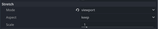
RESOLUTION
To get a low resolution window, I set the window size of the game and the window override size to different amounts

In green is actually how big the window is on my screen (4k monitor) and in red is the retro resolution I want. If you set the stretch mode correctly (an option a little further down the Window tab) then it'll make the pixels big
COLORS
Now the PS1 had the capability of showing you over 16 million different colors, but it could only display 50,000-150,000 at a time, so in order to get more fidelity out of it, the engineers implemented a dithering effect to better blend the otherwise sharp edges between colors.
I used this shader to achieve the dithering effect. If you don't understand shader languages, that's fine. There are a few different pre-built ones for looking like the PlayStation 1 out there.
TEXTURES
Textures for the PS1 could be as big as 256x256, but they were typically 128x128. And they would squish everything a model needed into there usually, at least with like player models and objects and such.
As mentioned, if you're not good with shader language don't worry. There are countless resources out there that people will either let you use or teach you how it works. But I'm gonna touch on it a little bit here.
PS1 textures had no pixel filtering, so you could see individual pixels.
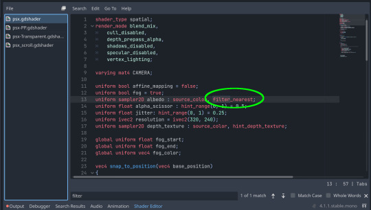
This is what determines that in the shader code. If you want it to look like the N64 (blurry lol), the proper hint is "filter_linear". Note that it won't be 1:1 with N64, cuz they used bilinear filtering (which kinda sucks and causes weird quirks) whereas now you'll only find linear or trilinear filtering. It's a negligible difference imo.
PS1 textures also were only saved using 15 bit color. I'm told that Photoshop's "Posterize" filter set to 32 can achieve this, but don't use photoshop if you can help it. I use GIMP, and while a newer version might have a posterize filter, or there may be a plugin out there, my version doesn't so I cluge it a little.
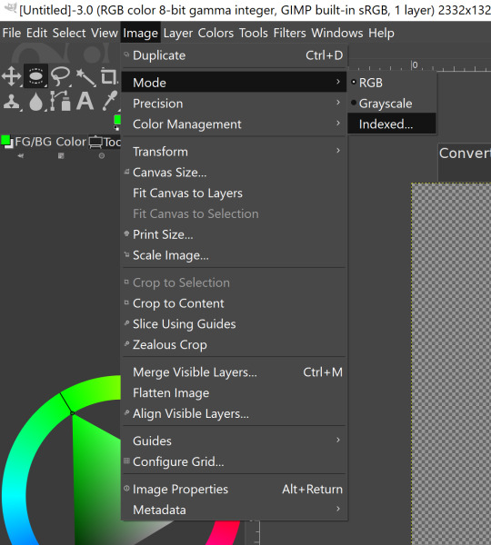

Change your color mode to "indexed", set color dithering to how you like it, and the number of colors in the palette to a number to get a good result. Usually I'll do 16, 8, 32, but occasionally I'll cheat and do a non-multiple-of-8 teehee >:3c
You can change it back to RGB after to make further editing easier.
LIGHTING
N64 and PS1 both implemented vertex lighting, as opposed to the more modern and (now) ubiquitous per-pixel lighting. Godot as it is right now (4.2 i think?) claims it has vertex lighting that you can set as a shader property but they're lying and it doesn't work yet.
The old consoles could only handle like, 2 lights though so it doesn't matter much.
The real star of the show, and in my opinion the one thing that makes a game most look like the 90s is the inclusion of vertex colors.
By multiplying the color of your texture by its stored vertex color, you can do all the shading yourself!
Plus you can reuse textures like crazy just by coloring them differently. The N64 also made heavy use of vertex colors by forgoing a texture on models entirely and just painting them using verticies. The only textures on SM64 Mario are his eyes, stache, hat emblem, buttons, and sideburns. Everything else is done with vertex colors.


Here you can see this level from my Crock Land with no vertex coloring, with some of the vertex colors only, and then with the two combined.
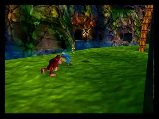
Rare loved this. Look at how colorful that cliffside is in Jungle Japes. It makes it so much more interesting than just a brown cliff face. Plus you can see the vertex coloration instead of textures at work on DK and the Gnawty.
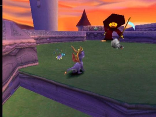
My go-to example for PS1 is always Spyro, what a gorgeous game. All of those colors there are not made by a light or an environment. They're hand painted babey! Also! With spyro! The skyboxes are actually just huge domes made up of vertices that are colored in different ways! That's how they can look so colorful and "hi-res".
There's plenty more you can do, like adding a CRT filter or a little bit of chromatic aberration which I haven't gotten into yet.
The way I've learned all this is just by being curious as to how the old consoles did their thing, and slowly accruing the knowledge over time. There's still infinite stuff I don't know too.
I hope that helped! And wasn't too longwinded or confusing! Like I said, it's all about piling up tons and tons of little things, small details, weird graphical quirks that really bring out the retro 3D feel for me.
And I didn't even get into the modeling side of things! That's an entirely different "color-of-the-sky"-sized post though.
I'd be happy to re-explain or explain more about any of this!
214 notes
·
View notes
Text

Tonight, working on some preparation and planning for the RPG Maker workshop idea i've been cooking! Join in if you're curious!
twitch_live
22 notes
·
View notes
Text
I wrote a new tutorial! This one's about radial health/progress bars in GameMaker.
https://yal.cc/gamemaker-radial-progress/
44 notes
·
View notes
Text
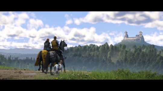
(10 min into the game) MY FAMILY, MY BOIS, MY LOVES!!! 🥹🥹
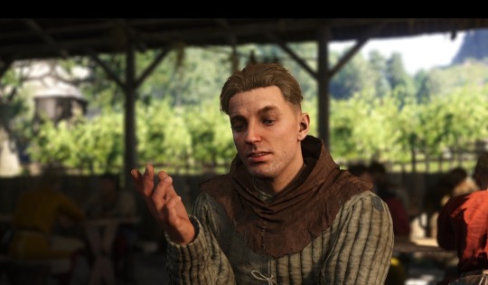
(3 hours later) I'm gonna punch you in your f*cking face, you lovely idiot. I will heal your wounds immediatelly, but I will punch you nonetheless....
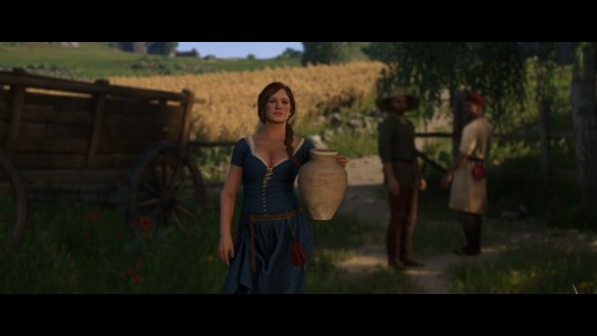
OH YES, ALSO LOVE IS THERE TOO, LOOKING VERY RESPECTFULLY, BUT SORRY I LOVE YOU. ❤️❤️❤️❤️
#fuck I'm so happy#Y'ALL I'M GOING FOR IT#FINALLY GAME 2 WHOOOO#I LOVED EVERYTHING SO FAR#ABOVE ALL HENRY'S SASSY WIFE HERE#LIKE LITERALLY THEIR DIALOGUE. HIS REACTIONS. HONESTLY ONE OF THEM JUST NEEDS TO POPP THE QUESTION “so what are we?” ALREADY#HANS' LITTLE SIGH AT THE LAKE#YOU KNOW EXACTLY WHICH ONE - Y'ALL I SCREAMED#MY LITTLE WHINEY BITCH IS HERE AND I LOVE HIM#ALRIGHTY CAPON LET'S START YOUR CHARACTER DEVELOPMENT ARC RIGHT HERE RIGHT NOW BABY#ALSO HENRY OMG YOU FINE MAN.#YOU GREW UP SO FAST#HONESTLY I CAN'T LOOK AWAY SIR#I LOVE THEM BOTH SO MUCH - THERE CHARACTER ARE ON PEAK.#ALSO COVER THEM IN SHIT I DON'T CARE I LOVE THEM#I AM STILL SCREAMING SORRY Y'ALL#kcd2#kingdom come deliverance 2#hansry#even tho I know a lot of the game by now that's an amazing feeling there playing it#the intro - the tutorial - the proper introduction - all was fire and I had goosebumbs.#spoiler? cause screenshots?#icy play kcd2#also not me taking hundreds of reference shots from naked hans while sneaking away from bandits lol
34 notes
·
View notes
Text
I just posted a character texture deep-dive where I take an in-depth look at one of my character textures used in Of Love and Eternity ✨
Watch the full breakdown by becoming a patron! There's a link to that in my bio 🎊
P.S. The video includes a surprise face reveal 🎃
#indie dev#indie game#indie game dev#low poly#3d#3d game#game art#retro style#retro game#retro aesthetic#tutorial#art resources#game development
46 notes
·
View notes
Text
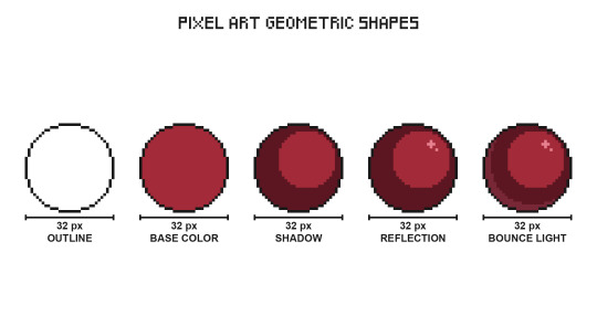
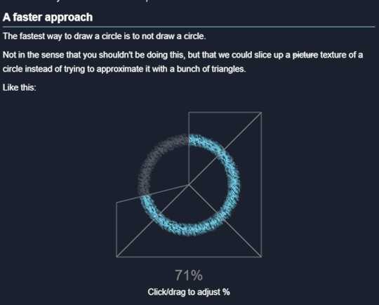
Pixel Art Geometric Shapes - Level 3
Using shadows and lights will help you create volume in two-dimensional shapes.
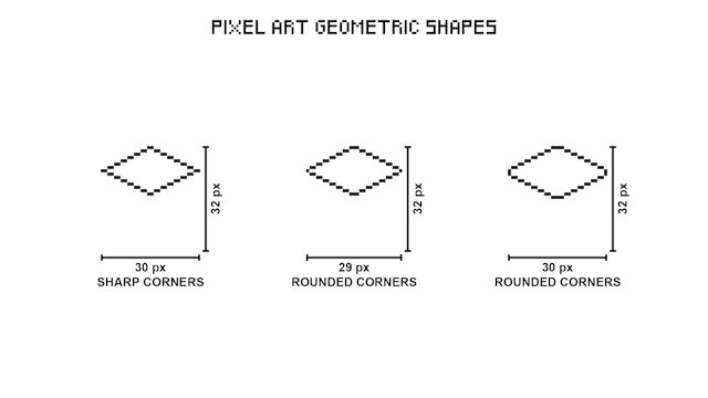
When creating shapes in pixel art it is not always possible to draw a central line, in these cases you must make use of an imaginary line.

Increase the number of pixels in the corners to make them rounded.
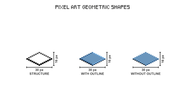
Resize the vertical edge to change the height of a shape.
Use different colors to create divisions in 3D shapes, it is not always possible to create the outline of the central edge.

3D shapes in pixel art usually have an isometric projection, this method allows pixels of various geometric shapes to fit together perfectly.

Put together multiple cubes to start creating structures.
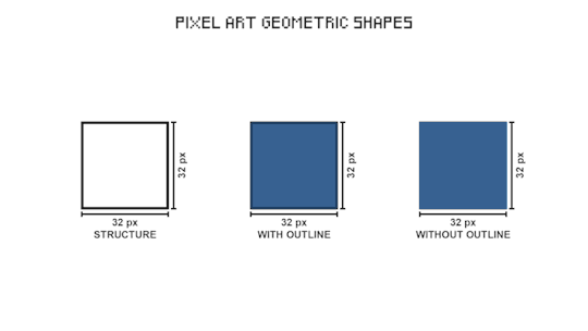
This three-dimensional cube structure is the one used in pixel art RPG video games.

In isometric projection the faces of a shape that simulate depth are the same size.
#pixel art#pixelart#pixel#pixel artist#game design#game development#game dev#video games#tutorial#art tutorial#art reference#art help#art tips#geometry
33 notes
·
View notes
Text
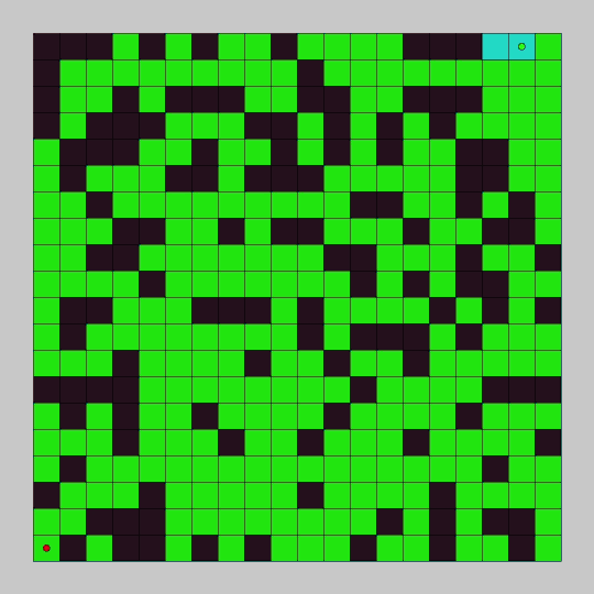
Learn how to explore a grid and find a goal point with breadth first search in this pathfinding tutorial. You will use Processing and Java to code the breadth first search pathfinding algorithm and create a graphical demo so you can see it in action.
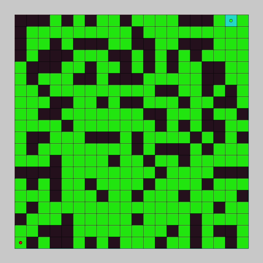
In the last tutorial, we programmed depth first search and watched it explore a node graph. In this tutorial we will program breadth first search and watch it explore a grid.
The breadth first search algorithm will add every unexplored adjacent node to a queue, and explore all of the added nodes in sequence. For each node explored, it will continue to add the adjacent unexplored nodes to the queue. It will continue to do this until the goal is found or all connected nodes have been explored.
#gamedev#indiedev#maze#pathfinding#game development#coding#creative coding#programming#Java#processing#search algorithm#tutorial#education#breadth first search#grid
18 notes
·
View notes
Text


#markiplier#youtube comments#video games#lets play#white knuckle#hidden inventory arc but markiplier version#don’t skip the tutorial!#powerwash simulator#making a game harder to yourself than it should be#classic markiplier#game developer#steam reviews#you could make a movie out of it#iron lung#a crossover between the two would be fire#adhd things
15 notes
·
View notes
Text
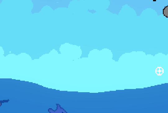
🐟How I made Hook Line & Sniper's water physics 🐟

I always love dynamic pixel art effects, so with my game being highly fish-centric, I spent a lot of time making the water look just right.
First, our starting point: just a semi-transparent Polygon2D. It has several points across the top, which I can move around to make interesting shapes. Note that, unlike some more complicated fluid simulations, I won't be simulating tons of water particles throughout the body of water. I only care about the curve that makes up the top of the ocean.
At this point, we already have a bit of the pixel-art look, since the whole game is drawn to a lower resolution texture.
Next step: adding interaction. I essentially model each of the polygon's points as a spring. Each point has a velocity, and based on its distance from the resting height, I pull it back according to Hooke's law. To make it look like one connected body of water, each point gives a bit of its velocity to nearby points.
Now, whenever the player enters or exits the water, I apply an impulse to the nearest point, and that's enough for some fairly convincing water :D

Finally: polishing up the visuals. To greatly improve the look of the water, I put the whole thing through a shader. I gave the water a pixel-perfect outline by checking if the adjacent pixels are also water. I wanted the water to have a shallow color and a deeper color, which I achieved by checking if there's still water several pixels above the current pixel. (To make it look more natural, this depth test is very subtly randomized based on the pixel's position)

This shader gives me a ton of room for other neat effects. For example, in the final product you'll notice there's a nice splash effect. This is just a simple particle system, but since it goes through the same shader, it blends with the water perfectly.
Since the game has 5 worlds, the shader lets me easily swap out the water's color palette to make each one stand out.
I'm super happy with how world 2's sun reflection turned out, which makes very heavy use of procedural dithering.

Thanks for reading my ramble <3 The game is on Steam now if you want to see the water for yourself!
19 notes
·
View notes
Note
Possibly odd question, I'm trying to prepare to write my undergraduate thesis next year and I'm going to do it on creating battle AIs. Is there any chance I could possibly ask about how the battle system AI in 'in stars and time' works? Totally okay if not or if you're busy!
I'm just especially interested in the design decisions that go behind how especially smaller games handle enemies and creat fun/well weighted battles :D

(all the screencaps will be in JPN because I am currently working on the JPN version ok!!!)
i would love to talk about battle AI and this definitely didn't turn into a "this is how I think about random enemies for In Stars and Time which you should wishlist and play the demo of" just deal with it ok
ok so first I gotta explain how RPGMaker's AI works.
You can give skills to enemies, and you can tell them 1. Conditions, aka when to do a certain skill (always? only on certain turns? only if under a certain state? only if under 50%HP?) and 2. Ratings, aka how high that skill is on the action list.
So for example, this is a Paper Tristesse's attack patterns:
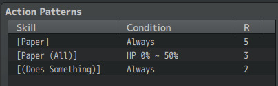
Paper Tristesse's [Paper] attack (which attacks only one target) is set to Always, so they'll always have the possibility to do this attack. [Paper (All)] (which targets the whole party) will be activated only if Tristesse's HP is under 50%, and [Does Something] (which actually just... gives a line of dialogue and nothing else) also always has the possibility to happen. BUT those Rating numbers are different- the higher the number, the more likely that skill is to be activated. So [Paper] happens pretty often, [Paper (All)] less often, and only if Tristesse's HP is under 50%, and [Does Something] is even less likely to happen than both of those.
Paper Tristesse doesn't have a whole lot of attacks, because it's easier for the player so they can keep track of what attacks the enemy has, and it's easier for me. So I don't have. To figure out a whole damn complicated AI when this works great (some other enemies have very long lists of patterns but they're spoilers ok!!!)
(sidenote: [Does Something] is here to give a tiny bit of worldbuilding (how does the Tristesse act?) and to make the enemy skip a turn, giving the player some room to breathe and plan. So sometimes instead of attacking Tristesse goes "(Tristesse is distracted.)" I'm being so nice to players)
This simple pattern of 3 attacks is used by enemies that my producer calls "Goomba enemies", which are random encounters that are supposed to be very simple and not time intensive for the player! For the demo, Tristesse enemies are Goombas, and the triplets (seen below)/Rancoeur+Amertume encounters are made to be slightly harder and ask you to think a lil bit.
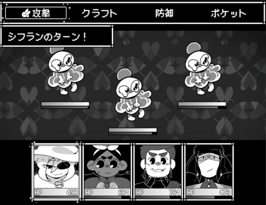
(oooh what's the difference between those three lil ladies?????)
The way I'm thinking about random enemies is, they should all teach the player something. Basic Tristesse enemies are here to teach you about the basics of Rock Paper Scissors and have pretty low stakes (just one weak enemy to focus on! Not a lot of attacks to keep track of!), the triplets are here to teach you that HEY WHAT'S THE DIFFERENCE BETWEEN THOSE THREE SEEMINGLY IDENTICAL ENEMIES DO YOU GET WHAT YOU SHOULD LOOK AT YET (it's their hands, because they do different hand signs depending on their RPS type), and Rancoeur+Amertume are here to teach you about enemies with different goals/patterns (Rancoeur buffs, Amertume attacks), and also that enemies can buff themselves, and also about player priorities to a certain extent- which one to focus on first??? And learning those things are useful against bosses and midbosses!
tldr: rpgmaker's AI is pretty simple and so my enemy AI is also pretty simple but it works well so it's perfect. for me ✨
#in stars and time#tutorial#reference#game dev#indie game#ask tag#game development#this has been A WEEK so thank you for your patience#long post#usual 'i hope that helped' disclaimer
211 notes
·
View notes
Text
youtube
This one goes out to anyone who wants to learn to animate pixel art! There are a lot of great resources from great artists out there, I'm not one! But I show my entire process, and how someone who doesn't have a great understanding of perspective and anatomy, but needs to learn this stuff for gamedev can approach animation, and it doesn't have to be intimidating.
I personally find to useful to, along with expert tutorials, also watch less experienced creators doing full walkthroughs of their process of learning/creating, so that's what I'm offering too! It gives me confidence that I don't have to know everything to start.
So, I show everything from creating a silhouette to making an animatable rig, blocking out the animation, keyframes, interpolating frames, keeping shapes consistent, and I talk through all the choices I make until it's done. Right up until the colour side of things, which I will do in a follow-up.
Partly I realized some of my devlogs could be all art some weeks, and I could spend days making something I could show in a minute, so why not make the process into something I can use and share as well? I hope people find this helpful!

#gamedev#solodev#indiedev#game development#indiegamedev#indie games#pixel art#pixelart#pixel animation#animation tutorial#Youtube
26 notes
·
View notes
Text

Learn how to create a 3D heart in Blender with my quick and easy YouTube tutorial! Perfect for beginners or anyone looking to add a little love to their 3D projects.
I know this is a bit different to my game I normally post, but I also love helping people learn. If you want more tutorials please sub to my youtube channel :)
#blender#gamedev#blender tutorial#youtube#game development#video games#youtube video#3d model#indiegamedev#3d art
9 notes
·
View notes
Note
hey spot, do you have any tips for drawing iterator faces- more specifically "snouted" faces (like five pebbles)?
this gotta be some kinda ploy to make me draw Pebs again augh...
not sure if i really have many tips from my actual process, i guess? i'm tryin to speed thru the process of drawin as much as i can so more nuanced things get lost in favor of a shorthand, but i suppose i can try muster some stuff up. one isn't a master of their craft if they can't explain it to a child, as they say

main idea i try to chase with Pebs (since for now he's the only Gen 3 design i have with the snout stuff) is the silhouette of the head, the boundaries? the same shape can be recycled for a different angle, though the body then has to be adjusted cuz it can look funky then

this is the quick process, at least. generally i'd slow down, polish some things, a drawing with a goal in mind usually takes a while longer because of the attempts at the best shapes n things that would communicate what i have in head, but it's also better defined because there is an actual specific idea in the head. "draw expression for sake of showing a head" vs "draw this character a little appalled with apprehensive hand against the chest and as if he can't stand something that's happening in front of him"
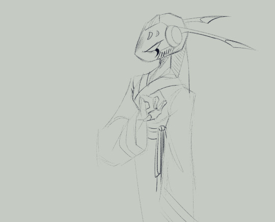
here's the latter idea Pebs with more time spent on him- slower brush strokes, eraser and Especially the select tool which was used specifically to move the eye n marks lower + make his head smaller. the select tool isn't cheating (since i know some throw a fuss about that), use it when something isn't entirely clickin freely
as always, when an artist's shorthand isn't working out for ya/you can't tune into the same process of slappin a vision on canvas, breaking a thing down to its basic shapes and working with those should do the trick
oh! another trick i used a few times. from the middle of the + on the base circle that helps direct the face, extend a line that would serve for some snout navigation in 3D
#spot says stuff#rw#its all fun n games with shorthand until you stop sketchin ur shit out properly n then shit becomes Unbearably Stiff#yeaaaa boy i am Fucked Up i have Horrible little habits#n as always when im asked for some sort of tutorial: gentle reminder that everyone has easier time with their own set of shapes#for me its going Sharp some might be prospering more with round things. dont copy what exactly i said here reach for the core of the idea-#-communicated and develop it in a way thats more helpful to you
77 notes
·
View notes
Text
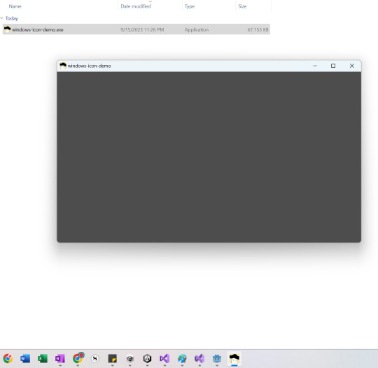
Godot Tutorial: Creating a Custom Windows Icon
I had a little trouble with this, so I made a tutorial in case anyone needs it!
Download IConyc. This is a cool tool (made in Godot!) that you can use to generate ICO files for Windows and ICNS files for Mac.

2. Use it to generate an icon with these sizes: 256x256, 128x128, 64x64, 48x48, 32x32, and 16x16. (Note that you can also make ICO files in GIMP. In order to do this, create different sizes of your image on different layers and order them from largest on top to smallest on bottom. Then export as an ICO file.)
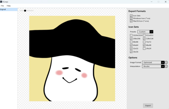
3. Add your ICO to your project.
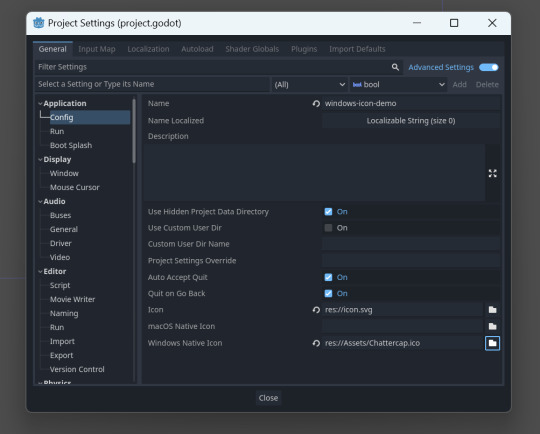
4. Go to Project -> Project Settings -> Application -> Config. Check "Advanced Settings." Go to "Windows Native Icon" and select your ICO file.
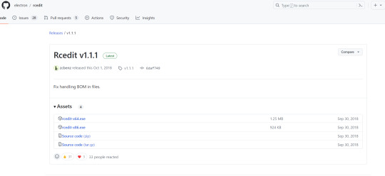
5. Download rcedit.
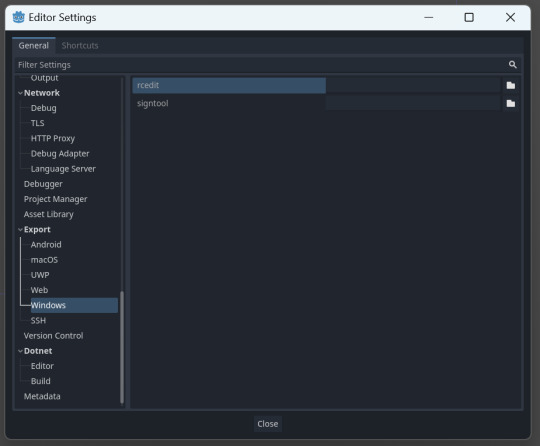
6. Go to Editor -> Editor Settings -> Export -> Windows. Under "rcedit," find where you downloaded the rcedit executable.
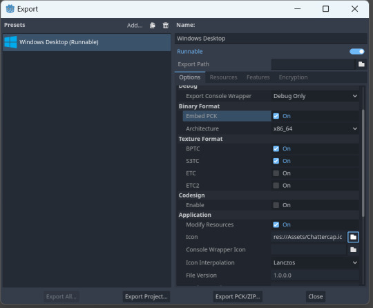
7. Go to Project -> Export. Select your icon in ICO format in the Application -> Icon field. Check "Embed PCK."
8. You should have your custom icons!
(Note, if this does not work, try renaming the exported executable. Sometimes that "refreshes" the icon.)
65 notes
·
View notes
Text
This tutorial will walk you through how to create real retro textures just like Dad used to make!
Become a patron to access all of my full length game dev tutorials including this one! Link to that in my bio ✨
#indie dev#indie game#indie game dev#game dev#game development#low poly#game art#retro style#retro game#retro aesthetic#photoshop#photoshop tutorial#pixel art
30 notes
·
View notes
Text

Pixel Art Merge Shapes
Merge Type
Union: Combine two or more shapes into one.
Combine: Removes overlaps to form a new shape.
Intersect: Obtain a shape from overlapping areas.
Subtract: Removes overlapping parts of one shape from another.
Fragment: Divide each of the intersections into different shapes.

A compound figure is made up of two or more simple geometric shapes.

With time and practice you will begin to recognize all the forms that make up things, and you will even notice different ways of getting the same result.

Use different shapes of various sizes and positions in conjunction with merge types to create unique shapes.
Identify the elements that make up an object and find a way to create each of them individually. I recommend having a sketch or a clear idea before starting.
#pixel art#pixelart#pixel#pixel artist#game design#game development#game dev#video games#art#artist#digital artist#tutorial#art tutorial#art tips#2d art
21 notes
·
View notes