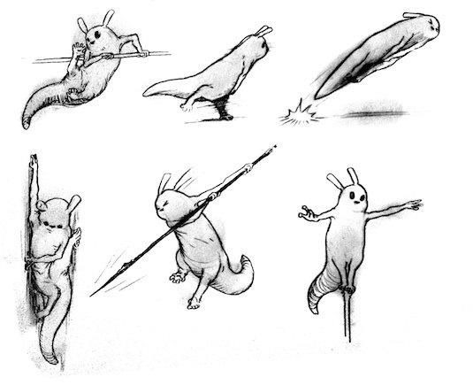
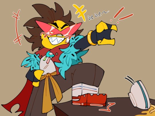
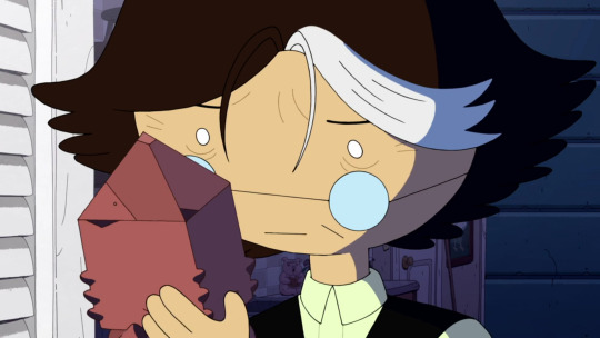
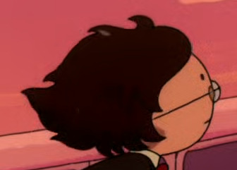
#i have an artstyle that is not meant for drawing
Text

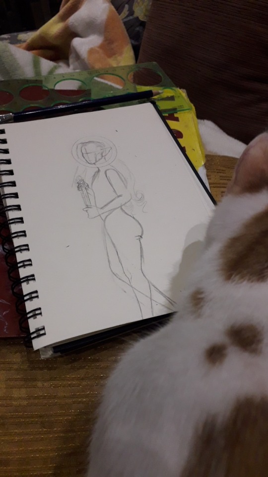
giggling and kicking my feet though thanks anyways who wants to see a wip
#my art#wip#i speak#:D#ill finish it this time i promise#also ignore the funky angles ill fix it#criticism welcome#and also needed#i have an artstyle that is not meant for drawing#if anyone has any good free animation softwares that would be great ok thank you :3#my art is so wildly inconsistant 🔥🔥🔥
3 notes
·
View notes
Text
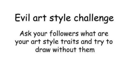
I'd like to try this challenge, it might be funny to draw something different. So, to the 4 people that follow me, which are my art style traits? If I have any lol
#evil art style challenge#wren draws stuff#memes#art challenge#let's try alright#like I asked a friend which art style traits I have and she said that my drawings are very round and soft#well actually she defined it like “very delicate and feminine”#which BTW she is right#when I was a teen I used to draw only magical girls that later developed in the “I can't draw boys” fr#I'm not jocking#I started to actually to learn how to draw them after watching JoJo#I'm 😔😔😔#also that one friend told me I should draw more rendered stuff#and when I asked what she meant she answered with “y'know like the jelly artstyle” and I didn't know what to answer
13 notes
·
View notes
Note
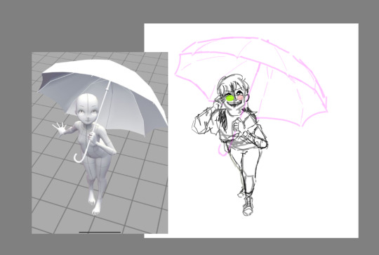
I ADORE your art and how well you match the ISAT artstyle. I've been being alot of studies to try replicate the style and draw characters 3d but stylised. Are there any tutorials that have helped you, studies you do, or things you keep in mind whilst drawing to make the characters look so 3d?
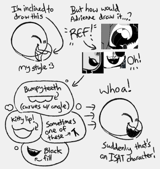
Oooaaahh thank you!!! This is a really good question. I say that because I feel like I "2D cheat" ISAT art a lot. It's very comfy to draw bc my normal art is like that too, with angles that shouldn't be able to exist but look right bc it's 2D so your brain forgives it. Design of the art > accuracy of the anatomy, y'kno?
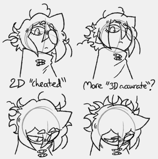
The hair kind of gives it away in most cases. It's meant to be such a specific shape, it kind of stops looking like the character if it gets too 3D? But drawing it more 3D has huge utility too, especially for animation n stuff. It's just something I've noticed about the style! It's very designed for 2D. It's very "the shape of the lines" > "the shape of the 3D object"
It's helpful to remember that ISAT characters are all made up of really simple shapes. Like Siffrin's head is just a ball from nearly any angle but the side. Their body is a cylinder but one end is wider than the other. Odile's face is a ball but the bottom is long, like an oval. Isa's is a ball but his chin is square, it has soft corners. Even Bonnie's face is a ball you just add a cheek bump. Etc etc.
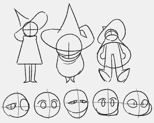
^Notice how i can't simplify the hat down into a consistent 3D shape bc otherwise it just. kind of. doesn't look like Siffrin's hat LOL
If you have the simple 3D shapes down then the rest of it is all 2D cheating and focussing on details! Having character refs nearby at all times especially when ur tryna figure out how to draw the character is KEY so you can keep looking at it and comparing. Try to pay attention to the little quirks of the art style that differ from yours and try to mimic them. But don't be afraid to let your style infect it a bit if it helps you to create something more dynamic looking.
It helps that i've been drawing for ages. I know 'practice' is the age old advice but here's my spin on it: just draw, keep drawing what u want no matter if it looks bad or if some professional artist tells you you're doing it wrong. So long as you keep drawing you are learning. Indulge and draw what you want so you get to keep all the motivation and keep going.
oh and PUSH YOUR POSES/EXPRESSIONS!!! By this I mean, draw it once, and then lower the opacity and draw it again on top but pushing everything a little bit further. If a pose feels stiff this tends to fix it.
uhmmm i rambled on for ages but i hoped it helped u Tea (or anyone else reading)! thank u for the excuse to draw a bunch of funny isat doodlies :D keep going you have GOT THIS!!! THERE IS NO WRONG WAY TO MAKE OR ENJOY ART! YAY
1K notes
·
View notes
Text
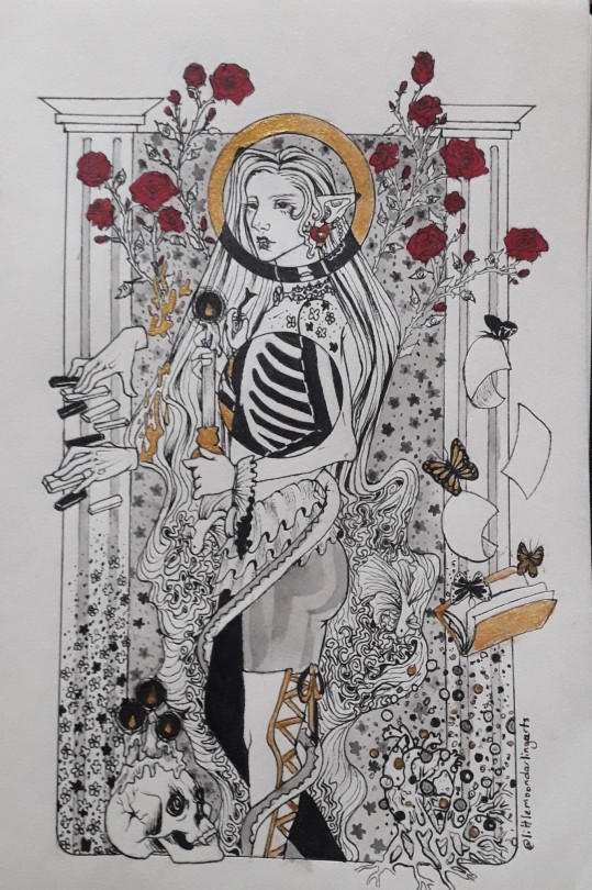
Did an artstyle study of the gorgeous art of @iliothermia and I genuinely learned alot so I'm very thankful that he gave me permission to do this 🙏🏻🙏🏻
As usual, rambles and process pics under the cut, be warned that I talk alot because this drawing was a true labor of love both for his art and Rouge
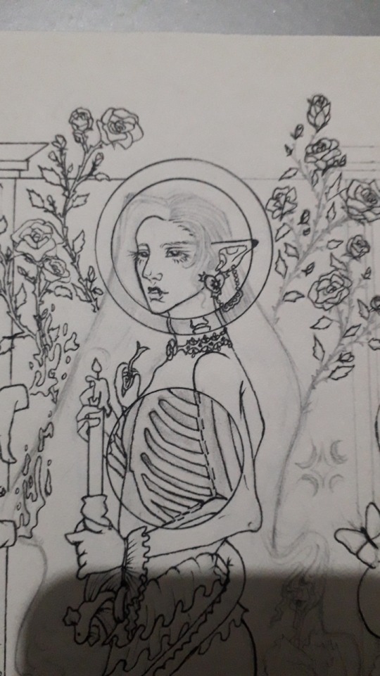
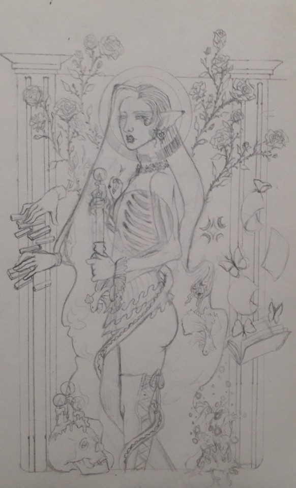
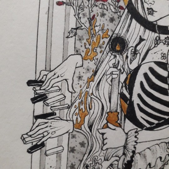
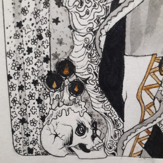
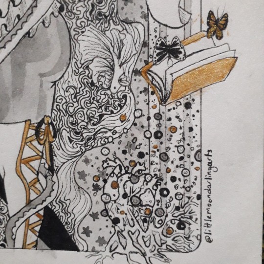
I wanted to use elements from his art but at the same time i know how deeply personal his art is to his own life and struggles and culture so i tried to be as respectful as possible (and if I failed at that please tell me I have no problem in deleting this) and tried to minimize my use of direct elements from his art to keep it to the skull which was heavily inspired by a drawing he has done, the waves which are such a beautiful staple of his art that I just couldn't not put it and the use of candles and small floral patterns and the style of the mold, but I tried to keep the rest to things that are symbolic to the character.
While he may have restraint to not explain everything, I'm not famous for that lol, so I will be explaining the symbolism behind my choices.
Part 1: the symbolism:
The red rose is Rouge's flower and it is heavily associated with him. The meaning of it being romantic desire and passion mixed with the thorns of it perfectly sum up his position as a beautiful black widow.
Voyeurism is a big part of this drawing and it is first noticed with the eyes motif on the roses' leaves, this symbolises his response to his trauma which left him feeling like an unwanted pervert on his own self. I can talk about this aspect of his story for hours but I'll spare you lol.
The X-ray cutouts are his complicated relationship with his own body and death, it is a thing that is constantly on his mind as he suffers from suicidal thoughts but at the same time he is always running away from it in fear, but he knows that eventually, he will have to stop running.
The candles melting represent him being only wanted when he is useful, when he is giving parts of himself up for others to use and abuse, when he is lighting their lives by slowly draining his own.
The piano is one of the rare things that bring him happiness and peace, but he needs to be heavily dissociated to be able to enjoy it which is represented by the hands being disconnected from the rest of the drawing and just floating in their own reality.
The snake represents two things, one is him being venomous to those around him, the mistakes he's made, the promises he's broken, the pain he's caused etc. But it also represents those who slowly wrap themselves around him in a warm embrace, presenting themselves as a saviour in his most dire times only to end up being the ones who will hurt him the most.
The book is about his obsession with keeping track of everything and of studying people, accidentally turning himself into an unwanted voyeur on their lives to the point where he has written the life stories of many people who would never want to be remembered through his eyes in his little books.
The butterflies are him, both in the way they are seen as "the good insects" and the beautiful delicate ones despite the fact that they eat flesh sometimes, it is also related to the way his simple presence for a few minutes in someone's life can create a whirlwind of change that will leave it unrecognizable, or he can simply be another body in their bed.
The hair turning into waves is meant to reflect the way he is always drowning in his own thoughts, a hand crafted constant state of misery.
The beta fish are some of the most beautiful and colourful fish out there, yet they are seen as cheap and easy first pets, leading to them being neglected and given environments that are too small and crammed, making their beautifully slow death the only thing they can offer to their owner. I don't think I need to explain more..
The skull is probably someone he's loved, or someone he's killed, or both.
The heart is his, it is rotten and covered in mold, any love he offers is tainted by his inability to heal and it is spreading to infect every aspect of his life.
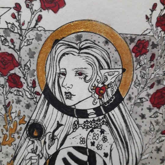
Part 2: the inspirations:
The roses are a homage to the way Rachamim always places flowers in his art, either in the background or as a focal point of the illustration, most of the flowers he uses are cultural in nature, so I opted to not reuse any of them and changed it to a flower related to my oc.
Eyes are a repeated theme in his art, whether it be angel eyes, the evil eye or anything else, and as you can tell both of these are cultural and religious and while the evil eye exists in my culture, it does not in my oc's so I didn't use it. Instead I opted to pay homage to one of his beautiful merman drawings in which he used the plants to make an eye-like shape that stares at the viewer.
I thought I was being real smart in turning the hair into waves but yesterday I saw an illustration where he did the same so rip to me thinking i was being original lol.
The snake and butterflies are my way of replicating his use of animals while trying to not directly copy any animals that have a connection to himself or his culture/religion.
The beta fish is just to reference the ever present fishies in his art. I know he uses them because they represent friendship for him and they are the only animals safe from the evil eye (thanks for the fun fact) so I uh... I don't really know if this was disrespectful or not to be honest but I tried to use a different type of fish, idk this might still be slightly problematic and again I'm always ready to delete this if it makes anyone uncomfortable.
The waves are a direct copy of how he draws the gorgeous waves in his art, another case of something I fear may be crossing the line because the waves are drawn in the style of cultural jewelry 😭
The tiny flowers are an obvious reference to his own tiny flowers that decorate his art and characters.
The skull with the candles is heavily inspired by a specific drawing of his.
The cutouts are my way of paying my respects to my absolute favourite piece of art he's done without directly copying its concept because as far as I can tell, it is a very personal and emotional piece.
The mold style is a reference to his mold man (I forgot his name I'm sorry).
And the candles are another repeated motif in his art as well as the pillars and the pant style.
And ouf I sure do talk alot don't I? I just really love the amount of things I was able to cram into this piece and I haven't even mentioned everything😭😭 I will NOT be doing this again because I'm simply not as patient as he is and as proud as I am of the result, this was torture. I hope I didn't disrespect him, his art or his culture and I genuinely tried my best to be as respectful as possible but I might have some blind spots due to our experiences being so vastly different so again, please don't hesitate to inform me if you want this deleted!
#my art#art#artists on tumblr#oc#my oc#rouge#original characters#oc artist#oc artwork#oc art#lineart illustration#artsyle study#art style study#art study#idk how to tag this#anyway#hii#ty for reading#i hope you like it
237 notes
·
View notes
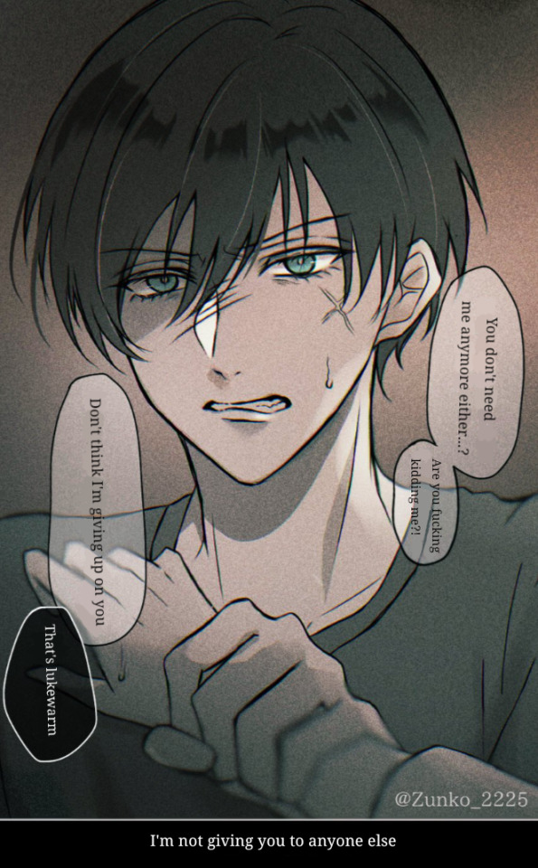
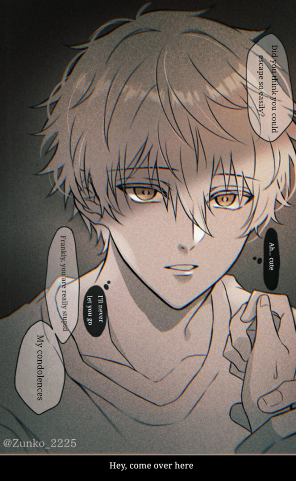
Text
Cw: yandere, suggestive (for Kaiser)
I found out these wonderful yan bllck drawings and felt compelled to translate them (to the best of my abilities) and share them. The original artist is zunko_2225 on Twitter, they have a lovely artstyle and I recommend checking them out!
P.S: Kaiser's "get ready for fucking" likely meant "fucking prepare yourself" but my thirst for this man was happier with the first version, even if the second one is enough to make me weak on my knees


3K notes
·
View notes
Text
people constantly talk about making a little middle age peasant boy try a can of monster or whatever to give them cultural shock but one thing i genuenly wonder about is how they would have reacted to modern artstyles, particularly cartoon and anime ones.
like, we can see anime girls or random fanart on tumblr and think nothing of it because we grew up in a cultural context where they were either the norm or we saw the artistic evolution from the style we grew up with into the current styles. but like imagine presenting a victorian child (whose only exposure to comics might have been the yellow kid and hasnt gotten to see the creation of the rubberhose style which would evolve into the disney style which would later inspire osamu tezuka who would set the foundations for the anime style that would evolve across half a century into moeblobs or whatever) to an image of panty and stocking or dragon maid.
would he be able to parse that this is supposed to depict people? would he think they look attractive or that they look like deformed homunculi. would this little german boy, fresh off the coal mines, be able to appreciate that characters like the powerpuff girls are supposed to look cute? that the designs of the characters in arcane are meant to be compelling and aspirational? would hans who is two months away from dying from tuberculosis, think that the simpsons look like incoherent doodles from someone who has no idea how to draw? would he understand the stylization in the way that lisa's and bart's hairline fades into their heads or think they are disturbingly mishappen? would he be able to understand that bugs bunny is supposed to be a rabbit or would the proportions of his limbs throw him for a loop? he would probably be able to understand furries, after all anthropomophized animals are something that human culture has had since the very beggining, but would he have it within himself the capacity to get as obsessed as kids today get over them? we have to remember we grew up in a culture where humanized animals, specifically depicted in a semi disney-cartoonish style, has been the main component in a little kid's media diet, but would this kid, who at 12 years of age has never seen a sparkle dog, be capable of being as enchanted by this as kids today?
these questions keep me up at night.
#art#the funny thing is that they are probably not that hard to answer#just find some kid in some uncontacted tribe in the amazon and show them drawings of cartoon characters
74 notes
·
View notes
Text

Saw this meme and i HAD to draw tobecky with it.
I'm aboutta yap about every single detail so buckle up!
I tried to make it a stained glass type of artstyle. Although the colors do kinda burn my eyes but i guess that's the beauty of it?
Also i don't want nobody telling me a star is not similar to the sun in terms of mythical... astrology or whatever yall call it, the sun IS a star😤
I made them COMPLETE polar opposites of each other.
Like how the shades of the bg colors are opposite. How the people worship the star due to it's benefits. While the moon is lonely, and looks down on the robots he made as friends, while the star never had to look down, she knows people are there to support her.
The star is wearing more ancient clothes compared to the moon, which is more modern, because the sun is older than the moon and has been worshipped far longer.
The sun has messier glass shards because becky can't draw for shit lol (a.k.a, she isn't that creative so it would be funny and accurate to make her card messy)
Meanwhile tobey's card is more organized and sophisticated. Usually stained glass art has organized glass shards but sometimes their locations are messy for the purpose of focusing on the story or meaning.
I originally didn't intend for the sun's card to be so bright but i guess that's the whole point of the sun, it's beautiful but if you look it too long you'll hurt your eyes. So imma keep it this way.
This is a small detail i'm pretty no one noticed or even bothered to notice. The shield behind becky (meant to reoresent her iconic star insignia, with her body sprawled out like a star) is actually flipped upside down behind tobey in his card to truly represent how flipped and different their moral standards are.
This is also slightly based off of the wordgirl lore and backstories of tobey and becky in the fading facade which is one of my fav wordgirl fanfics! I liked the idea of tobey being the prince of britannica, a rival planet to lexicon. and for tobecky's story to have a romeo and juliet mix to it. So tobey's clothes here are what i think royal britannica princes wear. That's why it's so fancy.
Here's the original template btw

98 notes
·
View notes
Text
ikevil - tips on how to draw william rex
next: harrison ->
what better way to start this than with our beautiful lord rex? I hope I make sense with this guide oml
introduction:
you know how you want to draw your favorite characters, but don't know where to start? you know, those characters with ridiculously difficult designs?
this is for ikevil. hope this helps
(there is no tracing whatsoever in this. this was all done by hand. analyzing anothers' artstyle is NOT a form of art stealing. people naturally learn from observing others. imitation is the highest form of flattery. this is not meant to disrespect natsume lemon in any way.) disclaimer, I am not a professional artist. these are not set in stone. these are just tips.
section 1 - observation
finding important traits

my writing sucks. let me sum it up for you
thin, angular features. thin nose, sharp eyebrows, elf sharp ears
his face is quite long. the chin is not completely sharp, it is more blunt.
william has an earring on his left ear.
large forehead to plant a kiss on
his smile is :>
his eyebrows are in a ] shape (I don't know how to describe it)
section 2 - study
imitating the original sprite


this is the part that gets tricky.
it helps me learn better because it translates the reference into something I can understand. it's also so I don't forget anything (so many accessories...)
I crudely slapped the colors from the original onto my imitation to save time 😭😭
let's break down his design.
hair
monstrosity. aesthetically pleasing to look at. but drawing it? hell. I have color-coded it into pieces here:


magenta: back hair. very spiky and a bit long. it's a bit poofy on top (at least on the main sprite)
red: extends outwards. try to have the part dangling down cover the end of the hairline.
yellow: think of it like a little extension from the green section. just dangling down a bit.
green: make it dramatic
blue: similar to red, but smaller and on the other side. tucked behind green.
2. eyes


his eyes are in a parallelogram shape. the slant is similar for both ends.
outer corners extend upwards.
they're not opened very wide.
almost everything is sharp. very little curves.
his pupils are a bit larger than slits.
the inner corners are lowered significantly.
3. clothing
I only did a bust but still


underneath that outer collar is the same dress shirt you see in the sprite below. don't forget about it.
the cravat (???) is crinkled by the outer chain
I was obviously too lazy but remember to draw the pattern of the outer collar


all these accents have a rope-like texture
the chain mainly consists of triangles, but they rotate... I could not be bothered to go through that pain
accessories in the third image


section 3 - personal application
applying all these tips to my own artstyle


this was arguably the most painful part of the process. I got artstyle envy because of the study, so I had to hide the study 😭😭
I hope I portrayed him accurately
got a lazy with the clothes... but I make up for it in coloring. eugh trust the process
final comparison

I still like the study better but my artstyle is fine too 🤧
◇◇◇◇◇◇◇◇◇◇
taglist!!
@bakersgrief @floydsteeth @tako-cafe @rubia8 @xxoomiii
@sh0jun @noxinara @g0dwat3r @sapphire-323 @lycemagee
@citrusmornings @drachonia
please let me know if you'd like to be added or removed!! or if you'd just like to be tagged for this series
#ikemen villains#ikevil#william rex#ikevil william#ikevil fanart#ikemen villains fanart#ikevil cast drawing guide#rouletmecook
66 notes
·
View notes
Note
something about your artstyle just feels so on model to me
like these feel like how the scugs are meant to look
Thanks! that means a lot
I try to draw closely to how I imagine, I like things to feel tangible.
Though in fact I would say I don't exactly follow my own headcanon a lot of time, I often make slugcats appear more like quadrupedal animals than I think they actually are. Since they're definitely bipedal and have more articulate arms.
Though on the subject of "how the scugs are meant to look" I'll randomly take a moment to bring up how they actually ARE meant to look. Joar's concept art sketches.
I always find it interesting how quickly the slugcats were made more cutesy the moment they got handed to other artists, while the original concepts are much more alien and weird. a bit more clearly bipedal, the digits very apposable on the feet, very skrunkly.
I just love these sketches and figured I'd take an excuse to show.
381 notes
·
View notes
Note
Can I ask how you learned to draw in the lmk artstyle? It's very impressive to see how accurate yet unique ur lmk art is compared to the show!
At first I simply did just trace out the shapes of screenshots to get an understanding of the proportions of the lmk style. as well as just stare and study for as long as I can to dumb down the style for myself-
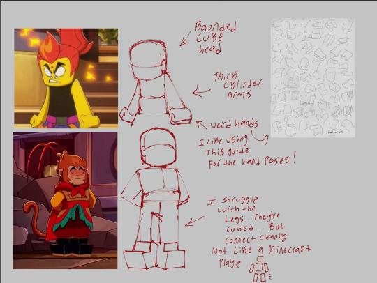
Alot of my old LMK, Mainly OC art were just redraws from screenshots that I heavily edited and changed, like outfits were drawn all on my own and hairstyles ect. It was mainly just the body breakdown I used.
like these-
I also have a little more knowledge on the style in general as a few buddies of mine, who can draw in the style Much more accurately then I can, Gave some tips and tricks! Like keeping in mind that drawing in the LMK style, the characters ARE lego characters and are meant to represent being made of molded plastic, and you don't want to draw somthing that feels like that plastic is snapping or breaking! as well as some style anatomy things!
Before I used to freehand the eyes- Now I just use the circle tool and fill in.
for coloring and rendering I just freehand it, but sometimes depending on things like shading (not always) I look at how LMK Shades things.
I just do my usual method of flatcolor, shade sporadically but let it make sense, Throw some texture on there. Color the lineart, Blur the lineart a smidge and bam... Art.
I'm still learning and studying.
sometimes i cheat by drawing the pants baggy or the sleeves baggy so i don't have to keep up with drawing the "LMK Geometry"
theres only so many cubes i want to draw hahah.
In terms of my own "unique ness" I never stress over how "SHOW ACCURATE" I want my LMK style to emmulate, I just do enough to the poitn of "yeah thats the LMK style" and add my own flare like again texture or design in general.
#I think tracing a style from popular media is okay so long as you do so purely to learn how said style function and works#and be honest that you did use or reference a screenshot#NEVER trace another fanartists work#that's a line that shouldn't be crossed.#By tracing a shows style#I mainly mean like in terms of “breaking down” how that style works and give yourself a better understanding to the shape language used#in terms of
206 notes
·
View notes
Text
Surprise! I am going to rant about my own redesign and art! I think this is me mentally preparing for the helluva boss episode next week and praying to god it’s actually good. I’ve also been nursing a bit of a hangover today so forgive me if my wording is a bit more jumbled than usual
Im a big fan of my Angel Dust redesign, but in the general aspect of my art, a lot of my poses are a bit flat. That can be from either posing issues on my end, trouble with facial features, or just some secret third thing, but I think so far Ive been enjoying drawing much more cartoonishly as of recent. That vox canon & headcanon drawing was super super fun to do even though it was supposed to be vivzies style, but I used to have a style with more sharp angles and pointy curves that I honestly kind of miss, I also miss playing with cartoonish proportions!!
My art style may end up changing eventually, but my main pieces will stay in my usual style and my more doodle-y ones will probably be in a more cartoony style like the ones above. While theyre definitely closer to canon and meant to be inspired as such, the difference is that I can draw diverse body types in said artstyle! I also cant lie, Angel’s chest fluff is one of my absolute favourite things to draw and it’s so easy in this style…
About my redesigns though! This is mostly about Angel, but I’m gonna slap this here from DMs with a friend: “Im so pleased with this genuinely im so happy he has his little pedipalps, theyre technically also still his fangs but now he can move them and stuff and :33 typically for male spiders the pedipalps are a reproductive organ but that isnt the case for angel or many other arachnid or insect sinners id say so I think personally most of them have developed pedipalps for primarily other reasons like fangs in Angels case or maybe something similar to cat whiskers for other people”
In my original angel dust redesigns I just couldn’t find a way to draw his fangs in a way that made me happy because I want to keeo the same energy in his face as the original. Big clunky fangs that stick out just didn’t work for him and while they made him look like a spider, he lost that sort of angel-ness that I need when drawing him so I instead looks to the pedipalp aspect of spiders to move them off of his mouth and more onto his cheeks. It’s a very small change but it improved the design in my eyes significantly and just really made me a lot happier. I wont be updating his redesign post as of right now and maybe never will, but if I do yknow why now!
I just really really like drawing this guy a bit rubbery, hes supposed to be fluffy so like he should move kinda soft in a way? I dunno how to explain it rn, its 2 AM at the time of writing this so im gonna lay the hell down now!
#hazbin hotel#hazbin critical#hazbin hotel criticism#hazbin hotel critical#angel dust#hazbin angel dust#hazbin angel#anti vivziepop#angel dust hazbin#angel dust hazbin hotel#angel dust redesign#hazbin redesign#hazbin hotel redesign#my art#will add alt text later
123 notes
·
View notes
Text

C!Beeduo Pride art!
Notes under the cut
Cranboo is meant to be wearing a black cut off top kind of thing and a black button up in this, also they're supposed to be wearing a skirt but I didn't have enough room.
ALSO ALSO I know I forgot to give Cranboo an enby flag here somewhere. -- I apologize, oh gay council.
ALSO ALSO ALSO I was going to draw Ctubbo holding Micheal here, that's why his arm is kind of bent funny, but since I usually draw Micheal in a chibi artstyle and this drawing is in my usual more realistic artstyle and I didn't know how those two would blend I just didn't do it. (That and I have no fucking clue how to draw children).
ALSO ALSO ALSO ALSO for an explanation on why I gave Cranboo short hair, I tried giving them long hair but it just didn't look right so after a bit of trial and error I just gave up and gave them short hair. But hey, I kind of liked short hair with this design for them so maybe I'll keep it, maybe I won't, I guess we'll see.
ALSO ALSO ALSO ALSO ALSO I am not shipping the content creators. I am choosing to interpret the characters they plays' relationship as romantic. --This comes mostly from Cranboo replying with "yes" when Ctommy asked them if they fell in love with each other at some point after they got married platonically.
#bee duo#beeduo#ranboo fanart#ranboo#cranboo#c!ranboo#c!tubbo#ctubbo#tubbo fanart#tubbo#c!beeduo#charliesapienarttag
71 notes
·
View notes
Note
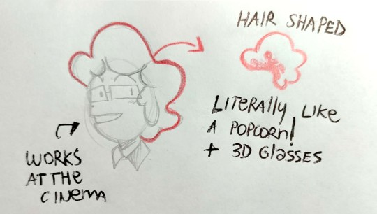
Hi! So I want to make a Spooky Month OC but I suck at drawing, do you have any tips or advices about drawing characters in the Spooky Month artstyle?
Okay so, I might not be the right person for this, cause I also am not all that great at drawing in the Spooky Month artstyle, but I did some character design at school so I might be able to give a few tips! Please do take everything I say with a grain of salt tho!
Spooky Month's strong suit is definitely character design. It's SO expressive and well done it's genuinely unreal. You might want to know exactly what your character is gonna be doing, or how their personality is gonna be like, because character design in Spooky Month cares a lot about things like these. For example: Radford works at a cinema, so of course he's wearing 3D glasses, but also his HAIR IS LITERALLY SHAPED LIKE A POPCORN.
So maybe decide on a job for your character, and try to start from there, get crazy with shapes and have fun! Spooky Month characters have designs that are both extremely simple to draw, since they use mostly basic shapes, but also are extremely thought out and meaningful. Another example of great character design is Pump
Now, I have no idea if you already had an OC in mind, but make sure to choose the right shapes to represent it. Something I see around in the fandom is people making these OCs that are like, serial killers and dangerous people and stuff, but then give them the "Lila"-like oval head. And honestly, nothing wrong with that, that's a choice you can use! But still, shapes allow us to understand a lot about how a character is just by looking at them. So you might want to experiment around a bit!
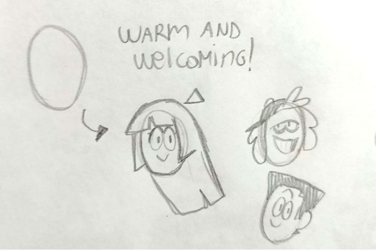
Ovals in Spooky Month are the "good" shape, let's just say. Most character with an oval head are sweet, helpful, kind-natured! It's often paired with oval eyes, so it's mostly a shape that's used for not villainous characters.
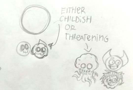
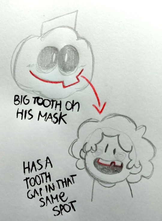
Circles are a bit more complicated, because Spooky Month subvertes the Circle Characters. While yes, they're also used to draw children, such as Skid and Pump, so they may come off as unthreatening at first, most main villains, such as Eyes, Bob and Dexter Doll (which is meant to represent the likes of a child, so that's a nice contrast), are mostly circle-shaped.
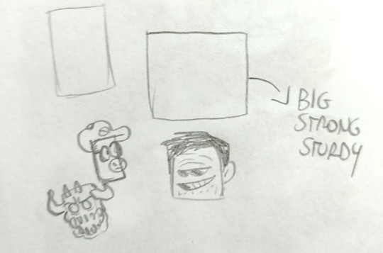
There's a very wide range of Square characters in Spooky Month. Square characters are usually bulky, big and strong. They often come off as threatening (such as Moloch), but there are so many other fun things you can do with them. Like, take Frank. EVERYTHING in his design should alarm us, him being square-shaped, the black eyes, the wide smile. Yet, he has a shape of the eyes that's very relaxed and chill, so we end up trusting him. As for Dexter, he's a mix of circles and squares, so we can't really understand his intentions right away, because he's shaped in the most confusing way possible. He's just made to be unsettling and leaving us to wonder if he's a bad guy or just an oddball.
You can do SO MANY fun things by mixing up shapes of faces and eyes it's INSANE. Also, you can mix up other characters' features to create a new one, if you're planning to do a fankid or stuff like that. Look at Ross, he's literally a mixture of all his parents' features!
My main tips for drawing in the Spooky Month artstyle are mostly
1) Play around with shapes. Be as cartoony as possible.
2) Try to be consistent with proportions, because, based on personal experience, if you draw the pupils of the eyes slightly off it changes the whole character's expression drastically
3) don't worry too much about details, Spooky Month has a very simple artstyle. You don't have to draw a perfectly anatomically correct hand, just whip up some cartoony three-to-four fingers and you're good to go
4) try to redraw some pre-existing screenshots from the serie to get familiarity with the way Pelo draws expressions. It helps a bunch.
So yeah, that's all! Good luck with your oc :)
#spooky month#spooky month art#spooky month oc#spooky month au#spooky month fanart#radford spooky month#spooky month radford#sm radford#sm ross#spooky month ross#spooky month dexter#dexter erotoph#sm dexter#dexter doll#sm moloch#moloch#spooky month moloch#sm jaune#spooky month jaune#spooky month aaron#sm aaron#spooky month frank#sm frank#spooky month skid#skid and pump#sm skid#pump wonder#sm pump#spooky month pump#spooky month eyes
107 notes
·
View notes
Text
Okay, you know what, let's talk a little bit more about Simon Petrikov's ears
I already made a silly little post pointing out how the Winter King is drawn with visible ears, while Mainverse Simon is always drawn without them.
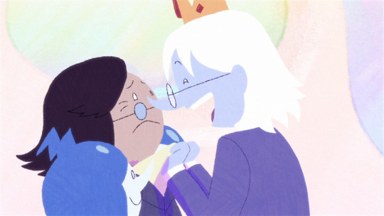
And I've gotten a few replies on that post saying that it's probably just a difference in hairstyle. Y'know, the Winter King tacks his hair behind his ears, Simon doesn't. But... I don't think that works if you look at Simon's design. I mean, it does seem to be the case if you look at this one screenshot I here - but usually....
Simon Petrikov's little glasses are very helpful here, because they literally form a line with where his ears should be, and you can see that his hair typically ends just above that point and no matter how much he turns his head there are no ears.
In a back shot you can even see where his glasses handle end, and there's no ears anywhere to actually hold them.
(this is also true when he's Ice King btw)

It's kind of a Whole Thing. The Adventure Time artstyle has some general guidelines of how to draw humanoids' face, but it's fully willing to break them to make someone more goofy and distinctive. Like, some characters having noses or more detailed eyes or even lips. And ears are already kind of a Weird Subject considering how many AT characters wear hair/hats in a way that hides their ears anyways.
Princess Bubblegum is another earless characters, but it's actually pretty hard to notice because most of her hairstyle obscure her Perfectly Spherical Head.
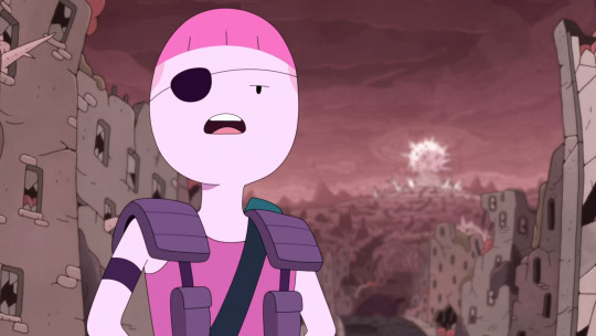
But she's like, Made of Gum, so it's less Weird for her to be earless compared to Simon Petrikov who's meant to be a Perfectly Normal Human Man.
(although Prince Gumball somehow does have ears. Even when he IS in his Magic Candy Form)
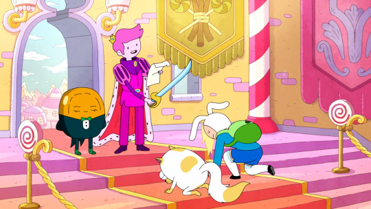
(Which is like... lowkey Weird. But still, Magic Candy People's physiologically can be whatever)
Meanwhile, ears IS something pretty consistently drawn for human Adventure Time characters. So it is pretty weird Simon doesn't seem to have them. It's probably a matter of, like, Simon being one of the first not-Finn Human characters added to Adventure Time and with the aforementioned matter of most characters not having their ears/lack of ears visible either way they weren't really sure of how Humans should look in the AT style at that point.
Or maybe they wanted to keep it consistent with Ice King's "Loyalty to the King" look and decided that a Magic Evil Crown that makes your ears fall off is a step too far. Or maybe having his ears hidden by his hair is what was originally intended in his design, but was misinterpreted as being straight-up earless so consistently by the shortboarders and animators it eventually just became his canon look.
But I think also... characters having certain non-typical facial features on Adventure Time is generally an indication that they're particularly prominent. So characters who are drawn with noses generally have large noses. The smaller a facial feature is, the more likely it is to get simplified into nothing.
Therefore, looking at it from an in-universe perspective, I think the most logical conclusion is that Simon Petrikov is not straight-up literally earless - he just has weird freakishly-small ears
And the Winter King was so insecure about them he literally enlarged them with magic.
#('The Winter King' has a lot more shots where it DOES seem like Simon's ears are just hidden behind his hair than normal but I think#that it's probably just because putting him next to WK all the time really made the storyboarders and animators notice#how Weird and Earless Simon looks)#adventure time#atimers#fionna and cake#at#fac#f&c#adventure time fionna and cake#adventure time simon#fionna and cake simon#fionna and cake series#fionna and cake show#simon petrikov#simon adventure time#the winter king#winter king#ice king#the ice king#at simon
369 notes
·
View notes
Text
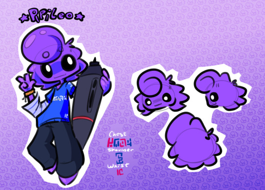
Pipileo Pinned Post Vol. 3
hi im ☆pipileo☆, or pip, and HHIII HELLO I DRAW STUPID JUUNK
==About the Blog==
a minor owns this place, so 18+ accounts, please stay away!! if your account has content that is too sexual for my tastes, you will get blocked.
this blog is meant to be available to all ages (unless you dont like profanity...) so suggestive content will neither be produced nor reblogged here.
all of my art should be in #pipsoddcreations or #pipsanswerdoods, or if you wanna see some of my OC's backstories, check #pipsOCstorytime
I like to draw my ocs and some Cult Of The Lamb art, but please do feel free to ask me to draw something (no guarantees, but i will try my best)
speaking of ocs, heres the full list of their names and tags... they are plentiful, yet underutilized.
dont be worried if i disappear for a few days- i lose motivation often, or i get too busy sometimes.
my artstyle is inconsistennntttttt babeyyyy
dont be afraid of me- i dont bite that hard. feel free to dm me or put something in my inbox whenever ya want
==About my Sonas==
say hi!!! I have two sonas, one is a slime, and the other is a kitty : )
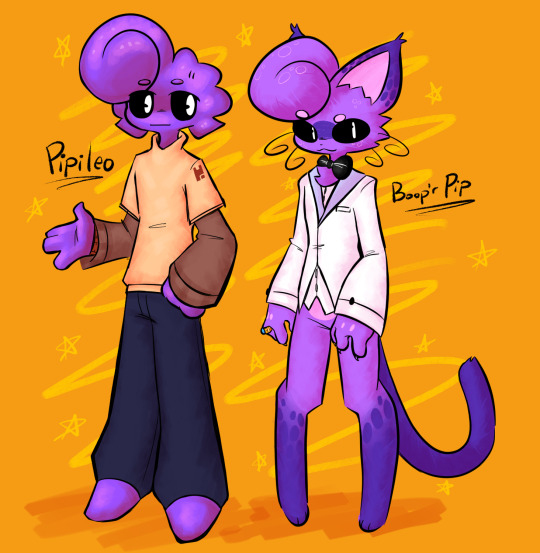
Pip is 5'5, tastes like grapes, and dies or gets hurt in liquid water. great guy, amirite? he gets all disoriented if you bite him though.
Boop'r Pip is 5'3, is affectionately violent, hates water, and will likely bite you first. he's married! you don't wanna know what he did to his spouse.
my sonas are INTERCHANGEABLE! you can use one or the other in any fanarts, depending on your preference.
==About some other stuff==
you can totally use my art as reference or inspiration, just dont like- trace my stuff
if you wanna use my art as a pfp, just let me know before you do so, and please do credit me somewhere on your account
im thinking about doing comms, but for the time being, i usually draw whatever you ask me to, so long as you ask politely. also, do feel free to ask me for an art trade.
if i mass-like your blog its bc you provoked me + i love you + im very competitive + its my go-to method of showing affection
====
i love all of you, i hope yall at least enjoy my drawings here <3
ORIGINAL REF SHEET UNDER THIS LINE ⬇️⬇️
End of post. Have a great day!
#pinned post#pipsoddcreations#pipsOCstorytime#pipsanswerdoods#ref sheet#digital drawing#digital art#my art#oc#artists on tumblr#slime oc#original art
63 notes
·
View notes
Note
i've noticed that some card sets have different styles compared to other sets. Did they ever talk about this or a more in depth explanation about it? I find it really interesting how some cards have a more painty style and how some have a strong lighting and stuff like that.
in some of their blog posts they will talk about stylistic choices, but nothing much on why some sets get to have different artstyles and some just have regular coloring/shading. I don't think they really need to though since it honestly just comes down to "this set is meant to have a retro feel so lets draw it in a comic-like style" or "this one is new year themed so let's make it look like it was drawn on traditional paper". I don't think there's like a specific system they use to decide what sets get different styles and what sets don't.

While some sets before this had used slightly different styles/textures, the first card to use an entirely different style was probably Ena's card from Blank Canvas. Starting from this event there was a trend where the banner card for an event would quite often have fancier art than the rest of the set (compare Haruka's Painful Hope card and Akito's POU card to the rest of their respective sets), but over time this has kinda evolved to just be entire sets having unique art styles. Ena's card being the first one kinda proves the "it's just based on the theme" idea of it.
If you wanna read them, here's all the colorful palette art blogs. They have more information about the stylistic choices and processes behind the card art.
89 notes
·
View notes
Last Seen Blogs

deersstorystorage
Story Storage

anniepilatesphysicaltherapist
Annie Pilates
Physical Therapist

huppicht
Huppicht

supercool-askblog
The Great Papyrus

muffin-sweets
Muffin